An Introduction to Measures of Mortality - ACPHDleading causes of death are based simply on numbers...
26
An Introduction to Measures of Mortality Assessing Overall Health, Cause of Death Rankings, Health-Adjusted Life Expectancy, and Socioeconomic Conditions in Alameda County Alameda County Health Care Services Agency Alameda County Public Health Department November 2017
Transcript of An Introduction to Measures of Mortality - ACPHDleading causes of death are based simply on numbers...

An Introduction to Measures of Mortality
Assessing Overall Health, Cause of Death Rankings, Health-Adjusted Life Expectancy, and
Socioeconomic Conditions in Alameda County
Alameda County Health Care Services Agency
Alameda County Public Health Department
November 2017

Acknowledgements
This report was produced by:
Alameda County Health Care Services Agency Alameda County Public Health Department
Community Assessment, Planning, and Evaluation (CAPE) Unit
Interim Director Jane Martin
Author Matt Beyers
Reviewers Radhika Agarwal Roxanna Guide
Anna Lee Jennifer Lucky
Jane Martin
Comments and questions can be directed to:
Community Assessment, Planning, and Evaluation (CAPE) Unit
Alameda County Public Health Department 1000 Broadway, Suite 500 Oakland, California 94607
(510) 267-8020 www.acphd.org
Suggested Citation: Alameda County Public Health Department. An Introduction to Measures of Mortality: Assessing Overall Health, Cause of Death Rankings, Health-Adjusted Life Expectancy, and Socioeconomic Conditions in Alameda County. Oakland, California. November 2017.
Copyright © 2017, Alameda County Public Health Department

Overall Health _________________________________________________________________ 1
All-Cause Mortality Rate _____________________________________________________ 1
Life Expectancy at Birth ______________________________________________________ 2
Cause of Death Rankings ________________________________________________________ 3
Leading Causes of Death ______________________________________________________ 4
Cause-Specific Mortality Rates _________________________________________________ 5
Years of Life Lost (YLL) ______________________________________________________ 6
Potential Gains in Life Expectancy (PGLE) _______________________________________ 7
Health-Adjusted Life Expectancy (HALE) ___________________________________________ 8
Mortality Outcomes and Socioeconomic Conditions ___________________________________ 9
Life Expectancy by Neighborhood Poverty Over Time ______________________________ 9
Life Expectancy and Nativity _________________________________________________ 11
Mortality Rate and Education _________________________________________________ 12
Conclusions __________________________________________________________________ 13
References ___________________________________________________________________ 14
Appendix A: The Global Burden of Disease Project ___________________________________ 16
Appendix B: Exhaustive List of Causes of Death and Measures of Cause-Specific Mortality ____ 17
Appendix C: Leading Causes of Death by Race/Ethnicity _______________________________ 19
Appendix D: Leading Causes of Death by Age Group _________________________________ 21
Contents
An Introduction to Measures of Mortality 1
An Introduction to Measures of Mortality This is an introduction to several ways to look at mortality statistics. While some of the data may be useful for program planning, it is meant more as a way to compare various measures of mortality.
The paper begins with two measures that are useful for estimating the overall health of the population: all-cause mortality rate and life expectancy. Next, to look at cause-specific mortality, four statistics are compared side by side—leading caus-es of death, cause-specific mortality rates, years of life lost (YLL), and potential gains in life expectancy (PGLE) due to eliminating specific causes of death. The modified health-adjusted life expectancy (HALE), or years of expected disability-free life, is also presented. Finally, recognizing the importance of the social determinants of health, some mortality data related to socioeconomic measures are included—life expectancy by neighborhood poverty, life expectancy by nativity (born in the U.S. or outside the U.S.), and mortality rate by education.
Supplementary information is in the appendices. Appendix A has a summary of the Global Burden of Disease (GBD) project and gives some background to the development and use of the YLL and HALE. Appendix B lists the four cause-specific mortality measures for every disease group. Appendices C and D include data on leading causes of death by race/ethnicity and by age group.
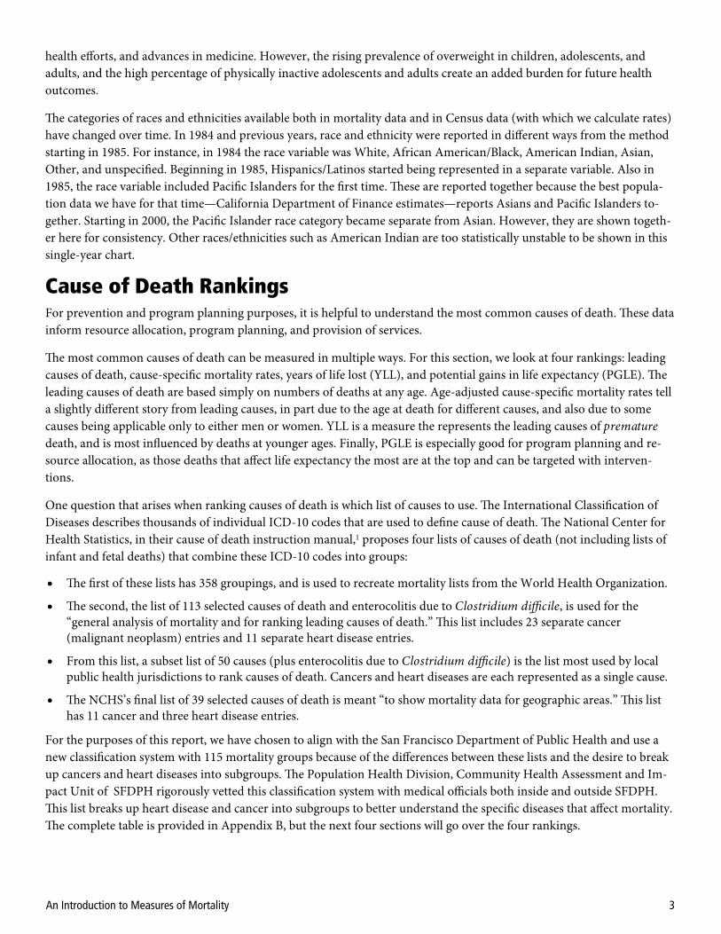
Overall Health All-Cause Mortality Rate The age-adjusted all-cause mortality rate is the rate of all deaths in a specific population regardless of cause. It is a good overall measure of health and can be used to look at trends in overall health over time, compare over geographic areas, and to identify inequalities between groups.
Age adjusting is a method that accounts for differences in age structure or age composition so that populations of differ-ent age distributions can be directly compared. For instance, an area with a high number of people of old age almost al-ways has higher crude mortality rates (simply dividing the numbers of deaths by the population) because the population is older. So comparing that crude rate to that of an area with a young age distribution is not recommended. One might incorrectly attribute the higher rates of death to something other than age. The same distortions can happen when com-paring between races/ethnicities or time periods. We use direct age adjustment based on the 2000 U.S. standard popula-tion.
As seen in figure 1, African Americans/Blacks in Ala-meda County had the highest age-adjusted mortality rate in 2000-2002 and 2013-2015. For each of the cat-egories of race/ethnicity, the mortality rate decreased between 2000-2002 and 2013-2015.
For both American Indians and Pacific Islanders, we have less confidence in these rates. This is both be-cause of small population numbers—reflected in the rather large 95% confidence intervals shown in the error bars—and because of differences in reporting such races/ethnicities between the Census and death certificates. The large change for Pacific Islanders,
Figure 1: All-Cause Mortality Rate by Race/Ethnicity
Source: Alameda County vital statistics files, 2000-2002 and 2013-2015.

An Introduction to Measures of Mortality 2
Figure 3: Life Expectancy Trend, 1960-2015
Source: Alameda County vital statistics files, 1960-2015.
dropping 36% in the nominal value between 2000-2002 and 2013-2015, could be the result of changes to reporting, such as how the Census and death certificates now allow multiple races to be reported.
Life Expectancy at Birth Life expectancy, like all-cause mortality, is a measure of the overall health of a population. It is a snapshot of the mortali-ty rates in the year of death (e.g., 2000-2002 and 2013-2015) compared to the population’s age composition at that time. In other words, a current life table is used rather than a cohort life table, which would follow the entire population from birth through death. Life expectancy is a statistical construct, which assumes that current mortality rates continue throughout each person’s lifespan, and thus represents how long babies are expected to live in a completely hypothetical way. One of the advantages of using life expectancy is that it does not require the use of a standard population (as in age-adjusted mortality), so it is easily comparable across subgroups, time periods, and areas. Although the math is complex, life expectancy is basically analogous to the inverse of all-cause mortality—as mortality rates go down, life expectancy goes up.
The life expectancy at birth increased for nearly all groups in Alameda County between 2000-2002 and 2013-2015 (figure 2). As with all-cause mortality rate, the life expectancy for American Indians and Pacific Islanders should be interpreted with caution. The change of 8.1 years for Pacific Islanders may be most-ly due to small numbers.
As seen in figure 3, life expectancy for all groups in Alameda County has been increasing since 1960. For African Americans, it has not increased as fast as that for Whites. Asian & Pacific Islanders (shown togeth-er) have tended to have the highest life expectancy, and Hispanics/Latinos the second highest. In general. recent declines in mortality rates—and the associated rise in life expec-tancy—for many leading causes of death reflect the influence of healthier lifestyles, greater use of preventive care, public
Source: Alameda County vital statistics files, 2000-2002 and 2013-2015.
Figure 2: Life Expectancy by Race/Ethnicity
An Introduction to Measures of Mortality 3
health efforts, and advances in medicine. However, the rising prevalence of overweight in children, adolescents, and adults, and the high percentage of physically inactive adolescents and adults create an added burden for future health outcomes.
The categories of races and ethnicities available both in mortality data and in Census data (with which we calculate rates) have changed over time. In 1984 and previous years, race and ethnicity were reported in different ways from the method starting in 1985. For instance, in 1984 the race variable was White, African American/Black, American Indian, Asian, Other, and unspecified. Beginning in 1985, Hispanics/Latinos started being represented in a separate variable. Also in 1985, the race variable included Pacific Islanders for the first time. These are reported together because the best popula-tion data we have for that time—California Department of Finance estimates—reports Asians and Pacific Islanders to-gether. Starting in 2000, the Pacific Islander race category became separate from Asian. However, they are shown togeth-er here for consistency. Other races/ethnicities such as American Indian are too statistically unstable to be shown in this single-year chart.
Cause of Death Rankings For prevention and program planning purposes, it is helpful to understand the most common causes of death. These data inform resource allocation, program planning, and provision of services.
The most common causes of death can be measured in multiple ways. For this section, we look at four rankings: leading causes of death, cause-specific mortality rates, years of life lost (YLL), and potential gains in life expectancy (PGLE). The leading causes of death are based simply on numbers of deaths at any age. Age-adjusted cause-specific mortality rates tell a slightly different story from leading causes, in part due to the age at death for different causes, and also due to some causes being applicable only to either men or women. YLL is a measure the represents the leading causes of premature death, and is most influenced by deaths at younger ages. Finally, PGLE is especially good for program planning and re-source allocation, as those deaths that affect life expectancy the most are at the top and can be targeted with interven-tions.
One question that arises when ranking causes of death is which list of causes to use. The International Classification of Diseases describes thousands of individual ICD-10 codes that are used to define cause of death. The National Center for Health Statistics, in their cause of death instruction manual,1 proposes four lists of causes of death (not including lists of infant and fetal deaths) that combine these ICD-10 codes into groups:
The first of these lists has 358 groupings, and is used to recreate mortality lists from the World Health Organization.
The second, the list of 113 selected causes of death and enterocolitis due to Clostridium difficile, is used for the “general analysis of mortality and for ranking leading causes of death.” This list includes 23 separate cancer (malignant neoplasm) entries and 11 separate heart disease entries.
From this list, a subset list of 50 causes (plus enterocolitis due to Clostridium difficile) is the list most used by local public health jurisdictions to rank causes of death. Cancers and heart diseases are each represented as a single cause.
The NCHS’s final list of 39 selected causes of death is meant “to show mortality data for geographic areas.” This list has 11 cancer and three heart disease entries.
For the purposes of this report, we have chosen to align with the San Francisco Department of Public Health and use a new classification system with 115 mortality groups because of the differences between these lists and the desire to break up cancers and heart diseases into subgroups. The Population Health Division, Community Health Assessment and Im-pact Unit of SFDPH rigorously vetted this classification system with medical officials both inside and outside SFDPH. This list breaks up heart disease and cancer into subgroups to better understand the specific diseases that affect mortality. The complete table is provided in Appendix B, but the next four sections will go over the four rankings.
An Introduction to Measures of Mortality 4
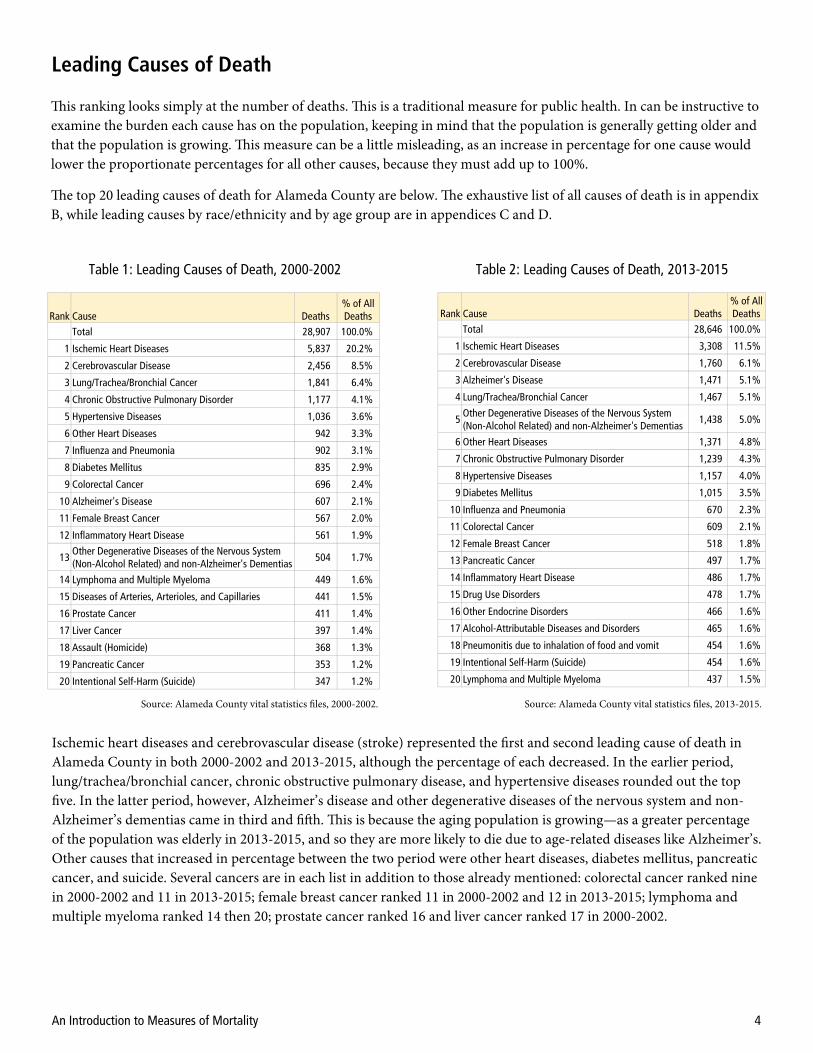
Leading Causes of Death
Table 1: Leading Causes of Death, 2000-2002 Table 2: Leading Causes of Death, 2013-2015
Source: Alameda County vital statistics files, 2000-2002. Source: Alameda County vital statistics files, 2013-2015.
Ischemic heart diseases and cerebrovascular disease (stroke) represented the first and second leading cause of death in Alameda County in both 2000-2002 and 2013-2015, although the percentage of each decreased. In the earlier period, lung/trachea/bronchial cancer, chronic obstructive pulmonary disease, and hypertensive diseases rounded out the top five. In the latter period, however, Alzheimer’s disease and other degenerative diseases of the nervous system and non-Alzheimer’s dementias came in third and fifth. This is because the aging population is growing—as a greater percentage of the population was elderly in 2013-2015, and so they are more likely to die due to age-related diseases like Alzheimer’s. Other causes that increased in percentage between the two period were other heart diseases, diabetes mellitus, pancreatic cancer, and suicide. Several cancers are in each list in addition to those already mentioned: colorectal cancer ranked nine in 2000-2002 and 11 in 2013-2015; female breast cancer ranked 11 in 2000-2002 and 12 in 2013-2015; lymphoma and multiple myeloma ranked 14 then 20; prostate cancer ranked 16 and liver cancer ranked 17 in 2000-2002.
Rank Cause Deaths % of All Deaths
Total 28,907 100.0%
1 Ischemic Heart Diseases 5,837 20.2%
2 Cerebrovascular Disease 2,456 8.5%
3 Lung/Trachea/Bronchial Cancer 1,841 6.4%
4 Chronic Obstructive Pulmonary Disorder 1,177 4.1%
5 Hypertensive Diseases 1,036 3.6%
6 Other Heart Diseases 942 3.3%
7 Influenza and Pneumonia 902 3.1%
8 Diabetes Mellitus 835 2.9%
9 Colorectal Cancer 696 2.4%
10 Alzheimer's Disease 607 2.1%
11 Female Breast Cancer 567 2.0%
12 Inflammatory Heart Disease 561 1.9%
13 Other Degenerative Diseases of the Nervous System (Non-Alcohol Related) and non-Alzheimer's Dementias
504 1.7%
14 Lymphoma and Multiple Myeloma 449 1.6%
15 Diseases of Arteries, Arterioles, and Capillaries 441 1.5%
16 Prostate Cancer 411 1.4%
17 Liver Cancer 397 1.4%
18 Assault (Homicide) 368 1.3%
19 Pancreatic Cancer 353 1.2%
20 Intentional Self-Harm (Suicide) 347 1.2%
Rank Cause Deaths % of All Deaths
Total 28,646 100.0%
1 Ischemic Heart Diseases 3,308 11.5%
2 Cerebrovascular Disease 1,760 6.1%
3 Alzheimer's Disease 1,471 5.1%
4 Lung/Trachea/Bronchial Cancer 1,467 5.1%
5 Other Degenerative Diseases of the Nervous System (Non-Alcohol Related) and non-Alzheimer's Dementias
1,438 5.0%
6 Other Heart Diseases 1,371 4.8%
7 Chronic Obstructive Pulmonary Disorder 1,239 4.3%
8 Hypertensive Diseases 1,157 4.0%
9 Diabetes Mellitus 1,015 3.5%
10 Influenza and Pneumonia 670 2.3%
11 Colorectal Cancer 609 2.1%
12 Female Breast Cancer 518 1.8%
13 Pancreatic Cancer 497 1.7%
14 Inflammatory Heart Disease 486 1.7%
15 Drug Use Disorders 478 1.7%
16 Other Endocrine Disorders 466 1.6%
17 Alcohol-Attributable Diseases and Disorders 465 1.6%
18 Pneumonitis due to inhalation of food and vomit 454 1.6%
19 Intentional Self-Harm (Suicide) 454 1.6%
20 Lymphoma and Multiple Myeloma 437 1.5%
This ranking looks simply at the number of deaths. This is a traditional measure for public health. In can be instructive to examine the burden each cause has on the population, keeping in mind that the population is generally getting older and that the population is growing. This measure can be a little misleading, as an increase in percentage for one cause would lower the proportionate percentages for all other causes, because they must add up to 100%.
The top 20 leading causes of death for Alameda County are below. The exhaustive list of all causes of death is in appendix B, while leading causes by race/ethnicity and by age group are in appendices C and D.

An Introduction to Measures of Mortality 5
Cause-Specific Mortality Rates
Rank Cause
Age-Adjusted Mortality Rate per 100,000
Total 752.3
1 Ischemic Heart Diseases 155.4
2 Cerebrovascular Disease 65.4
3 Lung/Trachea/Bronchial Cancer 48.7
4 Chronic Obstructive Pulmonary Disorder 31.8
5 Prostate Cancer 29.2
6 Hypertensive Diseases 27.0
7 Female Breast Cancer 25.5
8 Other Heart Diseases 24.8
9 Influenza and Pneumonia 24.0
10 Diabetes Mellitus 21.9
11 Colorectal Cancer 18.3
12 Alzheimer's Disease 16.2
13 Inflammatory Heart Disease 14.5
14 Other Degenerative Diseases of the Nervous System (Non-Alcohol Related) and non-Alzheimer's dementias
13.5
15 Lymphoma and Multiple Myeloma 11.7
16 Diseases of Arteries, Arterioles, and Capillaries 11.7
17 Pancreatic Cancer 9.3
18 Intentional Self-Harm (Suicide) 8.1
19 Assault (Homicide) 8.0
20 Liver Cancer 7.8
Rank
Age-Adjusted Mortality Rate per 100.000
Total 600.4
1 Ischemic Heart Diseases 69.7
2 Cerebrovascular Disease 37.3
3 Alzheimer's Disease 31.2
4 Lung/Trachea/Bronchial Cancer 31.2
5 Other Degenerative Diseases of the Nervous System (Non-Alcohol Related) and non-Alzheimer's dementias
30.6
6 Other Heart Diseases 28.9
7 Chronic Obstructive Pulmonary Disorder 26.6
8 Hypertensive Diseases 23.9
9 Diabetes Mellitus 21.3
10 Prostate Cancer 18.9
11 Female Breast Cancer 18.9
12 Influenza and Pneumonia 14.0
13 Colorectal Cancer 12.5
14 Pancreatic Cancer 10.3
15 Inflammatory Heart Disease 10.1
16 Other Endocrine Disorders 9.8
17 Pneumonitis due to inhalation of food and vomit 9.6
18 Drug Use Disorders 9.4
19 Lymphoma and Multiple Myeloma 9.3
20 Intentional Self-Harm (Suicide) 9.3
Table 3: Cause-Specific Mortality Rates, 2000-2002 Table 4: Cause-Specific Mortality Rates, 2013-2015
Source: Alameda County vital statistics files, 2000-2002. Source: Alameda County vital statistics files, 2013-2015.
Age-adjusted cause-specific mortality rates are better than leading causes of death in that they adjust for the age compo-sition of the population. These numbers reflect the probability of an individual dying per unit of time per population at risk. The rankings are only slightly different from those of leading causes of death with its percentages. The main differ-ences are that there are certain diseases that affect only half the population, prostate cancer for example. The top 20 caus-es for Alameda County for 2000-2002 and 2013-2015 are below.
As with leading causes, ischemic heart diseases and cerebrovascular disease are the first and second in each time period, although the rate for each decreased. Among the remainder, the rates of Alzheimer’s disease, other degenerative diseases of the nervous system and non-Alzheimer’s dementias increased for the reason cited earlier; other heart diseases, pancre-atic cancer, and suicide increased as well.
An Introduction to Measures of Mortality 6
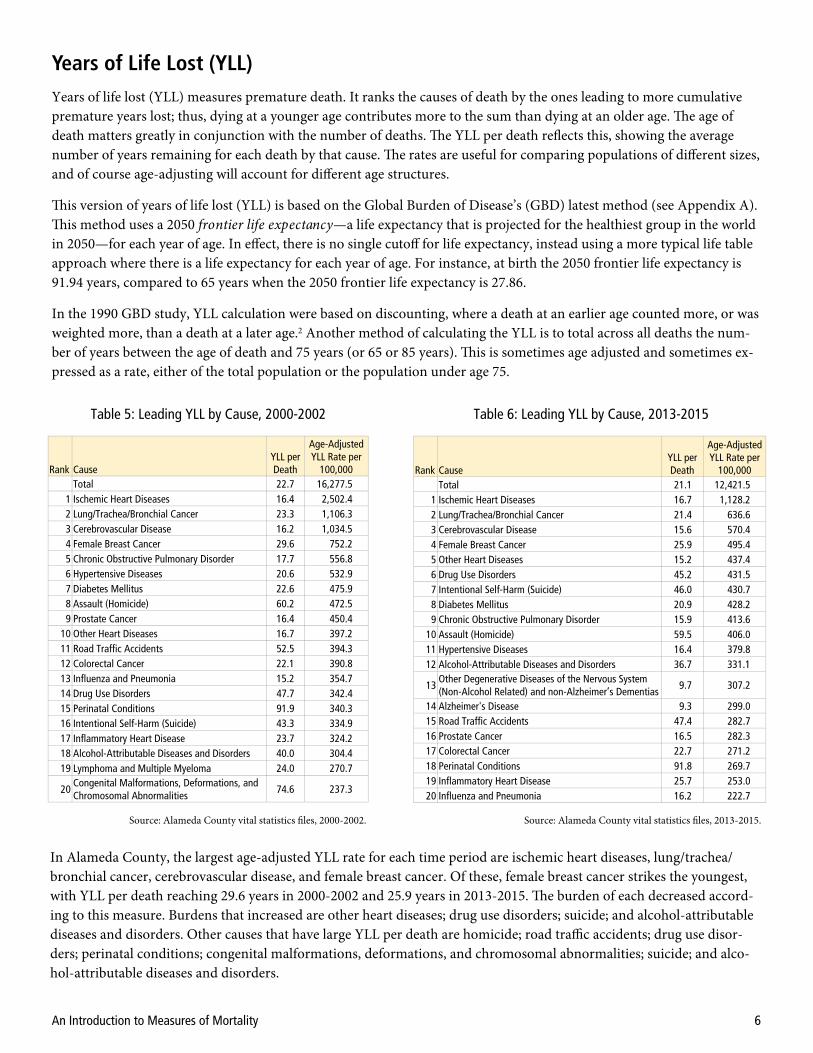
Years of Life Lost (YLL) Years of life lost (YLL) measures premature death. It ranks the causes of death by the ones leading to more cumulative premature years lost; thus, dying at a younger age contributes more to the sum than dying at an older age. The age of death matters greatly in conjunction with the number of deaths. The YLL per death reflects this, showing the average number of years remaining for each death by that cause. The rates are useful for comparing populations of different sizes, and of course age-adjusting will account for different age structures.
This version of years of life lost (YLL) is based on the Global Burden of Disease’s (GBD) latest method (see Appendix A). This method uses a 2050 frontier life expectancy—a life expectancy that is projected for the healthiest group in the world in 2050—for each year of age. In effect, there is no single cutoff for life expectancy, instead using a more typical life table approach where there is a life expectancy for each year of age. For instance, at birth the 2050 frontier life expectancy is 91.94 years, compared to 65 years when the 2050 frontier life expectancy is 27.86.
In the 1990 GBD study, YLL calculation were based on discounting, where a death at an earlier age counted more, or was weighted more, than a death at a later age.2 Another method of calculating the YLL is to total across all deaths the num-ber of years between the age of death and 75 years (or 65 or 85 years). This is sometimes age adjusted and sometimes ex-pressed as a rate, either of the total population or the population under age 75.
Table 5: Leading YLL by Cause, 2000-2002
Source: Alameda County vital statistics files, 2000-2002. Source: Alameda County vital statistics files, 2013-2015.
Table 6: Leading YLL by Cause, 2013-2015
In Alameda County, the largest age-adjusted YLL rate for each time period are ischemic heart diseases, lung/trachea/bronchial cancer, cerebrovascular disease, and female breast cancer. Of these, female breast cancer strikes the youngest, with YLL per death reaching 29.6 years in 2000-2002 and 25.9 years in 2013-2015. The burden of each decreased accord-ing to this measure. Burdens that increased are other heart diseases; drug use disorders; suicide; and alcohol-attributable diseases and disorders. Other causes that have large YLL per death are homicide; road traffic accidents; drug use disor-ders; perinatal conditions; congenital malformations, deformations, and chromosomal abnormalities; suicide; and alco-hol-attributable diseases and disorders.
Rank Cause YLL per Death
Age-Adjusted YLL Rate per
100,000 Total 22.7 16,277.5
1 Ischemic Heart Diseases 16.4 2,502.4 2 Lung/Trachea/Bronchial Cancer 23.3 1,106.3 3 Cerebrovascular Disease 16.2 1,034.5 4 Female Breast Cancer 29.6 752.2 5 Chronic Obstructive Pulmonary Disorder 17.7 556.8 6 Hypertensive Diseases 20.6 532.9 7 Diabetes Mellitus 22.6 475.9 8 Assault (Homicide) 60.2 472.5 9 Prostate Cancer 16.4 450.4
10 Other Heart Diseases 16.7 397.2 11 Road Traffic Accidents 52.5 394.3 12 Colorectal Cancer 22.1 390.8 13 Influenza and Pneumonia 15.2 354.7 14 Drug Use Disorders 47.7 342.4 15 Perinatal Conditions 91.9 340.3 16 Intentional Self-Harm (Suicide) 43.3 334.9 17 Inflammatory Heart Disease 23.7 324.2 18 Alcohol-Attributable Diseases and Disorders 40.0 304.4 19 Lymphoma and Multiple Myeloma 24.0 270.7
20 Congenital Malformations, Deformations, and Chromosomal Abnormalities
74.6 237.3
Rank Cause YLL per Death
Age-Adjusted YLL Rate per
100,000 Total 21.1 12,421.5
1 Ischemic Heart Diseases 16.7 1,128.2 2 Lung/Trachea/Bronchial Cancer 21.4 636.6 3 Cerebrovascular Disease 15.6 570.4 4 Female Breast Cancer 25.9 495.4 5 Other Heart Diseases 15.2 437.4 6 Drug Use Disorders 45.2 431.5 7 Intentional Self-Harm (Suicide) 46.0 430.7 8 Diabetes Mellitus 20.9 428.2 9 Chronic Obstructive Pulmonary Disorder 15.9 413.6
10 Assault (Homicide) 59.5 406.0 11 Hypertensive Diseases 16.4 379.8 12 Alcohol-Attributable Diseases and Disorders 36.7 331.1
13 Other Degenerative Diseases of the Nervous System (Non-Alcohol Related) and non-Alzheimer’s Dementias
9.7 307.2
14 Alzheimer's Disease 9.3 299.0 15 Road Traffic Accidents 47.4 282.7 16 Prostate Cancer 16.5 282.3 17 Colorectal Cancer 22.7 271.2 18 Perinatal Conditions 91.8 269.7 19 Inflammatory Heart Disease 25.7 253.0 20 Influenza and Pneumonia 16.2 222.7

An Introduction to Measures of Mortality 7
Potential Gains in Life Expectancy (PGLE)
Table 7: Leading PGLE by Cause, 2000-2002
Source: Alameda County vital statistics files, 2000-2002. Source: Alameda County vital statistics files, 2013-2015.
Table 8: Leading PGLE by Cause, 2013-2015
Potential gains in life expectancy (PGLE) is another way to rank leading causes of death. In this case, the rank is by how many years of life expectancy could be gained at birth by eliminating specific causes of death. This gain is for the entire population, and so even small gains are very significant. For instance, if diabetes mellitus were eliminated, the life expec-tancy would have been 0.44 years more for every person in the county in 2013-2015.
The advantage of PGLE is that, like life expectancy, age adjustment is not needed to normalize. Thus the choice of stand-ard population does not affect the results.
This measure can be calculated in one of two methods. The first method uses a multiple-decrement life table, subtracting deaths for a specific cause from the total by age group.3 An easier method again subtracts the deaths for a specific cause, but the resultant life expectancy is calculated directly, not through a multiple-decrement life table.4 Here we have used the latter method.
Ischemic heart diseases and cerebrovascular disease were ranked one and two in each time period in Alameda County in 2000-2002 and 2013-2015. However, the gain in eliminating ischemic heart diseases nearly halved in that time, meaning the overall burden decreased. Most strikingly, in 2013-2015, diseases associated with the elderly, Alzheimer’s disease as well as other degenerative diseases of the nervous system and non-Alzheimer’s dementias gained substantially in PGLE and were ranked three and four. Other diseases that increased were chronic obstructive pulmonary disease, other heart diseases, hypertensive diseases, and diabetes mellitus. Lung/trachea/bronchial cancer and female breast cancer, ranked five and nine in 2013-2015, decreased slightly in PGLE from 2000-2002.
* Female only; uses female life expectancy as reference. † Male only; uses male life expectancy as reference.
Group Life Expectancy at Birth (Years)
Total 79.06 Female 81.39 Male 76.54
Cause PGLE Ischemic Heart Diseases 3.04 Cerebrovascular Disease 1.09 Lung/Trachea/Bronchial Cancer 0.87 Female Breast Cancer* 0.56 Chronic Obstructive Pulmonary Disorder 0.50 Hypertensive Diseases 0.46 Other Heart Diseases 0.40 Influenza and Pneumonia 0.38 Diabetes Mellitus 0.37 Prostate Cancer† 0.35 Colorectal Cancer 0.31 Assault (Homicide) 0.27 Inflammatory Heart Disease 0.25 Alzheimer's Disease 0.24 Road Traffic Accidents 0.23 Perinatal Conditions 0.21 Lymphoma and Multiple Myeloma 0.21 Other Degenerative Diseases of the Nervous System (Non-Alcohol Related) and Non-Alzheimer's Dementias
0.20
Intentional Self-Harm (Suicide) 0.20 Diseases of Arteries, Arterioles, and Capillaries 0.18
Rank
1 2 3 4 5 6 7 8 9
10 11 12 13 14 15 16 17
18
19 20
Group Life Expectancy at Birth (Years)
Total 81.96 Female 84.10 Male 79.67
Cause PGLE Ischemic Heart Diseases 1.54 Cerebrovascular Disease 0.78 Alzheimer's Disease 0.66 Other Degenerative Diseases of the Nervous System (Non-Alcohol Related) and Non-Alzheimer's Dementias
0.64
Lung/Trachea/Bronchial Cancer 0.64 Other Heart Diseases 0.61 Chronic Obstructive Pulmonary Disorder 0.53 Hypertensive Diseases 0.50 Female Breast Cancer* 0.46 Diabetes Mellitus 0.44 Prostate Cancer† 0.30 Influenza and Pneumonia 0.29 Intentional Self-Harm (Suicide) 0.27 Drug Use Disorders 0.27 Colorectal Cancer 0.26 Assault (Homicide) 0.25 Inflammatory Heart Disease 0.22 Alcohol-Attributable Diseases and Disorders 0.22 Pancreatic Cancer 0.21 Other Endocrine Disorders 0.21
Rank
1 2 3
4
5 6 7 8 9
10 11 12 13 14 15 16 17 18 19 20

An Introduction to Measures of Mortality 8
Health-Adjusted Life Expectancy (HALE)
Age Life Expectancy Health-Adjusted Life Expectancy
0 82.58 71.08
5 77.94 66.42
18 65.06 53.97
35 48.74 38.23
65 22.36 13.61
75 15.09 7.29
Source: Alameda County vital statistics files, 2011-2015 and American Community Survey 2015 5-year files.
Table 9: Life Expectancy and Health-Adjusted Life Expectancy
As of 2011-2015 in Alameda County, the average life expectancy at birth was 82.58 years, with 71.08 years in full health and disability free. Those 65 years had a life expectancy of 22.36 years, 13.61 years of which would be in full health.
The idea of health-adjusted life expectancy—or average years of life in full health and free of disease or injury—was de-veloped by Sullivan.5 This is a measure that is also called disability-free life expectancy (DFLE) and that can be derived, as in the Global Burden of Disease, from knowing the morbidity rates by age group for every possible cause. The method applied here uses the estimates of the number with any disability in the population by age group from the American Community Survey.
The American Community Survey (ACS) reports disability rates for six age groups: 0-4 years, 5-17 years, 18-34 years, 35-64 years, 65-74 years, and 75+ years. This allows a modified life table to be used that is based on these abridged age groups. The six disability statuses reported in the ACS are hearing, vision, cognitive, ambulatory, self-care, and independ-ent living.
It should be noted here that the California Health Interview Survey (CHIS) reports higher disability rates than those from the American Community Survey. However, the CHIS estimates disability only for those 18+ years, so it cannot be used to calculate HALE. However, the important point is that the numbers below can be assumed to be conservative esti-mates—the HALE may be much lower.
The life expectancy here is slightly different from that in the PGLE section. This is because a different abridged life table was used, built to match the age groups available in the American Community Survey for disability, and because this is five years of mortality data.

An Introduction to Measures of Mortality 9
Mortality Outcomes and Socioeconomic Conditions
Figure 4: Social Gradient, 1989-1991
Source: Alameda County vital statistics files, 1989-1991.
The social gradient is a method to examine the role of neighborhood poverty in life expectancy. Each residential address on the death certificate is placed into a neighborhood (census tract). The neighborhoods—and their constituent deaths and populations—in the county are aggregated into five groups: less than five percent poverty, from five percent to less than ten percent poverty, from ten percent to less than 20 percent poverty, from 20 percent to less than 30 percent pov-erty, and 30 percent poverty or more. For each of these groups, overall life expectancy and life expectancy by race/ethnicity is calculated. It should be noted that we drop several census tracts from the analysis. These include the tract where Santa Rita jail is located, and several tracts near UC Berkeley where more than 50% of the population is college students.
Source: Alameda County vital statistics files, 1999-2001.
Figure 5: Social Gradient, 1999-2001
Figure 6: Social Gradient, 2009-2011
Source: Alameda County vital statistics files, 2009-2011.
Figure 7: Social Gradient, 2013-2015
Source: Alameda County vital statistics files, 2013-2015.
Life Expectancy by Neighborhood Poverty Over Time
Socioeconomic conditions have great influences on health outcomes. These conditions may be more important than ge-netics, biology, and access to medical care. We examine three indicators here based on information available from the death certificate: neighborhood poverty as taken by the residence at the time of death, nativity (those born in the United States vs. those not), and educational attainment.

An Introduction to Measures of Mortality 10
Figure 9: Composition of Neighborhood Poverty Groups
389,534 459,523 375,264 198,484 116,358 Total popula on of each group
Source: CAPE, with data from Esri 2015.
We have done the social gradient analysis for several sets of years, starting in 1989-1991 and continuing each decade, - and ending with the most recent time period. While the life expectancy increased for each race/ethnicity group in the county in each time period until 2009-2011, it did not change substantially between 2009-2011 and 2013-2015. This may reflect the leveling off in life expectancy that has been recorded at the national level.6
Generally, as neighborhood poverty increases, life expectancy decreases, with those in areas of 30.0%+ poverty having the lowest life expectancy. There is a wide variation in the experience of different racial/ethnic groups, however—there is about a 15-year difference between African Americans/Blacks and Asians in the highest poverty areas. In each time peri-od, the Hispanic/Latino lines are fairly flat across neighborhood poverty groups. The Asian & Pacific Islander line is sloped slightly, while African American/Black and White lines are more highly sloped. For these two groups, with higher life expectancy in lower poverty areas, neighborhood poverty is more predictive of life expectancy.
Figure 8 shows the change in the social gradient over time for all races. The life expectancy of each poverty group in-creased until 2009-2011. Between that period and 2013-2015, however, the change is relatively flat (except for the least-poor neighborhoods). This is consistent with the na-tional trend.
It is illustrative to examine the racial/ethnic composition of these poverty groups. Figure 9 shows us that, of those in very high-poverty neighborhoods (30.0%+ poverty), 64.1% are African American/Black and Hispanic/Latino. Compare this to very low-poverty neighborhoods (<5.0%), where a greater percentage, 79.0%, are White and Asian. Thus, even though African Americans/Blacks have the lowest life ex-pectancies in the 30.0%+ poverty group, and Whites have the next lowest, these poor outcomes are affecting many fewer Whites than African Americans/Blacks.
1989‐1991 1999‐2001 2009‐2011 2013‐2015
Figure 8: Change in the Social Gradient
Source: Alameda County vital statistics files, 1989-1991, 1999-2001, 2009-2011, and 2013-2015.

An Introduction to Measures of Mortality 11
Life Expectancy and Nativity
In terms of race/ethnicity, those born outside the United States had a higher life expectancy than those native born. The exception is Pacific Islanders, for whom there were too few born in the United States to calculate. For Asians the effect is minimal, but for African Americans/Blacks, Hispanics/Latinos, and Whites the differences in life expectancy are each about five years.
Explanations for this have been proposed in the literature.7 A large component of this is that healthy people are more likely to migrate. Also, before the acculturation that usually begins with assimilation over time or with second-generation immigrants, the hypothesis is that immigrants bring with them healthier lifestyles than those in the United States in terms of what type of food they eat and attitudes toward exercise. Family structure and social support also play a role. A corollary is the salmon effect: many immigrants may go to the country of their birth to die, though this has been shown not to hold true for Hispanics/Latinos.8
There is also some evidence that immigrants experience poorer health outcomes.9 Some explanations for this are that immigrants are negatively affected by the immigration process itself, that they live in poor conditions in the United States because of low employment status, predisposition to certain poor outcomes, and poorer access to health care.
Figure 10: Nativity and Life Expectancy by Race
Source: Alameda County vital statistics files, 2011-2015.
NA
Another variable available on death certificates is where people were born. We aggregated all those born in the United States (defined here as the fifty states and Washington DC) and those born outside of the United States. This aggregation covered five years of mortality data by race/ethnicity. To match the numerators, deaths, we pulled data from the Ameri-can Community Survey PUMS data to get nativity by age group.

An Introduction to Measures of Mortality 12
Mortality Rate and Education
Figure 11: Education, Race/Ethnicity, and Mortality Rate
Source: Alameda County vital statistics files, 2011-2015.
Source: Alameda County vital statistics files, 2011-2015.
Education seems to have a bigger effect on Whites and African Americans/Blacks than for Asians and Hispanics/Latinos. For African Americans/Blacks, the age-adjusted all-cause mortality rate more than halves from 1,670.2 per 100,000 for those who haven’t completed high school to 796.6 per 100,000 for those who have completed a bachelor’s degree or more.
With the implementation of the Electronic Death Registration System (EDRS) in Alameda County in 2007 and im-proved data quality for the education variable, it is possible to do analyses of education and mortality.
For this analysis, as with the nativity analysis, we pulled data from the American Community Survey PUMS data to cal-culate denominators by race, age, and educational attainment. These denominators were matched with data similarly aggregated from the death certificates.
To look at mortality rate by level of education, we restrict the analysis to people 25 years or older. This restriction gives people time to have completed their education and matches the American Community Survey variable. For this reason, we are limited to looking at all-cause age-adjusted mortality rate and cannot look at life expectancy.
Figure 12: Education, Nativity, and Mortality Rate

An Introduction to Measures of Mortality 13
To investigate the effect of immigration and education, which primarily concerns Asians and Hispanics/Latinos, we looked at those born outside the United States versus those native to the United States. For those born outside, the effect of education is minimal, while for those born in the United States the rate halves from 1,426.3 per 100,000 for those with less than a high school education to 705.3 per 100,000 for those with a bachelor’s degree or more. This may be due to some combination of the healthy immigrant effect and the effect of ethnic enclaves in the county where someone with less formal education can still thrive.
Conclusions There are advantages and disadvantages to each of the measures presented in this paper. These are explained in the fol-lowing table.
Measure Advantages Disadvantages
Age-adjusted all-cause mortality rate
Widely used. Age adjusting evens out the distortions between groups of
different age structures.
Cannot be compared cross-nationally except when spe-cifically using a world population standard.
Age adjusting can be difficult to explain.
Life expectancy Starting to be more widely used. More intuitive than age-adjusted all-cause mortality rate. Can be compared cross-nationally.
Sometimes too intuitive, as some believe we are actually predicting how long today’s children will live.
Changes that seem small can be very meaningful.
Leading causes of death Easy to do. Widely used, though lists of causes of deaths differ. Doesn’t require population (denominator) statistics.
Doesn’t differentiate between varying age structures. Skewed toward causes of death of older persons.
Cause-specific mortality rates
Widely used. Tends to over-emphasize deaths of older persons. Age adjusting can be difficult to explain.
Years of life lost (YLL) Starting to be more widely used, though methods differ. Identifies those dying at younger ages.
Difficult to grasp intuitively. Age adjusting can be difficult to explain.
Potential gains in life expectancy (PGLE)
Can be compared cross-nationally. Difficult to grasp intuitively. Changes that seem small can be very meaningful.
Health-adjusted life expectancy (HALE)
Combines disability (or morbidity) and mortality into a single indicator.
Not enough morbidity statistics exist on a sub-national level to do it using the more nuanced method.
Limited disability statistics; California Health Interview Survey does not provide disability numbers for those less than 18 years.
Life expectancy by neighborhood poverty
Shows relationship between socioeconomic status and life expectancy in a simple, easy-to-understand manner.
Ecological poverty data, not based on individual economic status.
Life expectancy and nativity Takes advantage of birthplace data on death certificates. Can be difficult to explain why the differences exist.
Mortality rate and education Takes advantage of improvement in education variable on California death certificates.
Results not as intuitive (i.e., more education leads to lower mortality rates) as might be expected.
Cau
se o
f Dea
th R
anki
ngs
HA
LE
Soci
oeco
nom
ic
Con
ditio
ns
Ove
rall
Hea
lth
An Introduction to Measures of Mortality 14
References
1. Centers for Disease Control and Prevention, National Center for Health Statistics. 2011. Instruction Manual Part 9: ICD-10 Cause-of-Death Lists for Tabulating Mortality Statistics (Updated March 2011 to include WHO updates to ICD-10 for data year 2011). (Available: https://www.cdc.gov/nchs/nvss/instruction_manuals.htm; referenced August 2017.)
2. World Health Organization. 2001. National Burden of Disease Studies: A Practical Guide, Edition 2.0, Geneva.
3. Lai D and Hardy RJ. 1999. Potential gains in life expectancy of years of potential life lost: impact of competing risks of death. International Journal of Epidemiology 28:894-898.
4. Ho A, Hameed H, Lee AW, and Shih M. 2016. Potential gains in life expectancy from reductions in leading causes of death, Los Angeles County: a quantitative approach to identify candidate diseases for prevention and burden disparities elimination. Journal of Racial and Ethnic Health Disparities 3:431-443.
5. Sullivan DF. 1971. A single index of mortality and morbidity. HSMHA Health Reports 86(4):347-354.
6. Xu J et al. 2016. Mortality in the Unites States, 2015. CDC, National Center for Health Statistics. (Available: https://www.cdc.gov/nchs/data/databriefs/db267.pdf; referenced August 2017.)
7. Cunningham SA, Ruben JD, and Narayan, KMV. 2008. Health of foreign-born people in the United States: a review. Health and Place 14:623-635.
8. Abraido-Lanza AF, Dohrenwend BP, Ng-Mak DS, and Turner JB. 1999. The Latino mortality paradox: a test of the "salmon bias" and healthy migrant hypotheses. American Journal of Public Health 89(10):1543-1548.
9. World Health Organization. 2017. Metrics: Disability-Adjusted Life Year (DALY). (Available: http://www.who.int/healthinfo/global_burden_disease/metrics_daly/en/; referenced August 2017.)
10. World Health Organization. 2003. World Health Report 2003: Shaping the Future (Available: http://www.who.int/whr/2003/en/; referenced August 2017.)
An Introduction to Measures of Mortality 15
As part of public health’s ten essential services, epidemiologists play a role in monitoring health status to identify com-munity health problems and educate people about health issues. Toward this end, the World Health Organization (WHO) and the Institute of Health Metrics and Evaluation (IHME) at the University of Washington have developed and published mortality and morbidity indicators as part of the Global Burden of Disease (GBD) project.
The GBD project seeks to quantify disease burden primarily through the metric disability-adjusted life years (DALY), which combines years lost to disability with life expectancy. One DALY is equivalent to one lost year of healthy life. The burden of different types of diseases are the sum of these DALYs across the population, and thus can be thought of as a measurement of the disparity between current health status and ideal health where each person in the population lives to an elevated age free of disease.9 Years lived with disability (YLD) and years of life lost (YLL) due to premature death com-prise the DALY. A related metric, health-adjusted life expectancy (HALE), takes into account morbidity and mortality rates. The HALE is based on life expectancy at birth but has an adjustment for time spent in poor health. It is the number of years in full health that can be expected.10
To do the YLD and thus the DALY, one needs to have morbidity rates for every cause by age. Unfortunately these rates are only available at large geographic areas like countries. However, we can present the YLL and a modified form of the HALE that relies on disability by age in the American Community Survey rather than needing every morbidity rate.
Appendix A: The Global Burden of Disease Project
An Introduction to Measures of Mortality 16
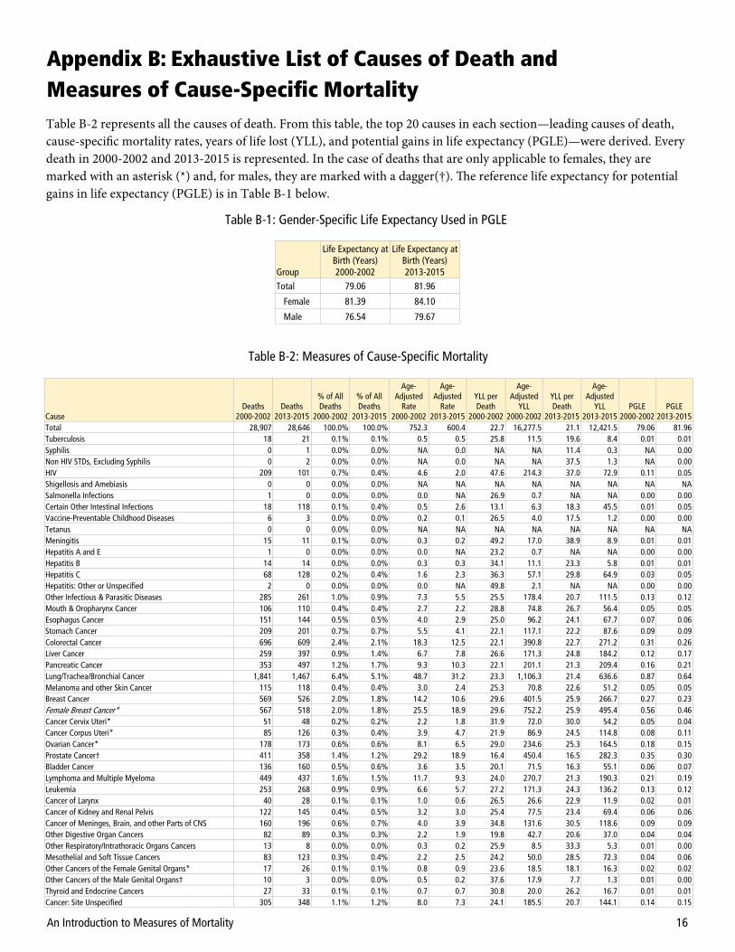
Table B-2 represents all the causes of death. From this table, the top 20 causes in each section—leading causes of death, cause-specific mortality rates, years of life lost (YLL), and potential gains in life expectancy (PGLE)—were derived. Every death in 2000-2002 and 2013-2015 is represented. In the case of deaths that are only applicable to females, they are marked with an asterisk (*) and, for males, they are marked with a dagger(†). The reference life expectancy for potential gains in life expectancy (PGLE) is in Table B-1 below.
Group
Life Expectancy at Birth (Years) 2000-2002
Life Expectancy at Birth (Years) 2013-2015
Total 79.06 81.96
Female 81.39 84.10
Male 76.54 79.67
Table B-1: Gender-Specific Life Expectancy Used in PGLE
Appendix B: Exhaustive List of Causes of Death and Measures of Cause-Specific Mortality
Cause Deaths
2000-2002 Deaths
2013-2015
% of All Deaths
2000-2002
% of All Deaths
2013-2015
Age-Adjusted
Rate 2000-2002
Age-Adjusted
Rate 2013-2015
YLL per Death
2000-2002
Age-Adjusted
YLL 2000-2002
YLL per Death
2013-2015
Age-Adjusted
YLL 2013-2015
PGLE 2000-2002
PGLE 2013-2015
Total 28,907 28,646 100.0% 100.0% 752.3 600.4 22.7 16,277.5 21.1 12,421.5 79.06 81.96 Tuberculosis 18 21 0.1% 0.1% 0.5 0.5 25.8 11.5 19.6 8.4 0.01 0.01 Syphilis 0 1 0.0% 0.0% NA 0.0 NA NA 11.4 0.3 NA 0.00 Non HIV STDs, Excluding Syphilis 0 2 0.0% 0.0% NA 0.0 NA NA 37.5 1.3 NA 0.00 HIV 209 101 0.7% 0.4% 4.6 2.0 47.6 214.3 37.0 72.9 0.11 0.05 Shigellosis and Amebiasis 0 0 0.0% 0.0% NA NA NA NA NA NA NA NA Salmonella Infections 1 0 0.0% 0.0% 0.0 NA 26.9 0.7 NA NA 0.00 0.00 Certain Other Intestinal Infections 18 118 0.1% 0.4% 0.5 2.6 13.1 6.3 18.3 45.5 0.01 0.05 Vaccine-Preventable Childhood Diseases 6 3 0.0% 0.0% 0.2 0.1 26.5 4.0 17.5 1.2 0.00 0.00 Tetanus 0 0 0.0% 0.0% NA NA NA NA NA NA NA NA Meningitis 15 11 0.1% 0.0% 0.3 0.2 49.2 17.0 38.9 8.9 0.01 0.01 Hepatitis A and E 1 0 0.0% 0.0% 0.0 NA 23.2 0.7 NA NA 0.00 0.00 Hepatitis B 14 14 0.0% 0.0% 0.3 0.3 34.1 11.1 23.3 5.8 0.01 0.01 Hepatitis C 68 128 0.2% 0.4% 1.6 2.3 36.3 57.1 29.8 64.9 0.03 0.05 Hepatitis: Other or Unspecified 2 0 0.0% 0.0% 0.0 NA 49.8 2.1 NA NA 0.00 0.00 Other Infectious & Parasitic Diseases 285 261 1.0% 0.9% 7.3 5.5 25.5 178.4 20.7 111.5 0.13 0.12 Mouth & Oropharynx Cancer 106 110 0.4% 0.4% 2.7 2.2 28.8 74.8 26.7 56.4 0.05 0.05 Esophagus Cancer 151 144 0.5% 0.5% 4.0 2.9 25.0 96.2 24.1 67.7 0.07 0.06 Stomach Cancer 209 201 0.7% 0.7% 5.5 4.1 22.1 117.1 22.2 87.6 0.09 0.09 Colorectal Cancer 696 609 2.4% 2.1% 18.3 12.5 22.1 390.8 22.7 271.2 0.31 0.26 Liver Cancer 259 397 0.9% 1.4% 6.7 7.8 26.6 171.3 24.8 184.2 0.12 0.17 Pancreatic Cancer 353 497 1.2% 1.7% 9.3 10.3 22.1 201.1 21.3 209.4 0.16 0.21 Lung/Trachea/Bronchial Cancer 1,841 1,467 6.4% 5.1% 48.7 31.2 23.3 1,106.3 21.4 636.6 0.87 0.64 Melanoma and other Skin Cancer 115 118 0.4% 0.4% 3.0 2.4 25.3 70.8 22.6 51.2 0.05 0.05 Breast Cancer 569 526 2.0% 1.8% 14.2 10.6 29.6 401.5 25.9 266.7 0.27 0.23 Female Breast Cancer* 567 518 2.0% 1.8% 25.5 18.9 29.6 752.2 25.9 495.4 0.56 0.46 Cancer Cervix Uteri* 51 48 0.2% 0.2% 2.2 1.8 31.9 72.0 30.0 54.2 0.05 0.04 Cancer Corpus Uteri* 85 126 0.3% 0.4% 3.9 4.7 21.9 86.9 24.5 114.8 0.08 0.11 Ovarian Cancer* 178 173 0.6% 0.6% 8.1 6.5 29.0 234.6 25.3 164.5 0.18 0.15 Prostate Cancer† 411 358 1.4% 1.2% 29.2 18.9 16.4 450.4 16.5 282.3 0.35 0.30 Bladder Cancer 136 160 0.5% 0.6% 3.6 3.5 20.1 71.5 16.3 55.1 0.06 0.07 Lymphoma and Multiple Myeloma 449 437 1.6% 1.5% 11.7 9.3 24.0 270.7 21.3 190.3 0.21 0.19 Leukemia 253 268 0.9% 0.9% 6.6 5.7 27.2 171.3 24.3 136.2 0.13 0.12 Cancer of Larynx 40 28 0.1% 0.1% 1.0 0.6 26.5 26.6 22.9 11.9 0.02 0.01 Cancer of Kidney and Renal Pelvis 122 145 0.4% 0.5% 3.2 3.0 25.4 77.5 23.4 69.4 0.06 0.06 Cancer of Meninges, Brain, and other Parts of CNS 160 196 0.6% 0.7% 4.0 3.9 34.8 131.6 30.5 118.6 0.09 0.09 Other Digestive Organ Cancers 82 89 0.3% 0.3% 2.2 1.9 19.8 42.7 20.6 37.0 0.04 0.04 Other Respiratory/Intrathoracic Organs Cancers 13 8 0.0% 0.0% 0.3 0.2 25.9 8.5 33.3 5.3 0.01 0.00 Mesothelial and Soft Tissue Cancers 83 123 0.3% 0.4% 2.2 2.5 24.2 50.0 28.5 72.3 0.04 0.06 Other Cancers of the Female Genital Organs* 17 26 0.1% 0.1% 0.8 0.9 23.6 18.5 18.1 16.3 0.02 0.02 Other Cancers of the Male Genital Organs† 10 3 0.0% 0.0% 0.5 0.2 37.6 17.9 7.7 1.3 0.01 0.00 Thyroid and Endocrine Cancers 27 33 0.1% 0.1% 0.7 0.7 30.8 20.0 26.2 16.7 0.01 0.01 Cancer: Site Unspecified 305 348 1.1% 1.2% 8.0 7.3 24.1 185.5 20.7 144.1 0.14 0.15
Table B-2: Measures of Cause-Specific Mortality

An Introduction to Measures of Mortality 17
Cause Deaths
2000-2002 Deaths
2013-2015
% of All Deaths
2000-2002
% of All Deaths
2013-2015
Age-Adjusted
Rate 2000-2002
Age-Adjusted
Rate 2013-2015
YLL per Death
2000-2002
Age-Adjusted
YLL 2000-2002
YLL per Death
2013-2015
Age-Adjusted
YLL 2013-2015
PGLE 2000-2002
PGLE 2013-2015
Cancer: Secondary or Ill-Defined Site 161 117 0.6% 0.4% 4.2 2.4 22.1 89.9 21.4 49.4 0.07 0.05 Cancer: Multiple Sites 23 43 0.1% 0.2% 0.6 0.9 29.3 16.0 19.4 16.8 0.01 0.02 All Other Malignant Neoplasms 23 22 0.1% 0.1% 0.6 0.5 34.7 18.9 30.1 14.0 0.01 0.01 In Situ, Benign, or Unknown Behavior Cancers 154 159 0.5% 0.6% 4.1 3.5 20.1 80.0 20.3 67.8 0.07 0.07 Blood/Immune Diseases 91 110 0.3% 0.4% 2.3 2.3 28.7 63.2 28.3 63.9 0.05 0.05 Diabetes Mellitus 835 1,015 2.9% 3.5% 21.9 21.3 22.6 475.9 20.9 428.2 0.37 0.44 Other Endocrine Disorders 259 466 0.9% 1.6% 6.7 9.8 23.9 152.9 21.9 209.0 0.12 0.21 Schizophrenia 5 4 0.0% 0.0% 0.1 0.1 10.6 1.4 15.4 1.5 0.00 0.00 Unipolar and Bipolar Depression Disorders
6 5 0.0% 0.0% 0.2 0.1 9.7 1.6 14.8 1.9 0.00 0.00
Alcohol-Attributable Diseases and Disorders 335 465 1.2% 1.6% 7.8 9.0 40.0 304.4 36.7 331.1 0.17 0.22 Drug Use Disorders 332 478 1.1% 1.7% 7.3 9.4 47.7 342.4 45.2 431.5 0.18 0.27 Alzheimer's Disease 607 1,471 2.1% 5.1% 16.2 31.2 10.3 168.3 9.3 299.0 0.24 0.66
Other Degenerative Diseases of the Nervous System (Non-Alcohol Related) and non-Alzheimer's Dementias
504 1,438 1.7% 5.0% 13.5 30.6 10.8 146.6 9.7 307.2 0.20 0.64
PTSD, OCD, and Panic Disorders 0 1 0.0% 0.0% NA 0.0 NA NA 7.1 0.1 NA 0.00 Parkinson’s Disease 169 293 0.6% 1.0% 4.6 6.6 13.7 63.5 12.8 86.6 0.06 0.12 Multiple Sclerosis 43 49 0.1% 0.2% 1.0 1.0 35.7 35.7 28.5 27.2 0.02 0.02 Epilepsy 20 19 0.1% 0.1% 0.5 0.3 41.9 18.7 37.5 13.0 0.01 0.01 Other Neuro-Psychiatric Diseases 201 273 0.7% 1.0% 5.1 5.7 30.3 147.3 29.0 161.3 0.10 0.13 Glaucoma 0 0 0.0% 0.0% NA NA NA NA NA NA NA NA Cataract 0 0 0.0% 0.0% NA NA NA NA NA NA NA NA Otitis Media 1 1 0.0% 0.0% 0.0 0.0 91.9 2.2 3.2 0.1 0.00 0.00 Other Diseases/Disorders Related to the Sense Organs (Eye & Ear)
1 1 0.0% 0.0% 0.0 0.0 44.3 1.0 34.6 0.5 0.00 0.00
Acute Rheumatic Fever and Chronic Rheumatic Heart Disease
37 44 0.1% 0.2% 1.0 0.9 21.7 19.9 20.9 18.9 0.02 0.02
Hypertensive Diseases 1,036 1,157 3.6% 4.0% 27.0 23.9 20.6 532.9 16.4 379.8 0.46 0.50 Ischemic Heart Diseases 5,837 3,308 20.2% 11.5% 155.4 69.7 16.4 2,502.4 16.7 1,128.2 3.04 1.54 Inflammatory Heart Disease 561 486 1.9% 1.7% 14.5 10.1 23.7 324.2 25.7 253.0 0.25 0.22 Cerebrovascular Disease 2,456 1,760 8.5% 6.1% 65.4 37.3 16.2 1,034.5 15.6 570.4 1.09 0.78 Other Heart Diseases 942 1,371 3.3% 4.8% 24.8 28.9 16.7 397.2 15.2 437.4 0.40 0.61 Diseases of Arteries, Arterioles, and Capillaries 441 291 1.5% 1.0% 11.7 6.1 17.3 197.2 18.9 115.3 0.18 0.13 Diseases of Veins, Lymphatic Vessels, and Lymph Nodes; and Unspecified Disorders of Circulatory System
78 52 0.3% 0.2% 2.0 1.0 29.0 53.2 29.3 29.3 0.04 0.02
Influenza and Pneumonia 902 670 3.1% 2.3% 24.0 14.0 15.2 354.7 16.2 222.7 0.38 0.29 Upper Respiratory Infections 1 3 0.0% 0.0% 0.0 0.1 15.2 0.4 51.6 3.1 0.00 0.00 Other Lower Respiratory Infections 1 8 0.0% 0.0% 0.0 0.2 21.3 0.6 35.3 6.2 0.00 0.01 Chronic Obstructive Pulmonary Disorder 1,177 1,239 4.1% 4.3% 31.8 26.6 17.7 556.8 15.9 413.6 0.50 0.53 Asthma 75 59 0.3% 0.2% 1.9 1.2 25.7 46.9 26.0 30.4 0.04 0.03 Pneumonitis due to Inhalation of Food and Vomit 293 454 1.0% 1.6% 7.8 9.6 14.0 107.7 14.8 138.6 0.12 0.19 Other Respiratory Diseases Principally Affecting the Interstitium
200 273 0.7% 1.0% 5.3 5.9 19.7 102.0 17.1 100.4 0.09 0.12
Other Diseases of the Respiratory System 84 105 0.3% 0.4% 2.2 2.3 21.0 44.1 22.6 51.7 0.04 0.05 Lung Disease Due to other External Agents 4 14 0.0% 0.0% 0.1 0.3 19.1 2.0 23.5 6.4 0.00 0.01 Oral Health Diseases 2 3 0.0% 0.0% 0.1 0.1 11.7 0.6 13.5 1.0 0.00 0.00 Peptic Ulcer Disease 85 69 0.3% 0.2% 2.2 1.4 20.6 44.7 22.6 30.0 0.04 0.03 Diseases of Appendix 6 3 0.0% 0.0% 0.2 0.1 31.1 4.5 20.6 1.3 0.00 0.00 Hernia 23 27 0.1% 0.1% 0.6 0.6 15.4 9.2 19.1 10.8 0.01 0.01 Non-Infective Gastroenteritis and Colitis 34 23 0.1% 0.1% 0.9 0.5 21.4 18.8 18.8 9.2 0.02 0.01 Digestive Vascular Disorders and Intestinal Obstruction without Hernia
162 153 0.6% 0.5% 4.3 3.2 19.2 79.4 17.8 54.9 0.07 0.06
Diverticular Disease of Intestine 41 59 0.1% 0.2% 1.1 1.2 18.6 19.4 14.4 18.1 0.02 0.02 Diseases of the Liver (Non-Alcohol Related) 267 233 0.9% 0.8% 6.6 4.6 32.2 203.8 28.7 127.3 0.13 0.10 Cholelithiasis and other Disorders of the Gallbladder 41 45 0.1% 0.2% 1.1 0.9 15.1 16.7 14.9 13.7 0.02 0.02 Disorders of Biliary Tract and Pancreas 53 54 0.2% 0.2% 1.4 1.1 24.6 31.8 26.6 29.4 0.02 0.03 Other Diseases of the Digestive System 139 171 0.5% 0.6% 3.6 3.6 20.4 70.5 17.7 61.4 0.06 0.07 Skin Diseases 59 55 0.2% 0.2% 1.5 1.1 21.3 31.0 21.7 23.3 0.03 0.02 Rheumatoid Arthritis 33 26 0.1% 0.1% 0.9 0.6 21.3 17.6 17.7 10.0 0.01 0.01 Other Musculo-Skeletal Disorders 166 126 0.6% 0.4% 4.2 2.6 27.8 108.8 24.0 62.2 0.08 0.06 Nephritis, Nephrotic Syndrome, and Nephrosis 252 348 0.9% 1.2% 6.6 7.4 18.7 119.6 17.6 128.0 0.11 0.15 Infections of Kidney 18 7 0.1% 0.0% 0.5 0.1 22.6 9.6 24.5 3.5 0.01 0.00 Urinary Tract Infection 252 173 0.9% 0.6% 6.8 3.7 13.6 91.3 14.7 54.2 0.10 0.07 Hyperplasia of Prostate 11 22 0.0% 0.1% 0.3 0.4 12.6 3.6 10.9 4.9 0.00 0.01 Other Genito-Urinary System Diseases 35 42 0.1% 0.1% 0.9 0.9 24.3 21.6 21.0 17.1 0.02 0.02
Table B-2: Measures of Cause-Specific Mortality (continued)
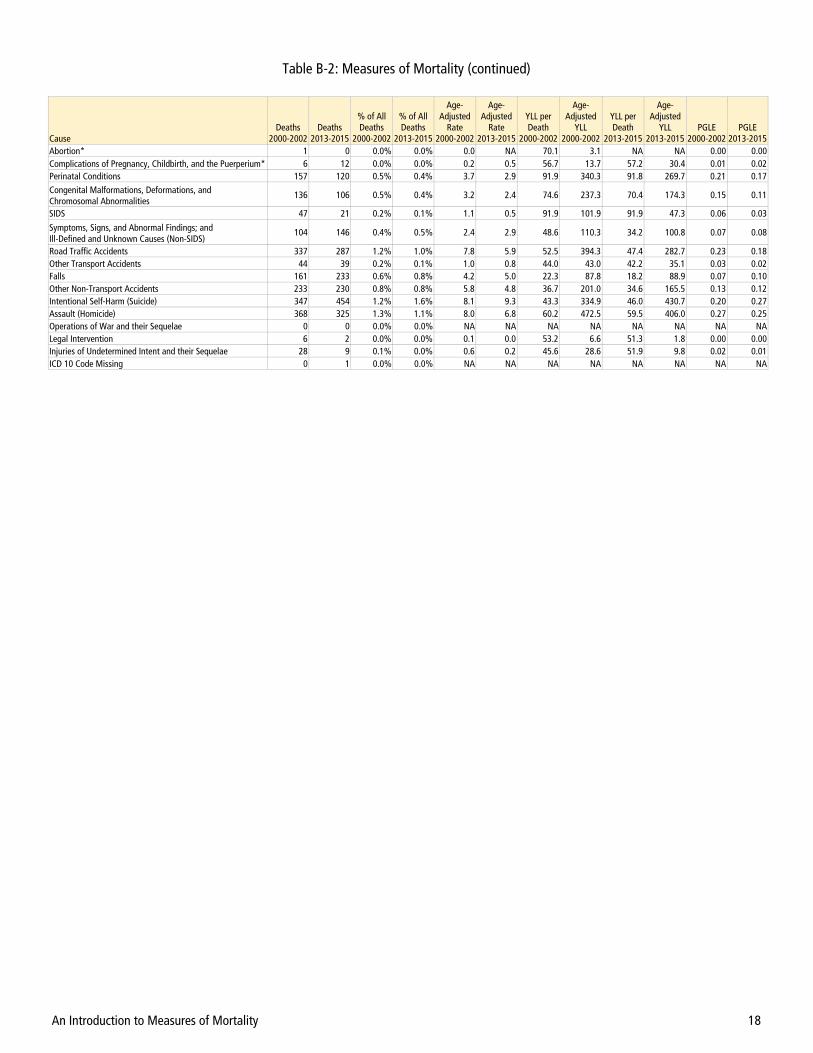
An Introduction to Measures of Mortality 18
Cause Deaths
2000-2002 Deaths
2013-2015
% of All Deaths
2000-2002
% of All Deaths
2013-2015
Age-Adjusted
Rate 2000-2002
Age-Adjusted
Rate 2013-2015
YLL per Death
2000-2002
Age-Adjusted
YLL 2000-2002
YLL per Death
2013-2015
Age-Adjusted
YLL 2013-2015
PGLE 2000-2002
PGLE 2013-2015
Abortion* 1 0 0.0% 0.0% 0.0 NA 70.1 3.1 NA NA 0.00 0.00 Complications of Pregnancy, Childbirth, and the Puerperium* 6 12 0.0% 0.0% 0.2 0.5 56.7 13.7 57.2 30.4 0.01 0.02 Perinatal Conditions 157 120 0.5% 0.4% 3.7 2.9 91.9 340.3 91.8 269.7 0.21 0.17 Congenital Malformations, Deformations, and Chromosomal Abnormalities
136 106 0.5% 0.4% 3.2 2.4 74.6 237.3 70.4 174.3 0.15 0.11
SIDS 47 21 0.2% 0.1% 1.1 0.5 91.9 101.9 91.9 47.3 0.06 0.03
Symptoms, Signs, and Abnormal Findings; and Ill-Defined and Unknown Causes (Non-SIDS)
104 146 0.4% 0.5% 2.4 2.9 48.6 110.3 34.2 100.8 0.07 0.08
Road Traffic Accidents 337 287 1.2% 1.0% 7.8 5.9 52.5 394.3 47.4 282.7 0.23 0.18 Other Transport Accidents 44 39 0.2% 0.1% 1.0 0.8 44.0 43.0 42.2 35.1 0.03 0.02 Falls 161 233 0.6% 0.8% 4.2 5.0 22.3 87.8 18.2 88.9 0.07 0.10 Other Non-Transport Accidents 233 230 0.8% 0.8% 5.8 4.8 36.7 201.0 34.6 165.5 0.13 0.12 Intentional Self-Harm (Suicide) 347 454 1.2% 1.6% 8.1 9.3 43.3 334.9 46.0 430.7 0.20 0.27 Assault (Homicide) 368 325 1.3% 1.1% 8.0 6.8 60.2 472.5 59.5 406.0 0.27 0.25 Operations of War and their Sequelae 0 0 0.0% 0.0% NA NA NA NA NA NA NA NA Legal Intervention 6 2 0.0% 0.0% 0.1 0.0 53.2 6.6 51.3 1.8 0.00 0.00 Injuries of Undetermined Intent and their Sequelae 28 9 0.1% 0.0% 0.6 0.2 45.6 28.6 51.9 9.8 0.02 0.01 ICD 10 Code Missing 0 1 0.0% 0.0% NA NA NA NA NA NA NA NA
Table B-2: Measures of Mortality (continued)
An Introduction to Measures of Mortality 19
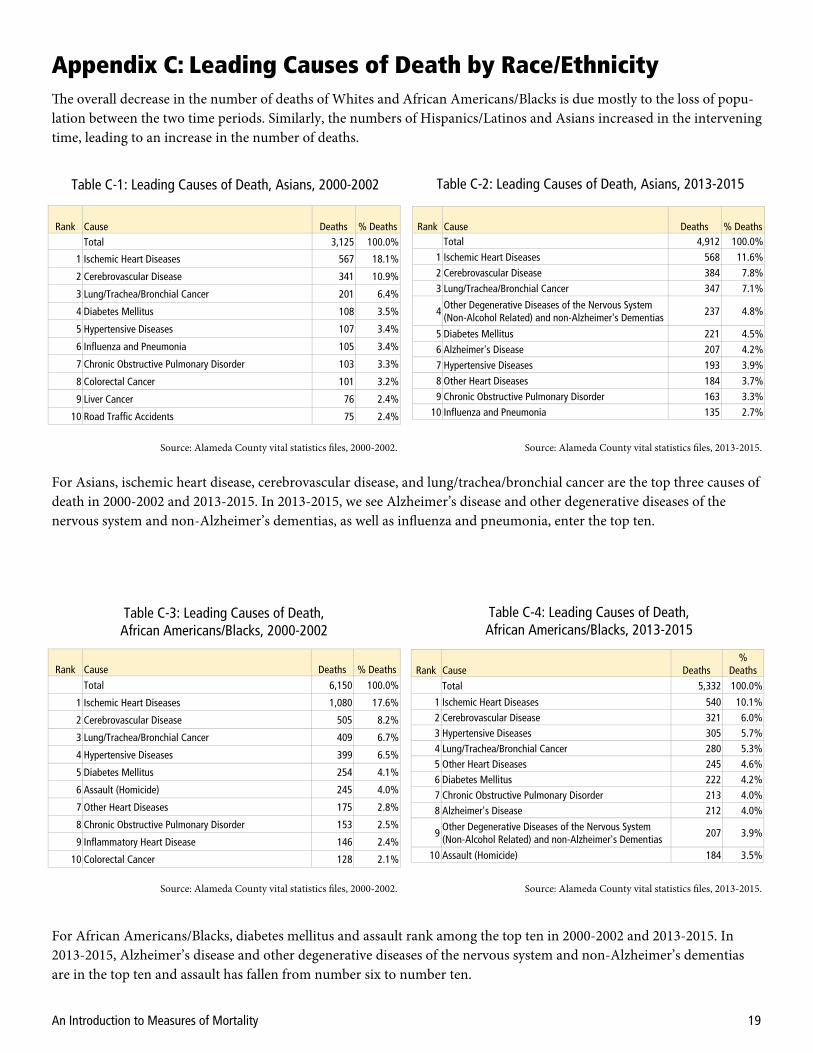
Rank Cause Deaths % Deaths
Total 3,125 100.0%
1 Ischemic Heart Diseases 567 18.1%
2 Cerebrovascular Disease 341 10.9%
3 Lung/Trachea/Bronchial Cancer 201 6.4%
4 Diabetes Mellitus 108 3.5%
5 Hypertensive Diseases 107 3.4%
6 Influenza and Pneumonia 105 3.4%
7 Chronic Obstructive Pulmonary Disorder 103 3.3%
8 Colorectal Cancer 101 3.2%
9 Liver Cancer 76 2.4%
10 Road Traffic Accidents 75 2.4%
Rank Cause Deaths % Deaths
Total 4,912 100.0% 1 Ischemic Heart Diseases 568 11.6%
2 Cerebrovascular Disease 384 7.8% 3 Lung/Trachea/Bronchial Cancer 347 7.1%
4 Other Degenerative Diseases of the Nervous System (Non-Alcohol Related) and non-Alzheimer's Dementias
237 4.8%
5 Diabetes Mellitus 221 4.5% 6 Alzheimer's Disease 207 4.2%
7 Hypertensive Diseases 193 3.9%
8 Other Heart Diseases 184 3.7% 9 Chronic Obstructive Pulmonary Disorder 163 3.3%
10 Influenza and Pneumonia 135 2.7%
Table C-2: Leading Causes of Death, Asians, 2013-2015 Table C-1: Leading Causes of Death, Asians, 2000-2002
Rank Cause Deaths % Deaths
Total 6,150 100.0%
1 Ischemic Heart Diseases 1,080 17.6%
2 Cerebrovascular Disease 505 8.2%
3 Lung/Trachea/Bronchial Cancer 409 6.7%
4 Hypertensive Diseases 399 6.5%
5 Diabetes Mellitus 254 4.1%
6 Assault (Homicide) 245 4.0%
7 Other Heart Diseases 175 2.8%
8 Chronic Obstructive Pulmonary Disorder 153 2.5%
9 Inflammatory Heart Disease 146 2.4%
10 Colorectal Cancer 128 2.1%
Rank Cause Deaths %
Deaths Total 5,332 100.0%
1 Ischemic Heart Diseases 540 10.1% 2 Cerebrovascular Disease 321 6.0% 3 Hypertensive Diseases 305 5.7% 4 Lung/Trachea/Bronchial Cancer 280 5.3% 5 Other Heart Diseases 245 4.6% 6 Diabetes Mellitus 222 4.2% 7 Chronic Obstructive Pulmonary Disorder 213 4.0% 8 Alzheimer's Disease 212 4.0%
9 Other Degenerative Diseases of the Nervous System (Non-Alcohol Related) and non-Alzheimer's Dementias
207 3.9%
10 Assault (Homicide) 184 3.5%
Table C-4: Leading Causes of Death, African Americans/Blacks, 2013-2015
Table C-3: Leading Causes of Death, African Americans/Blacks, 2000-2002
Source: Alameda County vital statistics files, 2000-2002. Source: Alameda County vital statistics files, 2013-2015.
Source: Alameda County vital statistics files, 2000-2002. Source: Alameda County vital statistics files, 2013-2015.
For Asians, ischemic heart disease, cerebrovascular disease, and lung/trachea/bronchial cancer are the top three causes of death in 2000-2002 and 2013-2015. In 2013-2015, we see Alzheimer’s disease and other degenerative diseases of the nervous system and non-Alzheimer’s dementias, as well as influenza and pneumonia, enter the top ten.
For African Americans/Blacks, diabetes mellitus and assault rank among the top ten in 2000-2002 and 2013-2015. In 2013-2015, Alzheimer’s disease and other degenerative diseases of the nervous system and non-Alzheimer’s dementias are in the top ten and assault has fallen from number six to number ten.
Appendix C: Leading Causes of Death by Race/Ethnicity The overall decrease in the number of deaths of Whites and African Americans/Blacks is due mostly to the loss of popu-lation between the two time periods. Similarly, the numbers of Hispanics/Latinos and Asians increased in the intervening time, leading to an increase in the number of deaths.

An Introduction to Measures of Mortality 20
Rank Cause Deaths % Deaths
Total 17,050 100.0%
1 Ischemic Heart Diseases 3,759 22.0%
2 Cerebrovascular Disease 1,411 8.3%
3 Lung/Trachea/Bronchial Cancer 1,133 6.6%
4 Chronic Obstructive Pulmonary Disorder 863 5.1%
5 Other Heart Diseases 617 3.6%
6 Influenza and Pneumonia 611 3.6%
7 Hypertensive Diseases 474 2.8%
8 Alzheimer's Disease 469 2.8%
9 Colorectal Cancer 415 2.4%
10 Other Degenerative Diseases of the Nervous System (Non-Alcohol Related) and non-Alzheimer's Dementias
364 2.1%
Rank Cause Deaths % Deaths Total 14,643 100.0%
1 Ischemic Heart Diseases 1,802 12.3% 2 Alzheimer's Disease 923 6.3%
3 Other Degenerative Diseases of the Nervous System (Non-Alcohol Related) and non-Alzheimer's Dementias
854 5.8%
4 Cerebrovascular Disease 850 5.8% 5 Other Heart Diseases 804 5.5% 6 Chronic Obstructive Pulmonary Disorder 768 5.2% 7 Lung/Trachea/Bronchial Cancer 719 4.9% 8 Hypertensive Diseases 544 3.7% 9 Diabetes Mellitus 395 2.7%
10 Influenza and Pneumonia 356 2.4%
Rank Cause Deaths % Deaths
Total 2,224 100.0%
1 Ischemic Heart Diseases 366 16.5%
2 Cerebrovascular Disease 170 7.6%
3 Diabetes Mellitus 103 4.6%
4 Lung/Trachea/Bronchial Cancer 83 3.7%
5 Road Traffic Accidents 71 3.2%
6 Other Heart Diseases 68 3.1%
7 Alcohol-Attributable Diseases and Disorders 65 2.9%
8 Diseases of the Liver (Non-Alcohol Related) 53 2.4%
9 Influenza and Pneumonia 51 2.3%
10 Hypertensive Diseases 50 2.2%
Table C-6: Leading Causes of Death, Whites, 2013-2015 Table C-5: Leading Causes of Death, Whites, 2000-2002
Table C-8: Leading Causes of Death, Hispanics/Latinos, 2013-2015
Table C-7: Leading Causes of Death, Hispanics/Latinos, 2000-2002
Source: Alameda County vital statistics files, 2000-2002. Source: Alameda County vital statistics files, 2013-2015.
Source: Alameda County vital statistics files, 2000-2002. Source: Alameda County vital statistics files, 2013-2015.
Rank Cause Deaths % Deaths Total 3,001 100.0%
1 Ischemic Heart Diseases 300 10.0% 2 Cerebrovascular Disease 173 5.8%
3 Diabetes Mellitus 136 4.5%
4 Other Degenerative Diseases of the Nervous System (Non-Alcohol Related) and non-Alzheimer's Dementias
119 4.0%
5 Other Heart Diseases 113 3.8% 6 Alcohol-Attributable Diseases and Disorders 110 3.7%
7 Alzheimer's Disease 106 3.5% 8 Hypertensive Diseases 93 3.1% 9 Lung/Trachea/Bronchial Cancer 89 3.0%
10 Assault (Homicide) 73 2.4%
For Whites, the percentage and number of deaths from most diseases went down between 2000-2002 and 2013-2015. The exceptions were Alzheimer’s disease, other degenerative diseases of the nervous system and non-Alzheimer’s dementias, influenza and pneumonia, and diabetes mellitus. The former three are evidence of the aging population.
For Hispanics/Latinos, as with other groups, ischemic heart diseases and cerebrovascular disease are the top two causes of death in 2000-2002 and 2013-2015. Unlike others, diabetes mellitus is number three in each period. In 2013-2015, oth-er degenerative diseases of the nervous system and non-Alzheimer’s dementias and Alzheimer’s disease—again, evidence of the aging population—and assault enter the top ten.

An Introduction to Measures of Mortality 21
Appendix D: Leading Causes of Death by Age Group
Rank Cause Deaths % Deaths Total 323 100.0%
1 Perinatal Conditions 157 48.6%
2 Congenital Malformations, Deformations, and Chromosomal Abnormalities
76 23.5%
3 SIDS 47 14.6%
4 Symptoms, Signs, and Abnormal Findings; and Ill-Defined and Unknown Causes (Non-SIDS)
5 1.5%
4 Digestive Vascular Disorders and Intestinal Obstruction without Hernia
5 1.5%
Rank Cause Deaths % Deaths Total 236 100.0%
1 Perinatal Conditions 119 50.4%
2 Congenital Malformations, Deformations, and Chromosomal Abnormalities
56 23.7%
3 SIDS 21 8.9%
4 Symptoms, Signs, and Abnormal Findings; and Ill-Defined and Unknown Causes (Non-SIDS)
6 2.5%
Rank Cause Deaths % Deaths Total 141 100.0%
1 Road Traffic Accidents 23 16.3%
2 Congenital Malformations, Deformations, and Chromosomal Abnormalities
15 10.6%
3 Non-Transport Accidents 15 10.6% 4 Leukemia 8 5.7% 5 Cancer of Meninges, Brain, and other parts of CNS 8 5.7% 6 Other Neuro-Psychiatric Diseases 7 5.0% 7 Blood/Immune Diseases 5 3.5%
Rank Cause Deaths % Deaths Total 73 100.0%
1 Congenital Malformations, Deformations, and Chromosomal Abnormalities
8 11.0%
2 Non-Transport Accidents 7 9.6% 3 Road Traffic Accidents 6 8.2% 4 Leukemia 5 6.8%
Table D-2: Leading Causes of Death, <1 Year, 2000-2002 Table D-3: Leading Causes of Death, <1 Year, 2013-2015
Table D-4: Leading Causes of Death, 1-14 Years, 2000-2002 Table D-5: Leading Causes of Death, 1-14 Years, 2013-2015
Source: Alameda County vital statistics files, 2000-2002.
Source: Alameda County vital statistics files, 2013-2015.
Source: Alameda County vital statistics files, 2000-2002.
Source: Alameda County vital statistics files, 2013-2015.
Leading causes in each time period for infants less than one year old were led by perinatal conditions; congenital malfor-mations, deformations, and chromosomal abnormalities; and SIDS. The number and percentage of SIDS deaths de-creased between the two time periods. Factoring in the change in the numbers of infants, overall <1 year mortality de-creased from 16.5/1,000 population in 2000-2002 to 12.6/1,000 population in 2013-2015, a 23.8% decrease.
In the 1-14 age group in 2013-2015, congenital malformations, deformations, and chromosomal abnormalities were the leading cause of death, followed by non-transport accidents. Road traffic accidents decreased from 23 deaths and 16.3% of all deaths to only six deaths and 8.2%. There were far fewer deaths in the age group in 2013-2015 than in 2000-2002. Including the decrease in population, the death rate decreased 47.4% for this group between the two time periods.
The four age groups chosen for this summary are <1 year (infants), 1-14 years, 15-24 years, 25-59 years, and 60+ years. These tables are limited to five deaths or more in any group, and limited to a maximum of ten causes of death.
One important factor to look at is that the age structure of the county changed significantly between the two time peri-ods, as shown in Table D-1 below. For example, while the number of infant deaths decreased by 26.9% between 2002-2002 and 2013-2015, the number of infants declined 4.1%; thus, infant mortality decreased during this time. Also signifi-cant are the comparative changes in those 1-14 years and 60+ years.
Age Group Total <1 1-14 15-24 25-59 60+
Population 2001 1,465,564 19,535 281,115 196,761 764,821 203,332
2014 1,580,083 18,731 276,576 213,017 781,560 290,199
% Change 7.8% -4.1% -1.6% 8.3% 2.2% 42.7%
Deaths 2000-2002 28,907 323 141 350 5,569 22,524
2013-2015 28,646 236 73 360 4,806 23,171
% Change -0.9% -26.9% -48.2% 2.9% -13.7% 2.9%
Table D-1: Alameda County Change in Age and Deaths by Age

An Introduction to Measures of Mortality 22
Rank Cause Deaths % Deaths Total 5,569 100.0%
1 Ischemic Heart Diseases 573 10.3% 2 Lung/Trachea/Bronchial Cancer 335 6.0% 3 Drug Use Disorders 299 5.4% 4 Breast Cancer 244 4.4% 5 Alcohol-Attributable Diseases and Disorders 237 4.3% 6 Assault (Homicide) 227 4.1% 7 Cerebrovascular Disease 219 3.9% 8 Intentional Self-Harm (Suicide) 216 3.9% 9 Hypertensive Diseases 214 3.8%
10 HIV 190 3.4%
Rank Cause Deaths % Deaths Total 4,806 100.0%
1 Drug Use Disorders 356 7.4% 2 Ischemic Heart Diseases 339 7.1% 3 Alcohol-Attributable Diseases and Disorders 289 6.0% 4 Intentional Self-Harm (Suicide) 282 5.9% 5 Lung/Trachea/Bronchial Cancer 197 4.1% 6 Diabetes Mellitus 175 3.6% 7 Assault (Homicide) 162 3.4% 8 Cerebrovascular Disease 159 3.3% 9 Road Traffic Accidents 157 3.3%
10 Breast Cancer 151 3.1%
Table D-8: Leading Causes of Death, 25-59 Years, 2000-2002 Table D-9: Leading Causes of Death, 25-59 Years, 2013-2015
Source: Alameda County vital statistics files, 2000-2002. Source: Alameda County vital statistics files, 2013-2015.
Rank Cause Deaths % Deaths Total 350 100.0%
1 Assault (Homicide) 124 35.4% 2 Road Traffic Accidents 76 21.7% 3 Intentional Self-Harm (Suicide) 27 7.7% 4 Non-Transport Accidents 20 5.7%
5 Symptoms, Signs, and Abnormal Findings; and Ill-Defined and Unknown Causes (Non-SIDS)
11 3.1%
6 Leukemia 10 2.9% 7 Drug Use Disorders 9 2.6%
8 Congenital Malformations, Deformations, and Chromosomal Abnormalities
6 1.7%
9 Other Neuro-Psychiatric Diseases 5 1.4% 9 Lymphoma and Multiple Myeloma 5 1.4% 9 Other Musculo-Skeletal Disorders 5 1.4%
Rank Cause Deaths % Deaths Total 360 100.0%
1 Assault (Homicide) 133 36.9% 2 Intentional Self-Harm (Suicide) 58 16.1% 3 Road Traffic Accidents 48 13.3% 4 Drug Use Disorders 25 6.9% 5 Non-Transport Accidents 11 3.1% 6 Other Neuro-Psychiatric Diseases 10 2.8%
7 Symptoms, Signs, and Abnormal Findings; and Ill-Defined and Unknown Causes (Non-SIDS) 6 1.7%
8 Inflammatory Heart Disease 5 1.4% 8 Falls 5 1.4%
Table D-6: Leading Causes of Death, 15-24 Years, 2000-2002 Table D-7: Leading Causes of Death, 15-24 Years, 2013-2015
Source: Alameda County vital statistics files, 2000-2002.
Source: Alameda County vital statistics files, 2013-2015.
Homicide was the leading cause of death for those 15-24 years in both time periods. In 2013-2015, homicide was fol-lowed by suicide, road traffic accidents, drug use disorders, and non-transport accidents. Suicide increased from 27 deaths and 7.7% of all deaths in 2000-2002 to 58 deaths and 16.1% of deaths in 2013-2015. Drug use disorders saw an increase from nine deaths and 2.6% of all in 2000-2002 to 25 deaths and 6.9% of deaths in 2013-2015.
For those 25-59 years, drug use disorders increased from the third-leading cause (299 deaths and 5.4% of all deaths) in 2000-2002 to the first-leading cause (356 deaths and 7.4%) in 2013-2015. Ischemic heart diseases came in second in 2013-2015, followed by alcohol-attributable diseases and disorders, suicide, and lung/trachea/bronchial cancer. Of those, alcohol-attributable diseases and disorders saw the largest gain in percentage, from 4.3% of deaths in 2000-2002 to 6.0% in 2013-2015.
An Introduction to Measures of Mortality 23
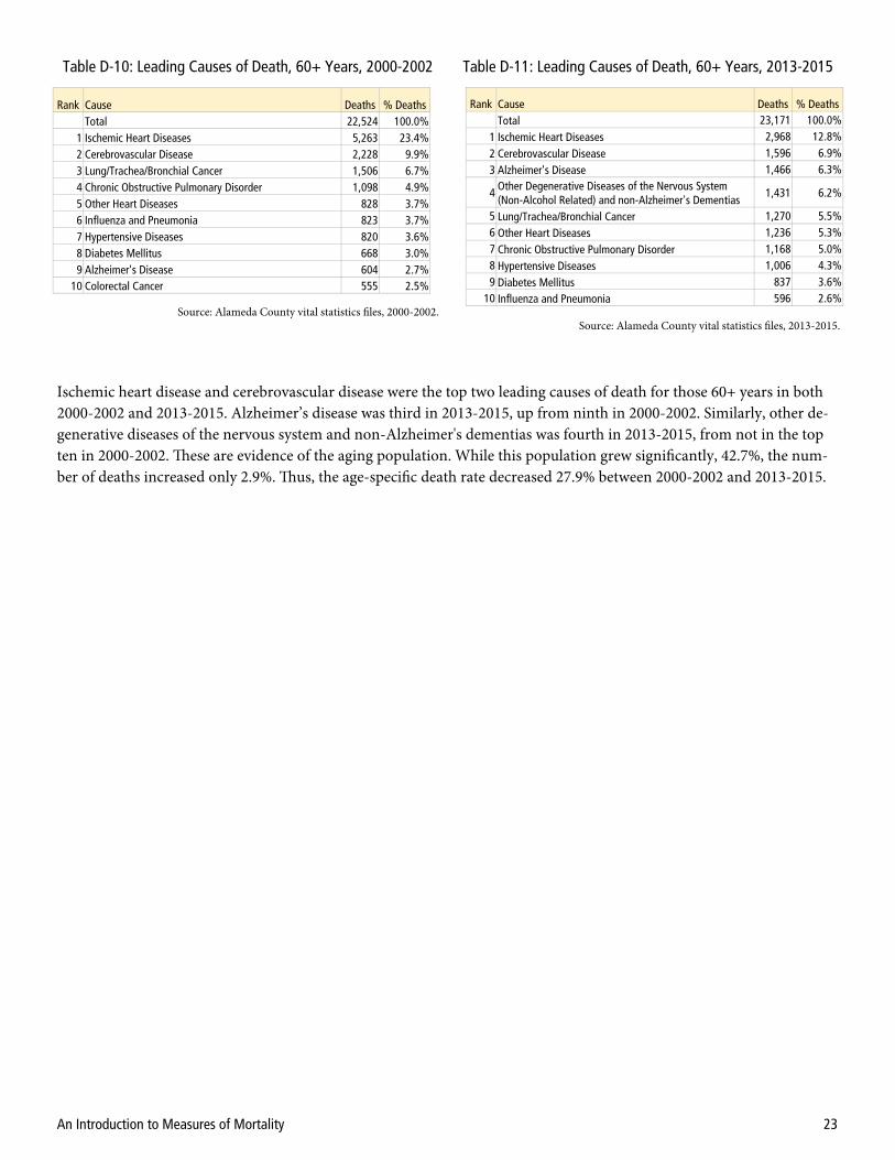
Rank Cause Deaths % Deaths Total 22,524 100.0%
1 Ischemic Heart Diseases 5,263 23.4% 2 Cerebrovascular Disease 2,228 9.9% 3 Lung/Trachea/Bronchial Cancer 1,506 6.7% 4 Chronic Obstructive Pulmonary Disorder 1,098 4.9% 5 Other Heart Diseases 828 3.7% 6 Influenza and Pneumonia 823 3.7% 7 Hypertensive Diseases 820 3.6% 8 Diabetes Mellitus 668 3.0% 9 Alzheimer's Disease 604 2.7%
10 Colorectal Cancer 555 2.5%
Rank Cause Deaths % Deaths Total 23,171 100.0%
1 Ischemic Heart Diseases 2,968 12.8% 2 Cerebrovascular Disease 1,596 6.9% 3 Alzheimer's Disease 1,466 6.3%
4 Other Degenerative Diseases of the Nervous System (Non-Alcohol Related) and non-Alzheimer's Dementias
1,431 6.2%
5 Lung/Trachea/Bronchial Cancer 1,270 5.5% 6 Other Heart Diseases 1,236 5.3% 7 Chronic Obstructive Pulmonary Disorder 1,168 5.0% 8 Hypertensive Diseases 1,006 4.3% 9 Diabetes Mellitus 837 3.6%
10 Influenza and Pneumonia 596 2.6%
Table D-10: Leading Causes of Death, 60+ Years, 2000-2002 Table D-11: Leading Causes of Death, 60+ Years, 2013-2015
Source: Alameda County vital statistics files, 2000-2002. Source: Alameda County vital statistics files, 2013-2015.
Ischemic heart disease and cerebrovascular disease were the top two leading causes of death for those 60+ years in both 2000-2002 and 2013-2015. Alzheimer’s disease was third in 2013-2015, up from ninth in 2000-2002. Similarly, other de-generative diseases of the nervous system and non-Alzheimer's dementias was fourth in 2013-2015, from not in the top ten in 2000-2002. These are evidence of the aging population. While this population grew significantly, 42.7%, the num-ber of deaths increased only 2.9%. Thus, the age-specific death rate decreased 27.9% between 2000-2002 and 2013-2015.