
A developers view on Material Design
46
A developer view on Google’s Material Design - Manikanta Garikipati
-
Upload
manikanta-garikipati -
Category
Design
-
view
161 -
download
0
Transcript of A developers view on Material Design

A developer view on Google’s
Material Design- Manikanta Garikipati

Why do we need it?
What is Material Design?
New Patterns
How do i start?
Agenda

Why?
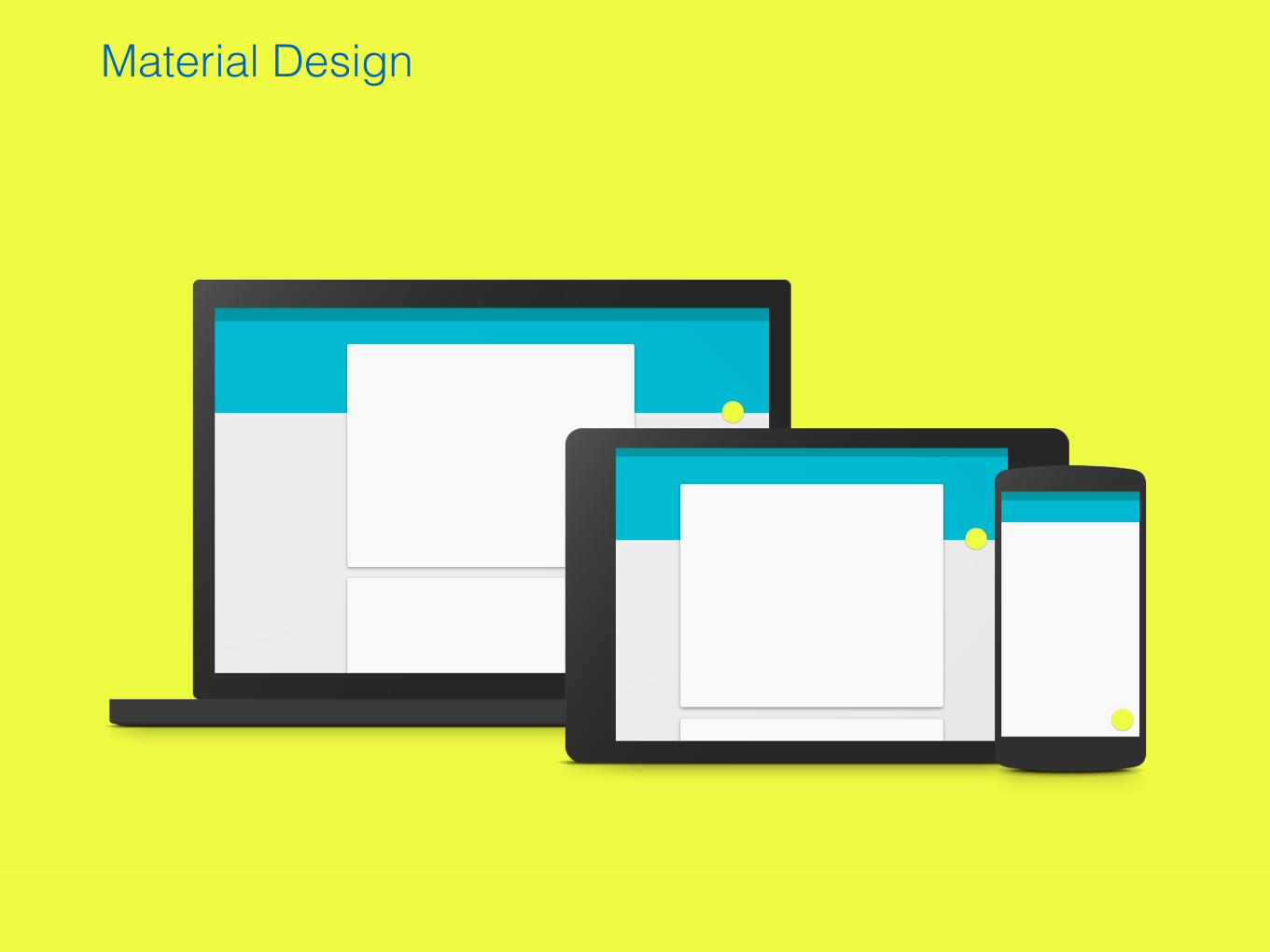
Material Design

Goals• Visual design language that synthesises classic
principles of good design
• Unified experience across platforms and different
device sizes
• Provide guidelines in order to create appealing
Android applications

Material Principles
Material is a metaphor
It is the unifying theory of a
rationalised space and a system of
motion.
Yet technologically advanced and
open to imagination and magic.
Bold, graphic, intentional
The foundational elements of print-
based design – typography, grids,
space, scale, colour, and use of
imagery – guide visual treatments.
Motion provides meaning
Motion respects and reinforces the
user as the prime mover. Primary
user actions are inflection points
that initiate motion, transforming
the whole design.


Elevation

Layering


Elevationres/layout/fragment_sample.xml
<ImageView android:id="@+id/my_textview"
android:layout_width="wrap_content"
android:layout_height="wrap_content"
android:elevation="5dp"/>
SampleFragment.java
view.animate().translationZ(5).start();

Cards (Only if you need them)
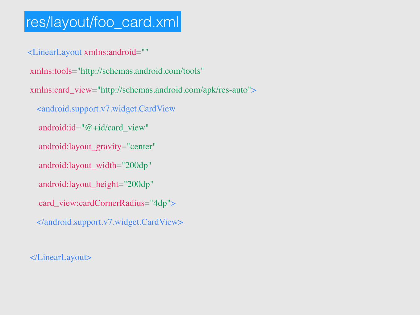
res/layout/foo_card.xml
<LinearLayout xmlns:android=""
xmlns:tools="http://schemas.android.com/tools"
xmlns:card_view="http://schemas.android.com/apk/res-auto">
<android.support.v7.widget.CardView
android:id="@+id/card_view"
android:layout_gravity="center"
android:layout_width="200dp"
android:layout_height="200dp"
card_view:cardCornerRadius="4dp">
</android.support.v7.widget.CardView>
</LinearLayout>

Color Palette
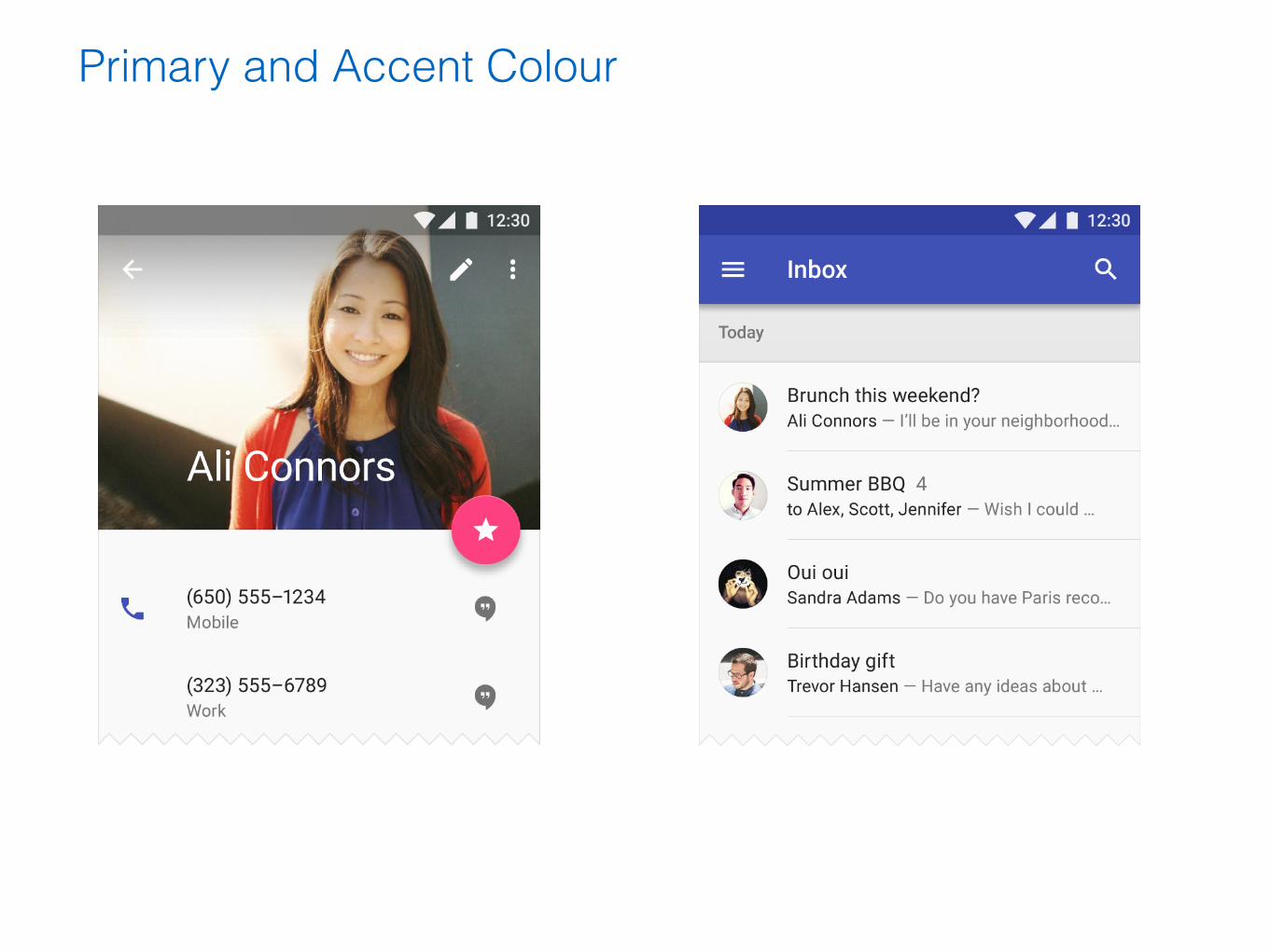
Primary and Accent Colour

<style name="AppTheme" parent=“android:Theme.Material.Light.DarkActionBar”> <item name="android:colorPrimary">@color/primary</item> <item name="android:colorAccent">@color/accent</item> <item name=“android:colorPrimaryDark">@color/primary_dark</item></style>
res/layout-v21/theme.xml
SDK 21 and above

<style name="AppTheme" parent=“Theme.AppCompat.Light.DarkActionBar > <item name="android:colorPrimary">@color/primary</item> <item name="android:colorAccent">@color/accent</item> <item name=“android:colorPrimaryDark">@color/primary_dark</item></style>
res/layout/theme.xml
SDK 7 and above


Holo to material

Holo to material

Holo to material
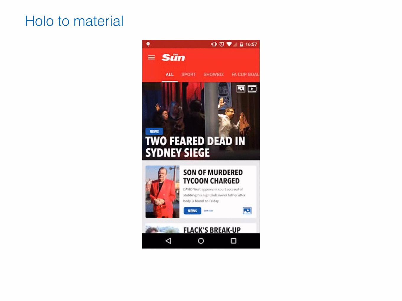
Holo to material

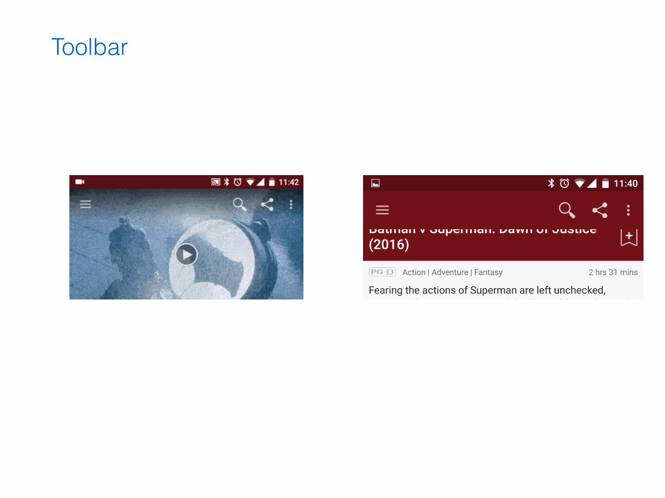
Toolbar

Toolbar in Material
MainActivity.java Toolbar toolbar = (Toolbar) findViewById(R.id.my_awesome_toolbar);
setActionBar(toolbar);
res/layout/toolbar.xml <Toolbar
android:id="@+id/my_awesome_toolbar"
android:layout_height="wrap_content"
android:layout_width=“match_parent"
android:minHeight="?android/actionBarSize"
android:background="?android/colorPrimary"/>

Toolbar in AppCompat
MainActivity.java Toolbar toolbar = (Toolbar) findViewById(R.id.my_awesome_toolbar);
setSupportActionBar(toolbar);
res/layout/toolbar.xml <android.support.v7.widget.Toolbar
android:id="@+id/my_awesome_toolbar"
android:layout_height="wrap_content"
android:layout_width=“match_parent"
android:minHeight="?android/actionBarSize"
android:background="?android/colorPrimary"/>

Navigation Drawer

Touch Feedback

Reveal effect
MyActivity.java
Animator anim = ViewAnimationUtils.
createCircularReveal(
myView,
centerX,
centerY,
startRadius,
finalRadius);
anim.start();

final View myView = findViewById(R.id.my_view);
Animator anim =
ViewAnimationUtils.createCircularReveal(myView,
cx,
cy,
initialRadius,
0);
anim.addListener(new AnimatorListenerAdapter() {
@Override
public void onAnimationEnd(Animator animation) {
super.onAnimationEnd(animation);
myView.setVisibility(View.INVISIBLE);
} });
MyActivity.java
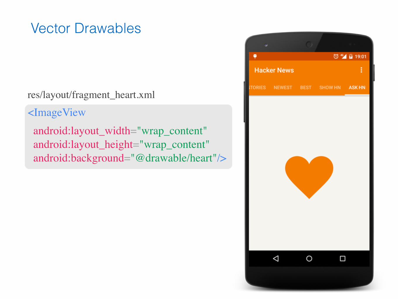
Vector Drawables
res/layout/fragment_heart.xml
<ImageView android:layout_width="wrap_content" android:layout_height="wrap_content" android:background="@drawable/heart"/>

<vector xmlns:android=“...”
android:height="256dp"
android:width="256dp"
android:viewportWidth="32"
android:viewportHeight="32">
<path
android:fillColor="@color/orange"
android:pathData="M20.5,9.5
c-1.955,0,-3.83,1.268,-4.5,3
c-0.67,-1.732,-2.547,-3,-4.5,-3
C8.957,9.5,7,11.432,7,14
c0,3.53,3.793,6.257,9,11.5
c5.207,-5.242,9,-7.97,9,-11.5
C25,11.432,23.043,9.5,20.5,9.5z" />
</vector>
res/drawable/heart.xml
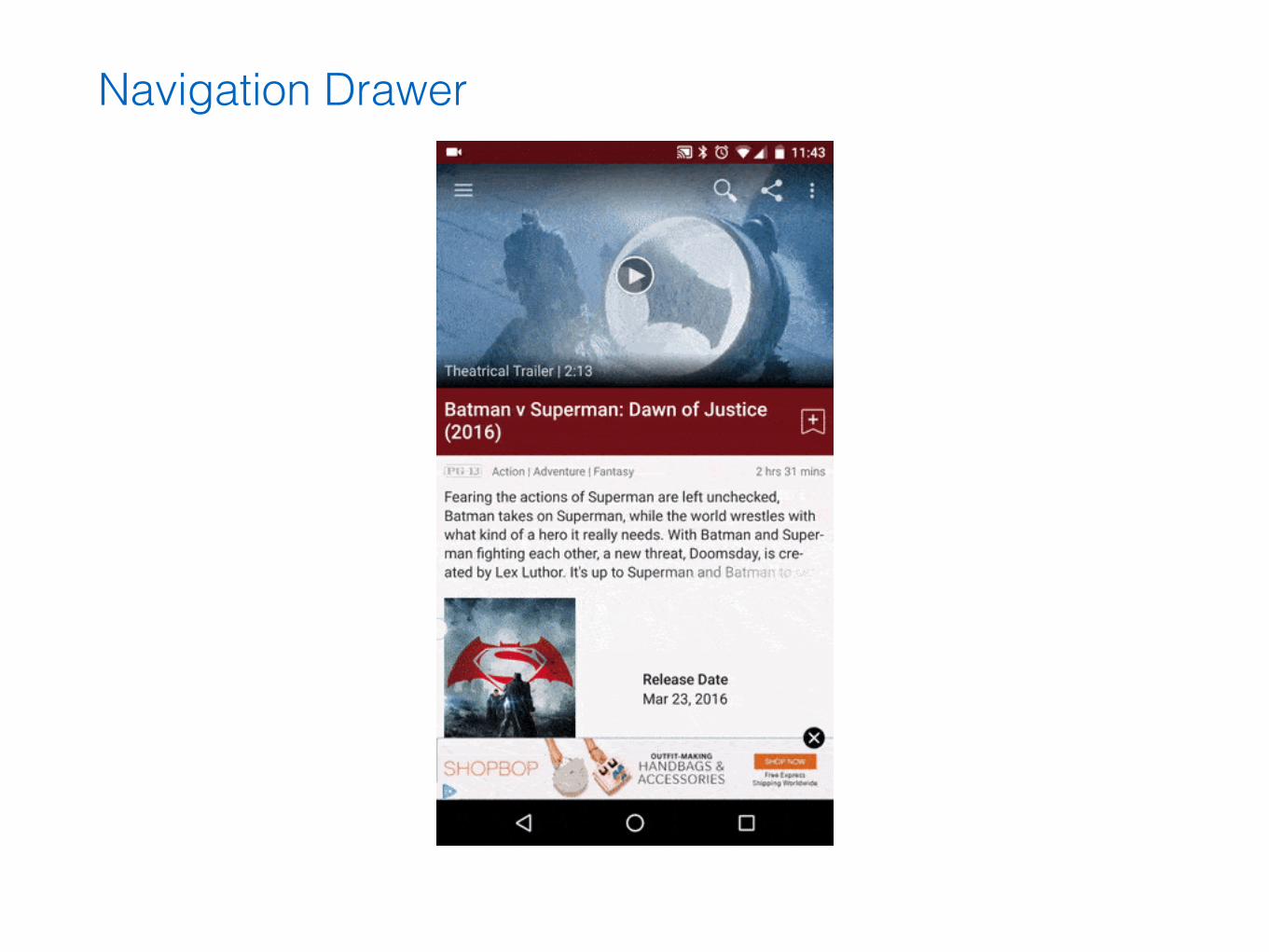
Navigation Drawer
Toolbar

Iconography

Key lines

Typography
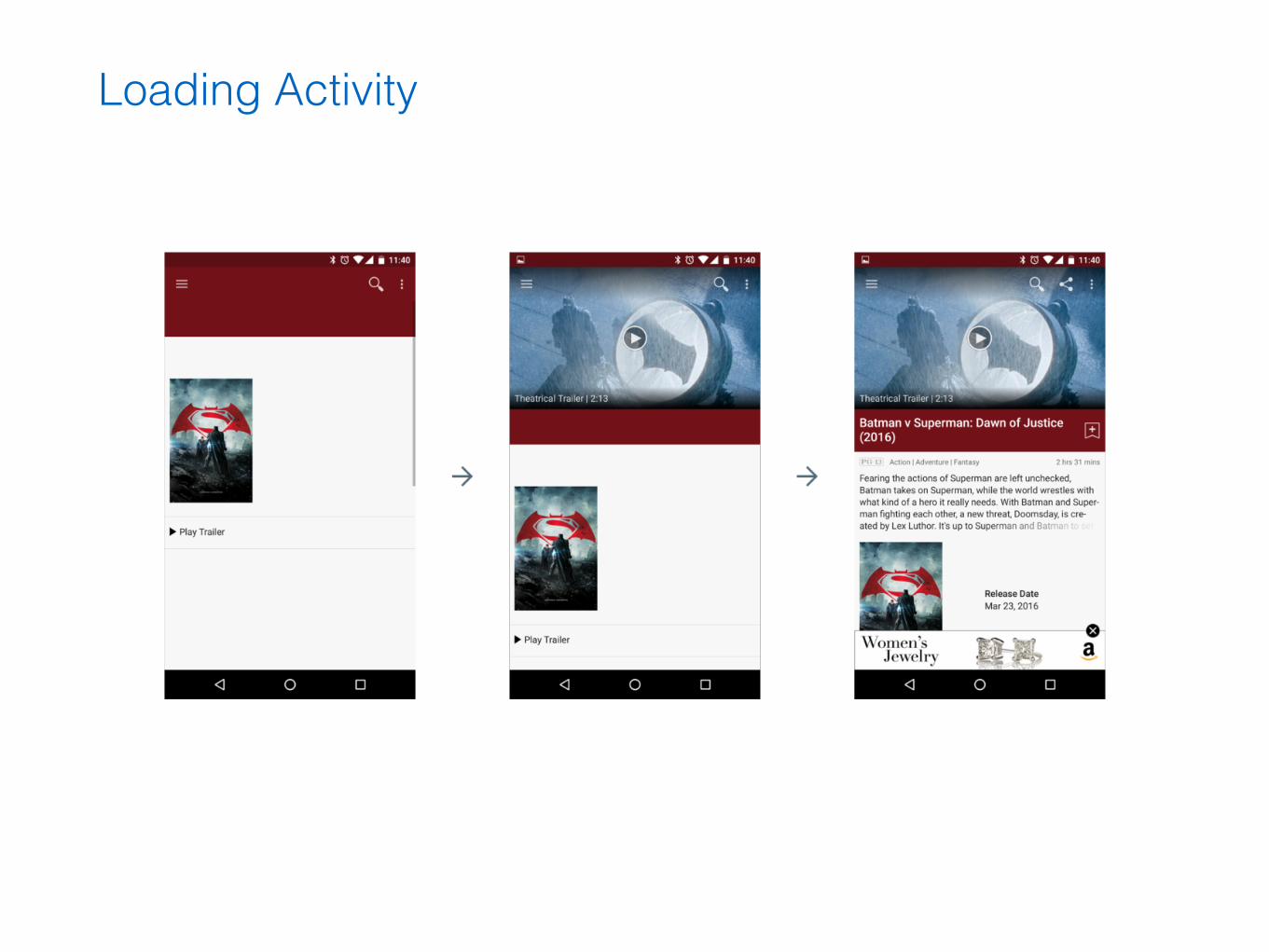
Loading Activity
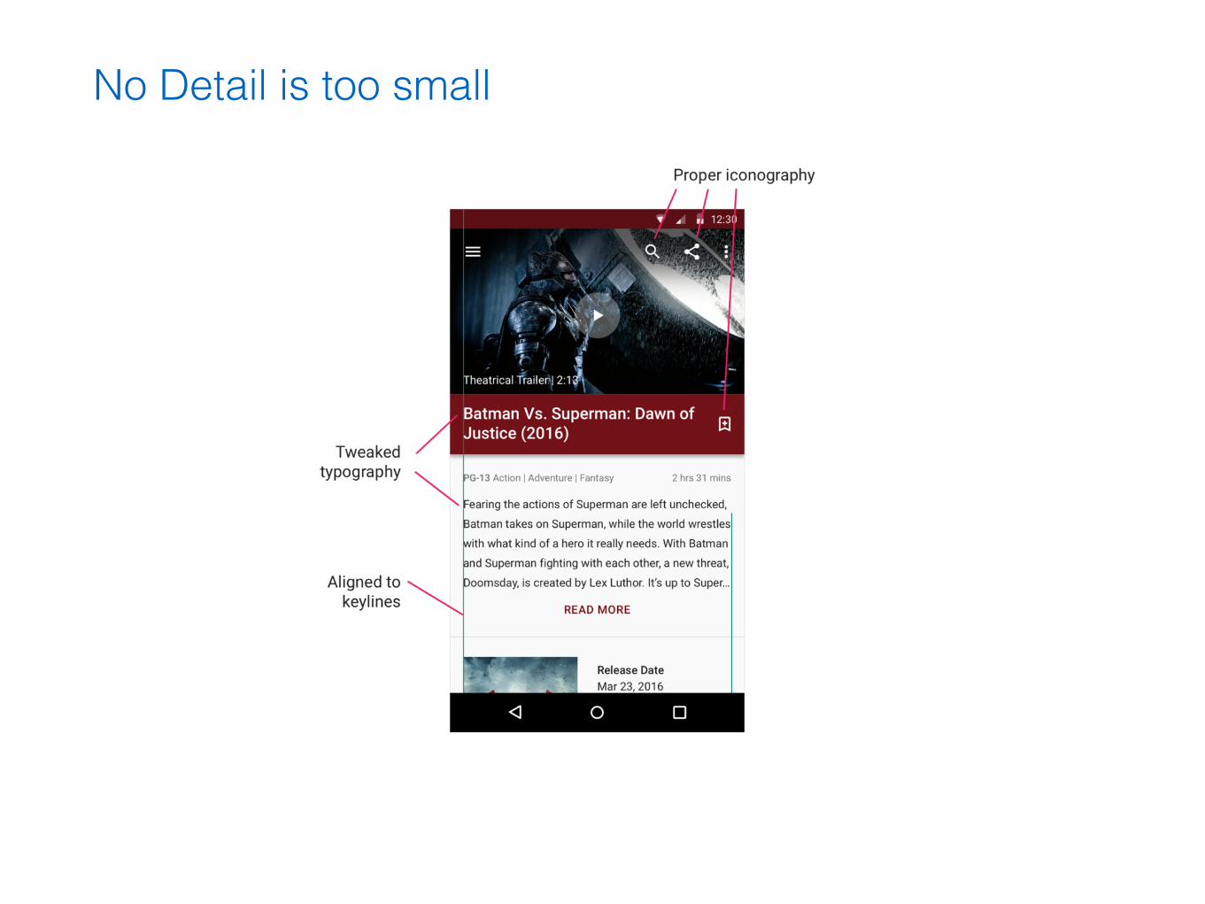
No Detail is too small

No Detail is too small

How to Start
Learn the theory

Priorities

Iterate, and do it fast
Thank You!
Questions?

Further Reading
• http://geekmk.com
• https://www.google.com/design/spec/material-design/introduction.html
References
• Google material design Guidelines
• Novodo