A Case in Data Analytics and Visualization using Alteryx ...
11
A Case in Data Analytics and Visualization using Alteryx Designer and Tableau
Transcript of A Case in Data Analytics and Visualization using Alteryx ...

A Case in Data Analytics and Visualization using
Alteryx Designer and Tableau

1
General Notes and Information
It is strongly recommended that you read through the entire exercise prior to starting. Not all
instructions can be provided in a linear manner.
Process Overview
Alteryx Designer is an ETL (Extract, Transform, Load) and Data Analytics software that enables users to
perform predictive analytics, spatial analytics, reporting and visualization, as well as to create analytical
applications through a single workflow. Users can access and blend data from data sources, including flat files,
data warehouses, relational databases, Hadoop data stores, SQL databases, Microsoft Office applications, social
media platforms, other analytic tools, and third-party big data and cloud data sources.
Tableau is a visualization software that combines business intelligence platforms with interactive dashboards
and analytic applications – all in one display - that can be used for interpretation of a business’ key performance
indicators. Tableau can visualize data originating from several file types, such as CSV files, SAP databases, and
Microsoft Excel spreadsheets.
This case study describes how to analyze and transform data using Alteryx Designer, and then visualizing the
transformed data using Tableau. The questions are based on sales data of Zeus Corporation, who operates
globally.
The main learning objective is not only to understand how to use Alteryx Designer and Tableau, but how to
analyze and clean data given a reporting request or problem, and based on possible options, how to present the
best way to visualize the solution.
The human visual system has evolved to be particularly good at recognizing patterns. Data visualization has
become a standard analytical tool which capitalizes on the ability of humans to recognize patterns within
massive quantities of multi-dimensional data generated by business information systems. Many specific studies
have led to the creation of visualization models that utilize human perception and cognition.
Introduction to Alteryx & Tableau

2
“To Acquire or not to Acquire?” – Zeus Corp. Overview
Zeus Corporation is a privately held company that designs and manufactures outdoor clothing, footwear,
outdoor gear and luggage products for men, women and children. While the company started by making
clothing for rock and alpine climbing, they now offer apparel targeted towards bikers, skiers, surfers, climbers
and others. They are a large international company, operating in over 15 different countries and offering
merchandise in 12 different product lines. Zeus, along with its subsidiaries, has a large customer list, and
generates high annual revenues compared to its competition. GBI is looking to acquire Zeus in order to take
advantage of their product lines, retail locations, international outlets, and supply chain.
A user of SAP S/4 HANA, Zeus Corp. holds all of their operations data in an SAP database. To store the
company’s financial data in a more versatile format, Zeus Corp. exports their annual Operations Reports from
an SAP database and saves it in the form of Microsoft Excel files, one for each of the past three fiscal years. In
order to get an executive overview of Zeus’s transactions, GBI is looking to analyze Zeus’s three fiscal years’
worth of operations reports together in a single consolidated database. Likewise, they would like to be able to
quickly add new years to this aggregated database for analytics purposes. Finally, they would like to utilize the
power of data visualization to determine if key performance indicators are up to GBI’s standards.
GBI needs you to serve as a consultant to assess the overall performance of Zeus and identify key performance
indicators that will help Art Vandelay determine if the company is a valuable acquisition target.
Objective: Possible Acquisition of Zeus Corp. → Growth and Profit Increase
Company comparison:
Global Bike Incorporated (GBI) Zeus Corporation
Products Sold: Bicycles and Accessories Products Sold: Outdoor Apparel
Product Lines: 2 Product Lines: 12
Market Presence: Operating in 2 countries Market Presence: Operating in 15 countries
Goal: Use the historical and future data of Zeus to determine whether GBI should acquire the company to take
advantage of their product lines, locations, and supply chain.

3
Analytics & Reporting in Action – Alteryx Designer and Tableau
Zeus Corp. Operations
Reports: Excel
Download
Download Zeus Corp.’s Operations Reports from Canvas.
• In your Canvas Site, download the three Zeus Corp. Operations Reports Excel files found under
STARFusion: Alteryx in Action. Each file represents one fiscal years’ worth of data for Zeus Corporation.
Save/move each of the files to your desktop.
• Additionally, download the Excel file titled Zeus Corp. Consolidated Operations Report from the
Canvas site. This file is also located under STARFusion: Alteryx in Action. Save/move the file to your desktop.
Opening Alteryx
Designer
Launch Alteryx Designer & Upload Zeus’s Operations Reports
1. On your desktop, locate the Alteryx Designer Application and double click on it
2. Once opened, you may be prompted to activate Alteryx. If so, enter your email address and the keycode
included in your Alteryx download email and click Activate. If not prompted, skip this step.
3. If the Start Here.yxmd tab is selected by default, click the New Workflow1 tab to create a new
workflow. The blank screen created in the New Workflow1 tab is referred to as a Workflow Canvas
Using the Input Data
Tool
Use the Input Data Tool to import Zeus’s Operations Reports into Alteryx
1. From the In/Out tab , click and drag the Input Data Tool onto the
Workflow Canvas towards the middle-left portion.
2. Click the drop-down next to the Connect a File or Database field. From the pop-
up window, select Microsoft Excel .xlsx
3. Select the Zeus 2018 Operations Report file from your desktop and click Open
4. Repeat Steps 1-3 for the Zeus 2019 Operations Report and Zeus 2020 Operations
Report Excel files
Using the Union Tool
Use the Union tool to join 3 years’ worth of Operations Reports into 1
consolidated dataset
1. From the Join tab, click and drag the Union Tool onto the Workflow
Canvas.
2. Click the Link Start Tab located to the right of the Zeus 2018 Operations
Report file and drag it to the Link End Tab located on the left side of the
Union tool.
3. Repeat Steps 1 & 2 for the Zeus 2019 Operations Report and Zeus 2020
Operations Report files.
Using the Select Tool
Use the Select Tool to choose the data you want to analyze
1. From the Preparation tab and click and drag the
Select Tool onto the workflow canvas.
2. Click the Link Start Tab located on the right of the Union tool
and drag it to the Link End Tab located to the left of the Select tool.
3. Click on the Select tool once and in the Workflow Configuration
window on the left side of the Canvas, ensure that only the boxes next
to the following fields are checked:
- Category - Date - Number of Issues Reported
- Product Lines - Quantity Sold - GMR
- City - Sales Revenue - Fiscal Quarter
- Country - Gross Margin - Fiscal Year -*Unknown

4
Using the Summarize
Tool
Use the Summarize Tool to configure an Alteryx-embedded report
1. From the Transform tab click and drag the
Summarize Tool onto the top portion of the Workflow Canvas
2. Click the Link Start Tab located on the right of the Union
tool and drag it to the Link End Tab located to the left of the
Summarize tool.
3. In the pop-up window under Fields, click the white box next to
the Product Lines field, select the drop-down in the Add box and
select Group By
4. Click the white box next to the Number of Issues field, select
the drop-down in the Add box and select Count
Using the Sort Tool
Use the Sort Tool to organize the report in descending order
1. From the Preparation tab click the Sort Tool.
Drag it to the right of the Summarize Tool
2. Click the Link Start Tab located on the right of the
Summarize tool and drag it to the Link End Tab located
to the left of the Sort tool.
3. Under the Name field, select the Count option
4. Under the Order field, select the Descending option
5. Click the Run button at the top of the screen.
6. Click the Link End Tab to the right of the Sort tool. The completed summary will appear at the bottom of the
screen.
Using the Formula Tool
Use the Formula Tool to create a Cost of Goods Sold
calculation
1. From the Preparation tab click and drag
the Formula Tool onto the Workflow Canvas to the
right of the Select Tool
2. Click the Link Start Tab located on the right of the
Select tool and drag it to the Link End Tab located to
the left of the Formula tool
3. In the Formula Configuration Window on the left
side of the screen, click the drop-down arrow located
next to Select Column and select + Add Column. Name
this new column Cost of Goods Sold
4. Click the Columns and Constants button and
select Sales Revenue. Once entered into the Formula
box, type a minus sign (-) next to [Sales Revenue]
5. Click the Columns and Constants button on the
left sidebar and select Gross Margin
6. Next to the Data Type box, click the drop-down and
select Double

5
Using the Output Data
Tool
Use the Output Data Tool to create a consolidated Excel spreadsheet
1. From the In/Out tab and click and
drag the Output Data Tool onto the Workflow
Canvas to the right of the Formula Tool.
2. In the Output Data Configuration Window,
click the drop-down arrow under the Write to
File or Database field and select File.
3. If given the option, select Microsoft Excel
.xlsx in the pop-up window. If not given the
option, proceed to step 4.
4. Select to save the file as a Microsoft Excel
(*.xlsx) file under your Desktop. Name the file
Zeus Corp. Consolidated Operations Report and
click Save. Name the Excel sheet Zeus Corp. Consolidated Operations Report, and click OK.
5. Click the Run button at the top of your screen to run the completed Workflow.
6. After clicking Run, you can exit Alteryx Designer by clicking the Exit button in the top right-hand
corner of the window. When the system asks if you’d like to Save changes to the following workflows,
Click Save Selected. In the pop-up window, name the file Zeus Corp. Workflow and save it to your
Desktop.
Opening Tableau
Desktop Professional
Launch Tableau Desktop Professional
1. On your desktop, locate the Tableau Desktop Professional Application and double click on it
2. Once opened, you may be prompted to activate Tableau. If so, enter the License Key provided by your
Administrator to proceed. If not prompted, skip this step.
Upload the Zeus Corp.
Consolidated
Operations Report to
Tableau
Upload the Zeus Corp. Consolidated Operations Report to Tableau
1. In the Connect section under the To a File column, select the Microsoft Excel option. From the window
that appears, select the Zeus Corp. Consolidated Operations Report file saved on the Desktop and click
Open.
2. In the data preview window, click the Number (Whole) icon in the Fiscal Year column to format
the number as a Date
3. Click the Sheet 1 tab in the bottom left-hand corner of the screen
Visualization 1:
Map Graph
Compare Zeus’s annual revenues by geographical
locations
1. Under the Dimensions section located on the left-
hand side of the screen, click on Country,City and
drag it into the Columns shelf located in the top-
middle of the screen.
2. Under the Measures section located on the left-hand side of the screen, click on Sales Revenue and
drag it into the Rows shelf located in the top-middle
of the screen.
3. From the Show Me tab select the
Maps visualization
4. Under the Marks section located to the left of the
visual, select the Color icon . From the Color Menu, select Edit Colors
5. From the Palette drop-down, select Sunrise-Sunset Diverging. Click the Apply icon to apply the color
palette and click the OK icon to confirm.
6. Navigate to the top Tableau menu bar and click on the Map icon . From the drop-down, select
Background Maps → Satellite

6
Visualization 2:
Lines (Continuous)
Chart
Analyze and Forecast Zeus’s annual revenues and gross margins by fiscal quarters.
1. Click the New Worksheet icon located in the bottom left-hand side of the screen to open a new
worksheet.
2. Under the Dimensions section located on the left-hand side of the screen, click on Date and drag it into
the Columns shelf located in the top-middle of the screen
3. Under the Measures section located on the left-hand side of the screen, click on Sales Revenue and
Gross Margin and drag it into the Rows shelf located in the top-middle of the screen
4. From the Show Me tab select the Lines (Continuous) visualization.
5. In the Columns shelf, click the Drop-Down Arrow in the YEAR(Date) section . In
the drop-down menu, select Quarter (Q2 2015). Ensure you are selecting the Quarter option that is
formatted as Q2 2015, NOT Q2
6. Select the Analytics tab located on the left-hand side of the screen. From the Analytics
menu, select the Forecast option
7. Under the Marks section located to the left
of the visual, select the Color icon . From
the Color Menu, select Edit Colors
8. From the Select Color Palette drop-down,
select Color Blind. Click the Assign Palette
icon to apply the color palette and click the
OK icon to confirm
Visualization 3:
Tree Map
Compare Zeus’s revenues and issues reported by product lines
1. Click the New Worksheet icon located in the bottom left-hand side of the screen to open a new
worksheet.
2. Under the Dimensions section located on the left-hand side of the screen, click on Product Lines and
drag it into the Rows shelf located in the top-middle of the screen.
3. Under the Measures section located on the left-hand side of the screen, click on Sales Revenue and
Number of Issues Reported and drag it into the Columns shelf located in the top-middle of the screen
4. From the Show Me tab select the Treemaps visualization.
5. Under the Marks section located to the left of the visual, select the
Color icon . From the Color
Menu, select Edit Colors
6. From the Palette drop-down,
select Sunrise-Sunset Diverging.
Click the Apply icon to apply the
color palette and click the OK icon
to confirm.

7
Creating a Dashboard
Create a dashboard of your visualizations
1. Click on the New Dashboard icon located in the bottom left-hand side of the screen to create a
new dashboard
2. From the Size section located on the left-hand side of the screen, click the drop-down arrow
to open the Size menu. Click the drop-down arrow located to the right of the Fixed Size field
and select Automatic.
3. From the Sheets section located on the left-hand side of the screen, click and drag each
sheet into the Drop Sheets Here section of the dashboard. Ensure that the layout of your dashboard
resembles the dashboard pictured.
4. In Sheet 2 and Sheet 3, right-click on the title boxes and select Hide Title for each.
5. In Sheet 1, right-click on the title box and select Edit Title…. Delete the default <Sheet
Name> placeholder and name the sheet Zeus Corp. Global Trends and Analysis.
6. Double-click the Dashboard 1 tab located at the bottom of the screen. Re-name the tab
Zeus Corp. Global Trends and Analysis.
Creating and Using a
Dynamic Filter
Create and use a dynamic filter to make visuals interactive with one another
1. Click anywhere in the white space below the colored product line squares in the Treemap to open the
visualization menu on the sidebar.
2. In the black-colored sidebar that appears after clicking in the white space, click the Use as Filter icon
to create a dynamic filter.
3. To use the dynamic filter of the
Treemap, click on any of the
colored product line squares to
filter all three visualizations by
independent product lines.
4. To return to the full dashboard,
click on the colored product line
square again.

8
Creating a Story
Create a Story and Analyze the Visualizations
1. Click on the New Story icon located in the bottom left-hand side of the screen to create a new
story.
2. From the Size section located on the left-hand side of the screen, click the drop-down arrow
to open the Size menu. Click the drop-down arrow located to the right of the Fixed Size field
and select Automatic.
3. From the Story section located on the left-hand side of the screen, click and drag the Zeus
Corp. Global Trends and Analysis dashboard
into the Drag A Sheet Here section of the story.
4. Right-click on the Story 1 title box
and select Hide Title.
5. Click the Presentation Mode icon located
on the top menu bar to expand the story window.
6. In Presentation Mode, analyze the
visualizations by hovering your mouse over
different data points and clicking on them. To
navigate the Map Graph, use the Zoom In and Zoom Out icons along with the Pan tool to
move around the map. Use the Undo and Redo icons at any time to go backwards or forwards.
Sending the Tableau
Dashboard and
Analysis in an E-mail
to Art Vandelay
Use the SAP Business Workplace to email your dashboard and analysis to Art Vandelay
1. Using the Snipping Tool, take a snippet of the Zeus Corp. Global Trends and Analysis Dashboard. You
can find the Snipping Tool by searching for it in your desktop search tool
2. In the Snipping Tool window, click New. The screen will fade out slightly in color to signify that the
system is ready to snip.
3. Click the drop-down arrow next to either the New or Mode button and make sure that the Rectangular
Snip option is selected.
4. Your cursor will turn into a cross icon . Click and drag across the dashboard so that only the title
and visualizations will be included in the snip.
5. Once the Dashboard has been snipped, click File → Save as to save the image to your Desktop. Give
this snip the same name as the dashboard (Zeus Corp. Global Trends and Analysis – XX & YY) 6. Send a copy of the Analytics dashboard to your partner through your SJU email (if applicable).
Requirement: Send a copy of the dashboard to Art, and complete a written analysis on the following:
I. What is the value of data analytics? How could the following dashboard help Art Vandelay make
decisions?
II. Evaluate each of the visualizations that you chose to report, individually. In a few sentences per visualization, explain any significant numbers, facts, trends, or relationships that you believe
exist.
III. Based on the visualizations you created, do you believe GBI should attempt to acquire Zeus
Corp.? What possible positives/negatives would be associated with this acquisition?
Send this e-mail to Art Vandelay through SAP Business Workplace by following the steps below:
Disclaimer: Each student must submit their OWN, UNIQUE AND INDIVIDUALLY
WRITTEN E-MAIL. The e-mail should be written based on YOUR analysis of the data and
visualizations.

9
1. Login to SAP S/4 HANA by using your assigned login
information:
Server: #HONDA
Client: 531
User: LEARN-###
Password: star###
NOTE: Your login information may be different from the information listed above. Please check with your
administrator to ensure that the proper login credentials are used.
2. Once in SAP Standard Menu, navigate to the SAP Business Workplace (Highlighted in red)
3. Create a New Message
5. Select Create Attachment
10
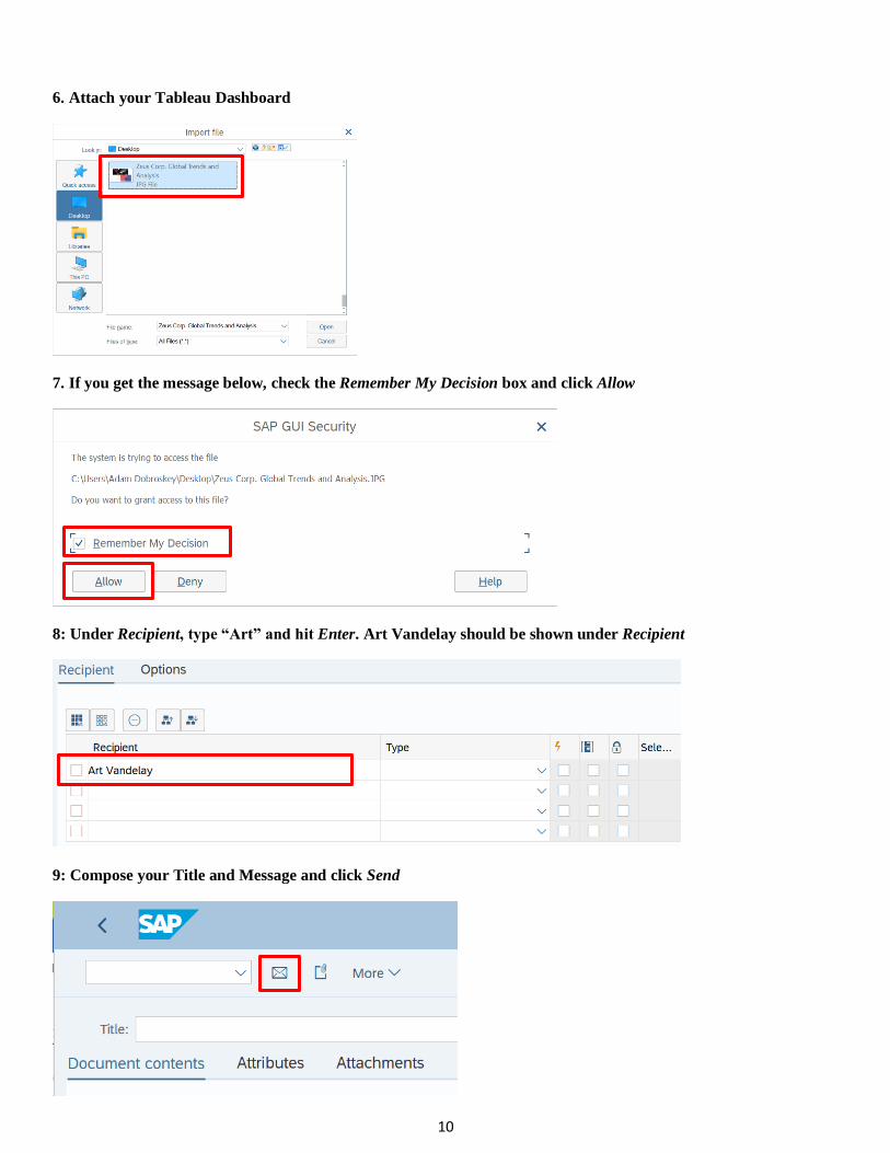
6. Attach your Tableau Dashboard
7. If you get the message below, check the Remember My Decision box and click Allow
8: Under Recipient, type “Art” and hit Enter. Art Vandelay should be shown under Recipient
9: Compose your Title and Message and click Send