A Basic Step Guide to Technical Analysis€¦ · the higher the value of DeMax relative to DeMin,...
19
A Basic Step Guide to Technical Analysis
Transcript of A Basic Step Guide to Technical Analysis€¦ · the higher the value of DeMax relative to DeMin,...
A Basic Step Guide to
Technical Analysis

1. Volumes The term volume means how much of a given stock (Quantity) was traded in a particular period of time.
2. Accumulation Distribution
Accumulation Distribution uses volume to confirm the price trends.
i. Accumulation : Volume is considered to be accumulated when the day’s closing price is higher than the previous day’s closing price.
ii. Distribution : Volume is distributed when the day’s closing price is lower than the previous day’s closing price.
3. Money Flow Index (MFI) It’s an oscillator that ranges from 0 to 100 used to show the money flow over several days. MFI uses price & volume concept to create an oversold and overbought indicator that is
helpful in confirming trends in price and warning of potential reversals in prices. Oversold levels typically occur below 20 and overbought levels typically occur above 80.
4. On Balance Volume (OBV)
OBV is a technical analysis indicator which is designed to relate price and volume in
the stock market. Total volume for each day is assigned a positive or negative value depending on prices being higher or lower that day. A higher close results in the volume for that day to get a positive value, while a lower close results in negative value. So, when price closes higher than the previous close, OBV should be positive and If it closes lower
than the previous close, OBV should be negative.
A B C D E F
Day High Low Volume B minus C E/D
1 11.37 10.364 10,000 1.006 0.0001006
2 11.369 10.365 9,156 1.004 0.0001096
3 11.374 10.368 12,487 1.006 0.0000805
5. Market Facilitation Index This indicator used to establish the effectiveness of price movement by computing the price
movement per volume unit. This is accomplished by subtracting the day’s low from the
high and dividing the result by the total volume.
6. Commodity Channel Index The Commodity Channel Index (CCI) measures the current price level relative to an average price level over a given period of time. CCI is relatively high when prices are far above their average. CCI is relatively low when prices are far below their average. Using this method, CCI can be used to identify overbought and oversold levels.
Commodity Channel Index provides potential BUY signal when CCI goes ON or BELOW oversold line i.e. -100
Commodity Channel Index provides potential SELL signal when CCI goes ON or ABOVE overbought line i.e. +100

Note: CCI is an unbound oscillator, meaning there is no upside or downside limits. This makes interpreting an overbought or oversold condition subjective. When the CCI is overbought the
security can continue to move higher. When the CCI is oversold the security can continue lower as well. Use the CCI in conjunction with additional indicators or price analysis when attempting to read overbought or oversold conditions.
7. DeMaker
It measures the demand for the underlying instrument by comparing the maximum prices of the current period with those of previous periods. It is an oscillator composed of a single line that ranges between limits of 0 and 1 and has a base value of 0.5. As a general thumb
rule, the overbought level is usually set at 0.7 (Sell signal) and the oversold (Buy signal) level at 0.3.
The basic principle behind the Indicator is, if the current high is smaller than the previous high, we record a value of 0. If it is greater than the previous high, we record the difference between the two as our value. We call these values DeMAX; if the current low is higher than the previous low, we record a value of 0. If the current low is lower than the previous low, we record the difference between the two as our value. We call these values DeMIN. Thus, the higher the value of DeMax relative to DeMin, the greater the value of the Demarker Indicator.
8. Force Index FI is an indicator used in technical analysis to show how strong the actual buying or selling
pressure is. High positive values mean there is a strong rising trend, and low values signify a strong downward trend
The force index is calculated by subtracting yesterday's close from today's close and
multiplying the result by today's volume. If closing prices are higher today than yesterday, the force is positive. If closing prices are lower than yesterday's, the force is negative. The strength of the force is determined either by a larger change in price or a larger volume.
The raw value of force index is plotted as a histogram, with the center line set to zero. A higher market will result in a positive force index, plotted above the center line; a lower market points to a negative force index, below the center line.
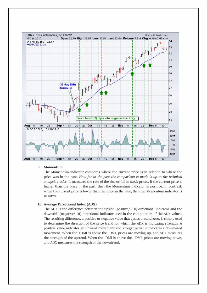
9. Momentum
The Momentum indicator compares where the current price is in relation to where the price was in the past. How far in the past the comparison is made is up to the technical analysis trader. It measures the rate of the rise or fall in stock prices. If the current price is higher than the price in the past, then the Momentum indicator is positive. In contrast,
when the current price is lower than the price in the past, then the Momentum indicator is negative
10. Average Directional Index (ADX) The ADX is the difference between the upside (positive/+DI) directional indicator and the downside (negative/-DI) directional indicator used in the computation of the ADX values. The resulting difference, a positive or negative value that cycles around zero, is simply used to determine the direction of the price trend for which the ADX is indicating strength. A positive value indicates an upward movement and a negative value indicates a downward movement. When the +DMI is above the -DMI, prices are moving up, and ADX measures the strength of the uptrend. When the -DMI is above the +DMI, prices are moving down, and ADX measures the strength of the downtrend.

The chart below shows four calculation examples for directional movement:
ADX Value Trend Strength
0-25 Absent or Weak Trend
25-50 Strong Trend
50-75 Very Strong Trend
75-100 Extremely Strong Trend

11. Bollinger Bands
Bollinger Bands a type of statistical chart characterizing the prices and volatility over time of a financial instrument or commodity. The purpose of Bollinger Bands is to provide a relative definition of high and low prices of a market. By definition, prices are high at the upper band and low at the lower band.
12. Envelopes The Envelopes indicator is a tool that attempts to identify the upper and lower bands of a trading range. It does this by plotting two moving average envelopes on a price chart, one shifted up a certain distance above and one shifted below. Signal to sell appears when the price reaches the upper margin of the band; signal to buy appears when the price reaches
the lower margin.
13. Ichimoku Kinko Hyo Ichimoku Kinko Hyo, which translates to "Equilibrium chart at a glance". Ichimoku
utilizes five separate components, they are not to be used individually, when making trading decisions, but rather used together to form an integrated "whole" picture of price
action that can be gleaned "at a glance". Thus, a simple look at an Ichimoku chart should provide the Ichimoku practitioner with a nearly immediate understanding of sentiment, momentum and strength of trend.

14. Tenkan-sen
i. Tenan-sen The tenkan-sen is calculated by adding the highest high and the highest low over the past nine periods and then dividing the result by two. The resulting line represents a key support and resistance level, as well as a signal line for reversals.
ii. Kijun-sen The kijun-sen is calculated by adding the highest high and the lowest low over the past 26
periods and dividing the result by two. The resulting line represents a key support and resistance level, a confirmation of a trend change, and can be used as a trailing stop-loss point.
iii. Senkou Span A The senkou span A is calculated by adding the tenkan-sen and the kijun-sen, dividing the result
by two, and then plotting the result 26 periods ahead. The resulting line forms one edge of the kumo - or cloud - that's used to identify future areas of support and resistance.
iv. Senkou Span B The senkou span B is calculated by adding the highest high and the lowest low over the past 52 periods, dividing it by two, and then plotting the result 26 periods ahead. The resulting line forms the other edge of the kumo that's used to identify future areas of support and resistance.
v. Chickou Span The chickou span is the current period's closing price plotted 26 days back on the chart. This line is used to show possible areas of support and resistance.
15. Moving Average
Moving Average is a mathematical result that is calculated by averaging a number of past data points. In other words, a set of numbers, or prices in the case of financial instruments, are added together and then divided by the number of prices in the set. For example, to calculate a basic 10-day moving average you would add up the closing prices from the past 10 days and then divide the result by 10. Once determined, the resulting average is then plotted onto a chart in order to allow traders to look at smoothed data rather than focusing on the day-to-day price fluctuations that are present in all financial markets.
16. Standard deviation SD is the statistical measure of market risk. If prices trend in a narrow range, the standard deviation will indicates low risk. On the other hand, if prices swing wildly up and down, then standard deviation indicates high risk.
17. MACD
MACD stands for Moving Average Convergence and Divergence. MACD is trend following
momentum indicator which shows relationship between 2 moving averages.
The key components are as follows:
(i) MACD line [White line] – 12 day minus 26 day exponential moving average is default
setting
(ii) A Signal line [Red line] – Default setting is 9 day Exponential Moving Average (EMA)
(iii) Histogram – Represents the difference between the MACD line and signal line
How this indicator works?
(i) Cross-overs
- When the MACD line crosses the signal line

- When it crosses above it suggests the trend has turned up and vice-versa
- Zero on histogram depicts that points
(ii) Centre line method
- Confirms the trend direction has changed and could be accelerating
(iii) Divergence method
- When the MACD diverges from the price action it can signal an end to the trend
18. Stochastic Oscillator
The stochastic oscillator is another well-known momentum indicator used in technical analysis.
The idea behind this indicator is that the closing prices should predominantly close in the same
direction as the prevailing trend. The stochastic oscillator generally uses the past 14 trading
days in its calculations, but as with any indicator, can be adjusted by traders to meet their
needs.
How this indicator works?
In an upward trend the price should be closing near the highs of the trading range and in
a downward trend the price should be closing near the lows of the trading range. When this
occurs it signals continued momentum and strength in the direction of the prevailing trend.
The stochastic oscillator is plotted within a range of zero and 100. Readings above 80 are
considered overbought while readings below 20 are considered oversold. The oscillator has
two lines, the %K and %D, where the former measures momentum and the latter measures
the moving average of the former. The %D line is more important of the two indicators and
tends to produce better trading signals.

19. Accelerator Oscillator
The Accelerator Oscillator has been developed by Bill Williams as the development of the
Awesome Oscillator. It represents the difference between the Awesome Oscillator and the 5-
period moving average, and as such it shows the speed of change of the Awesome Oscillator,
which can be useful to find trend reversals before the Awesome Oscillator does.
How this indicator works? Interpretation of the Accelerator Oscillator (AC) is based on the following rules - If AC is higher than the nought line, it is considered that acceleration will continue the upward movement.
The same rule applies for downward movements if the AC is below the nought line. Signals of a market rise are confirmed by two green bars (one after the other) and the AC is
above the nought line. Indication of a market decline is confirmed by two red bars (one after the other), when the AC
is below the nought line.
A more aggressive approach to the AC interpretation looks for signals, while the AC oscillator is on the opposite side of the nought line (for traders considering a long position - below the nought line, and the opposite in the case of short positions). In such a situation an additional bar would be necessary for confirmation. As a result, when the AC is below the nought line and
the investor is considering opening a long position, there should be at least three green bars appearing below the nought line.
On the other hand, when the AC is above the nought line and the investor wants to open a short position, three red bars appearing above the nought line would be required
as confirmation.

20. Awesome Oscillator
The Awesome Oscillator is an indicator in the form of a histogram that compares two moving averages, one of them representing the market dynamics in the short-term and the other capturing the long-term movements.
How this indicator works?
Below is a description of the typical interpretation of the signals provided by the oscillator.
Buy signals Saucer - this buy signal is generated with three bars, and when the histogram has reversed its
direction from downward to upward. It occurs only if the second bar is lower (coloured in red) than the first one, and the third bar (coloured in green) is higher than the second.
Nought line crossing - this buy signal is generated with two bars, when the second histogram bar crosses above the “0” (zero) line - called the nought line, while the first one is below the nought line.
Two pikes - this buy signal is generated with two pikes visible below the nought line. The signal
will be valid only if the second pike is higher than the first one (i.e. is closer to the nought line). Bars between the pikes must also be below the nought line but higher than the pikes. The bars
after the second pike should be moved in the direction of the nought line.
Sell signals Saucer - this sell signal is generated with three bars, and when the histogram reversed its
direction from upward to downward. It occurs only if the second bar is higher (coloured in
green) than the first one, and the third bar (coloured in red) is lower than the second. Nought line crossing - this sell signal is generated with two bars, when the second histogram
bar crosses below the “0” (zero) line - called the nought line, while the first one is above the
nought line. Two pikes - this buy signal is generated with two pikes visible above the nought line. The signal
will be valid only if the second pike is lower than the first one (i.e. is closer to the nought line). Bars between the pikes must also be above the nought line but below the pikes. The bars after the second pike should move in the direction of the nought line.

21. Gator Oscillator
The Gator Oscillator is secondary oscillator to the Alligator Oscillator, developed by Bill
Williams. As the main idea behind the Alligator Oscillator is the counteraction of the three
moving averages, the Gator Oscillator has the function to show the difference between the
values of these lines, helping to visualise the trend dynamics better.
How to Use Gator Oscillator
Being an oscillator in the form of two histograms built on either side of the naught line, the
Gator Oscillator plots the absolute difference between the Alligator’s Jaw and Teeth (blue and red lines) in the positive area and the absolute difference between the Alligator’s Teeth and Lips (red and green lines) in the negative area. The histogram’s bars are colored green if exceeding the previous bar’s volume or red if falling short. The bars of the extreme values are in tune with the strong trend forces.
The Alligator's activity periods are divided into the following four:
1. Gator awakes
The bars on different sides of the naught line are colored differently. 2. Gator eats Green bars on both sides of the naught line. 3. Gator fills out Single red bar during the "eating" phase.
4. Gator sleeps The bars on both sides are red.

22. Relative Strength Index (RSI) The Relative Strength Index (RSI), developed by J. Welles Wilder, is a momentum oscillator that measures the speed and change of price movements. The RSI oscillates between zero and 100.
Traditionally the RSI is considered overbought when above 70 and oversold when below 30. Signals can
be generated by looking for divergences and failure swings. RSI can also be used to identify the general trend.

How this indicator works? RSI is considered overbought when above 70 and oversold when below 30. These traditional levels
can also be adjusted if necessary to better fit the security. For example, if a security is repeatedly reaching the overbought level of 70 you may want to adjust this level to 80. Note: During strong trends, the RSI may remain in overbought or oversold for extended periods.
RSI also often forms chart patterns that may not show on the underlying price chart, such as double tops and bottoms and trend lines. Also, look for support or resistance on the RSI.
In an uptrend or bull market, the RSI tends to remain in the 40 to 90 range with the 40-50 zone acting as support. During a downtrend or bear market the RSI tends to stay between the 10 to 60 range with the 50-60 zone acting as resistance. These ranges will vary depending on the RSI settings and the strength of the security’s or market’s underlying trend.
If underlying prices make a new high or low that isn't confirmed by the RSI, this divergence can signal a price reversal. If the RSI makes a lower high and then follows with a downside move below a previous low, a Top Swing Failure has occurred. If the RSI makes a higher low and then follows with an upside move above a previous high, a Bottom Swing Failure has occurred.
23. Relative Vigor Index (RVI)
RVI calculation is based on the idea that in a rising market the closing price is usually higher than
the opening price, and on the bearish market the closing is usually below the opening price.
To normalize the index the price fluctuation is divided by the maximum price range within the bar:
Relative Vigor Index (RVI) formula:
RVI = (CLOSE – OPEN) / (HIGH – LOW)
Where;

OPEN – open price;
HIGH – the highest price;
LOW – the lowest price;
CLOSE – close price.
To eliminate occasional price fluctuations (so called “noise”) the Relative Vigor Index (RVI)
oscillator is smoothed by the 10-period simple moving average. A signal line is also formed as a
4-period moving average on the oscillator values.
How this indicator works?
The basic signals of Relative Vigor Index (RVI) are:
Bullish divergence / bearish convergence – the main signal pointing to the weakness of the
current trend; A good moment to open a sell / buy position is the crossing of the RVI line by the
signal line from above/below once the bullish divergence / bearish convergence has appeared
on the chart; In a flat market an exit from the overbought / oversold area is a signal to sell /
buy.
24. Bulls or Bear Power Bulls/Bears Power oscillators are used to identify good entry/exit points. The indicators reflect the power of bulls and bears. It is recommended to use them together with the
Exponential Moving Average indicator (EMA, the best period is 13).

How this indicator works?
Buy signals: EMA is increasing. Bears Power is negative but increases diverging with the price chart. The last peak of the Bulls Power oscillator is higher than the previous one
It is better not to go long if the Bears Power is positive.
Sell signals:
EMA is decreasing Bulls Power is positive but decreases diverging with the price chart. The last low of the Bears Power oscillator is lower than the previous one
It is better not to go short if the Bulls Power is negative.
A divergence between the Bulls/ Bears Power and prices is the best time for trading.
24. Moving Average of Oscillator
Moving Average of Oscillator (OsMA) is a technical analysis tool that reflects the difference
between an oscillator (MACD) and its moving average (signal line).
OsMA = MACD – signal

How to Use OsMa Indicator
The OsMa is displayed as a histogram - up or down from the zero line. The values of OsMa are
positive, if MACD is above the signal line, and negative, if MACD is below the signal line.
Extremum points:
OsMA switching from falling to rising in extreme areas may be a sign of bullish reversal; OsMA switching from rising to falling may be a sign of bearish reversal.
Crossing zero axis:
OsMA rising above zero (corresponds to MACD crossing from below its signal line) generates a buy signal;
OsMA falling below zero (corresponds to MACD crossing from above its signal line) generates a sell signal.
25. Alligator
Alligator an indicator simply gives buy and sell signals. It consists of three lines:
- Jaw (blue): this is the slowest moving average of the three, and is marked blue calculated as a 13 period moving average
- Teeth (red): this is the intermediate moving average of the three, and is marked red calculated
as a 8 period moving average
- Lips (green): shown as a green line and calculated as a 5 period moving average

When the Lips (green line) cross over the other two moving averages it indicates a buy signal while
when it crosses below the other two moving averages it indicates a sell signal.
If the moving averages are crossed and moving sideways it means the alligator is sleeping and usually
the longer they trade sideways the hungrier the alligator will be when it wakes up.
This is basically helpful with high volume trades.
26. Fractals
The basic fractal indicator is composed of a minimum of 5 bars. It is basically a repeating pattern in
which the same design occurs throughout the structure, on a variety of different scales. The fractal
indicates a bottom or top.
● The Fractal Technical Indicator it is a series of at least five successive bars. The highest HIGH in the
middle and two lower HIGHs on both sides.
● The reversing set is a series of at least five successive bars. The lowest LOW in the midst, and two
higher LOWs on both sides, which correlates to the sell fractal
● The fractals have High and Low values. They are indicated with the up and down arrows.
The below image will make you understand how this pattern works.
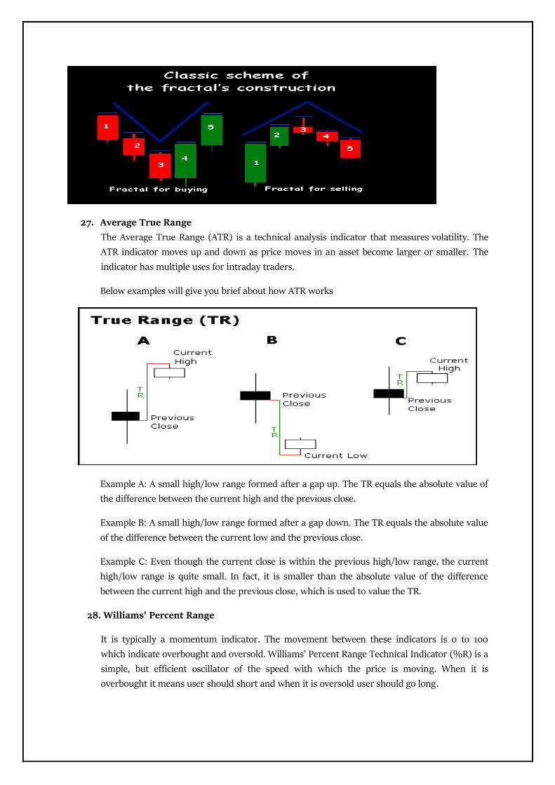
27. Average True Range
The Average True Range (ATR) is a technical analysis indicator that measures volatility. The
ATR indicator moves up and down as price moves in an asset become larger or smaller. The
indicator has multiple uses for intraday traders.
Below examples will give you brief about how ATR works
Example A: A small high/low range formed after a gap up. The TR equals the absolute value of
the difference between the current high and the previous close.
Example B: A small high/low range formed after a gap down. The TR equals the absolute value
of the difference between the current low and the previous close.
Example C: Even though the current close is within the previous high/low range, the current
high/low range is quite small. In fact, it is smaller than the absolute value of the difference
between the current high and the previous close, which is used to value the TR.
28. Williams' Percent Range
It is typically a momentum indicator. The movement between these indicators is 0 to 100
which indicate overbought and oversold. Williams’ Percent Range Technical Indicator (%R) is a
simple, but efficient oscillator of the speed with which the price is moving. When it is
overbought it means user should short and when it is oversold user should go long.

Overbought Oversold
29. Parabolic SAR
The parabolic SAR is a technical indicator used to determine the price direction of an stock, as
well draw attention to when the price direction is changing. On a chart, the
indicator appears as a sequence of dots placed either above or below the price bars. A dot below
the price is deemed to be a bullish signal. In opposition, a dot above the price is used to
illustrate that the bears signals.