morgana.unimore.itmorgana.unimore.it/bordoni_stefano/BI2016/Tableau/Tuto… · Web viewWorld Map....
27
Lezioni Tableau 1) Getting started Start screen - connect to excel “global superstore” drag orders - drag people - explain join integrated blend data sources - add “global…csv” explain join with blended data Field type - split - rename Connect live - extract --sheet 1 Categ-segment / quantity-market - market to color --data pane, dimension discrete blue pills /measures numbers we want to analize, continuos green --sale seasonality Put sales on rows, order date to see sales over time. Expand to quarter, pivot year with Quarters, year to color, click the quarter pills to change to months Table calculation -> Year over year growth Back sales into the viz Move Year over year to tooltip Category on rows -> annotate point - dip in july, rebound in the fall --crosstab Copy image - copy data to excel - duplicate as crosstab - swap axis -fit entire -add profit to color - color edit - green gold 6 steps - marks to square - turn on mark label -category pill show highlighter --Map Global sales and profit Show me for sales and country - symbol map - add in state - size - transparency - border -hide legend -color profit - navigate india - unpin - duplicate sheet - let just country - group with lazo the southern emisphere -create group use group on sale seasonality to compare - keep only -category show filter -- Sales by Sub-Category category- subcategory-product- hierarchies -sort - quick sort - profit on color -market on color - group items “small office supplies” - remove market - swap axis --Customer breakdown Profit, shipping cost - cat on color - customer name, profit on detail - disaggregate - trend line - R2 not meaningful - select customer with negative profit and drill through --Sales dashboard
Transcript of morgana.unimore.itmorgana.unimore.it/bordoni_stefano/BI2016/Tableau/Tuto… · Web viewWorld Map....
Lezioni Tableau
1) Getting started
Start screen - connect to excel “global superstore” drag orders - drag people - explain join integrated blend data sources - add “global…csv” explain join with blended dataField type - split - renameConnect live - extract--sheet 1Categ-segment / quantity-market - market to color--data pane, dimension discrete blue pills /measures numbers we want to analize, continuos green--sale seasonalityPut sales on rows, order date to see sales over time. Expand to quarter, pivot year with Quarters, year to color, click the quarter pills to change to monthsTable calculation -> Year over year growthBack sales into the vizMove Year over year to tooltipCategory on rows -> annotate point - dip in july, rebound in the fall--crosstabCopy image - copy data to excel - duplicate as crosstab - swap axis -fit entire -add profit to color - color edit - green gold 6 steps - marks to square - turn on mark label -category pill show highlighter--Map Global sales and profitShow me for sales and country - symbol map - add in state - size -transparency - border -hide legend -color profit - navigate india - unpin - duplicate sheet - let just country - group with lazo the southern emisphere -create group use group on sale seasonality to compare - keep only -category show filter-- Sales by Sub-Categorycategory- subcategory-product- hierarchies -sort - quick sort - profit on color -market on color - group items “small office supplies” - remove market - swap axis--Customer breakdownProfit, shipping cost - cat on color - customer name, profit on detail -disaggregate - trend line - R2 not meaningful - select customer with negative profit and drill through--Sales dashboardSize - sheets Map Global sales and profit - Sales by Sub-Category - Customer breakdown . hide titles . categories filters apply to worksheet - all using this data source - map use as filter--story pointsMap Global sales and profit overall sales are fine -but not always Sales dashboard with filter on texas

2) Mapping
Mappare latitudini e longitudini. A geographic information system (or GIS) is a system designed to capture, store, manipulate, analyze, manage, and present spatial or geographical data.
Coordinate Points
Latitude indicates how far up or down from the equator, Longitude indicates how far east or west from the Prime Meridian. Geo fields must have a Geographic Role
Any point on a map can be represented with latitude and longitude coordinates. In Tableau, coordinates need to be numbers in decimal format. Positive latitudes indicate the northern hemisphere, positive longitudes indicate eastward from the Prime Meridian. In this way, every point on the globe has unique latitude and longitude coordinates. Incidentally, Tableau uses same projection as Google Maps, which is Web Mercator
Plotting Latitude and Longitude
If your dataset has latitude and longitude fields, Tableau can automatically plot them on a map.
On the other hand, if your data doesn’t have latitude and longitude but you have geographic place names such as city, country, or province, Tableau will determine their coordinates for you provide the fields latitude (generated) and longitude (generated).
Custom Geocoding
If your data contains locations (without latitude and longitude coordinates) that Tableau cannot recognize, you can add to the database and enter your own custom geocoding, or simply blend in the geographic data. The videos Expanding Tableau’s Mapping Capabilities and Custom Geocoding go into more depth. 3
Polygon Maps
Locations can be plotted on a map in two ways – as a point or mark to represent the entire area, or a polygon, covering the area. It’s also possible to provide your own polygon data to create custom polygon maps, such as this map of National Parks in the UK.
Marks = polygon
Pointorder (point ID) -> path
Polygon ID -> detail
Double clic on lat and long
Other Map Services - WMS server
If the default map tiles aren’t what you need – maybe your analysis is of ocean currents – Tableau offers the option for connecting to Mapbox or a Web Map Service.
GIS-LAB.info tWMS service (usa solo open street)
http://irs.gis-lab.info/?z=!&x=!&y=!&
WMS for the GEBCO global bathymetric grid
http://www.gebco.net/data_and_products/gebco_web_services/web_map_service/mapserv?
World Map
http://www2.demis.nl/wms/wms.asp?wms=WorldMap&
Background Images
Image hk metro map
X left 0 right 840
Y bottom 0 top 623
Option always show image
Use annotation point to know the coordinates
X -> column shelf
Y -> rows shelf
Station -> details
Line->colors
Mark->solid-> halo
Esercizi
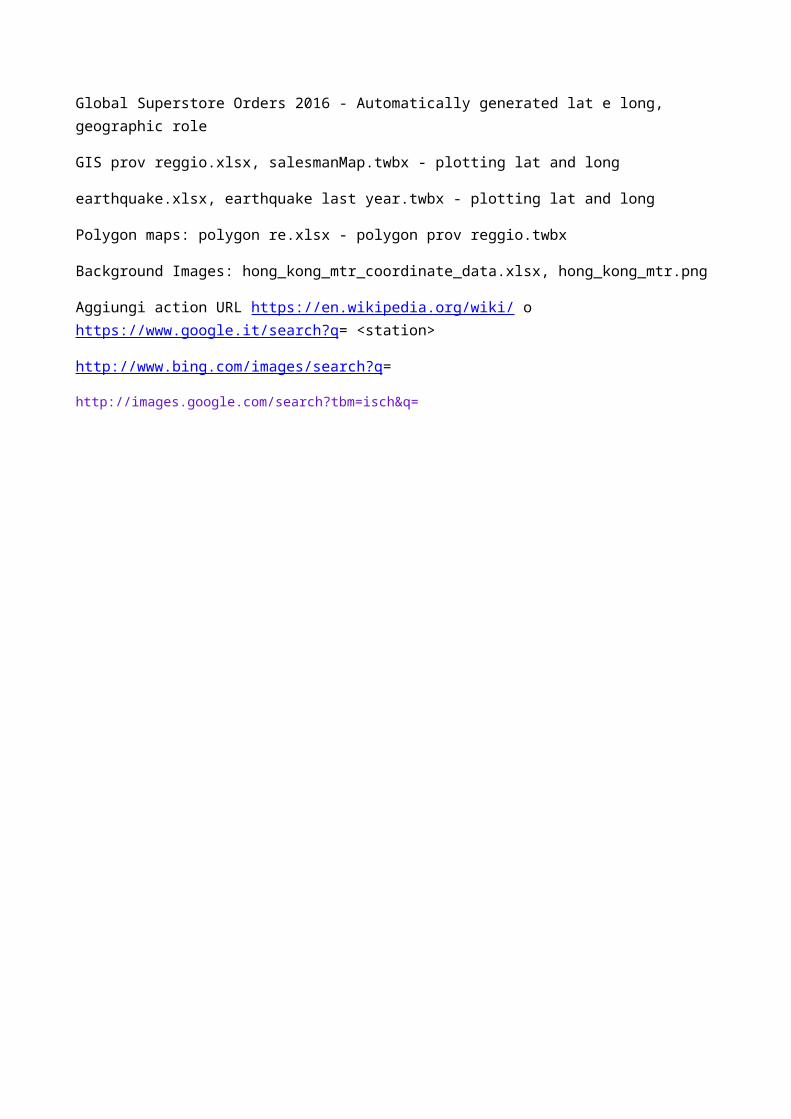
Global Superstore Orders 2016 - Automatically generated lat e long, geographic role
GIS prov reggio.xlsx, salesmanMap.twbx - plotting lat and long
earthquake.xlsx, earthquake last year.twbx - plotting lat and long
Polygon maps: polygon re.xlsx - polygon prov reggio.twbx
Background Images: hong_kong_mtr_coordinate_data.xlsx, hong_kong_mtr.png
Aggiungi action URL https://en.wikipedia.org/wiki/ o https://www.google.it/search?q= <station>
http://www.bing.com/images/search?q=
http://images.google.com/search?tbm=isch&q=
3) Dashboard excel like 14 objects (Customer ranking 3, Revenue analysis 3 (no speedometer), Product analysis 1, Geographic 3 (+ map), Salesman analysis 3
Classifica clienti
Customer description to row
Sum(fatturato 2012) to columns
Copy Sum(fatturato 2012) to rows - discrete -quick table calc-> rank
Crate calculated field Index()
Fatt 2012 to colors
Customer description to filter -> top 10 by sum fat 2012, parameter
Metti macro area, index su cust description, rank su table
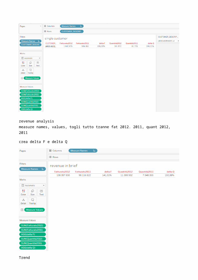
single customer
revenue analysismeasure names, values, togli tutto tranne fat 2012. 2011, quant 2012, 2011
crea delta F e delta Q
Trend
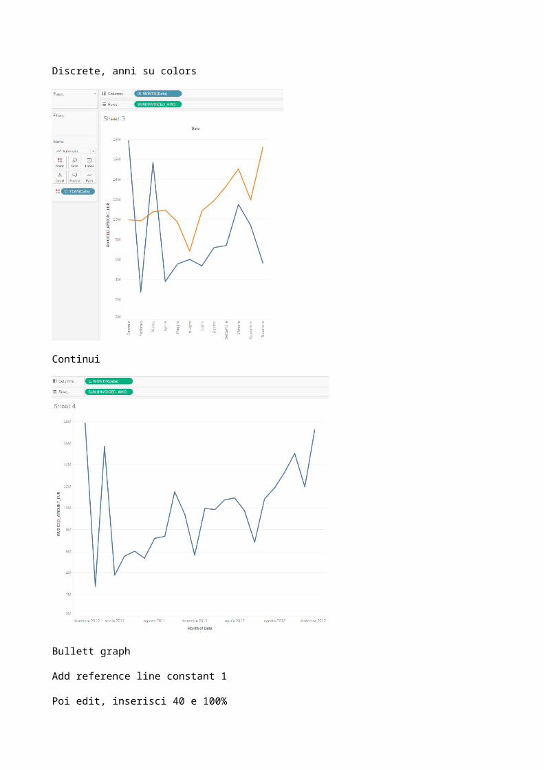
Discrete, anni su colors

Continui
Bullett graph
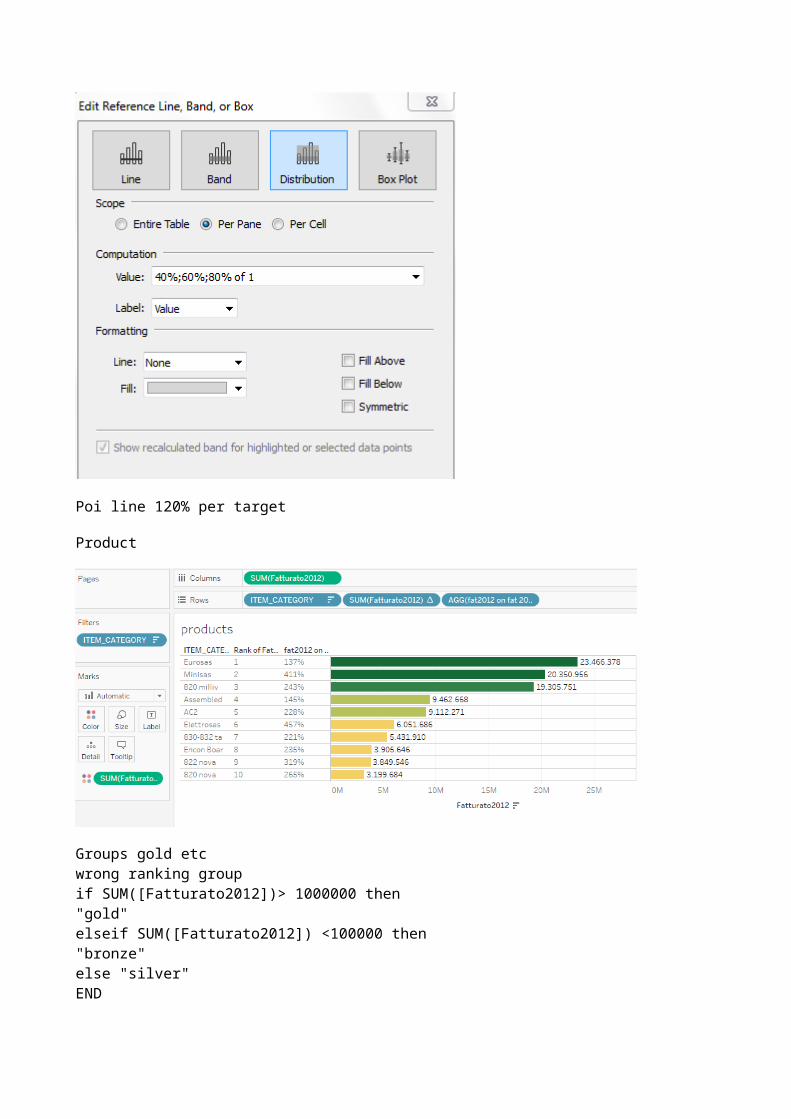
Add reference line constant 1
Poi edit, inserisci 40 e 100%
Poi line 120% per target
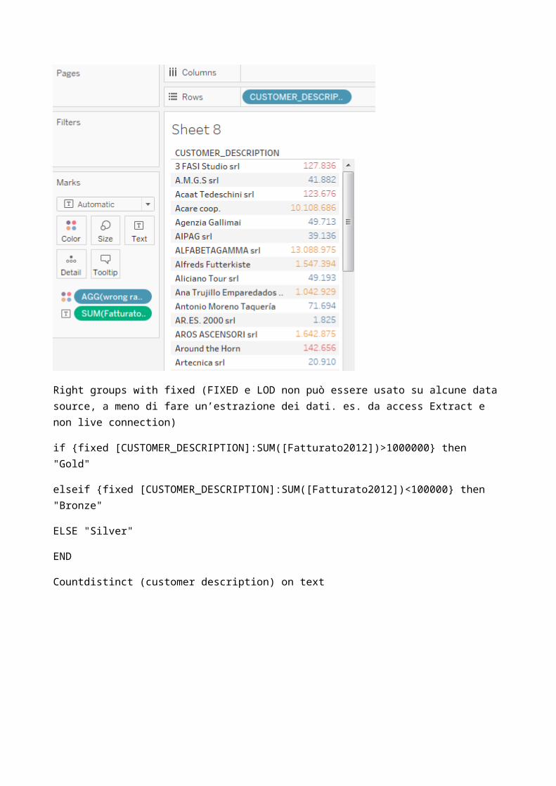
Product
Groups gold etcwrong ranking groupif SUM([Fatturato2012])> 1000000 then"gold"elseif SUM([Fatturato2012]) <100000 then "bronze"else "silver"END
Right groups with fixed (FIXED e LOD non può essere usato su alcune data source, a meno di fare un’estrazione dei dati. es. da access Extract e non live connection)
if {fixed [CUSTOMER_DESCRIPTION]:SUM([Fatturato2012])>1000000} then "Gold"
elseif {fixed [CUSTOMER_DESCRIPTION]:SUM([Fatturato2012])<100000} then "Bronze"
ELSE "Silver"
END
Countdistinct (customer description) on text
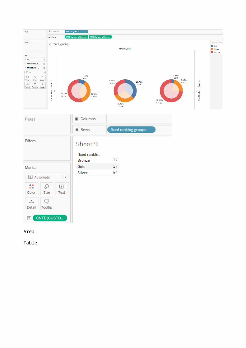
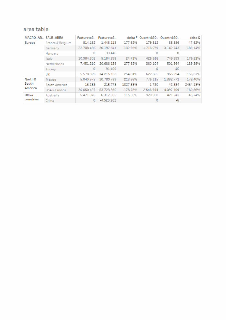
Area
Table
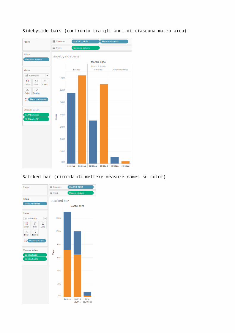
Sidebyside bars (confronto tra gli anni di ciascuna macro area):
Satcked bar (ricorda di mettere measure names su color)
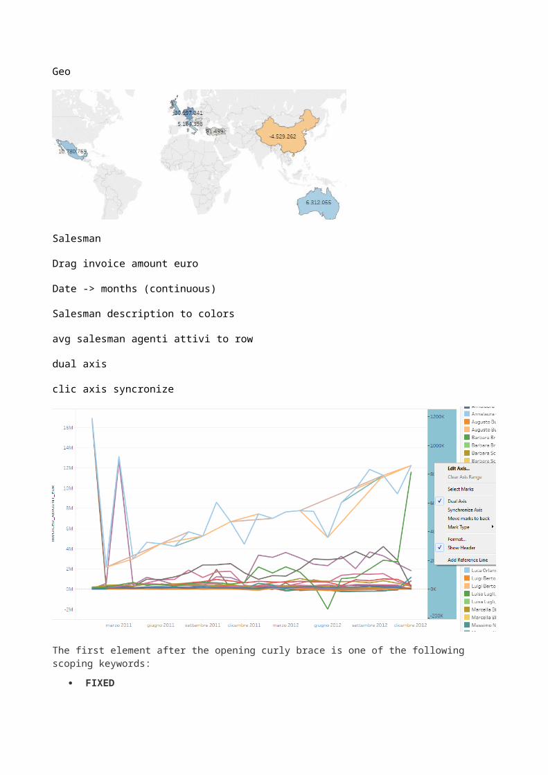
Geo
Salesman
Drag invoice amount euro
Date -> months (continuous)
Salesman description to colors
avg salesman agenti attivi to row
dual axis
clic axis syncronize
The first element after the opening curly brace is one of the following scoping keywords:
FIXED
FIXED level of detail expressions compute values using the specified dimensions without reference to the view level of detail—that is, without reference to any other dimensions in the view.
FIXED level of detail expressions also ignore all the filters in the view other than context filters, data source filters, and extract filters.
Example: { FIXED [Region] : SUM([Sales]) }
INCLUDE
INCLUDE level of detail expressions compute values using the specified dimensions in addition to whatever dimensions are in the view.
INCLUDE level of detail expressions are most useful when including a dimension that isn’t in the view.
Example: { INCLUDE [Customer Name] : SUM([Sales]) }
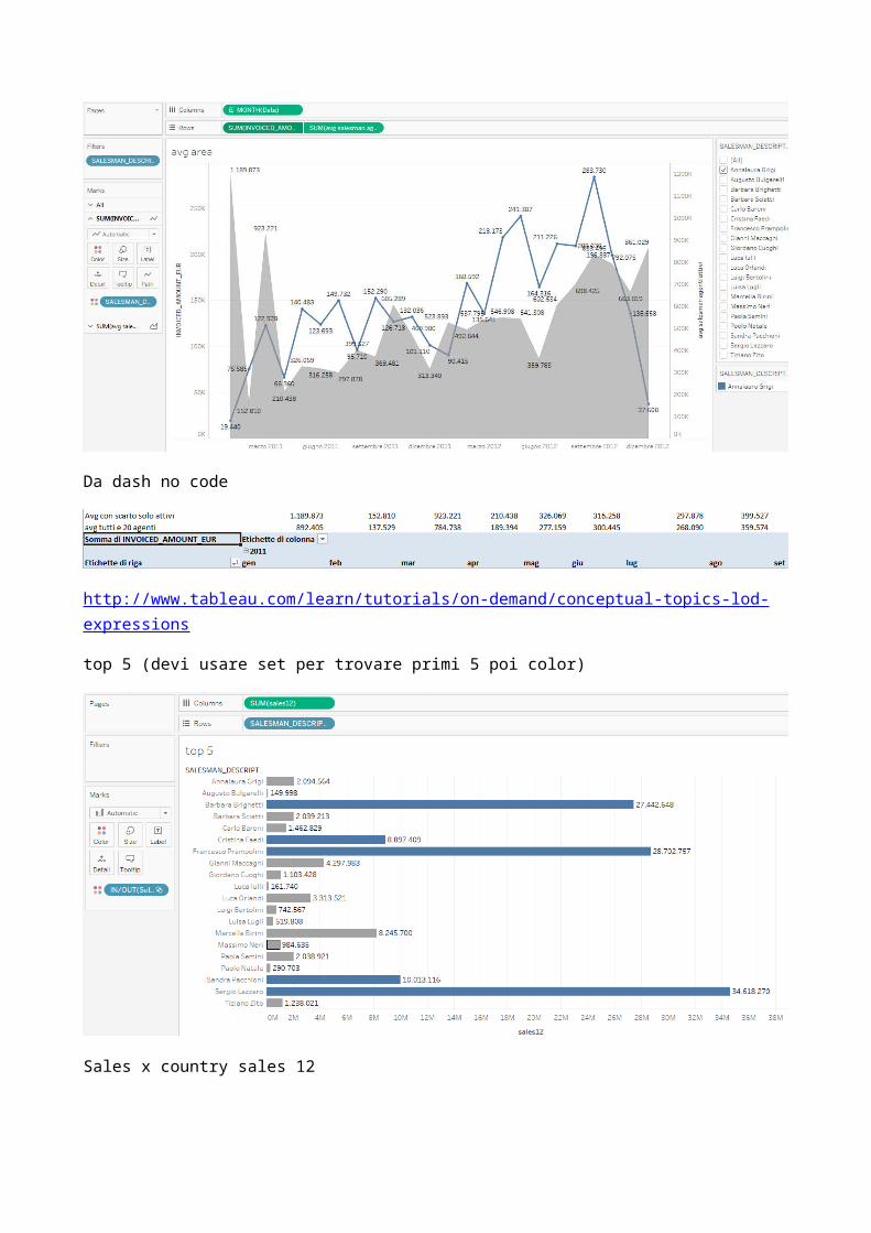
avg salesman agenti attivi
{fixed DATETRUNC('month', [Data]):SUM([INVOICED_AMOUNT_EUR])}/{FIXED DATETRUNC('month', [Data]):COUNTD([SALESMAN_DESCRIPTION])}
avg salesman tutti agenti
{fixed DATETRUNC('month', [Data]):SUM([INVOICED_AMOUNT_EUR])}/{COUNTD([SALESMAN_DESCRIPTION])}
Trascina il livello di data dallo scaffale al box editing della formula!!!
Deve esserci almeno un salesman su tutti i mesi per vedere la media corretta!!!!
Da dash no code
http://www.tableau.com/learn/tutorials/on-demand/conceptual-topics-lod-expressions
top 5 (devi usare set per trovare primi 5 poi color)
Sales x country sales 12


Se parto da Staging complete:
datagiustaDATE(RIGHT([INVOICE_DATE],2)+"/"+MID([INVOICE_DATE],5,2)+"/"+LEFT([INVOICE_DATE],4))inv2011-2012IF YEAR([datagiusta])=2011 THEN [INVOICED_AMOUNT_EUR] ELSE NULLEND
4) Getting Started with Data Transcript
Connect pane, we have a long list of native connections to all sorts of data sourcesConnecting to Multiple Tables (cross-database joins, integrated data source) to add columns from other tables in the same data source, we need to edit our data connection - To do so, click on the Data Source tab – add Global Superstore Excels.csv - Let’s join our Global Superstore Returns 2016s.csv to the orders table explain join. Join merge dataset at row level, needs a key in commondata blending aggregates at a query level. 2 data sources (es. Access coffee chain – excel office chain) – no primary key in common – just one common field separate queries to separate data sources and aggregation of results (es state, country) Live versus ExtractConnecting live leaves the data in the database or source file. - The other option is to extract the data into Tableau’s high performance in-memory data engine
Metadata and Saving Data Sources
hierarchy - folders by right clicking and selecting Group by > folder - change the data type say, Row ID, change the data type to a string – field Default Properties , we can edit the default number format and the default aggregationIf we want to save this data source for further use, we right click up here on the data source and say “add to saved data sources”. This will save the connection as a .tds (note: this is not the data itself, just the information about the connection) and it’s saved in the local version of Tableau Desktop
Managing Extracts
Creating Extracts - If we’re connected to a data source and decide that we’d like to extract it, we can do soby right clicking on the data source and selecting Extract Data. If the workbook has already been saved as a .twbx packaged workbook, the extract will automatically save as part of the packaged workbook. If the workbook has been saved as a .twb or hasn’t been saved yet, we’d be asked where to save the Tableau Data Extract file (.tde).using extract - Refreshing Extracts. Data prep:Saving and publishing data sources:Join types:Cross database joins:Data blending and additional data blending:Connecting to google analytics:Connecting to cubes:
5) Visual analytics
Getting Started with Visual Analytics: Marks, changing, workkibg, aggregation and number of marks – highlighting – lod – show meDrill Down and Hierarchies: Hierarchy building, working, date (continuous date can’t be separate date part son can’t drill)

Sorting: sort on axis – click the pill – use and drag the header in the legend – click a discrete pill and select sort option from menu – sort different pills different ways. Continuous pills are sorted using axis or toolbar – discrete dimensions pills full sorting option Grouping: use header (florida, small office supplies), use data pane “select field -> create -> group” es. Subcategories – edit group, include other, use marks “visual grouping”. Groups are metadata definitions, sets are combination of data like filters and can be used in calculationsAdditional Ways to Group (with or without parameter): calculation to define groups – if sum([profits])>[threshold] then “a” else “b” end. Using bins Creating Sets: Working with Sets:Ways to Filter: filter shelf, quick filter, in the view (keep/exclude) or legend, conditions (top, by field…) – remove filter by removing pillUsing the Filter Shelf:Quick (Interactive) Filters: layout mode, cascading filters, only relevant values, all valuesWhere Tableau Filters: summary level (normale, sulla dimensione della viz es category) – record level (normale, sui dati che costruiscono la dimensione della viz es profits) – data sourceAdditional Filtering Topics. Top, parameters, index(). Apply to worksheet, context filterParametersFormattingThe Formatting PaneTrend LinesReference LinesForecastingClusteringAnalysis with Cubes and MDX
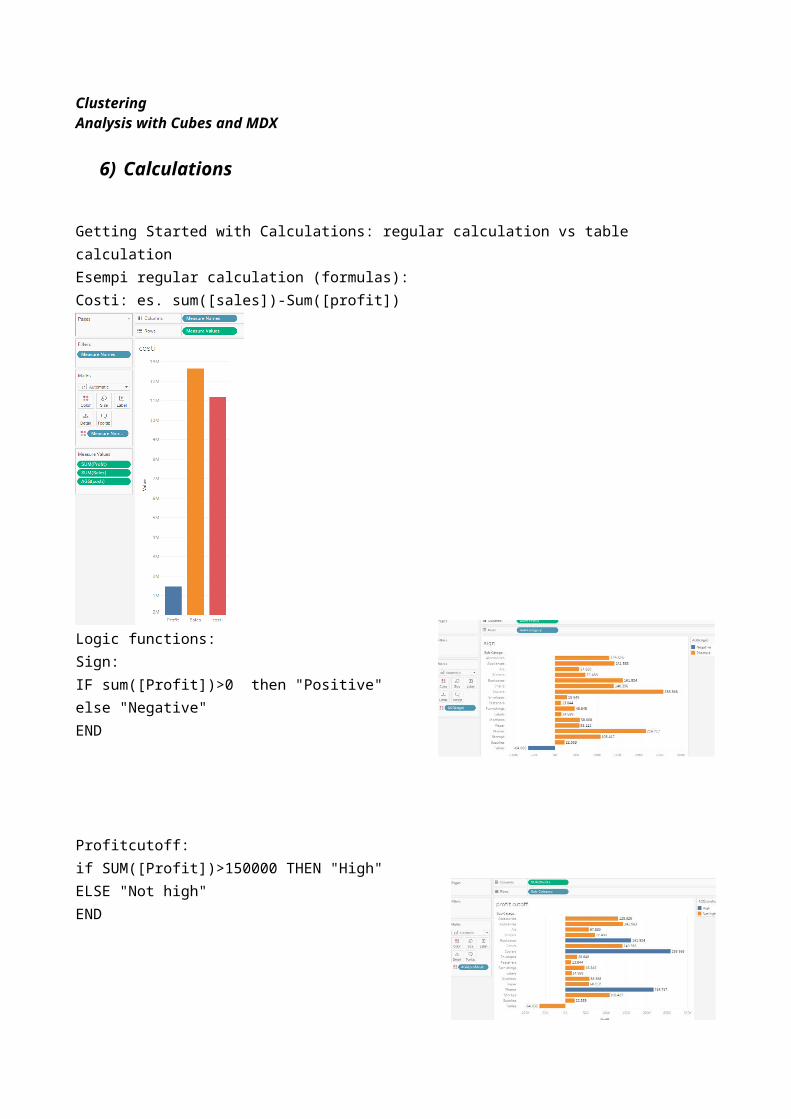
6) Calculations
Getting Started with Calculations: regular calculation vs table calculationEsempi regular calculation (formulas):Costi: es. sum([sales])-Sum([profit])

Logic functions:Sign: IF sum([Profit])>0 then "Positive"else "Negative"END
Profitcutoff:if SUM([Profit])>150000 THEN "High"ELSE "Not high"END
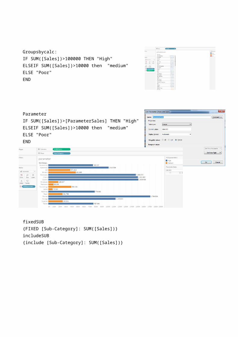
Groupsbycalc:IF SUM([Sales])>100000 THEN "High"ELSEIF SUM([Sales])>10000 then "medium"ELSE "Poor"END
Parameter IF SUM([Sales])>[ParameterSales] THEN "High"ELSEIF SUM([Sales])>10000 then "medium"ELSE "Poor"END
fixedSUB{FIXED [Sub-Category]: SUM([Sales])}includeSUB{include [Sub-Category]: SUM([Sales])}
fixedCAT{fixed [Category]:SUM([Sales])}
Fixedsales{fixed: SUM([Sales])}
Percentuale su totale riga (percentuale across)
Percentuale su totale o subtotale colonna (percentuale down o panedown o subcat)
Percentuale su totale generale (table)
Rank e index computing on different part of the table
Introduction to LOD Expressions:Intro to Table Calculations: secondary calculation performed on top of a returned result setModifying Table Calculations: TC can be written like any other calculation or pre-definedAggregate CalculationsDate CalculationsLogic CalculationsNumber CalculationsString CalculationsType CalculationsConceptual Topics with LOD ExpressionsAggregation and Replication with LOD ExpressionsNested LOD ExpressionsHow to Integrate R and TableauUsing R within Tableau
7) Dashboards and Stories
Getting Started with Dashboards and Stories Building a DashboardDashboard Layouts and FormattingDevice Designer Dashboard Interactivity using ActionsStory Points https://public.tableau.com/en-us/s/gallery
8) Tableau online
PARAMETRI E-MAIL
E-mail: [email protected]
Password: IMbi2016
Tiscali Mail: mail.tiscali.it
SMTP server: smtp.tiscali.it
POP server: pop.tiscali.it
tableau online per corso 11/12/2016
IMBI2016
IMbi2016
https://dub01.online.tableau.com/#/site/imbi2016/workbookshttps://sso.online.tableau.com/public/idp/SSO