


Languages
Pages
Legal

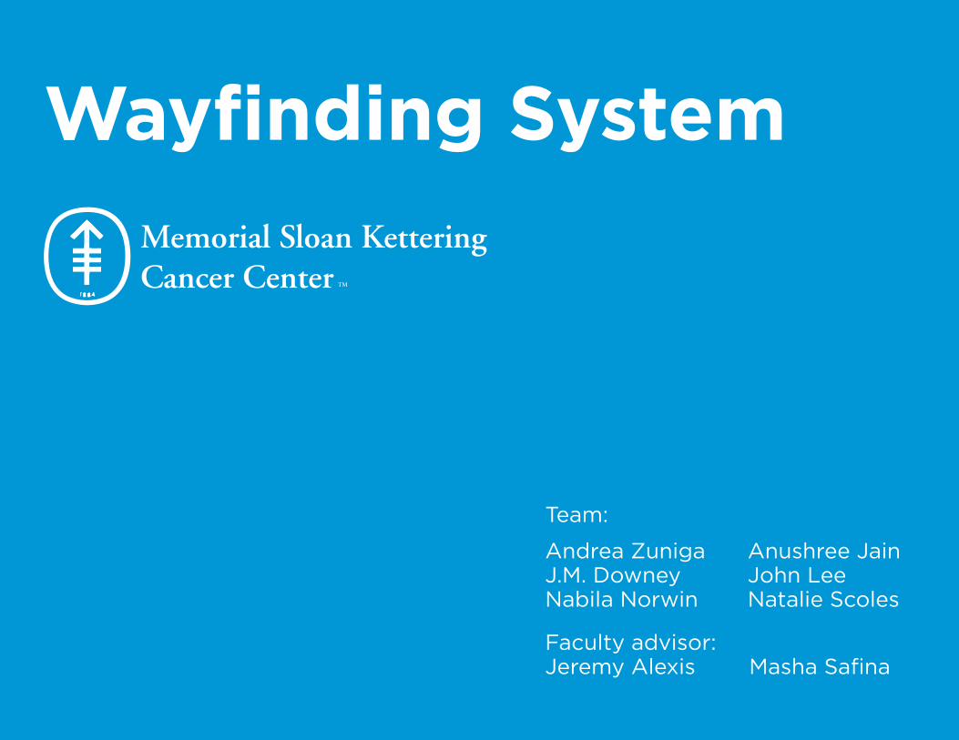
Wayfinding System
Anushree JainJohn LeeNatalie Scoles
Andrea Zuniga J.M. Downey Nabila Norwin
Team:
Faculty advisor: Jeremy Alexis Masha Safina
CURRENT STATE
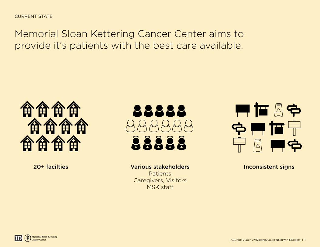
Memorial Sloan Kettering Cancer Center aims to provide it’s patients with the best care available.
20+ facilties Various stakeholdersPatients
Caregivers, VisitorsMSK staff
Inconsistent signs
+ ++ ++
AZuniga AJain JMDowney JLee NNorwin NScoles I 1
PROJECT OBJECTIVE
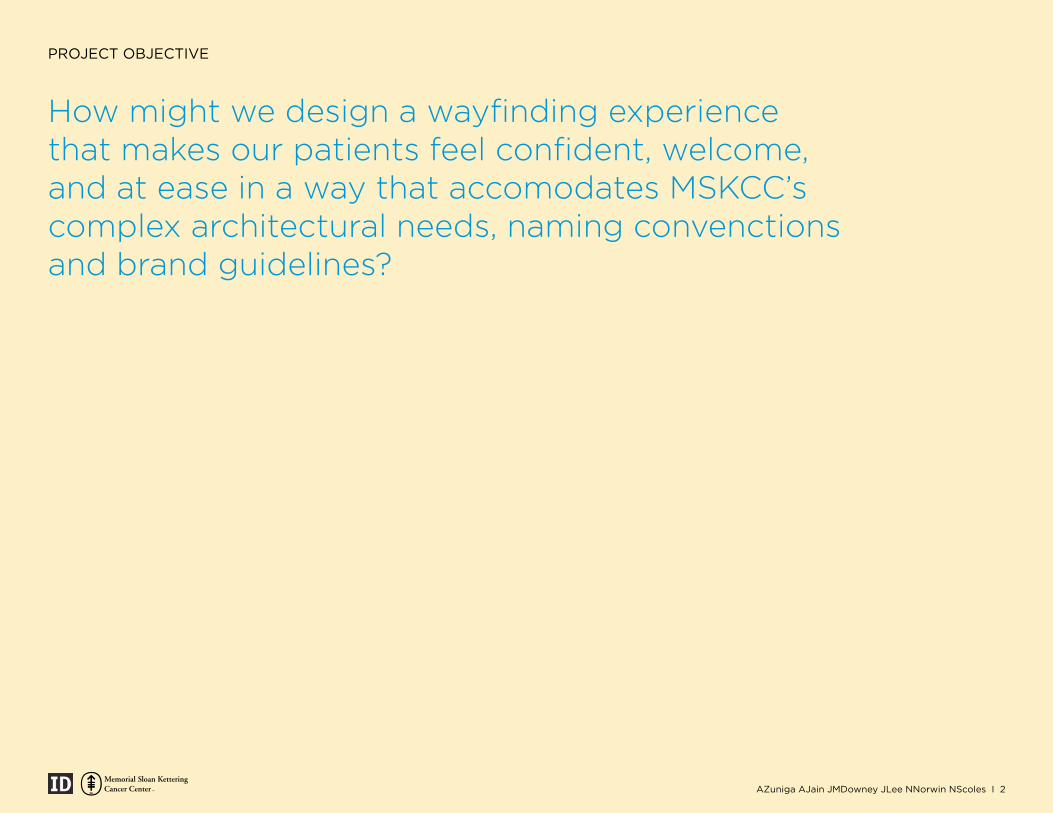
How might we design a wayfinding experience that makes our patients feel confident, welcome, and at ease in a way that accomodates MSKCC’s complex architectural needs, naming convenctions and brand guidelines?
AZuniga AJain JMDowney JLee NNorwin NScoles I 2
PROJECT OVERVIEW
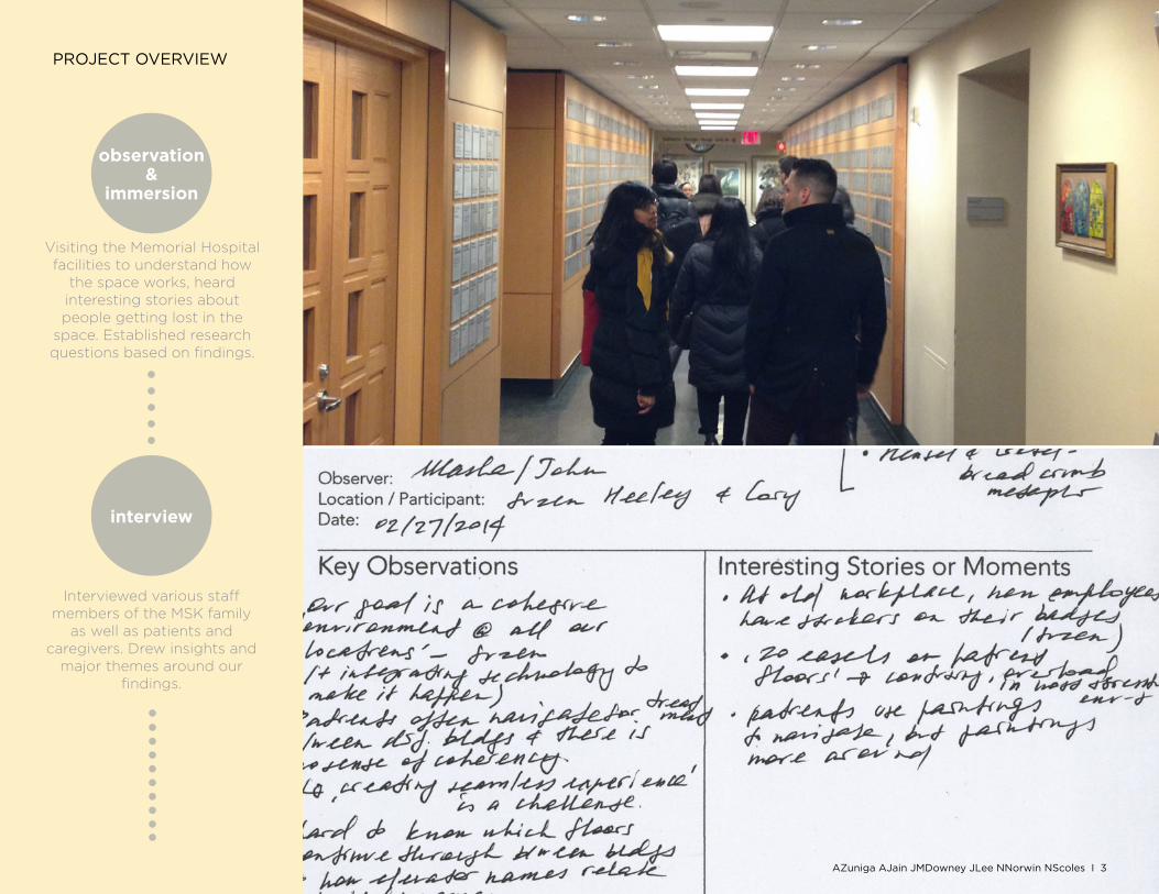
observation&
immersion
interview
Visiting the Memorial Hospital facilities to understand how
the space works, heard interesting stories about people getting lost in the
space. Established research questions based on findings.
Interviewed various staff members of the MSK family
as well as patients and caregivers. Drew insights and
major themes around our findings.
AZuniga AJain JMDowney JLee NNorwin NScoles I 3
PROJECT OVERVIEW
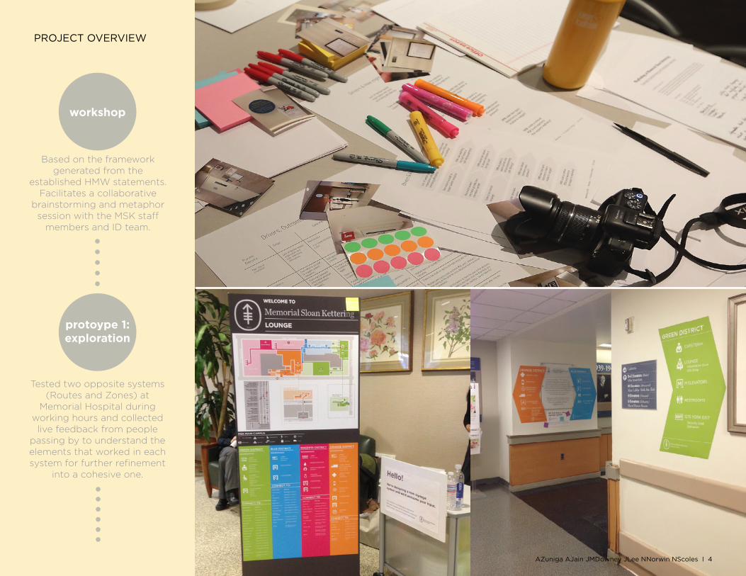
workshop
protoype 1:exploration
Based on the framework generated from the
established HMW statements. Facilitates a collaborative
brainstorming and metaphor session with the MSK staff
members and ID team.
Tested two opposite systems (Routes and Zones) at
Memorial Hospital during working hours and collected live feedback from people
passing by to understand the elements that worked in each system for further refinement
into a cohesive one.
AZuniga AJain JMDowney JLee NNorwin NScoles I 4
PROJECT OVERVIEW
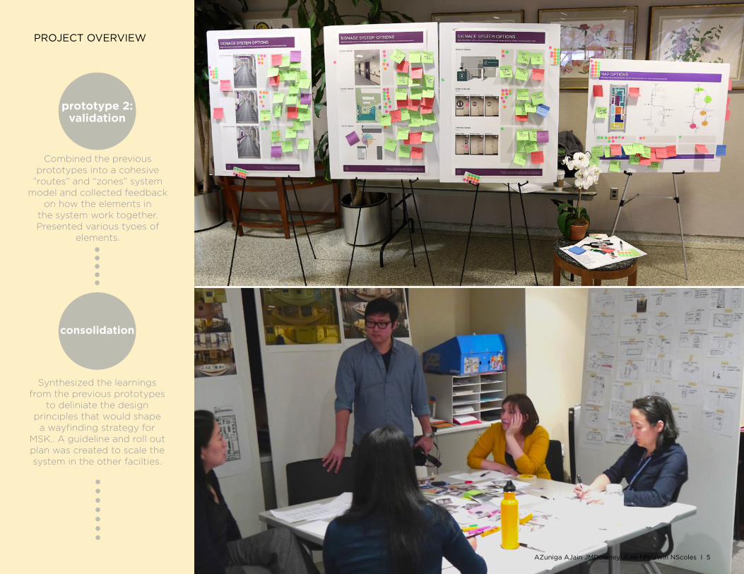
prototype 2:validation
consolidation
Combined the previous prototypes into a cohesive
“routes” and “zones” system model and collected feedback
on how the elements in the system work together. Presented various tyoes of
elements.
Synthesized the learnings from the previous prototypes
to deliniate the design principles that would shape
a wayfinding strategy for MSK.. A guideline and roll out plan was created to scale the system in the other facilties.
AZuniga AJain JMDowney JLee NNorwin NScoles I 5
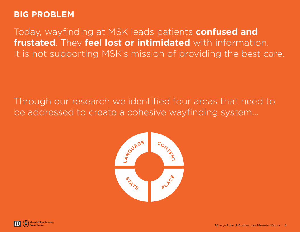
Through our research we identified four areas that need to be addressed to create a cohesive wayfinding system...
Today, wayfinding at MSK leads patients confused and frustated. They feel lost or intimidated with information. It is not supporting MSK’s mission of providing the best care.
LA
NGUAGE
STATE
PLAC
E
CONTENT
AZuniga AJain JMDowney JLee NNorwin NScoles I 6
BIG PROBLEM
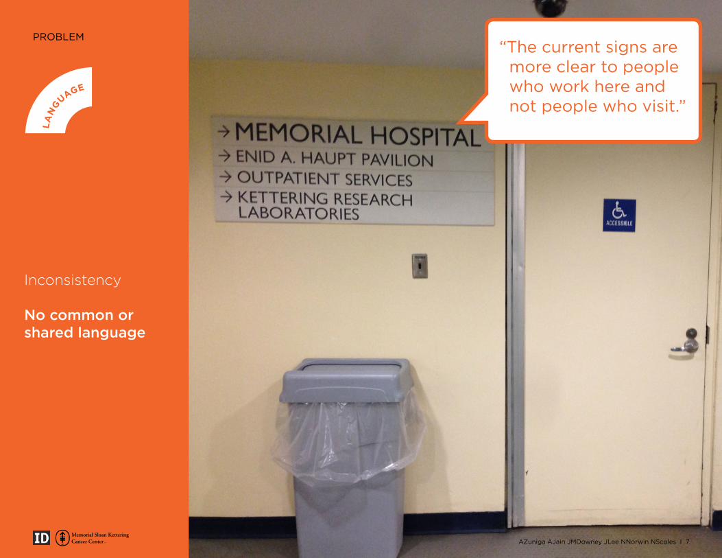
PROBLEM
Inconsistency
No common or shared language
LA
NGUAGE
STATE
PLAC
E
CONTENT
“The current signs are more clear to people who work here and not people who visit.”
AZuniga AJain JMDowney JLee NNorwin NScoles I 7
PROBLEM
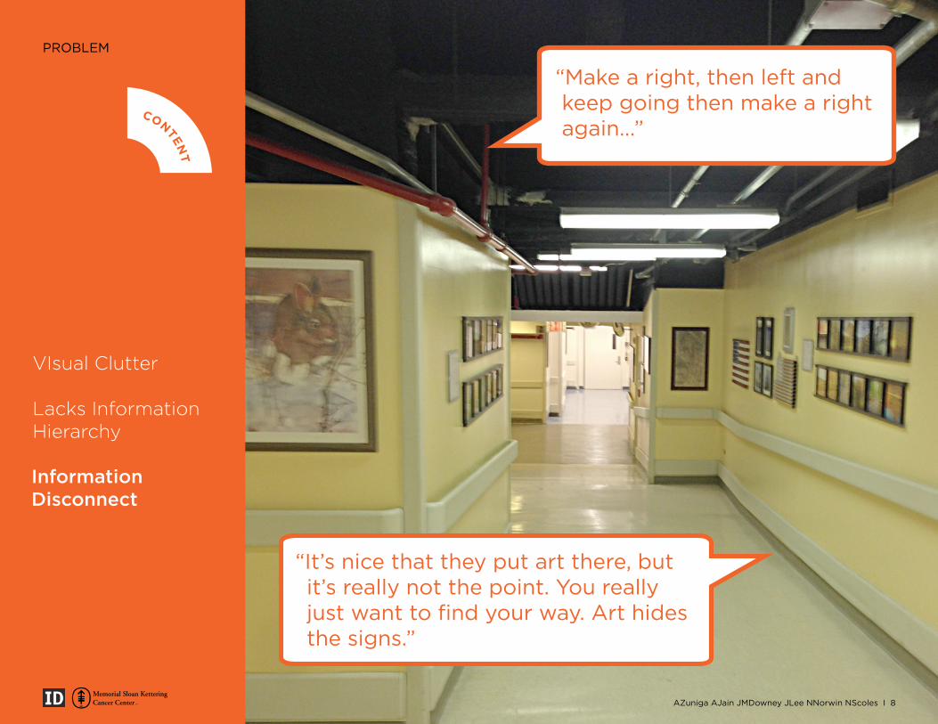
VIsual Clutter
Lacks Information Hierarchy
Information Disconnect
LA
NGUAGE
STATE
PLAC
E
CONTENT
“Make a right, then left and keep going then make a right again...”
AZuniga AJain JMDowney JLee NNorwin NScoles I 8
“It’s nice that they put art there, but it’s really not the point. You really just want to find your way. Art hides the signs.”
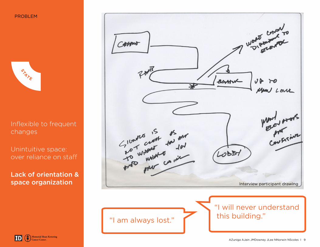
PROBLEM
Inflexible to frequent changes
Unintuitive space: over reliance on staff
Lack of orientation & space organization Interview participant drawing
LA
NGUAGE
STATE
PLAC
E
CONTENT
“I am always lost.”
“I will never understand this building.”
AZuniga AJain JMDowney JLee NNorwin NScoles I 9
PROBLEM
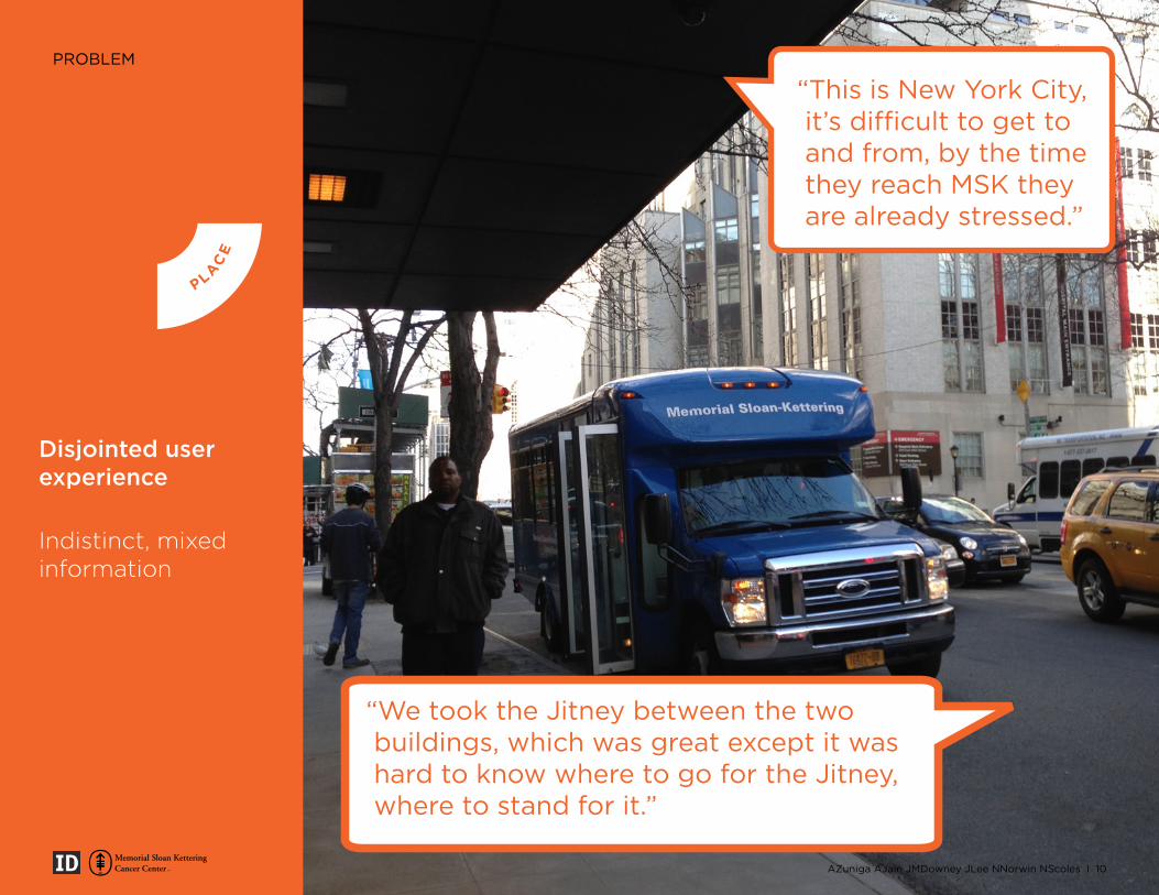
Disjointed user experience
Indistinct, mixed information
“This is New York City, it’s difficult to get to and from, by the time they reach MSK they are already stressed.”
“We took the Jitney between the two buildings, which was great except it was hard to know where to go for the Jitney, where to stand for it.”
LA
NGUAGE
STATE
PLAC
E
CONTENT
AZuniga AJain JMDowney JLee NNorwin NScoles I 10
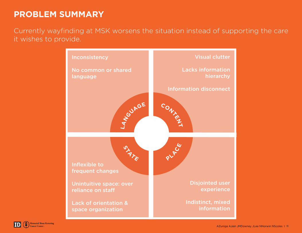
Currently wayfinding at MSK worsens the situation instead of supporting the care it wishes to provide.
LA
NGUAGE
STATE
PLAC
E
CONTENT
Inconsistency
No common or shared language
Inflexible to frequent changes
Unintuitive space: over reliance on staff
Lack of orientation & space organization
Visual clutter
Lacks information hierarchy
Information disconnect
Disjointed user experience
Indistinct, mixed information
AZuniga AJain JMDowney JLee NNorwin NScoles I 11
PROBLEM SUMMARY
LA
NGUAGE
STATE
PLAC
E
CONTENT
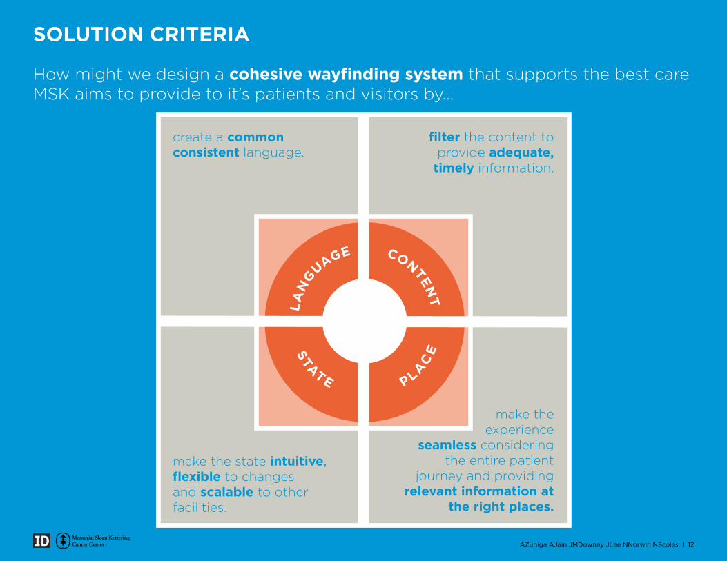
How might we design a cohesive wayfinding system that supports the best care MSK aims to provide to it’s patients and visitors by...
create a common consistent language.
filter the content to provide adequate,
timely information.
make the state intuitive, flexible to changes and scalable to other facilities.
make the experience
seamless considering the entire patient
journey and providing relevant information at
the right places.
AZuniga AJain JMDowney JLee NNorwin NScoles I 12
SOLUTION CRITERIA
SOLUTION
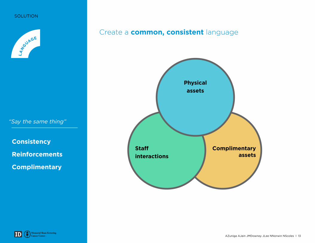
“Say the same thing”
Consistency
Reinforcements
Complimentary
Create a common, consistent language
LA
NGUAGE
STATE
PLAC
E
CONTENT
Staff interactions
Complimentary assets
Physical assets
AZuniga AJain JMDowney JLee NNorwin NScoles I 13
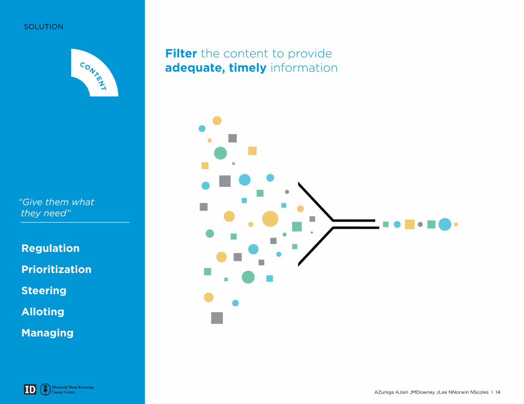
SOLUTION
Regulation
Prioritization
Steering
Alloting
Managing
“Give them what they need”
Filter the content to provide adequate, timely information
LA
NGUAGE
STATE
PLAC
E
CONTENT
AZuniga AJain JMDowney JLee NNorwin NScoles I 14
SOLUTION
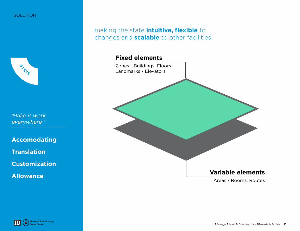
Accomodating
Translation
Customization
Allowance
“Make it work everywhere”
Fixed elementsZones - Buildings, FloorsLandmarks - Elevators
Variable elementsAreas - Rooms; Routes
making the state intuitive, flexible to changes and scalable to other facilities
LA
NGUAGE
STATE
PLAC
E
CONTENT
AZuniga AJain JMDowney JLee NNorwin NScoles I 15
SOLUTION
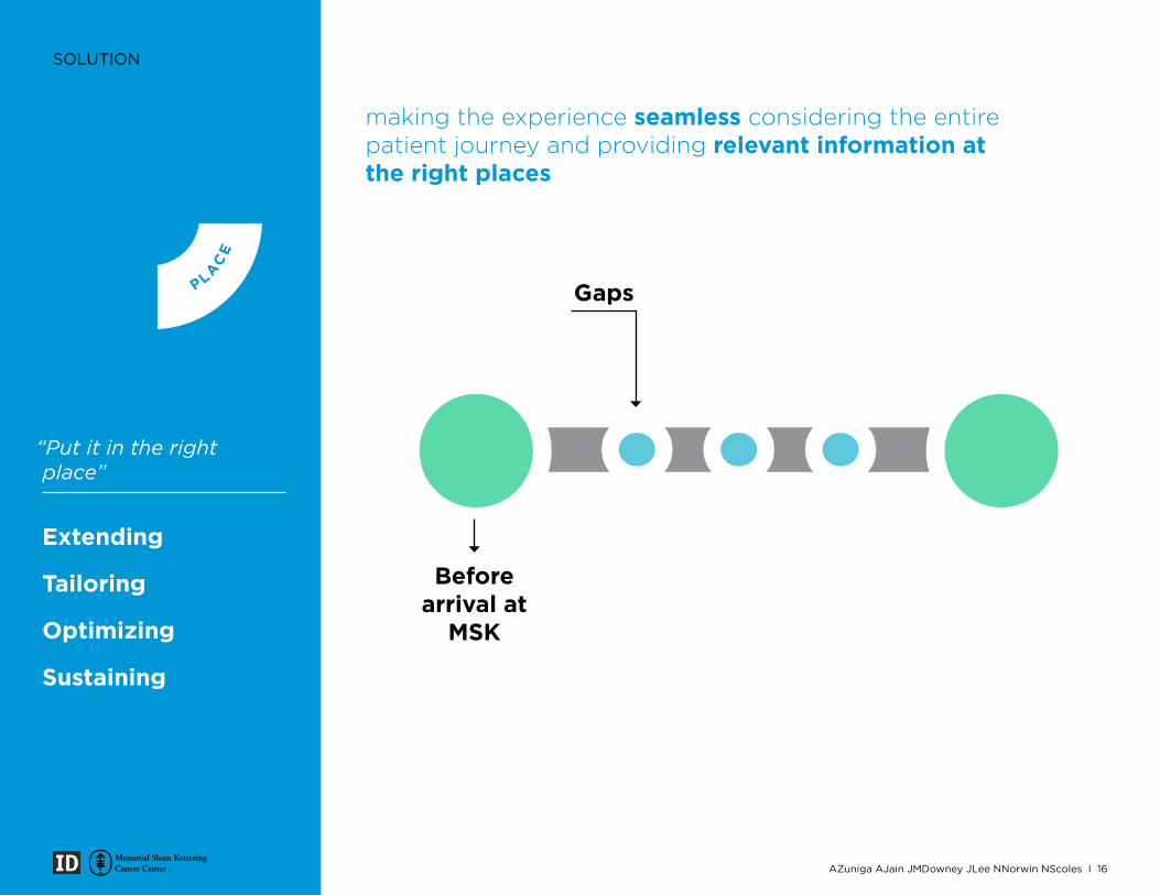
Extending
Tailoring
Optimizing
Sustaining
“Put it in the right place”
making the experience seamless considering the entire patient journey and providing relevant information at the right places
LA
NGUAGE
STATE
PLAC
E
CONTENT
Gaps
Beforearrival at
MSK
AZuniga AJain JMDowney JLee NNorwin NScoles I 16
AZuniga AJain JMDowney JLee NNorwin NScoles I 17
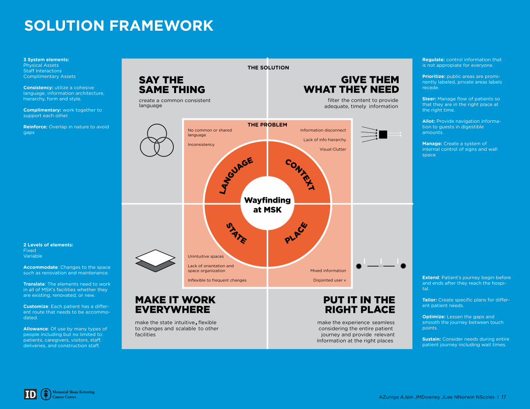
SOLUTION FRAMEWORK
Regulate: control information that is not appropiate for everyone.
Prioritize: public areas are promi-nently labeled, private areas labels recede.
Steer: Manage flow of patients so that they are in the right place at the right time.
Allot: Provide navigation informa-tion to guests in digestible amounts.
Manage: Create a system of internal control of signs and wall space
Extend: Patient’s journey begin before and ends after they reach the hospi-tal.
Tailor: -ent patient needs.
Optimize: Lessen the gaps and smooth the journey between touch points.
Sustain: Consider needs during entire patient journey including wait times.
3 System elements:Physical Assets
Complimentary Assets
Consistency: utilize a cohesive language, information architecture, hierarchy, form and style.
Complimentary: work together to support each other.
Reinforce: Overlap in nature to avoid gaps
2 Levels of elements:FixedVariable
Accommodate: Changes to the space such as renovation and maintenance.
Translate: The elements need to work in all of MSK’s facilities whether they are existing, renovated, or new.
Customize -ent route that needs to be accommo-dated.
Allowance: Of use by many types of people including but no limited to:
CONTEXTLA
NG
UAGE
STATE PLACE
SAY THE SAME THINGcreate a common consistent language
MAKE IT WORK EVERYWHERE
make the state intuitive , flexible to changes and scalable to other facilities
PUT IT IN THE RIGHT PLACE
make the experience seamless
considering the entire patient journey and provide relevant
Information at the right places
GIVE THEM WHAT THEY NEED
filter the content to provide adequate, timely information
Wayfinding at MSK
No common or shared language
Inconsistency
Unintuitive spaces
Lack of orientation and space organization
Inflexible to frequent changes
Information disconnect
Lack of info hierarchy
Visual Clutter
Mixed information
Disjointed user v
THE PROBLEM
THE SOLUTION
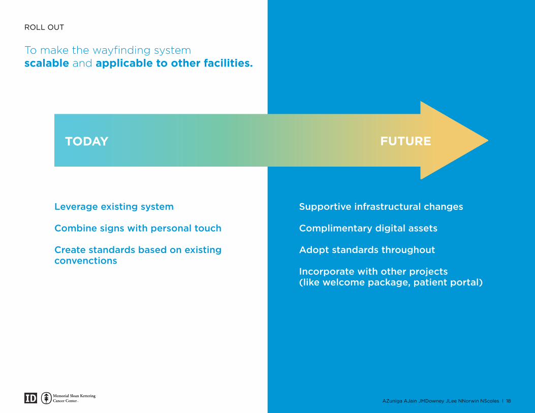
ROLL OUT
To make the wayfinding system scalable and applicable to other facilities.
steps stretch leapcrawl walk run fly
Leverage existing system
Combine signs with personal touch
Create standards based on existing convenctions
Supportive infrastructural changes
Complimentary digital assets
Adopt standards throughout
Incorporate with other projects(like welcome package, patient portal)
TODAY FUTURE
AZuniga AJain JMDowney JLee NNorwin NScoles I 18
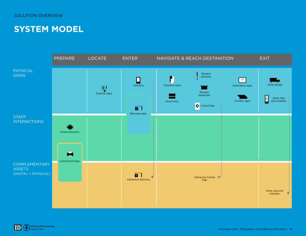
SOLUTION OVERVIEW
PHYSICAL SIGNS
PREPARE LOCATE EXITENTER NAVIGATE & REACH DESTINATION
STAFF INTERACTIONS
COMPLEMENTARYASSETS(DIGITAL + PHYSICAL)
Elevator landmarks
Elevator directory
Jitney designDestination signs
Corridor signs
Transition signs
Route lines
External Signs
Central Map
Jitney stop and schedule
Directory
Verbal directions
Interactive directory
Jitney stop and schedule
Interactive Central Map
Customized maps
Welcome desk
S- 013Stairs
BLACK
GREY
WHITE
AZuniga AJain JMDowney JLee NNorwin NScoles I 19
SYSTEM MODEL
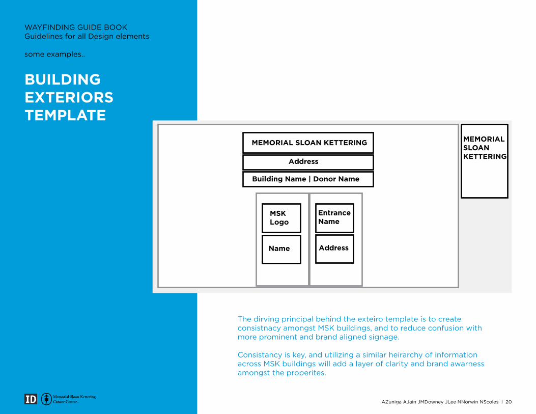
The dirving principal behind the exteiro template is to create consistnacy amongst MSK buildings, and to reduce confusion with more prominent and brand aligned signage.
Consistancy is key, and utilizing a similar heirarchy of information across MSK buildings will add a layer of clarity and brand awarness amongst the properites.
Address
MEMORIAL SLOAN KETTERING
Building Name | Donor Name
MSKLogo
Entrance Name
AddressName
MEMORIAL SLOAN KETTERING
BUILDING EXTERIORS TEMPLATE
WAYFINDING GUIDE BOOKGuidelines for all Design elements
some examples..
AZuniga AJain JMDowney JLee NNorwin NScoles I 20
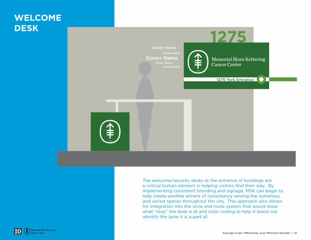
1275 York Entrance
The welcome/security desks at the entrance of buildings are a critical human element in helping visitors find their way. By implementing consistent branding and signage, MSK can begin to help create another elment of consistancy among the numerous and varied spaces throughout the city. This approach also allows for integration into the zone and route system that would show what “stop” the desk is at and color coding to help it stand out identify the zone it is a part of.
WELCOME DESK
AZuniga AJain JMDowney JLee NNorwin NScoles I 21
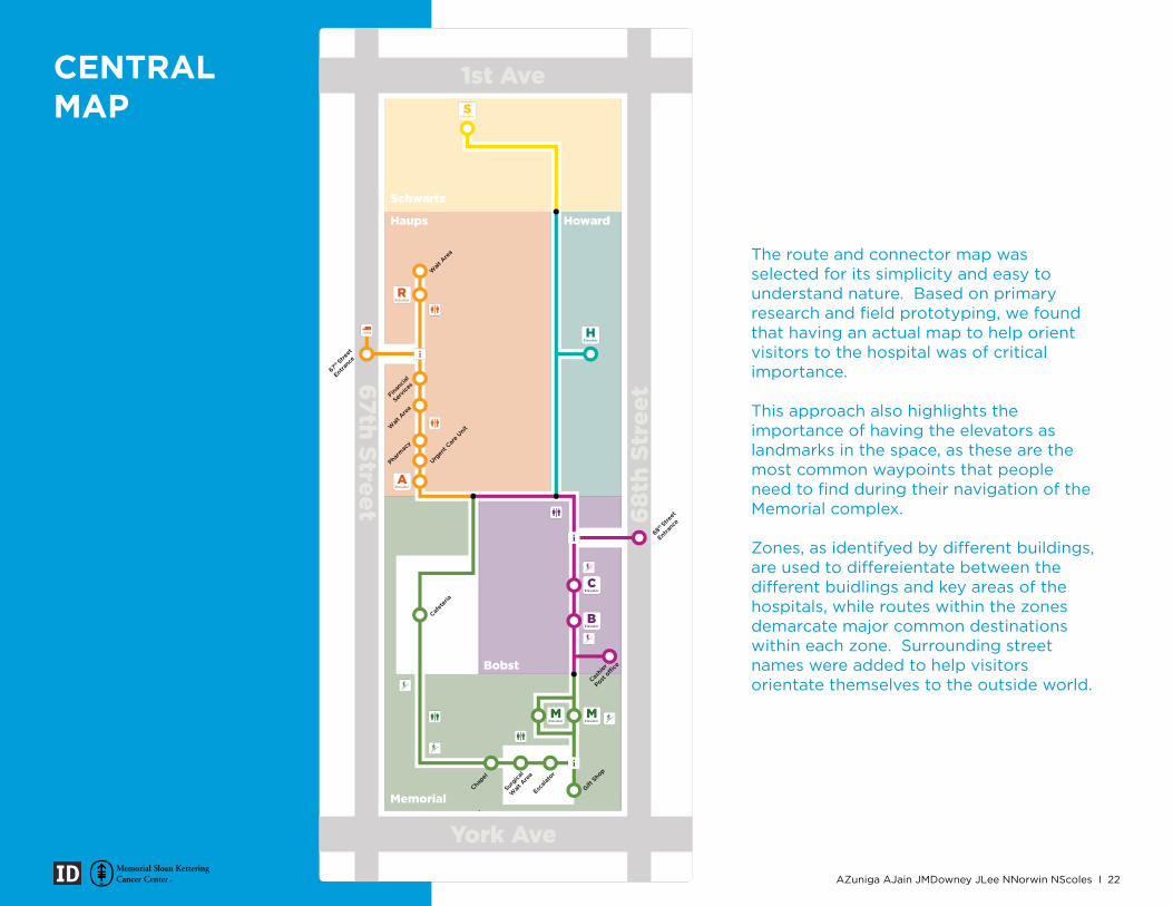
The route and connector map was selected for its simplicity and easy to understand nature. Based on primary research and field prototyping, we found that having an actual map to help orient visitors to the hospital was of critical importance.
This approach also highlights the importance of having the elevators as landmarks in the space, as these are the most common waypoints that people need to find during their navigation of the Memorial complex.
Zones, as identifyed by different buildings, are used to differeientate between the different buidlings and key areas of the hospitals, while routes within the zones demarcate major common destinations within each zone. Surrounding street names were added to help visitors orientate themselves to the outside world.
67th Street
Schwartz
Haups
Memorial
Bobst
Howard
Surgica
l
Wait
Are
a
Chapel
Escala
tor
Gift S
hop
Cafet
eria
68th Stre
et
Entra
nce
67th Stre
et
Entra
nce
Financ
ial
Servic
es
Wait
Are
a
Pharm
acy
Urgen
t Car
e Unit
Wait
Are
a
Cashie
r
Post o
ffice
CENTRAL MAP
AZuniga AJain JMDowney JLee NNorwin NScoles I 22
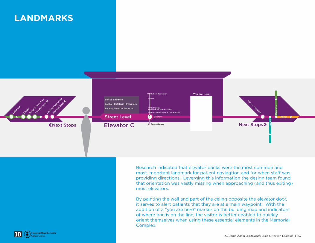
Research indicated that elevator banks were the most common and most important landmark for patient naviagtion and for when staff was providing directions. Leverging this information the design team found that orientation was vastly missing when approaching (and thus exiting) most elevators.
By painting the wall and part of the celing opposite the elevator door, it serves to alert patients that they are at a main waypoint. With the addition of a “you are here” marker on the building map and indicators of where one is on the line, the visitor is better enabled to quickly orient themselves when using these essential elements in the Memorial Complex.
Patient Financial Services
Lobby | Cafeteria | Pharmacy
68th St. Entrance
Parking Garage
PathologyPhysician Practice Suites
Radiology | Surgical Day Hospital
MRI
Patient Recreation You are Here
Next Stops Next StopsElevator C
LANDMARKS
AZuniga AJain JMDowney JLee NNorwin NScoles I 23
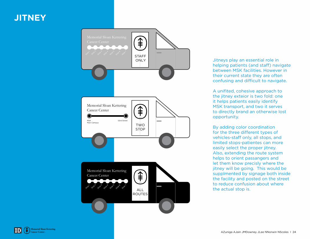
Jitneys play an essential role in helping patients (and staff) navigate between MSK facilities. However in their current state they are often confusing and difficult to navigate.
A unifited, cohesive approach to the jitney exteior is two fold: one it helps patients easily identify MSK transport, and two it serves to directly brand an otherwise lost opportunity.
By adding color coordination for the three different types of vehicles-staff only, all stops, and limited stops-patientes can more easily select the proper jitney. Also, extending the route system helps to orient passangers and let them know precisly where the jitney will be going. This would be supplmented by signage both inside the facility and posted on the street to reduce confusion about where the actual stop is.
MSK Main Campus
53rd Street
ALL ROUTES
STAFFONLY
TWO STOP
JITNEY
AZuniga AJain JMDowney JLee NNorwin NScoles I 24
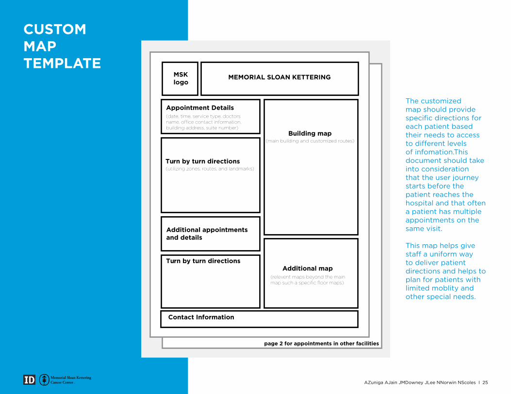
MSK logo
MEMORIAL SLOAN KETTERING
Appointment Details
Turn by turn directions
Building map
Contact Information
(date, time, service type, doctors name, office contact information,building address, suite number)
(utilizing zones, routes, and landmarks)
Additional appointments and details
Turn by turn directions
page 2 for appointments in other facilities
Additional map
(main building and customized routes)
(relevent maps beyond the mainmap such a specific floor maps)
The customized map should provide specific directions for each patient based their needs to access to different levels of infomation.This document should take into consideration that the user journey starts before the patient reaches the hospital and that often a patient has multiple appointments on the same visit.
This map helps give staff a uniform way to deliver patient directions and helps to plan for patients with limited moblity and other special needs.
CUSTOM MAP TEMPLATE
AZuniga AJain JMDowney JLee NNorwin NScoles I 25
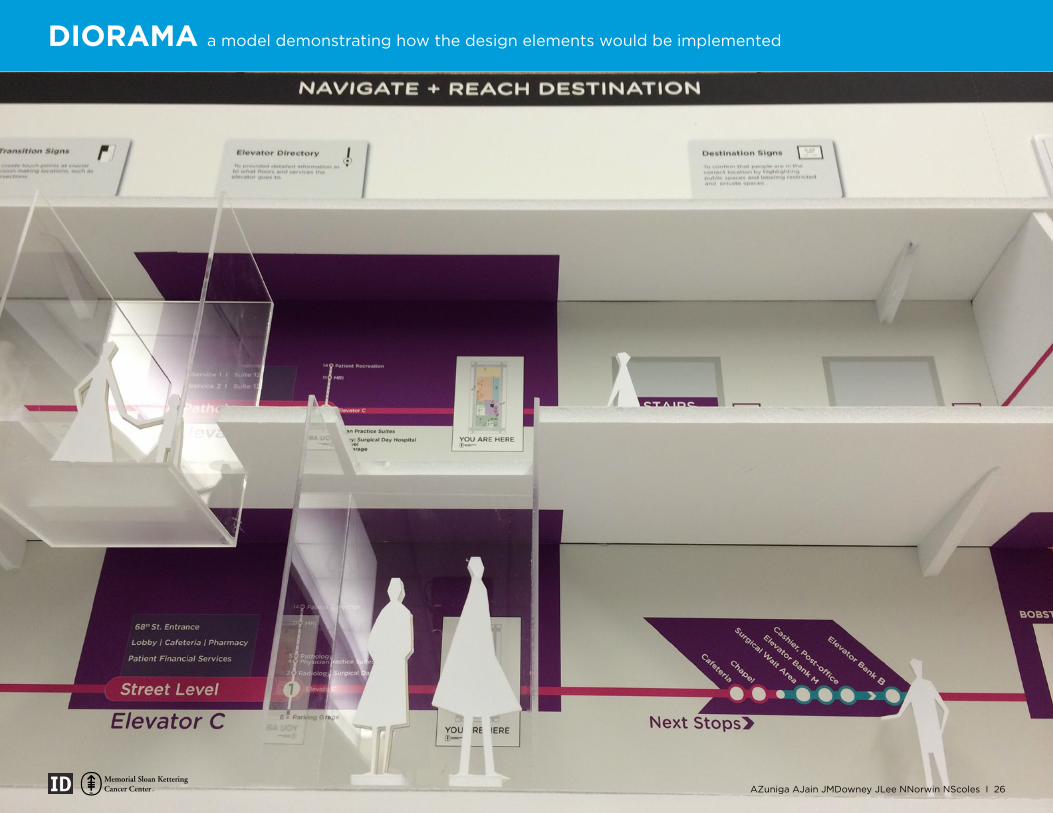
DIORAMA a model demonstrating how the design elements would be implemented
AZuniga AJain JMDowney JLee NNorwin NScoles I 26
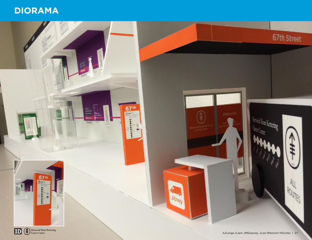
DIORAMA
AZuniga AJain JMDowney JLee NNorwin NScoles I 27
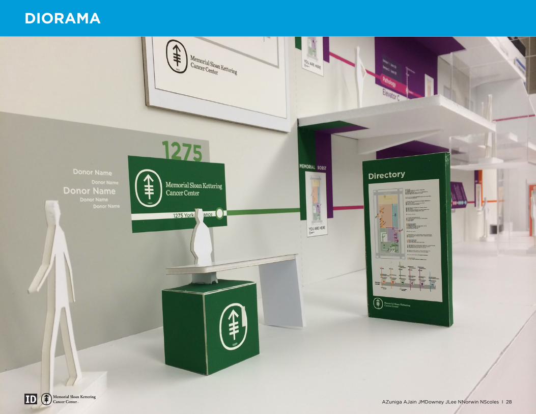
DIORAMA
AZuniga AJain JMDowney JLee NNorwin NScoles I 28
OUR TEAM!
AZuniga AJain JMDowney JLee NNorwin NScoles I 29
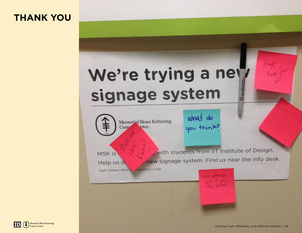
THANK YOU
AZuniga AJain JMDowney JLee NNorwin NScoles I 30
Top Related