


Languages
Pages
Legal


THE EMPLOYMENT/PRODUCTIVITY PUZZLE:SUPPLY(ING) THE ANSWER.
BILL WELLS
DEPUTY DIRECTOR: LABOUR MARKET ANALYSIS:
DEPARTMENT FOR BUSINESS, INNOVATION AND SKILLS.

STRUCTURE OF THE PRESENTATION
1. STRUCTURAL FEATURES OF THE UK LABOUR MARKET.
2. LABOUR SUPPLY.
3. LABOUR DEMAND.
4. EFFECTIVENESS OF JOBSEARCH.
5. FUTURE PROSPECTS.
6. WAGES, TAKE HOME PAY & LABOUR COSTS.
7. CONCLUSIONS

1. STRUCTURAL FEATURES OF UK LABOUR MARKET
• The UK product and labour markets are amongst the most open and competitive in the world…
• …however, the price of labour is ‘sticky’ – the real wage - does not seem to be affected much, if at all, by market forces…
• …and it is quantity rather than price adjustment that enables the UK labour market to clear, and employment to grow…
• …with supply rather than demand for labour apparently the main determinant of employment…
• …but since 1992 there are very different results for those aged 25 and over – fairly continuous employment growth - compared to young people - structural employment decline.

UK product & labour markets are characterised by
near-’Perfect Competition’…UK product & labour markets are amongst the most open and competitive in the world with ‘light and even’ regulatory regimes…
– 1st in the OECD Product Market Regulation Index; and
– 3rd in the OECD Employment Protection Regulation Index.
…and they are becoming increasingly individualistic and decentralised.
Product Market
- 2.1 Million Vat Businesses: Up nearly ¼ since 1984
- 4.2 Million Self Employed Jobs: More than doubled since 1979
Labour Market- 23.3 Million Non-Union Workers: Almost doubled since 1979
(95%)
& up from < ½ to > ¾ of all LFS employment (47% to 79%)
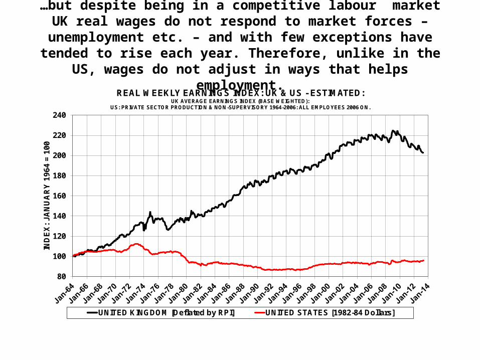
…but despite being in a competitive labour market UK real wages do not respond to market forces – unemployment etc. – and with few exceptions have tended to rise each year. Therefore, unlike in
the US, wages do not adjust in ways that helps employment.
80
100
120
140
160
180
200
220
240
IND
EX
: JA
NU
AR
Y 1
964
= 1
00
REAL WEEKLY EARNINGS INDEX: UK & US - ESTIMATED: UK AVERAGE EARNINGS INDEX (BASE WEIGHTED):
US: PRIVATE SECTOR PRODUCTION & NON-SUPERVISORY 1964-2006: ALL EMPLOYEES 2006 ON.
UNITED KINGDOM [Deflated by RPI] UNITED STATES [1982-84 Dollars]

The quantity rather than the price of labour does adjust. The ‘light and even’ employment regulation regime enables workers to move
in and out of work easily. Consequently, there are always vacancies coming up as part of the high natural turnover in the
UK…
HIRING & SEPARATION RATES: OECD ESTIMATES:Annual Average: 2000-2007
0
5
10
15
20
25
30
GreHun It
Svk SlvCze Bel
Ger NorAus
PorSwi
FraSwe
PolHol
Ire UK Fin USCan Sp
Den Ice
Per
Cen
t
Hiring Rate Separation Rate

…and because there are few legislative restrictions on types of work the UK has a greater range in work patterns . This diversity
means that workers have more opportunities to find a job that suits then and their personal circumstances…
UK
0.0%
10.0%
20.0%
30.0%
40.0%
50.0%
Usual Hours Worked
Germany
0.0%
10.0%
20.0%
30.0%
40.0%
50.0%
Usual Hours Worked
France
0.0%
10.0%
20.0%
30.0%
40.0%
50.0%
Usual Hours Worked
Italy
0.0%
10.0%
20.0%
30.0%
40.0%
50.0%
Usual Hours Worked

…and as a result of these structural features it seems that labour supply rather than the demand for labour is
the primary determinant of employment…
80
100
120
140
160
180
200
220
240
260
280
1971Q1
1974Q1
1977Q1
1980Q1
1983Q1
1986Q1
1989Q1
1992Q1
1995Q1
1998Q1
2001Q1
2004Q1
2007Q1
2010Q1
2013Q1
IND
EX
: Q
1 19
71 =
100
DEMAND, LABOUR SUPPLY & EMPLOYMENT:[INDEX: QUARTER 1 1971 = 100]
Demand [Real GDP] Labour Supply [Economically Active] Employment

With over 90% of the rise in employment ‘explained’ by the rise in labour supply – the economically active – over the
whole period from 1971 to early 2013.
22
23
24
25
26
27
28
29
30
25 26 27 28 29 30 31 32 33
EM
PL
OY
ME
NT
LABOUR SUPPLY [NUMBER ECONOMICALLY ACTIVE]
LABOUR SUPPLY & LFS EMPLOYMENT: MILLIONS:[Trend Line: Employment = 0.2 + 0.92 Labour Supply : R Sq. = 0.86]
Jan-Mar1971
Feb-Apr2013
Trend Line [Linear]

Conversely, here is relatively little sign of a relationship between demand and employment with little more than 10% of employment growth ‘explained’ by the demand for labour
– the growth in real (adjusted for inflation) GDP .
80
100
120
140
160
180
200
220
240
260
280
80 100 120 140 160 180 200 220 240 260 280
EM
PL
OY
ME
NT
LABOUR DEMAND [REAL GDP]
DEMAND & LFS EMPLOYMENT: INDEX: Q1 1971 =100:[Trend Line: Employment = 85 + 0.12 GDP: R Sq. = 0.92]
Q1 1971
Q1 2013Trend Line [Linear]

The structural and institutional features of the UK labour market also seem to deliver very different employment results for those
aged 25 & over – with fairly continuous employment since the early 1990s. Employment for those aged under 25 has fallen.
20
21
22
23
24
25
26
27
0
1
2
3
4
5
6
7
Mill
ion
s
Mill
ion
s
Date: Centre Month of the LFS 3 Month Average
UK EMPLOYMENT: LFS SEASONALLY ADJUSTED
Under 25 [LHS] 25 & Over [RHS]

2. LABOUR SUPPLY• A combination of rapid population growth and rising activity rates
has led to a rapid increase in the numbers in the labour force – the economically active – around 400 thousand p.a. …
• …but this growth is restricted to adults. Young people are now taking longer to move from education to work – having fallen through the cracks between the education and the benefit system.
• The growth in adult activity rates is due, at least in part, to welfare to work policies for people on ‘inactive’ benefits; the equalisation of the state pension age; and removal of barriers to participation for older workers…
• …and this has led to increases in employment rates for lone parents, the disabled and older people – despite the recession.
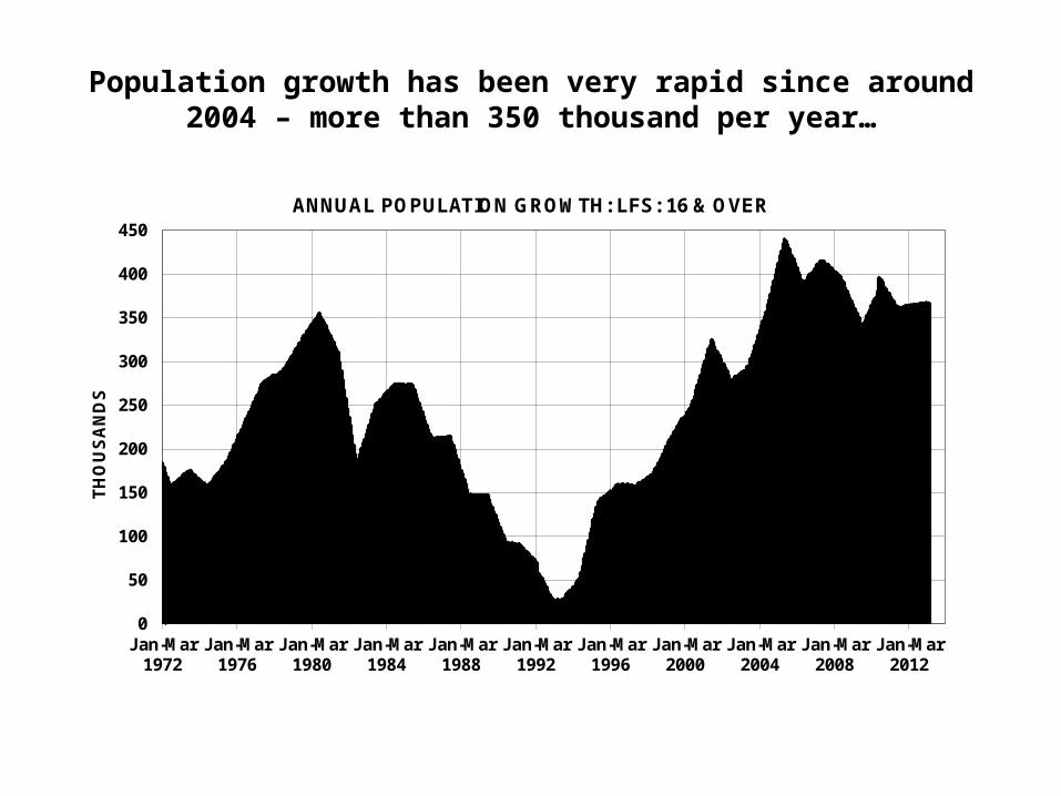
Population growth has been very rapid since around 2004 – more than 350 thousand per year…
0
50
100
150
200
250
300
350
400
450
Jan-Mar1972
Jan-Mar1976
Jan-Mar1980
Jan-Mar1984
Jan-Mar1988
Jan-Mar1992
Jan-Mar1996
Jan-Mar2000
Jan-Mar2004
Jan-Mar2008
Jan-Mar2012
TH
OU
SA
ND
S
ANNUAL POPULATION GROWTH: LFS: 16 & OVER
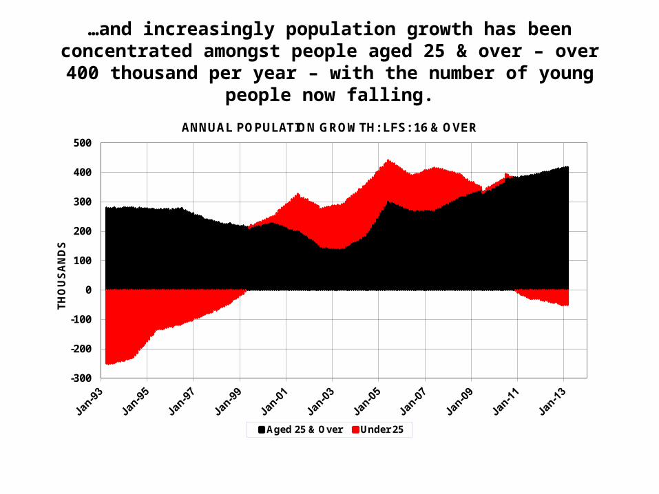
…and increasingly population growth has been concentrated amongst people aged 25 & over – over 400 thousand per year –
with the number of young people now falling.
-300
-200
-100
0
100
200
300
400
500
TH
OU
SA
ND
S
ANNUAL POPULATION GROWTH: LFS: 16 & OVER
Aged 25 & Over Under 25

After a period when the proportion of young people in full-time education grew only slowly it jumped during the recession –
presumably as a recession response – and has remained at the higher level. This left fewer young people available to take up work.
20
25
30
35
40
45
Per
Cen
t
SHARE OF POPULATION AGED 16-24 IN FULL TIME EDUCATION: LFS

Also, young people are now taking longer to move from education to work – having fallen through the cracks between the education and
the benefit system. By contrast, the number of workless young people already in the labour market – they have had a job – are close to pre-
recessionary levels and historic lows.
0
200
400
600
800
1,000
Th
ou
san
ds
LFS WORKLESSNESS: BY WHETHER THEY HAVE HAD A PAID JOB OR NOT:16-24 YEARS EXCLUDING THOSE IN FULL-TIME EDUCATION: FOUR QUARTER AVERAGE
HAD A JOB (Inc. Missing Values) HAD A JOB (Exc. Missing Values)
NEVER HAD A JOB (Inc. Missing Values) NEVER HAD A JOB (Exc. Missing Values)

The activity rate of people aged 25 & over has grown strongly since the late 1990s – even during the recession - which is unusual.
60.5
61.0
61.5
62.0
62.5
63.0
63.5
64.0
Per
Cen
t
ECONOMIC ACTIVITY RATE: AGE 25 YEARS & OVER: LFS

For adults, with rapid population growth and rising activity rates the number in the labour force has been growing very rapidly recently. By contrast, there have generally been fewer young
people in or looking for work.
-400
-300
-200
-100
0
100
200
300
400
500
TH
OU
SA
ND
S
LABOUR SUPPLY:ANNUAL CHANGE IN THE NUMBERS ECONOMICALLY ACTIVE: LFS
Aged 25 & Over Aged Under 25
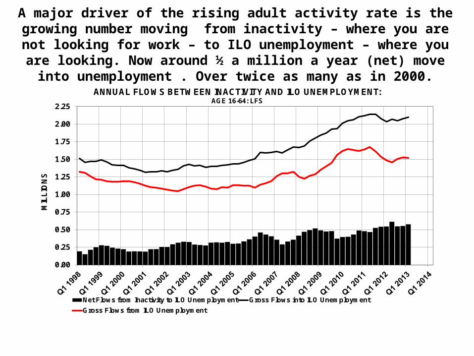
A major driver of the rising adult activity rate is the growing number moving from inactivity – where you are not looking for work – to ILO
unemployment – where you are looking. Now around ½ a million a year (net) move into unemployment . Over twice as many as in 2000.
0.00
0.25
0.50
0.75
1.00
1.25
1.50
1.75
2.00
2.25
MIL
LIO
NS
ANNUAL FLOWS BETWEEN INACTIVITY AND ILO UNEMPLOYMENT: AGE 16-64: LFS
Net Flows from Inactivity to ILO Unemployment Gross Flows into ILO Unemployment
Gross Flows from ILO Unemployment
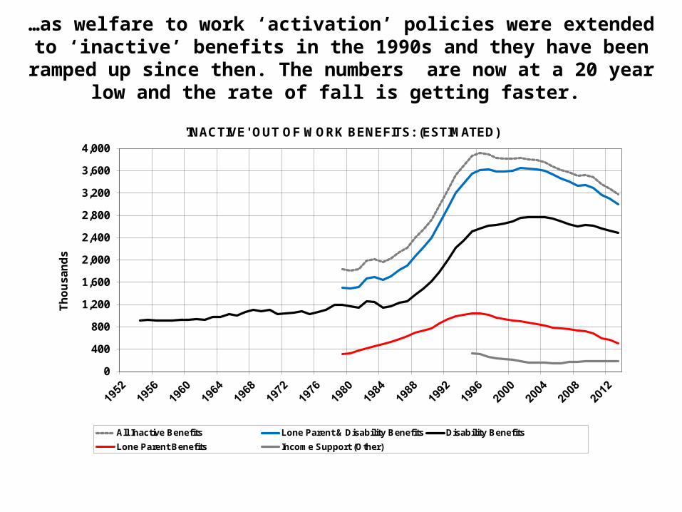
…as welfare to work ‘activation’ policies were extended to ‘inactive’ benefits in the 1990s and they have been ramped up since then. The
numbers are now at a 20 year low and the rate of fall is getting faster.
0
400
800
1,200
1,600
2,000
2,400
2,800
3,200
3,600
4,000
Th
ou
san
ds
'INACTIVE' OUT OF WORK BENEFITS: (ESTIMATED)
All Inactive Benefits Lone Parent & Disability Benefits Disability Benefits
Lone Parent Benefits Income Support (Other)

…and the number retiring before 65 is now falling despite more older people. The process of equalising pension age at 65 starting from
2010 has kept more women in the labour market…
750
800
850
900
950
1,000
1,050
1,100
1,150
200
250
300
350
400
450
500
550
600
Th
ou
san
ds
Th
ou
san
ds
INACTIVE DUE TO 'EARLY RETIREMENT - BEFORE AGE 65: LFS
Male [LHS] Female [RHS]
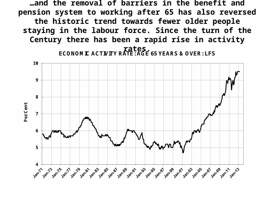
…and the removal of barriers in the benefit and pension system to working after 65 has also reversed the historic trend towards
fewer older people staying in the labour force. Since the turn of the Century there has been a rapid rise in activity rates.
4
5
6
7
8
9
10
Pe
r C
en
t
ECONOMIC ACTIVITY RATE: AGE 65 YEARS & OVER: LFS
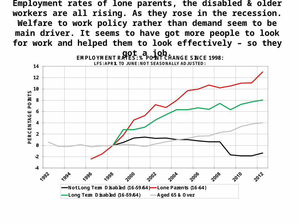
Employment rates of lone parents, the disabled & older workers are all rising. As they rose in the recession. Welfare to work policy rather
than demand seem to be main driver. It seems to have got more people to look for work and helped them to look effectively – so they got a job.
-4
-2
0
2
4
6
8
10
12
14
PE
RC
EN
TAG
E P
OIN
TS
EMPLOYMENT RATES: % POINT CHANGE SINCE 1998:LFS: APRIL TO JUNE: NOT SEASONALLY ADJUSTED:
Not Long Term Disabled (16-59/64) Lone Parents (16-64)
Long Term Disabled (16-59/64) Aged 65 & Over

3. LABOUR DEMAND
• A combination of a decline in labour demand in the recession and ‘sticky’ real wages led to a surge in redundancies in 2008 as it had in the previous recession in the early 1990s…
• …but more job losses and separations seem to be moving into unemployment rather than inactivity and so are remaining in the labour market (but boosting unemployment).
• There are indications in the labour market statistics that the private sector recession lasted until early 2010. Then in 2011 public sector cuts in 2011 may have stalled the economy…
• …but from early 2012 it seems that labour demand picked up again – perhaps also indicating a pick-up in underlying GDP.

As demand falls it can damage employment without a change in wages…
Wages
E2 E1
W
Employment
1
Labour demand curve paid shifts inwards due to fall in demand
2
Area 1 and 2 represent loss to workers due to lower employment
3
Area 3 represents loss to businesses due to lower employment
- PROTECT -
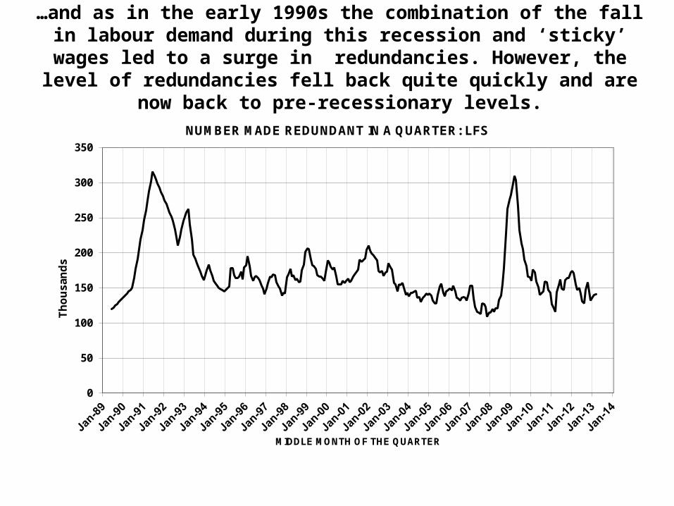
…and as in the early 1990s the combination of the fall in labour demand during this recession and ‘sticky’ wages led to a surge in redundancies. However, the level of redundancies fell back quite
quickly and are now back to pre-recessionary levels.
0
50
100
150
200
250
300
350
Th
ou
san
ds
MIDDLE MONTH OF THE QUARTER
NUMBER MADE REDUNDANT IN A QUARTER: LFS

But, despite the fact that total separations – including redundancies - are now at pre-recessionary levels – the flows into ILO unemployment are still above that level – perhaps because of the Government’s aim
to raise participation rates rather than promote labour market exits…
1.2
1.6
2.0
2.4
2.8
3.2
3.6
4.0
4.4
MIL
LIO
NS
JOB SEPARATIONS: ANNUAL FLOWS OUT OF EMPLOYMENT: AGE 16-64: LFS
To ILO Unemployment To Economic Inactivity All Outflows

…and inflows to the claimant count – usually a good indicator of labour demand - are improving but still high. This is partly because fewer people are now allowed on ‘inactive’ benefits and join JSA.
Also, more – both lone parent and IB/ESA – have been moved on to JSA.
180
220
260
300
340
380
420
TH
OU
SA
ND
S
UK CLAIMANT COUNT INFLOWS:[Estimated before November 1988.]

Other indicators suggest that the demand for labour picked up from early 2012. The numbers remaining in work is consistent with a private sector
recession between 2008 and early 2010 followed by a stalling in 2011 due to public sector cutbacks and then growth resuming from early 2012…
24
25
26
27
28
Mill
ion
s
REMAINED IN EMPLOYMENT FROM PREVIOUS QUARTER:LFS FLOWS: AGED 16-64: N.S.A.
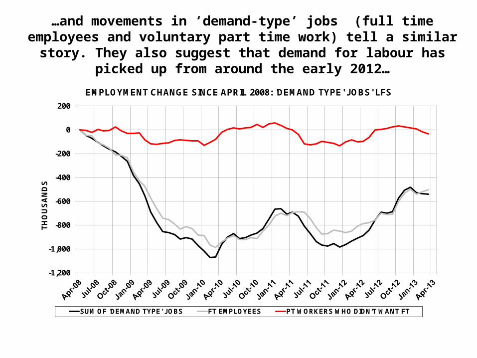
…and movements in ‘demand-type’ jobs (full time employees and voluntary part time work) tell a similar story. They also suggest that
demand for labour has picked up from around the early 2012…
-1,200
-1,000
-800
-600
-400
-200
0
200
TH
OU
SA
ND
S
EMPLOYMENT CHANGE SINCE APRIL 2008: 'DEMAND TYPE' JOBS' LFS
SUM OF 'DEMAND TYPE' JOBS FT EMPLOYEES PT WORKERS WHO DIDN'T WANT FT

Finally, hours have grown faster than employment since mid-2009 and particularly since mid-2011. Now, both hours and employment
have passed pre-recessionary peaks and, over the period since April 2008 have grown at exactly the same rate.
95
96
97
98
99
100
101
95
96
97
98
99
100
101
IND
EX
: A
PR
IL 2
008
= 1
00
IND
EX
: A
PR
IL 2
008
= 1
00
EMPLOYMENT (INC. 2ND JOBS) AND HOURS (ACTUALLY WORKED): LFSCHANGES SINCE THE START OF THE RECESSION IN APRIL 2008
TOTAL EMPLOYMENT: LFS TOTAL HOURS: LFS

4. EFFECTIVENESS OF JOB SEARCH
• There is evidence that vacancies are being filled more quickly; some people are willing to take up ‘second choice’ jobs rather than remain unemployed; and some even seem to have constructed their own jobs…
• …so hiring has risen during and since the recession and this is the major reason for the UK’s good employment performance.
• The welfare to work policies associated with the JSA regime have played a large part in this and people are moving off JSA more quickly than in the 1980s and 1990s recession…
• …however, the recession has left a legacy of young people – in and out of education – and long term unemployment that may require extra attention.
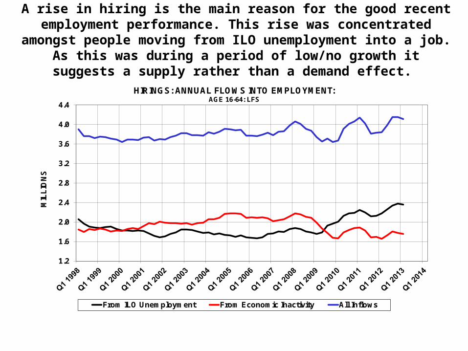
A rise in hiring is the main reason for the good recent employment performance. This rise was concentrated amongst people moving from ILO unemployment into a job. As this was during a period of low/no growth it suggests a supply rather than a demand effect.
1.2
1.6
2.0
2.4
2.8
3.2
3.6
4.0
4.4
MIL
LIO
NS
HIRINGS: ANNUAL FLOWS INTO EMPLOYMENT: AGE 16-64: LFS
From ILO Unemployment From Economic Inactivity All Inflows
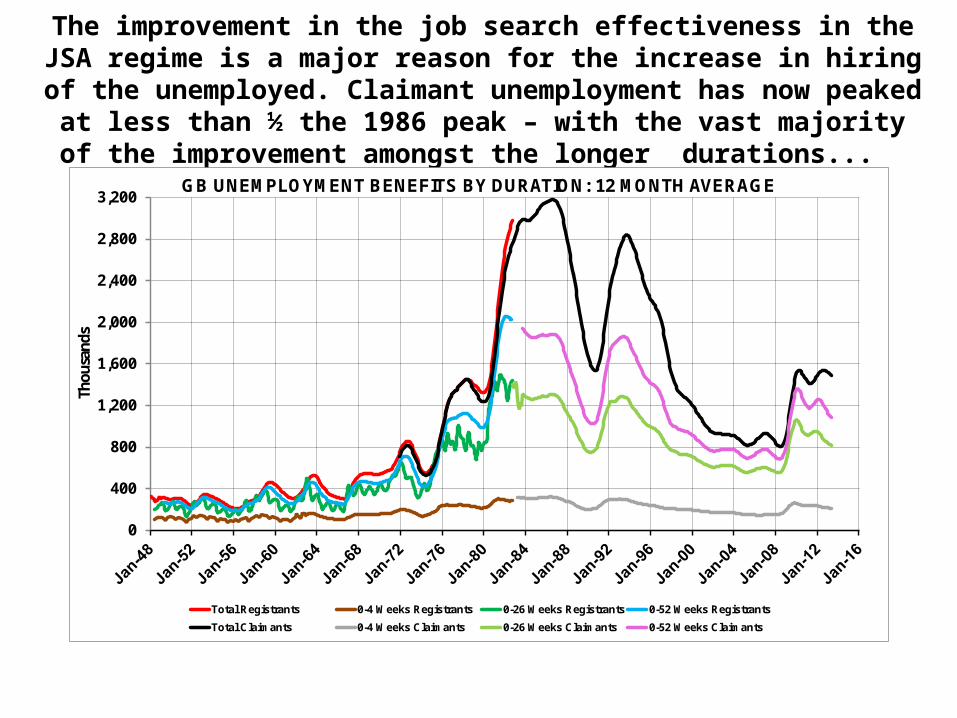
The improvement in the job search effectiveness in the JSA regime is a major reason for the increase in hiring of the unemployed.
Claimant unemployment has now peaked at less than ½ the 1986 peak – with the vast majority of the improvement amongst the longer
durations...
0
400
800
1,200
1,600
2,000
2,400
2,800
3,200
Thou
sand
s
GB UNEMPLOYMENT BENEFITS BY DURATION: 12 MONTH AVERAGE
Total Registrants 0-4 Weeks Registrants 0-26 Weeks Registrants 0-52 Weeks Registrants
Total Claimants 0-4 Weeks Claimants 0-26 Weeks Claimants 0-52 Weeks Claimants

…with people moving off benefits and into jobs more quickly – bringing the average duration of those who remain down. And
although the JSA outflow rate is worse than the pre-1966 regime it is much better than in both the 1980s and 1990s recession.
0
2
4
6
8
10
12
MO
NT
HS
GB UNEMPLOYMENT BENEFITS: AVERAGE DURATION:12 MONTH AVERAGE:TOTAL DIVIDED BY DURATION UNDER 4 WEEKS
Total Registrants Total Claimants

Since 2008 survival (1 minus outflow) rates have worsened. However, they still remain high by historical standards and the deterioration is
largely in the longer durations. So, although long term unemployment is a problem a large majority of people move off benefits very quickly…
35
40
45
50
55
60
65
70
75
80
Per
Cen
t
Rates held constant from May 2013
CLAIMANT COUNT SURVIVAL RATES: TOTAL AGED 18 & OVERProportion in One Duration Remaining in a Later Duration
Inflows to 0- 3 Months Duration 0-3 to 3-6 Months 3-6 to 6-12 Months
6-12 to 12-18 Months 12-18 to 18-24 Months 18 & Over to 24 Months & Over

…and this is even more true of young people. The leave JSA even more quickly than the average. The problem groups of young
people are not JSA claimants but mostly the people making the transition from education to work.
0
10
20
30
40
50
60
70
80
Per
Cen
t
Rates held constant from May 2013
CLAIMANT COUNT SURVIVAL RATES: TOTAL AGED 18 to 24Proportion in One Duration Remaining in a Later Duration
Inflows to 0- 3 Months Duration 0-3 to 3-6 Months 3-6 to 6-12 Months
6-12 to 12-18 Months 12-18 to 18-24 Months 18 & Over to 24 Months & Over
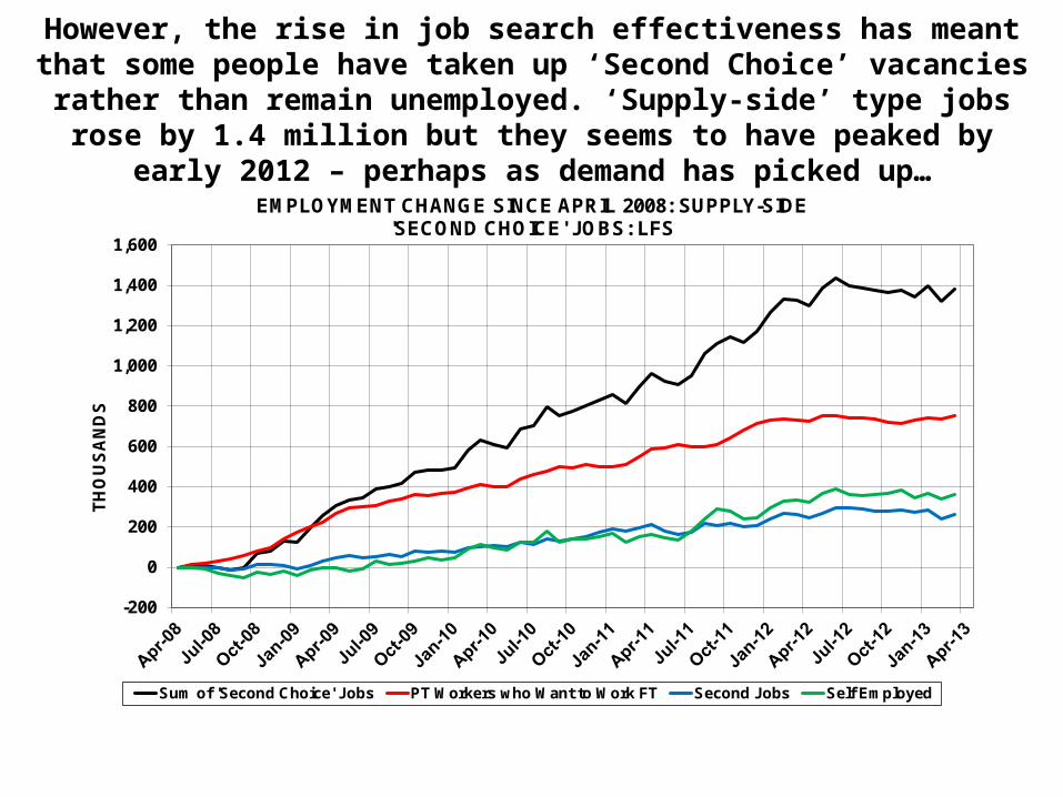
However, the rise in job search effectiveness has meant that some people have taken up ‘Second Choice’ vacancies rather than remain
unemployed. ‘Supply-side’ type jobs rose by 1.4 million but they seems to have peaked by early 2012 – perhaps as demand has picked up…
-200
0
200
400
600
800
1,000
1,200
1,400
1,600
TH
OU
SA
ND
S
EMPLOYMENT CHANGE SINCE APRIL 2008: SUPPLY-SIDE 'SECOND CHOICE' JOBS: LFS
Sum of 'Second Choice' Jobs PT Workers who Want to Work FT Second Jobs Self Employed

…and although the rise in ILO unemployment has not been as substantial as feared it has left a legacy of young people – in and out of
education – and the long term unemployed. It may be difficult to convince them that the vacancies that are out there are for them.
ILO UNEMPLOYMENT INCREASE SINCE START OF RECESSION: APRIL 2008 BY AGE, DURATION AND WHETHER IN FULL-TIME EDUCATION OR NOT.
0
50
100
150
200
250
300
Aged U
nder 2
5
U25 In
FT E
duc
U25 N
ot In F
T Educ
Aged 2
5-34
Aged 3
5-49
Aged 5
0 & O
ver
Under 6
Month
s
6-12
Month
s
1-2
Years
2 Yea
rs &
Ove
r
TH
OU
SA
ND
S

5. FUTURE PROSPECTS
• Recently there has been rapid labour supply growth but this may now be coming to an end as the Post-War baby boom reaches retirement age…
• …and unless we can raise activity rates both substantially and quite quickly we may face labour shortages relatively soon.
• In order to raise activity rates we will need to address the structural problem associated with the transition from education to work. For all qualifications not just the unskilled…
• …and also to address thorny issues associated with inactivity – particularly amongst single adult households – and the long term unemployed.

Population growth has, until this year, been beneficial to labour supply and, therefore, employment growth. However, that is now
changing…
-100
-50
0
50
100
150
200
250
300
350
400
450
Jan-Mar1972
Jan-Mar1976
Jan-Mar1980
Jan-Mar1984
Jan-Mar1988
Jan-Mar1992
Jan-Mar1996
Jan-Mar2000
Jan-Mar2004
Jan-Mar2008
Jan-Mar2012
TH
OU
SA
ND
S
ANNUAL POPULATION GROWTH: LFS: 16 & OVER

…the peak of the 1942-48 baby boom reaches 65 in 2013 and the mini-peak in 1964 reaches 50 in 2014…
WORKING AGE POPULATION: ANNUAL CHANGE:[2007-2012: LFS ESTIMATES: 2011-2017:: ONS POPULATION PROJECTIONS]
-200
-100
0
100
200
300
400
2007 2008 2009 2010 2011 2012 2013 2014 2015 2016 2017
TH
OU
SA
ND
S
Aged 16-24 LFS Aged 25-49 LFS Aged 50-64 LFS Aged 65 & Over LFS
Aged 15-24 ONS Aged 25-49 ONS Aged 50-64 ONS Aged 65 & Over ONS
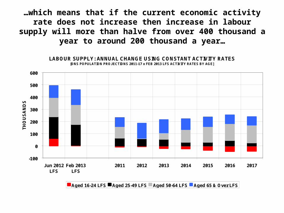
…which means that if the current economic activity rate does not increase then increase in labour supply will more than halve from
over 400 thousand a year to around 200 thousand a year…
LABOUR SUPPLY: ANNUAL CHANGE USING CONSTANT ACTIVITY RATES[ONS POPULATION PROJECTIONS 2011-17 x FEB 2013 LFS ACTIVITY RATES BY AGE]
-100
0
100
200
300
400
500
600
Jun 2012LFS
Feb 2013LFS
2011 2012 2013 2014 2015 2016 2017
TH
OU
SA
ND
S
Aged 16-24 LFS Aged 25-49 LFS Aged 50-64 LFS Aged 65 & Over LFS

We need, therefore, to increase both activity rates and the effectiveness of the job search regime. The most acute problem
remains the breakdown in the transition from school to work. And it is a problem that affects all qualifications not just those with no or low
skills.
0
50
100
150
200
250
NVQ Level 2 - 5 GCSEs A Levels
Th
ou
san
ds
WORKLESS UNDER 25s WHO HAVE NEVER HAD A JOB:BY HIGHEST QUALIFICATION
2003 2006 2009 2012

In fact, the trend increase was greater amongst the more rather than the less qualified. The system seems to be the
cause rather than the characteristics of the individual…
0
20
40
60
80
100
120
140
160
180
200
No Qualifications Less than NVQ Level 2
Th
ou
san
ds
WORKLESS UNDER 25s WHO HAVE NEVER HAD A JOB:BY HIGHEST QUALIFICATION
2003 2006 2009 2012
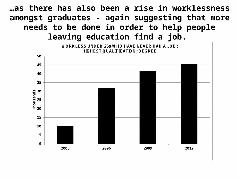
…as there has also been a rise in worklessness amongst graduates - again suggesting that more needs to be done in
order to help people leaving education find a job.
0
5
10
15
20
25
30
35
40
45
50
2003 2006 2009 2012
Th
ou
san
ds
WORKLESS UNDER 25s WHO HAVE NEVER HAD A JOB:HIGHEST QUALIFICATION: DEGREE

…but it may also be increasingly more difficult to attract more people into the labour market and help them into jobs. The vast majority of workless people are economically inactive – not looking for work…
NUMBER OF HOUSEHOLDS WITH WORKLESS PEOPLE: APR-JUN 2012
565366
2,745
973
395
4,602
0
1,000
2,000
3,000
4,000
5,000
6,000
7,000
8,000
Just Unemployed Unemployed & Inactive Just Inactive
WORKLESS IN HOUSEHOLD ARE:-
TH
OU
SA
ND
S
Workless H'holds Mixed H'holds (Employed & Workless)

…and the people in workless households are overwhelmingly single adults – with and without kids. These groups are difficult to help
because they tend not to have job-finding networks and the overhead costs of taking up a job – childcare etc. – are greater.
NUMBER OF PEOPLE AGED 16-64 IN WORKLESS HOUSEHOLDS:BY TYPE OF HOUSEHOLD: [APR-JUN 2012]
857634
1491
1358
348
291
430
500
1,000
1,500
2,000
2,500
3,000
Single Adult Couple Other H'hold Types
MIL
LIO
NS
With Kids Without Kids Lone Parents Without Dependent Kids

6: WAGES, TAKE HOME PAY AND LABOUR COSTS
• Real wages, take home pay and labour costs are amongst the highest in the world because nominal wage growth only seems to be affected by (labour) market forces in recessions. Between recessions wage growth seems to get stuck in a groove.
• Take home pay remained roughly constant between 2002 and 2008. Since real take home pay fell by around 3 ¼% - roughly half the fall in real wages - as interest rates and taxes were cut…
• …but if an inflation target of 2% had been hit take home pay would be at its highest ever level.
• Finally, it is important to choose the right wage and price statistic. Base weighted indices are preferable as they just reflect price and not quantity changes. This is particularly true since the quantity adjustment is likely to be a response to the price change.

Base weighted indices measure just the price effect whilst current weighted also includes quantity effects. This effect can be large – 3
percentage points on the AWE in the 5 years from 2008-2013. Therefore, where possible base weighted indices for wages are used.
100
110
120
130
140
150
160
IND
EX
: JA
NU
AR
Y 2
001
= 1
00
REGULAR AVERAGE WEEKLY EARNINGS: CURRENT & BASE WEIGHTED: [REGULAR = AWE TOTAL EARNINGS MINUS BONUSES: CURRENT WEIGHTED Seas. Adj: BASE WEIGHTED: 12 Mth Av.]
Regular Earnings - Current Weighted (AWE) Index
Regular Earnings - (Estimated) Base Weighted Index

Similarly, the RPI rather than the CPI should be used as the deflator for wages from a worker’s perspective. The GDP deflator is used as a deflator from a business perspective. Between 1997 and 2013 no index was able to
hit an inflation target of 2% per year.
90
100
110
120
130
140
150
160
170
IND
EX
JA
NU
AR
Y 1
997
=10
0
PRICE INDICES: INDEX JANUARY 1997 =100
CPI- CURRENT WEIGHTED (EXC. HOUSING) GDP Deflator
RPI - BASE WEIGHTED (Exc. MIPs) RPI - BASE WEIGHTED (ALL ITEMS)
INFLATION - 2% P.A. TARGET
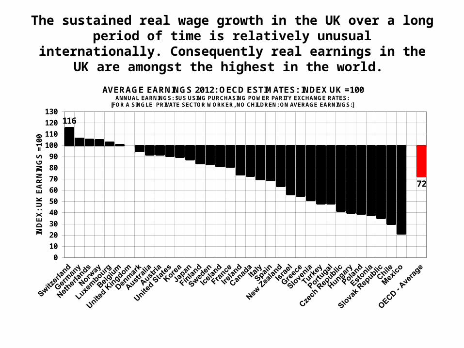
The sustained real wage growth in the UK over a long period of time is relatively unusual internationally. Consequently real
earnings in the UK are amongst the highest in the world.
116
72
0
10
20
30
40
50
60
70
80
90
100
110
120
130
IND
EX
: U
K E
AR
NIN
GS
=10
0
AVERAGE EARNINGS 2012: OECD ESTIMATES: INDEX UK =100ANNUAL EARNINGS: $US USING PURCHASING POWER PARITY EXCHANGE RATES:
[FOR A SINGLE PRIVATE SECTOR WORKER, NO CHILDREN: ON AVERAGE EARNINGS:]
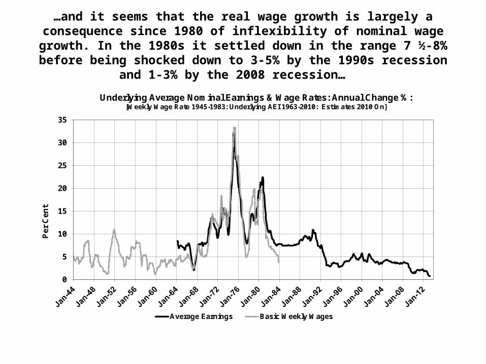
…and it seems that the real wage growth is largely a consequence since 1980 of inflexibility of nominal wage growth. In the 1980s it settled down
in the range 7 ½-8% before being shocked down to 3-5% by the 1990s recession and 1-3% by the 2008 recession…
0
5
10
15
20
25
30
35
Per
Cen
t
Underlying Average Nominal Earnings & Wage Rates: Annual Change %:[Weekly Wage Rate 1945-1983: Underlying AEI 1963-2010: Estimates 2010 On]
Average Earnings Basic Weekly Wages

If a 2% inflation target had been hit then real wage would have peaked in 2008 and then stagnated. Since 2008 inflation exceeded the target
so real wages have fallen – more for workers than businesses…
95
100
105
110
115
120
125
130
135
IND
EX
JA
NU
AR
Y 1
997
=10
0
AVERAGE UK REAL WAGES: DEFLATED BY DIFFERENT PRICE INDICES:[WAGES = BASE WEIGHTED INDEX BASED ON (UNDERLYING) AVERAGE EARNINGS INDEX (AEI)]
RPI - WORKER DEFLATOR
GDP DEFLATOR - BUSINESS DEFLATOR
DEFLATOR IF 2% P.A. INFLATION TARGET HAD BEEN ACHIEVED

Workers pay tax and NICs to government so their take home pay is less than earnings. Businesses also pay NICs so their labour costs are
more than earnings. And taxes and NICs change – taxes for the low-paid have been cut since 2007 and the NICs contribution rate rose.
-6
-4
-2
0
2
4
6
8
10
12
14
16
INC
OM
E T
AX
& N
ICs D
ED
UC
TIO
NS
%
ANNUAL EARNINGS £000s
SIZE OF TAX CUTS BETWEEN 2007-08 AND 2014-15: % OF WAGES:[POSITIVE = TAX CUT ; NEGATIVE = TAX RISE ]
Just Income Tax Income Tax & Employee NICs Income Tax: Employer & Employee NICs
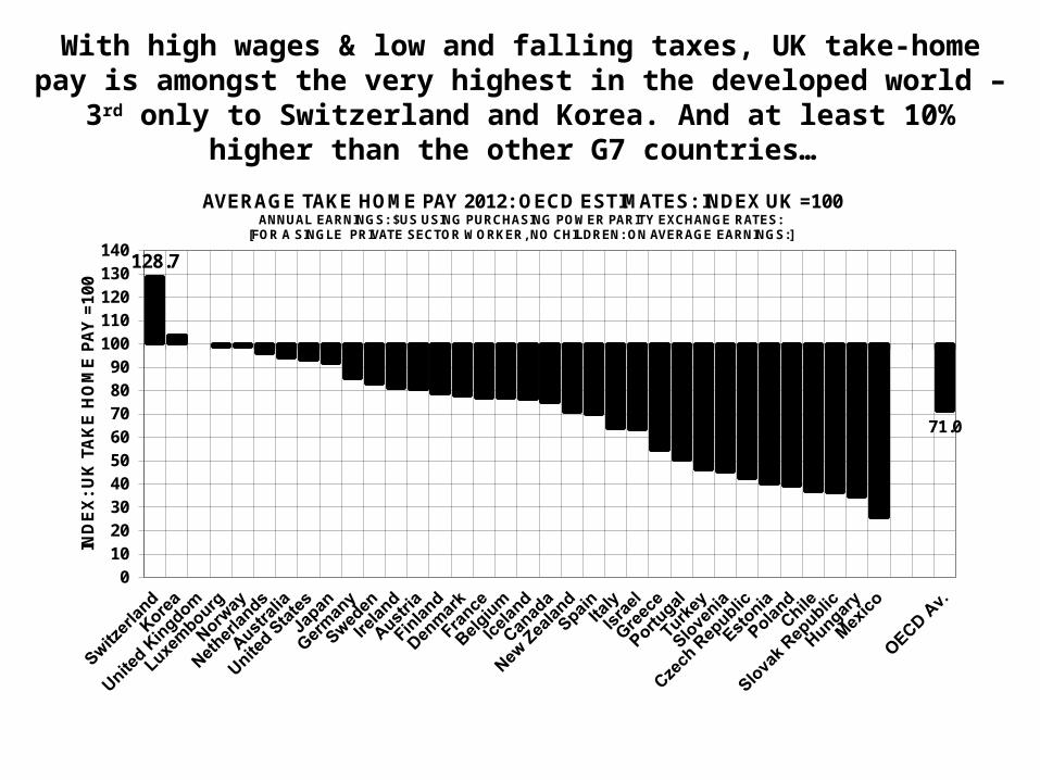
With high wages & low and falling taxes, UK take-home pay is amongst the very highest in the developed world – 3rd only to Switzerland and
Korea. And at least 10% higher than the other G7 countries…
128.7
71.0
0102030405060708090
100110120130140
IND
EX
: U
K T
AK
E H
OM
E P
AY
=10
0
AVERAGE TAKE HOME PAY 2012: OECD ESTIMATES: INDEX UK =100ANNUAL EARNINGS: $US USING PURCHASING POWER PARITY EXCHANGE RATES:
[FOR A SINGLE PRIVATE SECTOR WORKER, NO CHILDREN: ON AVERAGE EARNINGS:]

…and despite the fact that our earnings are very high, the UK’s labour costs are lower than in some countries where earnings are lower as employer NICs are lower. But still amongst the highest in the OECD.
118.1
76.3
0
10
20
30
40
50
60
70
80
90
100
110
120
130
IND
EX
: U
K T
AK
E H
OM
E P
AY
=1
00
AVERAGE LABOUR COSTS 2012: OECD ESTIMATES: INDEX UK =100ANNUAL EARNINGS: $US USING PURCHASING POWER PARITY EXCHANGE RATES:
[FOR A SINGLE PRIVATE SECTOR WORKER, NO CHILDREN: ON AVERAGE EARNINGS:]
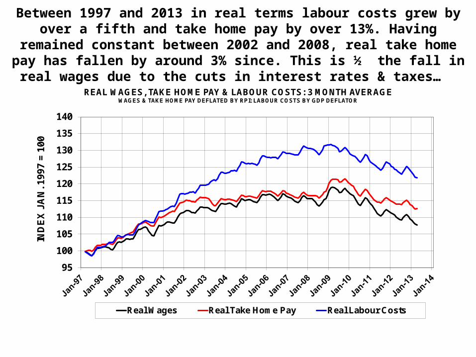
Between 1997 and 2013 in real terms labour costs grew by over a fifth and take home pay by over 13%. Having remained constant between
2002 and 2008, real take home pay has fallen by around 3% since. This is ½ the fall in real wages due to the cuts in interest rates & taxes…
95
100
105
110
115
120
125
130
135
140
IND
EX
JA
N. 1
99
7 =
10
0
REAL WAGES, TAKE HOME PAY & LABOUR COSTS: 3 MONTH AVERAGEWAGES & TAKE HOME PAY DEFLATED BY RPI: LABOUR COSTS BY GDP DEFLATOR
Real Wages Real Take Home Pay Real Labour Costs
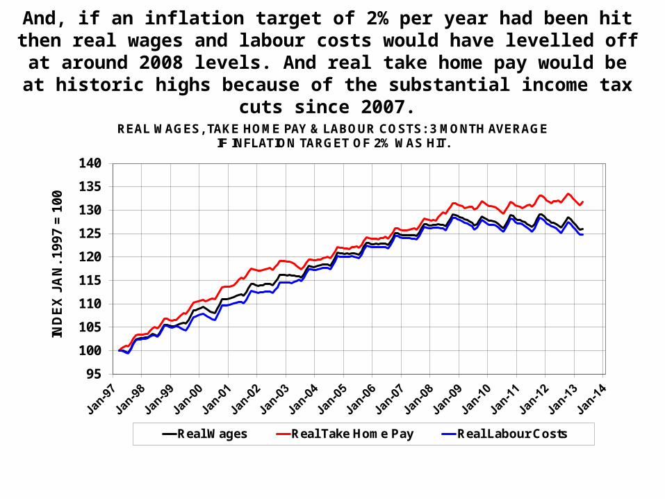
And, if an inflation target of 2% per year had been hit then real wages and labour costs would have levelled off at around 2008 levels. And
real take home pay would be at historic highs because of the substantial income tax cuts since 2007.
95
100
105
110
115
120
125
130
135
140
IND
EX
JA
N. 1
99
7 =
10
0
REAL WAGES, TAKE HOME PAY & LABOUR COSTS: 3 MONTH AVERAGEIF INFLATION TARGET OF 2% WAS HIT.
Real Wages Real Take Home Pay Real Labour Costs

CONCLUSIONS• Labour supply not demand seems to be the main determinant of
employment. This is despite the fact that UK wages are very ‘sticky’. Quantity rather than price/wage adjustment seems to be the important factor.
• Recent employment growth has been strong because labour supply growth has been rapid – partly down to government policy. And welfare to work policies have meant that this supply growth can be translated in employment through effective job search.
• UK nominal wage growth is very ‘sticky’ and movements in real wages are largely determined by price inflation. Tax and interest rate cuts since 2008 has meant that if a 2% inflation rate target had been met average take home pay would be at a historic high.
• Because we are entering the ‘ageing society’ period labour shortages could soon emerge unless activity rates rise. Young people entering the labour force and single adult households are potential priorities.
Top Related