


Languages
Pages
Legal


Statistical Literacy
Anthony J. Evans Associate Professor of Economics, ESCP Europe
www.anthonyjevans.com
London, February 2015
(cc) Anthony J. Evans 2015 | http://creativecommons.org/licenses/by-nc-sa/3.0/

How to be an effective consumer of statistical analysis
• The purpose of this presentation is to discuss some of the common ways in which people are misled by statistics
2

How big is big?
1 million seconds =
1 billion seconds =
1 trillion seconds =
11 days
32 years
317 centuries
3

How big is big?
1 million seconds =
1 billion seconds =
1 trillion seconds =
11 days
32 years
317 centuries
4
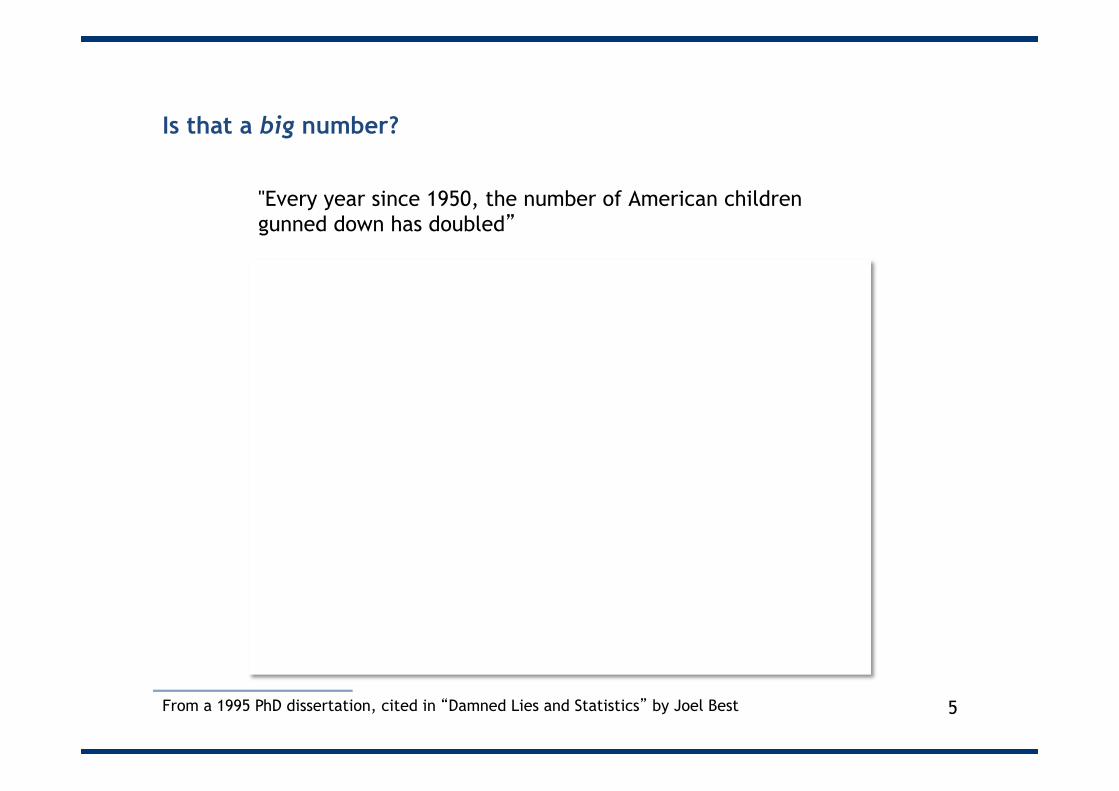
Is that a big number?
"Every year since 1950, the number of American children gunned down has doubled”
From a 1995 PhD dissertation, cited in “Damned Lies and Statistics” by Joel Best
Year Gunned down kids
1950 1
1951 2
1952 4
1953 8
1954 16
… …
1960 1024
… …
1995 35 trillion
5

Is that a big number?
"Every year since 1950, the number of American children gunned down has doubled”
From a 1995 PhD dissertation, cited in “Damned Lies and Statistics” by Joel Best
Year Gunned down kids
1950 1
1951 2
1952 4
1953 8
1954 16
… …
1960 1024
… …
1995 35 trillion
6

Is that a big number?
“In 1997 the Labour government said it would spend an extra £300m over five years to create a million new childcare places”
• 300m/1m = £300 per place • 300/5 = £60 per year • 60/52 = £1.15 per week
Source: Blastland & Dilnot p.7 7

Is that a big number?
“In 1997 the Labour government said it would spend an extra £300m over five years to create a million new childcare places”
• 300m/1m = £300 per place
• 300/5 = £60 per year
• 60/52 = Only £1.15 per week
Source: Blastland & Dilnot p.7 8

“Random” numbers aren’t all that random
9 Random Walk – The Visualization of Randomness by Daniel A. Becker http://www.random-walk.com/index_en.htm

How much of life is random?
What is the longest run of the same colour that you expect to see?
10

Regression to the mean
• Imagine that 9 volunteers are observing traffic. • They each roll 2 die and the combined score is the number
of accidents. • Which are the accident black-spots? • We place a speed camera at these black-spots • Now, let’s roll again • How effective are the speed cameras?
11

Regression to the mean
3 2
1
4 6
7
8
9 5
12

Importance of scale
94
95
96
97
98
99
May July0102030405060708090100
May July
13

Importance of the Y axis
94
95
96
97
98
99
May July0102030405060708090100
May July
14
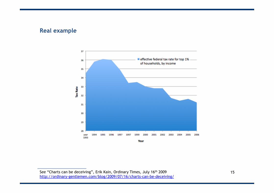
Real example
15 See “Charts can be deceiving”, Erik Kain, Ordinary Times, July 16th 2009 http://ordinary-gentlemen.com/blog/2009/07/16/charts-can-be-deceiving/

Real example
16 See “Charts can be deceiving”, Erik Kain, Ordinary Times, July 16th 2009 http://ordinary-gentlemen.com/blog/2009/07/16/charts-can-be-deceiving/

17

18 Culprit: DairyCo See https://fullfact.org/factchecks/top_bad_infographics_charts-29075

This uses a different Y axis for each bar!
19 Source: Electionleaflets.org See https://fullfact.org/factchecks/top_bad_infographics_charts-29075

Misleading Y axis (and a dodgy projection)
20 Culprit: Oxfam See: https://fullfact.org/article/economy/oxfam_1_percent-38483

Share of global wealth is in fact pretty flat
21 Culprit: Oxfam See: https://fullfact.org/article/economy/oxfam_1_percent-38483

And global wealth doesn’t really capture poverty
22
This includes graduates (i.e. high earning potential but negative net wealth)
“Global Wealth Databook” Credit Suisse, October 2014

Importance of weight
• Compare the “On time arrival rate” of Alaska Airlines vs. America West
• Alaska Airlines is performing better on a per airport basis…
89% 95%
91%
83% 86% 85,6% 92,1%
85,5%
71,3% 76,7%
0%
10%
20%
30%
40%
50%
60%
70%
80%
90%
100%
LA Phoenix San Diego San Francisco Seattle
Alaska Airlines America West Airlines
On time arrival rates
23

Importance of weight
811 5255 448 449 262 0
Alaska Airlines
89% LA
95% Phoenix
91% San Diego
83% San Francisco
86% Seattle
0 0.1 0.2 0.3 0.4 0.5 0.6 0.7 0.8 0.9 1
605 232 233 559 2146
86%
LA
92%
Phoenix
86%
San Diego
71%
San Francisco
77%
Seattle
0.1 0.2 0.3 0.4 0.5 0.6 0.7 0.8 0.9 1
America West Airlines
89.1%
86.7%
% arrivals on time and number of arrivals
…but on a weighted basis America West has the higher on
time arrival rate
24

Be wary of histograms
• Generally speaking “bins” should be: – Not too many – Not too few – Of equal size – Consecutive – Non-overlapping
25

Spot the problem…
26 Source: “Where the Tax Money Is” Wall Street Journal, April 17th 2011

The same chart, with equal bins
27 See “Lies, Damned Lies, and Statistics (36): Manipulating the X-axis Scale in Graphs”, Filip Spagnoli, September 30th 2011

Alternatively…
28 See “Lies, Damned Lies, and Statistics (36): Manipulating the X-axis Scale in Graphs”, Filip Spagnoli, September 30th 2011

Be wary of pie charts
29 The problem here is that the question allowed multiple responses.

30 Source: The Sun, 25 July 2013 See https://fullfact.org/factchecks/top_bad_infographics_charts-29075

Percentages vs. percentage points
• “We produced only 28% more faults than the industry average”
• Actually, it was 28 percentage points higher • To calculate the percentage difference, you have to divide 28
by 35
• 80% more faults than the national average
31 A percentage is a portion of the whole (where the whole isn’t necessarily 100) A percentage point is a unit of measurement that is calculated as a portion of 100

Percentages vs. percentage points
• “We produced only 28% more faults than the industry average”
• Actually, it was 28 percentage points higher • To calculate the percentage difference, you have to divide 28
by 35
• 80% more faults than the national average
32 A percentage is a portion of the whole (where the whole isn’t necessarily 100) A percentage point is a unit of measurement that is calculated as a portion of 100

Examples of the conflation of percentages and percentage points
Nationwide has upped the cost of its fixed-rate deals by up to 0.86%, and state-owned Northern Rock has raised its five-year fixed rates by 0.2%, both with effect from tomorrow*
33 *“Buyers face hike in mortgage rates as inflation fears mount” The Guardian, 11th June 2009, **“Lenders rush to raise fixed-rate mortgages “ The Times 12th June 2009
On Wednesday, Times Online revealed that Nationwide Building Society, Britain's third biggest lender, was putting up rates by up to 0.86 percentage points today, the biggest hike in mortgage rates for months. A five-year fix has jumped from 4.78 per cent to 5.64 per cent**

• This presentation forms part of a free, online course on analytics
• http://econ.anthonyjevans.com/courses/analytics/
34
Top Related