


Languages
Pages
Legal


Slide i
Designing Effective Poster Presentations
Reid SczerbaCenter for Educational Resources, JHU
Slide ii The potential poster presentation atmosphere. How can one stand out?
Slide iii
What makes a good poster presentation?
• One part billboard: one part research paper.
• Should be memorable.
• Should be concise.
• Should be self sustaining.
• Posters speak, but you speak better.
• Know your audience.
The Good Poster
Designing Effective Poster PresentationsPresentation slides

Slide iv
Hypothesis
Structuring the Narrative
?...
Typical scientific posters use hypothesis and experimentation to prove or disprove the research and lends itself well to a narrative arc structure. But here are other ways to structure a narrative through argument or examination
Slide v
Evidence by Example
Structuring the Narrative
A B C
In building Evidence by Example you give concrete illustrations that provide a convincing argument supporting a thesis.
Slide vi
Process Analysis
Structuring the Narrative
12
3
Process Analysis is a demonstration either of how something works, for example, cell mitosis, or of how to do something, like edit a Wikipedia article.
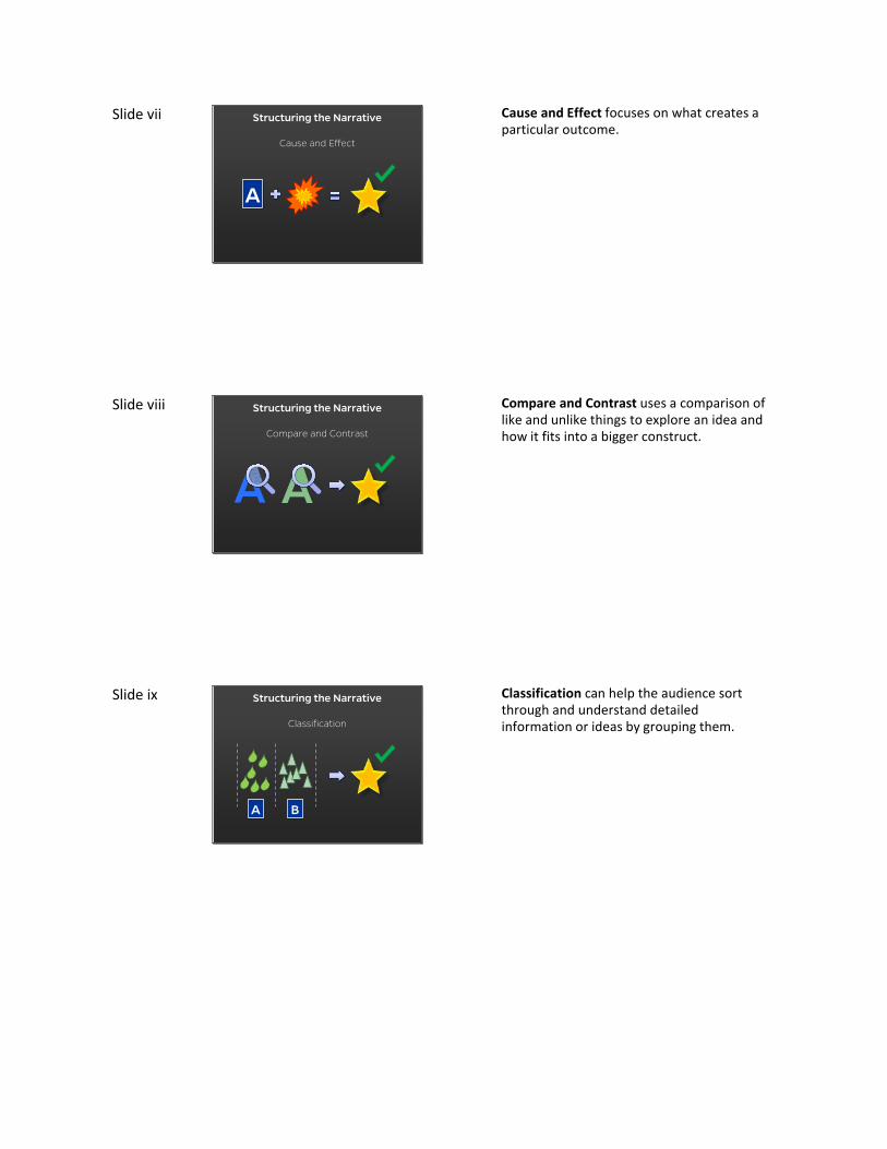
Slide vii
Cause and Effect
Structuring the Narrative
A
Cause and Effect focuses on what creates a particular outcome.
Slide viii
ACompare and Contrast
Structuring the Narrative
A
Compare and Contrast uses a comparison of like and unlike things to explore an idea and how it fits into a bigger construct.
Slide ix
Classification
Structuring the Narrative
A B
Classification can help the audience sort through and understand detailed information or ideas by grouping them.

Slide x
Deductive
Structuring the Narrative
A
B therefore
C}
With a Deductive process you accumulate evidence to make a useful generalization.
Slide xi
Definition/Redefinition
Structuring the Narrative Definition is used when a subject requires the understanding of terms, ideas, or phenomena, while Redefinition gives new understanding or new meaning to a topic.
Slide xii
• Title • (Abstract?)• Intro• Materials/methods• Results• Conclusion
• Citations• Acknowledgements
Sections to Include

Slide 1
Design Considerations
Slide 2
Two main conceptswhile designing
centered on:
Consistency
Slide 3
Consistency
Branding Craftsmanship
Being consistent with the design in your presentation adds 2 qualities to your presentation; It gives the sense of a branded presentation which can make it memorable And craftsmanship makes it clear and professional. First, let’s talk about branding consideration which is where the creativity lies. It all starts with establishing design “rules” in your presentation.

Slide 4 Branding
Font Borders Bullets Background
AaBbCcAaBbCc
AaBbCcAaBbCcAaBbCcAaBbCc
• ……………
…
AaBbCc • …
Branding is important to keep the look of the poster consistent and memorable.
You can choose a variety of elements but make sure you don’t lose sight of the big picture
Slide 5 Good -Consistent headers-Consistent colors-Consistent font choice
Slide 6 Bad -Not much consistency-Layout is jumbled or cluttered

Slide 7 Layout This is an example of a poster that uses memorable elements But the use of memorable elements has to be used wisely. Here you can see that the Overview section is a little hidden.
Slide 8 Craftsmanship With poster presentations, you only have one very large display so you have to make it look professional, which brings us back to craftsmanship.
Good craftsmanship shows that you care about presenting your subject in the best light and that you should be taken seriously
Slide 9
Design Principles
• Layout• Graphics• Type Treatment• Color
The design principles that I will describe can be used in a variety of other mediums, from PowerPoint presentations, to brochures and beyond.

Slide 10
Layout
In a poster presentation you will have designated sections that orient your reader to your content.
The sections of the poster (abstract, intro, results, conclusion, etc) act as a way for a viewer to be guided through your presentation sequentially.
Slide 11 Traditional column layout The traditional column or grid layout is a universal approach that can bring a sense of flow for your viewers.
Viewers can start from the left and progress thru your content by reading to the right.
Slide 12 Vertical Layout Sometimes a vertical layout is required for an event.
You can still make use of a column layout but perhaps you can use an additional row or two to add supplemental content.

Slide 13 Circular/web layout This can be an eye catching unique approach but it depends on your subject matter.
This less orthodox format/layout can see use for humanities subject matter that lends itself to a sequential approach
Slide 14 The grid doesn’t have to be visible The grid doesn’t have to be visible
Slide 15
LogosLiterature Cited Acknowledgements More Info
Real estate1
2
3
Setting your layout to have a focal point can be useful in giving the most space for your main points.
In this case, center view is the prime real estate for your main analysis 2nd is the intro, conclusions, materials, etc.
The acknowledgements and logos can be placed out of the way on the bottom.

Slide 16
LogosLiterature Cited
Acknowledgements More Info
Real estate
1
2
3
Setting your layout to have a focal point can be useful in giving the most space for your main points.
In this case, center view is the prime real estate for your main analysis 2nd is the intro, conclusions, materials, etc.
The acknowledgements and logos can be placed out of the way on the bottom.
Slide 17 Clear cues Visual cues can help guide a viewer through the content.
If you find that your content doesn’t happen to be balanced enough to fit within a perfect grid, then using numbers or letters can help keep the viewer from getting lost in your research.
Slide 18 Spacing
• Text text text text text• text text text text• text text more text
Some more text text text texttext text text text text text texttext text text text text.
Some text here too.
Some more text here too.
{
{
{
{
{
{
{
{
{
Be mindful of the empty space between content items to ensure that your sections align well in your poster. This adds to a poster by giving it a clean an organized look. Here the vertical space units size are all the same. That unit size is reused for the top and bottom margin giving us a frame for the slide. Here we see ½ of the unit size used to separate the content items vertically. We can also see that smaller spacing unit reused to separate two images. Content that is close in proximity to other content, makes it appear that the content should be related. By using more space to separate the content items, you can make subsections or new sections altogether. Visual Hierarchy plays a role here.

Slide 19 Layout Example (bad)
Whats wrong here? -Horizontal grid doesn’t work well -No visual hierarchy -No focal point
Slide 20 Layout Example (good?)
Good or bad? Mostly good
Slide 21
Graphics
Use as many interesting images you can get your hands on. Despite how interesting your research is, images will always be the first thing that is seen by a passerby.

Slide 22 A picture is worth a 1000 words.
Your graphics will attract attention
Altho images should be large enough to dicipher from 6 feet away
Slide 23 Graphics Examples What’s missing here?
Slide 24 Image orientation You can use tricks if the image is too detailed to be as large as you want it.
This will help maximize your space for more materials.

Slide 25 Borders for images Edges of an image can blend into the background.
To clearly define the edges of an image, add a border or a shadows will also work well.
Images with clearly defined edges, whether it has a border or not, look nicer and will align better within your layout.
Slide 26 Infographic Types
Distribution
Histogram Box & Whisker
Infographic Types
Relationship
Venn Diagram Scatter Plot
Infographic Types
Time Comparison
Line Chart Timeline
Infographic Types
Pie Chart Donut Chart
Parts to a whole
Treemap
Infographic Types
Spatial
Choropleth Contour Line
Infographic Types
System
Flowchart Schematic

Slide 27 Too much data! Showing too much data with charts, graphs, and infographics will obscure the message and may confuse the viewer. Simplify the message and choose an appropriate way to display that message.
Slide 28 3d Graphs vs 2d Graphs
0102030405060708090
1st Qtr 2nd Qtr 3rd Qtr 4th Qtr
EastWestNorth
0102030405060708090
100
1st Qtr 2nd Qtr 3rd Qtr 4th Qtr
EastWestNorth
3d graphs can confuse the data being presented. It is better to use simple 2d graphs because they can be easier to read.
Slide 29 Considering graphs, the y-axis text should be rotated, not stacked.

Slide 30 What when wrong
Slide 31 Graphics Examples Whats good here? What might not be so good.
Slide 32
Type Treatment
Just as with powerpoint, the type treatment can help bring emphasis to your content.

Slide 33
- San-sarif font
- Sarif font
- Sarifs
Fonts 2 main types of font faces Sarif and San-sarif. San-sarif fonts are easier to read at a distance and should be used a majority of the time in PowerPoint presentations. Sarif fonts have little graphic shapes. Sarif font could still be used in titles Sarif fonts most of the time have thick and thin elements which again makes it harder to read at a distance (some San-sarif fonts do too). Script fonts are notorious with thin elements of a letter.
Slide 34 Body Text
SomaFM is 19 unique channels of listener-supported, commercial-free, underground radio broadcasting from San Francisco. All music hand-picked by SomaFM's award-winning DJs and music directors.
SomaFM is 19 unique channels of listener-supported, commercial-free, underground radio broadcasting from San Francisco. All music hand-picked by SomaFM's award-winning DJs and music directors.
San-sarif {
Sarif {
San-sarif fonts have a more modern look to them, but a sarif font can be easier to read in large amounts. That’s why novels and most newspapers use a sarif font.
Slide 35
WHICH TEXT IS EASIER TO READ?
Is This Text Easier To Read?
Sentence case is easier to read.
Titles: CAPS vs. no caps All caps and capitalizing the first letter in titles make the titles a little hard to read. In a poster presentation, typically the audience will glance at a title and it using capital letters in a line of text, takes the viewer slightly longer to read.
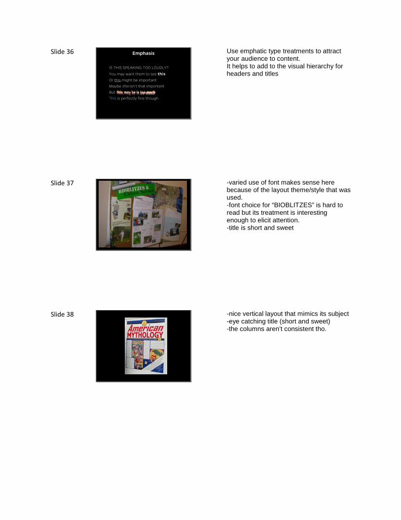
Slide 36 Emphasis
IS THIS SPEAKING TOO LOUDLY?
You may want them to see thisOr this might be important
Maybe this isn’t that important
But
This is perfectly fine though
Use emphatic type treatments to attract your audience to content. It helps to add to the visual hierarchy for headers and titles
Slide 37 -varied use of font makes sense here because of the layout theme/style that was used. -font choice for “BIOBLITZES” is hard to read but its treatment is interesting enough to elicit attention. -title is short and sweet
Slide 38 -nice vertical layout that mimics its subject -eye catching title (short and sweet) -the columns aren’t consistent tho.

Slide 39 - This example has a nice header that uses different type treatments to generate a hierarchy of info that effectively breaks the header down into bit-size piece.
Slide 40
Color
Just as with type treatment, color can help attract attention to your content.
Slide 41 Dark Background, Light text
Example color scheme
Top
RightLeft
Dark colored backgrounds use a lot of ink when printing and can slightly bleed if printed on lower quality paper. Not too much a concern

Slide 48 Light Background, Dark Text
Another color scheme
Top
Left Middle Right
Light background are more common. Be sure to keep the contrast high between for the text and the background. If you squint your eyes and content is hard to see (like Left and Middle boxes here) then it is time choose more contrasted colors. Use more muted (less vivid) colors in your presentation because it can work well for design elements, such as text backgrounds, borders, etc. and looks more sophisticated most times.
Slide 49
Large printouts = Tubes
Modular = Carrying case or Portfolio
Other items to bring with you– Pushpins
– Velcro strips
– Glue stick
– Wite-out and black pen to fix tybo’s
Transporting your Poster There are two main methods for creating posters; large printouts, and the modular form. With either method there may be a different set of tool that you may need to bring with you, as well at ways to transport the posters safely.
Slide 50 This is the modular form which can be a useful approach. In the case of a live experiment that may be ongoing, you can quickly swap out panels to update the information on the status of the current experiment. This method gives you a little less options for designing and usually takes up more space.

Slide 51 The large print out method has a nice unified look and usually allows you full creative freedom in laying out your content. Altho, you are not able to edit any portion of the poster without it becoming less professional looking.
Slide 52
• Appearance– Dress– Name tag– Demeanor
• Prepare a one-sentence overview.• Do not refer to notes.• Speak to your viewers.
Presenting your Poster Bring business cards, copies of papers or manuscripts and shrunken version of poster. If you must leave your poster, affix a note alerting any viewers to your expected time of return. Thank your viewers for visiting. If they have stayed more than 4 minutes, you have succeeded.
Slide 53 Parting image: memorable poster and presenter.
Top Related