


Languages
Pages
Legal


ReferenceManual
PanelBuilder�1400eConfigurationSoftware forWindows
(Cat. No. 2711E–ND1)
Allen-Bradley
Because of the variety of uses for the products described in this publication,those responsible for the application and use of this control equipment mustsatisfy themselves that all necessary steps have been taken to assure thateach application and use meets all performance and safety requirements,including any applicable laws, regulations, codes and standards.
The illustrations, charts, sample programs and layout examples shown inthis guide are intended solely for purposes of example. Since there aremany variables and requirements associated with any particular installation,Allen-Bradley does not assume responsibility or liability (to includeintellectual property liability) for actual use based upon the examples shownin this publication.
Allen-Bradley publication SGI-1.1, Safety Guidelines for the Application,Installation, and Maintenance of Solid-State Control (available from yourlocal Allen-Bradley office), describes some important differences betweensolid-state equipment and electromechanical devices that should be takeninto consideration when applying products such as those described in thispublication.
Reproduction of the contents of this copyrighted publication, in whole or inpart, without written permission of Allen-Bradley Company, Inc., isprohibited.
Throughout this manual we use notes to make you aware of safetyconsiderations:
!ATTENTION: Identifies information about practicesor circumstances that can lead to personal injury ordeath, property damage, or economic loss.
Attention statements help you to:
• identify a hazard
• avoid the hazard
• recognize the consequences
Important: Identifies information that is critical for successfulapplication and understanding of the product.
PanelBuilder, PanelView, Data Highway Plus, DH+, ControlNet, and SLC are trademarks, andPLC, PLC-2, and PLC-3 are registered trademarks of Allen-Bradley Company, Inc.RSView and RSLinx are trademarks of Rockwell Software, Inc.IBM, PC, PS/2, VGA, and PC-DOS are registered trademarks of International Business MachinesCorporation.Epson is a registered trademark of Seiko Epson Corporation.Ethernet is a registered trademark of Digital Equipment Corporation, Intel, and XeroxCorporation.Microsoft, Windows, MS, and MS-DOS are registered trademarks of Microsoft Corporation.Mouse Systems is a trademark of MSC Technologies, Inc.AutoCAD is a registered trademark of Autodesk Inc.Taylor, and ProWORXPLUS are registered trademarks of Taylor Industrial Software, Inc.MODICON, MODSOFT, Quantum, and Modbus are registered trademarks ofAEG Schneider Automation, Inc.All other brand and product names are trademarks of their respective companies and are hereby acknowledged.
Important UserInformation

Publication 2711E-820 – January 1998
Welcome to PanelBuilder 1400e Configuration Softwarefor Windows P–1. . . . . . . . . . . . . . . . . . . . . . . . . . . . . . . . . . . . . .
Registering Your Copy of PanelBuilder 1400e P–1. . . . . . . . . . . . . . . . Available Documentation P–1. . . . . . . . . . . . . . . . . . . . . . . . . . . . . . . What’s in the Reference Manual? P–2. . . . . . . . . . . . . . . . . . . . . . . . . Who Should Read the Reference Manual? P–3. . . . . . . . . . . . . . . . . . . Terminology Used P–3. . . . . . . . . . . . . . . . . . . . . . . . . . . . . . . . . . . . Before You Begin P–4. . . . . . . . . . . . . . . . . . . . . . . . . . . . . . . . . . . . . Technical Support Services P–4. . . . . . . . . . . . . . . . . . . . . . . . . . . . . .
About ASCII Displays 1. . . . . . . . . . . . . . . . . . . . . . . . . . . . . . . . . . ASCII Display String Format 3. . . . . . . . . . . . . . . . . . . . . . . . . . . Special Characters and Control Sequences 3. . . . . . . . . . . . . . . . Invalid Control Sequences 3. . . . . . . . . . . . . . . . . . . . . . . . . . . . Configuring the ASCII Display Object 4. . . . . . . . . . . . . . . . . . . .
About ASCII Inputs 5. . . . . . . . . . . . . . . . . . . . . . . . . . . . . . . . . . . ASCII Input Object Displays 6. . . . . . . . . . . . . . . . . . . . . . . . . . . Buttons of the ASCII Input Object 7. . . . . . . . . . . . . . . . . . . . . . . Configuring the ASCII Input Object (Large or Small) 9. . . . . . . . . .
About Bar Graphs 11. . . . . . . . . . . . . . . . . . . . . . . . . . . . . . . . . . . . Configuring the Bar Graph 12. . . . . . . . . . . . . . . . . . . . . . . . . . . .
About Control Selectors 13. . . . . . . . . . . . . . . . . . . . . . . . . . . . . . . . Control List Selector with Enter Key 14. . . . . . . . . . . . . . . . . . . . . . . .
Configuring a Control List Selector with Enter Key 15. . . . . . . . . . . Control List Selector without Enter Key 17. . . . . . . . . . . . . . . . . . . . .
Configuring a Control List Selector without Enter Key 18. . . . . . . . . Set Bit Cursor Points (Keypad Terminals Only) 20. . . . . . . . . . . . . . . .
Using the Set Bit Cursor Point on the PanelView Terminal 21. . . . . . Cursor Point Default Operation 22. . . . . . . . . . . . . . . . . . . . . . . Cursor Point Operation after Screen Change 23. . . . . . . . . . . . . Cursor Point Operation on a Terminal Powerup 23. . . . . . . . . . .
Defining the Set Bit Cursor Point Character and Display Field 24. . . Configuring the Set Bit Cursor Point 25. . . . . . . . . . . . . . . . . . . . .
About Drawing Objects 27. . . . . . . . . . . . . . . . . . . . . . . . . . . . . . . . . Arc 27. . . . . . . . . . . . . . . . . . . . . . . . . . . . . . . . . . . . . . . . . . . . . . . Ellipse 28. . . . . . . . . . . . . . . . . . . . . . . . . . . . . . . . . . . . . . . . . . . . Line 28. . . . . . . . . . . . . . . . . . . . . . . . . . . . . . . . . . . . . . . . . . . . . .
Arrows 28. . . . . . . . . . . . . . . . . . . . . . . . . . . . . . . . . . . . . . . . . .
Table of Contents
Preface
ASCII Displays
ASCII Inputs
Bar Graphs
Control Selectors
Drawings
Table of Contentstoc–ii
Publication 2711E-820 – January 1998
Panel 29. . . . . . . . . . . . . . . . . . . . . . . . . . . . . . . . . . . . . . . . . . . . . Rectangle 29. . . . . . . . . . . . . . . . . . . . . . . . . . . . . . . . . . . . . . . . . . Wedge 29. . . . . . . . . . . . . . . . . . . . . . . . . . . . . . . . . . . . . . . . . . . .
About the Goto Configure Mode Button 31. . . . . . . . . . . . . . . . . . . . . Software Mode Switching at the PanelView Terminal 33. . . . . . . . . Configuring the Goto Configure Mode Button 34. . . . . . . . . . . . . . .
About Graphic Images 35. . . . . . . . . . . . . . . . . . . . . . . . . . . . . . . . . Importing Graphic Images 35. . . . . . . . . . . . . . . . . . . . . . . . . . . . Sizing Graphic Images 36. . . . . . . . . . . . . . . . . . . . . . . . . . . . . . . Copying and Exporting Graphic Images 36. . . . . . . . . . . . . . . . . . .
About Indicators 39. . . . . . . . . . . . . . . . . . . . . . . . . . . . . . . . . . . . . Multistate Indicator 39. . . . . . . . . . . . . . . . . . . . . . . . . . . . . . . . . . . .
Configuring the Multistate Indicator 40. . . . . . . . . . . . . . . . . . . . . . List Indicator 41. . . . . . . . . . . . . . . . . . . . . . . . . . . . . . . . . . . . . . . .
Configuring the List Indicator 42. . . . . . . . . . . . . . . . . . . . . . . . . .
About Local Message Displays 43. . . . . . . . . . . . . . . . . . . . . . . . . . . How a Local Message Is Triggered 44. . . . . . . . . . . . . . . . . . . . . .
Triggering Messages on Multiple Local Message Displays 44. . . . Configuring the Local Message Display 44. . . . . . . . . . . . . . . . . . .
About Numerics 47. . . . . . . . . . . . . . . . . . . . . . . . . . . . . . . . . . . . . . Increment and Decrement Value Buttons 48. . . . . . . . . . . . . . . . . . . .
Increment Value Button (with or without Display) 48. . . . . . . . . . . . Configuring the Increment Value Button 49. . . . . . . . . . . . . . . . . . . Decrement Value Button (with or without Display) 51. . . . . . . . . . . . Configuring the Decrement Value Button 52. . . . . . . . . . . . . . . . . .
Numeric Data Display 53. . . . . . . . . . . . . . . . . . . . . . . . . . . . . . . . . Configuring the Numeric Data Display 55. . . . . . . . . . . . . . . . . . . .
Numeric Keypad Enable Button (Keypad Terminals Only) 57. . . . . . . . Configuring the Numeric Keypad Enable Button 58. . . . . . . . . . . . .
Numeric Input Cursor Point (Keypad Terminals Only) 60. . . . . . . . . . . Using the Numeric Input Cursor Point on the PanelView Terminal 60Defining the Numeric Input Cursor Point Character 62. . . . . . . . . . . Using the Decimal Point (Display Component) 62. . . . . . . . . . . . . . Configuring the Numeric Input Cursor Point 63. . . . . . . . . . . . . . . .
Name 63. . . . . . . . . . . . . . . . . . . . . . . . . . . . . . . . . . . . . . . . . Numeric Input Configuration 64. . . . . . . . . . . . . . . . . . . . . . . . . Display Configuration 65. . . . . . . . . . . . . . . . . . . . . . . . . . . . . . Controls 66. . . . . . . . . . . . . . . . . . . . . . . . . . . . . . . . . . . . . . .
Numeric Entry Keypads (Touch Screen Terminals only) 69. . . . . . . . . . Configuring the Numeric Entry Keypad 70. . . . . . . . . . . . . . . . . . .
Goto Configure Mode
Graphic Images
Indicators
Local Message Displays
Numerics

Table of Contents toc–iii
Publication 2711E-820 – January 1998
Examples: Editing an Array of Numeric Values 72. . . . . . . . . . . . . . . Using the Decimal Point 75. . . . . . . . . . . . . . . . . . . . . . . . . . . . . . . . Enter Key Handshake Operation 78. . . . . . . . . . . . . . . . . . . . . . . . . . Using Write Expressions 79. . . . . . . . . . . . . . . . . . . . . . . . . . . . . . .
About Push Buttons 81. . . . . . . . . . . . . . . . . . . . . . . . . . . . . . . . . . . How the Different Push Buttons Work 81. . . . . . . . . . . . . . . . . . . .
Normally Open Momentary (N/O) Push Button 82. . . . . . . . . . . . . . . . Configuring the Normally Open Momentary (N/O) Button 83. . . . . . .
Normally Closed Momentary (N/C) Push Button 85. . . . . . . . . . . . . . . Configuring the Normally Closed Momentary (N/C) Button 86. . . . . .
Latched Push Button 87. . . . . . . . . . . . . . . . . . . . . . . . . . . . . . . . . . Configuring the Latched Push Button 88. . . . . . . . . . . . . . . . . . . . .
Maintained Push Button 89. . . . . . . . . . . . . . . . . . . . . . . . . . . . . . . . Configuring the Maintained Push Button 90. . . . . . . . . . . . . . . . . .
Multistate Push Button 91. . . . . . . . . . . . . . . . . . . . . . . . . . . . . . . . . Configuring the Multistate Push Button 92. . . . . . . . . . . . . . . . . . .
Interlocked Push Button 94. . . . . . . . . . . . . . . . . . . . . . . . . . . . . . . . Configuring the Interlocked Push Button 95. . . . . . . . . . . . . . . . . .
About Scales 97. . . . . . . . . . . . . . . . . . . . . . . . . . . . . . . . . . . . . . . . Configuring the Scale 98. . . . . . . . . . . . . . . . . . . . . . . . . . . . . . . .
About Screen Print Buttons 99. . . . . . . . . . . . . . . . . . . . . . . . . . . . . . Configuring the Screen Print Button 99. . . . . . . . . . . . . . . . . . . . . .
About Screen Selectors 101. . . . . . . . . . . . . . . . . . . . . . . . . . . . . . . . Goto Screen and Return to Previous Screen Buttons 102. . . . . . . . . . .
Configuring the Goto Screen and Return to Previous Screen Buttons 102. . . . . . . . . . . . . . . . . . . . . . . . . . . . . . . . .
Screen List Selector 103. . . . . . . . . . . . . . . . . . . . . . . . . . . . . . . . . . . Configuring the Screen List Selector 104. . . . . . . . . . . . . . . . . . . . .
Screen Select Keypad (Large and Small) (Touch ScreenTerminals Only) 105. . . . . . . . . . . . . . . . . . . . . . . . . . . . . . . . . . .
Configuring the Screen Select Keypad 105. . . . . . . . . . . . . . . . . . . . Screen Keypad Enable Button (Keypad Terminals Only) 106. . . . . . . . .
Configuring the Screen Keypad Enable Button 106. . . . . . . . . . . . . .
About Scrolling Lists 107. . . . . . . . . . . . . . . . . . . . . . . . . . . . . . . . . . Cursor List 108. . . . . . . . . . . . . . . . . . . . . . . . . . . . . . . . . . . . . . . . .
Configuring the Cursor List 108. . . . . . . . . . . . . . . . . . . . . . . . . . . . Configuring Preview States 110. . . . . . . . . . . . . . . . . . . . . . . . . . . . Configuring Retained Last List States 111. . . . . . . . . . . . . . . . . . . . The Cursor List Controls 112. . . . . . . . . . . . . . . . . . . . . . . . . . . . . . Configuring Cursor List State Values 114. . . . . . . . . . . . . . . . . . . . .
Push Buttons
Scales
Screen Print Buttons
Screen Selectors
Scrolling Lists

Table of Contentstoc–iv
Publication 2711E-820 – January 1998
Configuring Skipped States 115. . . . . . . . . . . . . . . . . . . . . . . . . . . Configuring the Cursor List Buttons 116. . . . . . . . . . . . . . . . . . . . . . Configuring the Cursor List Font 118. . . . . . . . . . . . . . . . . . . . . . . . Optimizing Scrolling List Performance 118. . . . . . . . . . . . . . . . . . . .
Object Lists 119. . . . . . . . . . . . . . . . . . . . . . . . . . . . . . . . . . . . . . . . . Multistate Indicator Object List 121. . . . . . . . . . . . . . . . . . . . . . . . . . .
Configuring Labels for Multistate Indicator Object Lists 121. . . . . . . . Configuring the Multistate Indicator Object List 123. . . . . . . . . . . . . .
Local Message Object List 124. . . . . . . . . . . . . . . . . . . . . . . . . . . . . . Configuring the Local Message Object List 124. . . . . . . . . . . . . . . . .
Numeric Data Display Object List 125. . . . . . . . . . . . . . . . . . . . . . . . . Configuring the Numeric Data Display Object List 125. . . . . . . . . . . .
Scrolling List Example 128. . . . . . . . . . . . . . . . . . . . . . . . . . . . . . . . . Step 1: Create the Cursor List 129. . . . . . . . . . . . . . . . . . . . . . . . . Step 2: Create the Object Lists 130. . . . . . . . . . . . . . . . . . . . . . . . .
Assembly Stations 130. . . . . . . . . . . . . . . . . . . . . . . . . . . . . . . . Luxury Option 130. . . . . . . . . . . . . . . . . . . . . . . . . . . . . . . . . . . Station Status 131. . . . . . . . . . . . . . . . . . . . . . . . . . . . . . . . . . . Option Command 131. . . . . . . . . . . . . . . . . . . . . . . . . . . . . . . . Option Style Number 132. . . . . . . . . . . . . . . . . . . . . . . . . . . . . . Assigning Addresses for Object Lists 132. . . . . . . . . . . . . . . . . . .
Step 3: Program the PLC 133. . . . . . . . . . . . . . . . . . . . . . . . . . . . . Create the Block Transfer Rungs 134. . . . . . . . . . . . . . . . . . . . . . Create the Auto Mode Rung 135. . . . . . . . . . . . . . . . . . . . . . . . . Create the Manual Mode Rung 136. . . . . . . . . . . . . . . . . . . . . . . Create the Toggle Command Rungs 137. . . . . . . . . . . . . . . . . . . Create the Set Command Input Rung 139. . . . . . . . . . . . . . . . . . Create the Option Style Number Input Rung 139. . . . . . . . . . . . . . Create the Manual On / Manual Off Input Rung 140. . . . . . . . . . . Create the Visible State File Copy Rung 141. . . . . . . . . . . . . . . . Create the Auto Mode Simulation Rungs 142. . . . . . . . . . . . . . . .
About Symbols 145. . . . . . . . . . . . . . . . . . . . . . . . . . . . . . . . . . . . . . Available Graphic Images 145. . . . . . . . . . . . . . . . . . . . . . . . . . . . . Sizing Symbols 146. . . . . . . . . . . . . . . . . . . . . . . . . . . . . . . . . . . . Configuring Symbols 146. . . . . . . . . . . . . . . . . . . . . . . . . . . . . . . .
About Text 149. . . . . . . . . . . . . . . . . . . . . . . . . . . . . . . . . . . . . . . . . . The Extended ASCII Character Set 149. . . . . . . . . . . . . . . . . . . . . .
About Time and Date Displays 151. . . . . . . . . . . . . . . . . . . . . . . . . . . Time Display 151. . . . . . . . . . . . . . . . . . . . . . . . . . . . . . . . . . . . . . Date Display 151. . . . . . . . . . . . . . . . . . . . . . . . . . . . . . . . . . . . . . Configuring the Time and Date Display 152. . . . . . . . . . . . . . . . . . .
Symbols
Text
Time and Date Displays

Table of Contents toc–v
Publication 2711E-820 – January 1998
About Trends 153. . . . . . . . . . . . . . . . . . . . . . . . . . . . . . . . . . . . . . . Configuring the Trend 157. . . . . . . . . . . . . . . . . . . . . . . . . . . . . . . .
Configuring the Pens 158. . . . . . . . . . . . . . . . . . . . . . . . . . . . . . Configuring the Pen Value Labels 159. . . . . . . . . . . . . . . . . . . . .
Appendix A
Symbol Icons A–1. . . . . . . . . . . . . . . . . . . . . . . . . . . . . . . . . . . . . . .
Appendix B
Symbol Icons B–1. . . . . . . . . . . . . . . . . . . . . . . . . . . . . . . . . . . . . . .
Appendix C
Arrows C–1. . . . . . . . . . . . . . . . . . . . . . . . . . . . . . . . . . . . . . . . . . . . Equipment Parts C–2. . . . . . . . . . . . . . . . . . . . . . . . . . . . . . . . . . . . .
Appendix D
ASCII Character Set D–1. . . . . . . . . . . . . . . . . . . . . . . . . . . . . . . . . .
Index
Trends
ISA Symbols
DIN Symbols
Arrows and Parts
ASCII Character Set

�������
Publication 2711E-820 – January 1998
�������
Welcome to Allen-Bradley’s PanelBuilder 1400e ConfigurationSoftware for Windows, Version 4. With this software you can createapplications in the Microsoft Windows 3.1 (or later) operatingsystem, Windows 95, and in Windows NT 4.0. You can use thePanelBuilder applications in PanelView 1000e, 1200e, or 1400eterminals, or PanelView 1200 Series F and later terminals that havebeen enhanced to -MC catalog numbers.
PanelBuilder 1400e Configuration Software for Windows, Version 4provides the advantages that PanelBuilder 1400e Version 3 offered,as well as other enhancements. These include running on WindowsNT 4.0, increased ControlNet station addressing, an Ethernet/RIOPass-Through File Transfer, RSLinx communication drivercompatibility, and a CD–ROM install.
For a more comprehensive description of each of these features, see“What’s New in PanelBuilder 1400e, Version 4” in Chapter 1 ofGetting Started with PanelBuilder 1400e Configuration Software forWindows.
To register your software, mail the registration card from the front ofthis manual to this address:
Rockwell SoftwareSoftware Services6680 Beta DriveMayfield Village, Ohio 44143
or fax the card to 1-440-646-7701.
Your PanelBuilder 1400e software comes with several types ofdocumentation to meet your different needs:
• Getting Started with PanelBuilder 1400e Configuration Softwarefor Windows (Publication Number 2711E-818) guides youthrough setting up PanelBuilder 1400e and introduces you toPanelBuilder 1400e basics. It includes a tutorial to give youhands-on experience working with a PanelBuilder 1400eapplication.
• The PanelBuilder 1400e Configuration Software for WindowsUser Manual (Publication Number 2711E-819) explainsPanelBuilder 1400e in detail, and provides step-by-stepinstructions for planning, creating, and working with applications.
Welcome toPanelBuilder 1400eConfiguration Software forWindows
Registering Your Copy ofPanelBuilder 1400e
Available Documentation

PrefaceP–2
Publication 2711E-820 – January 1998
• The PanelBuilder 1400e Screen Objects Reference Manual(Publication Number 2711E-820) provides detailed referenceinformation for application screen objects.
• The PanelBuilder 1200/1400e Transfer Utility User Manual(Publication Number 2711E-6.8) provides detailed instructionsfor transferring files using the Transfer Utility that comes withPanelBuilder 1400e Version 3.
• Context-sensitive online Help provides a reference for anyprocedures or commands you need explained, or problems youmay encounter. To get help, press F1 or choose the Help button ifyou’re in a dialog box.
• The PanelBuilder 1400e Readme file is a Microsoft WindowsNotepad file that is copied to your hard disk when you installPanelBuilder 1400e. It informs you of any software changes afterthe manuals were printed.
• The PanelView 1000e, 1200e, and 1400e Operator TerminalsUser Manual (Publication Number 2711E-821) describes thefeatures, operation, and specifications of PanelView operatorterminals.
• The PanelBuilder 1400e Modbus User Manual (PublicationNumber 2711E-6.12) describes how to create PanelBuilderapplications for the Modbus communications network. Thismanual is supplied as part of the optional ModbusCommunications Kit, Catalog Number 2711E-UMOD.
The Reference Manual is a guide to the objects you can create forapplication screens. It contains the following chapters:
• ASCII Displays
• ASCII Inputs
• Bar Graphs
• Control Selectors
• Drawings
• Goto Configure Mode
• Graphic Images
• Indicators
• Local Message Displays
• Numerics
• Push Buttons
• Scales
• Screen Print Buttons
• Screen Selectors
• Scrolling Lists
• Symbols
What’s in the ReferenceManual?

Preface P–3
Publication 2711E-820 – January 1998
• Text
• Time and Date Displays
• Trends
The titles of the chapters match the selections on the Objects menu,which appears when you open a screen in PanelBuilder. If a selectionon the Objects menu has a submenu, the group of related objects onthe submenu is described in the same chapter. For example, numericobjects are described in the chapter called Numerics. The drawingobjects are combined in the chapter called Drawings. Chapters arearranged alphabetically for easy reference.
This manual is intended as a reference guide for users who areexperienced with PanelBuilder 1400e, and have a good knowledge ofMicrosoft Windows. Users who are not familiar with PanelBuilder1400e should read Getting Started with PanelBuilder 1400eConfiguration Software for Windows and the PanelBuilder 1400eConfiguration Software for Windows User Manual first.
Users who are not familiar with Microsoft Windows should readtheir Microsoft Windows User’s Guide (for users of Windows 3.1),Introducing Microsoft Windows 95 (for users of Windows 95), orIntroducing Microsoft Windows NT Workstation (for users ofWindows NT).
The term PanelBuilder refers to PanelBuilder 1400e ConfigurationSoftware for Windows. Where confusion may arise between thecurrent and previous versions of the software, the current release ofsoftware is “PanelBuilder 1400e, Version 4.”
PanelView terminal and terminal refer to a PanelView 1000eterminal, an enhanced PanelView 1200 Series F or G terminal, aPanelView 1200e terminal, or a PanelView 1400e terminal.
The terms programmable controller and PLC refer to aprogrammable logic controller, or any other controlling device.
The term control is a generic term that refers to the PLC addressesthat dynamic objects write to or read from. Some controls use tagsonly, while others can use tags or expressions. All dynamic objectsuse one or more controls. In this manual, the configuration table foreach object lists the controls for the object, and specifies whichcontrols use tags only and which can use expressions. For moreinformation about expressions see Chapter 7, Creating Expressions,in the PanelBuilder 1400e Configuration Software for Windows UserManual.
Who Should Read theReference Manual?
Terminology Used
PrefaceP–4
Publication 2711E-820 – January 1998
User Manual refers to the PanelBuilder 1400e ConfigurationSoftware for Windows User Manual. Other user manuals are referredto by their full names.
Before you begin, you should install and know how to operate thefollowing equipment and software:
• a personal computer with at least a 486, 25-MHz microprocessor;at least 8 MB Random Access Memory (RAM) for Windows3.1/95 (although 16 MB RAM is recommended for Windows 95);at least 32 MB RAM for Windows NT; and a SVGA monitor with256 colors (recommended). For users working with imported .dxffiles, at least 16 MB RAM is required.
If you want to resize graphic images in PanelBuilder, set yourdisplay adapter to 65,536 colors.
• Microsoft Windows 3.1 and above, Windows 95, orWindows NT 4.0
• the family of PLCs you’ll be monitoring and controlling
You should also be familiar with these manuals:
• Getting Started with PanelBuilder 1400e Configuration Softwarefor Windows
• PanelBuilder 1400e Configuration Software for Windows UserManual
If you have questions about PanelBuilder, please consult the manualsor the online Help first. If you can’t find the answer, take advantageof our Technical Support Fax Back system, available 24 hours a day,7 days a week at 1-440-646-5436, or browse through our technicalsupport document library at http://www.ab.com/mem/prodserv/services/technotes/techmain.html on the World Wide Web.
Alternatively, contact:
Allen-BradleyTechnical Support1 Allen Bradley DriveMayfield Heights, Ohio 44124-6118
or call 1-440-646-6800 or fax 1-440-646-6890 for technical supportbetween 8 AM and 5 PM (EST), Monday to Friday.
Please have the serial number for your software ready when you call,or include it on your fax. You can find this number:
• on the Software Registration card that was shipped with yoursoftware
• on the screen that appears when you start PanelBuilder
• in the main Help menu, when you choose “About”
Before You Begin
Technical SupportServices

����� ������
Publication 2711E-820 – January 1998
����� ������
This chapter tells you:
• how the ASCII Display object functions
• about special characters and control sequences
• which characters are in the ASCII character set
• about invalid control sequences
• how to configure the ASCII Display object
The ASCII Display object is used to display on the PanelViewterminal a character string sent from the PLC. The display is updatedwhenever the string changes.
The ASCII Display object can display any character in the IBMextended character set. Special control characters can be included, toprovide special formatting for the displayed characters. Thecharacters displayed are controlled exactly as specified by the data inthe string. Characters are processed sequentially until a null character(all bits 0) is received. Any characters after a null character areignored.
The maximum character string length is 82 characters.
If only 10 displayable characters (not control characters) are in thestring, only 10 positions on the screen will be filled. Any previouslyexisting text anywhere else within the display area will beunaffected.
Words wrap within the area defined for the ASCII Display object,but if the character string is too long to be displayed, the extracharacters are ignored.
About ASCII Displays
2 ASCII Displays
Publication 2711E-820 – January 1998
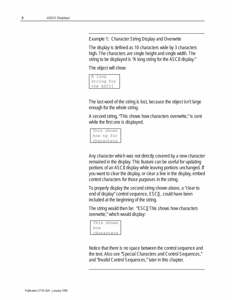
Example 1: Character String Display and Overwrite
The display is defined as 10 characters wide by 3 charactershigh. The characters are single height and single width. Thestring to be displayed is “A long string for the ASCII display.”
The object will show:
A longstring forthe ASCII
The last word of the string is lost, because the object isn’t largeenough for the whole string.
A second string, “This shows how characters overwrite,” is sentwhile the first one is displayed.
This shows how ng forcharacters
Any character which was not directly covered by a new characterremained in the display. This feature can be useful for updatingportions of an ASCII display while leaving portions unchanged. Ifyou want to clear the display, or clear a line in the display, embedcontrol characters for those purposes in the string.
To properly display the second string shown above, a “clear toend of display” control sequence, ESC[J, could have beenincluded at the beginning of the string.
The string would then be: “ESC[JThis shows how charactersoverwrite,” which would display:
This showshowcharacters
Notice that there is no space between the control sequence andthe text. Also see “Special Characters and Control Sequences,”and “Invalid Control Sequences,” later in this chapter.
3ASCII Displays
Publication 2711E-820 – January 1998
ASCII Display String Format
The format of the data string must be as in the following table. Formore characters see the ASCII character set in Appendix D, or seeAppendix B, The Extended Character Set, in the PanelBuilder 1400eConfiguration Software for Windows User Manual.
ÁÁÁÁÁÁÁÁÁÁÁÁÁÁÁÁ
Bit ÁÁÁÁÁÁÁÁÁÁÁÁÁÁ
15 8 ÁÁÁÁÁÁÁÁÁÁÁÁÁÁÁÁ
7 0
ÁÁÁÁÁÁÁÁÁÁÁÁÁÁÁÁ
1st word ÁÁÁÁÁÁÁÁÁÁÁÁÁÁ
1st character ÁÁÁÁÁÁÁÁÁÁÁÁÁÁÁÁ
2nd character
ÁÁÁÁÁÁÁÁÁÁÁÁÁÁÁÁ
2nd word ÁÁÁÁÁÁÁÁÁÁÁÁÁÁ
3rd character ÁÁÁÁÁÁÁÁÁÁÁÁÁÁÁÁ
4th character
ÁÁÁÁÁÁÁÁÁÁÁÁÁÁÁÁ
ÁÁÁÁÁÁÁÁÁÁÁÁÁÁ
… ÁÁÁÁÁÁÁÁÁÁÁÁÁÁÁÁ
…
Special Characters and Control Sequences
The ASCII Display uses character 255 (�) to align display strings ofodd length. Fill characters are not printable and will not occupyspace on the display. For a list of the ASCII character set, seeAppendix D in this manual.
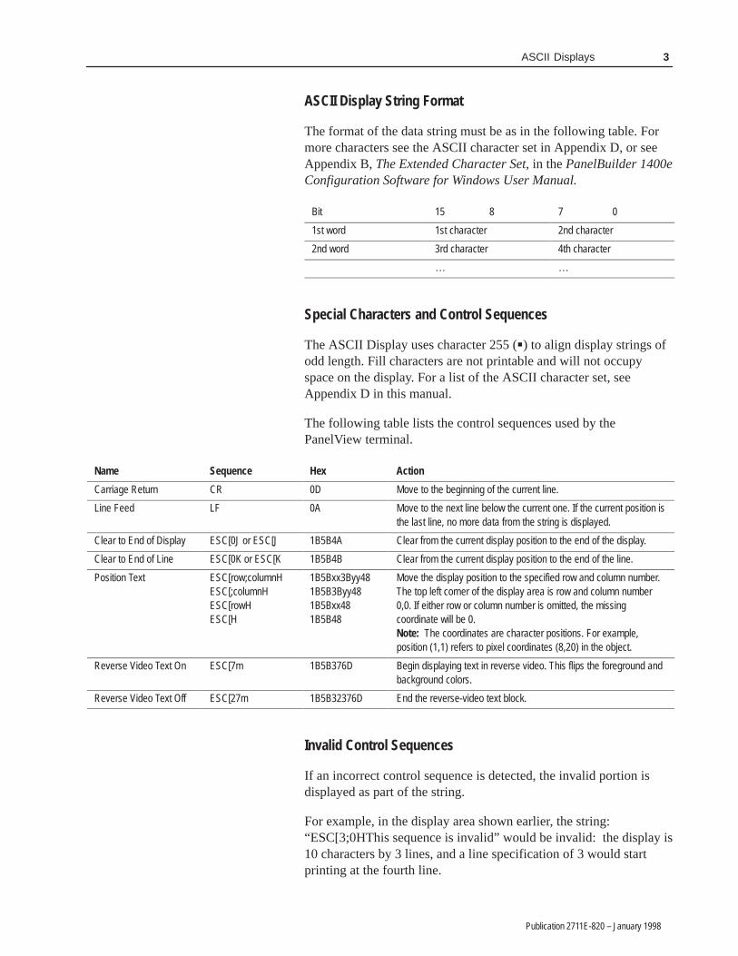
The following table lists the control sequences used by thePanelView terminal.
ÁÁÁÁÁÁÁÁÁÁÁÁÁÁÁÁÁÁÁÁÁ
NameÁÁÁÁÁÁÁÁÁÁÁÁÁÁÁÁÁÁÁÁÁ
SequenceÁÁÁÁÁÁÁÁÁÁÁÁÁÁÁ
HexÁÁÁÁÁÁÁÁÁÁÁÁÁÁÁÁÁÁÁÁÁÁÁÁÁÁÁÁÁÁÁÁÁÁÁÁÁÁÁÁÁÁÁÁÁÁÁÁÁÁÁ
ActionÁÁÁÁÁÁÁÁÁÁÁÁÁÁÁÁÁÁÁÁÁ
Carriage ReturnÁÁÁÁÁÁÁÁÁÁÁÁÁÁÁÁÁÁÁÁÁ
CRÁÁÁÁÁÁÁÁÁÁÁÁÁÁÁ
0DÁÁÁÁÁÁÁÁÁÁÁÁÁÁÁÁÁÁÁÁÁÁÁÁÁÁÁÁÁÁÁÁÁÁÁÁÁÁÁÁÁÁÁÁÁÁÁÁÁÁÁ
Move to the beginning of the current line.ÁÁÁÁÁÁÁÁÁÁÁÁÁÁÁÁÁÁÁÁÁ
Line FeedÁÁÁÁÁÁÁÁÁÁÁÁÁÁÁÁÁÁÁÁÁ
LFÁÁÁÁÁÁÁÁÁÁÁÁÁÁÁ
0AÁÁÁÁÁÁÁÁÁÁÁÁÁÁÁÁÁÁÁÁÁÁÁÁÁÁÁÁÁÁÁÁÁÁÁÁÁÁÁÁÁÁÁÁÁÁÁÁÁÁÁ
Move to the next line below the current one. If the current position isthe last line, no more data from the string is displayed.
ÁÁÁÁÁÁÁÁÁÁÁÁÁÁ
Clear to End of DisplayÁÁÁÁÁÁÁÁÁÁÁÁÁÁ
ESC[0J or ESC[JÁÁÁÁÁÁÁÁÁÁ
1B5B4AÁÁÁÁÁÁÁÁÁÁÁÁÁÁÁÁÁÁÁÁÁÁÁÁÁÁÁÁÁÁÁÁÁÁ
Clear from the current display position to the end of the display.ÁÁÁÁÁÁÁÁÁÁÁÁÁÁ
Clear to End of LineÁÁÁÁÁÁÁÁÁÁÁÁÁÁ
ESC[0K or ESC[KÁÁÁÁÁÁÁÁÁÁ
1B5B4BÁÁÁÁÁÁÁÁÁÁÁÁÁÁÁÁÁÁÁÁÁÁÁÁÁÁÁÁÁÁÁÁÁÁ
Clear from the current display position to the end of the line.ÁÁÁÁÁÁÁÁÁÁÁÁÁÁÁÁÁÁÁÁÁÁÁÁÁÁÁÁÁÁÁÁÁÁÁÁÁÁÁÁÁÁ
Position TextÁÁÁÁÁÁÁÁÁÁÁÁÁÁÁÁÁÁÁÁÁÁÁÁÁÁÁÁÁÁÁÁÁÁÁÁÁÁÁÁÁÁ
ESC[row;columnHESC[;columnHESC[rowHESC[H
ÁÁÁÁÁÁÁÁÁÁÁÁÁÁÁÁÁÁÁÁÁÁÁÁÁÁÁÁÁÁ
1B5Bxx3Byy481B5B3Byy481B5Bxx481B5B48
ÁÁÁÁÁÁÁÁÁÁÁÁÁÁÁÁÁÁÁÁÁÁÁÁÁÁÁÁÁÁÁÁÁÁÁÁÁÁÁÁÁÁÁÁÁÁÁÁÁÁÁÁÁÁÁÁÁÁÁÁÁÁÁÁÁÁÁÁÁÁÁÁÁÁÁÁÁÁÁÁÁÁÁÁÁÁÁÁÁÁÁÁÁÁÁÁÁÁÁÁÁÁ
Move the display position to the specified row and column number.The top left corner of the display area is row and column number0,0. If either row or column number is omitted, the missingcoordinate will be 0.Note: The coordinates are character positions. For example,position (1,1) refers to pixel coordinates (8,20) in the object.
ÁÁÁÁÁÁÁÁÁÁÁÁÁÁÁÁÁÁÁÁÁ
Reverse Video Text OnÁÁÁÁÁÁÁÁÁÁÁÁÁÁÁÁÁÁÁÁÁ
ESC[7m ÁÁÁÁÁÁÁÁÁÁÁÁÁÁÁ
1B5B376D ÁÁÁÁÁÁÁÁÁÁÁÁÁÁÁÁÁÁÁÁÁÁÁÁÁÁÁÁÁÁÁÁÁÁÁÁÁÁÁÁÁÁÁÁÁÁÁÁÁÁÁ
Begin displaying text in reverse video. This flips the foreground andbackground colors.
ÁÁÁÁÁÁÁÁÁÁÁÁÁÁ
Reverse Video Text OffÁÁÁÁÁÁÁÁÁÁÁÁÁÁ
ESC[27m ÁÁÁÁÁÁÁÁÁÁ
1B5B32376D ÁÁÁÁÁÁÁÁÁÁÁÁÁÁÁÁÁÁÁÁÁÁÁÁÁÁÁÁÁÁÁÁÁÁ
End the reverse-video text block.
Invalid Control Sequences
If an incorrect control sequence is detected, the invalid portion isdisplayed as part of the string.
For example, in the display area shown earlier, the string:“ESC[3;0HThis sequence is invalid” would be invalid: the display is10 characters by 3 lines, and a line specification of 3 would startprinting at the fourth line.

4 ASCII Displays
Publication 2711E-820 – January 1998
If the current display position were 0;0, the string would display:
←[3;0HThissequence is invalid
The left arrow character in the display represents ESC.
Other invalid sequences:
• nested Reverse Video On, for example,“ESC[7mOneESC[7mTwo” The second command is invalid and, if possible, is displayed aspart of the string.
Note: If the Reverse Video On is without an Off, the terminalautomatically turns off the reverse video at the end of the string.
• nested Reverse Video Off, for example,“ESC[27mOneESC[27mTwo”The second command is invalid and, if possible, is displayed aspart of the string.
• wrong characters in text position sequence. The text positioncoordinates must not contain any characters other than 0 to 9, forexample, “ESC[a3;4HThe string.”
Configuring the ASCII Display Object
Configure the ASCII Display object according to this table:
Field Meaning
Name Assign a name, up to 15 characters, to document the object forprinted reports. This increases the application’s size by 1 byteper character.
Control ASCII Text indicates the PLC location of the string this objectdisplays. The display is updated whenever this string changes.Assign a String type tag up to 82 characters long.
You can adjust the size of the ASCII Display and format itsforeground color, background color, font style, border style, andblink and underline attributes. For details on formatting objects see“Changing Object Appearance,” in Chapter 9, Creating Objects, inthe PanelBuilder 1400e Configuration Software for Windows UserManual.
Note: If you use the Extra Large Font, the application will becompatible only with PanelView Version 2 or later. The applicationwill not be compatible with earlier versions.
�
�

����� ����
Publication 2711E-820 – January 1998
����� ����
This chapter tells you:
• how the ASCII Input object functions
• how to configure the ASCII Input object
The ASCII Input object allows the operator to send an alphanumericstring (up to 82 characters) to the PLC.
There are two types of ASCII Input objects:
• large ASCII Input object
• small ASCII Input object
These function differently on keypad and touch screen terminals.
• On the Large ASCII Input object for a touch screen terminal, theoperator selects characters by touching the keyboard on thescreen. The selected character appears in the scratchpad. Whenthe character string in the scratchpad is complete, the operatorsends it to the ASCII Input control by pressing the ENT button onthe keyboard.
• On the Small ASCII Input object for both touch screen andkeypad terminals, and on the Large ASCII Input object forkeypad terminals, the operator selects characters from thekeyboard by moving the screen cursor (with the arrow keys) tothe desired character and pressing the SEL button. The selectedcharacter appears in the scratchpad. When the character string inthe scratchpad is complete, the operator sends it to the ASCIIInput control by pressing the ENT button.
The following table shows the scratchpad input and contents of theASCII Input control.
Scratchpad Input ASCII Input
leftmost character high byte – 1st word
2nd character low byte – 1st word
3rd character high byte – 2nd word
4th character low byte – 2nd word
The ASCII Input control’s initial value is sent to the PLC when theapplication first runs. The initial value is also displayed with theobject.
About ASCII Inputs

6 ASCII Inputs
Publication 2711E-820 – January 1998
Important: In Remote I/O applications, depending on how theApplication Startup screen is configured, the PanelViewterminal retains the current value of the ASCII Inputcontrol even after the terminal is turned off.
In DH+ applications the value is not retained.
ASCII Input Object Displays
The following illustration shows the Large ASCII Input object for atouch screen terminal.
RIO
DH+
7ASCII Inputs
Publication 2711E-820 – January 1998
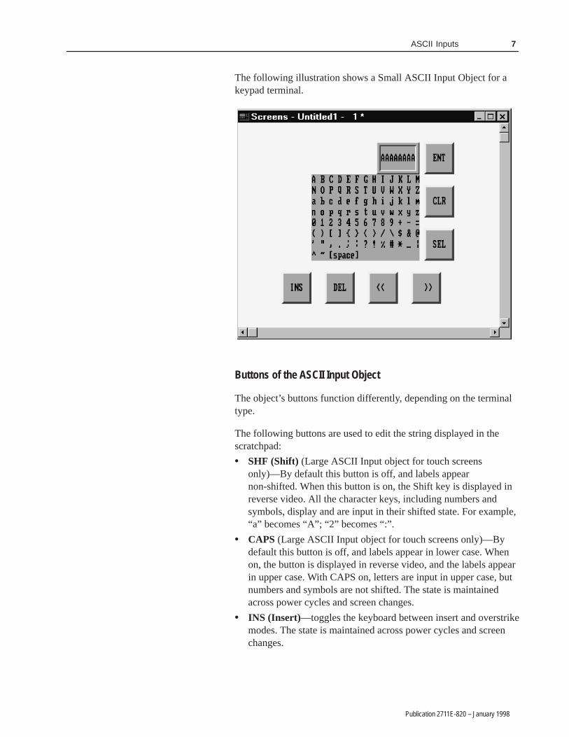
The following illustration shows a Small ASCII Input Object for akeypad terminal.
Buttons of the ASCII Input Object
The object’s buttons function differently, depending on the terminaltype.
The following buttons are used to edit the string displayed in thescratchpad:
• SHF (Shift) (Large ASCII Input object for touch screensonly)—By default this button is off, and labels appearnon-shifted. When this button is on, the Shift key is displayed inreverse video. All the character keys, including numbers andsymbols, display and are input in their shifted state. For example,“a” becomes “A”; “2” becomes “:”.
• CAPS (Large ASCII Input object for touch screens only)—Bydefault this button is off, and labels appear in lower case. Whenon, the button is displayed in reverse video, and the labels appearin upper case. With CAPS on, letters are input in upper case, butnumbers and symbols are not shifted. The state is maintainedacross power cycles and screen changes.
• INS (Insert)—toggles the keyboard between insert and overstrikemodes. The state is maintained across power cycles and screenchanges.

8 ASCII Inputs
Publication 2711E-820 – January 1998
When the keyboard entry is in insert mode the button appears inreverse video. New characters appear at the current cursorposition. The cursor also moves one character to the right foreach new character. The string in the scratchpad scrolls; however,if the maximum number of input characters has been entered inthe scratchpad, the new character will not be inserted.
When the keyboard entry is in overstrike mode and the INSbutton is in normal video, new characters type over existingcharacters.
• DEL (Delete)—deletes the character at the current scratchpadcursor position.
• <<—moves the cursor in the scratchpad to the left.
• >>—moves the cursor in the scratchpad to the right.
• CLR (Clear)—clears the scratchpad.
• SEL (Select)—places the highlighted character into thescratchpad at the cursor position. (For all ASCII Input objectsexcept the Large ASCII Input object for touch screens.)
• ENT (Enter)—When the operator presses the ENT button, theleftmost character is placed in the high order byte of the first PLCword, the next character to the right in the low order byte, and soon. If the character string is too large for the configured tag, theterminal displays an “out of range” error message. In this case,the character string is not sent to the PLC.
The ASCII input object supports a scrollable scratchpad area sothe operator can enter a long character string in a smallscratchpad. Pressing ENT sends all the characters to the PLC, notonly the visible characters. For example, if the scratchpad is fivecharacters wide, and the operator enters ten characters and pressesEnter, all ten characters are sent, assuming the “Number of InputCharacters” is configured to ten or more.
The string in the scratchpad is highlighted after the ENT button ispressed. If the operator selects an ASCII character immediately,the terminal clears the scratchpad and displays that character.However, if the operator presses an editing key (INS, DEL, or thecursor keys << and >> ), the terminal continues to display theexisting string (no longer highlighted), allowing the operator toedit it without having to retype it.
• Arrow keys (Large and Small ASCII Input objects for keypadterminals)—The operator uses the arrow keys on the PanelViewterminal to select characters from the keyboard.
• Arrow keys (Small ASCII Input object for touch screenterminals)—The operator uses the four directional arrows that arepart of the object to select characters from the keyboard.
9ASCII Inputs
Publication 2711E-820 – January 1998
Configuring the ASCII Input Object (Large or Small)
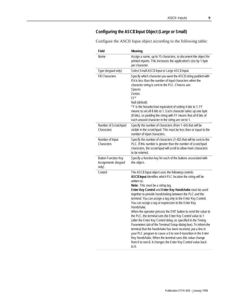
Configure the ASCII Input object according to the following table:
Field Meaning
Name Assign a name, up to 15 characters, to document the object forprinted reports. This increases the application’s size by 1 byteper character.
Type (keypad only) Select Small ASCII Input or Large ASCII Input.
Fill Characters Specify which character you want the ASCII string padded withif it is less than the number of input characters when thecharacter string is sent to the PLC. Choices are:SpacesZeroesFF* Null (default)* F is the hexadecimal equivalent of setting 4 bits to 1; FFmeans to set all 8 bits to 1. Each character takes up one byte(8 bits), so padding the string with FF means that all 8 bits ofeach unused character in the string are set to 1.
Number of ScratchpadCharacters
Specify the number of characters (from 1–64) that will bevisible in the scratchpad. This must be less than or equal to thenumber of input characters.
Number of InputCharacters
Specify the number of characters (1–82) that will be sent to thePLC. If this number is greater than the number of scratchpadcharacters, the scratchpad will scroll to allow more charactersto be entered.
Button Function KeyAssignments (keypadonly)
Specify a function key for each of the buttons associated withthis object.
Control The ASCII Input object uses the following controls.ASCII Input identifies which PLC location the string will bewritten to.Note: This must be a string tag.Enter Key Control and Enter Key Handshake must be usedtogether to provide handshaking between the PLC and theterminal. You can assign a tag only to the Enter Key Control.You can assign a tag or expression to the Enter KeyHandshake.When the operator presses the ENT button to send the value tothe PLC, the terminal sets the Enter Key Control value to 1(after the Enter Key Control delay, as specified in the TimingParameters tab of the Terminal Setup dialog box). To inform theterminal that the handshake has been received, put a line inyour PLC program to cause a 0 to non-0 transition in the EnterKey Handshake. When the terminal sees this value changefrom 0 to non-0, it changes the Enter Key Control value backto 0.

10 ASCII Inputs
Publication 2711E-820 – January 1998
Field Meaning
Control (con’t) If the terminal does not receive acknowledgment (transitionfrom 0 to non-0) within the Enter Key Handshake Time (asspecified in the Timing Parameters tab of the Terminal Setupdialog box), it displays an error message in the Fault Windowand resets the Enter Key Control. If the Enter Key Handshakeis unassigned, the Enter Key Control remains set for theduration of the Push Button Hold Time or for as long as thebutton is pressed, whichever is longer.Because this control uses only two values, a digital tag isrecommended.Important: If the Enter Key Control is assigned, all keypadand touch screen input is disabled when the Enter Key ispressed, until the Enter Key Control is reset to 0.
You can adjust the size of the scratchpad and format the ASCII Inputobject’s foreground color, background color, font style, and borderstyle. For details on formatting objects see “Changing ObjectAppearance,” in Chapter 9, Creating Objects, in the PanelBuilder1400e Configuration Software for Windows User Manual.
Note: If you use the Extra Large Font the application will becompatible with PanelView Version 2 or later. It will not becompatible with earlier versions.
�
��� ������
Publication 2711E-820 – January 1998
��� ������
This chapter tells you:
• how bar graphs function
• how to configure bar graphs
Bar graphs are useful for monitoring analog conditions that change,such as temperature or fluid levels. You can create vertical andhorizontal bar graphs across the height or width of the screen.
Vertical bars can be configured to fill from bottom to top orvice-versa. Horizontal bars can be configured to fill from left to rightor vice versa.
Tip: Use the following suggestions to customize bar graphs:
• To show the bar’s fill level, make an axis with incremental ticksalongside the bar graph by using the Scale object, or by usinglines or graphic images.
• To have a bar graph change color at certain values, cascade bargraphs together. To do this, remove the border from the graphs,place the high end of one graph at the low end of the next, andadjust each graph’s data range accordingly. To add a border to thecascading graphs, place a hollow or solid panel behind the bargraphs.
• To create a fully functional “template,” group bar graphs withother objects. For example, position two or three bar graphstogether and put numeric display objects immediately below thebar graphs to display the process variable, set point, and controlvariable. You can use any of the numeric entry objectsinteractively with these values.
About Bar Graphs
�

12 Bar Graphs
Publication 2711E-820 – January 1998
Configuring the Bar Graph
Configure the bar graph according to this table:
Field Meaning
Name Assign a name, up to 15 characters, to document the object forprinted reports. This increases the application’s size by 1 byteper character.
Graph Type Specify Vertical Bar Graph or Horizontal Bar Graph.
Fill Direction Specify the direction you want the bar to fill.For vertical graphs, specify either Top Down or Bottom Up.For horizontal graphs, specify either Left to Right or Right to Left.
Maximum Value Specify the maximum value to be displayed in the graph. Whenthe PLC value reaches (or exceeds) this value, the bar graph iscompletely full. Enter a value between -2,147,483,648 and2,147,483,647.The maximum value must be greater than the minimum value.
Minimum Value Specify the minimum value to be displayed in the graph. Whenthe PLC value drops to (or falls below) this value, the bar graphis completely empty. Enter a value between -2,147,483,648and 2,147,483,647.The minimum value must be less than the maximum value.
Control Bar Graph Value identifies the value to be displayed. Assign atag or expression to the Bar Graph Value control.
You can adjust the size of the bar graph and format its foregroundcolor, background color, border style, and blink attributes. For detailson formatting objects see “Changing Object Appearance,” inChapter 9, Creating Objects, in the PanelBuilder 1400eConfiguration Software for Windows User Manual.

������ �������
Publication 2711E-820 – January 1998
������ �������
This chapter discusses:
• the different types of Control Selectors
• how to use Control Selectors
• how to configure Control Selectors
Control Selectors allow operators to select items from a list. Whenthe application is running, the operator can move through the listusing the Up and Down Cursor buttons and select items.
The choice the operator makes is always indicated by the value ofthe Selector Control.
There are three Control Selectors:
This Control Selector Does this
Control List Selector with EnterKey
Allows the operator to move through a list and selecta list item by pressing Enter.
Control List Selector without EnterKey
Allows the operator to move through a list. Thecurrent list item is automatically selected.
Set Bit Cursor Point (Keypad applications only)
Points to a screen character and allows the operatorto select from a list or an array of objects.
Tip: You can position Control Selectors so they point at otherobjects on the same screen. For example, a Control List Selectorcould point to an adjacent list of Numeric Display objects. Valuesentered using the selector could be directed (by the PLC program) tothe Displayed Value tag or expression of the numeric object beingdisplayed.
Control List Selectors consist of a list of entries. Consider each entryin the Control List Selector as a state, where state 0 is the first entryand state ‘n’ is the last entry.
Each state in the list corresponds to a value. This value is written tothe Selector Control.
About Control Selectors
�

14 Control Selectors
Publication 2711E-820 – January 1998
The Control List Selector with Enter Key object allows the operatorto choose items in a list by selecting them and then pressing Enter.
The maximum number of items in this list is determined by the sizeof the list component. For information on changing the size of thelist component, see Chapter 9, Creating Objects, in the PanelBuilder1400e Configuration Software for Windows User Manual.
The Control List Selector with Enter Key consists of the followingcomponents:
This component Does this
Selector List This vertical list can have up to 24 different states (each listitem represents a state). With Double High or Large Font, thelist can contain 12 states. If you use the Extra Large Font, thelist can contain only 6 states.
Up Cursor Button When the operator presses the Up Cursor button, the arrowin the list moves up by one list entry. If the Down Cursorbutton is enabled, you can disable the Up Cursor button. Onlyone of the Up and Down Cursor buttons needs to be enabled.The Up Cursor button auto-repeats at the rate specified in theTiming Parameters tab of the Terminal Setup dialog box.
Down Cursor Button When the operator presses the Down Cursor button, thearrow in the list moves down by one list entry. If the UpCursor button is enabled, you can disable the Down Cursorbutton. Only one of the Up and Down Cursor buttons needsto be enabled.The Down Cursor button auto-repeats at the rate specified inthe Timing Parameters tab of the Terminal Setup dialog box.
Enter When the operator presses Enter, the desired option ischosen and the Selector Control value is updated.
As the operator presses the Up or Down Cursor buttons, an arrowindicator moves through the list states, wrapping around the top andbottom. To make a choice, the operator presses Enter. When Enter ispressed, the list state is chosen, and the terminal updates the SelectorControl with the value assigned to that state.
Because the operator can move through the list and select differentstates at will, the states are not necessarily executed consecutively.The new state is determined by the cursor’s position in the list whenEnter is pressed.
Control List Selector withEnter Key

15Control Selectors
Publication 2711E-820 – January 1998
The Control List Selector with Enter Key recognizes when theSelector Control value is changed externally. For example, if the tagassigned to the Selector Control is also assigned to another object,and this object sends a new value to the tag, the Control ListSelector’s highlight bar moves to the list state that has this valueassigned. If the state value doesn’t match the tag value, the highlightbar will be removed. An error state also occurs if the SelectorControl is not assigned. In this case also, no highlight bar appears.
If the Selector Control cannot accommodate a state value, an errormessage is displayed, and the PLC value is not changed. Theoperator must clear the fault before continuing.
Important: In Remote I/O applications, the PanelView terminal canretain the current value for the Control List Selectorwith Enter Key, even after the terminal is turned off.Depending on how the Application Startup operation isdefined, the retained value (last state) or initial value(default) is sent to the PLC when power is re-applied.
For details on configuring Application Startupoperation, see “Application Startup” in Chapter 5 in thePanelView 1000e, 1200e, and 1400e OperatorTerminals User Manual.
Configuring a Control List Selector with Enter Key
Configure the Control List Selector with Enter Key according to thistable:
Field Meaning
Name Assign a name, up to 15 characters, to document the object forprinted reports. This increases the application’s size by 1 byteper character.
Control List Type Specify Control List Selector with Enter Key.
Initial State Specify the state that the cursor defaults to when theapplication is run for the first time. Choose any of the states inthe list.Instead of assigning a state, you can enter a blank value in theInitial State field. This means that the object will always use theSelector Control’s initial value to set the initial state.
Edit States Change the values of the states. You can assign any uniquevalue from –2,147,483,648 to 2,147,483,647. For moreinformation, see “Configuring List Object States,” in Chapter 9,Creating Objects, in the PanelBuilder 1400e ConfigurationSoftware for Windows User Manual.Note: To minimize the size of the application file, use statevalues that increment by one for each state. Do not configuremore states than you need.
RIO

16 Control Selectors
Publication 2711E-820 – January 1998
Field Meaning
Up Cursor Specify whether the Up Cursor button is enabled, and, if youhave a keypad application, select a function key. You musthave at least one of the Up and Down Cursor buttons enabled.
Down Cursor Specify whether the Down Cursor button is enabled, and, if youhave a keypad application, select a function key. You musthave at least one of the Up and Down Cursor buttons enabled.
Enter If you have a keypad application, specify which function key theoperator will press to choose the highlighted selection.
Control The Control List Selector with Enter Key uses the followingcontrols:Selector Control records the state value of the list itemcurrently selected. You can assign a tag only to the SelectorControl.Note: If you do not assign this control, an error state occurswhen the object is displayed on the PanelView terminal. Nohighlight bar appears on the list, alerting the operator to theerror state.Enter Key Control records that the Enter Key has beenpressed. You can only assign a tag to this control.When Enter is pressed after the Enter Key Control Delay timehas elapsed, the control is set to 1 for the Enter KeyHandshake Time (specified in the Timing Parameters tab of theConfigure Terminal Setup dialog box) or until the Enter KeyHandshake makes a 0 to non-0 transition. When either occurs,the Enter Key Control is reset to 0.Since this control uses only two values, a digital tag isrecommended.Enter Key Handshake is set by the PLC to confirm that it hasrecorded the change for the Enter Key Control. You can assigna tag or expression to the Enter Key Handshake control.The PanelView terminal sets the Enter Key Control to 1 whenthe operator presses the button. PLC logic must set the EnterKey Handshake to non-0 when the Enter Key Control is set.When the terminal detects a 0 to non-0 transition in the EnterKey Handshake, it resets the Enter Key Control to 0. PLC logicmust then reset the Enter Key Handshake to 0.If this control is left unassigned, the Enter Key Control is resetafter the Push Button Hold Time.
You can adjust the size of each component of the Control ListSelector with Enter Key and format the object’s foreground color,background color, font style, button margins (touch screenapplications only), border style, fill style, and blink attributes. Fordetails on formatting objects see “Changing Object Appearance,” inChapter 9, Creating Objects, in the PanelBuilder 1400eConfiguration Software for Windows User Manual.
Note: If you use the Extra Large Font, the application will becompatible only with PanelView Version 2 or later. The applicationwill not be compatible with earlier versions.
�

17Control Selectors
Publication 2711E-820 – January 1998
Unlike the Control List Selector with Enter Key, the selections in theControl List Selector without Enter Key list are highlighted and sentto the PLC as the operator moves the cursor to each item.
The number of items in this list is determined by the size of the listcomponent. For information on changing the size of the listcomponent, see Chapter 9, Creating Objects, in the PanelBuilder1400e Configuration Software for Windows User Manual.
The Control List Selector without Enter Key consists of thesecomponents:
This component Does this
Selector List This vertical list can have up to 24 different states (each listitem represents a state). With Double High or Large Font,the list can contain 12 states. If you use the Extra LargeFont, the list can contain only 6 states.
Up Cursor Button When the operator presses the Up Cursor button, thearrow in the list moves up by one list entry. If the DownCursor button is enabled, you can disable the Up Cursorbutton. Only one of the Up and Down Cursor buttonsneeds to be enabled.The Up Cursor button auto-repeats at the rate specified inthe Timing Parameters tab of the Terminal Setup dialogbox.
Down Cursor Button When the operator presses the Down Cursor button, thearrow in the list moves down by one list entry. If the UpCursor button is enabled, you can disable the DownCursor button. Only one of the Up and Down Cursorbuttons needs to be enabled.The Down Cursor button auto-repeats at the rate specifiedin the Timing Parameters tab of the Terminal Setup dialogbox.
Tip: Build a simple two-position Control List Selector and includeonly the Down Cursor button. Functionally, the result is the same asa Maintained Push Button or a hard-wired, two-position selectorswitch. However, you also have a two-position list with the currentselection highlighted.
Note: The Control List Selector without Enter Key recognizes whenthe Selector Control value is changed externally. For example, if thetag assigned to the Selector Control is also assigned to anotherobject, and this object writes a new value in the tag, the Control ListSelector indicates the new value. If the Selector Control value doesnot match any of the list’s state values, the highlight bar is removed.
If the Selector Control cannot accommodate the state value, an errormessage is displayed, and the PLC value is not changed. Theoperator must clear the fault before continuing.
Control List Selectorwithout Enter Key
�
�

18 Control Selectors
Publication 2711E-820 – January 1998
Important: In Remote I/O applications, the PanelView terminal canretain the current value for the Control List Selectorwithout Enter Key, even after the terminal is turned off.Depending on how the Application Startup operation isdefined, the retained value (last state) or initial value(default) is sent to the PLC when power is re-applied.
For details on configuring Application Startupoperation, see “Application Startup” in Chapter 5 in thePanelView 1000e, 1200e, and 1400e OperatorTerminals User Manual.
!ATTENTION: A control function should requireoperator confirmation. Do not use this object on itsown to initiate a control function. Also, a retainedvalue could be used when the terminal is powered backon, which could result in a control function startingwithout the operator’s knowledge.
Configuring a Control List Selector without Enter Key
Configure the Control List Selector without Enter Key according tothis table:
Field Meaning
Name Assign a name, up to 15 characters, to document the object forprinted reports. This increases the application’s size by 1 byteper character.
Control List Type Specify Control List Selector without Enter Key.
Initial State Specify the state that the cursor defaults to when theapplication is run for the first time. Choose any of the states inthe list.Instead of assigning a state, you can enter a blank value in theInitial State field. This means that the object will always use theSelector Control’s initial value to set the initial state.
Edit States Change the values of the states. You can assign any uniquevalue from –2,147,483,648 to 2,147,483,647. For moreinformation, see “Configuring List Object States” in Chapter 9,Creating Objects, in the PanelBuilder 1400e ConfigurationSoftware for Windows User Manual.Note: To minimize the size of the application file, use statevalues that increment by one for each state. Do not configuremore states than you need.
Auto-Repeat Rate Set the number of times per second the Up and Down Cursorbuttons will repeat when pressed and held down by theoperator. A value of 0 disables auto-repeat.
Auto-Repeat StartDelay
Set the time that should pass before the Up and Down Cursorbuttons go into Auto-Repeat mode when pressed and helddown by the operator. The range is 200 milliseconds to 2.5seconds.
RIO

19Control Selectors
Publication 2711E-820 – January 1998
Field Meaning
Up Cursor Specify whether the Up Cursor button is enabled, and if youhave a keypad application, select a function key. You musthave at least one of the Up and Down Cursor buttons enabled.
Down Cursor Specify whether the Down Cursor button is enabled, and if youhave a keypad application, select a function key. You musthave at least one of the Up and Down Cursor buttons enabled.
Control Selector Control records the state value of the list itemcurrently selected. You can assign a tag only to the SelectorControl.When the application is run for the first time, if initial values aredefined, the value of the initial state is written to the SelectorControl. Each time the button is pressed, the value of the nextstate is sent to the Selector Control. After the value for the laststate is sent, the next button press wraps back to the first state.The button recognizes external control value changes. If theSelector Control value changes to one that does not match anyof the state values, the next button press will set the button tostate 0.Note: If you do not assign this control, an error state occurswhen the object is displayed on the PanelView terminal. Nohighlight bar appears on the list, alerting the operator to theerror state.
You can adjust the size of each component of the Control ListSelector without Enter Key, and format the object’s foreground color,background color, font style, button margins (touch screenapplications only), border style, fill style, and blink attributes. Fordetails on formatting objects see “Changing Object Appearance,” inChapter 9, Creating Objects, in the PanelBuilder 1400eConfiguration Software for Windows User Manual.
Note: If you use the Extra Large Font, the application will becompatible only with PanelView Version 2 or later. The applicationwill not be compatible with earlier versions.
�

20 Control Selectors
Publication 2711E-820 – January 1998
A group of Set Bit Cursor Point objects allows the operator to selectfrom a list or an array of objects.
The Set Bit Cursor Point object consists of a cursor character, adisplay field, and a unique control.
To use the Set Bit Cursor Points at runtime, the operator must pressthe Select button on the PanelView terminal, thereby enabling thearrow and Home keys. The arrow keys move the cursor to thedesired Set Bit Cursor Point on the terminal display. The Home keymoves the cursor to the home position (the cursor position at the topleft of the screen).
When the operator selects a Set Bit Cursor Point, the PanelViewterminal sets the selected Set Bit Cursor Point’s control to 1 anddisplays the Set Bit Cursor Point character highlighted and blinking.To turn off the Set Bit Cursor Point feature and disable the keys, theoperator must press the Cancel button on the PanelView terminal.
Only the selected Set Bit Cursor Point will have a control value setto 1. All other Set Bit Cursor Points will have a Control value of 0.
Important: The Cursor Point operation status (Select or Cancel)and the current cursor point position for eachapplication screen are maintained even after theterminal is turned off and back on. This is true for DH+,ControlNet, and Remote I/O applications.
!ATTENTION: A control function should requireoperator confirmation. Do not use this object on itsown to initiate a control function. Also, a retainedvalue could be used when the terminal is powered backon, which could result in a control function startingwithout the operator’s knowledge.
When you create a screen in PanelBuilder 1400e, all Set Bit CursorPoint characters are visible. However, when you display the screenon a PanelView terminal, only one Set Bit Cursor Point character isvisible and blinking.
Place successive Set Bit Cursor Points above, below, or besideexisting Set Bit Cursor Points (any distance apart). Refer to the Xand Y coordinates in the status bar to make sure the Set Bit CursorPoints line up. At runtime, if the Set Bit Cursor Points aren’tproperly lined up, the operator may not be able to navigate frompoint to point as expected. There is no warning if the Set Bit CursorPoints don’t line up.
Set Bit Cursor Points (Keypad Terminals Only)

21Control Selectors
Publication 2711E-820 – January 1998
Example 1: Using Set Bit Cursor Points
To monitor all the motors on a conveyor belt, draw a line torepresent the belt, and place Set Bit Cursor Points pointing toeach motor along the belt.
Program the PLC so that when you display this screen on aterminal you can move the cursor to the desired motor and seeits status in a Local Message Display or Multistate Indicator.
Using the Set Bit Cursor Point on the PanelView Terminal
When the application is running, the operator can use these keys onthe PanelView terminal to control the Set Bit Cursor Point:
This key Does this
Select Enables the arrow keys and Home key.
Arrow keys Move the cursor through the Set Bit Cursor Points on thescreen.
Home Moves the cursor to the home position (at the top left of thescreen).
Cancel Turns the Set Bit Cursor Point feature off and disables thearrow and Home keys.

22 Control Selectors
Publication 2711E-820 – January 1998
When selected, the Cursor Point character is highlighted andblinking. The Control is set to 1. To turn off the Set Bit Cursor Pointfeature and disable the keys, the operator must press the Cancelbutton on the PanelView terminal.
The Set Bit Cursor Point values are not changed when the Set BitCursor Point feature is cancelled. The last selected Set Bit CursorPoint remains on.
Note: By default, when the Cancel button is pressed, the Set BitCursor Point character becomes invisible. To keep the charactervisible, even after the Cancel button is pressed, enable the RetainCursor On Cancel check box in the Object Setup tab of the TerminalSetup dialog box. For more information about terminal setupoptions, see Chapter 12, “Configuring Terminal Setup Options,” inthe PanelBuilder 1400e Configuration Software for Windows UserManual.
Note: If you enable the Retain Cursor On Cancel option, theapplication will be compatible only with PanelView Version 2 orlater. The application will not be compatible with earlier versions.
Cursor Point Default Operation
1. When the application is run for the first time, the PanelViewterminal scans all Set Bit Cursor Point objects in the screen fromleft to right, top to bottom. The first Set Bit Cursor Point objectwith its control value set to 1 is as the active Cursor Point for thatscreen.
2. If none are found, the Cursor Point object (Set Bit or NumericInput) nearest the home position of the screen is the active CursorPoint object for that screen. If this is a Set Bit Cursor Point, itscontrol is set to 1.
3. All other Set Bit Cursor Point objects in the selected screen havetheir control values reset to 0. Any other Numeric Input CursorPoint objects on the screen remain inactive.
4. In a Remote I/O application, when the screen is selected and theScreen Number to PLC option is enabled, both the new screennumber and the new Set Bit Cursor Point values are transferred tothe PLC in the same PLC scan.
Note: When the application is first run, the Cursor Point operation isenabled.
�
�
�

23Control Selectors
Publication 2711E-820 – January 1998
Cursor Point Operation after Screen Change
1. When a screen is re-selected, the Set Bit Cursor Point object thatwas last active is active again.
2. The object’s control value is set to 1.
3. All other Set Bit Cursor Point objects in the screen have theircontrol values reset to 0.
Cursor Point Operation on a Terminal Powerup
The Set Bit Cursor Point operation status (Selected or Cancelled) isalways saved. On powerup, as well as when you switch to a newscreen, the Set Bit Cursor Point object that was active when thescreen was last displayed is active.
!ATTENTION: The Set Bit Cursor Point object shouldnot share tags with objects used for control purposes.Sharing tags could cause control functions to startwithout the operator’s knowledge.
The following example shows how the PanelView terminaldetermines which Set Bit Cursor Point is active.
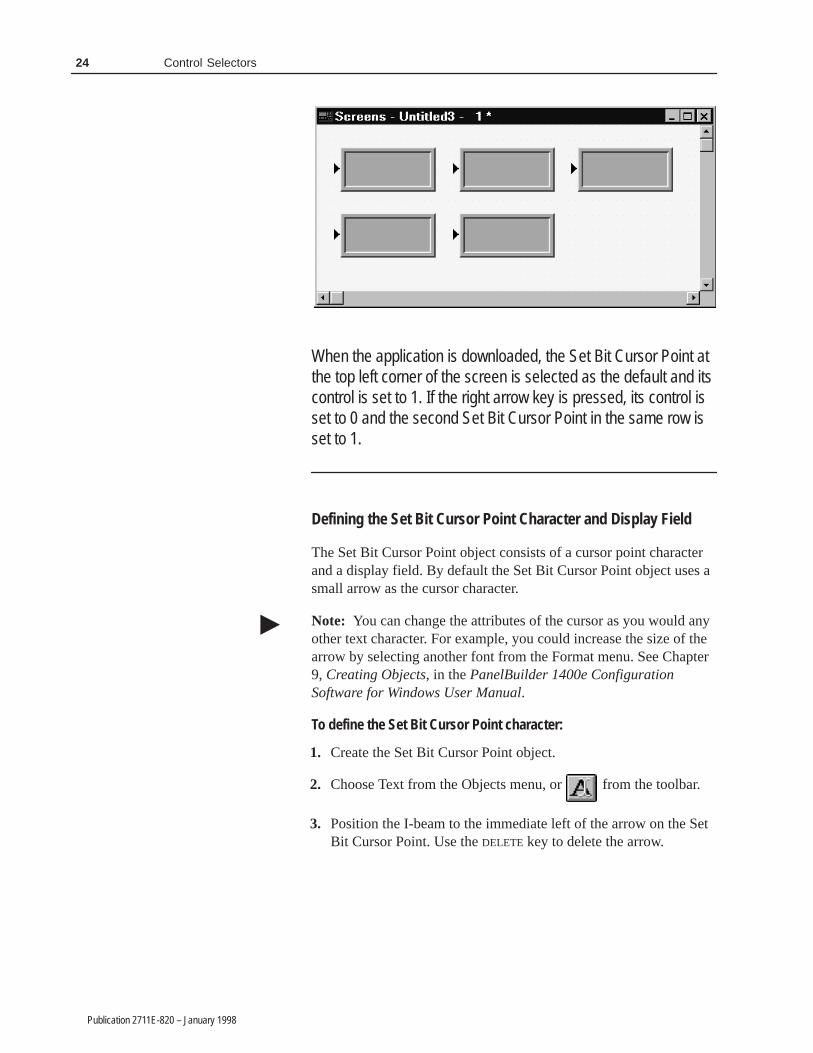
Example 2: When a Screen Uses Multiple Set Bit Cursor Points
The Application Startup screen has five Set Bit Cursor Points:three in a row at the top of the screen and two in a row below.The first two Set Bit Cursor Points in each row are aligned incolumns.
24 Control Selectors
Publication 2711E-820 – January 1998
When the application is downloaded, the Set Bit Cursor Point atthe top left corner of the screen is selected as the default and itscontrol is set to 1. If the right arrow key is pressed, its control isset to 0 and the second Set Bit Cursor Point in the same row isset to 1.
Defining the Set Bit Cursor Point Character and Display Field
The Set Bit Cursor Point object consists of a cursor point characterand a display field. By default the Set Bit Cursor Point object uses asmall arrow as the cursor character.
Note: You can change the attributes of the cursor as you would anyother text character. For example, you could increase the size of thearrow by selecting another font from the Format menu. See Chapter9, Creating Objects, in the PanelBuilder 1400e ConfigurationSoftware for Windows User Manual.
To define the Set Bit Cursor Point character:
1. Create the Set Bit Cursor Point object.
2. Choose Text from the Objects menu, or from the toolbar.
3. Position the I-beam to the immediate left of the arrow on the SetBit Cursor Point. Use the DELETE key to delete the arrow.
�

25Control Selectors
Publication 2711E-820 – January 1998
4. To use a character from the keyboard, type that character. You cantype only one character. To use a character from the extendedcharacter set, hold down the ALT key while you enter thecharacter’s ASCII code on the numeric keypad. See Appendix B,The Extended Character Set, in the PanelBuilder 1400eConfiguration Software for Windows User Manual for moreinformation.
You can use text or a graphic image as the Set Bit Cursor Pointdisplay.
To define the Set Bit Cursor Point display field:
1. Create the Set Bit Cursor Point object.
2. Type the text you want to see associated with the cursor point, orimport and place a graphic image in the display.
You can position the display on another area of the screen, insteadof next to the character.
If you don’t want a display with the cursor point, remove theborder and change the field’s background color to the screencolor. This will make the field disappear.
Configuring the Set Bit Cursor Point
Configure the Set Bit Cursor Point according to this table:
Field Meaning
Name Assign a name, up to 15 characters, to document the object forprinted reports. This increases the application’s size by 1 byteper character.
Set Bit Control Set Bit Control records the status of the Set Bit Cursor Point.You can only assign a tag to this control.When it is selected, the control is set to 1. Otherwise it is 0.Since this control uses only two values, a digital tag isrecommended.
You can adjust the size of the Set Bit Cursor Point’s display andformat the object’s foreground color, background color, font style,border style, fill style, and blink attributes. For details on formattingobjects see “Changing Object Appearance,” in Chapter 9, CreatingObjects, in the PanelBuilder 1400e Configuration Software forWindows User Manual.
Note: If you use the Extra Large Font, the application will becompatible only with PanelView Version 2 or later. The applicationwill not be compatible with earlier versions.
�

��������
Publication 2711E-820 – January 1998
��������
This chapter tells you how to use the PanelBuilder drawing objectsto illustrate your application.
Tip: To simplify screen editing and maximize runtime performance,convert all text and drawing objects into wallpaper. See Chapter 9,Creating Objects, in the PanelBuilder 1400e Configuration Softwarefor Windows User Manual, for detailed information.
Use the following drawing objects to illustrate your applicationscreens:
• arcs
• ellipses
• lines
• panels
• rectangles
• wedges
Note: For information about Scales, see the Scales chapter, later inthis manual.
You can draw arcs from one to four quadrants. You can size the arc,configure it to appear hollow or solid, and change the line style orwidth.
When you first draw an arc, it appears as an ellipse. Select one of thehandles and drag the pointer around the circumference of the ellipseto reduce the curve to three, two, or one quadrant of the ellipse.
Tip: To draw quadrants of a perfect circle, hold the Shift key as youfirst draw the arc.
For more details on drawing and configuring arcs, see Chapter 9,Creating Objects, in the PanelBuilder 1400e Configuration Softwarefor Windows User Manual.
�
About Drawing Objects
�
Arc
�

28 Drawings
Publication 2711E-820 – January 1998
You can create any size and shape of ellipse.
You can configure the ellipse as hollow or solid, and change the linestyle or width.
Tip: To create or edit a perfect circle, hold the Shift key as you drawor edit the ellipse. You can draw any size of circle.
For details on drawing and configuring ellipses, see Chapter 9,Creating Objects, in the PanelBuilder 1400e Configuration Softwarefor Windows User Manual.
Lines can be used for emphasis, to divide the screen, to connectsymbols, or to represent physical devices like pipes or conveyors.You can draw lines in any direction.
Tip: To create exact 45� angles when drawing or moving a line,hold the Shift key while you move the mouse.
Five line styles are available:
• Solid, in four widths (1, 2, 4, and 8 pixels)
• Dash
• Dot
• Dash-Dot
• Dash-Dot-Dot
For more information on lines and line styles, refer to Chapter 9,Creating Objects, in the PanelBuilder 1400e Configuration Softwarefor Windows User Manual.
Arrows
You can use the arrow graphic images to place arrows on lines. Thearrow images are contained in the IMAGES directory. If youfollowed the default installation, the directory will beC:\AB\PB1400E\IMAGES\ARROWS.
You must import the arrow images into the graphic images librarybefore you can place them on the screen. For instructions onimporting Graphic Images, refer to Chapter 9, Creating Objects, inthe PanelBuilder 1400e Configuration Software for Windows UserManual.
Ellipse
�
Line
�
29Drawings
Publication 2711E-820 – January 1998
Panels are similar to rectangles, except panels can have a border.They are useful for providing emphasis.
You can configure the border style of the panel and assign a hollowor solid fill pattern.
Tip: To draw or edit a perfect square, hold the Shift key as you drawor edit the panel. You can draw any size of panel.
For details on drawing and configuring panels, see Chapter 9,Creating Objects, in the PanelBuilder 1400e Configuration Softwarefor Windows User Manual.
Use rectangles to emphasize text or any other object. You can drawany size of rectangle. You can configure the rectangle as hollow orsolid and change its line style or width.
Tip: To draw or edit a perfect square, hold the Shift key as you drawor edit the rectangle. You can draw any size of square.
For details on drawing and configuring rectangles, see Chapter 9,Creating Objects, in the PanelBuilder 1400e Configuration Softwarefor Windows User Manual.
Wedges or pie-shapes are partial ellipses or closed arcs. You candraw wedges from one to four quadrants. Wedges always have a fillstyle and can have any line style or width.
When you first draw a wedge, it appears as an ellipse. Select one ofthe handles and drag the pointer around the circumference of theellipse to reduce the curve to three, two, or one quadrant of theellipse.
Tip: To draw quadrants of a perfect circle, hold the Shift key as youdraw the wedge.
For more details on drawing and configuring wedges, see Chapter 9,Creating Objects, in the PanelBuilder 1400e Configuration Softwarefor Windows User Manual.
Panel
�
Rectangle
�
Wedge
�

�� � ������� ����
Publication 2711E-820 – January 1998
�� � ������� ����
This chapter shows you how to create the Goto Configure Modeobject. This object allows operators to switch the PanelView terminalfrom Run Mode to Configure Mode without using the terminal’shardware keyswitch (where applicable). In addition, this chapterprovides tips on how to configure the Goto Configure Mode objectto avoid accidental switching of the terminal to Configure Mode.
When the operator presses the Goto Configure Mode button, theterminal displays the Confirm Configure Mode screen.
After the operator presses OK the terminal switches from Run Modeto Configure Mode and displays the Terminal Configuration Screen.Pressing Cancel returns the operator to the application currentlyexecuting on the terminal without interrupting communications orexecution of the application in any way.
About the Goto ConfigureMode Button
32 Goto Configure Mode
Publication 2711E-820 – January 1998
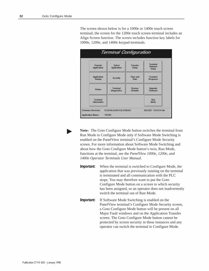
The screen shown below is for a 1000e or 1400e touch screenterminal; the screen for the 1200e touch screen terminal includes anAlign Screen function. The screen includes function key labels for1000e, 1200e, and 1400e keypad terminals.
Note: The Goto Configure Mode button switches the terminal fromRun Mode to Configure Mode only if Software Mode Switching isenabled on the PanelView terminal’s Configure Mode Securityscreen. For more information about Software Mode Switching andabout how the Goto Configure Mode button’s twin, Run Mode,functions at the terminal, see the PanelView 1000e, 1200e, and1400e Operator Terminals User Manual.
Important: When the terminal is switched to Configure Mode, theapplication that was previously running on the terminalis terminated and all communication with the PLCstops. You may therefore want to put the GotoConfigure Mode button on a screen to which securityhas been assigned, so an operator does not inadvertentlyswitch the terminal out of Run Mode.
Important: If Software Mode Switching is enabled on thePanelView terminal’s Configure Mode Security screen,a Goto Configure Mode button will be present on allMajor Fault windows and on the Application Transferscreen. The Goto Configure Mode button cannot beprotected by screen security in these instances and anyoperator can switch the terminal to Configure Mode.
�

33Goto Configure Mode
Publication 2711E-820 – January 1998
Software Mode Switching at the PanelView Terminal
For the Goto Configure Mode Button to operate, the Soft ModeSwitch must be enabled, and the terminal’s hardware keyswitch mustbe in Run mode. The Goto Configure Mode button allows operatorsto switch between Run and Configure modes without using thehardware keyswitch.
When in Configure Mode, press the Mode Switch tab in the Securitywindow to display the following screen.
Important: If the Software Mode Switch is set to Enable, the GotoConfigure Mode button is displayed without accessrestrictions on both the Transfer Application screen andthe Major Fault window. (See below for a screendisplay.) This may pose a security issue, because alloperators will be able to switch between Run andConfigure modes.
The presence of the Goto Configure Mode button in an applicationrunning on the PanelView terminal does not disable the terminal’shardware keyswitch; the terminal can still be switched from Runmode to Configure mode using the keyswitch or remote keyswitch(if fitted).

34 Goto Configure Mode
Publication 2711E-820 – January 1998
The following table shows the behavior of the terminal at power up:
If the terminal is powered up with Then the terminal powers up in
The Software Mode Switching optiondisabled
The mode indicated by the hardwarekeyswitch
The Software Mode Switching optionenabled, and the hardware key switch inRun Mode
The same mode it was in at power down
The Software Mode Switch option enabledand the hardware keyswitch in ConfigureMode
Configure Mode
The Software Mode Switch button also lets you enable or disable theRun Mode button on the Terminal Configuration screen.
• Enable�If you enable the software mode switch, operators canswitch the terminal from Run mode to Configure mode using theGoto Configure Mode button. Also the Run Mode button on theTerminal Configuration screen is enabled.
• Disable�If you disable the software mode switch, the GotoConfigure Mode button is disabled, and the Run Mode button onthe Terminal Configuration screen is disabled.
Configuring the Goto Configure Mode Button
Configure the Goto Configure Mode button according to this table:
Field Meaning
Name Assign a name, up to 15 characters, to document the object forprinted reports. This increases the application’s size by 1 byteper character.
Function Key(Keypad only)
Specify which function key the operator must press to activatethis button.
You can adjust the size of the button and format its foreground color,background color, button margins (touch screen applications only),border style, fill style, and blink attributes. For details on formattingobjects see “Changing Object Appearance,” in Chapter 9, CreatingObjects, in the PanelBuilder 1400e Configuration Software forWindows User Manual.
������ ����
Publication 2711E-820 – January 1998
������ ����
This chapter tells you how to use graphic images.
For step-by-step instructions about importing, placing, sizing,copying, and exporting graphic images, refer to Chapter 9, CreatingObjects, in the PanelBuilder 1400e Configuration Software forWindows User Manual.
Tip: To simplify screen editing and maximize runtime performance,convert all graphic images except object labels into wallpaper. SeeChapter 9, Creating Objects, in the PanelBuilder 1400eConfiguration Software for Windows User Manual, for detailedinformation.
Use graphic images to illustrate screens, objects, functions, and soon. You can add graphic images to the screen background, or addthem to an object as object labels. See Symbols later in this manualfor information about using graphic images as object labels.
If you followed the default installation, you’ll find a set of bitmap(.bmp) files in the folders contained in theC:\AB\PB1400E\IMAGES directory. The images in these foldersinclude all ISA symbols, arrow images, DIN symbols, and othercolor bitmaps. See Appendix A, ISA Symbols, Appendix B, DINSymbols, and Appendix C, Arrows and Parts, for samples of thesegraphic images.
Importing Graphic Images
You can import bitmaps from any other application into PanelBuilder1400e’s bitmap graphic image library. You can also import 2-DAutoCAD graphics saved in the .dxf file format into PanelBuilder1400e’s DXF Image library. Transparent AutoCAD .dxf images aremade solid when converted for use in PanelBuilder. Color bitmapsand .dxf graphics are converted into 16-color images; monochromebitmap images are imported as monochrome. The maximum graphicimage size is 640 by 480 pixels. If you import a file larger than this,PanelBuilder automatically shrinks it to 640 by 480 pixels.
Note: AutoCAD (.dxf) graphics are converted to bitmap files whenPanelBuilder creates the application’s .pvd file for downloading tothe PanelView terminal.
�
About Graphic Images
�

36 Graphic Images
Publication 2711E-820 – January 1998
Tip: Convert two-color bitmaps to monochrome before you importthem. Monochrome images use less memory and therefore providebetter runtime performance. You can configure a monochromeimage’s foreground and background colors, fill style, and blinkattributes. You can’t change the format of 16-color images.
Tip: Because PanelBuilder converts color images to 16-colorbitmaps, a 256-color image may not convert as expected. To achievea photographic appearance for your color bitmaps, import imagesthat use few colors. Screen 10 of the demonstration applicationsshows a good example: TANK16.BMP uses grays and greens andhas the quality of a photographic image. If you followed the defaultinstallation, the demonstration application files are in thePB1400E\DEMO folder.
Once bitmaps and .dxf files are imported into the application’sgraphic image libraries, you can select the files and place them onthe application screen or in objects as labels.
Sizing Graphic Images
You can increase or decrease the size of the graphic images once youplace them on screens in PanelBuilder. You can use multiple copiesof the same graphic image and change the size of any or all of them.The size of the source image remains unchanged; PanelBuilder saveseach new size of the image as a separate graphic when theapplication’s .pvd file is created.
Note: The application’s size increases each time you resize animage. Limit the number of images you resize to ensure that yourapplication will fit in the terminal’s memory.
Copying and Exporting Graphic Images
If you copy a graphic image to another PanelBuilder application, itssize attributes are copied as well. If you export a graphic image, it isexported with its original size dimensions, or with the size 640 by480 pixels, if it was originally larger than this. When exporting, ifthe source image was a .dxf file, the exported file is a bitmap (.bmp)representation of the source image.
�
�
�

37Graphic Images
Publication 2711E-820 – January 1998
Note: If you are concerned about minimizing the size of yourapplication, use as few graphic images as possible. For each graphicimage you use, the application file’s size increases the number ofbytes in the image. Copies of a graphic image take much less spacethan the original, so you might consider using the same image onseveral screens rather than placing a unique image on each screen.Ensure that all copies are the same size as the original, however,otherwise each copy is saved as a separate image. Monochromegraphic images take less file space than 16-color images that are thesame height and width.
�

��������
Publication 2711E-820 – January 1998
��������
This chapter tells you about:
• the different types of Indicators
• how to configure each Indicator
You can create these two types of Indicators:
• Multistate Indicator
• List Indicator
Indicators do not retain their values when the terminal is turned off.
The Multistate Indicator is a display object that enables the operatorto display the state of a PLC operation on the screen.
You can use the Multistate Indicator for various purposes. Forexample, create a Multistate Indicator that is only two pixels high tosimulate flow in a pipe or indicate the motion of an object. Use atwo-state solid rectangle to simulate an indicator light, adddescriptive text to the object, or add a graphic image. Or, use aMultistate Indicator to hide text until it is needed or becomesapplicable.
You can configure the state values of Multistate Indicator objects. Atruntime, the object displays the state whose value matches theIndicator State control value.
Note: If the Indicator State control contains a value that doesn’tmatch any of the Multistate Indicator’s assigned state values, an errorstate occurs and the highest numbered state is displayed without itslabel. An error state also occurs if the Indicator State control is notassigned. In this case also, the highest numbered state is displayedwithout its label.
Tip: If you plan to use the same graphic image for each state, use aSymbol instead of a Multistate Indicator. You can configure theSymbol to display different colors or blink attributes for differentstates, and the Symbol uses less memory. PanelView also processesthe information more quickly for Symbols than for MultistateIndicators. For more information, see Symbols, later in this manual.
About Indicators
Multistate Indicator
�
�

40 Indicators
Publication 2711E-820 – January 1998
Configuring the Multistate Indicator
For each Multistate Indicator, you must specify the number of states(from 2 to 255), and define an Indicator State control. At runtime,the value at the Indicator State control determines the state that isdisplayed on the PanelView terminal.
Configure the Multistate Indicator according to this table:
Field Meaning
Name Assign a name, up to 15 characters, to document the object forprinted reports. This increases the application’s size by 1 byteper character.
Number of States Specify the number of states, from 2 to 255, this object willdisplay.
Edit States If you increase the number of states beyond the default of 4,you must assign state values. You can also change the defaultstate values for the default 4 states.
To assign different values to the states, choose Edit States. Youcan assign any unique value from -2,147,483,648 to2,147,483,647. See “Configuring Object States,” in Chapter 9,Creating Objects, in the PanelBuilder 1400e ConfigurationSoftware for Windows User Manual for information on assigningstate values and configuring state attributes.
Note: To minimize the size of the application file, use statevalues that increment by one for each state. Do not configuremore states than you need.
You should configure colors, text, graphic images, and otherattributes for each state.
Control Indicator State controls the state for this object. You can assigna tag or expression to this control.
When the PLC changes the control’s value, the terminaldisplays the state with the assigned value.
Note: If you do not assign this control, an error state occurswhen the object is displayed on the PanelView terminal. Thehighest numbered state is displayed without its label, alertingthe operator to the error state.
You can adjust the size of the Multistate Indicator and format itsbackground color, border style, and blink attributes. For details onformatting objects see “Changing Object Appearance,” in Chapter 9,Creating Objects, in the PanelBuilder 1400e Configuration Softwarefor Windows User Manual.

41Indicators
Publication 2711E-820 – January 1998
The List Indicator displays a list of states for a particular PLCoperation and highlights the current state.
The font size determines the maximum number of states possible inthe list. Small and Double Wide fonts allow up to 24 states; DoubleHigh or Large fonts allow up to 12 states. If you use the Extra Largefont the maximum number of states is 6.
Note: List text can be in only one font size. The List Indicatorsupports text labels only, not graphic image labels.
At runtime, the operator can see all the states for a particularoperation and see which state is current. The current state ishighlighted. The size of the list component determines the number ofstates. For information on changing the font size, resizing the list,and adding state text, see “Changing Object Appearance,” inChapter 9, Creating Objects, in the PanelBuilder 1400eConfiguration Software for Windows User Manual.
The List Indicator is similar to the Control List Selector, except thePLC, rather than the operator, controls the display.
You can configure the state values of List Indicator objects. Atruntime, the object highlights the state whose value matches theIndicator State control’s value.
Note: If the Indicator State control contains a value that doesn’tmatch any of the List Indicator’s assigned state values, an error stateoccurs and no state is highlighted. An error state also occurs if theIndicator State control is not assigned. In this case also, no highlightbar appears.
List Indicator
�
�

42 Indicators
Publication 2711E-820 – January 1998
Configuring the List Indicator
The size of the List Indicator, font size, and border configurationdetermine the maximum number of states. To increase or decreasethe number of states, resize the list. Configure the List Indicatoraccording to this table:
Field Meaning
Name Assign a name, up to 15 characters, to document the object forprinted reports. This increases the application’s size by 1 byteper character.
Edit States Assign different values to the states. You can assign any uniquevalue from –2,147,483,648 to 2,147,483,647. See “ConfiguringList Object States” in Chapter 9, Creating Objects, in thePanelBuilder 1400e Configuration Software for Windows UserManual for information on assigning state values.
Note: To minimize the size of the application file, use statevalues that increment by one for each state. Do not configuremore states than you need.
Control Indicator State controls the state for this object. You can assigna tag or expression to the Indicator State control.
When the PLC changes the control’s value, the terminalhighlights the state with the assigned value.
Note: If you do not assign this control, an error state occurswhen the object is displayed on the PanelView terminal. Nohighlight bar appears on the list, alerting the operator to theerror state.
You can adjust the size of the List Indicator and format itsforeground color, background color, font style, border style, andblink attributes. For details on formatting objects see “ChangingObject Appearance,” in Chapter 9, Creating Objects, in thePanelBuilder 1400e Configuration Software for Windows UserManual.
Note: If you use the Extra Large Font, the application will becompatible only with PanelView Version 2 or later. The applicationwill not be compatible with earlier versions.
�

���� �� ��� � ���
Publication 2711E-820 – January 1998
���� �� ��� � ���
This chapter explains:
• how the Local Message Display object functions
• how to configure the Local Message Display object
The Local Message Display provides information to the operator bydisplaying one message from a list.
There are two components to a local message: the Local MessageDisplay object, and the list of local messages. You add LocalMessage Display objects to screens; you define the messages in theLocal Messages editor. You can create up to 2000 messages perapplication. The message’s text can contain any characters, includingthose in the extended ASCII character set. For information aboutcreating messages, see Chapter 10, Creating Messages, in thePanelBuilder 1400e Configuration Software for Windows UserManual.
Each Local Message Display object is assigned a Message Control.The value of this control determines which message is displayed. Forexample, if the control value is 39, the local message that has triggervalue 39 is displayed. You can program the PLC to set this value, oryou can add objects to the screen so the operator can control whichlocal message is displayed.
The Local Message Display object can display single or multiplelines of message text, depending on the object size and font size. Alocal message can contain up to 256 characters. You can select anyfont size, including the Extra Large font.
At runtime, if the display is wide enough to display the full messageon one line, the text appears centered within the display area. If themessage is longer than the display area, it is left-justified.
If the display is not wide enough, automatic word wrapping occursso the message is displayed on multiple lines, and the text isleft-justified. If the message uses the newline character (\n), the textafter the character begins on a new line of the display. If the messageis longer than the display, the message is truncated to fit. The “>”character at the end of the message indicates it has been truncated.
About Local MessageDisplays

44 Local Message Displays
Publication 2711E-820 – January 1998
How a Local Message Is Triggered
A message is triggered when the value of the Message Controlchanges. This value must correspond to the trigger value of a localmessage. For example, a control value of 19 would cause themessage with trigger value 19 from the Local Message list to appearin the display. If the control value changed to 27, the message withtrigger value 27 would appear, replacing the previous message. TheLocal Message Display is cleared when the trigger value is 0. If nomatching trigger value is found, the display is cleared and displays“????”.
Triggering Messages on Multiple Local Message Displays
Each application has only one local message list but you can haveseveral Local Message Displays for different purposes. To triggerdifferent messages for different displays, create a subset of the localmessage list for each display.
To trigger different messages on multiple Local Message Displays,create the display objects using controls with different tags orexpressions that don’t overlap addresses. Then create all messagesusing the Local Message editor.
The PLC can then write different values to each object control,causing different messages to appear in each display.
For an example of using Local Message Displays with a ScrollingList Object, see “Scrolling Lists”, later in this manual.
Configuring the Local Message Display
Configure the Local Message Display according to this table:
Field Meaning
Name Assign a name, up to 15 characters, to document the object forprinted reports. This increases the application’s size by 1 byteper character.
Control Message Control records the trigger value of the localmessage to be displayed. You can assign a tag or expression tothe Message Control.
The control must be able to accommodate the trigger values ofall messages to be displayed for the object.

45Local Message Displays
Publication 2711E-820 – January 1998
You can adjust the size of the Local Message Display and format itsforeground color, background color, font style, border style, andblink and underline attributes. For details on formatting objects see“Changing Object Appearance,” in Chapter 9, Creating Objects, inthe PanelBuilder 1400e Configuration Software for Windows UserManual.
Note: If you use the Extra Large Font, the application will becompatible only with PanelView Version 2 or later. The applicationwill not be compatible with earlier versions.
�

��������
Publication 2711E-820 – January 1998
��������
This chapter describes:
• the different Numeric objects
• how to configure each Numeric object
• how different Numeric objects can work together
There are six Numeric objects:
• Increment Value Button (with and without Display)
• Decrement Value Button (with and without Display)
• Numeric Data Display
• Numeric Keypad Enable Button (keypad terminals only)
• Numeric Input Cursor Point (keypad terminals only)
• Small or Large Numeric Entry Keypad (touch screen terminalsonly)
Numeric objects can be divided into two groups: input objects(which are used for numeric entry) and display objects (whichdisplay numeric values on the screen). Some numeric objects belongto both groups.
The following table outlines which objects are input and which aredisplay. It also outlines which objects support polarity, decimalpoints, and floating decimal points.
Object Input Display Polarity Decimal Point FloatingDecimal
Increment Value Button � �
Increment Value Button with Display � � �
Decrement Value Button � �
Decrement Value Button with Display � � �
Numeric Data Display � � � �
Numeric Keypad Enable Button � � �
Numeric Input Cursor Point � � � � �
Numeric Entry Keypad � � �
About Numerics

48 Numerics
Publication 2711E-820 – January 1998
The following table lists tag types, data types, and the valid range ofvalues available when assigning tags to numeric objects.
Tag Type Data Type Range of ValuesAnalog Default Address dependent (for Device tags)
0 to 65535 (for RIO tags)
Unsigned Integer 0 to 65535
Integer –32768 to 32767
Long Integer –2,146,483,648 to 2,147,483,647
Floating Point –3.402823 × 1038 to –3.402823 × 10–37, 0,+3.402823 × 10–37 to +3.402823 × 1038
Byte 0 to 255
Binary Address dependent
Bit Position Address dependent
1-Digit BCD to8-Digit BCD
0 to 99,999,999
Digital 0 or 1
String 1 to 82 characters
Block 1 to 1024 bits
Increment and Decrement Value Buttons are input objects that theoperator presses to change a current value.
Increment Value Button (with or without Display)
When the operator presses the Increment Value Button, the value ofthe Button Control increases by a specified integer or floating-pointamount.
Note: If you configure the Increment Value Button for floating-pointvalues, the application will be compatible only with PanelViewVersion 2 or later. The application will not be compatible with earlierversions.
You can control the value range by assigning an upper limit to thebutton. If the operator tries to increment the Button Control abovethe upper limit, an error message is displayed, and the value is notsent to the PLC.
You can choose to have the Increment Value Button’s numeric valuedisplayed. You can place the Numeric Display component anywhereon the screen.
Increment and DecrementValue Buttons
�
49Numerics
Publication 2711E-820 – January 1998
Tip: If you want immediate indication of the value you’re sendingto the PLC, use the button’s Numeric Display component instead of aNumeric Data Display. This is especially important for DH+ andControlNet applications when Auto-Repeat is enabled. Since theDH+ and ControlNet network response can be slow, you don’t wantto overshoot the target value when the button is auto-repeating. TheNumeric Display component shows the last value sent to the PLC.Use a separate Numeric Data Display object if you want to feed backthe value you’ve written.
Note: When the button is released, the Numeric Display componentwill be aware of any external changes to the Button Control andupdate itself.
At runtime, if the numeric value cannot be displayed—for example,if the field is too small—the Numeric Display component is filledwith asterisks (***).
Important: In Remote I/O applications, the PanelView terminal canretain the current Button Control value, even after theterminal is turned off. Depending on how theApplication Startup operation is defined, the retainedvalue (last state) or initial value (default) is sent to thePLC when power is re-applied.
For details on configuring Application Startupoperation, see “Application Startup” in Chapter 5 in thePanelView 1000e, 1200e, and 1400e OperatorTerminals User Manual.
!ATTENTION: A control function should requireoperator confirmation. Do not use this object on itsown to initiate a control function. Also, a retainedvalue could be used when the terminal is powered backon, which could result in a control function startingwithout the operator’s knowledge.
Configuring the Increment Value Button
Configure the Increment Value Button according to this table:
Field Meaning
Name Assign a name, up to 15 characters, to document the object forprinted reports. This increases the application’s size by 1 byteper character.
Button Type Specify Increment Value Button.
Function Key(Keypad only)
Specify which function key the operator must press to activatethis button.
RIO
�
�

50 Numerics
Publication 2711E-820 – January 1998
Field Meaning
Auto-Repeat Rate (per second)
Specify a number between 0 and 20. When the operator holdsdown the Increment Value Button, the terminal beginsincreasing the value at the Button Control by the “Amount perIncrement” value at the rate you specify in this field.
A value of 0 disables auto-repeat. When the button is pushedand held, the value at the Button Control increases once by theamount specified in the Amount per Increment field. The buttonmust be released and pushed again for the next increment.
Auto-Repeat StartDelay
Specify the time, between 200 milliseconds and 2.5 seconds,that the operator must hold down the Increment Value Buttonbefore the auto-repeat function starts.
Amount per Increment Enter an integer or floating-point value between 0.0000000001and 2,147,483,647. Floating-point values are accurate to 10significant digits The value at the control increases by thisamount each time the operator presses the button or at eachauto-repeat.
Maximum Value Define a maximum value above which the Increment ValueButton value will stop increasing. If the value is already at orabove the maximum you define here, and the Increment ValueButton is pressed, the value will not change. Instead, an errormessage appears. Enter a value between –2,147,483,648 and2,147,483,647. Floating-point values are accurate to 10significant digits.
Show Numeric Display Check this field if you want the button’s value to be displayed. Ifyou choose this, it will be an Increment Value Button withDisplay object.
Number of Digits If you choose to show the numeric display with the button, youcan specify the number of digits that will appear. Choose from 1to 16. Keep in mind that a minus sign uses one digit.
Fill Left With If you choose to show the numeric display with the button, youcan specify how the left portion of the display appears whenfewer than the maximum number of digits are displayed. Youcan choose either spaces or zeroes.
Control Button Control . The control’s value increases by the specifiedamount each time the operator presses the Increment ValueButton or when the button auto-repeats. You can assign only atag to this control.
You can adjust the size of the Increment Value Button and format itsforeground color, background color, button margins (touch screenapplications only), border style, fill style, and blink attributes. If youchoose the Show Numeric Display option you can also format thedisplay’s font style and underline attributes. For details on formattingobjects see “Changing Object Appearance,” in Chapter 9, CreatingObjects, in the PanelBuilder 1400e Configuration Software forWindows User Manual.
Note: If you use the Extra Large Font, the application will becompatible only with PanelView Version 2 or later. The applicationwill not be compatible with earlier versions.
�

51Numerics
Publication 2711E-820 – January 1998
Decrement Value Button (with or without Display)
When the operator presses the Decrement Value Button, the value ofthe Button Control decreases by a specified integer or floating-pointamount.
Note: If you configure the Decrement Value Button forfloating-point values, the application will be compatible only withPanelView Version 2 or later. The application will not be compatiblewith earlier versions.
You can control the value range by assigning a lower limit to thebutton. If the operator tries to decrement the Button Control belowthe lower limit, an error message is displayed and the value is notsent to the PLC.
You can choose to have the Decrement Value Button’s numeric valuedisplayed. You can place the Numeric Display component anywhereon the screen.
Tip: If you want immediate indication of the value you’re sendingto the PLC, use the button’s Numeric Display component instead of aNumeric Data Display. This is especially important for DH+ andControlNet applications when Auto-Repeat is enabled. Since theDH+ and ControlNet network response can be slow, you don’t wantto overshoot the target value when the button is auto-repeating. TheNumeric Display component will show the last value sent to thePLC. Use a separate Numeric Data Display object if you want tofeed back the value you’ve written
Note: When the button is released, the Numeric Display componentwill recognize any external changes to the Button Control and updateitself.
At runtime, if the numeric value cannot be displayed—for example,if the field is too small—the Numeric Display component is filledwith asterisks (***).
Important: In Remote I/O applications, the PanelView terminal canretain the current Button Control value, even after theterminal is turned off. Depending on how theApplication Startup operation is defined, the retainedvalue (last state) or initial value (default) is sent to thePLC when power is re-applied.
For details on configuring Application Startupoperation, see “Application Startup” in Chapter 4 in thePanelView 1200e and 1400e Operator Terminals UserManual.
RIO
�
�
�
52 Numerics
Publication 2711E-820 – January 1998
!ATTENTION: A control function should requireoperator confirmation. Do not use this object on itsown to initiate a control function. Also, a retainedvalue could be used when the terminal is powered backon, which could result in a control function startingwithout the operator’s knowledge.
Configuring the Decrement Value Button
Configure the Decrement Value Button according to this table:
Field Meaning
Name Assign a name, up to 15 characters, to document the object forprinted reports. This increases the application’s size by 1 byteper character.
Button Type Specify Decrement Value Button.
Function Key(Keypad only)
Specify which function key the operator must press to activatethis button.
Auto-Repeat Rate(per second)
Specify a number between 0 and 20. When the operator holdsdown the Decrement Value Button, the terminal beginsdecreasing the value at the Button Control by the “Amount perDecrement” value at the rate you specify.
A value of 0 disables auto-repeat. When the button is pushedand held, the value at the Button Control is decreased once bythe amount specified in the Amount per Decrement field. Thebutton must be released and pushed again for the nextdecrement.
Auto-Repeat StartDelay
Specify the time, between 200 milliseconds and 2.5 seconds,that the operator must hold down the Decrement Value Buttonbefore the auto-repeat function starts.
Amount per Decrement Enter an integer or floating-point value between 0.0000000001and 2,147,483,647. Floating-point values are accurate to 10significant digits. The value at the control will decrease by thisamount each time the operator presses the button or at eachauto-repeat.
Minimum Value Define a minimum value below which the Decrement ValueButton will stop decrementing the value. If the value is alreadyat or below the minimum you define here, and the DecrementValue Button is pressed, the value will not change. Instead, anerror message appears. Enter a value between –2,147,483,648and 2,147,483,647. Floating-point values are accurate to 10significant digits.
Show Numeric Display Check this field if you want the button’s value to be displayed. Ifyou choose this, it will be a Decrement Value Button withDisplay.
Number of Digits If you choose to show the numeric display, you can specify thenumber of digits that will appear. Choose from 1 to 16. Keep inmind that a minus sign uses one digit.

53Numerics
Publication 2711E-820 – January 1998
Field Meaning
Fill Left With If you choose to show the numeric display with the button, youcan specify how the left portion of the display will appear whenfewer than the maximum number of digits are displayed. Youcan choose either spaces or zeroes.
Control Button Control . The control’s value increases by the specifiedamount each time the operator presses the Increment ValueButton or when the button auto-repeats. You can assign only atag to this control.
You can adjust the size of the Decrement Value Button and format itsforeground color, background color, button margins (touch screenapplications only), border style, fill style, and blink attributes. If youchoose the Show Numeric Display option you can also format thedisplay’s font style and underline attributes. For details on formattingobjects see “Changing Object Appearance,” in Chapter 9, CreatingObjects, in the PanelBuilder 1400e Configuration Software forWindows User Manual.
Note: If you use the Extra Large Font, the application will becompatible only with PanelView Version 2 or later. The applicationwill not be compatible with earlier versions.
The Numeric Data Display object allows the operator to monitor aPLC process. This object displays PLC values such as temperature,level, and speed.
Depending on how you configure the Numeric Data Display object,it can display a decimal point and a minus sign.
Tip: Use Numeric Data Displays with other objects. For example,include a Numeric Keypad (for touch screen terminals), or aNumeric Keypad Enable Button (for keypad terminals) on the samescreen as a Numeric Data Display. Assign the same Control to bothobjects so the display can show the control’s current value as enteredby the input object.
Important: The Numeric Data Display does not retain its valuewhen power is switched off and on.
The following examples show how the Numeric Data Display works.They illustrate how the Decimal Display and polarity options affectthe way numbers are displayed.
�
Numeric Data Display
�

54 Numerics
Publication 2711E-820 – January 1998
Example 1: Displaying a Negative Fractional Value
The Displayed Value control has a fractional value. The valuedisplayed depends on the assigned Decimal Display option andthe value of the Polarity control.
Note: Implicit (floating-point) values are accurate up to 7significant digits. If there are more than 7 significant digits, thenumber is rounded off.
The following table illustrates how the Decimal Display optiondetermines the display. The Displayed Value control is set to–3124.798.
If Polarity is unassigned, and theDecimal Display option is set to
This value is displayed
Disabled –3125
Implicit –3124.798
PLC Controlled at 1 digit –3124.8
Fixed Position at 5 digits –3124.79800
The following table illustrates how the value of the Polaritycontrol determines the display. The Displayed Value control isset to –3124.798.
If the Decimal Display is set to Implicit,and the Polarity control is this value
This value is displayed
Unassigned –3124.798
0 3124.798
1 –3124.798
Example 2: Displaying an Integer Value
The Displayed Value control has an integer value. The valuedisplayed depends on the assigned Decimal Display option andthe value of the Polarity control.
The following table illustrates how the Decimal Display optiondetermines the display. The Displayed Value control is set to3124.
�

55Numerics
Publication 2711E-820 – January 1998
If Polarity is unassigned, and theDecimal Display option is set to
This value is displayed
Disabled 3124
Implicit 3124
PLC Controlled at 1 digit 312.4
Fixed Position at 5 digits .03124
The following table illustrates how the value of the Polaritycontrol determines the display. The Displayed Value control’svalue is –3124.
If the Decimal Display is set to Implicit,and the Polarity control is this value
This value is displayed
Unassigned –3124
0 3124
1 –3124
Configuring the Numeric Data Display
Configure the Numeric Data Display according to the followingtable:
Field Meaning
Name Assign a name, up to 15 characters, to document the object forprinted reports. This increases the application’s size by 1 byteper character.
Fill Left With Choose whether the left portion of the display will be filled withzeroes or blank spaces when fewer than the maximum numberof digits are displayed.
Number of Digits Specify the number of digits to display, up to a maximum of 16.Keep in mind that a decimal point and minus sign each take onedigit.
At runtime, if the value can’t be displayed within the number ofdigits specified for the object, a string of asterisks (*) isdisplayed.
Decimal Display How you configure the decimal display and polarity determinesthe appearance and behavior of the Numeric Data Display. (Seethe examples before this table.) The configuration alsodetermines the tags or expressions you must assign. EachNumeric Data Display can have only one configuration.
Disabled—Select this item if you don’t want any decimal pointdisplayed. If the Displayed Value control contains a decimalpoint, it will be rounded off.
56 Numerics
Publication 2711E-820 – January 1998
Field Meaning
Decimal Display (con’t) Implicit—The value from the Displayed Value control will bedisplayed as it is, without any external decimal manipulation.For example, a value of “1” is displayed as “1”. A value of “1.3”is displayed as “1.3.” If the number of digits following thedecimal point is too large to fit in the display, the fraction isrounded off to fit the number of digits. For example, if thedisplay has four digits, and the value is “1.237,” the display willshow “1.24.” If an integer value or the integer portion of anumber can’t be displayed fully, asterisks (***) are displayedinstead.
PLC Controlled—Select this item if you want the position of thedecimal point to be determined by the PLC. This means that thedecimal point is not in a fixed position, and the PLC controls thenumber of digits after the decimal point. If the Displayed Valuecontrol is a fractional number and has fewer than the specifiednumber of digits to the right of the decimal point, the value willbe padded with zeroes. If the value has more than the numbero i it the value ill be oun e o . The P ont ollebe padded with zeroes. If the value has more than the numberof digits, the value will be rounded off. The PLC Controlleddecimal position can display 1 to 15 decimal digits. If the valuereturned by the Decimal Point Position control is outside thisrange, the display field is filled with asterisks (***). If you checkthis button, define the Decimal Point Position control.
Fixed Position—Select this item if you want the decimal pointto appear always in the same position. See Digits after DecimalPoint, next.
Tip: Use Fixed Position with an analog tag that has scale andoffset defined to achieve the version 5.10 Scaled Numeric DataDisplay capability. Or, define an expression so that it willmanipulate the PLC output to achieve the same effect.
If the Displayed Value control is a fractional number and hasfewer than the specified number of digits to the right of thedecimal point, the value is padded with zeroes. If the value hasmore than the number of digits, the value is rounded off.
Digits after DecimalPoint
If you specify the decimal point as Fixed Position, enter thenumber of digits that will appear after the decimal point. Themaximum is 15.
Control The Numeric Data Display uses the following controls. You canassign a tag or expression to each control.
Displayed Value contains the value to be displayed. If thecontrol uses a tag with a float address or a non-standard scaleand offset value, the object can display a fractional value.
Important: If you assign the Polarity control, when you definethe Displayed Value control use a digital or analog tag with anyof the following unsigned data types: byte, binary, bit position,or 1 to 8 BCD. If you use a signed data type, do not assign thePolarity control unless you want to override the value’s ownpolarity.
Decimal Point Position determines the position of the decimalpoint. Define this control if you specified the Decimal Displayfield as PLC Controlled. The value of this control determines thenumber of digits after the decimal point.
Polarity determines whether or not a minus sign is displayed. Ifthe Polarity control’s value is other than 0, the minus sign isalways displayed; if it is 0, the sign is never displayed. If thiscontrol is assigned, it overrides the Displayed Value control’spolarity. Remember to account for the minus sign in the numberof digits you assign.

57Numerics
Publication 2711E-820 – January 1998
You can adjust the size of the Numeric Data Display and format itsforeground color, background color, font style, border style, andblink and underline attributes. For details on formatting objects see“Changing Object Appearance,” in Chapter 9, Creating Objects, inthe PanelBuilder 1400e Configuration Software for Windows UserManual.
Note: If you use the Extra Large Font, the application will becompatible only with PanelView Version 2 or later. The applicationwill not be compatible with earlier versions.
The Numeric Keypad Enable Button object calls up the NumericKeypad scratchpad. The operator enters a numeric value in thescratchpad to be sent to the PLC. If you assign the Optional KeypadWrite Expression, the PanelView terminal can perform amathematical calculation or logical operation on the value theoperator enters, and then send the result to the PLC.
While the Numeric Keypad scratchpad is on the screen, the Cancelkey, numeric keypad, backspace, decimal point, minus sign andHome/Arrow keys remain active. All other keys and buttons aredisabled.
The Numeric Keypad scratchpad is removed when:
• the Cancel key is pressed
• the screen changes
• the operator moves the cursor to a Set Bit Cursor Point
• mode is switched
The Numeric Keypad scratchpad can display up to 16 digits. Thedecimal point and minus sign use one digit each.
Note: The Numeric Keypad scratchpad appears over the top60 pixels of the screen. Keep this in mind before you place objects inthis area.
Important: In Remote I/O applications, the PanelView terminal canretain the current values for the object’s controls, evenafter the terminal is turned off. Depending on how theApplication Startup operation is defined, the retainedvalue (last state) or initial value (default) is sent to thePLC when power is re-applied.
For details on configuring Application Startupoperation, see “Application Startup” in Chapter 4 in thePanelView 1200e and 1400e Operator Terminals UserManual.
RIO
�
Numeric Keypad EnableButton (Keypad Terminals Only)
�

58 Numerics
Publication 2711E-820 – January 1998
Configuring the Numeric Keypad Enable Button
Configure the Numeric Keypad Enable Button according to thefollowing table:
Field Meaning
Name Assign a name, up to 15 characters, to document the object forprinted reports. This increases the application’s size by 1 byteper character.
Scratchpad Specify whether you want the Numeric Keypad scratchpad tobe retained or removed after the operator presses the Enterkey:
Retain after Enter retains the scratchpad on the screen.
Remove after Enter removes the scratchpad from the screen.
Decimal Point Specify whether the operator can enter a number with decimalpoints, and how the decimal points appear in the scratchpad.
Disabled—the operator can’t enter a decimal point.
Implicit—allows the operator to enter the number and decimalpoint. Assign an analog tag with Floating Point data type.
Fixed Position—you specify where the decimal point ispositioned in the scratchpad display. See Digits after DecimalPoint, next.
PLC Controlled—allows the PLC to determine the number ofdigits that appear after the decimal point by specifying a valuein the tag for the Decimal Point Position control.
The PLC Controlled decimal position can display 1 to 15decimal digits. If the value returned by the Decimal PointPosition control is outside this range, the decimal pointcharacter is replaced by a single asterisk (*).
Decimal Key Controlled—allows the operator to enter thenumber and decimal point. The terminal calculates the decimalpoint position and writes this value to the Decimal Point Positioncontrol.
See “Using the Decimal Point” later in this chapter for moreinformation.
Digits after DecimalPoint
If you specify the decimal point as Fixed Position, enter thenumber of digits that will appear after the decimal point. Themaximum is 15.
Function Key Specify which function key the operator must press to call upthe scratchpad.

59Numerics
Publication 2711E-820 – January 1998
Field Meaning
Control The Numeric Keypad Enable Button uses the following controls:
Keypad Numeric Input identifies the PLC location to which theterminal writes the value that the operator enters in thescratchpad. You can assign only a tag to this control.
Define this control for all Decimal Point options.
Optional Keypad Write Exprn performs a mathematicalcalculation or logical operation on the value the operator entersat the PanelView terminal, then sends the result to the KeypadNumeric Input control. Use of this control is optional. You canassign only an expression to this control. See “Using WriteExpressions” later in this chapter for information aboutassigning this control.
Decimal Point Position determines or indicates the position ofthe decimal point.
If you specified the Decimal Point field as PLC Controlled, youcan assign a tag or expression to this control.
If you specified the Decimal Point field as Decimal KeyControlled, you can assign only a tag.
Enter Key Control and Enter Key Handshake are usedtogether to provide handshaking between the PLC and theterminal. See “Enter Key Handshake Operation” later in thischapter for more information. You can assign only a tag to theEnter Key Control. You can assign a tag or expression to theEnter Key Handshake control.
Important: All function keys are disabled while the terminal iswaiting for handshake acknowledgement.
You can adjust the size of the Numeric Keypad Enable Button andformat its foreground color, background color, border style, fill style,and blink attributes. For details on formatting objects see “ChangingObject Appearance,” in Chapter 9, Creating Objects, in thePanelBuilder 1400e Configuration Software for Windows UserManual.
Note: If you assign a write expression, or configure the NumericKeypad Enable button for implicit decimal point operation, theapplication will be compatible only with PanelView Version 2 orlater. The application will not be compatible with earlier versions.
�

60 Numerics
Publication 2711E-820 – January 1998
The Numeric Input Cursor Point object allows the operator to selectfrom an array of numbers. Each Numeric Cursor Point has anassociated Keypad Numeric Input control that communicates thevalue to the PLC. At the terminal, the keypad’s arrow and Homekeys are used to select a cursor point. The keypad’s Select buttonenables the arrow and Home keys while Cancel disables them.
Numeric Input Cursor Point
Refer to the section “ Cursor Point Default Operation” in the chapteron Control Selectors.
Note: Numeric Input Cursor Points can be used with Set Bit CursorPoints on the same application screen.
Using the Numeric Input Cursor Point on the PanelView Terminal
When the application is running, the operator can use the followingkeys to control the Numeric Input Cursor Point:
This key Does this
Select Enables cursor point operation and activates the arrow andHome keys.
Arrow keys Move the cursor to the desired Numeric Input or Set Bit CursorPoint in the screen.
Home Moves the cursor to the Home position (the top left NumericInput or Set Bit Cursor Point) in the screen.
Cancel Turns off the Numeric Input Cursor Point feature and disablesthe keys.
Numeric Input CursorPoint (Keypad TerminalsOnly)
�

61Numerics
Publication 2711E-820 – January 1998
When a Numeric Input Cursor Point is selected, the Numeric Entryscratchpad prompt “Enter New Value or Press Cancel”appears on the top of the display. The operator then uses the NumericKeypad keys to type the new value, and presses the Enter key to sendthe value to the Keypad Numeric Input control. If you assign theOptional Keypad Write Expression, the PanelView terminal canperform a mathematical calculation or logical operation on the valuethe operator enters, and then send the result to the PLC.
If the operator uses the Raise or Lower keys while the scratchpad’svalue field is blank, the Keypad Numeric Input control value isincremented or decremented directly, without the Enter key beingpressed. The Raise and Lower keys are disabled as soon as a digit isentered into the Numeric Entry scratchpad. They remain disableduntil the value in the scratchpad has been entered or cleared.
Note: If you assign the Optional Keypad Write Expression, theRaise and Lower keys are disabled.
The operator can enter up to 16 digits in the window. By default, 5 ofthese are displayed. Pressing Enter validates the value. If the valueentered is valid, the window clears. The new value is then sent to thePLC.
If the value is invalid, an error message appears. The value remainsin the window and is not sent to the PLC. The operator must clearthe error message from the display.
Note: The Numeric Entry scratchpad occupies the full screen widthof the top 60 pixels of the screen. When displayed, the scratchpadcovers any objects in this area. Keep this in mind before you placeobjects in this area.
Important: In Remote I/O applications, the PanelView terminal canretain the current values for the object’s controls, evenafter the terminal is turned off. Depending on how theApplication Startup operation is defined, the retainedvalue (last state) or initial value (default) is sent to thePLC when power is re-applied.
For details on configuring Application Startupoperation, see “Application Startup” in Chapter 4 in thePanelView 1200e and 1400e Operator Terminals UserManual.
RIO
�
�

62 Numerics
Publication 2711E-820 – January 1998
Defining the Numeric Input Cursor Point Character
By default, the Numeric Input Cursor Point object uses a small arrowas the cursor character. You can change this character to either akeyboard character or a character from the extended character set.
For information about the extended characters and their ASCIIcodes, see Appendix B, The Extended Character Set, in thePanelBuilder 1400e Configuration Software for Windows UserManual.
Note: By default, when the Cancel button is pressed at the terminal,the Numeric Input Cursor Point Character becomes invisible. Tokeep the character visible, even after the Cancel button is pressed,enable the Retain Cursor On Cancel check box in the Object Setuptab of the Terminal Setup dialog box. For more information aboutterminal setup options, see Chapter 12, “Configuring Terminal SetupOptions,” in the PanelBuilder 1400e Configuration Software forWindows User Manual.
Note: If you enable the Retain Cursor On Cancel option, theapplication will be compatible only with PanelView Version 3 orlater. The application will not be compatible with earlier versions.
Using the Decimal Point (Display Component)
The Numeric Input Cursor Point has both a display and an inputcomponent. See “Using the Decimal Point” later in this chapter forinformation about the decimal point options for the input component.The following options let you determine how the decimal point willbe displayed.
• Disabled—Select this option if you don’t want any decimal pointdisplayed. If the Displayed Value control contains a decimalpoint, it is rounded off.
• Implicit —The value from the Displayed Value control isdisplayed as it is, without any external decimal positionmanipulation. For example, a value of “1” is displayed as “1”. Avalue of “1.3” is displayed as “1.3”. If the number of digitsfollowing the decimal point is too large to fit in the display, thefraction is rounded off to fit the number of digits. For example, ifthe display has four digits, and the value is “1.237,” the displayshows “1.24”. If an integer value or the integer portion of anumber can’t be displayed fully, asterisks (***) are displayed.
�
�

63Numerics
Publication 2711E-820 – January 1998
• PLC Controlled—Select this option if you want the position ofthe decimal point to be determined by the PLC. This means thatthe decimal point is not in a fixed position, and the PLC controlsthe number of digits after the decimal point.
If the Displayed Value control is a fractional number and hasfewer than the specified number of digits, the value is paddedwith zeroes. If the value has more than the number of digits, thevalue is rounded off.
If you select this option, you must define the Displayed DecimalPoint Position control.
If the PLC’s value is invalid or greater than 15, this field is filledwith asterisks (***).
• Fixed Position—Select this option if you want the decimal pointto appear always in the same position. You must specify thenumber of digits to appear after the decimal point. Enter a valuebetween 1 and 15.
Tip: Use Fixed Position with an analog tag that has scale andoffset defined to achieve the version 5.10 Scaled Numeric DataDisplay capability. Or, define an expression for the DisplayedValue control to achieve the same result.
Configuring the Numeric Input Cursor Point
Configure the Numeric Input Cursor Point according to thefollowing tables.
Name
Field Meaning
Name Assign a name, up to 15 characters, to document the object forprinted reports. This increases the application’s size by 1 byteper character.
�

64 Numerics
Publication 2711E-820 – January 1998
Numeric Input Configuration
How you configure the numeric input determines the values theoperator can enter at runtime.
Field Meaning
Decimal Point Specify whether the operator can enter a number with decimalpoints.
Disabled—the operator can’t enter a decimal point.
Implicit—allows the operator to enter the number and decimalpoint. Use an analog tag with Floating Point data type.
Fixed Position—you specify where the decimal point ispositioned in the scratchpad display.
PLC Controlled—allows the PLC to determine the number ofdigits that appear after the decimal point by specifying a valueat the Numeric Decimal Point Position control.
The PLC Controlled decimal position can display 1 to 15decimal digits. If the value returned by the Numeric DecimalPoint Position control is outside this range, the decimal pointcharacter is replaced by a single asterisk (*).
Decimal Key Controlled—allows the operator to enter thenumber and decimal point. The terminal calculates the decimalpoint position and writes this value to the Numeric DecimalPoint Position control.
See “Using the Decimal Point” later in this chapter for moreinformation.
Digits after DecimalPoint
If you’ve selected the decimal point as Fixed Position, specifythe number of digits to follow the decimal point, up to amaximum of 15.
Auto-Repeat Rate (per second)
When the operator holds down the Raise or Lower key, theterminal begins changing the value in the Keypad Numeric Inputcontrol by the specified Amount per Increment/Decrementvalue, at the rate entered in this field. Specify a numberbetween 0 and 20 (per second).
A value of 0 disables auto-repeat.
Auto-Repeat StartDelay
Specify the time, between 200 ms and 2.5 seconds, that theoperator must hold down the Raise or Lower key before theauto-repeat function starts.
Amount per Increment/Decrement
Enter a value between 1 and 2,147,483,647 if the decimal pointis disabled. If the decimal point is enabled, enter any valuebetween 0.0000000001 and 2,147,483,647. The number canhave a maximum of 10 digits. The decimal point is notconsidered a digit.
The value at the Keypad Numeric Input control will change bythis amount each time the operator presses the Raise or Lowerkey.

65Numerics
Publication 2711E-820 – January 1998
Field Meaning
Maximum Value Specify a maximum value greater than the minimum value. Therange of possible values is any number between–2,147,483,647 and 2,147,483,647. The number can have amaximum of 10 digits. The decimal point is not considered adigit.
Note: If the Decimal Point type is Implicit, the valid range is–2,147,483,000 to 2,147,483,000. Implicit (floating–point)values are accurate up to 7 significant digits; additional digitsare rounded off at the PanelView terminal.
At runtime, if the operator enters a value above the value youspecify, the terminal won’t write the value to the PLC.
Minimum Value Specify a minimum value less than the maximum value. Therange of possible values is any number between–2,147,483,648 and 2,147,483,646. The number can have amaximum of 10 digits. The decimal point is not considered adigit.
Note: If the Decimal Point type is Implicit, the valid range is–2,147,484,000 to 2,147,482,000. Implicit (floating-point) valuesare accurate up to 7 significant digits; additional digits arerounded off at the PanelView terminal.
At runtime, if the operator enters a value below the value youspecify, the terminal won’t write the value to the PLC.
Display Configuration
How you configure the display determines how the values appear tothe operator at runtime.
Field Meaning
Number of Digits Enter the number of digits that can be displayed on the screen.The maximum number is 16.
Fill Left With Choose whether the left portion of the display will be filled withzeroes or blank spaces when fewer than the maximum numberof digits is displayed.
Decimal Point How you configure the decimal display determines theappearance of the display. It also determines the controls youmust assign.
Disabled—Select this option if you don’t want any decimal pointdisplayed. If the Displayed Value control contains a decimalpoint, it will be rounded off.
Implicit—The value from the Displayed Value control will bedisplayed as it is, without any external decimal positionmanipulation.
Fixed Position—Specify where the decimal point is positionedin the numeric display. See Digits after Decimal Point, next.

66 Numerics
Publication 2711E-820 – January 1998
Field Meaning
Decimal Point (con’t) PLC Controlled—Select this option if you want the position ofthe decimal point to be determined by the PLC. This means thatthe decimal point is not in a fixed position, and the PLC controlsthe number of digits after the decimal point.The PLC Controlleddecimal position can display 1 to 15 decimal digits. If the valuereturned by the Displayed Decimal Point Position control isoutside this range, the display field is filled with asterisks (***).See the section “Using the Decimal Point (Display Component)”earlier in this chapter for more information.
Digits after DecimalPoint
If you specify the decimal point as Fixed Position, enter thenumber of digits that will appear after the decimal point. Themaximum is 15.
Controls
Field Meaning
Control The Numeric Input Cursor Point uses the following controls:
Keypad Numeric Input identifies where the terminal writes thevalue to the PLC. You can assign only a tag to this control.
Define this control for all Decimal Point options.
Optional Keypad Write Exprn performs a mathematicalcalculation or logical operation on the value the operator entersat the PanelView terminal, then sends the result to the KeypadNumeric Input control. Use of this control is optional. You canassign only an expression to this control. See ”Using WriteExpressions” later in this chapter for information aboutassigning this control.
Numeric Decimal Point Position indicates or determines theposition of the decimal point.
If you specified the decimal point as PLC Controlled, you canassign a tag or expression to this control.
If you specified the decimal point as Decimal Key Controlled,you can assign only a tag to this control.
Enter Key Control and Enter Key Handshake are usedtogether to provide handshaking between the PLC and theterminal. You can assign only a tag to the Enter Key Control.You can assign a tag or expression to the Enter Key Handshakecontrol.
See “Enter Key Handshake Operation” later in this chapter formore information about basic handshake operation.

67Numerics
Publication 2711E-820 – January 1998
Field Meaning
Control (con’t) When the Raise or Lower buttons are pressed, PanelView setsthe Enter Key Control (after the delay specified in the Enter KeyControl Delay field in the Configure Terminal Setup dialog box)and ignores the Enter Key Handshake control. After the buttonis released, PanelView monitors the Enter Key Handshakecontrol for a 0 to non-0 transition. If this does not occur withinthe specified Enter Key Handshake Time, a minor fault occurs.If the Raise or Lower button is released before the Enter KeyControl Delay has expired, the terminal waits until that timeexpires before setting the Enter Key Control. After the Enter KeyControl is set, the terminal monitors the Enter Key Handshakecontrol for up to the Enter Key Handshake Time for a 0 to non-0transition.
The terminal resets the Enter Key Control in these situations:• an error message appears if the terminal does not receive
acknowledgement (transition from 0 to another value) withinthe Enter Key Handshake Time specified in the TimingParameters tab of the Configure Terminal Setup dialog box.
• if the Enter Key Handshake is unassigned, the Enter KeyControl remains set for the duration of the Push Button HoldTime if the value is entered using the Enter key. If the raise orlower keys are used, the Enter Key Control waits for theduration of the Enter Key Delay time after the Raise or Lowerkey is released.
• if the handshake occurs.Define these controls for all Decimal Point options.
Displayed Value identifies the value to be displayed in thenumeric display. You can assign a tag or expression to thiscontrol.
You can assign the same tag you assigned to the KeypadNumeric Input control. Whatever value appears in this tag willbe displayed. However, if you are using the Enter Key Controland Enter Key Handshake control, use a different PLC addressfor the Displayed Value control. You should program your PLCto read the value at the Keypad Numeric Input control and copyit to the Displayed Value control. This will provide loop-backconfirmation for the value entered.
Define this control for all Decimal Point options.
Displayed Decimal Point Position indicates the position of thedecimal point. You can assign a tag or expression to thiscontrol.
The value of this control determines the number of digitsdisplayed to the right of the decimal point.
Define this control if you specified the Decimal Point as PLCControlled.
Place successive Numeric Input Cursor Points any distance above,below, or beside existing Numeric Input Cursor Points. Refer to theX and Y coordinates in the status bar to check that the cursor pointcharacters align properly.

68 Numerics
Publication 2711E-820 – January 1998
When you create the screen, you’ll be able to see all the cursor pointcharacters. However, when you display the screen on a PanelViewterminal, only one cursor point character will be blinking andhighlighted. The display component is shown for all Numeric InputCursor Points.
You can assign an upper and lower limit to the Numeric Input CursorPoint. These limits apply whether the value is entered using the Enterkey or using the Raise and Lower keys.
Note: If you assign the Optional Keypad Write Expression, theRaise and Lower keys are disabled.
You can configure a display as part of the object to provide feedbackof the control’s value as it is changed by the cursor point input.
You can adjust the size of the Numeric Input Cursor Point and formatits foreground color, background color, font style, border style, fillstyle, and blink and underline attributes. For details on formattingobjects see “Changing Object Appearance,” in Chapter 9, CreatingObjects, in the PanelBuilder 1400e Configuration Software forWindows User Manual.
Note: If you use the Extra Large Font, assign a write expression, orconfigure the Numeric Input Cursor Point for implicit decimal pointoperation, the application will be compatible only with PanelViewVersion 2 or later. The application will not be compatible with earlierversions.
Note: By default, when the Cancel button is pressed at the terminal,the Numeric Input Cursor Point Character becomes invisible. Tokeep the character visible, even after the Cancel key is pressed,enable the Retain Cursor On Cancel check box in the Object Setuptab of the Terminal Setup dialog box. For more information aboutterminal setup options, see Chapter 12, “Configuring Terminal SetupOptions,” in the PanelBuilder 1400e Configuration Software forWindows User Manual.
Note: If you enable the Retain Cursor On Cancel option, theapplication will be compatible only with PanelView Version 3 orlater. The application will not be compatible with earlier versions.
�
�
�
�

69Numerics
Publication 2711E-820 – January 1998
The Small or Large Numeric Entry Keypads enable an operator tosend numeric data to the PLC from a touch screen terminal. If youassign the Optional Keypad Write Expression, the PanelViewterminal can perform a mathematical calculation or logical operationon the value the operator enters, then send the result to the PLC.
Large Numeric Entry Keypad Small Numeric Entry Keypad
The two keypads differ only in size. The large keypad is 384 pixelswide by 480 pixels high. The small keypad is 192 pixels wide by480 pixels high.
Both keypads operate in exactly the same way. They include numberkeys, Clear, Delete, Enter, and the minus sign. The keypad mayinclude a decimal point, depending on which Decimal Point optionyou choose.
Important: In Remote I/O applications, the PanelView terminal canretain the current values for the object’s controls, evenafter the terminal is turned off. Depending on how theApplication Startup operation is defined, the retainedvalue (last state) or initial value (default) is sent to thePLC when power is re-applied.
For details on configuring Application Startupoperation, see “Application Startup” in Chapter 4 in thePanelView 1200e and 1400e Operator Terminals UserManual.
A maximum of 16 digits can be displayed on the scratchpad of theSmall and Large Numeric Entry Keypads. The decimal point andminus sign use one digit each. The assigned tag’s data typedetermines the range of PLC values.
RIO
Numeric Entry Keypads (Touch Screen Terminalsonly)

70 Numerics
Publication 2711E-820 – January 1998
Configuring the Numeric Entry Keypad
Configure the Numeric Entry Keypad according to the followingtable:
Field Meaning
Name Assign a name, up to 15 characters, to document the object forprinted reports. This increases the application’s size by 1 byteper character
Type Specify Small Numeric Entry Keypad or Large Numeric EntryKeypad.
Decimal Point Specify whether the operator can enter a number with decimalpoints, and how the decimal points appear in the scratchpad.
Disabled—the operator can’t enter a decimal point.
Implicit—allows the operator to enter the number and decimalpoint. Assign an analog tag with Floating Point data type.
Fixed Position—you specify where the decimal point ispositioned in the scratchpad display. See Digits after DecimalPoint, next.
PLC Controlled—allows the PLC to determine the number ofdigits that appear after the decimal point by specifying a valueat the Decimal Point Position control.
The PLC Controlled decimal position can display 1 to 15decimal digits. If the value returned by the Decimal PointPosition control is outside this range, the decimal character isreplaced by a single asterisk (*).
Decimal Key Controlled—allows the operator to enter thenumber and decimal point. The terminal calculates the decimalpoint position and writes this value to the Decimal Point Positioncontrol.
For more details, see “Using the Decimal Point” earlier in thischapter.
Digits after DecimalPoint
If you specify the decimal point as Fixed Position, enter thenumber of digits that will appear after the decimal point. Themaximum is 15.

71Numerics
Publication 2711E-820 – January 1998
Field Meaning
Control The Numeric Entry Keypad uses the following controls:
Keypad Numeric Input identifies where the terminal writes thevalue. You can assign only a tag to this control.
Optional Keypad Write Exprn performs a mathematicalcalculation or logical operation on the value the operator entersat the PanelView terminal, then sends the result to the KeypadNumeric Input control. Use of this control is optional. You canassign only an expression to this control. See “Using WriteExpressions” later in this chapter for information aboutassigning this control.
Decimal Point Position determines or indicates the position ofthe decimal point.
If you specified the Decimal Point field as PLC Controlled, youcan assign a tag or expression to this control.
If you specified the Decimal Point field as Decimal KeyControlled, you can assign a tag only.
Enter Key Control and Enter Key Handshake are usedtogether to provide handshaking between the PLC and theterminal. You can assign only a tag to the Enter Key Control.You can assign a tag or expression to the Enter Key Handshakecontrol.
See “Enter Key Handshake Operation” later in this chapter formore information.
Important: All touch screen input is disabled while the terminalis waiting for handshake acknowledgement.
You can format the Numeric Entry Keypad’s foreground color andbackground color. For details on formatting objects see “ChangingObject Appearance,” in Chapter 9, Creating Objects, in thePanelBuilder 1400e Configuration Software for Windows UserManual.
Note: If you assign a write expression, or configure the NumericEntry Keypad for implicit decimal point operation, the applicationwill be compatible only with PanelView Version 2 or later. Theapplication will not be compatible with earlier versions.
�
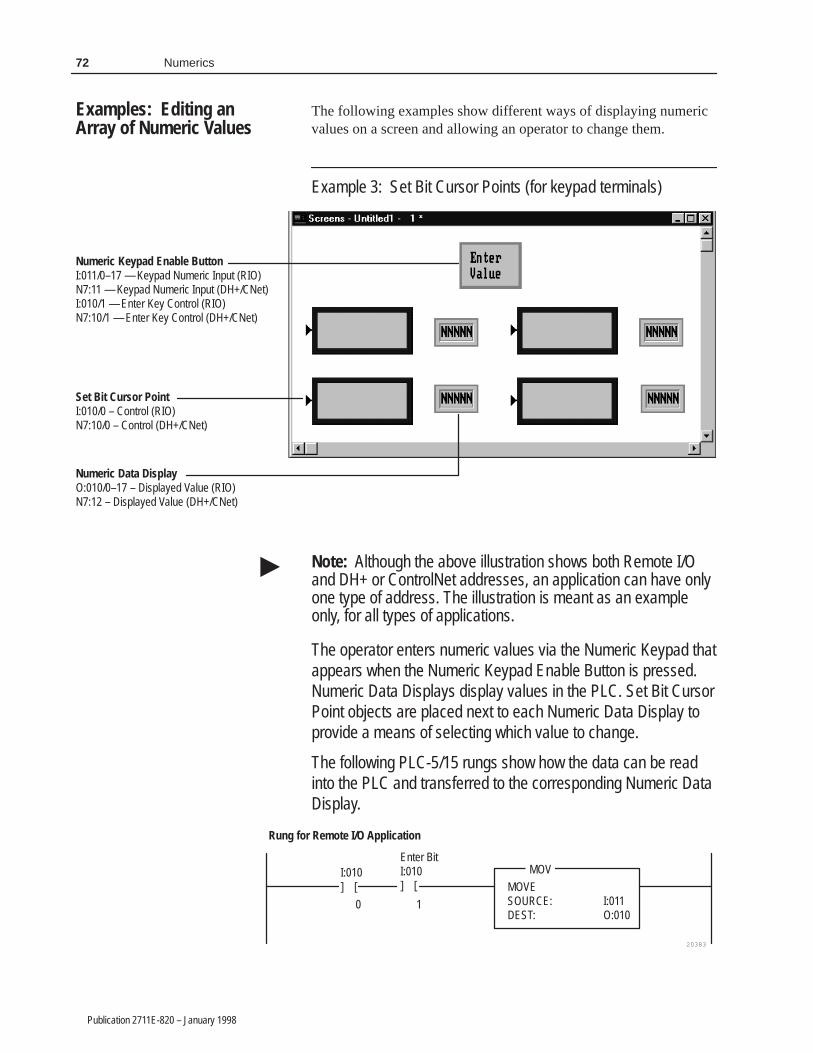
72 Numerics
Publication 2711E-820 – January 1998
The following examples show different ways of displaying numericvalues on a screen and allowing an operator to change them.
Example 3: Set Bit Cursor Points (for keypad terminals)
Numeric Keypad Enable ButtonI:011/0–17 — Keypad Numeric Input (RIO)N7:11 — Keypad Numeric Input (DH+/CNet)I:010/1 — Enter Key Control (RIO)N7:10/1 — Enter Key Control (DH+/CNet)
Numeric Data DisplayO:010/0–17 – Displayed Value (RIO)N7:12 – Displayed Value (DH+/CNet)
Set Bit Cursor PointI:010/0 – Control (RIO)N7:10/0 – Control (DH+/CNet)
Note: Although the above illustration shows both Remote I/Oand DH+ or ControlNet addresses, an application can have onlyone type of address. The illustration is meant as an exampleonly, for all types of applications.
The operator enters numeric values via the Numeric Keypad thatappears when the Numeric Keypad Enable Button is pressed.Numeric Data Displays display values in the PLC. Set Bit CursorPoint objects are placed next to each Numeric Data Display toprovide a means of selecting which value to change.
The following PLC-5/15 rungs show how the data can be readinto the PLC and transferred to the corresponding Numeric DataDisplay.
20383
MOV
MOVESOURCE: I:011DEST: O:010
Enter BitI:010] [
I:010] [
0 1
Rung for Remote I/O Application
Examples: Editing anArray of Numeric Values
�

73Numerics
Publication 2711E-820 – January 1998
20383
MOV
MOVESOURCE: N7:11DEST: N7:12
Enter BitN7:10] [
N7:10] [
0 1
Rung for DH+ or ControlNet Application
To select the value to change, press the SELECT button on thePanelView terminal to enable the Set Bit Cursor Point object.Use the arrow keys to select the value, then press the NumericKeypad Enable Button and enter the new value.
Example 4: Numeric Input Cursor Point (for keypad terminals)
Numeric Input Cursor Point
Numeric Input Cursor Point objects change an array of values.
To select which value to change, press the SELECT button onthe PanelView terminal to enable the Numeric Input CursorPoints and to open the scratchpad at the top of the screen. Usethe arrow keys to select the value to change, then use theNumeric Keypad to enter the data in the window. Use the Enterkey to send the data to the PLC.

74 Numerics
Publication 2711E-820 – January 1998
Example 5: Numeric Entry Keypad (for touch screen terminals)
Small Numeric Entry KeypadI:011/0–17—Keypad Numeric Input (RIO)N7:11—Keypad Numeric Input (DH+/CNet)I:010/1—Enter Key Control (RIO)N7:10/1—Enter Key Control (DH+/CNet)
Numeric Data DisplayO:010/0–17—Displayed Value (RIO)N7:12—Displayed Value (DH+/CNet)
Interlocked Push ButtonI:012/0–17—Button Control (RIO)N7:13—Button Control (DH+/CNet)
Note: Although the above illustration shows both Remote I/Oand DH+ or ControlNet addresses, an application can have onlyone type of address. The illustration is meant as an exampleonly, for all types of applications.
In this example, all numeric values are entered using oneNumeric Keypad. Numeric Data Displays display the values inthe PLC. Interlocked Push Buttons are placed next to eachNumeric Data Display to provide a means of selecting whichvalue to change. The Interlocked Push buttons have been givencontrol values 0 to 3.
The following PLC-5/15 rungs show how the data can be readinto the PLC and transferred to the corresponding Numeric DataDisplay.
Rung for Remote I/O Application
20383
MOV
MOVESOURCE: I:011DEST: O:010
Enter BitI:010] [
1
EQU
EQUALSOURCE A I:012SOURCE B 0
�

75Numerics
Publication 2711E-820 – January 1998
Rung for DH+ or ControlNet Application
20384
MOV
MOVESOURCE: N7:11DEST: N7:12
Enter BitN7:10] [
1
EQU
EQUALSOURCE A N7:13SOURCE B 0
To select which value to change, press the Interlocked PushButton beside the value, and use the Numeric Keypad to enterthe new value.
You can determine whether or not the operator can enter numberswith decimal points in the scratchpad for the Numeric KeypadEnable Button, Numeric Input Cursor Point, and Numeric EntryKeypad objects.
Note: With the exception of the Implicit decimal point option, anydecimal point entered is implied only. With the Implicit option, afloating-point value is written to the PLC. For all other decimal pointoptions, the value sent to the Keypad Numeric Input control isstripped of the decimal point.
Choose from the following decimal point options:
• Disabled specifies no values with decimal points can be enteredin the scratchpad. Only integer values can be entered.
• Implicit allows the operator to enter the number and decimalpoint. Unlike the Decimal Key Controlled option, Implicit doesnot use a (Numeric) Decimal Point Position control. The KeypadNumeric Input control, which uses a floating-point address in thePLC, contains all the information.
Implicit (floating-point) numbers are accurate up to 7 significantdigits. Leading or trailing zeroes do not count as significantdigits. If there are more than 7 significant digits, the number isrounded off. The following table illustrates how the PanelViewterminal calculates the number of significant digits.
Number Entered Number of Significant Digits Number sent to thePLCÁÁÁÁÁÁ
ÁÁÁÁÁÁ.000012ÁÁÁÁÁÁÁÁÁÁÁÁÁÁÁÁÁÁ2
ÁÁÁÁÁÁÁÁÁÁÁÁÁÁ.000012
.000012345678 8 .00001234568ÁÁÁÁÁÁÁÁÁÁÁÁ123.45000
ÁÁÁÁÁÁÁÁÁÁÁÁÁÁÁÁÁÁ5
ÁÁÁÁÁÁÁÁÁÁÁÁÁÁ123.45ÁÁÁÁÁÁ
ÁÁÁÁÁÁ123.45678ÁÁÁÁÁÁÁÁÁÁÁÁÁÁÁÁÁÁ8
ÁÁÁÁÁÁÁÁÁÁÁÁÁÁ123.4568
Using the Decimal Point
�

76 Numerics
Publication 2711E-820 – January 1998
The control you assign must use an analog tag with a FloatingPoint data type. If you use Device tags (for ControlNet or DH+),the tag must specify a floating-point address in the programmablecontroller. If you use RIO, the tag must be configured with aBlock Transfer File address. For more information see Chapter 6,Defining Tags, in the PanelBuilder 1400e Configuration Softwarefor Windows User Manual.
Note: If you use the Implicit option, the application will becompatible only with PanelView Version 2 or later. Theapplication will not be compatible with earlier versions.
• Fixed Position specifies that a decimal point always appears in afixed position, and a fixed number of digits is always displayedafter the decimal point. You can specify the number of digits tofollow the decimal point.
The number of digits after the decimal determines the minimumnumber of digits in the value to be sent to the control. Forexample, if the setting was for three digits after the decimal, anoperator’s entry would appear as follows:
Digits Entered Number Displayed Keypad Numeric Input Value(to PLC)
ÁÁÁÁÁÁÁÁÁÁÁÁÁÁ
1 ÁÁÁÁÁÁÁÁÁÁÁÁ
.1 ÁÁÁÁÁÁÁÁÁÁÁÁÁÁÁÁÁÁ
100
ÁÁÁÁÁÁÁÁÁÁÁÁÁÁ
12 ÁÁÁÁÁÁÁÁÁÁÁÁ
.12 ÁÁÁÁÁÁÁÁÁÁÁÁÁÁÁÁÁÁ
120
ÁÁÁÁÁÁÁÁÁÁÁÁÁÁ
123 ÁÁÁÁÁÁÁÁÁÁÁÁ
.123 ÁÁÁÁÁÁÁÁÁÁÁÁÁÁÁÁÁÁ
123
ÁÁÁÁÁÁÁÁÁÁÁÁÁÁ
1234 ÁÁÁÁÁÁÁÁÁÁÁÁ
1.234 ÁÁÁÁÁÁÁÁÁÁÁÁÁÁÁÁÁÁ
1234
ÁÁÁÁÁÁÁÁÁÁÁÁÁÁ
12345 ÁÁÁÁÁÁÁÁÁÁÁÁ
12.345 ÁÁÁÁÁÁÁÁÁÁÁÁÁÁÁÁÁÁ
12345
Note: Although you can configure up to 15 digits after thedecimal point, 10 or more digits may generate a Mistake messageon the PanelView terminal. PanelView converts the decimalnumber into a signed long value, with a range of –2,147,483,648to 2,147,483,647. If the converted number is outside this range,the Mistake message appears.
If the setting was for 15 digits after the decimal, an operator’sentry would appear as follows:
Digits Entered Number Displayed Keypad Numeric Input Value(to PLC)
0000000000000015 0.000000000000015 15
ÁÁÁÁÁÁÁÁÁÁÁÁÁÁÁÁÁÁÁÁÁ
0100000000000015 ÁÁÁÁÁÁÁÁÁÁÁÁÁÁÁÁÁÁ
0.100000000000015 ÁÁÁÁÁÁÁÁÁÁÁÁÁÁÁÁÁÁÁÁÁÁÁÁÁÁÁ
ERROR(100000000000015)
• PLC Controlled allows the PLC to set the number of digits to bedisplayed after the decimal point.
�
�

77Numerics
Publication 2711E-820 – January 1998
If you choose the PLC Controlled decimal point, assign aDecimal Point Position control. For the Numeric Input CursorPoint object, use the Numeric Decimal Point Position control (notthe Decimal Point Position control).
This control should use analog tags.
The following examples illustrate how the (Numeric) DecimalPoint Position control’s value affects the appearance of thescratchpad:
• If the control’s value is zero, no decimal point is displayed.• If the control’s value is three, three digits are displayed to the
right of the decimal point.• If the control’s value is seven, seven digits are displayed to the
right of the decimal point.• If the control’s value changes, the display changes
accordingly.
Note: If the Decimal Point control’s value is greater than 15, thedecimal point is replaced by a single asterisk (*). Pressing Enterwhen the asterisk is displayed displays an error message.
The number of digits after the decimal determines the minimumnumber of digits in the value to be sent to the control. Forexample, if the setting was for three digits after the decimal, anoperator’s entry would appear as follows:
Digits Entered Number Displayed Keypad Numeric Input Value(to PLC)
ÁÁÁÁÁÁÁÁÁÁÁÁÁÁ
1 ÁÁÁÁÁÁÁÁÁÁÁÁÁÁ
.1 ÁÁÁÁÁÁÁÁÁÁÁÁÁÁÁÁ
100
ÁÁÁÁÁÁÁÁÁÁÁÁÁÁ
12 ÁÁÁÁÁÁÁÁÁÁÁÁÁÁ
.12 ÁÁÁÁÁÁÁÁÁÁÁÁÁÁÁÁ
120
ÁÁÁÁÁÁÁÁÁÁÁÁÁÁ
123 ÁÁÁÁÁÁÁÁÁÁÁÁÁÁ
.123 ÁÁÁÁÁÁÁÁÁÁÁÁÁÁÁÁ
123
ÁÁÁÁÁÁÁÁÁÁÁÁÁÁ
1234 ÁÁÁÁÁÁÁÁÁÁÁÁÁÁ
1.234 ÁÁÁÁÁÁÁÁÁÁÁÁÁÁÁÁ
1234
ÁÁÁÁÁÁÁÁÁÁÁÁÁÁ
12345 ÁÁÁÁÁÁÁÁÁÁÁÁÁÁ
12.345 ÁÁÁÁÁÁÁÁÁÁÁÁÁÁÁÁ
12345
Note: Although you can configure up to 15 digits after thedecimal point, 10 or more digits may generate a Mistake messageon the PanelView terminal. PanelView converts the decimalnumber into a signed long value, with a range of –2,147,483,648to 2,147,483,647. If the converted number is outside this range,the Mistake message appears.
If the setting was for 15 digits after the decimal, an operator’sentry would appear as follows:
Digits Entered Number Displayed Keypad Numeric Input Value(to PLC)
0000000000000015 0.000000000000015 15ÁÁÁÁÁÁÁÁÁÁÁÁÁÁÁÁÁÁÁÁÁ
0100000000000015ÁÁÁÁÁÁÁÁÁÁÁÁÁÁÁÁÁÁÁÁÁ
0.100000000000015ÁÁÁÁÁÁÁÁÁÁÁÁÁÁÁÁÁÁÁÁÁÁÁÁ
ERROR(100000000000015)
�
�

78 Numerics
Publication 2711E-820 – January 1998
• Decimal Key Controlled allows the operator to enter the numberand decimal point. The terminal notes the position of the decimalpoint and sets the Decimal Point Position control to that value.
For the Numeric Input Cursor Point object, use the NumericDecimal Point Position control (not the Decimal Point Positioncontrol).
This control should use analog tags.
To send a decimal point value to the PLC, define a (Numeric)Decimal Point Position control. The value stored at this controldetermines the number of digits to the right of the decimal point.The relationship between the number and decimal point isimplied; the number sent to the PLC does not contain a decimalpoint.
Digits Entered Number Displayed Keypad NumericInput
(Numeric)Decimal PointPosition Value
ÁÁÁÁÁÁÁÁÁÁ
123ÁÁÁÁÁÁÁÁÁÁÁÁ
123ÁÁÁÁÁÁÁÁÁÁÁÁ
123ÁÁÁÁÁÁÁÁÁÁÁÁ
0ÁÁÁÁÁÁÁÁÁÁ
1.23ÁÁÁÁÁÁÁÁÁÁÁÁ
1.23ÁÁÁÁÁÁÁÁÁÁÁÁ
123ÁÁÁÁÁÁÁÁÁÁÁÁ
2ÁÁÁÁÁÁÁÁÁÁ
.12345ÁÁÁÁÁÁÁÁÁÁÁÁ
.12345ÁÁÁÁÁÁÁÁÁÁÁÁ
12345ÁÁÁÁÁÁÁÁÁÁÁÁ
5
You can assign controls to provide handshaking between the PLCand terminal for the Numeric Keypad Enable Button, Numeric InputCursor Point, and Numeric Entry Keypad objects. To use this option,assign the Enter Key Control and the Enter Key Handshake.
When the operator presses the Enter key to send the value to thePLC, the terminal sets the Enter Key Control to 1 (after the delayspecified in the Enter Key Control Delay field in the TimingParameters tab of the Configure Terminal Setup dialog box). Toinform the terminal that the handshake has been received put a rungin your PLC program to cause a 0 to non-0 transition in the value ofthe Enter Key Handshake control. When the terminal sees this non-0value, it resets the Enter Key Control value.
The Enter Key Control is also reset:
• if the terminal does not receive acknowledgement (transitionfrom 0 to a non-0 value) within the Enter Key Handshake Timespecified in the Timing Parameters tab of the Configure TerminalSetup dialog box. An error message appears.
• if the Enter Key Handshake control is unassigned. The Enter KeyControl remains set for the duration of the Push Button HoldTime.
Enter Key HandshakeOperation

79Numerics
Publication 2711E-820 – January 1998
Optionally, you can assign write expressions to perform amathematical calculation or logical operation on the value theoperator enters through the Numeric Keypad Enable Button,Numeric Input Cursor Point, and Numeric Entry Keypad objects. Touse this option, assign the Optional Keypad Write Expression.
When the operator presses the Enter key to send the value to thePLC, the PanelView terminal performs the mathematical calculationor logical operation specified in the Optional Keypad WriteExpression, then sends the result to the Keypad Numeric InputControl.
Write expressions use the same syntax as read expressions. However,you must also include the User Entry Character, to indicate theposition in the expression of the value entered by the operator. TheUser Entry Character is the question mark symbol “?”. For example,if the operator enters a 5 at the Numeric Entry Keypad, theexpression:
tag1 + ?
evaluates to the value of tag1, plus 5.
You can enter multiple question marks in the write expression, forexample, if you are using a Case statement in the expression. See“Assigning Write Expressions” in Chapter 7, Creating Expressions,in the PanelBuilder 1400e Configuration Software for Windows UserManual.
Note: If you assign a write expression, the application will becompatible only with PanelView Version 2 or later. The applicationwill not be compatible with earlier versions.
Using Write Expressions
�

��� ������
Publication 2711E-820 – January 1998
��� ������
This chapter tells you:
• what push buttons are
• how the different types of push buttons function
• how to configure each type of push button
Push buttons are application screen objects that function likemechanical push buttons on industrial control panels. Operators usepush buttons to control processes.
There are six types of push buttons:
• Normally Open Momentary
• Normally Closed Momentary
• Latched
• Maintained
• Multistate
• Interlocked
Note: Some PanelBuilder objects consist of several components,including buttons. For example, Control List Selectors have two orthree associated buttons. These buttons are configured as part of theobject that contains them, not as independent push buttons.
!ATTENTION: Push buttons can be used as stopbuttons but not for emergency stops. Emergency stopbuttons must be hard-wired.
How the Different Push Buttons Work
Each push button has an assigned Button Control at the PLC. Whenthe button is pressed, the value of this control changes and initiatesan action.
The six types of push buttons differ in these ways:
• number of states
• how they respond to being pressed
• how they respond to screen changes, mode switches, and powercycles
About Push Buttons
�

82 Push Buttons
Publication 2711E-820 – January 1998
The following table shows the differences between the push buttons:
Push Button States Response to button-press Response toscreenchanges/modeswitch
Response to powercycles
Normally Open orClosed Momentary
2 State changes to open (0) or closed (1).
When released, the button returns to itsinitial state.
Returns to its initialstate.
Returns to its initialstate.
Latched 2 State changes to latched, and remainslatched when released.
The button remains latched until unlatchedby the handshake value from the PLC.
Returns to its initialstate.
Returns to its initialstate.
Maintained 2 State toggles, and remains changed whenreleased.
Pressing the button a second time returnsthe button to its initial state.
Retains its changedstate.
Retains its changedstate or returns to itsinitial state,depending on theterminal’sApplication Startupsetting.
Multistate 2 to 255 Cycles through a pre-configured set ofstates. Pressing the button triggers thechange of state. The state’s value is thenwritten to the Button Control.
Retains its changedstate.
Retains its changedstate or returns to itsinitial state,depending on theterminal’sApplication Startupsetting.
Interlocked 1 Usually functions as a group of buttons.Pushing one button cancels out the functionof the previous button pressed, and sets theButton Control to the newly pressed button’scontrol value.
A single Interlocked Push Button can alsobe used to set a value.
Retains its changedstate.
Retains its changedstate or returns to itsinitial state,depending on theterminal’sApplication Startupsetting.
Use a Normally Open Momentary Push Button to initiate aPLC-controlled process or action.
The Normally Open Momentary Push Button controls the value atthe Button Control. Normally, the control’s value is 0. When thebutton is pressed, the control is set to 1. When the button is released,the control is reset to 0. If the button is being pressed at the momenta window (Information Message, Alarm Message, or Fault Window)appears on the screen, the button’s value is reset to 0. In other words,a window appearing is treated as an automatic button release.
Note: You can assign more than one Normally Open MomentaryPush Button to the same Button Control. Normally Open MomentaryPush Buttons using the same control will function like theirhard-wired equivalents wired in parallel.
Normally Open Momentary(N/O) Push Button
�

83Push Buttons
Publication 2711E-820 – January 1998
This object also has an Indicator State control, used to control thedisplay state of the object. The PanelView terminal evaluates thecontrol and compares the result to the state values to determinewhich state to display.
Note: If the Indicator State value does not match any of the definedstate values, an error state occurs and the button displays state 1without labels. An error state also occurs if the Button Control is notassigned. In this case also, the button displays state 1 without labels.
Important: The Normally Open Momentary Push Button does notretain its value when power is switched off and onagain, after screen changes, or when the terminal isswitched to Configuration mode and then back to Runmode. The Button Control is reset to the initial statevalue.
!ATTENTION: If a communication error occurs, thecontrol value remains in its last state and the ButtonControl will not reset. For Remote I/O applications, therack fault bit should be monitored when these buttonsare used. For DH+ and ControlNet applications, use theactive node bits in the status file. See your controllerdocumentation for more information.
!ATTENTION: You can use this button as a stopbutton but not for emergency stops. Emergency stopbuttons must be hard-wired.
Configuring the Normally Open Momentary (N/O) Button
Configure the button according to this table:
Field Meaning
Name Assign a name, up to 15 characters, to document the object forprinted reports. This increases the application’s size by 1 byteper character.
Button Type Specify a Normally Open Momentary Push Button.
Function Key (Keypad only)
Specify which function key the operator must press to activatethis button.
Number of States Only two states are possible. The value of state 0 is fixed at 0;the value of state 1 is fixed at 1. You cannot change the numberof states or their values.
Initial State The button’s initial state is fixed at 0. You cannot edit this value.
�

84 Push Buttons
Publication 2711E-820 – January 1998
Field Meaning
Control The Normally Open Momentary Push Button uses the followingcontrols:
Button Control records the status of the button: 1 when thebutton is pressed and 0 otherwise. You can assign only a tag tothis control.
The Push Button Hold Time, as selected in the TimingParameters tab of the Configure Terminal Setup dialog box,ensures that the value at this control is held for at least thespecified duration.
Note: If you do not assign this control, an error state occurswhen the object is displayed on the PanelView terminal. Thebutton displays state 1 without its label, alerting the operator tothe error state.
Indicator State controls the display state of the object. You canassign a tag or expression to this control.
If you assign just the Button Control and not the Indicator Statecontrol, the button state is displayed as soon as the button ispressed and released. The feedback for this control is local andimmediate. It does not necessarily reflect the Button Control’svalue.
If you assign the same tag to the Button Control and IndicatorState control, the terminal displays the button state based onthe Button Control value. The button displays state 1 when theoperator presses it, and displays state 0 when the operatorreleases it. This is a more reliable way of configuring the button;however, if traffic is heavy over DH+ or ControlNet, the displayresponse may be delayed.
To provide a visual handshake with the PLC, assign differentPLC addresses to the Button Control and Indicator Statecontrol. Program the PLC to set the Indicator State control to 1when the Button Control is 1, and the button displays state 1.
If the Indicator State control value does not match any of thestate values, an error state occurs and the button displays state1 without labels.
Since these controls use only two values, digital tags arerecommended.
You can adjust the size of the Normally Open Momentary PushButton and format its foreground color, background color, buttonmargins (touch screen applications only), border style, fill style, andblink attributes. For details on formatting objects see “ChangingObject Appearance,” in Chapter 9, Creating Objects, in thePanelBuilder 1400e Configuration Software for Windows UserManual.

85Push Buttons
Publication 2711E-820 – January 1998
The Normally Closed Momentary Push Button controls the value atthe Button Control. Normally, this control’s value is 1. When thebutton is pressed, the control is set to 0. When the button is released,the control is reset to 1. If the button is pressed at the moment awindow (Information Message, Alarm Message, or Fault Window)appears on the screen, the button’s value is reset to 1.
Note: You can assign two or more of these buttons to the sameButton Control. When this is the case, Normally Closed MomentaryPush Buttons function like their hard-wired equivalents wired inseries: pressing either button, rather than both, turns off the PLCcontrol.
This object also has an Indicator State control, used to control thedisplay state of the object. The PanelView terminal evaluates thecontrol and compares the result to the state values to determinewhich state to display.
Note: If the Indicator State value does not match any of the definedstate values, an error state occurs and the button displays state 1without labels. An error state also occurs if the Button Control is notassigned. In this case also, the button displays state 1 without labels.
Important: The Normally Closed Momentary Push Button does notretain its value when power is switched off and onagain, after screen changes, or when the terminal isswitched to Configuration mode and then back to Runmode. The Button Control is reset to the initial statevalue.
!ATTENTION: If a communication error occurs, thecontrol value remains in its last state and the ButtonControl will not reset. For Remote I/O applications, therack fault bit should be monitored when these buttonsare being used. For DH+ and ControlNet applications,use the active node bits in the status file. See yourcontroller documentation for more information.
!ATTENTION: You can use this button as a stopbutton but not for emergency stops. Emergency stopbuttons must be hard-wired.
Normally ClosedMomentary (N/C) PushButton
�
�

86 Push Buttons
Publication 2711E-820 – January 1998
Configuring the Normally Closed Momentary (N/C) Button
Configure the button according to this table:
Field Meaning
Name Assign a name, up to 15 characters to document the object forprinted reports. This increases the application’s size by 1 byteper character.
Button Type Specify a Normally Closed Momentary Push Button.
Function Key(Keypad only)
Specify which function key the operator must press to activatethis button.
Number of States Only two states are possible. The value of state 0 is fixed at 1;the value of state 1 is fixed at 0. You cannot change the numberof states or their values.
Initial State The button’s initial state is fixed at 0. You cannot edit this value.
Control The Normally Closed Momentary Push Button uses thefollowing controls:
Button Control records the status of the button: 0 when thebutton is pressed and 1 otherwise. You can assign only a tag tothis control.
The Push Button Hold Time, as selected in the TimingParameters tab of the Configure Terminal Setup dialog box,ensures that the value at the control is held for at least thespecified duration.
Note: If you do not assign this control, an error state occurswhen the object is displayed on the PanelView terminal. Thebutton displays state 1 without its label, alerting the operator tothe error state.
Indicator State controls the display state of the object. You canassign a tag or expression to this control.
If you assign only the Button Control and not the Indicator Statecontrol, the button state is displayed as soon as the button ispressed and released. The feedback for this control is local andimmediate. It does not necessarily reflect the Button Control’svalue.
If you assign the same tag to the Button Control and IndicatorState control, the terminal displays the button state based onthe Button Control value. The button displays state 1 when theoperator presses it, and displays state 0 when the operatorreleases it. This is a more reliable way of configuring the button;however, if DH+ or ControlNet network traffic is heavy, thedisplay response may be delayed.
To provide a visual handshake with the PLC, assign differentPLC addresses to the Button Control and Indicator Statecontrol. Program the PLC to set the Indicator State control tothe value of the Button Control, and the button changes to thestate with that value.
If the Indicator State control value does not match any of thestate values, an error state occurs and the button displays state1 without labels.
Because these controls use only two values, digital tags arerecommended.

87Push Buttons
Publication 2711E-820 – January 1998
You can adjust the size of the Normally Closed Momentary PushButton and format its foreground color, background color, buttonmargins (touch screen applications only), border style, fill style, andblink attributes. For details on formatting objects see “ChangingObject Appearance,” in Chapter 9, Creating Objects, in thePanelBuilder 1400e Configuration Software for Windows UserManual.
A Latched Push Button changes state when pressed and remains inthe latched state until unlatched by the PLC. This button uses aHandshake control as well as the Button Control and Indicator Statecontrol.
Pressing the button sets the Button Control to the state 1 value.When this happens, the PLC program must set the Handshakecontrol to a non-0 value. When the terminal detects that theHandshake control has made a 0 to non-0 state transition, it resets theButton Control to the state 0 value. Your PLC must be programmedto set the Handshake control back to 0.
If the Button Control cannot accommodate the state value (if thevalue is too large for the control’s address), an error message isdisplayed, and the PLC value is not changed. The operator mustclear the fault before continuing.
Use the Latched Push Button when you want the Button Control toremain on until a particular process within the PLC is completed.
Tip: Use a Latched Push Button if you have a PLC with longprogram or I/O scan times. Use the Handshake control to signal thatthe program has read the Button Control. You can accomplish thesame thing by creating a Normally Open Momentary Push Buttonwith a long enough Push Button Hold Time, but a Latched PushButton takes the guesswork out of estimating the program or I/Oscan times, or the network responsiveness in DH+ and ControlNetapplications.
Note: If the Indicator State value does not match any of the definedstate values, an error state occurs and the button displays state 1without labels. An error state also occurs if the Button Control is notassigned. In this case also, the button displays state 1 without labels.
Important: The Latched Push Button does not retain its value whenpower is switched off and on again, after screenchanges, or when the terminal is switched toConfiguration mode and then back to Run mode. TheButton Control is reset to the initial state value
Latched Push Button
�
�

88 Push Buttons
Publication 2711E-820 – January 1998
Important: Operator screen changes are not permitted while theButton Control is set to the state 1 value (if thehandshake is still outstanding). If the PLC initiates ascreen change, the Button Control is reset to the state 0value.
Configuring the Latched Push Button
Configure the Latched Push Button according to the following table:
Field Meaning
Name Assign a name, up to 15 characters to document the object forprinted reports. This increases the application’s size by 1 byteper character.
Button Type Specify a Latched Push Button.
Function Key (Keypad only)
Specify which function key the operator must press to activatethis button.
Number of States Only two states are possible. You cannot change this number.
Initial State The initial state is fixed at 0. You cannot change the initial state.
Edit States Although you can’t change the initial state, you can change thestate values. For example, you could assign 100 to state 0, and557 to state 1.
To change the state values, choose Edit States. You can assignany unique value from –2,147,483,648 to 2,147,483,647. See“Configuring Object States” in Chapter 9, Creating Objects, inthe PanelBuilder 1400e Configuration Software for WindowsUser Manual for more information.
Note: To minimize the size of the application file, use statevalues that increment by one for each state. Do not configuremore states than you need.
Control The Latched Push Button uses the following controls:
Button Control records the status of the button: state 1 valuewhen the button is pressed and state 0 value otherwise. Youcan assign only a tag to this control.
Note: If you do not assign this control, an error state occurswhen the object is displayed on the PanelView terminal. Thebutton displays state 1 without its label, alerting the operator tothe error state.
Indicator State controls the display state of the object. You canassign a tag or expression to this control.
If you assign just the Button Control and not the Indicator Statecontrol, the button state is displayed as soon as the button ispressed and released. The feedback for this control is local andimmediate. It does not necessarily reflect the Button Control’svalue.
If you assign the same control to the Button Control andIndicator State control, the terminal displays the button statebased on the Button Control value. The button displays state 1when the operator presses it, and displays state 0 when theoperator releases it. This is a more reliable way of configuringthe button; however, if traffic is heavy over DH+ or ControlNet,the display response may be delayed.

89Push Buttons
Publication 2711E-820 – January 1998
Field Meaning
Control (con’t) You can provide a visual handshake with the PLC by assigningdifferent PLC addresses to the Button Control and IndicatorState control. If the PLC is programmed to match the value ofthe Indicator State control to the value of the Button Control, thebutton changes to the state with that value.
If the Indicator State control value does not match any of thestate values, an error state occurs and the button displays state1 without labels.
Handshake is set by the PLC to confirm that it has recorded thechange for the Button Control. You can assign a tag orexpression to this control. A digital tag is recommended.
The PanelView terminal sets the Button Control to the state 1value when the operator presses the button. PLC logic must setthe Handshake control to a non-0 value when the ButtonControl is set. When the terminal detects a 0 to non-0 transitionin the Handshake control, it resets the Button Control to state 0.PLC logic must then reset the Handshake control to 0.
If the Handshake control is not assigned, the Button Controlvalue remains at the state 1 value.
You can adjust the size of the Latched Push Button and format itsforeground color, background color, button margins (touch screenapplications only), border style, fill style, and blink attributes. Fordetails on formatting objects see “Changing Object Appearance,” inChapter 9, Creating Objects, in the PanelBuilder 1400eConfiguration Software for Windows User Manual.
A Maintained Push Button has two states. It changes state whenpressed and remains in the changed state when released. Pressing thebutton a second time changes the button back to its original state.This button is also known as “Push-On, Push-Off.”
When the application first runs, the Maintained Push Button is in itsinitial state. When the button is pressed, the corresponding ButtonControl is set to its other state’s value. The control remains set evenafter the button is released. The operator must press the button asecond time to reset the control to the initial state value.
If the Button Control cannot accommodate the state value (if thevalue is too large for the control’s address), an error message isdisplayed, and the PLC value is not changed. The operator mustclear the fault before continuing.
Note: If the Indicator State value does not match any of the definedstate values, an error state occurs and the button displays state 1without labels. An error state also occurs if the Button Control is notassigned. In this case also, the button displays state 1 without labels.
Maintained Push Button
�

90 Push Buttons
Publication 2711E-820 – January 1998
Important: In Remote I/O applications, depending on how theApplication Startup screen is configured, the PanelViewterminal can retain the current value for the buttonsetting even after the terminal is turned off. For thisreason, don’t use a Maintained Push Button to initiate aPLC-controlled machine or process. Instead use aLatched or Momentary Push Button.
Configuring the Maintained Push Button
Configure the Maintained Push Button according to the followingtable:
Field Meaning
Name Assign a name, up to 15 characters to document the object forprinted reports. This increases the application’s size by 1 byteper character.
Button Type Specify a Maintained Push Button.
Function Key(Keypad only)
Specify which function key the operator must press to activatethis button.
Number of States Only two states are possible. You cannot change this number.
Initial State You can assign either state to be the button’s initial state. Thisstate’s value will be written to the Button Control when theapplication is run for the first time. This value will override thecontrol’s initial value.
You don’t need to assign any state as the initial state. You caninstead assign the button’s initial state to be blank. If you do, theobject will write the tag’s initial value to the Button Control.
Edit States If you wish, you can edit the values of each state. For example,you could assign 100 to state 0, 200 to state 1.
To change the state values, choose Edit States. You can assignany unique value from –2,147,483,648 to 2,147,483,647. See“Configuring Object States” in Chapter 9, Creating Objects, inthe PanelBuilder 1400e Configuration Software for WindowsUser Manual for more information.
Note: To minimize the size of the application file, use statevalues that increment by one for each state. Do not configuremore states than you need.
Control The Maintained Push Button uses the following controls:
Button Control records the status of the button. You canassign only a tag to this control.
When the button is first pressed, the control is set to the valueof the state not configured as the initial state. This valueremains until the button is pressed a second time, resetting thecontrol to the initial state value.
The button is aware of external control value changes. If theButton Control value changes to one that does not match any ofthe state values, the next button pressed sets the button tostate 0.
RIO

91Push Buttons
Publication 2711E-820 – January 1998
Field Meaning
Control (con’t) Note: If you do not assign this control, an error state occurswhen the object is displayed on the PanelView terminal. Thebutton displays state 1 without its label, alerting the operator tothe error state.
Indicator State controls the display state of the object. You canassign a tag or expression to this control.
If you assign just the Button Control and not the Indicator Statecontrol, the button state is displayed as soon as the button ispressed and released. The feedback for this control is local andimmediate. It does not necessarily reflect the Button Control’svalue.
If you assign the same tag to the Button Control and IndicatorState control, the terminal displays the button state based onthe Button Control value. The button displays state 1 when theoperator presses it, and displays state 0 when the operatorpresses it again. This is a more reliable way of configuring thebutton; however, if traffic is heavy over DH+ or ControlNet, thedisplay response may be delayed.
You can provide a visual handshake with the PLC by assigningdifferent PLC addresses to the Button Control and IndicatorState control. If the PLC is programmed to match the value ofthe Indicator State control to the value of the Button Control, thebutton changes to the state with that value.
If the Indicator State control value does not match any of thestate values, an error state occurs and the button displays state1 without labels.
You can adjust the size of the Maintained Push Button and format itsforeground color, background color, button margins (touch screenapplications only), border style, fill style, and blink attributes. Fordetails on formatting objects see “Changing Object Appearance,” inChapter 9, Creating Objects, in the PanelBuilder 1400eConfiguration Software for Windows User Manual.
The Multistate Push Button enables the operator to send apre-configured series of values to the PLC.
Each button state can be configured with different attributes such astext and graphic image labels and colors.
At runtime, if the Button Control cannot accommodate the statevalue (if the value is too large for the control’s address), an errormessage is displayed, and the PLC value is not changed. Theoperator must clear the fault before continuing.
Note: If the Indicator State value does not match any of the definedstate values, an error state occurs and the button displays the higheststate without labels. An error state also occurs if the Button Controlis not assigned. In this case also, the button displays the highest statewithout labels.
Multistate Push Button
�

92 Push Buttons
Publication 2711E-820 – January 1998
Important: In Remote I/O applications, depending on how theApplication Startup screen is configured, the terminalcan retain the current value for the button setting evenafter the terminal is turned off. For this reason, don’tuse a Multistate Push Button to initiate aPLC-controlled machine or process. Use a MomentaryPush Button instead.
Configuring the Multistate Push Button
Configure the Multistate Push Button according to the followingtable:
Field Meaning
Name Assign a name, up to 15 characters, to document the object forprinted reports. This increases the application’s size by 1 byteper character.
Button Type Specify a Multistate Push Button.
Function Key(Keypad only)
Specify which function key the operator must press to activatethis button.
Number of States Assign from 2 to 255 states to the button. If you increase thenumber of states from the default of 2, you must assign statevalues. To do so, choose Edit States, described below.
Initial State You can assign any state to be the button’s initial state. Thisstate’s value is written to the Button Control when theapplication runs for the first time. This value overrides thecontrol’s initial value.
You don’t need to assign any state as the initial state. You caninstead assign the button’s initial state to be blank. If you do, theobject writes the tag’s initial value to the Button Control.
Edit States If you wish, you can edit the values of each state. For example,if you assign three states, you could assign 100 to state 0, 200to state 1, and 57 to state 3.
To assign different values to the states, choose Edit States.Assign a unique value from –2,147,483,648 to 2,147,483,647for each state. See “Configuring Object States” in Chapter 9,Creating Objects, in the PanelBuilder 1400e ConfigurationSoftware for Windows User Manual for more information.
Note: To minimize the size of the application file, use statevalues that increment by one for each state. Do not configuremore states than you need.
Auto-Repeat Rate Specify how many times the button will repeat per second, ifheld down. A value of 0 disables auto-repeat.
Auto-Repeat StartDelay
Specify how long the button must be held down before it startsto auto-repeat.
RIO

93Push Buttons
Publication 2711E-820 – January 1998
Field Meaning
Control The Multistate Push Button uses the following controls:
Button Control records the status of the button. You canassign only a tag to this control.
When the application runs for the first time, the value of theinitial state is written to the Button Control. Each time the buttonis pressed, the value of the next state is sent to the ButtonControl. After the value for the last state is sent, the next buttonpress wraps back to the first state.
The button recognizes external control value changes. If theButton Control value changes to one that does not match any ofthe state values, the next button pressed sets the button tostate 0.
Note: If you do not assign this control, an error state occurswhen the object is displayed on the PanelView terminal. Thehighest state is displayed without its label, alerting the operatorto the error state.
Indicator State controls the display state of the object. You canassign a tag or expression to this control.
If you assign just the Button Control and not the Indicator Statecontrol, the button state is displayed as soon as the button ispressed and released. In this case, the feedback for this controlis local and immediate. It does not necessarily reflect the ButtonControl’s value.
You can assign the same tag to the Button Control and IndicatorState control. In this case, the terminal displays the button statebased on the Button Control value. This is a more reliable wayof configuring the button; however, if traffic is heavy over DH+ orControlNet, the display response may be delayed.
You can provide a visual handshake with the PLC by assigningdifferent PLC addresses to the Button Control and IndicatorState control. If the PLC is programmed to match the value ofthe Indicator State control to the value of the Button Control, thebutton changes to the state with that value.
If the Indicator State control value does not match any of thestate values, an error state occurs and the button displays thehighest state without its label.
You can adjust the size of the object and format its foreground color,background color, button margins (touch screen applications only),border style, fill style, and blink attributes. For details on formattingobjects see “Changing Object Appearance,” in Chapter 9, CreatingObjects, in the PanelBuilder 1400e Configuration Software forWindows User Manual.

94 Push Buttons
Publication 2711E-820 – January 1998
An Interlocked Push Button is one of a group of buttons that havethe same control. The buttons function together in much the sameway as the station selector buttons on a car radio: pressing onecancels the other and makes a new selection. Although InterlockedPush Buttons function as a group, you must add them to the screenone at a time.
When the operator presses an Interlocked Push Button, thePanelView terminal places the button’s control value at the ButtonControl address in the PLC and highlights the selected button.
The Interlocked Push Button remains highlighted as long as the PLCvalue is the same as the value of the button. Therefore only onebutton in the group is active and highlighted at any time.
If two or more Interlocked Push Buttons have the same controlvalue, both are highlighted whenever the associated Button Controlcontains that value.
Note: If the Button Control value does not match any of theInterlocked Push Buttons’ Control Values, an error state occurs andno button is highlighted. An error state also occurs if the ButtonControl is not assigned. In this case also, no button is highlighted.
You can use different groups of Interlocked Push Buttons on thesame screen, as long as each group uses a different Button Control.
Note: You can also add a single Interlocked Push Button to thescreen. When pressed, it sends its control value to the PLC. This actsas a Set Value Button.
Important: In Remote I/O applications, the PanelView terminal canretain the current value for the button setting, even afterthe terminal is turned off. Depending on how theApplication Startup operation is defined, the retainedvalue (last state) or initial value (default) is sent to thePLC when power is re-applied.
For details on configuring Application Startupoperation, see “Application Startup” in Chapter 4 in thePanelView 1200e and 1400e Operator Terminals UserManual.
Tip: While a Control List Selector with Enter Key serves a similarpurpose, you have much more flexibility in placing Interlocked PushButtons on your screen.
RIO
Interlocked Push Button
�
�
�

95Push Buttons
Publication 2711E-820 – January 1998
Configuring the Interlocked Push Button
Configure each Interlocked Push Button according to this table:
Field Meaning
Name Assign a name, up to 15 characters to document the object forprinted reports. This increases the application’s size by 1 byteper character.
Control Value Enter a value from –2,147,483,648 to 2,147,483,647. This valueshould be unique for each button in the group.
Function Key(Keypad only)
Specify which function key the operator must press to activatethis button.
Control Button Control records the status of the button. You canassign only a tag to this control.
You define a series of Interlocked Push Buttons to function as agroup. Assign the same tag to each button. When the operatorpresses an Interlocked Push Button, the Control Value is writtento the Button Control and the button appears highlighted. Thebutton remains highlighted for as long as the value at the tagremains the same as the Control Value.
Note: If you do not assign this control, an error state occurswhen the object is displayed on the PanelView terminal. Nobutton is highlighted, alerting the operator to the error state.
You can adjust the size of the Interlocked Push Button and format itsforeground color, background color, button margins (touch screenapplications only), border style, fill style, and blink attributes. Fordetails on formatting objects see “Changing Object Appearance,” inChapter 9, Creating Objects, in the PanelBuilder 1400eConfiguration Software for Windows User Manual.

������
Publication 2711E-820 – January 1998
������
This chapter tells you about:
• what scales are used for
• how to configure scales
A scale consists of a line with ticks, used to provide an illustrativemeasurement scale beside bar graphs and Trend objects. You cancreate vertical and horizontal scales across the height or width of thescreen.
Vertical scales can be configured so the ticks extend from left to rightor vice versa. Horizontal scales can be configured so the ticks extendfrom bottom to top or vice versa.
Note: If you use scales, the application will be compatible only withPanelView Version 2 or later. The application will not be compatiblewith earlier versions.
Tip: Use the following suggestions to customize scales:
• Position text labels on or near the scale object for staticdescriptions, or use display objects for changing descriptions.
• Specify the number of major and minor ticks to reflectaccurately the range of values in the bar graph or Trend object.For example, if a bar graph has a minimum value of 0 and amaximum value of 50, you could specify 6 major ticks for thescale, and 9 minor ticks between each major tick.
• To have a scale use different colors for different value ranges,cascade scales together. To do this, remove the border fromthe scales, place the high end of one scale at the low end of thenext, and adjust each scale’s color accordingly. To add aborder to the cascading scales, place a hollow or solid panelbehind the scales.
• Group scales with other objects to create a fully functional“template.” For example, position two or three pairs of scalesand bar graphs together and put numeric display objectsimmediately below the scale/bar graph pairs to display theprocess variable, set point, and control variable.
About Scales
�
�
98 Scales
Publication 2711E-820 – January 1998
Configuring the Scale
Configure the scale according to this table:
Field Meaning
Tick Direction Specify the direction in which you want the ticks to extend fromthe line.
For vertical scales specify either Left or Right.
For horizontal scales specify either Up or Down.
Major Ticks Specify the number of major ticks on the line. Major ticks aretwice the length of minor ticks.
The range is from 2 to 20. If you choose 2, one mark appears ateither end of the scale.
Minor Ticks Specify the number of minor ticks between each major tick.Minor ticks are half the length of major ticks.
The range is from 0 to 20.
You can adjust the size of the scale and format its foreground color,background color, border style, line style, fill style, and blinkattributes. For details on formatting objects see “Changing ObjectAppearance,” in Chapter 9, Creating Objects, in the PanelBuilder1400e Configuration Software for Windows User Manual.

����� ���� � ����
Publication 2711E-820 – January 1998
����� ���� � ����
This chapter tells you:
• how the Screen Print Button works
• how to configure the Screen Print Button
The Screen Print Button is a static object; it doesn’t interact with thePLC. The operator uses the Screen Print Button to print the currentscreen. When this button is pressed, a monochrome bitmap image ofthe screen is sent to the printer. If a window is open, the window isprinted also.
Important: Only Epson FX-80 compatible printers are supported.
Note: For best print results, design the screens you intend theoperator to print with black text on a white screen background.
Screen print requests are ignored when the printer is already busywith a previous screen print. Enabling the Screen Print Active toPLC option in the PLC I/O Control Options dialog box allows thePanelView terminal to inform the PLC that a screen print is inprogress. For details on setting this option, as well as informationabout screen prints, see Chapter 12, Configuring Terminal and PLCOptions, in the PanelBuilder 1400e Configuration Software forWindows User Manual.
The PLC can also trigger screen prints. If the PLC-controlled screenprint and screen change happen at the same time, the current screenis printed before the screen changes.
Configuring the Screen Print Button
Configure the Screen Print Button according to this table:
Field Meaning
Name Assign a name, up to 15 characters, to document the object forprinted reports. This increases the application’s size by 1 byteper character.
Function Key(Keypad only)
Specify which function key the operator must press to activatethis button.
About Screen PrintButtons
�

100 Variable Content TTL:Chap Is Linked To HD:Running
Publication 2711E-820 – January 1998
You can adjust the size of the Screen Print Button and format itsforeground color, background color, button margins (touch screenapplications only), border style, fill style, and blink attributes. Fordetails on formatting objects see “Changing Object Appearance,” inChapter 9, Creating Objects, in the PanelBuilder 1400eConfiguration Software for Windows User Manual.

������ �������
Publication 2711E-820 – January 1998
������ �������
This chapter tells you about:
• the different types of Screen Selectors
• how to configure the Screen Selectors
Screen Selectors are static objects; they don’t interact with the PLC.At runtime, the operator uses Screen Selectors to move to anotherscreen, or to return to a previously displayed screen. Every screenshould have a Screen Selector, so an operator is not stranded at aparticular screen.
Note: Enabling the Screen Number Change to PLC option in thePLC I/O Control dialog box allows the PanelView terminal to informthe PLC of a new screen.
There are five types of Screen Selectors:
This Screen Selector Does this
“Goto Screen” button Displays the screen associated with the button.
“Return to Previous Screen”button
Returns to the screen displayed previously.
Screen List Selector Allows the operator to select from a list of screens.
Screen Select Keypad(Touch Screen terminalsonly)
Allows the operator to choose the next screen to bedisplayed by entering its number on the screen’s keypad.
Screen Keypad Enablebutton (Keypad terminalsonly)
Allows the operator to choose the next screen to bedisplayed by entering its number on the terminal’s numerickeypad.
Depending on how the application is configured, the operator can’talways use these objects to control screen changes. The operatorcan’t change the screen when:
• the PLC Controlled Screen Change option is enabled and thevalue of the associated control is not 0
• “Minimum Push Button Hold Time,” “Latch Button PLCHandshakes” or “Enter Key Handshakes” are outstanding
• the screen is security-coded, and the operator doesn’t haveauthority to access it
If one of these situations occurs, or if the operator selects a screenthat does not exist, an error message is displayed and the screen doesnot change.
You can use screen selectors to call up any screens in the application,including Alarm History and Alarm Status screens.
About Screen Selectors
�

102 Screen Selectors
Publication 2711E-820 – January 1998
When the operator presses the Goto Screen button, the screenassociated with the button is displayed. When the operator pressesthe Return to Previous Screen button, the previously displayedscreen re-appears.
Tip: Include a Goto Screen button labeled “View Current Status” ina screen and configure the button to go to a screen displaying thecurrent status. That screen would include a Return to PreviousScreen button, so the operator could easily return. For a touch screenapplication, configure a Goto Screen button labeled “Select NewScreen” to go to a screen displaying a Screen Select Keypad. For akeypad application, use a Screen Keypad Enable button. Theoperator could then select the desired screen by entering the screennumber.
Note: The PanelView terminal remembers only the last screen. Youcan’t back up through a succession of screens with Return ToPrevious Screen buttons.
Important: In PanelBuilder, if you delete or renumber a screen thatis assigned to Goto Screen buttons, you must assign anew screen to each of the affected buttons. Otherwisethe application will not run properly.
Configuring the Goto Screen and Return to Previous ScreenButtons
Configure the Goto Screen and Return to Previous Screen buttonsaccording to this table:
Field Meaning
Name Assign a name, up to 15 characters, to document the object forprinted reports. This increases the application’s size by 1 byteper character.
Button Type Select Goto Screen Button or Return to Previous ScreenButton.
Go to Screen For Goto Screen buttons, specify which screen will be displayedwhen the operator presses this button.
Function Key(Keypad only)
Specify which function key the operator must press to activatethis button.
Goto Screen and Return toPrevious Screen Buttons
�
�

103Screen Selectors
Publication 2711E-820 – January 1998
You can adjust the size of the buttons and format their foregroundcolor, background color, button margins (touch screen applicationsonly), border style, fill style, and blink attributes. For details onformatting objects see “Changing Object Appearance,” in Chapter 9,Creating Objects, in the PanelBuilder 1400e Configuration Softwarefor Windows User Manual.
With a Screen List Selector, the operator presses Up and Downbuttons to scroll through a list of screen names, then presses theEnter key to switch to a selected screen. The Screen List Selector issimilar to the Control List Selector with Enter Key, but it is used tocontrol screen changes.
Note: The size of the Selector List object’s list componentdetermines the number of screens you can display. To increase ordecrease the number, you must resize the list. For information onresizing the list, see Chapter 9, Creating Objects, in the PanelBuilder1400e Configuration Software for Windows User Manual. You’llalso find information on adding list text in that chapter.
The Screen List Selector consists of the following components:
This component Does this
List Displays up to 24 different items (12 with Double High orLarge font; 6 with Extra Large font) in a vertical list. You canuse only one font size. Using a border decreases themaximum possible number of items.
Up Cursor Moves the arrow indicator up one entry in the list. Becauseonly one of the Up and Down Cursors must be enabled,you can disable this cursor.
Down Cursor Moves the arrow indicator down one entry in the list.Because only one of the Up and Down Cursors must beenabled, you can disable this cursor.
Enter Changes to the selected screen.
Screen List Selector
�

104 Screen Selectors
Publication 2711E-820 – January 1998
Configuring the Screen List Selector
Configure the Screen List Selector according to this table:
Field Meaning
Name Assign a name, up to 15 characters, to document the object forprinted reports. This increases the application’s size by 1 byteper character.
Up Cursor Specify whether the Up Cursor is enabled, and, if you have akeypad application, which function key it uses. You must haveat least one of the Up and Down Cursor keys enabled.
Down Cursor Specify whether the Down Cursor is enabled, and, if you have akeypad application, which function key it uses. You must haveat least one of the Up and Down Cursor keys enabled.
Enter(Keypad only)
Specify which function key the operator will press to select thehighlighted choice.
Screens The list must have at least 2 lines or states, to a maximum of 24(0 – 23 states). To assign a screen to a state, highlight the linefor the state and choose Assign Screen. The Assign Screendialog box appears. Choose the screen to assign to this statefrom the list of existing screens.
You can adjust the size each component of the Screen List Selectorand format the object’s foreground color, background color, fontstyle, button margins (touch screen applications only), border style,fill style, and blink attributes. For details on formatting objects see“Changing Object Appearance,” in Chapter 9, Creating Objects, inthe PanelBuilder 1400e Configuration Software for Windows UserManual.
Note: If you use the Extra Large font, the application will becompatible only with PanelView Version 2 or later. The applicationwill not be compatible with earlier versions.
�
105Screen Selectors
Publication 2711E-820 – January 1998
A Screen Select Keypad is a numeric keypad that enables theoperator to choose the next screen to be displayed by entering itsnumber.
Tip: Configure a Goto Screen button labeled “Select New Screen”to go to a screen displaying a Screen Select Keypad. The operatorcan then select the desired screen by entering the screen number.
Screen Select Keypads come in two sizes: the large keypad is384 pixels wide, while the small keypad is 192 pixels wide. Bothkeypads are 480 pixels high, and both operate in the same way.
The following table lists and explains the object’s components.
This component Does this
Enter Removes the current screen and displays the screen withthe screen number that was in the scratchpad.
Scratchpad Shows the screen number being entered.
Delete Deletes the most recent digit entered.
Number keys Specify the number of the screen to select.
Clear Clears the scratchpad.
Configuring the Screen Select Keypad
Configure the Screen Select Keypad according to this table:
Field Meaning
Name Assign a name, up to 15 characters, to document the object forprinted reports. This increases the application’s size by 1 byteper character.
Type Specify Large Screen Select Keypad or Small Screen SelectKeypad.
You can format the Screen Select Keypad’s foreground color andbackground color. For details on formatting objects see “ChangingObject Appearance,” in Chapter 9, Creating Objects, in thePanelBuilder 1400e Configuration Software for Windows UserManual.
Screen Select Keypad(Large and Small) (Touch Screen TerminalsOnly)
�
106 Screen Selectors
Publication 2711E-820 – January 1998
This button allows the operator to choose the next screen to bedisplayed by entering the screen number on the terminal’s numerickeypad.
At runtime, when the button is pressed, a scratchpad appears on thetop 60 pixels of the screen. The operator enters the screen number inthe scratchpad using the terminal’s numeric keypad.
The keys on the numeric keypad function as follows:
This key Does this
Enter Removes the scratchpad and current screen and displaysthe screen with the screen number that was in thescratchpad.
Number keys Enter numbers in the scratchpad.
Delete Deletes the last digit entered in the scratchpad.
Cancel Removes the scratchpad and cancels the screen change.
Note: Operator input is disabled for a short time when thescratchpad is first displayed. This may result in a delay before thefirst digit can be entered.
Configuring the Screen Keypad Enable Button
Configure the Screen Keypad Enable Button according to this table:
Field Meaning
Name Assign a name, up to 15 characters, to document the object forprinted reports. This increases the application’s size by 1 byteper character.
Function Key Specify which function key the operator must press to activatethis button.
You can adjust the size of the Screen Keypad Enable Button andformat its foreground color, background color, fill style, and blinkattributes. For details on formatting objects see “Changing ObjectAppearance,” in Chapter 9, Creating Objects, in the PanelBuilder1400e Configuration Software for Windows User Manual.
Screen Keypad EnableButton(Keypad Terminals Only)
�

������� �����
Publication 2711E-820 – January 1998
������� �����
This chapter tells you about:
• the different Scrolling List components
• how to configure the components
The Scrolling List object allows you to define and view a list that isbigger than the screen. The Scrolling List consists of a Cursor Listand one or more Object Lists. You can use the cursor buttons tomove through a maximum of 999 items within these object lists.Each screen can have only one Cursor List. However, you can definemultiple object lists. These object lists include:
• Multistate Indicator Object Lists
• Local Message Object Lists
• Numeric Data Display Object Lists
Important: For the Scrolling List object to function, you mustgroup the Cursor List and all object lists on the screen.
The following illustration shows how a Scrolling List could appear:
Cursor List
Numeric Data DisplayObject List
Cursor List Buttons
The Scrolling List permits PLC output data to be multiplexed to thePanelView terminal. This reduces the PLC ladder logic typicallyneeded to display and edit large amounts of data.
About Scrolling Lists

108 Scrolling Lists
Publication 2711E-820 – January 1998
Important: Depending on how the Scrolling Lists in the applicationare configured, the terminal can retain the last (that is,most current) list state for all the Cursor List and ObjectList settings even after the terminal is turned off. SeeConfiguring Retained Last List States, later in thischapter, for more information.
How you define the Cursor List determines how you can define theObject Lists. Therefore, create and configure the Cursor List beforeyou create any of the Object Lists.
You use three dialog boxes to configure the Cursor List:
• Configure Cursor List—In this dialog box you assign thenumber of states, configure the button-repeat times, configurewhether to retain the last list state, and assign controls. You canalso access the Configure Cursor List Buttons and ConfigureCursor List States dialog boxes from this dialog box.
• Configure Cursor List Buttons—In this dialog box you enableor disable the different navigation buttons available for the CursorList object. Access this dialog box from the Configure CursorList dialog box by choosing Edit Buttons.
• Configure Cursor List States—In this dialog box you assignstate values to the states in the list, and specify whether any of thestates will be skipped. Access this dialog box from the ConfigureCursor List dialog box by choosing Edit States.
Configuring the Cursor List
Configure the Cursor List according to the following table:
Field Meaning
Name Assign a name, up to 15 characters, to document the object forprinted reports. This increases the application’s size by 1 byte percharacter.
Number of States Specify the total number of states or items in the Scrolling Listobject. The valid range is from 2 to 999. This value cannot be lessthan the Number of Visible States defined for the object.
You can accept the default state values, or assign different values toeach state, as described in this chapter.
Cursor List
109Scrolling Lists
Publication 2711E-820 – January 1998
Field Meaning
Number of VisibleStates
Define the height of the scrollable list that is visible to the operator.The valid range is from 1 to 24. The value you enter cannot begreater than the Number of States defined for the object and mustbe greater than the Number of Preview States.
You can also configure the number of visible states by sizing theCursor List graphically. See Chapter 9, Creating Objects, in thePanelBuilder 1400e Configuration Software for Windows UserManual for details.
Note: You cannot size the Cursor List to accommodate fewer statesthan the number of the highest assigned Visible State control. Forexample, if you assigned a tag to Visible State 5, you cannotgraphically size the list to display fewer than 5 states. If you size thelist to display fewer than 5 states by entering a lower number in theNumber of Visible States field, you will receive a warning, and, if youchoose to proceed, Visible State controls with a higher number willbe deleted.
Each visible state can have a Visible State control assigned.
Number of PreviewStates
Define the minimum number of visible states above or below thecursor before the list begins to scroll.
The minimum number you can enter is 0. See Configuring PreviewStates, later in this chapter, for information about the maximumNumber of Preview States.
Auto-Repeat Rate(per second)
Set the number of times per second the Up, Down, Page Up, andPage Down cursor buttons will repeat when pressed and held downby the operator. Valid values are between 0 and 20. A value of 0disables auto-repeat.
Auto-Repeat StartDelay
Set the time that should pass before the Up, Down, Page Up, andPage Down cursor buttons go into Auto-Repeat mode when pressedand held down by the operator. Valid values are between 200milliseconds and 2.5 seconds.
Retain Last ListState
Select Yes or No. If you select Yes, PanelView retains the last (thatis, most current) list state for the Cursor List and related Object Listseven after a screen change, mode change, or after the terminal isturned off. If you choose No, the list state for the Cursor List andrelated Object Lists are not retained even after a screen change,mode change, or after the terminal is turned off.
See Configuring Retained Last List States, later in this chapter, formore information.
Note: If you select Yes, the application will be compatible only withPanelView Version 2 or later. The application will not be compatiblewith earlier versions.

110 Scrolling Lists
Publication 2711E-820 – January 1998
Configuring Preview States
The Number of Preview States you define for a cursor listdetermines the minimum number of visible states that will appearabove or below the cursor before the list begins to scroll.
In PanelBuilder, Version 2, the maximum Number of Preview Statesis calculated differently than in earlier versions. The following tableillustrates the different calculation methods:
Formula for Maximum Number of PreviewStates, pre-Version 2
Formula for Maximum Number of PreviewStates, Version 2
Number of Visible States/2 – 1 (Number of Visible States + 1)/2 – 1
Note: If you use a maximum number that is higher than the numberobtained using the earlier method, the application will be compatibleonly with PanelView Version 2 or later. The application will not becompatible with earlier versions.
The following table illustrates the different results produced by thetwo methods:
Number ofVisible States
Maximum Number of PreviewStates, pre-Version 2
Maximum Number of PreviewStates, Version 2
5 5/2 – 1 = 1.5 = 1 (rounded down) (5 + 1)/2 – 1 = 2
6 6/2 – 1 = 2 (6 + 1)/2 – 1 = 2.5 = 2 (rounded down)
The following illustration shows an example of how the previewstate option works when the Number of States is 7, the Number ofVisible States is 5, and the Number of Preview States is 1.
�
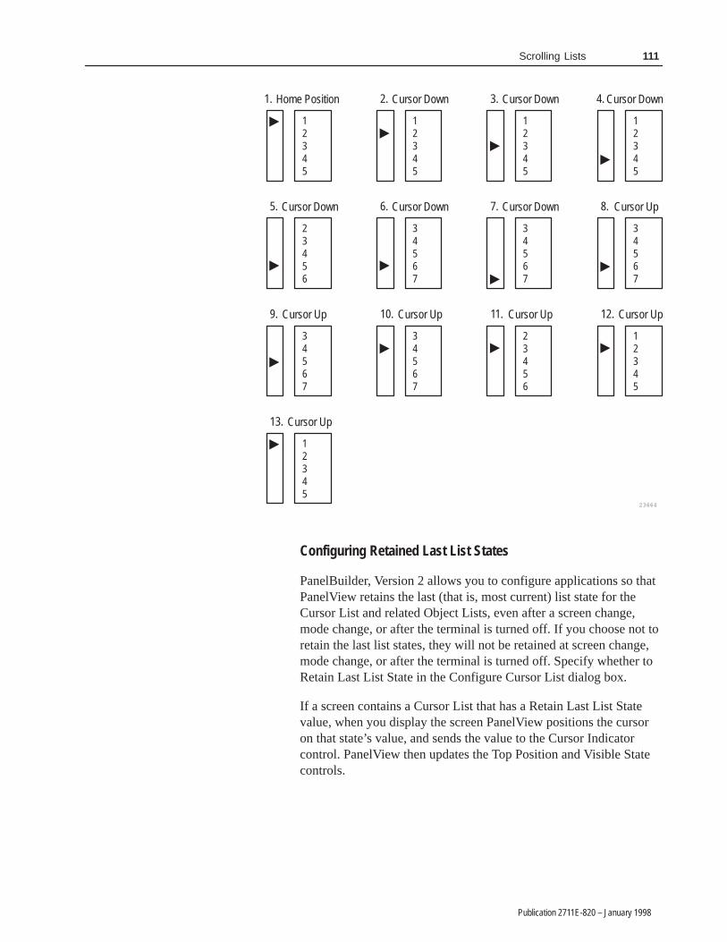
111Scrolling Lists
Publication 2711E-820 – January 1998
23664
12345
�
Home Position1.
12345
�
Cursor Down2.
12345
�
Cursor Down3.
12345
�
Cursor Down4.
23456
�
Cursor Down5.
34567
�
Cursor Down6.
34567�
Cursor Down7.
34567
�
Cursor Up8.
34567
�
Cursor Up9.
34567
�
Cursor Up10.
23456
�
11.
12345
�
12.
12345
�
Cursor Up13.
Cursor Up Cursor Up
Configuring Retained Last List States
PanelBuilder, Version 2 allows you to configure applications so thatPanelView retains the last (that is, most current) list state for theCursor List and related Object Lists, even after a screen change,mode change, or after the terminal is turned off. If you choose not toretain the last list states, they will not be retained at screen change,mode change, or after the terminal is turned off. Specify whether toRetain Last List State in the Configure Cursor List dialog box.
If a screen contains a Cursor List that has a Retain Last List Statevalue, when you display the screen PanelView positions the cursoron that state’s value, and sends the value to the Cursor Indicatorcontrol. PanelView then updates the Top Position and Visible Statecontrols.

112 Scrolling Lists
Publication 2711E-820 – January 1998
Note: A Cursor List will not have a Retain Last List State valueuntil its parent screen has been displayed, or if the application hasbeen newly selected as the current application. If it has no RetainLast List State value, and the list is under operator control,PanelView positions the cursor on the Cursor Indicator state value, ifnon-skipped. Otherwise, PanelView positions the cursor on the firstnon-skipped state. See Configuring Skipped States, later in thischapter, for more information.
Note: If the PLC controls the list, the PanelView terminal ignoresany Retained Last List State values. In this case, the list position isdetermined by the Cursor List control. PanelView then updates theCursor Indicator, Top Position, and Visible State controls.
Important: When the operator switches to a new screen, there couldbe a slight delay before the Cursor List values areupdated from the PLC.
If you load Application Initial Values in Configure Mode, the RetainLast List State values will be cleared. However, Application Startupsettings have no effect on Retain Last List State values.
Note: If you choose Yes to Retain Last List States, the applicationwill be compatible only with PanelView Version 2 or later. Theapplication will not be compatible with earlier versions.
The Cursor List Controls
The Cursor List object uses the following controls:
Control Meaning
Cursor Controlfrom PLC
Lets the PLC inform the terminal where to position the cursor in theScrolling List. The control contains the value of the state to place thecursor on. You can assign a tag or expression to this control. Thecontrol, Enable PLC Controlled List, must be on (non-0) for thiscontrol to work.
Note: For the PLC to control the cursor, the value of the EnablePLC Controlled List must be non-0. Pressing the cursor buttons atthe terminal will generate a Mistake message.
Note: If no state matches the Cursor Control value, or if the valuepoints to a skipped state, an error state occurs and the arrow cursorand highlight bar disappear.
�
�
�

113Scrolling Lists
Publication 2711E-820 – January 1998
Control Meaning
Cursor Indicator toPLC
This control informs the PLC of the cursor’s location in the ScrollingList. You can assign only a tag to this control. The control containsthe value of the state that the cursor is pointing to. The terminalupdates this value when the cursor position changes.
If the Enable PLC Controlled List value is 0 (under the operator’scontrol), the Cursor List buttons control the Cursor Indicator value. Ifthe Enable PLC Control value is not 0 (and the list is therefore underthe control of the PLC), the Cursor Indicator value reflects the CursorControl value.
Note: For the PLC to control the cursor, the value of the EnablePLC Controlled List must be non-0. Pressing the cursor buttons atthe terminal will generate a Mistake message.
Important: Do not share the Cursor Indicator tag with other objects.Shared tags can cause unpredictable results.
Top Position toPLC
This control informs the PLC of the value of the state displayed atthe top of the Cursor List. You can assign only a tag to this control.This value directs the PLC to the value that should be placed in thefirst or “Top” Visible State control of the object lists.
Important: Do not share the Top Position tag with other objects.Shared tags may cause the PLC to display the wrong range ofnumbers.
Enter Key Controland Enter KeyHandshake
These controls work together to provide handshaking between thePLC and the terminal. You can assign only a tag to the Enter KeyControl. You can assign a tag or expression to the Enter KeyHandshake.
When the operator presses the Enter button, the terminal sets theEnter Key Control to 1 (after the Enter Key Control Delay specified inthe Timing Parameters tab of the Configure Terminal Setup dialogbox). Put a line in your PLC program to cause a 0 to non-0 transitionin the Enter Key Handshake’s value, to inform the terminal that theEnter Key Control value has been received. When the terminal seesthis value, it sets the Enter Key Control’s value to 0.
If the terminal does not receive acknowledgment (transition from 0 toanother value) within the specified delay time, it displays an errormessage in the Fault Window and resets the Enter Key Control to 0.If the Enter Key Handshake is unassigned, the Enter Key Control willremain set for the duration of the Push Button Hold Time or for aslong as the button is pressed, whichever is longer.
Enable PLCControlled List
This control informs the terminal whether the PLC or the terminaloperator (using the Scrolling List buttons) controls the cursor list. Youcan assign a tag or expression to this control. If the control’s value is0, the operator controls the cursor using the buttons. If the value isother than 0, the PLC controls the cursor, using the Cursor Controlvalue.
Note: For the PLC to control the cursor, the value of the EnablePLC Controlled List must be non-0. Pressing the cursor buttons atthe terminal generates a Mistake message.
Note: If you don’t assign the Enable PLC Controlled List, ensurethat you have at least one of the Cursor List buttons enabled,because the operator must be able to control the cursor.
Visible State This control is assigned for each configured visible state. You canassign only tags to this control. The state value for each visible stateis sent to the PLC via its control.

114 Scrolling Lists
Publication 2711E-820 – January 1998
Configuring Cursor List State Values
To configure the Cursor List State Values, choose Edit States in theConfigure Cursor List dialog box. Configure the Cursor List StateValues according to the following table.
Column Meaning
State Value Assign a value to each state the Cursor List will use. Also assignvalues to skipped states. To assign different values to the states,choose Edit States. You can assign any unique value from–2,147,483,648 to 2,147,483,647.
For more information, see “Configuring List Object States” inChapter 9, Creating Objects, in the PanelBuilder 1400eConfiguration Software for Windows User Manual.
Skip State Specify whether this state will be skipped. If you choose Yes, neitherthe PLC nor the operator can select it. When the operator scrollsthrough the Cursor List, the cursor will skip the state.
If the Cursor List is under PLC control, and the PLC sends a statevalue for a skipped state to the terminal, the terminal treats the valueas invalid and removes the arrow cursor and highlight. The terminalwill not send a value to the Cursor Indicator control. However, if thestate is a visible state, the state’s value will still be written to theVisible State control. See “Configuring Skipped States,” earlier in thischapter, for more information.
Note: If you choose Yes to assign skipped states, the applicationwill be compatible only with PanelView Version 2 or later. Theapplication will not be compatible with earlier versions.
The state values you assign determine how the Cursor List objectoperates at runtime, that is, whether the PLC or the Cursor List hasprimary control over the Object List values.
• If the PLC has main control over the Object List values, theCursor List object lets the operator use a set of control valuesstored in your PLC ladder logic.
To have the Cursor List operate this way, assign consecutive statevalues in ascending order, starting from 1 for State 0. Also assignthe Top Position and Cursor Indicator controls. These controlsinform the PLC of the top-most visible state displayed and thestate the cursor is pointing to. The PLC can then determine thevalues to be sent to the Object Lists.
Assign the Enable PLC Control, Cursor Control, Enter KeyControl, and Enter Key Handshake control as needed. With thisconfiguration, the Cursor List’s Visible State controls are notneeded and can be left unassigned.
See the keypad demonstration file provided with PanelBuilder1400e for an example of a Cursor List that is configured this way.If you followed the default installation, the file is in the\AB\PB1400E\DEMO directory. The Scroll List screen contains aCursor List grouped with several Object Lists.

115Scrolling Lists
Publication 2711E-820 – January 1998
Note: If the Cursor List is under PLC control, and the PLC sendsa state value that does not match any of the defined state values,an error state occurs and the arrow cursor and highlight bar areremoved. An error message appears.
If the control values are stored in the Cursor List, the Cursor Listroutes these values to the PLC. The PLC in turn routes the valuesto the Object Lists.
To have the Cursor List operate this way, assign values to theCursor List states, in the order most suitable for your application.Assign the Visible State controls. These controls will be updatedwith the state values of the currently displayed visible states. ThePLC can route these directly to the Object Lists’ Visible Statecontrols.
Assign the Cursor Indicator control to inform the PLC of thecurrent cursor position. Assign the Enable PLC Control, CursorControl, Enter Key Control, and Enter Key Handshake control asneeded. Because the Top Position control is not needed, leave itunassigned.
Note: When this configuration is used in a DH+ or ControlNetapplication, the Scrolling List’s performance can be somewhatslow if the number of visible states is large.
Configuring Skipped States
PanelBuilder, Version 2, allows you to configure individual states as“skipped.” While skipped states appear in the Scrolling List, neitherthe operator nor the PLC can select them. When the operator scrollsthrough the Cursor List, the cursor skips the state.
For example, you can configure the first and last states in the list tobe skipped, so that these states act as a “buffer” to prevent the cursorfrom going to the very top or very bottom of the list.
Note: You cannot configure every state to be skipped. At least onestate must not be skipped.
Skipped states cannot have the same value as a non-skipped state.PanelBuilder will report a validation error if a skipped state has thesame value as a non-skipped state. However, skipped states can havethe same value as other skipped states. For example, you couldassign every skipped state the value 0.
�
�
�

116 Scrolling Lists
Publication 2711E-820 – January 1998
If the Cursor List is under PLC control, and the PLC sends a statevalue for a skipped state to the terminal, the terminal treats the valueas invalid and removes the arrow cursor and highlight. An errormessage appears. The terminal does not send a value to the CursorIndicator to PLC control. Nothing on the Cursor List is highlighteduntil the PLC sends a value for a non-skipped state.
Note: If you use skipped states, the application will be compatibleonly with PanelView Version 2 or later. The application will not becompatible with earlier versions.
Configuring the Cursor List Buttons
The Scrolling List object supports several buttons that control thecursor position of the Cursor List and of all the Object Lists. Specifythe buttons for the Scrolling List in the Cursor List object.
You can enable or disable any or all of the buttons, move them todifferent locations on the screen, change their colors, and add labels(text or bitmaps).
To configure the Cursor List Buttons, choose Edit Buttons in theConfigure Cursor List dialog box. Configure the Cursor List Buttonsaccording to the following table.
Field Meaning
Up Cursor Specify whether the Up Cursor button is enabled, and, if you have akeypad application, select a function key.
Up Cursor moves the cursor to the previous non-skipped state in thescrolling list. If the cursor is at the top-most or first position in the list,or if all previous states are skipped states, pressing this button hasno effect.
Down Cursor Specify whether the Down Cursor button is enabled, and, if you havea keypad application, select a function key.
Down Cursor moves the cursor to the next non-skipped state in thescrolling list. If the cursor is at the bottom-most or last position in thelist, or if all remaining states are skipped states, pressing this buttonhas no effect.
�

117Scrolling Lists
Publication 2711E-820 – January 1998
Field Meaning
Page Up Specify whether the Page Up button is enabled, and, if you have akeypad application, select a function key.
Page Up scrolls up the list by the defined Number of Visible States.The cursor is in the same position on the new page unless thatposition is occupied by a skipped state. In that case, the cursor isplaced on the first non-skipped state on the new page. If nonon-skipped states appear on the page, PanelView scrolls anotherPage Up until a non-skipped state is found. If the cursor is at thetop-most or first non-skipped position in the list, pressing this buttonhas no effect.
Page Down Specify whether the Page Down button is enabled, and, if you havea keypad application, select a function key.
Page Down scrolls down the list by the defined Number of VisibleStates. The cursor is in the same position on the new page unlessthat position is occupied by a skipped state. In that case the cursor isplaced on the first non-skipped state on the new page. If nonon-skipped states appear on the page, PanelView scrolls anotherPage Down until a non-skipped state is found. If the cursor is at thebottom-most or last non-skipped position in the list, pressing thisbutton has no effect.
Home Specify whether the Home button is enabled, and, if you have akeypad application, select a function key.
Home positions the cursor at the top-most or first non-skippedposition in the list. The configured Number of Preview States appearabove the cursor if sufficient skipped states are defined to appearabove the first non-skipped state.
End Specify whether the End button is enabled, and, if you have akeypad application, select a function key.
End positions the cursor at the bottom-most or last non-skippedposition of the list. The configured Number of Preview States appearbelow the cursor if sufficient skipped states are defined to appearbelow the last non-skipped state.
Enter The Enter button is always visible, but it is enabled only when theEnter Key Control is set. If you have a keypad application, select afunction key.
If the Enter Key Control is defined (in the Configure Cursor Listdialog box), the terminal sets this control’s value after the Enterbutton is pressed (after the Enter Key Control Delay time specified inthe Timing Parameters tab of the Configure Terminal Setup dialogbox). If the Enter Key Handshake control is defined, the terminalresets the Enter Key Control when the Enter Key Handshake makesa transition from 0 to another value after the Enter Key Control is set.If the Enter Key Handshake control does not make this transitionwithin the specified time, the terminal displays a message, andautomatically resets the Enter Key Control. If the Enter KeyHandshake is not defined for this object, the Enter Key Control isreset when the Push Button Hold Time elapses.
Note: Except for the Enter button, the cursor buttons are active onlywhen the value of the Enable PLC Control for the Cursor List is setto 0. If this value is other than 0, the PLC controls the cursor. TheEnter button is always active, regardless of the state of the EnablePLC Control. Pressing a cursor button at the terminal while the PLCcontrols the Cursor List generates a Mistake message at the terminal.
�

118 Scrolling Lists
Publication 2711E-820 – January 1998
Configuring the Cursor List Font
You can apply most of the font sizes in the Format menu to theCursor List; the only font you cannot use for Cursor Lists is theExtra Large font. The font height you choose determines the size ofthe list. A Large or Double High font doubles the vertical size of thelist, reducing the number of entries by half. If the font is Large orDouble High, the maximum number of visible states is 12. If not, itis 24.
Note: All Object Lists should have the same font height as theCursor List. If screen space is limited, use a smaller font.
Optimizing Scrolling List Performance
The Scrolling List object operates faster in Remote I/O applicationsthan in DH+ and ControlNet applications. If your application isconfigured for DH+ or ControlNet, the following tips will helpmaximize performance:
• The Scrolling List performs faster if Visible State write tags arenot used. If Visible State tags are used, assign as few visible statesas possible.
• If there are several visible states, use the Top Position to PLC andCursor Indicator to PLC controls, and keep control values for thelist at the PLC instead of with the Cursor List Object.
• Use a low auto-repeat rate, because the Scrolling List repeats oneat a time only. How fast it can repeat depends on the DH+ orControlNet network traffic.
You can adjust the size of each component of the Cursor List andformat the object’s foreground color, background color, font style,button margins (touch screen applications only), border style, fillstyle, and blink attributes. You cannot use the Extra Large Font forthe Cursor List or its object lists. For details on formatting objectssee “Changing Object Appearance,” in Chapter 9, Creating Objects,in the PanelBuilder 1400e Configuration Software for Windows UserManual.
�

119Scrolling Lists
Publication 2711E-820 – January 1998
An Object List consists of a list of objects of the same type. TheObject Lists and the Cursor List together make up the Scrolling List.You can create any number of Object Lists for each screen, as longas there is sufficient space on the screen.
Although you define the Cursor List and Object List componentsseparately, they are in fact components of a single Scrolling Listobject.
An object list can have up to 24 visible states. Each visible stateconstitutes one object. You can’t configure individual visible states;the configuration applies to all objects in the list.
The number of items in each object list is determined by the Numberof Visible States specified in the Cursor List. You can choose fromthree types of Object Lists:
• Multistate Indicator Object List —This Object List consists ofindividual Multistate Indicator objects.
The Multistate Indicator objects can have up to 255 differentstates. You can define only one set of state labels per MultistateObject List.
• Local Message Object List—This Object List is a list ofindividual Local Message Display objects.
• Numeric Data Display Object List—This Object List is a list ofindividual Numeric Data Display objects.
You can define only one type of numeric display for eachNumeric Data Display Object List.
The following illustration shows a sample Scrolling List object,consisting of a cursor list and two object lists. The number of visiblestates is the same for all three lists.
Object Lists

120 Scrolling Lists
Publication 2711E-820 – January 1998
Cursor List withSix Visible States
Cursor List Buttons
Local Message Object List
Numeric Data Display Object List
Note: Use the same font height (font sizes Large and Double Highare the same height; Small and Double Wide are the same height) forthe object lists that you use for the cursor list. OtherwisePanelBuilder will display a validation error. You must also group thecursor list and its Object List together before downloading the file, toavoid validation errors.
The Object List’s width determines the size of the objects to bedisplayed in the list:
• For Multistate Indicator Object Lists, the size of the state labeldetermines the appropriate width of the list.
• For Local Message Object Lists, the minimum width should bethe longest defined message that will be displayed.
• For Numeric Display Data Object Lists, the minimum widthdepends on the range of values you are expecting to display.
Note: You can size the Object List height to increase or decreasethe number of Visible States. However, you cannot size theObject List to accommodate fewer states than the number of thehighest assigned Visible State control. For example, if youassigned a tag to Visible State 5, you cannot size the list todisplay fewer than 5 states. If you size the list to display fewerthan 5 states by entering a lower number in the Number of VisibleStates field, you will receive a warning, and, if you choose toproceed, Visible State controls with a higher number will bedeleted.
�
�

121Scrolling Lists
Publication 2711E-820 – January 1998
Each Multistate Indicator object in the Multistate Indicator ObjectList allows the operator to view the state of a PLC operation on thescreen. The Number of Visible States you define for the MultistateIndicator Object List must be the same as for the Cursor List.
Because the objects function as a list, they are configured as a group.You can define from 2 to 255 states for the objects. For each state,you can define unique labels, colors and attributes, using text andbitmap images. The PanelView terminal then monitors the VisibleState control and displays the state labels and colors appropriate tothe control value.
Configuring Labels for Multistate Indicator Object Lists
As part of configuring the Multistate Indicator Object List, you maywant to add text or graphic images to different states.
Note: To add a graphic image, you can use monochrome or colorbitmaps, but not PanelBuilder drawing objects.
By default the text is configured as Small Font. You can change thefont size. Different states can have different font sizes. However, youcannot use the Extra Large font for Scrolling List objects.
The lines of text, the font size, and the maximum size of the graphicimage depend on whether or not the Double Height States option isselected in the Configure Multistate Indicator Object List dialog box.
• If the Double Height States option is not selected, you can enteronly a single line of Small or Double Wide text. You can addgraphic images that are 20 pixels or less in height.
• If the Double Height States option is selected you can enter asingle line of Large or Double High text, or two lines of Small orDouble Wide text. You can add graphic images that are 40 pixelsor less in height.
Multistate Indicator ObjectList
�

122 Scrolling Lists
Publication 2711E-820 – January 1998
To change the text font to Double High or Large:
1. Draw the Multistate Indicator Object List.
2. Select the Double Height States option in the ConfigureMultistate Indicator Object List dialog box.
3. Select Text from the Object menu, or from the toolbox.
4. Choose the text size you want from the Format menu.
5. Click the I-beam in the Multistate Indicator Object List. Thecursor automatically appears at the top of the list. If you selectedDouble Height States, and you are using the Small or DoubleWide font, the cursor can appear on the first or second line of theobject, depending on where you click.
6. Type the text. It is automatically formatted as a label, and youcannot move the text outside the boundaries of the object.
7. With the Multistate Indicator Object List selected, select the nextstate to format. Either select from the list box on the tool bar, orchoose Next State from the View menu.
8. Repeat steps 1 through 6 to add text to the next state. Or, followthe steps in the next section to add a graphic image.
To add a graphic image as a label:
1. Place the graphic image on the screen, and move it into theMultistate Indicator Object List. Position the image near the topof the object. For information on importing, placing, and movinggraphic images, see Chapter 9, Creating Objects, in thePanelBuilder 1400e Configuration Software for Windows UserManual.
Depending on how close to the top of the object you position thegraphic image, it may be repositioned and converted into a labelautomatically.
If the selected graphic image is surrounded by solid handles, it isstill an independent graphic. If the handles are solid, go to step 2.If the handles are hollow, it is a label.
Independent Graphic Label

123Scrolling Lists
Publication 2711E-820 – January 1998
2. With the graphic image selected, choose Make Label from theEdit menu.
A message informs you if the image is too large to fit into theline; if this message appears, the image is not converted to alabel.
If the image is not converted to a label, and you know the imageis small enough, move the graphic image closer to the top of theobject and choose Make Label again.
Note: To deselect the Double Height States option after you haveentered Double High or Large text, two lines of text, or a graphicimage that is larger than 20 pixels, change the text size, delete thesecond line of text, or remove the graphic image. Remember thatyou must do this for every state with Large or Double High text,or two lines of text.
Configuring the Multistate Indicator Object List
Configure the Multistate Indicator Object List according to thefollowing table:
Field Meaning
Name Assign a name, up to 15 characters, to document the object forprinted reports. This increases the application’s size by 1 byteper character.
Number of States Specify the number of states this object will display, from 2 to255. You can specify different values for each state. To do so,choose Edit States in the dialog box. You can assign anyunique value from –2,147,483,648 to 2,147,483,647. For moreinformation on configuring states, see “Configuring List ObjectStates” in Chapter 9, Creating Objects, in the PanelBuilder1400e Configuration Software for Windows User Manual.
For each state, you should configure colors, labels, and otherattributes.
Note: To minimize the size of the application file, use statevalues that increment by one for each state. Do not configuremore states than you need.
Number of VisibleStates
Define the number of objects from the whole list that theoperator can see at any given time. For the scrolling list to bevalid, the Number of Visible States must be the same as theCursor List’s Number of Visible States.
Double Height States Check this box if you want each list state to appear twice aslarge as normal. If you choose this option, each list itemdoubles in size. Note that Double Height States reduce themaximum number of visible states to 12. The states’ heightshould be the same as that of the Cursor List.
Control Visible State controls allow you to attach an individual controlto each visible object or state in the list. You can assign tags orexpressions to these controls.
�

124 Scrolling Lists
Publication 2711E-820 – January 1998
You can adjust the size of the Multistate Indicator Object List andformat its background color, border style, and blink attributes. Fordetails on formatting objects see “Changing Object Appearance,” inChapter 9, Creating Objects, in the PanelBuilder 1400eConfiguration Software for Windows User Manual.
After you configure the Multistate Indicator Object List and anyother object lists that are part of the same Scrolling List, group theobject lists with the Cursor List. You must group all the componentsof the Scrolling List at the same time or PanelBuilder will report avalidation error. For more information about grouping objects seeChapter 9, Creating Objects, in the PanelBuilder 1400eConfiguration Software for Windows User Manual.
For an example of how to configure Multistate Indicator Object Liststhat would be displayed with your Cursor List, see “Scrolling ListExample” at the end of this chapter.
The number of Local Message objects in a list is determined by theNumber of Visible States you defined for the Cursor List. The listshould be wide enough to accommodate the longest Local Messageon a single line.
Configuring the Local Message Object List
Configure the Local Message Object List according to the followingtable:
Field Meaning
Name Assign a name, up to 15 characters, to document the object forprinted reports. This increases the application’s size by 1 byteper character.
Number of VisibleStates
Define the number of objects that the operator can see at anygiven time. For the scrolling list to be valid, the Number ofVisible States must be the same as the Cursor List’s Number ofVisible States.
Highlight Bar Check this box if you want the current state (controlled by theCursor Control or cursor buttons) to appear highlighted inreverse video.
Control Visible State controls are used to attach an individual control toeach visible object or state in the list. You can assign tags orexpressions to these controls.
Local Message Object List
125Scrolling Lists
Publication 2711E-820 – January 1998
You can adjust the size of the Local Message Object List and formatits foreground color, background color, font style, and blink andunderline attributes. You cannot use the Extra Large Font for theLocal Message Object List. For details on formatting objects see“Changing Object Appearance,” in Chapter 9, Creating Objects, inthe PanelBuilder 1400e Configuration Software for Windows UserManual.
After you configure the Local Message Object List and any otherobject lists that are part of the same Scrolling List, group the objectlists with the Cursor List. You must group all the components of theScrolling List at the same time or PanelBuilder will report avalidation error. For more information about grouping objects seeChapter 9, Creating Objects, in the PanelBuilder 1400eConfiguration Software for Windows User Manual.
For an example of how to configure Local Message Object Lists thatwould be displayed with your Cursor List, see “Scrolling ListExample” at the end of this chapter.
The number of Numeric Data Display objects in a list is determinedby the Number of States you defined for the Cursor List.
Configuring the Numeric Data Display Object List
Configure the Numeric Data Display Object List according to thefollowing table:
Field Meaning
Name Assign a name, up to 15 characters, to document the object forprinted reports. This increases the application’s size by 1 byteper character.
Fill Left With You can choose whether the left portion of the display will befilled with zeros or blank spaces, when fewer than the maximumnumber of digits is displayed.
Number of Digits Specify the number of digits to display, up to a maximum of 16.Keep in mind that a decimal point and minus sign each take theplace of one digit. If you choose to display several digits afterthe decimal point, be sure to take these into account also.
Number of VisibleStates
Define the number of objects that the operator can see at anygiven time. For the scrolling list to be valid, the Number ofVisible States must be the same as the Cursor List’s Number ofVisible States.
Highlight Bar Select this option if you want the current state (controlled by theCursor Control or cursor buttons) to appear highlighted.
Numeric Data DisplayObject List

126 Scrolling Lists
Publication 2711E-820 – January 1998
Field Meaning
Decimal Display How you configure the decimal display and polarity determinesthe appearance and behavior of the Numeric Data Display. Italso determines the controls you must assign. Each NumericData Display Object List can have only one configuration.
Disabled—Check this button if you don’t want a decimal pointdisplayed. If the Visible State value contains a decimal point, itis rounded off.
Implicit—The value from the Visible State control is displayedas it is, without any external decimal position manipulation. Forexample, a value of “1” is displayed as “1” and a value of “1.3”is displayed as “1.3”. If the number of digits following thedecimal point is too large to fit in the display, the fraction isrounded off to fit the number of digits. For example, if thedisplay has four digits, and the value is “1.237”, the displayshows “1.24”. If an integer value or the integer portion of anumber can’t be displayed fully, asterisks (***) are displayed.
PLC Controlled—Check this box if you want the position of thedecimal point to be determined by the PLC. This means that thedecimal point is not in a fixed position, and the PLC controls thenumbe o i it a te the ecimal oint.number of digits after the decimal point.
Generally, use this option with integer values so the decimalpoint is only implied. If the value is an integer value, the decimalpoint is displayed within the number string.
If the Visible State value is a fractional number and has fewerthan the specified number of digits, the value is padded withzeros. If the value has more than the number of digits, the valueis rounded off.
If you check this button, define the Decimal Point Positioncontrol.
Fixed Position—Check this box if you want the decimal pointto always appear in a certain position. Specify the number ofdigits to appear after the decimal point. Enter a value between 0and 15. The maximum number you can enter is the Number ofDigits (above) less 1.
Tip: Use Fixed Position with a tag that has scale and offsetdefined to achieve the version 5.10 Scaled Numeric DataDisplay capability, or define an expression to achieve the sameeffect.
Digits after DecimalPoint
If you specify the decimal point as Fixed Position, enter thenumber of digits that will appear after the decimal point, up to15. The maximum is the Number of Digits (above) less 1.
127Scrolling Lists
Publication 2711E-820 – January 1998
Field Meaning
Control The Numeric Data Display Object List uses the followingcontrols. You can assign tags or expressions to these controls.
Decimal Point Position determines the position of the decimalpoint. Define this control if you specified the Decimal Displayfield as PLC Controlled.
Polarity determines whether or not a minus sign is displayed. Ifthe Polarity control’s value is other than 0, the minus sign isalways displayed; if it is 0, the sign is never displayed. If thiscontrol is assigned, it overrides the Visible State value’s polarity.Remember to account for the minus sign in the Number ofDigits you assign.
Visible State controls allow you to attach an individual controlto each visible state in the list.
Important: If you assign the Polarity control, when you createthe Visible State controls use digital or analog tags with any ofthe following unsigned data types: byte, binary, bit position, or 1to 8 BCD. If you use a signed data type, do not assign thePolarity control unless you want to override the values’ ownpolarity.
You can adjust the size of the Numeric Data Display Object List andformat its foreground color, background color, font style, borderstyle, and blink and underline attributes. You cannot use the ExtraLarge Font for the Numeric Data Display Object List. For details onformatting objects see “Changing Object Appearance,” in Chapter 9,Creating Objects, in the PanelBuilder 1400e Configuration Softwarefor Windows User Manual.
After you configure the Numeric Data Display Object List and anyother object lists that are part of the same Scrolling List, group theobject lists with the Cursor List. You must group all the componentsof the Scrolling List at the same time or PanelBuilder will report avalidation error. For more information about grouping objects seeChapter 9, Creating Objects, in the PanelBuilder 1400eConfiguration Software for Windows User Manual.
For an example of how to configure Numeric Data Display ObjectLists that would be displayed with your Cursor List, see “ScrollingList Example” at the end of this chapter.

128 Scrolling Lists
Publication 2711E-820 – January 1998
In this example you create a Scrolling List in a keypad terminal thatallows you to monitor an automobile luxury-option assemblyoperation. This example is part of the demonstration files that areprovided with the PanelBuilder 1200 and 1400e software.
The Scrolling List object allows you to control a sequential assemblyoperation with up to 999 individual steps. This exampledemonstrates an assembly operation of 57 sequential stationoperations.
The Scrolling List object allows you to scroll through all 57assembly stations, five at a time. The table below lists the 57 luxuryoption stations.
1. AM/FM Radio 20. Mahogany Dash 39. Deluxe Mud Flaps
2. Cassette Player 21. Tilt Wheel 40. Front Spoiler
3. CD Player 22. Leather Seats 41. Rear Spoiler
4. Sound Equalizer 23. Split Seats 42. Cruise Control
5. Speakers Plus 24. Bucket Seats 43. Air Ride
6. Power Antenna 25. Mileage Computer 44. Gold Trim
7. CB 26. Pin Striping 45. Door Guards
8. Phone 27. Sports Gauge 46. Password Locks
9. Television 28. Window Speed 47. White Walls
10. Power Windows 29. Voice Computer 48. Wire Wheels
11. Power Locks 30. Glove Bar 49. Mags
12. Power Seat Driver 31. Rear Window Defrost 50. Air Scoop
13. Power Seat Passenger 32. Scotch Guard 51. Turbo Plus
14. Tint Glass 33. Sound Proofing 52. Security Plus
15. Vanity Mirror 34. Headlight Retract 53. Sun Roof
16. Vanity Lights 35. Headlight Washer 54. Party Trunk
17. Cup Caddy 36. Fog Lights 55. Luggage Rack
18. Tape Storage 37. Deer Alert 56. Trailer Package
19. Wet Bar 38. Bumper Guards 57. Search Light
Creating a Scrolling List with some additional button objects allowsyou to monitor and control the entire operation, using either manualor automatic modes. To build the Scrolling List, you must first createa cursor list. Then you will create three different types of object lists:
• Multistate Indicator Object Lists
• Numeric Data Display Object Lists
• Local Message Object List
Scrolling List Example

129Scrolling Lists
Publication 2711E-820 – January 1998
The following illustration shows how the screen for the AutomobileLuxury-Option Assembly Scrolling List will appear in a keypadterminal when you have finished it.
Standard Cursor List Buttons
Standard Interlocked Buttons
Standard Momentary Buttons
Numeric Keypad Enable Button
Standard Momentary Buttons
Cursor List Object
Numeric DisplayObject List
Local MessageObject List
Multistate IndicatorObject List
Multistate IndicatorObject List
Numeric DisplayObject List
Step 1: Create the Cursor List
As the figure shows, the cursor list includes the cursor and thestandard cursor list buttons.
When you define the cursor list, you also need to define the mainscrolling list parameters. How you define these determines the sizeof the scrolling list, and how the cursor and buttons function with theobject lists.
For this example, use the parameters and addresses shown in thefollowing two tables:
Scrolling List Object Parameters Quantity
Number of States 57
Number of Visible States 5
Number of Preview States 1

130 Scrolling Lists
Publication 2711E-820 – January 1998
Cursor List ObjectAddresses
Block TransferAddress
Number of Bits PLC Address
Cursor Control Address BO50 16 N30:10
Cursor IndicatorAddress
BI50 16 N30:1
Top Position Address BI51 16 N30:2
Enter Key ControlAddress
Not used
Enter Key HandshakeAddress
Not used
After you have defined the Cursor List object addresses, you areready to begin creating the object lists.
Step 2: Create the Object Lists
To monitor and control all the stations of the AutomobileLuxury-Options Assembly, create these five object lists:
• two Numeric Data Display Object Lists
• two Multistate Indicator Object Lists
• one Local Message Object List
In this application, each object list serves a different function. Thesefunctions are outlined below.
Assembly Stations
A Numeric Display Object List displays the station number of theautomobile assembly sequence. The station numbers range from1 to 57. Because five visible states are configured, five stations arealways visible. The values displayed depend on where the cursormoves and the number of preview states selected.
Luxury Option
The Local Message List contains the luxury option descriptions foreach station from 1 to 57. The Local Message Object List for theScrolling List object displays the appropriate luxury optiondescription for each of the five stations currently visible based on thecursor position.

131Scrolling Lists
Publication 2711E-820 – January 1998
Station Status
A Multistate Indicator Object List displays the status of each of thefive visible stations. The following table shows the eight differentstates that are possible for each station, and the PLC value.
State Message PLC Value
0 0
1 Stand-by 1
2 On 2
3 Complete 3
4 Bypassed 4
5 Manual On 5
6 Manual Off 6
7 Alarm 7
Option Command
A Multistate Indicator Object List displays command state text foreach of the five currently visible stations.
State Message PLC Value
0 0
1 Select 1
2 Bypass 2
3 Manual On 3
4 Manual Off 4
In this example you can use a momentary button identified asTOGGLE COMMAND to toggle and display between “Select” and“Bypass” for the station currently selected by the cursor. Anothermomentary button, labeled SET COMMAND, activates the toggledcommand.
You can also modify the command for the station currently selectedby pressing the standard momentary buttons “Manual On” or“Manual Off”. The PLC uses the Cursor Indicator Address to changethe selected station’s command.

132 Scrolling Lists
Publication 2711E-820 – January 1998
Option Style Number
A Numeric Display Object List displays the style numbers of thecurrently visible stations. The values displayed in this list alsodepend on cursor movement.
The Numeric Keypad Enable Button allows you to modify the stylenumber of the selected luxury option station in manual mode.
Assigning Addresses for Object Lists
These tables list the addresses and files used in the example PLCprogram for each of the object lists.
The following table displays the addresses for each of the objectlists:
Object List Visible StateBLK TransferStart Address
Number ofContiguousAddresses
Number ofBits perAddress
Visible StatePLC StartAddress
ASSEMBLYSTATIONNumericDisplay
BO51 5 16 N30:11
LUXURYOPTIONLocal Message
BO56 5 16 N30:16
STATIONSTATUSMultistateIndicator
BO511 5 16 N30:21
OPTIONCOMMANDMultistateIndicator
BO516 5 16 N30:26
OPTIONSTYLE NO.NumericDisplay
BO521 5 16 N30:31

133Scrolling Lists
Publication 2711E-820 – January 1998
The following table displays the addresses for each of the additionalbuttons:
Additional Buttons Command BLKTransfer Address
Indicator StateBLK TransferAddress
PLC Address
AUTO MODE BI52/1 (Value = 1) N30:3/1 (Value = 1)
MANUAL MODE BI52/1 (Value = 0) N30:3/1 (Value = 0)
TOGGLECOMMAND
BI52/3 N30:3/3
BI52/1 N30:3/1
SET COMMAND BI52/0 N30:3/0
BI52/1 N30:3/1
MANUAL ON BI52/4 N30:3/4
BI52/1 N30:3/1
MANUAL OFF BI52/5 N30:3/5
BI52/1 N30:3/1
NUMERIC KEYPADENTER KEY FORSTYLE NUMBER
BI52/6 N30:3/6
CHANGE STYLENO. CONTROLADDR
BI53/0 — 3/15 N30:4
The following table displays the addresses for the Object List PLCfiles:
Object List PLC Files PLC File Addresses PLC File Data Presets
ASSEMBLY STATION N31:1 through N31:57 1 through 57
LUXURY OPTION N32:1 through N32:57 1 through 57
STATION STATUS N33:1 through N33:57 1
OPTION COMMAND N34:1 through N34:57 1
OPTION STYLE NO. N35:1 through N35:57 100
When you have assigned all the addresses for the Object List PLCfiles, you are ready to begin programming the PLC.
Step 3: Program the PLC
To program the PLC, follow the ladder diagrams shown in thefollowing pages.
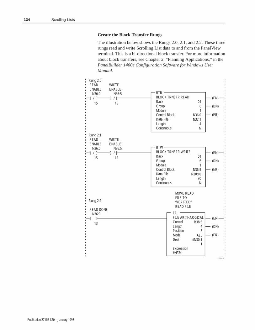
134 Scrolling Lists
Publication 2711E-820 – January 1998
Create the Block Transfer Rungs
The illustration below shows the Rungs 2:0, 2:1, and 2:2. These threerungs read and write Scrolling List data to and from the PanelViewterminal. This is a bi-directional block transfer. For more informationabout block transfers, see Chapter 2, “Planning Applications,” in thePanelBuilder 1400e Configuration Software for Windows UserManual.
FALFILE ARITH/LOGICALControlLengthPositionModeDest
Expression#N37:1
(EN)
23669
BTRBLOCK TRNSFR READRackGroupModuleControl BlockData FileLengthContinuous
Rung 2:0 READ ENABLE N36:0 ] / [
15
WRITEENABLE N36:5 ] / [
15 0161
N36:0N37:1
4N
(DN)
(ER)
(EN)BTWBLOCK TRNSFR WRITERackGroupModuleControl BlockData FileLengthContinuous
Rung 2:1 READ ENABLE N36:0 ] / [
15
WRITEENABLE N36:5 ] / [
15 0161
N36:5N30:10
30N
(DN)
(ER)
(EN)
Rung 2:2
READ DONE N36:0 ] [
13 R38:543
ALL#N30:1
1
(DN)
(ER)
MOVE READFILE TO“VERIFIED”READ FILE

135Scrolling Lists
Publication 2711E-820 – January 1998
Create the Auto Mode Rung
When Rung 2:3 is energized, the Auto mode bit latches and thesequencer resets to its safe state (position 0). When the sequencerincrements its position above Step 0, the Scrolling List cursor iscontrolled by the PLC via the Sequencer Position Word Move to theCursor Control Address, and the Manual Cursor List buttons aredisabled automatically.
MOVMOVESource
Dest
23700
Rung 2:3 AUTO FROM PLC B40 ] [
2 SEQUENCERPOSITIONRESET
AUTOFROM PV N30:3 ] [
1
AUTO MODEB40(L)
1AUTOONE SHOT B40 [ONS] 3
MOVMOVESource
Dest
0
R38:0.POS5
N31:2021
N34[N31:200]3
MOVMOVESource
Dest
CURSORCONTROLADDRESS
MOVMOVESource
Dest
R38:0.POS5
N30:100

136 Scrolling Lists
Publication 2711E-820 – January 1998
Create the Manual Mode Rung
Rung 2:4 places the process in Manual mode. It moves a 0 to theCursor Control Address and permits the Cursor List buttons tocontrol the cursor. This rung also places the currently “On” station to“Stand-By” when Auto mode is switched to Manual.
23701
Rung 2:4
MANUAL FROM PLC B40 ] [
0
CURSORCONTROLADDRESS
MANUALFROM PV N30:3 ] / [
1AUTOMODE B40 ( U )
MOVMOVESource
Dest
0
N30:100
1 MANUAL ONE SHOT B40 [ ONS ]
7
MOVMOVESource
Dest
1
N33[N30:1]1
EQUEQUALSource A
Source B
N33[N30:1]12

137Scrolling Lists
Publication 2711E-820 – January 1998
Create the Toggle Command Rungs
Rung 2:5 handles the toggle command variables when a cursorchange or mode change occurs.
23719
Rung 2:5
PRE-TOGGLE LATCH B40 ] [
6
AUTOMODE B40 ] [
1
MOVMOVESource
Dest
N31:2021
N34[N31:200]3
MOVMOVESource
Dest
N30:11
N31:2003
MOVMOVESource
Dest
N34[N30:1]1
N31:2021
PRE-TOGGLE LATCH B40 ( U )
6
NEQNOT EQUALSource A
Source B
N30:11
N31:2003
CURSORCHANGE

138 Scrolling Lists
Publication 2711E-820 – January 1998
Rung 2:6 toggles the command between “Select” and “Bypass” forthe currently selected station.
23702
Rung 2:6
MANUAL MODE B40 ] / [
1
TOGGLECOMMANDBUTTON N30:3 ] [
3
TOGGLECOMMANDONE SHOT B40 [ONS]
4 2
1
EQUEQUALSource A
Source B
N34[N30:1]11
MOVMOVESource
Dest N34[N30:1]
1(JMP)
PRE-TOGGLELATCH B40 ] [
6
1
1
GEQGRTR THAN OR EQUALSource A
Source B
MOVMOVESource
Dest N34[N30:1]
N34[N30:1]12
PRE-TOGGLELATCH B40 ] / [
6
MOVMOVESource
Dest
N34[N30:1]1
N31:2021
MOVMOVESource
Dest
2
N34[N30:1]1
EQUEQUALSource A
Source B
N31:20211
MOVMOVESource
Dest
N30:11
N31:2003
PRE-TOGGLELATCH B40 ( L )
6
MOVMOVESource
Dest
1
N34[N30:1]1
GEQGRTR THAN OR EQUALSource A
Source B
N31:20212

139Scrolling Lists
Publication 2711E-820 – January 1998
Create the Set Command Input Rung
Rung 2:7 enables the Set Command function. When the SetCommand button is pressed, the currently displayed command valueis placed in the command variable address. This secures the newcommand value when the cursor position or mode changes. Thisrung also sets the Station Status file according to which command isset.
Rung 2:7
1 [LBL]
MANUALMODE B40 ] / [
1
SET COMNDBUTTON N30:3 ] [
MOVMOVESource
Dest
MOVMOVESource
Dest
1
N33[N30:1]1
N34[N30:1]
11
EQUEQUALSource A
Source B
0
N34[N30:1]
1N31:202
1
MOVMOVESource
Dest
4
N33[N30:1]1
N34[N30:1]
12
EQUEQUALSource A
Source B
23703
PRE-TOGGLE LATCH B40 ] [
6
Create the Option Style Number Input Rung
When the operation is in Manual mode and the numeric keypadenable object Enter key is pressed, Rung 2:8 transfers the newOption style number value to the currently selected station’s optionstyle address. The PLC ladder logic uses the Cursor Indicator addressas its pointer.
23722
Rung 2:8
MANUALMODE B40 ] / [
1
CHANGESTYLE NO.ENTER KEY N30:3 ] [
MOVMOVESource
Dest
6 N30:40
N35[N30:1]100

140 Scrolling Lists
Publication 2711E-820 – January 1998
Create the Manual On / Manual Off Input Rung
Rung 2:9 allows you to change the command value for the selectedstation to Manual On or Manual Off while in Manual mode. Thisrung uses the Cursor Indicator Address to place the command valuein the proper command file (N34, word address 1 through 57). It alsoupdates the Status File (N33) accordingly.
3
N34[N30:1]1
23705
Rung 2:9
MANUAL MODE B40 ] / [
1
MANUAL ONBUTTON N30:3
] [
MOVMOVESource
Dest
5
N33[N30:1]1
MOVMOVESource
Dest
4
N34[N30:1]1
MOVMOVESource
Dest
6
N33[N30:1]1
MOVMOVESource
Dest
4
PRE-TOGGLELATCH B40( U )
6
MANUAL OFFBUTTON N30:3
] [5
PRE-TOGGLELATCH B40( U )
6

141Scrolling Lists
Publication 2711E-820 – January 1998
Create the Visible State File Copy Rung
Rung 2:10 copies appropriate file data to the visible state addressesfor each object list. The data copied is based on the Top PositionAddress value from the PanelView terminal.
COPCOPY FILESourceDestLength
#N31[N30:2]#N30:11
5
23706
Rung 2:10COPCOPY FILESourceDestLength
OPTIONFILE
#N32[N30:2]#N30:16
5
COPCOPY FILESourceDestLength
STATUSFILE
#N33[N30:2]#N30:21
5
COPCOPY FILESourceDestLength
COMMANDFILE
#N34[N30:2]#N30:26
5
COPCOPY FILESourceDestLength
STYLE NO.FILE
#N35[N30:2]#N30:31
5
STATIONFILE

142 Scrolling Lists
Publication 2711E-820 – January 1998
Create the Auto Mode Simulation Rungs
Rungs 2:11 through 2:14 simulate a sequential process. This is forexample purposes only.
Rung 2:11 sets a variable N30:8 to 1 when an Auto mode restartoccurs. This sets up a station status reset in the next rung.
23720
Rung 2:11
R38:0 ] [
DN
MOVMOVESource
Dest
1
N30:857
EQUEQUALSource A
Source B
R38:0.POS50
Rung 2:12 resets all STATION status indicators to “Stand-By” whoseStation Commands are “Select”.
23721
Rung 2:12
2 [ LBL ]
R38:0 ] [
MOVMOVESource
Dest
1
N33[N30:8]1
EQUEQUALSource A
Source B
R38:0.POS50
DN
EQUEQUALSource A
Source B
N34[N30:8]11
ADDADDSource ASource B
Dest
1N30:8
57N30:8
57
LESLESS THANSource A
Source B
N30:85757
2(JMP)
Rung 2:13 includes the Simulation Sequencer driven by the timer inrung 2:14. Rung 2:13 also sets the currently selected station status to“On”, and the previous station status to “Complete” as the sequencerincrements through the 57 steps.
Rung 2:14 includes the timer that increments the simulationsequencer each second.
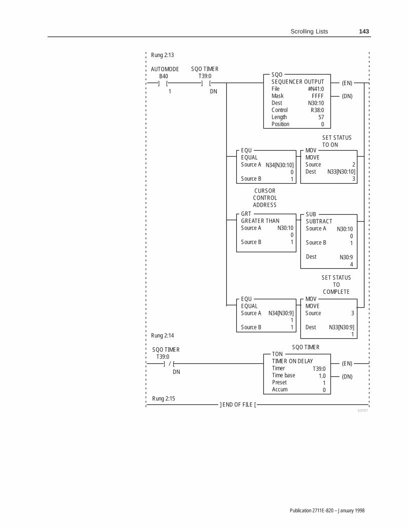
143Scrolling Lists
Publication 2711E-820 – January 1998
2N33[N30:10]
3
(EN)
23707
SQOSEQUENCER OUTPUTFileMaskDestControlLengthPosition
Rung 2:13
AUTOMODE B40 ] [
1
SQO TIMERT39:0 ] [
DN #N41:0FFFF
N30:10R38:0
570
(DN)
Rung 2:14
SQO TIMER T39:0 ] / [
DN
SET STATUSTO ON
MOVMOVESourceDest
SUBSUBTRACTSource A
Source B
Dest
N30:1001
N30:94
SET STATUSTO
COMPLETEMOVMOVESource
Dest
3
N33[N30:9]1
TONTIMER ON DELAYTimerTime basePresetAccum
SQO TIMER
T39:01.0
10
] END OF FILE [
EQUEQUALSource A
Source B
CURSORCONTROLADDRESS
N34[N30:10]01
GRTGREATER THANSource A
Source B
N30:1001
EQUEQUALSource A
Source B
N34[N30:9]11
(EN)
(DN)
Rung 2:15

�������
Publication 2711E-820 – January 1998
�������
This chapter tells you about:
• what Symbols are
• available labels for Symbols
• how to configure Symbols
Symbols are identical in function to Multistate Indicators, except thatthe same graphic image label appears for every state. Symbols useless memory than Multistate Indicators, and the PanelView terminalprocesses information more quickly for Symbols. You can includeany number of Symbols in your screen.
A Symbol can have up to 255 different states. You can assign uniqueattributes such as color and blink to every state, but the monochromegraphic image you assign to it is used for all states. You assign aSymbol State control to the Symbol object. The value of this controldetermines the state that is displayed at runtime.
If a value that has not been assigned to any of the states is written tothe control, or if no control is defined, an error state occurs and thehighest numbered state is displayed without the image. This willcause the Symbol to disappear.
Available Graphic Images
Your PanelBuilder 1400e install set includes a set of 32 standard ISAIndustrial Symbol bitmaps in two sizes. These are monochromebitmaps you can use as Symbols. If you followed the defaultinstallation, the bitmaps will be in PanelBuilder 1400e’s\IMAGES\ISA directory. Appendix A, ISA Symbols, shows the ISAsymbols available.
There is also a set of monochrome DIN symbols in the\IMAGES\DIN directory. Appendix B, DIN Symbols, shows the DINsymbols available. The IMAGES\ARROWS and IMAGES\PARTSdirectories contain sets of arrows and equipment parts, respectively.They are listed in Appendix C, Arrows and Parts. Some of thearrows are monochrome and can be used as symbols. The equipmentparts cannot be used as Symbols because they are not monochrome.
Note: You can use any monochrome bitmap for a Symbol, includingbitmaps you import from another application. You cannot use .dxfimages for Symbols.
About Symbols
�
146 Symbols
Publication 2711E-820 – January 1998
Tip: To use .dxf images as Symbols, export them. The .dxf imagesare exported as bitmap (.bmp) images, and you can use any bitmapimage for a Symbol. Ensure that the size of the .dxf image is correctbefore you export it as a bitmap image, because bitmap images donot resize well.
Sizing Symbols
You can increase or decrease the size of the symbols once you placethem on screens in PanelBuilder. You can use multiple copies of thesame symbol and change the size of any or all of them. The size ofthe source graphic image remains unchanged; PanelBuilder saveseach new size of the symbol as a separate graphic when theapplication’s .pvd file is created.
Note: The application’s size increases each time you resize asymbol. Limit the number of symbols you resize to ensure that yourapplication will fit in the terminal’s memory.
Configuring Symbols
For information about placing Symbols on the screen, refer toChapter 9, Creating Objects, in the PanelBuilder 1400eConfiguration Software for Windows User Manual. Configure eachSymbol according to this table:
Field Meaning
Name Assign a name, up to 15 characters, to document the object forprinted reports. This increases the application’s size by 1 byteper character.
Number of States Assign the number of states you want the Symbol to have. Themaximum number you can assign is 255.
Edit States Change the value of each state. To do so, choose Edit States.You can assign any unique value from –2,147,483,648 to2,147,483,647. For more information about changing statevalues, see “Configuring Object States,” in Chapter 9, CreatingObjects, in the PanelBuilder 1400e Configuration Software forWindows User Manual.
Note: To minimize the size of the application file, use statevalues that increment by one for each state. Do not configuremore states than you need.
�
�

147Symbols
Publication 2711E-820 – January 1998
Field Meaning
Select Graphic Image To change the bitmap, choose Select Graphic Image from theConfigure Symbol dialog box. The Select Symbol dialog boxappears, with all the graphic image library’s bitmaps listed.Choose the graphic image you want to use, or import it. You canselect monochrome bitmaps only.
Control Symbol State determines which state is shown. You can assigna tag or expression to this control.
Important: If a value that has not been assigned to any of thestates is written to the control, or if no control is defined, anerror state occurs and the highest numbered state is displayedwithout the image. This will cause the Symbol object todisappear.
You can format the Symbol’s foreground color, background color,border style, fill style, and blink attributes. The fill and border styleyou assign apply to every state, but you can configure individualcolors and blink attributes for each state. For details on formattingobjects see “Changing Object Appearance,” in Chapter 9, CreatingObjects, in the PanelBuilder 1400e Configuration Software forWindows User Manual.

����
Publication 2711E-820 – January 1998
����
This chapter tells you about text.
Tip: To simplify screen editing and maximize runtime performance,convert all text and drawing objects into wallpaper. See Chapter 9,Creating Objects, in the PanelBuilder 1400e Configuration Softwarefor Windows User Manual, for detailed information.
Text is used for describing screens, objects, functions, and so on.You can add text to the screen background, or add it to an object asan object label.
A text label is part of an object. For example, you can add text labelsto a List Indicator or to a button to provide information to theoperator. If you configure an object to change appearances fordifferent states, you can also have different text labels appear foreach state.
You can format the foreground color, background color, font style,and blink and underline attributes of the text.
Note: If you use the Extra Large Font for your text, the applicationwill be compatible only with PanelView Version 2 or later. Theapplication will not be compatible with earlier versions.
For step-by-step instructions about creating and editing text and textlabels, see Chapter 9, Creating Objects, in the PanelBuilder 1400eConfiguration Software for Windows User Manual.
The Extended ASCII Character Set
For a list of the ASCII character set, see Appendix D, ASCIICharacter Set, in this manual. You can also use PanelBuilder 1400eto create characters not found on your keyboard by pressing ALT andtyping a number on the numeric keypad. See Appendix B, TheExtended Character Set, in the PanelBuilder 1400e ConfigurationSoftware for Windows User Manual or refer to the online help.
�
About Text
�

��� �� �� � ��������
Publication 2711E-820 – January 1998
��� �� �� � ��������
This chapter tells you:
• about Time and Date Displays
• how to configure Time and Date Displays
Use the Time Display and the Date Display to show time and dateinformation on your application.
Time Display
The Time Display shows the current time at a specified location on ascreen.
Use the PanelView terminal’s Configuration Menu or the PLCControlled Time & Date option in the PLC I/O Control Optionsdialog box (see Chapter 12, Configuring Terminal and PLC Options,in the PanelBuilder 1400e Configuration Software for Windows UserManual) to set the correct time on your PanelView terminal. Use theterminal’s Configuration Menu to configure the time display format.
Note: Only one time or date object will run per screen.
Date Display
The Date Display shows the current date at a specified location on ascreen.
Use the PanelView terminal’s Configuration Menu or the PLCControlled Time & Date option in the PLC I/O Control Optionsdialog box (see Chapter 12, Configuring Terminal and PLC Options,in the PanelBuilder 1400e Configuration Software for Windows UserManual) to set the correct date on your PanelView terminal. Use thePanelView terminal’s Configuration menu to configure the datedisplay format.
Note: To display the full year (four digits) on the PanelViewterminal, make the object large enough for the full format. If the fieldis not large enough, the full year will not be displayed.
About Time and DateDisplays
�
�

152 Time and Date Displays
Publication 2711E-820 – January 1998
Configuring the Time and Date Display
Configure the Time and Date Display according to the followingtable:
Field Meaning
Name Assign a name, up to 15 characters, to document the object forprinted reports. This increases the application’s size by 1 byteper character.
Display Type Specify Time Display or Date Display.
You can adjust the size of the Time or Date Display and format itsforeground color, background color, font style, border style, andblink and underline attributes. For details on formatting objects see“Changing Object Appearance,” in Chapter 9, Creating Objects, inthe PanelBuilder 1400e Configuration Software for Windows UserManual.
Note: If you use the Extra Large Font, the application will becompatible only with PanelView Version 2 or later. The applicationwill not be compatible with earlier versions.
�

������
Publication 2711E-820 – January 1998
������
This chapter tells you about:
• how Trends function
• how to configure Trends
Trends allow the operator to track process variables over a period oftime. The Trend is a dynamic, graphical display object with time onthe horizontal axis and the value range of the process variable on thevertical axis. For example, you can use Trends for ProportionalIntegral Differential (PID) loop tuning or for data analysis.
Note: If you use the Trend object the application will be compatiblewith PanelView Version 2 or later. It will not be compatible withearlier versions.
You can use up to four Trend objects per screen. The Trend objectconsists of a panel, up to four pens, value indicators for maximum,median and minimum, and time and date displays for the maximum,median and minimum values. Time is displayed on the horizontalaxis; values are displayed on the vertical axis. You cannot changethis orientation of the Trend object.
The Trend uses a pen to plot each variable. You can use up to fourpens per Trend object to track up to four process variables. Thevalues plotted on a Trend object are called data points. The numberof data points is determined by the number of pens in the Trend, thesample rate, and the time span covered by the Trend. The number ofdata points that can be displayed on the screen is determined by thewidth of the Trend object. Each pen can display a maximum of 640data points at a time on the screen. An example of a Trend object isshown below.
About Trends
�

154 Trends
Publication 2711E-820 – January 1998
Panel
Maximum
Median
Minimum
Pens
Time & Date labelsfor Minimum
Time & Date labelsfor Median
Time & Date labelsfor Maximum
All pens in a Trend can be configured to plot values either in theforeground or in the background, or the individual pens in a trendcan be configured (independently of the trend as a whole) forforeground or background plotting.
If one or more pens are configured to use background plotting, theTrend begins to plot values for those pens when the applicationenters Run mode, and continues to plot values whether or not it isdisplayed. The Trend does not retain data when you switch modes orselect a new application. It also does not retain data across powercycles of the PanelView terminal. For pens not configured to usebackground screen plotting, the Trend object begins to plot valueswhen it is displayed on the PanelView terminal. These values are notsaved when you switch to a different screen.
You can configure up to 85 pens in your application for backgroundplotting, but the total number of data points cannot exceed 3000 forall pens using background plotting. You can see the total number ofdata points in use for background plotting in your application in theConfigure Trend Object dialog box, when you enable the backgroundscreen for one or more pens.
The Trend plots from the right side, scrolling to the left to makeroom for a new data point each time a new point is plotted. The timelabels on the horizontal axis, if used, are updated every time a datapoint is collected.
The Trend object includes Trend Minimum Value and TrendMaximum Value controls to specify the range of values to display ata given point in time. The Minimum and Maximum values allow theTrend to zoom in and out by adjusting the range of values displayedon the vertical axis. If you change the value for the minimum ormaximum value displayed, the Trend is re-plotted at the new rangeof values.

155Trends
Publication 2711E-820 – January 1998
Note: If the trend contains a large number of values, and the samplerate is fast, a few unreliable points will be generated while the trendis re-drawn. These unreliable points may cause a break in the plotteddata, similar to that caused by a communication error. Existingvalues are not affected.
If a value is outside the range specified by the Trend Minimum andMaximum Value controls, the pen line is drawn to the lower or upperedge of the Trend object and then disappears. When a plotted valueis next within the specified range, a line is drawn from the lower orupper edge of the Trend object to the new point. No data appears forthe time interval during which the values are outside the specifiedrange.
Out of Range Plots
Communication Error
If there is an error in the value of the Trend Minimum or MaximumValue control, the Pen Value label corresponding to the control isfilled with asterisks (***). Values that have already been plotted areerased, and new data is collected, but not plotted, until the error stateno longer exists. An error state also occurs when the Trend MinimumValue control value is greater than the Trend Maximum Value controlvalue, and when there is an overflow or underflow in the value ofeither control.
If a communication error occurs, there is a break in the plotted datauntil communication is resumed. New values are plotted beginning atthe point in time when communication resumes.
�

156 Trends
Publication 2711E-820 – January 1998
Tip: Use the Scale object to provide a scale along the axes of theTrend object, as shown in the example below. Configure the numberof ticks in the Scale to correspond to the frequency with which theTrend is updated and to represent the value ranges of the activity youare tracking.
Note: When placing the Trend object on the screen, ensure that noother objects overlap it. Objects overlapping a Trend object willcause an error when the application is validated.
�
�

157Trends
Publication 2711E-820 – January 1998
Configuring the Trend
Configure the Trend according to this table:
Field Meaning
Name Assign a name, up to 15 characters, to document the object forprinted reports. This increases the application’s size by 1 byteper character.
Number of Pens Specify the number of process variables to track, from 1 to 4.Choose Configure Pens and choose a pen to specify the pen’scolor, line style, and plotting symbol, and the control each penmonitors. See “Configuring the Pens” later in this chapter.
Note: Each Pen uses the same Sample Rate, Time Span andMinimum and Maximum Values. If the Pens’ controls do notcontain similar values, or if you want to plot the Pens at differentrates, use separate Trend objects.
Note: You can configure up to 85 pens for background plotting(across all Trends in your application). The total number of datapoints for all pens using background plotting in your applicationcannot exceed 3000.
Background ScreenPlotting for All Pens
Select the check box if you want the Trend to continue trackingprocess variables even when the screen containing the Trendobject is not displayed. Deselect the check box if you don’t needthe Trend to track the processes when the screen is notdisplayed.
You can configure each pen to specify whether to continuetracking its process when the screen is not displayed, asdescribed in “Configuring the Pens” later in this chapter. Theindividual pen configuration overrides the Background ScreenPlotting for All Pens option.
Note: You can configure up to 85 pens for background screenplotting (across all Trends in your application). The total numberof data points for all pens using background plotting in yourapplication cannot exceed 3000.
Sample Rate Specify the rate at which to plot new values. The range is0.25 seconds to 86400 seconds (1 day).
Time Span Days —Specify the number of days covered by the Time Spanon the horizontal axis, from 0 to 7.
Hours —Specify the number of hours covered by the TimeSpan on the horizontal axis, from 0 to 23.
Minutes —Specify the number of minutes covered by the TimeSpan on the horizontal axis, from 0 to 59.
Seconds —Specify the number of seconds covered by theTime Span on the horizontal axis, from 0 to 59.
Note: The total time span of a Trend must be at least2 seconds.
Time Specify whether to display labels for the time at which the datais collected. The Maximum time is the time of the most recentpoint displayed on the Trend object. The Minimum time is theMaximum time less the Time Span. The Median time iscalculated at the Maximum time less half the Time Span.
The time label is displayed using the format configured at thePanelView terminal’s Time and Date configuration screen.

158 Trends
Publication 2711E-820 – January 1998
Field Meaning
Date Specify whether to display labels for the date at which the datais collected. The Maximum date is the date of the most recentpoint displayed on the Trend object. The Minimum date is thedate of the earliest point displayed on the Trend object. TheMedian date is the date of the median point.
The date label is displayed using the format configured at thePanelView terminal’s Time and Date configuration screen.
Pen Value Specify whether to display labels for the Pen values for therange of data collected. The Minimum Pen value is the value ofthe Trend Minimum Value control. The Median Pen value is theaverage of the Minimum and Maximum values. The MaximumPen value is the value of the Trend Maximum Value control.
Choose Configure Labels to specify the appearance of the PenValue labels. See “Configuring the Pen Value Labels” later inthis chapter.
Control Trend Minimum Value controls the minimum value of thevertical axis. Assign a tag, expression, or constant to thiscontrol.
Trend Maximum Value controls the maximum value of thevertical axis. Assign a tag, expression, or constant to thiscontrol.
Configuring the Pens
Configure the pens according to this table:
Field Meaning
Background ScreenPlotting
Select the check box if you want the Trend to continue plottingthis Pen even when the screen containing the Trend object isnot displayed. Deselect the check box if you don’t need theTrend to plot this particular Pen when the screen is notdisplayed. This selection overrides the Background ScreenPlotting for All Pens option for this pen.
Pen Color Select the color to use for the pen’s line and symbol.
Symbol Select a symbol to display at each data point. Leave this fieldblank if you do not want the Trend object to display symbols forthis pen.
Line Style Select the style of line to use to connect the data points for thispen.
Control Pen Value specifies the location of the values you want this pento track. Assign a tag or expression to this control.
159Trends
Publication 2711E-820 – January 1998
Configuring the Pen Value Labels
Configure the Pen Value Labels according to this table:
Field Meaning
Fill Left With Choose whether the left portion of the display will be filled withzeros or blank spaces when fewer than the maximum numberof digits is displayed.
Number of Digits Specify the number of digits that can be displayed on thescreen, from 1 to 16.
Decimal Display Specify how you want decimal points to appear in the label:
Disabled —Select this option if you don’t want a decimal pointdisplayed. If the Pen Value control contains a decimal point, itwill be rounded off.
Implicit —The Pen Value will be displayed as it is, without anyexternal decimal position manipulation.
Fixed Position—Specify where the decimal point is positionedin the display. See Digits after Decimal Point, next.
Digits after DecimalPoint
If you specify the Decimal Display as Fixed Position, enter thenumber of digits that will appear after the decimal point. Themaximum is 15.
You can adjust the size of the Trend panel and format its backgroundcolor and border style. You can format each Trend label’s foregroundcolor, background color, font style, border style, and blink andunderline attributes. For more information about configuring objects,see Chapter 9, “Creating Objects,” in the PanelBuilder 1400eConfiguration Software for Windows User Manual.

�������� �
Publication 2711E-820 – January 1998
��� �����
This appendix lists all the ISA symbols provided with PanelBuilder1400e. If you followed the default installation, they are in the\IMAGES\ISA directory.
You can use any monochrome image as a Symbol object, includingthese bitmaps of standard ISA symbols. You can also use thesebitmaps as Graphic Images. Each bitmap is available in two sizes. Thefile name containing the ‘l’—for example, ‘agitatrl.bmp’—indicatesthe bitmap is the large size.
Symbol Name File Names ISA Symbol Icon
Agitator agitatr.bmp
agitatrl.bmp
Blower blower.bmp
blowerl.bmp
Compressor comprsr.bmp
comprsrl.bmp
Conveyor conveyr.bmp
conveyrl.bmp
Cyclone Separator cyclone.bmp
cyclonel.bmp
Distillation Tower distowr.bmp
distowrl.bmp
Exchanger exchngr.bmp
exchngrl.bmp
Liquid Filter ftrliqd.bmp
ftrliqdl.bmp
Vacuum Filter ftrvacm.bmp
ftrvacml.bmp
Furnace furnace.bmp
furnacel.bmp
Inline Mixer inlmixr.bmp
inlmixl.bmp
Symbol Icons
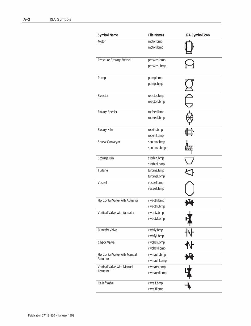
ISA SymbolsA–2
Publication 2711E-820 – January 1998
Symbol Name ISA Symbol IconFile Names
Motor motor.bmp
motorl.bmp
Pressure Storage Vessel presves.bmp
presvesl.bmp
Pump pump.bmp
pumpl.bmp
Reactor reactor.bmp
reactorl.bmp
Rotary Feeder rotfeed.bmp
rotfeedl.bmp
Rotary Kiln rotkiln.bmp
rotkilnl.bmp
Screw Conveyor scrconv.bmp
scrconvl.bmp
Storage Bin storbin.bmp
storbinl.bmp
Turbine turbine.bmp
turbinel.bmp
Vessel vessel.bmp
vessell.bmp
Horizontal Valve with Actuator vlvacth.bmp
vlvacthl.bmp
Vertical Valve with Actuator vlvactv.bmp
vlvactvl.bmp
Butterfly Valve vlvbfly.bmp
vlvbflyl.bmp
Check Valve vlvchck.bmp
vlvchckl.bmp
Horizontal Valve with ManualActuator
vlvmach.bmp
vlvmachl.bmp
Vertical Valve with ManualActuator
vlvmacv.bmp
vlvmacvl.bmp
Relief Valve vlvrelf.bmp
vlvrelfl.bmp

ISA Symbols A–3
Publication 2711E-820 – January 1998
Symbol Name ISA Symbol IconFile Names
Horizontal Valve with ThrottlingActuator
vlvthrh.bmp
vlvthrhl.bmp
Vertical Valve with ThrottlingActuator
vlvthrv.bmp
vlvthrvl.bmp
Weigh Hopper weihopr.bmp
weihoprl.bmp
Transformer xformer.bmp
xformerl.bmp

������� �
Publication 2711E-820 – January 1998
��� �����
This appendix lists all the DIN symbols provided with PanelBuilder1400e. If you followed the default installation, they are in the\IMAGES\DIN directory.
You can use any monochrome image as a Symbol object, includingthese bitmaps of standard DIN symbols. You can also use thesebitmaps as Graphic Images. The symbols are listed alphanumericallyby file name.
File Name DIN Symbol Icon File Name DIN Symbol Icon File Name DIN Symbol Icon
din001.bmp din002.bmp din003.bmp
din004.bmp din005.bmp din006.bmp
din007.bmp din008.bmp din009.bmp
din010.bmp din011.bmp din012.bmp
din013.bmp din014.bmp din015.bmp
Symbol Icons

DIN SymbolsB–2
Publication 2711E-820 – January 1998
File Name DIN Symbol IconFile NameDIN Symbol IconFile NameDIN Symbol Icon
din016.bmp din017.bmp din018.bmp
din020.bmp din021.bmp din023.bmp
din024.bmp din025.bmp din026.bmp
din027.bmp din028.bmp din029.bmp
din030.bmp din031.bmp din032.bmp
din033.bmp din034.bmp din036.bmp
din037.bmp din038.bmp din040.bmp
din042.bmp din050.bmp din054.bmp
din055.bmp din056.bmp din057.bmp
din062.bmp din078.bmp din079.bmp
din080.bmp din081.bmp din083.bmp
din086.bmp din087.bmp din088.bmp
din089.bmp din090.bmp din091.bmp
din092.bmp din093.bmp din094.bmp

DIN Symbols B–3
Publication 2711E-820 – January 1998
File Name DIN Symbol IconFile NameDIN Symbol IconFile NameDIN Symbol Icon
din095.bmp din096.bmp din097.bmp
din098.bmp din099.bmp din100.bmp
din101.bmp din102.bmp din103.bmp
din104.bmp din105.bmp din106.bmp
din107.bmp din108.bmp din109.bmp

DIN SymbolsB–4
Publication 2711E-820 – January 1998
File Name DIN Symbol IconFile NameDIN Symbol IconFile NameDIN Symbol Icon
din110.bmp din111.bmp din112.bmp
din113.bmp din114.bmp din115.bmp
din116.bmp din117.bmp din118.bmp
din119.bmp din120.bmp din121.bmp
din122.bmp din123.bmp din124.bmp
din125.bmp din126.bmp din127.bmp

DIN Symbols B–5
Publication 2711E-820 – January 1998
File Name DIN Symbol IconFile NameDIN Symbol IconFile NameDIN Symbol Icon
din128.bmp din129.bmp din130.bmp
din131.bmp din132.bmp din133.bmp
din134.bmp din135.bmp din136.bmp
din137.bmp din138.bmp din139.bmp
din140.bmp din141.bmp din142.bmp
din143.bmp din144.bmp din145.bmp
din146.bmp din147.bmp din148.bmp
din149.bmp din150.bmp din151.bmp
din152.bmp din153.bmp din154.bmp
din155.bmp din156.bmp din157.bmp
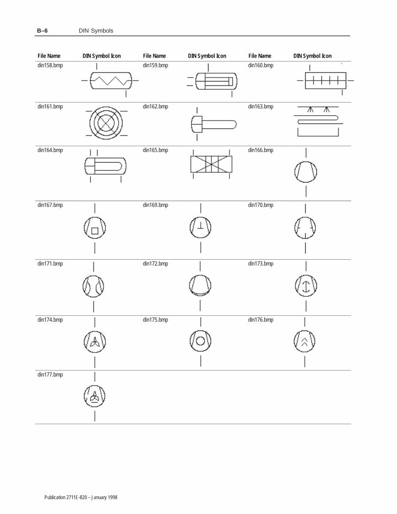
DIN SymbolsB–6
Publication 2711E-820 – January 1998
File Name DIN Symbol IconFile NameDIN Symbol IconFile NameDIN Symbol Icon
din158.bmp din159.bmp din160.bmp
din161.bmp din162.bmp din163.bmp
din164.bmp din165.bmp din166.bmp
din167.bmp din169.bmp din170.bmp
din171.bmp din172.bmp din173.bmp
din174.bmp din175.bmp din176.bmp
din177.bmp

������� �
Publication 2711E-820 – January 1998
����� ��� ���
This appendix lists the graphic images of arrows and equipment partsprovided with PanelBuilder 1400e. If you followed the defaultinstallation, they are in the \IMAGES\ARROWS andIMAGES\PARTS directories.
You can use any monochrome image as a Symbol object, includingsome of these bitmaps of arrows (the first eight arrows are notmonochrome). You can also use these bitmaps as graphic images.The images are presented alphabetically by file name in the tablesthat follow, to match the order in which they are listed in the SelectImage and Select Symbol dialog boxes.
File Name Arrow Shape File Name Arrow Shape
arrow1.bmp arrow2.bmp
arrow3.bmp arrow4.bmp
arrow5.bmp arrow6.bmp
arrow7.bmp arrow8.bmp
arrowdn.bmp arrowdnt.bmp
arrowlf.bmp arrowlft.bmp
arrowret.bmp
Arrows

Arrows and PartsC–2
Publication 2711E-820 – January 1998
File Name Arrow ShapeFile NameArrow Shape
arrowrt.bmp arrowrtt.bmp
arrowup.bmp arrowupt.bmp
arrwldn.bmp arrwldnt.bmp
arrwlup.bmp arrwlupt.bmp
arrwrdn.bmp arrwrdnt.bmp
arrwrup.bmp arrwrupt.bmp
You can use these bitmaps of equipment parts as graphic images.Since they are not monochrome you cannot use them as Symbols.The images are presented alphanumerically by file name in the tablesthat follow, to match the order in which they are listed in the SelectImage dialog box.
Image Type File Name Equipment Part Graphic Image File Name Equipment Part Graphic Image
Buttons button10.bmp button11.bmp
button12.bmp
Equipment Parts

Arrows and Parts C–3
Publication 2711E-820 – January 1998
Image Type File Name Equipment Part Graphic Image
Conveyors cnv2.bmp
cnv3.bmp
cnvy1.bmp
Image Type File Name Equipment Part Graphic Image File Name Equipment Part Graphic Image
Motors mtr1.bmp mtr2.bmp

Arrows and PartsC–4
Publication 2711E-820 – January 1998
Image Type File Name Equipment Part Graphic Image
Motors mtr3.bmp
mtr6.bmp
Image Type File Name Equipment Part Graphic Image File Name Equipment Part Graphic Image
Pipes pipe1.bmp pipe14.bmp
pipe15.bmp pipe16.bmp
pipe2.bmp pipe21.bmp
pipe22.bmp pipe23.bmp

Arrows and Parts C–5
Publication 2711E-820 – January 1998
Image Type Equipment Part Graphic ImageFile NameEquipment Part Graphic ImageFile Name
Pipes pipe24.bmp pipe25.bmp
pipe26.bmp pipe27.bmp
pipe28.bmp pipe29.bmp
pipe3.bmp pipe34.bmp
pipe35.bmp pipe4.bmp
pipe5.bmp pipe6.bmp
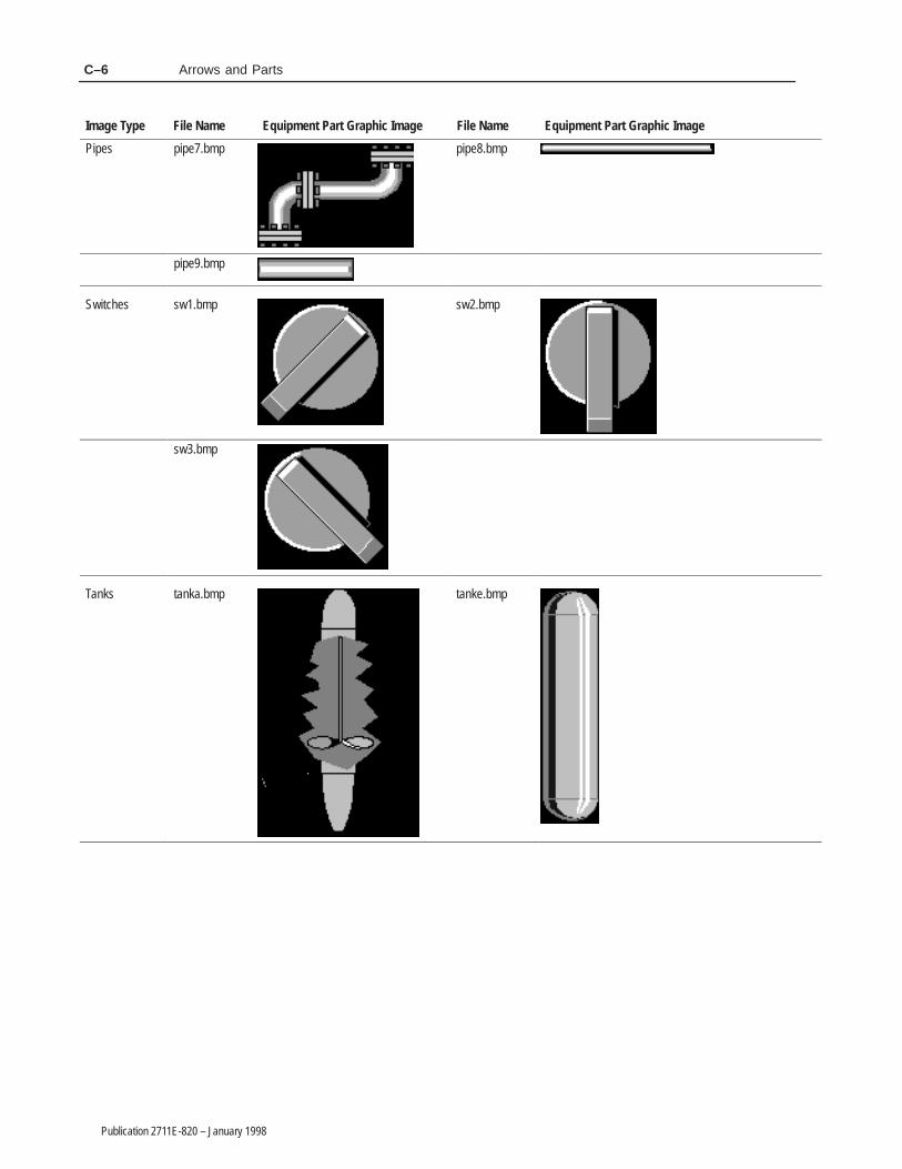
Arrows and PartsC–6
Publication 2711E-820 – January 1998
Image Type Equipment Part Graphic ImageFile NameEquipment Part Graphic ImageFile Name
Pipes pipe7.bmp pipe8.bmp
pipe9.bmp
Switches sw1.bmp sw2.bmp
sw3.bmp
Tanks tanka.bmp tanke.bmp

Arrows and Parts C–7
Publication 2711E-820 – January 1998
Image Type File Name Equipment Part Graphic Image File Name Equipment Part Graphic Image
Tanks tankf.bmp tankg.bmp
tankh.bmp tanki.bmp
tankj.bmp tankk.bmp

Arrows and PartsC–8
Publication 2711E-820 – January 1998
Image Type File Name Equipment Part Graphic Image
Tanks tankl.bmp
Valves vlv1.bmp Valves vlv3.bmp
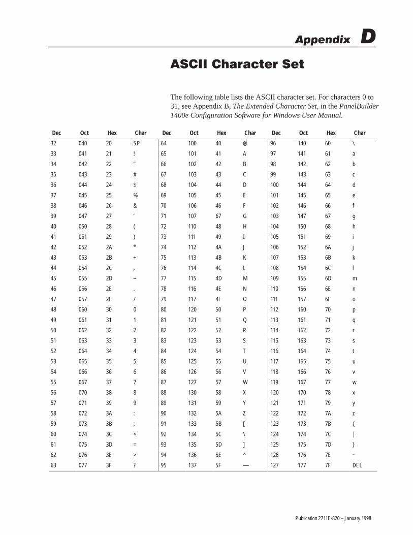
������� �
Publication 2711E-820 – January 1998
����� ������ ���
The following table lists the ASCII character set. For characters 0 to31, see Appendix B, The Extended Character Set, in the PanelBuilder1400e Configuration Software for Windows User Manual.
ÁÁÁÁÁÁÁÁ
Dec ÁÁÁÁÁÁ
Oct ÁÁÁÁÁÁÁÁ
Hex ÁÁÁÁÁÁÁÁ
Char ÁÁÁÁÁÁ
Dec ÁÁÁÁÁÁÁÁ
Oct ÁÁÁÁÁÁÁÁ
Hex ÁÁÁÁÁÁ
Char ÁÁÁÁÁÁÁÁ
Dec ÁÁÁÁÁÁÁÁ
Oct ÁÁÁÁÁÁ
Hex ÁÁÁÁÁÁÁÁ
Char
ÁÁÁÁÁÁÁÁ
32 ÁÁÁÁÁÁ
040 ÁÁÁÁÁÁÁÁ
20 ÁÁÁÁÁÁÁÁ
SP ÁÁÁÁÁÁ
64 ÁÁÁÁÁÁÁÁ
100 ÁÁÁÁÁÁÁÁ
40 ÁÁÁÁÁÁ
@ ÁÁÁÁÁÁÁÁ
96 ÁÁÁÁÁÁÁÁ
140 ÁÁÁÁÁÁ
60 ÁÁÁÁÁÁÁÁ
\
ÁÁÁÁÁÁÁÁ
33 ÁÁÁÁÁÁ
041 ÁÁÁÁÁÁÁÁ
21 ÁÁÁÁÁÁÁÁ
! ÁÁÁÁÁÁ
65 ÁÁÁÁÁÁÁÁ
101 ÁÁÁÁÁÁÁÁ
41 ÁÁÁÁÁÁ
A ÁÁÁÁÁÁÁÁ
97 ÁÁÁÁÁÁÁÁ
141 ÁÁÁÁÁÁ
61 ÁÁÁÁÁÁÁÁ
a
ÁÁÁÁÁÁÁÁ
34 ÁÁÁÁÁÁ
042 ÁÁÁÁÁÁÁÁ
22 ÁÁÁÁÁÁÁÁ
” ÁÁÁÁÁÁ
66 ÁÁÁÁÁÁÁÁ
102 ÁÁÁÁÁÁÁÁ
42 ÁÁÁÁÁÁ
B ÁÁÁÁÁÁÁÁ
98 ÁÁÁÁÁÁÁÁ
142 ÁÁÁÁÁÁ
62 ÁÁÁÁÁÁÁÁ
b
ÁÁÁÁÁÁÁÁ
35 ÁÁÁÁÁÁ
043 ÁÁÁÁÁÁÁÁ
23 ÁÁÁÁÁÁÁÁ
# ÁÁÁÁÁÁ
67 ÁÁÁÁÁÁÁÁ
103 ÁÁÁÁÁÁÁÁ
43 ÁÁÁÁÁÁ
C ÁÁÁÁÁÁÁÁ
99 ÁÁÁÁÁÁÁÁ
143 ÁÁÁÁÁÁ
63 ÁÁÁÁÁÁÁÁ
c
ÁÁÁÁÁÁÁÁ
36 ÁÁÁÁÁÁ
044 ÁÁÁÁÁÁÁÁ
24 ÁÁÁÁÁÁÁÁ
$ ÁÁÁÁÁÁ
68 ÁÁÁÁÁÁÁÁ
104 ÁÁÁÁÁÁÁÁ
44 ÁÁÁÁÁÁ
D ÁÁÁÁÁÁÁÁ
100 ÁÁÁÁÁÁÁÁ
144 ÁÁÁÁÁÁ
64 ÁÁÁÁÁÁÁÁ
d
ÁÁÁÁÁÁÁÁ
37 ÁÁÁÁÁÁ
045 ÁÁÁÁÁÁÁÁ
25 ÁÁÁÁÁÁÁÁ
% ÁÁÁÁÁÁ
69 ÁÁÁÁÁÁÁÁ
105 ÁÁÁÁÁÁÁÁ
45 ÁÁÁÁÁÁ
E ÁÁÁÁÁÁÁÁ
101 ÁÁÁÁÁÁÁÁ
145 ÁÁÁÁÁÁ
65 ÁÁÁÁÁÁÁÁ
e
ÁÁÁÁÁÁÁÁ
38 ÁÁÁÁÁÁ
046 ÁÁÁÁÁÁÁÁ
26 ÁÁÁÁÁÁÁÁ
& ÁÁÁÁÁÁ
70 ÁÁÁÁÁÁÁÁ
106 ÁÁÁÁÁÁÁÁ
46 ÁÁÁÁÁÁ
F ÁÁÁÁÁÁÁÁ
102 ÁÁÁÁÁÁÁÁ
146 ÁÁÁÁÁÁ
66 ÁÁÁÁÁÁÁÁ
f
ÁÁÁÁÁÁÁÁ
39 ÁÁÁÁÁÁ
047 ÁÁÁÁÁÁÁÁ
27 ÁÁÁÁÁÁÁÁ
‘ ÁÁÁÁÁÁ
71 ÁÁÁÁÁÁÁÁ
107 ÁÁÁÁÁÁÁÁ
67 ÁÁÁÁÁÁ
G ÁÁÁÁÁÁÁÁ
103 ÁÁÁÁÁÁÁÁ
147 ÁÁÁÁÁÁ
67 ÁÁÁÁÁÁÁÁ
g
ÁÁÁÁÁÁÁÁ
40 ÁÁÁÁÁÁ
050 ÁÁÁÁÁÁÁÁ
28 ÁÁÁÁÁÁÁÁ
( ÁÁÁÁÁÁ
72 ÁÁÁÁÁÁÁÁ
110 ÁÁÁÁÁÁÁÁ
48 ÁÁÁÁÁÁ
H ÁÁÁÁÁÁÁÁ
104 ÁÁÁÁÁÁÁÁ
150 ÁÁÁÁÁÁ
68 ÁÁÁÁÁÁÁÁ
h
ÁÁÁÁÁÁÁÁ
41 ÁÁÁÁÁÁ
051 ÁÁÁÁÁÁÁÁ
29 ÁÁÁÁÁÁÁÁ
) ÁÁÁÁÁÁ
73 ÁÁÁÁÁÁÁÁ
111 ÁÁÁÁÁÁÁÁ
49 ÁÁÁÁÁÁ
I ÁÁÁÁÁÁÁÁ
105 ÁÁÁÁÁÁÁÁ
151 ÁÁÁÁÁÁ
69 ÁÁÁÁÁÁÁÁ
i
ÁÁÁÁÁÁÁÁ
42 ÁÁÁÁÁÁ
052 ÁÁÁÁÁÁÁÁ
2A ÁÁÁÁÁÁÁÁ
* ÁÁÁÁÁÁ
74 ÁÁÁÁÁÁÁÁ
112 ÁÁÁÁÁÁÁÁ
4A ÁÁÁÁÁÁ
J ÁÁÁÁÁÁÁÁ
106 ÁÁÁÁÁÁÁÁ
152 ÁÁÁÁÁÁ
6A ÁÁÁÁÁÁÁÁ
j
ÁÁÁÁÁÁÁÁ
43 ÁÁÁÁÁÁ
053 ÁÁÁÁÁÁÁÁ
2B ÁÁÁÁÁÁÁÁ
+ ÁÁÁÁÁÁ
75 ÁÁÁÁÁÁÁÁ
113 ÁÁÁÁÁÁÁÁ
4B ÁÁÁÁÁÁ
K ÁÁÁÁÁÁÁÁ
107 ÁÁÁÁÁÁÁÁ
153 ÁÁÁÁÁÁ
6B ÁÁÁÁÁÁÁÁ
k
ÁÁÁÁÁÁÁÁ
44 ÁÁÁÁÁÁ
054 ÁÁÁÁÁÁÁÁ
2C ÁÁÁÁÁÁÁÁ
, ÁÁÁÁÁÁ
76 ÁÁÁÁÁÁÁÁ
114 ÁÁÁÁÁÁÁÁ
4C ÁÁÁÁÁÁ
L ÁÁÁÁÁÁÁÁ
108 ÁÁÁÁÁÁÁÁ
154 ÁÁÁÁÁÁ
6C ÁÁÁÁÁÁÁÁ
l
ÁÁÁÁÁÁÁÁ
45 ÁÁÁÁÁÁ
055 ÁÁÁÁÁÁÁÁ
2D ÁÁÁÁÁÁÁÁ
– ÁÁÁÁÁÁ
77 ÁÁÁÁÁÁÁÁ
115 ÁÁÁÁÁÁÁÁ
4D ÁÁÁÁÁÁ
M ÁÁÁÁÁÁÁÁ
109 ÁÁÁÁÁÁÁÁ
155 ÁÁÁÁÁÁ
6D ÁÁÁÁÁÁÁÁ
m
ÁÁÁÁÁÁÁÁ
46 ÁÁÁÁÁÁ
056 ÁÁÁÁÁÁÁÁ
2E ÁÁÁÁÁÁÁÁ
. ÁÁÁÁÁÁ
78 ÁÁÁÁÁÁÁÁ
116 ÁÁÁÁÁÁÁÁ
4E ÁÁÁÁÁÁ
N ÁÁÁÁÁÁÁÁ
110 ÁÁÁÁÁÁÁÁ
156 ÁÁÁÁÁÁ
6E ÁÁÁÁÁÁÁÁ
n
ÁÁÁÁÁÁÁÁ
47 ÁÁÁÁÁÁ
057 ÁÁÁÁÁÁÁÁ
2F ÁÁÁÁÁÁÁÁ
/ ÁÁÁÁÁÁ
79 ÁÁÁÁÁÁÁÁ
117 ÁÁÁÁÁÁÁÁ
4F ÁÁÁÁÁÁ
O ÁÁÁÁÁÁÁÁ
111 ÁÁÁÁÁÁÁÁ
157 ÁÁÁÁÁÁ
6F ÁÁÁÁÁÁÁÁ
o
ÁÁÁÁÁÁÁÁ
48 ÁÁÁÁÁÁ
060 ÁÁÁÁÁÁÁÁ
30 ÁÁÁÁÁÁÁÁ
0 ÁÁÁÁÁÁ
80 ÁÁÁÁÁÁÁÁ
120 ÁÁÁÁÁÁÁÁ
50 ÁÁÁÁÁÁ
P ÁÁÁÁÁÁÁÁ
112 ÁÁÁÁÁÁÁÁ
160 ÁÁÁÁÁÁ
70 ÁÁÁÁÁÁÁÁ
p
ÁÁÁÁÁÁÁÁ
49 ÁÁÁÁÁÁ
061 ÁÁÁÁÁÁÁÁ
31 ÁÁÁÁÁÁÁÁ
1 ÁÁÁÁÁÁ
81 ÁÁÁÁÁÁÁÁ
121 ÁÁÁÁÁÁÁÁ
51 ÁÁÁÁÁÁ
Q ÁÁÁÁÁÁÁÁ
113 ÁÁÁÁÁÁÁÁ
161 ÁÁÁÁÁÁ
71 ÁÁÁÁÁÁÁÁ
q
ÁÁÁÁÁÁÁÁ
50 ÁÁÁÁÁÁ
062 ÁÁÁÁÁÁÁÁ
32 ÁÁÁÁÁÁÁÁ
2 ÁÁÁÁÁÁ
82 ÁÁÁÁÁÁÁÁ
122 ÁÁÁÁÁÁÁÁ
52 ÁÁÁÁÁÁ
R ÁÁÁÁÁÁÁÁ
114 ÁÁÁÁÁÁÁÁ
162 ÁÁÁÁÁÁ
72 ÁÁÁÁÁÁÁÁ
r
ÁÁÁÁÁÁÁÁ
51 ÁÁÁÁÁÁ
063 ÁÁÁÁÁÁÁÁ
33 ÁÁÁÁÁÁÁÁ
3 ÁÁÁÁÁÁ
83 ÁÁÁÁÁÁÁÁ
123 ÁÁÁÁÁÁÁÁ
53 ÁÁÁÁÁÁ
S ÁÁÁÁÁÁÁÁ
115 ÁÁÁÁÁÁÁÁ
163 ÁÁÁÁÁÁ
73 ÁÁÁÁÁÁÁÁ
s
ÁÁÁÁÁÁÁÁ
52 ÁÁÁÁÁÁ
064 ÁÁÁÁÁÁÁÁ
34 ÁÁÁÁÁÁÁÁ
4 ÁÁÁÁÁÁ
84 ÁÁÁÁÁÁÁÁ
124 ÁÁÁÁÁÁÁÁ
54 ÁÁÁÁÁÁ
T ÁÁÁÁÁÁÁÁ
116 ÁÁÁÁÁÁÁÁ
164 ÁÁÁÁÁÁ
74 ÁÁÁÁÁÁÁÁ
t
ÁÁÁÁÁÁÁÁ
53 ÁÁÁÁÁÁ
065 ÁÁÁÁÁÁÁÁ
35 ÁÁÁÁÁÁÁÁ
5 ÁÁÁÁÁÁ
85 ÁÁÁÁÁÁÁÁ
125 ÁÁÁÁÁÁÁÁ
55 ÁÁÁÁÁÁ
U ÁÁÁÁÁÁÁÁ
117 ÁÁÁÁÁÁÁÁ
165 ÁÁÁÁÁÁ
75 ÁÁÁÁÁÁÁÁ
u
ÁÁÁÁÁÁÁÁ
54 ÁÁÁÁÁÁ
066 ÁÁÁÁÁÁÁÁ
36 ÁÁÁÁÁÁÁÁ
6 ÁÁÁÁÁÁ
86 ÁÁÁÁÁÁÁÁ
126 ÁÁÁÁÁÁÁÁ
56 ÁÁÁÁÁÁ
V ÁÁÁÁÁÁÁÁ
118 ÁÁÁÁÁÁÁÁ
166 ÁÁÁÁÁÁ
76 ÁÁÁÁÁÁÁÁ
v
ÁÁÁÁÁÁÁÁ
55 ÁÁÁÁÁÁ
067 ÁÁÁÁÁÁÁÁ
37 ÁÁÁÁÁÁÁÁ
7 ÁÁÁÁÁÁ
87 ÁÁÁÁÁÁÁÁ
127 ÁÁÁÁÁÁÁÁ
57 ÁÁÁÁÁÁ
W ÁÁÁÁÁÁÁÁ
119 ÁÁÁÁÁÁÁÁ
167 ÁÁÁÁÁÁ
77 ÁÁÁÁÁÁÁÁ
w
ÁÁÁÁÁÁÁÁ
56 ÁÁÁÁÁÁ
070 ÁÁÁÁÁÁÁÁ
38 ÁÁÁÁÁÁÁÁ
8 ÁÁÁÁÁÁ
88 ÁÁÁÁÁÁÁÁ
130 ÁÁÁÁÁÁÁÁ
58 ÁÁÁÁÁÁ
X ÁÁÁÁÁÁÁÁ
120 ÁÁÁÁÁÁÁÁ
170 ÁÁÁÁÁÁ
78 ÁÁÁÁÁÁÁÁ
x
ÁÁÁÁÁÁÁÁ
57 ÁÁÁÁÁÁ
071 ÁÁÁÁÁÁÁÁ
39 ÁÁÁÁÁÁÁÁ
9 ÁÁÁÁÁÁ
89 ÁÁÁÁÁÁÁÁ
131 ÁÁÁÁÁÁÁÁ
59 ÁÁÁÁÁÁ
Y ÁÁÁÁÁÁÁÁ
121 ÁÁÁÁÁÁÁÁ
171 ÁÁÁÁÁÁ
79 ÁÁÁÁÁÁÁÁ
y
ÁÁÁÁÁÁÁÁ
58 ÁÁÁÁÁÁ
072 ÁÁÁÁÁÁÁÁ
3A ÁÁÁÁÁÁÁÁ
: ÁÁÁÁÁÁ
90 ÁÁÁÁÁÁÁÁ
132 ÁÁÁÁÁÁÁÁ
5A ÁÁÁÁÁÁ
Z ÁÁÁÁÁÁÁÁ
122 ÁÁÁÁÁÁÁÁ
172 ÁÁÁÁÁÁ
7A ÁÁÁÁÁÁÁÁ
z
ÁÁÁÁÁÁÁÁ
59 ÁÁÁÁÁÁ
073 ÁÁÁÁÁÁÁÁ
3B ÁÁÁÁÁÁÁÁ
; ÁÁÁÁÁÁ
91 ÁÁÁÁÁÁÁÁ
133 ÁÁÁÁÁÁÁÁ
5B ÁÁÁÁÁÁ
[ ÁÁÁÁÁÁÁÁ
123 ÁÁÁÁÁÁÁÁ
173 ÁÁÁÁÁÁ
7B ÁÁÁÁÁÁÁÁ
{
ÁÁÁÁÁÁÁÁ
60 ÁÁÁÁÁÁ
074 ÁÁÁÁÁÁÁÁ
3C ÁÁÁÁÁÁÁÁ
< ÁÁÁÁÁÁ
92 ÁÁÁÁÁÁÁÁ
134 ÁÁÁÁÁÁÁÁ
5C ÁÁÁÁÁÁ
\ ÁÁÁÁÁÁÁÁ
124 ÁÁÁÁÁÁÁÁ
174 ÁÁÁÁÁÁ
7C ÁÁÁÁÁÁÁÁ
|
ÁÁÁÁÁÁÁÁ
61 ÁÁÁÁÁÁ
075 ÁÁÁÁÁÁÁÁ
3D ÁÁÁÁÁÁÁÁ
= ÁÁÁÁÁÁ
93 ÁÁÁÁÁÁÁÁ
135 ÁÁÁÁÁÁÁÁ
5D ÁÁÁÁÁÁ
] ÁÁÁÁÁÁÁÁ
125 ÁÁÁÁÁÁÁÁ
175 ÁÁÁÁÁÁ
7D ÁÁÁÁÁÁÁÁ
}
ÁÁÁÁÁÁÁÁ
62 ÁÁÁÁÁÁ
076 ÁÁÁÁÁÁÁÁ
3E ÁÁÁÁÁÁÁÁ
> ÁÁÁÁÁÁ
94 ÁÁÁÁÁÁÁÁ
136 ÁÁÁÁÁÁÁÁ
5E ÁÁÁÁÁÁ
^ ÁÁÁÁÁÁÁÁ
126 ÁÁÁÁÁÁÁÁ
176 ÁÁÁÁÁÁ
7E ÁÁÁÁÁÁÁÁ
~
ÁÁÁÁÁÁÁÁ
63 ÁÁÁÁÁÁ
077 ÁÁÁÁÁÁÁÁ
3F ÁÁÁÁÁÁÁÁ
? ÁÁÁÁÁÁ
95 ÁÁÁÁÁÁÁÁ
137 ÁÁÁÁÁÁÁÁ
5F ÁÁÁÁÁÁ
— ÁÁÁÁÁÁÁÁ
127 ÁÁÁÁÁÁÁÁ
177 ÁÁÁÁÁÁ
7F ÁÁÁÁÁÁÁÁ
DEL

Publication 2711E-820 – January 1998
A
Arcs, 27
Arrows, 28, 35
ASCII display, D–1about, 1configuring, 4control sequences, 3invalid control sequences, 3special characters, 3string format, 3
ASCII extended character set, 149, D–1
ASCII input, 5about, 5buttons, 7configuring, 9displays, 6
B
Bar graph, 11about, 11configuring, 12
Bitmaps. See Graphic images
C
Configuringdecimal point, for input objects, 75Enter key handshake, 78objects
ASCII display, 4ASCII input, 9bar graph, 12trends, 157control list selector with enter key, 15control list selector without enter key,
18cursor list, 108date display, 152decrement value button, 52goto configure mode button, 34goto screen button, 102increment value button, 49interlocked push button, 95latched push button, 88list indicator, 42local message display, 44
local message object list, 124maintained push button, 90multistate indicator, 40multistate indicator object list, 123multistate push button, 92normally closed momentary push
button, 86normally open momentary push button,
83numeric data display, 55numeric data display object list, 125numeric entry keypad, 70numeric input cursor point, 63numeric keypad enable button, 58return to previous screen button, 102scales, 98screen keypad enable button, 106screen list selector, 104screen print button, 99screen select keypad, 105set bit cursor point, 25symbols, 146time display, 152
pens, in trends, 158scales, 97write expressions, 79
Control, defined, P–3
Control list selector with enter key, 13, 14,94
configuring, 15
Control list selector without enter key, 13,17
configuring, 18
Control selectors, 13about, 13controls, 13
Controls, in trends, 154
Copying, graphic images, 36
Cursor listSee also Scrolling listbuttons, configuring, 111, 116configuring, 108control values, configuring, 114font, configuring, 118number of states, 108number of visible states, 109preview states, 110skipped states, configuring, 115
�����

IndexI–2
Publication 2711E-820 – January 1998
D
Data points, in trends, 154
Date display, 151about, 151configuring, 152
Decimal point, configuring for input objects,75
Decrement value button, 47, 48configuring, 52
Display objects, about, 47
Drawing objects, 27, 35
E
Editing, array of numeric values, 72
Ellipses, 28
Emergency stops, push buttons, 81, 83, 85
Enter key handshake, configuring, 78
Exporting, graphic images, 36
Expressions, using write expressions, 79
F
Foreground/Background plotting, in trends,154
G
Goto configure mode, 31
Goto configure mode buttonconfigure mode, 31configuring, 34description, 31run mode, 31security, 32, 33software mode switching, 32
Goto screen button, 101, 102configuring, 102
Graphic images, A–1, B–1, C–1arrows, 35copying, 36exporting, 36IMAGES directory, 35
importing, 35ISA symbols, 35library, 35sizing, 36symbols, A–1, B–1, C–1
H
Handshaking, with the PLC, 78
Hardware, requirements, P–4
Help. See Online help
I
Icons. See Symbols
Increment value button, 47, 48configuring, 49
Input objects, about, 47
Interlocked push button, 81, 94configuring, 95
ISA symbols, 35, 145
K
Keypad screen selector, 105
L
Labels, configuring, in trends, 159
Latched push button, 81, 87configuring, 88
Lines, 28
List indicator, 39, 41configuring, 42
Local message display, 43about, 43configuring, 44
Local message object list, 119configuring, 124number of states, 124number of visible states, 124
Local messages, 43triggering, 44

Index I–3
Publication 2711E-820 – January 1998
M
Maintained push button, 81, 89configuring, 90
Multistate indicator, 39configuring, 40
Multistate indicator object list, 119configuring, 123number of states, 123number of visible states, 123
Multistate push button, 81, 91configuring, 92
N
Normally closed momentary push button,81, 85
configuring, 86
Normally open momentary push button, 81,82
configuring, 83
Numeric data display, 47, 53configuring, 55
decimal point position, 55polarity, 55
scaling formula, 54
Numeric data display object list, 119, 125configuring, 125
Numeric entry keypad, 47, 69configuring, 70
Numeric input cursor point, 47, 60configuring, 63
decimal point, 62defining character, 62using at runtime, 60
Numeric keypad enable button, 47, 57configuring, 58
Numerics, 47about, 47editing array of numeric values, 72
O
Object listSee also Scrolling listlocal message, 119multistate indicator, 119numeric data display, 119types, 119
Objectsarcs, 27arrows, 28ASCII display, 1ASCII input, 5control list selector with enter key, 13, 14control list selector without enter key, 13,
17cursor list. See Scrolling listdate display, 151decrement value button, 47, 48drawing objects, 27ellipses, 28goto screen button, 101, 102graphic objects, 35increment value button, 47, 48interlocked push button, 81ISA symbols, 145latched push button, 81lines, 28list indicator, 39, 41local message display, 43maintained push button, 81multistate indicator, 39multistate push button, 81normally closed momentary push button,
81normally open momentary push button,
81numeric data display, 47, 53numeric data display object list, 125numeric entry keypad, 47, 69numeric input cursor point, 47, 60numeric keypad enable button, 47, 57object list. See scrolling listpanels, 29rectangles, 29return to previous screen button, 101,
102screen keypad enable button, 101, 106screen list selector, 101, 103screen print button, 99screen select keypad, 101, 105scrolling list, 107set bit cursor point, 13, 20symbols, 145text, 35time display, 151wedges, 29
Online help, P–4
Out of range values, in trends, 155

IndexI–4
Publication 2711E-820 – January 1998
P
PanelBuilder 1400eREADME.TXT file, P–2related publications, P–1software registration, P–1support services, P–4Version 4 features, P–1
Panels, 29
Pen value labels, configuring, 159
Pensconfiguring, 158configuring value labels, in trends, 159maximum in trends, 153
PLChandshaking, 78message triggering, 44
Printers, and screen prints, 99
Publications, related, P–1
Push buttons, 81differences between, 82emergency stops, 81, 83, 85function, 81interlocked, 94latched, 87maintained, 89multistate, 91normally closed momentary, 85normally open momentary, 82safety considerations, 81, 83, 85types, 81
R
README.TXT file, about, P–2
Rectangles, 29
Registering PanelBuilder 1400e, P–1
Related publications, P–1
Requirementshardware, P–4software, P–4
Retain cursor on cancel, 22, 62, 68
Return to previous screen button, 101, 102configuring, 102
S
Safety considerations, push buttons, 81, 83,85
Scales, 97about, 97configuring, 97, 98customizing, 97
Screen keypad enable button, 101, 106configuring, 106
Screen list selector, 101, 103configuring, 104
Screen print button, 99about, 99configuring, 99printer compatibility, 99
Screen select keypad, 101configuring, 105
Screen selectors, 101about, 101
Scrolling list, 107about, 107example, 128
ladder logic, 134
security, 32
Set bit cursor point, 13, 20configuring, 25default operation, 22defining character, 24defining display field, 25operation on power-up, 23retained default operation, 23using, 21
Sizing, graphic images, 36
Skipped states, configuring, in scrollinglists, 115
Software, requirements, P–4
Software mode switch, 32, 33disable, 34enable, 34terminal behavior at power–up, 34
Software registration, P–1
Support services, P–4
Symbols, 145, A–1, B–1, C–1about, 145configuring, 146states, 145

Index I–5
Publication 2711E-820 – January 1998
T
Technical support services, P–4
Terminology, P–3
Terms, P–3
Text, 35about, 149label, 149
Time display, 151about, 151configuring, 152
Trends, 153about, 153
configuring, 157controls in, 154data points, maximums, 154foreground/background plotting, 154maximums, 153out of range values, 155pens, maximums, 153
Triggering, local messages, 44
W
Wedges, 29
Write expressions, using, 79

Publication 2711E-820 – January 1998
Rockwell Automation helps its customers receive a superior return on their investment by bringingtogether leading brands in industrial automation, creating a broad spectrum of easy-to-integrateproducts. These are supported by local technical resources available worldwide, a global networkof system solutions providers, and the advanced technology resources of Rockwell.
Worldwide representation.
Argentina • Australia • Austria • Bahrain • Belgium • Bolivia • Brazil • Bulgaria • Canada • Chile • China, People’s Republic of • Colombia • Costa Rica • Croatia • CyprusCzech Republic • Denmark • Dominican Republic • Ecuador • Egypt • El Salvador • Finland • France • Germany • Ghana • Greece • Guatemala • Honduras • Hong KongHungary • Iceland • India • Indonesia • Iran • Ireland • Israel • Italy • Jamaica • Japan • Jordan • Korea • Kuwait • Lebanon • Macau • Malaysia • Malta • Mexico • MoroccoThe Netherlands • New Zealand • Nigeria • Norway • Oman • Pakistan • Panama • Peru • Philippines • Poland • Portugal • Puerto Rico • Qatar • Romania • Russia • SaudiArabia • Singapore • Slovakia • Slovenia • South Africa, Republic of • Spain • Sweden • Switzerland • Taiwan • Thailand • Trinidad • Tunisia • Turkey • United Arab EmiratesUnited Kingdom • United States • Uruguay • Venezuela
Rockwell Automation Headquarters, 1201 South Second Street, Milwaukee, WI 53204-2496 USA, Tel: (1) 414 382-2000 Fax: (1) 414 382-4444Rockwell Automation European Headquarters, Avenue Hermann Debroux, 46, 1160 Brussels, Belgium, Tel: (32) 2 663 06 00, Fax: (32) 2 663 06 40Rockwell Automation Asia Pacific Headquarters, 27/F Citicorp Centre, 18 Whitfield Road, Causeway Bay, Hong Kong, Tel: (852) 2887 4788, Fax: (852) 2508 1846World Wide Web: http://www.ab.com
Publication 2711E-820 – January 1998Supersedes Publication 2711E-820 – July 1997
40061–297–01(D)Copyright 1998 Allen-Bradley Company, Inc. Printed in USA
Top Related