


Languages
Pages
Legal


Inspiration
colours.textures.trends.
DECORATIVE BOARDS/2017/N°1

colours.
From contemporary tones to ones that surprise you, colour is king! Real colours, taken from real life and
translated into contemporary decors. An endless source of inspiration for you.

textures.
We translate authentic materials into budget-friendly, low-maintenance alternatives without
losing any sensitivity to natural aesthetics.Bet you can’t spot the difference!

trends.
Trends give direction to our collection. Create with your finger on the pulse and let UNILIN
Evola help you bring your inspiration to life.
4

Dear design lover,
We are delighted to present the new UNILIN Evola, a collection of decorative boards for interior design professionals. With a wide selection of designs and surprising palette of solid colours, our new, sophisticated collection is the perfect alternative to wood, metallics, concrete and other materials.
With melamine-faced boards, HPL and edg-ing tape in no fewer than 168 designs, UNILIN Evola lets you create unlimited combinations to your heart’s content. We want to offer you solutions for your projects without restricting your creativity.
In the first edition of our inspiration magazine, we introduce you to the design team and pres-ent you with inspiring combinations.
We hope you enjoy bringing your imagination to life.
PS: You can see and feel how authentic our designs are. Request your favourite decors
via our online sample service atwww.unilinpanels.com
Lode De BoePresident UNILIN, division panels
5
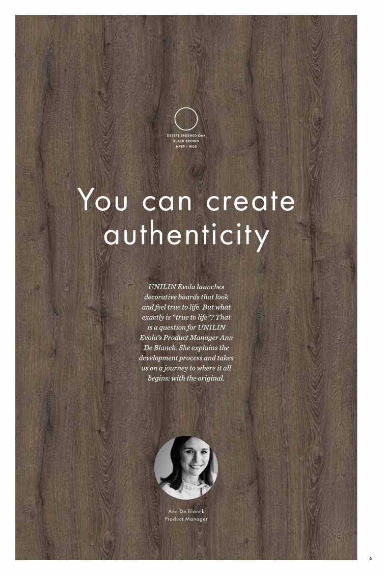
UNILIN Evola launches decorative boards that look
and feel true to life. But what exactly is “true to life”? That
is a question for UNILIN Evola’s Product Manager Ann
De Blanck. She explains the development process and takes us on a journey to where it all
begins: with the original.
You can create authenticity
Ann De BlanckProduct Manager
DESERT BRUSHED OAK BLACK BROWN
H789 / W05
6
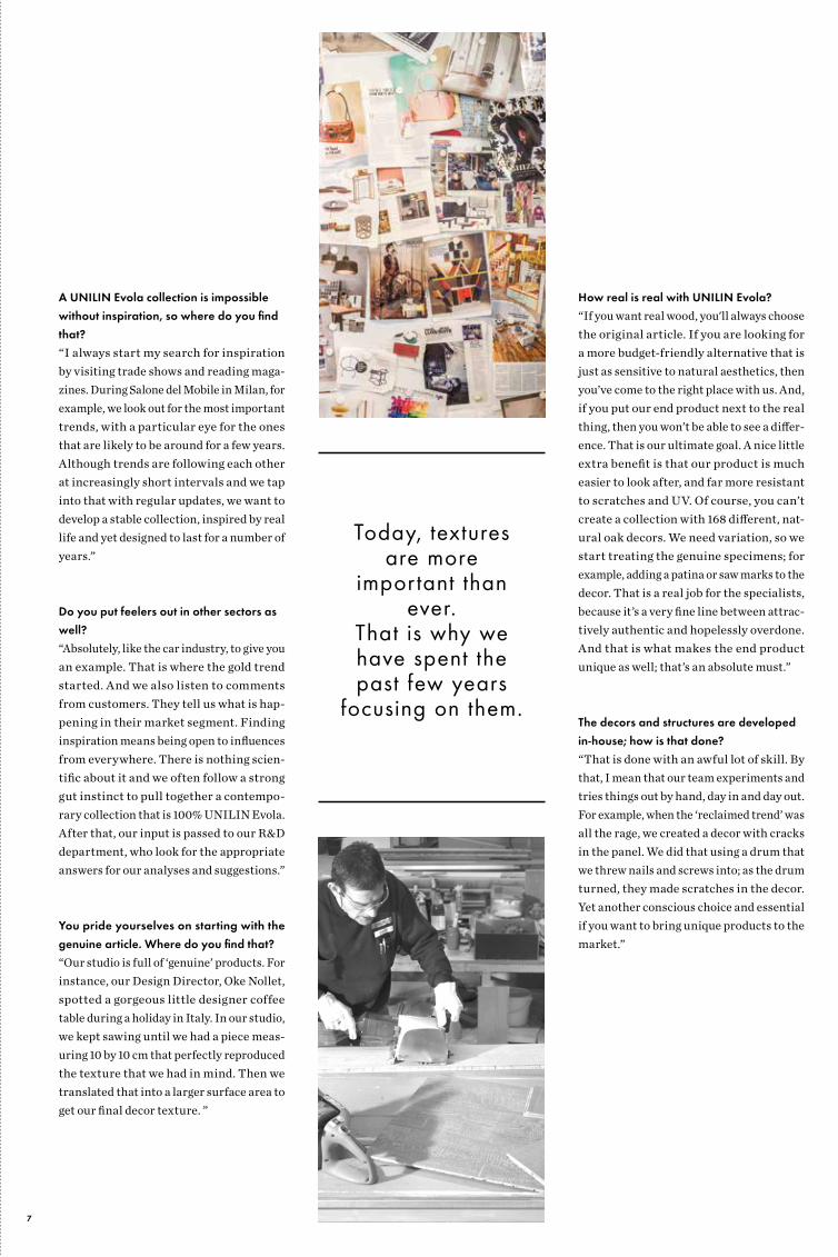
A UNILIN Evola collection is impossible without inspiration, so where do you find that?“I always start my search for inspiration by visiting trade shows and reading maga-zines. During Salone del Mobile in Milan, for example, we look out for the most important trends, with a particular eye for the ones that are likely to be around for a few years. Although trends are following each other at increasingly short intervals and we tap into that with regular updates, we want to develop a stable collection, inspired by real life and yet designed to last for a number of years.”
Do you put feelers out in other sectors as well?“Absolutely, like the car industry, to give you an example. That is where the gold trend started. And we also listen to comments from customers. They tell us what is hap-pening in their market segment. Finding inspiration means being open to influences from everywhere. There is nothing scien-tific about it and we often follow a strong gut instinct to pull together a contempo-rary collection that is 100% UNILIN Evola. After that, our input is passed to our R&D department, who look for the appropriate answers for our analyses and suggestions.”
You pride yourselves on starting with the genuine article. Where do you find that?“Our studio is full of ‘genuine’ products. For instance, our Design Director, Oke Nollet, spotted a gorgeous little designer coffee table during a holiday in Italy. In our studio, we kept sawing until we had a piece meas-uring 10 by 10 cm that perfectly reproduced the texture that we had in mind. Then we translated that into a larger surface area to get our final decor texture. ”
How real is real with UNILIN Evola? “If you want real wood, you'll always choose the original article. If you are looking for a more budget-friendly alternative that is just as sensitive to natural aesthetics, then you’ve come to the right place with us. And, if you put our end product next to the real thing, then you won’t be able to see a differ-ence. That is our ultimate goal. A nice little extra benefit is that our product is much easier to look after, and far more resistant to scratches and UV. Of course, you can’t create a collection with 168 different, nat-ural oak decors. We need variation, so we start treating the genuine specimens; for example, adding a patina or saw marks to the decor. That is a real job for the specialists, because it’s a very fine line between attrac-tively authentic and hopelessly overdone. And that is what makes the end product unique as well; that’s an absolute must.”
The decors and structures are developed in-house; how is that done?“That is done with an awful lot of skill. By that, I mean that our team experiments and tries things out by hand, day in and day out. For example, when the ‘reclaimed trend’ was all the rage, we created a decor with cracks in the panel. We did that using a drum that we threw nails and screws into; as the drum turned, they made scratches in the decor. Yet another conscious choice and essential if you want to bring unique products to the market.”
Today, textures are more
important than ever.
That is why we have spent the past few years
focusing on them.
7

Our ultimate goal is always very
clear: if you put our end product next to the real thing, we don’t
want to be able to see a dif ference.
8

You make a huge investment in developing texture. Why is that?“Today, the textures are more important than ever. That is something that we find in our showroom in particular: people want to feel. What’s the point of attractive decors if they come across as fake? That is why we have spent the past few years focusing on developing textures. They can be deep or very subtle. If we choose very deep struc-tures, like our brand-new Brushed Wood, we do that without sacrificing the ease of maintenance and workability. This is no easy task; we came up with a complex tech-nology for this.”
If we’ve understood this correctly, you come up with a product that is equal to the original by refining the designs down to the very last detail?“Yes, that’s right. We have a team that spends every day examining and reposi-tioning all the elements in a decor. Take the flaked look as an example. Our people will analyse whether that look is actually right: is the design not too heavy, is every element in the right place, is it too big or just right? That is a truly painstaking job.”
Is that how you go about choosing the colour as well?“We always use a reference point for that, like a candle or a piece of fabric, and we look at how we can reproduce that colour as accurately as possible. After all, a colour can make or break a decor. You can also see that in the show piece from our new collection, a black veneer wood decor. We developed that with a specific technology that minimises how much light is reflected, so that the col-our is guaranteed to be maintained. When it comes to our wood decors, we opt for per-fect, natural colours ranging from light to dark, so the decors suit any style of interior design. Together with a matt texture, they really do look like genuine wood!”
DESERT BRUSHED OAKBLACK BROWN
H789 / W05
ELEGANT BLACK-
113 / W06
ROBINSON OAKLIGHT NATURAL
H784 / W06
ROMANTIC OAKLIGHT
H780 / W06
DESERT BRUSHED OAKGREY
H787 / W05
9
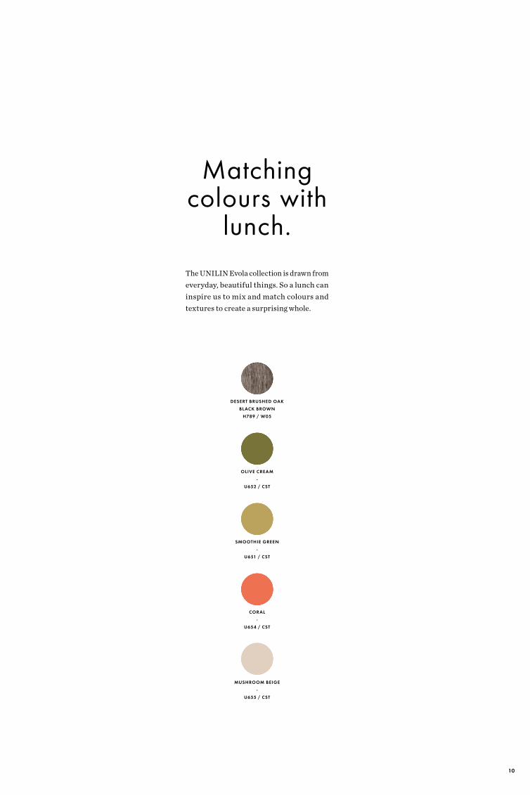
Matching colours with
lunch.The UNILIN Evola collection is drawn from everyday, beautiful things. So a lunch can inspire us to mix and match colours and textures to create a surprising whole.
DESERT BRUSHED OAK BLACK BROWN
H789 / W05
OLIVE CREAM-
U652 / CST
SMOOTHIE GREEN-
U651 / CST
CORAL-
U654 / CST
MUSHROOM BEIGE-
U655 / CST
10

DESERT BRUSHED OAK BLACK BROWN
H789 / W05
11

ARABICA WALNUT-
H562 / BST
GREEN SHADOW-
U653 / CST
12
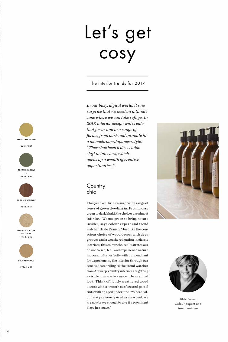
Country chic
This year will bring a surprising range of tones of green flooding in. From mossy green to dark khaki, the choices are almost infinite. “We use green to bring nature inside”, says colour expert and trend watcher Hilde Francq. “Just like the con-scious choice of wood decors with deep grooves and a weathered patina in classic interiors, this colour choice illustrates our desire to see, feel, and experience nature indoors. It fits perfectly with our penchant for experiencing the interior through our senses.” According to the trend watcher from Antwerp, country interiors are getting a visible upgrade to a more urban refined look. Think of lightly weathered wood decors with a smooth surface and pastel tints with an aged undertone. “Where col-our was previously used as an accent, we are now brave enough to give it a prominent place in a space.”
In our busy, digital world, it’s no surprise that we need an intimate zone where we can take refuge. In 2017, interior design will create that for us and in a range of forms, from dark and intimate to a monochrome Japanese style.“There has been a discernible shift in interiors, which opens up a wealth of creative opportunities.”
BRUSHED GOLD-
F994 / M01
ARABICA WALNUT-
H562 / BST
MINNESOTA OAK NATURAL
H162 / Z5L
SMOOTHIE GREEN -
U651 / CST
GREEN SHADOW-
U653 / CST
Let’s get cosy
The interior trends for 2017
Hilde FrancqColour exper t and
trend watcher
13
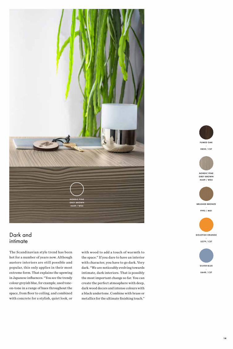
Dark and intimate
The Scandinavian style trend has been hot for a number of years now. Although austere interiors are still possible and popular, this only applies in their most extreme form. That explains the upswing in Japanese influences. “You see the trendy colour greyish blue, for example, used tone-on-tone in a range of hues throughout the space, from floor to ceiling, and combined with concrete for a stylish, quiet look, or
FUMED OAK-
H850 / CST
BRUSHED BRONZE-
F992 / M01
GOLDFISH ORANGE -
U279 / CST
NORDIC PINEGREY BROWNH449 / W04
SILVER BLUE-
U648 / CST
NORDIC PINEGREY BROWNH449 / W04
with wood to add a touch of warmth to the space.” If you dare to have an interior with character, you have to go dark. Very dark. “We are noticeably evolving towards intimate, dark interiors. That is possibly the most important change so far. You can create the perfect atmosphere with deep, dark wood decors and intense colours with a black undertone. Combine with brass or metallics for the ultimate finishing touch.”
14

If you dare to have an interior with character, you have to go dark.
Very dark.
FUMED OAK-
H850 / CST
15

The trendy colour pink is under-going a metamorphosis; gaining a grey undertone or spilling over
into a variety of peach tones.
TANNED PEACH-
U656 / CST
16

Peach is the new pink
Finally, tactility is also becoming an impor-tant term for interior professionals. It is the response to the digital, anxious world that we live in. “Skin colour and pale pink are probably the most tactile colours that there are. This explains the current popularity of nude tones and has already been introduced by the pink revolution in interiors. Pink is currently undergoing a subtle metamor-phosis. The trendy colour is gaining an aged undertone or spilling over into a variety of peach tones.”
TANNED PEACH-
U656 / CST
JASMINA-
551 / CST
FROZEN BLUE-
U647 / CST
NORDIC PINE NATURAL
H447 / W04
LYCHEE-
U640 / CST
17

ESSENTIAL OAK NATURAL
H852 / W03
18

TIGER ORANGE -
U272 / CST
Matching colours with
music.Do you want to know where the design team at UNILIN Evola get their inspiration? Then watch closely, because the colours, textures and even the names of our decors sometimes conceal subtle references to music heroes.
ESSENTIAL OAK NATURAL
H852 / W03
FROZEN BLUE -
U647 / CST
OPAL -
U149 / CST
ELECTRIC BLUE-
U649 / CST
19

FLAKEWOODPAINTED WHITE
H455 / W04
White Whiter Whitest
20

FLAKEWOODPAINTED WHITE
H455 / W04
LYCHEE-
U640 / CST
LACE WHITE -
WE27 / CST
BRUSHED ALU -
760 / M01
PEBBLE WHITE-
WE26 / CST
Retailers are increasingly aware of how col-our affects the purchasing behaviour of their customers. The right colour depends on the shop’s target group and DNA.
So white is the perfect base colour in a shop with a minimalist look and the clear nature of white has a positive effect on mood. But white is also an obvious colour that is often spread around thoughtlessly. If you want to
avoid creating an impression that is overly sterile, you can play with delicate colour accents and captivating materials and tex-tures. Think of combining wood, concrete or aluminium tones with white to create highlights.
If you want something a bit calmer, grey and cream are the perfect partners. So, long live white, the workhorse in any interior.
PEBBLE WHITE-
WE26 / CST
21

TURTLE GREY-
U292 / CST
INK BLUE-
U150 / CST
AMBER YELLOW -
U135 / CST
WOVEN-
F981 / CST
CLOVERFIELD GREEN
U646 / CST
Asparagus soup
-
With a hint of Scandinavia and a match with our Woven (F981 / CST) for unbreakable lightness and subtle contrast.
WOVEN-
F981 / CST
Around the table
22

BLUE JEANS -
F984 / CST
FRESH GREEN-
U143 / CST
CANDY RED -
U137 / CST
IVORY-
U172 / CST
BRUSHEDSTEEL BLUEF993 / M01
PastaVongole
-
With a hint of Italy and a match with our Brushed Steel Blue (F993 / M01) for the perfect contemporary darkness.
BRUSHEDSTEEL BLUEF993 / M01
23

UNILIN, division panelsIngelmunstersteenweg 229 • 8780 Oostrozebeke Belgium • T +32 56 66 70 21
[email protected] • www.unilinpanels.com
free.sample.service.See and feel how authentic our UNILIN Evola designs are. Request free samples at www.unilinpanels.com
UN
ILIN
Evo
la -
Insp
irat
ion
is p
ublis
hed
by U
NIL
IN d
ivis
ion
pane
ls. I
D-1
8042
017
Top Related