


Languages
Pages
Legal

Heuristic AnalysisCatherine Au-Yeung, Fabiola Einhorn, Saima Mohammad, Dylan ShadApril 14th, 2015
PURPOSE OF THIS ANALYSIS
The goal of this heuristic analysis is to identify usability issues, their frequency and severity, in order to assure a more efficient desktop user experience and identify areas of opportunity for an enhanced user experience. The following PBS NewsHour sections where evaluated:
● Recent Programs● Politics● Arts● Nation● The Rundown● World● PBS newshour broadcast
This document presents synthesized site-wide trends with specific recommendations, evaluated according to universal principles of design by four usability experts according to the following criteria:
● Priority: Low, Medium, High, Critical● Frequency: Low, Medium, High
METHODOLOGY
1. Entry Point
2. Hierarchy, Layout, and Information Design
3. Visibility of System Status
4. Navigation
5. Consistency and Standards
6. Aesthetic and Minimalist Design / Signal to Noise Ratio
7. Flexibility and Efficiency of use
8. Error Prevention
9. Help and Documentation
IDENTIFIED TRENDS
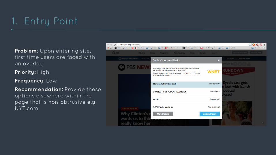
Problem: Upon entering site, first time users are faced with an overlay.
Priority: High
Frequency: Low
Recommendation: Provide these options elsewhere within the page that is non-obtrusive e.g. NYT.com
1. Entry Point
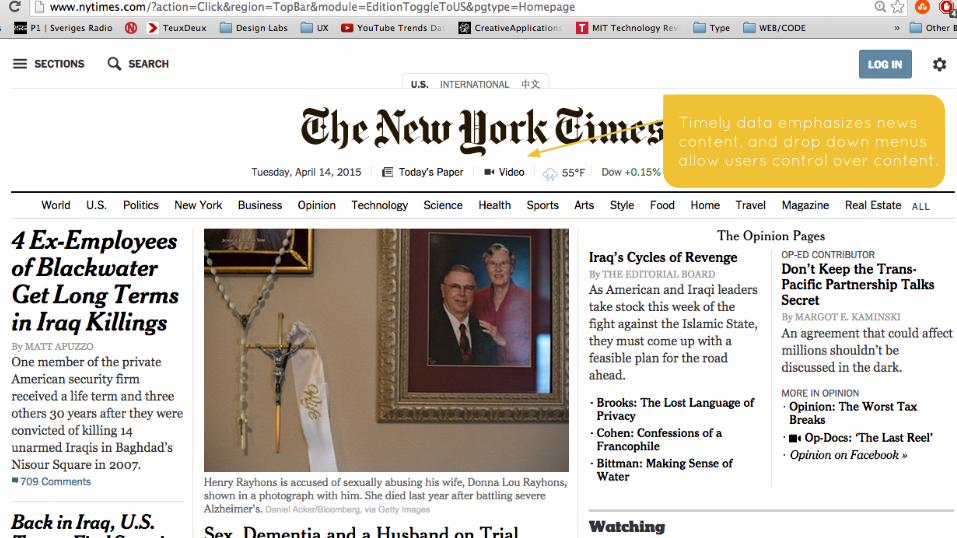
Timely data emphasizes news content, and drop down menus allow users control over content.
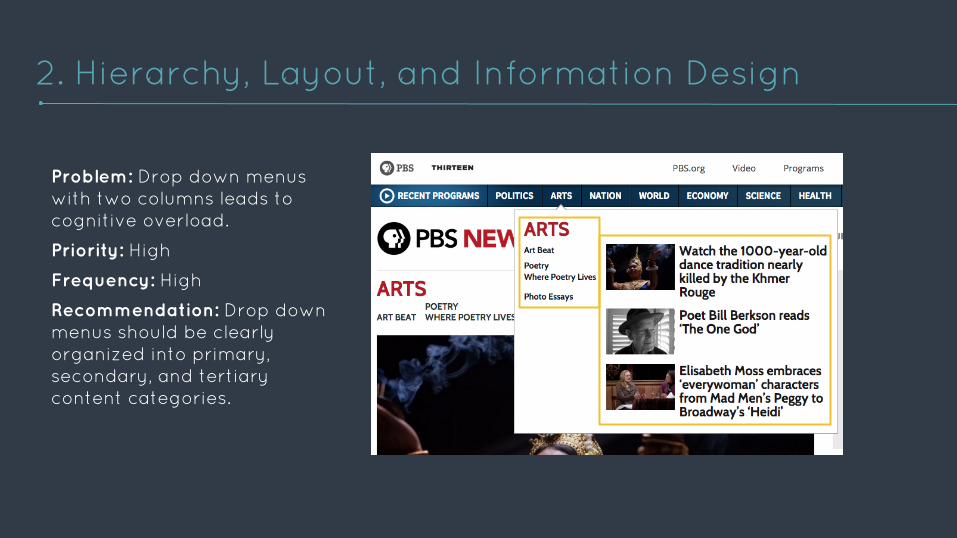
Problem: Drop down menus with two columns leads to cognitive overload.
Priority: High
Frequency: High
Recommendation: Drop down menus should be clearly organized into primary, secondary, and tertiary content categories.
2. Hierarchy, Layout, and Information Design
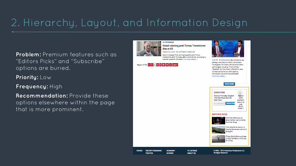
Problem: Premium features such as “Editors Picks” and “Subscribe” options are buried.
Priority: Low
Frequency: High
Recommendation: Provide these options elsewhere within the page that is more prominent.
2. Hierarchy, Layout, and Information Design
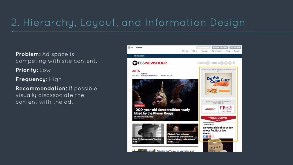
Problem: Ad space is competing with site content.
Priority: Low
Frequency: High
Recommendation: If possible, visually disassociate the content with the ad.
2. Hierarchy, Layout, and Information Design
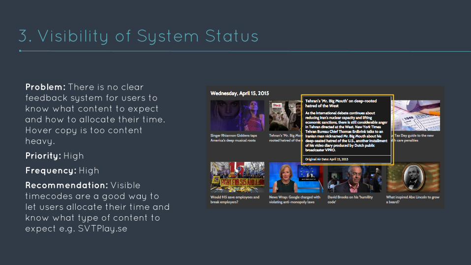
Problem: There is no clear feedback system for users to know what content to expect and how to allocate their time. Hover copy is too content heavy.
Priority: High
Frequency: High
Recommendation: Visible timecodes are a good way to let users allocate their time and know what type of content to expect e.g. SVTPlay.se
3. Visibility of System Status
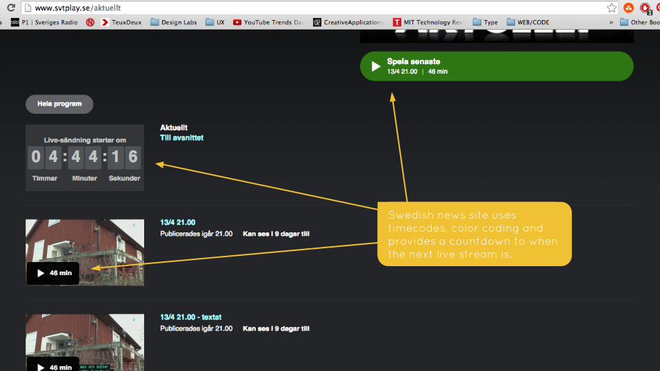
Swedish news site uses timecodes, color coding and provides a countdown to when the next live stream is.
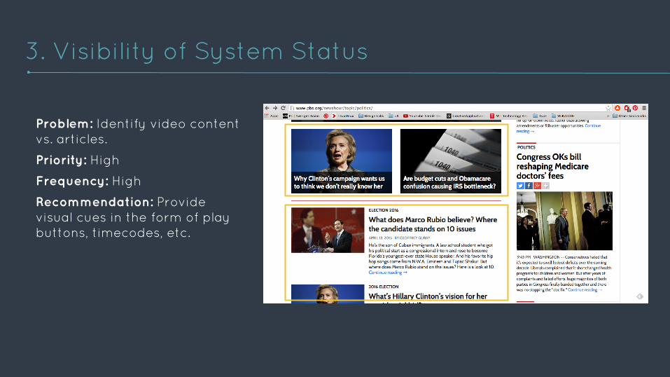
Problem: Identify video content vs. articles.
Priority: High
Frequency: High
Recommendation: Provide visual cues in the form of play buttons, timecodes, etc.
3. Visibility of System Status
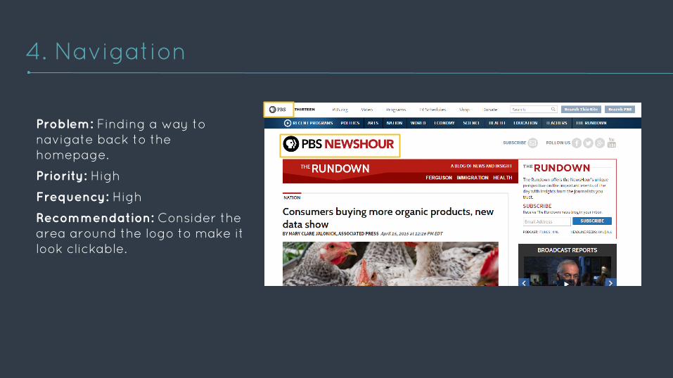
Problem: Finding a way to navigate back to the homepage.
Priority: High
Frequency: High
Recommendation: Consider the area around the logo to make it look clickable.
4. Navigation
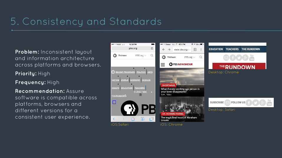
Problem: Inconsistent layout and information architecture across platforms and browsers.
Priority: High
Frequency: High
Recommendation: Assure software is compatible across platforms, browsers and different versions for a consistent user experience.
5. Consistency and Standards
Desktop: Chrome
Desktop: Safari
iOS: ChromeiOS:Safari
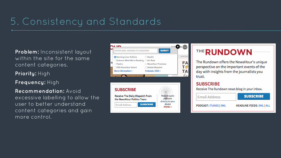
Problem: Inconsistent layout within the site for the same content categories.
Priority: High
Frequency: High
Recommendation: Avoid excessive labelling to allow the user to better understand content categories and gain more control.
5. Consistency and Standards
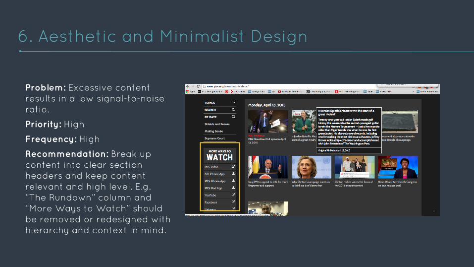
Problem: Excessive content results in a low signal-to-noise ratio.
Priority: High
Frequency: High
Recommendation: Break up content into clear section headers and keep content relevant and high level. E.g. “The Rundown” column and “More Ways to Watch” should be removed or redesigned with hierarchy and context in mind.
6. Aesthetic and Minimalist Design
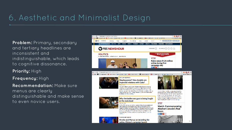
Problem: Primary, secondary and tertiary headlines are inconsistent and indistinguishable, which leads to cognitive dissonance.
Priority: High
Frequency: High
Recommendation: Make sure menus are clearly distinguishable and make sense to even novice users.
6. Aesthetic and Minimalist Design
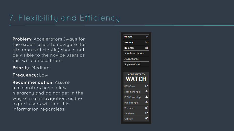
Problem: Accelerators (ways for the expert users to navigate the site more efficiently) should not be visible to the novice users as this will confuse them.
Priority: Medium
Frequency: Low
Recommendation: Assure accelerators have a low hierarchy and do not get in the way of main navigation, as the expert users will find this information regardless.
7. Flexibility and Efficiency
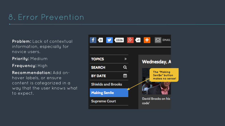
Problem: Lack of contextual information, especially for novice users.
Priority: Medium
Frequency: High
Recommendation: Add on-hover labels, or ensure content is categorized in a way that the user knows what to expect.
8. Error Prevention
The “Making Sen$e” button makes no sense!
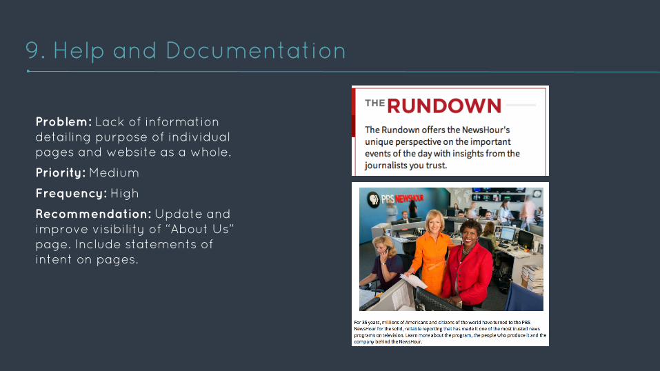
Problem: Lack of information detailing purpose of individual pages and website as a whole.
Priority: Medium
Frequency: High
Recommendation: Update and improve visibility of “About Us” page. Include statements of intent on pages.
9. Help and Documentation
OVERVIEW
The PBS site has a lot of different content categories that need to be distinguished in a more consistent and clear manner, especially for first time users who may not be familiar with
PBS’s terminology.
This can be done through visual cues such as color, and a clear information architecture that emphasizes real time content
which lets the users know what to expect.
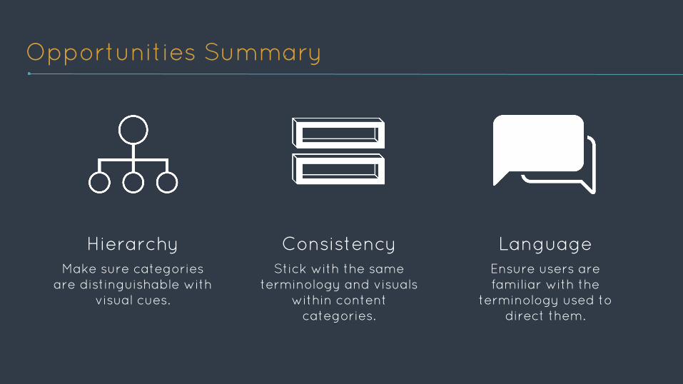
Opportunities Summary
HierarchyMake sure categories
are distinguishable with visual cues.
ConsistencyStick with the same
terminology and visuals within content
categories.
Language Ensure users are familiar with the
terminology used to direct them.
THANK YOU / QUESTIONSCatherine Au-Yeung, Fabiola Einhorn, Saima Mohammad, Dylan ShadApril 14th, 2015
Top Related