


Languages
Pages
Legal


Insights Platform Ad Hoc Reporting
Tool
End User Guide
January 2015
2
Insights Platform User Guide v1.4 January 2015
© Genius Digital 2013-14, all rights reserved
Contents
Introduction .............................................................................................................................. 3
About this Release ............................................................................................................... 3
Contact ................................................................................................................................. 3
Dashboards, Cubes, Dimensions and Measures ................................................................. 4
Dashboards........................................................................................................................... 4
Cubes .................................................................................................................................... 4
Dimensions and Measures .................................................................................................. 4
Logging in ................................................................................................................................. 5
Ad-Hoc Reporting Tool ........................................................................................................... 6
Selecting a cube ................................................................................................................. 6
Creating an Ad-Hoc Report, filtering, sorting and charts .............................................. 7
Ad-Hoc Reporting Tool Toolbar ......................................................................................... 9
Graphing................................................................................................................................. 16
Spark Charts ........................................................................................................................ 16
Basic Statistics ..................................................................................................................... 16
Chart Types ......................................................................................................................... 16
Export ................................................................................................................................... 21

3
Insights Platform User Guide v1.4 January 2015
© Genius Digital 2013-14, all rights reserved
Introduction This document is an easy guide to the most important screens and functions of
Genius Digital Insights Platform reporting tool, helping you to create and view reports
instantly.
About this Release
Version: 0.100.0
Release Date: 2014-01-20
About this User Guide
Future updates will be made to this user guide to include new functionalities and
enhancements developed during releases.
Contact
If you have any additional questions about the Insights Platform you can contact our
support team by e-mail [email protected]
4
Insights Platform User Guide v1.4 January 2015
© Genius Digital 2013-14, all rights reserved
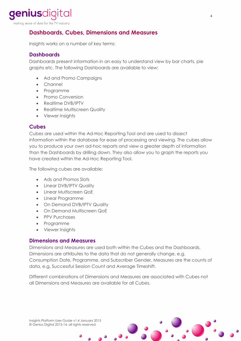
Dashboards, Cubes, Dimensions and Measures
Insights works on a number of key terms:
Dashboards
Dashboards present information in an easy to understand view by bar charts, pie
graphs etc. The following Dashboards are available to view:
Ad and Promo Campaigns
Channel
Programme
Promo Conversion
Realtime DVB/IPTV
Realtime Multiscreen Quality
Viewer Insights
Cubes
Cubes are used within the Ad-Hoc Reporting Tool and are used to dissect
information within the database for ease of processing and viewing. The cubes allow
you to produce your own ad-hoc reports and view a greater depth of information
than the Dashboards by drilling down. They also allow you to graph the reports you
have created within the Ad-Hoc Reporting Tool.
The following cubes are available:
Ads and Promos Slots
Linear DVB/IPTV Quality
Linear Multiscreen QoE
Linear Programme
On Demand DVB/IPTV Quality
On Demand Multiscreen QoE
PPV Purchases
Programme
Viewer Insights
Dimensions and Measures
Dimensions and Measures are used both within the Cubes and the Dashboards.
Dimensions are attributes to the data that do not generally change, e.g.
Consumption Date, Programme, and Subscriber Gender. Measures are the counts of
data, e.g. Successful Session Count and Average Timeshift.
Different combinations of Dimensions and Measures are associated with Cubes not
all Dimensions and Measures are available for all Cubes.

5
Insights Platform User Guide v1.4 January 2015
© Genius Digital 2013-14, all rights reserved
Logging in
To load the Insights Platform login page, visit the following URL:
https://example.geniusdigital.tv/
The login page allows you to login to the Dashboards and the Ad-Hoc Reporting
Tool. You should have been issued with your password by an administrator.
Enter your email address and password and select the appropriate tool to start with.
N.B.: Currently you can only switch between Dashboards but you cannot move from
the Dashboards to the Ad-Hoc Reporting Tool and vice versa.
6
Insights Platform User Guide v1.4 January 2015
© Genius Digital 2013-14, all rights reserved
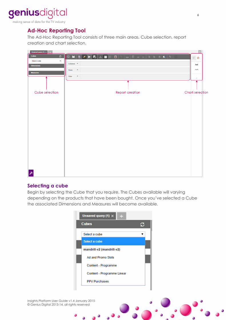
Ad-Hoc Reporting Tool The Ad-Hoc Reporting Tool consists of three main areas, Cube selection, report
creation and chart selection.
Selecting a cube
Begin by selecting the Cube that you require. The Cubes available will varying
depending on the products that have been bought. Once you’ve selected a Cube
the associated Dimensions and Measures will become available.
7
Insights Platform User Guide v1.4 January 2015
© Genius Digital 2013-14, all rights reserved
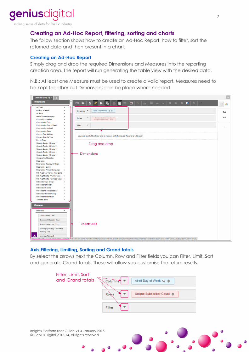
Creating an Ad-Hoc Report, filtering, sorting and charts
The follow section shows how to create an Ad-Hoc Report, how to filter, sort the
returned data and then present in a chart.
Creating an Ad-Hoc Report
Simply drag and drop the required Dimensions and Measures into the reporting
creation area. The report will run generating the table view with the desired data.
N.B.: At least one Measure must be used to create a valid report. Measures need to
be kept together but Dimensions can be place where needed.
Axis Filtering, Limiting, Sorting and Grand totals
By select the arrows next the Column, Row and Filter fields you can Filter, Limit, Sort
and generate Grand totals. These will allow you customise the return results.

8
Insights Platform User Guide v1.4 January 2015
© Genius Digital 2013-14, all rights reserved
The axis filter also allows you to add a custom MDX snippet.
Sorting
You can sort by using the arrows next to the Dimension or Measure.
Dimension filtering
Clicking on the magnifier next to a Dimension will allow you to filter by that
Dimension.
The filter window then allows you to select which available members you’d like to
filter by. Use the arrows in the middle to select required members.
For example, if you’ve selected Aired Day of Week, select the magnifier and you
can choose Saturday and Sunday to see results just for the weekend.

9
Insights Platform User Guide v1.4 January 2015
© Genius Digital 2013-14, all rights reserved
Chart creation
From the table view you can use the Chart selection to turn your data into a chart.
There are a number of charts to choose from, select the one that best suits your
data.
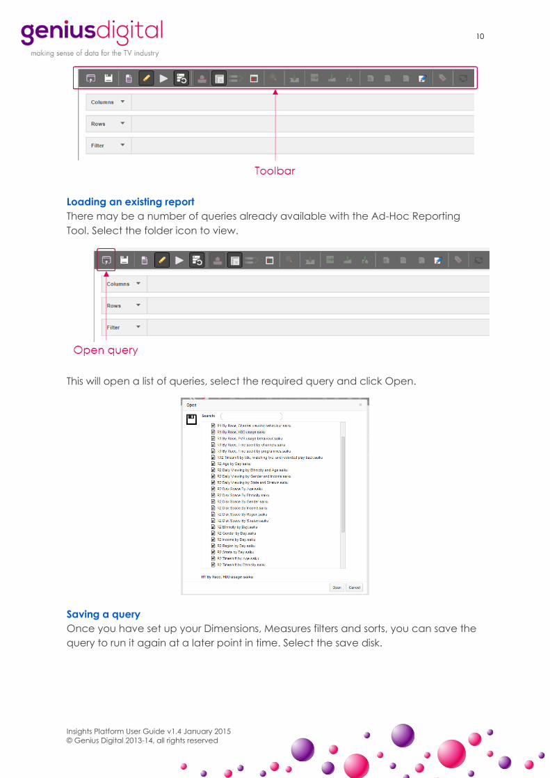
Ad-Hoc Reporting Tool Toolbar
The toolbar allows you to carry out a number of tasks which the following section will
explain.
10
Insights Platform User Guide v1.4 January 2015
© Genius Digital 2013-14, all rights reserved
Loading an existing report
There may be a number of queries already available with the Ad-Hoc Reporting
Tool. Select the folder icon to view.
This will open a list of queries, select the required query and click Open.
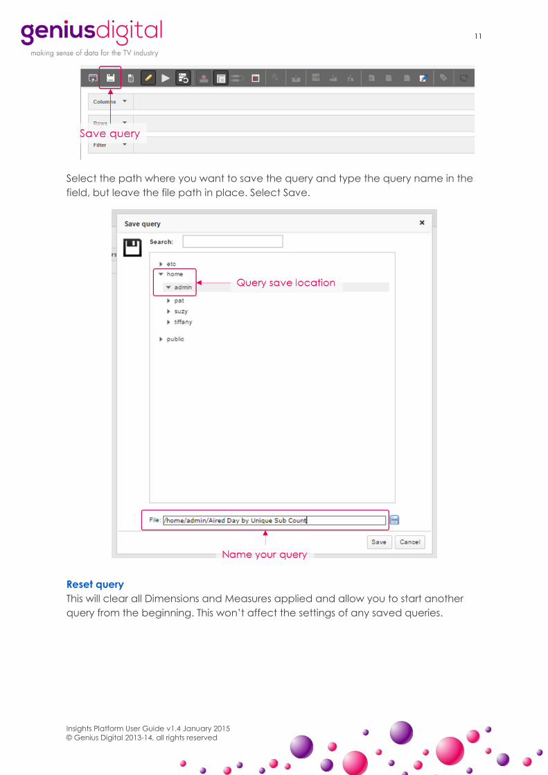
Saving a query
Once you have set up your Dimensions, Measures filters and sorts, you can save the
query to run it again at a later point in time. Select the save disk.
11
Insights Platform User Guide v1.4 January 2015
© Genius Digital 2013-14, all rights reserved
Select the path where you want to save the query and type the query name in the
field, but leave the file path in place. Select Save.
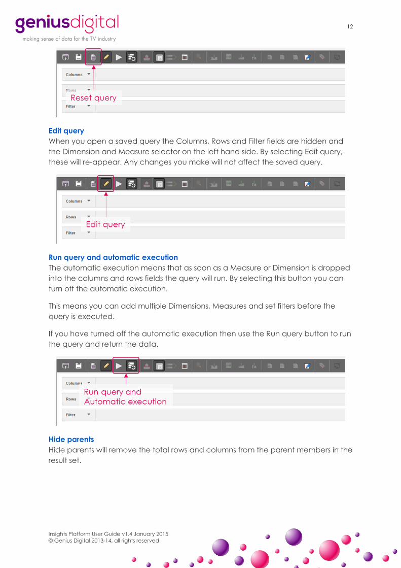
Reset query
This will clear all Dimensions and Measures applied and allow you to start another
query from the beginning. This won’t affect the settings of any saved queries.
12
Insights Platform User Guide v1.4 January 2015
© Genius Digital 2013-14, all rights reserved
Edit query
When you open a saved query the Columns, Rows and Filter fields are hidden and
the Dimension and Measure selector on the left hand side. By selecting Edit query,
these will re-appear. Any changes you make will not affect the saved query.
Run query and automatic execution
The automatic execution means that as soon as a Measure or Dimension is dropped
into the columns and rows fields the query will run. By selecting this button you can
turn off the automatic execution.
This means you can add multiple Dimensions, Measures and set filters before the
query is executed.
If you have turned off the automatic execution then use the Run query button to run
the query and return the data.
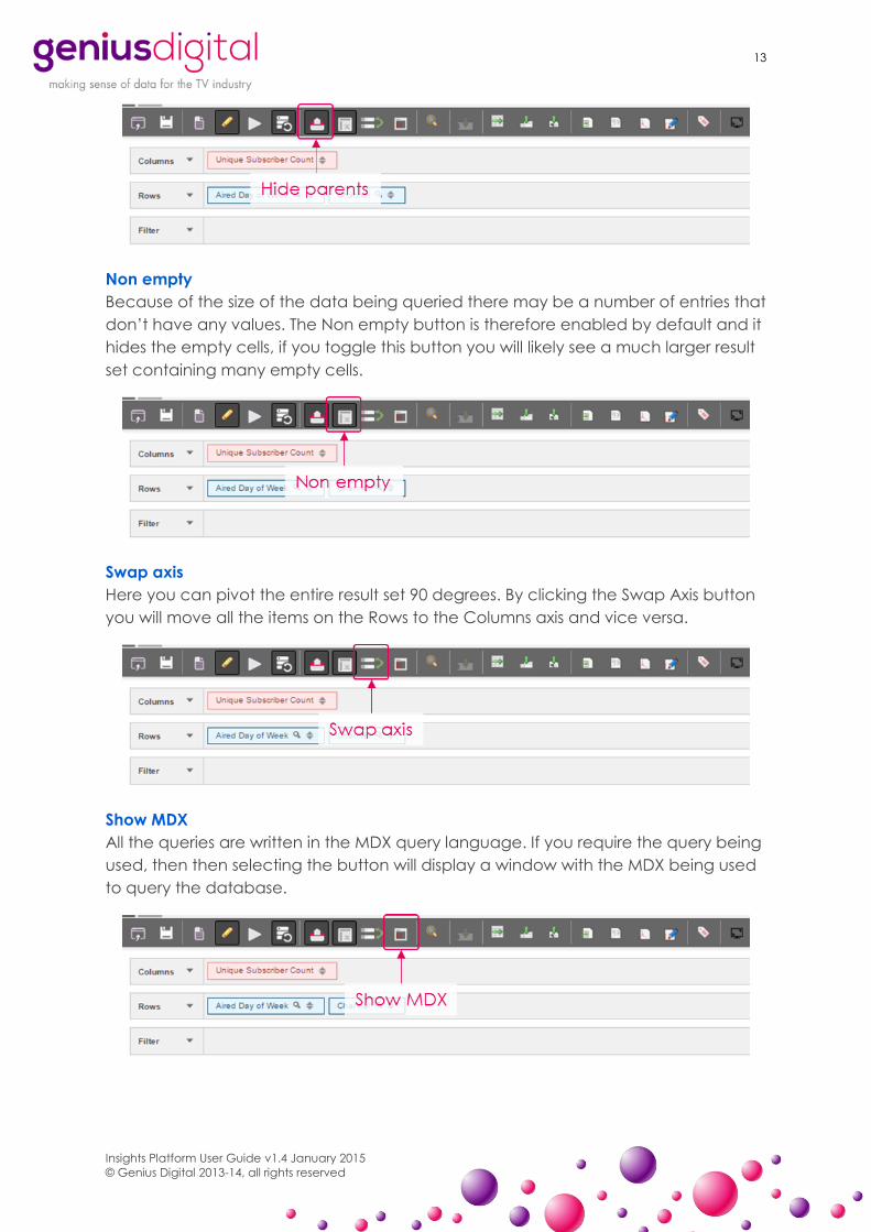
Hide parents
Hide parents will remove the total rows and columns from the parent members in the
result set.
13
Insights Platform User Guide v1.4 January 2015
© Genius Digital 2013-14, all rights reserved
Non empty
Because of the size of the data being queried there may be a number of entries that
don’t have any values. The Non empty button is therefore enabled by default and it
hides the empty cells, if you toggle this button you will likely see a much larger result
set containing many empty cells.
Swap axis
Here you can pivot the entire result set 90 degrees. By clicking the Swap Axis button
you will move all the items on the Rows to the Columns axis and vice versa.
Show MDX
All the queries are written in the MDX query language. If you require the query being
used, then then selecting the button will display a window with the MDX being used
to query the database.

14
Insights Platform User Guide v1.4 January 2015
© Genius Digital 2013-14, all rights reserved
Drill across on cell
Select the Drill across on cell button and then select the specific cell that you want
to drill across on. You’ll then be present with the list of Dimensions and Measures to
drill across by.
For example if the query shows the Unique Subscriber Count by Air Day and then
Programme, we can see how many unique subscribers watched ‘How I Met your
Mother’ on 24th July 2014.
By selecting the Drill across on cell button and then selecting the Unique Subscriber
Count against the programme, we can add the Dimension of Subscriber age. This
will then show the age groups of those unique subscribers who watch ‘How I Met
your Mother’ on 24th July 2014.
Drill Through On Cell and Export Drill Through on cell to CSV
Drill through allows you to see the underlying data in the query. Once you have run
a query, select this option and then click on the cell you want to drill through on. You
can then select the Dimensions and Measures you want in the drill through query
and the row limit. You'll then be presented with a popup window containing the drill
through data.
By selecting the Export Drill Through on cell to CSV button, you can export what
would appear in the popup window into CSV.

15
Insights Platform User Guide v1.4 January 2015
© Genius Digital 2013-14, all rights reserved
Export as XLS, CSV or PDF
Use the Export button to export the current query results into XLS, CSV or PDF files.
Switch to MDX Mode
Once you have designed your query you can switch to MDX query mode. MDX
query mode allows you to customise the query by altering the MDX query itself.
N.B.: This is a one way switch, once you go into MDX mode you cannot get back to
the drag and drop mode with any changes you have made.
Full screen
Selecting full screen will present the query results in full screen mode.
16
Insights Platform User Guide v1.4 January 2015
© Genius Digital 2013-14, all rights reserved
Graphing
Spark Charts
Spark charts are small bar or line graphs displayed on the result-set to help show
trends especially over time, design a query and select this option to see a small
chart plot the data points.
Basic Statistics
Basic statistics is a small statistics add-on that replaces the result set with a number of
statistics about the members on columns. Min, Max, Sum, Average and Std Deviation
are all covered.
Chart Types
The front end has a number of chart types, these are found by switching the mode
on the right hand sidebar from Table to Chart. You can then select between:
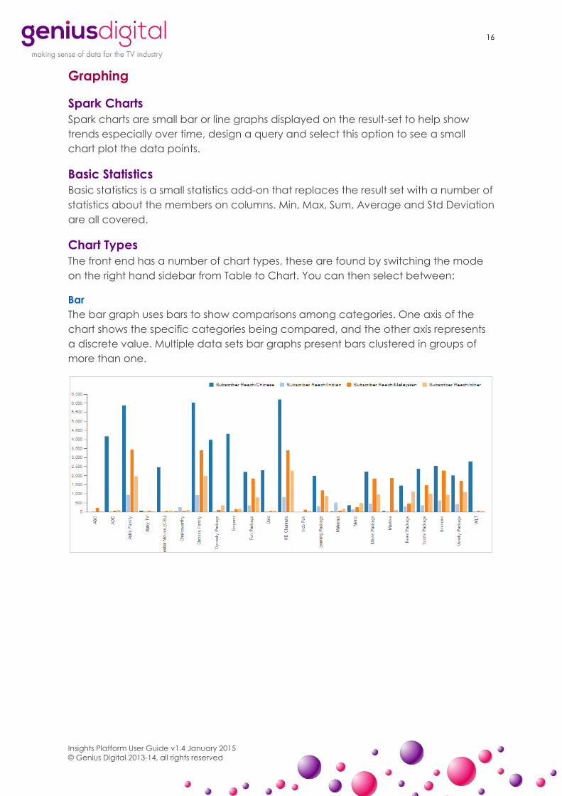
Bar
The bar graph uses bars to show comparisons among categories. One axis of the
chart shows the specific categories being compared, and the other axis represents
a discrete value. Multiple data sets bar graphs present bars clustered in groups of
more than one.
17
Insights Platform User Guide v1.4 January 2015
© Genius Digital 2013-14, all rights reserved
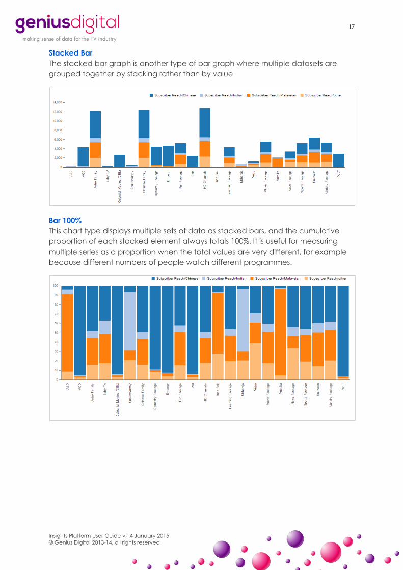
Stacked Bar
The stacked bar graph is another type of bar graph where multiple datasets are
grouped together by stacking rather than by value
Bar 100%
This chart type displays multiple sets of data as stacked bars, and the cumulative
proportion of each stacked element always totals 100%. It is useful for measuring
multiple series as a proportion when the total values are very different, for example
because different numbers of people watch different programmes.
18
Insights Platform User Guide v1.4 January 2015
© Genius Digital 2013-14, all rights reserved
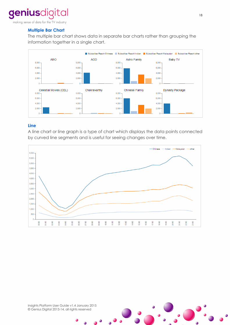
Multiple Bar Chart
The multiple bar chart shows data in separate bar charts rather than grouping the
information together in a single chart.
Line
A line chart or line graph is a type of chart which displays the data points connected
by curved line segments and is useful for seeing changes over time.

19
Insights Platform User Guide v1.4 January 2015
© Genius Digital 2013-14, all rights reserved
Area
The area plot is identical to the line plot but with the graph filled in.
Heat Grid
A heat map is a graphical representation of data where the individual values
contained in a matrix are represented as colours. It is useful for noting peaks in
larger sets of data.

20
Insights Platform User Guide v1.4 January 2015
© Genius Digital 2013-14, all rights reserved
Dot
The dot plot is displays each individual data point as a dot on a graph.
Waterfall
The waterfall chart is used to understand how an initial value is affected by a series
of intermediate positive or negative values. The initial and the final values are
represented by whole bar, while the intermediate values are denoted by floating
bars. The bars are color-coded according to the different data sets.
21
Insights Platform User Guide v1.4 January 2015
© Genius Digital 2013-14, all rights reserved
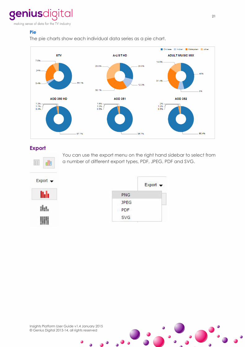
Pie
The pie charts show each individual data series as a pie chart.
Export
You can use the export menu on the right hand sidebar to select from
a number of different export types, PDF, JPEG, PDF and SVG.
Top Related