


Languages
Pages
Legal


Confidential
Designing a BetterDesign Studio
@BrianKSullivan@bigdesign#studio

2Confidential
Creative and Evaluative Sides of Your Brain

3Confidential
Simple Definition = Generate and Evaluate Sketches *
* Design Studios are not simple.

4Confidential
Politics

5Confidential
Hidden Agendas

6Confidential
Confusion
7Confidential
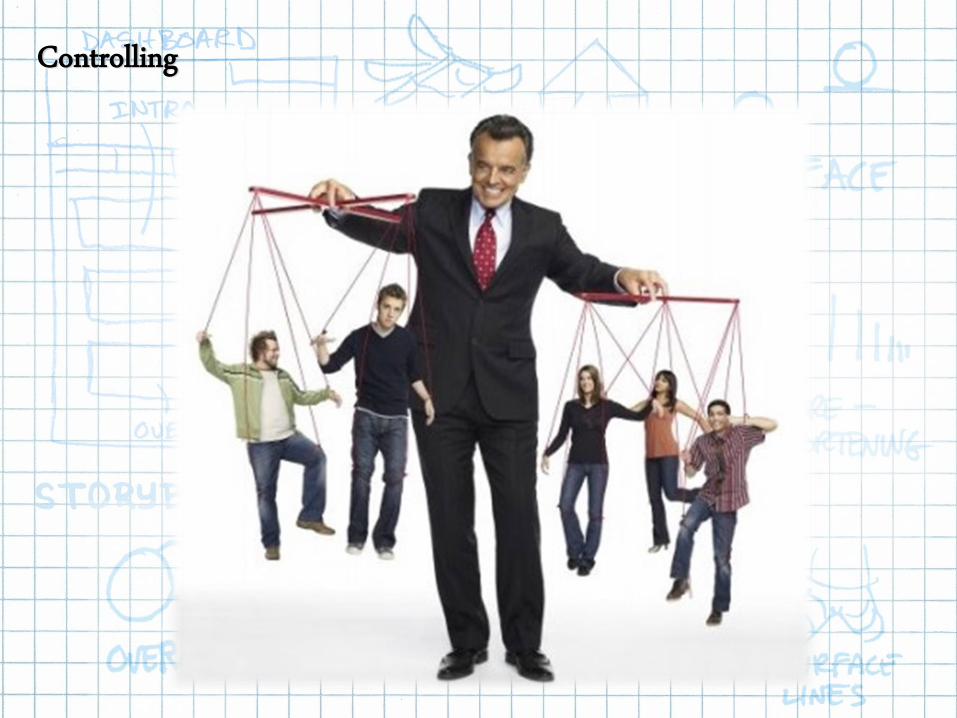
Controlling

8Confidential
1. Sketching
2. Storytelling
3. Critiquing
4. Presenting
5. FacilitatingJared Spool (2010)
Master UX Designers Do Five Things Well:
For practicing UX Designers, one of the most important Sturgeon's Law, which
tells us that 99% of everything is crap. It's easy to produce a poor quality
result. Master UX Designers disciplines within the UX world—interaction
design, information architecture, user research, copywriting, and visual design.
They had these five things in common:
Sketching, Storytelling, Critiquing, Presenting, and Facilitating

9Confidential
10Confidential
“But, Brian I can’t draw!”

11Confidential

12Confidential
Taking notes? Try this!

13Confidential
Why do we sketch?
1. To Communicate an Idea:
“Here’s what I’m trying to tell you…”
2. To Record What We’re Seeing and Hearing:
“This is what I want to remember…”
3. To Work Through Some Thinking:
“What will this look like?”
4. To Document:
“Here’s what we’ve ended up with”

14Confidential
Why Should YouListen to Me?

15Confidential
Brian Sullivan.
@BrianKSullivan@bigdesign
Hi, my name is
#studio

16Confidential
Over 20 Years of User Research and Testing Experience

17Confidential
Speaker at Industry Events

18Confidential
Keynote Author on SlideShare (12,000+ Followers)

19Confidential
Wrote the Book on The Design Studio Method

20Confidential
Basics ofSketching

21Confidential
“There is no substitute for good drawing.”
- Walt Stanchfield

22Confidential
Walt Stanchfield (1919 – 2000)
FILM CREDITS:
• The Jungle Book
• The Aristocats
• The Great Mouse Detective
• Who Framed Roger Rabbit
STUDENTS:
• Brad Bird
• John Lasseter
• Don Bluth
• Glen Keane

23Confidential

24Confidential
Let’s keep it simple!

25Confidential
Exercise #1Let’s dot the “eyes”!

26Confidential
27Confidential

28Confidential
“We learn drawing by studying parts; we practice drawing by assembling those parts into a meaningful whole.”
- Walt Stanchfield

29Confidential
SIMPLE SHAPES

30Confidential
Simple Shapes in Familiar Objects• Identify objects or parts of object

31Confidential
SIMPLE SHAPES: EVOKE EMOTIONS

32Confidential
Simple Shapes in UX Wireframes• Wireframes are mostly squares, circles, and lines.

33Confidential
Simple Shapes Can Make Complex Objects• Identify objects or parts of object

34Confidential
Simple Rules of Perspective

35Confidential
We’ll Stick to Simple UX Designs

36Confidential
Exercise #2Let’s Get Hands On!
37Confidential
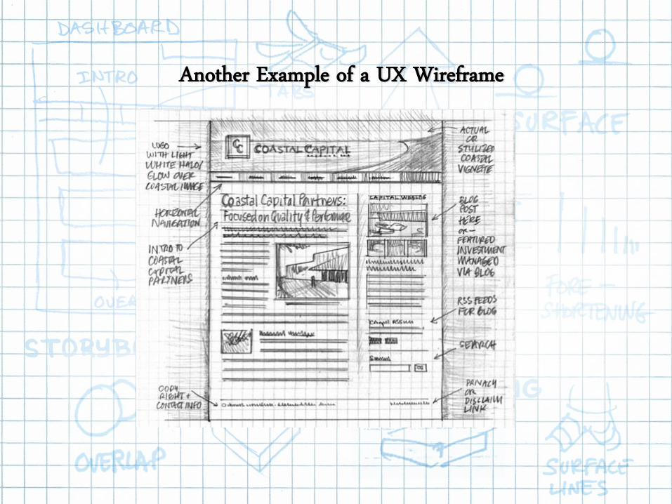
Another Example of a UX Wireframe

38Confidential
Use Some UX Sketch Paper

39Confidential
Setting the Scene
Jared Spool
The $300,000,000 Fix (per Jared Spool):
In the above example, we have a form with two fields,
two buttons, and one link. This form appeared on the
bottom of a Shopping Cart. What are the problems?
Hint: Current and New Customers both had problems.

40Confidential
New Customers:
New customers did not want to register. They resisted clicking the Register
button. New customers wanted to buy what was in their shopping cart.
They did not want a relationship. Most wanted to leave. As it turns out,
customers are not required to register—it is optional.
New Customers Struggled

41Confidential
Existing Customers Struggled
Existing Customers:
Existing customers couldn’t remember their exact email and/or password.
They clicked the “Forgot Password” link. Help Desk logs revealed this link
was clicked about 167,000 each day! According to Spool, 75% of these
people didn’t make a purchase. They did leave!

42Confidential
Sketch Your Solution….5 Minutes!!!

43Confidential
Jared Spool
$300,000,000 Fix:
Make it obvious. The results:
- The number of customers purchasing went up by 45%.
- Extra purchases resulted in 15 million the first month.
- In the first year, there was additional $300 million.
The Actual Solution….Make It a Checkout Button

44Confidential
Evolution of the Checkout Button at Amazon

45Confidential
Customer Widget to Checkout Button to Shopping Cart
46Confidential
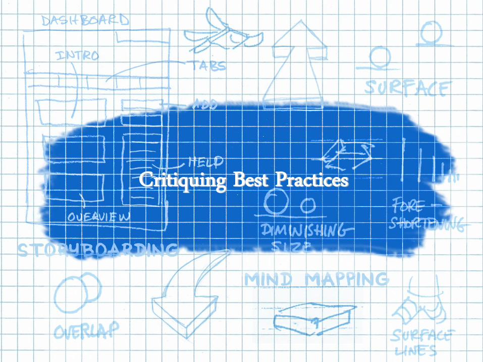
Critiquing Best Practices
47Confidential
Simon Criticizes Early, He Critiques Later

48Confidential
Criticism versus Critique
Criticism Critique
Finds Fault Determines Design Intent
Looks for Problems Looks for What Works and Doesn't Work
Condemns What It Doesn't Understand Asks for Clarification
Can Be Abrasive Is Honest and Objective
Is Usually Negative Is Positive Even About What Isn't Working
Is General and Vague Is Concrete and Specific
Is Opinionated Is Collaborative

49Confidential
A UX Critique is a method for evaluating design concepts against
design principles and the collective experience of the participants.
- It’s not a brainstorming session.
- It doesn’t evaluate engineering feasibility.
- It is part Heuristic Inspection and part Art School Critique.
What’s a UX Critique?
UX Critique = Heuristic Inspection + Art School Critique

50Confidential
• A UX Critique differs from a Design Review.
- Design Reviews: peer-based (not part of the delivery team)
- UX Critiques: stakeholder-based (people who implement a design)
• Both groups are important reviewers, but their purposes entirely distinct.
UX Critique is Not a Design Review!
DBA,TRAINER, MARKETER, WRITER, QA,
ANALYST, DEVELOPER, SUPPORT,
STRATEGIST, SALES,CEO……………….
VS

51Confidential
• Invite 5 or 6 people to the UX Critique
- You need open, honest feedback
- Consider the most critical people only
• You can’t be informal with 7+ people
- You can send email after the meeting
- Schedules are a great excuse
• Don’t worry about job titles or hierarchy
- Moving the design forward is the goal
- Don’t play office politics here
Who’s in the Room?
The right people are critical to success.

52Confidential
• Handouts. Each person gets a copy to
enter questions and comments. Sketches
can be used, but Marketers may see the
low-fidelity sketch as low quality idea.
• Hang Pictures on Wall. You can easily
compare different ideas, review branding,
and see inconsistencies this way. Use
post-it notes for questions and comments.
• Project on a Wall. If you have prototype,
demo it. Project on a whiteboard, where
people can make comments and questions.
Take a picture to capture the feedback.
Ways to Show Your Designs
Pick the right room! We recommend a small conference room with
whiteboards. You may need to have a War Room for long projects.
The environment puts people at ease.

53Confidential
• Moderator. Facilitates the Critique. Ensures
everyone is focused, on-track, and on-
schedule.
• Designer. Presents their work and answers
questions. They must be impartial participant
(like it is someone else’s work). They work
with (not against) reviewers.
• Scribe. Takes notes for the Designer and
socializes the feedback to the larger team.
• Reviewer. Critiques designs with thought
provoking questions. Avoids opinions.
Roles in a UX Critique
The best piece of feedback is not feedback at all, but
a questions that prompts the Designer to think!
Each person plays a specific role.

54Confidential
• Design Intent. You start by exploring the
problem(s) the Designer is trying to solve.
- What problem is the design addressing?
- Is this the essence of the problem?
- What if the problem is worded differently?
• Design Execution. Any design addresses a
problem by its form and function.
What are we Critiquing?
Formal Elements Functional Elements
- Color - Efficiency
- Typography - Effectiveness
- Layout - Discoverability
- UI Text - Readability
- Iconography - Findability
- Transitions - Navigation
55Confidential
• What are the user scenarios the site or app is designed for? Can you
walkthrough through how each design would enable those scenarios?
• What known usability / design / business issues are these sketches
trying to solve?
• What is the intended style of the design, and is it appropriate for the
target audience?
• What is the intention of the style, and does it achieve the desired effect?
• Are there standard brand elements that should be used, and are they
used appropriately?
• Are there similar software products or features that these designs
should relate to?
• What usability heuristics does each design support well? (or not?)
Questions You Might Hear or Ask…

56Confidential
• Where in the design are the most likely places for users to have
trouble? and why?
• Are there reasonable design changes that might avoid these problem
points?
• Does each design idea take advantage of things the user might already
have learned?
• What are the pros and cons of each design idea, relative to each other?
• Are there any hybrid design ideas that are worth exploring, based on the
designs in the room?
• What open issues might best be resolved by a usability study or other
research?
More Questions You Might Hear or Ask…

57Confidential
Exercise #3Critiquing
58Confidential
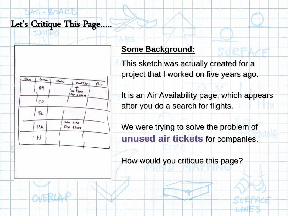
Let’s Critique This Page…..
Some Background:
This sketch was actually created for a
project that I worked on five years ago.
It is an Air Availability page, which appears
after you do a search for flights.
We were trying to solve the problem of
unused air tickets for companies.
How would you critique this page?

59Confidential
What’s Your Immediate Response?
• What is your first reaction to what you see?
(could be positive or negative)
• What did you notice first?
• Where have you seen something like this
before? Was that successful?
• What stands out to you? How could this
affect users?

60Confidential
Describe What You See Here…
• What do you think see initially?
• What do you think customers will see?

61Confidential
What about Form and Function?
• How are the form factors of this design:
- Color
- Typography
- Layout
- UI Text
- Iconography
- Transitions
• How are the functions of this design:
- Efficiency
- Effectiveness
- Discoverability
- Readability
- Findability
- Navigation

62Confidential
What about Consistency?
• Is the design consistent with other areas of
the product?
• What about other products (web, phone,
tablet, kiosk)?
• Is there deliberate inconsistency? Why?
• What about other products within the
overall portfolio (i.e.branding)?

63Confidential
Where Critiques Fit In Your Design Process?
Internal
Design
Review
UX Critique
or
Design Studio
Heuristic
Inspection
(3rd Party)
Use the critique guidelines here in other meetings.
Each UX critiquing checkpoint is more formal than the last one.
• Peer Designers
• Style Guides
• Consistency
• Opportunity Finding
• Project Stakeholders
• Form and Function
• Branding and Product Portfolio
• Solution Finding
• Usability Professionals
• Design Guidelines
• Expert Review
• Cognitive Walkthrough
64Confidential
Design Studio:Sketching & Critiquing

65Confidential
1. Sketching
2. Storytelling
3. Critiquing
4. Presenting
5. FacilitatingJared Spool (2010)
Design Studios Use Your Master UX Skills
Do you remember this slide from earlier?
66Confidential
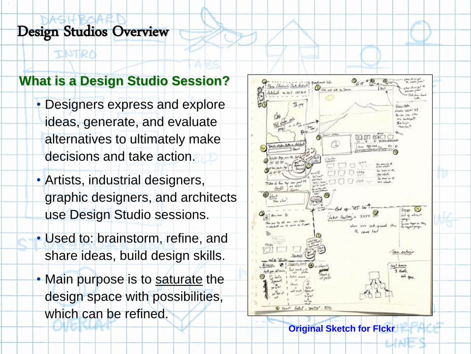
What is a Design Studio Session?
• Designers express and explore
ideas, generate, and evaluate
alternatives to ultimately make
decisions and take action.
• Artists, industrial designers,
graphic designers, and architects
use Design Studio sessions.
• Used to: brainstorm, refine, and
share ideas, build design skills.
• Main purpose is to saturate the
design space with possibilities,
which can be refined.Original Sketch for Flckr
Design Studios Overview

67Confidential
Sketch for Word Processor Program
for One Laptop Per Child
Two excellent sources for design thinking are Bill Buxton’s Sketching the
User Experience and Edward De Bono’s Six Thinking Hats.
- Buxton’s book tells of different ways to perform Design Studio projects
- De Bono’s “Thinking Hats” helps to control the conversation
Sources for a Design Studio

68Confidential
Project Timeline
Buxton talks about
a Design Funnel in
the SDLC, where
the opportunity to
saturate the design
space with ideas
occurs very early.
The design space
is limited (or goes
into a funnel) as
projects move in
the timeline.
Bill Buxton’s Design Funnel

69Confidential
Buxton explains that
opportunities to
saturate the design
space decrease, as
convergence occurs.
Concept generation
narrows the further
you move into the
SDLC, but there are
still opportunities.
Coding limits the
design opportunities.
Sketch Early, Prototype Later

70Confidential
Source: Bill Buxton’s “Sketching the User Experience”
Why Sketches?
• Worth a 1,000 words
• Disposable
• Quick
• Cheap
• No special skills needed
• No coding needed
The goal is to saturate the
design space with ideas…
Why Use Sketches in a Design Studio?

71Confidential
• Participants produce several rough sketches
• Discuss and critique the sketches
• Merge ideas into one design concept
Design Studios Saturate the Design Space

72Confidential
What Makes a Good Sketch?

73Confidential
• You’re making a rough sketch—Use pen & paper, and colored markers.
Don’t use a computer.
• Use large paper and use the whole page—Write BIG. Draw BIG. Only
use fat-nib markers so a roomful of people can see the idea when you
present it.
• “Good enough” is good enough—You’re making a rough sketch.
• Use only enough detail to communicate your main idea.
• Only ONE idea per sketch.
• ANY idea—even crazy or expensive ideas—are OK. Don’t judge your
ideas now, just get five on paper.
• Remember: QUANTITY breeds QUALITY.
How to Do a Good Sketch?

74Confidential
One Idea Per Page (Screen, Flow, etc.)

75Confidential
Don’t Worry Too Much About Details
76Confidential
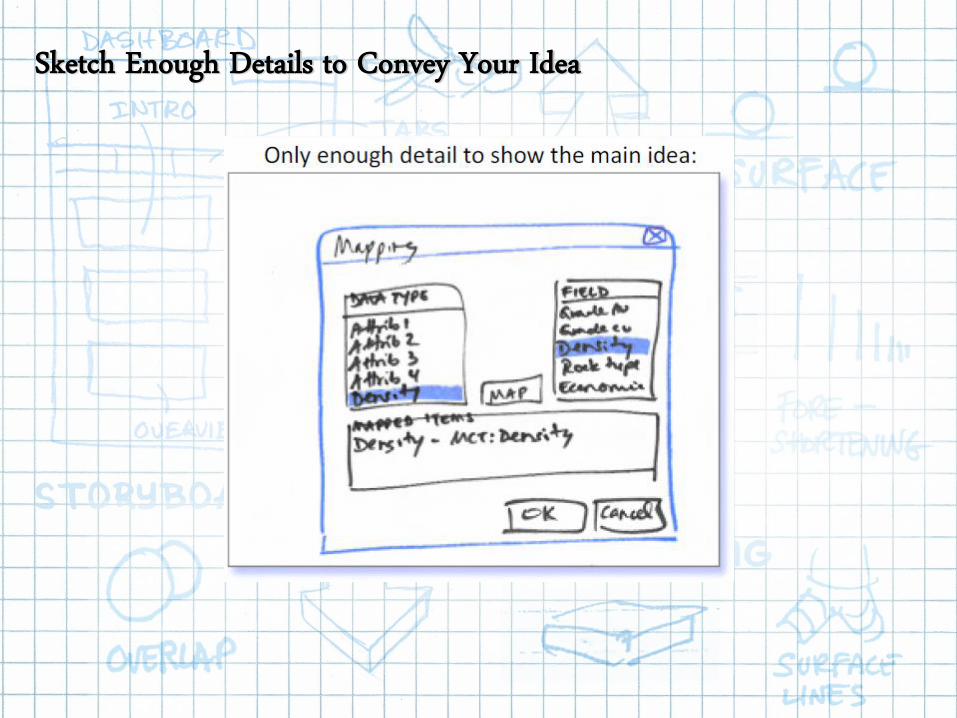
Sketch Enough Details to Convey Your Idea

77Confidential
You Can Always Start Over

78Confidential
Use Arrows and Annotations

79Confidential
Provide a Title and Brief Description

80Confidential
• Add LABELS and arrows that identify the actions and the results.
Number the labels and responses.
• Always write labels in red, and use red only for labels. (Text in the
GUI and title bars is not a label.)
• Add a SKETCH TITLE to help communicate the idea and to help
people remember what it’s about later on.
• Be able to take about 20 seconds to talk about your sketch.
(Don’t worry—it’s enough time. Remember, a picture is “worth a
thousand words”.)
What Makes a Presentable Sketch?
81Confidential
What Makes a Good Design Studio?

82Confidential
• Do your sketches separately from others on the team.
• Expect to spend 2-4 minutes on each sketch, but don’t expect to do all
your sketches in one sitting.
• FIVE substantially different ideas—five sketches—for each solution.
We need to get out of the common response zone, so five unique
sketches, or else (FUSE).
• Don’t be discouraged if you feel uncomfortable when it’s harder to come
up with sketches after doing your third one. This is “the sticking point.”
Hang in there! Your really creative ideas need a bit more time to come
to the surface. They will come. Talk to other people who’ve done
sketching sessions about their experience.
• QUANTITY breeds QUALITY. We are saturating the design space.
Before You Come to a Design Studio

83Confidential
• You must come with five sketches, or else:
- We are wasting our time.
- We are staying in the common response zone.
- We are not saturating the design space.
• The sketches must be unique, or else:
- You are iterating the same basic idea.
- You risk getting committed to one idea.
- You are still in the common response zone.
Five Sketches, or Else (FUSE)

84Confidential
• De Bono’s Six Hats help team
members think about a problem
in the same way at the same
time, and in a specific
progression.
• This allows the team to
complete each step more
quickly, and it ensures that all
essential details get covered.
• The hats are ordered in a
specific way, so we all think
about the designs from various
perspectives.
Six Thinking Hats = Communication Method

85Confidential

86Confidential
87Confidential
• Blue hat: Process (meta-talking). Useful to guide and
focus the group.
• For example: “Now let’s think of yellow-hat thoughts
about this idea” moves the group to the next step, and
“Can you hold that thought? We’ll look at grey-hat thoughts
later” postpones a comment to the right time.
• Things You Might Hear:
- What have we done so far?
- What decision have we reached?
- What do we do next?
- Let’s where a different hat for the next few minutes.
- Let’s summarize what we have learned.
Blue Hat: Process, Organizing

88Confidential
• White hat: Factual (state the facts). Seeking
objective information, without opinions.
• Things you might hear:
- What do we know?
- What don’t we know?
- What information is missing?
- What questions do we need to ask?
- How will we get the information we need?
White Hat: Factual, Neutral

89Confidential
• Green hat: Creative (ideation). For each
problem, sketch five substantially different ideas.
• During green-hat thinking, do not analyze or
judge the ideas; reject nothing; all ideas are
acceptable, even “silly” or “impossible” ones.
• After presenting your sketches to the other
design participants, mash up—or re-sketch—to
add something new and something borrowed.
• Re-sketch one of your sketches, and present it.
Re-sketch one of someone else’s sketches, and
present it.
• Next, synthesize everything you’ve seen into a
few sketches. Present those, and then apply the
next two hats to them.
Rules of Creativity:
1. Defer Judgment
2. Strive for Quantity
3. Freewheel
4. Piggyback
Green Hat: Creative, Generative

90Confidential

91Confidential

92Confidential

93Confidential
• Yellow hat: Positive. What are the
reasons that a green-hat idea may
work?
• Analyze all sketches together, but
ask participants to comment on each
sketch in turn, so that one sketch
never gets two comments in
succession.
• Ask participants to start each
comment with the words “This idea
may succeed because….”
• This allows you to probe for value
and benefit of potential ideas.
Things You Might Ask/Hear:
• What are the good points?
• What are the benefits?
• How will it help us?
• Why can it be done?
• Why is this worth doing?
Yellow Hat: Positive, Sunny

94Confidential
• Black hat: Critical. What are the reasons that a green-hat idea may not work?
• Analyze all sketches together, but ask participants to comment on each sketch in turn, so that one sketch never gets twocomments in succession.
• Require participants to start each comment with “This idea may not succeed because….”
• This is a good time for a usability expert to identify unusable features in all sketches.
• If participants get defensive about a comment, refocus them on black-hat thinking (defensive remarks are often yellow-hat), and remind them that one sketch never gets two comments in succession. Follow the black-hat thinking by another round of yellow-hat thinking.
• After the analysis (yellow- and black-hat thinking), do a further round of green-hat thinking.
• Use this round of green-hat thinking to address the grey-hat and yellow-hat thoughts.
Black Hat: Cautious, Critical

95Confidential
• Red hat: Decision. Decision-making based on everything you’ve experienced, based on what you think and feel, using your judgment and opinions.
• No consensus? You may need to follow the process for another round, starting with white-hat thinking. Although frustrating, sketching is cheaper than having a developer code and then discard (or worse—not discard) a poor design.
• Things You Might Hear:
- I feel like this idea has potential.- I feel like this idea is very unusual.- How do I feel about this idea right now?
• NOTE: Everyone feels something, even neutrality or apathy.
Your Feelings Could Be:
• Neutral
• Undecided
• Confused
• Doubtful
• Mixed
Red Hat: Emotional, Intuitive Decisions (Voting)

96Confidential
97Confidential
Case Study:Unused e-Tickets
98Confidential
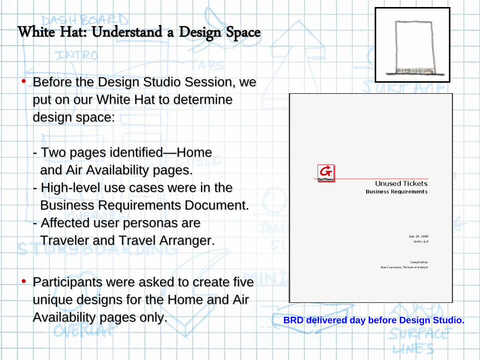
• Before the Design Studio Session, we
put on our White Hat to determine
design space:
- Two pages identified—Home
and Air Availability pages.
- High-level use cases were in the
Business Requirements Document.
- Affected user personas are
Traveler and Travel Arranger.
• Participants were asked to create five
unique designs for the Home and Air
Availability pages only. BRD delivered day before Design Studio.
White Hat: Understand a Design Space

99Confidential
Green Hat: Sketch Separately
100Confidential
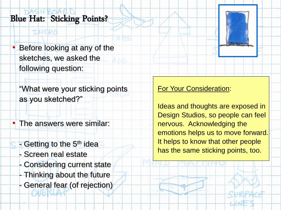
• Before looking at any of the
sketches, we asked the
following question:
“What were your sticking points
as you sketched?”
• The answers were similar:
- Getting to the 5th idea
- Screen real estate
- Considering current state
- Thinking about the future
- General fear (of rejection)
For Your Consideration:
Ideas and thoughts are exposed in
Design Studios, so people can feel
nervous. Acknowledging the
emotions helps us to move forward.
It helps to know that other people
has the same sticking points, too.
Blue Hat: Sticking Points?

101Confidential
Green Hat: Saturate the Design Space

102Confidential
• For the Air Availability pages,
we clustered the designs that
were similar to make them
easier to analyze.
• Three predominant page
designs emerged from the
Design Studio session.
• We still reviewed all of the
pages using the Yellow Hat
(positive) and the Black Hat
(critical). Three pre-dominate designs emerged.
Blue Hat: Cluster Similar Patterns

103Confidential
Yellow Hat: Positive, Sunny

104Confidential
Black Hat: Critical, Cautious
105Confidential
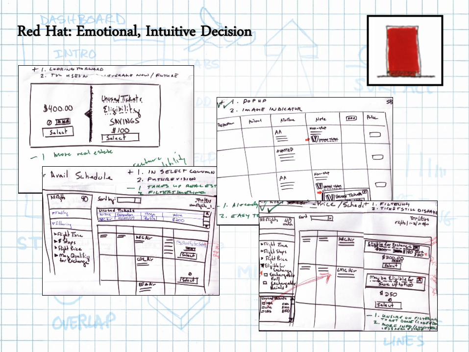
Red Hat: Emotional, Intuitive Decision

106Confidential
Green Hat: Re-sketch the Widget

107Confidential
And the winner is…..
Red Hat: Decision Point (4 of 4 Pick)

108Confidential
• 4 Sketchers/1 Facilitator
• 20 Original Sketches
• 40 Positive Comments
• 40 Critical Comments
• 3 Basic Page Designs Emerge
• 4 Designs go to 2nd Round
• Iterate on 2 of 3 Page Designs
• 4 New Designs for 2nd Round
• 1 Design Voted on 4-4
• 2 Hours to Complete
Final sketch mashes up ideas from all participants.
Blue Hat: Debrief

109Confidential
• Using Final Sketch, a designer
can turn the initial drawing into
a JPG rendering.
• Key things to note here:
- About 2 hours to sketch
- About 2 hours to render JPG
- Further down Design Funnel
Green Hat: Refine the Sketch into a JPG

110Confidential
Design Studio:Exercise

111Confidential
Need to Develop a Widget for a Website

112Confidential
Widget is Main Splash Element of the Page
WIDGET GOES HERE

113Confidential
Create a Widget to Show Light Bulb Savings

114Confidential
1. Break into teams of 6 people.
2. Each person creates two sketches – separately.
3. In 30 minutes, meet as a team.
4. Cluster similar design together.
5. Provide two positive comments.
6. Provide two negative comments.
7. Vote.
8. Re-sketch your ideal design.
9. Present to the entire class, and then go home.
Let’s Do a Design Studio!!!

115Confidential
Create a Widget….Based Upon This Information

116Confidential
The Finished Widget Looked Like This

117Confidential
The Finished Widget Tested Positively in Usability Surveys

118Confidential
Question and Answer