


Languages
Pages
Legal

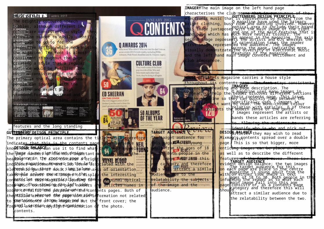
Q magazine uses many images in their contents page. This issue specifically uses 7 images in relation with articles. 6 of these 7 images represent the artists or bands these articles are referring to. Allowing the audience to identify who is who and pick out articles they may wish to read first.
TARGET AUDIENCE
The target audience for this magazine is young adult from the ages of 18 to 30. Both people in the main image fall into this age category and therefore this will attract a similar audience due to the relatability between the two.
GUTTENBERG DESIGN PRINCIPLE
Q magazine have used the primary optical area to include their brand, and one of the main features that is to appear in the magazine. The axis of orientation takes the reader across the page, indicating more features of the magazine.
HOUSE STYLEThis magazine carries a house style throughout its contents page. The font stays consistent for each subheading and page description. The subheadings help the reader discover different sections of the magazine so they can quickly jump between the pages they most want to read. The mono-chrome colour scheme highlights the modern sense of the genre.
TARGET AUDIENCE
The target audience for this magazine is young adult from the ages of 18 to 30. Both people in the main image fall into this age category and therefore this will attract a similar audience due to the relatability the subjects of the image and the audience.
GUTTENBERG DEISGN PRINCIPLE
The primary optical area contains the title, which therefore indicates that this is the contents page so an audience knows that they can use it to find what they need as well as the page numbers of the most important articles under the heading ‘VIP’. It also contains a bright image which indicates excitement and club scene associated with the electronic genre of music. While the axis of orientation takes you across the 4 images to display the interesting contents of this magazine, leading to the terminal optical area which contains more page numbers and articles names in order to fulfil the purpose of the contents pages. Both of the fallow areas of the page contain information not related to the contents of the magazine but the front cover; the free CD and the copyright information of the photo.
DESIGN BALANCE
Mixmag’s contents spread over a double page. This is so that bigger, more enticing images can be place on there as well as to describe the different features of the front cover. There is evident design balance; the two images on each page are place in the centre with on either side there is text informing the reader as to what each page consists of, as a contents page should.
IMAGERYThe main image on the left hand page characterises the club scene that is synonymous of the electronic music that is represented by mixmag from the bright clothing, busy room and dancing involved. However this image juxtaposes with the main image of the right hand page which has much more neutral colours. The second image represents the artists and DJs whereas the first image represented the audience. The images visually demonstrate the diversity of electronic music and the left hand main image connotes excitement and club atmosphere.
Top Related