


Languages
Pages
Legal

CHECK POINT IDENTITY GUIDELINES
Version 1

Check Point Identity Guidelines
Contents3 Manifesto
4 Logo
9 Colors
10 Typography
11 Photography
17 Design System
18 Design System Usage
19 Design Examples
22 Contact WESECURETHE FUTURE

3
Check Point Identity Guidelines
The Check Point ManifestoToday, one attack can shut down an entire country’s power grid, disrupt transportation systems, or steal the personal information of millions. From large corporations to start-ups, no company is immune.
Cyber criminals are nimble, resourceful, and organized.Attacks are constantly evolving and becoming more complex. In the future, driverless cars, smart homes and billions of new smart objects will be connected to the network. Hackers will have access to every part of our work and daily lives — how we commute, how we operate, how we feel, what we create, what we seek.
We need security today against tomorrow’s threats. Security that traces hackers’ activities through cyber space. Security that delivers the latest defenses and updates from the cloud, protecting millions of devices and networks around the world, every second of every day. One company has the vision and execution to deliver. Check Point.
We believe only the best security is acceptable. We built the most comprehensive security architecture with the most advanced management, translating your security strategy into reality. We continue to innovate and build new technologies and protections against the ever-changing threat landscape.
We secure over 100,000 organizations, from small leaders to the giants of the world. They trust us to secure their most complex and sensitive environments and we continue to work every day to earn that trust.
Check Point is the standard by which all security solutions are measured. We believe in an exciting, continuously changing world of new discoveries and new capabilities beyond the dreams and limitations of today. And it is our singular purpose to make you safe and secure.
We are Check Point. We secure the future.

4
Check Point Identity Guidelines
2
LogoThe Check Point logo is the most visible and recognizable symbol of our brand. It should appear on every piece of communication from Check Point — from the basic internal memo to the website and everything in between.
The corporate logo should always be placed in an unobstructed area on a clean, clear, solid background that provides maximum clarity and visibility.
1
1 Use the logo with black text when it is placed on white or a light-color background.2 Use the logo with white text when it is placed on black or a medium-to-dark color background.3 When use of Pantone colors or four-color process is not an option, the alternative is black-and-white line art.
3

5
Check Point Identity Guidelines
PANTONE® C M Y K R G B Hex
Pantone 072 100 88 0 5 28 63 148 1C3F94
Pantone 200 0 100 63 12 211 18 69 D31245
Pantone 701 0 45 20 0 246 162 168 F6A2A8
Process Yellow C 0 0 100 0 255 242 0 FFF200
Process Black 0 0 0 100 0 0 0 000000
Opaque White 255 255 255 FFFFFF
Logo (continued)Our audiences recognize Check Point by our colors as well as the design of our logo. This is why all of our communications must use a consistent color palette. Never change the color of the corporate logo.
The color of the logotype should only be black or white. Always use the approved Pantone (“PMS”) color or the equivalent Pantone CMYK or RGB mix to reproduce colors in the logo icon.
The chart on the right lists the formulas for the RGB colors for on-screen usage, Hex for web, and the Pantone and process (CMYK) colors for print usage.
Logo Color Palette
BluePantone 072
PinkPantone 701
White
YellowProcess Yellow C
RedPantone 200
Black

6
Check Point Identity Guidelines
Logo (continued)The size of the Check Point logo, when used in communications and signage, depends on many variables such as environment, emphasis, audience, etc.
Always consider the logo as an integral part of the design, rather than as an element to be added after the design is complete. If there is a question, make the logo larger rather than smaller.
With visibility and clarity as objectives in the use of the corporate logo, a minimum acceptable size has been established to ensure readability.
The minimum size for the horizontal format logo is 1.33 inches wide.
Minimum Logo Size
1.33"
When appearing in conjunction with other company logos in an equal relationship, the Check Point corporate logo should be at least the same size and in an equally prominent position in the layout.
Size proportion for co-branding
7
Check Point Identity Guidelines
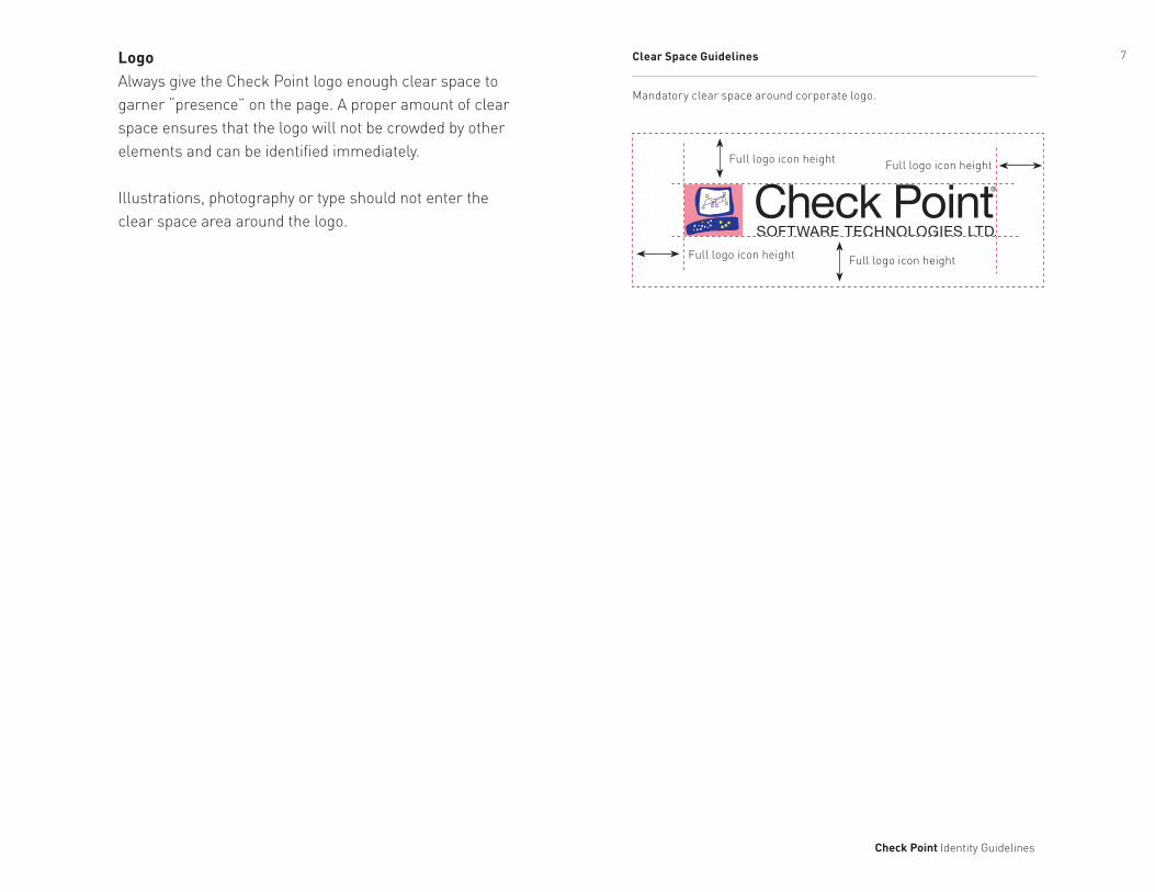
LogoAlways give the Check Point logo enough clear space to garner “presence” on the page. A proper amount of clear space ensures that the logo will not be crowded by other elements and can be identified immediately.
Illustrations, photography or type should not enter the clear space area around the logo.
Full logo icon height Full logo icon height
Full logo icon height Full logo icon height
Mandatory clear space around corporate logo.
Clear Space Guidelines

8
Check Point Identity Guidelines
Unacceptable Uses of the Corporate Logo
Do not alter the proportions of the logotype or the graphic symbol in any way.
Do not enclose the logo in a box or any other shape.
Do not replace the graphical elements within the screen with other graphics.
Do not place the logo on a busy background or any solid background that does not provide strong contrast with the logo colors.
Do not transpose the logotype and the graphic symbol in any way.
Do not alter or substitute any colors of the corporate logo.
Do not use typefaces other than the approved standard for the logotype.
Logo (continued)These graphic standards have been created to protect our brand and our trademarks. They help define both authorized and unauthorized uses of the corporate logo.
Graphic treatments such as blurs and speed lines dilute the Check Point brand and lessen the value of our logo as a recognizable visual identity.
Using digital artwork downloaded from CP Image Library is the best way to ensure proper use of the Check Point logo. When you use the logo in a layout, do not alter the proportions, colors or angles; such deviations weaken our brand and negatively impact our identity.
9
Check Point Identity Guidelines
Color PANTONE® PANTONE® C M Y K R G B Hex
Coated Uncoated
Pink 7423 C 213 U 05 81 23 0 228 87 133 E45785
Black Black 6 C Black 6 U 0 0 0 100 0 0 0 000000
Dark Gray 0 0 0 70 109 110 113 6D6E71
Light Gray 0 0 0 70 188 190 192 BCBEC0
White — — 0 0 0 0 255 255 255 FFFFFF
Color PANTONE® PANTONE® C M Y K R G B Hex
Coated Uncoated
Yellow 109 C 109 U 0 5 100 0 255 230 0 FFE600
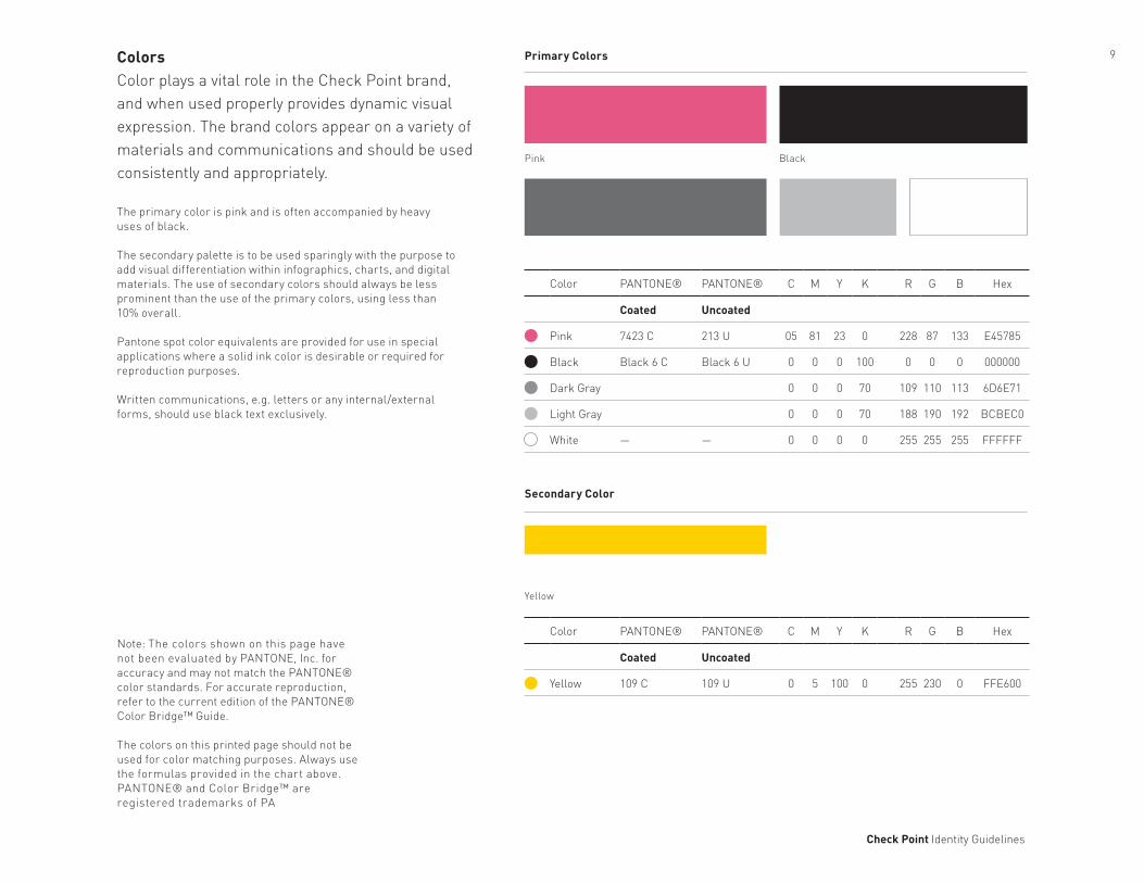
ColorsColor plays a vital role in the Check Point brand, and when used properly provides dynamic visual expression. The brand colors appear on a variety of materials and communications and should be used consistently and appropriately.
The primary color is pink and is often accompanied by heavy uses of black.
The secondary palette is to be used sparingly with the purpose to add visual differentiation within infographics, charts, and digital materials. The use of secondary colors should always be less prominent than the use of the primary colors, using less than 10% overall.
Pantone spot color equivalents are provided for use in special applications where a solid ink color is desirable or required for reproduction purposes.
Written communications, e.g. letters or any internal/external forms, should use black text exclusively.
Primary Colors
Secondary Color
Note: The colors shown on this page have not been evaluated by PANTONE, Inc. for accuracy and may not match the PANTONE® color standards. For accurate reproduction, refer to the current edition of the PANTONE® Color Bridge™ Guide.
The colors on this printed page should not be used for color matching purposes. Always use the formulas provided in the chart above. PANTONE® and Color Bridge™ are registered trademarks of PA
Pink
Yellow
Black

10
Check Point Identity Guidelines
TypographyPrinted and online communications are an essential element of the brand. Typography plays a significant role in projecting Check Point’s visual style. DIN is the primary typeface of the brand design system.
Flush left typography is preferred. For headlines use upper case. For titles and headings, upper and lower case are preferable to sentence case.
For designed general communications, use DIN Light. DIN Regular and Bold may be used for display situations or text emphasis.
Arial is a Windows and Macintosh system typeface. Arial should be used for written communications only or whenever the use of DIN is not feasible.
DIN Light
ABCDEFGHIJKLMNOPQRSTUVWXYZ abcdefghijklmnopqrstuvwxyz 0123456789DIN Regular
ABCDEFGHIJKLMNOPQRSTUVWXYZ abcdefghijklmnopqrstuvwxyz 0123456789DIN Bold
ABCDEFGHIJKLMNOPQRSTUVWXYZ abcdefghijklmnopqrstuvwxyz 0123456789
Arial (System)
ABCDEFGHIJKLMNOPQRSTUVWXYZ abcdefghijklmnopqrstuvwxyz 0123456789

11
Check Point Identity Guidelines
PhotographyPhotography can be a powerful asset in promoting thebrand as well as Check Point’s specific security features. Subject matter should focus on one of three categories: environmental images, threat interpretations, and futuristic images of people.

12
Check Point Identity Guidelines
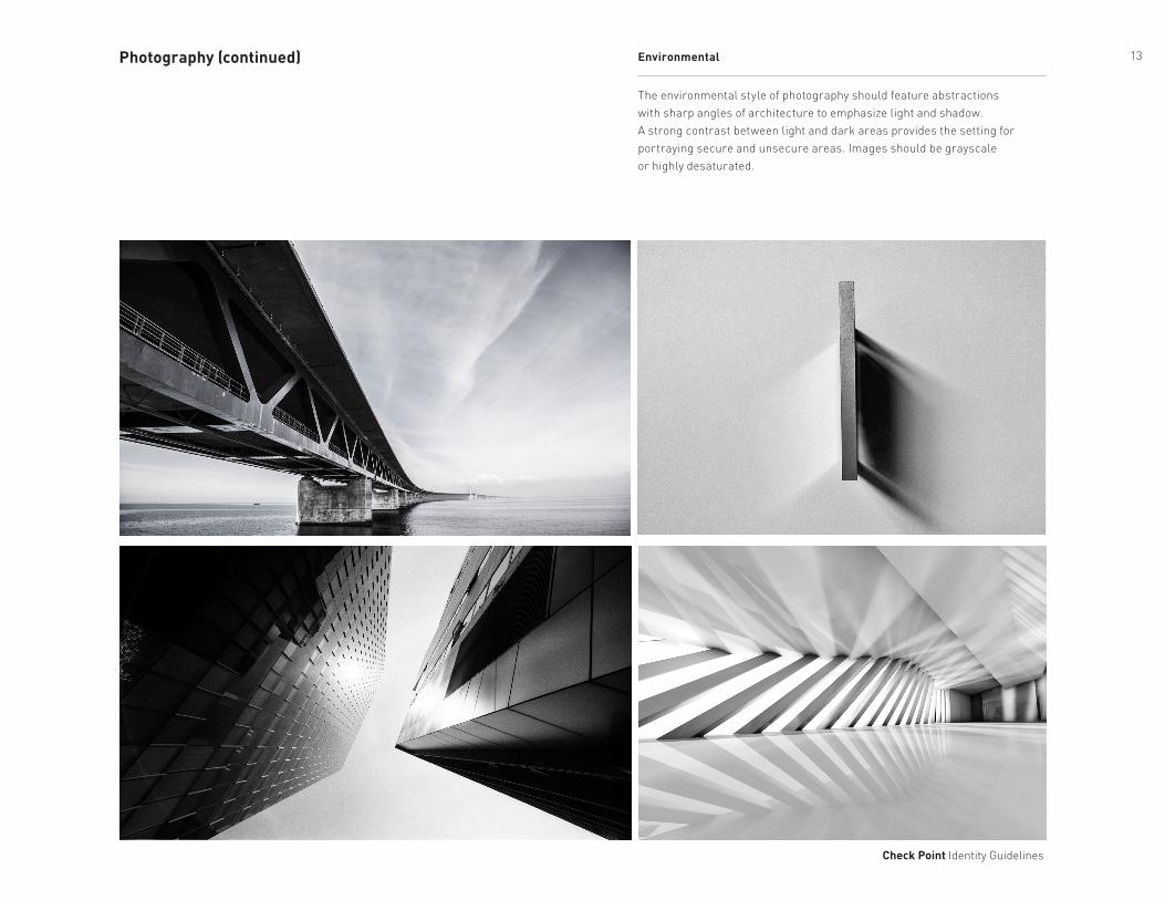
The environmental style of photography should feature abstractions with sharp angles of architecture to emphasize light and shadow. A strong contrast between light and dark areas provides the setting for portraying secure and unsecure areas. Images should be grayscale or highly desaturated.
EnvironmentalPhotography (continued)
13
Check Point Identity Guidelines
The environmental style of photography should feature abstractions with sharp angles of architecture to emphasize light and shadow. A strong contrast between light and dark areas provides the setting for portraying secure and unsecure areas. Images should be grayscale or highly desaturated.
EnvironmentalPhotography (continued)
14
Check Point Identity Guidelines
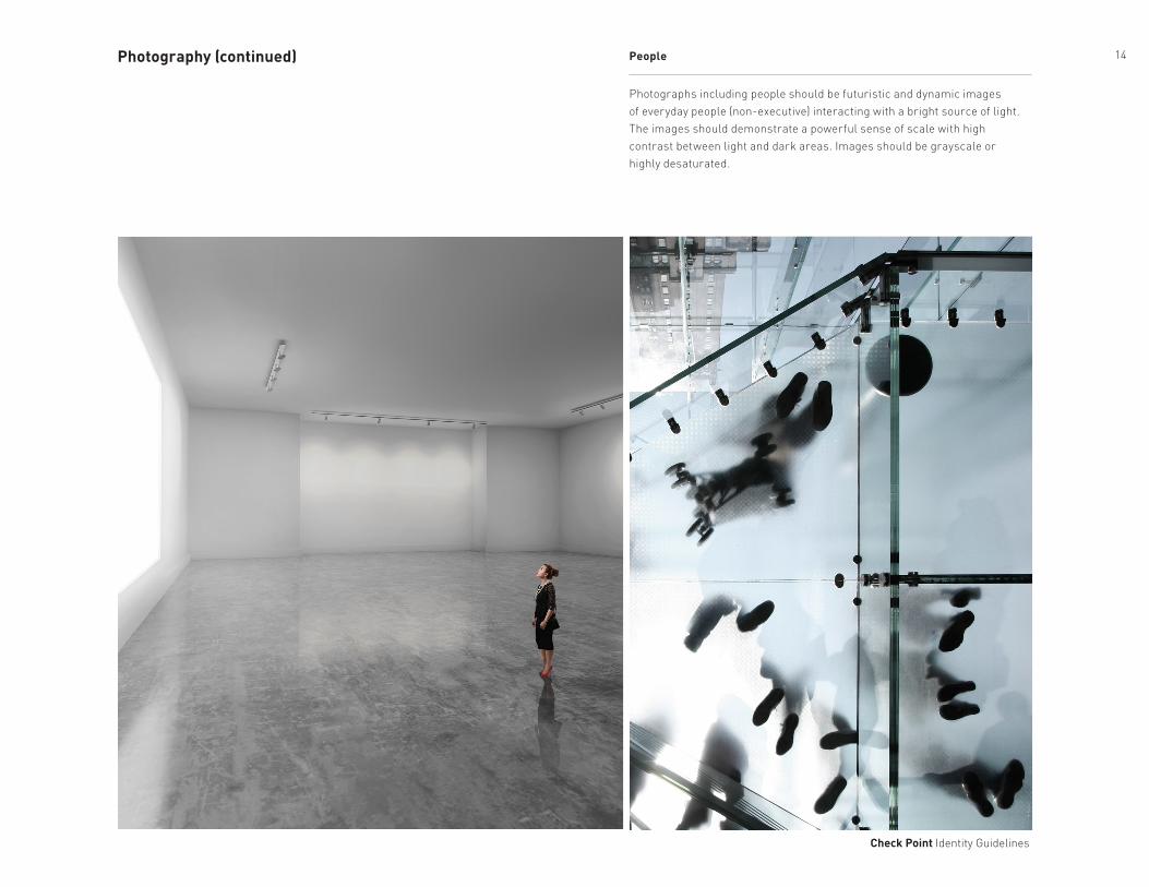
Photographs including people should be futuristic and dynamic images of everyday people (non-executive) interacting with a bright source of light. The images should demonstrate a powerful sense of scale with high contrast between light and dark areas. Images should be grayscale or highly desaturated.
PeoplePhotography (continued)

15
Check Point Identity Guidelines
Photographs including people should be futuristic and dynamic images of everyday people (non-executive) interacting with a bright source of light. The images should demonstrate a powerful sense of scale with high contrast between light and dark areas. Images should be grayscale or highly desaturated.
PeoplePhotography (continued)

16
Check Point Identity Guidelines
This photography style is the representation of the threats Check Point protects against. These images should contain menacing, sharp shapes —or “bots” — on a black background.
BotsPhotography (continued)

17
Check Point Identity Guidelines
Design SystemUnique design elements are an essential visual tool of the Check Point brand. These graphic shapes represent the diverse and flexible security platforms we offer.
The main design elements that make up the system are comprised of four pink bars representing Check Point’s security zone. One is solid and the remaining three are of increasing transparency. The solid bar is always closest to the “secure” area in a visual composition.
These elements can be used in a variety of shapes and angles, as shown below. They can be the primary element in a design or a basic visual accent.
Security Layer Transparencies
100% Pink
85% Pink
60% Pink
45% Pink
Graphic Shapes

18
Check Point Identity Guidelines
Design System Usage
Example 4 (no images) Example 5 (no images) Example 6 (no images)
Example 1 (with images)
A - threat imagery / outside worldB - secure area
A - protective brand linesB - content area
A - threat imagery / outside worldB - secure area
A - protective brand lines and secure areaB - content area
A - threat imagery / outside worldB - secure area
A - protective brand linesB - content area
Example 2 (with images) Example 3 (with images)
A
A
A
A
A AB
B B B
B B
Aquae sequatur aut et, optam quis ma nam experio. Natur, consequatium acercimodi aut re nihil et in pa porum est aut alique ea ducil intor audipsapis rehenim harchic iusandi ciasincte re idebis
Aquae sequatur aut et, optam quis ma nam experio. Natur, consequatium acercimodi aut re nihil et in pa porum est aut alique ea ducil intor audipsapis rehenim harchic iusandi ciasincte re idebisTotatem que pero tenem ulparum endio tem nos a inverum eatet fugitia
Aquae sequatur aut et, optam quis ma nam experio. Natur, consequatium acercimodi aut re nihil et in pa porum est aut alique ea ducil intor audipsapis rehenim harchic iusandi ciasincte re idebisTotatem que pero tenem ulparum endio tem nos a inverum eatet fugitia
Aquae sequatur aut et, optam quis ma nam experio. Natur, consequatium acercimodi aut re nihil et in pa porum est aut alique ea ducil intor audipsapis rehenim harchic iusandi ciasincte re idebisTotatem que pero tenem ulparum endio tem nos a inverum eatet fugitia
Aquae sequatur aut et, optam quis ma nam experio. Natur, consequatium acercimodi aut re nihil et in pa porum est aut alique ea ducil intor audipsapis rehenim harchic iusandi ciasincte re idebisTotatem que pero tenem ulparum endio tem nos a inverum eatet fugitia
Aquae sequatur aut et, optam quis ma nam experio. Natur, consequatium acercimodi aut re nihil et in pa porum est aut alique ea
Headline Text Goes Here Headline Text
Goes Here
Headline Text Goes Here
Subheadline Text

19
Check Point Identity Guidelines
Design ExamplesThese examples demonstrate how the Check Point design system translates to multiple applications.
1 Brochure cover2 Brochure spread3 PowerPoint cover slide
4 Video still5 Website content page
31 2
4
Note: The examples and colors shown on this page are intended for illustrative purposes only. Always use the approved colors on page 4.
5

20
Check Point Identity Guidelines
Design ExamplesThese examples demonstrate how the Check Point design system translates to multiple applications.
6 Solution Brief7 Video still8 PowerPoint presentation slide
9 Data sheet10 Sales Collateral
9
6
8
Note: The examples and colors shown on this page are intended for illustrative purposes only. Always use the approved colors on page 4.
10
7

21
Check Point Identity Guidelines
Design ExamplesThese examples demonstrate how the Check Point design system translates to multiple applications.
11 Brochure cover12 Brochure spread
13 Signage14 Sales Guides
11
Note: The examples and colors shown on this page are intended for illustrative purposes only. Always use the approved colors on page 4.
12 13
SELLING CHECK POINT THREAT PREVENTION
SELLING CHECK POINTMOBILE SECURITY
SELLING CHECK POINTSECURITY MANAGEMENT
14

22
Check Point Identity Guidelines
ContactFor any brand identity design questions please contact the brand identity team:
Johnny ThompsonCreative Director [email protected]
Steven ClarkDesign [email protected]
Chunming JiaDesign Manager [email protected]
Carole LeungDesign [email protected]
Jacques RambonnetDesign [email protected]
Check Point Software Technologies, Ltd.959 Skyway Road Suite 300San Carlos, CA 94070
Top Related