

Languages
Pages
Legal


CHANGES

The black background doesn’t convey comedy on the blog as it should. Our target audience feedback told me I should use brighter more vibrant colours to show humour and joy.

From the information I gathered form the feedback I was told that my colour scheme reflected more romance and horror, with the contrast of the pink and black.Therefore, I decided to change
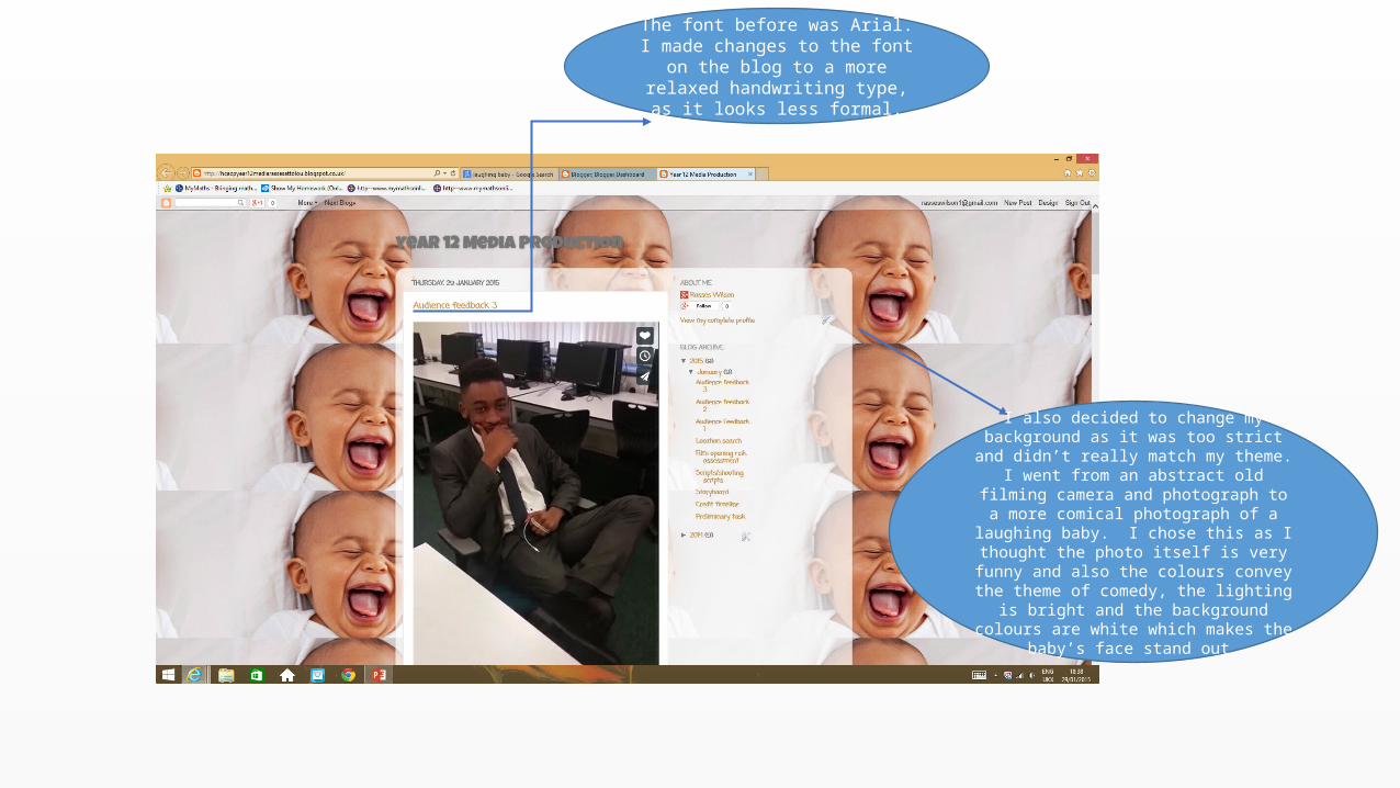
The font before was Arial. I made changes to the font on the blog to a
more relaxed handwriting type, as it looks less formal.
I also decided to change my background as it was too strict and didn’t really match my
theme. I went from an abstract old filming camera and photograph to a more comical
photograph of a laughing baby. I chose this as I thought the photo itself is very funny and also the colours convey the theme of comedy, the lighting is bright and the background colours are white which makes the baby’s face stand
out.
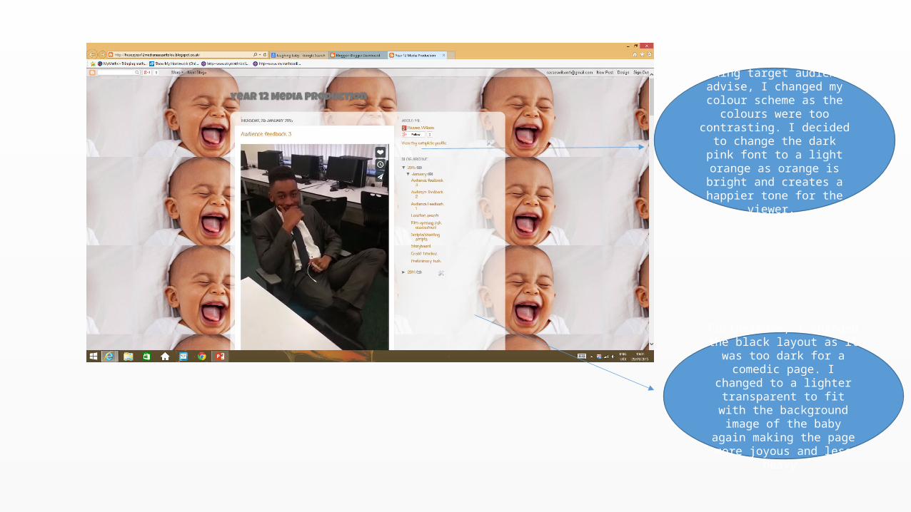
Taking target audience advise, I changed my colour scheme as
the colours were too contrasting. I decided to change
the dark pink font to a light orange as orange is bright and creates a happier tone for the
viewer.
Furthermore, I changed the black layout as it was too dark
for a comedic page. I changed to a lighter transparent to fit with
the background image of the baby again making the page more joyous and less heavy.