


Languages
Pages
Legal

Group Members :
Danial Kalbassi
Erfan Beiraghdar
Farid Sediqiani

A p i i t f r e e w a r e w e b s i t e s i s a b o u t a l l f r e e s o u r c e s s u c h a s s o f t w a r e , v i d e o ,
w a l l p a p e r , g a m e s i n d i f f e r e n t c a t e g o r i e s We u s e d i f f e r e n t t e c h n o l o g i e s f o r
d e s i g n i n g a n d p r o g r a m m i n g . T h e a l l o f t h e g r a p h i c a l s e c t i o n s , d e s i g n w i t h
A d o b e P h o t o s h o p a n d i l l u s t r a t o r , s o a f t e r t h a t w e u s e t h e s e i m a g e f i l e s
f o r p r o g r a m m i n g a n d s t y l i n g w i t h H T M L a n d C S S a n d J a v a S c r i p t . a l s o w e
u s e d f l a s h t o d e v e l o p a d v e r t i s e m e n t s a n d s o m e b u t t o n s . T h e o t h e r f e a t u r e
i s C E O o p t i m i z a t i o n i n a l l p a g e s , f o r b e t t e r s e a r c h i n g a n d m o r e a t t r a c t
v i s i t o r s .
Introduction
Development Tools
As we mentioned before , we use different tools
such as
Adobe Photoshop
Adobe Illustrator
Adobe Flash
Aptana Studio

Body Of Site
The important things in our design is standard body . Our design has : Header
Logo Top Navigation Bar Middle Navigation Bar Search
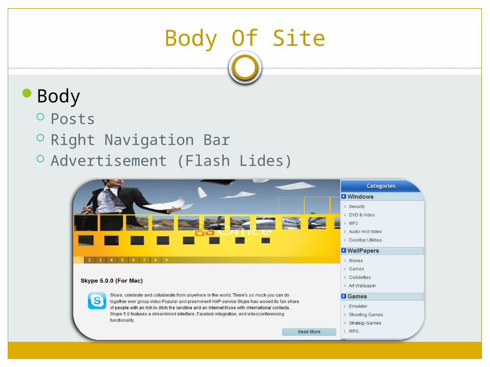
Body Of Site
Body Posts Right Navigation Bar Advertisement (Flash Lides)

Footer
Our Copyright Terms
In footer we provide owner email and Copyright terms
and other detail about the site .
User Interaction And Layout Adjustment
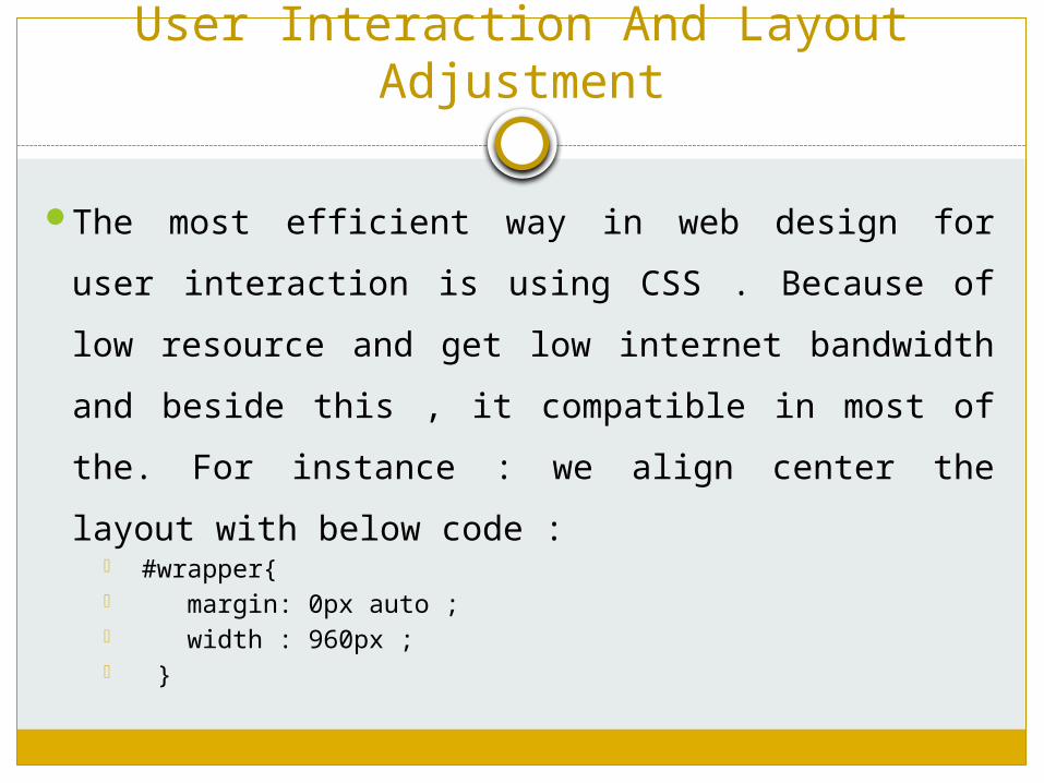
The most efficient way in web design for user
interaction is using CSS . Because of low resource
and get low internet bandwidth and beside this , it
compatible in most of the. For instance : we align
center the layout with below code : #wrapper{ margin: 0px auto ; width : 960px ; }

User Interaction And Layout Adjustment
In menus we use mouse hover event for changing color , For Example :
#topnav li a { text-decoration:none; padding-left:70px; color:white; font-weight:bold ; font-family:arial; float:left ; } #topnav li a:hover{ color:yellow; text-decoration:underline; }
Design Section - Logo
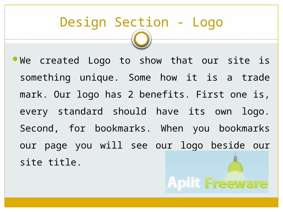
We created Logo to show that our site is
something unique. Some how it is a trade mark.
Our logo has 2 benefits. First one is, every
standard should have its own logo. Second, for
bookmarks. When you bookmarks our page you
will see our logo beside our site title.

Design Section – Navigation Bar
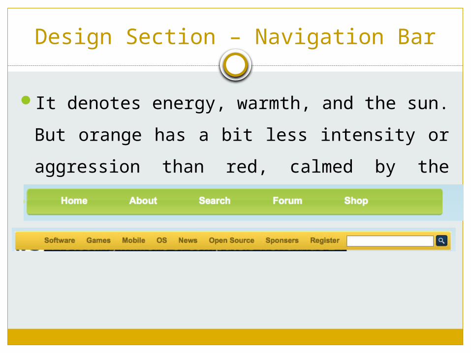
We choose 2 different color to separate our
primary navigation bar from secondary navigation
bar. For main section we choose green color cause
green is color of peace and serenity so user will
feel much better by seeing this color. On the other
hand we choose Orange color for our secondary
navigation bar. We use orange to attract user
attention.
Design Section – Navigation Bar
It denotes energy, warmth, and the sun. But
orange has a bit less intensity or aggression
than red, calmed by the cheerfulness of
yellow.

Design Section – Flash Button
We have used different colors according to our button condition. In normal situation we have used simple red but when user try to hit the button, the button color will be changed to orange.

Search boxes
Search utility boxes are derived from “PicoSearch” engine. Real results among all contexts of website.
Apparently implemented in two parts of page:o Express search box:providing direct search located in orange nav. Bar
o External search box: opening search box in a separate page
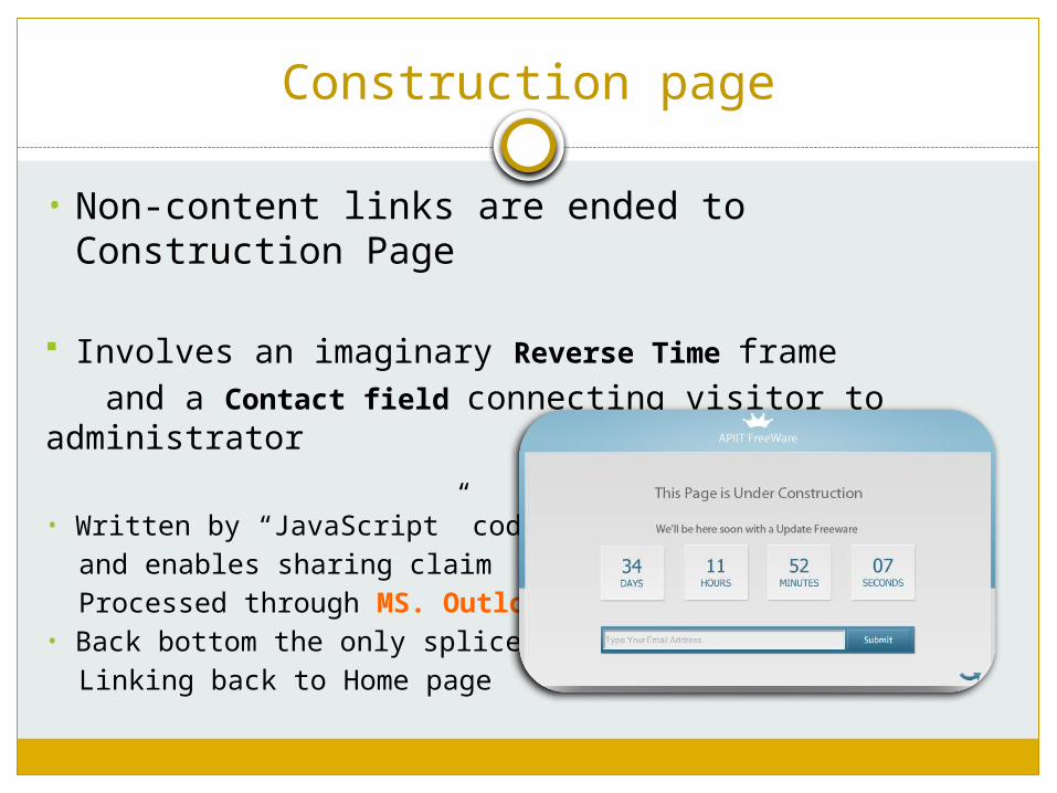
Construction page
• Non-content links are ended to Construction Page
Involves an imaginary Reverse Time frame and a Contact field connecting visitor to administrator
• Written by “JavaScript” codes and enables sharing claim Processed through MS. Outlook• Back bottom the only splicer Linking back to Home page
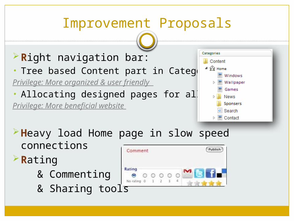
Improvement Proposals
Right navigation bar:• Tree based Content part in CategoriesPrivilege: More organized & user friendly
• Allocating designed pages for all linksPrivilege: More beneficial website
Heavy load Home page in slow speed connections
Rating & Commenting & Sharing tools
Top Related