
You Me At Six- Cavalier Youth
6
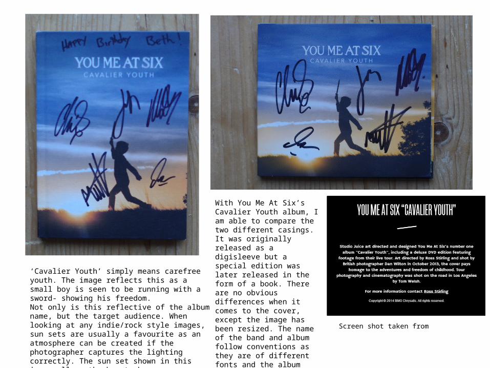
With You Me At Six’s Cavalier Youth album, I am able to compare the two different casings. It was originally released as a digisleeve but a special edition was later released in the form of a book. There are no obvious differences when it comes to the cover, except the image has been resized. The name of the band and album follow conventions as they are of different fonts and the album ‘Cavalier Youth’ simply means carefree youth. The image reflects this as a small boy is seen to be running with a sword- showing his freedom. Not only is this reflective of the album name, but the target audience. When looking at any indie/rock style images, sun sets are usually a favourite as an atmosphere can be created if the photographer captures the lighting correctly. The sun set shown in this image allows the boy to become a Screen shot taken from
Transcript of You Me At Six- Cavalier Youth
With You Me At Six’s Cavalier Youth album, I am able to compare the two different casings. It was originally released as a digisleeve but a special edition was later released in the form of a book. There are no obvious differences when it comes to the cover, except the image has been resized. The name of the band and album follow conventions as they are of different fonts and the album name is smaller than the band name. They are, however, the same colour- although this is most likely to keep the colour of the cover simple and so attention is not drawn away from the image.
‘Cavalier Youth’ simply means carefree youth. The image reflects this as a small boy is seen to be running with a sword- showing his freedom.Not only is this reflective of the album name, but the target audience. When looking at any indie/rock style images, sun sets are usually a favourite as an atmosphere can be created if the photographer captures the lighting correctly. The sun set shown in this image allows the boy to become a silhouette, creating a simple yet effective image as he stands out more against the brighter background.
Screen shot taken from

The design and layout of each casing vary slightly from on another. The book has sleeves, at the front and back, allowing a DVD to be part of it- this is also due to the fact it is a special edition. The lyrics are written over a number of pages (therefore there is no need for a lyric booklet) which also features various images of the band. The photographs are like a documentary of the band making the album- something which is quite common with such bands. The digisleeve does not contain a DVD and instead replaces it with a small lyric booklet- the image portrays their urban lifestyle. Conventions are also followed in this casing as there are three separate images covering the inside of the case. The images in this album are the type of images I personally enjoy taking and I am going to look into other pieces of work by the photographer. However, I am not sure whether this type of imagery will be best suited to the genre of my album.The CD/DVD are conventional as the band/album name is placed at the top and the record company name at the bottom. Since there are two discs within the booklet, they have been labelled ‘disc one’ and ‘disc two’.

Since the images, featured in the book, are following the band making their album, the way they are posed are quite natural which is something I like my own photos to have. Excluding the ones above, a lot of the photos show the band members looking away from the camera, enhancing the natural position and facial expressions they hold. It also allows the audience to feel more like they are apart of the production of the album and not like they are just listeners of the music. These photographs have a very personal feel to them, this is something I want the images for my album to have.


The back of the both these casings are very similar, much like the covers. The track list is conventionally centred and in the same font as the album name. They also hold other conventions such as the barcode, record label name and copyright information which is all placed at the bottom. For the book, Disc One and Two have been categorised using the same label on the actual discs. For the booklet, there is a fourth image which you see when you first open it- therefore it follows on from the front cover. In this image, the boy, again, represents the idea of freedom, expressing that as a child you have that freedom. As pop punk/rock band, this is a common topic of nostalgia within the genre, therefore not only making it personal to them but also to their main audience which are generally older teens and young adults.

The spine of the album is conventionally simplistic, using the same fonts of the artist/album name as on the cover. The only difference between the two casings is that a catalogue number is present on the digisleeve and not the book.