WYSIWYG
13
ANNUAL 276TH typography conference 2015 may 23-25 INTERLAKEN switzerland; europe WYSIWYG CATALOG what you see is what you get W . Y. S . I . W . Y. G AND WHAT YOU GET IS A BEAUTIFUL TYPOGRAPHY CATALOG LUCKY YOU ’15
-
Upload
bridgette-hall -
Category
Documents
-
view
212 -
download
0
description
graphic design catalog
Transcript of WYSIWYG

annual 276thtypography conference
2015may 23-25
interlakenswitzerland; europe
wysiwyg catalogwhat you see is what you get
W.Y.S. I .W.Y.GAND WHAT YOU GET IS A BEAUTIFUL TYPOGRAPHY CATALOG
LUCKY YOU
’15

welcometo the 276th annual typography conference
A fancy, little get together; full of fancy, diaccritc type designers
as the saying goes, type is a beautiful group of letters, not a group of beautiful letters
– Matthew Carter
hello. we are very glad you could make it to the 276th Annual Typography Conference. Yes, that is
correct, the 267th Annual Typography Conference. Crazy
to think that this Annual Typography Conference has been
going on for that long. And lucky you! You have the excep-
tional privilege to attend and participate in all of the fun and
educational activities prepared for this week. There will be
type designers from all around the world and from a range
of different times periods present, so make sure to use this
time wisely and take advantage to peep into the clever minds
of all the old style and modern type geniuses. We are confi-
dent that this experience will be one of the most rewarding
typography conferences you will ever attend.
during your time here, you have the opportunity to attend speeches and workshops that will callout new in-
formation and insights much needed to flex your creative
mind. The goal of this typography conference is to provide
an educational experience so that when you leave here you
feel that you can take with you what you learned and expand
on your own personal typography goals. So put on your best
typeface and let the kerning begin!
If you have any questions regarding any concern you may encounter during
your time here at the WYSIWYG 276th Annual Typography Conference,
please contact Phinley Cottle, Head Coordinator of WYSIWYG Annual
Typography Conference, at (389) 991-6645 or [email protected]
try & find 2 ampersands
1/2page numbers
2015may 23-25
1.0section
introductionjust a way to say hello & welcome

WYSIWYGDraw these letter forms
x height
cap height
baseline
gametimedrawing type
x height
cap height
baseline

personal information
name:
address: street apt. # city state zip country
company:
title:
contact information
phone: ( )
email:
web url:
workshop sign up
name of workshops:
date & time:
registration fee
credit card info/payment:
billing address:
send to:
wysiwyg member [ ] y [ ] n
application form
Send Application Form to WYSIWYG 276th Annual Typography Conference | Swiss Legacy Studio Aaraverstrasse 2, Lenzburg Interlaken 5600, Switzerland
a call for typographers
APPLICATION FORMwysywig 276th annual typography conference
interlaken, switZerland; europe
elegibility
You must be a member of WYSIWYG. If you're not a member already, you can become one online at:www.wysiwyg.com
dates
The WYSIWYG Typography Conference will be held the 23rd of May through the 25th of May.
application form
On the back of this page is the appli-cation form. Please fill out and return Thank you.
’15

SCHEDULEFor your connotation, we made these instructions as simple as possible in 3 easy steps:
5/6page numbers
2015may 23-25
2.0section
schedule so you know what to do
1 tear the schedule page for the appropriate day
2 carry the schedule with you throughout the day
3 take notes on the back of the schedule page
ty
pog
ra
phy c
on
fer
en
ce s
hc
ed
ule
05.2
3.15
we
dn
esd
ay
8:00
am
co
nfe
re
nc
e c
he
ck-in
9:00
am
he
rb l
ub
ali
n k
ey
no
te s
pea
ke
r: M
ore i
s Bett
er
10/1
1 a
m
er
ik s
pie
ke
rm
an
ma
in s
pea
ke
r:
Des
ign
Min
d
11/1
2 pm
ad
ria
n f
ru
tig
er w
or
ksh
op: S
wiss
Typ
e Des
ign
12/1
2:45
pm
lun
ch A
bit
of ti
me t
o re
lax
1/2
pm
pa
ul
re
nn
er w
or
ksh
op: T
he A
rt of
Typ
ogra
phy
2/3
pm
wil
lia
m c
asl
on
ma
in s
pea
ke
r: C
aslo
n Fo
undr
y
3/4
pm
ma
rti
n m
ajo
or m
ain
spe
ar
ke
r: T
ype D
esig
n Ph
iloso
phy
4/5
pm
ca
ro
l tw
om
bly
wo
rk
sho
p: C
allig
raph
y
5/6
pm
cla
ud
e g
ar
am
on
d m
ain
spe
ak
er
: Gre
cs d
u R
oi
5/6
pm
nic
ola
s je
nso
n m
ain
spe
ak
er
: Ven
itian
Old
style
have
a g
ood
day
!
ty
pog
ra
phy c
on
fer
en
ce s
hc
ed
ule
05.2
4.15
th
ur
sda
y
8:00
am
co
nfe
re
nc
e c
he
ck-in
9:00
am
typ
og
ra
ph
y t
alk
ga
th
er
in m
ain
bu
ild
ing
to
ta
lk
ty
pe
10/1
1 a
m
ro
be
rt
slim
ba
ch m
ain
spe
ak
er
: Ad
obe
11/1
2 pm
ma
tth
ew
ca
rte
r w
or
ksh
op: T
rans
ition
from
med
al to
dig
ital t
ype
12/1
2:45
pm
lun
ch A
bit
of ti
me t
o re
lax
1/2
pm
da
vid
be
rlo
w w
or
ksh
op: P
ostS
crip
t
2/3
pm
pa
ul
re
nn
er m
ain
spe
ak
er
: The
Fut
ura
of T
ype
3/4
pm
ad
ria
n f
ru
tig
er m
ain
spe
ar
ke
r: T
ype,
Sign
, Sym
bol
4/5
pm
tob
ias
fre
re-j
on
es
wo
rk
sho
p: H
&FJ
e
5/6
pm
fre
de
ric
go
ud
y m
ain
spe
ak
er
: Sto
p St
ealin
g Sh
eep
5/6
pm
fra
nc
esc
o g
rif
fo m
ain
spe
ak
er
: Pun
ch C
uttin
g take
goo
d n
otes
!
ty
pog
ra
phy c
on
fer
en
ce s
hc
ed
ule
05.2
5.15
fr
ida
y
8:00
am
co
nfe
re
nc
e c
he
ck-in
9:00
am
fir
min
did
ot
ke
yn
ot
e s
pea
ke
r: S
tereo
type
10/1
1 a
m
gia
mb
att
ista
bo
do
ni m
ain
spe
ak
er
: Il
Man
uale
tipog
rafic
o
11/1
2 pm
er
ik s
pie
ke
rm
an
n w
or
ksh
op: M
etaD
esig
n
12/1
2:45
pm
lun
ch A
bit
of ti
me t
o re
lax
1/2
pm
ma
rti
n m
ajo
or w
or
ksh
op: L
iefde
voo
r Lett
ers
2/3
pm
ma
tth
ew
ca
rte
r m
ain
spe
ak
er
: Mak
ing
the W
orld
mor
e Leg
ible
3/4
pm
ca
ro
l tw
om
bly
ma
in s
pea
rk
er
: How
to b
e the
Nex
t Mov
ie T
ypefa
ce
4/5
pm
ro
be
rt
slim
ba
ch w
or
ksh
op: D
igita
l Typ
eface
Des
ign
5/6
pm
da
vid
be
rlo
w m
ain
spe
ak
er
: Dra
win
g Le
tters
5/6
pm
tob
ias
fre
re-j
on
es
ma
in s
pea
ke
r: G
errit
Noo
rdzi
j
than
ks f
or a
tten
din
g!

no
te
sw
ed
ne
sda
y | ma
y 23, 2015
____________________________________
____________________________________
____________________________________
____________________________________
____________________________________
____________________________________
____________________________________
____________________________________
____________________________________
____________________________________
____________________________________
____________________________________
____________________________________
____________________________________
____________________________________
____________________________________
____________________________________
____________________________________
____________________________________
____________________________________
____________________________________
____________________________________
____________________________________
____________________________________
no
te
st
hu
rsd
ay | m
ay 24, 2015
____________________________________
____________________________________
____________________________________
____________________________________
____________________________________
____________________________________
____________________________________
____________________________________
____________________________________
____________________________________
____________________________________
____________________________________
____________________________________
____________________________________
____________________________________
____________________________________
____________________________________
____________________________________
____________________________________
____________________________________
____________________________________
____________________________________
____________________________________
____________________________________
no
te
sf
rid
ay | m
ay 25, 2015
____________________________________
____________________________________
____________________________________
____________________________________
____________________________________
____________________________________
____________________________________
____________________________________
____________________________________
____________________________________
____________________________________
____________________________________
____________________________________
____________________________________
____________________________________
____________________________________
____________________________________
____________________________________
____________________________________
____________________________________
____________________________________
____________________________________
____________________________________
____________________________________
WORKSHOPS
wednesday | may 23, 2015
adrian fruitger: Swiss Type Design
In this workshop, you will learn all of the different characterists and
form of Swiss type design and then try to create your own Swiss type
using the characteristcs of Swiss type design.
paul renner: The Art of Typography
In this workshop, you will learn about the different philosophies of
The Art of Typography. You will then write your own philosophy
and design a typographic document stating your philosophy of The
Art of Typography.
carol twombly: Swiss Type Design
In this workshop, you will learn how Carol Twombly has mastered
calligraphic type design. You will then have the opportunity to prac-
tice hand drawn calligraphy using the techniques and tools Carol
Twombly will teach and provide. thursday | may 24, 2015
adrian fruitger: Swiss Type Design
In this workshop, you will learn all of the different characterists and
form of Swiss type design and then try to create your own Swiss type
using the characteristcs of Swiss type design.
paul renner: The Art of Typography
In this workshop, you will learn about the different philosophies of
The Art of Typography. You will then write your own philosophy
and design a typographic document stating your philosophy of The
Art of Typography.
carol twombly: Swiss Type Design
In this workshop, you will learn how Carol Twombly has mastered
calligraphy. You will then have the opportunity to practice hand
drawn calligraphy using the techniques and tools Carol Twombly
will teach and provide.
friday | may 25, 2015
adrian fruitger: Swiss Type Design
In this workshop, you will learn all of the different characterists and
form of Swiss type design and then try to create your own Swiss type
using the characteristcs of Swiss type design.
paul renner: The Art of Typography
In this workshop, you will learn about the different philosophies of
The Art of Typography. You will then write your own philosophy
and design a typographic document stating your philosophy of The
Art of Typography.
carol twombly: Swiss Type Design
In this workshop, you will learn how Carol Twombly has mastered
calligraphy. You will then have the opportunity to practice hand
drawn calligraphy using the techniques and tools Carol Twombly
will teach and provide.
typography talk | Thursday May 24, 2015
At Typography Talk, you will have the opportunity to meet and greet
with people attending the conference, including keynote and main
speakers. This is a wonderful way to have intellectual and useful con-
versations with a range of unique typographers. Typography Talk is
just a casual get together to simply talk about type.
*Breakfast will be provided.

7/14page numbers
2015may 23-25
3.0section
biographies for you to get to know each other
BIOGRAPHIES
herblubalintype designer
ITC Avant Garde, Ronda, Lubalin Graph, ITC Serif Gothic
“rather than less is more, more is best.”
few graphic designers embody the aesthetics of their time as completely as Lubalin. Arguably, from the late 1950s to
the late 1970s, he was American graphic design. His eclectic
sensibility pervaded advertising, editorial, and package design
so thoroughly that the best word to describe the era may be
“Lubalinesque.” The father of conceptual typography, Lubalin
helped build a bridge between the modern and late-modern
schools. Letters were not merely vessels of form, they were
objects of meaning. He made words emote. He came of age,
fortuitously, in an epoch of technological change. But rules, he
realized, were meant to be turned upside down. He liberated
white space from the traditional way, refusing to follow the edict
that less is more.
herb lubalin‘s numerous awards include seven gold medals from the Art Directors Club, Art Director of the Year
Award from the National Society of Art Directors, a Clio,
two honors from The Cooper Union, the Augustus St. Gaud-
ens Medal and The Award for Professional Achievement. He
considers, however, his greatest achievements to be his sons:
Robert, a talented designer with the architectural firm, Davis,
Brody, and Peter, who came to advertising prominence with his
Dannon Yogurt “Russian” commercials.
he has been both the subject and author of many articles on graphic design, which have appeared nationally and
internationally in, among others, such leading publications as:
Art Direction, American Artist, Popular Photography, Com-
munication Arts, Graphics Today, Graphis, Idea, Gabrauchs-
graphik, and U&lc.
keynotespeakers
Herb Lubalin & Firmin Didot
firmindidottype cutter
Didot
“before bodoni, there was didot.”
firmin didot was born in paris in 1764 to a family well acquainted with the printing industry. The first Didot to be
in the printing business was a printer-bookseller named Marie-
Anne Didot. She began her business in 1698. Firmin was able
to gain momentum and enjoy success as he built from the foun-
dation and history his family had left him.
firmin’s father, francois-ambroise didot, was particu-larly influential to his work. The first version of the Didot type-
face was cut by Louis Vafflard. He was an experienced cutter
working with instructions given to him by Francois-Ambroise
Didot. In 1784, the typface attained its most highly finished
form by Firmin.
firmin was able to use recent developments in type design to create his 1784 version of Didot, what many consider
to be the cleanest and purest version of the typeface. The type-
face has the appearance of being designed rather than drawn.
The 1784 version shows geometrical tendencies, pure and un-
cluttered. The letters are built on a vertical axis; the hairlines
are thin and beautifully finessed, while the stems are much
thicker with the serifs becoming finely bracketed.
the word “stereotype” was invented by firmin. a stereotype refers to the metal printing plate created for the ac-
tual printing of pages. This process consisted of molding an
entire made-up page of text set in movable type in the same
block of lead. This became an effective money saving process.
This technique allowed for greater regularity in print quality.

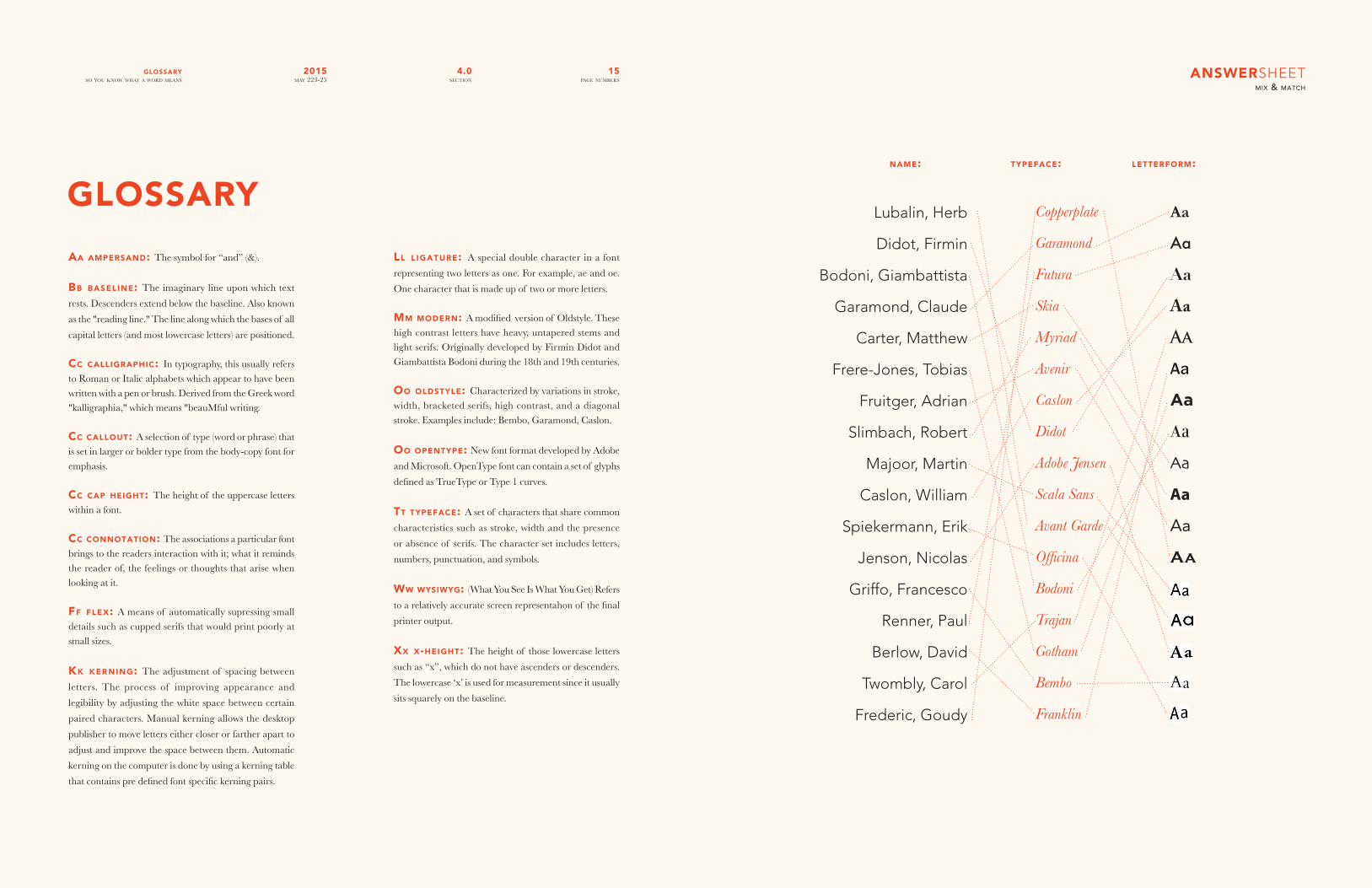
how to play the game:1 match the name with the typeface
2 match the typeface with the letterform
MIX & MATCH
gametimemix & match
Lubalin, Herb
Didot, Firmin
Bodoni, Giambattista
Garamond, Claude
Carter, Matthew
Frere-Jones, Tobias
Fruitger, Adrian
Slimbach, Robert
Majoor, Martin
Caslon, William
Spiekermann, Erik
Jenson, Nicolas
Griffo, Francesco
Renner, Paul
Berlow, David
Twombly, Carol
Frederic, Goudy
Copperplate
Garamond
Futura
Skia
Myriad
Avenir
Caslon
Didot
Adobe Jensen
Scala Sans
Avant Garde
Officina
Bodoni
Trajan
Gotham
Bembo
Franklin
Aa
Aa
Aa
Aa
Aa
Aa
Aa
Aa
Aa
Aa
Aa
Aa
name: typeface: letterform:
answers on page 16
giambattistabodoni
type designer
“The father of Modern type.”
as a young boy he took after his dad and grandfather who
owned a printing establishment. He went from engraving wood
there to working in Rome for the press of the Propoganda. His
superiors were pleased with his eagerness and zeal to learn not
only his language but ancient languages and types as well.
bodoni was forced to take a break when he contracted malaria. Once back in commission, Duke Ferdinand hired
Bodoni to organize a printing house in Parma that was to be
one of the great houses of Italy. This is where Bodoni worked
the rest of his days manage several houses including one that
was named after himself. It is in these houses that he created
specimens, specimen books, fine editions and much more in-
cluding pseudoclassical faces and more specifically Bodoni;
both known for their stylized characteristics to be admired and
for layout. The technical refinement Bodoni was able to achieve
allowed him to faithfully reproduce letterforms with extreme
thins in contrast to extreme thicks on the main stems and over-
all geometric shape.
bodoni died november 29, 1813 in padua, italy at the age
of 63 due to unknown causes. In total Bodoni designed and
personally engraved 298 typefaces and 1,200 fine editions with
work including 272 characters, 34 Greek characters and 48
Oriental or exotic ones.
claudegaramond
type designer
“Claude Garamond’s contribution to typography was vast, a true renaissance man.”
claude garamond was a type designer in 16th century
Paris. Garamond was born in 1480. By 1510 he apprenticed
as a punch cutter. In 1520 Garamond worked as an assistant to
Geoffrey Tory, who was interested in humanist typefaces and
Greek capitals. Both had an impact on Garamond’s later work.
In 1541 he gained prominence when royally commissioned to
design a Greek typeface for a series of books. The resulting
books have been described as being “among the most finished
specimens of typography that exist.” From this period on, he
began creating the Roman type for which he is best remem-
bered. His influence spread and by the end of his life, Gara-
mond was well known throughout Europe. Despite his popular-
ity, at the time of his death in 1561 he was destitute, and His
widow was forced to sell all of his punches. The typefaces that
Claude Garamond produced are considered to be the typo-
graphic highlight of the 16th century, and have been a source
of inspiration for modern type designers.
undoubtedly, claude garamond was one of the most influ-ential type designers of all time. However, the true magnitude
mainspeakersof his influence in contemporary design is often questioned. In
1621 Jean Jannon, created typefaces that were similar to Gara-
mond’s designs. These were forgotten for centuries until redis-
covered in 1825 and erroneously attributed to Claude Gara-
mond. This rediscovery sparked a revival of “Garamond” faces.
matthewcarter
type designer
“Watching me work is like watching a refrigerator make ice.”
matthew carter was born in london in 1937 and is a de-signer whose work is used throughout the world everyday. He
devoted the first half of his career to designing typefaces for use
in print such as Bell Centennial and Miller, and then pioneered
the use for fonts on screen, primarily Verdana for Microsoft. He
was introduced to type through the works of his father who was
also a typographer, book designer and type historian.
carter learned how to make metal type by hand at the Enschedé type foundry in the Netherlands. He is one of the last
people to have learned the art of making metal type by hand
and therefore understands the form and the counterform of the
letters. Carter compares his design process to knitting, by begin-
ning with the letters “h” and “o”, which give the height of the
ascenders and curves, he is then able to design the rest of the
alphabet off of these “control” characters. His decision to stay
at the type foundry was a priceless decision and earned him
training and knowledge that would prove to be highly valuable.
after working for lynotype, carter founded two type
foundries, Bitstream in 1981 and Carter and Cone Type in
1991. He is a recipient of the Chrysler Award for Innovation in
Design, the Type Directors Club Medal and the AIGA Medal.
tobiasfrere-jones
type designer“Shapes of our letters are just as important as the shapes of our buildings, or the accent in our voices ... (they’re) just as important, in terms of recognizing the city.”
mustard pots & marmalade jars with labels done in gill Sans; that’s how it all began. Tobias Frere-Jones, even as a child
had a fascination with type. Born on August 28, 1970 in New
York City, Tobias was instilled with a great love for the city. He
has given himself, “the task of visiting every block in Manhat-
tan and recording every piece of surviving lettering still there.”
Some of the seemingly strongest influences on Frere-Jones’
work as a typographer are road signs & old signage (neon, steel,
bronze) & lettering from old New York. BFA graduate of the
Rhode Island School of Design in 1992, Frere-Jones has gone
on to create over 500 typefaces for various clients including
GQ, Nike, Martha Stewart Living, & The Wall Street Journal.
He is most known for his typeface, Interstate, introduce in 1994
from the Font Burearu Inc.
in 1999, upon leaving the font bureau inc, frere-jones began partnership with Jonathan Hoefler creating Hoefler &
Frere-Jones. The two continue to create a wealth of beautiful
typography, sharing it will the world. In 2006 Frere-Jones was
awarded the Gerrit Noordzij Prize from the Royal Academy
of The Hague & was the first American to receive the award.
adrianfrutiger
type designer
“Helvetica is the jeans, and Univers the dinner jacket. Helvetica is here to stay.”
known for his many influential typeface designs in the 20th Century, (Avenir, Frutiger, Univers, etc.) Adrian Frutiger
was born May 24, 1928 in Unterseen, Switzerland as the son
of an artisan weaver.
one of frutiger’s major contributions to the world of typography is his development of a numerical classification
system for organizing his font family Univers (released in 1957
while he was a student in Zurich), which later became an ap-
proach for many other type designers and their typefaces in-
cluding Helvetica Neue. His fortunate timing in designing
within a period of technological reformation, together with his
experience from young age in printmaking, enabled him to de-
velop creative new fonts from hot metal, phototypesetting, and
eventually digital typesetting.
absorbed in his efforts for legibility, frutiger was asked to design a typeface for the Charles De Gaulle Airport in Paris
that could be read from different angles. This typeface was a
combination of his extremely rational typeface Univers and a
borrowed anatomy from the humanist qualities of Gill Sans by
Eric Gill. It originally was designed in one weight, meant to be
Eric Gill. It originally was designed in one weight, meant to be
more legible in white on a darker background, and he gave it
the name Roissy but soon it came to be known as Frutiger.
robertslimbach
type designer“We here all know Robert Slimbach is ‘the man’ at Adobe.”
robert slimbach was born in evanston, illinois, december 15th, 1956.. He attended UCLA and received an athletic schol-
arship (Carter). After college, he produced silkscreen posters
and prints, which he incorporated hand-lettering into. In 1983,
Slimbach decided to join Autologic and began to study typefac-
es and the designs of Hermann Zapf and Georg Trump.Later
in 1985, he decided to move to Ventura, California and did
freelance design. He designed two typefaces for ITC- a squarish
roman and italic called Slimbach (1987) and Giovanni (1988), a
cleaned-up old face. in 1992, robert slimbach and carol twom-
bly, worked onthe sans-serif typeface, Myriad. Poetica, a chan-
cery italic typeface, appeared to him.
slimbach later became interested in scripts and designed one called Sanvito, latest of Catfish Script (1993) based on Max
Catflisch’s handwriting. In 1995, Slimbach created Adobe Jen-
son, which was a less-mannered and decorative than Centaur.
Currently, he is working for Adobe in San Jose, California. He
remains devoted to old-style typefaces, many of which are lo-
cated and available to users on the Adobe programs of today.
martinmajoor
type designer
“I have to make another five type families before I turn 70.”
born in 1960 in the netherlands, martin majoor attended art school in Arnhem between 1980 and 1985. In 1985, Majoor
started his career as a type designer, resulting in the four font
families: FF Scala, Telefont, FF Seria and FF Nexus, an average
of one font per 6 years. First of all Majoor's fonts are fairly large
families, combining serif, sans and sometimes slab serif into
one connected super family. Secondly, Majoor did a few other
things in the last 25 years: book design, book collecting, smaller
type design projects, teaching, raising two children, travelling
between Holland and Poland, giving lectures and interviews,
writing articles for magazines and for books.
williamcaslon
type designer“When in doubt, use Caslon”
william caslon, also known as william caslon i, was an English gunsmith and designer of typefaces. By the age of 13,
he was taken in as an apprentice engraver of gunlocks and bar-
rels and as a bookbinder's tool cutter in gunlocks and barrels
and as a bookbinder's tool cutter in London. In 1720, Caslon
began his career in type design by accepting a commission to
create a typeface for the New Testament in Arabic. Also in
1720, he founded the Caslon Foundry, which would become the
leading English type foundry of the 18th and 19th centuries.
the distinction and legibility of his type secured him the patronage of the leading printers of the day in England and Eu-
rope. His typefaces were inspired by the Dutch Baroque types,
the most commonly used types in England before Caslon's faces.
His work influenced John Baskerville and are thus the progeni-
tors of the typeface classifications Transitional and Modern.
caslon typefaces were immediately popular and used for many important printed works, including the first printed
version of the United States Declaration of Independence.
Caslon's types became so popular that the expression about
typeface choice, “when in doubt, use Caslon,” came about. The
Caslon types fell out of favor in the century after his death, but
were revived in the 1840s. Several revivals of the Caslon types
are widely used today and it remains one of the most popular

typefaces of all time. William Caslon died on the 23rd of janu-
ary 1766. His grave is preserved in the churchyard of St Luke
Old Street, London.
erikspiekermann
type designer
“You are what you are seen to be.”
after earning a degree of art history in college, erik did freelance graphic design work in London from 1972-1979. He
then returned to Berlin and founded MetaDesign. In 1989 he
and his wife (Joan) started FontShop, the first mail-order dis-
tributor of digital fonts.
in 2001, spiekerman left metadesign and started udn (United Designers Networks). In 2007, he renamed UDN to
Spiekermann Partners and renamed it yet again in 2009 to
Edenspiekermann.
spiekermann has won many awards recently. in 2003, he was awarded the Gerrit Noordzij Prize. In 2006, he was given
an Honorary Doctorship for his contribution to design by The
Art Center College of Design and received a Gold Medal by
the German Federal Design Prize. In 2007, he was put into the
European Designers Hall of Fame (communication design) and
was Honorary Royal Designer for Industry. In 2009, he was
Ambassador for European Year of Creativity and Innovation
by the European Union.
spiekermann’s most prolific and known typefaces are itc Officina, FF Meta and FF Unit. He finds ITC Officina as his
classic and favorite typeface that he has designed. He is also
known for his feelings of the typeface Helvetica. He has known
to say that it is, “boring, bland, and that it has no rhythm or
contrast.” Spiekermann believes that future trends show that
there will be even more open type features available and that
fonts will be more like spontaneous handwriting.
nicolasjenson
punch cutter“The characters are so intelligently and carefully elaborated that the letters are neither smaller, larger nor thicker than reason or pleasure demand.”
nicolas jenson was born in france in 1420, and began working as an engraver when he was 38. In 1458 he was sent to
Mainz by the king of France, Charles VII to study Guttenberg’s
work with moveable-type printing. When Archbishop Adolf II
invaded the city in 1462, Jenson fled to Venice where he opened
the city’s second printer. Here, he designed his Venetian type-
face which was based on manuscript handwriting from local
Bibles and documents. He wanted the typeface to be more fo-
cused on typographic principles. Jenson used this typeface in
fused on typographic principles. Jenson used this typeface in the
first book he set De Praeparatione Evangelica by Eusebius. This
typeface became one of the first roman typefaces. The creation
of this typeface was also part of the historical shift away from
gothic typefaces to humanistic and roman typefaces. Jenson did
not focus on the perfection of the letters but rather the space
around the letters formed by the letter shapes.
jenson is credited with the creation of venetian typefaces, also known as Antiqua or Old Style typefaces. Jenson continued
to live in Venice until his death in 1480 and eventually pro-
duced about 150 books in his printing shop. He created two
more typefaces in his life; one typeface was Greek style which
he used primarily for quotations, and then a blackletter type-
face for books on medicine and history. After Jenson’s death, his
typefaces were adopted by a fellow printing company, Aldine
Press, and became the inspiration for multiple typefaces includ-
ing Centaur, Cloister Old Style, and Adobe Jenson.
francescogriffo
punch cutter
“Griffo has never received adequate recognition for his contribution to type design.”
francesco de griffo was born 1450 in bologna, italy. He started off as a goldsmith and as a Ventian punchcutter.
He worked under Aldus Manutius, an Italian humanist who
founded the Aldine Press in Venice. Under Manutius, they both
worked on the greek types, in order to improve on the early
roman type of Nicolas Jenson. Griffo was skilled and created
innovative with type. His romans were calligraphic, but they
are styled much different than Jenson’s. Griffo’s capitals were
shorter than the ascending letters of the lower-case letters. It
was innovative in the fact that it made the color of the text stand
out more, making the overall text more legible. An example of
this innovation is found in the typeface, Bembo, which he and
Manutius created. Later on he started working on more cal-
ligraphic typefaces that resembled handwriting.
as the first modern typographer, he was revolutionary in the world of type. Instead of creating typefaces for the written
manuscript, he created face for the mechanical style of printing.
The work of Griffo, especially his cursive, or italic type, was
giving Manutius quite a bit of fame. Soon the Aldine Press had
a monopoly over Venetian printing. Sadly, during the boom of
business, Griffo felt that he was not being given enough credit
for his works. In the end, the two separated ways and that was
the end of their friendship. Griffo’s life ended tragically. He got
into an argument or fight with his son-in-law where, in his an-
ger, beat him to death with an iron bar.
paulrenner
type designer“The goal of every attempt to give shape is to make out of different things a whole, out of diversity a unity, and not to reduce a whole to disconnected parts.”
paul renner was born august 8, 1878 in wernigerode, ger
many. He worked for Münich publishing trade from 1908 to
1917 in book design. He was inspired by the idea of “New Ty-
pography” and he started his work on the typeface now known
as Futura, in the summer of 1924. Futura was released in 1928,
and became the cornerstone of Geometrical Modernism.
in 1926, renner became the principle of the printing trade School in Münich. In 1932 Renner criticized the Nazi party
and their strict policies in a booklet titled “Kulturbolschewis-
mus?”. In 1933, Renner was arrested and imprisoned by the
Nazis. Shortly after he was removed from his position of direc-
tor at the school. Before his removal he arranged for his friend
and coworker Georg Trump to take over as director, to avoid
an outside appointment by the Nazis. In the years following
World War II, Renner lived in retirement, continuing to write
and design. He also became involved in discussions on the de-
sign problems facing the industry at the time. Paul Renner has
and will continue to offer a voice of experience to the graphic
design industry.
davidberlow
type designer
“It’s not over ‘til it’s over.”
born in 1954 in boston, he is considered one of the most
influential typography figures of today. He studied fine art at
the University of Wisconsin. In 1978, Berlow worked as a let-
ter designer in New York City for the Mergenthaler Linotype
where he fell in love with drawing the alphabet. In 1982, he be-
gan working for Bitstream Inc, a digital type supplier, where he
developed fonts, font tools, and marketing strategies. With time,
Berlow could see that Bitstream was reaching its limits in design
as it refused to pursue PostScript, so he left Bitstream Inc. in
1989 and founded with Roger Black The Font Bureau, Inc., an
innovative company that created custom type for clients like:
The Chicago Tribune, The Wall Street Journal, Rolling Stone,
Apple Computer, and many others. The Font Bureau currently
has more than 500 original typefaces. Through his work experi-
ence, he was able to witness and influence the development of
type into the digital age.
berlow feels that his main tool for designing type is the rest of the world, where there is a steady stream of typographic
stimulation. Some of the greatest influences and inspirations
for David were the people he graduated with like: Mike Parker,
Cherie Cone, Larry Oppenberg, and Alex Kaczun.
caroltwombly
type designer“The challenge of communicating an idea or feeling within the further confines of the Latin alphabet led me from graphic design into type design.”
while most of the notable typeface designers have histori-
cally been men, Carol Twombly has been one of the most influ-
ential type designers of this century. She began her art educa-
tion pursuing sculpture. The factor that brought her from
sculpture, to graphic design, and finally to type design can be
summed up in two lines.
a significant influence in twombly‘s career path was her professor Charles Bigelow. She studied under Bigelow at Rhode
Island School of Design and again at Stanford. At Stanford she
received an M.S. in the newly developed digital typography
program. She later worked with Adobe for over 10 years. Much
of Carol's work is centered around historical letterforms and
bringing them to the digital age. Lithos, Charlemagne, and Tra-
jan were inspired by Roman and Greek letterforms. Following
those, she created Adobe Caslon and Myriad. Myriad was co-
created with designer Robert Slimbach and is the chosen type-
face of huge companies such as Wal-Mart and Apple. Following
this she created decorative fonts such as Viva and Nueva. The
last typeface she created was Chaparral in 1997.
after an amaZingly fruitful decade of working at adobe, Carol Twombly ended her career as a type designer in1999.
She left to pursue artistic endeavors aside from type design such
as textile and jewelry design.
fredericgoudy
type designer
“Any man who would letterspace blackletter would shag sheep.”
at the age of 40, frederic w. goudy decided that he would leave his job as a book keeper for a mortgage and credit firm
in order to pursue a career as a typographer. Believing that the
typography in the books he kept could be more legible he began
gathering books and attending conferences about typography
and the creation of type. Goudy became the 3rd most prolific
typographer in America creating over 113 typefaces. He soon
built and started his own workshop and foundry believing that
he could create more creative and beautiful typefaces without
being bound by the limitations of the ideals of others.
goudy believed in the creation of type by hand and drew all of his faces. Later in his life he devoted his typographic skills
towards creating the perfect roman typeface. A goal he sought
after while working as the art director for the Linotype type
foundry. Goudy was even revered by the Library of Congress
for his work in the field of typography during his lifetime. Some
of Goudy’s popular typefaces include: Camelot, Village, Cop-
perplate Gothic, Kennerly, Goudy Old Style, Forum Title, and
Garamont. After the fire Goudy spent most of his time teaching
and speaking about typography and its art.
GLOSSARY
15page numbers
2015 may 223-25
4.0section
glossaryso you know what a word means
aa ampersand: The symbol for “and” (&).
bb basel ine: The imaginary line upon which text
rests. Descenders extend below the baseline. Also known
as the "reading line." The line along which the bases of all
capital letters (and most lowercase letters) are positioned.
cc calligraphic: In typography, this usually refers to Roman or Italic alphabets which appear to have been written with a pen or brush. Derived from the Greek word "kalligraphia," which means "beauMful writing.
cc callout: A selection of type (word or phrase) that is set in larger or bolder type from the body-copy font for emphasis.
cc cap height: The height of the uppercase letters within a font.
cc connotation: The associations a particular font brings to the readers interaction with it; what it reminds the reader of, the feelings or thoughts that arise when looking at it.
ff flex: A means of automatically supressing small details such as cupped serifs that would print poorly at small sizes.
kk ker ning: The adjustment of spacing between
letters. The process of improving appearance and
legibility by adjusting the white space between certain
paired characters. Manual kerning allows the desktop
publisher to move letters either closer or farther apart to
adjust and improve the space between them. Automatic
kerning on the computer is done by using a kerning table
that contains pre defined font specific kerning pairs.
ll l igature: A special double character in a font
representing two letters as one. For example, ae and oe.
One character that is made up of two or more letters.
mm modern: A modified version of Oldstyle. These high contrast letters have heavy, untapered stems and light serifs. Originally developed by Firmin Didot and Giambattista Bodoni during the 18th and 19th centuries.
oo oldstyle: Characterized by variations in stroke, width, bracketed serifs, high contrast, and a diagonal stroke. Examples include: Bembo, Garamond, Caslon.
oo opentype: New font format developed by Adobe
and Microsoft. OpenType font can contain a set of glyphs
defined as TrueType or Type 1 curves.
tt typeface: A set of characters that share common
characteristics such as stroke, width and the presence
or absence of serifs. The character set includes letters,
numbers, punctuation, and symbols.
ww wysiwyg: (What You See Is What You Get) Refers
to a relatively accurate screen representahon of the final
printer output.
xx x-height: The height of those lowercase letters
such as “x”, which do not have ascenders or descenders.
The lowercase ‘x’ is used for measurement since it usually
sits squarely on the baseline.
answersheetmix & match
Lubalin, Herb
Didot, Firmin
Bodoni, Giambattista
Garamond, Claude
Carter, Matthew
Frere-Jones, Tobias
Fruitger, Adrian
Slimbach, Robert
Majoor, Martin
Caslon, William
Spiekermann, Erik
Jenson, Nicolas
Griffo, Francesco
Renner, Paul
Berlow, David
Twombly, Carol
Frederic, Goudy
Copperplate
Garamond
Futura
Skia
Myriad
Avenir
Caslon
Didot
Adobe Jensen
Scala Sans
Avant Garde
Officina
Bodoni
Trajan
Gotham
Bembo
Franklin
Aa
Aa
Aa
Aa
Aa
Aa
Aa
Aa
Aa
Aa
Aa
Aa
name: typeface: letterform:

INTERLAKEN AIRPORTFLUGHAFEN BERN-BELP, ZELGLUSTRASSE 934
INTERLAKEN 5600
SWITZERLAND
swiss legacy STUDIOAARAVERSTRASSSE 2, LENZBURG
INTERLAKEN 5600
SWITZERLAND
MAP & LOCATION
walkeweg.....
aarauerstrasse ...............................................
ha
llw
ilst
ra
sse
parkweg.............
neumattstrasse..................
swiss legacy STUDIOaaraverstrassse 2, lenZburg
interlaken 5600
Zelg
list
ra
sse...
......
......
......
.....
INTERLAKEN AIRPORTFLUGHAFEN BERN-BELP, ZELGLISTRASSE 934
INTERLAKEN 5600
/ / / / / / / / / / / / /
<<
<<
<<
<>
>>
>>
>>
For an easier way, plug in addresses into your GPS. Thank goodness for technology!
17/18page numbers
2015 may 223-25
5.0section
map & locationa way to get from here to there

www.wysiwyg.com
mr. shawn randall
Brigham Young University–Idaho
Spori Building No. 214
525 South Center Street
Rexburg, Idaho 83460
bridgette hall
368 West 4th South
Rexburg, ID 83440
first class
us postage paid
rexburg, id
permit no. 3381
| | | | | | | | | | | | | | | | | | | | | | | | | | | | | | | | | | | | | | | | | |