Don’t Judge A Book By Its Cover. OR Choosing A “Just Right” Book.
Upload
nguyenkietCategory
view
216download
3
WOULD YOU JUDGE A BOOK BY ITS COVER?BOOK COVER DESIGNS ON PULSES AND LEGUMES FROM THE FAO LIBRARY COLLECTIONS

WOULD YOU JUDGE A BOOK BY ITS COVER?
BOOK COVER DESIGNS ON PULSES AND LEGUMES FROM THE
FAO LIBRARY COLLECTIONS
FOOD AND AGRICULTURE ORGANIZATION OF THE UNITED NATIONS - Rome, 2017

The designations employed and the presentation of material in this information product do not imply the expression of any opinion whatsoever on the part of the Food and Agriculture Organization of the United Nations (FAO) concerning the legal or development status of any country, territory, city or area or of its authorities, or concerning the delimitation of its frontiers or boundaries. The mention of specific companies or products of manufacturers, whether or not these have been patented, does not imply that these have been endorsed or recommended by FAO in preference to others of a similar nature that are not mentioned.
The views expressed in this information product are those of the author(s) and do not necessarily reflect the views or policies of FAO.
ISBN 978-92-5-109825-7
© FAO, 2017
FAO encourages the use, reproduction and dissemination of material in this information product. Except where otherwise indicated, material may be copied, downloaded and printed for private study, research and teaching purposes, or for use in non-commercial products or services, provided that appropriate acknowledgement of FAO as the source and copyright holder is given and that FAO’s endorsement of users’ views, products or services is not implied in any way.
All requests for translation and adaptation rights, and for resale and other commercial use rights should be made via www.fao.org/contact-us/licence-request or addressed to [email protected].
FAO information products are available on the FAO website (www.fao.org/publications) and can be purchased through [email protected].
This publication has been printed using selected products and processes so as to ensure minimal environmental impact and to promote sustainable forest management.
Texts: Sarah Dister and Véronique Montes Baffier
FAO. 2017. Would you judge a book by its cover? Book cover designs on pulses and legumes from the FAO Library collections. Rome.

3
4 Acknowledgements
5 Introduction
6 1910s / Art Nouveau
12 1920s-1930s / Art Deco
18 1940s-1950s / International typographic style
24 1960s / Time of contrasts
28 FAO Logo history
30 1970s / ‘Less is more’
36 1980s / ‘80s Deco
42 1990s / The picture
48 2000s / To the point
52 2010 to the present / Towards the future
56 From 1914 to 2016 / Transforming old into new to reflect the present
58 Inauguration of the Exhibition November 22nd 2016
60 Visit of the President of Fiji with the Director-General
Contents

4
AcknowledgementsThis book collects all the texts from the library exhibition Would you judge a book by its cover? which took place during 2016 in Rome at the FAO David Lubin Memorial Library.
The preparation of the book as well as the exhibition was possible with the support and input of many individuals from the library, archives and publication teams. Special thanks to: Michelle Bergerre and Sara Carnevale who found the beautiful covers in the library collections and helped us throughout the process; Milena Cazzato for her valuable insight on bibliographic citation; Fabio Ciccarello
who assisted us with the FAO logo research; Alison Small and Julian Plummer
for editing our texts; Monica Umena who was able to translate our ideas and texts into a wonderful design for both the exhibition and the book; and Pedro Javaloyes
for providing the guidance that helped us to achieve both goals.

5
IntroductionThe 68th UN General Assembly declared 2016 the International Year of Pulses
(IYP). The Food and Agriculture Organization of the United Nations (FAO) was nominated to facilitate its implementation by hosting various events throughout the year, highlighting the nutritional value and health benefits of pulses, their contribution to food security, biodiversity and climate change mitigation.
“These super foods have been nourishing people since historical records began and a long time before” declared the Director-General Jose Graziano da Silva.1
Within this context, the FAO library has contributed to the IYP with an exhibition and a book showing an historical perspective with publications on pulses and legumes from the International Institute of Agriculture’s collection, FAO first editions and its current and worldwide monographic collections.
The aim of raising awareness on pulses through an artistic perspective was the key element behind the library’s exhibition held in Rome in the fall of 2016. This book compiles all the texts and illustrations exhibited, showing some of the most beautiful book covers on these leguminous crops from the 1910s to the present day, illustrating how design has changed over the decades to reflect the content, attract audiences and celebrate art.
We are all familiar with the saying: “Don’t judge a book by its cover” but can we in fact do so? We invite you to explore this selection of books on pulses and legumes from the FAO Library collections and consider enjoying them for their covers!
1 FAO. 2016. Pulses: nutritious seeds for a sustainable future. Rome, FAO.
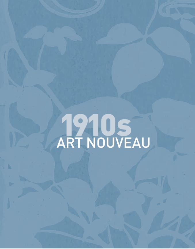
1910sART NOUVEAU

The beginning of the twentieth century is characterized by a new art style suitably called
Art Nouveau. A highly decorative style using curvilinear patterns often based on plant and floral motifs and stylized female silhouettes.
The movement comes to an end with the First World War and the Russian Revolution, historical
moments that call for a more sober style.

FAO INTERNATIONAL YEAR OF PULSES
8
Acquired in 1914, and republished by
German Kali Works, this booklet forms one
of a series of charming pamphlets about
pulses and other produce.
An early user’s manual, this volume is
illustrated in the Art Nouveau style of the
period (mid-1890s to the First World War),
focused on elevating to a high level the
decorative arts in a sophisticated manner.
Its influence within book cover design
is complex, ranging from geometrical
patterns to floral motifs with curves rooted
in British and Japanese art, as we can
appreciate in this delicately designed cover.
1914The cow peaAuthor: Supervising Committee of the Experimental Farms of the North Carolina State Horticultural Society Publisher: New York (USA), German Kali Works

9
WOULD YOU JUDGE A BOOK BY ITS COVER?
1910s ART NOUVEAU
Part of the German Kali Works’ reprinted
series of 18 volumes from the North
Carolina State Horticultural Society
(the United States of America), Plant
Food, which was “prepared to aid
practical farmers”, refers to the “nature,
composition and most profitable use of
fertilizers” that were originally provided
“upon request” to farmers.
Following the Art Nouveau movement of
decorative art characterized by floral and
curvilinear geometrical patterns – see
roots – the beautiful cover depicts Ceres,
the Roman goddess of agriculture, crops,
fertile land and grain, fertilizing the land
with potassium, phosphoros and nitrogen.
1914Plant food: its nature, composition and most profitable useAuthor: Supervising Committee of the Experimental Farms of the North Carolina State Horticultural Society Publisher: New York (USA), German Kali Works

FAO INTERNATIONAL YEAR OF PULSES
10
This booklet, part of a series of similar
pamphlets published in 1911, formed part
of a distinguished historical collection
of the Ottavi family in Italy (passionate
promotors of innovative agronomic
knowledge for public use) of works on
agriculture dating back to 1850.
Le Fave explains every aspect of beans
and their cultivation, describing the
different kinds, their cultivation, including
how the land should be farmed, the use
of fertilizer, the seeds and their harvesting
and how to guard against pest infection.
The elegant illustration in gold and sepia
by Arturo Stagliano is typical of the series
of books that form part of “I libri del
campagnolo” (books for rural producers).
It depicts the heroism of the working class
using the social realism style. Stagliano,
an Italian artist (1870-1936), was initially
influenced by Leonardo Bistolfi, an
important exponent of Italian symbolism,
but moved to a more classical style in the
second part of his artistic activity in line
with the social movements of the decade.
Some decorative art nouveau details can
be found within the text.
1911Le faveAuthor: Gorni, O.Publisher: Casale Monferreto (Italy), F.lli Ottavi

11
WOULD YOU JUDGE A BOOK BY ITS COVER?
1910s ART NOUVEAU
Charming in its simplicity, this 1911
extract from the periodical La Rivista
Agraria, describes bean production in the
Naples region of Italy.
The author tells us that the string bean
(Phaesolus vulgaris L.) is a direct
descendent of its Indian counterpart
and that Pomponius believed that the
string bean was introduced to Rome from
Phaseli, a maritime city on the island of
Egeus and from which the Italian and
Latin retain its original name.
After 1900, the cover designs of
periodicals gradually became simpler.
This unillustrated cover reflects the
simplicity as well as the format of the
journals of the period. Nerveless, we
can find some art nouveau motives
within the text.
1911Il fagiolinoAuthor: Cozzolino, M.Publisher: Naples (Italy), G. M. Priore

1920s-30s ART DECO
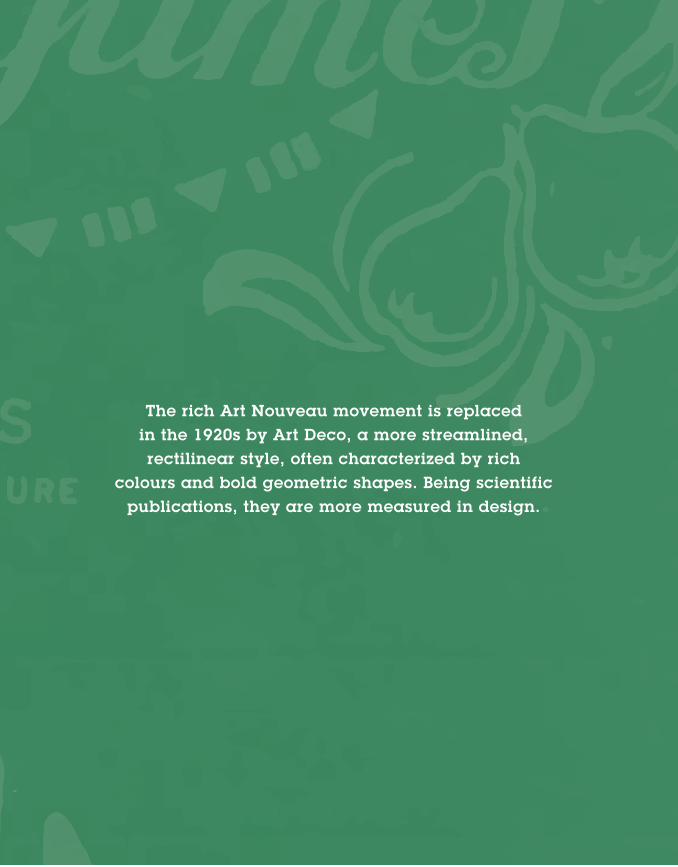
1920s-30s The rich Art Nouveau movement is replaced in the 1920s by Art Deco, a more streamlined, rectilinear style, often characterized by rich
colours and bold geometric shapes. Being scientific publications, they are more measured in design.

14
FAO INTERNATIONAL YEAR OF PULSES
Fleurs, fruits, légumes
This detailed publication is one of a
number of agricultural publications
from Belgium of the period. It refers in
particular to the virtues of city-gardens
and urban gardening, not least for their
health benefits, encouraging people to get
more fresh air.
The cover illustrates a perfect example
of the Art Deco style of the 1920s, using
the beautiful logo of Louis van Houtte, a
Belgian horticulturist and founder of the
Belgian Royal Horticultural Society, by
which this book was published.
Year: [s.d.]Author: Wuyts, O. F.Publishers: Ghent (Belgium), Société Anonyme Horticole. Louis van Houtte père
1920s-30sART DECO
WOULD YOU JUDGE A BOOK BY ITS COVER?
15
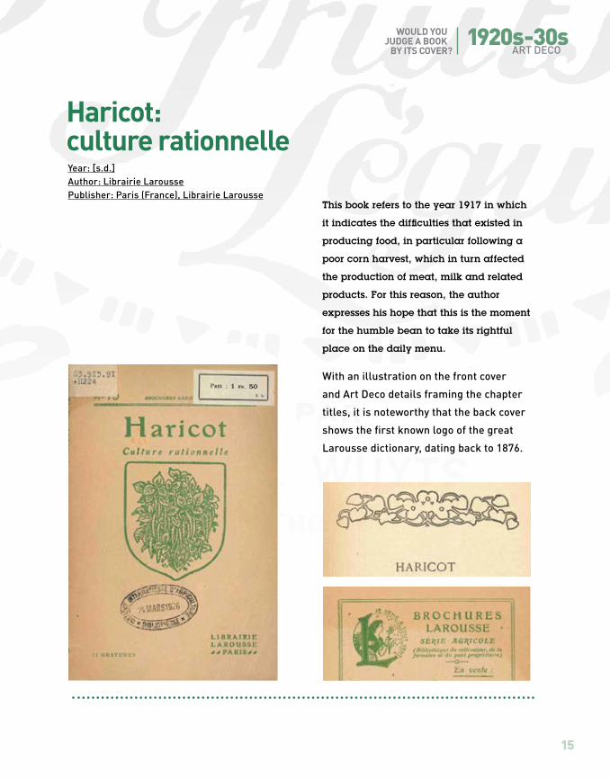
This book refers to the year 1917 in which
it indicates the difficulties that existed in
producing food, in particular following a
poor corn harvest, which in turn affected
the production of meat, milk and related
products. For this reason, the author
expresses his hope that this is the moment
for the humble bean to take its rightful
place on the daily menu.
With an illustration on the front cover
and Art Deco details framing the chapter
titles, it is noteworthy that the back cover
shows the first known logo of the great
Larousse dictionary, dating back to 1876.
Year: [s.d.]Author: Librairie LaroussePublisher: Paris (France), Librairie Larousse
Haricot: culture rationnelle

16
FAO INTERNATIONAL YEAR OF PULSES
This technical manual provides an
exhaustive description, not only of the
origins of peas but also where and how to
cultivate them depending on the zone and
type. The publishing house, Francesco
Battiato, specialized in publications about
farming and rural industries in the period
from 1900 to 1930.
The fine cover illustration stands out
for its beauty and craftsmanship. The
realistic botanical drawing reflects the
scientifically technical approach taken by
this publication.
1921Author: Viani, P.Publisher: Catania (Italy), F. Battiato
Il pisello

1920s-30sART DECO
WOULD YOU JUDGE A BOOK BY ITS COVER?
17
1931
Author: Dricot, J.Publisher: Gembloux (Belgium), J. Duculot
Published in 1931, this highly practical
manual was already in its eighth edition
when included in the International
Institute of Agriculture (IIA) collection.
As can be seen from the title, it covers
a broad spectrum of plant and small-
stock production with an emphasis
on growing legumes. The publisher
was a master printer who moved to
Gembloux, Belgium, which afforded him
the opportunity provided by being near
local agronomy universities to publish
specialized monographs.
The cover is a typical representation
of academic design of scientific books
of the period, with an emphasis on the
documented curriculum of the author.
Note the illustrations of cropping patterns
using geometric ornamentation.
Guide pratique de la culture des légumes des arbres fruitiers et des fleurs

1940s-50s INTERNATIONAL
TYPOGRAPHIC STYLE

In the 1950s, we see functional cover designs that are entirely centred on the bibliographic
information. Titles, authors and publishers are displayed with bold fonts and framed
by monochromatic design and square lines. It is a neutral approach that emphasizes
rational planning. The Scandinavian colour scheme, which is heavily influenced by
nature and includes shades of brown, cream, grey and green, becomes one of the major
colour trends of the period.

20
FAO INTERNATIONAL YEAR OF PULSES
1947Root crops and legumes in the CaribbeanAuthor: Caribbean CommissionPublisher: Washington, DC (USA), Caribbean Commission
Published in 1947 by the Committee
on Agriculture, Nutrition, Fisheries and
Forestry of the Caribbean Research
Council, the book serves to highlight the
particular position of Caribbean islands
and their tendency at the time to rely on
export crops rather than food crops. The
book is fascinating both for its political
insights as well as the presentation of
practical information on root crops and
legumes in the different island States of
the Caribbean.
The cover highlights, with bold fonts,
monochromatic design and structured
square spaces, the technical aspect of
this Crop Inquiry Series publication.
This classical layout with an overall
sense of controlled space underlines the
functionality of a design that reflects the
practicality of the content.

1940s-50s INTERNATIONAL TYPOGRAPHIC STYLE
21
WOULD YOU JUDGE A BOOK BY ITS COVER?
1957A monographic study of bean diseases and methods for their controlAuthors: Zaumeyer, W.J., Thomas, H.R.Publisher: Washington, DC (USA), United States Department of Agriculture
This technical bulletin of the US
Department of Agriculture assembles
as much of the pertinent information as
possible on bean diseases that was not
generally well known or had appeared
only in obscure journals and in languages
other than English.
Although a technical publication, the
cover has a soft drawing design of a
bean with the leaf embracing the title.
The subtle elegance of the drawing
grid and functional restraint allows
the picture to have a dominant space
without unbalancing the page. It is a clear
example of 1950s functional design in
book covers.

22
FAO INTERNATIONAL YEAR OF PULSES
1953Legumes in agricultureAuthors: Whyte, R.O., Nilsson-Leissner, G. & Trumble, H.C.Publisher: Rome (Italy), Food and Agriculture Organization of the United Nations
This FAO publication is one of the earliest
works on legumes published by the
Organization. It is a review of the state of
scientific and practical knowledge and
experience in producing legumes, and
provides an insight into the problems
that were engaging agronomists and
researchers worldwide during the 1950s.
The cover reflects the simplicity of the
first FAO designs with a monochrome-like
palette and bold titles, following the
1950s design style with relatively little
use of graphics with an emphasis on
functionality. On the cover, we find the first
official version of the FAO logo.

1940s-50s INTERNATIONAL TYPOGRAPHIC STYLE
23
WOULD YOU JUDGE A BOOK BY ITS COVER?
This first version of
the logo is based
on a design that
was created for the
second session of
the FAO Conference,
held in Copenhagen
(Denmark), 2–13
September 1946:
a small black and
silver button with the
FAO logo.
The logo of the
International Institute
of Agriculture (IIA)
is a symbol of three
stylized ears of wheat.
It appears throughout
the monographs and
reports published by
the IIA until it ceased
operations in 1945.

1960sTIME OF CONTRASTS
The influence of early 20th-century art movements like Suprematism and
Constructivism forged a new relationship between art, text, image and reader to channel
the power of modernity. This is also a time of change and contrasts with high-tech designs in contrast with the popular hippie culture.
Some designers use a colour scheme inspired by nature while others are influenced by the
contrasting colours of Art Nouveau.

26
FAO INTERNATIONAL YEAR OF PULSES
Author: Aykroyd, W.R., Doughty, J.Publisher: Rome (Italy), Food and Agriculture Organization of the United Nations
1964Les graines de légumineuses dans l’alimentation humaine
The FAO logo merits a mention in its own right. At the end of the 1950s,
some aspects of the first official version of the FAO
logo are changed: the square O in FAO becomes
round and the ear of wheat is redesigned.
The adapted logo is used for the first time in the
FAO logo developed for the Freedom-From-Hunger-
Campaign (launched in 1959). In this particular case the space outside the logo has also been
used to create a specific campaign-related logo.
This publication is the fourth report
on food that formed part of the FAO
Nutritional Series, which included rice,
maize and milk. The book summarizes
the knowledge at that time about the
production, consumption and nutritive
value of legumes and their contribution
to human diets.
The beautiful geometrical design of
this cover reminds us of the Russian
Suprematist style of Kazimir Malevich.

27
1960sTIME OF CONTRASTS
WOULD YOU JUDGE A BOOK BY ITS COVER?
1969Authors: Bocanegra, S., Echandi, E.Publisher: Lima (Peru), Ministerio de Agricultura, Misión Agrícola de la Universidad de Carolina del Norte
Cultivo de las menestras en el Perú
This book is written for local farmers and
agronomists, providing them with the
results of technical projects supervised
by Peru’s Agriculture Department and
aimed at speeding-up and strengthening
pulse production, given that pulses form
the core of the Peruvian diet.
This ethnic-look cover is typical
of the hippie period of the 1960s.
The hand-written typeface underscores
its social message and its availability at
a cost within reach of a modest budget.
The curvilinear drawing takes us back
to the Art Nouveau style.

28
FAO INTERNATIONAL YEAR OF PULSES
The Latin motto Ut educas panem de terra (“That he may bring forth food out of the earth” which refers to all the interests of FAO, from nutrition to agriculture to forestry to fisheries) was the favorite motto to accompany the logo, but it was rejected eventually, because it was too long.6
At that point Sir John Boyd Orr proposes the Latin motto Fiat panis, meaning “Let there be bread” or more freely translated “Let there be food” which becomes the official FAO motto still in use today. “The motto signifies the primary purpose of FAO that of raising the levels of food production and of nutrition the world over”7.
Mid-1947, a first official version of the FAO logo begins appearing in an irregular way on some FAO documents. It is the same logo we find on the cover of the FAO publication Legumes in Agriculture from 1953.
FAO’s first Director-General, Sir John Boyd Orr, addresses the need for “an official FAO seal, to use on documents, printed on FAO publications etc.”2 in 1946, one year after the foundation of the Organization. He suggests adopting the design created for the second session of the FAO Conference, held in Copenhagen (Denmark), 2-13 September 19463: a small black and silver button with an FAO logo4.
This button was designed by Harald Nielsen, a silversmith who worked for Georg Jensen Silversmiths in Denmark. Nielsen’s design was inspired by the Art Nouveau movement and characterized by strong clear lines. Central to the logo is an ear of wheat5: a continuation of the three ears of wheat that formed the logo of FAO’s predecessor, the International Institute of Agriculture.
FAO logo history
2 FAO Archives. RG8LEG - LE21/4. Vol. I: Adm seal 3.3A2. 3 FAO Archives. RG8LEG - LE21/4. Vol. I: 27 January 1960. 4 FAO Archives RG031.0 Series L4: Designs of the FAO Seal 0-109: This folder contains a copy of the Danish design, a note underneath says: “Orig button is 18 mm in diameter”. 5 “The world’s greatest bread grain”, from the brief statement prepared by the Information Service for Sir John Boyd Orr to inform the Execitive Committee on the FAO seal (FAO Archives. RG8LEG - LE21/4. Vol. I: Adm seal 3.1A5). 6 FAO Archives. RG031.0 Series L4: Designs of the FAO Seal 0-109; FAO Archives. RG8LEG - LE21/4. Vol. I: Adm seal 3.1A5. 7 FAO Archives. RG8LEG - LE21/4. Vol. I: Adm seal 3.3A2.

29
1960sTIME OF CONTRASTS
WOULD YOU JUDGE A BOOK BY ITS COVER?
Still in 1959, Mr. Engeler comes with another proposal which this time around is accepted: the tips and the stem of the wheat ear are extended to divide the circle of the logo in three (triangle?) sections10.
It is this FAO logo which is approved by Director-General B.R. Sen and is registered on 1 July 1964 with the United International Bureaux for the Protection of Intellectual Property, and it is this logo we still use today11.
At the end of the 1950s, a discussion takes place on changing some aspects of the logo. Mr. Engeler, chief Printing and Offset section, takes up the task of “reshaping the emblem to greater effect”. He describes his view on the purpose of a logo as follows:“An emblem has to announce an idea and epitomize a pledge. Symbolic representation is the most important means of concentrated expression. It must be a characteristic combination of the elements of the design in abstract from, and it must have an aesthetic as well as a graphic effect. The design must be a creation of our times capable of being understood in times to come.”
We do not have a drawing of Mr Engeler’s proposal, but according to his own words, he changed, among others, the circle into a triangle, since “this is an ancient symbol expressing organization”8. Engeler’s proposal is rejected, but the discussion continues. Among others, Mr. Cyprien, chief Visual Media, proposes to get rid of “the unattractive square O” and Mr. Cassola, chief Graphics, proposes to eliminate the peculiar “sawn-off” appearance of the base of the wheat ear”9. Both proposals are accepted and the changes are used for
8 FAO Archives. RG8LEG - LE21/4. Vol. I: Office memorandum, 26 June 1958, p. 2. 9 FAO Archives. RG8LEG - LE21/4. Vol. I: Office memorandum 1 December 1958. 10 The only archival prove we have of Mr. Engeler’s new proposal is a loose long card in the “Use of FAO emblem and flag (1946-1974)” archival folder containing the various proposals for the FAO logo between 1958 and 1959. The logo on this card which is assigned to Mr. Engeler is the one that is approved of by Director-General B.R. Sen. 11 Philips, R.W. 1981. FAO: Its origins, formation and evolution 1945-1981. Rome, FAO, p. 186.“The first published reference to its approval and use appears to have been in Administrative Circular 77/31, dated 30 March 1977, which was directed toward achieving complete uniformity in the design used. […]
the first time in the FAO logo developed for the Freedom-From-Hunger-Campaign (launched in 1959). In this particular case the space outside the logo has also been used to create a specific campaign-related logo.

1970sLESS IS MORE

The 1970s are about typography and colour. Minimalism takes over. Colour printing advances
and makes symbols and fonts pop out better against an “autumn” colour palette: brown,
dark orange, harvest gold and avocado green. Experimentation is going on in the world of
typography: letters are condensed or expanded, contain thick and thin parts or made balloony.
32
FAO INTERNATIONAL YEAR OF PULSES
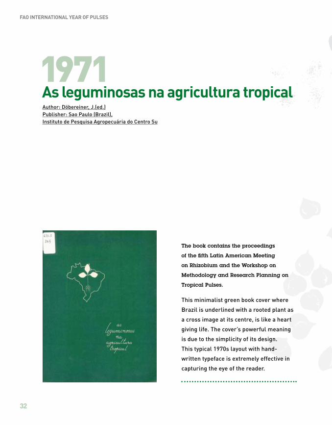
The book contains the proceedings
of the fifth Latin American Meeting
on Rhizobium and the Workshop on
Methodology and Research Planning on
Tropical Pulses.
This minimalist green book cover where
Brazil is underlined with a rooted plant as
a cross image at its centre, is like a heart
giving life. The cover’s powerful meaning
is due to the simplicity of its design.
This typical 1970s layout with hand-
written typeface is extremely effective in
capturing the eye of the reader.
Author: Döbereiner, J.(ed.)Publisher: Sao Paulo (Brazil), Instituto de Pesquisa Agropecuária do Centro Su
1971As leguminosas na agricultura tropical
1970s LESS IS MORE
33
WOULD YOU JUDGE A BOOK BY ITS COVER?
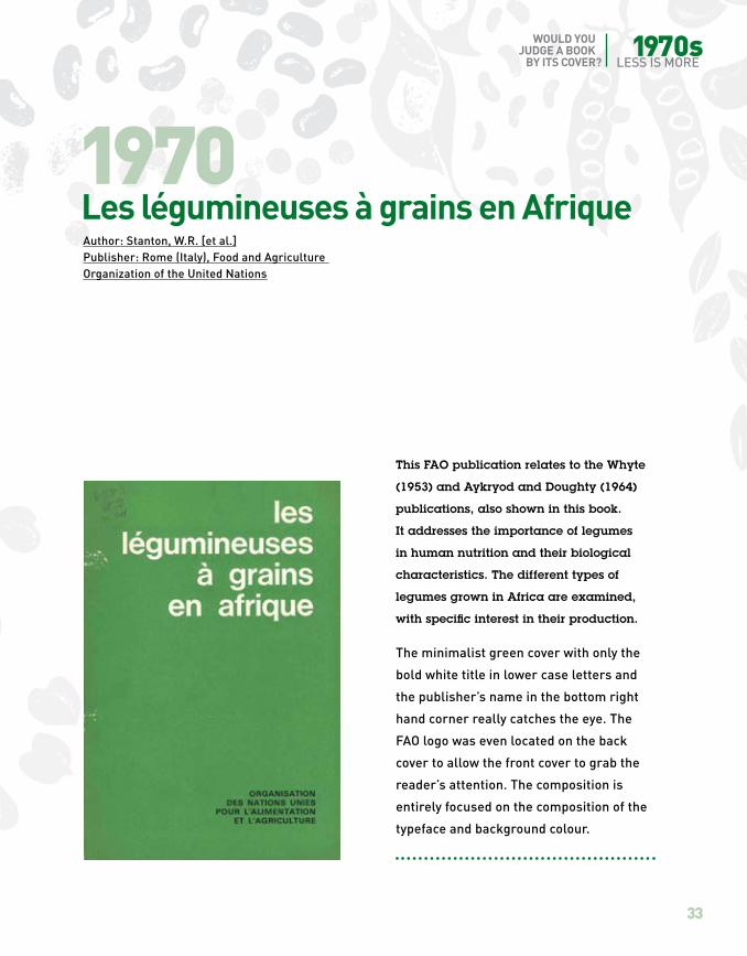
This FAO publication relates to the Whyte
(1953) and Aykryod and Doughty (1964)
publications, also shown in this book.
It addresses the importance of legumes
in human nutrition and their biological
characteristics. The different types of
legumes grown in Africa are examined,
with specific interest in their production.
The minimalist green cover with only the
bold white title in lower case letters and
the publisher’s name in the bottom right
hand corner really catches the eye. The
FAO logo was even located on the back
cover to allow the front cover to grab the
reader’s attention. The composition is
entirely focused on the composition of the
typeface and background colour.
Author: Stanton, W.R. [et al.]Publisher: Rome (Italy), Food and Agriculture Organization of the United Nations
1970Les légumineuses à grains en Afrique

34
FAO INTERNATIONAL YEAR OF PULSES
This publication promotes the exchange
and cross-fertilization of ideas and
information on issues in pulse production
that were of immediate relevance
at the time.
The minimalist design follows that
of the 1970s layouts in book covers,
especially with the use of the background
colour. The figure depicting, in Hindi, a
multiple cropping system in which four
short-duration pulse crops are grown:
mung, urad, ahrar and masoor, pops out
against the pink palette of the cover.
Author: Indian Agricultural Research InstitutePublisher: New Dehli (India),Indian Agricultural Research Institute
1971New vistas in pulse production

1970s LESS IS MORE
35
WOULD YOU JUDGE A BOOK BY ITS COVER?
With FAO support, a group of women
farmers and agricultural extensionists
developed and tasted all the recipes
included in this book, with a view
to ensuring the availability of local
ingredients, promoting attractive and
inexpensive dishes and preserving local
traditions. It represents an important step
forward in the greater use of subsidiary
foods to improve family nutrition.
The cover emphasizes the typeface of
the title with the typical 1970s balloon
typography, rather than the illustration
or photograph, which would have been
more expensive to reproduce. It was
not intended for a large readership but
rather to meet the specific needs of
extensionists in Sri Lanka.
Author: Department of Agriculture,Farm Women’s Agricultural ExtensionPublisher: Peradeniya (Sri Lanka),Department of Agriculture
1976Beans & grains: recipe book

1980s ‘80S DECO

In the 1980s, captivating colours appear – bright yellows, vivid greens, psychedelic
colour combinations – together with clean fonts with pronounced angles and curves. Here and there,
a touch of Art Deco, also called ’80s Deco.
38
FAO INTERNATIONAL YEAR OF PULSES
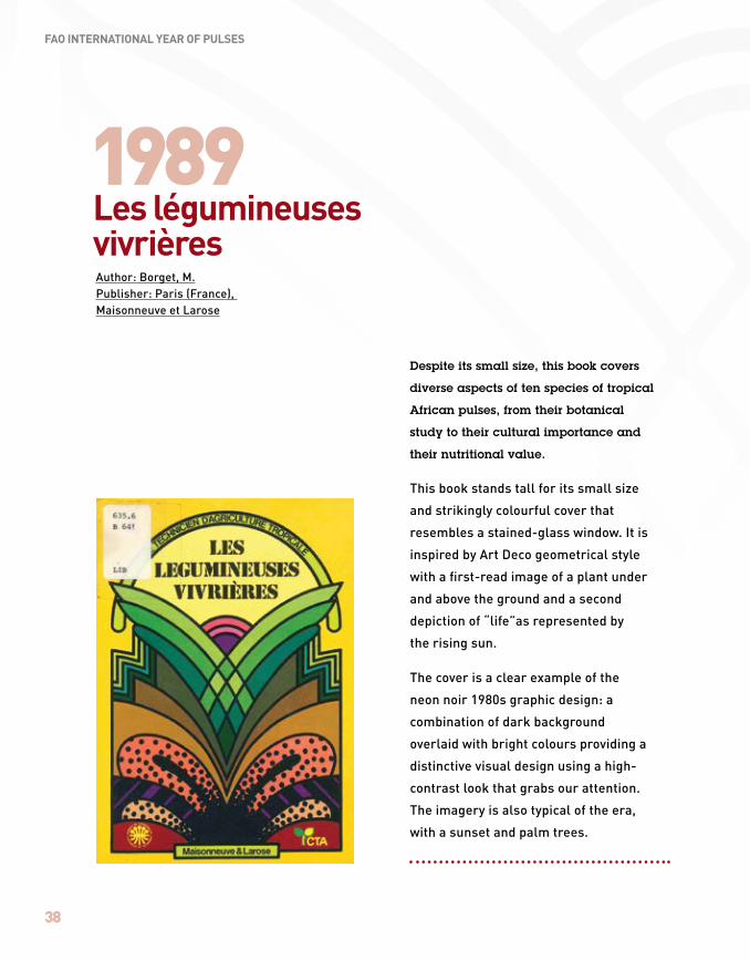
Despite its small size, this book covers
diverse aspects of ten species of tropical
African pulses, from their botanical
study to their cultural importance and
their nutritional value.
This book stands tall for its small size
and strikingly colourful cover that
resembles a stained-glass window. It is
inspired by Art Deco geometrical style
with a first-read image of a plant under
and above the ground and a second
depiction of “life”as represented by
the rising sun.
The cover is a clear example of the
neon noir 1980s graphic design: a
combination of dark background
overlaid with bright colours providing a
distinctive visual design using a high-
contrast look that grabs our attention.
The imagery is also typical of the era,
with a sunset and palm trees.
1989Les légumineuses vivrièresAuthor: Borget, M.Publisher: Paris (France), Maisonneuve et Larose
1980s ‘80S DECO
39
WOULD YOU JUDGE A BOOK BY ITS COVER?
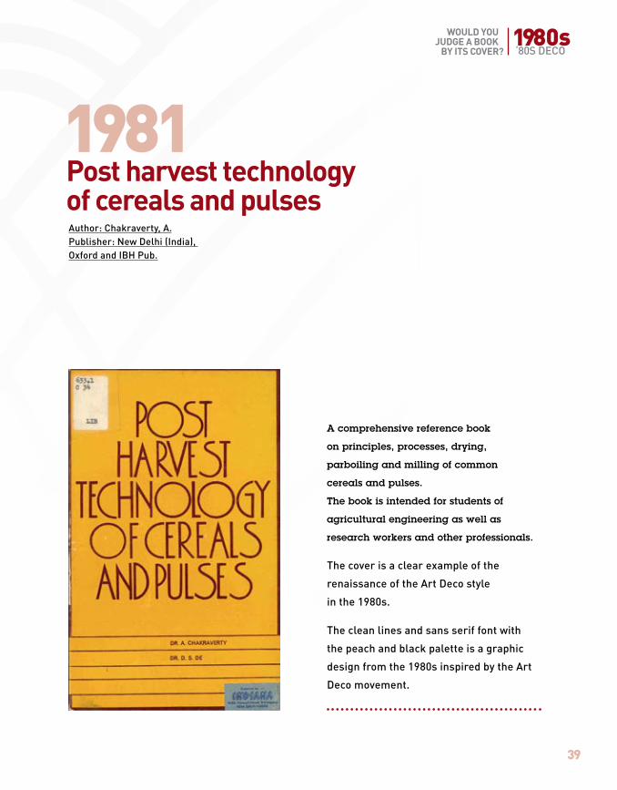
A comprehensive reference book
on principles, processes, drying,
parboiling and milling of common
cereals and pulses.
The book is intended for students of
agricultural engineering as well as
research workers and other professionals.
The cover is a clear example of the
renaissance of the Art Deco style
in the 1980s.
The clean lines and sans serif font with
the peach and black palette is a graphic
design from the 1980s inspired by the Art
Deco movement.
1981Post harvest technology of cereals and pulsesAuthor: Chakraverty, A.Publisher: New Delhi (India), Oxford and IBH Pub.

40
FAO INTERNATIONAL YEAR OF PULSES
The present publication aims to aid
conservation measures of legumes
in the Brazilian state of Bahia,
elaborately depicting their richness
and importance.
This book is illustrated by Sue Wickinson,
born in Sierra Leone, West Africa.
She is a contemporary botanical artist
with a scientific illustration degree and
nine years of experience in working
as an illustrator for the Royal Botanic
Gardens Kew, London.
The bright colour palette of the cover
follows the psychedelic aesthetic
of the 1980s.
1987Legumes of BahiaAuthor: Lewis, G.P.Publisher: Kew (United Kingdom), Royal Botanic Gardens
1980s ‘80S DECO
41
WOULD YOU JUDGE A BOOK BY ITS COVER?
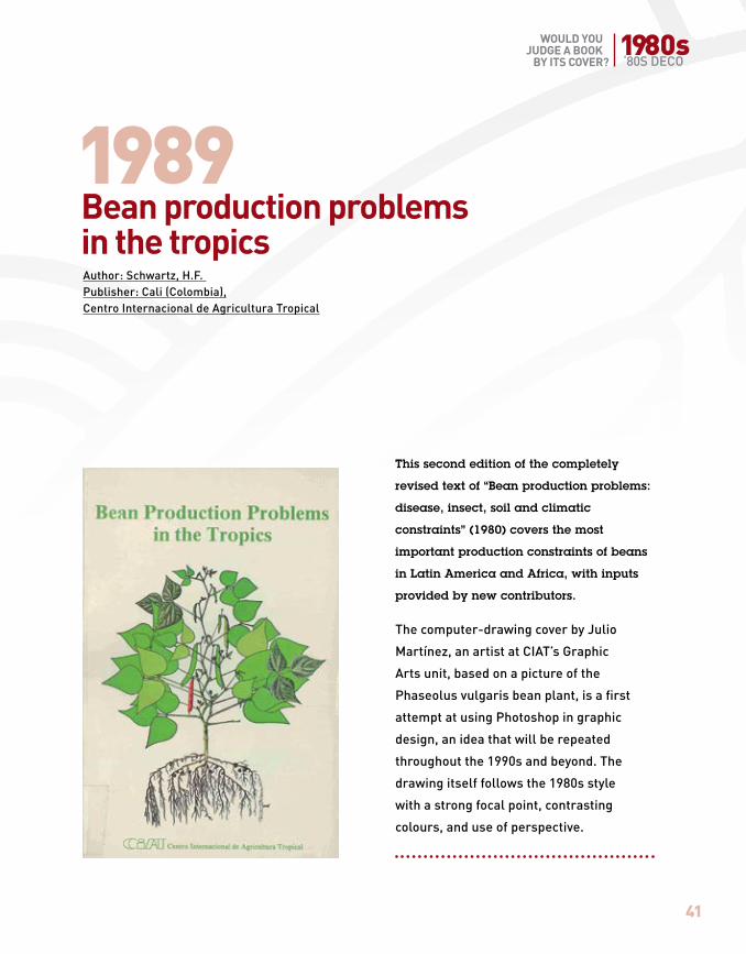
This second edition of the completely
revised text of “Bean production problems:
disease, insect, soil and climatic
constraints” (1980) covers the most
important production constraints of beans
in Latin America and Africa, with inputs
provided by new contributors.
The computer-drawing cover by Julio
Martínez, an artist at CIAT’s Graphic
Arts unit, based on a picture of the
Phaseolus vulgaris bean plant, is a first
attempt at using Photoshop in graphic
design, an idea that will be repeated
throughout the 1990s and beyond. The
drawing itself follows the 1980s style
with a strong focal point, contrasting
colours, and use of perspective.
1989Bean production problems in the tropicsAuthor: Schwartz, H.F. Publisher: Cali (Colombia), Centro Internacional de Agricultura Tropical
1990s THE PICTURE

The 1990s are hard to pin down in terms of specific fonts, colours or designs, although there is a
recurrent element: the picture. This may in part be due to the birth of Photoshop in the 1990s.

44
FAO INTERNATIONAL YEAR OF PULSES
Proceedings of the meeting held by
leading scientists from 21 countries
working on legume quality and
utilization. This meeting, co-sponsored
by FAO, covered in detail the food
products and uses of chickpea,
pigeonpea and groundnuts in different
regions of the world.
The cover recalls a still-life painting with
a photograph of diverse dishes using
legumes as the principal ingredient
against a black background. Although
it appeals as a cookbook, the technical
content does not correspond to the
cover. It is a clear example of how
designers were experimenting with the
new possibilities of photography in book
cover design.
1991Uses of tropical grain legumesAuthor: Jambunathan, R. (ed.), International Crops Research Instiyute for the Semi-Arid TropicsPublisher: Patancheru (India), ICRISAT

1990s THE PICTURE
45
WOULD YOU JUDGE A BOOK BY ITS COVER?
This proceedings from the Second
National Workshop on Pulses held in
Bangladesh reviewed the research done
on pulses in the 1980s on breeding,
crop management and protection, seed
production and consumer quality.
The photographic cover using a creative
approach to its composition recalls
geological strata: it is an image that
directly relates to the book’s content. In
this case, the photograph fully covers the
front, back and spine of the book, thereby
appearing to wrap the content through
the design.
1991Advances in pulses research in BangladeshAuthor: International Crops Research Institute for the Semi-Arid TropicsPublisher: Patancheru (India), ICRISAT

46
FAO INTERNATIONAL YEAR OF PULSES
Being the first monograph on the azuki
bean in the world, it contributed greatly
to enhancing academic interest in this
legume of Asian origin, also referred
to as the “red diamond”, because of its
color and cultural importance in Asian
legume food culture.
The full photographic cover throws a
handful of shiny, red diamonds in all its
shapes and shades at us – an invitation to
start discovering this ignored crop.
The original Chinese name of this bean is
written in big black Chinese characters
under its English translation to remind us
of its origin. The design relies entirely on
the zoomed photograph and appeals to the
use of Photoshop to tell a story.
1994Azuki Bean: botany, production and usesAuthor: Lumpkin, T.A., McClary, D.C.Publisher: Wallingford (United Kingdom), CAB International

1990s THE PICTURE
47
WOULD YOU JUDGE A BOOK BY ITS COVER?
1992Le secteur des légumineuses alimentaires au Maroc
This Moroccan-German publication
addresses the situation of leguminous
plants in Morocco and their important
role in crop rotation as well as in the food
security of the country.
The cover showcases bilateral cooperation
between two countries and their
institutions with the use of a photograph
from Quadrichromie, a printing house
in Rabat. The photograph shows
diverse pulses altogether with a mix of
textures, colours and sizes. Although not
completely covering the front cover, the
use of photography is the key element
to deliver the content without special
attention on typography or colour palette.
Author(s): Amine, M. [et al.]Publisher: Rabat (Morocco), Actes Ed.

2000sTO THE POINT

The new millennium sees modern and minimalist designs, sleek and to the point,
on the verge of becoming anonymous. It’s all about the message!

50
FAO INTERNATIONAL YEAR OF PULSES
The pigeonpea is one of ICRISAT’s six
mandated crops: crops vital to life for the
populations of the semi-arid tropics. This
publication contains the proceedings of
a regional conference held in Kenya in
2000 with the scope of developing and
promoting technology to improve the
commercialization of the pigeonpea and
provide smallholder farmers with reliable
market outlets.
The cover picture has a clear message:
gender and production. This is shown
using a photoshop design of a woman
working against an agricultural
crop background. There is no room
for typography, colour palettes or
composition. Everything emphasizes the
anonymous picture of a working woman.
2001Pigeonpea: status and potential in Eastern and Southern AfricaAuthor: International Crop Research Institute for Semi Arid Tropics Publisher: Gembloux (Belgium), Gembloux Agricultural University; Patancheru (India), ICRISAT

2000s TO THE POINT
51
WOULD YOU JUDGE A BOOK BY ITS COVER?
2001Legumes in rice-based cropping systems in tropical Asia
Legume cultivation improves and
maintains soil fertility in different
crop production systems. Despite this
knowledge, legume cultivation has
declined in rice-based cropping systems
in Asia. In this book, an attempt has been
made to update the database on area,
production and productivity of legumes
in tropical rice-growing countries in Asia.
Geographical Information System (GIS)
technologies have been used to map
legume production areas and to indicate
production constraints.
The cover shows a Photoshopped picture
of a rice field largely covered by legumes
displaying the message of the book: to
maintain soil health, legume cultivation
should be included in rice-based
cropping systems. Again, we see that
this composition speaks for itself and is
aimed at providing a strong message to
its readers.
Author: International Crop Research Institute for Semi Arid Tropics Publisher: Patancheru (India), ICRISAT

2010to the present
TOWARDS THE FUTURE

This latest FAO publication on pulses breaks with the more anonymous design we see in
the first decade of the new millennium, taking inspiration from earlier art styles.

54
FAO INTERNATIONAL YEAR OF PULSES
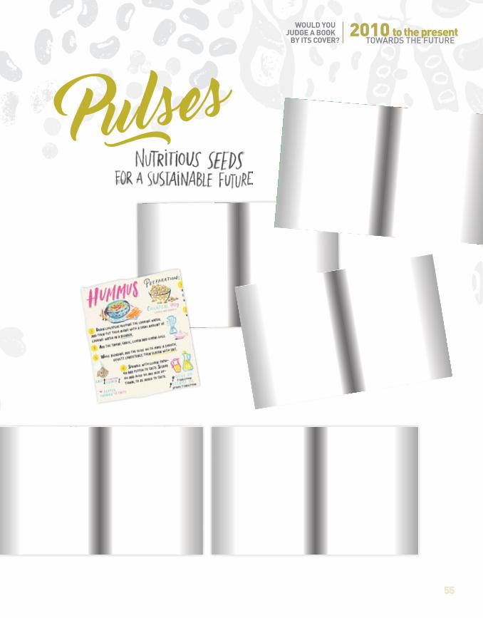
2016Pulses: Nutritious seeds for a sustainable future
This coffee table book, published by FAO
to celebrate the International Year of
Pulses, is part guide and part cookbook,
informative without being technical.
The book begins by giving an overview
of pulses, and explains why they are
an important food for the future. It also
includes more than 30 recipes prepared
by some of the most best-known chefs
in the world and includes a variety
of infographics.
The cover shows a lively drawing of
different types of legumes encircling the
handwritten-like title. The colour palette
is based on nature, but the tones are
accentuated in their brightness. Overall it
has a 1960s feel and a 1970s look to it, but
put into perspective to reflect the present.
Author: FAOPublisher: Rome (Italy): Food and Agriculture Organization of the United Nations
2010TOWARDS THE FUTURE
55
WOULD YOU JUDGE A BOOK BY ITS COVER?
2010
to the present
TOWARDS THE FUTURE

56
FAO INTERNATIONAL YEAR OF PULSES
From 1914 to 2016: transforming old into new
to reflect the present
1914 1969

2010TOWARDS THE FUTURE
57
WOULD YOU JUDGE A BOOK BY ITS COVER?
2010
to the present
TOWARDS THE FUTURE
2016This timeline shows how there is an interrelationship between book cover designs, how every period is inspired by earlier art styles and how the meaning of a cover design is shaped by previous designs.
The highly decorative style of the 1910s with its curvilinear plant and floral motives and the ethnic look with nature-based colour palette of the 1960s added layers of depth to the design of the 2010s, transforming the beauty of these early art styles into a timeless modern look. The latest 2016 FAO cover transforms old into new to reflect the present times, as each cover in this exhibition to a greater or lesser extent does, and as all art should.

58
FAO INTERNATIONAL YEAR OF PULSES
Inauguration of the Exhibition November 22nd 2016The exhibition was inaugurated officially on November 22nd, 2016 as part of the International Year of Pulses Global Dialogue meeting.
22 NOVEMBER 2016, ROME, ITALY (from left to right): JOYCE BOYE, FAO special ambassador for the IYP for North America, PATRICIA JUÁREZ ARANGO, FAO special ambassador for the IYP for Latin America and the Caribbean, MAGY HABIB, FAO special ambassador for the IYP for the Near East and North Africa, ELIZABETH MPOFU, FAO special ambassador for the IYP for Africa.
22 NOVEMBER 2016, ROME, ITALY - SARAH DISTER, librarian, giving a tour to the participants of the meeting.
22 NOVEMBER 2016, ROME, ITALY - (from left to right) MARCELA VILLAREAL, Director of the Office for Partnerships, Advocacy and Capacity Development at FAO, and PEDRO JAVALOYES, Chief of Publications.

59
WOULD YOU JUDGE A BOOK BY ITS COVER?
22 NOVEMBER 2016, ROME, ITALY the library team (from left to right) SARAH DISTER, LAURA GALEOTTI, VÉRONIQUE MONTES BAFFIER, MILENA CAZZATO and STEFANO DEMARCHI.
22 NOVEMBER 2016, ROME, ITALY - participants of the meeting during the inauguration.
Photographs: © FAO/G. Napolitano

60
FAO INTERNATIONAL YEAR OF PULSES
Visit of the President of Fiji with the Director-GeneralDuring the GLOBAL SYMPOSIUM ON SOIL ORGANIC CARBON organized by FAO in Rome on the 21st of March 2017, the Director-General, JOSE GRAZIANO DA SILVA, and the President of the Republic of Fiji, KONOUSI KONROTE, visited the library and its exhibition.
21 MARCH 2017, ROME, ITALY (from left to right) VÉRONIQUE MONTES BAFFIER, Officer in charge of the FAO Library,JOSE GRAZIANO DA SILVA, Director-General and KONOUSI KONROTE, President of Fiji.

61
WOULD YOU JUDGE A BOOK BY ITS COVER?
Visit of the President of Fiji with the Director-General
21 MARCH 2017, ROME, ITALY (from left to right) JOSE GRAZIANO DA SILVA, Director-General and KONOUSI KONROTE, President of Fiji.
21 MARCH 2017, ROME, ITALY (from left to right) JOSE GRAZIANO DA SILVA, Director-General, VÉRONIQUE MONTES BAFFIER, Oic FAO Library and KONOUSI KONROTE, President of Fiji, in front of David Lubin portrait.
Photographs: © FAO/C. Minichiello

FAO marked the International Year of Pulses (IYP) in 2016 by organizing an exhibition at its headquarters and publishing a book offering an overview of publications on these superfood pulses and legumes. The titles featured here were selected from FAO first editions, current publications and the International Institute of Agriculture’s collection.
Stretching from the start of the twentieth century to the present day, the compilation provides a visual backdrop alongside detailed descriptions of the various covers of the publications. The evolution of the designs is reflected across the span of decades, telling the story of how this art form has developed in tandem with its content to keep audiences engaged.
The result allows readers to explore for themselves whether they should in fact judge some books by their covers, or at least appreciate them for that most eye-catching of pages.