
Stephan Hurni Consultant Trivadis AG, [email protected] SQL Server notes from the field.

Working with Data Data Classification Symbolization Color Type and TypographyMy sincere apologies and gratitude to Boris Stern, Lorenz Hurni, Samuel Wiesmann, Yvonne Ysakowski, Peter H. Dana and JB Krygier from whom I stole without mercy to assemble this presentation.
Statistics for Thematic Cartography, Boris Stern, Lorenz Hurni, Samuel Wiesmann, Yvonne Ysakowskihttp://www.gitta.info/Statistics/en/html/index.html#
The Geographer’s Craft, Peter H. Dana http://www.colorado.edu/geography/gcraft/contents.html
JB Krygier, GEOG 353 Cartography and Visualizationhttp://krygier.owu.edu/krygier_html/geog_353/geog_353_lo/geog_353_lo10.html
Statistics for Thematic Cartography:
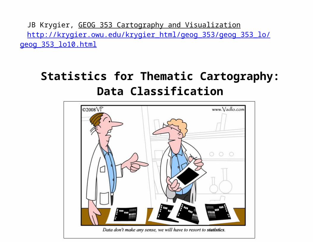
Data Classification
Types of Data
http://vadlo.com/Research_Cartoons/Last-line-of-defense---statistics.gif
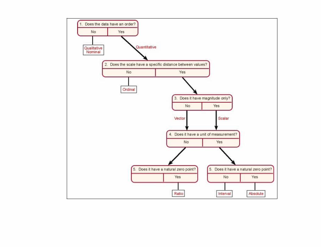
When measuring geographic phenomena, we commonly speak about the level of measurement. Data are usually divided into four level of measurement:
Nominal data Ordinal data Numeric data
o Interval datao Ratio data
The distinction of these data levels is relevant for the type of map presentation we wish to choose. Ordinal, interval, and ratio can be combined to create quantitative data. In contrast, to these three data levels, nominal data only describes qualitative information. In the following paragraphs, we will point out the characteristics of each data level.
http://www.ncsu.edu/labwrite/graphics/datatypes.jpg
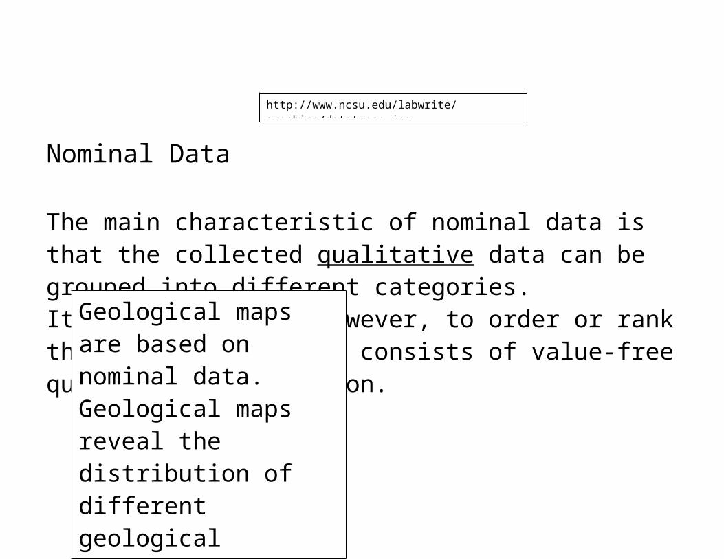
Nominal Data
The main characteristic of nominal data is that the collected
qualitative data can be grouped
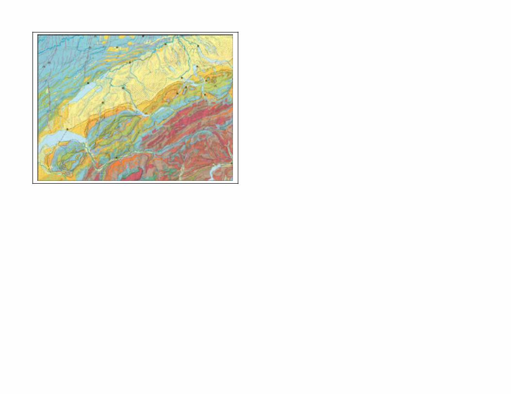
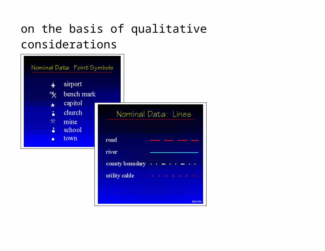
Geological maps are based on nominal data. Geological maps reveal the distribution of different geological patterns. We distinguish categories like granite, gneiss, limestone, tertiary and quaternary sediment deposits
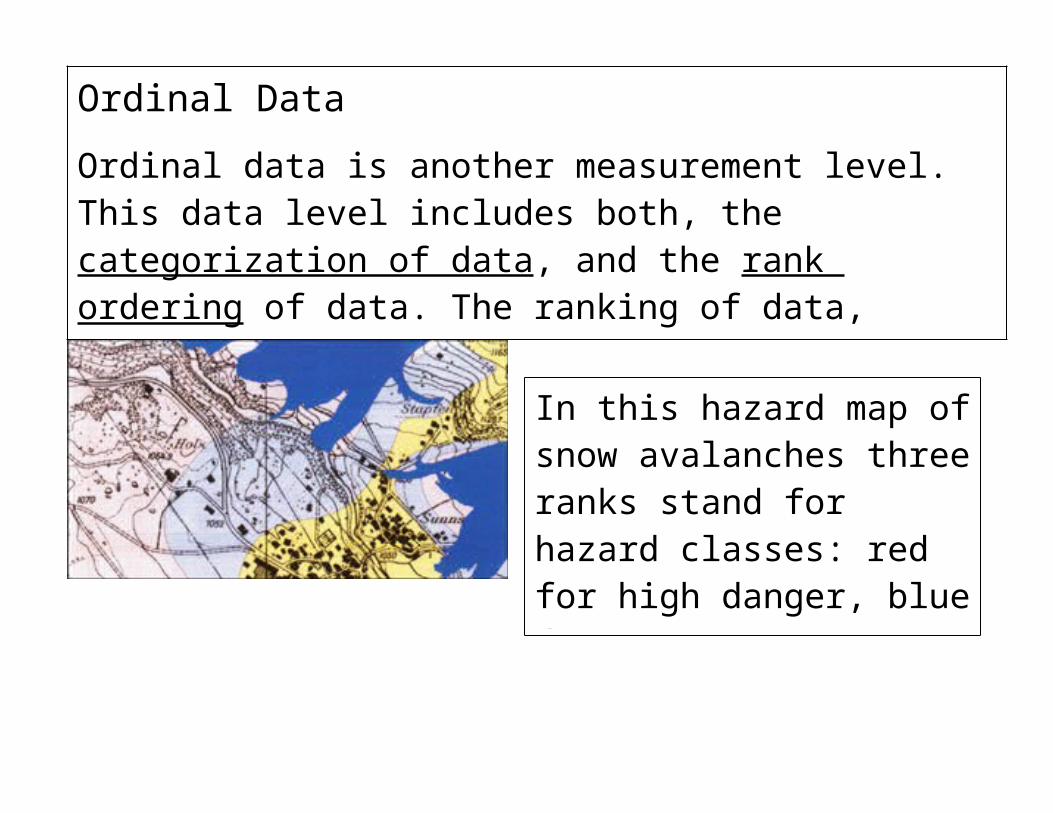
In this hazard map of snow avalanches three ranks stand for hazard classes: red for high danger, blue for moderate danger, and yellow for low danger
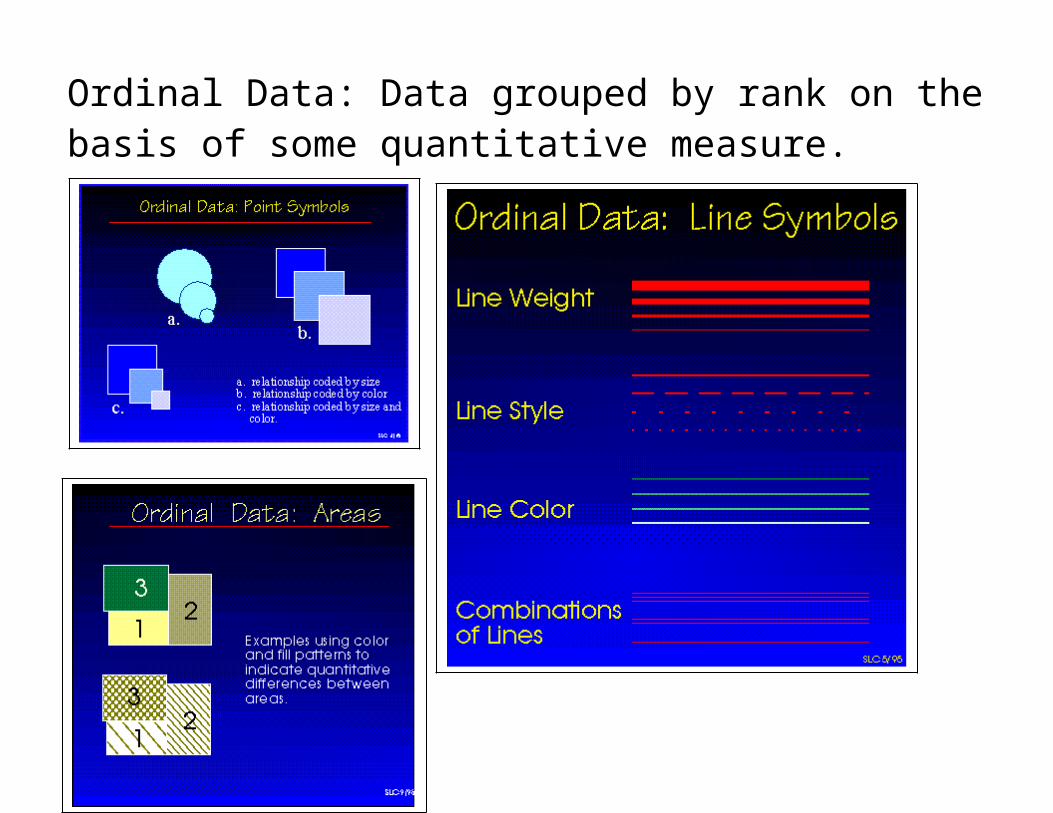
Ordinal DataOrdinal data is another measurement level. This data level includes both, the categorization of data, and the rank ordering of data. The ranking of data, however, does neither rely on equal category intervals, or are the chosen categories indicated by numbers, but by a qualitative ranked class description.
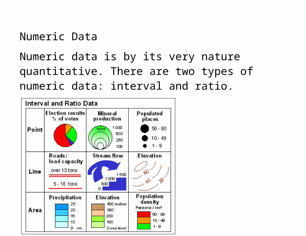
Numeric DataNumeric data is by its very nature quantitative. There are two types of numeric data: interval and ratio.
http://atlas.nrcan.gc.ca/site/english/learningresources/carto_corner/interval.gif
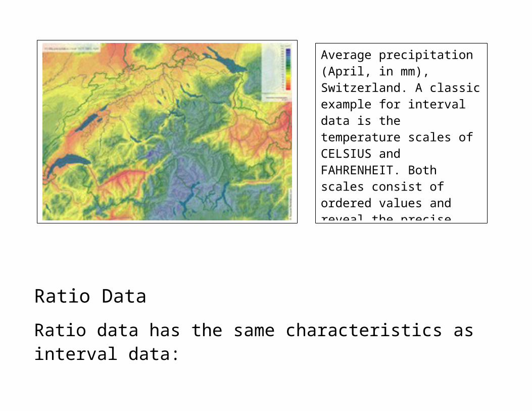
Interval DataInterval data has three characteristics:
The categorization of data The ordering of data, and An explicit numerical indication of the categories value
Average precipitation (April, in mm), Switzerland. A classic example for interval data is the temperature scales of CELSIUS and FAHRENHEIT. Both scales consist of ordered values and reveal the precise difference between their temperature values. However, the problem of these interval scales is the arbitrary character of their zero points.
Ratio DataRatio data has the same characteristics as interval data:
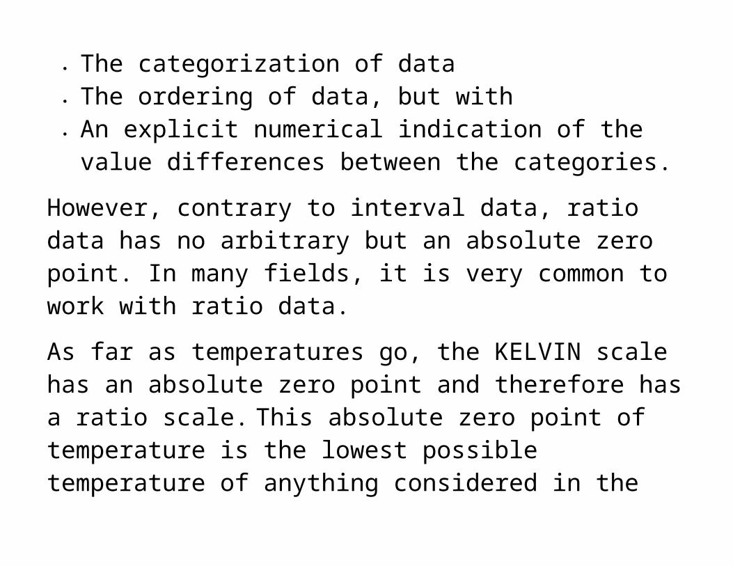
The categorization of data The ordering of data, but with An explicit numerical indication of the value differences
between the categories.
However, contrary to interval data, ratio data has no arbitrary but an absolute zero point. In many fields, it is very common to work with ratio data.
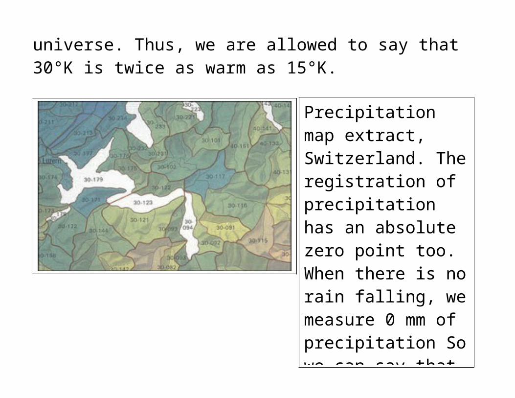
As far as temperatures go, the KELVIN scale has an absolute zero point and therefore has a ratio scale. This absolute zero point of temperature is the lowest possible temperature of anything considered in the universe. Thus, we are allowed to say that 30°K is twice as warm as 15°K.
Precipitation map extract, Switzerland. The registration of precipitation has an absolute zero point too. When there is no rain falling, we measure 0 mm of precipitation So we can say that 1000 mm is twice as much as 500 mm because precipitation relies on ratio data.
The Importance of ClassificationClassification allows you to structure the thematic communication message. How well this is done depends largely on your ability to understand the geographic phenomenon.
Before beginning any work on the data, it is important that you know exactly what is the information you want to convey, to whom and why? Think about who you are making the map for and assess their "reading potential" (their ability to understand what you are presenting) and their interest for the treated subject.
Before proceeding to the cartographic representation of the data, it is necessary to choose which data to represent, and then to treat the data to make them capable of being represented on a map.
Data PreparationData preparation includes the following stages:
Arrange the values into increasing order, Calculate some data information, such as:
o The number of data (N=)o The extreme values (Range)o Indications of descriptive statistics, such as mode, median,
and mean o Dispersal parameters: mean, co-variance and variance
Complete this statistical information with graphs, such as o Distribution diagramo Histograms
Raw data is typically not put on maps. The data have been transformed in some manner to better show a pattern of spatial distribution.
Data are typically put into classes for mapping.
How to Define the Number of Classes
The number of classes is connected to the objectives assigned to the cartographic representation.
How many classes per map?
Generally, it is difficult to visually perceive information, which is divided up into several classes or categories. This is why the number of classes must be big enough to be useful, but limited to allow the map to be readable without any trouble.Generally, a distribution between 4 and 8 classes is satisfactory with 5-6 classes being the standard. Truly as the human eye
cannot make nuanced distinctions between more than 5 or 6 colors or patterns, 5-6 data classes should be considered the maximum for ease of readership.
How to Define the Classes
There are several ways to define classes. You should choose the method which is best suited for the data distribution and for the aspect of the data you want to emphasize. In any case, with the method you choose:
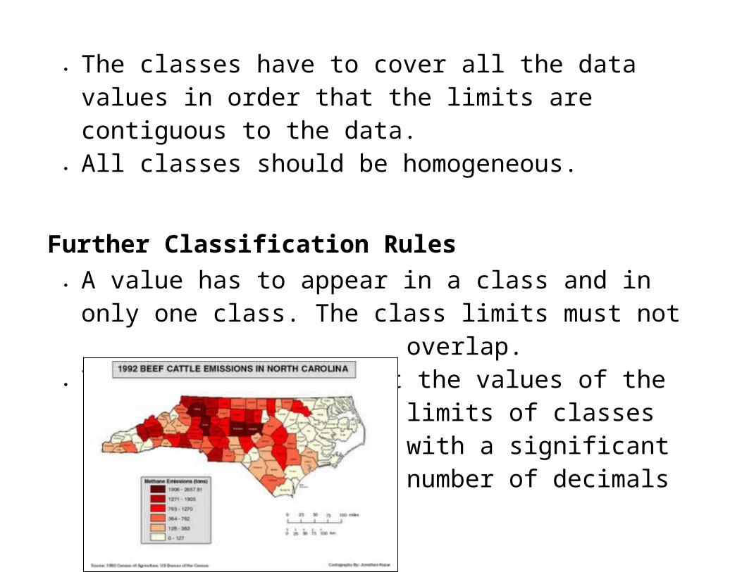
The classes have to cover all the data values in order that the limits are contiguous to the data.
All classes should be homogeneous.
Further Classification Rules A value has to appear in a class and in only one class. The
class limits must not overlap.
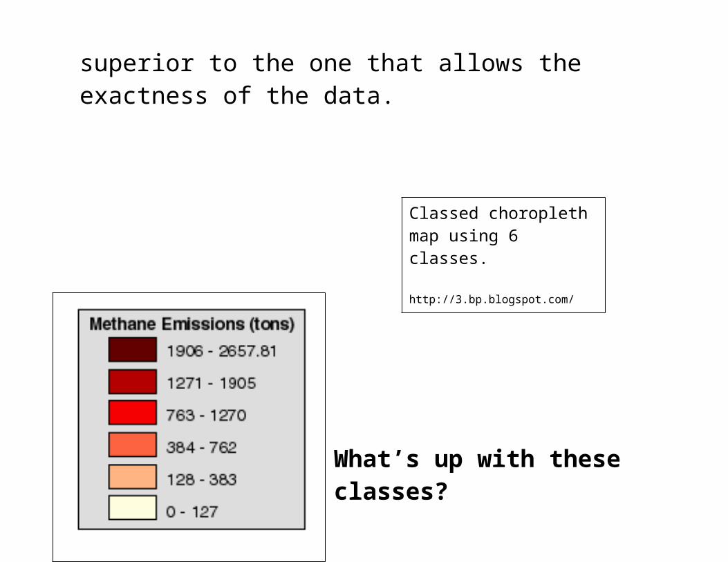
You should not present the values of the limits of classes with a significant number of decimals superior to the one that allows the exactness of the data.
What’s up with these classes?
Classed choropleth map using 6 classes.
http://3.bp.blogspot.com/_bP_q1lLWAys/STMQqhajKdI/AAAAAAAAAFU/XIyRYBFA4bg/s320/classed+choropleth+map.gif
Classed and Unclassed Maps
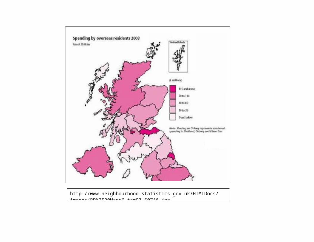
What is a classed map?
A classed map represents data that has been grouped into different classes. On the map the different classes can be distinguished by their color (hue, brightness, or saturation).
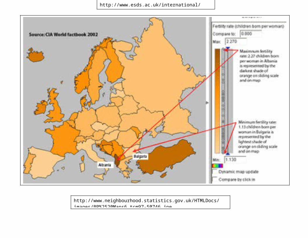
http://www.neighbourhood.statistics.gov.uk/HTMLDocs/images/BP%2520Maps6_tcm97-50746.jpe
What is the difference between a classed and an unclassed map?
Classed maps consist of color shades that are generally based on the conventional "maximum-contrast" approach, using equally spaced tones from one class to another. Thanks to this method, the classified map does not reveal a huge and inhomogeneous range of color variations.
In contrast to the unclassified map, the classified map does not reveal such huge visual variations between values.
The unclassed map uses a color spectrum which requires the map reader to make fine distinctions in the presentation of the data. The disadvantage of unclassed maps is that similar shades are hard to distinguish.
Choosing Classed or Unclassed…
http://www.esds.ac.uk/international/images/uchoropleth.gif
http://www.neighbourhood.statistics.gov.uk/HTMLDocs/images/BP%2520Maps6_tcm97-50746.jpe
When deciding whether or not to use a classed or unclassed map, consider these questions…
1. Do you want to maintain numerical data relations?
If so, unclassified data theoretically does a better job than classified data, as unclassified data allows us to maintain the numerical relations between data. This means that the color shades on an unclassed map are directly proportional to the values of each enumeration unit.
Or….

2. Is your map intended to be used for data presentation,
or is it meant to be applied for data analysis?
When you create a map that will be used for a simple data presentation, you have a choice between either classed or unclassed data. If you decide to use classified data for your map, the differences in value and color shade usually become more obvious. In general, cartographers do not approve the result of non-classified data, since unstructured (or non-generalized) maps are composed of many individual symbols.
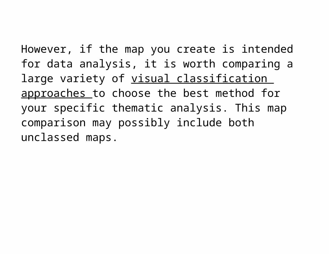
However, if the map you create is intended for data analysis, it is worth comparing a large variety of visual classification
approaches to choose the best method for your specific thematic analysis. This map comparison may possibly include both unclassed maps.
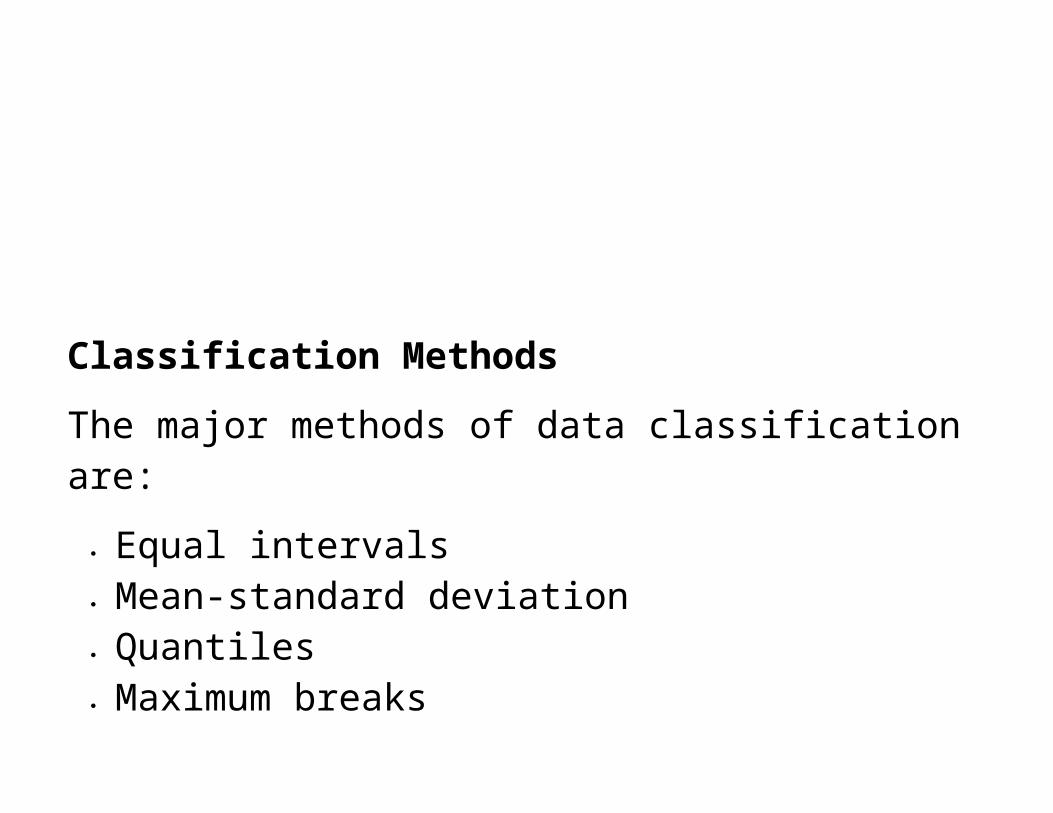
Classification Methods
The major methods of data classification are:
Equal intervals Mean-standard deviation Quantiles Maximum breaks Natural breaks
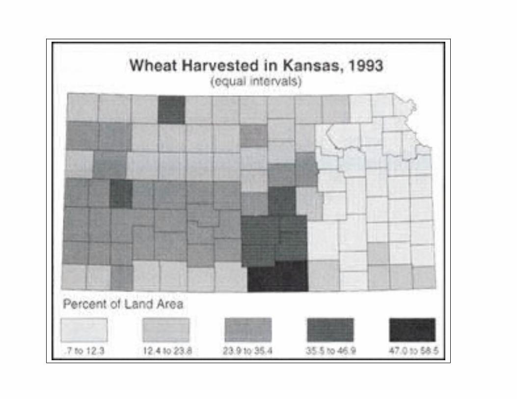
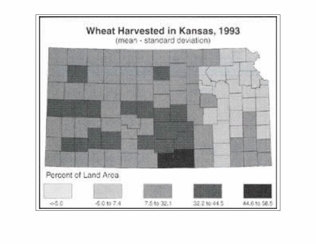
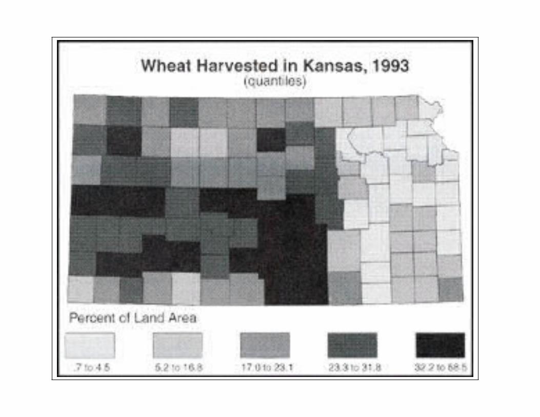
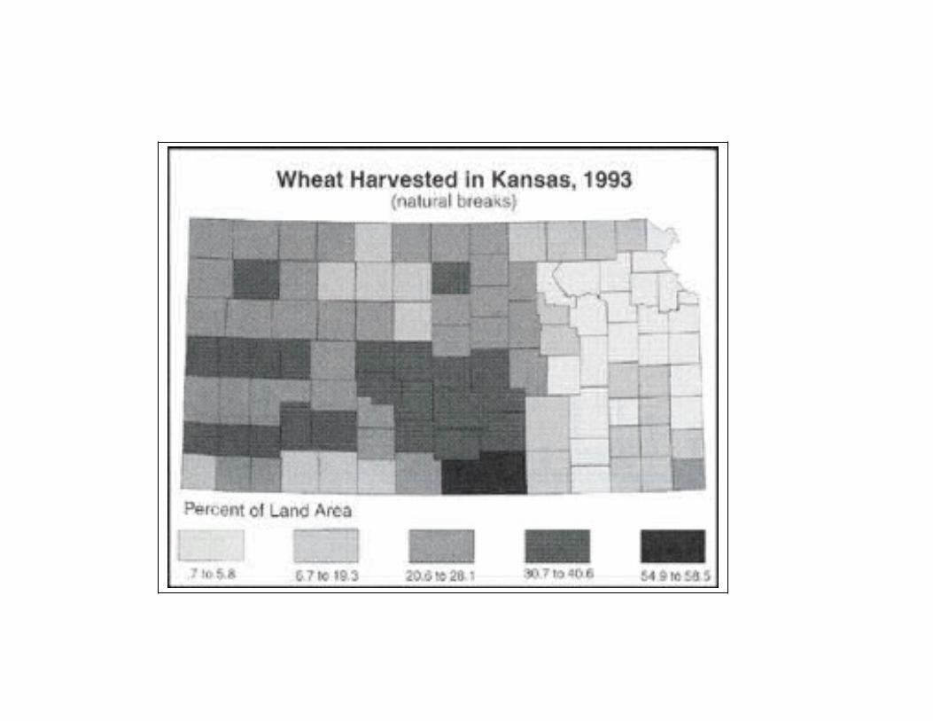
For the following discussion refer to the handout, “Percentage of land area from which wheat was harvested n Kansas Counties in 1993.”
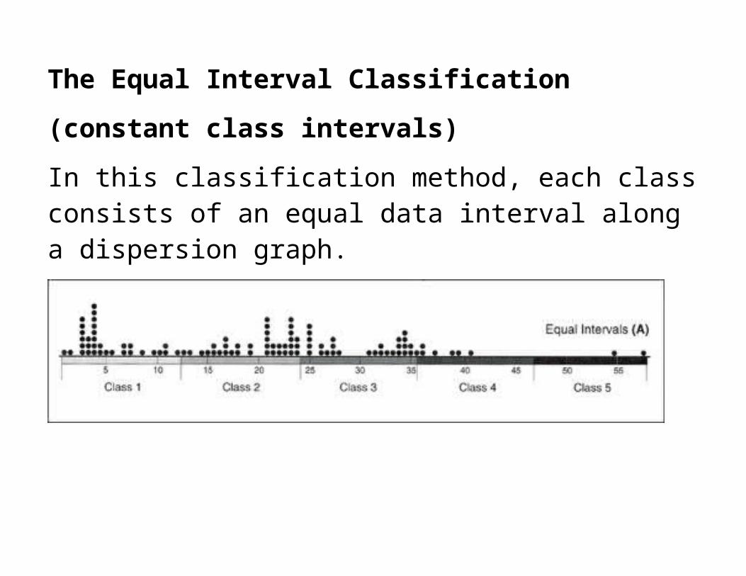
The Equal Interval Classification
(constant class intervals)
In this classification method, each class consists of an equal data interval along a dispersion graph.
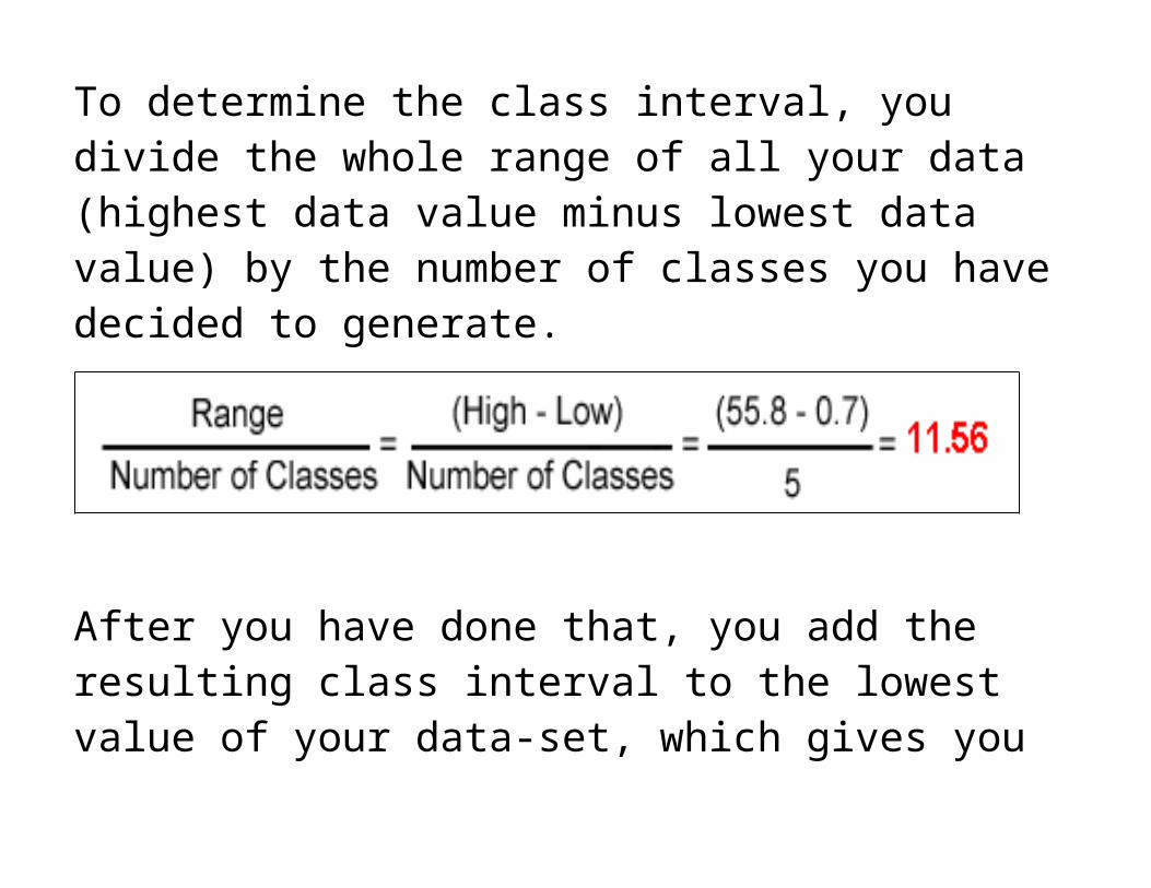
To determine the class interval, you divide the whole range of all your data (highest data value minus lowest data value) by the number of classes you have decided to generate.
After you have done that, you add the resulting class interval to the lowest value of your data-set, which gives you the first class interval. Add this interval as many times as necessary in order to reveal the number of your predefined classes.
When is it useful to choose the method of equal class intervals?
It is appropriate to use equal class intervals when the data distribution has a rectangular shape in the histogram. This, however, occurs very rarely in the context of geographic phenomena. Moreover, it is useful to use this method when your classification steps are nearly equal in size. The major disadvantage of this method is that class limits fail to reveal the distribution of the data along the number line. There may be classes that remain blank, which of course is not particularly meaningful on a map.
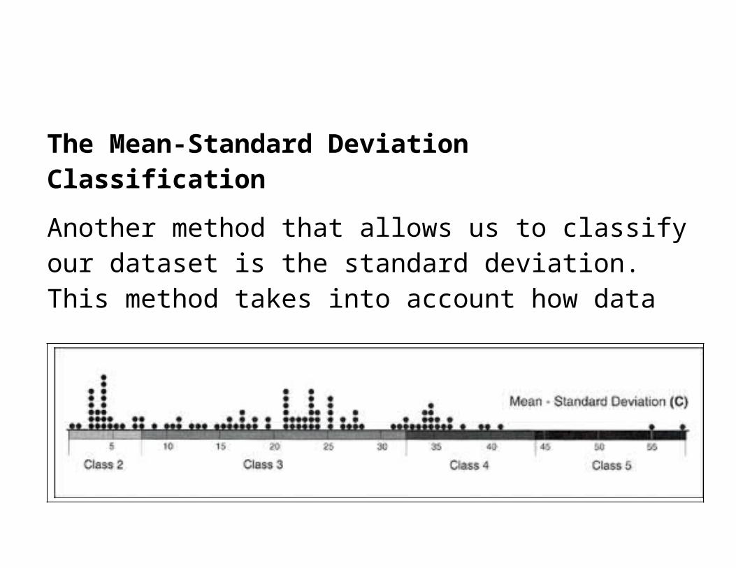
The Mean-Standard Deviation Classification
Another method that allows us to classify our dataset is the standard deviation. This method takes into account how data is distributed along the dispersion graph.
To apply this method, we repeatedly add (or subtract) the calculated standard deviation from the statistical mean of our
dataset. The resulting classes reveal the frequency of elements in each class.
The mean-standard deviation method is particularly useful when our purpose is to show the deviation from the mean of our data array. This classification method, however, should only be used for data-sets that show an approximately "standardized normal distribution" or Gaussian distribution". This constraint is the major disadvantage of this method.
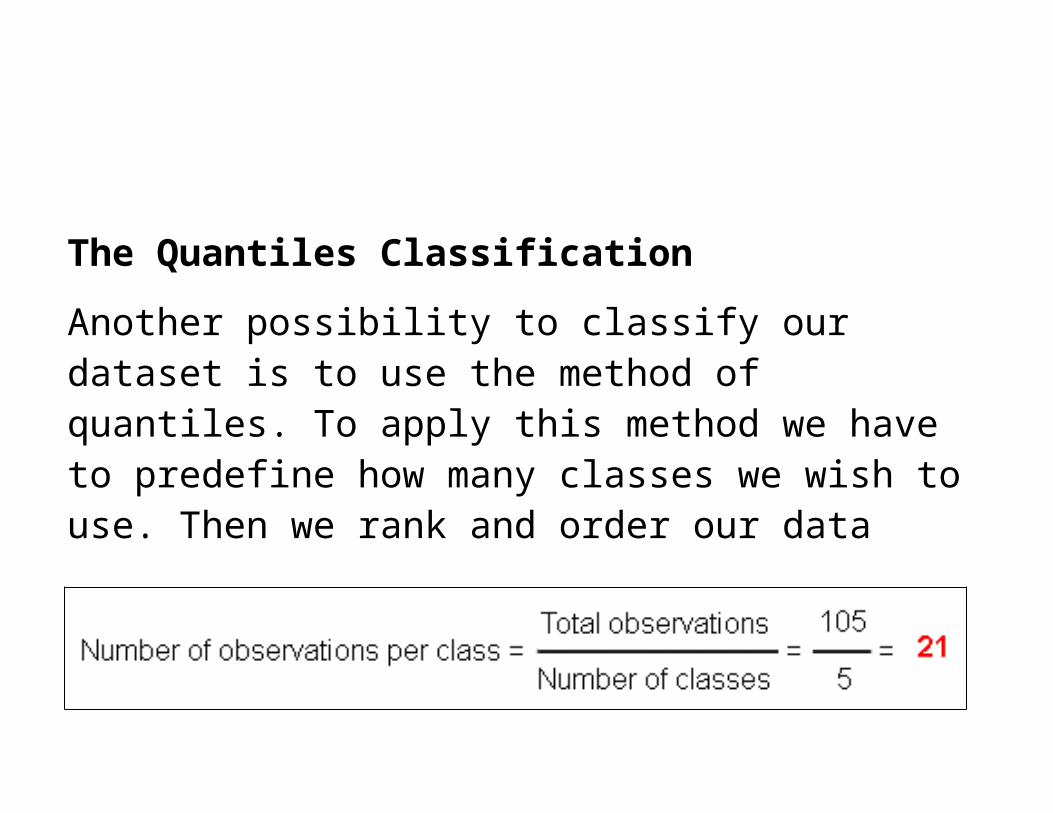
The Quantiles Classification
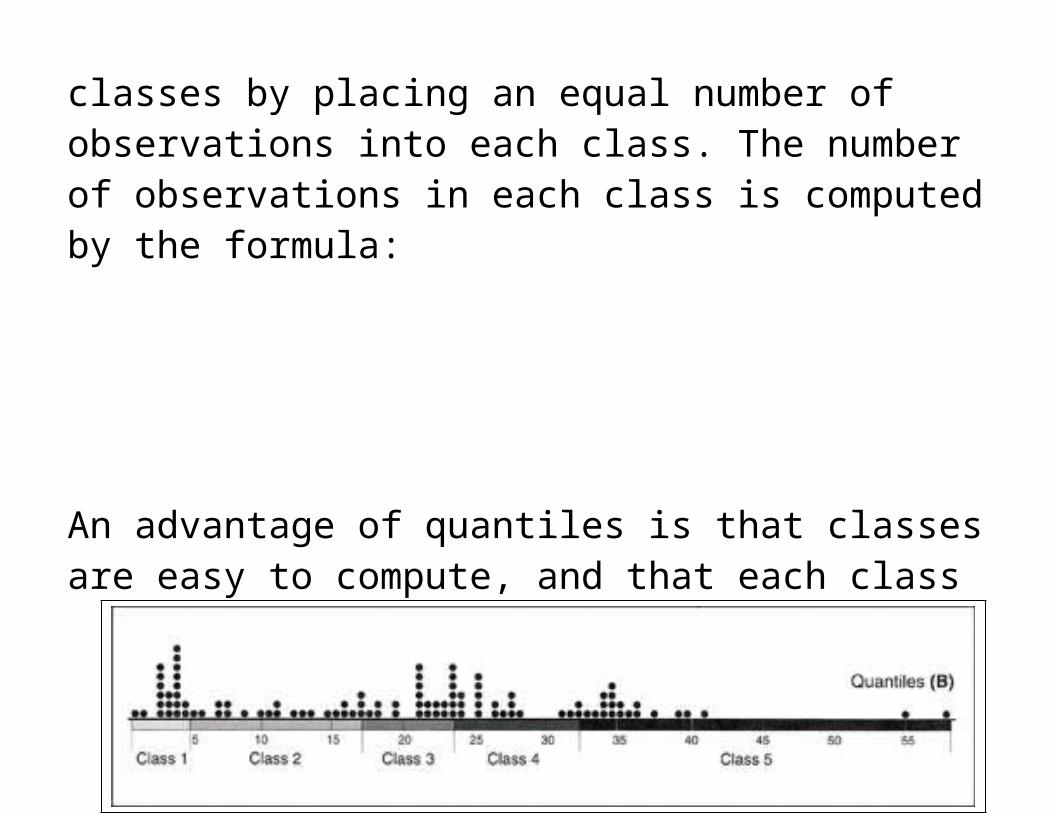
Another possibility to classify our dataset is to use the method of quantiles. To apply this method we have to predefine how many classes we wish to use. Then we rank and order our data classes by placing an equal number of observations into each class. The number of observations in each class is computed by the formula:
An advantage of quantiles is that classes are easy to compute, and that each class is approximately equally represented on the final map. Moreover, quantiles are very useful for ordinal data, since the class assignment of quantiles is based on ranked data. The main disadvantage of this classification method is that gaps that may occur between the observations. These gaps sometimes lead to an over-weighting of some single detached observations at the edge of the number line. You can see such a huge value gap within the quantile class 5.
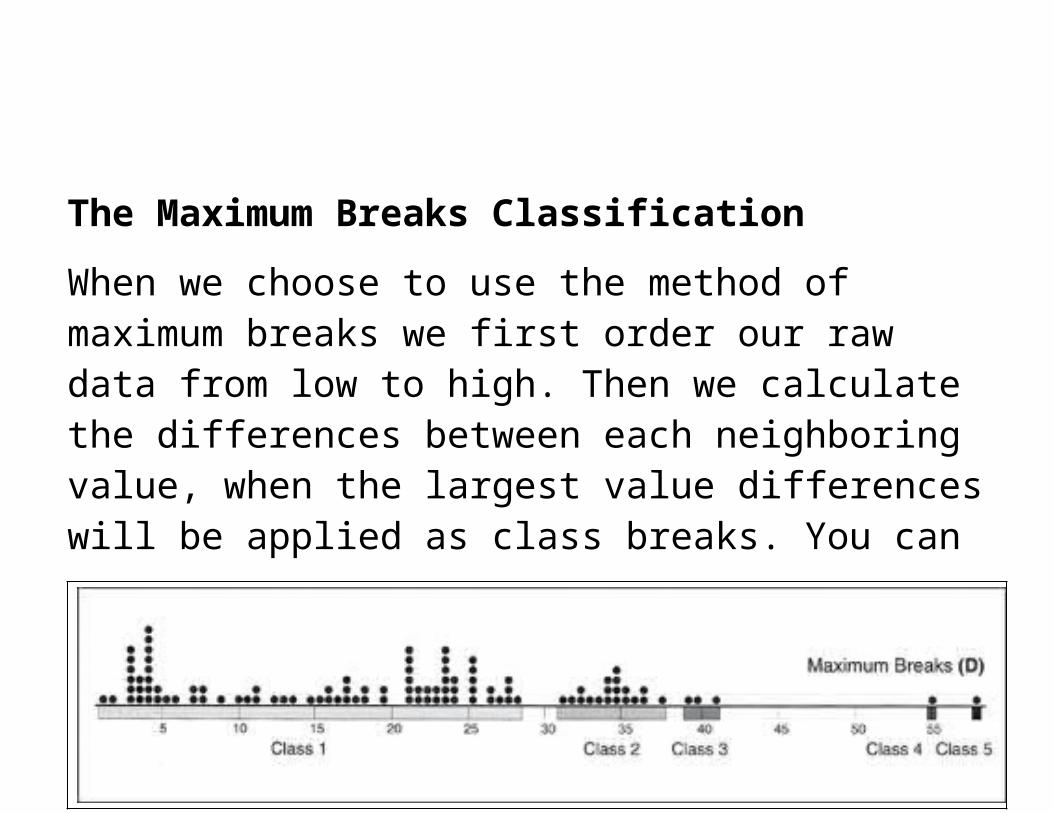
The Maximum Breaks Classification
When we choose to use the method of maximum breaks we first order our raw data from low to high. Then we calculate the differences between each neighboring value, when the largest value differences will be applied as class breaks. You can also recognize the maximum breaks visually on the dispersion graph: large value differences are represented by blank spaces.
One advantage of working with this method is its clear consideration of data distribution along the number line. Another advantage is that maximum breaks can be calculated easily by subtracting the next lower neighboring value from each value. A disadvantage, however, is that the systematic classification of data misses any proper attention to a visually more logical and more convenient clustering. This problem can be revealed when we compare the classes 4 and 5. It would probably be more useful to merge these two classes into one.
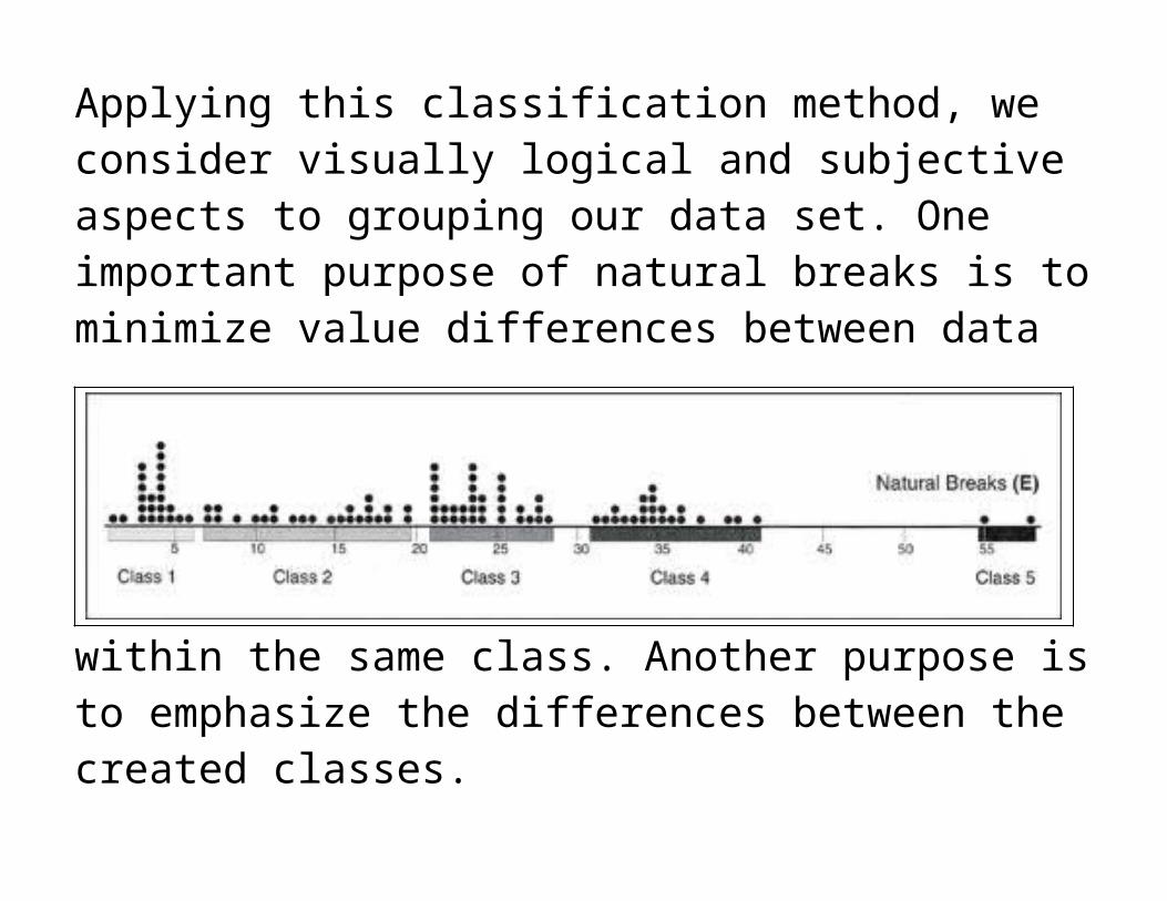
The Natural Breaks Classification
Applying this classification method, we consider visually logical and subjective aspects to grouping our data set. One important purpose of natural breaks is to minimize value differences between data within the same class. Another purpose is to emphasize the differences between the created classes.
A disadvantage of this method is that class limits may vary from one map-maker to another due to the author's subjective class definition
Making it Simple:Equal intervals
Particularly useful when the dispersion graph has a rectangular shape (rare in geographic phenomena) and when enumeration units are nearly equal in size. In such cases, orderly maps are produced.
Mean-standard Deviation
Should be used only when the dispersion graph approximates a normal distribution. The classes formed, yield information about frequencies in each class. Particularly useful when the purpose is to show deviation from the array mean. Understood by many readers.
Quantiles
Good method of assuring an equal number of observations in each class. Can be misleading if the enumeration units vary greatly in size.
Maximum Breaks
Simplistic method which considers how data are distributed along the dispersion graph and group those that are similar to one another (or, avoid grouping values that are dissimilar). Relatively easy to compute, simply involving subtracting adjacent values.
Natural Breaks
Good graphic way of determining natural group of similar values by searching for significant depressions in frequency distribution. Minor troughs can be misleading and may yield poorly defined class boundaries.
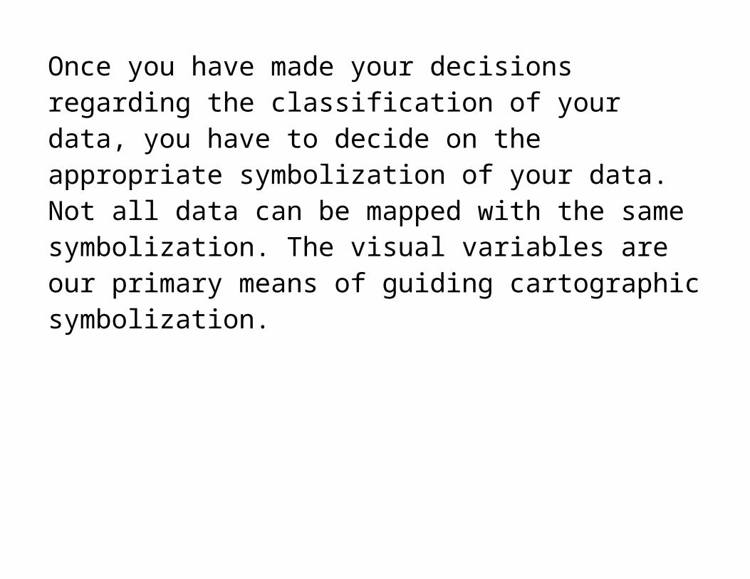
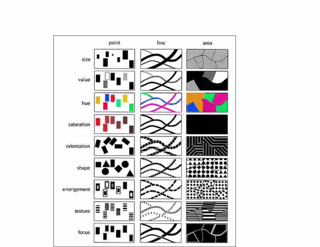
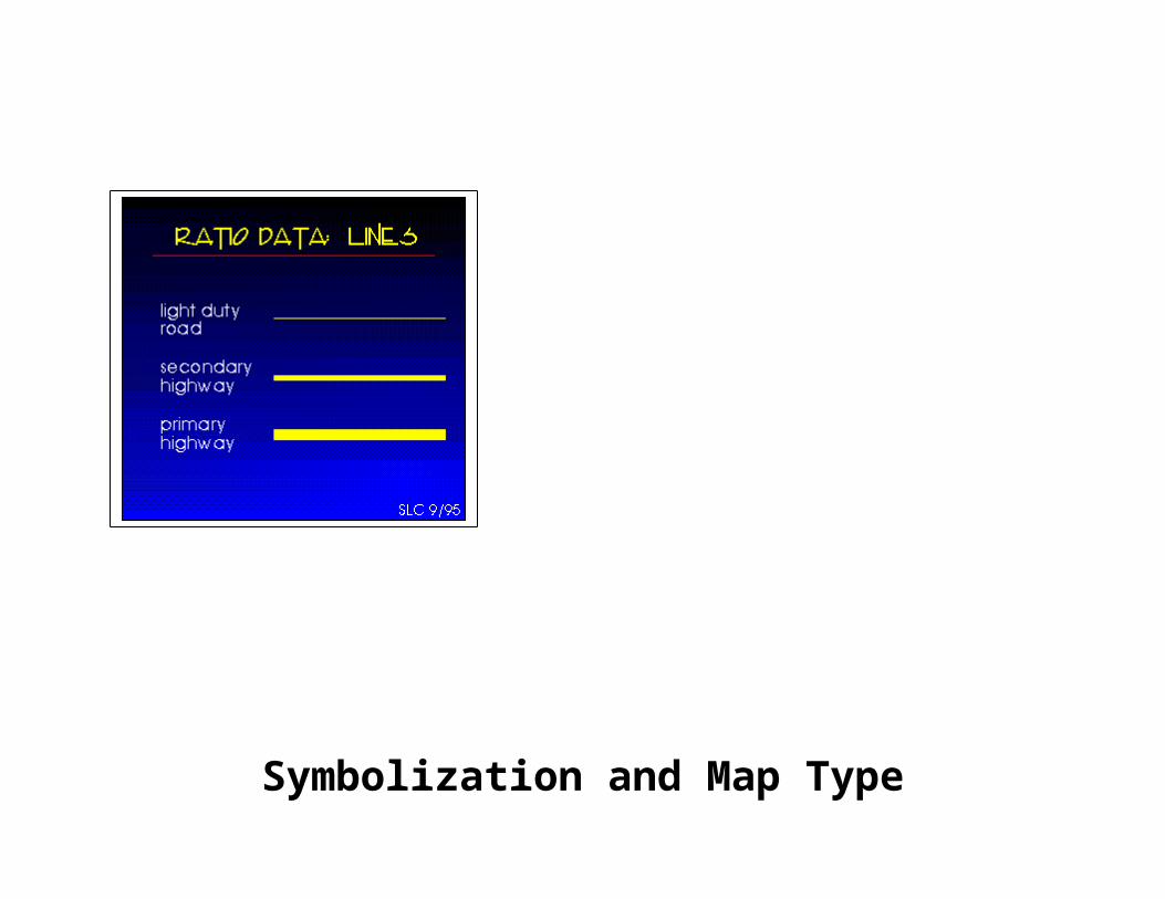
Symbolization
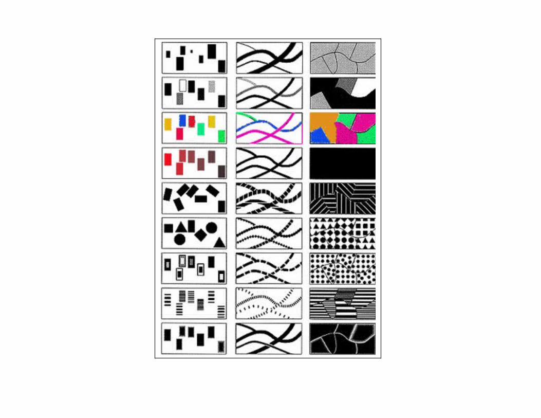
Once you have made your decisions regarding the classification of your data, you have to decide on the appropriate symbolization of your data. Not all data can be mapped with the same symbolization. The visual variables are our primary means of guiding cartographic symbolization.
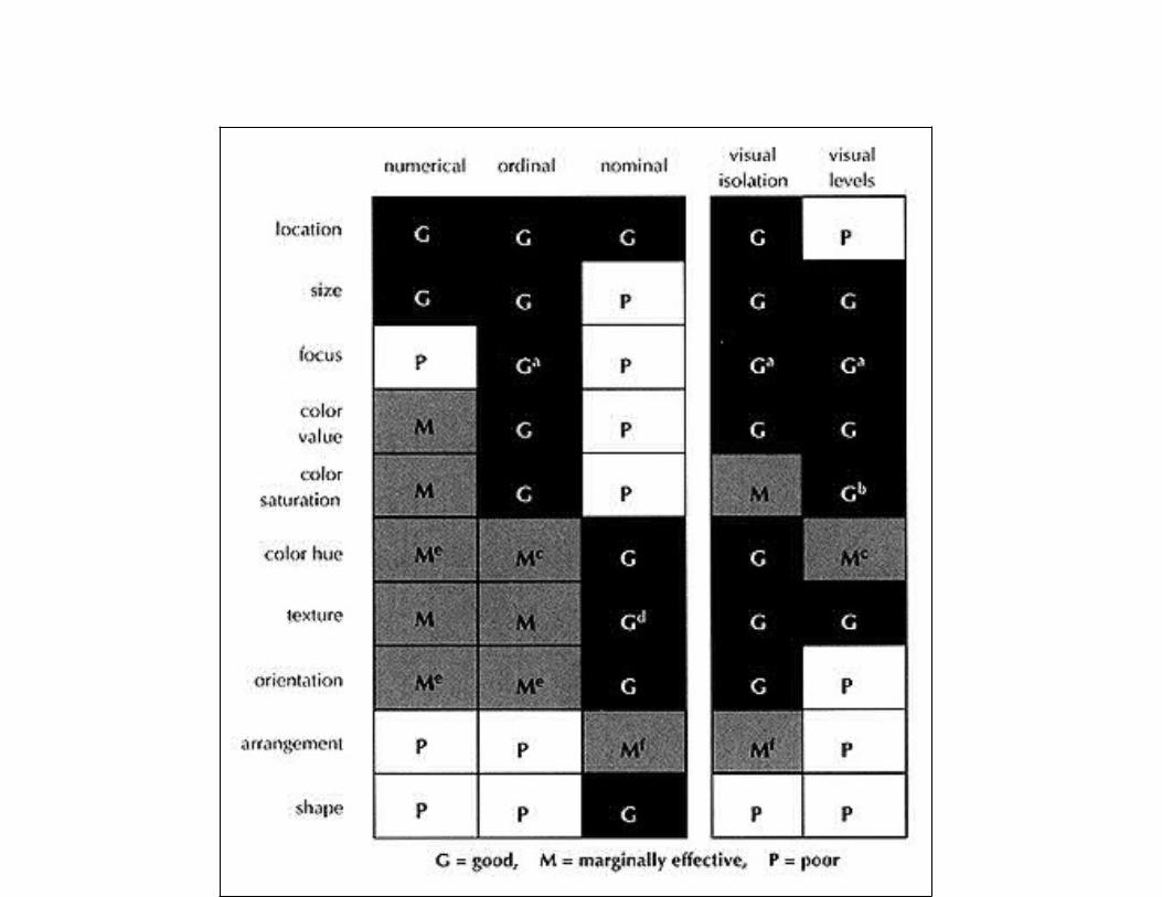
Types of Data and their SymbolizationNominal Data: Data grouped into categories on the basis of qualitative considerations
Ordinal Data: Data grouped by rank on the basis of some quantitative measure.
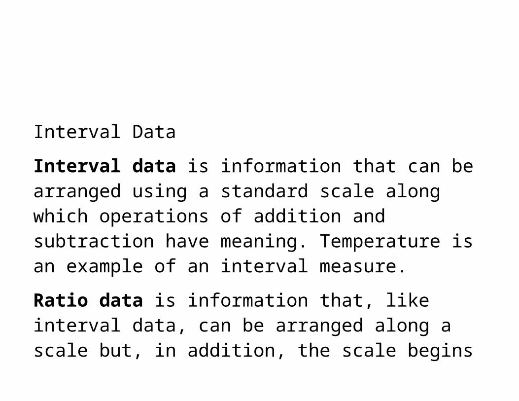
Interval Data
Interval data is information that can be arranged using a standard scale along which operations of addition and subtraction have meaning. Temperature is an example of an interval measure.
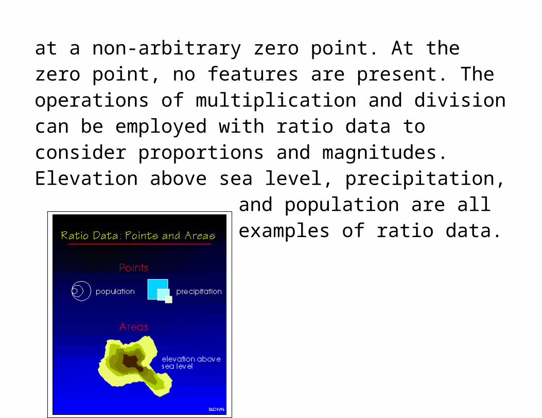
Ratio data is information that, like interval data, can be arranged along a scale but, in addition, the scale begins at a non-arbitrary zero point. At the zero point, no features are present. The operations of multiplication and division can be employed with ratio data to consider proportions and magnitudes. Elevation above sea level, precipitation, and population are all examples of ratio data.
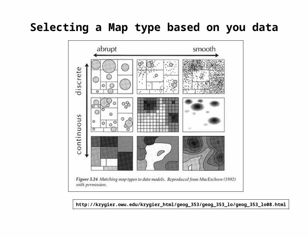
Symbolization and Map TypeSelecting a Map type based on you data
http://krygier.owu.edu/krygier_html/geog_353/geog_353_lo/geog_353_lo08.html
Choropleth Mapping (Area Value Mapping)
Most common way to map aggregated data Used to portary data collected for enumeration units such
as counties or states. Data are grouped into classes and a color is assigned to
each class. Appropriate when to use when values of a phenomenon
change abribtly at the boundaries of enumeration units. Useful when you want the reader to focus on values for
individual enueration units even if the value doesn’t change abrubtly. (Example compare how one unit varies from another)
Problems with Choropleth Maps
They do not display how the value of a phenomenon may vary within a single enumeration unit.
The boundaries of the units are arbitrary and are unlikely to be associated with the continuity or discontinuity of the actual phenomenon.
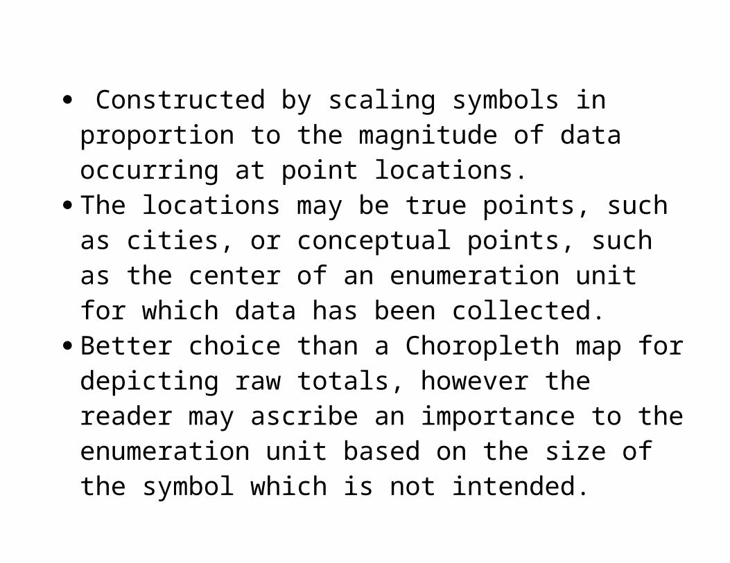
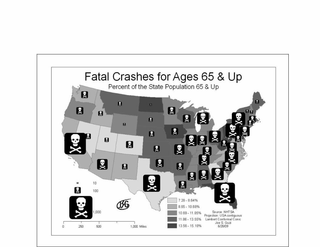
Proportional Symbol Maps
Constructed by scaling symbols in proportion to the magnitude of data occurring at point locations.
The locations may be true points, such as cities, or conceptual points, such as the center of an enumeration unit for which data has been collected.
Better choice than a Choropleth map for depicting raw totals, however the reader may ascribe an importance to the enumeration unit based on the size of the symbol which is not intended.
Isopleth Maps
An isarithmic map, or contour map, is created by interpolating a set of isolines between sample points of known values. The lines connect point of equal value, such as a contour line of 200 feet. The isopleth map on the other hand, is a specialized type of isarithmic map in which sample points are associated with enumeration units and the data is interpreted as being part of a smooth continuous surface. The data must be standardized to the enumeration unit in which raw values are adjusted for the differing sizes of the units. The simplest way to standardize data is to divide raw totals by the area of the enumeration units.
http://gozips.uakron.edu/~jsg23/fatalcrash65up.png
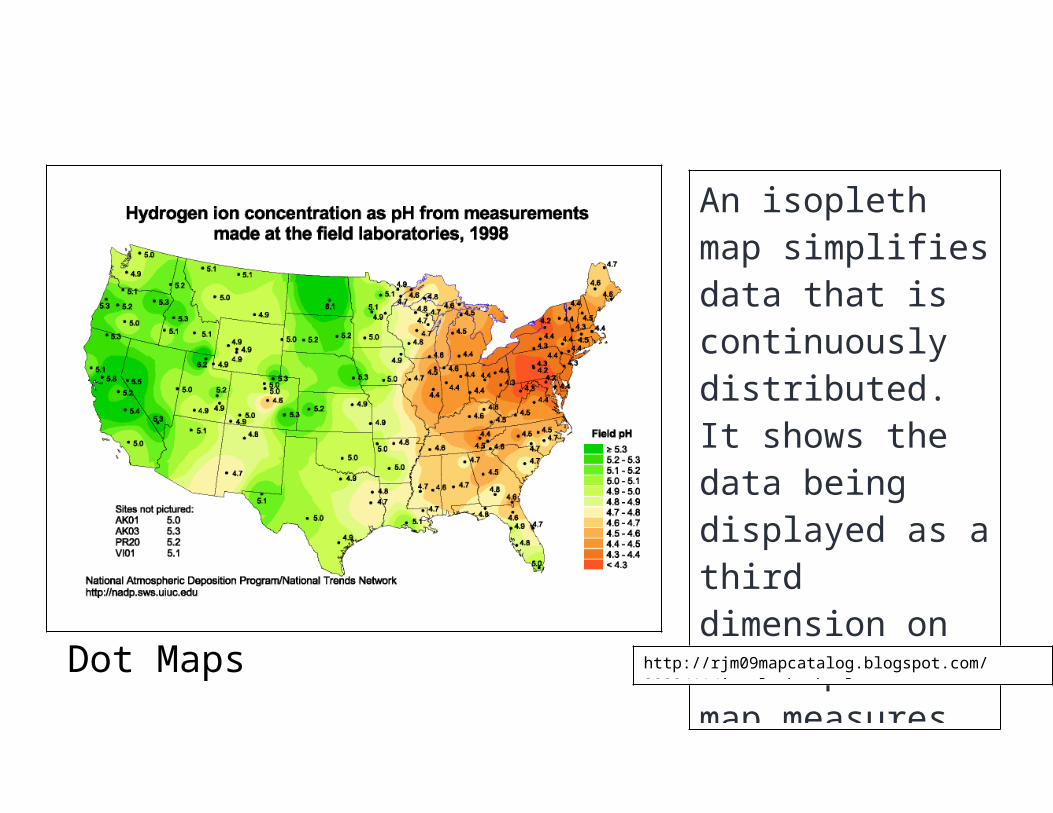
Dot Maps
An isopleth map simplifies data that is continuously distributed. It shows the data being displayed as a third dimension on the map. This map measures acid rainfall in the United States by looking at the pH level of rain in different areas.http://rjm09mapcatalog.blogspot.com/2009/11/isopleths.html
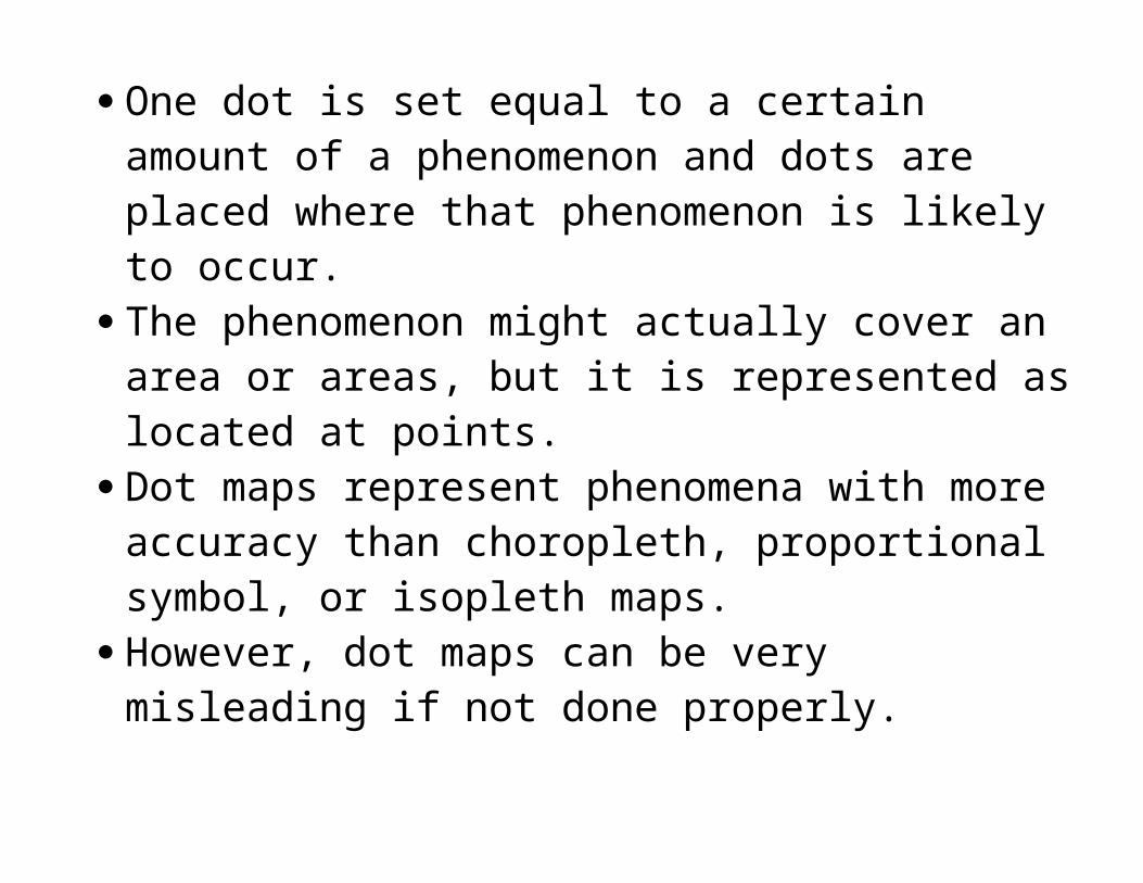
One dot is set equal to a certain amount of a phenomenon and dots are placed where that phenomenon is likely to occur.
The phenomenon might actually cover an area or areas, but it is represented as located at points.
Dot maps represent phenomena with more accuracy than choropleth, proportional symbol, or isopleth maps.
However, dot maps can be very misleading if not done properly.
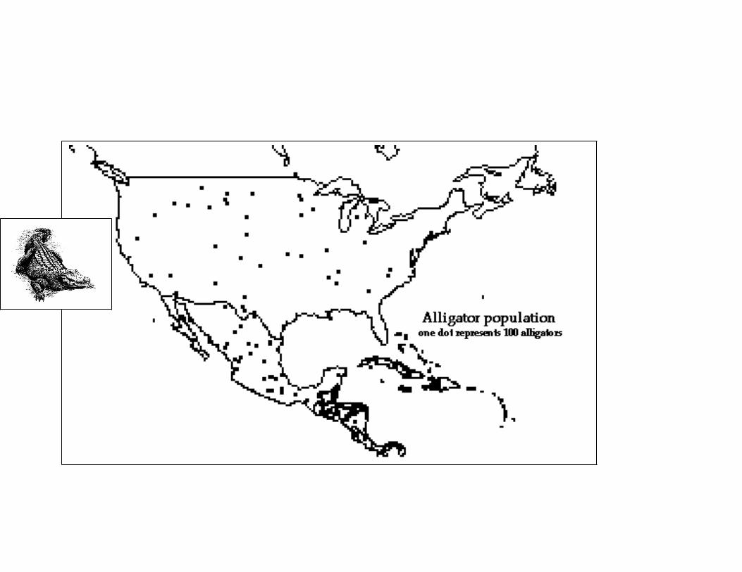
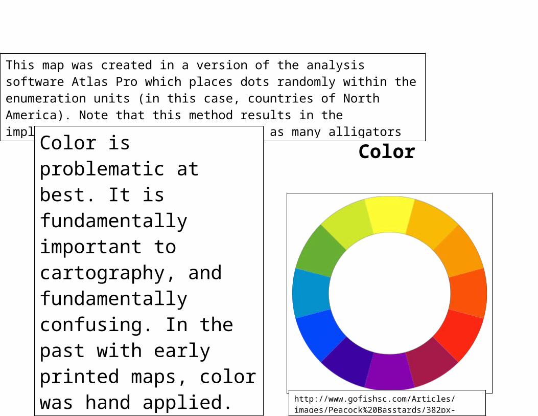
This map was created in a version of the analysis software Atlas Pro which places dots randomly within the enumeration units (in this case, countries of North America). Note that this method results in the implication that there are at least as many alligators in the Midwest and the desert southwest as there are in Florida.
http://www.ncgia.ucsb.edu/cctp/units/unit47/html/dotmap.html
Color
Color is problematic at best. It is fundamentally important to cartography, and fundamentally confusing. In the past with early printed maps, color was hand applied. The process was expensive and time consuming. These days, the use of color is assumed and a black and white map is viewed as “cheap” or “boring.”
http://www.gofishsc.com/Articles/images/Peacock%20Basstards/382px-BYR_color_wheel.svg.png
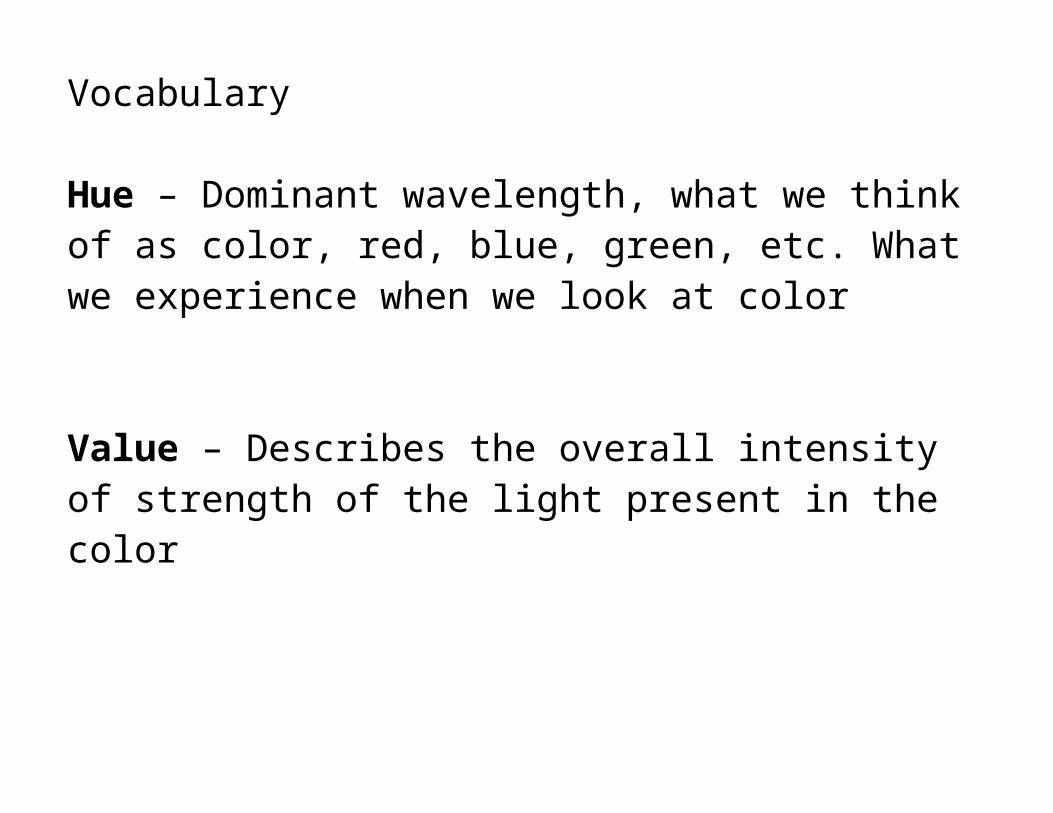
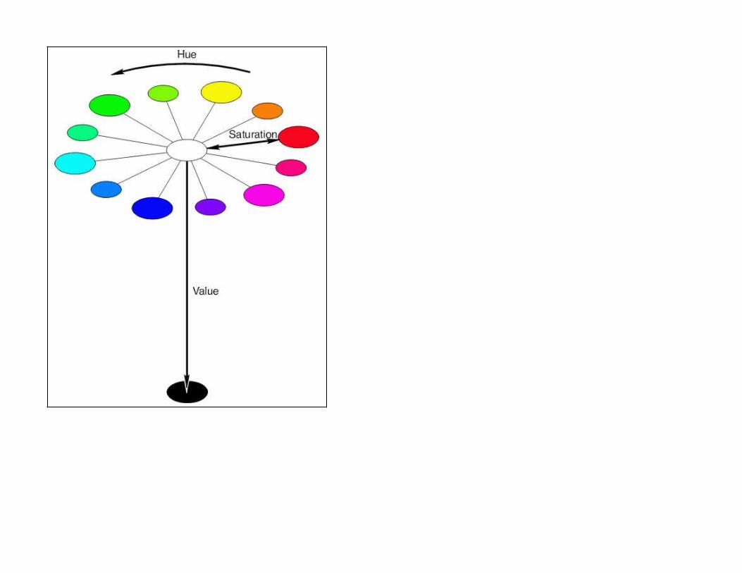
Vocabulary
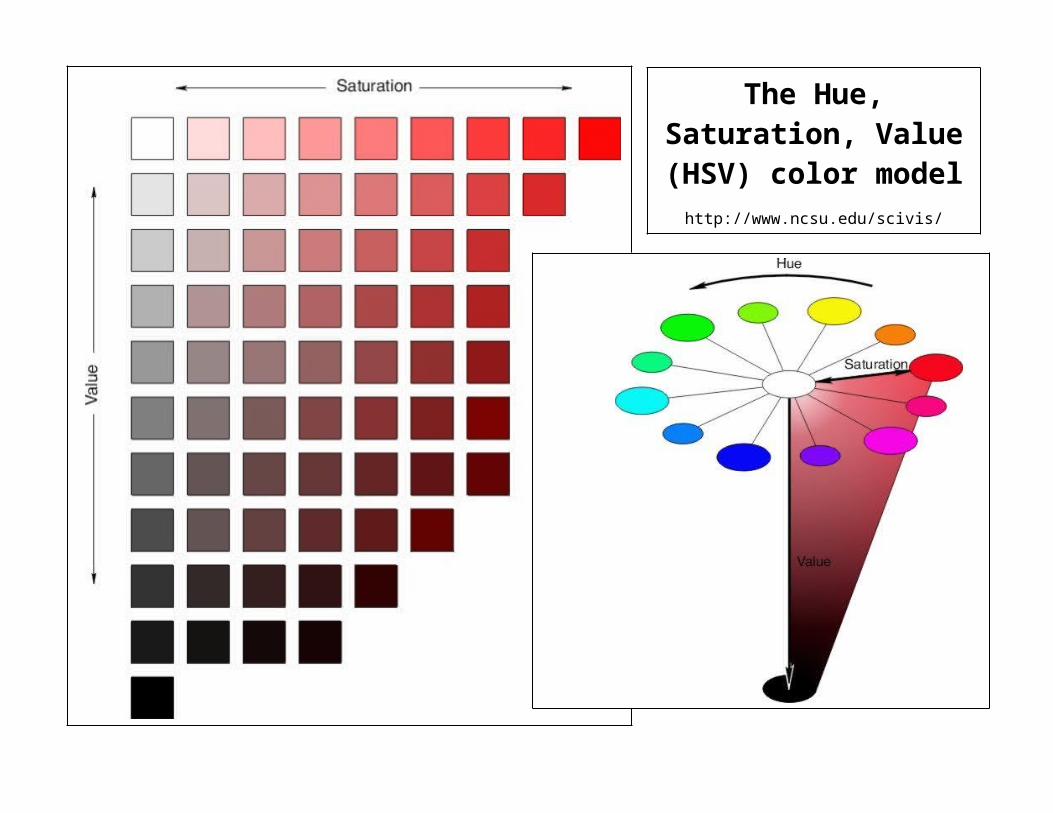
Hue – Dominant wavelength, what we think of as color, red, blue, green, etc. What we experience when we look at color
Value – Describes the overall intensity of strength of the light present in the color
Saturation (chroma)- the dominance of the hue in the color
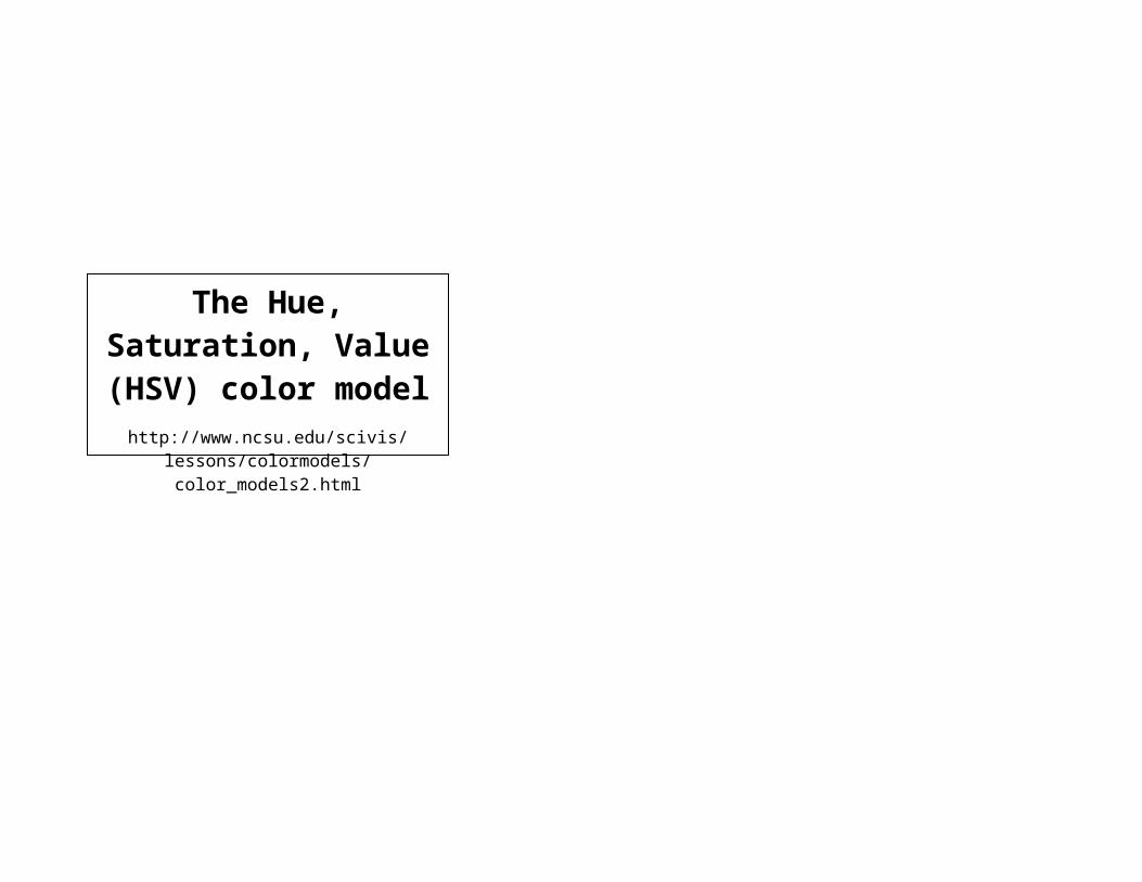
The Hue, Saturation, Value (HSV) color model
http://www.ncsu.edu/scivis/lessons/colormodels/color_models2.html
The Hue, Saturation, Value (HSV) color
modelhttp://www.ncsu.edu/scivis/lessons/
colormodels/color_models2.html
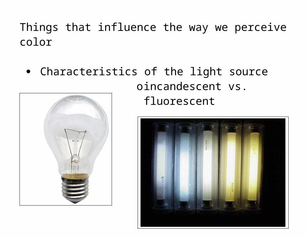
Things that influence the way we perceive color
Characteristics of the light sourceoincandescent vs. fluorescent
http://www.globalwarmingart.com/images/d/d9/Incandescent_Light_Bulb.pnghttp://www.tecnocem.com/image/fluorescents-lamps/portable-fluorescent-light.jpg
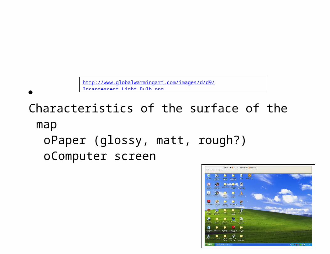
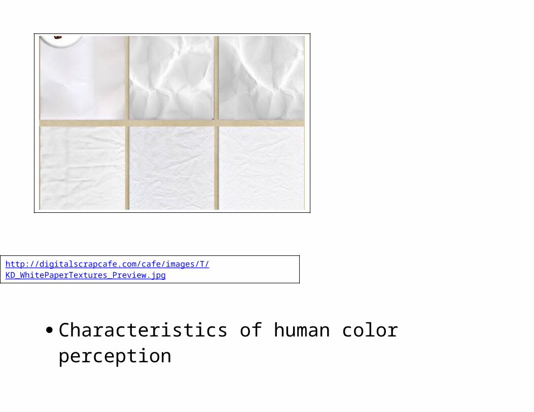
Characteristics of the surface of the mapoPaper (glossy, matt, rough?)oComputer screen
http://digitalscrapcafe.com/cafe/images/T/KD_WhitePaperTextures_Preview.jpghttp://i221.photobucket.com/albums/dd225/KellySt10/unwantedtanbarattopofdesktop.jpg
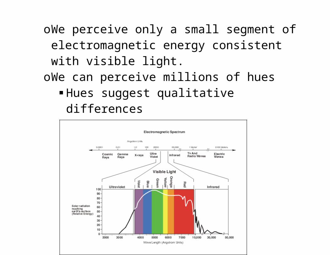
Characteristics of human color perceptionoWe perceive only a small segment of electromagnetic
energy consistent with visible light.oWe can perceive millions of hues
Hues suggest qualitative differences
http://www.ncsu.edu/scivis/lessons/colormodels/color_models2.html
Characteristics of human color perception, cont’doWe perceive differences in value
Lightness vs darkness Value suggests quantitative differences
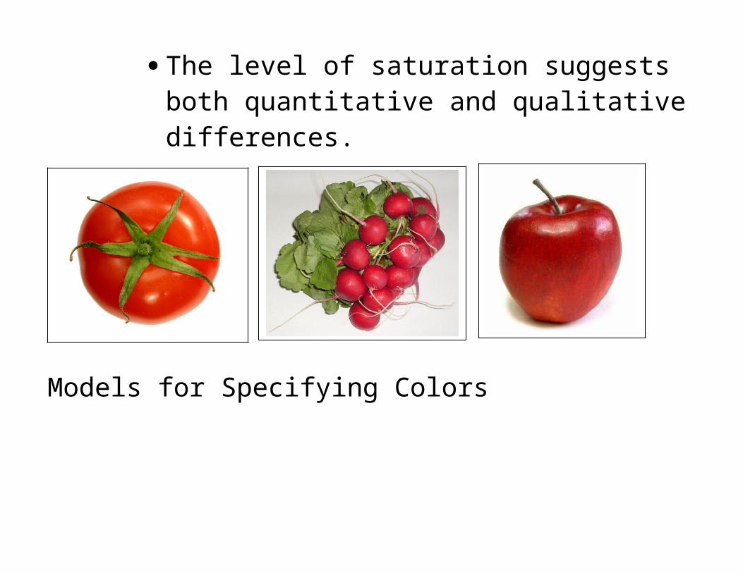
oWe perceive level of saturation This is the amount of the pure hue in a color relative
to neutral gray Radishes, Tomatoes, Apples The level of saturation suggests both quantitative
and qualitative differences.
Models for Specifying Colors
These are schemes which organize and help us produce different colors used by cartographers and graphic designers.
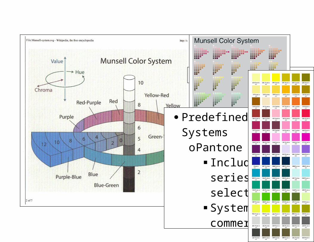
Perceptual Color Systems - based on how humans see colorsoThe Munsell Color System
3D color space based on hue, value and chroma/saturation.
Each plate or chip is easily differentiated by the average user
http://www.idooilpainting.com/_IMAGES/color_system.jpghttp://www.jaimetreadwell.com/munsell.jpg
Predefined Color SystemsoPantone Model
Includes a series of pre-selected colors
System used in commercial printers
You choose the color, the printer does the mixing
http://www.clothmen.com/Pictures/images/color-palet.jpg
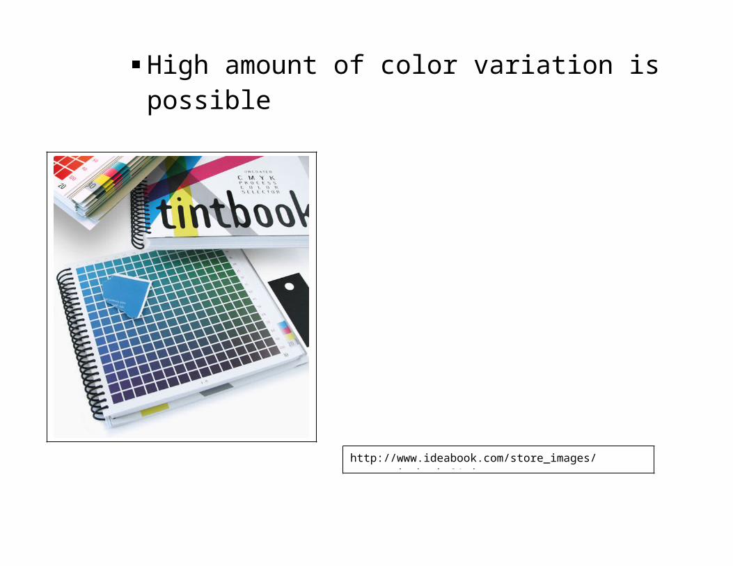
Other systemsoProcess Color Systems – use varying amounts of 3
primary hues to produce all other colors High amount of color variation is possible
http://www.ideabook.com/store_images/store_tintbook_01.jpg
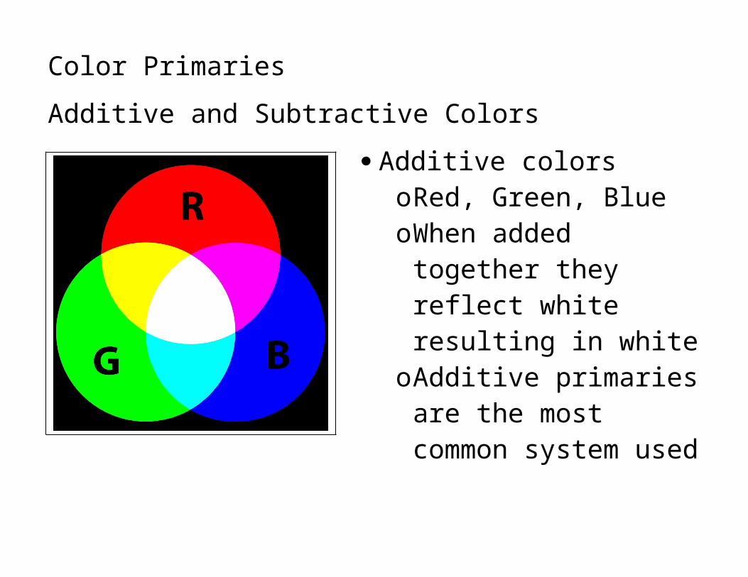
Color PrimariesAdditive and Subtractive Colors
Additive colorsoRed, Green, BlueoWhen added together they
reflect white resulting in white
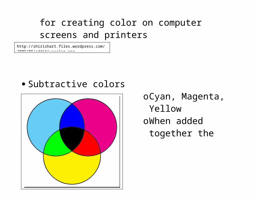
oAdditive primaries are the most common system used for creating color on computer screens and printers
http://shirishart.files.wordpress.com/2009/08/additivecolor.png
Subtractive colorsoCyan, Magenta, YellowoWhen added together
the subtract or absorb all light resulting in black
oIf you want a true black, ir must be added as a separate color Cyan, Magenta and
Yellow make a very dark brown
http://www.ronbigelow.com/articles/color-perception-5/perception-5-3.jpg
Complexities of Color Use
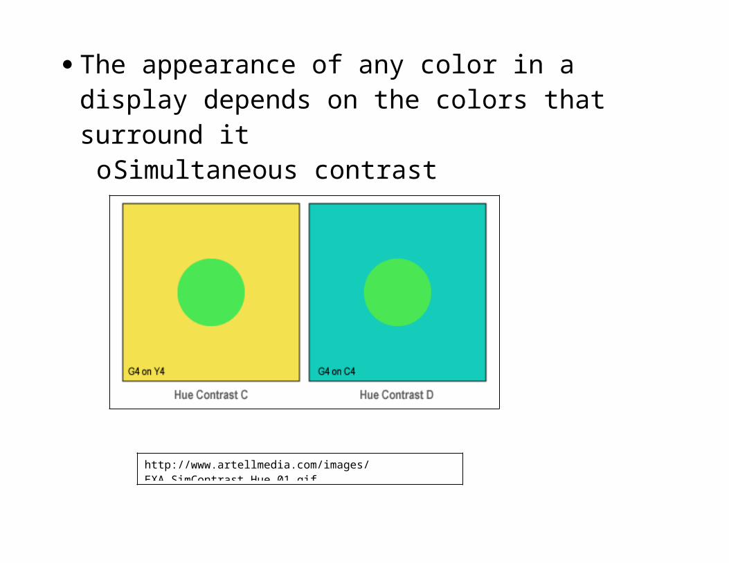
Color interacts with its environment The appearance of any color in a display depends on the
colors that surround itoSimultaneous contrast
http://www.artellmedia.com/images/EXA_SimContrast_Hue_01.gif
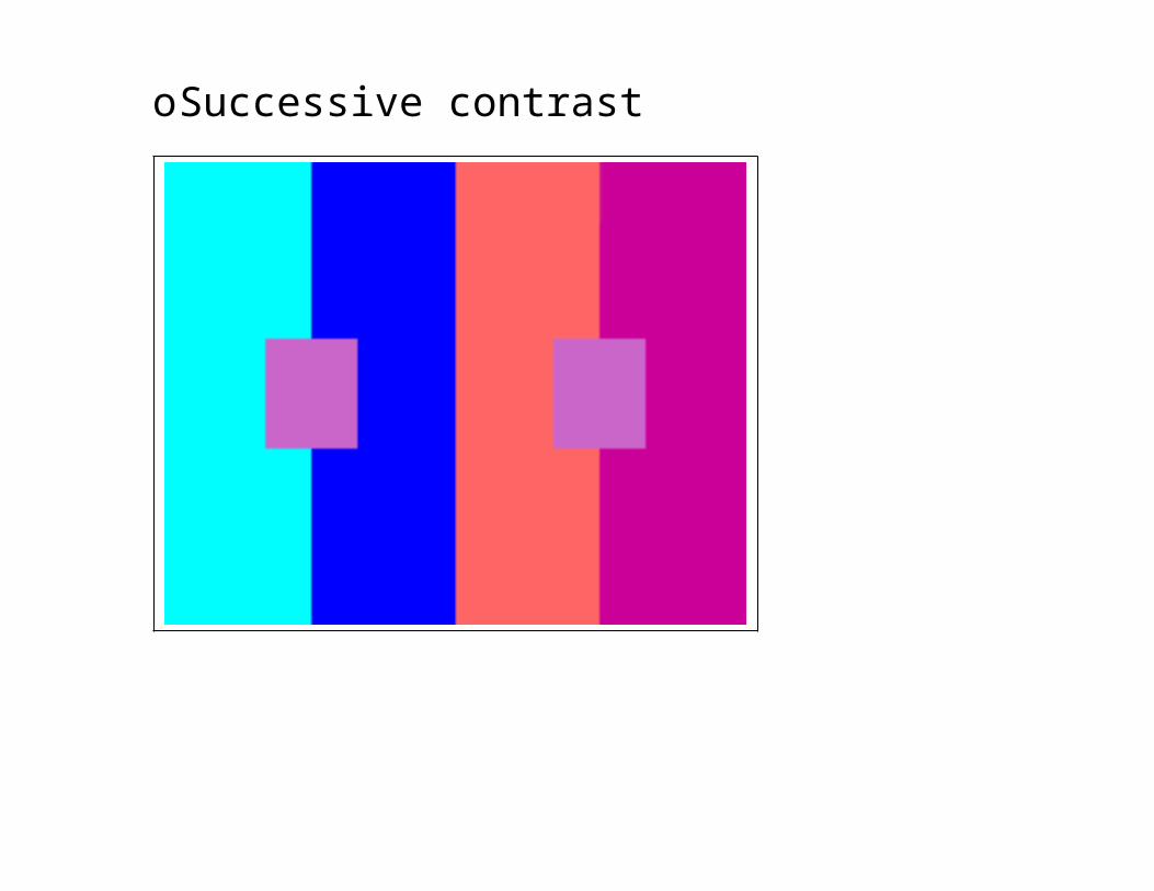
oSuccessive contrast
http://www.uxmatters.com/mt/archives/2006/01/images/color-theory-images/SuccessiveContrast1-2.gif
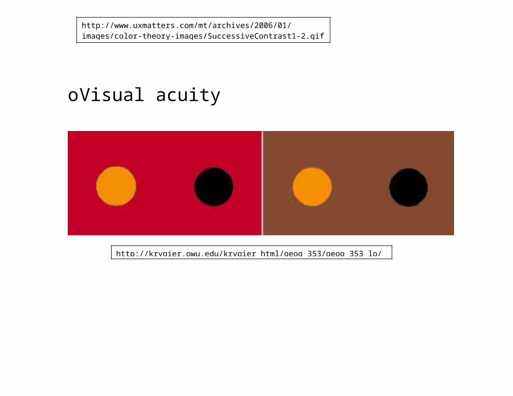
oVisual acuity
http://krygier.owu.edu/krygier_html/geog_353/geog_353_lo/geog_353_lo09.html
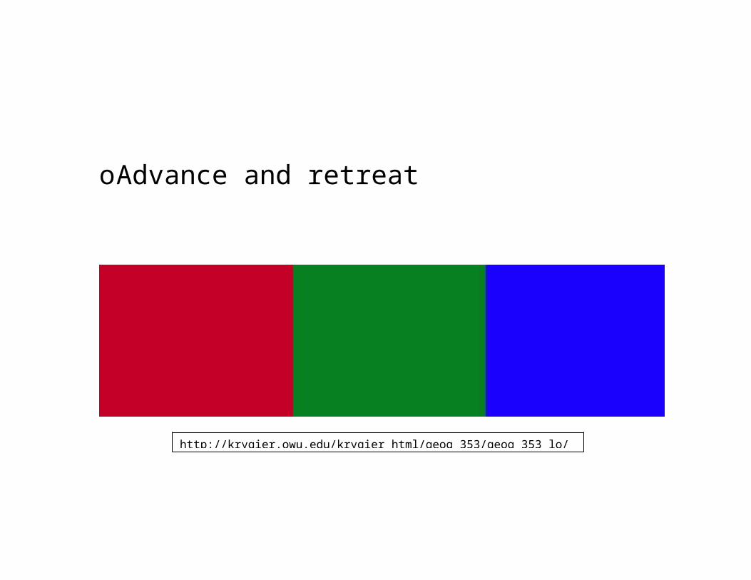
oAdvance and retreat
http://krygier.owu.edu/krygier_html/geog_353/geog_353_lo/geog_353_lo09.html
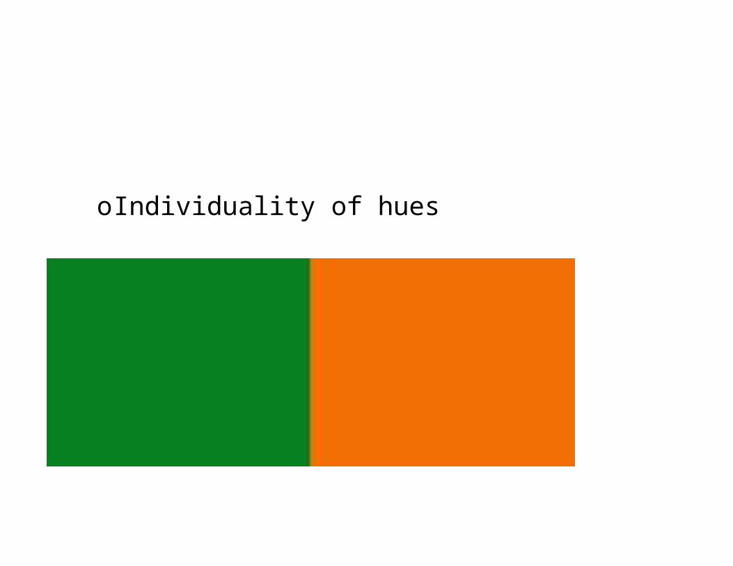
oIndividuality of hues
http://krygier.owu.edu/krygier_html/geog_353/geog_353_lo/geog_353_lo09.html
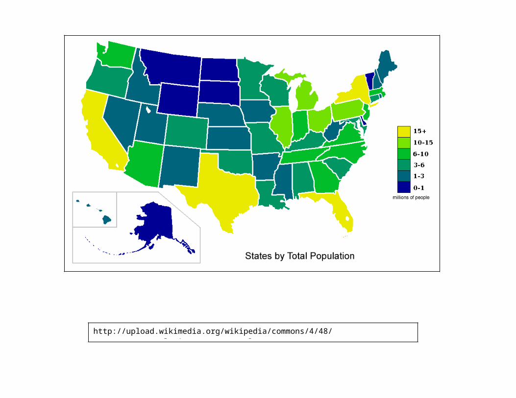
oColors will also seem to vary as their location, size and shape varies
http://upload.wikimedia.org/wikipedia/commons/4/48/USA_states_population_map_2007_color.png
As a result of all these issues it is important to realize that color choice must be carefully thought out, and selected within the context in which it will appear.
Other Issues to consider Children less that 5 years old understand only a limited
set of hues and have difficulty ordering colorsoThey have a preference for reds and greens which will
switch to a preference to blues later in lifeoThey have trouble perceiving highly saturated tones
(which are common in children’s illustrations and maps)
oThey have trouble with highly unsaturated hues
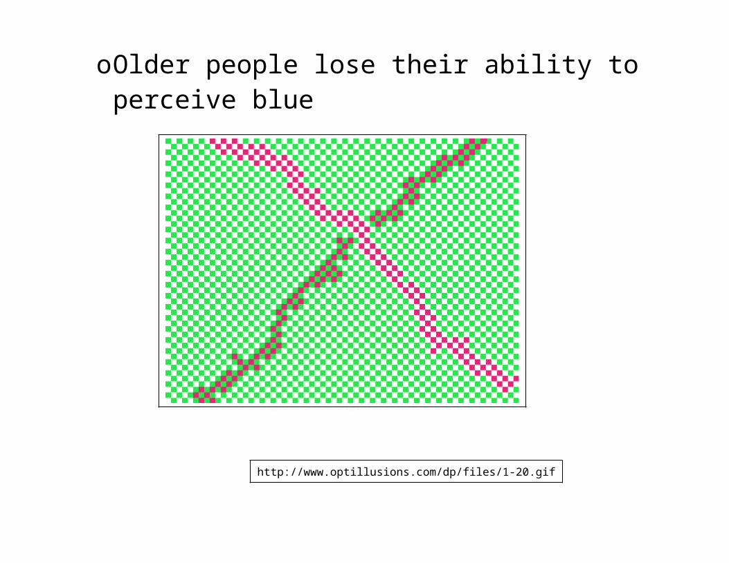
Older people are less sensitive to color and need brighter more saturated colorsoOlder people lose their ability to perceive blue
http://www.optillusions.com/dp/files/1-20.gif
Color blindnesso3% of females, 8% of
malesoRed and green appear
the sameoTry to use colors that
are “color blind safe”
http://files.sharenator.com/testcolo_Color_Blindness_Test_Ultimate_Edition-s500x738-13802-580.jpg
A regular color wheel and that same color wheel as seen by someone who is color blind to the color red.
http://adverlab.blogspot.com/2007/12/color-blind-image-simulation.html
Color has symbolic and emotional connotations which are largely culturally determinedoBlue
Water, cool, passive, loneliness, truth, murderoGreen
Vegetation, lowlands, forests, youth, spring, envy, greed, jealousy, peace
oRed Warm, importance, action, life, blood, fire, heat,
danger, passion, joy, angeroYellow
Aridity, cheerful, dishonest, cowardice, spring, warning
oOrange Harvest, fall, fire, warning
oBrown Landforms, cozy, dull, assuring, comfortable
oPurple Dignity, royalty, despair, elegance
oWhite Clean, faith, truth, illness
oBlack Mystery, strength, heaviness, mourning
oGray Quiet, unimportant, controlled, formality
Color and the Choropleth Map
An excellent resource for previewing color on a map
Cynthia Brewer Map Color,
http://colorbrewer2.org/
Color can be used various ways on Choropleth mapsOne variable color schemes:
using variations in value to show differences
Qualitative schemesoRepresent differences with different hues
http://krygier.owu.edu/krygier_html/geog_353/geog_353_lo/geog_353_lo09.html
Binary SchemesoUse constant hue, vary value
http://krygier.owu.edu/krygier_html/geog_353/geog_353_lo/geog_353_lo09.html
http://krygier.owu.edu/krygier_html/geog_353/geog_353_lo/geog_353_lo09.html
Sequential SchemesoHold hue constant, vary differences in hue to create a
hierarchy
Diverging SchemesoFocus on midpoint, vary hues and values from that
point
http://krygier.owu.edu/krygier_html/geog_353/geog_353_lo/geog_353_lo09.html
Two and Two and three variable color schemes Used for showing two or three data variables at once Harder to interpret, geared towards sophisticated users
Typehttp://krygier.owu.edu/krygier_html/geog_353/geog_353_lo/geog_353_lo09.html
Functions of type on maps Used for naming and labeling Use to organize features perceptually Provides structure for the graphic elements Can be manipulated to form a hierarchy Links the reader to the map’s intellectual hierarchy Used to explain – explanatory text & map elements Can create a visual atmosphere (historic type)
Facets of Type
What the word means – content and meaning What the word looks like, as a graphic symbol
oBigger vs. smaller, type faces, type forms
Letterform Anatomy While a perfect knowledge of letterform anatomy is not
required, it is useful to have a familiarity with the elements so you can better evaluate the readability of a typeface.
http://www.davidairey.com/images/design/letterform.gif
Typographic Variables in Cartographic Design Type style – serif, sans serif etc.
Times New Roman vs. Ariel Type size – how big is it? How does it change as you
change its size?Times New …Ariel
Type weight – how heavy is it? Does it use thick or thin line weights?
Lucida Bright vs. Franklin Gothic Medium vs. IMPACT Type form – spacing, upper case, italics, etc. C o u r i e r , Ariel, LUCIDA BRIGHT
Type style Creates the “mood” of the map Do not combine two ore more type styles on the map If using both serif and sans serif on the same map, be
careful how you combine them as they may not look good together (one may look “modern” while the other looks “frumpy”)
If using blocks of text, such as explanatory text, or in your map elements consider that serif type is easier to read in blocks of text.
Avoid decorative type styles as they draw attention away from the map
Type Size Variations in type size imply ordered or quantitative
relationships. The larger the type, the more important the text Avoid using less that 6 point size type as it is difficult to
see Avoid using type larger than 24 as it is too large for most
maps Vary type size 2-3 points in difference. The reader can
easily pick up these differences Do not use more than 5 categories on type on a map.
Type Weight Bold type assigns importance Do not underline type on labels, use bold instead
Type Form UPPER CASE vs. lower case – builds a hierarchy
oDo not use all upper case, it’s hard to read, same goes for all caps type
Italics vs. plain text- separates types of featuresoBy convention italics are used for natural features,
regular type is used for cultural featuresoItalics is hard to read, best suited for water features
S p a c i n g - g o o d f o r a r e a f e a t u r e soWide spacing is fine for labeling large areas
Type Placement – Labeling Points
http://krygier.owu.edu/krygier_html/geog_353/geog_353_lo/geog_353_lo10.html
Ideal placement for labels 1=best, 8=worst
Type placement needs to reflect the characteristics of the location being labeled. Label ports & harbor towns on the sea Label inland towns on land Label land features on the land, water features on water Label towns on the side of the river they are on
Type Placement – Labeling Linear Features Above the feature and horizontal to it
http://krygier.owu.edu/krygier_html/geog_353/geog_353_lo/geog_353_lo10.html
If you must place a label vertically, place the first letter towards the bottom of the map.
Repeat labels if need be, don’t space them out.
http://krygier.owu.edu/krygier_html/geog_353/geog_353_lo/geog_353_lo10.html
Type Placement – Areal Features Curve and space the type to fit the areas to ensure that the
area and he label are clearly associated Keep labels as horizontal as possible Avoid vertical or upside down labels Avoid hyphenating or breaking up labels
http://krygier.owu.edu/krygier_html/geog_353/geog_353_lo/geog_353_lo10.html
Overlapping labels can be distinguished by varying type size, weight and form.
Linear areas should be labeled like line symbols.
http://krygier.owu.edu/krygier_html/geog_353/geog_353_lo/geog_353_lo10.html
In conclusion…
These days the computer can pretty much do everything for you from selecting class intervals to type size. However, even though we can do it faster, it doesn’t mean it’s better.
Knowing what the computer can do is great, but in the end you as the cartographer are responsible for the final product, and only you can make the necessary design decisions that will be the difference between a good map and a poor one.