Women's Online Community Website Brand Standards
29
Brand Standards
-
Upload
kaye-putnam -
Category
Marketing
-
view
473 -
download
3
Transcript of Women's Online Community Website Brand Standards

Brand Standards

CONTENTS This brand standards document explores the message, visuals, and expression of the Vibrant Nation brand.
1. Brand Message 2. Design & Visuals 3. Words & Content 4. Live Your Brand
BRAND GUIDELINES VIBRANT NATION

MOODBOARD The moldboard was curated to express the “mood” of the brand and to inspire the visual decisions. The bright flowers are like ones that you’d bring to cheer up a friend. The kitchen is where some of our deepest conversations happen with those closest to us. I also featured women who fit your target market - not just by age, but with vibrant personalities and confidence.

Brand Message

POSITION
CORE IDEA Vibrant Nation is an online community and resource for women aged 45+ who are seeking support, friendship, and advice.
OUR GOAL We want to grow a thriving community of women who celebrate the stage of life they are in, offer peer-to-peer support, and view our brand as a safe & trusted place to go.
HOW WE ARE DIFFERENT As one of the few online communities that targets this demographic, we offer specific advice and resources that our women aren’t likely to find in other places.
WHAT WE DELIVER Our site gives them a combination of curated editorial content and community generated content targeted at the transitions they are experiencing now: an empty nest, retirement looming, aging parents, divorce, downsizing, menopause, etc.
BRAND GUIDELINES VIBRANT NATION
01
Brand Message

PERSONALITY
GIRL NEXT DOOR PERSONALITY ARCHETYPE
We want to create a healthy and thriving community where women feel like they belong and that they are not alone.
We are the practical and knowledgeable best friend who never judges you. We are the person you turn to when you want real-life and down-to-earth advice.
When they encounter our brand, our audience FEELS: Understood, seen, included, warm, trusting.
We are: • Real & authentic • Frank • Supportive • Warm • Relatable • Open-minded • Practical • Friendly • Honest • Humble
Channel your inner Thelma & Louise when you communicate with your audience.
BRAND GUIDELINES VIBRANT NATION
01
Brand Message

POINT OF VIEW
WE’RE BUILDING A SAFE PLACE With so many life transitions happening in women’s lives from age 45+, they need a safe and judgement-free place to turn to ask questions and get support.
FRIENDSHIPS MAKE THE WORLD GO ‘ROUND As we build our ‘neighborhood’ online, we love to see familiar faces. We recognize the voices in our community and treasure their friendship.
DON’T STEREOTYPE ME Life is definitely NOT over at 45. We’re thriving and living vibrantly. We’re also not 20 or 30 anymore. Speak to me with maturity, confidence, and authenticity.
GIVE TO THE COMMUNITY & IT’LL TAKE CARE OF YOU The community is built on peer-to-peer mentorship and support. If you give to the community where you can, they’ll give back to you when you need advice and love.
WISDOM IS EARNED Every woman is an expert once she reaches this stage of her life. You’ve ‘been there, done that.’ Use that wisdom you’ve earned over the years to help other women like you.
BRAND GUIDELINES VIBRANT NATION
01
Brand Message

I don’t want perfection, I want honesty.
MANIFESTO

VISIONWHAT WE’RE BUILDING A leading resource and community for women in mid-life.
HOW OUR COMMUNITY SEES US A safe & judgment free place to get advice, support, and friendship.
HOW INFLUENCERS SEE US A highly desirable place to be published because of our reach and brand.
HOW BRANDS SEE US The best platform to reach women 45+.
BRAND GUIDELINES VIBRANT NATION
01
Brand Message

Design & Visuals

LOGO
BRAND GUIDELINES VIBRANT NATION
02
The logo is uncomplicated and unfussy - like a knowledgeable best friend. She may not be a super model, but she listens. The deep purple is a color of wisdom, and the grey/brown feels approachable. The VN alternate mark can be used a watermark or signature.
Visual Identity

PRIMARY COLORS
BRAND GUIDELINES VIBRANT NATION
02
The deep purple is a color of wisdom. The blue communicates trust and community. The orange is friendly. (Use it sparingly for Calls to Action.) All three of the colors are modern and vibrant, which fit your brand name and personality.
#8b184f
20% 40% 60% 80%
#368ea1 #df5534
20% 60% 20% 60%
Visual Identity

SECONDARY COLORS
BRAND GUIDELINES VIBRANT NATION
02
The approachable brown will be used as a dark background color and for text. The grey is a confident color, and can be used as a background or a stroke. The feminine white can also be used as a background color or as the text color on dark backgrounds.
#5c5046 #d1d1d1 #f1f1f1
Visual Identity

PATTERNS
BRAND GUIDELINES VIBRANT NATION
02
The neutral color of the patterns is intentional. They should be used to balance out the vibrant colors seen elsewhere the brand. The designs are modern and mature, like our audience.
Visual Identity
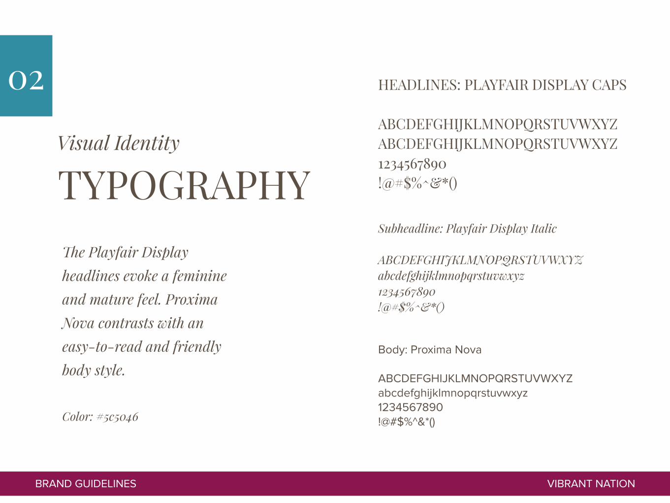
TYPOGRAPHY
HEADLINES: PLAYFAIR DISPLAY CAPS
ABCDEFGHIJKLMNOPQRSTUVWXYZ ABCDEFGHIJKLMNOPQRSTUVWXYZ 1234567890 !@#$%^&*()
BRAND GUIDELINES VIBRANT NATION
02
Subheadline: Playfair Display Italic
ABCDEFGHIJKLMNOPQRSTUVWXYZ abcdefghijklmnopqrstuvwxyz 1234567890 !@#$%^&*()
Body: Proxima Nova
ABCDEFGHIJKLMNOPQRSTUVWXYZ abcdefghijklmnopqrstuvwxyz 1234567890 !@#$%^&*()
The Playfair Display headlines evoke a feminine and mature feel. Proxima Nova contrasts with an easy-to-read and friendly body style.
Color: #5c5046
Visual Identity

FONTS IN ACTION
HEADLINE LEVEL 1 Subheadline
This is a description paragraph. It explains the purpose of the page and describes the title to the left.
1. Example 2. Example 3. Example 4. Example
“This is a quote from a very impressive person.”
-IMPORTANT PERSON
HEADLINE LEVEL 2
This is a description paragraph. It explains the purpose of the page and describes the title to the left. This is a description paragraph. It explains the purpose of the page and describes the title to the left.
• Example • Example • Example
HEADLINE LEVEL 3
BRAND GUIDELINES VIBRANT NATION
02
Headline & Body: #5c5046 Quote: #368ea1
Visual Identity

Image Style

IMAGE DO’S
BRAND GUIDELINES VIBRANT NATION
02
Visual Identity
To keep the brand consistent and authentic, pick stock images like these.
“Still life” photos related to article content
Studio, grey background with a real-looking woman
Show realistic relationships our women have
Out enjoying activities popular with our market
Environmental portraits of our target market
Another pretty still life setup

IMAGE DON’TS
BRAND GUIDELINES VIBRANT NATION
02
Visual Identity
To keep the brand consistent and authentic, avoid stock images like these.
Exaggerated expressions, theatrics Black and white photos
Staged poses Heavy photo filters/color alteration
People too young for our brandComputer-generated setups
People too young for our brand Nobody does this in real life.

Words & Content

TAGLINE W O M E N W H O… know.
understand. listen.
support each other. have been there.
BRAND GUIDELINES VIBRANT NATION
03
Brand Communication
Your tagline shouldn’t focus on the content - it’s about the women. You can also expand the tagline for different applications.

TONE OF VOICE
BRAND GUIDELINES VIBRANT NATION
03
Brand Communication
Your brand needs to sound consistent. Your brand occupies the position of the “best friend” - that’s how you should sound.
Content and communication from the Vibrant Nation brand should be specific, helpful, and supportive. Your people need to know that they aren’t alone in the issues they are facing.
Examples should come from real life situations and stories, not theories or statistics. Share resources without judgement - just support.
You’ll sound: • Supportive not judgmental • Warm not strictly facts-based • Down-to-earth not super-polished • Honest not perfect • Confident not wavering

WORD BANK
Authenticity Safe place Wisdom Been there, done that Friendship Community Questions & Answers Advice Resource Safe to share Big vibrant mess Sisterhood Encouragement Celebrate the transitions Hunt the good New adventures Feel more fulfilled
BRAND GUIDELINES VIBRANT NATION
03
Brand Communication
These are words and phrases we used describing the brand. Use them throughout your communication and content.

STORIESLOW TO HIGH On your “about” page, tell a story of your target client and what it feels like to be without friends, resources, and a community to navigate through their life stage. Contrast it with what happens when that same woman finds your community.
WHY STORY Speak to the fact that you wanted to create a community for this group of women who was previously ignored. You want them to feel like they belong.
HUMAN INTEREST Share as many stories from your community as possible that highlight how a community can help you feel more seen, included, and supported.
BRAND GUIDELINES VIBRANT NATION
03
Brand Communication

Live Your Brand

ACTION STEPS
SEPARATE EDITORIAL & COMMUNITY CONTENT To grow the ‘magazine’ like experience of the brand and to make sure your audience can find valuable content that they keep coming back for, you’ll want to highlight the very best content on your site.
HIGHLIGHT COMMUNITY STORIES Keep using your newsletter and your platform to highlight women’s stories who are both influencers and ‘every day’ women who fit your demographic.
STAY SUPPORTIVE & AUTHENTIC Moderate your community enough so it stays a supportive and safe place as you grow.
UPDATE WEBSITE Incorporate the new brand identity and improve functionality (including social sharing).
UNITE THE TEAM IN THE BRAND Have a meeting with your entire communication team about how you’ll implement this brand voice, message, and values into your everyday actions.
BRAND GUIDELINES VIBRANT NATION
04
Live Your Brand

GRAPHICS
BRAND GUIDELINES VIBRANT NATION
04
These are examples of how text and images can work together in designs. I like the square shapes you already have in the brand, so I updated them with the new brand standards.
Live Your Brand

GRAPHICS
BRAND GUIDELINES VIBRANT NATION
04
This homepage mockup shows an “ideal” situation when you redesign in 2016. The editorial content is separated from the community content, the brand is integrated, and the design is modern and engaging.
Live Your Brand

A N Y questions?Contact me:
Brand Strategy & Design by Kaye Putnam