
"Woman's Weekly" Magazine Analysis!
11
Magazine Analysis Kelsie Barrett
-
Upload
kelsbarrett1 -
Category
Education
-
view
36 -
download
2
Transcript of "Woman's Weekly" Magazine Analysis!

Magazine Analysis
Kelsie Barrett

Image as a whole
Masthead
Date of Issue & Price
Puff
Main Image
Main Cover Line
Caption and Lure
Barcode
Cover line
Banner
Strapline
Lure
Lure
Lure
The magazine draws attention due to its packed cover; making it look as though it is good value for money and therefore affordable to all audiences.
The colouring of the magazine cover, as a whole is very stereotypical for a female. The pink writing makes the magazine seem light and friendly. The white background makes it seem innocent and fun.

Masthead
Being pink, the masthead has a very friendly, girly vibe making it seem fun, light hearted and relatable to most women; making it something every girl wants. The fact that the masthead is positioned at the top of the page and spread out to reach both ends makes it important and stand out to an audience member stood away from the magazine stand. The lettering is tall but squashed together in order to fit all of the text onto the cover and draw the most attention. The lady in the middle interrupts the masthead by her image overlapping. This makes the masthead look different to usual and perhaps suggesting it is a special edition.
Main Image
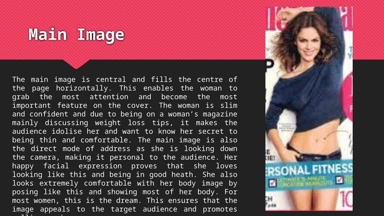
The main image is central and fills the centre of the page horizontally. This enables the woman to grab the most attention and become the most important feature on the cover. The woman is slim and confident and due to being on a woman’s magazine mainly discussing weight loss tips, it makes the audience idolise her and want to know her secret to being thin and comfortable. The main image is also the direct mode of address as she is looking down the camera, making it personal to the audience. Her happy facial expression proves that she loves looking like this and being in good heath. She also looks extremely comfortable with her body image by posing like this and showing most of her body. For most women, this is the dream. This ensures that the image appeals to the target audience and promotes selling copies.

Caption
The caption to the main image lures the audience into the magazine as ‘in 4 moves’ sounds quick, easy and doable. The girly, fun font also appeals to the target audience by appealing to women (even if it is stereotypical). The thin, italic writing stands out on the crowded page as it is a different font to the rest; however, still matching the fun theme of the cover. The caption doesn’t attract too much attention as it is placed on the right hand side out the page. This ensures that it doesn’t take away too much attention from the masthead or main image as it isn’t the most important or most relevant feature on the page.
Banner
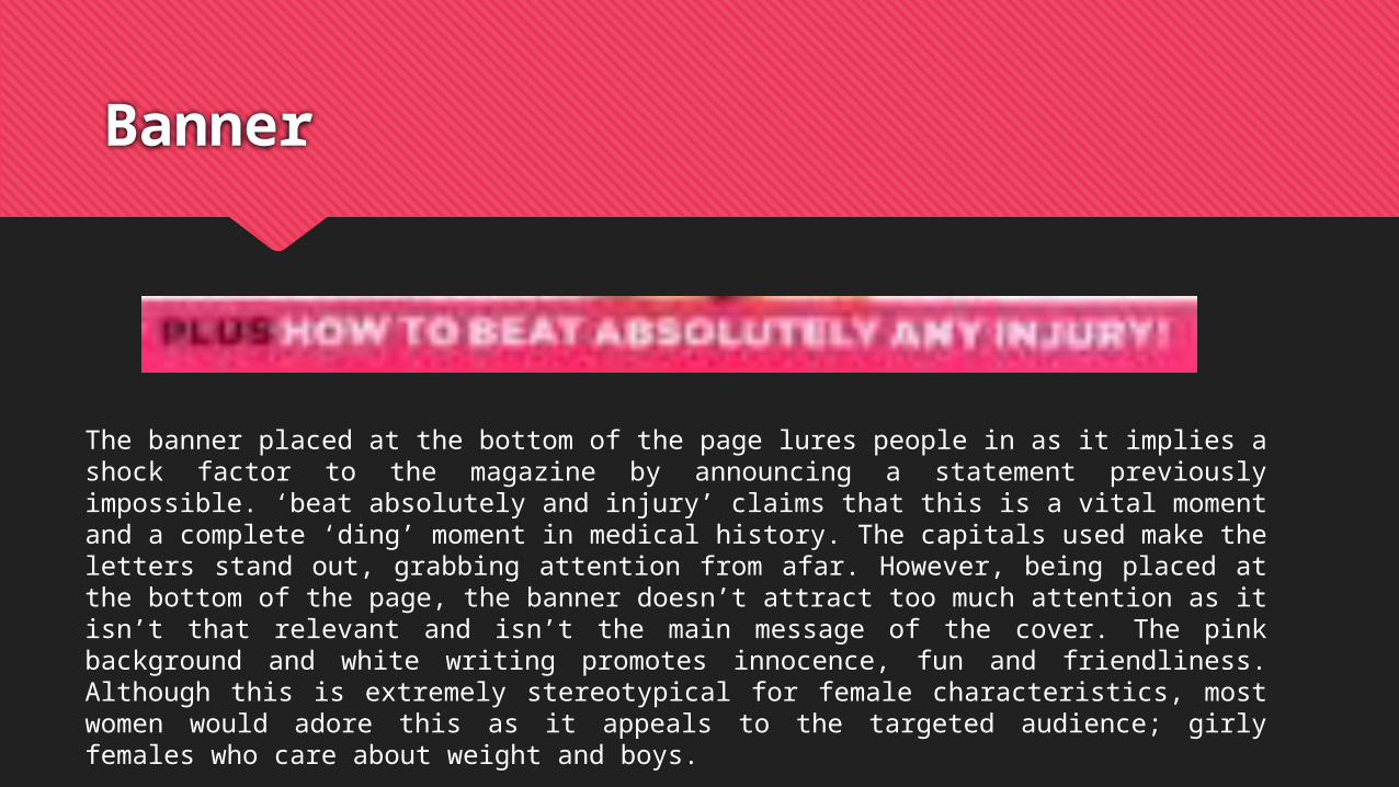
The banner placed at the bottom of the page lures people in as it implies a shock factor to the magazine by announcing a statement previously impossible. ‘beat absolutely and injury’ claims that this is a vital moment and a complete ‘ding’ moment in medical history. The capitals used make the letters stand out, grabbing attention from afar. However, being placed at the bottom of the page, the banner doesn’t attract too much attention as it isn’t that relevant and isn’t the main message of the cover. The pink background and white writing promotes innocence, fun and friendliness. Although this is extremely stereotypical for female characteristics, most women would adore this as it appeals to the targeted audience; girly females who care about weight and boys.
Main Cover Line
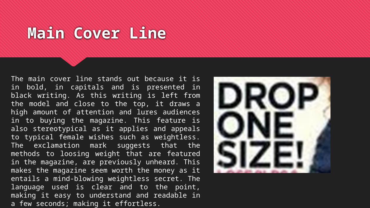
The main cover line stands out because it is in bold, in capitals and is presented in black writing. As this writing is left from the model and close to the top, it draws a high amount of attention and lures audiences in to buying the magazine. This feature is also stereotypical as it applies and appeals to typical female wishes such as weightless. The exclamation mark suggests that the methods to loosing weight that are featured in the magazine, are previously unheard. This makes the magazine seem worth the money as it entails a mind-blowing weightless secret. The language used is clear and to the point, making it easy to understand and readable in a few seconds; making it effortless.

Strap Line
The strap line is featured below the picture and is in capitals drawing the audiences attention and standing out. The blue colouring has the connotation of fitness and feeling fresh. To me, blue makes me think about a swimming pool, relaxation and feeling tropical. These connotations will calm the target audience; making them believe that the magazine will make them feel in control of their weight and ready to take on the world! The ticked tick boxes make the audience believe that weightless is extremely doable and that they are capable. This challenges women to also take on the tackle of becoming fit and healthy. ‘TOP CELEBRITY TONE-UP TRICKS’ makes the audience believe that they can look like their idolised celeb. This makes them believe that they can reach their dream and ultimately, they are more likely to buy the magazine.
Kelsie Barrett
Puff
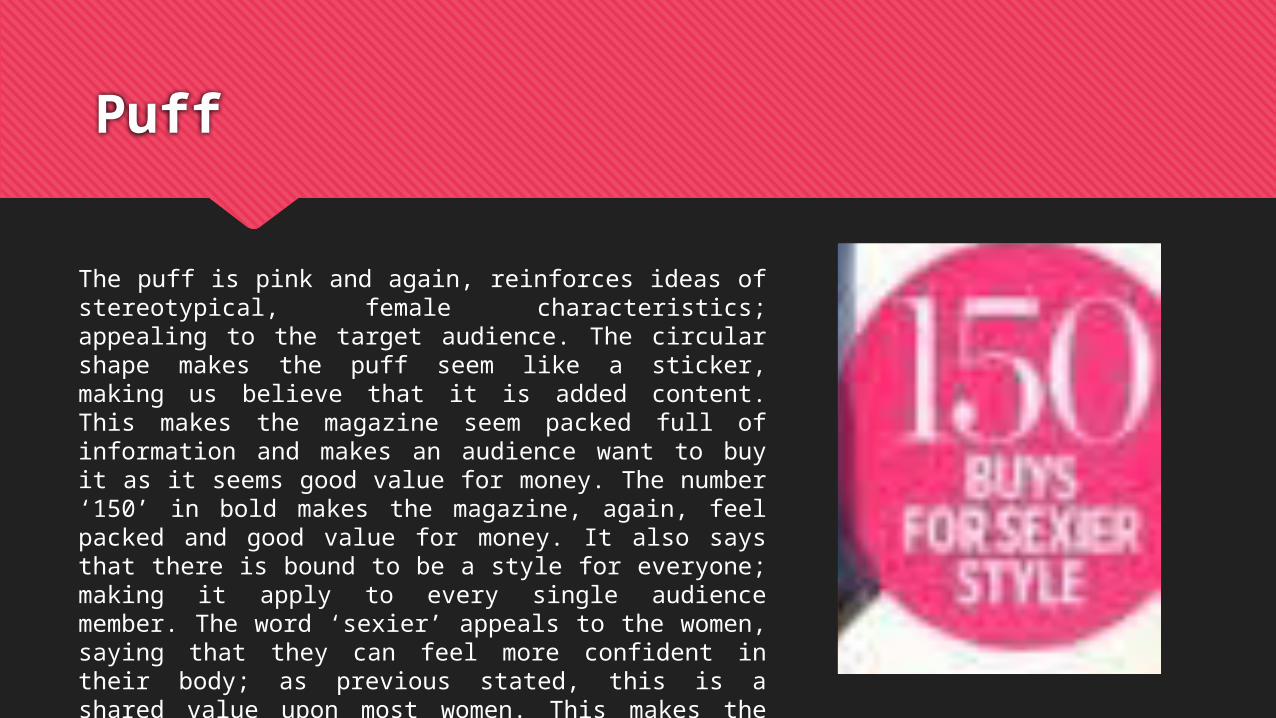
The puff is pink and again, reinforces ideas of stereotypical, female characteristics; appealing to the target audience. The circular shape makes the puff seem like a sticker, making us believe that it is added content. This makes the magazine seem packed full of information and makes an audience want to buy it as it seems good value for money. The number ‘150’ in bold makes the magazine, again, feel packed and good value for money. It also says that there is bound to be a style for everyone; making it apply to every single audience member. The word ‘sexier’ appeals to the women, saying that they can feel more confident in their body; as previous stated, this is a shared value upon most women. This makes the magazine more buyable.
Bar Code and Date of Issue and Price
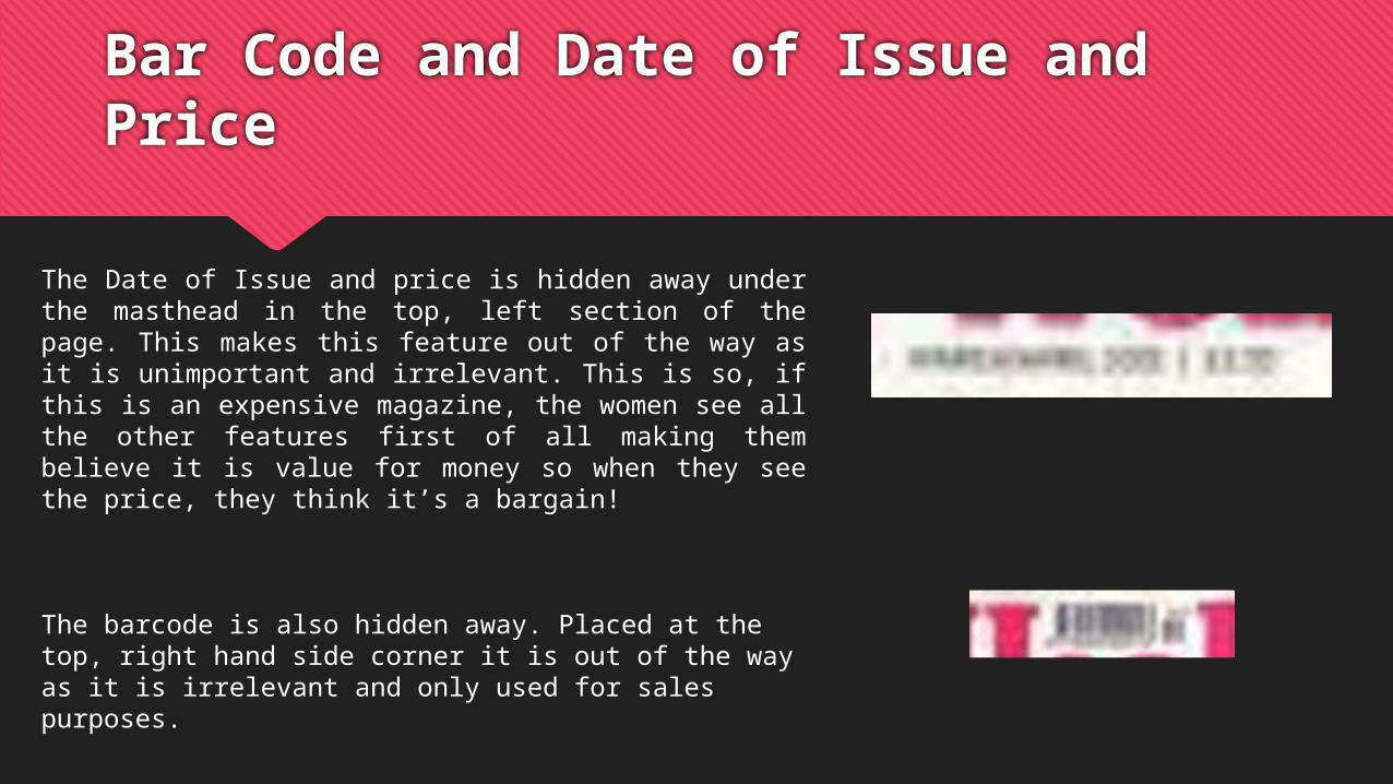
The Date of Issue and price is hidden away under the masthead in the top, left section of the page. This makes this feature out of the way as it is unimportant and irrelevant. This is so, if this is an expensive magazine, the women see all the other features first of all making them believe it is value for money so when they see the price, they think it’s a bargain!
The barcode is also hidden away. Placed at the top, right hand side corner it is out of the way as it is irrelevant and only used for sales purposes.
Cover Lines and Lures
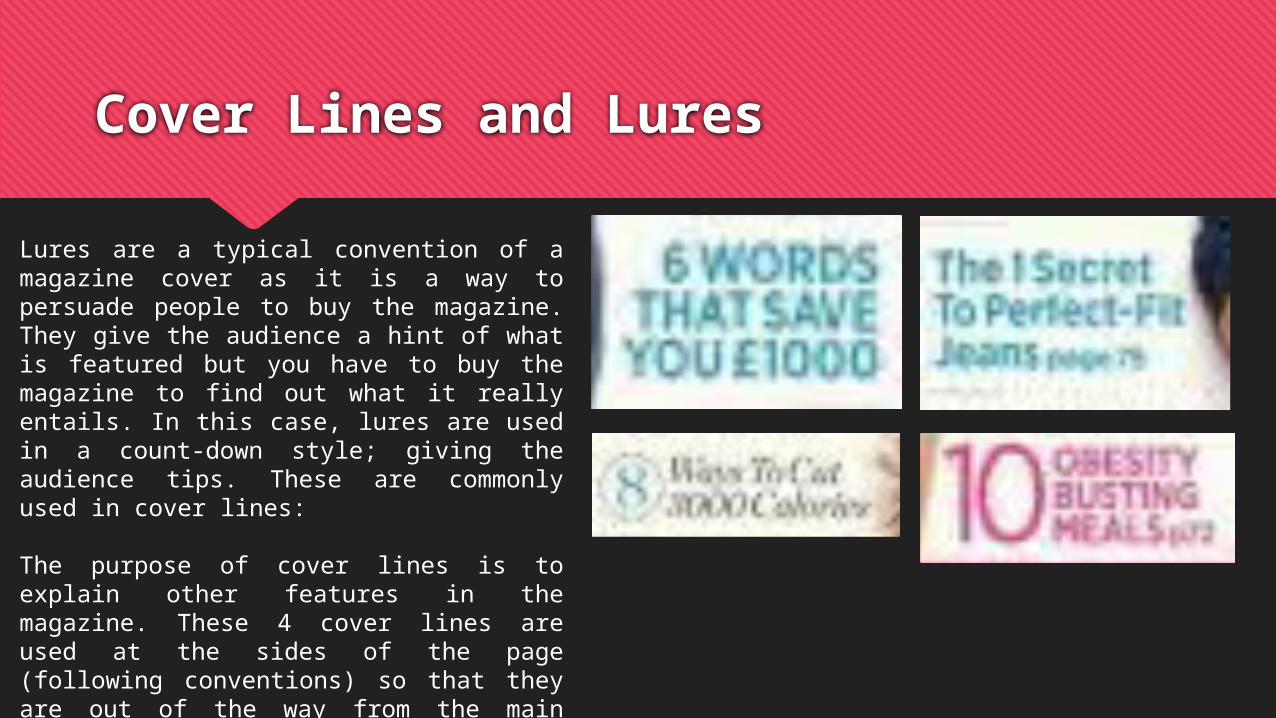
Lures are a typical convention of a magazine cover as it is a way to persuade people to buy the magazine. They give the audience a hint of what is featured but you have to buy the magazine to find out what it really entails. In this case, lures are used in a count-down style; giving the audience tips. These are commonly used in cover lines:
The purpose of cover lines is to explain other features in the magazine. These 4 cover lines are used at the sides of the page (following conventions) so that they are out of the way from the main features however, are still kept in mind. The colours are different but still comply to the main themes of the magazine.