WINTER-AUTUMN TRENDS 2015
23
AUTUMN/WINTER Trends 2015
-
Upload
kerry-hildyard -
Category
Documents
-
view
144 -
download
0
Transcript of WINTER-AUTUMN TRENDS 2015
AUTUMN/WINTER Trends 2015
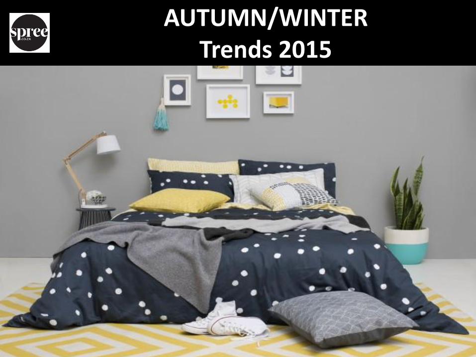
MACROTRENDS AUTUMN/WINTER 2015
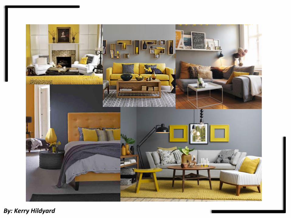
By: Kerry Hildyard

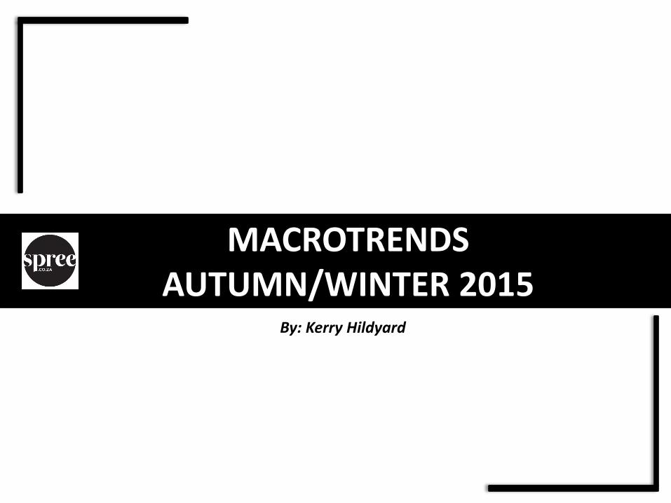
1.DUSTY BLUSH
• Inspired by sunrise & sunset
• The blend of barely here pastel tones and dark shades
• Creates a enigmatic yet positive mood
• Sepia style and butterscotch tones inspired by the sky of Mars
• Powdery tints
• Romance & beauty
• Stems from the pure natural beauty of a person
• Warm, yellowed neutrals are tinted with browns, pinks and a hint of purple that all reflect on a
purity of winter white.
• Fabrics reflect a sense of skin and translucency
• Delicate lines with forms of drapery
• Delicate balance between natural and a new minimalism
• Products are intricate and detailed but have a clean and polished appearance
• Warm coloured metals like copper and gold features
• Ceramics are porous and textured
• Refined wood and marble add a sense of crafty luxury
• Printed pattern is very low key, most decoration comes from textured surfaces
• Fine stripes and delicate honeycombs create a structural aesthetic
By: Kerry Hildyard

1.DUSTY BLUSH
KEYWORDS:
• OMBRE EFFECTS
• IRIDESCENT ACCENTS
• MULTI COLOUR WASHES
• GEOMETRIC SHAPES
COLOURS:
YELLOWS
TINTED BROWNS
POWDERY PINKS
PURITY WHITES
MATERIALS:
• SUBTLY BRUSHED
SURFACES
• TUFTED & FRINGED TRIMS
• DIPPED & PAINTED
By: Kerry Hildyard

By: Kerry Hildyard
By: Kerry Hildyard
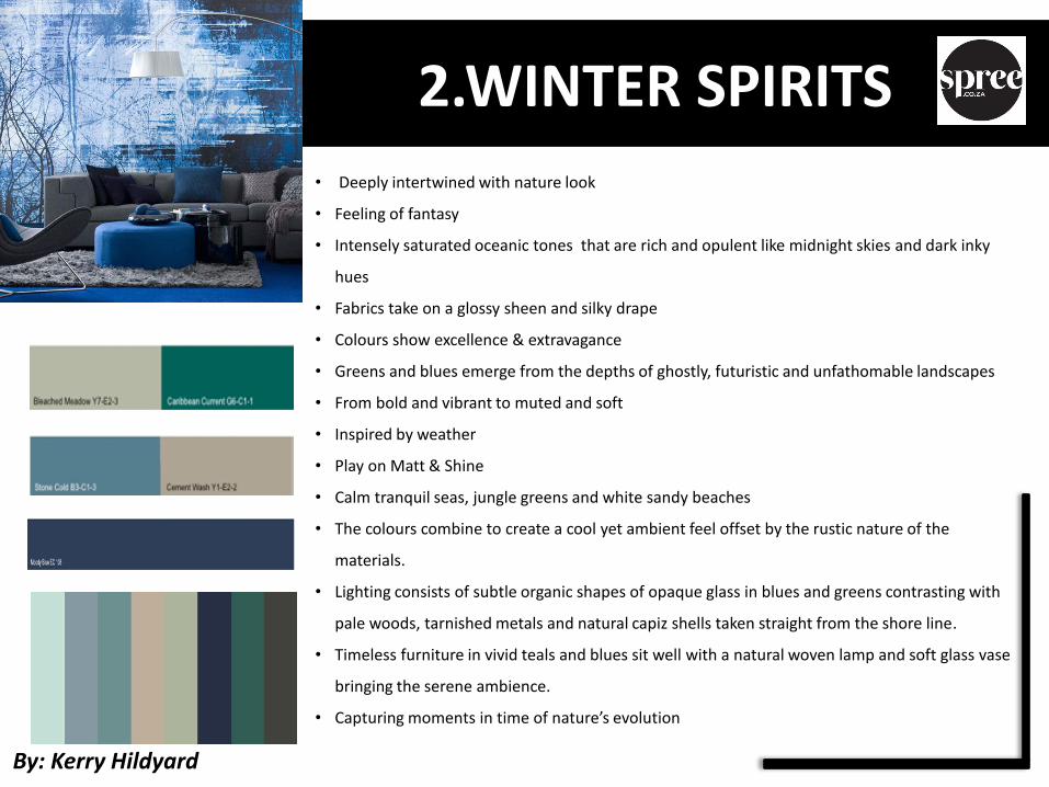
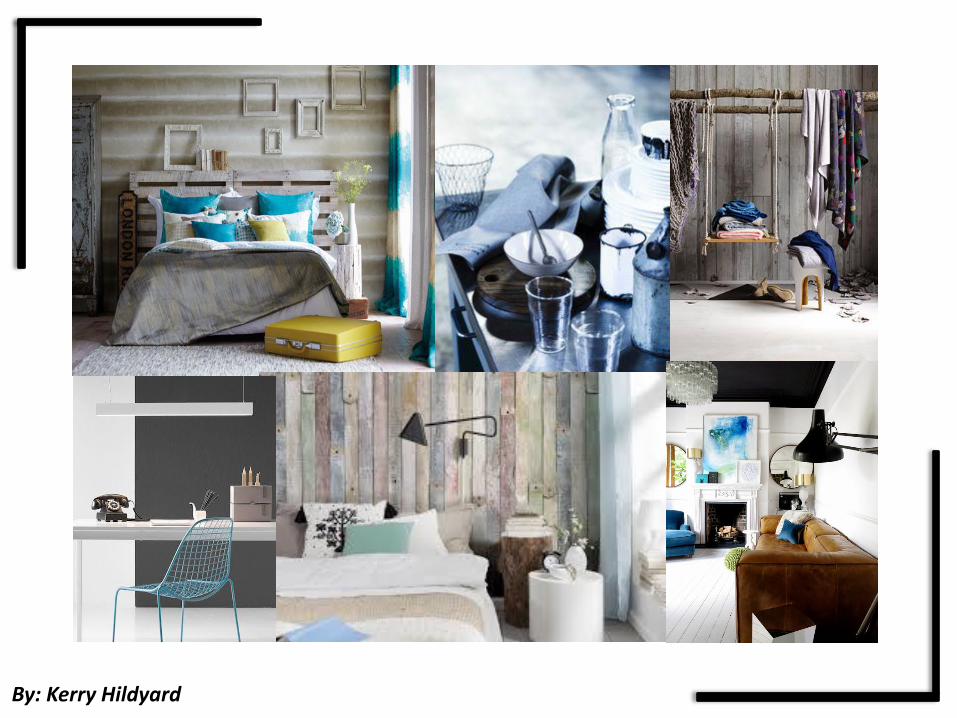
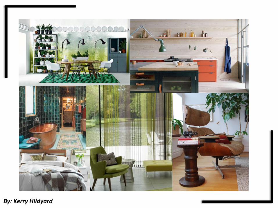
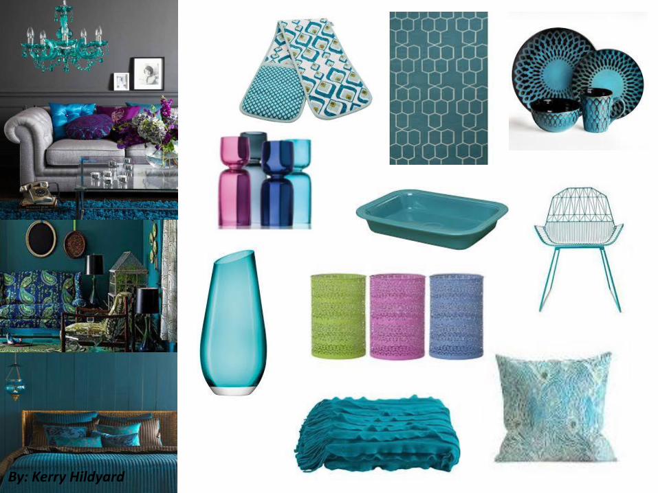
2.WINTER SPIRITS
• Deeply intertwined with nature look
• Feeling of fantasy
• Intensely saturated oceanic tones that are rich and opulent like midnight skies and dark inky
hues
• Fabrics take on a glossy sheen and silky drape
• Colours show excellence & extravagance
• Greens and blues emerge from the depths of ghostly, futuristic and unfathomable landscapes
• From bold and vibrant to muted and soft
• Inspired by weather
• Play on Matt & Shine
• Calm tranquil seas, jungle greens and white sandy beaches
• The colours combine to create a cool yet ambient feel offset by the rustic nature of the
materials.
• Lighting consists of subtle organic shapes of opaque glass in blues and greens contrasting with
pale woods, tarnished metals and natural capiz shells taken straight from the shore line.
• Timeless furniture in vivid teals and blues sit well with a natural woven lamp and soft glass vase
bringing the serene ambience.
• Capturing moments in time of nature’s evolution
By: Kerry Hildyard

2.WINTER SPIRITS
KEYWORDS:
• FLOATING
EXPERIENCE
• ALIVE
• WATERED
• DEEP TINTED
• REFLECTED
COLOURS:
• MIDNIGHT BLUES
• INKY HUES
• JUNGLE GREENS
MATERIALS:
• TARNISHED METALS
• PALEWOODS
• OPAQUE GLASS
By: Kerry Hildyard

By: Kerry Hildyard
By: Kerry Hildyard

3.RUSTIC CAMOUFLAGE
• Surviving in the wild
• Rural outdoors to urban survival
• Stems from “ Adapting ourselves to survive in a constantly changing environment
• Colours range from warm, earthy browns, with tones inspired by fur, camel and bronze through
to powerful industrial and stormy greys
• Gives the feeling of a urban jungle transforming rustic chaos into something civilized
• Contours are smoother
• Combination of both typical and atypical jungle hues
• Earth inspired themes
• Weathered treatments
• Tranquil spaces
• Industrial revolution
• Use of some bold reds and oranges creating a fabulous splash of colour
• Whilst this theme has the appearance of some old school products creating a lot of nostalgia,
the pure essence of this theme is essentially very modern.
• Taking inspiration from the silhouettes of trees and forest animals this theme begins to grow.
• Use of natural and distressed woods used in lighting and home accessories, botanical and
woodland prints in textiles
• introduction of owls and other woodland creatures
By: Kerry Hildyard

3.RUSTIC CAMOUFLAGE
KEYWORDS:
• BRUSHING
• MATT METALLICS
• ORGANIC ORIGIN
• RAW & TOUGH
• STRUCTURED
COLOURS:
• EARTHY BROWNS
• STORMY GREYS
• SULFURIC GREENS
• CITRONELLA
MATERIALS:
• FELTING
• BRONZE
• BONDED SURFACES
• WEATHERED TREATMENTS
By: Kerry Hildyard

By: Kerry Hildyard
By: Kerry Hildyard

4.BERRY PLEASURE
• Look is about being creative and curious
• Darker Backgrounds creating a moody feeling
• A more luxury feeling
• Trend of drama
• Purple stands for luxury and Exclusivity
• Best to describe this look: “We don’t live in a romantic world but are influenced by actual
difficult economical situations and in the search for a new way of expression, a new creativity,
wanting to explore again darker fields and moods”
• Berry tones still remaining slightly more pink
• Colours are treated with high key lighting
• Soft and romantic feeling
• Very Feminine and gentle feeling
• The elegance of the purple family adds a dramatic interplay against the classic mahoganies, off
whites, greys and taupe's.
• Can mix nicely with shimmering frosted almond and Champagne colours
• Evokes and atmosphere full of vivid richness
• Not for the faint of heart, this is a boldly glamorous look
By: Kerry Hildyard

4.BERRY PLEASURE
KEYWORDS:
• LUXURY
• EXCLUSIVE
• CREATIVE
• DUSKY
• EARTHY
• MOODY
COLOURS:
• BLUEBERRY
• RASBERRY
• BLACKBERRY
• BLACKBERRY
• FOREST GREEN
• SAFFRAN
MATERIALS:
• VELVET
• SILK
• SHINY MATERIALS
• LEATHER
• DARK WOOD
• TEXTURED SURFACES
By: Kerry Hildyard

By: Kerry Hildyard

By: Kerry Hildyard

MICROTRENDS AUTUMN/WINTER 2015
By: Kerry Hildyard
By: Kerry Hildyard

By: Kerry Hildyard

By: Kerry Hildyard
By: Kerry Hildyard