
Why present? Or better yet, why learn how to present well ... · ideas away, but by removing...
13
Transcript of Why present? Or better yet, why learn how to present well ... · ideas away, but by removing...

Why present? Or better yet, why learn how to present well? Simply put, because your life is one big presentation. You are presenting all the time, and many people’s lives have been defined by presentations. Promotions have been made or missed. Deals are won or lost. An election was just won due largely to one candidate being a far better presenter. It’s an important skill, a skill most people wish they had.
So what are we dealing with now? It’s bad…really bad. We’ve heard the term “Death by PowerPoint,” which is loosely defined as creating and delivering such a bad presentation that you actually bore your audience to death. It happens in conference rooms and cubicles across the world. A Google search for “Death by Powerpoint” offers over 402,000 results. It’s real and we’ve got to do something about it.
We’ve all been there - sitting through an excruciatingly boring, dry, scripted presentation with nothing to look at on the screen except bullet points, full sentences and lowsy clip-art. Making it even worse, the presenter has made no effort to keep you interested, help you understand the material, or create anything worth looking at. You’re in hell, and you’re counting down the minutes until you can leave – but it doesn’t have to be that way.
You can save your audience. You can become a vibrant, effective presenter whose passion and message gets through to each and every audience member. I’m not addressing just those who present to vast conference halls, but also (and most importantly) those presenting to their colleagues in a cramped, double-booked meeting room.
So what can I do for you? Maybe you already knew there was a problem but didn’t know what you could do about it. Let’s take a look 10 tips that can make you a more effective presenter.
The tips included are contained in three key areas of effective presenting – Design, Preparation, and Delivery.

There is no question that a well-designed presentation will contain effective visuals, most often in the form of PowerPoint slides. Thus, the design of your visuals matters. In case you’re still worried, let me stress again – You do NOT have to be a designer to create visually engaging, effective presentations. Only an understanding of standard design principles and the willingness to break the mold is necessary to begin designing effectively.
There is no question in my mind that the cornerstone of effective PowerPoint presentation design is the concept of “Simplicity.” It’s a theory, not a technique. You must understand that simplicity can mean a lot of things, especially when it comes to presenting. Simplicity can be a single image or a single word. Simplicity is the realization that you can’t offer all of your knowledge, so you have to choose the most important parts. Simplicity is clearly expressing your message. I could go on, and I’m sure you could go on too! Simplicity means many things to many people, but keeping that word “Simplicity” in mind as you craft your presentation can make all the difference.
An important aspect of slideware design is the Cognitive Load Theory, which states that the amount of information presented to the brain must be at a minimum during the learning process. Since it is presumed that you are presenting new information to your audience, you can’t bombard them with information, especially if it’s delivered both verbally and in written form. People simply can’t read and listen at the same time, thus making it useless to offer your information as full sentences (bullet points) on the screen if you are going to repeat those sentences. It is not only uninteresting but also nearly impossible to remember. [Of course, if you insist on that format, it is more convenient to just email the presentation as a word document and save everyone time.]
Instead, utilize your slides as a visual backdrop with few words (if any) and images that support your message (See Page 13). Thus, they hear you speak the theme of your slide and also see it in visual form on the screen. They don’t have to race to read all your bullet points, frantically trying to decide what is important and what isn’t. You give them simple imagery and a single point to take away from the slide. They spend less time staring at the slide and more time listening to you.
The idea of simplicity, then, seems to be easy to implement. Trust me, it’s not. Anyone can slap all their information into a pre-designed template full of bullet points. It takes true intelligence, something you ALL possess, to simplify your visuals and convey only the most important information. It will take a great deal of restraint, a word you must remember in effective presenting, but it will make your presentations infinitely better.
The font used in a PowerPoint presentation is nearly as important as the message it is delivering, at least in my opinion. Using a non-default font (a font not native to PowerPoint or Keynote) is a great way to individualize your presentation and make your text more interesting and memorable at the same time.
A great source for free Mac/PC compatible fonts is DaFont.com. They have an extensive library of fonts that are easily downloaded and installed onto your computer. The best part is that the majority of these fonts are free to use, with the only stipulation being you can’t use it on anything being sold. Since we’re dealing with PowerPoint presentations, I don’t think that should be an issue. Also, make sure to test your presentation before you deliver it live. If you aren’t using the computer you designed the PowerPoint on, the fonts may not translate. An easy way to solve this problem is to save your text as an image. You won’t be able to edit it, but since it’s an image it will show up on all systems.
Now that you’ve picked a font, make sure you follow a few design principles. First, you must make sure your font is legible. In order to do this, size does matter. I try not to go under 30pt. If you can’t fit all of your text on your slide at 30pt or above, then you have too many words. Often I hear the retort, “but if I’m displaying important findings or data, I have to use small font to fit it on the screen.” I disagree. If your presentation includes lengthy findings or confusing data, give it to them in a handout. Put the most important findings on your slides.
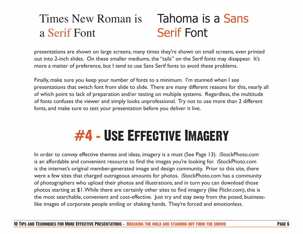
Using a Sans Serif font will also help legibility. Serif fonts have little “tails” at the end of the type which can be extremely thin, as well as portions of the typeface that are also very thin (see following page). Sans Serif fonts have 90-degree edges and remain wide throughout. Although most
In order to convey effective themes and ideas, imagery is a must (See Page 13). iStockPhoto.com is an affordable and convenient resource to find the images you’re looking for. iStockPhoto.com is the internet’s original member-generated image and design community. Prior to this site, there were a few sites that charged outrageous amounts for photos. iStockPhoto.com has a community of photographers who upload their photos and illustrations, and in turn you can download those photos starting at $1. While there are certainly other sites to find imagery (like Flickr.com), this is the most searchable, convenient and cost-effective. Just try and stay away from the posed, business-like images of corporate people smiling or shaking hands. They’re forced and emotionless.
presentations are shown on large screens, many times they’re shown on small screens, even printed out into 2-inch slides. On these smaller mediums, the “tails” on the Serif fonts may disappear. It’s more a matter of preference, but I tend to use Sans Serif fonts to avoid these problems.
Finally, make sure you keep your number of fonts to a minimum. I’m stunned when I see presentations that switch font from slide to slide. There are many different reasons for this, nearly all of which point to lack of preparation and/or testing on multiple systems. Regardless, the multitude of fonts confuses the viewer and simply looks unprofessional. Try not to use more than 2 different fonts, and make sure to test your presentation before you deliver it live.
Times New Roman is a Serif Font
Tahoma is a Sans Serif Font
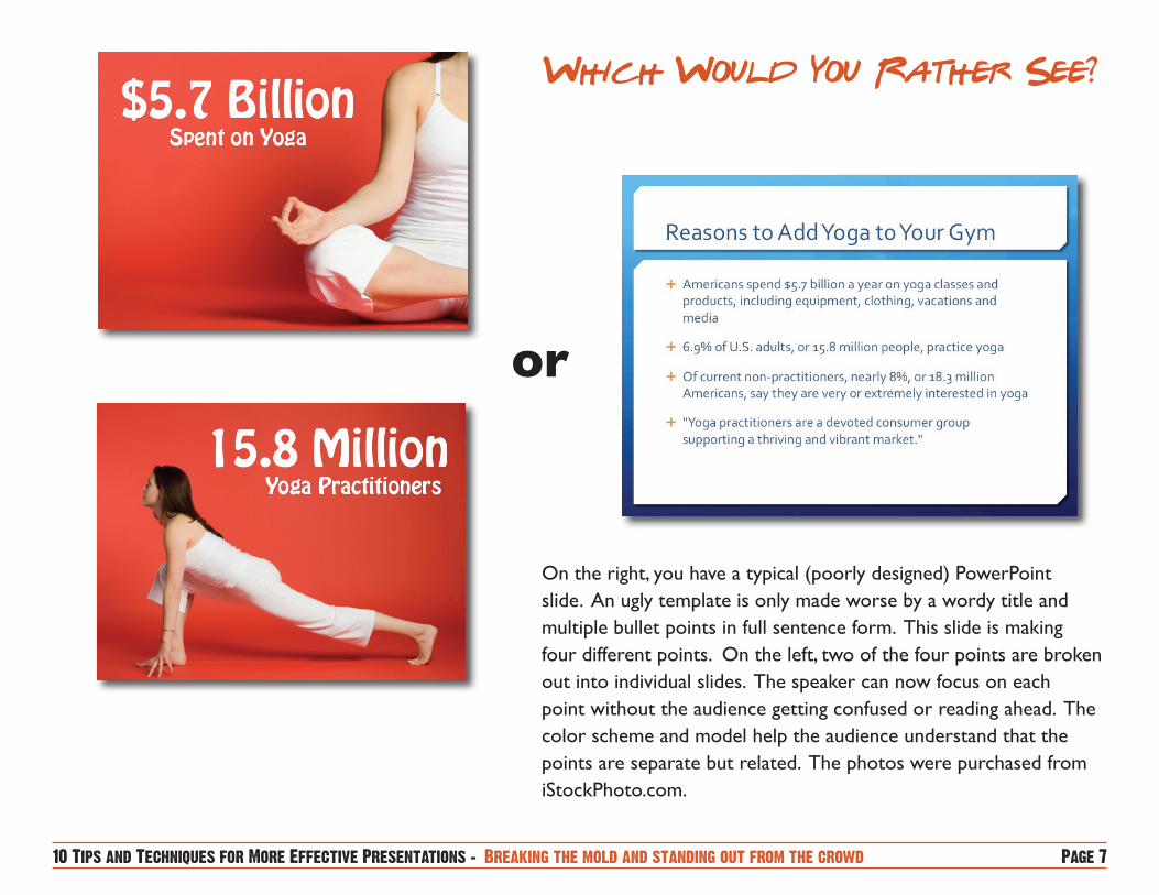
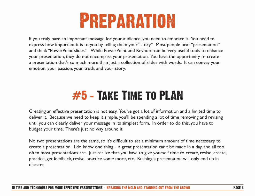
On the right, you have a typical (poorly designed) PowerPoint slide. An ugly template is only made worse by a wordy title and multiple bullet points in full sentence form. This slide is making four different points. On the left, two of the four points are broken out into individual slides. The speaker can now focus on each point without the audience getting confused or reading ahead. The color scheme and model help the audience understand that the points are separate but related. The photos were purchased from iStockPhoto.com.
or
If you truly have an important message for your audience, you need to embrace it. You need to express how important it is to you by telling them your “story.” Most people hear “presentation” and think “PowerPoint slides.” While PowerPoint and Keynote can be very useful tools to enhance your presentation, they do not encompass your presentation. You have the opportunity to create a presentation that’s so much more than just a collection of slides with words. It can convey your emotion, your passion, your truth, and your story.
Creating an effective presentation is not easy. You’ve got a lot of information and a limited time to deliver it. Because we need to keep it simple, you’ll be spending a lot of time removing and revising until you can clearly deliver your message in its simplest form. In order to do this, you have to budget your time. There’s just no way around it.
No two presentations are the same, so it’s difficult to set a minimum amount of time necessary to create a presentation. I do know one thing – a great presentation can’t be made in a day, and all too often most presentations are. Just realize that you have to give yourself time to create, revise, create, practice, get feedback, revise, practice some more, etc. Rushing a presentation will only end up in disaster.
Since most people hear “presentation” and immediately open their PowerPoint program, few people are able to break the confines of the program itself. In order to create unique presentations, you have to think of your presentation in analog form (thus, not digital).
I begin the process of creating a presentation by grabbing a piece of paper and pencil. Sometimes I’ll print out 9 slides on a piece of paper and start sketching slide ideas. You don’t have to be Picasso to do this. Nobody is grading you on your drawing skills. You may keep some, you may throw many ideas away, but by removing yourself from your computer you allow your creativity to roam free.
Many others use the Post-It Note method. Do this by taking a pad of Post-It notes and just start drawing slide ideas. Stick them onto your wall and see which ones you like. This method gives you the ability to start moving them around, allowing you to create the order and flow of the presentation as well.
Aww man, did I say you had to practice? Yeah I did. And of course, you know this. Presentations today are too rushed, too ill-prepared, and simply never approach their true potential. Some of the best presenters are known for their commitment to practicing. Apple CEO Steve Jobs begins preparing months in advance, working with his team to fine tune his presentation. Employees often see Steve alone in a room, practicing his presentation aloud. This preparation and practice leads to presentations that flow so well and seem so natural that it doesn’t seem like he practiced at all.
Remember, simplicity isn’t easy. It takes an enormous amount of practice for Mr. Jobs to make his presentations look so natural.
There are many different ways to practice presenting. When by yourself, you can always practice your presentation in slide show mode on your computer. Another great way to individually prepare is to set up a video camera and use it as your audience. Deliver your entire presentation and study the recording. It’s a great way to see what your audience sees, giving you a new perspective. You can often find those small nuances like putting your hands in your pockets, using your hands too much, looking down, etc. If you can’t get your hands on a camera, present in front of your mirror.
Of course, there’s no better way to practice than to practice in front of an audience. Finding an audience (as unbiased as possible) to give you feedback will improve your presentation and your presenting skills. This method also helps you get over that fear of presenting in front of your peers. So not only are you receiving constructive criticism (difficult, I know), but you’re helping yourself become more comfortable in front of a live audience. You can now practice other presentation skills like eye contact and live interaction.
I do realize that many business presentations are requested without much lead time, making some of these methods impossible. I do believe, however, that even a single run-through will vastly improve your live presentation. Also, utilizing these techniques will make you a better overall presenter. Thus, when you have to present with only a few hours to spare, you’ll be better prepared.
There are numerous methods to prepare for a presentation, and we all prepare in different ways. I can’t claim that this method is the best for you, but I believe it will certainly be effective.
All of the hard work you’ve put into developing your presentation has finally come down to this. It’s presentation day, and you know you’re ready. You’ve followed simple design principles and you’ve practiced for hours on end. Here are a few tips to help you nail that live performance.
It’s not a script. It’s not even your notes. Your PowerPoint presentation is a visual backdrop to present your themes and main points. PLEASE don’t treat it as script.
If you read your slides, your audience will immediately know that you don’t know what you’re talking about and that you didn’t care enough to prepare for them. Not to mention, turning your back and reading your slides creates an impersonal wall between you and your audience. You’re speaking at them, instead of with them. It’s crucial that you design a presentation with slides that support your message, not repeat it. If you do this correctly, you won’t have any words to read!
I know this seems like it should go in the “Design” portion, but the advantage of using black slides is that those slides will bring the attention of the audience back to you, the presenter. Keep in mind that your visuals are a backdrop to your presentation. Since you are the star, you want to make sure the attention will be on you as often as possible. This means that all the eyes will turn to you, so your delivery skills are important. It also gives you no chance to look back at your slides, and certainly no chance to read them. You will be able to reconnect, both literally (eyes, emotion) and figuratively. This is also a great way to help your audience recognize that you’re moving to a new topic.
A presentation is a two-way communication. Although you’re doing most of the speaking, it’s a conversation with the audience. You want to speak with them, not at them. You’re connecting with them on a certain level, bringing them through any number of emotions. I’ve seen presentations that have the audience laughing themselves off their seats and others that bring them to tears.
There are numerous ways to achieve this connection. It starts with body language, and more importantly, eye contact. When you have a conversation with a friend, you look at their eyes as you speak. Too many times the presenter’s eyes are directed at the screen, their laptop, or down at their notes. This creates a huge disconnect and gives the audience an uneasy feeling. They wonder, “Does the presenter even want to be here? Does he/she care that I’m here?” Along with visual contact, interaction with the audience is key. Ask them questions. Get their immediate input/feedback.
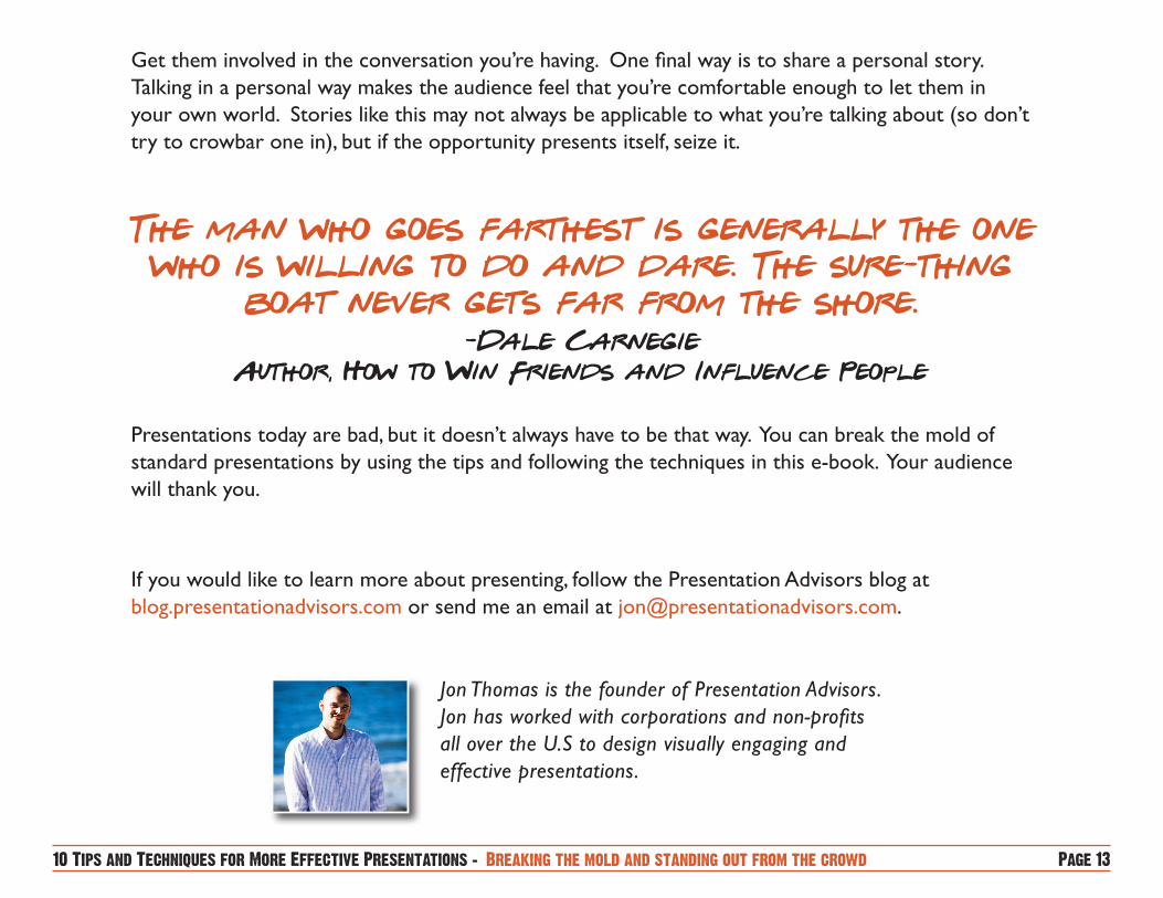
Get them involved in the conversation you’re having. One final way is to share a personal story. Talking in a personal way makes the audience feel that you’re comfortable enough to let them in your own world. Stories like this may not always be applicable to what you’re talking about (so don’t try to crowbar one in), but if the opportunity presents itself, seize it.
Presentations today are bad, but it doesn’t always have to be that way. You can break the mold of standard presentations by using the tips and following the techniques in this e-book. Your audience will thank you.
If you would like to learn more about presenting, follow the Presentation Advisors blog at blog.presentationadvisors.com or send me an email at [email protected].
Jon Thomas is the founder of Presentation Advisors. Jon has worked with corporations and non-profits all over the U.S to design visually engaging and effective presentations.