When to Use a Marimekko Chart
12
When to Use a Marimekko Chart
description
When to Use a Marimekko Chart. When to Use a Marimekko Chart. Use a Marimekko when you want to create a 100% stacked bar , and add an additional dimension, by making the width of the bar as variable instead of fixed . Some examples of when you would use a Marimekko Chart are: - PowerPoint PPT Presentation
Transcript of When to Use a Marimekko Chart
When to Use a Marimekko Chart

Copyright 2012 © Knowledge Management Associates, LLC. All rights reserved .
Use a Marimekko when you want to create a 100% stacked bar, and add an additional dimension, by making the width of the bar as variable instead of fixed.
Some examples of when you would use a Marimekko Chart are: • Sales by Country and Region• Sales by Market Segment and Sub-Segment• Sales by Market Segment and Region• Sales by Region and Market Segment • Sales by Competitor and Market Segment• Sales by Competitor and Channel• Cost Savings Through Consolidation• Sales Pipeline• Tracking Key Performance Indicators Along Two Dimensions• Tracking Key Performance Indicators Through Drill Down
When to Use a Marimekko Chart

Copyright 2012 © Knowledge Management Associates, LLC. All rights reserved .
Sales by Country and Region
You can use a Marimekko chart to drill-down on a key variable. This chart illustrates both which regions have the most sales and which emerging market countries within the region make up the region’s sales.
0
20
40
60
80
100%
Asia
China $100M
India $50M
Southeast Asia $20M
$170M
Latin Americaand Carribean
Brazil $30M
Other $20M
$50M
Europe
Russia $15M
Other $30M
$45M
Other$20M
$20M
SouthAfrica$10M
Other$5M
Emerging Market Sales
Middle EastAfrica
$15M
Total = $300M

Copyright 2012 © Knowledge Management Associates, LLC. All rights reserved .
Sales by Market Segment and Region
A Marimekko chart is most often used to map two variables. In this case, it’s sales by market and region. You can identify regions to target for specific market segments. This is an example of a market map.
0
20
40
60
80
100%
I ndustrial Goods andServices
Australia €20BAfrica €10B
Asia €30B
Europe €50B
North America €100B
€210B
Healthcare
Australia €20BAfrica €20BAsia €20B
Europe €70B
North America €80B
€210B
Technology
Australia €10BAfrica €5B
Asia €10B
Europe €60B
North America€70B
€155B
Retail
Australia€10B
Africa €5BAsia€10B
Europe€20B
NorthAmerica
€30B
€75B
Media
Australia€20B
Africa €5B
Asia€10B
Europe€20B
NorthAmerica
€10B
€65B
Market Segmentation Total = €715B
Copyright 2012 © Knowledge Management Associates, LLC. All rights reserved .
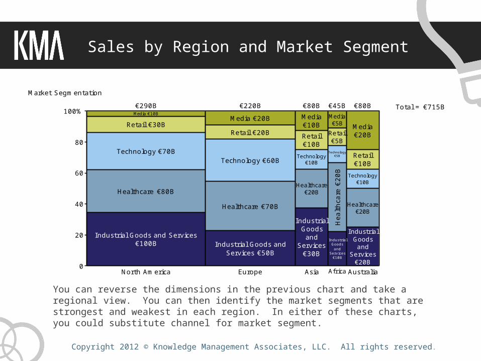
Sales by Region and Market Segment
You can reverse the dimensions in the previous chart and take a regional view. You can then identify the market segments that are strongest and weakest in each region. In either of these charts, you could substitute channel for market segment.
0
20
40
60
80
100%
Market Segmentation
North America
Healthcare €80B
Industrial Goods and Services€100B
Technology €70B
Media €10B
Retail €30B
€290B
Europe
Healthcare €70B
Industrial Goods andServices €50B
Technology €60B
Media €20B
Retail €20B
€220B
Asia
Healthcare€20B
IndustrialGoods
andServices
€30B
Technology€10B
Media€10BRetail€10B
€80B
Africa
Heal
thca
re€2
0B
IndustrialGoods
andServices
€10B
Technology€5B
Media€5B
Retail€5B
€45B
Australia
Healthcare€20B
I ndustrialGoodsand
Services€20B
Technology€10B
Media€20B
Retail€10B
€80B Total = €715B
Copyright 2012 © Knowledge Management Associates, LLC. All rights reserved .
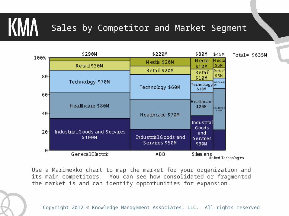
Sales by Competitor and Market Segment
0
20
40
60
80
100%
General Electric
Healthcare $80M
Industrial Goods and Services$100M
Technology $70M
Retail $30M
$290M
ABB
Healthcare $70M
Industrial Goods andServices $50M
Technology $60M
Media $20MRetail $20M
$220M
Siemens
Healthcare$20M
IndustrialGoods
andServices
$30M
Technology$10M
Media$10MRetail$10M
$80M
Healthcare$20M
Technology$5M
Media$5M
Retail$5M
$45M Total = $635M
United Technologies
Use a Marimekko chart to map the market for your organization and its main competitors. You can see how consolidated or fragmented the market is and can identify opportunities for expansion.

Copyright 2012 © Knowledge Management Associates, LLC. All rights reserved .
Sales by Competitor and Channel
If there are a few major channels in a market (e.g., direct to customer, through reseller), different manufacturers could use a different channel mix. This chart can help identify opportunities to increase sales by concentrating on a specific channel.
0
20
40
60
80
100%
Channel Segmentation
Microsoft
Integrator $70M
Reseller $80M
Direct $100M
$250M
Oracle
Integrator $60M
Reseller $70M
Direct $50M
$180M
SAP
I ntegrator$10M
Reseller$20M
Direct$30M
$60M
Adobe
I ntegrator$5M
Rese
ller$
20M
Direct$10M
$35M Total = $525M
Copyright 2012 © Knowledge Management Associates, LLC. All rights reserved .
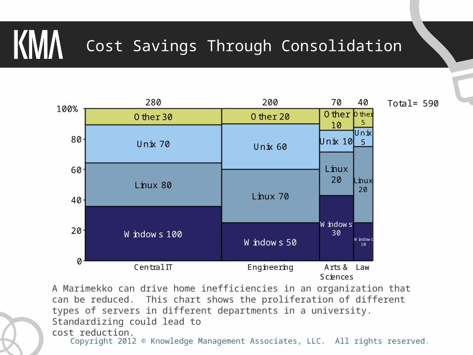
Cost Savings Through Consolidation
A Marimekko can drive home inefficiencies in an organization that can be reduced. This chart shows the proliferation of different types of servers in different departments in a university. Standardizing could lead to cost reduction.
0
20
40
60
80
100%
Central IT
Other 30
Unix 70
Linux 80
Windows 100
280
Engineering
Other 20
Unix 60
Linux 70
Windows 50
200
Arts &Sciences
Other10
Unix 10
Linux20
Windows30
70
Law
Other5
Unix5
Linux20
Windows10
40 Total = 590
Copyright 2012 © Knowledge Management Associates, LLC. All rights reserved .
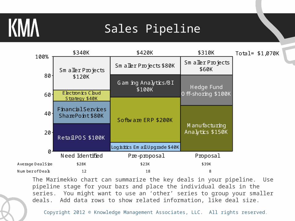
Sales Pipeline
The Marimekko chart can summarize the key deals in your pipeline. Use pipeline stage for your bars and place the individual deals in the series. You might want to use an ‘other’ series to group your smaller deals. Add data rows to show related information, like deal size.
0
20
40
60
80
100%
Need Identified
Smaller Projects$120K
Electronics CloudStrategy $40K
Financial ServicesSharePoint $80K
Retail POS $100K
$340K
Pre-proposal
Smaller Projects $80K
Gaming Analytics/BI$100K
Software ERP $200K
Logisitics Email Upgrade $40K
$420K
Proposal
Smaller Projects$60K
Hedge FundOff-shoring $100K
ManufacturingAnalytics $150K
$310K Total = $1,070K
$28K $23K $39KAverage Deal Size12 18 8Number of Deals

Copyright 2012 © Knowledge Management Associates, LLC. All rights reserved .
Tracking Key Performance Indicators Along Two Dimensions
Your business has KPIs that directly relate to revenue or expenses that you are trying to manage. You can view these KPIs along two dimensions in a Marimekko chart. In this example, a hospital tracks ‘denied claims’ (revenue that is challenged by the insurer) by hospital department and insurer.
0
20
40
60
80
100%
Denied Claims in Thousands of Dollars
Emergency
Cigna $10K
Aetna $30K
Tufts $70K
Harvard $80K
BCBS $100K
$290K
Surgery
Cigna $20KAetna $20K
Tufts $60K
Harvard $70K
BCBS $50K
$220K
Cardiac
Cigna$10KAetna$10KTufts$10K
Harvard$20K
BCBS$30K
$80K
Vascular
Cigna$20K
Aetna$10KTufts$10K
Harvard$20K
BCBS$20K
$80K
Other
Cigna$5K
Aetna$5K
Tufts$5K
Harvard$20K
BCBS$10K
$45K Total = $715K

Copyright 2012 © Knowledge Management Associates, LLC. All rights reserved .
Tracking Key Performance Indicators Through Drill Down
You can also drill down into a KPI. In this example, a consulting firm tracks billable hours by client and by project within the client. You can see the biggest projects and the largest clients.
0
20
40
60
80
100%Billable Hours by Client and Project
Acme Software
Social Media Strategy 800
ERP 1,000
1,800
High Tech Drilling
CRM 600
600
NewCommunications
DR Plan100
WindowsUpgrade
300
400 Total = 2,800

Copyright 2012 © Knowledge Management Associates, LLC. All rights reserved .
A successful business chart should help you as well as your audience make sense of what would otherwise be complex numbers and ideas. When designed poorly, charts just confuse. But choosing the right chart and utilizing good chart design will convey your message clearly and effectively.
For more information on other charts available in Mekko Graphics and the right way to use them please explore the following resources:
Mekko Graphics charts not available in PowerPoint:Cascade (Waterfall) ChartBar Mekko Chart
Our Chart Finder and Sample Presentations can help you learn about other charts enhanced by Mekko Graphics
Choosing the Right Chart for the Job