Week 7 Digital Photography COLOR…. October 19, 2005.
45
Week 7 Digital Photography COLOR…. October 19, 2005
-
Upload
gerald-tate -
Category
Documents
-
view
217 -
download
0
Transcript of Week 7 Digital Photography COLOR…. October 19, 2005.

Week 7
Digital Photography
COLOR….
October 19, 2005

Week 7
Maple Leaves, Mud, Zion by Charles Cramer
Week 7
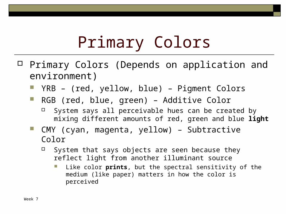
Primary Colors Primary Colors (Depends on application and
environment) YRB – (red, yellow, blue) – Pigment Colors RGB (red, blue, green) – Additive Color
System says all perceivable hues can be created by mixing different amounts of red, green and blue light
CMY (cyan, magenta, yellow) – Subtractive Color System that says objects are seen because they reflect light from
another illuminant source Like color prints, but the spectral sensitivity of the medium (like
paper) matters in how the color is perceived

Week 7
Primary Colors of Art Red Yellow Blue
Need additional pigments for mixing Black White
Week 7
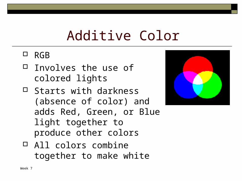
Additive Color RGB Involves the use of colored lights Starts with darkness (absence of
color) and adds Red, Green, or Blue light together to produce other colors
All colors combine together to make white

Week 7
Subtractive Color CMY Involves colorants and reflected light Uses Cyan, Magenta, and Yellow
pigments or dyes to subtract portions of white light illuminating on object to produce other colors.
When combined in equal amounts, pure subtractive primary colors make black
Create color by subtracting or absorbing certain wavelengths of color while reflecting other wavelengths back to the viewer

Week 7
Color Theory A lot of the theory about using color
in photographs comes from the art world, so even though we use the RGB color system when taking pictures, and the CMYK color systems when printing pictures, we are going to talk about color theory using the YRB painters color system

Week 7
Colors (From reading homework) First Order Colors: primary colors from painting
Yellow Red Blue
Second Order Colors: Orange Violet Green
Other Secondary colors: Blue, blue-violet, violet, red-violet, red, red-orange, orange, yellow-
orange, yellow, yellow-green, green, blue-green

Week 7
First and Second Order Colors & the Visible Spectrum
ROYGBIV Red Orange Yellow Green Blue Indigo Violet
Week 7
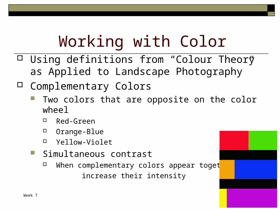
Working with Color Using definitions from “Colour Theory as Applied to
Landscape Photography” Complementary Colors
Two colors that are opposite on the color wheel Red-Green Orange-Blue Yellow-Violet
Simultaneous contrast When complementary colors appear together they
increase their intensity
Week 7
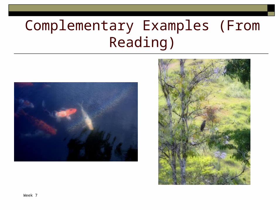
Complementary Examples (From Reading)

Week 7
Harmonizing Colors Visualizing three points of isosceles triangle
that sits in the middle of the circle Two of the colors are one zone apart and the third
is at the end of the triangle opposite As a photographer, it is difficult to plan for
harmonizing colors But can be good to understand Can make photo look “better”
Week 7
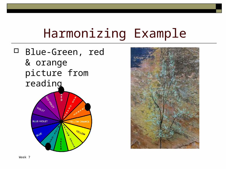
Harmonizing Example Blue-Green, red &
orange picture from reading

Week 7
Color Relationships Most of this content for the next 8 slides comes from
About.com: Color Meanings and Colors That Go Together (Conflicting definitions from reading)
Adjacent or harmonizing colors Appear next to each other on the color wheel Can work well together, but can also look washed out if there isn’t
enough contrast Complementary colors
Separated by another color on the color wheel Can cause visual vibration if they are directly next to one another, but
can be okay if separated by another color Clashing or contrasting colors
Directly opposite each other on the color wheel Can actually be good if the proportions of the colors are good – can
provide great contrast and high visibility
Week 7
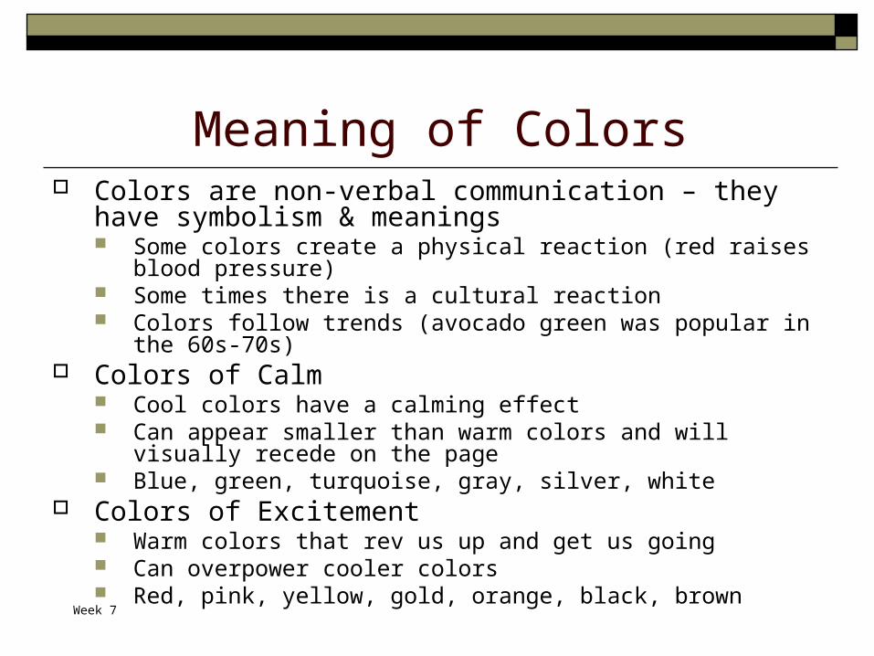
Meaning of Colors Colors are non-verbal communication – they have symbolism
& meanings Some colors create a physical reaction (red raises blood pressure) Some times there is a cultural reaction Colors follow trends (avocado green was popular in the 60s-70s)
Colors of Calm Cool colors have a calming effect Can appear smaller than warm colors and will visually recede on the
page Blue, green, turquoise, gray, silver, white
Colors of Excitement Warm colors that rev us up and get us going Can overpower cooler colors Red, pink, yellow, gold, orange, black, brown
Week 7
Meaning of Colors Colors of Intrigue
Attributes of both warm and cool colors – calm & excite Purple, lavender, green, turquoise, blue
Colors of Unity Neutral colors can unify diverse color palettes – putting
the focus back on other colors Black, gray, white, ivory, brown, beige
The following slides look at the primary and secondary colors and some meanings typically associated with them

Week 7
RED The Nature of Red
Red is hot – conflicting emotions from passionate love to violence and warfare
Red is the hottest of the warm colors Red is power, flashing red lights mean danger or emergency, in some
cultures red denotes purity, joy, happiness, & celebration Using Red
To grab attention and to get people to take action Use red to make your subject stand out from the background A little bit of red can go a long way Multiple shades of red and even pink or orange can combine for a
cheerful palette Red and other colors
Green – a contrasting color, can bring out the intensity of red Blues – provide contrast and tone down the heat of red Light pinks and yellows harmonize with red Purple and red can be overpowering
Your thoughts of red?

Week 7
Red
Snow Fence —Toronto, 1994
Week 7
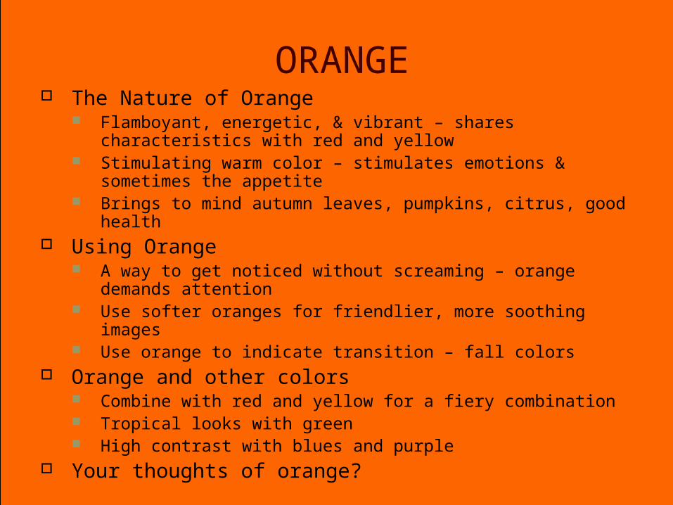
ORANGE The Nature of Orange
Flamboyant, energetic, & vibrant – shares characteristics with red and yellow
Stimulating warm color – stimulates emotions & sometimes the appetite
Brings to mind autumn leaves, pumpkins, citrus, good health Using Orange
A way to get noticed without screaming – orange demands attention Use softer oranges for friendlier, more soothing images Use orange to indicate transition – fall colors
Orange and other colors Combine with red and yellow for a fiery combination Tropical looks with green High contrast with blues and purple
Your thoughts of orange?

Week 7
Orange
Warm Turnout, October, 2000

Week 7
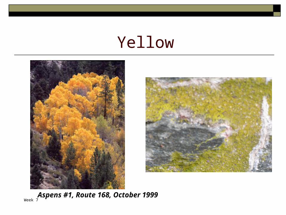
YELLOW The Nature of Yellow
Sunshine, very bright color Conflicting symbolism – happiness & joy but also
cowardice and deceit Warm color, high visibility; used in hazard or emergency
signs; also a cheerful color Using Yellow
Works well as a companion to other colors Can create excitement
Yellow and other colors Can perk up a more subdued color palette High contrast with blues and purples
Your thoughts of yellow?
Week 7
Yellow
Aspens #1, Route 168, October 1999

Week 7
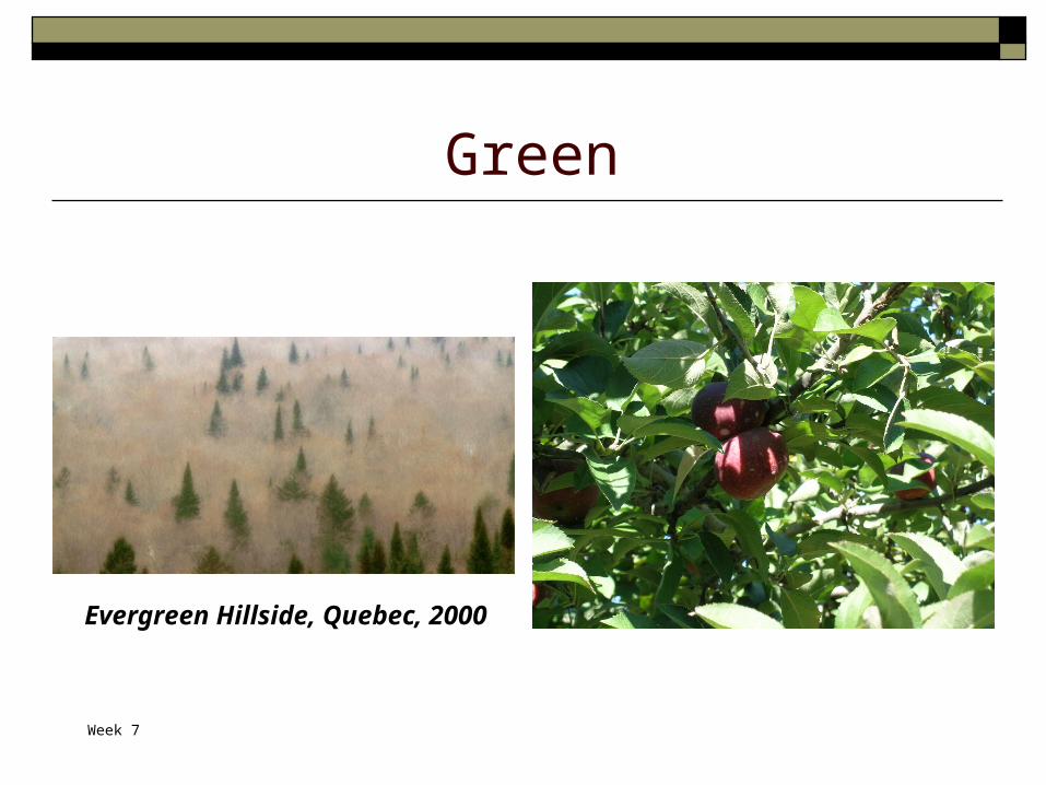
GREEN The Nature of Green
Life, nature – growth, renewal, health & the environment Restful color with calming effects
Using Green Warming and cooling effect – balance, harmony &
stability Several shades of green for Spring feeling
Green and other colors With blue – calming, nature feeling With red or purple - high contrast
Your thoughts of green?
Week 7
Green
Evergreen Hillside, Quebec, 2000

Week 7
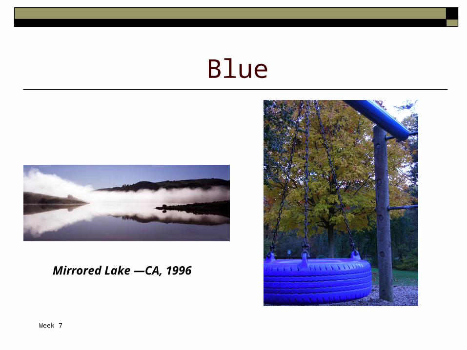
BLUE The Nature of Blue
Calm & cool Strong & steadfast or light & friendly Universal color
Using Blue Can convey a sense of richness or coolness Combine different shades of blue for sophisticated look
with subtle contrast Blue and other colors
With green – natural, watery palette Contrast it with orange or yellow Purple and red can be overpowering
Your thoughts of blue?
Week 7
Blue
Mirrored Lake —CA, 1996

Week 7
PURPLE/VIOLET The Nature of Purple
Royalty & spirituality Mysterious color – both warm and cool properties
Using Purple Deep or dark purples – riches Lighter purples – romantic and delicate Can add warm or cooler feeling, depending on shade of
purple Purple and other colors
Contrasts with yellow, orange Can be striking with greens Purple and red can be overpowering
Your thoughts of purple/violet?

Week 7
Purple/Violet
Blue Ridge Sunrise, October, 2000
www.canyoncreeknursery.com/ violets.html

Week 7
Color Homework Take 5-10 pictures in a “mini-portfolio”
focusing on a single color (ROYGBIV) Be prepared to show your favorite 2-3 of
them and describe how the color sets the mood/emotion of the picture
Week 7
Color Continued
Thursday, October 20

Week 7
Elements of Color Hue
The property of colors by which they can be perceived as ranging from red through yellow, green, and blue, as determined by the dominant wavelength of the light.
Saturation A measurement of a color’s purity or how much it has been diluted by white

Week 7
Elements of Color, cont’d Brightness
The amount of light the color reflects, or how much black is in the color
Contrast A measure of the rate of change of brightness in
an image. High contrasts means both dark black and bright
white within the picture

Week 7
Color Photography Color photography has
always been a challenge How many great
photographs use color? Ansel Adams – mostly
black and white images Other famous
photographers – what have you noticed?

Week 7
Color Mini-Portfolios Cammo Mills Liane
Show and discuss

Week 7
Color PerceptionNotice what the eye can see
Vs
Printable Colors
Vs
RGB monitor Colors

Week 7
Changing Nature of Color We already talked about how color changes with light
Daylight is different color at different times of day Light from a light bulb is different from a fluorescent tube is different from
daylight or moonlight Color also changes depending on the medium
Different kinds of paper, etc Different monitors
Color changes based on the surroundings

Week 7
Colors and their surroundings Colors are usually seen
with other colors The color we perceive
can change a lot depending on changes in surrounding colors
Week 7
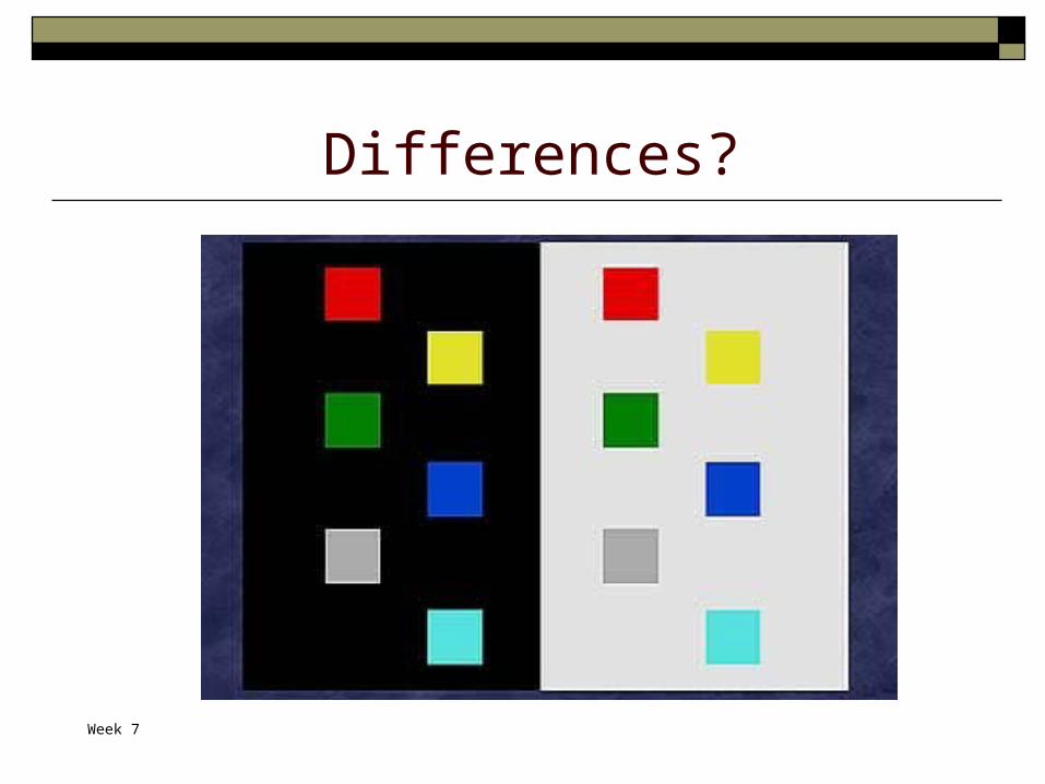
Differences?

Week 7
More differences?

Week 7
Color affecting sizes
Which square is bigger?
Week 7
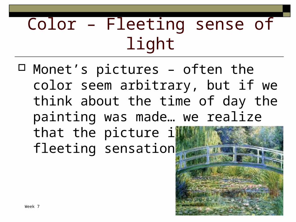
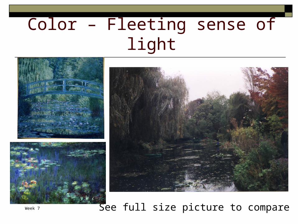
Color – Fleeting sense of light Monet’s pictures – often the color seem
arbitrary, but if we think about the time of day the painting was made… we realize that the picture is capturing a fleeting sensation of time
Week 7
Color – Fleeting sense of light
See full size picture to compare

Week 7
Abstract Color Color can be used as the composition itself
Finding a colorful item with textures and using a close-up of that item as the subject (also can disguise the subject and make it seem as if it is something else)
Image fromHedgecoe book
Week 7
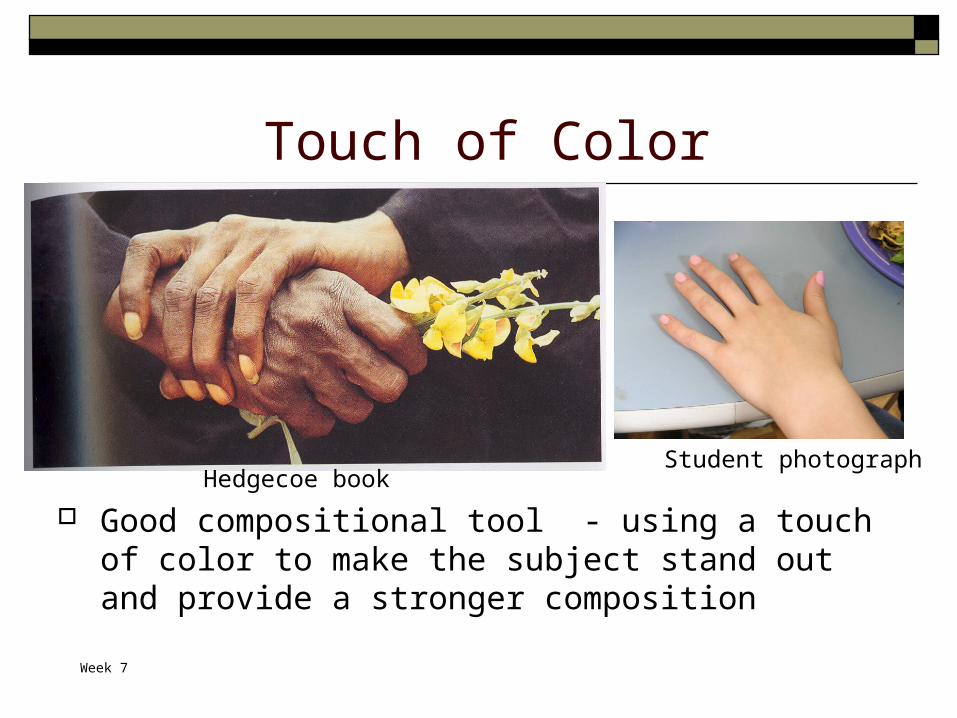
Touch of Color
Good compositional tool - using a touch of color to make the subject stand out and provide a stronger composition
Hedgecoe bookStudent photograph
Week 7
Test Review – Your Questions Camera, Camera Care, Camera Features Lenses Exposure Composition Basic Photoshop Lighting / Lighting techniques Memory & Storage (file formats) Color (Not on test, will be on a quiz next week)
Anything in assigned reading is fair game for the test, so make sure you have read everything


![Central Photography [Layer Masks - COLOR SPLASH]centralphoto.weebly.com/uploads/1/3/8/8/13887207/color_splash_ps… · Central Photography [Layer Masks - COLOR SPLASH] 1 Central Photography](https://static.fdocuments.us/doc/165x107/602b81d3a4eb083c7913cb2b/central-photography-layer-masks-color-splash-central-photography-layer-masks.jpg)