Website Owner's Manual - Unedited Draft, Meap Edition
286
©Manning Publications Co. Please post comments or corrections to the Author Online forum: 1
Transcript of Website Owner's Manual - Unedited Draft, Meap Edition
©Manning Publications Co. Please post comments or corrections to the Author Online forum:
1
©Manning Publications Co. Please post comments or corrections to the Author Online forum:
MEAP Edition Manning Early Access Program
Copyright 2009 Manning Publications
For more information on this and other Manning titles go to
www.manning.com
2
Licensed to Henry Vanyan <[email protected]>
Download at Boykma.Com

Last saved: 5/27/2009 Paul Boag / Website Owner's Manual 3
©Manning Publications Co. Please post comments or corrections to the Author Online forum:
http://www.manning-sandbox.com/forum.jspa?forumID=456
Table of Contents 1. The secret to a successful website 2. Stress free planning 3. Don't forget the explosives expert 4. Differences over design 5. Creating killer content 6. User centric design 7. Ensuring best practice 8. Taking control 9. Decoding technobabble 10. Driving traffic 11. Engaging your visitors 12. Planning for the future
3
Licensed to Henry Vanyan <[email protected]>
Download at Boykma.Com

1. THE SECRET OF A SUCCESSFUL WEBSITE
[1]
In this chapter‣ Your missing manual
Battling information overload
Seeing the bigger picture
Having a “need to know” mentality
‣ Balance conflicting priorities
Making your site easy to use
Providing access for all
Producing aesthetic appeal
Facilitating development
Creating killer content
Focusing on objectives
‣ Define your role
Having a vision
Be an advocate
Evangelize your site
Managing your content
Populating initial content
Keeping content fresh
Ensuring a consistent message and tone
Coordinating your projects
Resolving disagreements
‣ Plan for the future
Evaluating your objectives
Refining your website
Promoting your site
4
Licensed to Henry Vanyan <[email protected]>
Download at Boykma.Com
1. THE SECRET OF A SUCCESSFUL WEBSITE
[2]
1 The secret to a successful websiteHere’s the million-dollar question:
“What is the secret to a successful website?”
I’n not foolish enough to suggest a single answer. However in my decade of working on client websites I have noticed a recurring pattern. The sites that succeed are those that have a well informed, passionate website owner at the helm. No single thing makes a site successful, but a good website owner will put into place the elements that give a site a fighting chance.
The question should not be “What is the secret to a successful website?” but “How do I become a great website owner?”
No definitive manual exists explaining how to do the job. What does it mean to be a website owner and how can it be done successfully?
5
Licensed to Henry Vanyan <[email protected]>
Download at Boykma.Com
1. THE SECRET OF A SUCCESSFUL WEBSITE
[3]
Your Missing ManualThe lack of a manual defining the role of website owner is only part of the problem.
There is also a lack of training specific to being a website owner. There are already
courses for web designers and developers, so it seems only natural that website owners will be next. Meanwhile, this book endeavors to be your missing manual.
This book isn’t the only available resource on being a website owner. Knowing how to handle the plethora of information available both in print and on the web is crucial to the
success of your role.
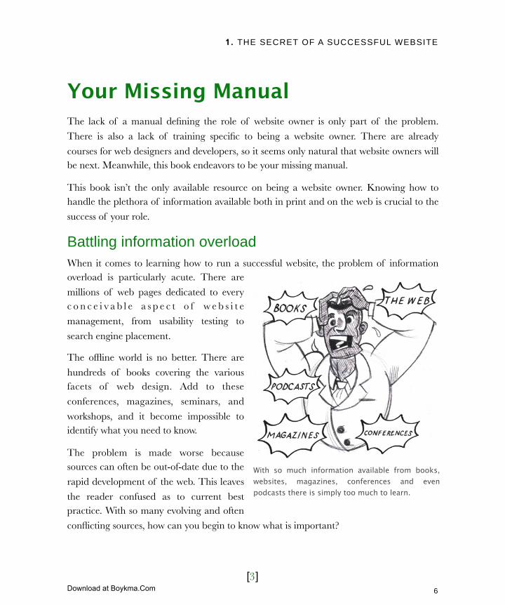
Battling information overloadWhen it comes to learning how to run a successful website, the problem of information overload is particularly acute. There are
millions of web pages dedicated to every c o n c e i v a b l e a s p e c t o f w e b s i t e
management, from usability testing to
search engine placement.
The offline world is no better. There are
hundreds of books covering the various facets of web design. Add to these
conferences, magazines, seminars, and
workshops, and it become impossible to identify what you need to know.
The problem is made worse because sources can often be out-of-date due to the
rapid development of the web. This leaves
the reader confused as to current best practice. With so many evolving and often
conflicting sources, how can you begin to know what is important?
With so much information available from books, websites, magazines, conferences and even podcasts there is simply too much to learn.
6
Licensed to Henry Vanyan <[email protected]>
Download at Boykma.Com
1. THE SECRET OF A SUCCESSFUL WEBSITE
[4]
Seeing the bigger pictureA good starting point is to recognize that
a website owner is a generalist rather than a specialist. Think of yourself as a family
doctor rather than a brain surgeon.
A family doctor deals with a huge variety of illnesses from the common cold to
complex neurological problem. However, he doesn’t necessarily treat every illness he
sees. In the same way a good website
owner will have enough knowledge to identify an issue and recognize that a
specialist is required to deal with it.
In short, you should focus on the big
picture of web design and know enough to ‘manage’ the specialists that are occasionally
required.
Having a “need to know” mentalityA good website owner should be able to identify what he “needs to know” rather than
trying to understand every aspect of the whole. Becoming a great website owner is not just about understanding a web technology or knowing specific pieces of information. It is
about grasping the role and approaching it with a certain mentality.
There are three principles of website management that encapsulate this mentality:
‣ Balancing conflicting priorities
‣ Defining your role
‣ Planning for the future
None of these principles are more important than the need to maintain a balance
between conflicting priorities.
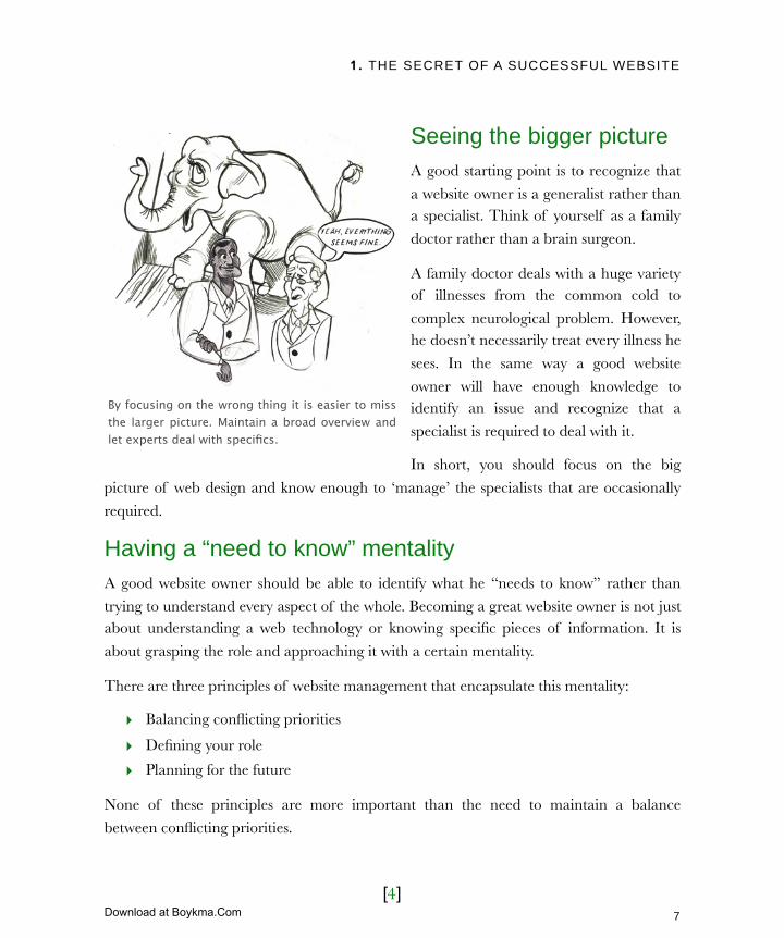
By focusing on the wrong thing it is easier to miss the larger picture. Maintain a broad overview and let experts deal with specifics.
7
Licensed to Henry Vanyan <[email protected]>
Download at Boykma.Com

1. THE SECRET OF A SUCCESSFUL WEBSITE
[5]
Balance conflicting prioritiesBalancing the various conflicting priorities in web design is like constructing a building. A
building is made up of a series of pillars. If one pillar is shorter than the others or missing
entirely then the building is in danger of collapsing.
As in construction it is vital that the pillars of web design have equal priority and that you
ensures a balance between them all. There are six pillars of web design:
Every site is built using six disciplines that are vital to its success.
Making your site easy to useDifficult sites can alienate visitors, causing them to give up entirely. Later we will
investigate ways to make your site more usable through card sorting and user testing.
For now it is important to stress that as with any pillar, too much emphasis on usability can
be damaging. If you are obsessed with usability you can undermine business objectives,
fail to engage with users emotionally (aesthetics) and even create accessibility problems.
8
Licensed to Henry Vanyan <[email protected]>
Download at Boykma.Com

1. THE SECRET OF A SUCCESSFUL WEBSITE
[6]
Providing access for allAccessibility is easy to ignore as a marginal
concern. However, there are many good reasons for emphasizing it: commercial
incentives, legal commitments, and moral
obligations.
Many reject accessibility because they
believe it is too expensive, difficult to implement or will negatively affect the sites
aesthetics. In fact, it is perfectly possible for
good accessibility to exist comfortably alongside our next pillar.
Producing aesthetic appealAesthetics refer to the elements that make up the look and feel of your site. These
include color, imagery, typography, and
layout. Historically many viewed aesthetics as the most important pillar of web design.
This bias towards design was prevalent in the late 1990s and early 2000s and led to
the proliferation of splash screens and a
gratuitous use of flash.
A heavy bias towards aesthetics not only
damages usability but almost all pillars of web design. Fortunately, we are beginning
to see less emphasis on design. We are also
seeing a closer working relationship with the other pillars, especially development.
More information
Many of the pillars of web design are
covered in more depth later in this book. For more information see the following
chapters...
‣ Chapter 2: Objectives
‣ Chapter 4: Aesthetics
‣ Chapter 5: Content
‣ Chapter 6: Usability
‣ Chapter 7: Accessibility
‣ Chapter 9: Development
aceofcakestv.com is so concerned with aesthetics that it is impossible to access without the flash plugin. Even if you have the plugin, it is incredibly difficult to navigate.
9
Licensed to Henry Vanyan <[email protected]>
Download at Boykma.Com
1. THE SECRET OF A SUCCESSFUL WEBSITE
[7]
Facilitating developmentDevelopment refers to the technical
aspects of a project. Many website owners find this pillar intimidating and
so they choose to ignore it. They want
the functionality but are not necessarily concerned with how it is delivered.
Although you cannot be expected to understand the complexities of
technical development, there is a
danger that the constraints and cha l l enges f aced by t echn ica l
developers are ignored. Technical development is evolving at a staggering
rate and if you do not engage with technical specialists, you will miss opportunities to
enhance your site.
Of course, technical development cannot be left to grow unchecked. As some sites built
entirely by “techies” show, unfettered technical development can damage usability, accessibility, design and of course content.
Creating killer contentAlthough content creation is one of your principle roles, it is often neglected. Perhaps this
is because it is not as ‘sexy’ like design or it could be because creating content is hard work. It is easier to copy and paste content from an existing brochure or out-of-date
website than write content from scratch. Of course, the reluctance to write content could be to do with website owners having no experience in writing web copy, let alone having
any training.
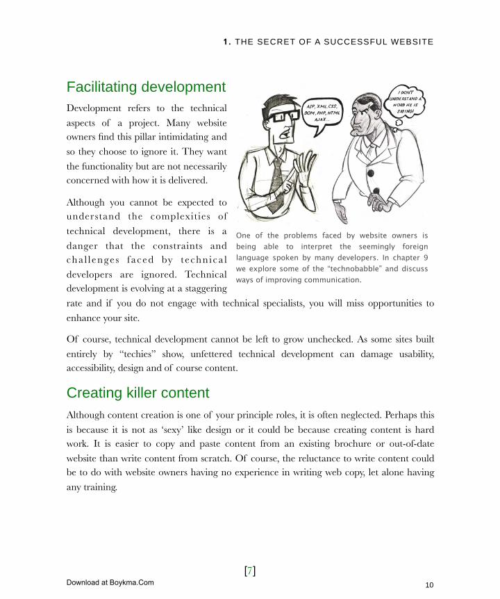
One of the problems faced by website owners is being able to interpret the seemingly foreign language spoken by many developers. In chapter 9 we explore some of the “technobabble” and discuss ways of improving communication.
10
Licensed to Henry Vanyan <[email protected]>
Download at Boykma.Com
1. THE SECRET OF A SUCCESSFUL WEBSITE
[8]
Focusing on objectivesA site’s “objectives” should occupy most of
your attention as the website owner. Objectives refers to the “business rational”
behind a site. Why does it exist? What is it
trying to achieve? How is success measured?
You could argue that objectives are not a pillar. You write good copy, design an
attractive site, and make it usable in an
attempt to fulfill your site objectives. Site objectives are the target you are trying to
reach, not the method by which you reach it. I have found that thinking of objectives
alongside usability, accessibility, aesthetic
and the rest creates a more rounded approach that should be encouraged.
The aim is to create a balance among all six pillars. If you can achieve this, you have built a good foundation upon which to construct a successful site.
Define your roleThe second principle of good website management is to have a clear vision for your role.
Being a website owner is one of the most multi-facetted jobs within the web development process. It is because of this diversity that the role is often poorly defined. Failing to give
the role boundaries can create two problems.
‣ A lack of definition leads to a lack of focus. Without a job description, you can find yourself drawn into unrelated work. Worse still, others can presume
something is your responsibility it is not.
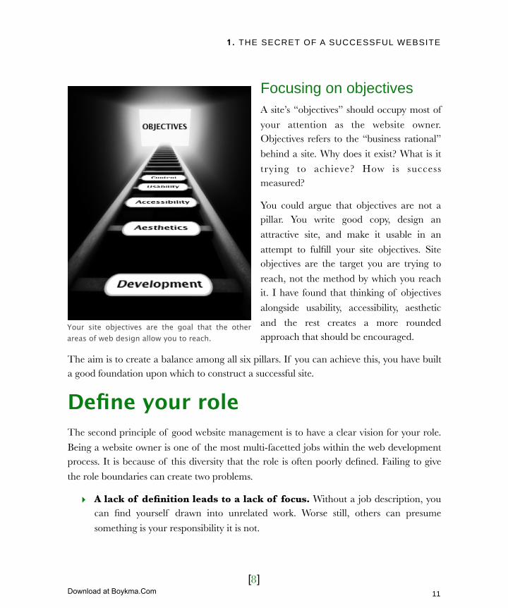
Your site objectives are the goal that the other areas of web design allow you to reach.
11
Licensed to Henry Vanyan <[email protected]>
Download at Boykma.Com
1. THE SECRET OF A SUCCESSFUL WEBSITE
[9]
‣ A lack of definition causes anxiety. There is always a vague feeling that you
are not fulfilling your role or are perceived in that way. By defining the role clearly
you allay your fears and establish others expectations.
I recommend defining broad principles of responsibility that you can measure specific
tasks against. Here are six roles a good website owner should be fulfilling:
‣ Visionary
‣ Advocate
‣ Evangelist
The dangers of focusing on objectives in isolation
I once worked with a client whose
objective was to generate sales leads. They became obsessed with that
objective. They insisted that a user
must register before they were allowed to view their product. Each
registrant then became a sales’ lead. Although they saw a slight increase
in leads, ultimately they damaged
their business.
Users actively wanted to view their product, but the barrier to entry was enough to
drive them away. These visitors never matured into quality sales leads. Although some users did complete the form, most were not ready for a sales call. They only
registered to access the demo and so the quality of the leads were low. The work
involved in following up these leads put a greater burden on the sales team without generating more sales.
By considering user needs, not just site objectives, my client might have produced fewer leads but the quality of those leads would have been higher.
12
Licensed to Henry Vanyan <[email protected]>
Download at Boykma.Com
1. THE SECRET OF A SUCCESSFUL WEBSITE
[10]
‣ Content guardian
‣ Project coordinator
‣ Referee
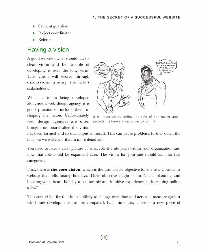
Having a visionA good website owner should have a
clear vision and be capable of developing it over the long term.
This vision will evolve through discuss ions among the s i te ’s
stakeholders.
When a site is being developed alongside a web design agency, it is
good practice to include them in shaping the vision. Unfortunately,
web design agencies are often
brought on board after the vision has been formed and so their input is missed. This can cause problems further down the
line, but we will cover that in more detail later.
You need to have a clear picture of what role the site plays within your organization and
how that role could be expanded later. The vision for your site should fall into two
categories.
First, there is the core vision, which is the unshakable objective for the site. Consider a
website that sells luxury holidays. Their objective might be to “make planning and
booking your dream holiday a pleasurable and intuitive experience, so increasing online sales.”
This core vision for the site is unlikely to change over time and acts as a measure against which site developments can be compared. Each time they consider a new piece of
It is important to define the role of site owner and provide the time and resources to fulfill it.
13
Licensed to Henry Vanyan <[email protected]>
Download at Boykma.Com

1. THE SECRET OF A SUCCESSFUL WEBSITE
[11]
functionality they can ask themselves “will
this increase sales by making planning and booking easier and more pleasurable?”
The second category is the roadmap.
This is a vision of how your site will develop over the coming months and even
years. What kind of new functionality are
you planning to add and how is the user base expected to change?
In the case of our example, roadmap items might include adding an itinerary planner
or allowing email subscription to the latest
offers. It could include details on how to cater to a new market or support
upcoming marketing campaigns.
Without a good understanding of the
overall vision and roadmap ahead, a site
can easily wander off track and lose its focus.
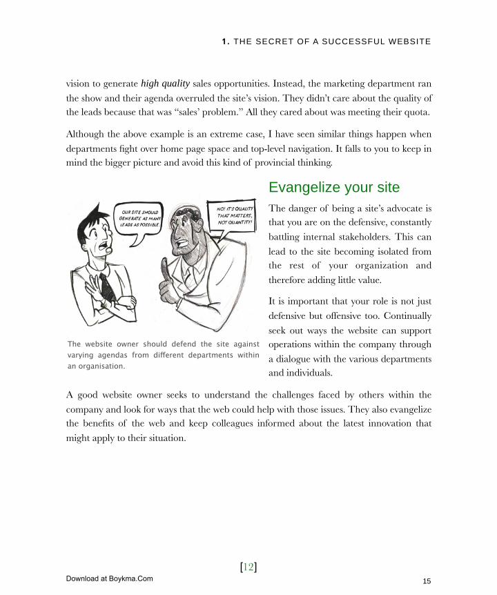
Be an advocateEstablishing a vision is one thing, maintaining it is quite another. The vision needs an advocate, somebody willing to defend the site against others within the organization that
would seek to undermine its focus.
The problem is particularly acute in larger organizations where people have a departmental rather than corporate perspective. This outlook leads to sites becoming
victim to internal politics and to individual departments pushing their own agendas.
Earlier in this chapter I mentioned a website where users were forced to register before
viewing a product demonstration. The problem arose because nobody was defending the
Who are your stakeholders?
Stakeholders are the people and organisations both internally and externally who have some interest in your site. The most important stakeholder should always be the end user.
14
Licensed to Henry Vanyan <[email protected]>
Download at Boykma.Com
1. THE SECRET OF A SUCCESSFUL WEBSITE
[12]
vision to generate high quality sales opportunities. Instead, the marketing department ran
the show and their agenda overruled the site’s vision. They didn’t care about the quality of the leads because that was “sales’ problem.” All they cared about was meeting their quota.
Although the above example is an extreme case, I have seen similar things happen when
departments fight over home page space and top-level navigation. It falls to you to keep in mind the bigger picture and avoid this kind of provincial thinking.
Evangelize your siteThe danger of being a site’s advocate is that you are on the defensive, constantly
battling internal stakeholders. This can
lead to the site becoming isolated from the rest of your organization and
therefore adding little value.
It is important that your role is not just
defensive but offensive too. Continually
seek out ways the website can support operations within the company through
a dialogue with the various departments and individuals.
A good website owner seeks to understand the challenges faced by others within the
company and look for ways that the web could help with those issues. They also evangelize the benefits of the web and keep colleagues informed about the latest innovation that
might apply to their situation.
The website owner should defend the site against varying agendas from different departments within an organisation.
15
Licensed to Henry Vanyan <[email protected]>
Download at Boykma.Com

1. THE SECRET OF A SUCCESSFUL WEBSITE
[13]
Managing your contentAlthough roles such as visionary,
advocate, and evangelist are important they can be somewhat conceptual in
nature. The more practical, demanding
and time-consuming role is your responsibility for the content of the
site.
This falls into three categories:
‣ Initial content population
‣ Keeping content fresh
‣ Ensuring a consistent message
Populating initial contentIf content responsibilities are the most time-consuming aspect of a website owner’s role, then content population in the initial build phase is the most demanding element of that.
Writing and collating content for a website is a huge undertaking and the biggest reason
that web projects fall behind schedule.
It is easy to underestimate the time involved in pulling together content from different
sources and re-purposing it in a format suitable for the web.
Keeping content freshEven after the initial site has been launched your responsibility towards content does not
end. There is also a need to keep the content fresh and up-to-date.
A website owner needs to continually source new content, review existing copy and update as necessary. New content such as news stories are required to keep users coming back for
more.
By talking to other departmental heads you will quickly identify areas where the website could help meet organizational objective.
16
Licensed to Henry Vanyan <[email protected]>
Download at Boykma.Com

1. THE SECRET OF A SUCCESSFUL WEBSITE
[14]
Ensuring a consistent message and toneThe job of generating content can become
too big for a single person. You may choose to solve this problem by reuse existing content or
turning to others for help. These approaches
are perfectly valid. However, they do present the danger of inconsistency in both tone and
content. You must ensure that the site speaks with a single unified voice.
You will need to review each new piece of
content added to a your site. Does it use the same tone of voice used elsewhere on the site?
Is the writing style the same? Are the facts quoted in line with what is already being
shown?
In chapter 5 (Creating killer content) we will talk more about generating content but for now all you need is a clear picture of the owner’s role in the process. That role involves
coordinating, generating, and standardizing content.
Coordinating your projectsContent contributors are not the only people who need managing in a web design project.
There are designers, developers, usability experts, hosting companies, and many more.
Although frequently you will turn to a web design agency to handle the management of these roles, it is inevitable that some management will be required internally. For example,
internal sign-off is often required for project components such as budget, design, and content.
Unfortunately the final role most website owners have to fulfill is unofficial referee.
Without a website owner ensuring consistent tone, a website can appear to have a split personality with different sections written in different ways.
17
Licensed to Henry Vanyan <[email protected]>
Download at Boykma.Com

1. THE SECRET OF A SUCCESSFUL WEBSITE
[15]
Resolving disagreementsRunning a website is all about compromise. There are compromises in content and which
sections of the organization get the highest priority. There are compromises between the different pillars of web design and there are compromises over budget and time scales.
The various stakeholders have different perspectives on what is important. It is your
responsibility to break any stalemates that occur by finding the middle ground. You have to be the decision-maker.
Recognizing your role is an important step in being a great website owner, but it is not the
end of the journey. It is also important to realize that the role is an ongoing one and that the work of a website owner is never done.
Planning for the futureMany organizations underestimate the enormity of the job faced by website owners,
because they fail to grasp that it is a long-term commitment. This explains why so few organizations have full-time website owners despite their website being considered an
It is your job as website owner to resolve disagreements over priorities.
18
Licensed to Henry Vanyan <[email protected]>
Download at Boykma.Com
1. THE SECRET OF A SUCCESSFUL WEBSITE
[16]
important asset. A website owner is needed through the entire life cycle of a website to
ensure that it evolves and remains successful.
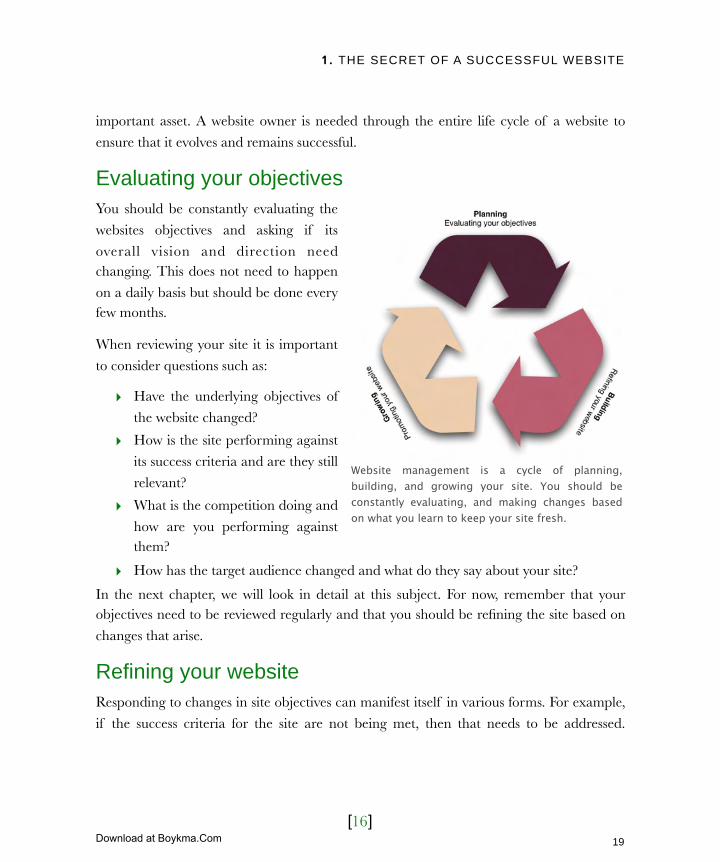
Evaluating your objectivesYou should be constantly evaluating the
websites objectives and asking if its
overall vision and direction need changing. This does not need to happen
on a daily basis but should be done every few months.
When reviewing your site it is important
to consider questions such as:
‣ Have the underlying objectives of
the website changed?
‣ How is the site performing against
its success criteria and are they still
relevant?
‣ What is the competition doing and
how are you performing against them?
‣ How has the target audience changed and what do they say about your site?
In the next chapter, we will look in detail at this subject. For now, remember that your objectives need to be reviewed regularly and that you should be refining the site based on
changes that arise.
Refining your websiteResponding to changes in site objectives can manifest itself in various forms. For example,
if the success criteria for the site are not being met, then that needs to be addressed.
Website management is a cycle of planning, building, and growing your site. You should be constantly evaluating, and making changes based on what you learn to keep your site fresh.
19
Licensed to Henry Vanyan <[email protected]>
Download at Boykma.Com

1. THE SECRET OF A SUCCESSFUL WEBSITE
[17]
Equally, if the competition is luring away your visitors then the site needs to be altered to
encourage them back. This continual “tweaking” of your site happens in three ways:
‣ Changes to the design,
‣ The introduction of new functionality,
‣ The addition, deletion and editing of content.
For example, the luxury holiday service I
mentioned earlier might respond to increased competition by adding a flight
price comparison tool (new functionality).
This would be appealing to users and will draw them away from the competition.
Alternatively, they might add reviews of existing destinations (new content) to
encourage repeat visitors.
Finally, they could refine the design based on user opinion to make it easier to
navigate (changes to design).
Responding to user comments is often the best way of refining your website. Later we will
address how to gather user feedback and use it to inform the changes you make. However,
first we need to address the last of a website owner’s ongoing roles, site promotion.
Promoting your siteBudget is rarely assigned to employ a specialist in site promotion and so it often falls to the
website owner to fulfill this role. The visitors coming to your website will decline if you do not actively and regularly promote it.
There are lots of ways to effectively promote your site, including:
Constantly evaluate your site looking for ways the design, content or functionality can be improved.
20
Licensed to Henry Vanyan <[email protected]>
Download at Boykma.Com

1. THE SECRET OF A SUCCESSFUL WEBSITE
[18]
Type Description
Offline promotionOffline promotion includes letterheads, business cards, signage, phone systems and other marketing collateral.
Email marketingEmail can be a powerful marketing tool to drive new traffic and a good way of encouraging existing users to return to your site.
Search mechanismsSearch mechanisms are more than good placement on Google. It also includes pay per click campaigns and social networking tools.
Guerilla marketingGuerilla marketing is a catchall term for lost cost marketing methods. It includes techniques like forum speeding, viral marketing, blogging and even podcasting.
You can promote a website in a number of different ways. The table above gives you a basic outline of the key methods we will be exploring in more depth later in this book.
Later we will explore how you might begin to promote his site using these and other
techniques. For now it is important to understand that site promotion requires a regular commitment (either internally or externally). It is important to decide right from the
outset who will be responsible for this work.
21
Licensed to Henry Vanyan <[email protected]>
Download at Boykma.Com

1. THE SECRET OF A SUCCESSFUL WEBSITE
[19]
Next ActionsWe have looked at the role of website owner and its associated responsibilities. I would like to end this chapter by proposing three tangible actions you can take to embrace the role.
‣ Action one: Formalize the role – The best way to formalize the role is for it to be
written into your job description. Your responsibilities should be clearly defined and time should be allocated to the role. Go to your boss and discuss what is expected.
‣ Action two: Set aside regular time – Just because the role has theoretical time allocated to it does not mean your website will get the attention it deserves. Try to
ring fence a certain amount of time every week that will be dedicated to the
website. Don’t allow more pressing responsibilities to push that time out. This will allow you to review the progress of your site and ensure it is updated and promoted.
‣ Action three: Review and plan before proceeding – Even if you believe you have a clear picture of what needs doing on your website, set aside a block of time
to review the current state of your online presence. With deadlines imminent and
management keen to see results, it is tempting to focus on site build or promotion. Resist the temptation to rush in. Plan your next step.
Planning is crucial to the success of a website. It is where you understand the background to your web project, define its objectives and decide how its success will be measured.
Planning allows opportunity to assess the competition, review your existing site, and better
understand your target audience. It should not be a surprise that the next chapter addresses planning.
22
Licensed to Henry Vanyan <[email protected]>
Download at Boykma.Com

2. STRESS FREE PLANNING
[1]
In this chapter‣ Keep your planning lightweight
‣ Do not plan in a bubble
The context of your web project
Gain context through consultation
How to run a successful stakeholder interview
‣ Measure success
Avoiding unrealistic goals
Avoiding the blame game
‣ Look back to move forward
Asking for feed back
Collecting cold hard facts
Weblog analyzers
Technical validators
Online visibility trackers
‣ Know your enemy
Reviewing the competition
Testing the competition
‣ Empathize with your users
Who to target first
Personalizing your audience
Sample persona
23
Licensed to Henry Vanyan <[email protected]>
Download at Boykma.Com

2. STRESS FREE PLANNING
[2]
2 Stress free planningWhen it comes to self-assembly furniture, I am a disaster. I am so bad that my wife has banned me from trying and now does it herself. I start off enthusiastic but within a few minutes I am swearing like a trooper and repeatedly hitting planks of wood with whatever implement is near.
Catherine, on the other hand, is always composed and in control. She plans what needs to be done. She carefully reads through all the instructions before she begins and collects the tools she will require.
By contrast, I believe instructions are for dummies and that I intuitively know where all the pieces fit. The result is that I find myself taking three times as long and become infinitely more stressed.
As with assembling flat pack furniture, if you plan your website development process up front, you will have a considerably less stressful experience. What is more, the result will be better.
24
Licensed to Henry Vanyan <[email protected]>
Download at Boykma.Com
2. STRESS FREE PLANNING
[3]
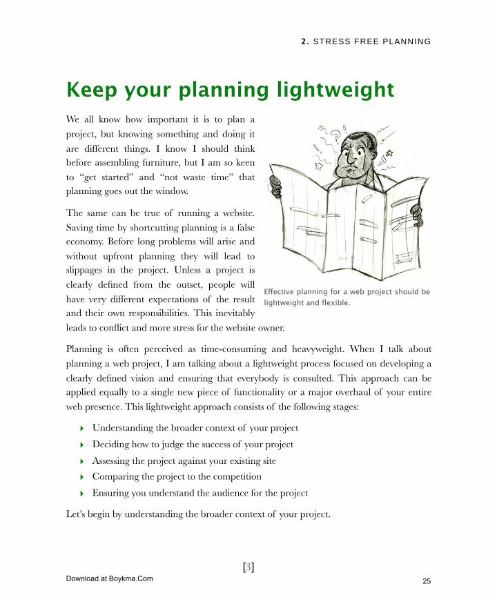
Keep your planning lightweightWe all know how important it is to plan a
project, but knowing something and doing it
are different things. I know I should think before assembling furniture, but I am so keen
to “get started” and “not waste time” that planning goes out the window.
The same can be true of running a website.
Saving time by shortcutting planning is a false economy. Before long problems will arise and
without upfront planning they will lead to slippages in the project. Unless a project is
clearly defined from the outset, people will
have very different expectations of the result and their own responsibilities. This inevitably
leads to conflict and more stress for the website owner.
Planning is often perceived as time-consuming and heavyweight. When I talk about
planning a web project, I am talking about a lightweight process focused on developing a
clearly defined vision and ensuring that everybody is consulted. This approach can be applied equally to a single new piece of functionality or a major overhaul of your entire
web presence. This lightweight approach consists of the following stages:
‣ Understanding the broader context of your project
‣ Deciding how to judge the success of your project
‣ Assessing the project against your existing site
‣ Comparing the project to the competition
‣ Ensuring you understand the audience for the project
Let’s begin by understanding the broader context of your project.
Effective planning for a web project should be lightweight and flexible.
25
Licensed to Henry Vanyan <[email protected]>
Download at Boykma.Com
2. STRESS FREE PLANNING
[4]
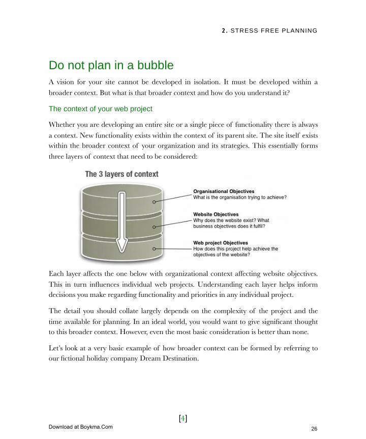
Do not plan in a bubbleA vision for your site cannot be developed in isolation. It must be developed within a
broader context. But what is that broader context and how do you understand it?
The context of your web project
Whether you are developing an entire site or a single piece of functionality there is always
a context. New functionality exists within the context of its parent site. The site itself exists within the broader context of your organization and its strategies. This essentially forms
three layers of context that need to be considered:
Each layer affects the one below with organizational context affecting website objectives.
This in turn influences individual web projects. Understanding each layer helps inform decisions you make regarding functionality and priorities in any individual project.
The detail you should collate largely depends on the complexity of the project and the
time available for planning. In an ideal world, you would want to give significant thought to this broader context. However, even the most basic consideration is better than none.
Let’s look at a very basic example of how broader context can be formed by referring to our fictional holiday company Dream Destination.
26
Licensed to Henry Vanyan <[email protected]>
Download at Boykma.Com
2. STRESS FREE PLANNING
[5]
The Dream Destination strategy document helps form a vision for the website. However,
it should also be informed by speaking with the site’s stakeholders.
Gain context through consultationWe established in chapter 1 that a stakeholder is anybody with a vested interest in the site.
At Dream Destination, one stakeholder would be the “expert travel specialists.”
Talking to stakeholders while planning a web project is an invaluable way of understanding the broader context of the project. Website owners sometimes dismiss
stakeholders because they “don’t know anything about the web.” However, the role of the
Dream Destination Strategy
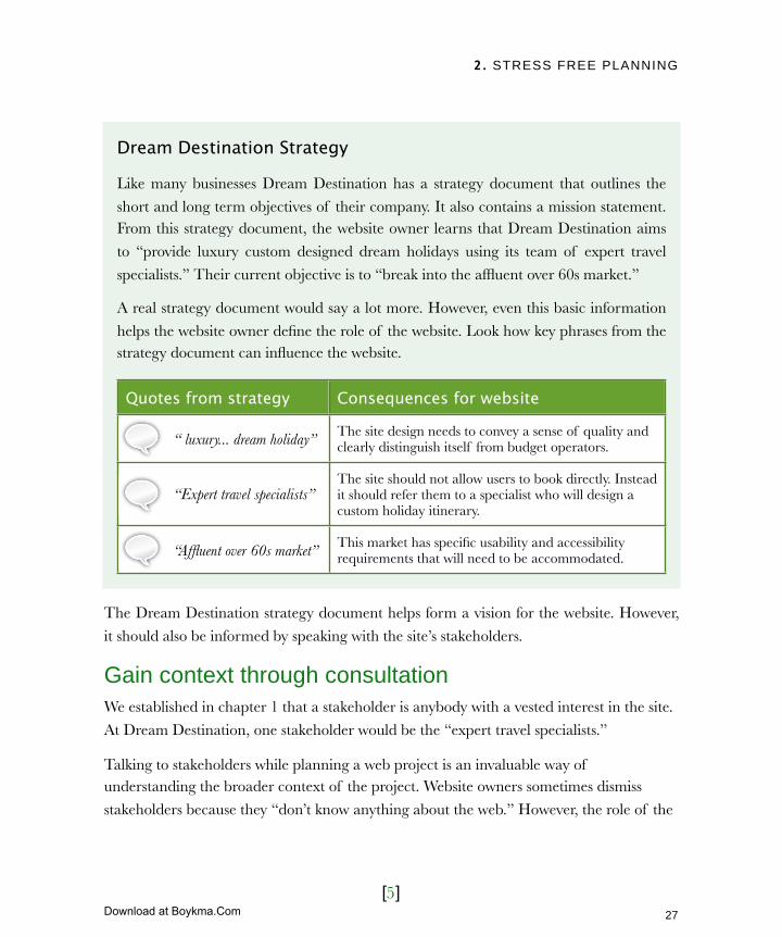
Like many businesses Dream Destination has a strategy document that outlines the
short and long term objectives of their company. It also contains a mission statement. From this strategy document, the website owner learns that Dream Destination aims
to “provide luxury custom designed dream holidays using its team of expert travel
specialists.” Their current objective is to “break into the affluent over 60s market.”
A real strategy document would say a lot more. However, even this basic information
helps the website owner define the role of the website. Look how key phrases from the strategy document can influence the website.
Quotes from strategyQuotes from strategy Consequences for website
“ luxury... dream holiday” The site design needs to convey a sense of quality and clearly distinguish itself from budget operators.
“Expert travel specialists”The site should not allow users to book directly. Instead it should refer them to a specialist who will design a custom holiday itinerary.
“Affluent over 60s market” This market has specific usability and accessibility requirements that will need to be accommodated.
27
Licensed to Henry Vanyan <[email protected]>
Download at Boykma.Com
2. STRESS FREE PLANNING
[6]
website is to help these stakeholders achieve their business objectives. Their input will help
shape the website’s vision.
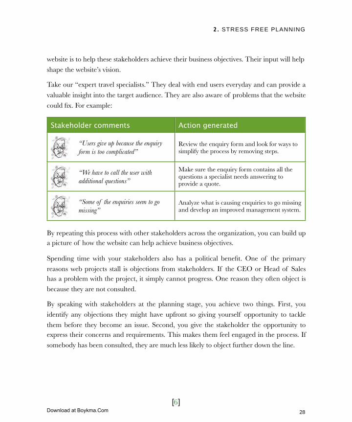
Take our “expert travel specialists.” They deal with end users everyday and can provide a
valuable insight into the target audience. They are also aware of problems that the website
could fix. For example:
Stakeholder commentsStakeholder comments Action generated
“Users give up because the enquiry form is too complicated”
Review the enquiry form and look for ways to simplify the process by removing steps.
“We have to call the user with additional questions”
Make sure the enquiry form contains all the questions a specialist needs answering to provide a quote.
“Some of the enquiries seem to go missing”
Analyze what is causing enquiries to go missing and develop an improved management system.
By repeating this process with other stakeholders across the organization, you can build up a picture of how the website can help achieve business objectives.
Spending time with your stakeholders also has a political benefit. One of the primary
reasons web projects stall is objections from stakeholders. If the CEO or Head of Sales has a problem with the project, it simply cannot progress. One reason they often object is
because they are not consulted.
By speaking with stakeholders at the planning stage, you achieve two things. First, you
identify any objections they might have upfront so giving yourself opportunity to tackle
them before they become an issue. Second, you give the stakeholder the opportunity to express their concerns and requirements. This makes them feel engaged in the process. If
somebody has been consulted, they are much less likely to object further down the line.
28
Licensed to Henry Vanyan <[email protected]>
Download at Boykma.Com

2. STRESS FREE PLANNING
[7]
How to run a successful stakeholder interviewArrange one-to-one meetings of between
forty-five minutes and an hour with each of your stakeholders. Be sure to leave some
time between sessions in case you find
somebody particularly enthusiastic. It is important that a stakeholder covers all the
subjects of concern to them.
What you cover in a session is largely
dependent on how well you know the
person and what role they have. However, some suggestions might be:
Questions Reason for asking
“Tell me about your role & that of your department”
This provides a context for the discussion. It helps you identify areas worth discussing in more depth.
“Talk to me about the processes you use in your average work day to get things done”
This builds up a picture of their working practices and identify areas where the website could aid or hinder that process.
“What are the most time consuming and challenging parts of your job?”
By asking about challenges you may discover ways that web technologies could enable those challenges to be overcome more efficiently.
“What company data or applications do you work with regularly in your job?”
Asking about data and applications can lead to valuable information and resources that can be used on the web.
“Tell me what you think of the company website and how you think it could be improved?”
Getting the stakeholders’ feedback on the website is invaluable and has obvious direct application. It also makes the stakeholders feel their opinions are valued.
Ultimately, the objective of a stakeholder interview is to identify areas where the website
can aid stakeholders in fulfilling their role of meeting company objectives. Once we have
By learning about the role of others within your organization you will identify areas in which the website can help.
29
Licensed to Henry Vanyan <[email protected]>
Download at Boykma.Com

2. STRESS FREE PLANNING
[8]
gathered background context and completed stakeholder interviews the next step is to
distill your vision into measurable goals. These are called “success criteria.”
Measuring successHaving a vision provides context from which to build, but you also need a clearly defined set of success criteria. Success criteria provide three distinct benefits:
‣ Measurable objectives. Whereas the broad vision for a site talks about a desire
to “boost sales” or “increase dwell time” success criteria set specific goals.
‣ Justification for investment. When you cannot categorically state that your
objectives have been met, it is hard to justify further investment. Success criteria
provide that justification.
‣ Improved communication. I have witnessed projects where the developer’s
expectations have been wildly different from managements. Discovering these differences at the end of a project leads to conflict. Working together to define
realistic goals avoids recrimination later.
Although success criteria can be beneficial they do carry risks.
Avoiding unrealistic goalsSetting success criteria should be a collaborative process
between all those involved. Everybody should have a sense of ownership and be committed to achieving the agreed
Multiple criteria
Most web projects have multiple success criteria associated with them. If multiple goals
are assigned it is important that you prioritize these goals. When success criteria are not prioritized they end up conflicting and causing confusion rather than clarity.
30
Licensed to Henry Vanyan <[email protected]>
Download at Boykma.Com

2. STRESS FREE PLANNING
[9]
criteria.
The issue of unrealistic goals is more common than you might expect. The
most common is unrealistic time-scales
and budget. Imposing these kinds of criteria without consultation can be a
dangerous road, especially when dealing with external agencies desperate to win
your work and willing to say whatever it
takes. Externally imposed success criteria inevitably lead to recriminations
further down the line.
Avoiding the blame gameAssigning blame can be very damaging to the morale of the web team involved. It is also
unrealistic to attribute blame to any individual. Web projects are complex, with each
person’s contribution being dependent on many others. If you start blaming developers for late delivery, they are just as likely to blame you for a poorly defined scope of work.
Nobody wins.
A better approach is to discuss, when the project is over, whether it fulfilled the success
criteria. Usually, this cannot happen immediately as success criteria only get fulfilled over
time. When that meeting does take place, however, it should always look forward rather than focusing on the past mistakes.
Look at why the project didn’t meet expectations. Was it because the expectations were unrealistic? Did a problem arise that could not have been anticipated in advance? Ask
these questions to ensure these problems can be overcome in the future. For example,
concluding that the success criteria were unrealistic enables you to revise them going forward. Identifying that a project was delayed due to unforeseen problems tells you to
build in contingency next time.
Goals should be agreed by all parties, not imposed by management.
31
Licensed to Henry Vanyan <[email protected]>
Download at Boykma.Com
2. STRESS FREE PLANNING
[10]
This principle of looking back to
plan for the future can also be used to analyze your existing site,
helping to decide on future
development.
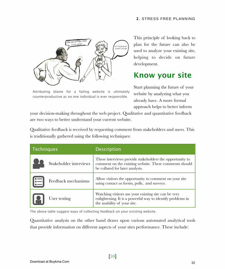
Know your siteStart planning the future of your
website by analyzing what you
already have. A more formal approach helps to better inform
your decision-making throughout the web project. Qualitative and quantitative feedback are two ways to better understand your current website.
Qualitative feedback is received by requesting comment from stakeholders and users. This
is traditionally gathered using the following techniques:
TechniquesTechniques Description
Stakeholder interviewsThese interviews provide stakeholders the opportunity to comment on the existing website. These comments should be collated for later analysis.
Feedback mechanisms Allow visitors the opportunity to comment on your site using contact us forms, polls, and surveys.
User testingWatching visitors use your existing site can be very enlightening. It is a powerful way to identify problems in the usability of your site.
The above table suggest ways of collecting feedback on your existing website.
Quantitative analysis on the other hand draws upon various automated analytical tools
that provide information on different aspects of your sites performance. These include:
Attributing blame for a failing website is ultimately counterproductive as no one individual is ever responsible.
32
Licensed to Henry Vanyan <[email protected]>
Download at Boykma.Com

2. STRESS FREE PLANNING
[11]
ToolsTools Description
Web logs analyzersEvery time a user interacts with your website information about that interaction is stored. Analysis of these logs can help identify areas of improvement.
Automated performance checkers
Automated checkers assess things like accessibility, download times and browser support. These help maximize your audience.
Online visibility trackersHaving a great site is important, but if nobody knows it exists then it has failed. There are a number of ways to gain a understanding of how visible your site is online.
The above table suggests ways of compiling quantitative data on how well your site is performing.
Lets look in more detail at these two approaches and better understand the role of each.
Qualitative feedbackI have already written about stakeholder interviews and will be covering user testing in chapter 6 (User centric design). So
let’s focus on other feedback
mechanisms.
Most websites provide some
method by which users can submit feedback. This is normally a
contact page, but something more
proactive is needed if you want consistent user feedback. Most
users will not think to send in c om m en t s un l e s s t h ey a re
frustrated with your site. The
problem is that in such situations they tend to simply leave rather
than complain.
Adobe support provides a simple and yet unobtrusive feedback mechanism. The side column asks users if they found the support document useful.
33
Licensed to Henry Vanyan <[email protected]>
Download at Boykma.Com

2. STRESS FREE PLANNING
[12]
If you want feedback on your site then specifically ask for it. This can be done with a
simple feedback form or a more comprehensive survey. However, a word of warning if you are considering a full-blown survey. Few users take the time to complete a long survey,
so keep your questions to a minimum. Also avoid making your requests for feedback too
intrusive. They should not hinder a user from completing his or her goals.
If you are considering making changes to an existing site, it is well worth implementing a
basic feedback mechanism to canvas opinion before you begin. Whether you are getting feedback from your site, through user
testing or via stakeholder interviews it is
necessary to assess the value of the comments made. When analyzing
negative comments about your site, use these four criteria to judge how seriously
those comments need to be taken:
‣ How often the comment is being made?
‣ Who makes the comment?
‣ What affect the problem has on the user and your objectives for the site?
‣ How easy the problem is to fix?
The more often you are hearing the same negative comment the more likely it is that the
comment is justified and needs addressing. However, you cannot rely on numbers alone. If your biggest customer has a problem then you had better address that concern fast!
There is also a need to ascertain the seriousness of a problem. Does it stop the user from completing a task or is it simply a mild inconvenience? Does it in someway hamper a
business objective? If it does then it will need addressing.
Finally, establish how difficult the problem is to fix. Even a minor problem is worth fixing if it is easy to do. Conversely, fixing a major problem might be unjustifiable if the expense
is prohibitive. In such situations look for a workaround that lessens the seriousness of the
For advice on running online surveys read
Jakob Nielsen’s research: www.useit.com/alertbox/20040202.html
34
Licensed to Henry Vanyan <[email protected]>
Download at Boykma.Com
2. STRESS FREE PLANNING
[13]
issue. Ultimately these decisions are about
return on investment. Does the seriousness of the problem justify the cost of fixing it?
Although nothing is better than feedback
from your users, it can be a battle. Stakeholder interviews and user testing are
time consuming, while site feedback m e c h a n i s m s a r e o f t e n i g n o r e d .
Quantitative analysis is much less work,
but it should be used to support, not replace qualitative feedback.
Quantitative AnalysisAt the beginning of the chapter I talked about how bad I was at assembling flat
pack furniture. Part of my problem is that I
never have the right tools. Fortunately when it comes to analyzing the strengths
and weaknesses of your site, there is no shortage of tools. Let’s look at the three
types of analytical tools I mentioned earlier, starting with web logs.
Web logs analyzersThe most well known form of analysis is carried out on a site’s log files. Log files track where a user has come from, what pages they have visited, how long they have spent on
each page and other data on users interaction with your site. The problem is that log files are hard to understand. There are many tools available to help with this, from free open
source software to expensive enterprise level products.
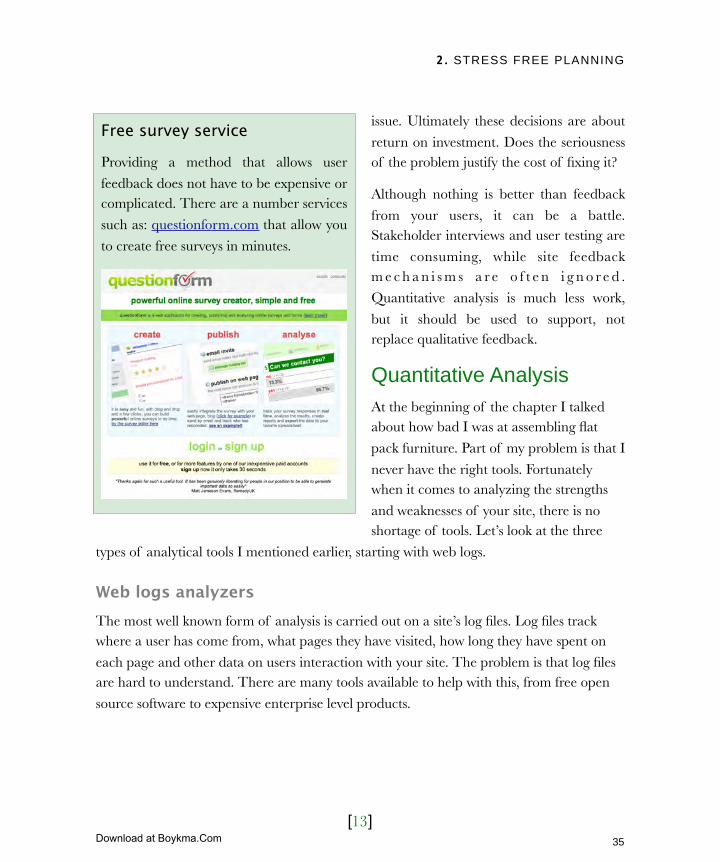
Free survey service
Providing a method that allows user
feedback does not have to be expensive or complicated. There are a number services
such as: questionform.com that allow you
to create free surveys in minutes.
35
Licensed to Henry Vanyan <[email protected]>
Download at Boykma.Com
2. STRESS FREE PLANNING
[14]
It is probably best to start with something cheap. In my experience the majority of website
owners won’t use the advanced features offered by high end tools. You can always upgrade later.
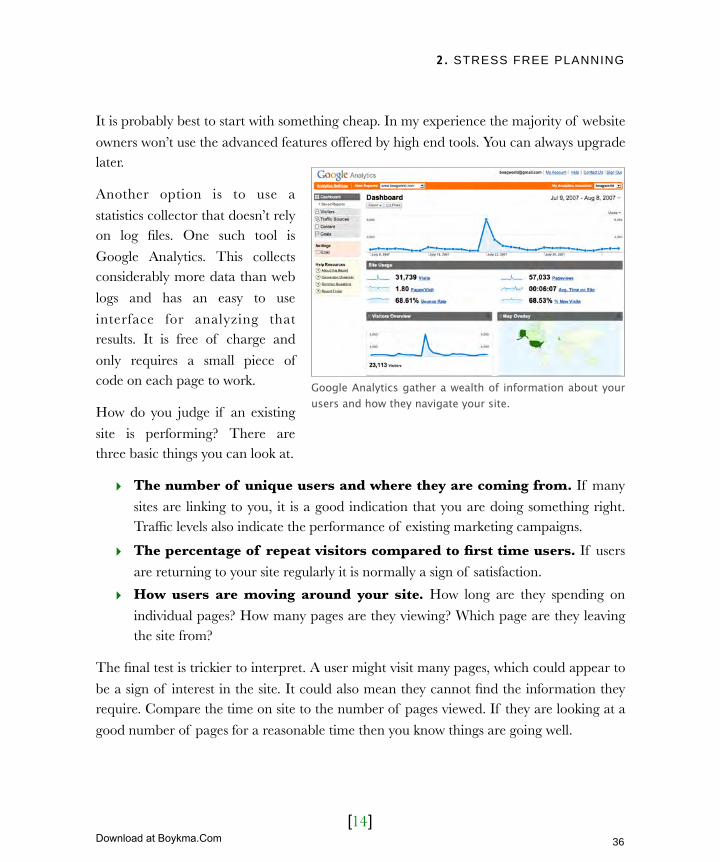
Another option is to use a
statistics collector that doesn’t rely on log files. One such tool is
Google Analytics. This collects considerably more data than web
logs and has an easy to use
interface for analyzing that results. It is free of charge and
only requires a small piece of code on each page to work.
How do you judge if an existing
site is performing? There are three basic things you can look at.
‣ The number of unique users and where they are coming from. If many
sites are linking to you, it is a good indication that you are doing something right. Traffic levels also indicate the performance of existing marketing campaigns.
‣ The percentage of repeat visitors compared to first time users. If users
are returning to your site regularly it is normally a sign of satisfaction.
‣ How users are moving around your site. How long are they spending on
individual pages? How many pages are they viewing? Which page are they leaving the site from?
The final test is trickier to interpret. A user might visit many pages, which could appear to
be a sign of interest in the site. It could also mean they cannot find the information they require. Compare the time on site to the number of pages viewed. If they are looking at a
good number of pages for a reasonable time then you know things are going well.
Google Analytics gather a wealth of information about your users and how they navigate your site.
36
Licensed to Henry Vanyan <[email protected]>
Download at Boykma.Com

2. STRESS FREE PLANNING
[15]
By looking at where a user
leaves, you can get an indication of potential problems. Are users
just looking at your homepage?
If they are leaving without viewing other pages then you
have a problem with your homepage. Are users getting to
checkout on your e-commerce
website and then giving up? Perhaps its time to user test your
checkout process.
There is a lot more you can do
with web stats, but that should be
enough for you to analysis your existing site. Let’s now turn our attention to automated checkers.
Automated performance checkersWhen analyzing your web stats you may notice a significant number of users who leave your site without viewing a single page. This can be happen for a variety of reasons. They
may have simply come to the wrong site. However, it could also mean they have met
technical difficulties accessing your site.
There are three tests you can easily perform to identify any potential problems.
‣ Check your site on as many different browsers as possible. I recommend you look at your site in at least the last two versions of Internet Explorer, Firefox, Opera
and Safari. If you do not have access to all of these browsers, then try out an online
service such as browsershots.org.
‣ Check your site’s accessibility using an online accessibility checker. These tools
provide a report outlining the various accessibility problems with your site. A word of warning: these automated accessibility reports can be both misleading and
confusing, as we will discover in chapter 7. Nevertheless, they can help you identify
It is easy to misinterpret website statistics. For example a large number of page views may mean people cannot find the information they are looking for.
37
Licensed to Henry Vanyan <[email protected]>
Download at Boykma.Com
2. STRESS FREE PLANNING
[16]
possible accessibility problem with your site.
‣ Carry out is a speed test on your site. You should be looking for download times of less than 10 seconds on a 56k modem. However, up to 20 seconds is acceptable.
Automated checkers have a broader role than monitoring site performance. They can also
be used to track the online visibility of your site.
Online visibility trackersWeb stats and performance checkers provide information on site usability and accessibility,
but they don’t tell you how easy your site is to find. Fortunately there are tools that do
exactly that.
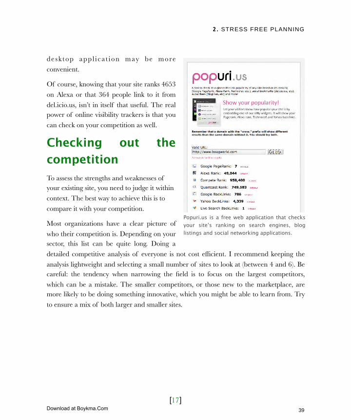
Start with a site like http://www.popuri.us. This site check various sources to ascertain
your online visibility.
If you want information about your site’s ranking for specific search terms, then a tool like
http://www.googlerankings.com will help. Despite the name, this free application checks
all major search engines reporting your rankings for whatever terms you specify.
There are also a number of desktop tools that bring all of this functionality (and more)
together. For the purposes of assessing an existing site, the free online tools will be adequate. In chapter 10 (Driving Traffic) we discuss the need to monitor your sites visibility
on an ongoing basis, especially when tracking marketing campaigns. In this situation a
Automated performance tools
To see what your site looks like in different browsers try:
http://www.browsershots.org
To check accessibility go to:
http://webxact.watchfire.com
For monitoring download times I would recommend:http://www.websiteoptimization.com/services/analyze/
38
Licensed to Henry Vanyan <[email protected]>
Download at Boykma.Com
2. STRESS FREE PLANNING
[17]
desk top app l i cat ion may be more
convenient.
Of course, knowing that your site ranks 4653
on Alexa or that 364 people link to it from
del.icio.us, isn’t in itself that useful. The real power of online visibility trackers is that you
can check on your competition as well.
Checking out the competitionTo assess the strengths and weaknesses of your existing site, you need to judge it within
context. The best way to achieve this is to
compare it with your competition.
Most organizations have a clear picture of
who their competition is. Depending on your sector, this list can be quite long. Doing a
detailed competitive analysis of everyone is not cost efficient. I recommend keeping the
analysis lightweight and selecting a small number of sites to look at (between 4 and 6). Be careful: the tendency when narrowing the field is to focus on the largest competitors,
which can be a mistake. The smaller competitors, or those new to the marketplace, are more likely to be doing something innovative, which you might be able to learn from. Try
to ensure a mix of both larger and smaller sites.
Popuri.us is a free web application that checks your site’s ranking on search engines, blog listings and social networking applications.
39
Licensed to Henry Vanyan <[email protected]>
Download at Boykma.Com

2. STRESS FREE PLANNING
[18]
Review your competitionTry to review your competitor’s website in a similar way to your own. Some adaptation
will be required when you do not have access to information.
For example, it is not going to be
possible to interview their internal
stakeholders. You are also not going to be able to survey existing visitors
through contact forms or online polls. Instead you will need to deploy
alternative methods like user testing.
Testing the competition gives you an opportunity to test out responses to
design, content, site structure and functionality. You can learn from what
they have done right and improve on
what they have done badly. It is the perfect training ground.
Although user testing is very useful it should not replace some basic analysis on your part. Take time to look at your competition and ask yourself:
‣ What is the message and tone of voice being used on this site?
‣ What content and functionality is highlighted on the home page and in the navigation?
‣ What image are they trying to project through the design?
‣ What functionality and content do they have compared to your website?
‣ What labeling are they applying to the content areas and site sections?
The aim is to better understand your competition’s online strategy. Why have they chosen to approach a problem in a different way to you? Does that alternative approach give
them an advantage?
Take the time to look at your competition’s websites and identify what works and what doesn’t.
40
Licensed to Henry Vanyan <[email protected]>
Download at Boykma.Com
2. STRESS FREE PLANNING
[19]
It is not necessary to limit your analysis of the competition to qualitative methods (such as
user testing). You can also do quantitative analysis too.
Test your competitionAs with reviewing the competition, some adaptation is required when doing quantitative
analysis. This is because you do not have access to their log files. There is however, a lot to
learn from checking the online visibility of your competition.
Do your competitor’s websites rank
higher than your own? Do more people link to them? Is there more talk about
your competitor’s brands? Who links to
your competition and can you persuade them to link to you?
Finding the answer to all of these questions is very simple. Use the same
popuri.us service I mentioned earlier in
the chapter and enter your competition’s web address. You can also use other tools
to test your competition, like using the automated checkers to see how well built their websites are.
All of these techniques should give you a clear understanding of your competition.
However, more important is the need to understand your users.
Picturing your usersMany website owners feel they have a clear picture of their users, but often they do not.
When asked, their answers are often vague and ill defined. The “general public” or even
“women over 50” is not clearly enough defined to be useful.
It is important that everybody on the web team has a clear understanding of the target
audience. It has to be more than a vague idea in your head. The designer needs to
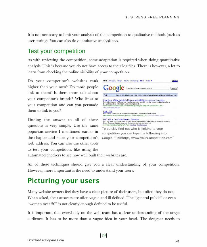
To quickly find out who is linking to your competition you can type the following into Google: “link:http://www.yourCompetition.com”
41
Licensed to Henry Vanyan <[email protected]>
Download at Boykma.Com

2. STRESS FREE PLANNING
[20]
understand the audience so he can create
a look and feel that resonates with those users. The content providers have to know,
so they can write at an appropriate
reading level and use terminology the reader familiar with. The list goes on.
Fortunately the process of refining and communicating your target audience only
consists of two painless steps. First, list and
prioritize your audience. Second, create personas for each of the target groups.
Let’s begin by prioritizing our users.
Prioritizing your usersMake a list of users who might be interested in your site. Be specific and include as many
types as you can. You will probably end up with a long list. It is the length of this list that
often spells disaster for many web projects. By targeting such a large
number of diverse audiences you inevitably end up appealing to nobody.
Where you could have had a focused,
engaging website, you end up with a bland solution.
It isn’t wrong to have a broad audience, but the list of target users needs
additional work before it aids, rather than
harms, the development process. I recommend prioritizing your audience
into three groups:
All members of the web team need to clearly understand the target audience.
This is an initial draft of a target audience list I wrote for a health care site. The site provided advice about health issues of pre-school children.The list was further refined before being given to the entire project team.
42
Licensed to Henry Vanyan <[email protected]>
Download at Boykma.Com

2. STRESS FREE PLANNING
[21]
Audiences Description
Primary audienceThe primary audience is the group you focus design, content and functionality around. The aim is to maximize their user experience.
Secondary audienceAlthough the site is not specifically tailored to the secondary audience it will still have sections specifically designed for their needs. These appear as “micro sites” or “landing pages”
OthersAlthough other audiences are catered for by the content of the site, the design and usability isn’t focused specifically on them. That said, nothing in the site should create unnecessary difficulties.
Organize your audience into three groups; primary, secondary and others.
Whether you’re redesigning a whole website or simply producing a new piece of
functionality for an existing site, list and prioritize your audience. The audience for a specific piece of functionality may be different to that of the website as a whole. For
example the primary audience for a specific application might be only a secondary audience for the site itself. Make sure everybody involved in the project gets a copy of the
final prioritized list. Designers and copywriters in particular will find it invaluable.
However, defining your users does not need to stop there. You can also look at creating personas.
Creating personasA persona is a description of a fictional individual. They are used to bring more life to the audiences on your list and help you better engage with them as real individuals. A persona
helps those involved in a web project to really understand the needs and motivation of
your target audience. As with the audience list they should be distributed to all members of your team and will be key in design, copywriting and user testing.
However, probably the most valuable role that personas fulfill is to act as a reference point. Once you have personified the target audience and given them a name, you can use them
as a sanity check for development decisions. For example you can ask yourself “what
43
Licensed to Henry Vanyan <[email protected]>
Download at Boykma.Com
2. STRESS FREE PLANNING
[22]
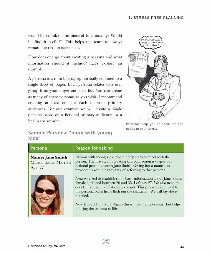
would Ben think of this piece of functionality? Would
he find it useful?” This helps the team to always remain focused on user needs.
How does one go about creating a persona and what
information should it include? Let’s explore an example.
A persona is a mini biography, normally confined to a single sheet of paper. Each persona relates to a user
group from your target audience list. You can create
as many of these personas as you wish. I recommend creating at least one for each of your primary
audiences. For our example we will create a single persona based on a fictional primary audience for a
health spa website.
Sample Persona: “mum with young kids”
Persona Reason for asking
Name: Jane SmithMarital status: MarriedAge: 27
“Mums with young kids” doesn’t help us to connect with the person. The first step in creating this connection is to give our fictional person a name: Jane Smith. Giving her a name also provides us with a handy way of referring to that persona.
Next we need to establish some basic information about Jane. She is female and aged between 20 and 35. Let’s say 27. We also need to decide if she is in a relationship or not. This probably isn’t vital to the persona but it helps flesh out the character. We will say she is married.
Now let’s add a picture. Again this isn’t entirely necessary but helps to bring the persona to life.
Personas help you to focus on the needs to your users.
44
Licensed to Henry Vanyan <[email protected]>
Download at Boykma.Com
2. STRESS FREE PLANNING
[23]
Persona Reason for asking
Occupation: MidwifeChildren: 2 (aged 18 months and 4 years)
Occupation will range hugely across our audience, but we need to pick something. Let’s say she works part time as a midwife. This job fits nicely around her childcare requirements. It also supplements her husband’s income and gives them a bit more disposable cash.
Let’s say she has 2 children aged 18 months and 4 years. You would not always need to specify this information but as children are a defining characteristic for this persona, it is worth mentioning.
Even with just this basic demographic information we are starting to build up a picture of
her life. We know she is busy, rushing from the school to her job and back again. She has little free time and probably craves peace and quiet. Being a midwife we know she is
intelligent and well educated. She is also relatively affluent due to their dual incomes.
In short, she is an ideal candidate for the health spa. It would provide a welcome break
from the kids and her hectic lifestyle. We know she has the income to afford a “treat” like
this occasionally. The next step is to understand how Jane interacts with the web.
Persona Reason for asking
Jane has very little time to surf the web. Because she always has children “underfoot,” using the internet rarely receives her full attention.
How much does this persona use the web and what does she use it for? In the case of Jane, she probably doesn’t us the web that much. She is not required to use it as part of her job and she hardly has much time at home to surf !
Unless she is giving up her precious quiet time after the kids have gone to bed, she will probably be looking at the web with children running around. The chances are she will not be able to give the site her full attention.
Jane uses the web occasionally to find childcare information, buy clothing, and order food.
She is not uncomfortable using computers when required.
Jane is well educated, so she uses the computer occasionally to look at childcare information or as a research tool for work. She may also make purchases of clothing and groceries online, because she doesn’t have the time to go shopping. Beyond that her usage will be limited.
45
Licensed to Henry Vanyan <[email protected]>
Download at Boykma.Com

2. STRESS FREE PLANNING
[24]
Our final step is to see what Jane will be looking for in our health spa website.
Persona Reason for asking
If Jane visits the spa site, she probably will have already decided in principle that go. She will not take much persuasion.
We know that Jane doesn’t surf the web. When she does go online she doesn’t hang around. As a result, she is unlikely to just stumble across the site. More likely she came across the site through something like a brochure. She probably already knows she wants to go to a spa by this stage. It is just a matter of which spa is right for her.
The first information Jane requires when arriving on the site is price and availability. Only then will she look at what exactly is on offer.
So what will make Jane choose this spa? Her primary motivations will probably be price and availability. Price because with two kids she will feel that the trip is an extravagance. Availability because she will have to arrange childcare. Only then will she allow herself to explore the site and find out how she can be pampered.
Jane needs the website to be easy to use and provide her quick access to the key information she requires.
We know that she is busy and cannot not give any website her full attention. It is therefore important that the site is easy to use and quickly tells her what she needs to know. If it does not she is likely to go to a competitors site.
Even a basic persona can provide an in-depth understanding of your audience. Personas are a great tool whose power extend well beyond the website and can even affect overall
business strategy. For example, wouldn’t it be helpful if the spa provided childcare, so that Jane did not need to arrange a babysitter?
46
Licensed to Henry Vanyan <[email protected]>
Download at Boykma.Com
2. STRESS FREE PLANNING
[25]
Next ActionsIn this chapter we have brought together the background information required to run a stress free web project. However, this information needs to be refined into something
tangible. Only then can it be turned into a brief that the web developers can work from.
Before moving on to the next chapter take a moment to complete the following actions.
‣ Action One: Collate your research - In this chapter you have researched
organizational and site objectives, developed success criteria and better understood
your target audience. You have also analyzed your own website and that of the competition. Take some time to condense this information into a short, digestible
form. Take the ideas that have come out of stakeholder interviews, competitive analysis and site review, and record them as a list that can be refined.
‣ Action Two: Refine by objectives - Start refining your wish-list based on your
site objectives and success criteria. Does that great idea suggested in the stakeholder interviews line up with your site objectives? Will that functionality on your
competition’s website help you meet your success criteria? If not, remove it to a
“maybe later” list.
‣ Action Three: Refine by persona needs - Take your newly trimmed list and
look at it from your persona’s point of view. Would Jane (our fictional persona) find the idea useful? Would it help her within her day-to-day constraints? If the answer
is yes, keep the item on the list. If not, remove it but keep it safe for the future.
You should now have a definitive list that can be implemented as a web project. Combined with your personas, list of target groups, success criteria and website objectives,
you have everything you need to write a brief and assemble your team.
47
Licensed to Henry Vanyan <[email protected]>
Download at Boykma.Com
3. THE PERFECT TEAM
[1]
In this chapter‣ Choosing when to outsource
‣ Clearly define your project
‣ How to write an effective brief Provide context
Clearly state your requirements
Define your deliverables
Learn about the supplier
‣ Avoiding disasters Never request speculative design
Avoid writing a wish list
‣ Selecting the perfect team How to narrow the field
Reading between the lines
Making the final selection
Assessing the proposals
Interviewing the shortlist
Taking up references
48
Licensed to Henry Vanyan <[email protected]>
Download at Boykma.Com
3. THE PERFECT TEAM
[2]
3 The perfect teamI am a huge fan of the ‘Mission Impossible’ TV show. I loved that each week Ethan Hunt would assemble the perfect team to complete his mission. People were carefully selected based on their skills and each person would get their moment of glory when their specialty saved the team. From the prosthetics artist to the explosives expert, every person played their part.
Of course the heroes in these stories were only trying to complete an impossible mission. They certainly weren’t doing anything as challenging as building a website! They instinctively knew the plan for success and who they needed to complete it. Unfortunately, in the real world things are much tougher.
In chapter two we established an outline of what needed to be done to complete our project. Now that outline must be turned into an actionable plan. You need to assemble your team and brief them properly. How do you find the right people? How do you ensure that your team knows exactly what is expected of them?
In this chapter we look at how to write a brief (also known as the scope of work) and select your team. However, first you need to make one vital decision. Are you going to develop your web project in-house or outsource it to an external web agency?
49
Licensed to Henry Vanyan <[email protected]>
Download at Boykma.Com
3. THE PERFECT TEAM
[3]
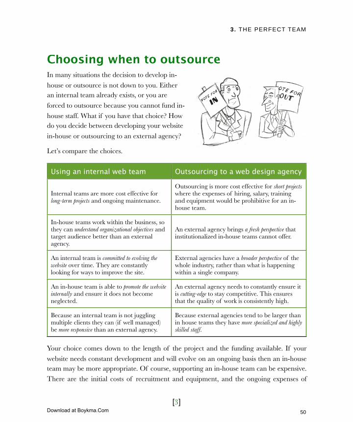
Choosing when to outsourceIn many situations the decision to develop in-
house or outsource is not down to you. Either an internal team already exists, or you are
forced to outsource because you cannot fund in-
house staff. What if you have that choice? How do you decide between developing your website
in-house or outsourcing to an external agency?
Let’s compare the choices.
Using an internal web team Outsourcing to a web design agency
Internal teams are more cost effective for long-term projects and ongoing maintenance.
Outsourcing is more cost effective for short projects where the expenses of hiring, salary, training and equipment would be prohibitive for an in-house team.
In-house teams work within the business, so they can understand organizational objectives and target audience better than an external agency.
An external agency brings a fresh perspective that institutionalized in-house teams cannot offer.
An internal team is committed to evolving the website over time. They are constantly looking for ways to improve the site.
External agencies have a broader perspective of the whole industry, rather than what is happening within a single company.
An in-house team is able to promote the website internally and ensure it does not become neglected.
An external agency needs to constantly ensure it is cutting-edge to stay competitive. This ensures that the quality of work is consistently high.
Because an internal team is not juggling multiple clients they can (if well managed) be more responsive than an external agency.
Because external agencies tend to be larger than in house teams they have more specialized and highly skilled staff.
Your choice comes down to the length of the project and the funding available. If your
website needs constant development and will evolve on an ongoing basis then an in-house team may be more appropriate. Of course, supporting an in-house team can be expensive.
There are the initial costs of recruitment and equipment, and the ongoing expenses of
50
Licensed to Henry Vanyan <[email protected]>
Download at Boykma.Com

3. THE PERFECT TEAM
[4]
salary and training. For shorter development projects the benefits and cost savings of
outsourcing may outweigh the convenience of an in-house team.
In reality, there is no reason why you cannot combine both approaches. An external
agency could be used for development work while ongoing maintenance could be handled
by an internal web editor. Equally, you could do the bulk of development internally, but bring in external agencies for specialist work such as search engine optimization. This
hybrid approach combines the strengths of both in-house and external.
Whatever your approach, you will need to provide a brief from which people can work.
Clearly define your projectHaving a clearly written, well defined scope of work (or brief) is central to a successful web
project, especially when engaging an external agency. The length of your brief should reflect the size and complexity of the project. It should also reflect the audience towards
whom it is aimed. For example, a brief that is distributed to external agencies will need more background information than one aimed at in-house developers.
The desire to avoid writing a brief can be strong, especially on smaller project being
developed internally. I encourage you to always write a brief, no matter what the circumstances, since a brief provides many benefits:
‣ Limits scope creep. Projects without a brief lack definition and allow new functionality to be added “on the fly.”
This results in slippages and loss of
direction.
‣Improve costing accuracy. Whether
developing in-house or outsourcing, a project needs to be costed. Costs can be
expenditure on external agencies, or
time and salary for in-house staff.
‣Clearly defines tasks. A well written
brief enables your development team to identify specifically what tasks need to be
Although it is tempting not to write a brief for smaller projects it will cause problems further down the line. All projects should have some kind of brief.
51
Licensed to Henry Vanyan <[email protected]>
Download at Boykma.Com
3. THE PERFECT TEAM
[5]
completed and by whom.
‣ Specifies delivery dates. Once tasks are established it becomes easier to estimate how long the project will take. If this exceeds the specified deadline then additional
resources will be required.
‣ Provides context for the developers. A good brief includes background research (see chapter 1), which will encourage intelligent suggestions.
‣ Sets expectations. A brief explains to the developers exactly what is expected and ensures internal stakeholders understand the scope of the project. This avoids
disappointment and dispute further down the line.
‣ Improves communication. A good brief should stimulate discussion between yourself and the developer. Expect questions after your invitation to tender is sent
out and encourage comments.
It is important to allow time for external agencies to ask questions when issuing an invitation to tender. Don’t send out your brief and then go on vacation until after the deadline for responses!
We have established that a scope of work is important, but what goes into it?
52
Licensed to Henry Vanyan <[email protected]>
Download at Boykma.Com

3. THE PERFECT TEAM
[6]
How to write an effective briefThere is no single way to write a web design brief. It depends on who will be reading the
brief and on the size of the project. A short email would suffice for a internal developer adding a contact form to a site. For a
website redesign or new sub-site, a
larger document would be required. Although the complexity of a brief
varies, there are four broad categories of elements which should appear:
‣ Context
‣ Requirements
‣ Deliverables
‣ Information on the developer
Let us begin with context.
Provide contextAn effective brief should provide
background information about the project, drawn from the research we gathered in chapter 2. The amount of context required is dependent on the knowledge of the reader.
If the document is being sent to external agencies then more context is required. Less is needed for an internal audience aware of this background information. Consider the
needs of your reader. Information should be distributed on a “need to know” basis! No
matter the size of the project, always include the following:
‣ Target Audience – For smaller projects list the target audience and what they want
to achieve. On larger projects include the personas developed in the chapter 2.
‣ About your organization – When using an external agency for the first time,
provide background information on who you are and what you do. Don’t give them
the company history. Instead, focus on your mission statement, organizational objectives and how you use the web to achieve your goals.
‣ Aims and objectives – The emphasis of any brief should be on the project
53
Licensed to Henry Vanyan <[email protected]>
Download at Boykma.Com
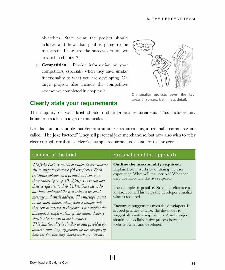
3. THE PERFECT TEAM
[7]
objectives. State what the project should
achieve and how that goal is going to be measured. These are the success criteria we
created in chapter 2.
‣ Competition – Provide information on your competitors, especially when they have similar
functionality to what you are developing. On large projects also include the competitive
reviews we completed in chapter 2.
Clearly state your requirementsThe majority of your brief should outline project requirements. This includes any limitations such as budget or time scales.
Let’s look at an example that demonstratesthese requirements, a fictional e-commerce site called “The Joke Factory.” They sell practical joke merchandise, but now also wish to offer
electronic gift certificates. Here’s a sample requirements section for this project:
Content of the brief Explanation of the approach
The Joke Factory wants to enable its e-commerce site to support electronic gift certificates. Each certificate appears as a product and comes in three values (£5, £10, £20). Users can add these certificates to their basket. Once the order has been confirmed the user enters a personal message and email address. The message is sent to the email address along with a unique code that can be entered at checkout. This applies the discount. A confirmation of the emails delivery should also be sent to the purchaser.This functionality is similar to that provided by amazon.com. Any suggestions on the specifics of how the functionality should work are welcome.
Outline the functionality required. Explain how it works by outlining the user experience. What will the user see? What can they do? How will the site respond?
Use examples if possible. Note the reference to amazon.com. This helps the developer visualize what is required.
Encourage suggestions from the developers. It is good practice to allow the developer to suggest alternative approaches. A web project should be a collaborative process between website owner and developer.
On smaller projects cover the key areas of context but in less detail.
54
Licensed to Henry Vanyan <[email protected]>
Download at Boykma.Com

3. THE PERFECT TEAM
[8]
Content of the brief Explanation of the approach
The new gift certificate system should integrate with our existing website. This site is built using Classic ASP with a SQL Server 2007 database. The front end is built using the latest standards based techniques.
Communicate any technical constraints. This prevents the developer suggesting inappropriate solutions. Don’t worry if the wording opposite sounds like gibberish. Many of the terms there will be explained later in the book. If in doubt ask your existing developer to outline any technical considerations that should be included.
The selection of gift certificates should reflect other products closely. The form field that allows users to redeem their vouchers should be clearly explained and consistent with the rest of the checkout process. Finally, the certificate emails should be visually attractive and conform to corporate guidelines (see attached).
Describe any design specifications. If you have a style guide, simply refer to that. Also mention other sites that convey the look you want. However, be specific about which elements you like and why.
Once this new service is launched we wish to promote it with our existing customers. We require the creation of a promotional email and distribution of that email to our mailing list. The list of email addresses can be provided in an Excel document and consists of just under 10,000 addresses.
List requirements beyond design and build. These can include things like email marketing, search engine optimization, and hosting. The requirements segment should outline these items to avoid unforeseen costs further down the line.
The Joke Factory’s sales are seasonable with the peak at Christmas. We therefore want the new gift certificate functionality available by late October.
Discuss deadlines. Do not create artificial deadlines. It will limit the number of agencies tendering. Include legitimate deadlines and explain why they exist.
We have allocated $5000 for this project. However, we will accept higher bids if they can be justified. Although cost is an important factor in our decision, it is not the only consideration. The ability to meet deadlines and integrate into our existing site is also very important.
Include an indication of budget. Any web project can be approached in different ways and without an indication of budget the web developer will not know the most suitable. Finally, indicate how important the budget is in your decision. Will you consider responses to your brief that exceed your budget or will you accept the cheapest quote?
55
Licensed to Henry Vanyan <[email protected]>
Download at Boykma.Com
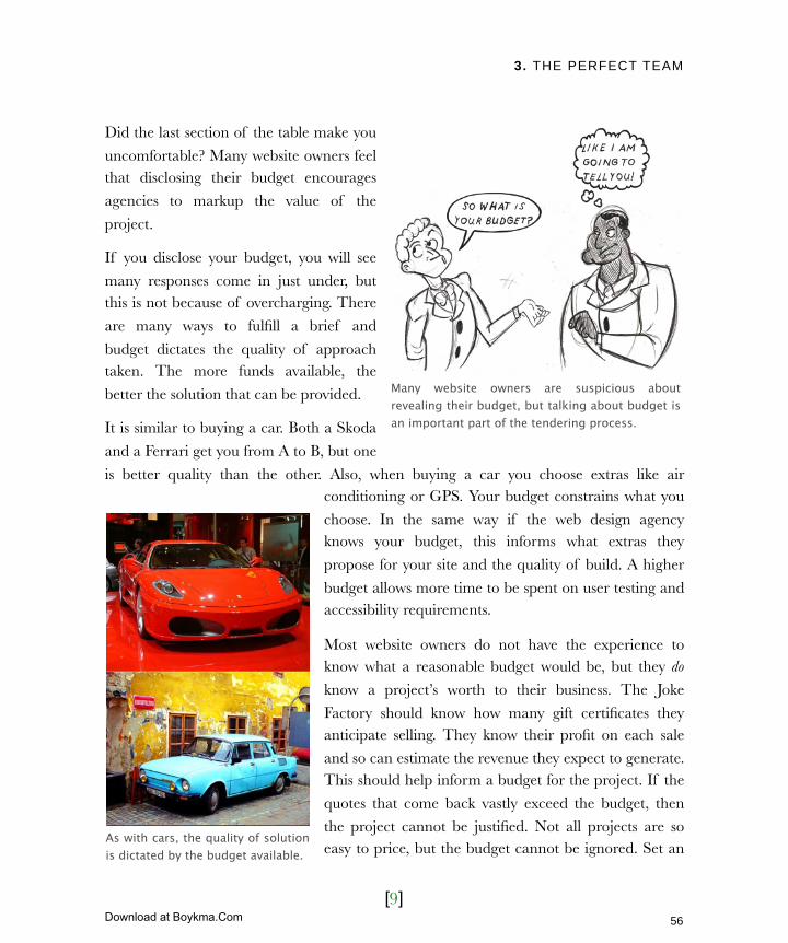
3. THE PERFECT TEAM
[9]
Did the last section of the table make you
uncomfortable? Many website owners feel that disclosing their budget encourages
agencies to markup the value of the
project.
If you disclose your budget, you will see
many responses come in just under, but this is not because of overcharging. There
are many ways to fulfill a brief and
budget dictates the quality of approach taken. The more funds available, the
better the solution that can be provided.
It is similar to buying a car. Both a Skoda
and a Ferrari get you from A to B, but one
is better quality than the other. Also, when buying a car you choose extras like air conditioning or GPS. Your budget constrains what you
choose. In the same way if the web design agency knows your budget, this informs what extras they
propose for your site and the quality of build. A higher
budget allows more time to be spent on user testing and accessibility requirements.
Most website owners do not have the experience to know what a reasonable budget would be, but they do
know a project’s worth to their business. The Joke
Factory should know how many gift certificates they anticipate selling. They know their profit on each sale
and so can estimate the revenue they expect to generate. This should help inform a budget for the project. If the
quotes that come back vastly exceed the budget, then
the project cannot be justified. Not all projects are so easy to price, but the budget cannot be ignored. Set an
Many website owners are suspicious about revealing their budget, but talking about budget is an important part of the tendering process.
As with cars, the quality of solution is dictated by the budget available.
56
Licensed to Henry Vanyan <[email protected]>
Download at Boykma.Com
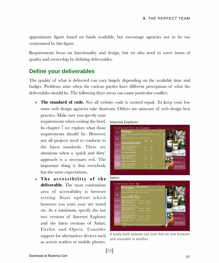
3. THE PERFECT TEAM
[10]
approximate figure based on funds available, but encourage agencies not to be too
constrained by this figure.
Requirements focus on functionality and design, but we also need to cover issues of
quality and ownership by defining deliverables.
Define your deliverablesThe quality of what is delivered can vary hugely depending on the available time and budget. Problems arise when the various parties have different perceptions of what the
deliverables should be. The following three areas can cause particular conflict:
‣ The standard of code. Not all website code is created equal. To keep costs low
some web design agencies take shortcuts. Others are unaware of web design best
practice. Make sure you specify your requirements when writing the brief.
In chapter 7 we explore what those requirements should be. However,
not all projects need to conform to
the latest standards. There are situations when a ‘quick and dirty’
approach is a necessary evil. The important thing is that everybody
has the same expectations.
‣ T h e a c c e s s i b i l i t y o f t h e deliverable. The most contentious
area of accessibility is browser tes t ing. State upfront which
browsers you want your site tested on. As a minimum, specify the last
two versions of Internet Explorer
and the latest versions of Safari, Firefox and Opera. Consider
support for alternatives devices such as screen readers or mobile phones.
Internet Explorer
Safari
A badly built website can look fine on one browser and unusable in another.
57
Licensed to Henry Vanyan <[email protected]>
Download at Boykma.Com
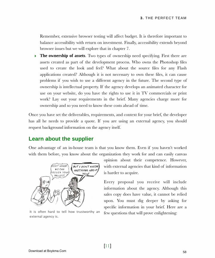
3. THE PERFECT TEAM
[11]
Remember, extensive browser testing will affect budget. It is therefore important to
balance accessibility with return on investment. Finally, accessibility extends beyond browser issues but we will explore that in chapter 7.
‣ The ownership of assets. Two types of ownership need specifying. First there are
assets created as part of the development process. Who owns the Photoshop files used to create the look and feel? What about the source files for any Flash
applications created? Although it is not necessary to own these files, it can cause problems if you wish to use a different agency in the future. The second type of
ownership is intellectual property. If the agency develops an animated character for
use on your website, do you have the rights to use it in TV commercials or print work? Lay out your requirements in the brief. Many agencies charge more for
ownership and so you need to know these costs ahead of time.
Once you have set the deliverables, requirements, and context for your brief, the developer
has all he needs to provide a quote. If you are using an external agency, you should
request background information on the agency itself.
Learn about the supplierOne advantage of an in-house team is that you know them. Even if you haven’t worked
with them before, you know about the organization they work for and can easily canvas opinion about their competence. However,
with external agencies that kind of information
is harder to acquire.
Every proposal you receive will include
information about the agency. Although this sales copy does have value, it cannot be relied
upon. You must dig deeper by asking for
specific information in your brief. Here are a few questions that will prove enlightening:It is often hard to tell how trustworthy an
external agency is.
58
Licensed to Henry Vanyan <[email protected]>
Download at Boykma.Com

3. THE PERFECT TEAM
[12]
Question to ask What the question reveals
How many years has your agency been trading? Younger companies can suffer from problems in their workflow and delivery.
Can you please provide accounts for the last three years?
Viewing the financial accounts of an agency will indicate how likely the company is to be around for ongoing support.
How many staff members do you employ and what is the approximate makeup of responsibilities?
The size and makeup of an organization helps determine if they can successfully deliver your project. Even a large agency will struggle to deliver a technical project if the majority of their staff are designers.
Please provide resumes for key staff that may potentially be involved on our project.
Don’t expect an agency to be able to tell you the final project team, but ask for resumes anyway.
What liability insurance does your company hold, which maybe relevant to this project?
An agency could fail to deliver or work could be lost for some reason. Having a financial recompense available is a reassuring safety net.
Along with the questions above, always ask for
references. References are an invaluable way of learning more about the agency as we will
discover later in this chapter.
Finally, ask for examples of relevant work. This shows the quality of their work and experience
on similar projects. Website owners often fail to do this when engaging an agency to do design
work. Instead they ask the agency to produce a
number of design mockups, which is a flawed approach.
If you are seeking a long term partnership with an external agency, be sure of their financial security.
59
Licensed to Henry Vanyan <[email protected]>
Download at Boykma.Com
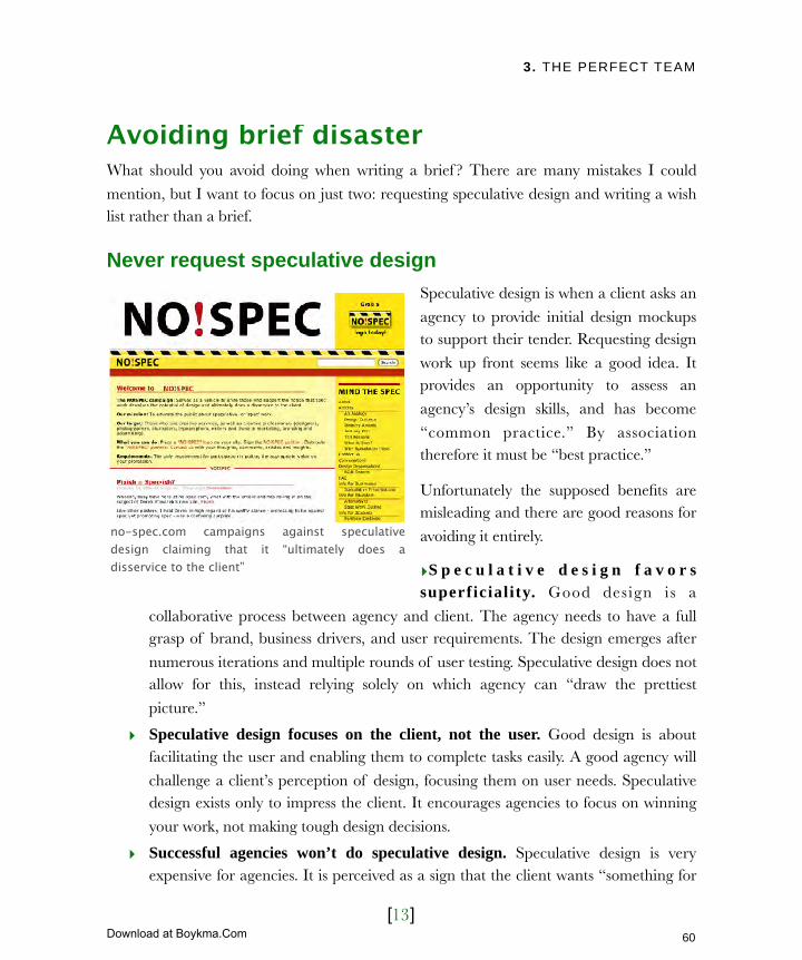
3. THE PERFECT TEAM
[13]
Avoiding brief disasterWhat should you avoid doing when writing a brief ? There are many mistakes I could
mention, but I want to focus on just two: requesting speculative design and writing a wish list rather than a brief.
Never request speculative designSpeculative design is when a client asks an
agency to provide initial design mockups to support their tender. Requesting design
work up front seems like a good idea. It provides an opportunity to assess an
agency’s design skills, and has become
“common practice.” By association therefore it must be “best practice.”
Unfortunately the supposed benefits are misleading and there are good reasons for
avoiding it entirely.
‣S p e c u l a t i v e d e s i g n f a v o r s superficiality. Good design is a
collaborative process between agency and client. The agency needs to have a full grasp of brand, business drivers, and user requirements. The design emerges after
numerous iterations and multiple rounds of user testing. Speculative design does not allow for this, instead relying solely on which agency can “draw the prettiest
picture.”
‣ Speculative design focuses on the client, not the user. Good design is about facilitating the user and enabling them to complete tasks easily. A good agency will
challenge a client’s perception of design, focusing them on user needs. Speculative design exists only to impress the client. It encourages agencies to focus on winning
your work, not making tough design decisions.
‣ Successful agencies won’t do speculative design. Speculative design is very expensive for agencies. It is perceived as a sign that the client wants “something for
no-spec.com campaigns against speculative design claiming that it “ultimately does a disservice to the client”
60
Licensed to Henry Vanyan <[email protected]>
Download at Boykma.Com

3. THE PERFECT TEAM
[14]
nothing.” If an agency is successful
and has no trouble generating work, they tend not to response to briefs
that include speculative design. A
willingness to produce speculative design can be a sign of a new or
struggling agency.
‣ You pay for speculative design. The perception that there is no cost
a s s o c i a t e d w i t h r e q u e s t i n g speculative design is false. The
agency has to cover its cost of sale by adding it onto the projects they win. In the end clients not only pays for the speculative designs produced for their project, but
also for other projects that the agency failed to win.
Later in this chapter we cover alternative ways of assessing the design skills of an agency. For now it is enough to put a requirement in your brief to see examples of related work.
Speculative design is not the only mistake that is made when writing a brief.
Avoid writing a wish listThe second mistake is that a brief can turn into a wish list of functionality rather than
immediate requirements. Even after refining your ideas according to users’ needs and
business requirements, you could still have an extensive list of work that needs to be done.
The best approach is to break requirements down into smaller mini-projects (or modules)
that can be rolled out over time. This phased development provides a number of benefits.
‣ Phased development increases speed of delivery by launching new modules
independently. Some modules can be launched while others are in development.
This prevents a single module stalling the entire rollout.
‣ Phased development leads to more accurate estimates. Bigger project are harder
to estimate. Breaking them down makes it easier for suppliers to quote accurately.
Would you have hired the designer who created this web page? Probably not because although it is usable it lacks the “wow” factor.
61
Licensed to Henry Vanyan <[email protected]>
Download at Boykma.Com

3. THE PERFECT TEAM
[15]
‣ Phased development improves cash flow by spreading the cost of a project. Instead of having two or
three large payments, you have a number o f smal ler payments
associated with the delivery of each
micro-project.
‣ Phased development provides PR opportunities. Whenever a new feature is launched there is an
opportunity to publicize the site. New features can motivate users into
taking another look. A single large
project only provides a single opportunity to grab people’s attention.
‣ Phased development limits the risks of working with a new supplier. Choosing
an agency is always a risk. Until you work with somebody, it is hard to gauge how good they are. Reduce this risk by limiting the size of project they are commissioned
to build. If the agency fails to perform, you can look elsewhere when
commissioning subsequent work.
Unfortunately, it is not always possible to break projects down. Sometimes you have to
take the decision to commission an agency for the entire project. In such situations it becomes important that you select the right team.
Selecting the perfect teamSelecting a web design agency is a crucial step in the web development process. The
wrong decision can have devastating consequences on your project leading to considerable stress and delays.
It is hard to provide accurate quotes for price and timescales on large projects.
62
Licensed to Henry Vanyan <[email protected]>
Download at Boykma.Com

3. THE PERFECT TEAM
[16]
Not that every website owner has to face this challenge. Many work with existing in-house
teams. However, there are number of reasons why a website owner with an in-house team might still choose to outsource.
Who then do you invite to tender? How do you evaluate their proposals and
presentations?
How to narrow the fieldAfter days of research, refinement and crafting, you finally have the perfect web design
brief. With millions of web design companies worldwide, who do you send it to?
One option is to filter by geography. There are valid reasons for selecting a web design
agency within country. Issues such as currency, time zones and company law can make
working with international agencies challenging. However, beyond that, geography has little effect. An agency is just as capable of developing your project whether they are next
door or a thousand miles away.
The best approach is word of mouth recommendation, especially from somebody you
know and respect. Start by talking to your suppliers or other business partners. Who did
they use to build their site? What was their experience like? If you are part of a trade association, see if they have any recommendations. Also, ask for recommendations in any
forums or mailing lists related to your sector.
Finally, look at websites that you like or
consider successful. Most sites will have a link to the agency that developed them. If
they don’t, then a search on Google often reveals the agency’s name. Be careful if
adopting this approach. Just looking at a
website does not tell the whole story. The underlying technology could be in
shambles, the management may have
Some methods for finding web design agencies are more successful than others.
63
Licensed to Henry Vanyan <[email protected]>
Download at Boykma.Com
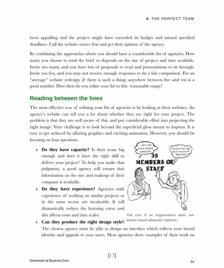
3. THE PERFECT TEAM
[17]
been appalling and the project might have exceeded its budget and missed specified
deadlines. Call the website owner first and get their opinion of the agency.
By combining the approaches above you should have a considerable list of agencies. How
many you choose to send the brief to depends on the size of project and time available.
Invite too many, and you have lots of proposals to read and presentations to sit through. Invite too few, and you may not receive enough responses to do a fair comparison. For an
“average” website redesign (if there is such a thing) anywhere between five and ten is a good number. How then do you refine your list to this reasonable range?
Reading between the linesThe most effective way of refining your list of agencies is by looking at their websites. An
agency’s website can tell you a lot about whether they are right for your project. The problem is that they are well aware of this, and put considerable effort into projecting the
right image. Your challenge is to look beyond the superficial gloss meant to impress. It is easy to get seduced by alluring graphics and exciting animation. However, you should be
focusing on four questions.
‣ Do they have capacity? Is their team big enough and does it have the right skill to
deliver your project? To help you make that judgment, a good agency will ensure that
information on the size and makeup of their
company is available.
‣ Do they have experience? Agencies with
experience of working on similar projects or in the same sector, are invaluable. It will
dramatically reduce the learning curve and
this affects costs and time scales.
‣ Can they produce the right design style?
The chosen agency must be able to design an interface which reflects your brand identity and appeals to your users. Most agencies show examples of their work on
The size if an organisation does not always equal adequate capacity.
64
Licensed to Henry Vanyan <[email protected]>
Download at Boykma.Com

3. THE PERFECT TEAM
[18]
their websites. Look for examples that are aimed at a similar target audience or
mirror your branding. Failing that make sure they demonstrate a broad range of styles. If all their sites have a “house” style and that is not inline with your
requirements, then look elsewhere.
‣ Can they deliver your technical requirements? Increasingly, web projects involve complex development work. An agency’s site should demonstrate a capability to
deliver these kinds of projects. Look for examples that are comparable to your site and use similar technologies.
This approach will allow you to create a definitive list of agencies you wish to invite to
tender. Once the brief has been sent, expect agencies to call with various questions. Be sure to note down the calls you receive. Who asked intelligent questions and who had not
read the brief thoroughly? These are all clues that help you build up a picture of the agency and informs your decision making process.
With the questions answered the agencies should now be able to produce a detailed
proposal. The next step is to choose the winning agency.
Making the final selectionChoosing an agency is an intimidating decision. However, the final choice can be
made using three simple steps:
‣ Assessing the proposals
‣ Interviewing the shortlist
‣ Taking up references
Let’s start narrowing the field by looking at the proposals you have received.
Speak to the agencies
If a website does not provide the
information you require, phone the agency directly. A five-minute phone
call can be more enlightening than
pouring over a site for hours.
65
Licensed to Henry Vanyan <[email protected]>
Download at Boykma.Com
3. THE PERFECT TEAM
[19]
Assessing the proposalsProposals can vary dramatically in price, approach and technology. Without clear
assessment criteria it can seem impossible to compare the different options. Before reading the proposals, write a list of criteria by which you are going to assess them. If appropriate
add weighting to important criteria. However, be careful not to over-weight a single
category. For example, it is dangerous to put too much emphasis on price as it can lead to a poor quality solution.
There are no set criteria by which you should judge a proposal. The particulars of your web project dictate the criteria. However, here are some
you should consider.
‣An understanding of the brief. Have they understood your objectives in the solution they have
proposed? Have they responded to the constraints of the brief ?
‣A proven track record. Has the agency shown
examples similar to your project and using similar technologies?
‣Evidence of best practice. Does the agency demonstrate experience in usability (see chapter 6),
accessibility and web standards (see chapter 7)?
‣An understanding of the sector. Has the agency worked with other clients in similar sectors? Do they
understand the challenges of your sector?
‣ Innovation. Has the agency challenged the brief in places and offered alternative
solutions that better meet your business needs?
‣ Value for money. Does the agency offer both “value for money” and quality?
Using this approach, narrow the number of agencies down to three or four. Next, arrange
to meet with the remaining agencies.
Never dismiss a good proposal based on a single criteria. Speak to the agency and see if a compromise can be reached.
66
Licensed to Henry Vanyan <[email protected]>
Download at Boykma.Com

3. THE PERFECT TEAM
[20]
Interviewing the shortlistI recommend this step for all but the smallest projects. How many agencies you interview
is subjective, but keep the number small. Interview too many, and they will blur together. Sitting through endless presentations is exhausting for you and unfair on the agency that
gets the last slot of the day!
Inform the agencies of any requirements you have for their presentations, as well as the time available to them. One condition worth setting is who should attend. Often an
agency will only send sales staff. However, it is not the sales person you will be working with, so ask that at least one member of
the proposed development team attends.
On large projects, ask for the project owner. On smaller ones, ask for a designer
or developer. This allows you to see what the working relationship might be like.
Although this is an effective approach, it
can backfire. As with speculative design, some successful agencies will choose to
turn away clients who ask development staff to attend presentations. These
agencies are too busy to spare staff to
attend sales meetings. Only use this approach if you are concerned about the
working relationship with an agency.
Establishing if you can work with an agency is very important. Do they approach
problems in the same way as you? Do they share your values and passions for the project?
Do they speak your language or does what they say go over your head? Are they honest about the challenges in the project and even their own weaknesses?
Judging whether you can work with an agency is a personal decision. However, meeting the agencies will allow you to narrow the selection down to one or two agencies.
Remember it is not the sales person you will be working with. Ask to meet the development team.
67
Licensed to Henry Vanyan <[email protected]>
Download at Boykma.Com
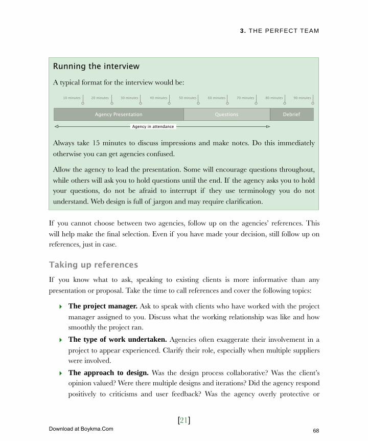
3. THE PERFECT TEAM
[21]
If you cannot choose between two agencies, follow up on the agencies’ references. This
will help make the final selection. Even if you have made your decision, still follow up on references, just in case.
Taking up referencesIf you know what to ask, speaking to existing clients is more informative than any
presentation or proposal. Take the time to call references and cover the following topics:
‣ The project manager. Ask to speak with clients who have worked with the project
manager assigned to you. Discuss what the working relationship was like and how smoothly the project ran.
‣ The type of work undertaken. Agencies often exaggerate their involvement in a
project to appear experienced. Clarify their role, especially when multiple suppliers were involved.
‣ The approach to design. Was the design process collaborative? Was the client’s opinion valued? Were there multiple designs and iterations? Did the agency respond
positively to criticisms and user feedback? Was the agency overly protective or
Running the interview
A typical format for the interview would be:
Agency Presentation Questions Debrief
Agency in attendance
10 minutes 20 minutes 30 minutes 40 minutes 50 minutes 60 minutes 70 minutes 80 minutes 90 minutes
Always take 15 minutes to discuss impressions and make notes. Do this immediately
otherwise you can get agencies confused.
Allow the agency to lead the presentation. Some will encourage questions throughout,
while others will ask you to hold questions until the end. If the agency asks you to hold your questions, do not be afraid to interrupt if they use terminology you do not
understand. Web design is full of jargon and may require clarification.
68
Licensed to Henry Vanyan <[email protected]>
Download at Boykma.Com

3. THE PERFECT TEAM
[22]
inflexible about design.
‣ Deadlines and budget. Being confident that an agency can deliver on their promises is the
cornerstone to a successful working relationship.
‣ Weaknesses. An agency will not refer you to a disgruntled client. To avoid an entirely glowing
report, ask directly about negative characteristics.
‣ The approach to projects. Was the approach
flexible enough to accommodate change? Did the
client speak directly to development staff or where they confined to liaising with a project
owner?
‣ Ongoing support. Did the agency respond
quickly to bugs in their work? Were there hidden
costs that emerged post-launch? Was the agency quick to respond to requests for additional functionality? Were they pro-active in
suggesting future developments for the site? Are the agency and the client still talking?
Covering these topics should provide the information and confidence to make a final
selection. From there all you need to do is finalize details and begin the project in earnest.
When taking up references ask specifically about the project owner assigned to your project.
69
Licensed to Henry Vanyan <[email protected]>
Download at Boykma.Com
3. THE PERFECT TEAM
[23]
Next ActionsIn this chapter we looked at how to engage an external web design agency. We investigated the process of writing a brief and selecting an agency. Whether you are using
an internal team or an external agency you should now be ready to start work. Before you
leap into production make sure you do the following:
‣ Action one: Produce a statement of work – A statement of work outlines the
deliverables for your project and forms the basis of the contract. It describes the final product and work required to produce it. Normally this is drawn up by the
external agency, but if the work is being done in-house then it will fall to the website
owner to write it.
‣ Action two: Have a kickoff meeting – Meet with your team to discuss the details
of the project. This meeting should include developers, designers, website owner, project owner, copywriter and anybody else who will contribute to the final
deliverables. If you have engaged an external agency this meeting will be run by
them. However, if you are developing the project in-house you will need to call this meeting yourself. Use your brief as a rough agenda. Discuss exactly what needs to
be produced and allow those attending to ask questions. The aim is to produce a list of deliverables that are agreed by everyone.
With the kickoff meeting over and statement of work produced, production can start.
This book will not take you through every part of the production process because it varies too much depending on the work to be done. However, in the next few chapters I hope to
highlight some of the areas where you as website owner are most engaged or where there is important information that you “need to know.”
Let’s start with the most contentious area of all, design.
70
Licensed to Henry Vanyan <[email protected]>
Download at Boykma.Com
4. DIFFERENCES OVER DESIGN
[1]
In this chapter‣ Too many cooks: Subjective design
Focus on your target audience
Cultural considerations
Test your design
What is design testing?
How to run design testing
Avoid design by committee
Maintain a broad overview
‣ The fight for homepage real estate
The changing role of the home page
Rushing into home page design
The importance of simplicity
‣ Grappling with corporate branding
Creating a personality for your brand
From print to the web
Logo design
Corporate fonts
Color
‣ The challenges of layout
Grappling with resolution
Understanding the fold
Constraining page width
71
Licensed to Henry Vanyan <[email protected]>
Download at Boykma.Com

4. DIFFERENCES OVER DESIGN
[2]
4 Differences over designWhy does iPod dominate the MP3 player market? The technology is nothing special and it has fewer features than many of its competitors. What makes it stand out is the user experience. The physical design of the hardware is sleek, simple and attractive. The user interface on the device itself is intuitive and clean. Apple understands the power of design.
When it comes to the web, design is no less important. Nothing is more frustrating than a badly designed site.
Good design can be equally powerful. A well-designed interface guides us to the content we need, encourages a positive feeling towards a brand and seduces us into completing calls to action.
Get the user experience wrong and the project may fail, no matter how good the content or functionality. No wonder design is one of the most contentious and stressful parts of the development process.
72
Licensed to Henry Vanyan <[email protected]>
Download at Boykma.Com
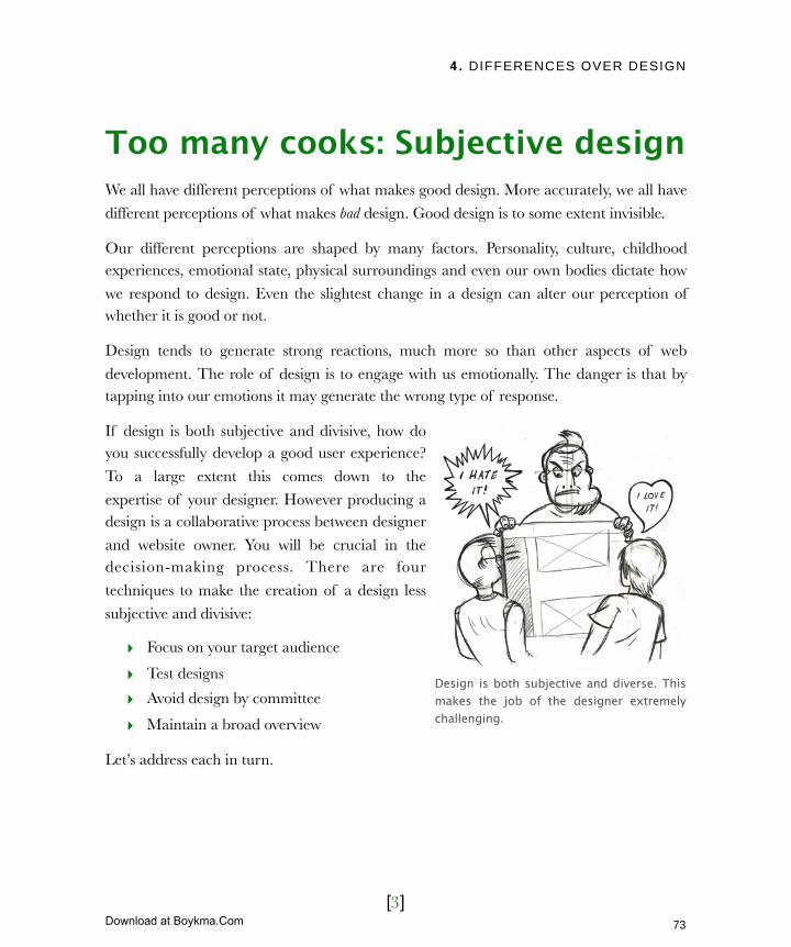
4. DIFFERENCES OVER DESIGN
[3]
Too many cooks: Subjective designWe all have different perceptions of what makes good design. More accurately, we all have
different perceptions of what makes bad design. Good design is to some extent invisible.
Our different perceptions are shaped by many factors. Personality, culture, childhood experiences, emotional state, physical surroundings and even our own bodies dictate how
we respond to design. Even the slightest change in a design can alter our perception of whether it is good or not.
Design tends to generate strong reactions, much more so than other aspects of web
development. The role of design is to engage with us emotionally. The danger is that by tapping into our emotions it may generate the wrong type of response.
If design is both subjective and divisive, how do you successfully develop a good user experience?
To a large extent this comes down to the
expertise of your designer. However producing a design is a collaborative process between designer
and website owner. You will be crucial in the decision-making process. There are four
techniques to make the creation of a design less
subjective and divisive:
‣ Focus on your target audience
‣ Test designs
‣ Avoid design by committee
‣ Maintain a broad overview
Let’s address each in turn.
Design is both subjective and diverse. This makes the job of the designer extremely challenging.
73
Licensed to Henry Vanyan <[email protected]>
Download at Boykma.Com
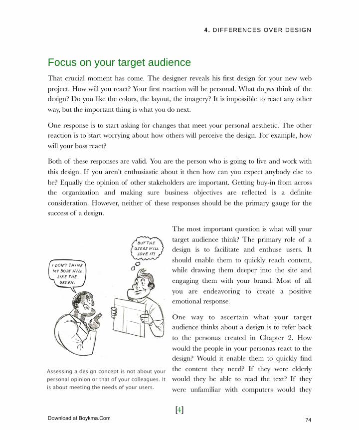
4. DIFFERENCES OVER DESIGN
[4]
Focus on your target audienceThat crucial moment has come. The designer reveals his first design for your new web
project. How will you react? Your first reaction will be personal. What do you think of the design? Do you like the colors, the layout, the imagery? It is impossible to react any other
way, but the important thing is what you do next.
One response is to start asking for changes that meet your personal aesthetic. The other reaction is to start worrying about how others will perceive the design. For example, how
will your boss react?
Both of these responses are valid. You are the person who is going to live and work with
this design. If you aren’t enthusiastic about it then how can you expect anybody else to
be? Equally the opinion of other stakeholders are important. Getting buy-in from across the organization and making sure business objectives are reflected is a definite
consideration. However, neither of these responses should be the primary gauge for the success of a design.
The most important question is what will your
target audience think? The primary role of a design is to facilitate and enthuse users. It
should enable them to quickly reach content, while drawing them deeper into the site and
engaging them with your brand. Most of all
you are endeavoring to create a positive emotional response.
One way to ascertain what your target audience thinks about a design is to refer back
to the personas created in Chapter 2. How
would the people in your personas react to the design? Would it enable them to quickly find
the content they need? If they were elderly would they be able to read the text? If they
were unfamiliar with computers would they
Assessing a design concept is not about your personal opinion or that of your colleagues. It is about meeting the needs of your users.
74
Licensed to Henry Vanyan <[email protected]>
Download at Boykma.Com

4. DIFFERENCES OVER DESIGN
[5]
understand the interface? Try to guess
how they would respond emotionally to the design. You may be able to make an
educated guess based on other sites you
know your target audience likes.
The ideal approach is to ask users directly
about a design. But how exactly should you do that? How can you test a design?
Test your designThere is a lot written about usability
testing and we cover that in chapter 6 (User centric design). However, there is little
written on design testing. Some in the design community feel it undermines their
role as designers. I believe that putting a
design in front of real users helps to make the process less subjective and helps aid
the sign off process.
What is design testing?Design testing is not like polling. It is not a
matter of selecting the design that scored
the highest. It is an interpretative process where observation and intuition are more
important than statistical results.
The most common question I use in
design testing is "Why?" By continually
asking why, you dig deeper, encouraging people to express in more detail their
Cultural considerations
Do not dismiss culture when thinking
about design just because your site has a local focus. We live in a multi-cultural
society and cultural consideration apply
as much to our neighbors as those around the world.
Our cultural background has an impact on how we perceive a design. Color in
particular can be heavily influenced by
culture. For example while red is perceived as dangerous and aggressive in
the West it is seen as a symbol of good fortune in some eastern cultures.
Images of people need careful thought. If for example you wish to reach an islamic audience, then ensure models are not dressed inappropriately for that culture.
75
Licensed to Henry Vanyan <[email protected]>
Download at Boykma.Com
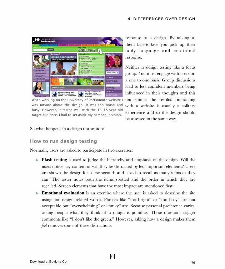
4. DIFFERENCES OVER DESIGN
[6]
response to a design. By talking to
them face-to-face you pick up their body language and emotional
response.
Neither is design testing like a focus group. You must engage with users on
a one to one basis. Group discussions lead to less confident members being
influenced in their thoughts and this
undermines the results. Interacting with a website is usually a solitary
experience and so the design should be assessed in the same way.
So what happens in a design test session?
How to run design testingNormally, users are asked to participate in two exercises:
‣ Flash testing is used to judge the hierarchy and emphasis of the design. Will the
users notice key content or will they be distracted by less important elements? Users are shown the design for a few seconds and asked to recall as many items as they
can. The tester notes both the items spotted and the order in which they are
recalled. Screen elements that have the most impact are mentioned first.
‣ Emotional evaluation is an exercise where the user is asked to describe the site
using non-design related words. Phrases like “too bright” or “too busy” are not acceptable but “overwhelming” or “funky” are. Because personal preference varies,
asking people what they think of a design is pointless. These questions trigger
comments like “I don’t like the green.” However, asking how a design makes them feel removes some of these distractions.
When working on the University of Portsmouth website I was unsure about the design. It was too brash and busy. However, it tested well with the 16-18 year old target audience. I had to set aside my personal opinion.
76
Licensed to Henry Vanyan <[email protected]>
Download at Boykma.Com
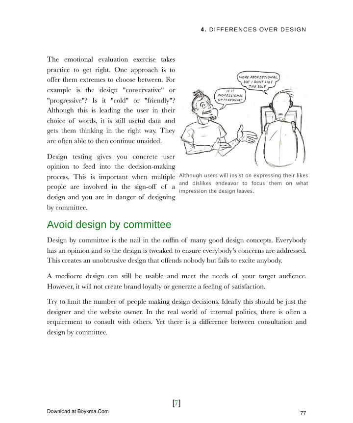
4. DIFFERENCES OVER DESIGN
[7]
The emotional evaluation exercise takes
practice to get right. One approach is to offer them extremes to choose between. For
example is the design "conservative" or
"progressive"? Is it "cold" or "friendly"? Although this is leading the user in their
choice of words, it is still useful data and gets them thinking in the right way. They
are often able to then continue unaided.
Design testing gives you concrete user opinion to feed into the decision-making
process. This is important when multiple people are involved in the sign-off of a
design and you are in danger of designing
by committee.
Avoid design by committeeDesign by committee is the nail in the coffin of many good design concepts. Everybody
has an opinion and so the design is tweaked to ensure everybody’s concerns are addressed. This creates an unobtrusive design that offends nobody but fails to excite anybody.
A mediocre design can still be usable and meet the needs of your target audience.
However, it will not create brand loyalty or generate a feeling of satisfaction.
Try to limit the number of people making design decisions. Ideally this should be just the
designer and the website owner. In the real world of internal politics, there is often a requirement to consult with others. Yet there is a difference between consultation and
design by committee.
Although users will insist on expressing their likes and dislikes endeavor to focus them on what impression the design leaves.
77
Licensed to Henry Vanyan <[email protected]>
Download at Boykma.Com

4. DIFFERENCES OVER DESIGN
[8]
Design by committee leads to uninspiring mediocre design.
The key to success is getting all parties to agree to a process before design begins. The following order of events works well.
Steps towards design sign offSteps towards design sign off People involved
1 Production of initial design concepts. Designer
2 Refine initial concepts using business objectives and personas.
Designer and website owner
78
Licensed to Henry Vanyan <[email protected]>
Download at Boykma.Com

4. DIFFERENCES OVER DESIGN
[9]
Steps towards design sign offSteps towards design sign off People involved
3 Present the refined design to stakeholders individually.
Designer, website owner, stakeholders
4 Collate responses from stakeholders and make amendments where appropriate
Designer and website owner
5 Present design concepts to real users Designer, website owner, users
6 Collate responses from users and make final iteration of the design concept.
Designer and website owner
7Present the final design to all stakeholders together with the results of user testing and stakeholder interviews.
Designer, website owner, stakeholders
8 Sign off design. Website owner
The crucial step is the individual meetings with stakeholders. By meeting with them individually you prevent “design on the fly.” This is when a group of people starts making
changes to a design in an attempt to reach a consensus. By meeting with people one on one, no design decisions will be made in the room.
When presenting a design to stakeholders, provide them with the information to give
educated feedback. Talk through the personas and objectives for the project. Ask how they believe the target audience would react to the design. Encourage them to think beyond
personal preferences and focus on business and user requirements. By the time the stakeholders see the final design they will already feel invested in it. They have:
‣ Contributed to the process.
‣ Been given all the background information.
‣ Seen the design testing results.
‣ Been educated to think from the users perspective.
79
Licensed to Henry Vanyan <[email protected]>
Download at Boykma.Com

4. DIFFERENCES OVER DESIGN
[10]
You will have done everything possible
to ensure that the design is not produced by committee. The only
danger remaining is that you
personally lose objectivity.
Maintain a broad overviewIt is important to understand the
difference between your role and the designer’s role in the development of a
site’s aesthetic. It is easy for the
website owner to take on the role of designer, reducing the designer to a
technician who manipulates pixels.
This happens when the website owner focuses on details rather than maintaining a broad
overview. The website owner should champion the needs of his users and the business
rather than deciding how the design should work. This may appear to be a meaningless distinction. After all, the design directly impacts the needs of the users and business.
However, there is a difference:
Wrong type of feedback Right type of feedback
“I hate the black and red colors. Use pink instead.”
“I am not sure our female users will like those masculine aggressive colors”
“The layout is all wrong. Move the enquiries to the top of the page and make it bigger”
“Our main business objective is to generate more enquiries. I think we need more emphasis on that”
“Make the logo bigger”“We are a new company and we need people to remember us. Can you place more emphasis on branding us strongly”
It is the website owners role to focus on business and user requirements. The designer should decide how that applies to design.
80
Licensed to Henry Vanyan <[email protected]>
Download at Boykma.Com
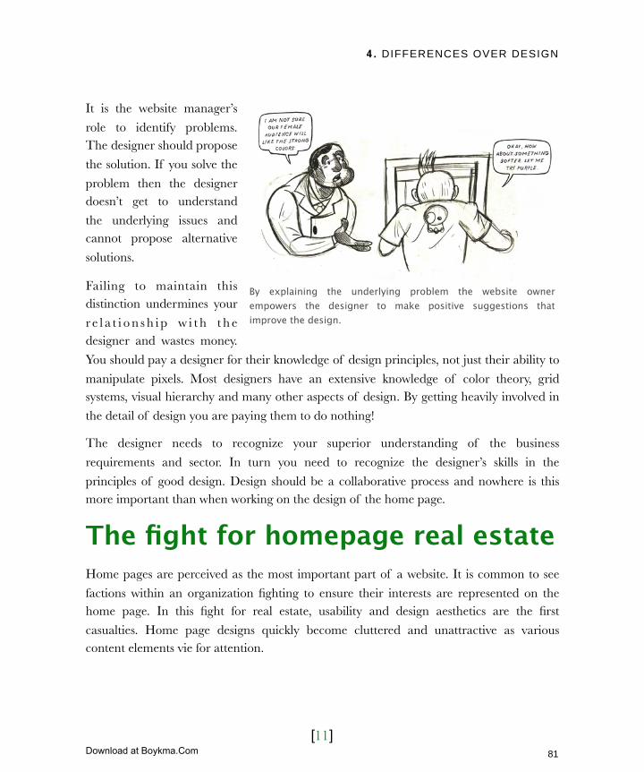
4. DIFFERENCES OVER DESIGN
[11]
It is the website manager’s
role to identify problems. The designer should propose
the solution. If you solve the
problem then the designer doesn’t get to understand
the underlying issues and cannot propose alternative
solutions.
Failing to maintain this distinction undermines your
r e l a t i o n s h i p w i t h t h e designer and wastes money.
You should pay a designer for their knowledge of design principles, not just their ability to
manipulate pixels. Most designers have an extensive knowledge of color theory, grid systems, visual hierarchy and many other aspects of design. By getting heavily involved in
the detail of design you are paying them to do nothing!
The designer needs to recognize your superior understanding of the business
requirements and sector. In turn you need to recognize the designer’s skills in the
principles of good design. Design should be a collaborative process and nowhere is this more important than when working on the design of the home page.
The fight for homepage real estateHome pages are perceived as the most important part of a website. It is common to see
factions within an organization fighting to ensure their interests are represented on the home page. In this fight for real estate, usability and design aesthetics are the first
casualties. Home page designs quickly become cluttered and unattractive as various content elements vie for attention.
By explaining the underlying problem the website owner empowers the designer to make positive suggestions that improve the design.
81
Licensed to Henry Vanyan <[email protected]>
Download at Boykma.Com
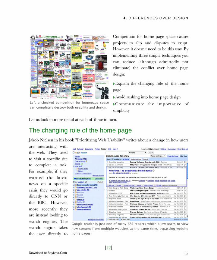
4. DIFFERENCES OVER DESIGN
[12]
Competition for home page space causes
projects to slip and disputes to erupt. However, it doesn’t need to be this way. By
implementing three simple techniques you
can reduce (although admittedly not eliminate) the conflict over home page
design:
‣Explain the changing role of the home
page
‣Avoid rushing into home page design
‣Communicate the importance of
simplicity
Let us look in more detail at each of these in turn.
The changing role of the home pageJakob Nielsen in his book "Prioritizing Web Usability" writes about a change in how users
are interacting with the web. They used
to visit a specific site to complete a task.
For example, if they
wanted the latest news on a specific
crisis they would go directly to CNN or
the BBC. However,
more recently they are instead looking to
search engines. The search engine takes
the user directly to
Google reader is just one of many RSS readers which allow users to view new content from multiple websites at the same time, bypassing website home pages.
Left unchecked competition for homepage space can completely destroy both usability and design.
82
Licensed to Henry Vanyan <[email protected]>
Download at Boykma.Com
4. DIFFERENCES OVER DESIGN
[13]
the information they require, bypassing the site’s home page. This deep linking seriously
reduces home page’s prominence.
Another factor for the decline of home pages is the rise of RSS feeds. RSS gathers
content from multiple websites together in a RSS reader. Users no longer have to check
sites for updated content, because that content comes to them. This ‘push’ orientated approach is great because it doesn’t rely on users checking your site. However, it does
diminish number of visits to your home page as the RSS feed either contains your content or links deep within your website.
These two factors have shifted the focus of websites away from home pages and towards
content. The home page is still important, but it is not as important as it once was. If you are struggling to convince people of the home page’s decline, the next technique is to
delay its design.
Rushing into home page designMuch of the conflict surrounding the home page focuses on what content it should
include, rather than on its design. By starting with something less controversial, such as a
text page, you can set the design for the site before the fight for real estate dilutes it.
A home page should reflect the content of a site at the highest level, and signpost key
content deeper in the site. In many projects the content has not been finalized at the initial design stage. It is hard to create an effective home page without a full understanding of
what content should be signposted. It is better to leave the home page alone until you have
a clearer understanding of the site’s content. When you do finally address the home page be sure to demonstrate the importance of simplicity to your stakeholders.
The importance of simplicitySimplicity is important. As the website owner you must fully embrace this idea. However you also must communicate it effectively to the project’s stakeholders. In the context of home
page design simplicity equate to a single principle: The more elements added to your home page the less importance each has.
83
Licensed to Henry Vanyan <[email protected]>
Download at Boykma.Com
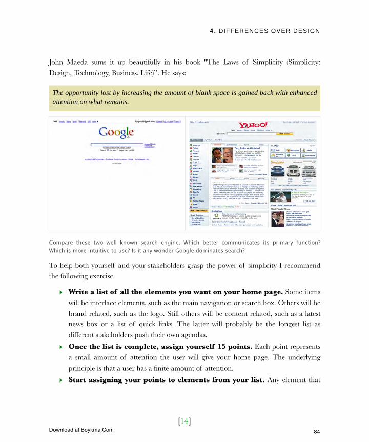
4. DIFFERENCES OVER DESIGN
[14]
John Maeda sums it up beautifully in his book "The Laws of Simplicity (Simplicity:
Design, Technology, Business, Life)”. He says:
The opportunity lost by increasing the amount of blank space is gained back with enhanced attention on what remains.
Compare these two well known search engine. Which better communicates its primary function? Which is more intuitive to use? Is it any wonder Google dominates search?
To help both yourself and your stakeholders grasp the power of simplicity I recommend
the following exercise.
‣ Write a list of all the elements you want on your home page. Some items
will be interface elements, such as the main navigation or search box. Others will be
brand related, such as the logo. Still others will be content related, such as a latest news box or a list of quick links. The latter will probably be the longest list as
different stakeholders push their own agendas.
‣ Once the list is complete, assign yourself 15 points. Each point represents
a small amount of attention the user will give your home page. The underlying
principle is that a user has a finite amount of attention.
‣ Start assigning your points to elements from your list. Any element that
84
Licensed to Henry Vanyan <[email protected]>
Download at Boykma.Com

4. DIFFERENCES OVER DESIGN
[15]
appears on a page must be assigned at least one point. However, the more points
you assign it the more attention it will be given. This approach will demonstrate that the more you add to a page, the more likely important elements are going to
get lost in the crowd.
Carry this exercise out with your stakeholders and (when possible) designers. It will help clarify what is important and bring some structure to the development of your home page.
Although this exercise is effective at resolving content and prioritization it doesn’t help with aesthetics such as branding.
Grappling with corporate brandingBrand ident i ty var ie s f rom one
organization to the next. In some businesses all that exists is an ill-defined
logo, which is regularly altered to suit the
whim of the designer. Elsewhere there is a weighty document that specifies every
aspect of the brand identity, including the use of color, imagery, typography and
logo. Whether your corporate guidelines
are excessive or non existent, it can be challenging to bring a brand online.
Creating a personality for your brandDesigners need clearly established brand guidelines to produce an appropriate design. If that brand does not exist or is ill defined, they will be forced to develop it. The website
owner will need to work with him.
It is unnecessary to produce a full corporate style guide. All you need is an idea of how the site should ‘feel’. To do this ask yourself what type of personality your brand has. If the
brand were a person what type of person would it be? Would it be friendly or formal,
Branding guidelines range from the extensive to nothing at all. Both extremes present problems.
85
Licensed to Henry Vanyan <[email protected]>
Download at Boykma.Com

4. DIFFERENCES OVER DESIGN
[16]
carefree or conservative, professional or
personable? How old and what gender would it be? What car would it drive and
what newspaper would it read? By giving
your brand personality it gives the designer direction when selecting color,
typography and layout.
How then do you go about establishing
your brand’s personality? Take a look at
existing marketing and sales collateral. Are the colors somber and conservative? What
about the copy? Is it written in the first or third person? Is it conversational or
formal? How does the company projects
itself to the outside world? Look at the business objectives of the company and
speak to internal stakeholders about how they perceive the personality of the company. Establish a plum line against which design decisions can be made.
In addition, existing sales and marketing material can be used more literally in
determining the design of your web project. It can guide the look in terms of color, typography, imagery and layout. However, sticking to offline material too closely can cause
problems.
From print to the webThe problem with using existing marketing material as a guide for your web project is that
it is usually print based. Also, most style guides are produced by traditional advertising
agencies, many of whom have little or no experience developing for the web. These guidelines often make no reference to the web and do not always conform to best practice.
Find your brand’s personality
Look to offline material for inspiration about your brand. The colors, text and design of this Lynx shower bottle say a lot about the personality of the brand. Lynx is obviously young, male and obsessed with girls. Their website (lynxeffect.com) reflects this perfectly.
86
Licensed to Henry Vanyan <[email protected]>
Download at Boykma.Com

4. DIFFERENCES OVER DESIGN
[17]
However, a style guide can be valuable if treated as guidelines rather than unbreakable
rules. A degree of flexibility is required to make the transition to the web. There are three areas that can prove particularly problematic:
‣ Logo design
‣ Corporate fonts
‣ Color
Let’s start with logo design.
Logo design Brand guidelines focus heavily on logo
usage. Specifications are supplied for size, color, posi t ion, background, and
whitespace. However, sometimes these rules cannot be applied to the web. For
example, when monitor size varies and
screen resolutions can be set by users, defining measurements in millimeters and
centimeters is useless. On other occasions it would be unwise to follow guidelines.
This typically happens with specifications
about the position of a logo. On the web the convention is that your logo is placed
top left. Positioning the logo elsewhere makes it harder for users to identify the site and conflicts with their expectations. It is better to ignore guidelines in such situations and
instead stick with web conventions.
A more serious problem is the logo itself. One of the most significant differences between the web and print is ‘dots per inch’. DPI is a term that originated in print design. It refers
to the detail at which a page is printed. A printed page is made up of a series of dots. The more dots in a single inch the more detailed and crisp the printed material appears. The
Because a computer screen can display less information than print, logos and type can often appear pixilated at smaller sizes. This problem can be so acute it effects legibility.
87
Licensed to Henry Vanyan <[email protected]>
Download at Boykma.Com
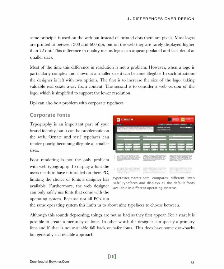
4. DIFFERENCES OVER DESIGN
[18]
same principle is used on the web but instead of printed dots there are pixels. Most logos
are printed at between 300 and 600 dpi, but on the web they are rarely displayed higher than 72 dpi. This difference in quality means logos can appear pixilated and lack detail at
smaller sizes.
Most of the time this difference in resolution is not a problem. However, when a logo is particularly complex and shown at a smaller size it can become illegible. In such situations
the designer is left with two options. The first is to increase the size of the logo, taking valuable real estate away from content. The second is to consider a web version of the
logo, which is simplified to support the lower resolution.
Dpi can also be a problem with corporate typefaces.
Corporate fontsTypography is an important part of your
brand identity, but it can be problematic on the web. Ornate and serif typefaces can
render poorly, becoming illegible at smaller
sizes.
Poor rendering is not the only problem
with web typography. To display a font the users needs to have it installed on their PC,
limiting the choice of fonts a designer has
available. Furthermore, the web designer can only safely use fonts that come with the
operating system. Because not all PCs run the same operating system this limits us to about nine typefaces to choose between.
Although this sounds depressing, things are not as bad as they first appear. For a start it is
possible to create a hierarchy of fonts. In other words the designer can specify a primary font and if that is not available fall back on safer fonts. This does have some drawbacks
but generally is a reliable approach.
typetester.maratz.com compares different ‘web safe’ typefaces and displays all the default fonts available in different operating systems.
88
Licensed to Henry Vanyan <[email protected]>
Download at Boykma.Com
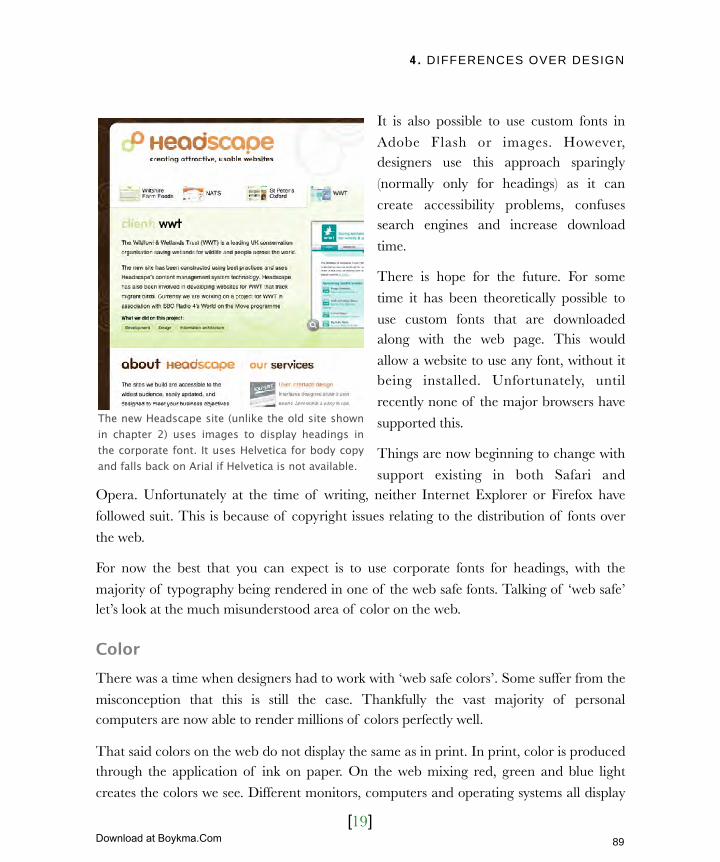
4. DIFFERENCES OVER DESIGN
[19]
It is also possible to use custom fonts in
Adobe Flash or images. However, designers use this approach sparingly
(normally only for headings) as it can
create accessibility problems, confuses search engines and increase download
time.
There is hope for the future. For some
time it has been theoretically possible to
use custom fonts that are downloaded along with the web page. This would
allow a website to use any font, without it being installed. Unfortunately, until
recently none of the major browsers have
supported this.
Things are now beginning to change with
support existing in both Safari and Opera. Unfortunately at the time of writing, neither Internet Explorer or Firefox have
followed suit. This is because of copyright issues relating to the distribution of fonts over
the web.
For now the best that you can expect is to use corporate fonts for headings, with the
majority of typography being rendered in one of the web safe fonts. Talking of ‘web safe’ let’s look at the much misunderstood area of color on the web.
Color There was a time when designers had to work with ‘web safe colors’. Some suffer from the
misconception that this is still the case. Thankfully the vast majority of personal computers are now able to render millions of colors perfectly well.
That said colors on the web do not display the same as in print. In print, color is produced through the application of ink on paper. On the web mixing red, green and blue light
creates the colors we see. Different monitors, computers and operating systems all display
The new Headscape site (unlike the old site shown in chapter 2) uses images to display headings in the corporate font. It uses Helvetica for body copy and falls back on Arial if Helvetica is not available.
89
Licensed to Henry Vanyan <[email protected]>
Download at Boykma.Com

4. DIFFERENCES OVER DESIGN
[20]
color slightly differently. These differences
means it is not enough to take the pantone numbers found in most style guides and
apply them to the web.
The problem becomes particularly acute when corporate palettes contain light or
dark colors. Because of the way colors are shown on screen, light colors becomes
lighter and dark colors get darker. On
some screens dark colors can appear almost black, while a light color can
appear almost white.
Ultimately the designer has to solve this
problem. However, colors will vary from monitor to monitor. Try viewing designs on as
many different computers as possible before commenting on the color. What looks great on your laptop may appear too dark or too light on your colleague’s old home monitor.
It’s easy to forget just how different the web is from print. However, those differences are not confined to style guides. They apply to layout as well.
The challenges of layoutCreating an effective layout for a website is a skilled area. A good designer can lead the
user’s eye around a page drawing attention to key elements using size, position and color. Designers use techniques such as white space, grid systems and web conventions to make a
design easy to understand. Understanding how layout on the web works defines a good
designer.
It is beyond the scope of this book to teach you the principles of good layout as this is not
something you ‘need to know’. You can assess the effectiveness of a layout by simply
Once web designers were limited to only 216 colors. Thankfully that is no longer the case.
90
Licensed to Henry Vanyan <[email protected]>
Download at Boykma.Com
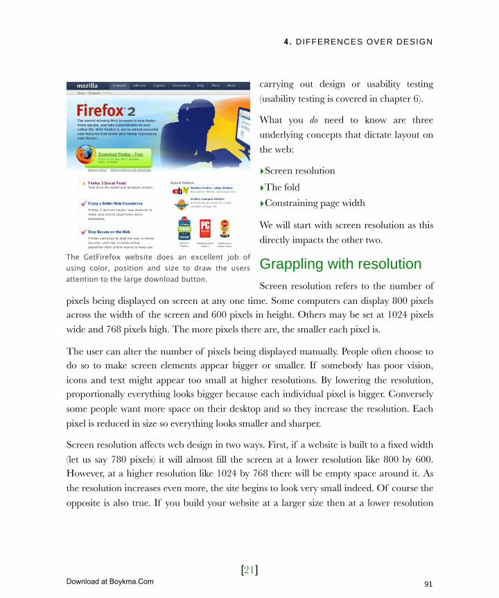
4. DIFFERENCES OVER DESIGN
[21]
carrying out design or usability testing
(usability testing is covered in chapter 6).
What you do need to know are three
underlying concepts that dictate layout on
the web:
‣Screen resolution
‣The fold
‣Constraining page width
We will start with screen resolution as this
directly impacts the other two.
Grappling with resolutionScreen resolution refers to the number of
pixels being displayed on screen at any one time. Some computers can display 800 pixels across the width of the screen and 600 pixels in height. Others may be set at 1024 pixels
wide and 768 pixels high. The more pixels there are, the smaller each pixel is.
The user can alter the number of pixels being displayed manually. People often choose to do so to make screen elements appear bigger or smaller. If somebody has poor vision,
icons and text might appear too small at higher resolutions. By lowering the resolution, proportionally everything looks bigger because each individual pixel is bigger. Conversely
some people want more space on their desktop and so they increase the resolution. Each
pixel is reduced in size so everything looks smaller and sharper.
Screen resolution affects web design in two ways. First, if a website is built to a fixed width
(let us say 780 pixels) it will almost fill the screen at a lower resolution like 800 by 600. However, at a higher resolution like 1024 by 768 there will be empty space around it. As
the resolution increases even more, the site begins to look very small indeed. Of course the
opposite is also true. If you build your website at a larger size then at a lower resolution
The GetFirefox website does an excellent job of using color, position and size to draw the users attention to the large download button.
91
Licensed to Henry Vanyan <[email protected]>
Download at Boykma.Com
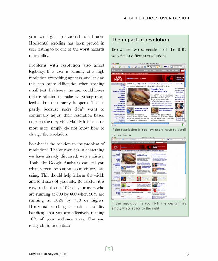
4. DIFFERENCES OVER DESIGN
[22]
you will get horizontal scrollbars.
Horizontal scrolling has been proved in user testing to be one of the worst hazards
to usability.
Problems with resolution also affect legibility. If a user is running at a high
resolution everything appears smaller and this can cause difficulties when reading
small text. In theory the user could lower
their resolution to make everything more legible but that rarely happens. This is
partly because users don’t want to continually adjust their resolution based
on each site they visit. Mainly it is because
most users simply do not know how to change the resolution.
So what is the solution to the problem of resolution? The answer lies in something
we have already discussed; web statistics.
Tools like Google Analytics can tell you what screen resolution your visitors are
using. This should help inform the width and font sizes of your site. Be careful: it is
easy to dismiss the 10% of your users who
are running at 800 by 600 when 90% are running at 1024 by 768 or higher.
Horizontal scrolling is such a usability handicap that you are effectively turning
10% of your audience away. Can you
really afford to do that?
The impact of resolution
Below are two screenshots of the BBC
web site at different resolutions.
If the resolution is too low users have to scroll horizontally.
If the resolution is too high the design has empty white space to the right.
92
Licensed to Henry Vanyan <[email protected]>
Download at Boykma.Com

4. DIFFERENCES OVER DESIGN
[23]
The resolution does not just affect
horizontal scrolling but also vertical scrolling and the point known as the fold.
Understanding the foldThis idea references the fold in newspapers
when they are placed on a newsstand. Because people passing by only see the top
half of the front page it became important that the lead story appeared ‘above the fold’
to catch people’s attention.
The idea has been transplanted to the web and refers to the point where people have to
start scrolling. Much as with newspapers, the idea is that important content is placed
above the fold to hook people and draw
them in. Some believe that users are so bad at scrolling that all content should be kept
above the fold especially on the home page.
Earlier in this chapter we looked at three
techniques for improving homepage sign-
off. I believe there is a fourth and that is accepting the fold is a myth. Too many people
exasperate the problems of content overload by insisting all content sit above
this mythical line called the fold.
The fold does not exist. In the newspaper industry you could clearly define where the fold would fall. On the web any number of
factors affect the point where users begin to scroll.
The mythical fold
The Leisure support services site fits
perfectly on to a single screen at 800 x 600 without the need to scroll.
However, if the user has added toolbars the design no longer fits on a single screen
and scrollbars appear.
93
Licensed to Henry Vanyan <[email protected]>
Download at Boykma.Com
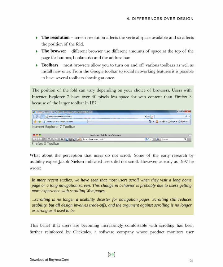
4. DIFFERENCES OVER DESIGN
[24]
‣ The resolution – screen resolution affects the vertical space available and so affects
the position of the fold.
‣ The browser – different browser use different amounts of space at the top of the
page for buttons, bookmarks and the address bar.
‣ Toolbars – most browsers allow you to turn on and off various toolbars as well as install new ones. From the Google toolbar to social networking features it is possible
to have several toolbars showing at once.
The position of the fold can vary depending on your choice of browsers. Users with
Internet Explorer 7 have over 40 pixels less space for web content than Firefox 3 because of the larger toolbar in IE7.
Internet Explorer 7 Toolbar
Firefox 3 Toolbar
What about the perception that users do not scroll? Some of the early research by usability expert Jakob Nielsen indicated users did not scroll. However, as early as 1997 he
wrote:
In more recent studies, we have seen that most users scroll when they visit a long home page or a long navigation screen. This change in behavior is probably due to users getting more experience with scrolling Web pages.
...scrolling is no longer a usability disaster for navigation pages. Scrolling still reduces usability, but all design involves trade-offs, and the argument against scrolling is no longer as strong as it used to be.
This belief that users are becoming increasingly comfortable with scrolling has been
further reinforced by Clicktales, a software company whose product monitors user
94
Licensed to Henry Vanyan <[email protected]>
Download at Boykma.Com
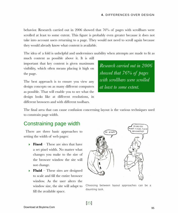
4. DIFFERENCES OVER DESIGN
[25]
behavior. Research carried out in 2006 showed that 76% of pages with scrollbars were
scrolled at least to some extent. This figure is probably even greater because it does not take into account users returning to a page. They would not need to scroll again because
they would already know what content is available.
The idea of a fold is unhelpful and undermines usability when attempts are made to fit as much content as possible above it. It is still
important that key content is given maximum visibility, which often means placing it high on
the page.
The best approach is to ensure you view any design concepts on as many different computers
as possible. That will enable you to see what the design looks like at different resolutions, in
different browsers and with different toolbars.
The final area that can cause confusion concerning layout is the various techniques used to constrain page width.
Constraining page width There are three basic approaches to setting the width of web pages:
‣ Fixed – These are sites that have
a set pixel width. No matter what changes you make to the size of
the browser window the site will
not change.
‣ Fluid – These sites are designed
to scale and fill the entire browser
window. As the user alters the window size, the site will adapt to
fill the available space.
Choosing between layout approaches can be a daunting task.
Research carried out in 2006 showed that 76% of pages with scrollbars were scrolled at least to some extent.
95
Licensed to Henry Vanyan <[email protected]>
Download at Boykma.Com
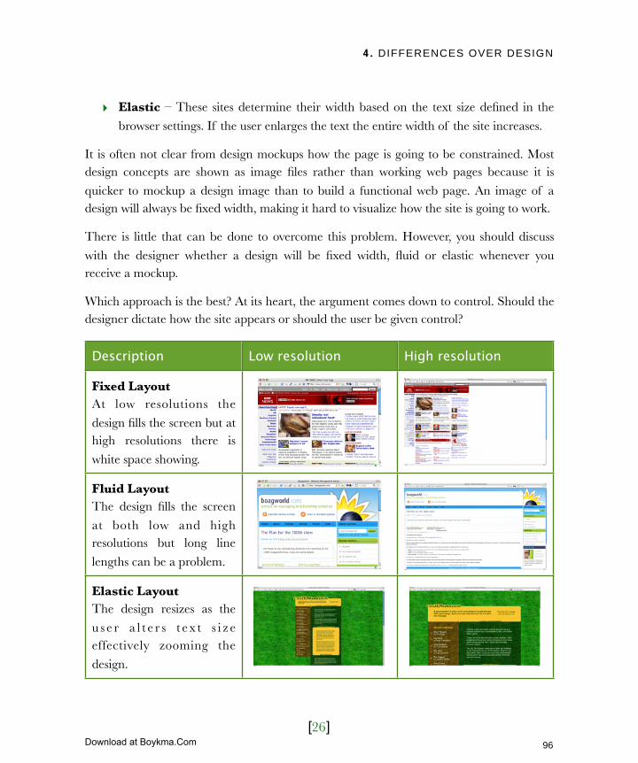
4. DIFFERENCES OVER DESIGN
[26]
‣ Elastic – These sites determine their width based on the text size defined in the
browser settings. If the user enlarges the text the entire width of the site increases.
It is often not clear from design mockups how the page is going to be constrained. Most design concepts are shown as image files rather than working web pages because it is
quicker to mockup a design image than to build a functional web page. An image of a design will always be fixed width, making it hard to visualize how the site is going to work.
There is little that can be done to overcome this problem. However, you should discuss
with the designer whether a design will be fixed width, fluid or elastic whenever you receive a mockup.
Which approach is the best? At its heart, the argument comes down to control. Should the designer dictate how the site appears or should the user be given control?
Description Low resolution High resolution
Fixed LayoutAt low resolutions the
design fills the screen but at high resolutions there is
white space showing.
Fluid LayoutThe design fills the screen
at both low and high resolutions but long line
lengths can be a problem.
Elastic LayoutThe design resizes as the
u s e r a l t e r s t ex t s i z e effectively zooming the
design.
96
Licensed to Henry Vanyan <[email protected]>
Download at Boykma.Com
4. DIFFERENCES OVER DESIGN
[27]
A fixed width design gives the designer pixel perfect control. The design is
entirely predictable with imagery appearing in exact position and content being displayed
at a particular line length. If your highest priority is branding and designs then a fixed width site is preferable. This is particularly true if the vast majority of users are viewing at
a certain resolution and you can design for that.
A fluid design lets the user dictate (to some extent) how the design looks. Users can resize the browser window to suit their needs and the design will adapt
accordingly. This is generally considered the more accessible approach as it supports a broader range of screen resolutions and allows the design to adapt to individual user
requirements. The downside is that you lose pixel perfect control. The design will not look
exactly as it did when mocked up and it can take longer to build and test.
Elastic is in many ways a compromise. Although the design does not resize based
on browser size it does support users that want to increase the size of text. It maintains some of the design control of fixed but allows some of the flexibility of fluid. Of course
this means it also inherits the negative elements of both too. Elastic designs can suffer
from horizontal scrolling like fixed and unpredictable layout like fluid.
As with all aspects of developing a design, the approach you choose should evolve from a
discussion between yourself and the designer.
97
Licensed to Henry Vanyan <[email protected]>
Download at Boykma.Com

4. DIFFERENCES OVER DESIGN
[28]
Next ActionsIn this chapter we have looked at the challenges of design. We have addressed the divisive nature of design, including the difficulties of the home page and brand guidelines. We
have also looked at the fold, screen resolutions and page constraint techniques. All of this
should help inform and smooth the design process. The designer should now be able to propose a design solution.
However, that is not the end of the process. The designer now needs to roll the design out across the entire site. You can facilitate that process by completing three actions:
‣ Action 1: Defining your content – Before the designer can implement the new
visual identify, he must know more about the content. Draw together a list of what the site should cover. What messages do you wish to communicate? What
functionality are you going to provide?
‣ Action 2: Compile the design assets – The designer will need any visual content
that has to appear on your site. This should include photography, illustrations,
graphs and video. If there are visuals you would like to include but do not have, speak to your designer about using a stock library for images or video. It may even
be appropriate to commission photography or video for the site.
‣ Action 3: List the design templates – Once you have a feel for the content on
your site, work with the designer to identify any areas that might need special design
attention. The majority of pages will be standard text templates but there are always special cases, such as search results or download pages, which need more
consideration.
Identifying the content that you wish to include is only the tip of the iceberg. Next, you
need to write and collate that content, as well as work with the web design agency to
structure it in a logical fashion.
98
Licensed to Henry Vanyan <[email protected]>
Download at Boykma.Com
5. CREATING KILLER CONTENT
[1]
In this chapter‣ Learn the importance of context
Don’t make users read online
Provide context through links
Reduce the desire to leave
‣ Reduce and remove
Where to prune
How to prune
Where planning pays off
Cold hard facts
From Macro to Micro
‣ User centric structure
Structuring through card sorting
Going with the flow
Common mistakes in structuring sites
Confusing naming
Overwhelming options
‣ Scannable and approachable
Make it engaging
Make it clear
Make it scannable
Be upfront
Breaking down the blocks
99
Licensed to Henry Vanyan <[email protected]>
Download at Boykma.Com

5. CREATING KILLER CONTENT
[2]
5 Creating killer contentThis is the first book I have written and the process has involved a steep learning curve. What has struck me most is how much consideration I give to my writing here compared to the content I publish on my website. Even though more people read my blog than will read this book, I have spent considerably longer agonizing over what I say in these pages.
I am not alone in this attitude. Only rarely have I come across a website owner with the budget to employee a professional copywriter or editor. It is unusual to find an organisation willing to dedicate resources to rewrite content for the web. Instead it is often acquired from other sources and dumped unceremoniously online.
In this chapter I describe how to create killer content for your site and explain why it is so important to give your content the same attention it would receive if you were writing a book. I would even argue that writing well for the web is more challenging than writing a book.
100
Licensed to Henry Vanyan <[email protected]>
Download at Boykma.Com

5. CREATING KILLER CONTENT
[3]
Learn the importance of contextOn larger websites the role of managing content can become so demanding that it is
sometimes assigned to a separate editor. However, with so few organisations willing to pay
for a web editor the job often falls to the website owner. To effectively ‘fill in’ for the role of website editor you need to understand
that on the web context is king, not content.
The web has unique characteristics
that affect what content you put online
and the way that content is written. I wish to focus on three of those
characteristics:
‣ Reading from a screen
‣ The impact of the link
‣ Easy access to other sites
Each o f the se charac te r i s t i c s
profoundly affects the way users interact with your site.
Donʼt make users read onlineAlthough emerging technologies such as electronic paper give me hope for the future,
screen legibility is currently extremely poor for two reasons. First, the majority of monitors display text at a considerably lower resolution than print. Second, instead of ink
printed on paper, monitors project light and over time this can cause eye strain.
The result is that users rarely choose to read online for any length of time. We need to
accommodate this characteristic in our copy. In short, we need to keep our copy concise.
The power of context is not unique to the web. When writing a billboard ad copy has to be short and snappy. Drivers don’t stop to read roadside advertisements.
101
Licensed to Henry Vanyan <[email protected]>
Download at Boykma.Com

5. CREATING KILLER CONTENT
[4]
Provide context through linksThe power of the web lies in a very
simple invention: the humble hypertext link. The ability to link
pages and for these links to be
followed in any order dramatically alters the way we write content.
Although each page is part of a bigger whole it also needs to stand
alone. A user could have arrived on a
specific page directly from a search engine, bypassing the rest of your
content. Content has to be written in a modular manner.
The link both creates and solves this
problem. By adding links to related information in your copy you can
provide context where it is lacking. Linking also allows you to provide
more detail without diluting the core message. In some ways writing for the web is like
writing newspaper headlines or billboard ads. You have to be short, snappy and engaging because users are not going to hang around to read things thoroughly. Pages at the highest
level needs to focus on communicating your core message. However, an interested user will want more. Luckily the web allows us to link to pages deeper in the site so providing
additional detail.
With users coming to a web page from any number of different sources it is important that your content is understandable without context.
102
Licensed to Henry Vanyan <[email protected]>
Download at Boykma.Com
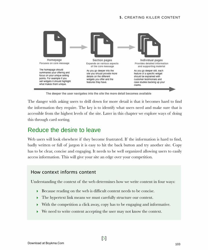
5. CREATING KILLER CONTENT
[5]
The danger with asking users to drill down for more detail is that it becomes hard to find
the information they require. The key is to identify what users need and make sure that is accessible from the highest levels of the site. Later in this chapter we explore ways of doing
this through card sorting.
Reduce the desire to leaveWeb users will look elsewhere if they become frustrated. If the information is hard to find, badly written or full of jargon it is easy to hit the back button and try another site. Copy
has to be clear, concise and engaging. It needs to be well organized allowing users to easily access information. This will give your site an edge over your competition.
How context informs content
Understanding the context of the web determines how we write content in four ways:
‣ Because reading on the web is difficult content needs to be concise.
‣ The hypertext link means we must carefully structure our content.
‣ With the competition a click away, copy has to be engaging and informative.
‣ We need to write content accepting the user may not know the context.
103
Licensed to Henry Vanyan <[email protected]>
Download at Boykma.Com
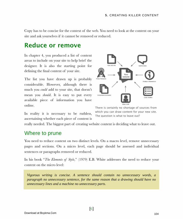
5. CREATING KILLER CONTENT
[6]
Copy has to be concise for the context of the web. You need to look at the content on your
site and ask yourselves if it cannot be removed or reduced.
Reduce or removeIn chapter 4, you produced a list of content areas to include on your site to help brief the
designer. It is also the starting point for defining the final content of your site.
The list you have drawn up is probably
considerable. However, although there is much you could add to your site, that doesn’t
mean you should. It is easy to put every available piece of information you have
online.
In reality it is necessary to be ruthless, ascertaining whether each piece of content is
really needed. The biggest part of creating website content is deciding what to leave out.
Where to pruneYou need to reduce content on two distinct levels. On a macro level, remove unnecessary
pages and sections. On a micro level, each page should be assessed and individual
sentences or paragraphs removed or reduced.
In his book “The Elements of Style,” (1979) E.B. White addresses the need to reduce your
content on the micro level:
There is certainly no shortage of sources from which you can draw content for your new site. The question is what to leave out?
Vigorous writing is concise. A sentence should contain no unnecessary words, a paragraph no unnecessary sentence, for the same reason that a drawing should have no unnecessary lines and a machine no unnecessary parts.
104
Licensed to Henry Vanyan <[email protected]>
Download at Boykma.Com

5. CREATING KILLER CONTENT
[7]
Steve Krug in his book “Don’t make me think” (2006) suggests that you should:
This harsh reduction in content must apply not only to individual paragraphs and
sentences but also to the pages and sections. This approach does provide tangible benefits:
‣ It reduces the chance of a user becoming lost
‣ It makes useful content more prominent
‣ It prevents users from becoming overwhelmed
‣ Content can be found quicker
The old adage of “less is more” is as true on the web as in any other part of life. Once you have accepted the need to reduce content the next question becomes how do you decide
what to keep in and what to reject?
How to pruneThe best way to start pruning is to look at how easily information can be sourced. I
worked with a charity who promoted the conservation of butterflies and moths.
They had the great idea of building an
application that helped users identify moths and butterflies.
Although they had the expertise necessary to identify species, the
information was contained solely in
people’s heads. There was no database or identification book. With over 2600
species of moths it would have been prohibitively time consuming to get these
experts to record their knowledge in a
Get rid of half the words on each page, then get rid of half of what is left.
Writing content can be time consuming. If you need others to contribute ensure they have been allocated time to work on it.
105
Licensed to Henry Vanyan <[email protected]>
Download at Boykma.Com
5. CREATING KILLER CONTENT
[8]
usable form. They had simply failed to consider the practicalities.
This is a common problem. It is easy to come up with great ideas for content, but it is much harder to source that content. Is the benefit of this content going to justify the effort
involved in getting it onto the site?
Many web projects are delayed because key content needs to be generated by somebody who is simply too busy. Before committing to using a particular piece of content ask
yourself who will produce it and ensure they have the time. If they don’t, work with that person and his or her manager to see if the website content can be prioritized.
Dismissing content because it is to hard to source probably won’t reduce your content
sufficiently. To reduce beyond that a judgment call has to be made. The question is - what do you use to make that decision?
Where planning pays offThe best method of judging contents value is to refer to the background material that you produced in chapter 2. Business objectives, success criteria and user personas not only
inform the brief and design process, but are instrumental in deciding what content should
go into the site. I recommend a three step approach in reducing content:
Step 1: Does the content help meet your business objectives?For example how does a page on company history help sell more widgets on your e-commerce site? If the answer is "it doesn't" then it shouldn't appear.
Step 2: Does the content contribute towards your success criteria?If your goal is to increase enquiries by 25% will a specific piece of content help or hinder that? Too much information on your site and users might not feel the need to call with questions. However, too little information and they become frustrated.
Step 3: What would your user personas think of your content?Will your users read the content? Will it help them complete their goals? If not, remove it.
Step 3 is probably the most effective method of judging the value of a piece of content. However, it can be hard to tell what your users will think. Sometimes it can be useful to
have hard evidence to back up your decision.
106
Licensed to Henry Vanyan <[email protected]>
Download at Boykma.Com

5. CREATING KILLER CONTENT
[9]
Cold hard factsWeb logs are a useful way of gauging
how popular a piece of content is. If the content is already online and
monitored by a tracking package such
as Google Analytics it is easy to view that content by popularity. You can look at
how many people visited a particular page and how long they spent on that
page. The latter is important because
if the user visits a page and then immediately leaves, it is an indication
the content is not of value.
Where statistical information is not
available the best course of action is
to put the content online for a trial period and monitor its popularity. If the page fails to perform remove it. Continually evaluate the success of individual pages.
This techniques should help you trim down your content significantly, but how do you go that extra mile? How do you “half it again” as Steve Krug would say?
From macro to microThe key is to shift focus from removing whole sections of content to editing at the micro
level. Start by targeting two distinct types of content that creep into may websites: marketing blurb and instructional text.
Marketing blurb can be found far beyond the web and appears in all kinds of promotional material. It is copy full of its own self-importance and devoid of real information. Good
promotional copy informs as well as sells. In contrast marketing blurb shouts about how
good the product or service is without providing tangible evidence to support the claim.
Marketing blurb is also the “happy talk” (as Steve Krug puts it) which you find on many
home pages. Copy like this does nothing to answer users’ questions or direct them towards
Google Analytics allows you to view content sorted by either page views or time spent on page. Both provides a valuable indication of a page’s value to users.
107
Licensed to Henry Vanyan <[email protected]>
Download at Boykma.Com

5. CREATING KILLER CONTENT
[10]
achieving their goal. It is the written
equivalent of small talk. Users also rarely read instructional text. They
would prefer to muddle through rather
than read instructions. Such copy is therefore often ignored.
The aim should be to eliminate instructions entirely by making the site
intuitive. Where this cannot be achieved
it should be reduced to the minimum number of words.
In the process of identifying and pruning your copy, you will start to think
about how it should be organized and
structured. Once you have stripped out the dead wood it is time to start work on
your site’s “information architecture.”
User centric structureInformation architecture refers to the way content is organized. The most common expression of this is the site map. A site map is the hierarchical structure of your site
organized in a similar way to a family tree. Much of the terminology draws from this analogy. Each page has a parent (the page immediately above it in the site hierarchy). It
also has children (those pages below) and siblings (those on the same level).
Although there is much more to information architecture than the site map, this is the area in which you will have most involvement. Working with the web designer or possibly
information architect, you will need to decide on a site structure. Because the website owner is often involved in the process of creating a site structure, it is important that you
Web copy should be more than “marketing blurb.” It should be information focused providing details to back up any marketing claims.
108
Licensed to Henry Vanyan <[email protected]>
Download at Boykma.Com
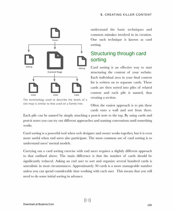
5. CREATING KILLER CONTENT
[11]
understand the basic techniques and
common mistakes involved in its creation. One such technique is known as card
sorting.
Structuring through card sortingCard sorting is an effective way to start structuring the content of your website.
Each individual area in your final content list is written on to separate cards. These
cards are then sorted into piles of related
content and each pile is named, thus creating a section.
Often the easiest approach is to pin these cards onto a wall and sort from there.
Each pile can be named by simply attaching a post-it note to the top. By using cards and
post-it notes you can try out different approaches and naming conventions until something works.
Card sorting is a powerful tool when web designer and owner works together, but it is even more useful when end users also participate. The most common use of card sorting is to
understand users’ mental models.
Carrying out a card sorting exercise with end users requires a slightly different approach to that outlined above. The main difference is that the number of cards should be
significantly reduced. Asking an end user to sort and organize several hundred cards is unrealistic in most circumstances. Approximately 30 cards is a more manageable number
unless you can spend considerable time working with each user. This means that you will
need to do some initial sorting in advance.
The terminology used to describe the levels of a site map is similar to that used on a family tree.
109
Licensed to Henry Vanyan <[email protected]>
Download at Boykma.Com
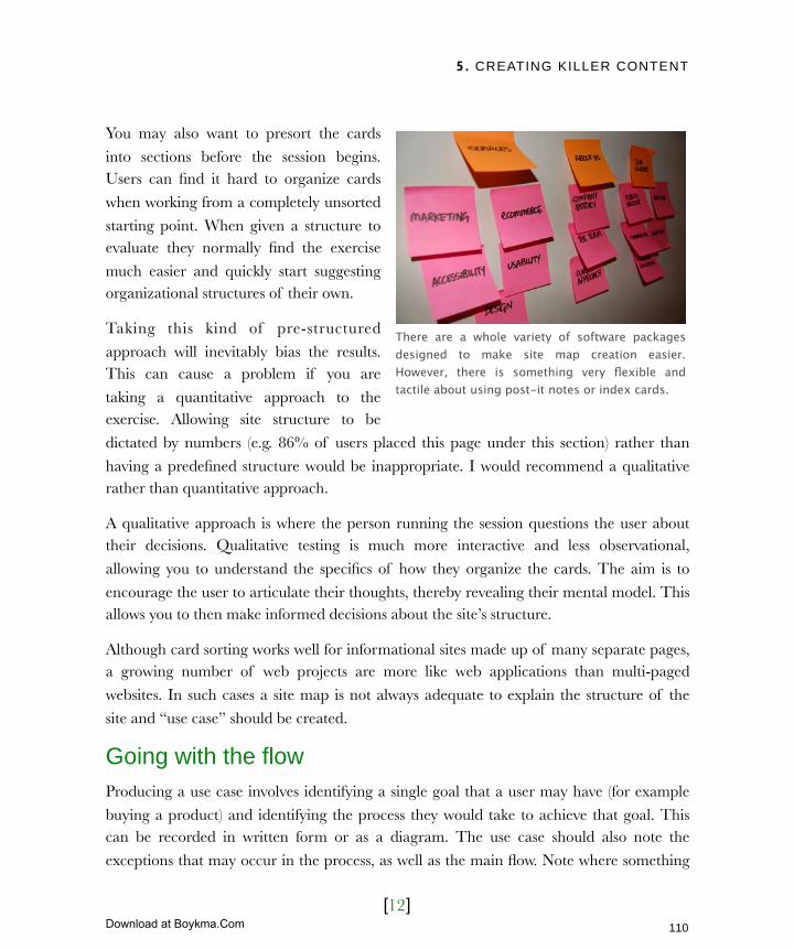
5. CREATING KILLER CONTENT
[12]
You may also want to presort the cards
into sections before the session begins. Users can find it hard to organize cards
when working from a completely unsorted
starting point. When given a structure to evaluate they normally find the exercise
much easier and quickly start suggesting organizational structures of their own.
Taking this kind of pre-structured
approach will inevitably bias the results. This can cause a problem if you are
taking a quantitative approach to the exercise. Allowing site structure to be
dictated by numbers (e.g. 86% of users placed this page under this section) rather than
having a predefined structure would be inappropriate. I would recommend a qualitative rather than quantitative approach.
A qualitative approach is where the person running the session questions the user about their decisions. Qualitative testing is much more interactive and less observational,
allowing you to understand the specifics of how they organize the cards. The aim is to
encourage the user to articulate their thoughts, thereby revealing their mental model. This allows you to then make informed decisions about the site’s structure.
Although card sorting works well for informational sites made up of many separate pages, a growing number of web projects are more like web applications than multi-paged
websites. In such cases a site map is not always adequate to explain the structure of the
site and “use case” should be created.
Going with the flowProducing a use case involves identifying a single goal that a user may have (for example
buying a product) and identifying the process they would take to achieve that goal. This can be recorded in written form or as a diagram. The use case should also note the
exceptions that may occur in the process, as well as the main flow. Note where something
There are a whole variety of software packages designed to make site map creation easier. However, there is something very flexible and tactile about using post-it notes or index cards.
110
Licensed to Henry Vanyan <[email protected]>
Download at Boykma.Com

5. CREATING KILLER CONTENT
[13]
goes wrong, like when the user mistypes their credit card number. Use cases help with
more complex tasks like site registration, e-commerce transactions or recovering lost passwords. The following is a use case for recovering a lost password:
Our example involves a number of exceptions. Each one will need additional code and
copy to be written. Without the use case a developer may not grasp the extent of work and you would be unaware of the additional copy required. It would have been easy to
miss these different eventualities.
Use cases and card sorting are only the tip of the information architecture iceberg. To avoid making mistakes in this complex area, you must also know the common pitfalls.
Common mistakes in structuring sitesThere are numerous mistakes I see made when people create a structure for their sites, but two happen more than others. The first of these is in the naming of pages and sections.
User recovery process for lost password
Main scenario (when things go smoothly):
‣ User provides email address
‣ System verifies email and retrieves password
‣ System sends email to the specified email address
Exceptions (when things go wrong):
‣ No email is entered
The user is asked to enter an email address
‣ The email address is incorrectly formatted
The user is asked to correct their email address
‣ The email address is not found
The user is told that the address cannot be found and is asked to try again or register.
111
Licensed to Henry Vanyan <[email protected]>
Download at Boykma.Com

5. CREATING KILLER CONTENT
[14]
Confusing namingLet’s look at a menu bar from a fictional company:
The first problem is jargon. Never assume your users know all the acronyms. They may be
new to the sector or use a slightly different variation of your company’s terminology. The names of your sections and pages should be free of jargon and potentially unfamiliar
product names. Titles should be descriptive and use the plainest language possible.
In our example Acme Elite is a site mapping tool aimed at web developers. Because it is a new product, people will not have heard of it and so it should be described in clear
language. Not everybody will know that CMS stands for content management system. Our revised menu therefore looks like this:
There is still more we can do. Although naming should be descriptive it should also be
short. Ideally all menu items should be one or two words long. Users should be able to
quickly scan a menu and identify sections most likely to have content they need.
“Case studies and testimonials” is an obvious candidate for shortening. We can even go a
step further. The constant reference to Acme is unnecessary and makes scanning more difficult. Users know what site they are on and don’t need reminding. These small changes
dramatically improve our menu:
The final issue to highlight is inconsistent naming between what is shown on the menu bar (About us) and the associated page title below (Our team). Be careful that the way you
refer to pages does not change. Every link to a page should be referred to in the same way.
112
Licensed to Henry Vanyan <[email protected]>
Download at Boykma.Com

5. CREATING KILLER CONTENT
[15]
Where a page title needs to be longer
than the wording used in menu item make sure they mirror each other.
Incons i s tent naming can cause
confusion making users unsure if they have previously viewed a page.
Our final menu now looks like this:
The second common pitfall is that of presenting the user with too many options.
Overwhelming optionsI commonly come across site structures with excessive links in the navigation. This goes against conventional wisdom that suggests the optimal number of options are between six
and eight. Any more and users become overwhelmed and struggle to process the choices
available.
With so many options on the Hartnell College homepage, users will quickly become overwhelmed.
Search engine voodoo
The reason some sites repeat the company
name in the menu is that it is supposed to aid search engine placement. Although it is
possible it may have a small effect, the
drawbacks to usability are significant enough to undermine any benefits.
113
Licensed to Henry Vanyan <[email protected]>
Download at Boykma.Com
5. CREATING KILLER CONTENT
[16]
The desire to present many options is understandable. There is pressure placed on website
owners to ensure certain content is not “buried” deep within the site. There is also a misconception that the number of clicks in a site should be minimized.
Like many of the misconceptions relating to the web, the belief that users do not like to
click is based on out-of-date thinking. The problem with clicks used to be the time a new page took to load. Today that is becoming less of a concern as broadband is more
pervasive. Users do not mind additional clicks if they feel they are making progress.
This leaves the fear of content becoming buried. How will anybody discover a crucial
product if it is four levels down? What if the user looks in the wrong section?
Remember that there is more to site navigation than the site’s hierarchy. A good website will provide numerous navigational tools to help the user find key content. These include:
114
Licensed to Henry Vanyan <[email protected]>
Download at Boykma.Com

5. CREATING KILLER CONTENT
[17]
An understanding of the various navigational tools alongside the other techniques I have
outlined should allow you to complete a site map for your site. The emphasis now shifts to editing your content and ensuring it is engaging and easy to read.
115
Licensed to Henry Vanyan <[email protected]>
Download at Boykma.Com

5. CREATING KILLER CONTENT
[18]
Scannable and approachableIt is not within the scope of this book to equip you to be a copywriter. I am presuming you
have some skill in that area or are merely adapting existing copy for the web. Instead my
focus is on techniques that can make copy more web friendly. These adaptations accommodate the unique medium through which you are communicating. These
techniques can be reduced to three simple rules.
‣ Make it engaging
‣ Make it clear
‣ Make it scannable
Let’s begin with the need to make copy engaging.
Make it engagingComputers and by association websites, are impersonal. At best people perceive
them as indifferent, at worst they view
them as hostile. It is important to counteract this perception.
The copy on your website should use a personal tone, written directly to the
reader, and in the first person. It should
be more informal than you would use if writing for a printed publication. This
overcomes the coldness associated with computer interactions.
In the chapter 4 I suggested that you
should consider the “personality” of your brand. If your brand was a person
From greeting you in Korean to approachable terms and conditions, Flickr.com is an excellent example of a website that adds personality into its copy.
116
Licensed to Henry Vanyan <[email protected]>
Download at Boykma.Com
5. CREATING KILLER CONTENT
[19]
how would that person speak? Would they be ‘to the point’ or chatty? Friendly or formal?
It is this personality that you need to reflect in your writing.
Make it clearThe copy on your site needs more than personality. It must also be clearly written. Long
sentences, complex punctuation and uncommon words can be problematic.
Even if your target audience is well educated and has a high reading level it is still good practice to avoid such pitfalls. Clear copy can be read and understood much faster. It is
also more accessible to those with cognitive disabilities such as dyslexia. Most of all it is easier to scan and scanning is the key to truly successful online copywriting.
Make it scannableThe sad reality is that nobody is going to read
your carefully crafted copy. Users rarely read a page online, rather they scan it looking for
information or a link that will take them closer to their goal. If they come across a large block
of text they will likely ignore it, preferring to
follow a link in the hopes of finding something more obviously useful.
If we want to help users find the information they require and ensure that they read key messages, then we need to support scanning. Fortunately this can be achieved using two
simple techniques, the first of which is known as front loading.
Be upfrontFront loading is a technique that accommodates the way people scan a page. When a user comes across a new page they are likely to read the first few lines of the first paragraph. If
the content seems relevant they scan down the remainder of the page reading the first few words of each paragraph until they find exactly the content they are after.
According to usability expert Jakob
Nielsen, in 1997 only 16% of people read a web page word for word.
Information overload has increased
dramatically over the last decade so that figure will certainly have fallen
sharply.
117
Licensed to Henry Vanyan <[email protected]>
Download at Boykma.Com

5. CREATING KILLER CONTENT
[20]
Accommodate this habit in your writing. The
first paragraph of the page should provide a summary of everything that follows, allowing
the user to quickly ascertain if the page is
relevant. Each paragraph should make its main point in the first sentence so that users an easily
pick out relevant content.
Although this can be a tricky technique to
master, it is worth the effort. Always have a
summary of each page at the top of the main content area.
Breaking down the blocksThe second technique is simply breaking up large blocks of text into more manageable
sections that can be scanned. There are a
number of ways that content can be broken up, as demonstrated by the website opposite.
Each technique is designed to help users find relevant content on the page without reading
every word.
By using these techniques in conjunction with everything else in this chapter you should be
able to create copy that is concise, user centric and scannable. In short, you will be able to
create killer copy.
Jakob Nielsen adds a summary to each article on his site so that people can quickly decide if it is relevant to them.
118
Licensed to Henry Vanyan <[email protected]>
Download at Boykma.Com

5. CREATING KILLER CONTENT
[21]
Next ActionsIn this chapter we have focused on the identification, organisation and editing of written copy. However, copy is not the only type of content on your website. There are three other
types of content worth noting:
‣ Graphics - “A picture says a thousand words” and well chosen imagery can replace paragraphs of text and aid scan-ability. From charts and graphs to
photography and illustrations, graphics are a vital component in a site’s content.
‣ Multimedia - With the growth of broadband we are seeing an explosion in multimedia content including video, animation and audio. These can greatly
enhance written content and aid comprehension, especially when trying to explain
complex ideas or demonstrate unfamiliar products.
‣ Applications - Many websites are now much more than brochureware sites
containing almost desktop-like functionality. Driven by complex coding and extensive databases of information, they are often the “killer content” for many
sites.
It is your responsibility to oversee the content in these areas. Before we move on, you need to repeat the steps from in this chapter and apply them to these new types of content:
‣ Action one: Identify content - Work with your development team to ascertain
what is achievable within your budget. Can the graphics be sourced or produced? What content is better explained with multimedia? Do you have the data to power
the applications you want? Is there the time and expertise to build them?
‣ Action two: Organize content - As you develop your site map, take into account
graphical and multimedia elements. Most of all, create “use cases” so that
everybody knows how the application based content will operate.
‣ Action three: Edit content - Your graphics, multimedia and applications should
be easy to understand, clearly represented and engaging, just like your copy. Work
with your team to ensure that these principles are applied to all content.
The best way to tell if your content is being effective is to test it on real users, which we’ll
do in the next chapter.
119
Licensed to Henry Vanyan <[email protected]>
Download at Boykma.Com

6. USER CENTRIC DESIGN
[1]
In this chapter‣ The profit and loss of usability
The perceived losses of user testing
The real profit of user testing
Detecting problems, fast
Increased user satisfaction
Reduced support costs
Increased efficiency
‣ Bargain basement usability
Test a little but often
Why often matters
When to test?
Beware of decreasing returns
Recruit loosely
‣ Running an effective test session
Be prepared
Where and when
Understand the role of facilitator
The facilitators responsibilities
Who should facilitate user testing?
Work from a script
‣ Fixing the problems
Filter out background noise
Prioritize and report
120
Licensed to Henry Vanyan <[email protected]>
Download at Boykma.Com

6. USER CENTRIC DESIGN
[2]
6 User centric designThroughout the first five chapters of this book, I have mentioned the importance of usability. Whether writing about the pillars of web design in chapter one or creating site structures in chapter five, the emphasis has been on supporting users through user testing.
Beyond design testing in chapter four, we have not discussed the practicalities of how to perform user testing. In this chapter, we will. I will present a strong business case for usability testing and dispel myths that it is time-consuming and expensive. I will also provide practical tips on running a user test session and how to interpret the results. Finally, we will look at common usability mistakes and how best to avoid them.
It will fall to you as website owner to ensure that usability lies at the heart of everything you build online. Having a firm understanding of its importance and the techniques for implementing it is fundamental to the role.
Let’s begin by looking at the benefits and perceived costs of usability testing.
121
Licensed to Henry Vanyan <[email protected]>
Download at Boykma.Com

6. USER CENTRIC DESIGN
[3]
The profit and loss of usabilityThe subject of usability generates a dichotomy between what we think and what we do.
We know it is good to focus on usability. We need only look at Apple and the iPod to know
that it provides tangible benefits. However, it is hard to prioritize usability when deadlines are looming and budgets are tight, so user testing gets pushed to the bottom of the
agenda. It is as if the perceived losses of testing outweigh the potential profit. Are these assumptions true? Is user testing time-consuming and expensive?
The perceived losses of user testingThere is a widespread perception that user testing is time-consuming and expensive, and
to some extent with good reason.
Traditionally user testing cost millions and
took weeks to complete. It was held in expensive usability labs with two-way
mirrors, computer suites, and video
surveillance. Large numbers of test subjects were required to provide
statistically relevant data. Each had to conform to a specific demographic profile
and so recruitment was difficult. A
usability consultant, testing in a lab, with carefully selected subjects is effective.
However, it is beyond the budgets and time frames of most organizations.
User testing does not need to be like this. It can be lightweight and inexpensive. It can also
be done yourself. Although testing yourself is not the most effective approach, it is better than no testing at all. However, even the most lightweight user testing will require some
time and budget. Do then the benefits outweigh this cost?
Traditional usability testing is expensive because it involves consultants, usability labs and carefully selected users.
122
Licensed to Henry Vanyan <[email protected]>
Download at Boykma.Com
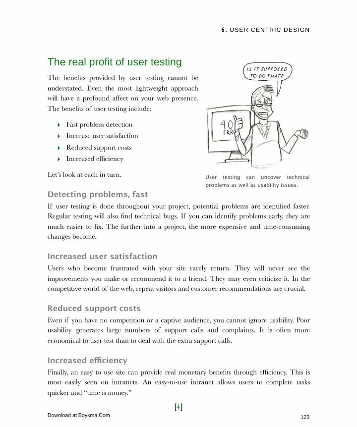
6. USER CENTRIC DESIGN
[4]
The real profit of user testingThe benefits provided by user testing cannot be
understated. Even the most lightweight approach will have a profound affect on your web presence.
The benefits of user testing include:
‣ Fast problem detection
‣ Increase user satisfaction
‣ Reduced support costs
‣ Increased efficiency
Let’s look at each in turn.
Detecting problems, fastIf user testing is done throughout your project, potential problems are identified faster. Regular testing will also find technical bugs. If you can identify problems early, they are
much easier to fix. The further into a project, the more expensive and time-consuming changes become.
Increased user satisfactionUsers who become frustrated with your site rarely return. They will never see the
improvements you make or recommend it to a friend. They may even criticize it. In the competitive world of the web, repeat visitors and customer recommendations are crucial.
Reduced support costsEven if you have no competition or a captive audience, you cannot ignore usability. Poor usability generates large numbers of support calls and complaints. It is often more
economical to user test than to deal with the extra support calls.
Increased efficiencyFinally, an easy to use site can provide real monetary benefits through efficiency. This is most easily seen on intranets. An easy-to-use intranet allows users to complete tasks
quicker and “time is money.”
User testing can uncover technical problems as well as usability issues.
123
Licensed to Henry Vanyan <[email protected]>
Download at Boykma.Com

6. USER CENTRIC DESIGN
[5]
To a lesser extent, this principle also applies to your public site. If users can complete tasks
quickly, they will perceive your site as a time saver and visit regularly.
User testing can provide real return on investment. However, this return can only be
realized if the cost of user testing can be kept to a minimum. How is this achieved?
Bargain basement usabilityThe bargain basement approach to usability testing was pioneered by usability experts Steve Krug and Jakob Nielsen. Although they differ on the details, they agree on three key
principles:
‣ Test a little but often
‣ Use a limited number of testers
‣ Don’t become too concerned with who you test
These principles are crucial if you want to
user test while delivering on time and in budget. Let’s look at each in turn.
Test a little but oftenKey to this approach is the principle of “little but often.” Testing should occur
throughout a web project’s life-cycle and
that means keeping testing lightweight.
Steve Krug calls this approach “cubicle
testing,” where any new development is shown to colleagues to see if they can
make sense of it. This simple form of
testing is remarkably effective.
If you choose to be more sophisticated in
who and how you test, never let that be at the expense of quantity.
Common usability mistakes
Jacob Nielsen annually updates his list of
the ten most egregious offenses against users on his website:
http://useit.com/alertbox/9605.html
124
Licensed to Henry Vanyan <[email protected]>
Download at Boykma.Com

6. USER CENTRIC DESIGN
[6]
Why ‘often’ mattersWhen initially testing, many users get stuck at the first hurdle. A second round lets you to
fix those problems, allowing users to progress further and uncover new issues. The number of rounds is largely dictated by budget and time. However, the more rounds, the more
issues you will uncover. This is true even with a limited number of testers.
The more rounds of testing, the more issues will be uncovered.
When should you schedule these numerous rounds?
When to test?Before the project commences, test your existing site or that of your competition. These sites act as a free prototype which help identify potential usability issues. Next, test sketches and design
concepts. Your designer may resist showing users unfinished work, but this is a valuable
chance to identify issues before too much time has been invested.
When testing a design for usability, focus on whether the user “gets it.” Do they
understand what the site is about and how it works? Did the user understand the terminology used and where they paying attention to the right screen elements?
125
Licensed to Henry Vanyan <[email protected]>
Download at Boykma.Com
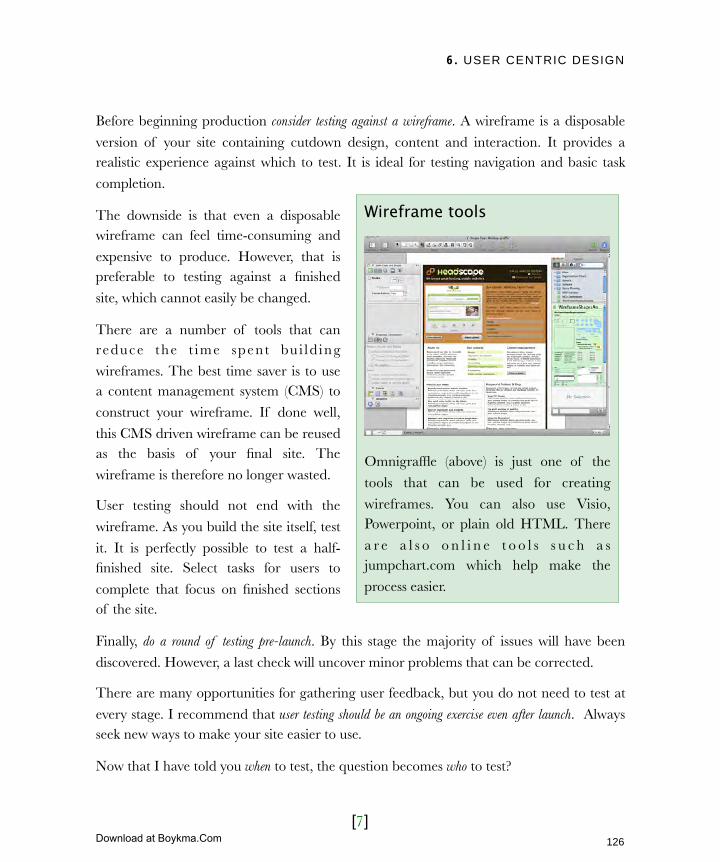
6. USER CENTRIC DESIGN
[7]
Before beginning production consider testing against a wireframe. A wireframe is a disposable
version of your site containing cutdown design, content and interaction. It provides a realistic experience against which to test. It is ideal for testing navigation and basic task
completion.
The downside is that even a disposable wireframe can feel time-consuming and
expensive to produce. However, that is preferable to testing against a finished
site, which cannot easily be changed.
There are a number of tools that can reduce the t ime spent bu i ld ing
wireframes. The best time saver is to use a content management system (CMS) to
construct your wireframe. If done well,
this CMS driven wireframe can be reused as the basis of your final site. The
wireframe is therefore no longer wasted.
User testing should not end with the
wireframe. As you build the site itself, test
it. It is perfectly possible to test a half-finished site. Select tasks for users to
complete that focus on finished sections of the site.
Finally, do a round of testing pre-launch. By this stage the majority of issues will have been
discovered. However, a last check will uncover minor problems that can be corrected.
There are many opportunities for gathering user feedback, but you do not need to test at
every stage. I recommend that user testing should be an ongoing exercise even after launch. Always seek new ways to make your site easier to use.
Now that I have told you when to test, the question becomes who to test?
Wireframe tools
Omnigraffle (above) is just one of the
tools that can be used for creating
wireframes. You can also use Visio, Powerpoint, or plain old HTML. There
a r e a l s o o n l i n e t o o l s s u c h a s jumpchart.com which help make the
process easier.
126
Licensed to Henry Vanyan <[email protected]>
Download at Boykma.Com

6. USER CENTRIC DESIGN
[8]
Beware of decreasing returnsMany website owners believe that
usability testing is worthless if you do not test a large groups of people within the
target demographic. They are therefore
discouraged from testing. However, this belief is not true.
Statistical testing as outlined above is expensive and time consuming. It does
not provide significant benefits over the
bargain basement approach. In 2000 Jakob Nielsen wrote:
The reason is that the majority of users encounter the same problems when testing. The
more users tested, the more overlap he found in problems found. Eventually the level of overlap is so high that the likelihood of discovering more issues is remote. As I said earlier
and Nielsen reinforces above, multiple rounds of testing are more effective.
Steve Krug takes the logic further suggesting that you should only test three or four people. This catches the majority of serious issues, although admittedly some minor issues
could slip through. He believes that this is a price worth paying as testing only three or four people allows testing and debrief in a single day.
In short, the more people you test the lower your return on investment. This is also an
issue for recruitment of testers.
Recruit looselyIt is easy to waste time and money recruiting the perfect user who matches the personas
we created earlier. This is fine if you have limitless resources. However, it cannot be
Elaborate usability tests are a waste of resources. The best results come from testing no more than 5 users and running as many small tests as you can afford.
In his article “Why You Only Need to Test With 5 Users” (useit.com/alertbox/20000319.html) Jakob Nielsen demonstrates the diminishing returns that come from increasing the number of test subjects.
127
Licensed to Henry Vanyan <[email protected]>
Download at Boykma.Com
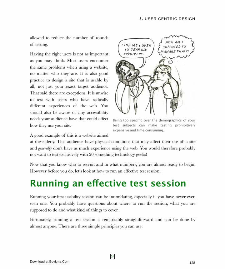
6. USER CENTRIC DESIGN
[9]
allowed to reduce the number of rounds
of testing.
Having the right users is not as important
as you may think. Most users encounter
the same problems when using a website, no matter who they are. It is also good
practice to design a site that is usable by all, not just your exact target audience.
That said there are exceptions. It is unwise
to test with users who have radically different experiences of the web. You
should also be aware of any accessibility needs your audience have that could affect
how they use your site.
A good example of this is a website aimed at the elderly. This audience have physical conditions that may affect their use of a site
and generally don’t have as much experience using the web. You would therefore probably not want to test exclusively with 20 something technology geeks!
Now that you know who to recruit and in what numbers, you are almost ready to begin.
However before you do, let’s look at how to run an effective test session.
Running an effective test sessionRunning your first usability session can be intimidating, especially if you have never even
seen one. You probably have questions about where to run the session, what you are
supposed to do and what kind of things to cover.
Fortunately, running a test session is remarkably straightforward and can be done by
almost anyone. There are three simple principles you can use:
Being too specific over the demographics of your test subjects can make testing prohibitively expensive and time consuming.
128
Licensed to Henry Vanyan <[email protected]>
Download at Boykma.Com

6. USER CENTRIC DESIGN
[10]
‣Be prepared
‣Understand the role of the facilitator
‣Work from a script
How, then, do you prepare?
Be preparedIt is possible to do usability testing with no preparation whatsoever using the cubicle
test I mentioned earlier. However, if you want to run something more formal a
little preparation goes a long way. Before
you begin recruiting, answer two basic questions. Where and when are you going
to test?
Where and when?If you can easily visit your testers, then you may wish to test where they normally access
the web. This provides two advantages. First, they are more relaxed in their own
surroundings. Second, you are seeing them in their “native environment” which is more realistic. However doing this is not always practical. The alternative is to ask tester to
come to a central location. This does not need to be anywhere sophisticated. It can be even be done at your own desk.
The most important requirement of the test environment is that it is quiet and the tester
will not be disturbed. Although a constantly ringing phone may be realistic it does not aid successful user testing!
Once you know where you are going to test, draw up a schedule. Try to schedule all of your sessions on a single day. Each session should last a maximum of 40 minutes as people
struggle to concentrate for longer. Placing each session an hour apart gives you an
opportunity to make additional notes and preparing for the next session. It also allows time for users who have a lot to share or struggle with their tasks.
Do regular informal testing, too. Ask somebody else in the office that isn’t involved with the project to take a look at your work.
129
Licensed to Henry Vanyan <[email protected]>
Download at Boykma.Com
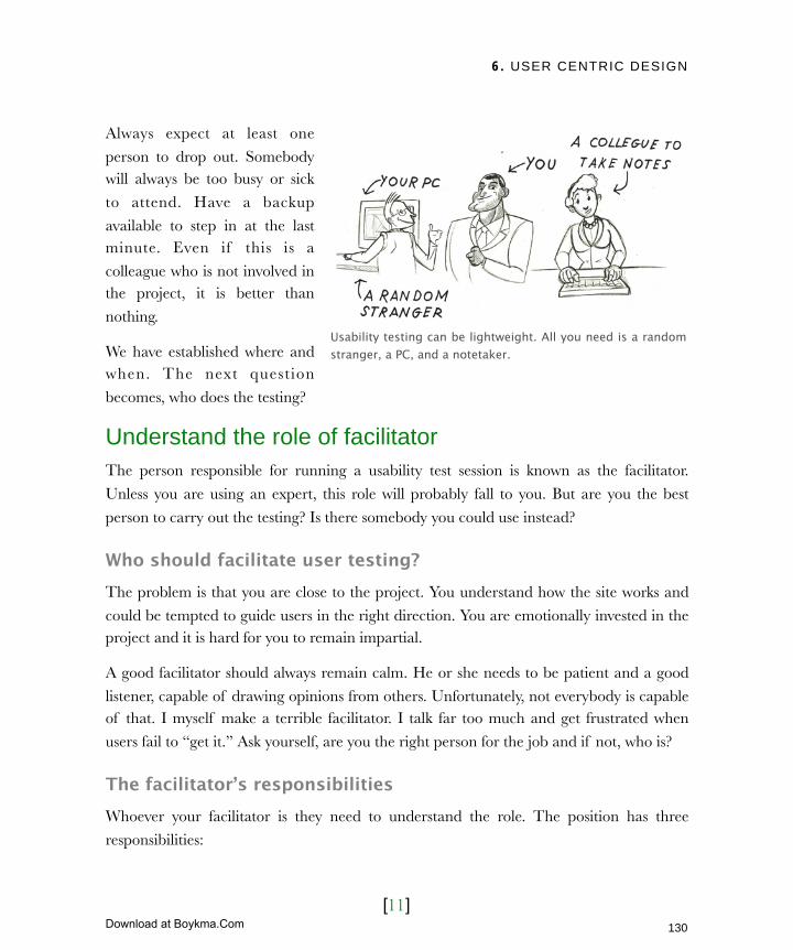
6. USER CENTRIC DESIGN
[11]
Always expect at least one
person to drop out. Somebody will always be too busy or sick
to attend. Have a backup
available to step in at the last minute. Even if this is a
colleague who is not involved in the project, it is better than
nothing.
We have established where and when. The next question
becomes, who does the testing?
Understand the role of facilitatorThe person responsible for running a usability test session is known as the facilitator.
Unless you are using an expert, this role will probably fall to you. But are you the best
person to carry out the testing? Is there somebody you could use instead?
Who should facilitate user testing?The problem is that you are close to the project. You understand how the site works and
could be tempted to guide users in the right direction. You are emotionally invested in the project and it is hard for you to remain impartial.
A good facilitator should always remain calm. He or she needs to be patient and a good
listener, capable of drawing opinions from others. Unfortunately, not everybody is capable of that. I myself make a terrible facilitator. I talk far too much and get frustrated when
users fail to “get it.” Ask yourself, are you the right person for the job and if not, who is?
The facilitator’s responsibilitiesWhoever your facilitator is they need to understand the role. The position has three
responsibilities:
Usability testing can be lightweight. All you need is a random stranger, a PC, and a notetaker.
130
Licensed to Henry Vanyan <[email protected]>
Download at Boykma.Com
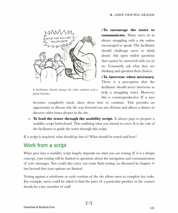
6. USER CENTRIC DESIGN
[12]
‣To encourage the tester to communicate. Many users sit in
silence struggling with a site unless encouraged to speak. The facilitator
should challenge users to think aloud. Ask open ended questions
that cannot be answered with yes or
no. Constantly ask what they are thinking and question their choices.
‣To intervene when necessary. There is a perception that the
facilitator should never intervene to
help a struggling tester. However, this is counterproductive. If a user
becomes completely stuck, show them how to continue. This provides an opportunity to discuss why the way forward was not obvious and allows a chance to
discover other issues deeper in the site.
‣ To lead the tester through the usability script. It always pays to prepare a usability script beforehand. This outlining what you intend to cover. It is the role of
the facilitator to guide the tester through this script.
If a script is required, what should go into it? What should be tested and how?
Work from a scriptWhat goes into a usability script largely depends on what you are testing. If it is a design
concept, your testing will be limited to questions about the navigation and communication of core messages. You could also carry out some flash testing (as discussed in chapter 4)
but beyond that your options are limited.
Testing against a wireframe or early versions of the site allows users to complete key tasks. For example, users could be asked to find the price of a particular product or the contact
details for a key member of staff.
A facilitator should always be calm, patient and a good listener.
131
Licensed to Henry Vanyan <[email protected]>
Download at Boykma.Com
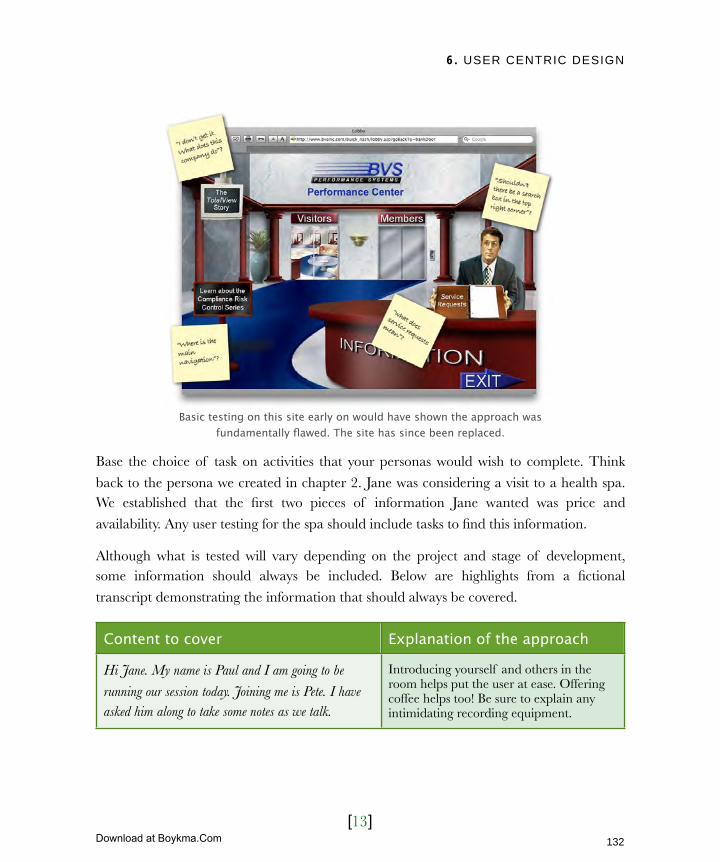
6. USER CENTRIC DESIGN
[13]
Basic testing on this site early on would have shown the approach was fundamentally flawed. The site has since been replaced.
Base the choice of task on activities that your personas would wish to complete. Think
back to the persona we created in chapter 2. Jane was considering a visit to a health spa. We established that the first two pieces of information Jane wanted was price and
availability. Any user testing for the spa should include tasks to find this information.
Although what is tested will vary depending on the project and stage of development, some information should always be included. Below are highlights from a fictional
transcript demonstrating the information that should always be covered.
Content to cover Explanation of the approach
Hi Jane. My name is Paul and I am going to be
running our session today. Joining me is Pete. I have asked him along to take some notes as we talk.
Introducing yourself and others in the room helps put the user at ease. Offering coffee helps too! Be sure to explain any intimidating recording equipment.
132
Licensed to Henry Vanyan <[email protected]>
Download at Boykma.Com
6. USER CENTRIC DESIGN
[14]
Content to cover Explanation of the approach
We are here to improve a website that is under
development. You are going to help us test the site. We are testing the site and not you, so you can relax!
By explaining to the user that you are testing the site and not them, they will behave more naturally.
You do not need to worry about messing up. There are
no right or wrong answers in a usability test. What we do need is complete honesty. If you are struggling
with something or do not like the way it works, say so.
You aren’t going to offend anybody.
If the user thinks the session is a test with right and wrong answers, they will tell you what they think is correct rather than what they feel. Many users are also worried about offending the facilitator. It is important to stress that you want honest answers and no offense will be taken.
The most important thing to remember is that we need
you to explain what you are thinking. Think out loud and talk about the options you are considering. Before
you click on a link explain what other options you
considered and why you picked that one.
Getting the user to articulate their thoughts is fundamental to the success of the session. This cannot be stressed enough. Even though you explain the need up front, you will still need to prompt the user throughout the session.
If you have any questions, feel free to ask. I might not
be able to answer them right away as I could prejudice the testing, but I will answer them at the end.
It is important to explain before you begin why you may not answer their questions during the session. If they do ask questions be sure to address them at the end.
Let’s start off with something easy. Can you tell me a
bit about yourself ? Tell me about your job?
Begin a session with simple questions such as family status, age and job title. This helps build the user’s confidence and provides some background information.
Tell me about your computer experience. How
confident do you feel using a PC? Do you use them for work? At home? How much do you use the internet?
What kind of sites do you use most and find useful?
Building up an understanding of the user’s computer and web experience is useful context for the session. It also indicates how representative they are of the target audience.
Let’s talk about the site. It is for a health spa. Before I
show it I want to ask about your expectations. What do you think a health spa website should look like and
what information would it contain?
It is often helpful to ask users about their expectations. If the expectations do not meet the reality it can cause confusion. Also it provides the opportunity to find out more about what users want from the site.
133
Licensed to Henry Vanyan <[email protected]>
Download at Boykma.Com
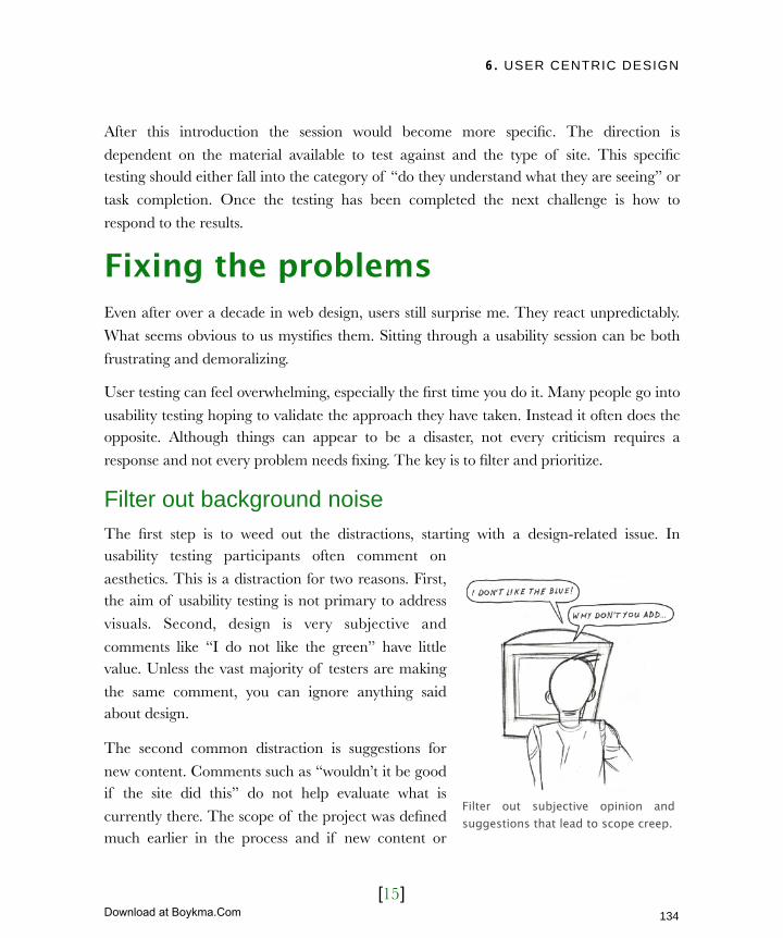
6. USER CENTRIC DESIGN
[15]
After this introduction the session would become more specific. The direction is
dependent on the material available to test against and the type of site. This specific testing should either fall into the category of “do they understand what they are seeing” or
task completion. Once the testing has been completed the next challenge is how to
respond to the results.
Fixing the problemsEven after over a decade in web design, users still surprise me. They react unpredictably.
What seems obvious to us mystifies them. Sitting through a usability session can be both
frustrating and demoralizing.
User testing can feel overwhelming, especially the first time you do it. Many people go into
usability testing hoping to validate the approach they have taken. Instead it often does the opposite. Although things can appear to be a disaster, not every criticism requires a
response and not every problem needs fixing. The key is to filter and prioritize.
Filter out background noiseThe first step is to weed out the distractions, starting with a design-related issue. In usability testing participants often comment on
aesthetics. This is a distraction for two reasons. First, the aim of usability testing is not primary to address
visuals. Second, design is very subjective and
comments like “I do not like the green” have little value. Unless the vast majority of testers are making
the same comment, you can ignore anything said about design.
The second common distraction is suggestions for
new content. Comments such as “wouldn’t it be good if the site did this” do not help evaluate what is
currently there. The scope of the project was defined much earlier in the process and if new content or
Filter out subjective opinion and suggestions that lead to scope creep.
134
Licensed to Henry Vanyan <[email protected]>
Download at Boykma.Com

6. USER CENTRIC DESIGN
[16]
functionality is added at this stage it will
lead to scope creep.
I am not suggesting that ideas about
content are worthless. As with design
suggestions, if the vast majority are suggesting something you have to take
their comments seriously. Ask whether you have missed something fundamental or
whether it is simply a nice extra. If it is the
latter, do not throw the suggestion away. Rather, add it to the list of ideas you
compiled back in chapter 2. These can be implemented in the future.
The final filter is return on investment.
Sometimes a problem cannot be fixed without investing a disproportionately
high amount of money compared to the return received. In many cases this is
because of existing technology or business
processes which cannot be changed.
Although there are things we can do to
minimize this inconvenience we are ultimately limited by the realities of
business.
Once the list of issues has been reduced, the final step is to prioritize them and
present them to the development team.
Case Study: Wiltshire Farm Foods
www.wiltshirefarmfoods.co.uk/quickorder
Wiltshire Farm Foods is an e-commerce
site which superbly demonstrates how business constraints sometimes need to
come before usability considerations. Their site requires a postcode before
displaying prices. In user testing a number
of participants made it clear they were uncomfortable purchasing from a
company that required personal data before showing prices.
There are good reasons for this approach.
The company’s entire business model is based around regional franchises.
Franchises can select products to stock and at what price, which allows them to match
regional tastes and affluency. Changing
this model would be costly for WFF and could lead to increased prices for their
customers.
135
Licensed to Henry Vanyan <[email protected]>
Download at Boykma.Com

6. USER CENTRIC DESIGN
[17]
Prioritize and reportHow you communicate the results of user testing to the rest of your team is key. It’s easy
to overwhelm and demoralize them or set them off on an ill-considered campaign of fixes.
If you want people to actually read the results of your usability study, the report needs to be
short. A page or two is usually adequate to communicate the issues which need addressing.
You can always provide additional supporting evidence if people need convincing. The primary aim of the report is to list the issues and propose possible solutions.
The layout of your report must also be considered. It cannot simply be a list of issues. Some level of prioritization needs to be provided. This prioritization is based on two
factors: the complexity of the fix and the seriousness of the problem. I suggest having two
sections entitled quick wins and deal breakers.
Quick wins are minor issues that are so
easy to fix, it is silly not to. A good example
of this might be a poorly named link that made a user pause for thought. It didn’t
stop the user completing the task and so cannot be considered crucial. Yet it is so
simple to rename the link that there is no
reason not to.
Deal breakers prevent users from
proceeding further. A classic example is a
user who cannot find the checkout button on an e-commerce site. Without it they are
unable to continue and are forced to give up. They are priority issues that simply have
to be fixed.
Not all issues fall neatly into these two categories. Much of the time users who
encounter problems manage to muddle through, which isn’t necessarily bad. From
Quick wins
Some usability fixes are so simple that
there is no reason not to do it. For example, removing an unnecessary
cancel button can prevent users from
accidently pressing the wrong button and loosing the data they have added.
136
Licensed to Henry Vanyan <[email protected]>
Download at Boykma.Com
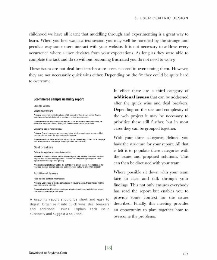
6. USER CENTRIC DESIGN
[18]
childhood we have all learnt that muddling through and experimenting is a great way to
learn. When you first watch a test session you may well be horrified by the strange and peculiar way some users interact with your website. It is not necessary to address every
occurrence where a user deviates from your expectations. As long as they were able to
complete the task and do so without becoming frustrated you do not need to worry.
These issues are not deal breakers because users succeed in overcoming them. However,
they are not necessarily quick wins either. Depending on the fix they could be quite hard to overcome.
In effect these are a third category of
additional issues that can be addressed after the quick wins and deal breakers.
Depending on the size and complexity of
the web project it may be necessary to prioritize these still further, but in most
cases they can be grouped together.
With your three categories defined you
have the structure for your report. All that
is left is to populate these categories with the issues and proposed solutions. This
can then be discussed with your team.
Where possible sit down with your team
face to face and talk through your
findings. This not only ensures everybody has read the report but enables you to
provide some context for the issues described. Finally, this meeting provides
an opportunity to plan together how to
overcome the problems.
A usability report should be short and easy to digest. Organize it into quick wins, deal breakers and additional issues. Explain each issue succinctly and suggest a solution.
137
Licensed to Henry Vanyan <[email protected]>
Download at Boykma.Com
6. USER CENTRIC DESIGN
[19]
Next ActionsUsability testing can be hugely beneficial without putting a strain on budget or timescales. You should have a clear understanding of how to run a test session and the role of
facilitator. You know who to recruit and when to test in the process. Finally, you are
equipped to analysis the results and report back to the rest of the team.
With all of that knowledge at your disposal it is time to create a usability test schedule.
This involves three separate actions:
‣ Action one: Identify test points in the development – I have already written
about the need to test throughout the development process. Now is the time to add
those test points into your project plan. Are you going to test the initial design concepts? Will you produce a wireframe and test that? What about initial
prototypes? Is there time in the plan for pre-launch testing? Scheduling testing upfront decreases the likelihood of it getting squeezed out.
‣ Action two: Planning your post launch testing – Testing should not stop once the
site goes live. Organisations continually assess the usability and effectiveness of their sites. This is particularly true when a site has ongoing development. Plan regular
review sessions every few months to ensure those “quick tweaks” made to the site have not created stumbling blocks for users.
‣ Action three: Creating a culture of ad-hoc testing – Although scheduled testing
is great, also foster a culture of ongoing ad-hoc testing. Constantly ask friends and colleagues to have a quick look at your site. When speaking to your customers get
their feedback and maybe even schedule time for a test session after customer meetings. Wherever possible, get people outside of the development team to look at
your site.
A user centric approach has become best practice within web design over the last few years. However, best practice exists also exists in how that site is built, which I’ll address in
the next chapter.
138
Licensed to Henry Vanyan <[email protected]>
Download at Boykma.Com
7. ENSURING BEST PRACTICE
[1]
In this chapter‣ Identifying the cowboys
Learning from history
The consequences of poor code
Inaccessible code
Bloated code
Hard to maintain code
A culture of redesign
A better way to build websites
‣ A matter of style
Improved printing
Capturing the emerging market
Responding quickly to change
‣ Never turn away users (or google)
But accessibility is expensive
Achieve increased traffic with minimal effort
‣ Exceed your legal obligations
Navigating overwhelming guidelines
‣ Creating an accessibility policy
Establish your long term accessibility goal
Have a roadmap for overcoming common problems
Poorly described images
Badly labelled links
No alternatives to media
Reliance on Javascript
Hard to read text
Testing accessibility
Maintaining accessibility
Dealing with complaints
139
Licensed to Henry Vanyan <[email protected]>
Download at Boykma.Com
7. ENSURING BEST PRACTICE
[2]
7 Ensuring best practiceBeing a geek, I love Star Trek. I am sorry, I cannot help it. I enjoy the amount of thought that goes into it. Take the difference between the original Star Trek series and the Next Generation. In the original series it was like the Wild West. Kirk, was a futuristic gunslinger exploring the galaxy, pushing back frontiers and breaking all the rules. In the Next Generation, the federation had grown up and those pioneering days were gone. It was about politics and alliances. New discoveries were happening, but at a slower pace.
The reason I bring up Star Trek is because there is a comparison to be made. The early days of the web were like the original series. There were no rules, everything was new and we were flying by the seat of our pants. Now the web has matured. Like the Next Generation we have our own ‘prime directives’. These include best practices, standards and even legal legislation. Web design has grown up a lot. Unfortunately, there are still a lot of Kirks around, building websites like it’s 1999.
This chapter will inform you of current best practice, emerging marketings and your accessibility obligations. This will ensure you do not get caught by cowboy designers peddling out-of-date techniques.
140
Licensed to Henry Vanyan <[email protected]>
Download at Boykma.Com
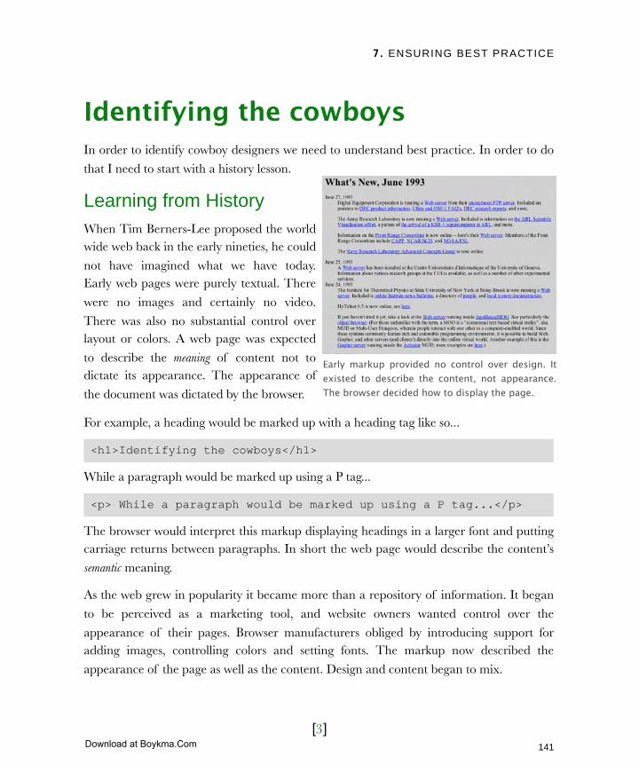
7. ENSURING BEST PRACTICE
[3]
Identifying the cowboysIn order to identify cowboy designers we need to understand best practice. In order to do
that I need to start with a history lesson.
Learning from HistoryWhen Tim Berners-Lee proposed the world wide web back in the early nineties, he could
not have imagined what we have today. Early web pages were purely textual. There
were no images and certainly no video.
There was also no substantial control over layout or colors. A web page was expected
to describe the meaning of content not to dictate its appearance. The appearance of
the document was dictated by the browser.
For example, a heading would be marked up with a heading tag like so...
<h1>Identifying the cowboys</h1>
While a paragraph would be marked up using a P tag...
<p> While a paragraph would be marked up using a P tag...</p>
The browser would interpret this markup displaying headings in a larger font and putting carriage returns between paragraphs. In short the web page would describe the content’s
semantic meaning.
As the web grew in popularity it became more than a repository of information. It began
to be perceived as a marketing tool, and website owners wanted control over the
appearance of their pages. Browser manufacturers obliged by introducing support for adding images, controlling colors and setting fonts. The markup now described the
appearance of the page as well as the content. Design and content began to mix.
Early markup provided no control over design. It existed to describe the content, not appearance. The browser decided how to display the page.
141
Licensed to Henry Vanyan <[email protected]>
Download at Boykma.Com

7. ENSURING BEST PRACTICE
[4]
Even this was not enough to satisfy the marketeers. They wanted to replicate print designs
on the web. This led to the abuse of markup. Instead of tags being used to describe the meaning of content they were selected because the browsers displayed them in a
particular way. For example, web designers would choose a H1 tag not because they
wanted to markup a heading, but because they wanted to make text large and bold.
The biggest abuse was in the use of the table tag. The table tag was originally created to
display tabular data similar to most spreadsheets. Web designers quickly discovered that tables could be used to position content on a page with almost pixel control.
Admittedly, this approach worked. Website owners got the ‘print like’ designs they wanted.
Software automated the process of creating this spaghetti of code keeping development costs low. Where then was the problem?
The consequences of poor codeUnfortunately design control came at a cost. The complicated, messy markup
created by table based design had
ramifications. Web pages became...
‣ Inaccessible
‣ Bloated
‣ Hard to maintain
Inaccessible codeWith the browsers displaying this
‘bastardized code’ in slightly different ways and offering support for their own
proprietary tags, it became increasingly hard to build sites that were accessible by
all. Designers were often forced to present
different versions of a site to each browser, so increasing development time. Designers
working with limited budgets sometimes
In 1997 David Siegel’s book ‘Creating Killer Web Sites’ popularized the use of tables for controlling web page layout. At the time this appeared to be positive, but with hindsight it proved detrimental.
142
Licensed to Henry Vanyan <[email protected]>
Download at Boykma.Com
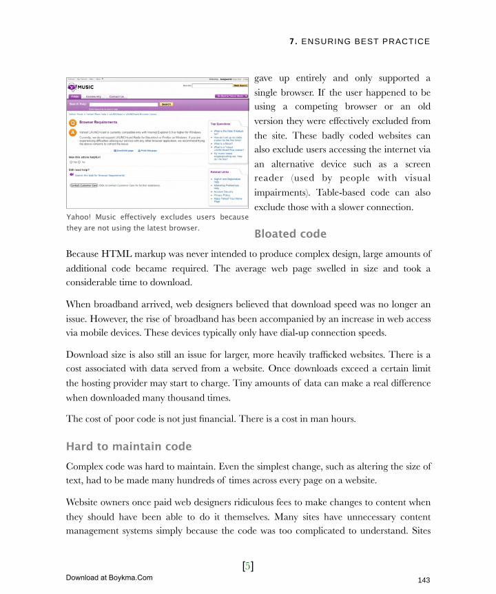
7. ENSURING BEST PRACTICE
[5]
gave up entirely and only supported a
single browser. If the user happened to be using a competing browser or an old
version they were effectively excluded from
the site. These badly coded websites can also exclude users accessing the internet via
an alternative device such as a screen reader (used by people with visual
impairments). Table-based code can also
exclude those with a slower connection.
Bloated codeBecause HTML markup was never intended to produce complex design, large amounts of
additional code became required. The average web page swelled in size and took a considerable time to download.
When broadband arrived, web designers believed that download speed was no longer an
issue. However, the rise of broadband has been accompanied by an increase in web access via mobile devices. These devices typically only have dial-up connection speeds.
Download size is also still an issue for larger, more heavily trafficked websites. There is a cost associated with data served from a website. Once downloads exceed a certain limit
the hosting provider may start to charge. Tiny amounts of data can make a real difference
when downloaded many thousand times.
The cost of poor code is not just financial. There is a cost in man hours.
Hard to maintain codeComplex code was hard to maintain. Even the simplest change, such as altering the size of text, had to be made many hundreds of times across every page on a website.
Website owners once paid web designers ridiculous fees to make changes to content when
they should have been able to do it themselves. Many sites have unnecessary content management systems simply because the code was too complicated to understand. Sites
Yahoo! Music effectively excludes users because they are not using the latest browser.
143
Licensed to Henry Vanyan <[email protected]>
Download at Boykma.Com

7. ENSURING BEST PRACTICE
[6]
became obsolete as new browsers were released and broke existing code. It was often more
cost effective to throw out a site and start again than fix what was there.
A culture of redesignThe difficulties in maintaining these
websites led to a culture of redesign.
Every few years an organisation becomes frustrated with their website
and gets a web design company to fix it. Unfortunately this new site was
often just as badly built and would also
degrade over time as new browsers were released and content was not
kept up to date. The process would repeat itself.
So far I have spoken about these
problems in the past tense, implying that websites are no longer built this way. Many still are. For a variety of reasons web
designers choose not keep up with best practice. It falls to you as the client to set the standard of work you require. To do this you need to understand standards-based design.
A better way to build websitesWhile web designers were bastardizing markup to suit their needs, Tim Berners-Lee and a
group of industry experts (the World Wide Web Consortium) were working on a solution to the problem. They proposed a complete separation of content from design. The
markup would return to its original role of defining the meaning of content. Meanwhile a separate file would describe to the browser how that content should look. This file was
called the cascading stylesheet (CSS). This separation of content from design provided the
design control demanded, while avoiding the pitfalls of other techniques.
At first browser support was limited. However, thanks to the campaigning of groups like
the Web Standards Project that quickly changed. A new generation of web designer emerged dedicated to building websites that conform to these new best practices. These
Fixes were required as browsers updated. Unfortunately because of the complexity of the code these fixes were expensive.
144
Licensed to Henry Vanyan <[email protected]>
Download at Boykma.Com

7. ENSURING BEST PRACTICE
[7]
websites are more likely to be accessible, faster to download and easier to maintain. They
provide a host of additional benefits which are explored in the next section.
Unfortunately not all web designers are so progressive. Many still produce websites where
content and design are mixed and accessibility is ignored. With many clients still ignorant
of best practice, these developers have little motivation to change their ways. These clients only care that their site looks ‘okay on their computer’. However, you should consider the
broader picture and so I will endeavor to clearly explain the benefits of standards-based design. Let’s begin with control over styling.
A matter of styleThe greatest benefit of this new approach to
building websites is born out of the separation of design from content. With all design being defined
from a single file (the CSS) it is simple to change
that file and give your site a different look. The content remained the same but the site’s design can
change radically. This offers a whole host of possibilities, not least when printing.
Improved printingIf you have ever printed a webpage you will know
that printing on the web sucks. There are two fundamental flaws.
It wastes paper and ink by printing screen elements that the user doesn’t need. Why
print the navigation or interface graphics? These are needed while interacting with a website, not for reading a piece of paper.
Many websites fail to print properly. This can manifest in many ways but the most
common is content being truncated down the right of a page. This can be clearly seen on the Washington Post website.
Designing with Web Standards by Jeffrey Zeldman is the definitive introduction to standards-based design. It is ideal for explaining the benefits of standards to designers and developers.
145
Licensed to Henry Vanyan <[email protected]>
Download at Boykma.Com
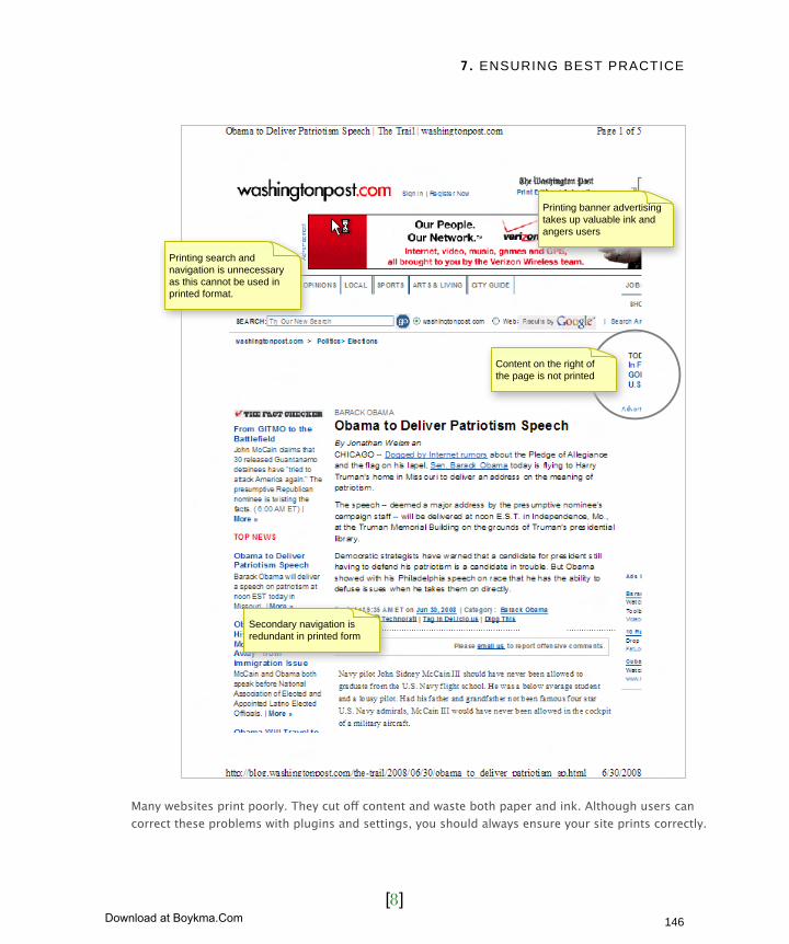
7. ENSURING BEST PRACTICE
[8]
Many websites print poorly. They cut off content and waste both paper and ink. Although users can correct these problems with plugins and settings, you should always ensure your site prints correctly.
Content on the right of the page is not printed
Printing banner advertising takes up valuable ink and angers users
Printing search and navigation is unnecessary as this cannot be used in printed format.
Secondary navigation is redundant in printed form
146
Licensed to Henry Vanyan <[email protected]>
Download at Boykma.Com
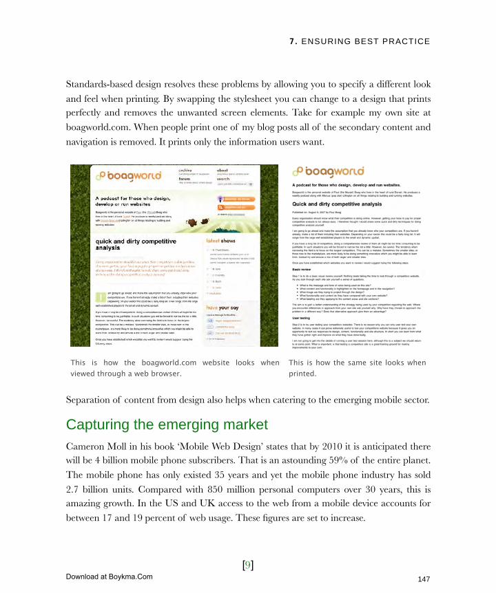
7. ENSURING BEST PRACTICE
[9]
Standards-based design resolves these problems by allowing you to specify a different look
and feel when printing. By swapping the stylesheet you can change to a design that prints perfectly and removes the unwanted screen elements. Take for example my own site at
boagworld.com. When people print one of my blog posts all of the secondary content and
navigation is removed. It prints only the information users want.
Separation of content from design also helps when catering to the emerging mobile sector.
Capturing the emerging marketCameron Moll in his book ‘Mobile Web Design’ states that by 2010 it is anticipated there will be 4 billion mobile phone subscribers. That is an astounding 59% of the entire planet.
The mobile phone has only existed 35 years and yet the mobile phone industry has sold
2.7 billion units. Compared with 850 million personal computers over 30 years, this is amazing growth. In the US and UK access to the web from a mobile device accounts for
between 17 and 19 percent of web usage. These figures are set to increase.
This is how the boagworld.com website looks when viewed through a web browser.
This is how the same site looks when printed.
147
Licensed to Henry Vanyan <[email protected]>
Download at Boykma.Com

7. ENSURING BEST PRACTICE
[10]
In chapter 12 we look at harnessing this emerging market. For now all you need to know is
that separating content from design is a key part of the process. Separation allows you to deliver a mobile friendly stylesheet to devices capable of reading one, and no stylesheet to
old devices.
Evernote.com use standards to help bring different visual experiences to a variety of devices.
The ability to swap styles is only the tip of the iceberg. Separating content from design
also allows your website to adapt based on circumstances.
Responding quickly to changeTraditionally websites have been difficult to change. When content and design are mixed a
small change, like altering the default font size, requires every page on the site to be edited.
With standards this is no longer the case and that offers a wealth of advantages.
Imagine you were launching a new advertising campaign that had a different look and feel
from the rest of your brand. Using standards based design you could change the entire site to match this design and swap back when the campaign was over.
You could also style the site depending on where the user was referred from. If they came
from a partners website it could rebranded to match their style. This would provide a seamless experience for the user.
Evernote on the web Evernote on an iphone Evernote on a mobile
148
Licensed to Henry Vanyan <[email protected]>
Download at Boykma.Com
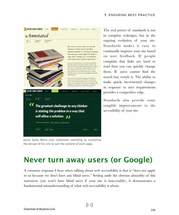
7. ENSURING BEST PRACTICE
[11]
The real power of standards is not
in complete redesigns, but in the ongoing evolution of your site.
Standards makes i t easy to
continually improve your site based on user feedback. If people
complain that links are hard to read then you can quickly change
them. If users cannot find the
search bar, restyle it. The ability to make quick, incremental changes
in response to user requirements provides a competitive edge.
Standards also provide some
tangible improvements to the accessibility of your site.
Never turn away users (or Google)A common response I hear when talking about web accessibility is that it “does not apply to us because we don’t have any blind users.” Setting aside the obvious absurdity of this
statement (you won’t have blind users if your site is inaccessible), it demonstrates a fundamental misunderstanding of what web accessibility is about.
Jason Santa Maria uses stylesheet switching to customize the design of his site to suit the content of each page.
149
Licensed to Henry Vanyan <[email protected]>
Download at Boykma.Com
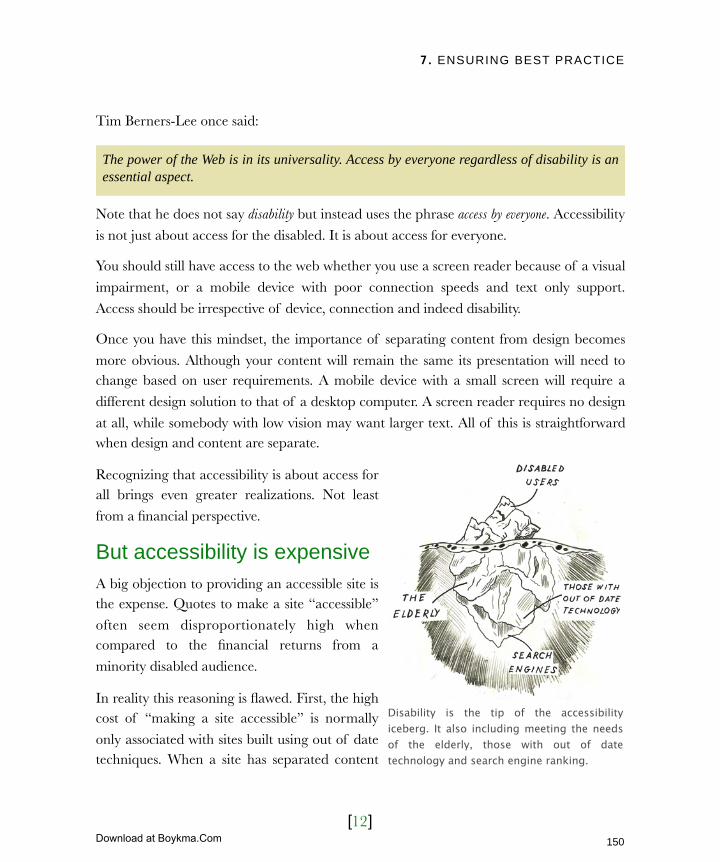
7. ENSURING BEST PRACTICE
[12]
Tim Berners-Lee once said:
The power of the Web is in its universality. Access by everyone regardless of disability is an essential aspect.
Note that he does not say disability but instead uses the phrase access by everyone. Accessibility
is not just about access for the disabled. It is about access for everyone.
You should still have access to the web whether you use a screen reader because of a visual
impairment, or a mobile device with poor connection speeds and text only support.
Access should be irrespective of device, connection and indeed disability.
Once you have this mindset, the importance of separating content from design becomes
more obvious. Although your content will remain the same its presentation will need to change based on user requirements. A mobile device with a small screen will require a
different design solution to that of a desktop computer. A screen reader requires no design
at all, while somebody with low vision may want larger text. All of this is straightforward when design and content are separate.
Recognizing that accessibility is about access for all brings even greater realizations. Not least
from a financial perspective.
But accessibility is expensiveA big objection to providing an accessible site is the expense. Quotes to make a site “accessible”
often seem disproportionately high when compared to the financial returns from a
minority disabled audience.
In reality this reasoning is flawed. First, the high cost of “making a site accessible” is normally
only associated with sites built using out of date techniques. When a site has separated content
Disability is the tip of the accessibility iceberg. It also including meeting the needs of the elderly, those with out of date technology and search engine ranking.
150
Licensed to Henry Vanyan <[email protected]>
Download at Boykma.Com
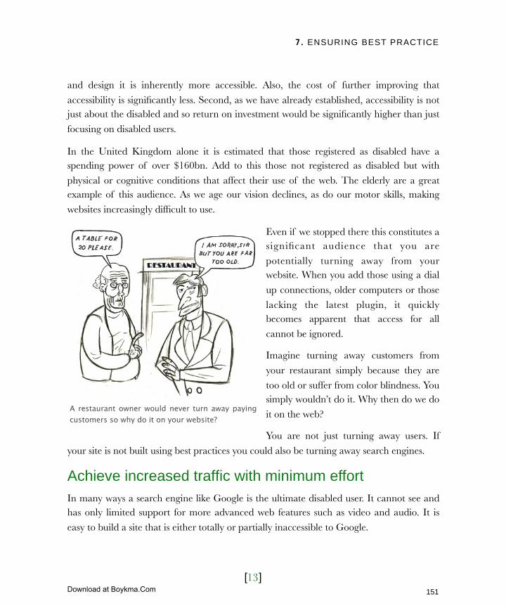
7. ENSURING BEST PRACTICE
[13]
and design it is inherently more accessible. Also, the cost of further improving that
accessibility is significantly less. Second, as we have already established, accessibility is not just about the disabled and so return on investment would be significantly higher than just
focusing on disabled users.
In the United Kingdom alone it is estimated that those registered as disabled have a spending power of over $160bn. Add to this those not registered as disabled but with
physical or cognitive conditions that affect their use of the web. The elderly are a great example of this audience. As we age our vision declines, as do our motor skills, making
websites increasingly difficult to use.
Even if we stopped there this constitutes a significant audience that you are
potentially turning away from your website. When you add those using a dial
up connections, older computers or those
lacking the latest plugin, it quickly becomes apparent that access for all
cannot be ignored.
Imagine turning away customers from
your restaurant simply because they are
too old or suffer from color blindness. You simply wouldn’t do it. Why then do we do
it on the web?
You are not just turning away users. If
your site is not built using best practices you could also be turning away search engines.
Achieve increased traffic with minimum effortIn many ways a search engine like Google is the ultimate disabled user. It cannot see and has only limited support for more advanced web features such as video and audio. It is
easy to build a site that is either totally or partially inaccessible to Google.
A restaurant owner would never turn away paying customers so why do it on your website?
151
Licensed to Henry Vanyan <[email protected]>
Download at Boykma.Com
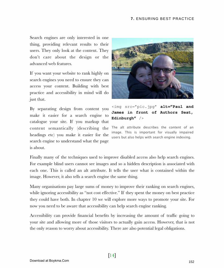
7. ENSURING BEST PRACTICE
[14]
Search engines are only interested in one
thing, providing relevant results to their users. They only look at the content. They
don’t care about the design or the
advanced web features.
If you want your website to rank highly on
search engines you need to ensure they can access your content. Building with best
practice and accessibility in mind will do
just that.
By separating design from content you
make it easier for a search engine to catalogue your site. If you markup that
content semantically (describing the
headings etc) you make it easier for the search engine to understand what the page
is about.
Finally many of the techniques used to improve disabled access also help search engines.
For example blind users cannot see images and so a hidden description is associated with
each one. This is called an alt attribute. It tells the user what is contained within the image. However, it also tells a search engine the same thing.
Many organisations pay large sums of money to improve their ranking on search engines, while ignoring accessibility as “not cost effective.” If they spent the money on best practice
they could have both. In chapter 10 we will explore more ways to promote your site. For
now you need to be aware that accessibility can help search engine ranking.
Accessibility can provide financial benefits by increasing the amount of traffic going to
your site and allowing more of those visitors to actually gain access. However, that is not the only reason to worry about accessibility. There are also potential legal obligations.
<img src=”pic.jpg” alt=”Paul and James in front of Authors Seat, Edinburgh” />
The alt attribute describes the content of an image. This is important for visually impaired users but also helps with search engine indexing.
152
Licensed to Henry Vanyan <[email protected]>
Download at Boykma.Com

7. ENSURING BEST PRACTICE
[15]
Exceed your legal obligationsFear of litigation is the most common motivating factor for addressing a website’s
accessibility. From lobby groups campaigning for disabled rights, to web designers trying
to drum up business, there is no shortage of people saying your site is breaking the law. Most of these claims are extreme, and although potentially true, do little to encourage best
practice.
I am not a lawyer and have no intention of giving legal advice about your liability. The
varying legislation on web accessibility worldwide makes that impossible. What I can share
with you is my experience and what I have observed online.
There will probably be a legal obligation on you to provide an accessible website. Whether
it is Section 508 in the United States or the Disability Discrimination Act in the United Kingdom, most countries have some form of legislation to address the issue of online
accessibility. Even if your website contravenes the legislation, you won’t necessarily be
taken to court.
A more likely scenario is that you will receive a complaint about some aspect of your site.
How you respond to that complaint dictates whether you end up in court.
Failure to respond quickly or take the
complaint seriously could lead to litigation. If you respond quickly and
apologetically, then the chances are the user will go away happy.
Am I proposing you ignore web
accessibility until somebody complains? Certainly not. Hopefully I have already
demonstrated good reasons to address accessibility beyond legal requirements. I
merely wished to dispel the fear
mongering that surrounds this subject.How you handle complaints will dictate whether your organisation ends up in court.
153
Licensed to Henry Vanyan <[email protected]>
Download at Boykma.Com

7. ENSURING BEST PRACTICE
[16]
This kind of fear mongering demands all or nothing. You must be compliant with
legislation today or face the consequences. This can seem overwhelming and many give up without trying. They choose instead to take the risk that nobody will draw attentions to
the failings of their site.
Instead I believe website owners should be looking to start small, and improve accessibility over time. A large proportion of accessibility problems can be overcome with a few simple
fixes. The question is what should these fixes be?
Navigating overwhelming guidelinesThere is no lack of people suggesting ways
to ensure your site’s accessibility. From
government legislation to pressure groups and disability charities, the amount of
advice can be overwhelming.
Once again the best solution lies with the
World Wide Web Consortium (W3C). The
W3C did not just produce the specification for HTML, CSS and other aspects of
standards-based design. They have also produced extens ive guide l ines on
accessibility. That is why accessibility and
standards are so closely linked.
What is more, the guidelines produced by
the W3C have become the template for almost all other accessibility advice. The first guidelines published by the W3C came out in 1999 and were referred to as WCAG 1.
Since then the web has moved on considerably, so the W3C have produced a second
version called WCAG 2.
At first glance the W3C guidelines can be very intimidating. The documentation
associated with them is extensive and highly technical in places. However, the guidelines themselves are relatively easy to understand. They are broken down into four principles:
The web content accessibility guidelines 2.0 (WCAG 2) are the definitive template for web accessibility going forward.
154
Licensed to Henry Vanyan <[email protected]>
Download at Boykma.Com
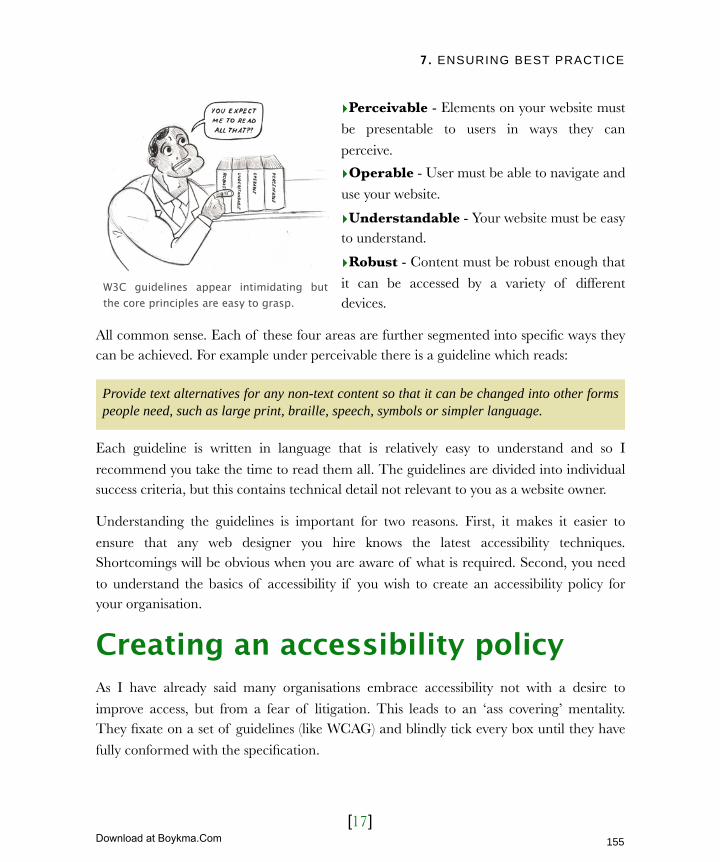
7. ENSURING BEST PRACTICE
[17]
‣Perceivable - Elements on your website must
be presentable to users in ways they can
perceive.
‣Operable - User must be able to navigate and
use your website.
‣Understandable - Your website must be easy to understand.
‣Robust - Content must be robust enough that
it can be accessed by a variety of different devices.
All common sense. Each of these four areas are further segmented into specific ways they can be achieved. For example under perceivable there is a guideline which reads:
Provide text alternatives for any non-text content so that it can be changed into other forms people need, such as large print, braille, speech, symbols or simpler language.
Each guideline is written in language that is relatively easy to understand and so I
recommend you take the time to read them all. The guidelines are divided into individual success criteria, but this contains technical detail not relevant to you as a website owner.
Understanding the guidelines is important for two reasons. First, it makes it easier to
ensure that any web designer you hire knows the latest accessibility techniques. Shortcomings will be obvious when you are aware of what is required. Second, you need
to understand the basics of accessibility if you wish to create an accessibility policy for your organisation.
Creating an accessibility policyAs I have already said many organisations embrace accessibility not with a desire to
improve access, but from a fear of litigation. This leads to an ‘ass covering’ mentality. They fixate on a set of guidelines (like WCAG) and blindly tick every box until they have
fully conformed with the specification.
W3C guidelines appear intimidating but the core principles are easy to grasp.
155
Licensed to Henry Vanyan <[email protected]>
Download at Boykma.Com

7. ENSURING BEST PRACTICE
[18]
This approach is flawed because it is organizationally
focused rather than user focused. Blindly following generic guidelines that may or may not apply to the specific needs
of your users is wasteful and serves nobody.
A better approach is to use WCAG as a starting point for the creation of an accessibility policy. This outlines your
organisation’s approach to dealing with issues of accessibility and should include:
‣ Your ultimate objectives in terms of W3C
guidelines.
‣ A roadmap for reaching these objectives.
‣ A process for testing compliance with these objectives.
‣ A plan for maintaining the accessibility of your site
over time.
‣ A procedure for responding to complaints.
This policy should not be drawn up in isolation but in consultation with your developers (who will have to implement the objectives) and your content providers (whose help will be
vital if your site is to remain accessible). Let’s look at each of the elements that appear in
your accessibility policy.
Establish your long term accessibility goalEvery accessibility policy should have an end goal in mind. This objective will probably
change over time but there is value in documenting your current aim. What that aim should be comes from discussion with developers, content providers and end users.
However it will probably be based on some aspect of WCAG 2.
Many organisations only choose to comply with the W3C accessibility guidelines in order to avoid prosecution.
156
Licensed to Henry Vanyan <[email protected]>
Download at Boykma.Com
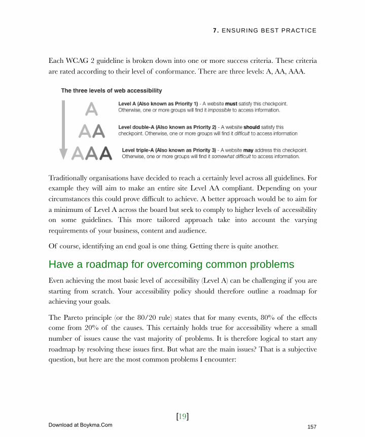
7. ENSURING BEST PRACTICE
[19]
Each WCAG 2 guideline is broken down into one or more success criteria. These criteria
are rated according to their level of conformance. There are three levels: A, AA, AAA.
Traditionally organisations have decided to reach a certainly level across all guidelines. For example they will aim to make an entire site Level AA compliant. Depending on your
circumstances this could prove difficult to achieve. A better approach would be to aim for
a minimum of Level A across the board but seek to comply to higher levels of accessibility on some guidelines. This more tailored approach take into account the varying
requirements of your business, content and audience.
Of course, identifying an end goal is one thing. Getting there is quite another.
Have a roadmap for overcoming common problemsEven achieving the most basic level of accessibility (Level A) can be challenging if you are
starting from scratch. Your accessibility policy should therefore outline a roadmap for achieving your goals.
The Pareto principle (or the 80/20 rule) states that for many events, 80% of the effects come from 20% of the causes. This certainly holds true for accessibility where a small
number of issues cause the vast majority of problems. It is therefore logical to start any
roadmap by resolving these issues first. But what are the main issues? That is a subjective question, but here are the most common problems I encounter:
157
Licensed to Henry Vanyan <[email protected]>
Download at Boykma.Com

7. ENSURING BEST PRACTICE
[20]
Poorly described imagesI have already mentioned that images should have associated alt attributes. This benefits
both visually impaired users and search engine placement. However, the problem of poorly described images is not simply a lack of description. It is badly written descriptions.
Because many people have realized the benefit of alt attributes for search engine
placement, they have taken to filling these descriptions with keywords and making them overly long. Make sure all content images have an alt attribute and that it clearly describes
what is being shown in a single sentence.
However, it is not just image that are labelled badly, so are links.
Badly labelled linksThe text contained within a link should be
able to describe that link without context. This is because screen readers have the
ability to read all the links on a page as a single list. This helps users quickly navigate
without listening to the entire page. The
problem arises because a link entitled “click here” does not give the user any
information about where the link leads. A better link would read simply “latest
news.” Where a longer description is
required a title attribute (similar to an alt attribute) can provide more information.
The use of descriptive links not only helps screen reader users but also other users who are quickly scanning a page looking for the
next link to follow. Finally search engines use the content of a link as a way of judging
what the page linked to is about.
As well as describing links and images, you also need to consider other forms of media.
If a link is labelled ‘click here’ it is meaningless out of context. For visually impaired users this can be frustrating.
158
Licensed to Henry Vanyan <[email protected]>
Download at Boykma.Com
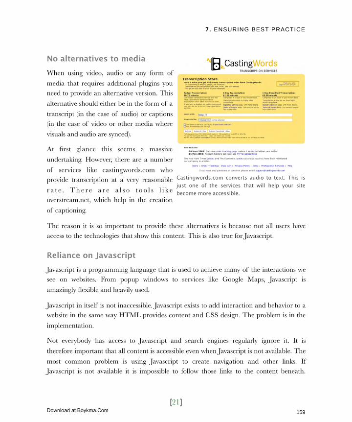
7. ENSURING BEST PRACTICE
[21]
No alternatives to mediaWhen using video, audio or any form of
media that requires additional plugins you need to provide an alternative version. This
alternative should either be in the form of a
transcript (in the case of audio) or captions (in the case of video or other media where
visuals and audio are synced).
At first glance this seems a massive
undertaking. However, there are a number
of services like castingwords.com who provide transcription at a very reasonable
r a t e . T h e r e a r e a l s o t o o l s l i k e overstream.net, which help in the creation
of captioning.
The reason it is so important to provide these alternatives is because not all users have access to the technologies that show this content. This is also true for Javascript.
Reliance on JavascriptJavascript is a programming language that is used to achieve many of the interactions we see on websites. From popup windows to services like Google Maps, Javascript is
amazingly flexible and heavily used.
Javascript in itself is not inaccessible. Javascript exists to add interaction and behavior to a website in the same way HTML provides content and CSS design. The problem is in the
implementation.
Not everybody has access to Javascript and search engines regularly ignore it. It is
therefore important that all content is accessible even when Javascript is not available. The
most common problem is using Javascript to create navigation and other links. If Javascript is not available it is impossible to follow those links to the content beneath.
Castingwords.com converts audio to text. This is just one of the services that will help your site become more accessible.
159
Licensed to Henry Vanyan <[email protected]>
Download at Boykma.Com
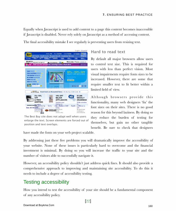
7. ENSURING BEST PRACTICE
[22]
Equally when Javascript is used to add content to a page this content becomes inaccessible
if Javascript is disabled. Never rely solely on Javascript as a method of accessing content.
The final accessibility mistake I see regularly is preventing users from resizing text.
Hard to read textBy default all major browsers allow users
to control text size. This is required for users with less than perfect vision. Most
visual impairments require fonts sizes to be increased. However, there are some that
require smaller text to fit better within a
limited field of view.
A l t h o u g h b ro w s e r s p rov i d e t h i s
functionality, many web designers ‘fix’ the font sizes on their sites. There is no good
reason for this beyond laziness. By doing so
they reduce the burden of testing for themselves, but gain no other tangible
benefit. Be sure to check that designers have made the fonts on your web project scalable.
By addressing just these five problems you will dramatically improve the accessibility of
your website. None of these issues is particularly hard to overcome and the financial investment is minimal. By doing so you will increase the traffic to your site and the
number of visitors able to successfully navigate it.
However, an accessibility policy shouldn’t just address quick fixes. It should also provide a
comprehensive approach to improving and maintaining site accessibility. To do this it
needs to include a degree of accessibility testing.
Testing accessibilityHow you intend to test the accessibility of your site should be a fundamental component
of any accessibility policy.
The Best Buy site does not adapt well when users enlarge the text. Screen elements are forced out of position and text overlaps.
160
Licensed to Henry Vanyan <[email protected]>
Download at Boykma.Com
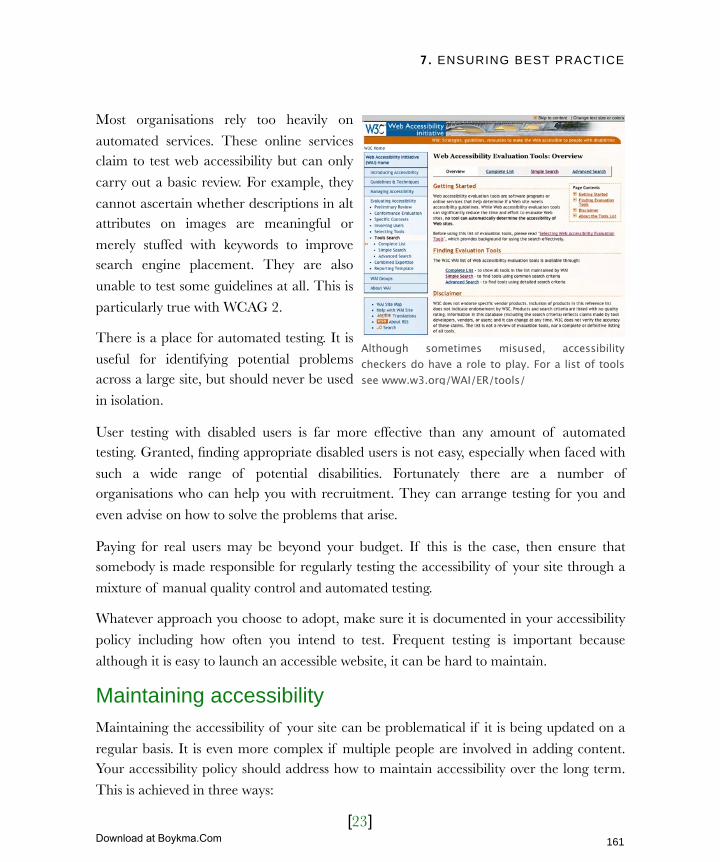
7. ENSURING BEST PRACTICE
[23]
Most organisations rely too heavily on
automated services. These online services claim to test web accessibility but can only
carry out a basic review. For example, they
cannot ascertain whether descriptions in alt attributes on images are meaningful or
merely stuffed with keywords to improve search engine placement. They are also
unable to test some guidelines at all. This is
particularly true with WCAG 2.
There is a place for automated testing. It is
useful for identifying potential problems across a large site, but should never be used
in isolation.
User testing with disabled users is far more effective than any amount of automated testing. Granted, finding appropriate disabled users is not easy, especially when faced with
such a wide range of potential disabilities. Fortunately there are a number of organisations who can help you with recruitment. They can arrange testing for you and
even advise on how to solve the problems that arise.
Paying for real users may be beyond your budget. If this is the case, then ensure that somebody is made responsible for regularly testing the accessibility of your site through a
mixture of manual quality control and automated testing.
Whatever approach you choose to adopt, make sure it is documented in your accessibility
policy including how often you intend to test. Frequent testing is important because
although it is easy to launch an accessible website, it can be hard to maintain.
Maintaining accessibilityMaintaining the accessibility of your site can be problematical if it is being updated on a
regular basis. It is even more complex if multiple people are involved in adding content. Your accessibility policy should address how to maintain accessibility over the long term.
This is achieved in three ways:
Although sometimes misused, accessibility checkers do have a role to play. For a list of tools see www.w3.org/WAI/ER/tools/
161
Licensed to Henry Vanyan <[email protected]>
Download at Boykma.Com
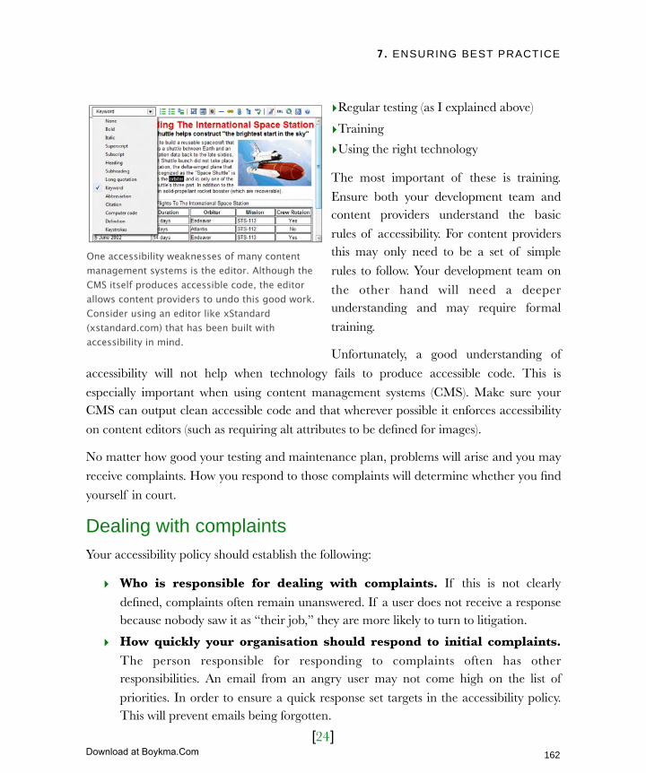
7. ENSURING BEST PRACTICE
[24]
‣Regular testing (as I explained above)
‣Training
‣Using the right technology
The most important of these is training.
Ensure both your development team and content providers understand the basic
rules of accessibility. For content providers this may only need to be a set of simple
rules to follow. Your development team on
the other hand will need a deeper understanding and may require formal
training.
Unfortunately, a good understanding of
accessibility will not help when technology fails to produce accessible code. This is
especially important when using content management systems (CMS). Make sure your CMS can output clean accessible code and that wherever possible it enforces accessibility
on content editors (such as requiring alt attributes to be defined for images).
No matter how good your testing and maintenance plan, problems will arise and you may
receive complaints. How you respond to those complaints will determine whether you find
yourself in court.
Dealing with complaintsYour accessibility policy should establish the following:
‣ Who is responsible for dealing with complaints. If this is not clearly
defined, complaints often remain unanswered. If a user does not receive a response because nobody saw it as “their job,” they are more likely to turn to litigation.
‣ How quickly your organisation should respond to initial complaints. The person responsible for responding to complaints often has other responsibilities. An email from an angry user may not come high on the list of
priorities. In order to ensure a quick response set targets in the accessibility policy. This will prevent emails being forgotten.
One accessibility weaknesses of many content management systems is the editor. Although the CMS itself produces accessible code, the editor allows content providers to undo this good work. Consider using an editor like xStandard (xstandard.com) that has been built with accessibility in mind.
162
Licensed to Henry Vanyan <[email protected]>
Download at Boykma.Com

7. ENSURING BEST PRACTICE
[25]
‣ The process for addressing a complaint. What happens when a complaint is
received? Who estimates the amount of work to fix the problem? Who signs off on
the expenditure? Who is contacted if legal advice is required? These are the kind of questions that need answering in your policy.
‣ What to do if the complaint cannot be addressed. Sometimes an
accessibility issue simply cannot be fixed or the cost of doing so would be prohibitive. In such cases a decision has to be made about how to respond. This is
where it is necessary to open a dialogue with the person complaining. Ask them how they believe the problem could be resolved? Offer them alternative methods of
getting the same information (printed brochure, phone, etc). If you can explain the
problem and offer a compromise most people are happy. The important thing is to address the complaint and not hope it goes away.
Dealing with complaints quickly and efficiently should not only avoid litigation but also create improved customer loyalty. Users who encounter problems that are then resolved
quickly view your website in a more positive light then if they had not encountered the
problem at all.
163
Licensed to Henry Vanyan <[email protected]>
Download at Boykma.Com

7. ENSURING BEST PRACTICE
[26]
Next ActionsThis chapter started by demonstrating the importance of accessibility and standards. It then went on to identify elements that you should address in these areas. The emphasis
has been on informing, rather than encouraging specific actions. That is because the
implementation of standards and accessibility is done by your development team, rather than yourself. That said, I would encourage you to complete the following three steps.
‣ Get your team onboard - The first and most important step is to ensure both
your developers and content providers understand the importance of standards and accessibility. If you are recruiting an outside agency, ensure they are using modern
techniques. If you have in-house staff, use the content of this chapter to argue for best practice and then consider training to bring people up to speed. If you don’t
convince your staff then development will be an uphill battle.
‣ Create an accessibility policy - Start by writing a rough draft yourself. Don’t worry too much about specifics at this stage but concentrate on creating a skeleton
for discussion. Next sit down with your development team and review the current
state of the site. In particular look at the common accessibility issues and identify which ones need addressing. Also discuss with your developers what is an achievable
goal for site accessibility. Finally, work with your content providers on a training program that will ensure accessibility over the long term.
‣ Finish what you start - Once you have completed the actions above consider
your long term strategy for ensuring accessibility. Draw up a periodic test plan preferably using real disabled users. Also ensure that somebody is ultimately
responsibility for the ongoing accessibility of your site. Ideally this person should come from your development team who understands the technical detail.
I recognise that some of what I have suggested in this chapter maybe overkill for smaller
organisations, but you should be able to tailor it to your needs. The key is ensuring accessibility over the long term and to a large extent that is reliant on the tools you use.
This brings us nicely on to content management systems.
164
Licensed to Henry Vanyan <[email protected]>
Download at Boykma.Com

8. TAKING CONTROL
[ 1 ]
In this chapter‣ The pros and cons
The benefits of a cms
The drawbacks of a cms
‣ Establishing your requirements
Core functionality
The editor
Managing assets
Search
Customization
User interaction
Roles and permissions
Versioning
Multiple site support
Multilingual support
‣ Examining your options
Off the shelf vs. custom built
Choosing a type of cms
‣ Making your selection
Licensing
The development team
Security
Accessibility and code quality
Documentation and training
Support
Community
165
Licensed to Henry Vanyan <[email protected]>
Download at Boykma.Com

8. TAKING CONTROL
[ 2 ]
8 Taking controlIn the early days of the web, website owners had no control over their sites. They relied on a web designer to make even the most basic change. Many web designers took advantage of this reliance, charging exorbitant fees to make even the smallest alteration to copy.
Over time things changed. You no longer needed to know HTML in order to add a phone number or correct a spelling mistake. Tools existed that helped do the job. However, they were primitive and it was still easy to ‘break’ your site.
We now have a plethora of tools at our disposal from blogs to enterprise-level content management systems. The question is no longer ‘how can I edit my website’ but ‘which tool is best for me?’
Although a content management system (cms) is not a silver bullet, it does have many benefits. This chapter explores those benefits, identifies the drawbacks and guides you through selecting the right content management system for your organisation.
Let us begin that journey by asking a simple question. Do you need a content management system?
166
Licensed to Henry Vanyan <[email protected]>
Download at Boykma.Com
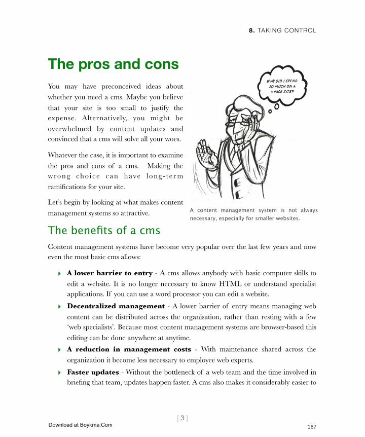
8. TAKING CONTROL
[ 3 ]
The pros and consYou may have preconceived ideas about
whether you need a cms. Maybe you believe
that your site is too small to justify the expense. Alternatively, you might be
overwhelmed by content updates and convinced that a cms will solve all your woes.
Whatever the case, it is important to examine
the pros and cons of a cms. Making the wrong cho i ce can have l ong - t e r m
ramifications for your site.
Let’s begin by looking at what makes content
management systems so attractive.
The benefits of a cmsContent management systems have become very popular over the last few years and now even the most basic cms allows:
‣ A lower barrier to entry - A cms allows anybody with basic computer skills to
edit a website. It is no longer necessary to know HTML or understand specialist applications. If you can use a word processor you can edit a website.
‣ Decentralized management - A lower barrier of entry means managing web
content can be distributed across the organisation, rather than resting with a few ‘web specialists’. Because most content management systems are browser-based this
editing can be done anywhere at anytime.
‣ A reduction in management costs - With maintenance shared across the
organization it become less necessary to employee web experts.
‣ Faster updates - Without the bottleneck of a web team and the time involved in briefing that team, updates happen faster. A cms also makes it considerably easier to
A content management system is not always necessary, especially for smaller websites.
167
Licensed to Henry Vanyan <[email protected]>
Download at Boykma.Com
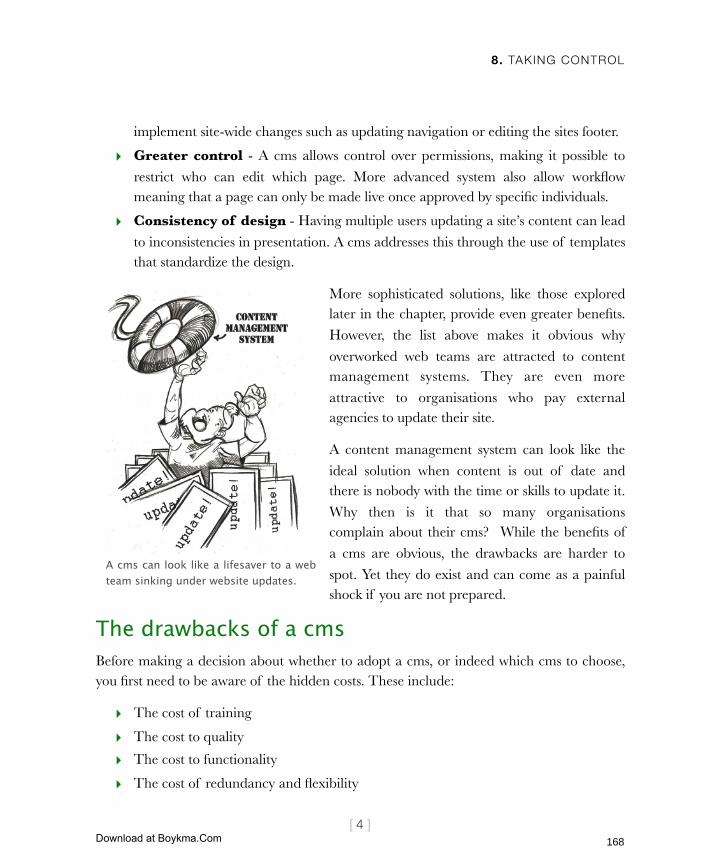
8. TAKING CONTROL
[ 4 ]
implement site-wide changes such as updating navigation or editing the sites footer.
‣ Greater control - A cms allows control over permissions, making it possible to
restrict who can edit which page. More advanced system also allow workflow meaning that a page can only be made live once approved by specific individuals.
‣ Consistency of design - Having multiple users updating a site’s content can lead
to inconsistencies in presentation. A cms addresses this through the use of templates that standardize the design.
More sophisticated solutions, like those explored later in the chapter, provide even greater benefits.
However, the list above makes it obvious why
overworked web teams are attracted to content management systems. They are even more
attractive to organisations who pay external agencies to update their site.
A content management system can look like the
ideal solution when content is out of date and there is nobody with the time or skills to update it.
Why then is it that so many organisations complain about their cms? While the benefits of
a cms are obvious, the drawbacks are harder to
spot. Yet they do exist and can come as a painful shock if you are not prepared.
The drawbacks of a cmsBefore making a decision about whether to adopt a cms, or indeed which cms to choose, you first need to be aware of the hidden costs. These include:
‣ The cost of training
‣ The cost to quality
‣ The cost to functionality
‣ The cost of redundancy and flexibility
A cms can look like a lifesaver to a web team sinking under website updates.
168
Licensed to Henry Vanyan <[email protected]>
Download at Boykma.Com

8. TAKING CONTROL
[ 5 ]
‣ The cost of commitment
It is important that you understand the impact of each.
The cost of trainingNo matter how well designed the
a p p l i c a t i o n o r h o w g o o d t h e
documentation, some level of training is required. Training is part icularly
important with free open-source systems. These tend to have less documentation
and the interface is often designed by
programmers rather than user experience experts. The result is a great learning
curve.
The more content production is delegated,
the more people it is necessary to train.
Whether this is done through onsite training or video tutorials it is still a considerable cost. Furthermore, organisations often fail to consider that training is an ongoing cost. The
more people using a system, the higher the likelihood somebody will need to be replaced.
This ongoing cost is not limited to training new cms users. Existing content provider also
require refresher courses if they are not using the cms regularly. I have often provided
training for an organisation only to receive a call six months later because people have forgotten how to login.
Ultimately the price of having a lot of people editing your site is the cost of increased training. However, that is not the only cost that grows with numbers.
Video tutorials are an effective accompaniment to training. They can be produced inexpensively using tools like Screenflow for the Mac or Camtasia Studio for Windows.
169
Licensed to Henry Vanyan <[email protected]>
Download at Boykma.Com

8. TAKING CONTROL
[ 6 ]
The cost to qualityWhat a cms gives with one hand, it often
takes away with the other. Quality and control are classic examples of this
problem. Enter pr i se - leve l content
management systems have complex workflow tools that prevent new content
from going live until it has been double checked for quality.
The problem with this is two fold. First, this
functionality is usually found in more e x p e n s i v e s y s t e m s . S e c o n d , f e w
organisations implement this kind of quality control because it creates a
bottleneck in the approval process. This
bottleneck is precisely the kind of problem a cms was supposed to solve.
This highlights a substantial problem with content management systems. They are often implemented in the hope they will solve what is an organizational rather than technical
problem. Unfortunately technology cannot solve everything.
At one extreme you can open up your cms to allow anybody to post to your site. This will lead to a decline in the quality of your content. On the other you can limit access and
create a bottleneck where only one or two individuals can make content live. The technology can offer you lots of options along that sliding scale. You need to find a happy
medium.
Of course, at least a cms offers this control, unlike an HTML-driven website. However, a non cms driven site allows more flexibility when it comes to functionality.
The cost to functionalityWhen you have a website that is not built on a cms the possibilities are endless. Because you have complete control over your code, it is possible to build any additional
Before going live many organizations insist that content is reviewed and approved. Although this maintains quality it can create a bottleneck.
170
Licensed to Henry Vanyan <[email protected]>
Download at Boykma.Com
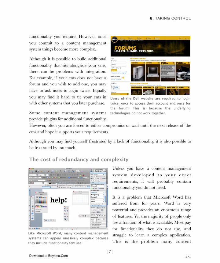
8. TAKING CONTROL
[ 7 ]
functionality you require. However, once
you commit to a content management system things become more complex.
Although it is possible to build additional
functionality that sits alongside your cms, there can be problems with integration.
For example, if your cms does not have a forum and you wish to add one, you may
have to ask users to login twice. Equally
you may find it hard to tie your cms in with other systems that you later purchase.
Some content management systems provide plugins for additional functionality.
However, often you are forced to either compromise or wait until the next release of the
cms and hope it supports your requirements.
Although you may find yourself frustrated by a lack of functionality, it is also possible to
be frustrated by too much.
The cost of redundancy and complexityUnless you have a content management
s y s t e m d e ve l o p e d t o yo u r e x a c t
requirements, it will probably contain functionality you do not need.
It is a problem that Microsoft Word has suffered from for years. Word is very
powerful and provides an enormous range
of features. Yet the majority of people only use a fraction of what is available. Most pay
for functionality they do not use, and struggle to learn a complex application.
This is the problem many content
Users of the Dell website are required to login twice, once to access their account and once for the forum. This is because the underlying technologies do not work together.
Like Microsoft Word, many content management systems can appear massively complex because they include functionality few use.
171
Licensed to Henry Vanyan <[email protected]>
Download at Boykma.Com

8. TAKING CONTROL
[ 8 ]
management systems are facing.
The reason people have not stopped using Word in favor of a simpler solution is that they are invested both financially and in time. This brings us to the final drawback of content
management systems.
The cost of commitmentContent management systems demand a high level of commitment on many fronts. These include:
‣ The upfront financial investment in implementing the system
‣ The cost and time involved in training staff
‣ The substantial amount of data entered into the system
The third area can be particularly tricky. Once your content is in a content management system, getting it out is not a simple matter.
With such an investment in both time and money it is important to make the right selection. Changing your mind later is expensive.
So am I suggesting you should avoid content management systems entirely? Not at all.
The benefits they provide are real and cannot be ignored. However, you should go into the process of selecting a content management system with your eyes wide open. A content
management system is not a magic bullet that solves all your content woes. However, it can be a useful tool if selected carefully.
How then do you make that selection? You begin by establishing your requirements.
Establishing your requirementsWhen I left home for University my mother taught me a valuable lesson. If you want to save money, never go grocery shopping when you are hungry and always write a list. If
you don’t you will be tempted to buy things you do not need.
The same principle is true when it comes to selecting a content management system. Without a clearly defined set of requirements you will be seduced by fancy functionality
172
Licensed to Henry Vanyan <[email protected]>
Download at Boykma.Com

8. TAKING CONTROL
[ 9 ]
that you will never use. Before you know it you will be buying an enterprise level system
for tens of thousands of dollars when a free blogging tool would have done.
How then do you establish your list of requirements? Although your circumstances will
vary there are ten areas that are particularly important:
‣ Core functionality
‣ The editor
‣ Managing assets
‣ Search
‣ Customization
‣ User interaction
‣ Roles and permissions
‣ Versioning
‣ Multiple site support
‣ Multilingual support
Avoid creating a wish list. Think back to Chapter 3 and the advice I gave on writing
a brief. Keep your requirements to a
minimum but at the same time keep an eye on the future. On one hand you don’t want
to pay for functionality you never use. On the other, you don’t want to be stuck with a
content management system that no longer
meets your needs.
Let’s look at the areas you should consider.
Core functionalityWhen most people think of content management, they think of the creation,
deletion, editing and organizing of pages.
They assume all content management systems do this and take this functionality for granted. That is not necessarily the case. There is also no guarantee that it is done in an
intuitive fashion.
Carefully consider your requirements before looking at content management systems. This will ensure you are not seduced by unwanted features.
173
Licensed to Henry Vanyan <[email protected]>
Download at Boykma.Com
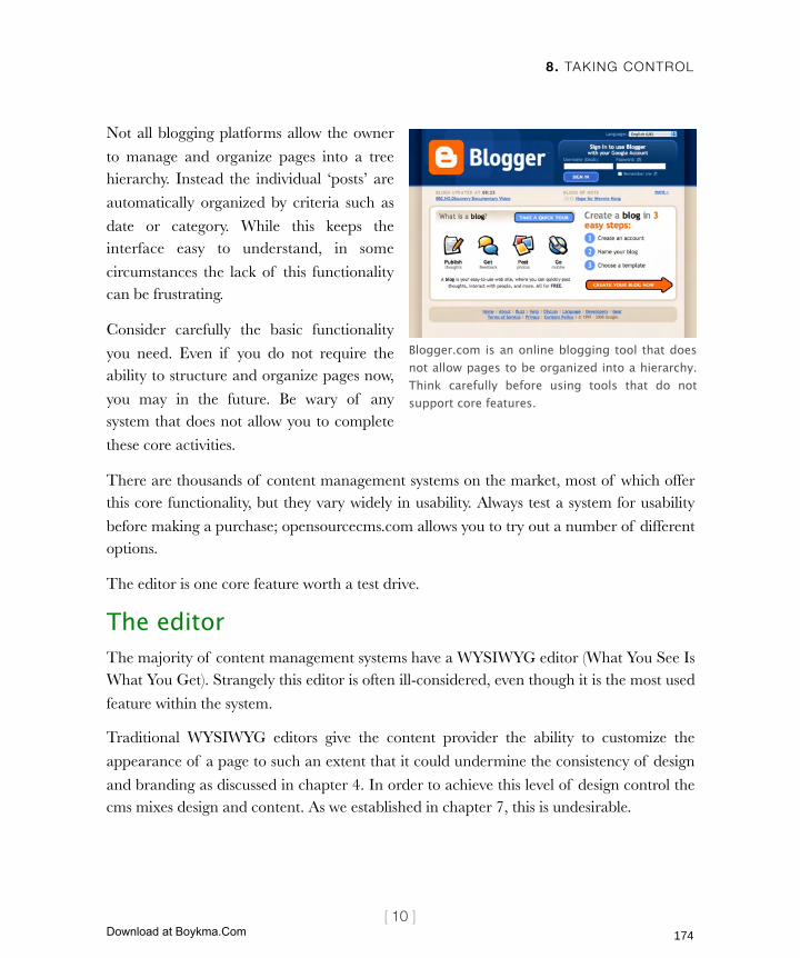
8. TAKING CONTROL
[ 10 ]
Not all blogging platforms allow the owner
to manage and organize pages into a tree hierarchy. Instead the individual ‘posts’ are
automatically organized by criteria such as
date or category. While this keeps the interface easy to understand, in some
circumstances the lack of this functionality can be frustrating.
Consider carefully the basic functionality
you need. Even if you do not require the ability to structure and organize pages now,
you may in the future. Be wary of any system that does not allow you to complete
these core activities.
There are thousands of content management systems on the market, most of which offer this core functionality, but they vary widely in usability. Always test a system for usability
before making a purchase; opensourcecms.com allows you to try out a number of different options.
The editor is one core feature worth a test drive.
The editorThe majority of content management systems have a WYSIWYG editor (What You See Is What You Get). Strangely this editor is often ill-considered, even though it is the most used
feature within the system.
Traditional WYSIWYG editors give the content provider the ability to customize the
appearance of a page to such an extent that it could undermine the consistency of design
and branding as discussed in chapter 4. In order to achieve this level of design control the cms mixes design and content. As we established in chapter 7, this is undesirable.
Blogger.com is an online blogging tool that does not allow pages to be organized into a hierarchy. Think carefully before using tools that do not support core features.
174
Licensed to Henry Vanyan <[email protected]>
Download at Boykma.Com
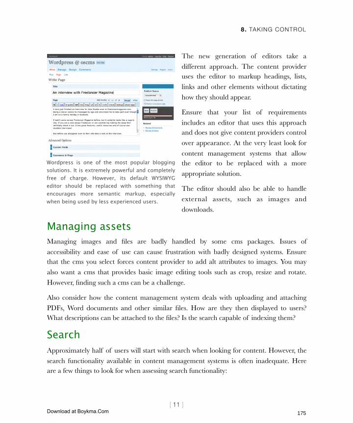
8. TAKING CONTROL
[ 11 ]
The new generation of editors take a
different approach. The content provider uses the editor to markup headings, lists,
links and other elements without dictating
how they should appear.
Ensure that your list of requirements
includes an editor that uses this approach and does not give content providers control
over appearance. At the very least look for
content management systems that allow the editor to be replaced with a more
appropriate solution.
The editor should also be able to handle
external assets, such as images and
downloads.
Managing assetsManaging images and files are badly handled by some cms packages. Issues of
accessibility and ease of use can cause frustration with badly designed systems. Ensure that the cms you select forces content provider to add alt attributes to images. You may
also want a cms that provides basic image editing tools such as crop, resize and rotate.
However, finding such a cms can be a challenge.
Also consider how the content management system deals with uploading and attaching
PDFs, Word documents and other similar files. How are they then displayed to users? What descriptions can be attached to the files? Is the search capable of indexing them?
Search Approximately half of users will start with search when looking for content. However, the
search functionality available in content management systems is often inadequate. Here are a few things to look for when assessing search functionality:
Wordpress is one of the most popular blogging solutions. It is extremely powerful and completely free of charge. However, its default WYSIWYG editor should be replaced with something that encourages more semantic markup, especially when being used by less experienced users.
175
Licensed to Henry Vanyan <[email protected]>
Download at Boykma.Com
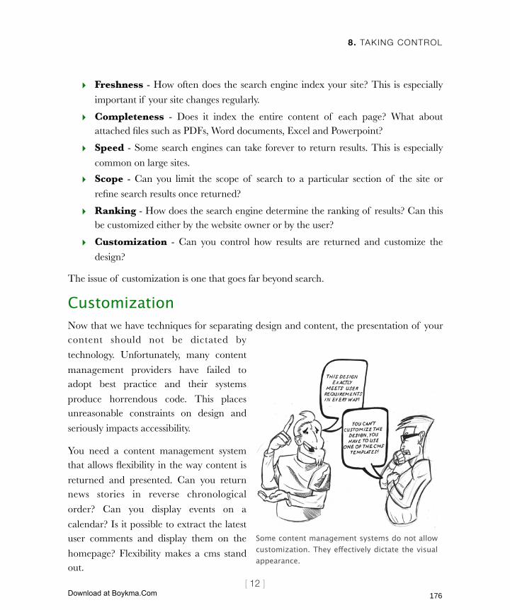
8. TAKING CONTROL
[ 12 ]
‣ Freshness - How often does the search engine index your site? This is especially
important if your site changes regularly.
‣ Completeness - Does it index the entire content of each page? What about attached files such as PDFs, Word documents, Excel and Powerpoint?
‣ Speed - Some search engines can take forever to return results. This is especially
common on large sites.
‣ Scope - Can you limit the scope of search to a particular section of the site or
refine search results once returned?
‣ Ranking - How does the search engine determine the ranking of results? Can this be customized either by the website owner or by the user?
‣ Customization - Can you control how results are returned and customize the
design?
The issue of customization is one that goes far beyond search.
CustomizationNow that we have techniques for separating design and content, the presentation of your content should not be dictated by
technology. Unfortunately, many content
management providers have failed to adopt best practice and their systems
produce horrendous code. This places unreasonable constraints on design and
seriously impacts accessibility.
You need a content management system that allows flexibility in the way content is
returned and presented. Can you return news stories in reverse chronological
order? Can you display events on a
calendar? Is it possible to extract the latest user comments and display them on the
homepage? Flexibility makes a cms stand out.
Some content management systems do not allow customization. They effectively dictate the visual appearance.
176
Licensed to Henry Vanyan <[email protected]>
Download at Boykma.Com

8. TAKING CONTROL
[ 13 ]
Talking of user comments, it is worth mentioning all forms of user interactions.
User interactionChapter 11 will explore the different options available for interacting with your users. However, some consideration needs to be given to the subject now. If you intend to gather
user feedback, your cms must provide that functionality or allow third-party plugins to do
so. Equally, if you want a community on your site then you will require functionality such as chat, forums, comments and ratings.
As a minimum you will require the ability to post forms and collect the responses.
How easy does the cms make this process?
Can you customize the fields or does that require technical expertise? What about
the results? Can you specify who they are emailed to? Can they be written to a
database or outputted as an Excel
document? Cons ider the type o f functionality that you will require and look
for a cms that supports that.
Ask what tools exist for communicating
with your customers. Can you send email
newsletters? Can recipients be organized into groups who are mailed individually?
What about news feeds and RSS?
Finally consider how you want users to be
managed. Do you need to reset passwords or set permissions? Do you need to be able to
export user information into other systems?
But it is not just user permissions that may need managing. You also have to consider
permissions for those editing the site.
RSS feeds allow users to keep up-to-date with changes on lots of websites without
visiting each site individually. This is most commonly used for news stories.
Each time a new story is published the
sites RSS feed is updated. If users have ‘subscribed’ to that feed using a piece of
software called a news aggregator, they will be notified of the change.
RSS feeds are still growing in popularity
b u t a r e q u i c k l y b e c o m i n g a n indispensable feature of any cms.
177
Licensed to Henry Vanyan <[email protected]>
Download at Boykma.Com
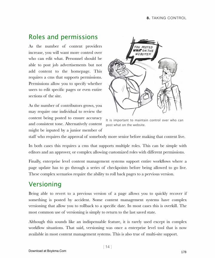
8. TAKING CONTROL
[ 14 ]
Roles and permissionsAs the number of content providers
increase, you will want more control over who can edit what. Personnel should be
able to post job advertisements but not
add content to the homepage. This requires a cms that supports permissions.
Permissions allow you to specify whether users to edit specific pages or even entire
sections of the site.
As the number of contributors grows, you may require one individual to review the
content being posted to ensure accuracy and consistent tone. Alternatively content
might be inputed by a junior member of
staff who requires the approval of somebody more senior before making that content live.
In both cases this requires a cms that supports multiple roles. This can be simple with
editors and an approver, or complex allowing customized roles with different permissions.
Finally, enterprise level content management systems support entire workflows where a
page update has to go through a series of checkpoints before being allowed to go live.
These complex scenarios require the ability to roll back pages to a pervious version.
VersioningBeing able to revert to a previous version of a page allows you to quickly recover if
something is posted by accident. Some content management systems have complex versioning that allow you to rollback to a specific date. In most cases this is overkill. The
most common use of versioning is simply to return to the last saved state.
Although this sounds like an indispensable feature, it is rarely used except in complex workflow situations. That said, versioning was once a enterprise level tool that is now
available in most content management systems. This is also true of multi-site support.
It is important to maintain control over who can post what on the website.
178
Licensed to Henry Vanyan <[email protected]>
Download at Boykma.Com

8. TAKING CONTROL
[ 15 ]
Multiple site supportWith more content management systems
allowing you to run multiple websites from the same installation, this is a must-
have feature.
Although you may not currently need to manage more than a single site, that
could change. You may decide to launch a new site targeting a different audience.
With the growth of the mobile web, you
may create a separate site designed for mobile devices. Whatever the reason,
having the flexibility to run multiple websites is important.
Another feature that you may not require immediately but could need in the future is
multilingual support.
Multilingual supportIt is easy to dismiss the need to support multiple languages. Your site may be
targeted specifically at the domestic market or you may sell a language-specific
product. Even if your product is language
specific, that could change. It is important that your cms can grow with your business
and changing requirements.
Just because you are targeting the domestic
market does not mean you can ignore
language. We live in a multicultural society where numerous languages are spoken.
Being able to accommodate these differences provides a significant edge on your competition.
Even blogging tools like Movable Type (featured above) and Wordpress now support the management of multiple websites.
Just because your CMS supports multiple languages does not mean you will be able to deliver a multilingual website.
179
Licensed to Henry Vanyan <[email protected]>
Download at Boykma.Com
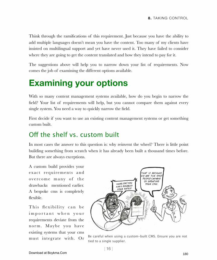
8. TAKING CONTROL
[ 16 ]
Think through the ramifications of this requirement. Just because you have the ability to
add multiple languages doesn’t mean you have the content. Too many of my clients have insisted on multilingual support and yet have never used it. They have failed to consider
where they are going to get the content translated and how they intend to pay for it.
The suggestions above will help you to narrow down your list of requirements. Now comes the job of examining the different options available.
Examining your optionsWith so many content management systems available, how do you begin to narrow the
field? Your list of requirements will help, but you cannot compare them against every single system. You need a way to quickly narrow the field.
First decide if you want to use an existing content management systems or get something custom built.
Off the shelf vs. custom builtIn most cases the answer to this question is: why reinvent the wheel? There is little point
building something from scratch when it has already been built a thousand times before. But there are always exceptions.
A custom build provides your exac t requ i rement s and
ove rc o m e m a ny o f t h e
drawbacks mentioned earlier. A bespoke cms is completely
flexible.
T h i s fl e x i b i l i t y c a n b e
i m p o r t a n t w h e n y o u r
requirements deviate from the nor m. Maybe you have
existing systems that your cms must integrate with. Or Be careful when using a custom-built CMS. Ensure you are not
tied to a single supplier.
180
Licensed to Henry Vanyan <[email protected]>
Download at Boykma.Com

8. TAKING CONTROL
[ 17 ]
perhaps you have an unusual business model that requires your site to work in a different
way. The more your requirements differ from others’ the less likely an off the shelf system will work for you.
Unfortunately a custom content management system can be expensive. However, that is
not their only weakness. Without careful planning you can find yourself tied to the developer who built the system.
If you are running an off-the-shelf content management system (especially one of the more well known names) it is relatively easy to change developers if you are unhappy with
the service you have received. However, this is not the case with bespoke builds.
Without careful documentation it can be hard for one developer to understand the code of another. If you decide to use a bespoke system, ensure that the developer provides
adequate documentation so that this problem is avoided. Also ask what technology is being used and call around to see if others can support that programming language. If
your developer chooses an obscure language you may have problems finding somebody
who can write the same language.
In most cases the answer is to work with an off-the-shelf system. If that is your choice,
how do you go about narrowing the field?
Choosing a type of cmsContent management systems fall into several broad categories. Although individual
systems vary within these categories, each has certain general characteristics. By matching
your requirements to one of these broad categories you help narrow the field considerably. These categories are:
‣ Desktop applications
‣ Partial content management systems
‣ Blogs
‣ Enterprise level content management systems
Let us look at the characteristics of each and what features they support.
181
Licensed to Henry Vanyan <[email protected]>
Download at Boykma.Com

8. TAKING CONTROL
[ 18 ]
Desktop applicationsSome argue that desktop applications are
not content management systems because they do not manage your content online.
However, they do ‘manage content’ and
so are worth mentioning.
Products l ike Adobe Contribute,
Dreamweaver or Microsoft Expression fall into this category. They tend to be
relatively cheap, require no special
technology on your web server and are easy to setup.
Desktop applications normally provide an excellent editor, and more modern versions also place the emphasis on marking up the
meaning of content rather than defining its appearance. However, these applications can
fall down on core functionality. Adding and deleting pages can become painful when working with large numbers of pages.
Beyond editing their use is limited. Some offer basic permissions but nothing in terms of versioning, search or multi-lingual support.
The use of desktop applications should be restricted to sites that change infrequently.
Partial content management systemsMost webpages rarely change. It is only specific sections that need updating on a regular basis. There is no reason why your entire website needs to be built using a content
management system. It is possible to combine a desktop application with partial systems to deal with specific functionality. There are excellent tools for managing news, events,
communities and search.
The downside of this approach is that it can be hard to get these various tools talking to one another. This can become complicated if you use a number of them together.
Despite the number of available tools, they don’t cover functionality like versioning,
Adobe Contribute is an excellent desktop application for the less experienced content contributor.
182
Licensed to Henry Vanyan <[email protected]>
Download at Boykma.Com

8. TAKING CONTROL
[ 19 ]
permissions, multi site or multilingual
support.
That said, they are perfect when you have
one or two areas of your site that need
updating or where you require community features.
BlogsBlogs are the most common form of content management . Their core
functionality is to publish a series of pages
sorted by category and date. This is ideal for managing regularly updated news.
Recently blogs have become considerably more powerful, allowing for the ordering of pages into hierarchical structures. Many now offer plugin support allowing the integration
of additional functionality.
Blogs normally come with a basic editor that emphasizes appearance over meaning. It may therefore be necessary to replace the
editor with something more advanced. Although most blogs support a basic level
of permissions they do not generally offer
versioning.
They also lack multi-lingual support, but
do allow the management of multiple websites. They provide an adequate search
f u n c t i o n a n d a l l o w e x t e n s i v e
customization.
Blogs are often perfectly adequate for
smaller organisations. They are especially good at dealing with constantly updating
news stories. For larger organisations a full
Blogging software like Wordpress is installed on your own web server. Alternatively you can use a system like Typepad which is hosted for you. This is ideal if you do not have a web server capable of hosting software. We explore these concepts further in chapter 9.
The Vanilla forum (getvanilla.com) is just one of many solutions that provide a portion of the functionality offered by a full content management system.
183
Licensed to Henry Vanyan <[email protected]>
Download at Boykma.Com
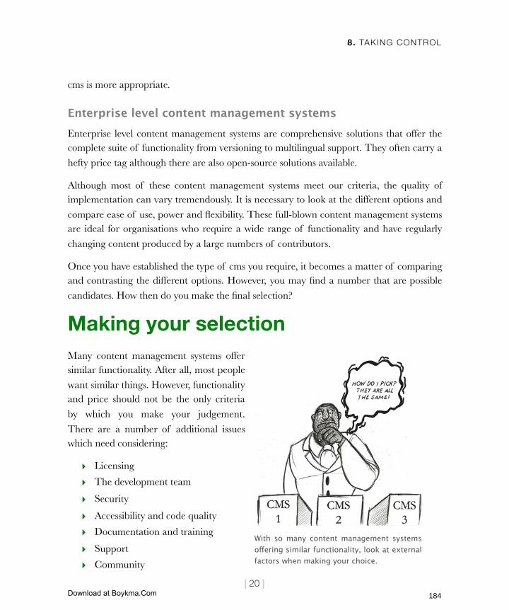
8. TAKING CONTROL
[ 20 ]
cms is more appropriate.
Enterprise level content management systemsEnterprise level content management systems are comprehensive solutions that offer the complete suite of functionality from versioning to multilingual support. They often carry a
hefty price tag although there are also open-source solutions available.
Although most of these content management systems meet our criteria, the quality of implementation can vary tremendously. It is necessary to look at the different options and
compare ease of use, power and flexibility. These full-blown content management systems are ideal for organisations who require a wide range of functionality and have regularly
changing content produced by a large numbers of contributors.
Once you have established the type of cms you require, it becomes a matter of comparing and contrasting the different options. However, you may find a number that are possible
candidates. How then do you make the final selection?
Making your selectionMany content management systems offer similar functionality. After all, most people
want similar things. However, functionality and price should not be the only criteria
by which you make your judgement.
There are a number of additional issues which need considering:
‣ Licensing
‣ The development team
‣ Security
‣ Accessibility and code quality
‣ Documentation and training
‣ Support
‣ Community
With so many content management systems offering similar functionality, look at external factors when making your choice.
184
Licensed to Henry Vanyan <[email protected]>
Download at Boykma.Com
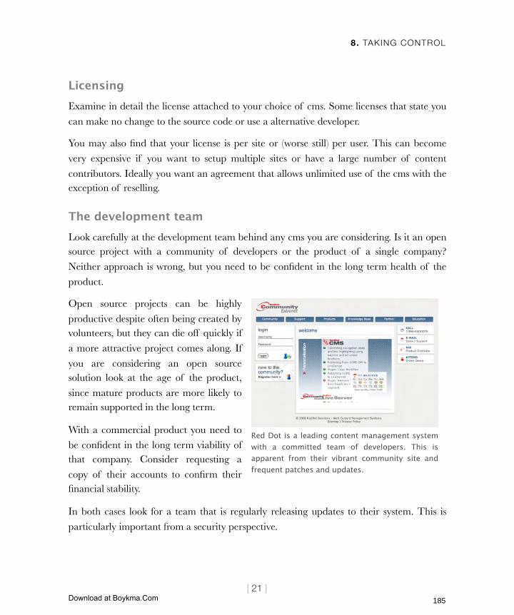
8. TAKING CONTROL
[ 21 ]
LicensingExamine in detail the license attached to your choice of cms. Some licenses that state you
can make no change to the source code or use a alternative developer.
You may also find that your license is per site or (worse still) per user. This can become
very expensive if you want to setup multiple sites or have a large number of content
contributors. Ideally you want an agreement that allows unlimited use of the cms with the exception of reselling.
The development teamLook carefully at the development team behind any cms you are considering. Is it an open source project with a community of developers or the product of a single company?
Neither approach is wrong, but you need to be confident in the long term health of the
product.
Open source projects can be highly
productive despite often being created by volunteers, but they can die off quickly if
a more attractive project comes along. If
you are considering an open source solution look at the age of the product,
since mature products are more likely to remain supported in the long term.
With a commercial product you need to
be confident in the long term viability of that company. Consider requesting a
copy of their accounts to confirm their financial stability.
In both cases look for a team that is regularly releasing updates to their system. This is
particularly important from a security perspective.
Red Dot is a leading content management system with a committed team of developers. This is apparent from their vibrant community site and frequent patches and updates.
185
Licensed to Henry Vanyan <[email protected]>
Download at Boykma.Com
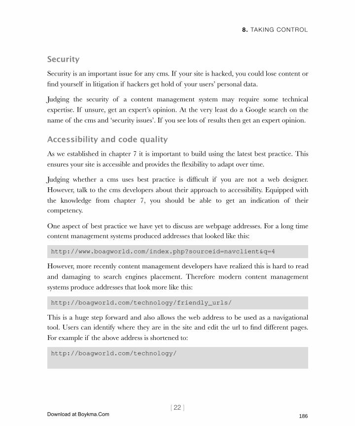
8. TAKING CONTROL
[ 22 ]
SecuritySecurity is an important issue for any cms. If your site is hacked, you could lose content or
find yourself in litigation if hackers get hold of your users’ personal data.
Judging the security of a content management system may require some technical
expertise. If unsure, get an expert’s opinion. At the very least do a Google search on the
name of the cms and ‘security issues’. If you see lots of results then get an expert opinion.
Accessibility and code qualityAs we established in chapter 7 it is important to build using the latest best practice. This
ensures your site is accessible and provides the flexibility to adapt over time.
Judging whether a cms uses best practice is difficult if you are not a web designer.
However, talk to the cms developers about their approach to accessibility. Equipped with
the knowledge from chapter 7, you should be able to get an indication of their competency.
One aspect of best practice we have yet to discuss are webpage addresses. For a long time content management systems produced addresses that looked like this:
http://www.boagworld.com/index.php?sourceid=navclient&q=4
However, more recently content management developers have realized this is hard to read
and damaging to search engines placement. Therefore modern content management
systems produce addresses that look more like this:
http://boagworld.com/technology/friendly_urls/
This is a huge step forward and also allows the web address to be used as a navigational tool. Users can identify where they are in the site and edit the url to find different pages.
For example if the above address is shortened to:
http://boagworld.com/technology/
186
Licensed to Henry Vanyan <[email protected]>
Download at Boykma.Com

8. TAKING CONTROL
[ 23 ]
it will return all pages within the technology
section.
Whenever possible look for systems that support
friendly urls. They are a good feature to have
and provide an indication of how up-to-date the practices of the developers are. If a cms
supports friendly urls they may well support accessibility and standards too.
Additional information on best practice should
a l so be made ava i l ab l e th rough the documentation that supports the cms. This too is
an important differentiating factor.
Documentation and trainingGood documentation is a crucial component of
any cms. As I have already said, content providers may not be using the system on a daily
basis. They can easily forget how it works. Documentation should therefore be comprehensive and easy to use. Some content management systems also provide
walkthroughs and video tutorials. These help users better understand how the system operates.
There should also be documentation for developers too. This will enable your web team to
adapt the cms to better suit your needs. Without this it can be nearly impossible to work out how the cms can be customized.
Alongside documentation, training is another useful resource. This is important for content providers who need more than a manual before they start using the system.
Training provides them with hands on experience and the opportunity to ask questions.
No matter how good the cms and supporting documentation, there are occasions when you will require additional support.
Use what you have learnt from Chapter 7 to speak with cms suppliers about their approach to accessibility and standards.
187
Licensed to Henry Vanyan <[email protected]>
Download at Boykma.Com
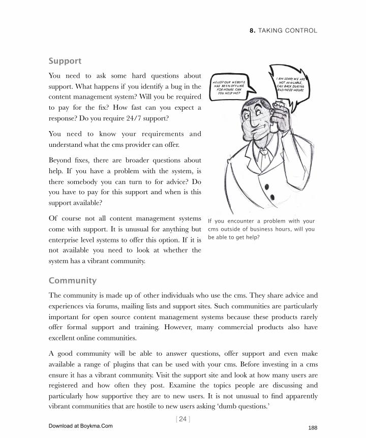
8. TAKING CONTROL
[ 24 ]
SupportYou need to ask some hard questions about
support. What happens if you identify a bug in the content management system? Will you be required
to pay for the fix? How fast can you expect a
response? Do you require 24/7 support?
You need to know your requirements and
understand what the cms provider can offer.
Beyond fixes, there are broader questions about
help. If you have a problem with the system, is
there somebody you can turn to for advice? Do you have to pay for this support and when is this
support available?
Of course not all content management systems
come with support. It is unusual for anything but
enterprise level systems to offer this option. If it is not available you need to look at whether the
system has a vibrant community.
CommunityThe community is made up of other individuals who use the cms. They share advice and
experiences via forums, mailing lists and support sites. Such communities are particularly
important for open source content management systems because these products rarely offer formal support and training. However, many commercial products also have
excellent online communities.
A good community will be able to answer questions, offer support and even make
available a range of plugins that can be used with your cms. Before investing in a cms
ensure it has a vibrant community. Visit the support site and look at how many users are registered and how often they post. Examine the topics people are discussing and
particularly how supportive they are to new users. It is not unusual to find apparently vibrant communities that are hostile to new users asking ‘dumb questions.’
If you encounter a problem with your cms outside of business hours, will you be able to get help?
188
Licensed to Henry Vanyan <[email protected]>
Download at Boykma.Com

8. TAKING CONTROL
[ 25 ]
Next ActionsThis chapter has provided all the techniques you need to narrow down the thousands of content management systems to a handful of options. However, a final selection needs to
be made and the choice implemented. This can be achieved in the following steps:
‣ Action 1: Get familiar - Although reading about a content management system is important, you must see the system in action and if possible have some ‘hands on’
time with it yourself. If you are buying the cms from a provider then ask them to
setup a test installation so you can use the system yourself. If you are using an open source program then try out their online demonstration and watch any video
tutorials they have. Do everything you can to become familiar with the system.
‣ Action 2: Collect references - Unfortunately no demonstration can tell you
what it will be like to use on a daily basis. Speak to existing customers. Ask them
about their experiences of using the system and the installation process. Ask about the systems flexibility and ease of use. Bear in mind that nobody likes every aspect
of their cms, so take their answers with a pinch of salt.
‣ Action 3: Plan the implementation - Once the selection has been made it is necessary to set up your system. Do not underestimate this task. Not only does the
system need to be installed and configured, you have to customize the templates and add your content. Work closely with your development team to establish
timescales and don’t forget to leave adequate time for testing and bug fixing. Do not
be surprised if it takes considerably longer than you expected.
One of the big problems you will encounter when choosing a content management system
is ‘techno babble.’ Techno babble is the jargon thrown at you by developers when talking about technology. The next chapter will help you decode this foreign language.
189
Licensed to Henry Vanyan <[email protected]>
Download at Boykma.Com
9. DECODING TECHNOBABBLE
[1]
In this chapter‣ Understanding the web
From the web to your PC
Why can’t you see my site when I can?
Why is my site down?
Why is my site so slow?
How web pages are built
What is a database?
What is a server side language?
Web 2.0, AJAX and other buzzwords
‣ Grappling with the browser
Different browsers, different bugs
Browser plugins
‣ Hosting your site
Assessing server requirements
Finding the right hosting package
Dedicated hosting
Shared hosting
Assessing hosting companies
Uptime
Support
The control panel
Limitations on growth
Hidden changes
190
Licensed to Henry Vanyan <[email protected]>
Download at Boykma.Com

9. DECODING TECHNOBABBLE
[2]
9 Decoding technobabbleWeb developers are very precise people. This is necessary to explain
complex concepts in a clear way to other developers. Inaccuracy and oversimplification cause mistakes and confusion.
Web developers are going to hate this chapter.
The problem is that they have developed their own language to explain
these complex technologies and concepts. AJAX, Web Services, XML,
Schemas, Domains, Client side, MYSQL, the list goes on. Although these terms are meaningful to web developers, they sound like technobabble to
everybody else.
The reason web developers will hate this chapter is because I oversimplify
things to make them intelligible. As a result, some of what I explain will
only be part of a larger picture. However, it is more important to grasp the concepts than understand the specifics. It is this compromise many
web developers fail to make.
In this chapter I aim to decode the technobabble and explain how the web
works, including concepts you need to understand, such as the
peculiarities of browsers, terms like client side and server side, hosting, and buzzwords like AJAX and web 2.0.
Let us begin by looking at how the web works.
191
Licensed to Henry Vanyan <[email protected]>
Download at Boykma.Com
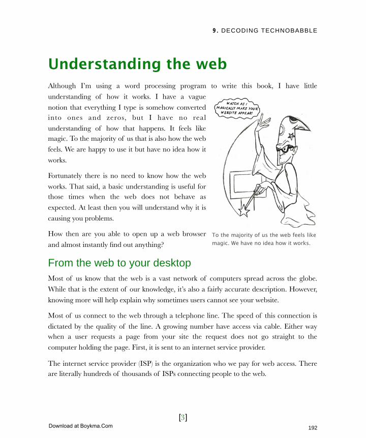
9. DECODING TECHNOBABBLE
[3]
Understanding the webAlthough I’m using a word processing program to write this book, I have little
understanding of how it works. I have a vague
notion that everything I type is somehow converted into ones and zeros, but I have no real
understanding of how that happens. It feels like magic. To the majority of us that is also how the web
feels. We are happy to use it but have no idea how it
works.
Fortunately there is no need to know how the web
works. That said, a basic understanding is useful for those times when the web does not behave as
expected. At least then you will understand why it is
causing you problems.
How then are you able to open up a web browser
and almost instantly find out anything?
From the web to your desktopMost of us know that the web is a vast network of computers spread across the globe.
While that is the extent of our knowledge, it’s also a fairly accurate description. However,
knowing more will help explain why sometimes users cannot see your website.
Most of us connect to the web through a telephone line. The speed of this connection is
dictated by the quality of the line. A growing number have access via cable. Either way when a user requests a page from your site the request does not go straight to the
computer holding the page. First, it is sent to an internet service provider.
The internet service provider (ISP) is the organization who we pay for web access. There are literally hundreds of thousands of ISPs connecting people to the web.
To the majority of us the web feels like magic. We have no idea how it works.
192
Licensed to Henry Vanyan <[email protected]>
Download at Boykma.Com

9. DECODING TECHNOBABBLE
[4]
The primary job of the ISP is to pass on a request for a page to the computer holding that
page. It first needs to know where that computer is and to do that it needs to contact a domain name server.
Every computer connected to the internet has a unique number that identifies it, called an
IP Address. Think of this as the computer’s telephone number. Try opening a web browser and typing 72.14.207.99 into the address bar. You will be taken to Google.
IP addresses are hard to remember, so we normally type
a d o m a i n n a m e s u ch a s
google.com. The domain name server is a computer that
matches domain names with IP addresses. Once it has converted
the domain name (Google.com)
to an IP Address (72.14.207.99) and informed your ISP, the ISP
will send your request for the web page to the web server.
The web server is the computer
which holds your website. It is not very different from your home computer and, with the right software, it is possible to host a website on your home computer. Once the web
server receives a request from the user it will find the specific page and pass all of its files to the user via his ISP. The web page then appears in the user’s browser.
All of this happens in a few milliseconds. The request for a page and the page itself pass
around the globe almost instantaneously, bridging oceans and crossing continents. It is not surprising that there are occasional problems. Three of the most common issues are:
‣ Domain name redirection
‣ Connection issues
‣ Slow download
There are many steps involved in downloading a web page. Unfortunately there are also many things that can go wrong.
193
Licensed to Henry Vanyan <[email protected]>
Download at Boykma.Com
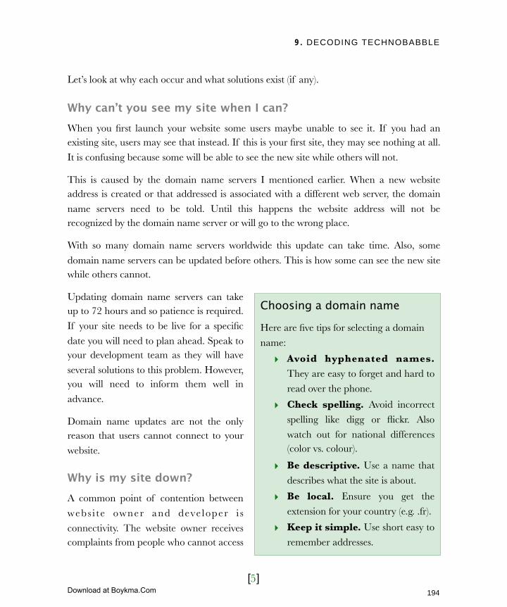
9. DECODING TECHNOBABBLE
[5]
Let’s look at why each occur and what solutions exist (if any).
Why can’t you see my site when I can?When you first launch your website some users maybe unable to see it. If you had an existing site, users may see that instead. If this is your first site, they may see nothing at all.
It is confusing because some will be able to see the new site while others will not.
This is caused by the domain name servers I mentioned earlier. When a new website address is created or that addressed is associated with a different web server, the domain
name servers need to be told. Until this happens the website address will not be recognized by the domain name server or will go to the wrong place.
With so many domain name servers worldwide this update can take time. Also, some
domain name servers can be updated before others. This is how some can see the new site while others cannot.
Updating domain name servers can take up to 72 hours and so patience is required.
If your site needs to be live for a specific
date you will need to plan ahead. Speak to your development team as they will have
several solutions to this problem. However, you will need to inform them well in
advance.
Domain name updates are not the only reason that users cannot connect to your
website.
Why is my site down?A common point of contention between
webs i t e owner and deve loper i s
connectivity. The website owner receives complaints from people who cannot access
Choosing a domain name
Here are five tips for selecting a domain
name:
‣ Avoid hyphenated names. They are easy to forget and hard to
read over the phone.
‣ Check spelling. Avoid incorrect
spelling like digg or flickr. Also
watch out for national differences (color vs. colour).
‣ Be descriptive. Use a name that
describes what the site is about.
‣ Be local. Ensure you get the
extension for your country (e.g. .fr).
‣ Keep it simple. Use short easy to
remember addresses.
194
Licensed to Henry Vanyan <[email protected]>
Download at Boykma.Com
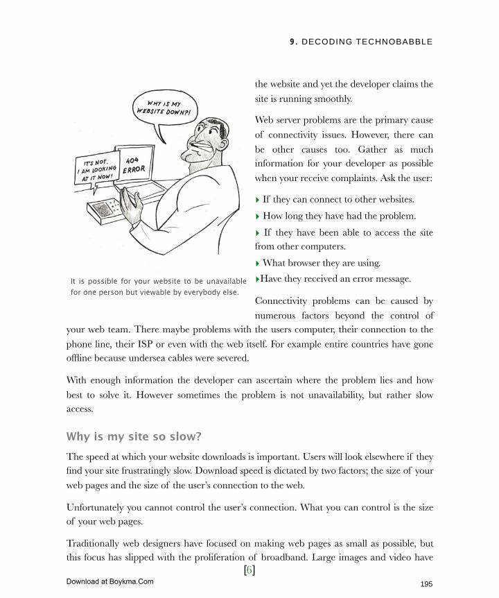
9. DECODING TECHNOBABBLE
[6]
the website and yet the developer claims the
site is running smoothly.
Web server problems are the primary cause
of connectivity issues. However, there can
be other causes too. Gather as much information for your developer as possible
when your receive complaints. Ask the user:
‣ If they can connect to other websites.
‣ How long they have had the problem.
‣ If they have been able to access the site from other computers.
‣ What browser they are using.
‣Have they received an error message.
Connectivity problems can be caused by
numerous factors beyond the control of your web team. There maybe problems with the users computer, their connection to the
phone line, their ISP or even with the web itself. For example entire countries have gone offline because undersea cables were severed.
With enough information the developer can ascertain where the problem lies and how
best to solve it. However sometimes the problem is not unavailability, but rather slow access.
Why is my site so slow?The speed at which your website downloads is important. Users will look elsewhere if they find your site frustratingly slow. Download speed is dictated by two factors; the size of your
web pages and the size of the user’s connection to the web.
Unfortunately you cannot control the user’s connection. What you can control is the size of your web pages.
Traditionally web designers have focused on making web pages as small as possible, but this focus has slipped with the proliferation of broadband. Large images and video have
It is possible for your website to be unavailable for one person but viewable by everybody else.
195
Licensed to Henry Vanyan <[email protected]>
Download at Boykma.Com
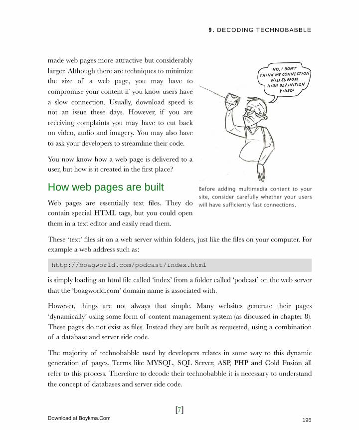
9. DECODING TECHNOBABBLE
[7]
made web pages more attractive but considerably
larger. Although there are techniques to minimize the size of a web page, you may have to
compromise your content if you know users have
a slow connection. Usually, download speed is not an issue these days. However, if you are
receiving complaints you may have to cut back on video, audio and imagery. You may also have
to ask your developers to streamline their code.
You now know how a web page is delivered to a user, but how is it created in the first place?
How web pages are builtWeb pages are essentially text files. They do contain special HTML tags, but you could open
them in a text editor and easily read them.
These ‘text’ files sit on a web server within folders, just like the files on your computer. For example a web address such as:
http://boagworld.com/podcast/index.html
is simply loading an html file called ‘index’ from a folder called ‘podcast’ on the web server
that the ‘boagworld.com’ domain name is associated with.
However, things are not always that simple. Many websites generate their pages
‘dynamically’ using some form of content management system (as discussed in chapter 8).
These pages do not exist as files. Instead they are built as requested, using a combination of a database and server side code.
The majority of technobabble used by developers relates in some way to this dynamic generation of pages. Terms like MYSQL, SQL Server, ASP, PHP and Cold Fusion all
refer to this process. Therefore to decode their technobabble it is necessary to understand
the concept of databases and server side code.
Before adding multimedia content to your site, consider carefully whether your users will have sufficiently fast connections.
196
Licensed to Henry Vanyan <[email protected]>
Download at Boykma.Com

9. DECODING TECHNOBABBLE
[8]
What is a database?A database is a receptacle for holding
information. It does this using tables, rows and columns. If you have used Microsoft
Access or Excel you are already familiar
with databases.
Content management systems use a
database to hold information about your site. Every title, keyword, or other piece of
information on a specific web page is held in the database.
There are many different types of databases from an Excel file to a massive Oracle database used on large, heavily trafficked websites. The majority of websites use either
MYSQL or SQL Sever. The developer’s choice is normally based on personal preference, restrictions of the web server, and which server side language is being used.
What is a server side language?A server side language is code
that runs on the web server. This ‘code’ can be written to fulfill a
variety of tasks. The most common role is to extract
content from a database and turn
it into an HTML page. The code identifies the page the user
wants, collects the appropriate information from the database
and turns this content into
HTML before passing it back to the user.
If you have used Numbers on the mac or Excel on the PC, you have an idea of how a database works.
The most common function of server side code is to extract content from a database and deliver it as HTML to the user’s browser.
197
Licensed to Henry Vanyan <[email protected]>
Download at Boykma.Com
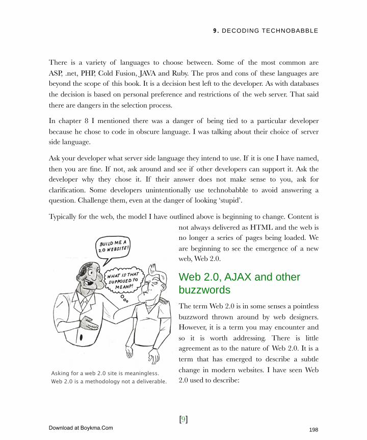
9. DECODING TECHNOBABBLE
[9]
There is a variety of languages to choose between. Some of the most common are
ASP, .net, PHP, Cold Fusion, JAVA and Ruby. The pros and cons of these languages are beyond the scope of this book. It is a decision best left to the developer. As with databases
the decision is based on personal preference and restrictions of the web server. That said
there are dangers in the selection process.
In chapter 8 I mentioned there was a danger of being tied to a particular developer
because he chose to code in obscure language. I was talking about their choice of server side language.
Ask your developer what server side language they intend to use. If it is one I have named,
then you are fine. If not, ask around and see if other developers can support it. Ask the developer why they chose it. If their answer does not make sense to you, ask for
clarification. Some developers unintentionally use technobabble to avoid answering a question. Challenge them, even at the danger of looking ‘stupid’.
Typically for the web, the model I have outlined above is beginning to change. Content is
not always delivered as HTML and the web is no longer a series of pages being loaded. We
are beginning to see the emergence of a new web, Web 2.0.
Web 2.0, AJAX and other buzzwordsThe term Web 2.0 is in some senses a pointless
buzzword thrown around by web designers. However, it is a term you may encounter and
so it is worth addressing. There is little agreement as to the nature of Web 2.0. It is a
term that has emerged to describe a subtle
change in modern websites. I have seen Web 2.0 used to describe:
Asking for a web 2.0 site is meaningless. Web 2.0 is a methodology not a deliverable.
198
Licensed to Henry Vanyan <[email protected]>
Download at Boykma.Com
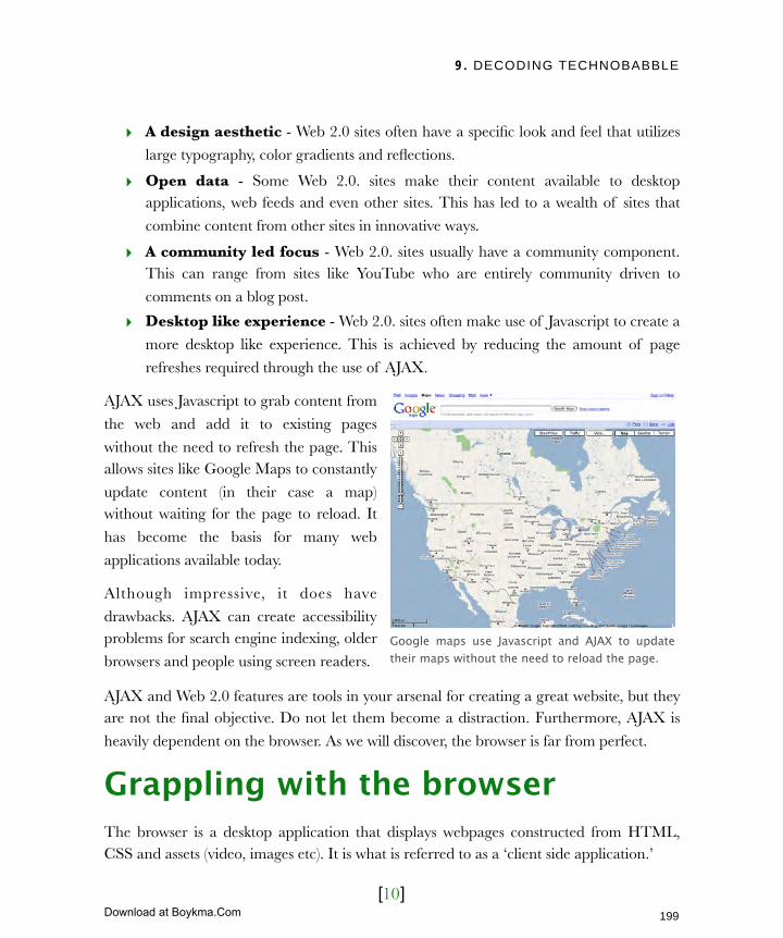
9. DECODING TECHNOBABBLE
[10]
‣ A design aesthetic - Web 2.0 sites often have a specific look and feel that utilizes
large typography, color gradients and reflections.
‣ Open data - Some Web 2.0. sites make their content available to desktop applications, web feeds and even other sites. This has led to a wealth of sites that
combine content from other sites in innovative ways.
‣ A community led focus - Web 2.0. sites usually have a community component. This can range from sites like YouTube who are entirely community driven to
comments on a blog post.
‣ Desktop like experience - Web 2.0. sites often make use of Javascript to create a
more desktop like experience. This is achieved by reducing the amount of page
refreshes required through the use of AJAX.
AJAX uses Javascript to grab content from
the web and add it to existing pages
without the need to refresh the page. This allows sites like Google Maps to constantly
update content (in their case a map) without waiting for the page to reload. It
has become the basis for many web
applications available today.
Although impressive, it does have
drawbacks. AJAX can create accessibility problems for search engine indexing, older
browsers and people using screen readers.
AJAX and Web 2.0 features are tools in your arsenal for creating a great website, but they are not the final objective. Do not let them become a distraction. Furthermore, AJAX is
heavily dependent on the browser. As we will discover, the browser is far from perfect.
Grappling with the browserThe browser is a desktop application that displays webpages constructed from HTML, CSS and assets (video, images etc). It is what is referred to as a ‘client side application.’
Google maps use Javascript and AJAX to update their maps without the need to reload the page.
199
Licensed to Henry Vanyan <[email protected]>
Download at Boykma.Com
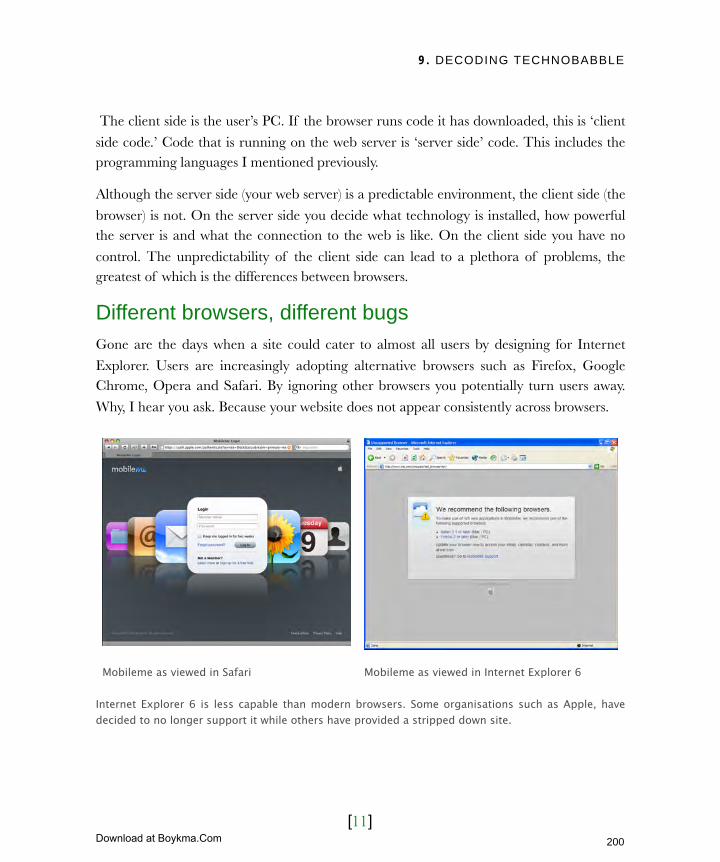
9. DECODING TECHNOBABBLE
[11]
The client side is the user’s PC. If the browser runs code it has downloaded, this is ‘client
side code.’ Code that is running on the web server is ‘server side’ code. This includes the programming languages I mentioned previously.
Although the server side (your web server) is a predictable environment, the client side (the
browser) is not. On the server side you decide what technology is installed, how powerful the server is and what the connection to the web is like. On the client side you have no
control. The unpredictability of the client side can lead to a plethora of problems, the greatest of which is the differences between browsers.
Different browsers, different bugsGone are the days when a site could cater to almost all users by designing for Internet
Explorer. Users are increasingly adopting alternative browsers such as Firefox, Google Chrome, Opera and Safari. By ignoring other browsers you potentially turn users away.
Why, I hear you ask. Because your website does not appear consistently across browsers.
Mobileme as viewed in Safari Mobileme as viewed in Internet Explorer 6
Internet Explorer 6 is less capable than modern browsers. Some organisations such as Apple, have decided to no longer support it while others have provided a stripped down site.
200
Licensed to Henry Vanyan <[email protected]>
Download at Boykma.Com
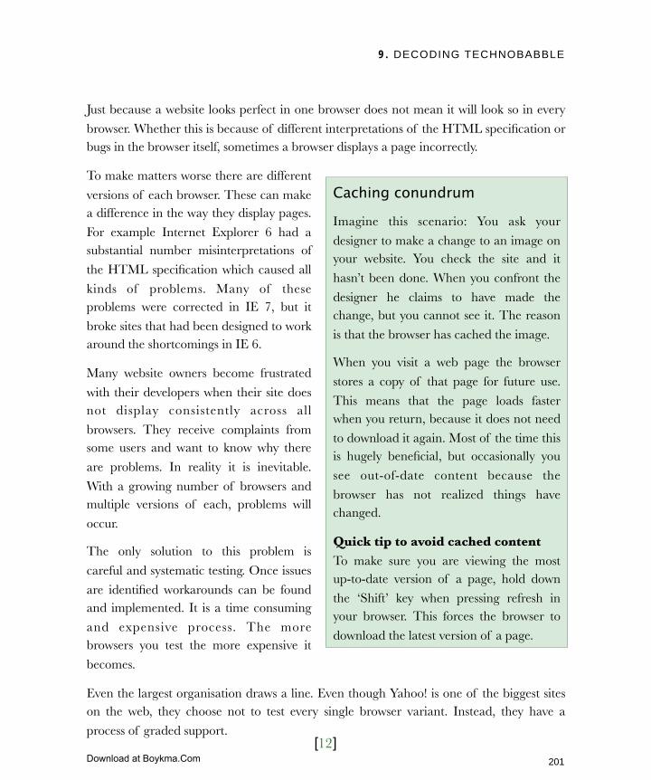
9. DECODING TECHNOBABBLE
[12]
Just because a website looks perfect in one browser does not mean it will look so in every
browser. Whether this is because of different interpretations of the HTML specification or bugs in the browser itself, sometimes a browser displays a page incorrectly.
To make matters worse there are different
versions of each browser. These can make a difference in the way they display pages.
For example Internet Explorer 6 had a substantial number misinterpretations of
the HTML specification which caused all
kinds of problems. Many of these problems were corrected in IE 7, but it
broke sites that had been designed to work around the shortcomings in IE 6.
Many website owners become frustrated
with their developers when their site does not display consistently across all
browsers. They receive complaints from some users and want to know why there
are problems. In reality it is inevitable.
With a growing number of browsers and multiple versions of each, problems will
occur.
The only solution to this problem is
careful and systematic testing. Once issues
are identified workarounds can be found and implemented. It is a time consuming
and expensive process. The more browsers you test the more expensive it
becomes.
Even the largest organisation draws a line. Even though Yahoo! is one of the biggest sites on the web, they choose not to test every single browser variant. Instead, they have a
process of graded support.
Caching conundrum
Imagine this scenario: You ask your
designer to make a change to an image on your website. You check the site and it
hasn’t been done. When you confront the
designer he claims to have made the change, but you cannot see it. The reason
is that the browser has cached the image.
When you visit a web page the browser
stores a copy of that page for future use.
This means that the page loads faster when you return, because it does not need
to download it again. Most of the time this is hugely beneficial, but occasionally you
see out-of-date content because the
browser has not realized things have changed.
Quick tip to avoid cached content To make sure you are viewing the most up-to-date version of a page, hold down
the ‘Shift’ key when pressing refresh in your browser. This forces the browser to
download the latest version of a page.
201
Licensed to Henry Vanyan <[email protected]>
Download at Boykma.Com
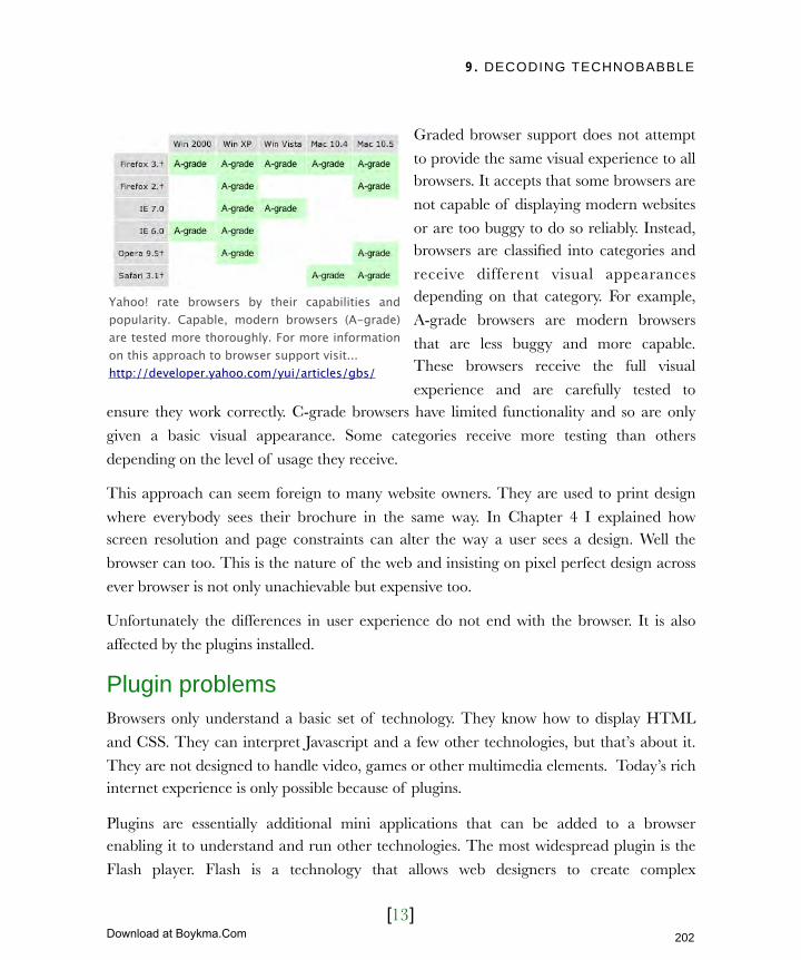
9. DECODING TECHNOBABBLE
[13]
Graded browser support does not attempt
to provide the same visual experience to all browsers. It accepts that some browsers are
not capable of displaying modern websites
or are too buggy to do so reliably. Instead, browsers are classified into categories and
receive different visual appearances depending on that category. For example,
A-grade browsers are modern browsers
that are less buggy and more capable. These browsers receive the full visual
experience and are carefully tested to ensure they work correctly. C-grade browsers have limited functionality and so are only
given a basic visual appearance. Some categories receive more testing than others
depending on the level of usage they receive.
This approach can seem foreign to many website owners. They are used to print design
where everybody sees their brochure in the same way. In Chapter 4 I explained how screen resolution and page constraints can alter the way a user sees a design. Well the
browser can too. This is the nature of the web and insisting on pixel perfect design across
ever browser is not only unachievable but expensive too.
Unfortunately the differences in user experience do not end with the browser. It is also
affected by the plugins installed.
Plugin problemsBrowsers only understand a basic set of technology. They know how to display HTML
and CSS. They can interpret Javascript and a few other technologies, but that’s about it.
They are not designed to handle video, games or other multimedia elements. Today’s rich internet experience is only possible because of plugins.
Plugins are essentially additional mini applications that can be added to a browser enabling it to understand and run other technologies. The most widespread plugin is the
Flash player. Flash is a technology that allows web designers to create complex
Yahoo! rate browsers by their capabilities and popularity. Capable, modern browsers (A-grade) are tested more thoroughly. For more information on this approach to browser support visit...http://developer.yahoo.com/yui/articles/gbs/
202
Licensed to Henry Vanyan <[email protected]>
Download at Boykma.Com

9. DECODING TECHNOBABBLE
[14]
animations, play video and even build desktop-like applications. Much of this would be
extremely hard or impossible without a plugin.
With plugins offering such a wealth of additional functionality, why do many web
designers shy away from using them? The answer lies in their availability.
The problem with a plugin is that the user is required to install it. Unfortunately, due to security concerns, browser manufacturers will not allow plugins to be automatically
installed. Therefore, there is no guarantee that a specific plugin will be present. Without that certainty, it becomes necessary to consider what will happen if it is not there.
One approach is to ask the user to install it, but fears over spyware, viruses and
performance problems can make users reluctant. Some may be unable to install it due to corporate restrictions or lack of knowledge. You cannot rely on users to install software.
You have two options to solve this problem. First, if the content is not critical you could choose to hide it entirely from users without the plugin. Second, if the content is critical
you must provide an alternative method of accessing it, as discussed in chapter 7.
Producing content twice (once for the plugin and once in an accessible form) is expensive and time consuming.
Some will say this problem does not apply to all plugins. Adobe argues that 99% of all users have Flash installed. With so many
users having Flash, why worry about an
alternative version? There are three reasons:
‣ Multiple versions - Even though
Flash is almost universally available, not everyone has the latest version.
Like browsers, there are many different versions of most plugins
and the functionality supported by
each version varies. Just because a user has the right plugin does not
Sites like Vimeo and YouTube rely heavily on Flash to display animation. What happens when Flash is not available?
203
Licensed to Henry Vanyan <[email protected]>
Download at Boykma.Com
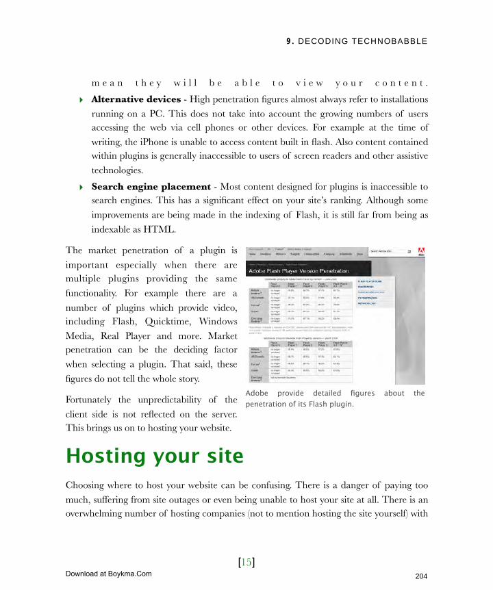
9. DECODING TECHNOBABBLE
[15]
m e a n t h e y w i l l b e a b l e t o v i e w y o u r c o n t e n t .
‣ Alternative devices - High penetration figures almost always refer to installations
running on a PC. This does not take into account the growing numbers of users accessing the web via cell phones or other devices. For example at the time of
writing, the iPhone is unable to access content built in flash. Also content contained within plugins is generally inaccessible to users of screen readers and other assistive
technologies.
‣ Search engine placement - Most content designed for plugins is inaccessible to search engines. This has a significant effect on your site’s ranking. Although some
improvements are being made in the indexing of Flash, it is still far from being as
indexable as HTML.
The market penetration of a plugin is
important especially when there are multiple plugins providing the same
functionality. For example there are a
number of plugins which provide video, including Flash, Quicktime, Windows
Media, Real Player and more. Market penetration can be the deciding factor
when selecting a plugin. That said, these
figures do not tell the whole story.
Fortunately the unpredictability of the
client side is not reflected on the server. This brings us on to hosting your website.
Hosting your siteChoosing where to host your website can be confusing. There is a danger of paying too
much, suffering from site outages or even being unable to host your site at all. There is an overwhelming number of hosting companies (not to mention hosting the site yourself) with
Adobe provide detailed figures about the penetration of its Flash plugin.
204
Licensed to Henry Vanyan <[email protected]>
Download at Boykma.Com

9. DECODING TECHNOBABBLE
[16]
countless ways to set up and run your website. You first need to narrow the field by clearly
defining your requirements.
Assessing server requirementsThe code written by your web developers may not run on your web server. That is why
many website owners choose to have the web developers to arrange hosting. If things
don’t work, there is only one person to blame! However, that is not always the right move. If you are using an external
agency they may charge a premium to host your site.
Also, their package might not
be as good as an independent supplier. Finally, you may
already have a web server which could be suitable for
hos t ing. There are any
number of reasons why you may choose to organize things
yourself.
If you do wish to arrange hosting and want to avoid the scenario where your site does not
work, then you need to know what code can or cannot run on your web server.
Earlier I explained that a web server could use databases and server side languages to generate HTML for the browser. However, a web server does not ‘just know’ how to run
server side code or access a database. It needs software installed on the web server first. Without the right software, it won’t be able to run the code that generates your website.
There are two approaches to ensuring your web server and code are compatible. The first
is the approach I proposed in chapter 3 about informing the developers of any technical constraints they had to work within. This now includes the limitations of your web server
and which databases and server side languages it can run. The alternative is to look for a hosting environment that supports the code produced by your developers.
Website owners often let their developers arrange hosting so they have a single point of contact if things go wrong.
205
Licensed to Henry Vanyan <[email protected]>
Download at Boykma.Com

9. DECODING TECHNOBABBLE
[17]
Your choice is largely dictated by circumstances. If you have an existing hosting
environment, the developers will have to work within those constraints. If you do not, it is better to let the developer find hosting that fits their requirements. The next step is finding
a hosting package that supports the server side code you wish to run.
Finding the right hosting packageAll you need to host your own website is a connection to the internet and a computer
with the right software installed. This can be a cheap solution for those with low-
traffic websites and the technical know-
how to set it up. Self hosting is normally for large organizations who want to cut the
cost of external hosting and have more control over their sites.
For the vast majority self hosting is not the
best option. It requires a lot of technical support and can become expensive if you
have to scale your hosting to support a more popular site. Most therefore sign up for a hosting package with an external company.
Every provider has a variety of packages accommodating different configurations.
However at the most basic level there are two choices: dedicated or shared hosting. Your web developers should advise you on the more appropriate solution for your site. However,
as your choice has business ramifications you need to understand the options. Let’s start with shared hosting.
Shared hostingWith shared hosting your site ‘shares’ the same web server as a number of other sites. The
advantage is that you ‘share’ the cost of the server too. Shared hosting tends to be significantly cheaper, which is why it tends to be the most popular solution for small to
medium businesses.
Many hosting companies have a terrifying variety of hosting packages.
206
Licensed to Henry Vanyan <[email protected]>
Download at Boykma.Com
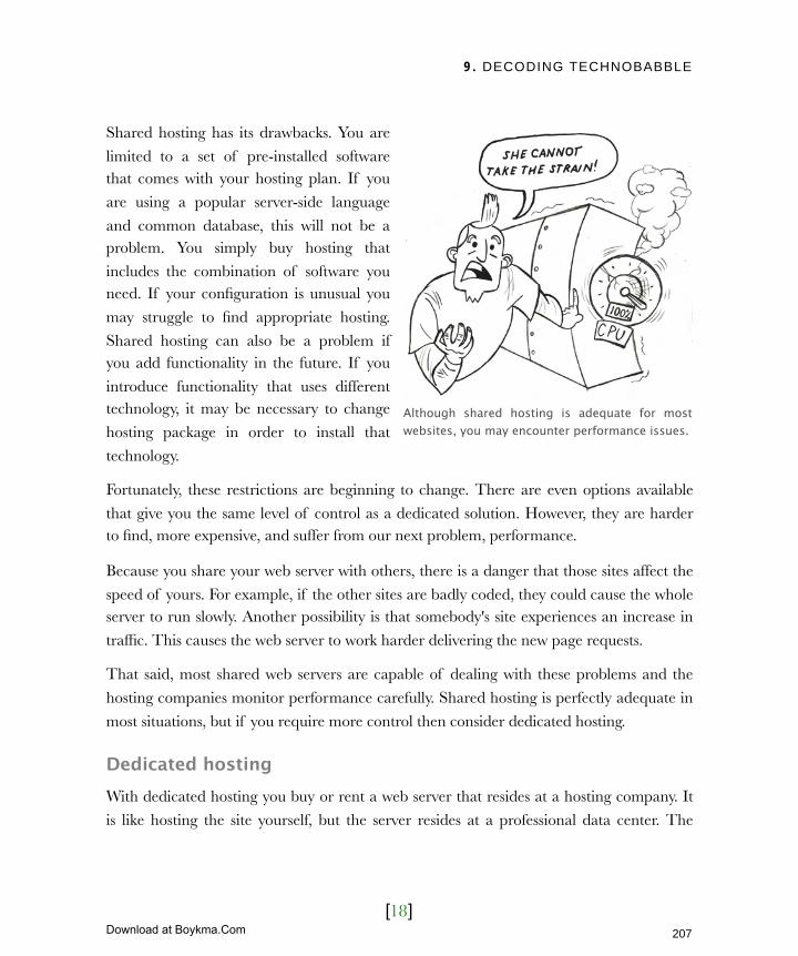
9. DECODING TECHNOBABBLE
[18]
Shared hosting has its drawbacks. You are
limited to a set of pre-installed software that comes with your hosting plan. If you
are using a popular server-side language
and common database, this will not be a problem. You simply buy hosting that
includes the combination of software you need. If your configuration is unusual you
may struggle to find appropriate hosting.
Shared hosting can also be a problem if you add functionality in the future. If you
introduce functionality that uses different technology, it may be necessary to change
hosting package in order to install that
technology.
Fortunately, these restrictions are beginning to change. There are even options available
that give you the same level of control as a dedicated solution. However, they are harder to find, more expensive, and suffer from our next problem, performance.
Because you share your web server with others, there is a danger that those sites affect the
speed of yours. For example, if the other sites are badly coded, they could cause the whole server to run slowly. Another possibility is that somebody's site experiences an increase in
traffic. This causes the web server to work harder delivering the new page requests.
That said, most shared web servers are capable of dealing with these problems and the
hosting companies monitor performance carefully. Shared hosting is perfectly adequate in
most situations, but if you require more control then consider dedicated hosting.
Dedicated hostingWith dedicated hosting you buy or rent a web server that resides at a hosting company. It
is like hosting the site yourself, but the server resides at a professional data center. The
Although shared hosting is adequate for most websites, you may encounter performance issues.
207
Licensed to Henry Vanyan <[email protected]>
Download at Boykma.Com

9. DECODING TECHNOBABBLE
[19]
advantage is better security (important for
storing personal information) and a faster web connection.
Dedicated hosting also avoids the
problems of shared hosting. Because only your site reside on the server there are no
performance issues caused by other sites. Also you have complete access to the
computer allowing you to install any
software you choose.
The downside is price. Dedicated hosting
is expensive compared to shared. There is the cost of hosting and the additional cost
of associated software. This can range
from free (for open source solutions) to thousands of dollars for enterprise level software. That said, the cost of dedicated hosting
is coming down and there are some excellent deals around.
Dedicated hosting remains the best option for highly trafficked websites, those that require
custom-installed software, or organisations running a number of different sites. Deciding
on the type of hosting and what software you require will go a long way to narrowing the field. Just like the selection of a cms, you also need to consider the company behind the
product. In this case you need to assess the hosting provider.
Assessing hosting companiesPresuming that your site does not require anything unusual in terms of hosting, you will
be faced with a plethora of potential providers. Some will be temptingly cheap, but be
wary of buying on price alone. There are a number of other criteria you should consider:
‣ Uptime
‣ Support
Media Temple is one of a growing number of hosting companies to offer Dedicated virtual hosting. This is shared hosting but has many of the benefits of dedicated, including the ability to install whatever software you wish.
208
Licensed to Henry Vanyan <[email protected]>
Download at Boykma.Com

9. DECODING TECHNOBABBLE
[20]
‣ The control panel
‣ Limitations on growth
‣ Hidden charges
Let’s take a look at each, starting with uptime.
UptimeThe last thing any website owner wants is for their website to be unavailable. Many
hosting companies therefore provide uptime guarantees. Figures range from
95% uptime to 100%. What exactly are
they guaranteeing and is it something you should worry about?
In most cases uptime guarantees are worthless. They do not actually guarantee
that your website will be available 100% of
the time. This is merely a figure they are striving for. If they fail, they will
compensate you. This compensation usually involves a partial refund of your hosting bill, but this could be insignificant
compared to the losses in sales. Always clarify what compensation is being offered.
Remember that even the largest organisations have downtime. It is a problem that can never be entirely avoided. Websites can be unavailable due to connectivity issues, poor
code or any number of reasons beyond the control of your hosting company. As a result they often specify exclusions from compensation in their terms of service.
In short uptime guarantees are meaningless. They are simply a marketing tool. Instead,
search for reviews of the hosting company or look at their support forum. If their are lots of complaints about downtime, think twice. However, in most cases the service offered in
regards to uptime is fairly universal.
Most uptime guarantees are worthless. The figures quoted are merely a figure they are striving for.
209
Licensed to Henry Vanyan <[email protected]>
Download at Boykma.Com

9. DECODING TECHNOBABBLE
[21]
Instead of asking how often your site is likely to go down, ask what happens when it does?
What kind of support can you expect?
Support Support is arguably the single most
important factor in choosing a hosting
company. Whether it is your website going offline or a piece of functionality not
running, it is inevitable you will have problems with your hosting. You will need
to quickly reach somebody who can help.
How can you tell if a hosting company offers good support? Look for the following
things:
‣ 24/7/365 support - When your website is offline you need to be able to get help
instantly. Check that your hosting company offers support 24 hours a day, 7 days a
week, 365 days a year.
‣ Telephone support - There is an increasing trend towards email only support.
However, technical problems can be hard to diagnose and prolonged conversation
via email are time consuming. When your site is offline you need the immediacy of a phone call. Ensure that option is available to you.
‣ Speedy response - Whether contacting your hosting company by email or phone
you should expect a speedy response. It is unacceptable to sit on hold while your site is down or waiting days for a response to an email query. I recommend calling the
technical support telephone number before you sign up for their service. How long do you have to wait before speaking to a real human being? Also, send a question
via email and see how long it takes to get a reply.
‣ In country support - Personally I prefer speaking to local support staff. Being put through to call centers in far-flung locations can be frustrating when discussing
complex technical problems. If you do not share the first language of support staff
misunderstandings are easier. By calling the support number before signing up you
When your website goes offline you want to be sure of a fast response.
210
Licensed to Henry Vanyan <[email protected]>
Download at Boykma.Com
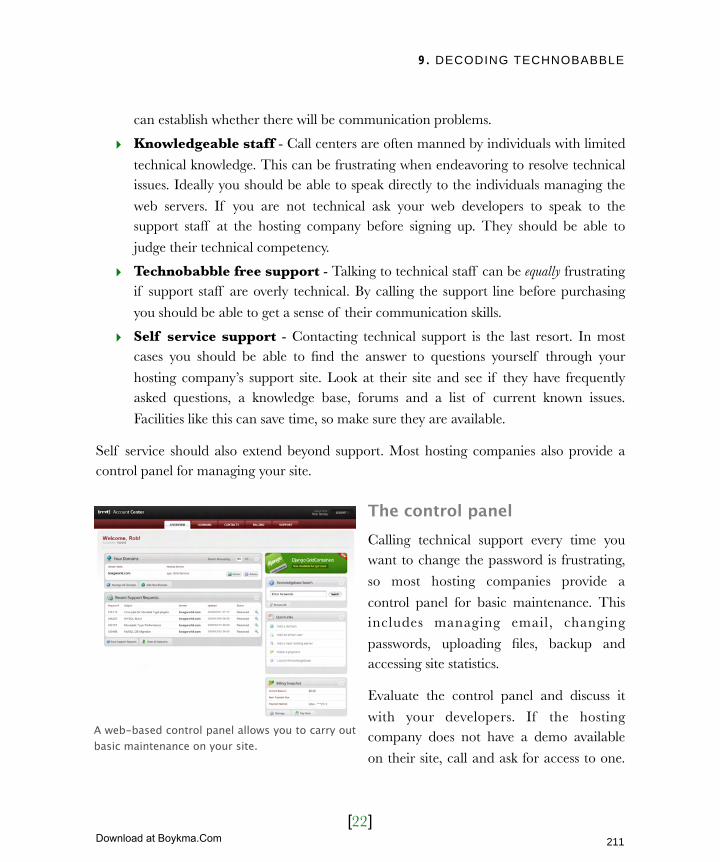
9. DECODING TECHNOBABBLE
[22]
can establish whether there will be communication problems.
‣ Knowledgeable staff - Call centers are often manned by individuals with limited
technical knowledge. This can be frustrating when endeavoring to resolve technical issues. Ideally you should be able to speak directly to the individuals managing the
web servers. If you are not technical ask your web developers to speak to the support staff at the hosting company before signing up. They should be able to
judge their technical competency.
‣ Technobabble free support - Talking to technical staff can be equally frustrating if support staff are overly technical. By calling the support line before purchasing
you should be able to get a sense of their communication skills.
‣ Self service support - Contacting technical support is the last resort. In most cases you should be able to find the answer to questions yourself through your
hosting company’s support site. Look at their site and see if they have frequently asked questions, a knowledge base, forums and a list of current known issues.
Facilities like this can save time, so make sure they are available.
Self service should also extend beyond support. Most hosting companies also provide a control panel for managing your site.
The control panelCalling technical support every time you want to change the password is frustrating,
so most hosting companies provide a
control panel for basic maintenance. This includes managing email, changing
passwords, uploading files, backup and accessing site statistics.
Evaluate the control panel and discuss it
with your developers. If the hosting company does not have a demo available
on their site, call and ask for access to one.
A web-based control panel allows you to carry out basic maintenance on your site.
211
Licensed to Henry Vanyan <[email protected]>
Download at Boykma.Com
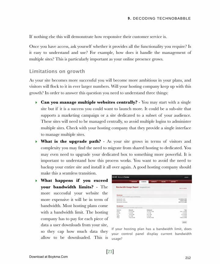
9. DECODING TECHNOBABBLE
[23]
If nothing else this will demonstrate how responsive their customer service is.
Once you have access, ask yourself whether it provides all the functionality you require? Is it easy to understand and use? For example, how does it handle the management of
multiple sites? This is particularly important as your online presence grows.
Limitations on growthAs your site becomes more successful you will become more ambitious in your plans, and visitors will flock to it in ever larger numbers. Will your hosting company keep up with this
growth? In order to answer this question you need to understand three things:
‣ Can you manage multiple websites centrally? - You may start with a single
site but if it is a success you could want to launch more. It could be a sub-site that
supports a marketing campaign or a site dedicated to a subset of your audience. These sites will need to be managed centrally, so avoid multiple logins to administer
multiple sites. Check with your hosting company that they provide a single interface
to manage multiple sites.
‣ What is the upgrade path? - As your site grows in terms of visitors and
complexity you may find the need to migrate from shared hosting to dedicated. You
may even need to upgrade your dedicated box to something more powerful. It is important to understand how this process works. You want to avoid the need to
backup your entire site and install it all over again. A good hosting company should make this a seamless transition.
‣ What happens if you exceed your bandwidth limits? - The more successful your website the
more expensive it will be in term of bandwidth. Most hosting plans come
with a bandwidth limit. The hosting
company has to pay for each piece of data a user downloads from your site,
so they cap how much data they allow to be downloaded. This is
If your hosting plan has a bandwidth limit, does your control panel display current bandwidth usage?
212
Licensed to Henry Vanyan <[email protected]>
Download at Boykma.Com

9. DECODING TECHNOBABBLE
[24]
more than adequate for most sites, but what happens if you exceed your bandwidth
limit? How much extra will it cost? What happens if you exceed your limit without a higher rate package in place? Will it costs you even more? Does the control panel
provide a way to monitor current bandwidth use?
It is not just bandwidth that can become expensive. You may discover there are
other hidden charges too.
Hidden chargesSome hosting companies can appear to
be inexpensive on the surface but have a
hidden cost. Establish what is included in the monthly charge and what is not. I
have encountered hosting companies who have made additional charges for:
‣ More than a predefined number of
email accounts
‣ Advanced email functionality such as exchange server or spam filters
‣ A technician to physically restart your web server
‣ Add-on technologies
‣ The ability to run databases
‣ Access to website statistics
The list could go on. There is nothing wrong with hosting companies using this form of
modular pricing. It can keep the price down if you only require basic functionality. The problem comes when they do not clearly communicate these additional costs and they
come as a surprise.
Additional bandwidth usage is just one hidden cost that may show up on your bill.
213
Licensed to Henry Vanyan <[email protected]>
Download at Boykma.Com

9. DECODING TECHNOBABBLE
[25]
Next ActionsCommissioning a website is a minefield of jargon and technical detail. However, this chapter has tackled the key technical issues you need to know. We have addressed how the
web works and why things sometimes go wrong. We have looked at how web pages are
created and how that is changing thanks to AJAX. We have investigated the problems with browsers and most importantly looked at how you host your site.
Now is the time to turn what you have learnt into action.
‣ Action one: End the technobabble - Stop allowing your developer to use
language you do not understand. Next time they do, ask them to explain. It is their
responsibility to ensure you have the information you require to make an informed decision. You should not be embarrassed to ask if you do not understand
something.
‣ Action two: Choose a host - If you have yet to arrange hosting, now is the time to speak to your developer using the knowledge from this chapter. Together you can
investigate the options available. Alternatively if you already have hosting, begin a
review of the service. Does it measure up to the criteria we have discussed? Should you be considering alternatives?
‣ Action three: Expand your vocabulary - I have only scratched the surface of the technobabble you may encounter. Should you come across terminology that you
cannot get explained, I recommend looking the glossary of terms found on the
Sitepoint website (sitepoint.com/glossary/). This provides definitions for everything from Accesskeys to XHTML.
You now have all the information you need to know in order to commission and build a website. We have addressed writing a brief, assembling your team, designing your site,
writing your content, and ensuring usability, accessibility and best practice. We have even
looked at how to find somewhere to host your site.
Does that therefore mean your job is done? Unfortunately not. Although the build phase is
over you still need to promote your site, engage with your users and plan for the future. It is this we need to address next, starting with site promotion.
214
Licensed to Henry Vanyan <[email protected]>
Download at Boykma.Com

10. DRIVING TRAFFIC
[1]
In this chapter‣ Become number one on Google
Avoid being blacklisted
Spot black hat operators
Spot black hate techniques
Improve your search engine rankings
Improving your sites build
Improving your sites content
Encouraging quality links
The problem with search engines
Pay per click advertising
‣ Beyond the search engine
Offline promotion
Business stationary
Traditional media
Miscellaneous marketing material
Word of mouth
Targeting your audience
Social sites
Editorial sites
Viral marketing
‣ Measuring success
Monitoring marketing
Monitoring conversion
Finding and resolving problems
Dropout points
Identifying popular content
215
Licensed to Henry Vanyan <[email protected]>
Download at Boykma.Com
10. DRIVING TRAFFIC
[2]
10Driving trafficIn the movie ‘Fields of Dreams’ Kevin Costner hears a voice in his corn
field tell him, "If you build it, they will come." Many website owners have the same mentality. They believe if they build a website, users will turn up.
Unfortunately it does not work like that. They mistakenly see their website as a marketing tool in its own right.
The best way to think of a website is as a shop front. If you open a new
store a few people will wander in, but not in substantial numbers. In order to make your shop a success it needs to be promoted.
You need to continually promote your site if you want to maintain a high level of new visitors. It is not enough to promote your site when it is first
launched. A long term strategy for site promotion is required.
Many see search engine placement as the answer for their long term strategy. They spend vast amounts of money on search engine
optimization experts. However, search engine placement is only a single component in a larger strategy. You will also need to actively pursue your
audience, create great content and promote your site offline.
That said, being ranked well on sites like Google is the linch pin of your broader strategy, so we’ll begin by looking at the role of the search engine.
216
Licensed to Henry Vanyan <[email protected]>
Download at Boykma.Com

10. DRIVING TRAFFIC
[3]
Become number one on GoogleMy publisher will love the fact that I have a section entitled ‘become number one on
Google’. Titles like that sell books. After all, that is what every website owner wants.
There is no shortage of companies promising the number one position. But can they really deliver what they are offering? To answer that question we need to refer back to
something I said in chapter 7:
If your content is not relevant, no amount of clever search engine optimization is going to
get you to number one.
There are of course ways to ‘trick’ Google
into ranking your site better, but these
break Google’s own guidelines. These are sometimes used by SEO companies to
improve ranking. In almost all cases the benefit is temporary as Google works to
close such loopholes.
Google comes down hard on sites who disregard their guidelines, but there are
techniques which will legitimately improve your ranking. These focus on removing
obstacles which could hinder search
engines from indexing the content of your site.
How can you distinguish between agencies using legitimate techniques and those using ‘black hat’ techniques? How do you avoid the fate of BMW?
Search engines are only interested in one thing - providing relevant results to their users.
Car manufacturer BMW was effectively removed from search engine Google after attempting to inappropriately manipulate their ranking.
217
Licensed to Henry Vanyan <[email protected]>
Download at Boykma.Com
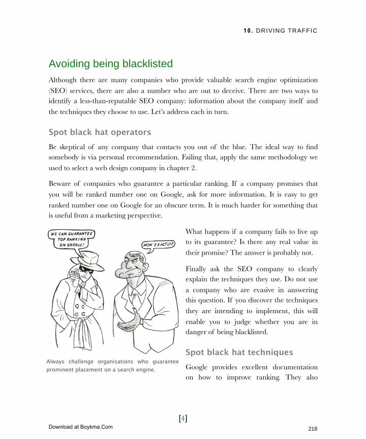
10. DRIVING TRAFFIC
[4]
Avoiding being blacklistedAlthough there are many companies who provide valuable search engine optimization
(SEO) services, there are also a number who are out to deceive. There are two ways to identify a less-than-reputable SEO company: information about the company itself and
the techniques they choose to use. Let’s address each in turn.
Spot black hat operatorsBe skeptical of any company that contacts you out of the blue. The ideal way to find somebody is via personal recommendation. Failing that, apply the same methodology we
used to select a web design company in chapter 2.
Beware of companies who guarantee a particular ranking. If a company promises that
you will be ranked number one on Google, ask for more information. It is easy to get
ranked number one on Google for an obscure term. It is much harder for something that is useful from a marketing perspective.
What happens if a company fails to live up to its guarantee? Is there any real value in
their promise? The answer is probably not.
Finally ask the SEO company to clearly explain the techniques they use. Do not use
a company who are evasive in answering this question. If you discover the techniques
they are intending to implement, this will
enable you to judge whether you are in danger of being blacklisted.
Spot black hat techniquesGoogle provides excellent documentation on how to improve ranking. They also
Always challenge organisations who guarantee prominent placement on a search engine.
218
Licensed to Henry Vanyan <[email protected]>
Download at Boykma.Com
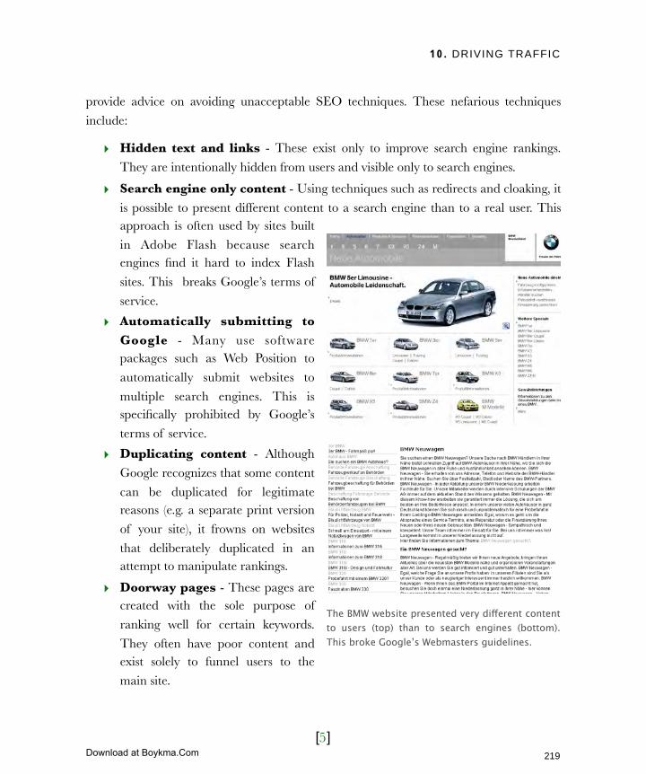
10. DRIVING TRAFFIC
[5]
provide advice on avoiding unacceptable SEO techniques. These nefarious techniques
include:
‣ Hidden text and links - These exist only to improve search engine rankings.
They are intentionally hidden from users and visible only to search engines.
‣ Search engine only content - Using techniques such as redirects and cloaking, it
is possible to present different content to a search engine than to a real user. This approach is often used by sites built
in Adobe Flash because search engines find it hard to index Flash
sites. This breaks Google’s terms of
service.
‣ Automatically submitting to Google - Many use software packages such as Web Position to
automatically submit websites to
multiple search engines. This is specifically prohibited by Google’s
terms of service.
‣ Duplicating content - Although
Google recognizes that some content
can be duplicated for legitimate reasons (e.g. a separate print version
of your site), it frowns on websites
that deliberately duplicated in an attempt to manipulate rankings.
‣ Doorway pages - These pages are created with the sole purpose of
ranking well for certain keywords.
They often have poor content and exist solely to funnel users to the
main site.
The BMW website presented very different content to users (top) than to search engines (bottom). This broke Google’s Webmasters guidelines.
219
Licensed to Henry Vanyan <[email protected]>
Download at Boykma.Com

10. DRIVING TRAFFIC
[6]
‣ Keyword stuffing - This is the practice of loading a webpage with keywords in
an attempt to manipulate ranking. This creates a negative user experience and
could ultimately cause Google to take action.
‣ Participating in link schemes - Although site ranking is partially based on who
links to you, link exchange programs are a bad idea. Exchanging links without
considering their relevancy will damage your ranking.
Will implementing the above techniques get you removed from Google? Probably
not. However, they will damage your
ranking over the long term and almost certainly be a waste of money.
Should you therefore avoid hiring SEO companies? Not necessarily. There are
many reputable companies offering
superb advice on how to improve your rankings. Use what you have learnt here
to find a respectable supplier.
But what if you cannot afford a SEO
expert? What can you do yourself ?
Improve your search engine rankingYou and your team can do a number of things to improve your placement on search engines. These fall into three broad categories:
‣ Improving your site’s build
‣ Improving your site’s content
‣ Encourage quality links
We have touched on the subject of building for search engines in chapter 7, but there is more you can do.
Web Position is one of many tools that will automatically submit your site to search engines. Although these tools save time they break Google’s terms of service.
220
Licensed to Henry Vanyan <[email protected]>
Download at Boykma.Com
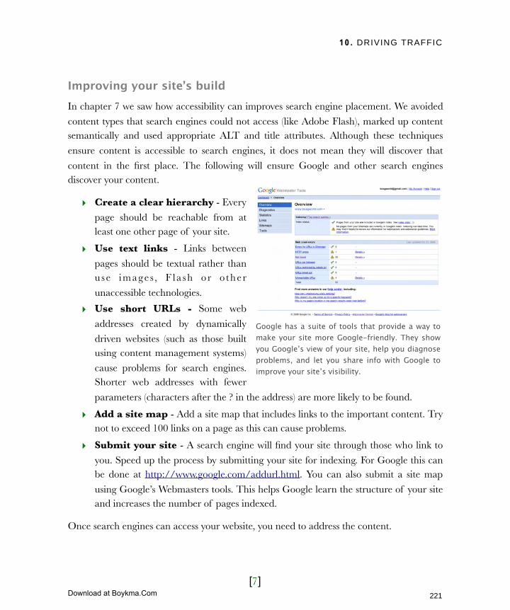
10. DRIVING TRAFFIC
[7]
Improving your site’s buildIn chapter 7 we saw how accessibility can improves search engine placement. We avoided
content types that search engines could not access (like Adobe Flash), marked up content semantically and used appropriate ALT and title attributes. Although these techniques
ensure content is accessible to search engines, it does not mean they will discover that
content in the first place. The following will ensure Google and other search engines discover your content.
‣ Create a clear hierarchy - Every
page should be reachable from at least one other page of your site.
‣ Use text links - Links between
pages should be textual rather than use images, F la sh or o ther
unaccessible technologies.
‣ Use short URLs - Some web
addresses created by dynamically
driven websites (such as those built using content management systems)
cause problems for search engines. Shorter web addresses with fewer
parameters (characters after the ? in the address) are more likely to be found.
‣ Add a site map - Add a site map that includes links to the important content. Try not to exceed 100 links on a page as this can cause problems.
‣ Submit your site - A search engine will find your site through those who link to
you. Speed up the process by submitting your site for indexing. For Google this can be done at http://www.google.com/addurl.html. You can also submit a site map
using Google’s Webmasters tools. This helps Google learn the structure of your site and increases the number of pages indexed.
Once search engines can access your website, you need to address the content.
Google has a suite of tools that provide a way to make your site more Google-friendly. They show you Google’s view of your site, help you diagnose problems, and let you share info with Google to improve your site’s visibility.
221
Licensed to Henry Vanyan <[email protected]>
Download at Boykma.Com

10. DRIVING TRAFFIC
[8]
Improving your site’s contentThe most important consideration when
writing copy for search engines is the inclusion of search terms. Before writing
a page have a clear idea of what it is about
and what search terms people might use to find that subject. Next, incorporate them
naturally into copy, headings, image alt attributes and the page title.
Be careful not to use too many search
terms. Two or three per page is adequate. If you use more, copy may become hard
to read and the ranking of each individual term will be reduced. Do not stuff a page
with search terms as you may be
penalized. They should be incorporated naturally into your copy. Try reading your copy out loud. If it sounds like you are forcing
the use of keywords it will require some rewriting.
Focus on writing good copy. Well written and engaging copy will also attract links.
Encourage quality linksIf you already run a website, you will have probably received an email from somebody
wanting to ‘exchange links’. The email may have explained that Google ranks pages by the number of incoming links. There is some truth in this claim. Google does partially rank
pages based on the number of sites who link to you. This is not the whole story.
In reality nobody but Google knows how they rank sites. Links are a factor but it is not just
the quantity that matter. Google states that:
Check that search engines can view your site using a text browser such as Lynx. Search engines access your site in a similar way.
The quantity, quality, and relevance of links count towards your rating.
222
Licensed to Henry Vanyan <[email protected]>
Download at Boykma.Com
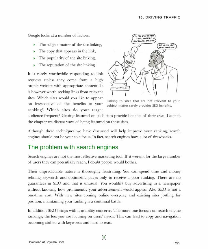
10. DRIVING TRAFFIC
[9]
Google looks at a number of factors:
‣ The subject matter of the site linking,
‣ The copy that appears in the link,
‣ The popularity of the site linking,
‣ The reputation of the site linking.
It is rarely worthwhile responding to link
requests unless they come from a high profile website with appropriate content. It
is however worth seeking links from relevant
sites. Which sites would you like to appear on irrespective of the benefits to your
ranking? Which sites do your target audience frequent? Getting featured on such sites provide benefits of their own. Later in
the chapter we discuss ways of being featured on these sites.
Although these techniques we have discussed will help improve your ranking, search engines should not be your sole focus. In fact, search engines have a lot of drawbacks.
The problem with search enginesSearch engines are not the most effective marketing tool. If it weren’t for the large number of users they can potentially reach, I doubt people would bother.
Their unpredictable nature is thoroughly frustrating. You can spend time and money
refining keywords and optimizing pages only to receive a poor ranking. There are no guarantees in SEO and that is unusual. You wouldn’t buy advertising in a newspaper
without knowing how prominently your advertisement would appear. Also SEO is not a one-time cost. With new sites coming online everyday and existing sites jostling for
position, maintaining your ranking is a continual battle.
In addition SEO brings with it usability concerns. The more one focuses on search engine rankings, the less you are focusing on users’ needs. This can lead to copy and navigation
becoming stuffed with keywords and hard to read.
Linking to sites that are not relevant to your subject matter rarely provides SEO benefits.
223
Licensed to Henry Vanyan <[email protected]>
Download at Boykma.Com

10. DRIVING TRAFFIC
[10]
To justify this aggravation, you would
expect search engines to be a remarkable marketing tool. However, SEO is actually
a very passive form of marketing. SEO
relies on users’ recognizing their need for a product or service. Unless they are aware
of that need they will not search for it and discover your site. Other forms of
marketing both fulfill and create need. In
this regard search engines are weak.
They also rely on the user typing in
keywords you have included in your site. Unfortunately, people are unpredictable
and enter keywords you do not expect.
Part of the problem is that we have all worked in our respective industries too long and use jargon unfamiliar to our users.
Despite our best efforts we lose potential visitors because they use different search phrases.
It can take months for a site to become listed and almost as long for SEO work to take
effect. This makes it hard to tweak and improve your marketing campaigns. It also means
that sites with short life spans (such as an event) may not appear at all.
Despite all of these frustrations, search engines cannot be ignored. One way to relieve the
pain is to use Pay Per Click advertising.
Pay Per Click advertisingA number of organisations offer pay per click advertising, but Google Adwords
dominates. Adwords appear on Google’s search results and thousands of other websites.
Any website owner can add them to a site as a way of generating income.
The ads consist of a short title, a two line description and a link. Each is associated with a
set of keywords. The ad is displayed when a user searches for an associated keyword or visits a site that has Google ads and is considered relevant.
You wouldn’t buy an advertisement in a newspaper without knowing the where it will appear, but when you spend money on SEO you have no guarantee as to where you will be listed.
224
Licensed to Henry Vanyan <[email protected]>
Download at Boykma.Com
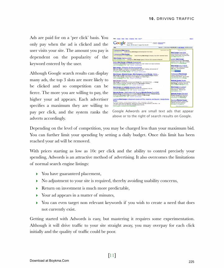
10. DRIVING TRAFFIC
[11]
Ads are paid for on a ‘per click’ basis. You
only pay when the ad is clicked and the user visits your site. The amount you pay is
dependent on the popularity of the
keyword entered by the user.
Although Google search results can display
many ads, the top 3 slots are more likely to be clicked and so competition can be
fierce. The more you are willing to pay, the
higher your ad appears. Each advertiser specifies a maximum they are willing to
pay per click, and the system ranks the adverts accordingly.
Depending on the level of competition, you may be charged less than your maximum bid.
You can further limit your spending by setting a daily budget. Once this limit has been reached your ad will be removed.
With prices starting as low as 10c per click and the ability to control precisely your spending, Adwords is an attractive method of advertising. It also overcomes the limitations
of normal search engine listings:
‣ You have guaranteed placement,
‣ No adjustment to your site is required, thereby avoiding usability concerns,
‣ Return on investment is much more predictable,
‣ Your ad appears in a matter of minutes,
‣ You can even target non relevant keywords if you wish to create a need that does
not currently exist.
Getting started with Adwords is easy, but mastering it requires some experimentation.
Although it will drive traffic to your site straight away, you may overpay for each click initially and the quality of traffic could be poor.
Google Adwords are small text ads that appear above or to the right of search results on Google.
225
Licensed to Henry Vanyan <[email protected]>
Download at Boykma.Com

10. DRIVING TRAFFIC
[12]
A common mistake is targeting broad
keywords such as “men’s fashion.” Competition for broad keywords is fierce
and prices are high. Also, broad keywords
generate lower quality leads. Those responding to ads on broad keywords are
less likely to want your product. Instead be specific with your keyword phrases.
Instead of “men’s fashion” use multiple
keywords naming specific brands.
Broad keywords are just one of the many
mistakes first-time advertisers make. Read the help section on Google Adwords. It
provides advice on selecting keywords,
writing an effective ad, optimizing conversions and tracking performance. It
also offers several tools to help run campaigns, like their keyword suggestion engine.
So far this chapter has focused exclusively on search engines. However, search engines are
only a small part of your site’s marketing strategy. What makes up the rest?
Beyond the search engineThe opportunities for promoting your website are endless. With so many options you must decide which approach is right for your site. This is dependent on your audience and
objectives. However, there are three strategies that all websites should consider:
The Google Keyword tool is invaluable when selecting keywords for your campaign. It will make suggestions based on phrases you enter or using the content of your website.
226
Licensed to Henry Vanyan <[email protected]>
Download at Boykma.Com

10. DRIVING TRAFFIC
[13]
Each approach has their pros and cons but most campaigns incorporate at least some of
each. Let’s begin by examining the most neglected of the three, offline promotion.
Offline promotionIt is amazingly easy to overlook the obvious. This is especially true for website owners who
spend so much time focusing on the web. They eventually develop tunnel vision when it
comes to marketing. In their haste to improve search engine rankings or get on Facebook they overlook offline methods of promoting their sites, even though offline promotion can
be quite powerful in certain circumstances. It is particular effective when trying to:
‣ reach an audience in a specific geographical area,
‣ encourage repeat traffic from existing customers,
‣ move customer interactions online
If you use any of the following forms of
communication they should also be promoting your website:
‣ Business stationary
‣ Traditional media
‣ Miscellaneous marketing material
‣ Word of mouth.
The most obvious of these is business
stationary.
Business stationaryA good rule of thumb when promoting your website offline is to place your website address wherever your logo appears. Nowhere is this more true than with business
stationary. Business stationary includes business cards, letterheads, envelopes, leaflets, brochures and any other form of documentation or paper based promotional material. If
you have a marketing style guide, amend it to mention the inclusion of your website
address whenever possible.
When promoting your website offline, always place your website address alongside your logo.
227
Licensed to Henry Vanyan <[email protected]>
Download at Boykma.Com
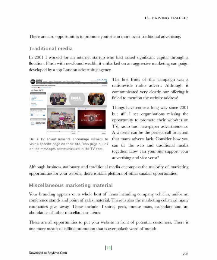
10. DRIVING TRAFFIC
[14]
There are also opportunities to promote your site in more overt traditional advertising.
Traditional mediaIn 2001 I worked for an internet startup who had raised significant capital through a flotation. Flush with newfound wealth, it embarked on an aggressive marketing campaign
developed by a top London advertising agency.
The first fruits of this campaign was a nationwide radio advert. Although it
communicated very clearly our offering it failed to mention the website address!
Things have come a long way since 2001
but still I see organisations missing the opportunity to promote their websites on
TV, radio and newspaper advertisements. A website can be the perfect call to action
that many adverts lack. Consider how you
can tie the web and traditional media together. How can your site support your
advertising and vice versa?
Although business stationary and traditional media encompass the majority of marketing
opportunities for your website, there is still a plethora of other smaller opportunities.
Miscellaneous marketing materialYour branding appears on a whole host of items including company vehicles, uniforms, conference stands and point of sales material. There is also the marketing collateral many
companies give away. These include T-shirts, pens, mouse mats, calendars and an abundance of other miscellaneous items.
These are all opportunities to put your website in front of potential customers. There is
one more means of offline promotion that is overlooked: word of mouth.
Dell’s TV advertisements encourage viewers to visit a specific page on their site. This page builds on the messages communicated in the TV spot.
228
Licensed to Henry Vanyan <[email protected]>
Download at Boykma.Com

10. DRIVING TRAFFIC
[15]
Word of mouthWord of mouth is an effective means of promoting your site, and it begins with you. You
need to convince your colleagues that your site has value and to spread the word.
Encourage your call center to
point people at the website
when possible. Sales people should be using the website as
part of their sales process. Even account managers, partners and
suppliers can refer people to the
website.
You need to ensure the site is a
useful resource. If you followed my advice in Chapter 2, then
you should have spoken to these
people about how the site can be developed to accommodate
their needs. Now you need to show them the benefits and encourage them to tell others.
Consider offering staff training or throwing a launch party when the site goes live. Send
out a regular newsletter to employees, telling them about new site features. Maybe even make everybody's browser default to your site. Anything to bring attention to the site.
Offline promotion needs to be accompanied by online marketing. This can be done using the ‘scatter gun’ approach of viral marketing or using a more targeted strategy.
Targeting your audienceOne of my problems with search engines is that they are passive. They rely on users
recognizing a need and actively looking for it. Waiting for users to turn up is not enough. You need to search them out and encourage them to visit your site.
Until you promote your website within your organisation, staff will not tell customers about it.
229
Licensed to Henry Vanyan <[email protected]>
Download at Boykma.Com
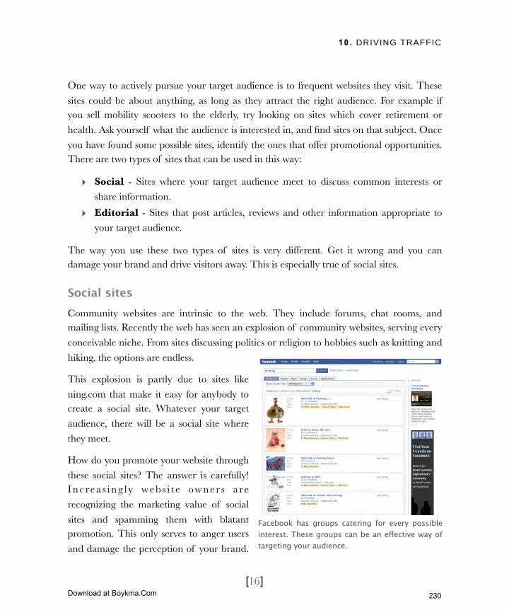
10. DRIVING TRAFFIC
[16]
One way to actively pursue your target audience is to frequent websites they visit. These
sites could be about anything, as long as they attract the right audience. For example if you sell mobility scooters to the elderly, try looking on sites which cover retirement or
health. Ask yourself what the audience is interested in, and find sites on that subject. Once
you have found some possible sites, identify the ones that offer promotional opportunities. There are two types of sites that can be used in this way:
‣ Social - Sites where your target audience meet to discuss common interests or
share information.
‣ Editorial - Sites that post articles, reviews and other information appropriate to
your target audience.
The way you use these two types of sites is very different. Get it wrong and you can damage your brand and drive visitors away. This is especially true of social sites.
Social sitesCommunity websites are intrinsic to the web. They include forums, chat rooms, and mailing lists. Recently the web has seen an explosion of community websites, serving every
conceivable niche. From sites discussing politics or religion to hobbies such as knitting and
hiking, the options are endless.
This explosion is partly due to sites like
ning.com that make it easy for anybody to create a social site. Whatever your target
audience, there will be a social site where
they meet.
How do you promote your website through
these social sites? The answer is carefully! I n c re a s i n g l y we b s i t e ow n e r s a re
recognizing the marketing value of social
sites and spamming them with blatant promotion. This only serves to anger users
and damage the perception of your brand.
Facebook has groups catering for every possible interest. These groups can be an effective way of targeting your audience.
230
Licensed to Henry Vanyan <[email protected]>
Download at Boykma.Com
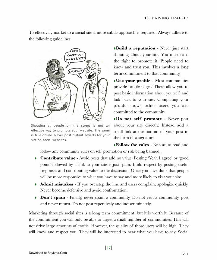
10. DRIVING TRAFFIC
[17]
To effectively market to a social site a more subtle approach is required. Always adhere to
the following guidelines:
‣Build a reputation - Never just start
shouting about your site. You must earn
the right to promote it. People need to know and trust you. This involves a long
term commitment to that community.
‣Use your profile - Most communities provide profile pages. These allow you to
post basic information about yourself and
link back to your site. Completing your profile shows other users you are
committed to the community.
‣Do not self promote - Never post
about your site directly. Instead add a
small link at the bottom of your post in the form of a signature.
‣Follow the rules - Be sure to read and
follow any community rules on self promotion or risk being banned.
‣ Contribute value - Avoid posts that add no value. Posting ‘Yeah I agree’ or ‘good
point’ followed by a link to your site is just spam. Build respect by posting useful responses and contributing value to the discussion. Once you have done that people
will be more responsive to what you have to say and more likely to visit your site.
‣ Admit mistakes - If you overstep the line and users complain, apologize quickly. Never become defensive and avoid confrontation.
‣ Don’t spam - Finally, never spam a community. Do not visit a community, post
and never return. Do not post repetitively and indiscriminately.
Marketing through social sites is a long term commitment, but it is worth it. Because of
the commitment you will only be able to target a small number of communities. This will
not drive large amounts of traffic. However, the quality of those users will be high. They will know and respect you. They will be interested to hear what you have to say. Social
Shouting at people on the street is not an effective way to promote your website. The same is true online. Never post blatant adverts for your site on social websites.
231
Licensed to Henry Vanyan <[email protected]>
Download at Boykma.Com

10. DRIVING TRAFFIC
[18]
sites are an excellent marketing opportunity for organisations trying to sell high value
services. In such cases the quality of lead that matters more than the quantity.
Social sites provide one promotional opportunity, but editorial sites allow for a different
approach.
Editorial sitesEditorial sites are article based. They includes news, reviews and magazine sites, as well as blogs. They tend to be topic oriented (such as sports) or lifestyle focused (like content for
the over 50s). Some are run by large professional organisations such as national newspapers, others by enthusiastic amateurs normally in the form of a blog.
Don’t dismiss blogs. Some blogs have massive audiences that exceed those of traditional
sites. Some blogs are highly influential with a loyal subscriber base who take their opinion very seriously. These influential blogs are also monitored by mainstream media who
occasionally pick up their stories.
It can be tricky getting mentioned on these
editorial sites. However, there are three
possible avenues:
‣ Write for them - The best option
is to write for these sites. They are
always looking for content and most are willing to consider submissions.
When submitting articles make sure they are relevant and interesting to
the audience. Self promotion is
unnecessary because the publisher normally links back to your site.
‣ Commenting - Many editorial
sites allow readers to respond to an article in the comments. If you
Sites like articlesbase.com distribute your articles for others to use. Potentially this will lead to links back to your site. However, a more effective approach is to contact specific sites that you would like to write for.
232
Licensed to Henry Vanyan <[email protected]>

10. DRIVING TRAFFIC
[19]
cannot write for the site begin posting comments on other articles they publish. As
with social sites, it is easy to fall into the trap of spamming so make sure your comments add value and aren’t self promotion. Comments allow you to add a link,
so that is your opportunity to promote your site.
‣ Email - The final option is to email the publication and tell them about your site. Explain why the site is of interest to their audience and suggest how they might
wish to write about it. Provide a story or angle that the publication can write about.
Editorial sites are a highly targeted way of reaching users, but there is another approach that can potentially drive many more users - viral marketing.
Viral marketingUsers turn to the web for entertainment as well as information. Sites like YouTube,
Digg, Facebook, Myspace and Twitter
have exploded in popularity because they offer social interaction, amusing videos
and entertaining content. Content on these sites is user generated and gains
popular i ty through peer to peer
recommendation. If people like the content they pass it on. ‘Going viral’ can
generate a lot of traffic.
Popular content on YouTube can be viewed by millions of users. Equally Digg has
become known for the ‘digg effect’ where entire sites collapse under the weight of the
traffic they send. With the ability to generate high levels of traffic, viral marketing can appear very appealing. However, these figures can be misleading. The quality of traffic
generated through viral marketing tends to be poor. This is for a number of reasons:
‣ It is much harder to target specific audiences. With viral marketing you
have little control over who is exposed to your content. Although the nature of the
content has some influence, it is not as refined as other methods.
Although unpredictable viral content can attract huge audience. This video of a baby biting his brothers finger has been viewed 57 million times.
233
Licensed to Henry Vanyan <[email protected]>

10. DRIVING TRAFFIC
[20]
‣ They do not care about your site. Users are interested in the content of your
viral marketing, not what your site can offer. This significantly reduces conversion.
‣ They are unlikely to remember you. The typical user who views viral marketing sees a lot of similar content. Unless yours is exceptional, they are unlikely
to remember you. Even if they do, they are more likely to remember the marketing
itself rather than your site.
Does this mean you should avoid viral
marketing? Not at all. If your campaign is successful, the large number of eyeballs
will generate enough good leads to justify
the investment.
Producing the kind of content that stands
out is challenging. Unless you hire experts in viral marketing, it is a high risk strategy
with a low chance of success. Here are
some tips which will give your campaign the best chance of ‘going viral’:
‣ Aim to create a reaction - Whether you shock or make people laugh out loud, it is important to get a reaction. If you don’t they will not pass it on to a friend.
‣ Be unexpected - With so many funny videos or clever blog posts vying for
attention, you need to stand out from the crowd. Be original.
‣ Never directly sell - People do not want an advertisement promoting your site.
They want to be entertained or engaged. People do not pass on advertisements.
‣ Enable passing - Make it easy for users to pass your campaign on. If possible, allow them to customize or comment on it too.
‣ Utilize trends - If something is cool or in the news, use it to your advantage.
Build a campaign around what people are already talking about.
‣ Followup - Viral marketing is pointless without a call to action. What is it and
what happens when people respond? Do not just send users to your homepage.
Consider something more tailored to the campaign to lead them into your site.
Social news website digg.com has gained a reputation for forcing websites offline because they can drive so much traffic to a site.
234
Licensed to Henry Vanyan <[email protected]>

10. DRIVING TRAFFIC
[21]
A case study in viral marketing: Dexter
An example of good viral marketing is
for the TV show Dexter. Dexter follows the story of a mass murdering vigilante.
It is a quirky and sometimes humorous
drama whose viral marketing campaign expertly picked up on this ‘vibe’.
The campaign allows you to play a prank on friends using a personalized
video. You enter a few basic details about
your friend including their name, occupation and age. A link is sent to your
friend referring them to a spoof video news site. This includes a video of a police press conference about a serial killer. The police indicate they have evidence identifying the
next victim. They mention the victim’s occupation, age and other details you entered
earlier. It concludes with a piece of paper containing a series of crossed-out names and the name of your friend, implying that your friend is the next victim.
It became a successful campaign for a number of reasons. It was shocking and received national coverage. It was also funny for those in on the joke, easy to pass on, and
nothing like it had been done before.
There are no guarantees with viral marketing, which makes it risky. But get it right and the rewards can be considerable.
By combining the various promotional approaches we have discussed it should not be long
before you are driving traffic to your site. But how do you know which campaigns are being successful and whether your site is doing its job?
235
Licensed to Henry Vanyan <[email protected]>
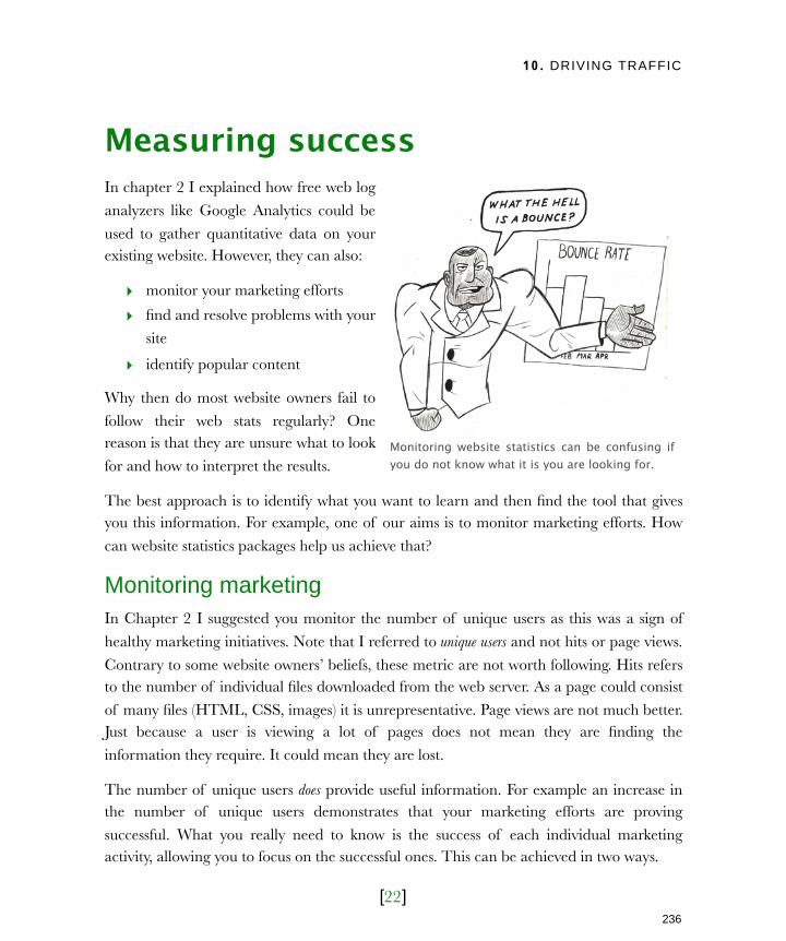
10. DRIVING TRAFFIC
[22]
Measuring successIn chapter 2 I explained how free web log
analyzers like Google Analytics could be
used to gather quantitative data on your existing website. However, they can also:
‣ monitor your marketing efforts
‣ find and resolve problems with your
site
‣ identify popular content
Why then do most website owners fail to
follow their web stats regularly? One reason is that they are unsure what to look
for and how to interpret the results.
The best approach is to identify what you want to learn and then find the tool that gives you this information. For example, one of our aims is to monitor marketing efforts. How
can website statistics packages help us achieve that?
Monitoring marketingIn Chapter 2 I suggested you monitor the number of unique users as this was a sign of
healthy marketing initiatives. Note that I referred to unique users and not hits or page views.
Contrary to some website owners’ beliefs, these metric are not worth following. Hits refers to the number of individual files downloaded from the web server. As a page could consist
of many files (HTML, CSS, images) it is unrepresentative. Page views are not much better. Just because a user is viewing a lot of pages does not mean they are finding the
information they require. It could mean they are lost.
The number of unique users does provide useful information. For example an increase in the number of unique users demonstrates that your marketing efforts are proving
successful. What you really need to know is the success of each individual marketing activity, allowing you to focus on the successful ones. This can be achieved in two ways.
Monitoring website statistics can be confusing if you do not know what it is you are looking for.
236
Licensed to Henry Vanyan <[email protected]>
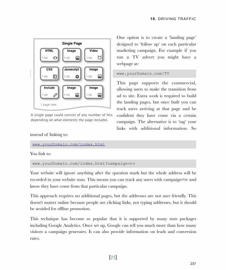
10. DRIVING TRAFFIC
[23]
One option is to create a ‘landing page’
designed to ‘follow up’ on each particular marketing campaign. For example if you
run a TV advert you might have a
webpage at:
www.yourDomain.com/TV
This page supports the commercial, allowing users to make the transition from
ad to site. Extra work is required to build the landing pages, but once built you can
track users arriving at that page and be
confident they have come via a certain campaign. The alternative is to ‘tag’ your
links with additional information. So instead of linking to:
www.yourDomain.com/index.html
You link to:
www.yourDomain.com/index.html?campaign=tv
Your website will ignore anything after the question mark but the whole address will be
recorded in your website stats. This means you can track any users with campaign=tv and
know they have come from that particular campaign.
This approach requires no additional pages, but the addresses are not user friendly. This
doesn't matter online because people are clicking links, not typing addresses, but it should be avoided for offline promotion.
This technique has become so popular that it is supported by many stats packages
including Google Analytics. Once set up, Google can tell you much more than how many visitors a campaign generates. It can also provide information on leads and conversion
rates.
A single page could consist of any number of hits depending on what elements the page includes.
237
Licensed to Henry Vanyan <[email protected]>
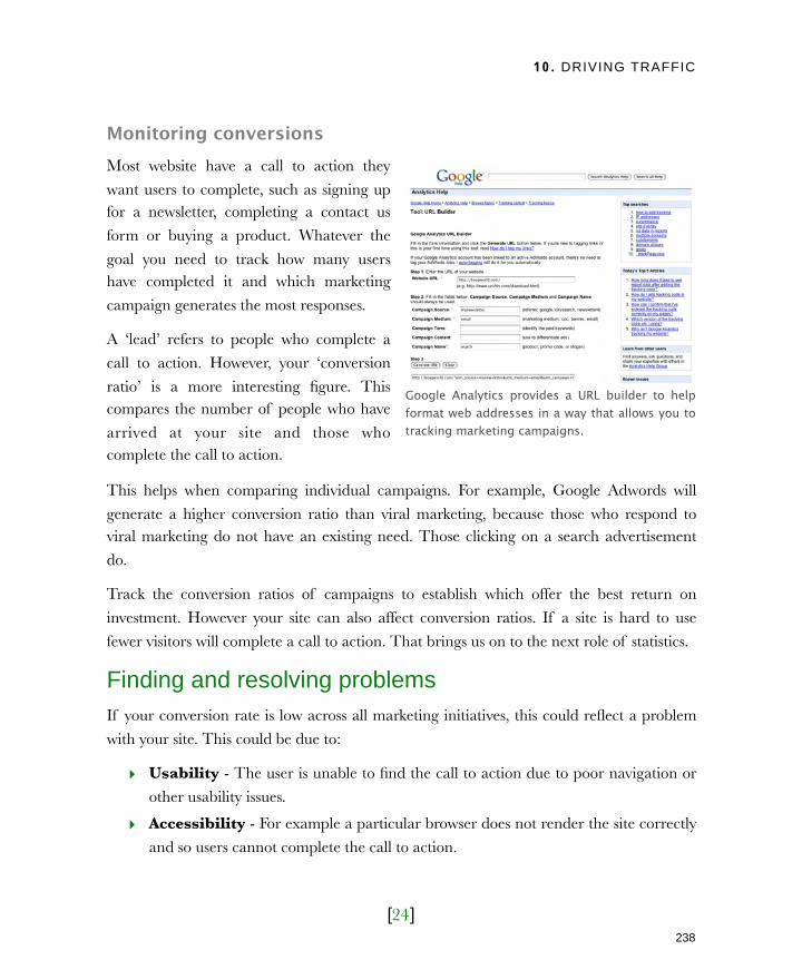
10. DRIVING TRAFFIC
[24]
Monitoring conversionsMost website have a call to action they
want users to complete, such as signing up for a newsletter, completing a contact us
form or buying a product. Whatever the
goal you need to track how many users have completed it and which marketing
campaign generates the most responses.
A ‘lead’ refers to people who complete a
call to action. However, your ‘conversion
ratio’ is a more interesting figure. This compares the number of people who have
arrived at your site and those who complete the call to action.
This helps when comparing individual campaigns. For example, Google Adwords will
generate a higher conversion ratio than viral marketing, because those who respond to viral marketing do not have an existing need. Those clicking on a search advertisement
do.
Track the conversion ratios of campaigns to establish which offer the best return on
investment. However your site can also affect conversion ratios. If a site is hard to use
fewer visitors will complete a call to action. That brings us on to the next role of statistics.
Finding and resolving problemsIf your conversion rate is low across all marketing initiatives, this could reflect a problem
with your site. This could be due to:
‣ Usability - The user is unable to find the call to action due to poor navigation or
other usability issues.
‣ Accessibility - For example a particular browser does not render the site correctly
and so users cannot complete the call to action.
Google Analytics provides a URL builder to help format web addresses in a way that allows you to tracking marketing campaigns.
238
Licensed to Henry Vanyan <[email protected]>
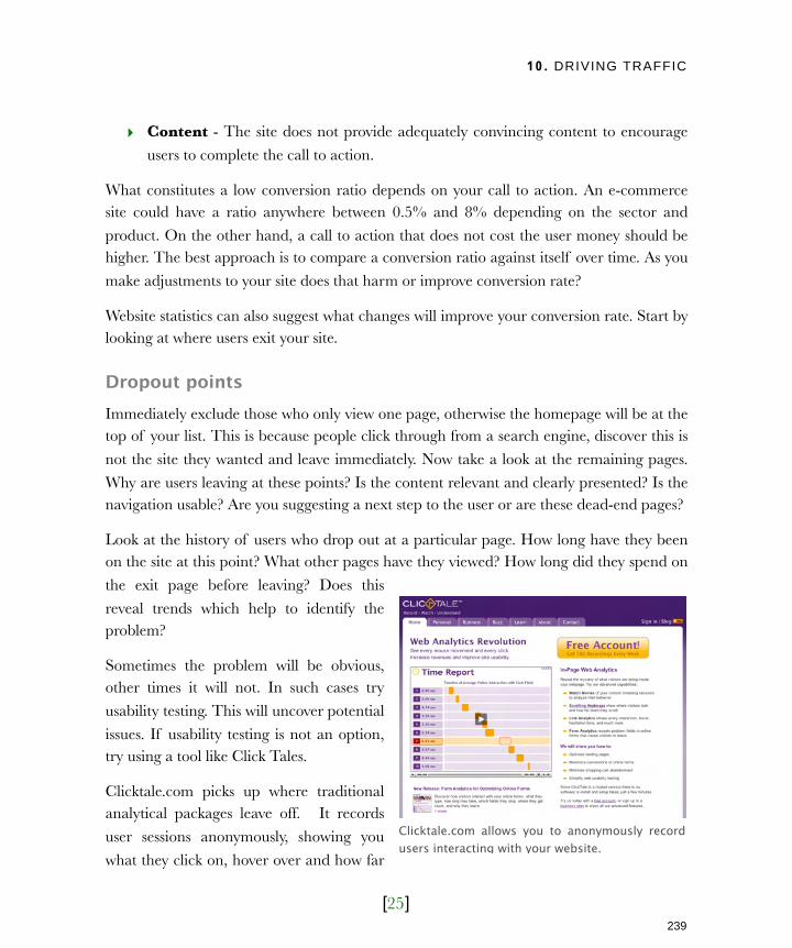
10. DRIVING TRAFFIC
[25]
‣ Content - The site does not provide adequately convincing content to encourage
users to complete the call to action.
What constitutes a low conversion ratio depends on your call to action. An e-commerce site could have a ratio anywhere between 0.5% and 8% depending on the sector and
product. On the other hand, a call to action that does not cost the user money should be higher. The best approach is to compare a conversion ratio against itself over time. As you
make adjustments to your site does that harm or improve conversion rate?
Website statistics can also suggest what changes will improve your conversion rate. Start by looking at where users exit your site.
Dropout pointsImmediately exclude those who only view one page, otherwise the homepage will be at the top of your list. This is because people click through from a search engine, discover this is
not the site they wanted and leave immediately. Now take a look at the remaining pages.
Why are users leaving at these points? Is the content relevant and clearly presented? Is the navigation usable? Are you suggesting a next step to the user or are these dead-end pages?
Look at the history of users who drop out at a particular page. How long have they been on the site at this point? What other pages have they viewed? How long did they spend on
the exit page before leaving? Does this
reveal trends which help to identify the problem?
Sometimes the problem will be obvious, other times it will not. In such cases try
usability testing. This will uncover potential
issues. If usability testing is not an option, try using a tool like Click Tales.
Clicktale.com picks up where traditional analytical packages leave off. It records
user sessions anonymously, showing you
what they click on, hover over and how far
Clicktale.com allows you to anonymously record users interacting with your website.
239
Licensed to Henry Vanyan <[email protected]>
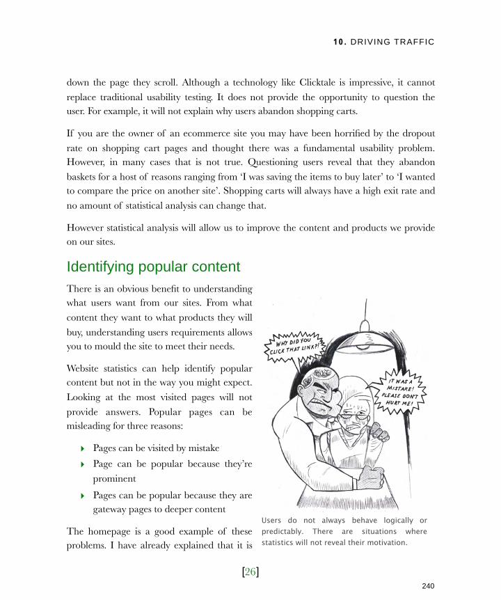
10. DRIVING TRAFFIC
[26]
down the page they scroll. Although a technology like Clicktale is impressive, it cannot
replace traditional usability testing. It does not provide the opportunity to question the user. For example, it will not explain why users abandon shopping carts.
If you are the owner of an ecommerce site you may have been horrified by the dropout
rate on shopping cart pages and thought there was a fundamental usability problem. However, in many cases that is not true. Questioning users reveal that they abandon
baskets for a host of reasons ranging from ‘I was saving the items to buy later’ to ‘I wanted to compare the price on another site’. Shopping carts will always have a high exit rate and
no amount of statistical analysis can change that.
However statistical analysis will allow us to improve the content and products we provide on our sites.
Identifying popular contentThere is an obvious benefit to understanding what users want from our sites. From what
content they want to what products they will
buy, understanding users requirements allows you to mould the site to meet their needs.
Website statistics can help identify popular content but not in the way you might expect.
Looking at the most visited pages will not
provide answers. Popular pages can be misleading for three reasons:
‣ Pages can be visited by mistake
‣ Page can be popular because they’re
prominent
‣ Pages can be popular because they are gateway pages to deeper content
The homepage is a good example of these problems. I have already explained that it is
Users do not always behave logically or predictably. There are situations where statistics will not reveal their motivation.
240
Licensed to Henry Vanyan <[email protected]>
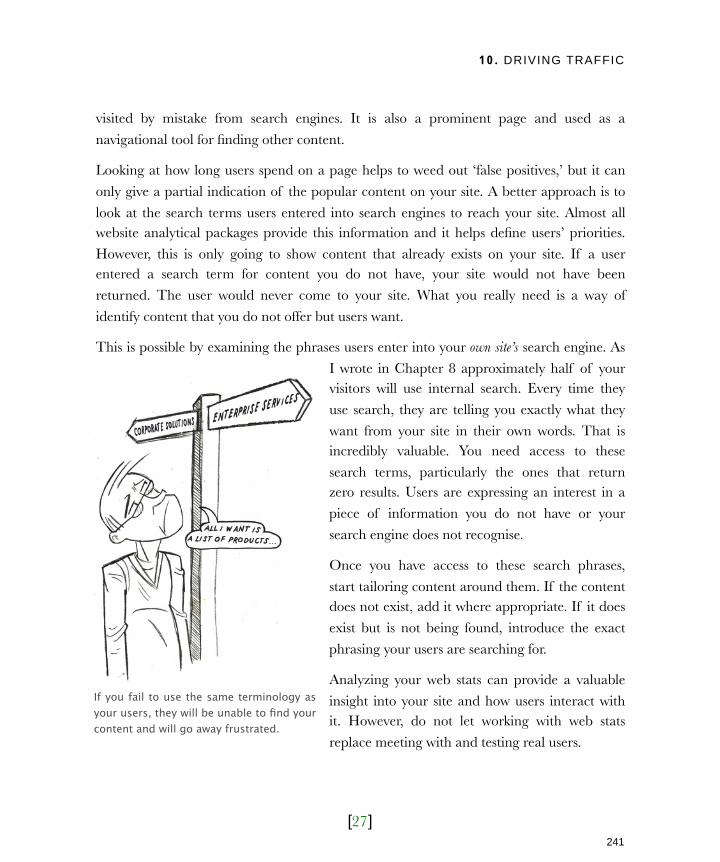
10. DRIVING TRAFFIC
[27]
visited by mistake from search engines. It is also a prominent page and used as a
navigational tool for finding other content.
Looking at how long users spend on a page helps to weed out ‘false positives,’ but it can
only give a partial indication of the popular content on your site. A better approach is to
look at the search terms users entered into search engines to reach your site. Almost all website analytical packages provide this information and it helps define users’ priorities.
However, this is only going to show content that already exists on your site. If a user entered a search term for content you do not have, your site would not have been
returned. The user would never come to your site. What you really need is a way of
identify content that you do not offer but users want.
This is possible by examining the phrases users enter into your own site’s search engine. As
I wrote in Chapter 8 approximately half of your visitors will use internal search. Every time they
use search, they are telling you exactly what they
want from your site in their own words. That is incredibly valuable. You need access to these
search terms, particularly the ones that return zero results. Users are expressing an interest in a
piece of information you do not have or your
search engine does not recognise.
Once you have access to these search phrases,
start tailoring content around them. If the content does not exist, add it where appropriate. If it does
exist but is not being found, introduce the exact
phrasing your users are searching for.
Analyzing your web stats can provide a valuable
insight into your site and how users interact with it. However, do not let working with web stats
replace meeting with and testing real users.
If you fail to use the same terminology as your users, they will be unable to find your content and will go away frustrated.
241
Licensed to Henry Vanyan <[email protected]>
10. DRIVING TRAFFIC
[28]
Next ActionsYour website is a part of a broader marketing strategy. You cannot launch a website and sit back while visitors pour in. Equally, you cannot rely on search engines alone for the
answer. You need to utilize existing offline marketing material to promote your site and
engage with users wherever they are online.
If your fledgling website is going to be a success you need to take action now:
‣ Action one: Start tracking - Ensure you can track the stats on your site. Unless
you already have a stats package, install Google Analytics. It’s free and only requires copying and pasting some code into your site.
‣ Action two: Get listed - Next you need to ensure you appear on search engines.
Start by adding yourself to Google (www.google.com/addurl) and other search engines like Yahoo! and MSN. Do this straight away as it can take several weeks to
appear. In the meantime consider using Google Adwords. It will get you instantly listed and you have complete control over the cost. Adwords campaigns also appear
in Google Analytics so you can easily track the success of these campaigns.
‣ Action one: Target your audience - Finally, identify one or two community sites where your target audience congregate and start to participate. Alongside this,
approach as many blogs and magazine sites as is appropriate to your audience. Offer to write on a subject of interest to them.
This should be more than enough to attract a new audience and ample to keep you
occupied now the build stage of the site is over.
Once you have attracted your new visitors, you need to keep them engaged. They are
unlikely to complete your call to action on their first visit so you will need to attract them back again. That is the subject of our next chapter.
242
Licensed to Henry Vanyan <[email protected]>

11. ENGAGING YOUR VISITORS
[1]
In this chapter‣ The power of community
Improving your offering
Changing brand perception
Promoting your site
Reducing your costs
‣ The right tool for the job
Broadcast tools
Feedback tools
Email feedback
Surveys and questionnaires
Interactive tools
‣ Successful communication
When to communicate
How to communicate
Know your voice
Be open and honest
‣ Fostering a community
Controlled growth
Surviving the early days
Demand based growth
Feeding the community
243
Licensed to Henry Vanyan <[email protected]>

11. ENGAGING YOUR VISITORS
[2]
11Engaging your visitorsWhen most organisations launch their first website it is nothing more than
a online brochure. Customers do not have the opportunity to respond in a meaningful way or communicate with one another. It was a model born
out of years of mass marketing.
However, the web is changing and you need to alter the way you
communicate with your users. The web is becoming an ever more
community-focused medium. High profile sites such as YouTube, Wikipedia and Facebook are built around communication between those
running the site and individual members.
This ‘community spirit’ is also spilling over into the commercial sector as
organisations such as Dell and Microsoft recognize the benefits of
transforming its users from a mass of individuals into a living community. These companies have seen the power of community revitalize damaged
brands, improve products and even reduce costs, but it has come at a cost.
Many marketeers struggle with the idea of open two-way communication
with customers. It is a model in which the ‘message’ cannot be controlled
and is sometimes unpredictable. Why then should you make your site more than brochureware? What are the benefits of cultivating a
community?
244
Licensed to Henry Vanyan <[email protected]>
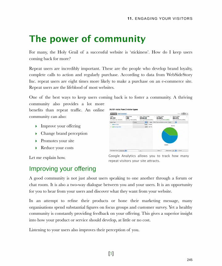
11. ENGAGING YOUR VISITORS
[3]
The power of communityFor many, the Holy Grail of a successful website is ‘stickiness’. How do I keep users
coming back for more?
Repeat users are incredibly important. These are the people who develop brand loyalty, complete calls to action and regularly purchase. According to data from WebSideStory
Inc. repeat users are eight times more likely to make a purchase on an e-commerce site. Repeat users are the lifeblood of most websites.
One of the best ways to keep users coming back is to foster a community. A thriving
community also provides a lot more benefits than repeat traffic. An online
community can also:
‣ Improve your offering
‣ Change brand perception
‣ Promotes your site
‣ Reduce your costs
Let me explain how.
Improving your offeringA good community is not just about users speaking to one another through a forum or
chat room. It is also a two-way dialogue between you and your users. It is an opportunity
for you to hear from your users and discover what they want from your website.
In an attempt to refine their products or hone their marketing message, many
organisations spend substantial figures on focus groups and customer survey. Yet a healthy community is constantly providing feedback on your offering. This gives a superior insight
into how your product or service should develop, at little or no cost.
Listening to your users also improves their perception of you.
Google Analytics allows you to track how many repeat visitors your site attracts.
245
Licensed to Henry Vanyan <[email protected]>
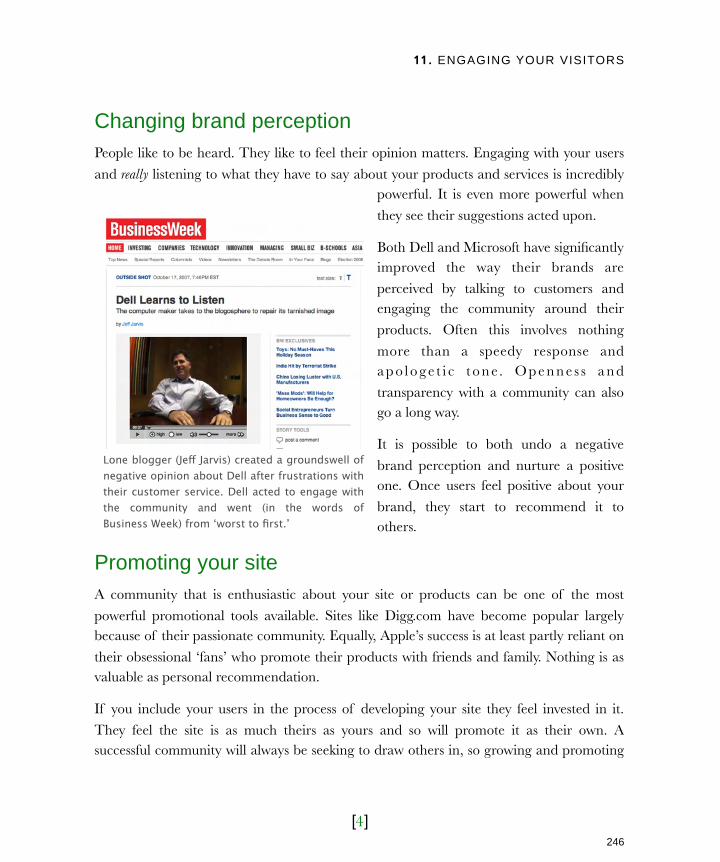
11. ENGAGING YOUR VISITORS
[4]
Changing brand perceptionPeople like to be heard. They like to feel their opinion matters. Engaging with your users
and really listening to what they have to say about your products and services is incredibly powerful. It is even more powerful when
they see their suggestions acted upon.
Both Dell and Microsoft have significantly improved the way their brands are
perceived by talking to customers and engaging the community around their
products. Often this involves nothing
more than a speedy response and a p o l o g e t i c t o n e. O p e n n e s s a n d
transparency with a community can also go a long way.
It is possible to both undo a negative
brand perception and nurture a positive one. Once users feel positive about your
brand, they start to recommend it to others.
Promoting your siteA community that is enthusiastic about your site or products can be one of the most
powerful promotional tools available. Sites like Digg.com have become popular largely because of their passionate community. Equally, Apple’s success is at least partly reliant on
their obsessional ‘fans’ who promote their products with friends and family. Nothing is as valuable as personal recommendation.
If you include your users in the process of developing your site they feel invested in it.
They feel the site is as much theirs as yours and so will promote it as their own. A successful community will always be seeking to draw others in, so growing and promoting
Lone blogger (Jeff Jarvis) created a groundswell of negative opinion about Dell after frustrations with their customer service. Dell acted to engage with the community and went (in the words of Business Week) from ‘worst to first.’
246
Licensed to Henry Vanyan <[email protected]>
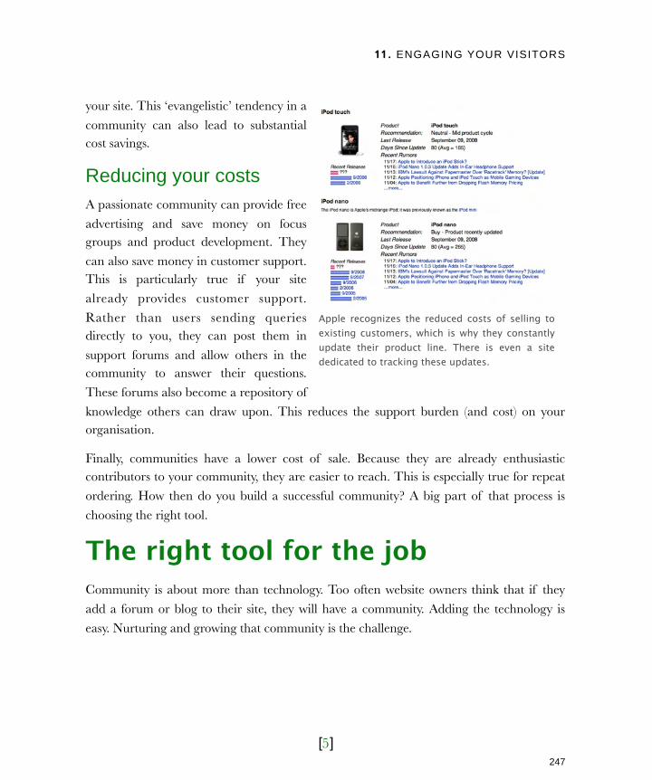
11. ENGAGING YOUR VISITORS
[5]
your site. This ‘evangelistic’ tendency in a
community can also lead to substantial cost savings.
Reducing your costsA passionate community can provide free
advertising and save money on focus groups and product development. They
can also save money in customer support. This is particularly true if your site
already provides customer support.
Rather than users sending queries directly to you, they can post them in
support forums and allow others in the community to answer their questions.
These forums also become a repository of
knowledge others can draw upon. This reduces the support burden (and cost) on your organisation.
Finally, communities have a lower cost of sale. Because they are already enthusiastic contributors to your community, they are easier to reach. This is especially true for repeat
ordering. How then do you build a successful community? A big part of that process is
choosing the right tool.
The right tool for the jobCommunity is about more than technology. Too often website owners think that if they
add a forum or blog to their site, they will have a community. Adding the technology is
easy. Nurturing and growing that community is the challenge.
Apple recognizes the reduced costs of selling to existing customers, which is why they constantly update their product line. There is even a site dedicated to tracking these updates.
247
Licensed to Henry Vanyan <[email protected]>

11. ENGAGING YOUR VISITORS
[6]
Yet tools do help shape the community. Different tools fulfill different roles. If you use the
wrong tool, no amount of nurturing will make the community grow. It is therefore important that you understand the tools available. In essence there are three types of
community tool:
‣ Broadcast tools
‣ Feedback tools
‣ Interactive tools
Let us look at how each works.
Broadcast toolsBroadcast tools allow you to communicate
with your community but do not allow your community to respond. They
generate interest, but don’t nurture community.
Some use these tools because they are
fashionable, without a real understanding of their role. It is important to be aware
of each tool’s strengths and weaknesses as well as the job they perform. These tools
include:
‣ Blogs - Most organisations fail to grasp blogging. Many corporate blog posts are nothing more than press releases and do nothing to nurture community. An
effective blog should build personal relationships with users. It should be personal,
engaging and encourage feedback via comments (see feedback tools below).
‣ Podcasting - Podcasting can be more time consuming than blogging . It also has
SEO and accessibility issues. It is still a powerful way of engaging with visitors. As
with radio or television, the consumer feels they know the presenter and experience
Microsoft has improved its image by encouraging individual employees to blog about their work. This openness has helped humanize the company and improve customer relationships.
248
Licensed to Henry Vanyan <[email protected]>

11. ENGAGING YOUR VISITORS
[7]
a personal connect ion. Most
successful podcasts have a substantial number of passionate followers who
natural ly for m a community.
Podcasts are also less common than blogs, so it is easier to stand out from
the crowd. Finally, podcasts can be accessed away from the PC via MP3
players. This allows users to listen on
their commute or at the gym. This attracts an audience other broadcast
methods may not reach.
‣ E m a i l n e w s l e t t e r s -
Organisations have been sending email newsletters for years. However, because of
their proliferation and the growth of spam, they are becoming less effective as a broadcast tool. Often they are ignored or worst still deleted by spam filters. That
said, they should still be apart of your strategy for encouraging repeat traffic. They
have a proven track record for bring people back to your site.
Web feeds (also known as RSS) have begun to replace email newsletters. They are also an
integral part of both blogging and podcasting. Users can subscribe to a web feed of a blog, podcast or indeed any other number of information sources. This feed is then
delivered to a feed aggregator. These aggregators are integrated into all kinds of software
including Microsoft Outlook, Internet Explorer and web applications. This allows users to see updates from numerous sources without having to visit each site individually.
Web feeds are an excellent way of ‘pushing’ content to interested parties without relying on them to checking your website regularly. The downside of web feeds and all the tools
mentioned so far is that they are focused on pushing content to users. To create a
community we need to hear from users.
Gary Vaynerchuk produces a daily wine podcast that receives 100,000 downloads per episode and promotes his wine retail business. Gary attributes the success of the show to his community.
249
Licensed to Henry Vanyan <[email protected]>
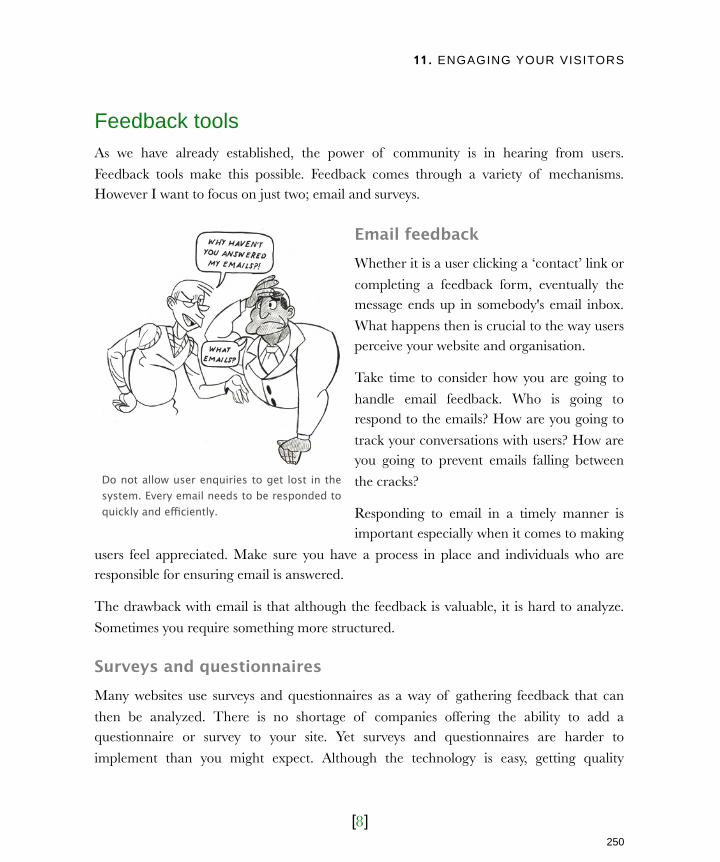
11. ENGAGING YOUR VISITORS
[8]
Feedback tools As we have already established, the power of community is in hearing from users.
Feedback tools make this possible. Feedback comes through a variety of mechanisms. However I want to focus on just two; email and surveys.
Email feedbackWhether it is a user clicking a ‘contact’ link or
completing a feedback form, eventually the message ends up in somebody's email inbox.
What happens then is crucial to the way users perceive your website and organisation.
Take time to consider how you are going to
handle email feedback. Who is going to respond to the emails? How are you going to
track your conversations with users? How are you going to prevent emails falling between
the cracks?
Responding to email in a timely manner is important especially when it comes to making
users feel appreciated. Make sure you have a process in place and individuals who are responsible for ensuring email is answered.
The drawback with email is that although the feedback is valuable, it is hard to analyze.
Sometimes you require something more structured.
Surveys and questionnaires Many websites use surveys and questionnaires as a way of gathering feedback that can
then be analyzed. There is no shortage of companies offering the ability to add a questionnaire or survey to your site. Yet surveys and questionnaires are harder to
implement than you might expect. Although the technology is easy, getting quality
Do not allow user enquiries to get lost in the system. Every email needs to be responded to quickly and efficiently.
250
Licensed to Henry Vanyan <[email protected]>
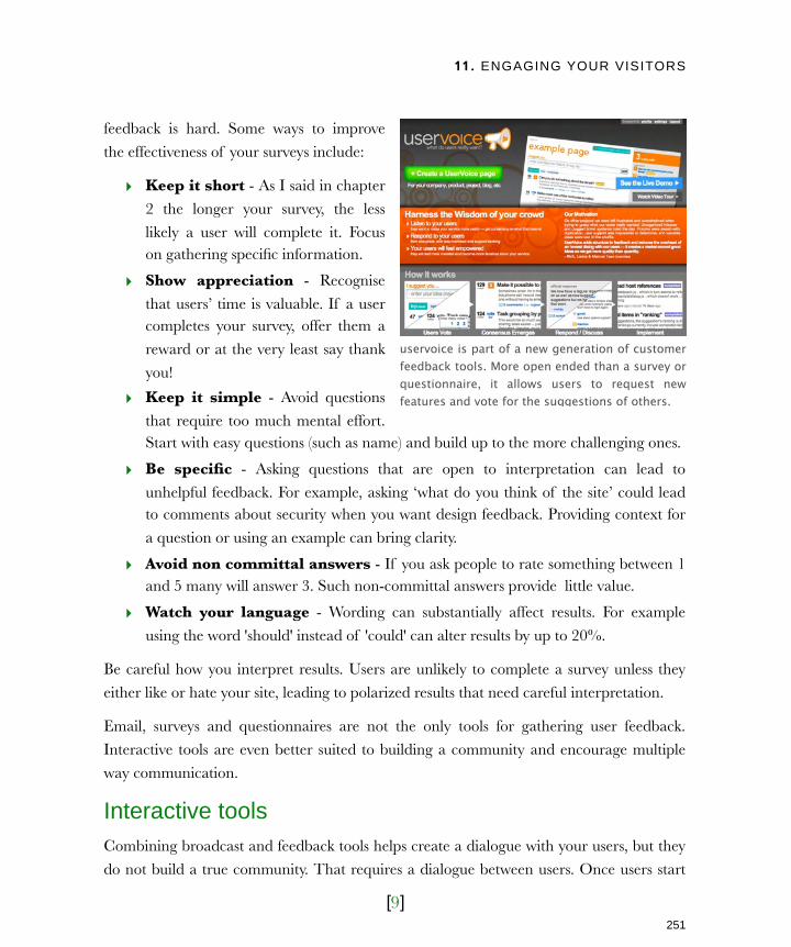
11. ENGAGING YOUR VISITORS
[9]
feedback is hard. Some ways to improve
the effectiveness of your surveys include:
‣ Keep it short - As I said in chapter
2 the longer your survey, the less
likely a user will complete it. Focus on gathering specific information.
‣ Show appreciation - Recognise
that users’ time is valuable. If a user completes your survey, offer them a
reward or at the very least say thank
you!
‣ Keep it simple - Avoid questions
that require too much mental effort. Start with easy questions (such as name) and build up to the more challenging ones.
‣ Be specific - Asking questions that are open to interpretation can lead to
unhelpful feedback. For example, asking ‘what do you think of the site’ could lead to comments about security when you want design feedback. Providing context for
a question or using an example can bring clarity.
‣ Avoid non committal answers - If you ask people to rate something between 1 and 5 many will answer 3. Such non-committal answers provide little value.
‣ Watch your language - Wording can substantially affect results. For example
using the word 'should' instead of 'could' can alter results by up to 20%.
Be careful how you interpret results. Users are unlikely to complete a survey unless they
either like or hate your site, leading to polarized results that need careful interpretation.
Email, surveys and questionnaires are not the only tools for gathering user feedback.
Interactive tools are even better suited to building a community and encourage multiple
way communication.
Interactive toolsCombining broadcast and feedback tools helps create a dialogue with your users, but they
do not build a true community. That requires a dialogue between users. Once users start
uservoice is part of a new generation of customer feedback tools. More open ended than a survey or questionnaire, it allows users to request new features and vote for the suggestions of others.
251
Licensed to Henry Vanyan <[email protected]>
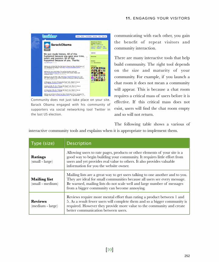
11. ENGAGING YOUR VISITORS
[10]
communicating with each other, you gain
the benefit of repeat visitors and community interaction.
There are many interactive tools that help
build community. The right tool depends on the size and maturity of your
community. For example, if you launch a chat room it does not mean a community
will appear. This is because a chat room
requires a critical mass of users before it is effective. If this critical mass does not
exist, users will find the chat room empty and so will not return.
The following table shows a various of
interactive community tools and explains when it is appropriate to implement them.
Type (size) Description
Ratings(small - large)
Allowing users to rate pages, products or other elements of your site is a good way to begin building your community. It requires little effort from users and yet provides real value to others. It also provides valuable information for you the website owner.
Mailing list(small - medium)
Mailing lists are a great way to get users talking to one another and to you. They are ideal for small communities because all users see every message. Be warned, mailing lists do not scale well and large number of messages from a bigger community can become annoying.
Reviews(medium - large)
Reviews require more mental effort than rating a product between 1 and 5. As a result fewer users will complete them and so a bigger community is required. However they provide more value to the community and create better communication between users.
Community does not just take place on your site. Barack Obama engaged with his community of supporters via social networking tool Twitter in the last US election.
252
Licensed to Henry Vanyan <[email protected]>

11. ENGAGING YOUR VISITORS
[11]
Type (size) Description
Comments(medium - large)
The ability to comment on articles, blog posts and other content is extremely popular. Like reviews, comments require a degree of effort on the part of users. They also require more people to maintain a sufficient level of activity.
Forums(medium - large)
Forums are the most popular community tool, but they only work effectively for medium to large communities. Often forums lay dormant if they do not have sufficient users to remain active. Nobody wants to be the only person at the party!
User generate content(large)
Many high profile communities such as YouTube, Facebook and Wikipedia are reliant on their users for content. Replying on and allowing users to create content is the ultimate expression of community. It does require a large number of dedicated users to be successful.
Chat room(large)
You need a large community of visitors regularly visiting your site to support a real-time chat room. If you do not then chat rooms can lay empty most of the time. Users will stop coming because they presume the community is dead.
If you are looking to build a new community, begin with ratings and slowly progress
through the interactive tools until you have enough committed users to support forums and eventually even chat rooms. Of course, having the right tools is only a part of the
battle. The important part is knowing how to communicate with users successfully.
Successful communicationIt is important to set the right tone for your community through the way you communicate with your users. Successful communication is trickier than it first appears. It
is dependent on two factors:
‣ When you communicate
‣ How you communicate
Get this wrong and you risk seriously damaging the relationship with your users.
253
Licensed to Henry Vanyan <[email protected]>

11. ENGAGING YOUR VISITORS
[12]
When to communicateThe schedule of your communications is
always important, whether posting to a blog or sending out a newsletter. Send
too many communications and it
becomes irritating, too few and they forget about you.
This frequency depends on the nature of your site. If your site sends out stock tips
then users may expect updates every few
minutes. If you sell a service that is purchased once every couple of years
then sending out communications every few weeks will be enough.
The key is regularity rather than frequency. Users should come to expect your
communications. Communicating on an ad-hoc basis becomes frustrating, especially with
blog posts, newsletters and podcasts.
However, communication does not have to be completely dictated by a schedule. You can
also have trigger-based communications. These are normally emails sent to a specific individual rather than the whole community. They are sent in response to a specific event
rather than a schedule.
A common trigger-based communication is the emails sent to users who have just purchased from an e-commerce site. These typically include an email confirming the
transaction but also one when the goods are dispatched. These emails are extremely important and yet are often overlooked in the development process.
Trigger-based communication also encourage repeat traffic. Most website communities
have a large number of ‘sleepers’. These are individuals who have signed up for your site but have stopped using it. It is possible to monitor user activity, so if they stop using the
service an email can be automatically sent tempting them back with incentives or new content.
Internet media company Revision 3 recognises the importance of regular release dates, which is why they have set broadcast times for all their shows.
254
Licensed to Henry Vanyan <[email protected]>
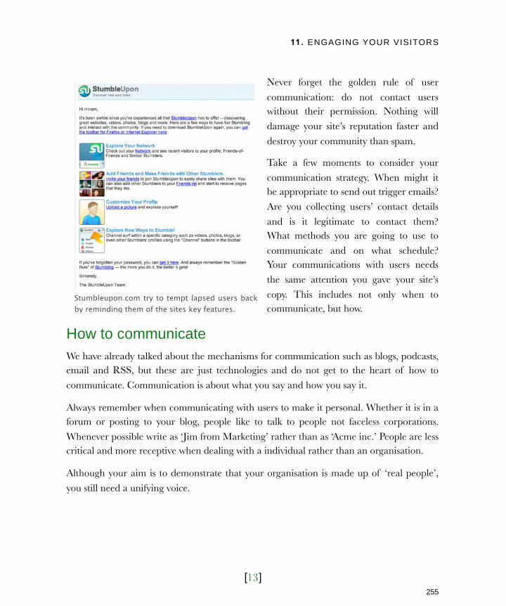
11. ENGAGING YOUR VISITORS
[13]
Never forget the golden rule of user
communication: do not contact users without their permission. Nothing will
damage your site’s reputation faster and
destroy your community than spam.
Take a few moments to consider your
communication strategy. When might it be appropriate to send out trigger emails?
Are you collecting users’ contact details
and is it legitimate to contact them? What methods you are going to use to
communicate and on what schedule? Your communications with users needs
the same attention you gave your site’s
copy. This includes not only when to communicate, but how.
How to communicateWe have already talked about the mechanisms for communication such as blogs, podcasts, email and RSS, but these are just technologies and do not get to the heart of how to
communicate. Communication is about what you say and how you say it.
Always remember when communicating with users to make it personal. Whether it is in a forum or posting to your blog, people like to talk to people not faceless corporations.
Whenever possible write as ‘Jim from Marketing’ rather than as ‘Acme inc.’ People are less critical and more receptive when dealing with a individual rather than an organisation.
Although your aim is to demonstrate that your organisation is made up of ‘real people’,
you still need a unifying voice.
Stumbleupon.com try to tempt lapsed users back by reminding them of the sites key features.
255
Licensed to Henry Vanyan <[email protected]>

11. ENGAGING YOUR VISITORS
[14]
Know your voiceThe danger of individual employees
engaging with your users is that your organisation sends out mixed messages
about its identity. All copy should have a
consistent tone, from the content on your website to the emails you send existing
customers.
This may seem contradictory. On one
hand I demand a consistent identity and
on the other I want users to see the people behind your organisation. Yet this
is actually an approach newspapers have been employing for years.
Most newspapers have recognizable
columnists. However, each newspaper has an overall identity. For example in the
U.K. tabloid newspaper “the Sun” has a very different persona to that of “the Times”.
Deciding on your persona will underpin all communications with users. Ask the question -
if your site was a person, what type of person would it be? Would it be a young hip teenager or a boring, middle-aged business man? These characteristics help define how
you communicate and the tone you set for your site. Whatever persona you create should always be open and transparent.
Be open and honestMany organisations feel they need to maintain a flawless facade with users. This serves to
create a barrier, reinforcing the feeling that the user is dealing with a faceless corporation.
All emails from print company moo.com are written as if sent by a piece of software called ‘little moo’. Although somewhat gimmicky this persona is strangely appealing.
256
Licensed to Henry Vanyan <[email protected]>

11. ENGAGING YOUR VISITORS
[15]
A better approach is to be honest and
fallible. Nothing is more effective in getting users’ trust than admitting when you’re
wrong. Take the photo sharing site
Flickr.com. Their site suffered a series of outages in which users were unable to
access their photos. Unsurprisingly the mood in the Flickr community was pretty
negative. However, Flickr was able to turn
that negativity around with a simple blog post entitled “Sometimes We Suck.” They
acknowledged the problem, apologized and promised to do better. They did exactly
that and before long Flickr was seen as a shining example of how an organisation should
run a community.
It is possible to turn a critical user into an evangelist for your site simply by responding in a
timely and open manner. Users can instantly broadcast their frustrations via blogs, social networks and other methods of online communication, so you cannot afford to ignore
them. However, if you respond in a positive and open fashion those same users will be
broadcasting their pleasure at your response.
Of course to respond to a user in a timely and open manner, you first need to encourage
that user to communicate with you by fostering a sense of community.
Fostering a communityThe sad truth is that most website owners only hear from users when there is a problem. “I can’t get this to work!” “Where is this piece of content?” “Why don’t you offer this?”
Although it is possible to nurture community out of such negative correspondences, it is not community in itself. There is no sense of loyalty to your site and certainly no
interaction between users.
Photo sharing site Flickr.com is always quick to acknowledge when they make mistakes.
257
Licensed to Henry Vanyan <[email protected]>
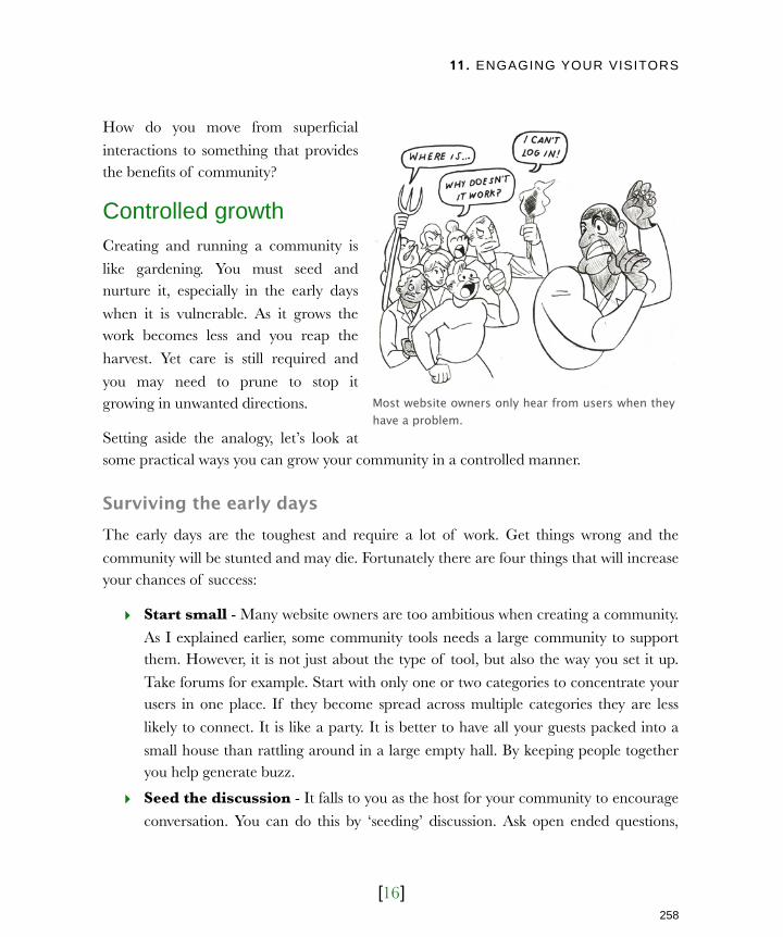
11. ENGAGING YOUR VISITORS
[16]
How do you move from superficial
interactions to something that provides the benefits of community?
Controlled growthCreating and running a community is
like gardening. You must seed and nurture it, especially in the early days
when it is vulnerable. As it grows the work becomes less and you reap the
harvest. Yet care is still required and
you may need to prune to stop it growing in unwanted directions.
Setting aside the analogy, let’s look at some practical ways you can grow your community in a controlled manner.
Surviving the early daysThe early days are the toughest and require a lot of work. Get things wrong and the
community will be stunted and may die. Fortunately there are four things that will increase your chances of success:
‣ Start small - Many website owners are too ambitious when creating a community.
As I explained earlier, some community tools needs a large community to support them. However, it is not just about the type of tool, but also the way you set it up.
Take forums for example. Start with only one or two categories to concentrate your users in one place. If they become spread across multiple categories they are less
likely to connect. It is like a party. It is better to have all your guests packed into a
small house than rattling around in a large empty hall. By keeping people together you help generate buzz.
‣ Seed the discussion - It falls to you as the host for your community to encourage
conversation. You can do this by ‘seeding’ discussion. Ask open ended questions,
Most website owners only hear from users when they have a problem.
258
Licensed to Henry Vanyan <[email protected]>
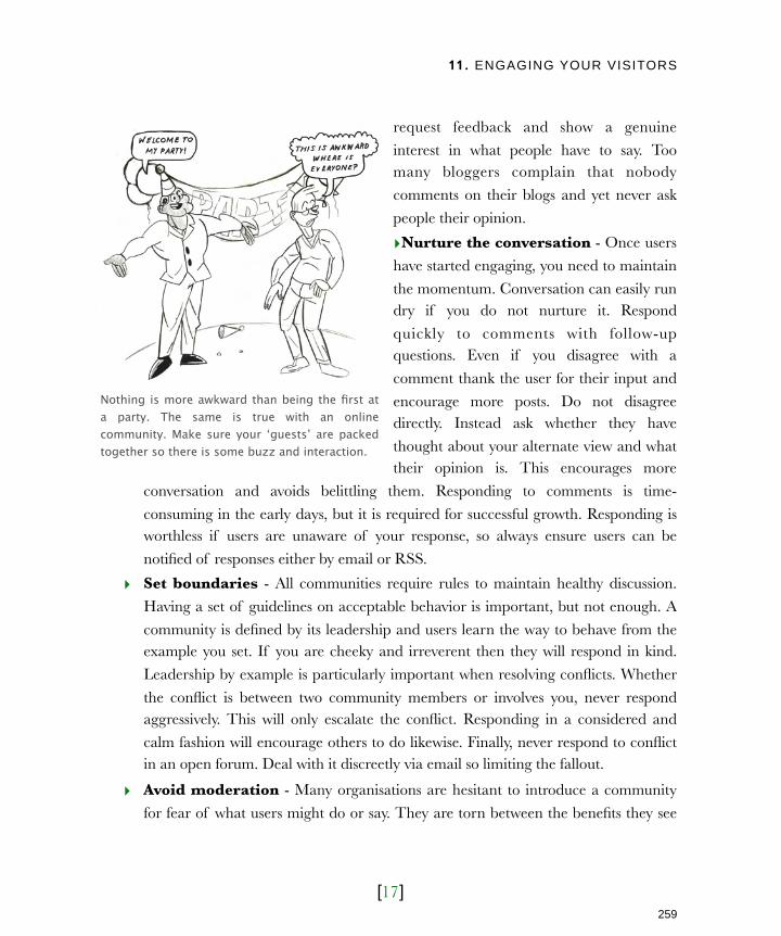
11. ENGAGING YOUR VISITORS
[17]
request feedback and show a genuine
interest in what people have to say. Too many bloggers complain that nobody
comments on their blogs and yet never ask
people their opinion.
‣Nurture the conversation - Once users
have started engaging, you need to maintain
the momentum. Conversation can easily run dry if you do not nurture it. Respond
quickly to comments with follow-up questions. Even if you disagree with a
comment thank the user for their input and
encourage more posts. Do not disagree directly. Instead ask whether they have
thought about your alternate view and what their opinion is. This encourages more
conversation and avoids belittling them. Responding to comments is time-
consuming in the early days, but it is required for successful growth. Responding is worthless if users are unaware of your response, so always ensure users can be
notified of responses either by email or RSS.
‣ Set boundaries - All communities require rules to maintain healthy discussion.
Having a set of guidelines on acceptable behavior is important, but not enough. A
community is defined by its leadership and users learn the way to behave from the example you set. If you are cheeky and irreverent then they will respond in kind.
Leadership by example is particularly important when resolving conflicts. Whether
the conflict is between two community members or involves you, never respond aggressively. This will only escalate the conflict. Responding in a considered and
calm fashion will encourage others to do likewise. Finally, never respond to conflict in an open forum. Deal with it discreetly via email so limiting the fallout.
‣ Avoid moderation - Many organisations are hesitant to introduce a community
for fear of what users might do or say. They are torn between the benefits they see
Nothing is more awkward than being the first at a party. The same is true with an online community. Make sure your ‘guests’ are packed together so there is some buzz and interaction.
259
Licensed to Henry Vanyan <[email protected]>
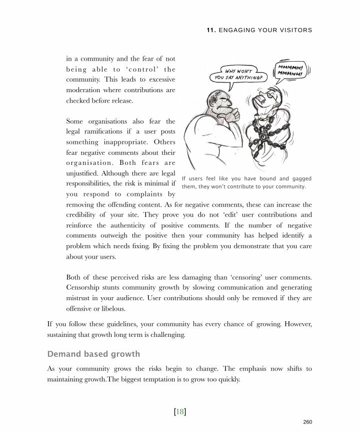
11. ENGAGING YOUR VISITORS
[18]
in a community and the fear of not
b e i n g a b l e t o ‘ c o n t ro l ’ t h e community. This leads to excessive
moderation where contributions are
checked before release.
Some organisations also fear the legal ramifications if a user posts
something inappropriate. Others
fear negative comments about their organi sat ion. Both fear s are
unjustified. Although there are legal responsibilities, the risk is minimal if
you respond to complaints by
removing the offending content. As for negative comments, these can increase the credibility of your site. They prove you do not ‘edit’ user contributions and
reinforce the authenticity of positive comments. If the number of negative comments outweigh the positive then your community has helped identify a
problem which needs fixing. By fixing the problem you demonstrate that you care
about your users.
Both of these perceived risks are less damaging than ‘censoring’ user comments. Censorship stunts community growth by slowing communication and generating
mistrust in your audience. User contributions should only be removed if they are
offensive or libelous.
If you follow these guidelines, your community has every chance of growing. However,
sustaining that growth long term is challenging.
Demand based growthAs your community grows the risks begin to change. The emphasis now shifts to
maintaining growth.The biggest temptation is to grow too quickly.
If users feel like you have bound and gagged them, they won’t contribute to your community.
260
Licensed to Henry Vanyan <[email protected]>

11. ENGAGING YOUR VISITORS
[19]
A handful of users request a forum and so you create one. Others ask for more categories
in the forum and so you add them. The problem is that a handful of users is not always enough. There needs to be a significant demand for new features before you implement
them. Without that demand, new features will not be used and your community will
appear to be dying. It is the party analogy I gave early. Better to have users concentrated on one or two community features than
spread thinly across several.
Knowing when to expand is difficult. Do it
too early and you give the impression your
community is unpopular. Do it too late and you frustrate users because their ideas are
not being implemented. No matter how hard you try you will make mistakes.
Do not be afraid to remove features which
are not working. Pruning is an essential part of a successful community. It is especially
important for older communities where numbers are beginning to decline. If you do
not have enough people to support a forum, be willing to move to a mailing list which is
better suited to smaller numbers. You will find that this stimulates new growth.
A growing community also brings scaling problems. When a community gets large it
becomes difficult to follow everything. It becomes hard to nurture new members and the community feels like a full-time job. Although the benefits of community are high they do
not normally justify that level of commitment.
The solution is to utilize your community. As the community grows enthusiastic members will emerge, regular contributors who are full of suggestions and ideas about how the site
could be improved. Ask these people if they want to be community leaders and effectively help run the community. Their role will be to moderate content, resolve disagreements
and encourage conversation.
The Boagworld.com forum relies heavily on community leaders to encourage new members, stimulate discussion and police community rules.
261
Licensed to Henry Vanyan <[email protected]>
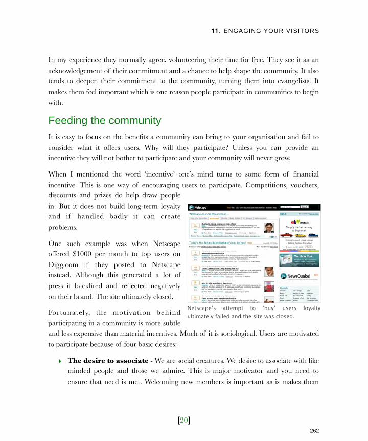
11. ENGAGING YOUR VISITORS
[20]
In my experience they normally agree, volunteering their time for free. They see it as an
acknowledgement of their commitment and a chance to help shape the community. It also tends to deepen their commitment to the community, turning them into evangelists. It
makes them feel important which is one reason people participate in communities to begin
with.
Feeding the communityIt is easy to focus on the benefits a community can bring to your organisation and fail to
consider what it offers users. Why will they participate? Unless you can provide an incentive they will not bother to participate and your community will never grow.
When I mentioned the word ‘incentive’ one’s mind turns to some form of financial
incentive. This is one way of encouraging users to participate. Competitions, vouchers, discounts and prizes do help draw people
in. But it does not build long-term loyalty and if handled badly it can create
problems.
One such example was when Netscape offered $1000 per month to top users on
Digg.com if they posted to Netscape instead. Although this generated a lot of
press it backfired and reflected negatively
on their brand. The site ultimately closed.
Fortunately, the motivation behind
participating in a community is more subtle and less expensive than material incentives. Much of it is sociological. Users are motivated
to participate because of four basic desires:
‣ The desire to associate - We are social creatures. We desire to associate with like minded people and those we admire. This is major motivator and you need to
ensure that need is met. Welcoming new members is important as is makes them
Netscape’s attempt to ‘buy’ users loyalty ultimately failed and the site was closed.
262
Licensed to Henry Vanyan <[email protected]>
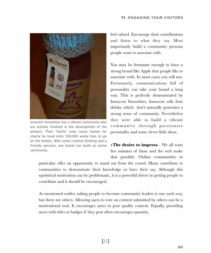
11. ENGAGING YOUR VISITORS
[21]
feel valued. Encourage their contributions
and listen to what they say. Most importantly build a community persona
people want to associate with.
You may be fortunate enough to have a
strong brand like Apple that people like to associate with. In most cases you will not.
Fortunately, communications full of
personality can take your brand a long way. This is perfectly demonstrated by
Innocent Smoothies. Innocent sells fruit drinks, which don’t naturally generates a
strong sense of community. Nevertheless
they were able to build a vibrant c o m m u n i t y t h r o u g h p a s s i o n a t e
personality and some clever little ideas.
‣The desire to impress - We all want
five minutes of fame and the web make that possible. Online communities in
particular offer an opportunity to stand out from the crowd. Many contribute to
communities to demonstrate their knowledge or have their say. Although this egotistical motivation can be problematic, it is a powerful driver in getting people to
contribute and it should be encouraged.
As mentioned earlier, asking people to become community leaders is one such way,
but there are others. Allowing users to vote on content submitted by others can be a motivational tool. It encourages users to post quality content. Equally, providing
users with titles or badges if they post often encourages quantity.
Innocent Smoothies has a vibrant community who are actively involved in the development of the product. Their “family” even raises money for charity by hand knits 500,000 wooly hats to go on the bottles. With some creative thinking and a friendly persona, any brand can build an active community.
263
Licensed to Henry Vanyan <[email protected]>
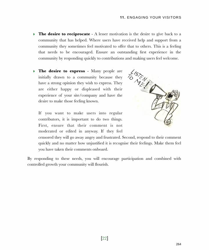
11. ENGAGING YOUR VISITORS
[22]
‣ The desire to reciprocate - A lesser motivation is the desire to give back to a
community that has helped. Where users have received help and support from a
community they sometimes feel motivated to offer that to others. This is a feeling that needs to be encouraged. Ensure an outstanding first experience in the
community by responding quickly to contributions and making users feel welcome.
‣ The desire to express - Many people are
initially drawn to a community because they have a strong opinion they wish to express. They
are either happy or displeased with their
experience of your site/company and have the desire to make those feeling known.
If you want to make users into regular
contributors, it is important to do two things.
First, ensure that their comment is not moderated or edited in anyway. If they feel
censored they will go away angry and frustrated. Second, respond to their comment quickly and no matter how unjustified it is recognise their feelings. Make them feel
you have taken their comments onboard.
By responding to these needs, you will encourage participation and combined with controlled growth your community will flourish.
264
Licensed to Henry Vanyan <[email protected]>

11. ENGAGING YOUR VISITORS
[23]
Next ActionsCommunity is a powerful business tool. It is a great way to retain customers, promote your site, improve your product and reduce your costs. In this chapter we have explored the
tools of community and the techniques for launching and maintaining that community.
However, understanding the principles of creating an effective community and putting that into practice are two different things. It can feel like an overwhelming task but you
can begin the process in three simple steps:
‣ Action one: Establish the potential - Before you begin to invest in community
tools establish whether there is a need. Do you already receive regular requests for
community features? At the least you will need a large newsletter subscriber base to work with. If you have neither, consider adding a survey to your site to see if users
are interested. If nobody completes the survey then they are unlikely to contribute
to a community. If they do and are positive then there is potential.
‣ Action two: Gather the resources - Once you have established potential, you
need to secure resources. A community needs a leader who is committed to
checking the site regularly and responding to users contributions. It is a big job and so it is important to find somebody who has the time and people skills to carry it
out. Second, you will need to implement the tools of community. Remember to start small. Ratings and comments are a good place to start.
‣ Action three: Commit to the long term - Finally, realize that building a
community is a long-term commitment. It will not happen overnight. You will need buy-in from your organisation if the community is going to survive. The return on
your investment will take time to materialize.
Building a community is not your only long-term commitment. The site itself and indeed
your entire web strategy is a long-term commitment. You should always be looking to the
future and thinking about the next step. That is the topic of our final chapter.
265
Licensed to Henry Vanyan <[email protected]>
12. PLANNING FOR THE FUTURE
[1]
In this chapter‣ A broken model
Adopt continuous development
‣ A broken relationship
A better client/designer relationship
‣ Targeting emerging trends
Creating a richer experience
Building on the shoulders of giants
Looking beyond your website
Building web services
Computer friendly content
‣ Targeting emerging platforms
Looking beyond the PC
The importance of environment
The limitations of the device
Move to the desktop
‣ Staying informed
266
Licensed to Henry Vanyan <[email protected]>

12. PLANNING FOR THE FUTURE
[2]
12Planning for the futureBefore becoming a web designer I trained in print design. Although I
enjoyed it, I always hated the finality. Once something was sent to press, there was no turning back.
The web doesn’t have these constraints. You can launch a site on Monday and tweak the design or content on Tuesday. This is both a blessing and a
curse.
A curse because it feels like the work will never end (and it won’t). A blessing because your site can dynamically change and adapt with your
business and user requirements.
It is your job as website owner to shape this evolution.
How do you plan the future of your site? How do you ensure it is flexible
enough to adapt to the rapidly evolving web? What exactly are the emerging trends and where do you look when keeping an eye on the
future?
The key to planning for the future is accepting that most of us have the
wrong attitude towards web design.
267
Licensed to Henry Vanyan <[email protected]>

12. PLANNING FOR THE FUTURE
[3]
A broken modelMost organisations have a throw away mentality that works like this: A company
commissions a rebuild of their website. The new site is launched and everybody is excited.
As time goes by, it begins to age. Content goes out of date. The design does not reflect changes in brand or audience. Technology becomes obsolete. Eventually the website is
seen as an embarrassment.
Everybody in the company knows the site is a problem, but nobody is responsible for
solving it. Finally, somebody in senior management decides the site must be prioritized
and a new version is commissioned. The old site is thrown out, and the cycle begins again. This is wasteful for two reasons:
‣ It wastes money - Completely replacing the old site every 2-3 years is a waste of
money. You replicate work already done, rather than build on what was there.
‣ It wastes potential - The website spends much of its life sits unused because
those within your organisation are
ashamed of it. Your site should be working hard to generate leads, support
customers and fulfill other functions throughout its entire life cycle.
It damages the way your organisation perceives
the web. Instead of seeing it as a powerful tool that supports your business, it is seen as a
significant expense.
Users visiting your site midway between
redesigns will see something out of date and
unreflective of your organisation.
It is time to move away from this broken
approach to one of continuous development.
If your site is left untended it will become out of date. Eventually it will be seen as a liability.
268
Licensed to Henry Vanyan <[email protected]>

12. PLANNING FOR THE FUTURE
[4]
Adopt continuous developmentFor your website to have a long-term future, you need to stop periodic redesigns and
embrace continual development. This is a significant cultural shift, especially from a financial perspective. Most organisations perceive their website as a periodic capital
expenditure (like buying a new photocopier) rather than an ongoing investment (like their
marketing budget). This needs to change.
In chapter 3 I explained the benefits of phased development and those same benefits
apply here. Continual development provides a financial benefit because:
‣Work is not being ‘thrown away’ -
I n s t e a d o f r e p l a c i n g p r e v i o u s
development work you enhance it.
‣Cash flow is improved - You replace
a major capital investment every few
ye a r s , w i t h a s m a l l e r o n g o i n g commitment.
The redesign model is partly born out of
the way organisations engage with their web design agency. This relationship also
needs to change.
A broken relationshipUnless they have an in-house web team, most organisations do not regularly speak to their web designers. Instead they hire an agency on a per-project basis. Many believe it is good
practice to change supplier every couple of years. It is not.
Whatever the case, it is the website owner who normally defines the project, writes the
brief and sets the scope. Although this approach is appropriate when commissioning an
agency for the first time (or when replacing an incumbent) it it not ideal. It is flawed for three reasons:
Periodically redesigning your website almost always results in the previous website being discarded. This is a wasteful approach.
269
Licensed to Henry Vanyan <[email protected]>

12. PLANNING FOR THE FUTURE
[5]
‣ It is time consuming - Finding,
choosing and briefing agencies
takes time. Taking on these new agencies also perpetuates the
redesign cycle, because each agency wants to stamp their own
mark on the site.
‣ There is a learning curve - The new agency has a steep
lear n ing curve be fore they
understand the business enough to deliver an effective solution. Even
an incumbent agency has a learning curve. Things may have
changed dramatically in the months (or years!) since they last worked on your site.
‣ The agency’s role is stifled - Web designers should be more than implementors. Traditionally it is the website owner who defines the brief and the
agency who responds. However, this provides no opportunity for the agency to contribute ideas to the site. The site fails to benefit from their expertise.
Surely there is a better way.
A better client / designer relationshipIf the future is in the continual evolution of your site, then you must break down the barriers of the formal tendering process. You and your team need to really engage in order
to move your site forward.
A good web design agency should be constantly suggesting new ideas to you. They should
share what they have learnt from other projects and from the industry at large. You can
then decide which of these ideas apply to your business.
Web designers are not just experts in building sites, they are also experts in the web. They
are aware of what other sites are doing and what is possible. Use this knowledge.
It is important to have an ongoing relationship with the team that built your website.
270
Licensed to Henry Vanyan <[email protected]>

12. PLANNING FOR THE FUTURE
[6]
This kind of relationship takes time to
develop. The agency needs to understand your business and objectives before they can
make suggestions. This will not work if you
regularly change suppliers or only talk to your agency every couple of years.
Arrange regular meetings with your agency. Encourage them to share what they have
been doing on other projects and what
innovations they have seen online. Encourage suggestions.
You may think that having an in-house team will foster this relationship. After all an
in-house team will know the business and
always be around to make suggestions.
There are many benefits to having in-house capacity (see chapter 3), but it has some
drawbacks. An in-house team does not work on other websites and so cannot learn from those sites. Many in-house teams are preoccupied with day-to-day maintenance rather
than long-term strategy.
Whether you have an in-house team or use an external agency, make sure they report trends they see emerging online. These trends are the future of your web strategy.
Targeting emerging trendsI started designing website in 1994 and back then it would have been impossible to
imagine the web of today. It is foolish to predict the long-term future of your website. Things simply move too fast. However, it is possible to see the next big thing.
If you use an external web designer, ask him or her to share ideas from other projects. You may find some of them are applicable to your site.
271
Licensed to Henry Vanyan <[email protected]>

12. PLANNING FOR THE FUTURE
[7]
I could write on entire book on emerging
trends, but there are three areas which I believe are relevant in the short term:
‣ The growing prevalence of rich
media
‣ The rise of the API and widget
‣ Web strategies that look beyond the website
Deciding which of these trends is
applicable to your site should be done in consultation with your web design team.
Each involves emerging technologies more complex than the other topics found in this
book. I will outline what is possible, but you
will need further advice if you are interested in implementing these ideas.
Creating a richer experienceAudio and video have been on the web for years. Recently the widespread adoption of
broadband and improved compression techniques have increased their prevalence.
From YouTube to iTunes, audio and video have become intrinsic parts of the web and yet
many website owners have not integrated them into their web strategies. Some of the
possibilities for using rich media include:
‣ Starting a podcast - In chapter 11 I explained the benefits of podcasting. Yet
many believe it is too complicated. In reality podcasting can be done on a shoe
string budget with very basic equipment. People are attracted to a podcast not for its production values but because of the content and presentation.
‣ Using video demonstrations - Often the best way to demonstrate your product
or website is to show people. Whether it is a video of your product, a panoramic of a venue or a screencast about using your site, video can communicate a lot of
information in a short time.
The combination of video hosting sites like Vimeo and the spread of broadband, mean an increasing number of sites are introducing video content.
272
Licensed to Henry Vanyan <[email protected]>
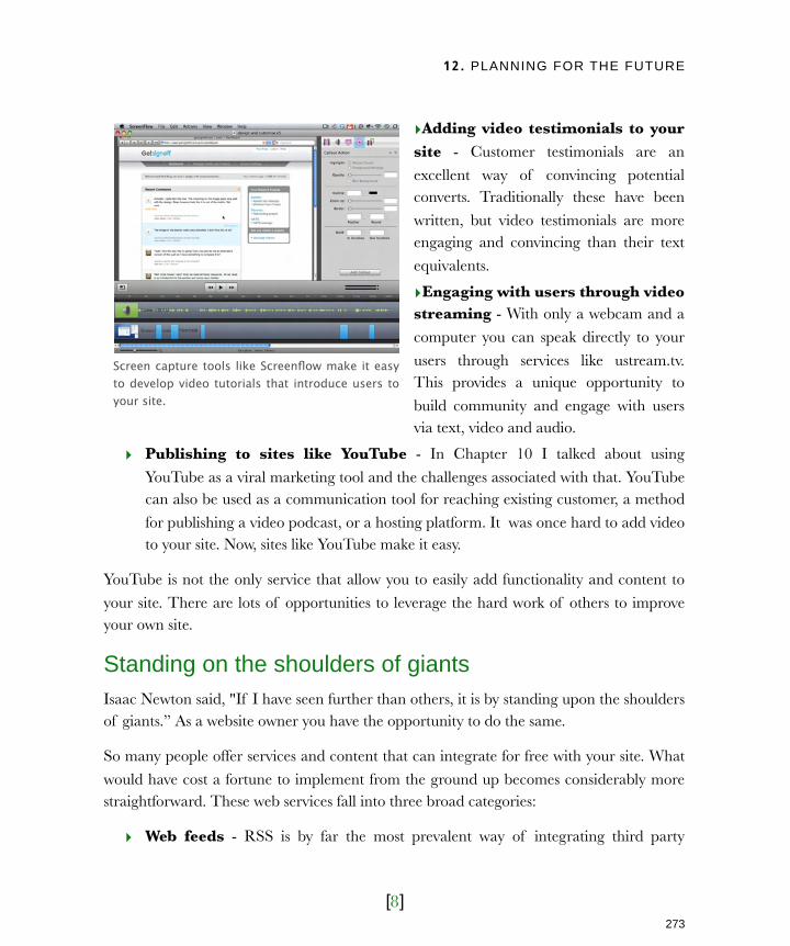
12. PLANNING FOR THE FUTURE
[8]
‣Adding video testimonials to your site - Customer testimonials are an
excellent way of convincing potential converts. Traditionally these have been
written, but video testimonials are more engaging and convincing than their text
equivalents.
‣Engaging with users through video streaming - With only a webcam and a
computer you can speak directly to your
users through services like ustream.tv. This provides a unique opportunity to
build community and engage with users via text, video and audio.
‣ Publishing to sites like YouTube - In Chapter 10 I talked about using
YouTube as a viral marketing tool and the challenges associated with that. YouTube can also be used as a communication tool for reaching existing customer, a method
for publishing a video podcast, or a hosting platform. It was once hard to add video to your site. Now, sites like YouTube make it easy.
YouTube is not the only service that allow you to easily add functionality and content to
your site. There are lots of opportunities to leverage the hard work of others to improve your own site.
Standing on the shoulders of giantsIsaac Newton said, "If I have seen further than others, it is by standing upon the shoulders of giants.” As a website owner you have the opportunity to do the same.
So many people offer services and content that can integrate for free with your site. What
would have cost a fortune to implement from the ground up becomes considerably more straightforward. These web services fall into three broad categories:
‣ Web feeds - RSS is by far the most prevalent way of integrating third party
Screen capture tools like Screenflow make it easy to develop video tutorials that introduce users to your site.
273
Licensed to Henry Vanyan <[email protected]>
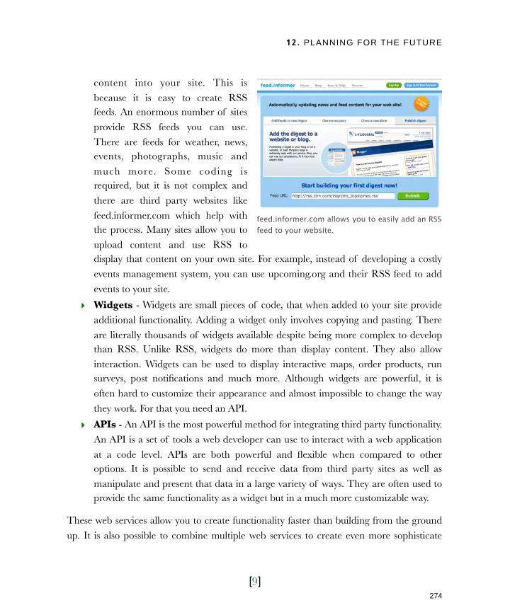
12. PLANNING FOR THE FUTURE
[9]
content into your site. This is
because it is easy to create RSS feeds. An enormous number of sites
provide RSS feeds you can use.
There are feeds for weather, news, events, photographs, music and
much more. Some coding is required, but it is not complex and
there are third party websites like
feed.informer.com which help with the process. Many sites allow you to
upload content and use RSS to display that content on your own site. For example, instead of developing a costly
events management system, you can use upcoming.org and their RSS feed to add
events to your site.
‣ Widgets - Widgets are small pieces of code, that when added to your site provide
additional functionality. Adding a widget only involves copying and pasting. There
are literally thousands of widgets available despite being more complex to develop than RSS. Unlike RSS, widgets do more than display content. They also allow
interaction. Widgets can be used to display interactive maps, order products, run surveys, post notifications and much more. Although widgets are powerful, it is
often hard to customize their appearance and almost impossible to change the way
they work. For that you need an API.
‣ APIs - An API is the most powerful method for integrating third party functionality.
An API is a set of tools a web developer can use to interact with a web application
at a code level. APIs are both powerful and flexible when compared to other options. It is possible to send and receive data from third party sites as well as
manipulate and present that data in a large variety of ways. They are often used to provide the same functionality as a widget but in a much more customizable way.
These web services allow you to create functionality faster than building from the ground
up. It is also possible to combine multiple web services to create even more sophisticate
feed.informer.com allows you to easily add an RSS feed to your website.
274
Licensed to Henry Vanyan <[email protected]>

12. PLANNING FOR THE FUTURE
[10]
applications called mash-ups. For example
twittervision.com takes posts from social networking site Twitter and displays them
on a map using the Google API.
The danger of web services is that your site becomes reliant on their functionality. If
the site providing the web service goes down then your own may also experience
problems. It is therefore important to be
confident in the uptime of the service before integrating it. This is not a problem
with services provided by organisations such as Google or Yahoo! However, you may wish to be more hesitant with smaller sites.
That said, web services can save you a lot of time in development, and allow functionality
normally beyond your budget. The challenge is to keep up with the growing number of services being released. You can often reinvent the wheel simply because you do not know
what is available. That is why you need an ongoing dialogue with your web design team.
Web services can also reach those who
never even visit your site.
Looking beyond your websiteWebsites are a passive way of engaging with potential customers. They rely on
users coming to the site and initiating contact. Relying on this as the sole means
of online engagement is a failure to
utilize the potential of the web.
It is not your website that matters but
widgetbox.com has thousands of widgets that you can add to your website.
Whether users see your website is irrelevant as long as your web strategy achieves it desired aim.
275
Licensed to Henry Vanyan <[email protected]>
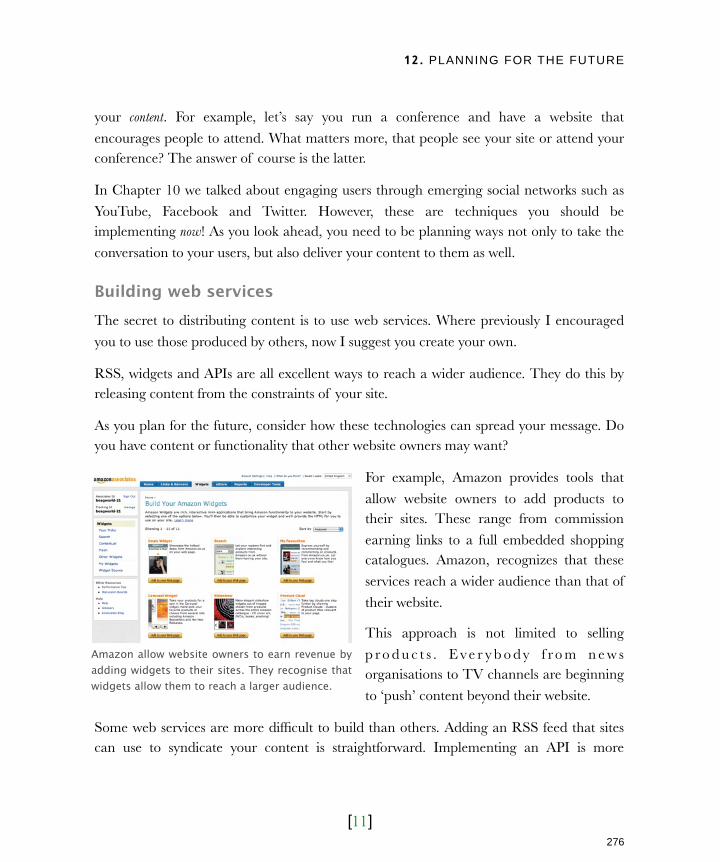
12. PLANNING FOR THE FUTURE
[11]
your content. For example, let’s say you run a conference and have a website that
encourages people to attend. What matters more, that people see your site or attend your conference? The answer of course is the latter.
In Chapter 10 we talked about engaging users through emerging social networks such as
YouTube, Facebook and Twitter. However, these are techniques you should be implementing now! As you look ahead, you need to be planning ways not only to take the
conversation to your users, but also deliver your content to them as well.
Building web servicesThe secret to distributing content is to use web services. Where previously I encouraged
you to use those produced by others, now I suggest you create your own.
RSS, widgets and APIs are all excellent ways to reach a wider audience. They do this by releasing content from the constraints of your site.
As you plan for the future, consider how these technologies can spread your message. Do you have content or functionality that other website owners may want?
For example, Amazon provides tools that
allow website owners to add products to their sites. These range from commission
earning links to a full embedded shopping catalogues. Amazon, recognizes that these
services reach a wider audience than that of
their website.
This approach is not limited to selling
p r o d u c t s . E v e r y b o d y f r o m n e w s organisations to TV channels are beginning
to ‘push’ content beyond their website.
Some web services are more difficult to build than others. Adding an RSS feed that sites can use to syndicate your content is straightforward. Implementing an API is more
Amazon allow website owners to earn revenue by adding widgets to their sites. They recognise that widgets allow them to reach a larger audience.
276
Licensed to Henry Vanyan <[email protected]>

12. PLANNING FOR THE FUTURE
[12]
challenging. Creating a basic widget can often be a good middle ground. Although
building a widget take time, it is easy to add to a site which encourages adoption.
Depending on your audience, you should consider building ‘applications’ for social
networks like Facebook or MySpace. These sites provide ‘frameworks’ that allows third
parties to build ‘applications’. Users can then add these applications to their profiles. Building applications can be time consuming, but if your audience uses these sites
regularly it may be worth the effort.
In the future, web services and applications will not be the only way to extend the reach of
your website.
Computer friendly contentTim Berners-Lee (the creator of the world wide web) has been working towards the next evolution of the web: the semantic web.
The semantic web will enable computers to understand web page in a similar way to us. They will be able to complete many of the tasks that consume our time online. For
example, they will be able to find content more efficiently than we are able using services
like Google.
The semantic web doesn’t need to be part of your short-term plans. The technologies
involved are still evolving and are some way from being mainstream. Nevertheless
there are some small steps that you can
take right now, like building your site using Microformats.
Microformats provide a standardized ways of marking up content in HTML, allowing
computers to better understand what that
content is about. For example, if the information about a conference was
marked up using Microformats, then it MapQuest uses Microformats to display longitude and Latitude, as well as the events it lists.
277
Licensed to Henry Vanyan <[email protected]>
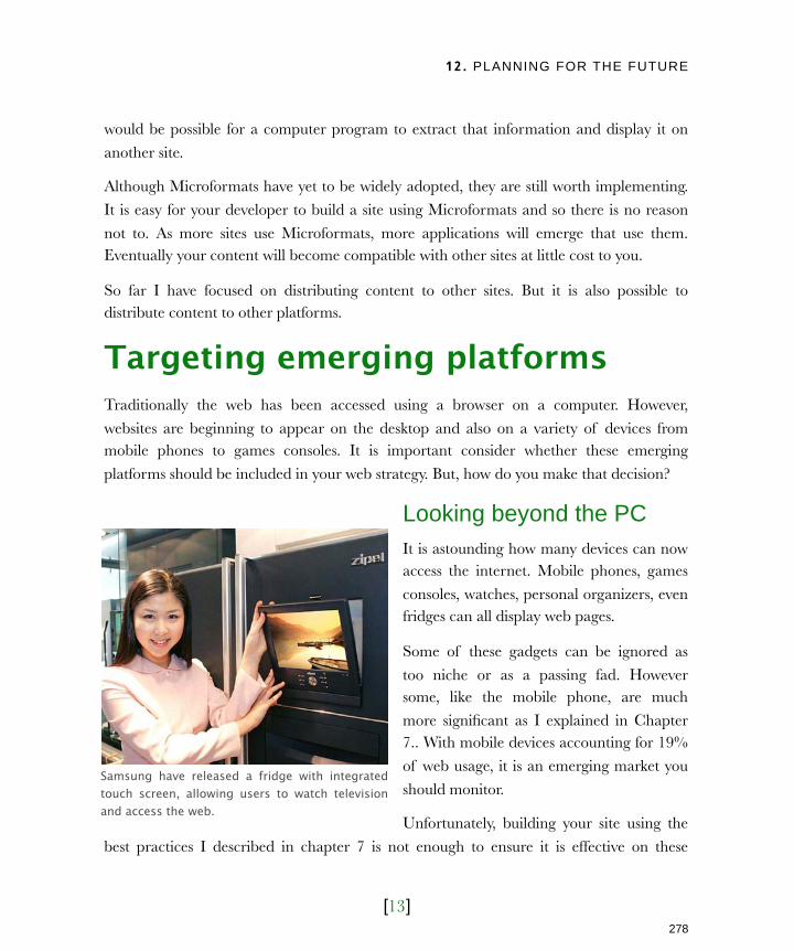
12. PLANNING FOR THE FUTURE
[13]
would be possible for a computer program to extract that information and display it on
another site.
Although Microformats have yet to be widely adopted, they are still worth implementing.
It is easy for your developer to build a site using Microformats and so there is no reason
not to. As more sites use Microformats, more applications will emerge that use them. Eventually your content will become compatible with other sites at little cost to you.
So far I have focused on distributing content to other sites. But it is also possible to distribute content to other platforms.
Targeting emerging platformsTraditionally the web has been accessed using a browser on a computer. However,
websites are beginning to appear on the desktop and also on a variety of devices from mobile phones to games consoles. It is important consider whether these emerging
platforms should be included in your web strategy. But, how do you make that decision?
Looking beyond the PCIt is astounding how many devices can now access the internet. Mobile phones, games
consoles, watches, personal organizers, even fridges can all display web pages.
Some of these gadgets can be ignored as
too niche or as a passing fad. However some, like the mobile phone, are much
more significant as I explained in Chapter 7.. With mobile devices accounting for 19%
of web usage, it is an emerging market you
should monitor.
Unfortunately, building your site using the
best practices I described in chapter 7 is not enough to ensure it is effective on these
Samsung have released a fridge with integrated touch screen, allowing users to watch television and access the web.
278
Licensed to Henry Vanyan <[email protected]>
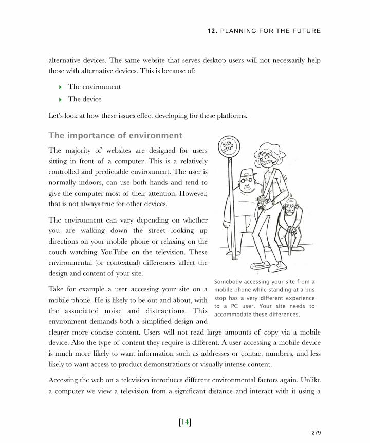
12. PLANNING FOR THE FUTURE
[14]
alternative devices. The same website that serves desktop users will not necessarily help
those with alternative devices. This is because of:
‣ The environment
‣ The device
Let’s look at how these issues effect developing for these platforms.
The importance of environmentThe majority of websites are designed for users
sitting in front of a computer. This is a relatively controlled and predictable environment. The user is
normally indoors, can use both hands and tend to
give the computer most of their attention. However, that is not always true for other devices.
The environment can vary depending on whether you are walking down the street looking up
directions on your mobile phone or relaxing on the
couch watching YouTube on the television. These environmental (or contextual) differences affect the
design and content of your site.
Take for example a user accessing your site on a
mobile phone. He is likely to be out and about, with
the associated noise and distractions. This environment demands both a simplified design and
clearer more concise content. Users will not read large amounts of copy via a mobile device. Also the type of content they require is different. A user accessing a mobile device
is much more likely to want information such as addresses or contact numbers, and less
likely to want access to product demonstrations or visually intense content.
Accessing the web on a television introduces different environmental factors again. Unlike
a computer we view a television from a significant distance and interact with it using a
Somebody accessing your site from a mobile phone while standing at a bus stop has a very different experience to a PC user. Your site needs to accommodate these differences.
279
Licensed to Henry Vanyan <[email protected]>

12. PLANNING FOR THE FUTURE
[15]
remote. Most televisions also have a
lower resolution than your average computer monitor. These factors
combine to have a significant effect on
the design of your site.
Before deciding to support a device,
consider how the user’s environment is going to alter the design and content of
your site. You may conclude that the
content you provide on your existing site is not appropriate. You may even decide
that supporting these devices is pointless because the situation or audience is
wrong for your offering.
If you do see potential in designing a site for mobile phones or other devices, also consider their limitations.
The limitations of the deviceAlternative devices do not just differ from a PC in context but also in technology. Mobile phones, games consoles and other devices all have significant differences that impact the
user experience. These include:
‣ The rendering engine - Not all devices display web pages as well as a PC. Mobile phones in particular have traditionally found it hard to display HTML
pages correctly. Also, many devices struggle with audio, video and other media.
However, these problems are diminishing as devices become more sophisticate.
‣ The screen - Devices come with an enormous variety of screens. Some are
monochrome, others have low resolution and most come in non-standard sizes. A
website that displays perfectly on most PCs will require horizontal scrolling on a TV and be unusable on a mobile phone. Fortunately, CSS can help but this does require
additional coding.
Opera has worked with Nintendo to produce a web browser for the Wii. This allows users to surf the internet from the comfort of their arm chairs.
280
Licensed to Henry Vanyan <[email protected]>

12. PLANNING FOR THE FUTURE
[16]
‣Input methods - Where most PC users have
a mouse and keyboard, those using other devices
could have any number of input methods. Remote controls, motion sensors, touch screens,
numeric keypads, the list could go on. This has a huge impact on how the user interface is built.
Once again CSS can provide the answer by
presenting different designs optimized for each device.
‣Connection speeds - Increasingly the sites
we develop with PCs in mind rely on broadband connections. They are graphically intensive and
make use of audio and video. However, some devices have less robust connections to the
internet. Mobile phones in particular have poor
connectivity especially in rural areas. Sites designed for these devices need to be
streamlined when compared to their PC counterparts.
Catering for alternative devices is not straightforward, but an increasing amount of web
traffic will come from these devices. Mobile phones need to be a part of your long-term strategy.
In the short term focus on preparation. Build your site with the latest web standards, which can be easily adapted for emerging devices. Also, think about what content the
users of these devices will want, and in what environments they will be using them.
However, amidst all of this planning for alternative devices do not forget the desktop.
Move to the desktopA new breed of desktop application is emerging that is built using web technologies. These
applications are:
An iPhone may be able to access traditional websites but the smaller screen, slower speeds and touch interface change the experience.
281
Licensed to Henry Vanyan <[email protected]>

12. PLANNING FOR THE FUTURE
[17]
‣ easier to build,
‣ do not require a different development team with different skill set,
‣ can reuse much of the technologies already developed for your websites.
Although there are a number of different
ways to create web powered desktop applications, the most common is to use
Adobe AIR. AIR allows you to build applications that run on all the major
operating systems using HTML, CSS,
Javascript and Flash.
This opens up some exciting possibilities.
However, just because you can do something doesn’t mean you should!
Be fo re i n c o r pora t in g a de s k top
application into your web strategy, ask whether it is appropriate. Do you need a desktop application or will a traditional website suffice? Ask yourself the following questions:
‣ Do your users have intermittent connectivity? - Those using desktop
applications are unaffected if they have no connection to your site. This is ideal for those with dial-up connections or traveling. However, do your users really need
access to your content while offline? In most cases they are happy to wait until they are connected again.
‣ Is the user entering a lot of data? - If you need users to complete long online
forms then you may want to consider a desktop application. They tend to be more reliable and less likely to lose data in transit to your web server. There is nothing
more annoying than loosing work because your connections times out.
‣ Do users require fast access? - Even AJAX driven websites do not respond as fast as a desktop application. Users who are continually using a portion of your site
(such as a contact directory) may become frustrated by poor performance. In some situations a fast response is required for other reasons. For example, a customer
services representative requires a faster response when looking up answers for a
eBay have built a desktop application using Adobe Air that allow users to monitor their bids.
282
Licensed to Henry Vanyan <[email protected]>
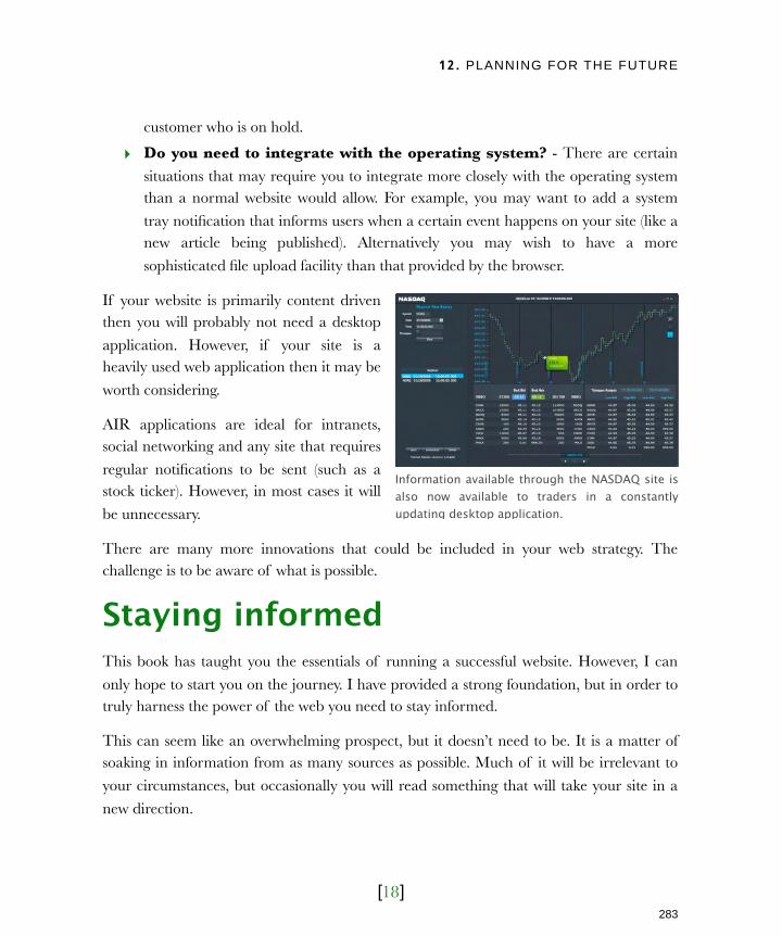
12. PLANNING FOR THE FUTURE
[18]
customer who is on hold.
‣ Do you need to integrate with the operating system? - There are certain
situations that may require you to integrate more closely with the operating system than a normal website would allow. For example, you may want to add a system
tray notification that informs users when a certain event happens on your site (like a new article being published). Alternatively you may wish to have a more
sophisticated file upload facility than that provided by the browser.
If your website is primarily content driven then you will probably not need a desktop
application. However, if your site is a heavily used web application then it may be
worth considering.
AIR applications are ideal for intranets, social networking and any site that requires
regular notifications to be sent (such as a stock ticker). However, in most cases it will
be unnecessary.
There are many more innovations that could be included in your web strategy. The challenge is to be aware of what is possible.
Staying informedThis book has taught you the essentials of running a successful website. However, I can
only hope to start you on the journey. I have provided a strong foundation, but in order to truly harness the power of the web you need to stay informed.
This can seem like an overwhelming prospect, but it doesn’t need to be. It is a matter of soaking in information from as many sources as possible. Much of it will be irrelevant to
your circumstances, but occasionally you will read something that will take your site in a
new direction.
Information available through the NASDAQ site is also now available to traders in a constantly updating desktop application.
283
Licensed to Henry Vanyan <[email protected]>

12. PLANNING FOR THE FUTURE
[19]
How do you find those nuggets of inspiration when you have limited time? Here are some
tips that will help:
‣ Get an RSS reader - If you don’t subscribe to RSS feeds then you should start.
Once you have a ‘RSS reader’, subscribe to a number of web design blogs. I can
particularly recommend Gerry McGovern (gerrymcgovern.com/new_thinking.htm) and A List Apart (alistapart.com). For a round up of web design related stories,
subscribe to my own feed at feedproxy.google.com/BoagworldArticles. Once
subscribed, scan the headlines each morning and see if anything jumps out. This shouldn’t take more than 10 minutes a day.
‣ S u b s c r i b e t o a web d e s i g n magazine - Magazines can provide an
overview of emerging innovations. They
also have the advantage that they can be read while away from the PC. I
recommend you start with the .net
magazine (netmag.co.uk).
‣ Attend local networking events -
Speaking to other site owners or des igner s i s both inspir ing and
educational. There are regular local
meetings all over the world, so you should be able to find one in your area. A
good place to start is the events site upcoming.org. From here you can search
on web design in your area.
‣ Listen to a web design podcast - You can listen to podcasts while commuting or at the gym. This avoids cutting into
valuable time but still keeps you informed about the web. Unsurprisingly I
recommend my own podcast which is available at boagworld.com.
‣ Get involved in a forum or mailing list - Join an online community of website
owners or web designers. There are a variety of forums and mailing lists full of people facing similar challenges and willing to share advice. You may wish to
Subscribe to a web design magazine like .net
284
Licensed to Henry Vanyan <[email protected]>
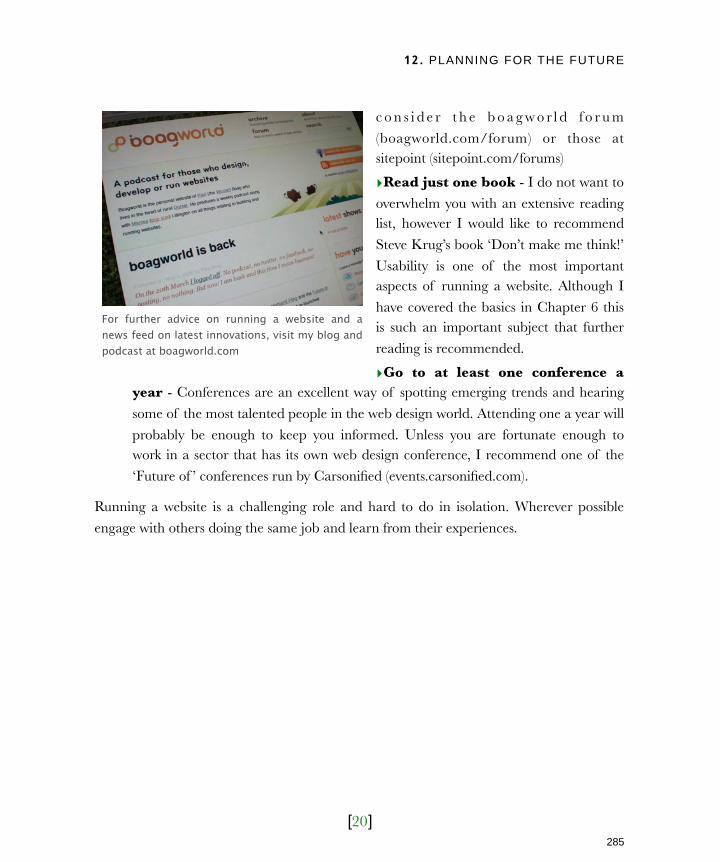
12. PLANNING FOR THE FUTURE
[20]
c o n s i d e r t h e b o a g w o r l d f o r u m
(boagworld.com/forum) or those at sitepoint (sitepoint.com/forums)
‣Read just one book - I do not want to
overwhelm you with an extensive reading list, however I would like to recommend
Steve Krug’s book ‘Don’t make me think!’
Usability is one of the most important aspects of running a website. Although I
have covered the basics in Chapter 6 this is such an important subject that further
reading is recommended.
‣Go to at least one conference a year - Conferences are an excellent way of spotting emerging trends and hearing
some of the most talented people in the web design world. Attending one a year will
probably be enough to keep you informed. Unless you are fortunate enough to work in a sector that has its own web design conference, I recommend one of the
‘Future of ’ conferences run by Carsonified (events.carsonified.com).
Running a website is a challenging role and hard to do in isolation. Wherever possible
engage with others doing the same job and learn from their experiences.
For further advice on running a website and a news feed on latest innovations, visit my blog and podcast at boagworld.com
285
Licensed to Henry Vanyan <[email protected]>
12. PLANNING FOR THE FUTURE
[21]
Next ActionsAnd so we reach the end of this book, but not the end of your journey. My underlying message has been the ongoing nature of your website and your role as website owner.
In this chapter especially, we have focused on the need to look forward. We have looked at
emerging trends and platforms. However most importantly, we have looked at your relationship with your development team. Get that right and you stand a much greater
chance of success.
So what now? Well, you could put this book aside and get on with work. However, let me
suggest three final things you could do instead:
‣ Look at your site with fresh eyes - With all that you have learnt from this book buzzing around your brain, now is a good time to take a fresh look at your site. Put
down your preconceptions and history. Allow yourself the freedom to ‘dream’.
‣ Arrange a meeting with your team - Don’t just limit brainstorming to yourself. Arrange a meeting with your design team and encourage them to share their ideas
for the site. Don’t worry about things like budget or timescales, just try to picture
what your perfect website would look like. You can worry about practicalities later.
‣ Visit boagworld.com - Finally, I would encourage you to visit my website at
boagworld.com. As well as the podcast and news feed I have already mentioned, the site contains hundreds of posts and articles on every aspect of running a website. If
there is an issue I haven’t written about email me and I will try to cover it.
Let me conclude with some words of encouragement. Running a website can seem a daunting task but it is also an incredibly exciting one. It is a medium where you can easily
correct your mistakes and that brings amazing freedom. It is the new frontier of marketing, business development and indeed business strategy. The web is a wonder of
human achievement and you get the chance to contribute to that. Enjoy the opportunity.
286