WBSC BRANDING GUIDELINES · 2017-11-28 · 2 The WBSC created a dynamic new visual identity to...
8
WBSC BRANDING GUIDELINES
Transcript of WBSC BRANDING GUIDELINES · 2017-11-28 · 2 The WBSC created a dynamic new visual identity to...

WBSC
BRANDING GUIDELINES
2
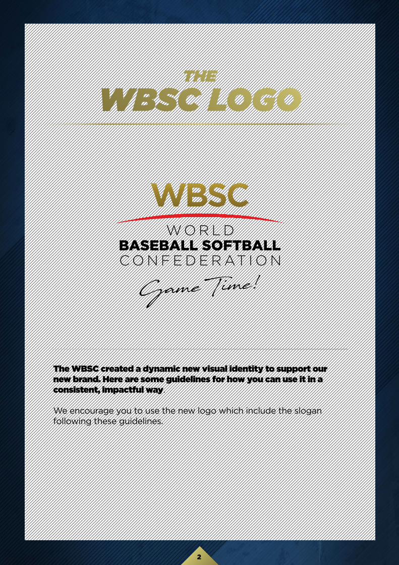
The WBSC created a dynamic new visual identity to support our new brand. Here are some guidelines for how you can use it in a consistent, impactful way.
We encourage you to use the new logo which include the slogan following these guidelines.
THE
WBSC LOGO
3
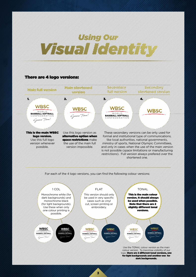
Using Our
Visual IdentityThere are 4 logo versions:
Main full version Main shortened version
Secondary full version
Secondary shortened version
This is the main WBSC logo version.
Use this full logo version whenever
possible.
Use this logo version as alternative option when space restrictions make the use of the main full
version impossible.
These secondary versions can be only used for formal and institutional type of communications,
like local authorities, national governments, ministry of sports, National Olympic Committees,
and only in cases when the use of the main version is not possible (space limitations or manufacturing restrictions). Full version always prefered over the
shortened one.
1. 2. 3. 4.
For each of the 4 logo versions, you can find the following colour versions:
1 COL FLAT TONAL
Monochrome white (for dark backgrounds) and
monochrome black (for light backgrounds).
Use these when only one colour printing is
possible.
This is the main colour version. It should always be used when possible.
Note that there are 2 slightly different tonal
versions.
Use the TONAL colour version as the main colour version. To maximise visibility of our
logo, there are 2 different tonal versions, one for light backgrounds and another one for
dark backgrounds.
This version should only be used in very specific
cases such as vinyl cut, screen printing or
embroidery.

4
Clear Space& Size
The minimum required clear space is defined by the measurement of the height of the uppercase ‘C’ letter of the WBSC logo. Any external element (including margins), must be separated to the logo with that
minimum clar space.
25mm wide70px wide
When reproducing the logo, be conscious of its size and legibility. A signature that is too small ceases to serve any useful communication function. The logo should never appear less than 25mm wide in print or 70px wide on screen.
5
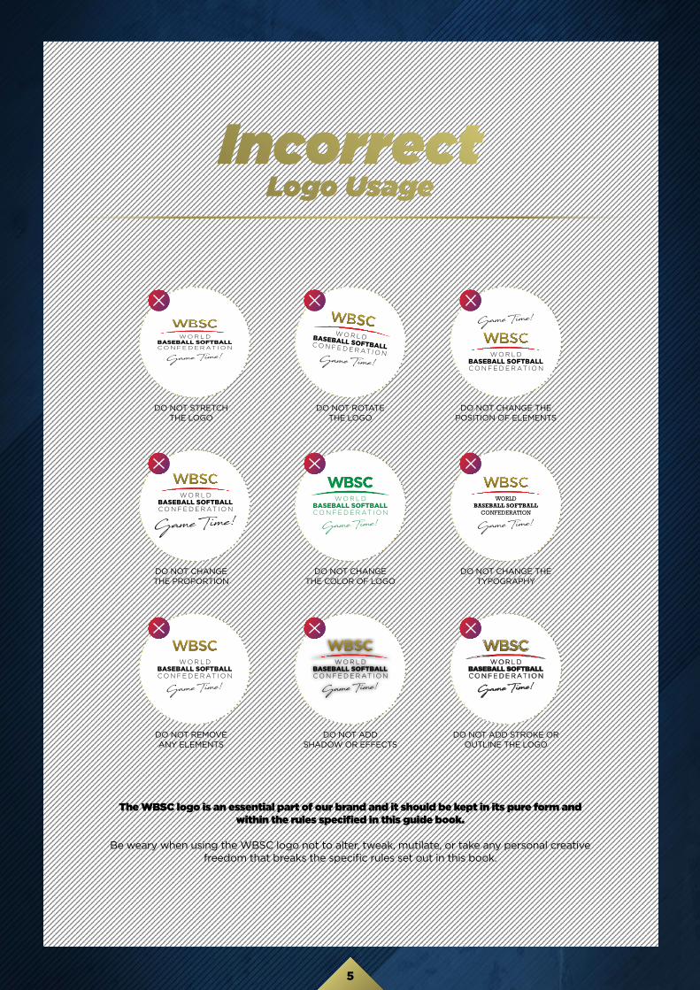
The WBSC logo is an essential part of our brand and it should be kept in its pure form and within the rules specified in this guide book.
Be weary when using the WBSC logo not to alter, tweak, mutilate, or take any personal creativefreedom that breaks the specific rules set out in this book.
Incorrect Logo Usage
DO NOT STRETCHTHE LOGO
DO NOT CHANGETHE PROPORTION
DO NOT REMOVEANY ELEMENTS
DO NOT ROTATETHE LOGO
DO NOT CHANGETHE COLOR OF LOGO
DO NOT ADDSHADOW OR EFFECTS
DO NOT CHANGE THEPOSITION OF ELEMENTS
DO NOT CHANGE THETYPOGRAPHY
DO NOT ADD STROKE OROUTLINE THE LOGO
6
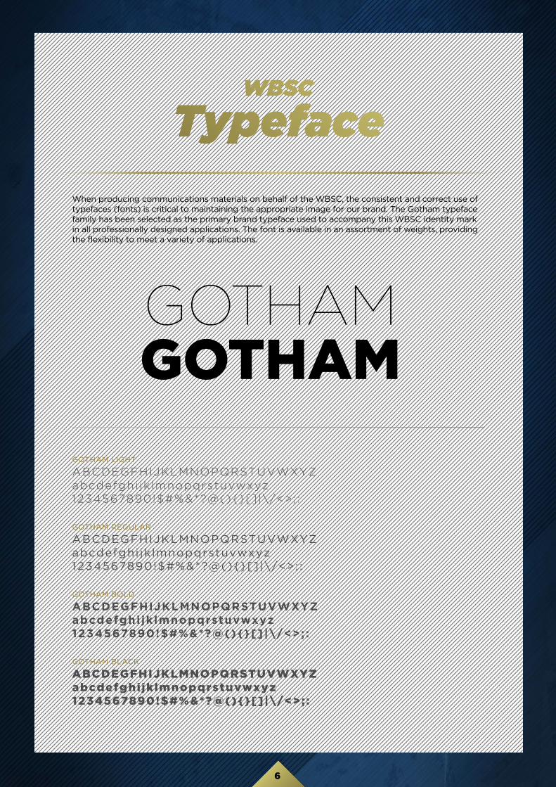
WBSC
Typeface
GOTHAM LIGHT
ABCDEGFHIJKLMNOPQRSTUVWXYZabcdefghi jk lmnopqrstuvwxyz1234567890!$#%&*?@(){}[] |\/<>; :
GOTHAM REGULAR
ABCDEGFHIJKLMNOPQRSTUVWXYZabcdefghi jk lmnopqrstuvwxyz1234567890!$#%&*?@(){}[] |\/<>; :
GOTHAM BOLD
ABCDEGFHIJKLMNOPQRSTUVWXYZabcdefghi jk lmnopqrstuvwxyz1234567890!$#%&*?@(){}[]|\/<>; :
GOTHAM BLACK
ABCDEGFHIJKLMNOPQRSTUVWXYZabcdefghi jk lmnopqrstuvwxyz1234567890!$#%&*?@(){}[]|\/<>; :
GOTHAMGOTHAM
When producing communications materials on behalf of the WBSC, the consistent and correct use of typefaces (fonts) is critical to maintaining the appropriate image for our brand. The Gotham typeface family has been selected as the primary brand typeface used to accompany this WBSC identity mark in all professionally designed applications. The font is available in an assortment of weights, providing the flexibility to meet a variety of applications.

7
A color palette has been especially developed to support this WBSC brand and identity. It is important that the WBSC logo is always reproduced in the correct colours. Please use the specific breakdowns provided to get the best possible colour matches. All Artwork files are available using the correct colours and Gradients, and are not to be altered in any circumstance. The colours that appear on your screen or that you print from your computer may not accurately represent the colours.
WBSC
Colors
C: 5 M: 100 Y: 100 K: 10PANTONE 1797 C
C: 2 M: 2 Y: 45 K: 0 C: 18 M: 18 Y: 84 K: 0
C: 35 M: 41 Y: 100 K: 9
C: 50 M: 55 Y: 100 K: 40
C: 10 M: 12 Y: 76 K: 12PANTONE 612 C
C: 100 M: 73 Y: 12 K: 33PANTONE 294 C
Red Gold
WBSC Gradient
Blue

8
Maison du Sport InternationalAvenue de Rhodanie 54 | CH-1007 Lausanne | Switzerland