
vty-ui User’s Manualjtdaugherty.github.io/vty-ui/manuals/vty-ui-users-manual...Chapter 1...
73
vty-ui User’s Manual For vty-ui version 1.6.1 Jonathan Daugherty ([email protected]) December 10, 2013
-
Upload
nguyendieu -
Category
Documents
-
view
219 -
download
1
Transcript of vty-ui User’s Manualjtdaugherty.github.io/vty-ui/manuals/vty-ui-users-manual...Chapter 1...

vty-ui User’s Manual
For vty-ui version 1.6.1Jonathan Daugherty ([email protected])
December 10, 2013
Contents
1 Introduction 2
1.1 Getting Started . . . . . . . . . . . . . . . . . . . . . . . . . . . . . . . . . . . 2
1.2 Conventions and API Notes . . . . . . . . . . . . . . . . . . . . . . . . . . . . 5
1.2.1 Widget Types . . . . . . . . . . . . . . . . . . . . . . . . . . . . . . . . 5
1.2.2 Return Values . . . . . . . . . . . . . . . . . . . . . . . . . . . . . . . . 6
1.2.3 Library Modules . . . . . . . . . . . . . . . . . . . . . . . . . . . . . . 6
2 Building Applications With vty-ui 7
2.1 Composing Widgets . . . . . . . . . . . . . . . . . . . . . . . . . . . . . . . . 7
2.2 Handling User Input . . . . . . . . . . . . . . . . . . . . . . . . . . . . . . . . 9
2.3 Focus Groups and Focus Changes . . . . . . . . . . . . . . . . . . . . . . . . 10
2.3.1 Top-Level Key Event Handlers . . . . . . . . . . . . . . . . . . . . . . 11
2.3.2 Container Widgets and Input Events . . . . . . . . . . . . . . . . . . . 11
2.3.3 Merging Focus Groups . . . . . . . . . . . . . . . . . . . . . . . . . . . 12
2.4 Collections . . . . . . . . . . . . . . . . . . . . . . . . . . . . . . . . . . . . . . 12
2.5 The vty-ui Event Loop . . . . . . . . . . . . . . . . . . . . . . . . . . . . . . 14
2.5.1 Skinning . . . . . . . . . . . . . . . . . . . . . . . . . . . . . . . . . . . 14
2.5.2 Attributes . . . . . . . . . . . . . . . . . . . . . . . . . . . . . . . . . . 15
2.5.3 vty-ui and Concurrency . . . . . . . . . . . . . . . . . . . . . . . . . 16
1

CONTENTS 2
3 Implementing Your Own Widgets 18
3.1 Creating a New Widget Type . . . . . . . . . . . . . . . . . . . . . . . . . . . 18
3.2 The WidgetImpl API . . . . . . . . . . . . . . . . . . . . . . . . . . . . . . . 21
3.3 Rendering . . . . . . . . . . . . . . . . . . . . . . . . . . . . . . . . . . . . . . 24
3.4 Growth Policy Functions . . . . . . . . . . . . . . . . . . . . . . . . . . . . . . 25
3.5 Deferring to Child Widgets . . . . . . . . . . . . . . . . . . . . . . . . . . . . 27
3.6 Widget Positioning . . . . . . . . . . . . . . . . . . . . . . . . . . . . . . . . . 28
3.7 Cursor Positioning . . . . . . . . . . . . . . . . . . . . . . . . . . . . . . . . . 29
3.8 Handling Events . . . . . . . . . . . . . . . . . . . . . . . . . . . . . . . . . . 30
3.9 Composite Widgets . . . . . . . . . . . . . . . . . . . . . . . . . . . . . . . . . 32
4 Guided Tour of Built-In vty-ui Widgets 36
4.1 Borders . . . . . . . . . . . . . . . . . . . . . . . . . . . . . . . . . . . . . . . . 36
4.2 Boxes . . . . . . . . . . . . . . . . . . . . . . . . . . . . . . . . . . . . . . . . . 38
4.3 Buttons . . . . . . . . . . . . . . . . . . . . . . . . . . . . . . . . . . . . . . . . 40
4.4 Centering . . . . . . . . . . . . . . . . . . . . . . . . . . . . . . . . . . . . . . . 40
4.5 Checkboxes and Radio Buttons . . . . . . . . . . . . . . . . . . . . . . . . . . 41
4.5.1 Binary Checkboxes . . . . . . . . . . . . . . . . . . . . . . . . . . . . . 41
4.5.2 Radio Buttons . . . . . . . . . . . . . . . . . . . . . . . . . . . . . . . . 42
4.5.3 Generalized, Multi-State Checkboxes . . . . . . . . . . . . . . . . . . 43
4.5.4 Customizing a CheckBox’s Appearance . . . . . . . . . . . . . . . . 44
4.6 Collections . . . . . . . . . . . . . . . . . . . . . . . . . . . . . . . . . . . . . . 44
4.7 Dialogs . . . . . . . . . . . . . . . . . . . . . . . . . . . . . . . . . . . . . . . . 45
4.8 The Directory Browser . . . . . . . . . . . . . . . . . . . . . . . . . . . . . . . 46
4.8.1 Skinning . . . . . . . . . . . . . . . . . . . . . . . . . . . . . . . . . . . 47
4.8.2 Annotations . . . . . . . . . . . . . . . . . . . . . . . . . . . . . . . . . 48

CONTENTS 3
4.8.3 Error Reporting . . . . . . . . . . . . . . . . . . . . . . . . . . . . . . . 49
4.9 Edit Widgets . . . . . . . . . . . . . . . . . . . . . . . . . . . . . . . . . . . . . 49
4.10 Fills . . . . . . . . . . . . . . . . . . . . . . . . . . . . . . . . . . . . . . . . . . 51
4.11 Fixed-Size Widgets . . . . . . . . . . . . . . . . . . . . . . . . . . . . . . . . . 52
4.12 Groups . . . . . . . . . . . . . . . . . . . . . . . . . . . . . . . . . . . . . . . . 53
4.13 Limits . . . . . . . . . . . . . . . . . . . . . . . . . . . . . . . . . . . . . . . . . 54
4.14 Lists . . . . . . . . . . . . . . . . . . . . . . . . . . . . . . . . . . . . . . . . . . 55
4.14.1 List Inspection . . . . . . . . . . . . . . . . . . . . . . . . . . . . . . 57
4.14.2 Scrolling a List . . . . . . . . . . . . . . . . . . . . . . . . . . . . . . 57
4.14.3 Handling Events . . . . . . . . . . . . . . . . . . . . . . . . . . . . . . 58
4.15 Padding . . . . . . . . . . . . . . . . . . . . . . . . . . . . . . . . . . . . . . . 59
4.16 Progress Bars . . . . . . . . . . . . . . . . . . . . . . . . . . . . . . . . . . . . 60
4.17 Tables . . . . . . . . . . . . . . . . . . . . . . . . . . . . . . . . . . . . . . . . . 61
4.17.1 Column Specifications: the ColumnSpec Type . . . . . . . . . . . . . 61
4.17.2 Border Settings . . . . . . . . . . . . . . . . . . . . . . . . . . . . . . . 62
4.17.3 Adding Rows . . . . . . . . . . . . . . . . . . . . . . . . . . . . . . . . 63
4.17.4 Default Cell Alignment and Padding . . . . . . . . . . . . . . . . . . 64
4.17.5 Customizing Cell Alignment and Padding . . . . . . . . . . . . . . . 64
4.18 Text . . . . . . . . . . . . . . . . . . . . . . . . . . . . . . . . . . . . . . . . . . 65
4.18.1 Updating Text Widgets . . . . . . . . . . . . . . . . . . . . . . . . . . . 66
4.18.2 Formatters . . . . . . . . . . . . . . . . . . . . . . . . . . . . . . . . . . 66
5 Other Topics 68
5.1 Text Clipping . . . . . . . . . . . . . . . . . . . . . . . . . . . . . . . . . . . . 68
5.2 The Text Zipper . . . . . . . . . . . . . . . . . . . . . . . . . . . . . . . . . . . 69
Chapter 1
Introduction
The terminal emulator user interface is a good, lightweight alternative to fully graphicalinterfaces such as those provided by GTK, QT, and the Windows and Macintosh OS X op-erating systems. Such interfaces are appealing because they can be used easily for remoteadministration, and many users prefer them over graphical interfaces for their responsive-ness.
Historically, terminal interfaces have been notoriously difficult to program. Libraries suchas Ncurses, CDK, Dialog, and Newt have appeared to aid in this task.
vty-ui provides a widget infrastructure for constructing user interfaces similar to thatprovided by libraries such as QT and GTK. In addition to rendering infrastructure, vty-uiprovides infrastructure for managing user input events, changes in widget focus, box lay-out support, and a flexible API for binding event handlers to widget events. It is built onthe Vty library,1 which provides functionality similar to Ncurses.
1.1 Getting Started
To get started using the library, you’ll need to import the main library module:
import Graphics.Vty.Widgets.All
The All module exports almost everything exported by the library. If you prefer, you canalways import specific modules.
1Vty on Hackage: http://hackage.haskell.org/package/vty
4

CHAPTER 1. INTRODUCTION 5
As a demonstration, we’ll create a program which presents an editing widget in the middleof the screen. You’ll be able to provide some text input and press Enter, at which point theprogram will exit and will print what you entered. The code for this program is as follows:
import qualified Data.Text as T
main :: IO ()main = doe <- editWidgetui <- centered e
fg <- newFocusGroupaddToFocusGroup fg e
c <- newCollectionaddToCollection c ui fg
e ‘onActivate‘ \this ->getEditText this >>= (error . ("You entered: " ++) . T.unpack)
runUi c defaultContext
There are some interesting things to note about this program. First, it withstands changesin your terminal size automatically, even though the size of the terminal is not an explicitpart of the program. Second, it only took a few lines of code to create a rich editing in-terface and position it in the terminal as desired. Now we’ll go into some depth on thisexample.
e <- editWidget
This line creates an Edit widget. This type of widget provides an editing interface for asingle line of text and supports some Emacs-style editing keybindings. The Edit widgetalso takes care of horizontal scrolling when its input doesn’t fit into the allowed space. Formore information on this widget type, see Section 4.9.
ui <- centered e
This creates a new Centered widget, ui, which centers the Edit widget vertically andhorizontally. This is a common pattern: create one widget and wrap it in another to affectits behavior. For more information on the Centered widget type, see Section 4.4.
fg <- newFocusGroup

CHAPTER 1. INTRODUCTION 6
This creates a FocusGroup widget. A “focus group” is an ordered sequence of widgetsthat will receive focus as you cycle between them. By default, this cycling is done with theTab key. Every vty-ui interface requires a focus group.
addToFocusGroup fg e
This adds the Edit widget to the FocusGroup. The first widget to be added to a Focus-Group automatically receives the initial focus, and widgets receive focus in the order inwhich they are added to the group.
c <- newCollection
This creates a new Collection. A “collection” is group of widgets, each with its ownFocusGroup, and the Collection makes it possible to switch between these interfaces.Think of an e-mail client whose initial interface might be listing the contents of the inbox;subsequent interactions might change the interface to present only the selected messageon the screen, with different navigation keystrokes, one of which returns to the inboxinterface. Collections make it easy to switch between such interface modes. Everyvty-ui program requires a Collection.
addToCollection ui fg
This adds the top-level user interface widget, ui, to the Collection and sets its focusgroup to fg. This means that the widgets to receive the users focus (and, consequently,input) will be those in the focus group fg and the interface to be presented will be ui.
e ‘onActivate‘ \this -> getEditText this >>=(error . ("You entered: " ++) . T.unpack)
This binds an event handler to the “activation” of the Edit widget. Activation occurswhen the user focuses the Edit widget and presses Enter. The handler for this event isan IO action which takes the Edit widget itself as its only parameter. The getEditTextfunction gets the current text of the Edit widget, and we use error to abort the programand print the text.2
runUi c defaultContext
2In general I wouldn’t recommend the use of error to do this, but the vty-ui event loop will still cleanlyshut down and clean up Vty in the event of any exception.
CHAPTER 1. INTRODUCTION 7
This runs the main vty-ui event loop with the Collection we created above. We passa “default rendering context” which provides defaults for the rendering process, such asthe default foreground and background colors to be used for normal and focused widgets,as well as a skin for line-drawing. The main event loop processes input events from theVty library and re-draws the interface after calling any event handlers. It also shuts downVty in the event of an exception.
We’ve now seen the general structure of a vty-ui program:
• Create and compose widgets,
• Create a FocusGroup and add input-receiving widgets to the group,
• Create a Collection and add the top-level widget(s) and FocusGroup(s) to theCollection, and
• Invoke the main event loop with the Collection and some default rendering set-tings.
1.2 Conventions and API Notes
1.2.1 Widget Types
When you create a widget in vty-ui, the result with almost always have a type likeWidget a. The type variable a represents the specific type of state the widget can carry,and therefore which operations can be performed on it. For example, a text widget hastype Widget FormattedText. Throughout this document, we’ll refer frequently towidgets by their state type (e.g., “Edit widgets”). In most cases we are referring to avalue whose type is, e.g., Widget Edit. When in doubt, be sure to check the API docu-mentation.
The Widget type is actually an IORef which wraps the real widget implementation type,WidgetImpl a. So it’s best to use Widget a whenever you need to refer to a widget;this makes it possible to mutate widget state when events occur in your application.

CHAPTER 1. INTRODUCTION 8
1.2.2 Return Values
Regarding return values, even if a function is of type ... -> IO a, we say it is “in theIO monad” and returns a. We won’t bother saying that a function returns IO a.
1.2.3 Library Modules
Lastly, we will refer to the many vty-ui library modules throughout this document. Wewill almost always omit the Graphics.Vty.Widgetsmodule namespace prefix and willinstead refer to the modules by their short names. In addition, many modules in this li-brary use Data.Text values to represent text strings. We assume that Data.Text is im-ported under the qualified name T. We also assume the use of the OverloadedStringscompiler language extension to avoid the repeated use of T.pack.

Chapter 2
Building Applications With vty-ui
This chapter will introduce various design aspects of the library and provide you with thetools you’ll need to build your own applications with vty-ui.
2.1 Composing Widgets
As with any user interface toolkit, vty-ui lets you compose your widgets to create a userinterface that is laid out the way you want. Widgets fall into two basic categories:
• “Basic” widgets, such as text strings, ASCII decorations (e.g. vertical and horizontalborders), and space-filling widgets.
• “Container” widgets, which hold other widgets and control how those widgets arelaid out and rendered. Most of these widgets influence layout; some modify otherbehaviors.
The most important widgets used in interface layout are the box layout widgets:
vBox :: Widget a -> Widget b -> IO (Widget (Box a b))hBox :: Widget a -> Widget b -> IO (Widget (Box a b))
The vBox returns a Box widget which lays out its two children vertically in the order inwhich they are passed to the function. The hBox function does the same for horizontallayout. These two widget types will probably be the most common in your applications.
9

CHAPTER 2. BUILDING APPLICATIONS WITH VTY-UI 10
vty-ui provides some combinators to make Boxes a bit eaiser to work with:
(<-->) :: IO (Widget a) -> IO (Widget b) -> IO (Widget (Box a b))(<++>) :: IO (Widget a) -> IO (Widget b) -> IO (Widget (Box a b))
These functions are essentially aliases for vBox and hBox, respectively, with the importantdifference being that they take IO arguments. You can use them to create nested boxes asfollows:
mainBox <- (hBox a b) <--> (hBox c d <++> vBox e f)
If you already have a reference to another widget, you can merely wrap it with return touse it with these combinators:
box2 <- (return box1) <++> (hBox c d)
The box layout widgets do more than merely place their children next to each other. Boxwidgets determine how to lay their children out depending on two primary factors:
• the amount of terminal space available to the box at the time it is rendered
• the size policies of the child widgets
Just as with graphical toolkits, when the terminal is resized, more space is available torender the interface, so we need to use the space wisely. To determine how to use it,vty-ui requires that the widgets declare their own policies for how to use the availablespace. The default size policy for the Box itself is to expand to use all available space onlyif that is true for either of its children. As a result, a Box containing two fixed-size widgetswill have a fixed size. For more details on how the Box widget is implemented, see theAPI documentation.
Placing text widgets in Boxes may suffice for most purposes. See the documentation forspace-filling widgets for greater control over box layout.
There are many other examples of widgets which influence their children; we’ll see moreexamples of these in Chapter 4.
CHAPTER 2. BUILDING APPLICATIONS WITH VTY-UI 11
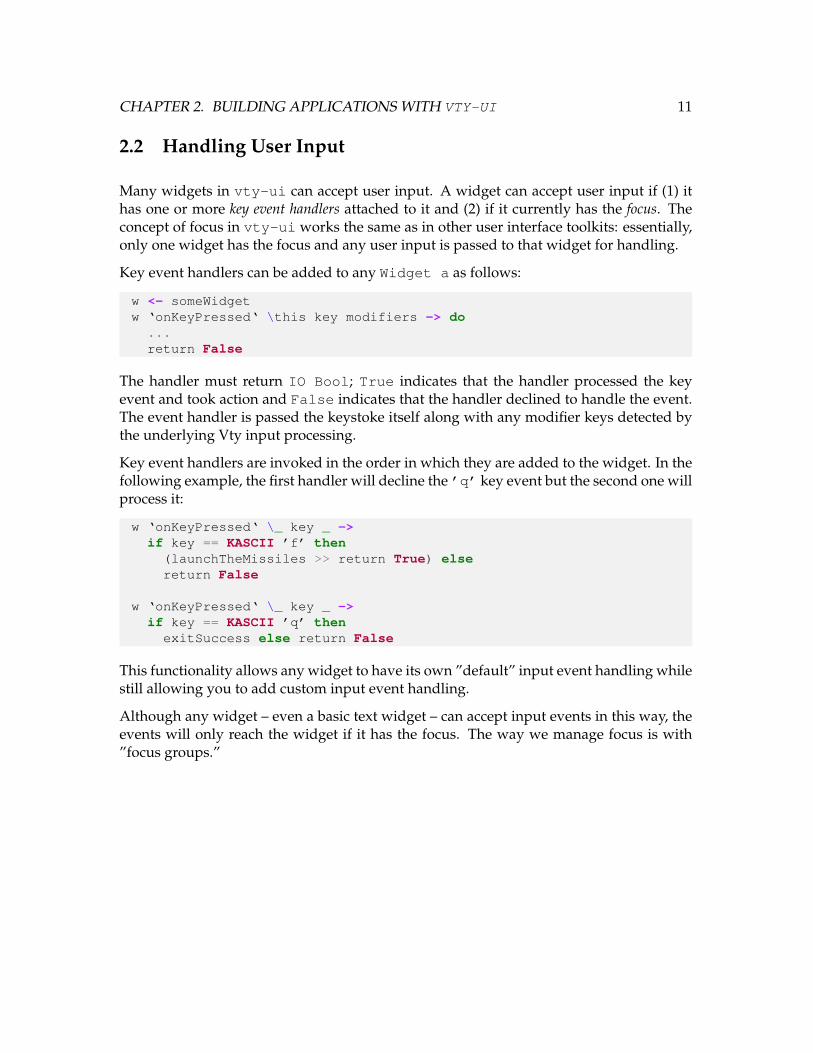
2.2 Handling User Input
Many widgets in vty-ui can accept user input. A widget can accept user input if (1) ithas one or more key event handlers attached to it and (2) if it currently has the focus. Theconcept of focus in vty-ui works the same as in other user interface toolkits: essentially,only one widget has the focus and any user input is passed to that widget for handling.
Key event handlers can be added to any Widget a as follows:
w <- someWidgetw ‘onKeyPressed‘ \this key modifiers -> do
...return False
The handler must return IO Bool; True indicates that the handler processed the keyevent and took action and False indicates that the handler declined to handle the event.The event handler is passed the keystoke itself along with any modifier keys detected bythe underlying Vty input processing.
Key event handlers are invoked in the order in which they are added to the widget. In thefollowing example, the first handler will decline the ’q’ key event but the second one willprocess it:
w ‘onKeyPressed‘ \_ key _ ->if key == KASCII ’f’ then
(launchTheMissiles >> return True) elsereturn False
w ‘onKeyPressed‘ \_ key _ ->if key == KASCII ’q’ then
exitSuccess else return False
This functionality allows any widget to have its own ”default” input event handling whilestill allowing you to add custom input event handling.
Although any widget – even a basic text widget – can accept input events in this way, theevents will only reach the widget if it has the focus. The way we manage focus is with”focus groups.”
CHAPTER 2. BUILDING APPLICATIONS WITH VTY-UI 12
2.3 Focus Groups and Focus Changes
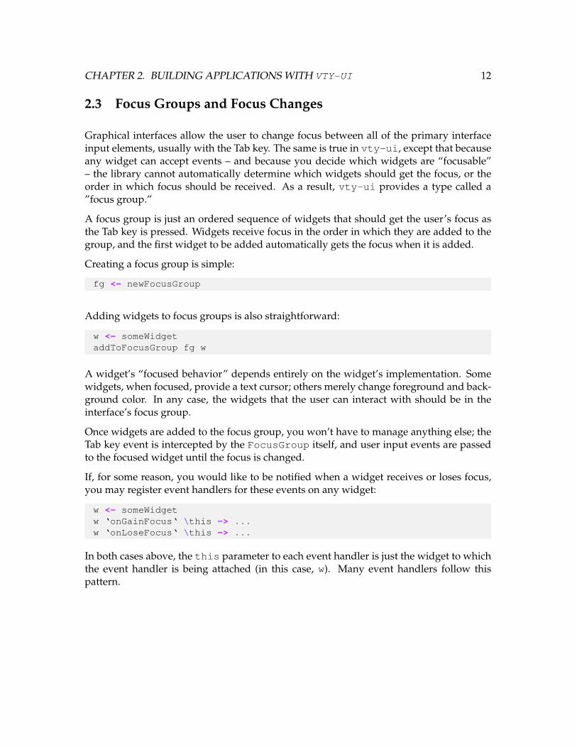
Graphical interfaces allow the user to change focus between all of the primary interfaceinput elements, usually with the Tab key. The same is true in vty-ui, except that becauseany widget can accept events – and because you decide which widgets are “focusable”– the library cannot automatically determine which widgets should get the focus, or theorder in which focus should be received. As a result, vty-ui provides a type called a”focus group.”
A focus group is just an ordered sequence of widgets that should get the user’s focus asthe Tab key is pressed. Widgets receive focus in the order in which they are added to thegroup, and the first widget to be added automatically gets the focus when it is added.
Creating a focus group is simple:
fg <- newFocusGroup
Adding widgets to focus groups is also straightforward:
w <- someWidgetaddToFocusGroup fg w
A widget’s “focused behavior” depends entirely on the widget’s implementation. Somewidgets, when focused, provide a text cursor; others merely change foreground and back-ground color. In any case, the widgets that the user can interact with should be in theinterface’s focus group.
Once widgets are added to the focus group, you won’t have to manage anything else; theTab key event is intercepted by the FocusGroup itself, and user input events are passedto the focused widget until the focus is changed.
If, for some reason, you would like to be notified when a widget receives or loses focus,you may register event handlers for these events on any widget:
w <- someWidgetw ‘onGainFocus‘ \this -> ...w ‘onLoseFocus‘ \this -> ...
In both cases above, the this parameter to each event handler is just the widget to whichthe event handler is being attached (in this case, w). Many event handlers follow thispattern.

CHAPTER 2. BUILDING APPLICATIONS WITH VTY-UI 13
2.3.1 Top-Level Key Event Handlers
All user input is handled via a FocusGroup; the focus state of the group indicates whichwidget will receive user input events. However, FocusGroups are widgets, too! Althoughthey cannot be rendered, they support the same key handler interface as other widgets.This is how we create ”top-level” key event handlers for the entire interface. For example,if you want to register a handler for a ”quit” key such as ’q’, the focus group itself iswhere this key event handler belongs. This is because focus groups always try to handlekey events first, and only pass those events onto the focused widget if the FocusGrouphas no matching handler.
fg <- newFocusGroupfg ‘onKeyPressed‘ \_ key _ ->
if key == KASCII ’q’ thenexitSuccess else return False
2.3.2 Container Widgets and Input Events
Most of the time you will probably end up adding key event handlers directly to interac-tive widgets, but it may be convenient to wrap those widgets in containers that affect theirbehavior. For example, in the demonstration in Section 1.1, we used then centered func-tion to center an edit widget. The result was a Centeredwidget, which is one of the manybuilt-in container widget types. This type of widget “relays” user input events and focusevents to the widget it contains. This means you can add key and focus event handlers tothe Centered widget and they will be passed on to the child widget for handling. Mostcontainer widgets are implemented this way; when in doubt about event relaying behav-ior, consult the API documentation. Relaying of events is accomplished with the followingfunctions, defined in the Core module:
• relayFocusEvents – relays focus events from one widget to another. For example:wRef ‘relayFocusEvents‘ someWidget. When wRef becomes focused, it willfocus someWidget.
• relayKeyEvents – relays keyboard input events from one widget to another. Forexample: wRef ‘relayKeyEvents‘ someWidget. When wRef becomes unfo-cused, it will unfocus someWidget.
As we saw above, only focused widgets will ever be asked to process input events; thismeans that if you add event handlers to a container such as Centered, you’ll need to addthat widget – not its child – to the FocusGroup.

CHAPTER 2. BUILDING APPLICATIONS WITH VTY-UI 14
You might wonder why this is useful. Consider a situation in which you want to addsome padding to an input widget, such as an Edit widget, but when the Edit widget isfocused you want to highlight the padding, too, to make them appear as a single widget.Since padding widgets (see Section 4.15) relay events to their children, you could focus thepadding widget and the edit widget would automatically receive the focus as well as userinput events. This kind of focus and event “inheritance” makes it possible to create new,composite widgets in a flexible way, while getting the desired visual results.
2.3.3 Merging Focus Groups
Some widgets, such as the “dialog” widget (Dialog, see Section 4.7), are composed ofa number of input widgets already; widgets like Dialog must create their own Focus-Groups to provide coherent focus behavior, and they will return them to you when theyare created. In order to integrate these focus groups into your application, you must mergethem with your own focus group.
For example, consider the “directory browser” widget (DirBrowser, see Section 4.8). Youmight want to place this alongside other widgets that should also accept input. When youcreate the DirBrowser widget, you will get a reference to the widget and a reference toits FocusGroup:
(browser, fg1) <- newDirBrowser defaultBrowserSkin
fg2 <- newFocusGroup-- Add my own widgets to fg2
merged <- mergeFocusGroups fg1 fg2
The mergeFocusGroups function will merge the two focus groups and preserve the or-der of the widgets, such that widgets in the first group will come before widgets in the sec-ond group in the new group’s focus ordering. The merged group should then be passedto the rest of the setup process that we introduced in Section 1.1; we’ll go into more detailon that in the next section.
2.4 Collections
Traditional user interfaces present the user with a window for each task the user needs toaccomplish. Since we don’t have the option of presenting multiple ”windows” to users of aterminal interface, we must present the user with one interface at a time. Then, through the

CHAPTER 2. BUILDING APPLICATIONS WITH VTY-UI 15
use of event handlers, the application will manage the transition between these interfaces.
Consider a text editor program in which we must present these top-level interfaces in thefollowing order:
• The user runs the program and is presented with an interface to select a file to edit;
• The user chooses a file to edit and is presented with the editing interface;
• After editing, the user chooses to exit and we present a dialog which asks the userwhether to save the file.
All three of these interfaces are separate and should be given the entire terminal window;unlike other graphical toolkits, vty-ui does not provide a way to ”show” or ”hide” wid-gets. Instead, it provides the notion of a ”collection.” A Collection is a widget whichwraps a set of other widgets and maintains a pointer to the one that should be displayedat any given time. The application then changes the current interface by changing theCollection’s state.
But an interface is more than what is presented in the terminal; each interface should haveits own set of user input widgets and its own notion of focus. Therefore, a Collectionis a set of interfaces and their focus groups. When we change the state of the Collection,we are really changing both the visual interface as well as the focus group used to interactwith it.
To create a Collection:
c <- newCollection
To add an interface and a FocusGroup to the Collection:
fg <- newFocusGroup-- Add widgets to focus group fgui <- someWidgetchangeToW <- addToCollection c ui fg
As a convenience, addToCollection returns a IO action which, when run, will switchto the specified interface. In the example above, changeToW is an action which will switchto the interface with ui as its top-level widget and fg as its focus group. You can use thisaction in event handlers that change your interface state. If you prefer, you can use thesetCurrentEntry function instead, which allows you to set the Collection’s interfaceby number. Use of setCurrentEntry is not recommended, however, since a bad indexcan cause an exception to be thrown.

CHAPTER 2. BUILDING APPLICATIONS WITH VTY-UI 16
2.5 The vty-ui Event Loop
vty-ui manages the user input event loop for you, and once you have created and pop-ulated a Collection, you can invoke the main vty-ui event loop:
runUi c defaultContext
The first parameter is the Collection you have created; the second parameter is a Ren-derContext. Here we use the “default” rendering context provided by the library. The“rendering context” provides three key pieces of functionality:
• The ”skin” to use when rendering ASCII lines, corners, and intersections
• The default “normal” (unfocused) attribute
• The default “focused” attribute
• The current “override” attribute
The event loop will run until one of two conditions occurs:
• An exception of any kind is thrown; if an exception is thrown, the event loop willshut down Vty cleanly and re-throw the exception.
• An event handler or thread calls shutdownUi; the shutdownUi function sends asignal to stop the event loop, at which point control will be returned to your pro-gram. The shutdown signal goes into a queue with all of the other signals processedby the event loop, such as key input events and scheduled actions (see Section 2.5.3),but it will preempt them. Note that there is no guarantee that there won’t be someother signal placed into the queue before you run shutdownUi, such as when an-other thread is running in parallel with an event handler which calls shutdownUi.
2.5.1 Skinning
Some widgets, such as the Table widget (see Section 4.17) and the horizontal and ver-tical border widgets VBorder and HBorder (see Section 4.1), use line-drawing charac-ters to draw borders between interface elements. Some terminal emulators are capableof drawing Unicode characters, which make for nicer-looking line-drawing. Other termi-nal emulators work best only with ASCII. The default rendering context uses a Unicodeline-drawing skin, which you can change to any other skin (or your own) as follows:
CHAPTER 2. BUILDING APPLICATIONS WITH VTY-UI 17
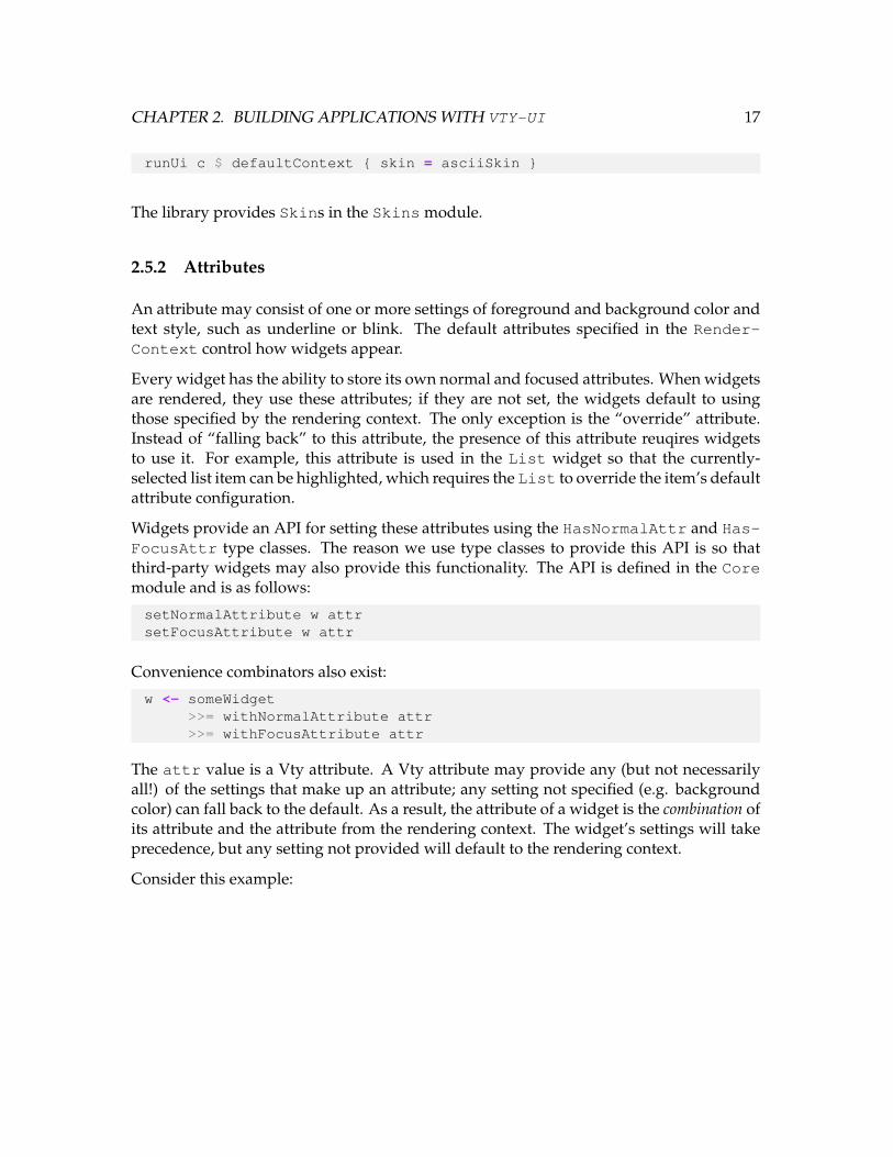
runUi c $ defaultContext { skin = asciiSkin }
The library provides Skins in the Skins module.
2.5.2 Attributes
An attribute may consist of one or more settings of foreground and background color andtext style, such as underline or blink. The default attributes specified in the Render-Context control how widgets appear.
Every widget has the ability to store its own normal and focused attributes. When widgetsare rendered, they use these attributes; if they are not set, the widgets default to usingthose specified by the rendering context. The only exception is the “override” attribute.Instead of “falling back” to this attribute, the presence of this attribute reuqires widgetsto use it. For example, this attribute is used in the List widget so that the currently-selected list item can be highlighted, which requires the List to override the item’s defaultattribute configuration.
Widgets provide an API for setting these attributes using the HasNormalAttr and Has-FocusAttr type classes. The reason we use type classes to provide this API is so thatthird-party widgets may also provide this functionality. The API is defined in the Coremodule and is as follows:
setNormalAttribute w attrsetFocusAttribute w attr
Convenience combinators also exist:
w <- someWidget>>= withNormalAttribute attr>>= withFocusAttribute attr
The attr value is a Vty attribute. A Vty attribute may provide any (but not necessarilyall!) of the settings that make up an attribute; any setting not specified (e.g. backgroundcolor) can fall back to the default. As a result, the attribute of a widget is the combination ofits attribute and the attribute from the rendering context. The widget’s settings will takeprecedence, but any setting not provided will default to the rendering context.
Consider this example:

CHAPTER 2. BUILDING APPLICATIONS WITH VTY-UI 18
w <- someWidgetsetNormalAttribute w (fgColor white)runUi c $ defaultContext { normalAttr = yellow ‘on‘ blue }
In this example, the widget w will use a normal attribute of white on a blue background,since it specified only a foreground color as its normal attribute. This kind of precedencefacilitates visual consistency across your entire interface.
In addition, container widgets are designed to pass their normal and focused attributesonto their children during the rendering process; this way, unless a child specifies a de-fault with setNormalAttribute or similar, it uses its parent’s attributes. Again, this fa-cilitates consistency across the interface while only requiring the you to specify attributeswhere you want to deviate from the default.
You can create attributes with varying levels of specificity by using the vty-ui API:
Expression Resulting attributefgColor blue foreground onlybgColor blue background onlystyle underline style onlyblue ‘on‘ red foreground and backgroundsomeAttr ‘withStyle‘ underline adding a style
The Vty def attr value’s default configuration is used as a basis for all partially-specifiedattributes. The functions described above are defined in the Util module.
2.5.3 vty-ui and Concurrency
So far we have only seen programs which modify widget state when user input events oc-cur. Such changes in widget state are safe, because they are triggered by the vty-ui eventloop.1 However, your program will more than likely need to trigger some widget statechanges due to other external events – such as network events – and vty-ui provides amechanism for doing this in a safe way.
vty-ui provides a function in the Core module called schedule which takes an IOaction and “schedules” it to be run by the main event loop. It will be run as soon aspossible, i.e., once the program control flow has returned to the event loop. Since thescheduled action will be run by the event loop, it’s important that the action not take verylong; if it’s important to block (e.g., by calling Control.Concurrent.threadDelay),you should do that in a thread and only call schedule when you have work to do.
1“Unsafe” updates are those that are not guaranteed to be reflected in the most-recently-rendered interface.

CHAPTER 2. BUILDING APPLICATIONS WITH VTY-UI 19
Consider this example, in which a text widget called timeText gets updated with thecurrent time every second:
forkIO $forever $ do
schedule $ dot <- getCurrentTimesetText timeText $
formatTime defaultTimeLocale rfc822DateFormat tthreadDelay 1000000
In this example the blocking occurs outside of the scheduled code, and only when we havean update for the clock display do we schedule an action to run.
Some built-in widgets will almost always be used in this way; for an example, take a lookat the ProgressBar widget in the ProgressBar module (see Section 4.16).

Chapter 3
Implementing Your Own Widgets
While the built-in widgets may prove sufficient in most cases, sooner or later you’ll proba-bly need to implement your own. This chapter describes the API you’ll need to implementto do this, as well as design and implementation considerations relevant to building cus-tom widgets correctly.
3.1 Creating a New Widget Type
The first step in creating a custom widget is deciding what kind of state the widget willstore. This decision is based on what behaviors the widget can have and it determineswhat the widget’s API will be.
As an example, consider a widget that displays a numeric counter. The widget state willbe the value of the counter. We’ll start with the following state type:1
data Counter = Counter Int
The next step is to write a widget constructor function. This function will return a value oftype Widget Counter. The constructor will take the counter’s initial value. Here’s thefunction in full:
1You might wonder why we don’t just use Int, i.e., Widget Int; the reason is because that’s too general.Other widgets might represent the temperature with an Int, and then your counter API functions – taking awidget of type Widget Int – would work on other types of widgets, which is probably not what you want!
20

CHAPTER 3. IMPLEMENTING YOUR OWN WIDGETS 21
newCounter :: Int -> IO (Widget Counter)newCounter initialValue = do
let st = Counter initialValuewRef <- newWidget st $ \w ->
w { render_ =\this size ctx -> do
(Counter v) <- getState thisreturn $ string (getNormalAttr ctx) (show v)
}
Now we have a constructor for a Counter widget. Let’s go through the code:
let st = Counter initialValuewRef <- newWidget st $ \w -> ...
The Core module’s newWidget function creates a new IORef wrapping a WidgetImpla. The WidgetImpl type is where all of the widget logic is actually implemented. Youimplement this logic by overriding the fields of the WidgetImpl type, such as render .We call newWidget’s result wRef because it is a reference to a widget, and this helpsdistinguish it from the actual widget data in the next step.
The newWidget function takes an initial state of the widget (of type a) and a transfor-mation function WidgetImpl a -> WidgetImpl a, creates a new WidgetImpl, setsits state to the initial state provided, and transforms it with the transformation func-tion. We do this to specify the behavior of the widget beyond the defaults provided by thenewWidget function.
Here is the render function which will actually construct a Vty Image to be displayedin the terminal:
render_ =\this size ctx -> do
(Counter v) <- getState thislet s = T.pack $ show v
width = (fromEnum $ region_width size) -(fromEnum $ textWidth s)
(truncated, _, _) = clip1d (Phys 0) (Phys width) sreturn $ string (getNormalAttr ctx) $ T.unpack truncated
The type of render is Widget a -> DisplayRegion -> RenderContext -> IOImage. The arguments are as follows:
• Widget a - the widget being rendered, i.e., the Widget Counter reference. Thisis passed to provide access to the widget’s state which will be used to render it.
CHAPTER 3. IMPLEMENTING YOUR OWN WIDGETS 22
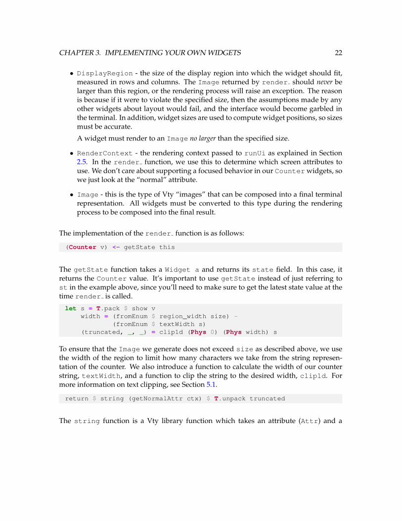
• DisplayRegion - the size of the display region into which the widget should fit,measured in rows and columns. The Image returned by render should never belarger than this region, or the rendering process will raise an exception. The reasonis because if it were to violate the specified size, then the assumptions made by anyother widgets about layout would fail, and the interface would become garbled inthe terminal. In addition, widget sizes are used to compute widget positions, so sizesmust be accurate.
A widget must render to an Image no larger than the specified size.
• RenderContext - the rendering context passed to runUi as explained in Section2.5. In the render function, we use this to determine which screen attributes touse. We don’t care about supporting a focused behavior in our Counter widgets, sowe just look at the “normal” attribute.
• Image - this is the type of Vty “images” that can be composed into a final terminalrepresentation. All widgets must be converted to this type during the renderingprocess to be composed into the final result.
The implementation of the render function is as follows:
(Counter v) <- getState this
The getState function takes a Widget a and returns its state field. In this case, itreturns the Counter value. It’s important to use getState instead of just referring tost in the example above, since you’ll need to make sure to get the latest state value at thetime render is called.
let s = T.pack $ show vwidth = (fromEnum $ region_width size) -
(fromEnum $ textWidth s)(truncated, _, _) = clip1d (Phys 0) (Phys width) s
To ensure that the Image we generate does not exceed size as described above, we usethe width of the region to limit how many characters we take from the string represen-tation of the counter. We also introduce a function to calculate the width of our counterstring, textWidth, and a function to clip the string to the desired width, clip1d. Formore information on text clipping, see Section 5.1.
return $ string (getNormalAttr ctx) $ T.unpack truncated
The string function is a Vty library function which takes an attribute (Attr) and a
CHAPTER 3. IMPLEMENTING YOUR OWN WIDGETS 23
String and returns an Image. The getNormalAttr function returns the normal at-tribute from the RenderContext, merged with the “override” attribute from the Render-Context, if it is set. For more information on the override attribute, see Section 2.5.2.
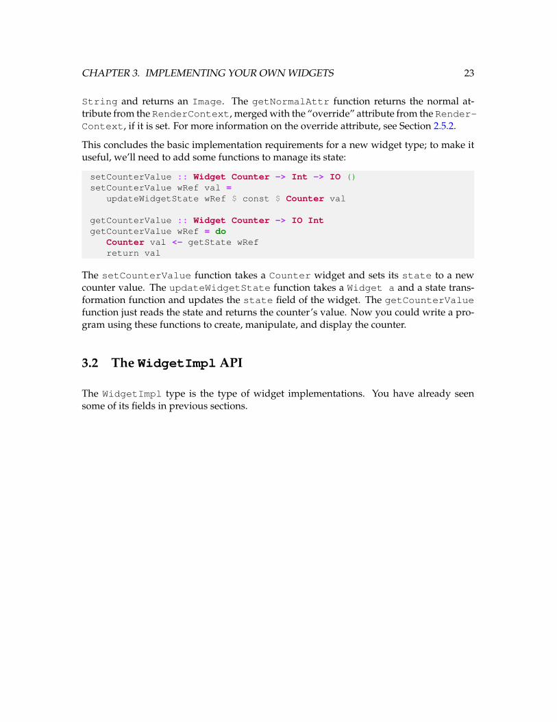
This concludes the basic implementation requirements for a new widget type; to make ituseful, we’ll need to add some functions to manage its state:
setCounterValue :: Widget Counter -> Int -> IO ()setCounterValue wRef val =
updateWidgetState wRef $ const $ Counter val
getCounterValue :: Widget Counter -> IO IntgetCounterValue wRef = do
Counter val <- getState wRefreturn val
The setCounterValue function takes a Counter widget and sets its state to a newcounter value. The updateWidgetState function takes a Widget a and a state trans-formation function and updates the state field of the widget. The getCounterValuefunction just reads the state and returns the counter’s value. Now you could write a pro-gram using these functions to create, manipulate, and display the counter.
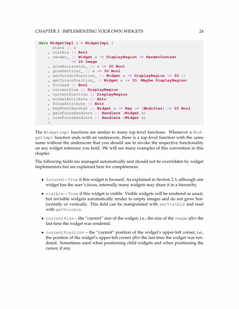
3.2 The WidgetImpl API
The WidgetImpl type is the type of widget implementations. You have already seensome of its fields in previous sections.
CHAPTER 3. IMPLEMENTING YOUR OWN WIDGETS 24
data WidgetImpl a = WidgetImpl {state :: a
, visibie :: Bool, render_ :: Widget a -> DisplayRegion -> RenderContext
-> IO Image, growHorizontal_ :: a -> IO Bool, growVertical_ :: a -> IO Bool, setCurrentPosition_ :: Widget a -> DisplayRegion -> IO (), getCursorPosition_ :: Widget a -> IO (Maybe DisplayRegion), focused :: Bool, currentSize :: DisplayRegion, currentPosition :: DisplayRegion, normalAttribute :: Attr, focusAttribute :: Attr, keyEventHandler :: Widget a -> Key -> [Modifier] -> IO Bool, gainFocusHandlers :: Handlers (Widget a), loseFocusHandlers :: Handlers (Widget a)}
The WidgetImpl functions are similar to many top-level functions. Whenever a Wid-getImpl function ends with an underscore, there is a top-level function with the samename without the underscore that you should use to invoke the respective functionalityon any widget reference you hold. We will see many examples of this convention in thischapter.
The following fields are managed automatically and should not be overridden by widgetimplementors but are explained here for completeness:
• focused – True if this widget is focused. As explained in Section 2.3, although onewidget has the user’s focus, internally many widgets may share it in a hierarchy.
• visible – True if this widget is visible. Visible widgets will be rendered as usual,but invisible widgets automatically render to empty images and do not grow hor-izontally or vertically. This field can be manipulated with setVisible and readwith getVisible.
• currentSize – the “current” size of the widget, i.e., the size of the Image after thelast time the widget was rendered.
• currentPosition – the “current” position of the widget’s upper-left corner, i.e.,the position of the widget’s upper-left corner after the last time the widget was ren-dered. Sometimes used when positioning child widgets and when positioning thecursor, if any.

CHAPTER 3. IMPLEMENTING YOUR OWN WIDGETS 25
• normalAttribute – the widget’s normal attribute. Defaults to Vty’s def attrvalue, which merges transparently with the RenderContext’s normal attribute.
• focusAttribute – the widget’s focus attribute. Defaults to Vty’s def attr value,which merges transparently with the RenderContext’s focus attribute.
• keyEventHandler – the action responsible for handling key events for this wid-get. The default implementation merely starts calling the sequence of user-registeredkey event handlers; it is strongly recommended that you not replace this, but useonKeyPressed to register key handlers instead.
• gainFocusHandlers – the actions responsible for handling the widget’s focus gainevent. You can add your own handlers with onGainFocus as described in Section2.3. For more information about event handling and the Handlers type, see Section3.8.
• loseFocusHandlers – the actions responisible for handling the widget’s focus lossevent. You can add your own handlers with onLoseFocus as described in Section2.3. For more information about event handling and the Handlers type, see Section3.8.
The following fields are important to widget implementors and, depending on widgetrequirements, need to be overridden:
• state – the state of the widget as described in Section 3.1. Use the getState func-tion to read this state and use the updateWidgetState function to modify it.
• render – the rendering routine for the widget. If this widget wraps child widgets,this function is responsible for rendering them and composing the resulting Imagesinto a final Image.
• growHorizontal – the horizontal growth policy function. See Section 3.4.
• growVertical – the vertical growth policy function. See Section 3.4.
• setCurrentPosition – this function is used to set the current position – the po-sition of the upper-left corner – of the widget. This is included in the WidgetImplAPI so that you can override it if your widget wraps others or has special logic forsetting their positions. See Section 3.6.
• getCursorPosition – this function may be used to indicate that this widgetshould display a cursor when it has the focus. The way that it does this is by re-turning a DisplayRegion. The default implementation returns Nothing, which

CHAPTER 3. IMPLEMENTING YOUR OWN WIDGETS 26
indicates that the widget does not want to position the cursor. For implementationswhich do show the cursor, the returned position should be relative to the positionreturned by getCurrentPosition. See Section 3.7.
We’ve already introduced the state and render functions. Now we’ll go into detail onthe use of the other functions.
3.3 Rendering
The render function is responsible for generating a visual representation of the widgetbased on various factors, including:
• The focus state of the widget
• The available space specified by the size parameter to the render function
• The widget’s own internal state in its state field
• All child widgets
• Attributes stored in the widget as well as those provided in the RenderContext
This involves constructing Images using the Vty library’s primitives. Some primitivesinclude:
• string – Creates an image from a string using the specified attribute.
• char – Creates an image from a character using the specified attribute.
• char fill – Creates an image with the specified width and height, filled with thespecified character and attribute.
• <-> – Vertical concatenation of images.
• <|> – Horizontal concatenation of images.
While these functions should be sufficient to render most widgets, if your widget wrapsother widgets, you’ll have to use the top-level render function provided by the Coremodule. It has the following type:
CHAPTER 3. IMPLEMENTING YOUR OWN WIDGETS 27
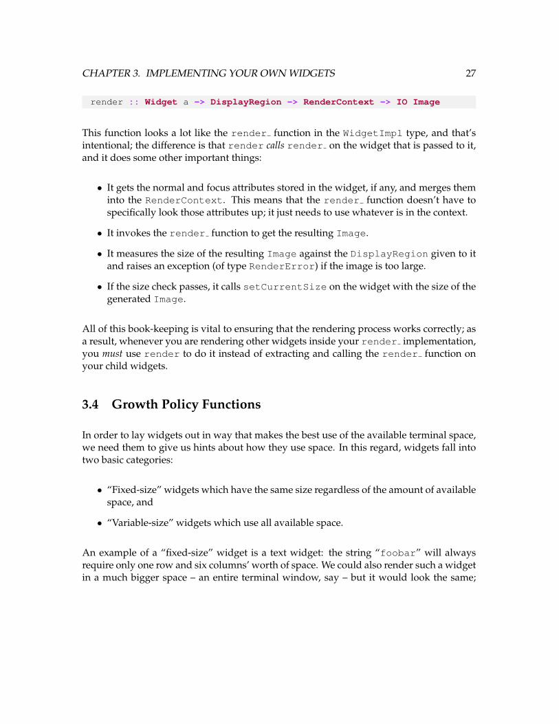
render :: Widget a -> DisplayRegion -> RenderContext -> IO Image
This function looks a lot like the render function in the WidgetImpl type, and that’sintentional; the difference is that render calls render on the widget that is passed to it,and it does some other important things:
• It gets the normal and focus attributes stored in the widget, if any, and merges theminto the RenderContext. This means that the render function doesn’t have tospecifically look those attributes up; it just needs to use whatever is in the context.
• It invokes the render function to get the resulting Image.
• It measures the size of the resulting Image against the DisplayRegion given to itand raises an exception (of type RenderError) if the image is too large.
• If the size check passes, it calls setCurrentSize on the widget with the size of thegenerated Image.
All of this book-keeping is vital to ensuring that the rendering process works correctly; asa result, whenever you are rendering other widgets inside your render implementation,you must use render to do it instead of extracting and calling the render function onyour child widgets.
3.4 Growth Policy Functions
In order to lay widgets out in way that makes the best use of the available terminal space,we need them to give us hints about how they use space. In this regard, widgets fall intotwo basic categories:
• “Fixed-size” widgets which have the same size regardless of the amount of availablespace, and
• “Variable-size” widgets which use all available space.
An example of a “fixed-size” widget is a text widget: the string “foobar” will alwaysrequire only one row and six columns’ worth of space. We could also render such a widgetin a much bigger space – an entire terminal window, say – but it would look the same;

CHAPTER 3. IMPLEMENTING YOUR OWN WIDGETS 28
there would still be plenty of room for other things in the interface. Such a widget doesnot “grow” with the available space.
An example of a “variable-size” widget is one which centers a child widget vertically andhorizontally in the terminal. Such a widget will pad its child widget so that it is alwayscentered, and this behavior depends on how much space is available. For example, in a100x100 terminal, the string “foobar” would need different padding to remain centeredthan it would require in a 50x50 terminal. As a result, we say that the centering widget“grows” with available space.
The WidgetImpl a type defines the following functions to provide these hints:
• growHorizontal :: a -> IO Bool
• growVertical :: a -> IO Bool
These functions should return True when the widget in question “grows” as describedabove, and False otherwise. These hints may be used by parent widgets to make layoutdecisions; concrete examples of such widgets are the Box and Centered widget types.
In situations where your widget wraps another – as with the Box and Centered types – itis strongly recommended that you defer to the child widgets for these policy values unlessyou have a good reason to override them. The Centered widget is a good example ofthis: it overrides the growth policy of its child so that it grows in both dimensions, eventhough its child may not. But the Box widget explicitly defers to its children to determineits growth policy, since it is only responsible for layout and does not add anything to theinterface.
An example of a growHorizontal implementation which defers to a child widget is asfollows:
-- Assume getChildWidget gets the child widget referencegrowHorizontal_ = growHorizontal . getChildWidget
Notice that we call the top-level function, growHorizontal, on the child widget; it doesthe job of dereferencing the widget and calling its growHorizontal function. This isanother example of the API convention we mentioned in Section 3.2.

CHAPTER 3. IMPLEMENTING YOUR OWN WIDGETS 29
3.5 Deferring to Child Widgets
Widget-wrapping widget types are common in vty-ui, since we use this technique toinfluence rendering and other behaviors. As a result, when implementing a wrapper wid-get it is important to decide which behaviors should be deferred to the child widget andwhich behaviors should be overridden.
In this section we’ll create a wrapper widget type called Wrapper and we’ll implement allof its behaviors to illustrate how the behaviors can be deferred in each case.
We’ll start with the type.
data Wrapper a = Wrapper (Widget a)
Then the implementation of the constructor:2
newWrapper :: Widget a -> IO (Widget (Wrapper a))newWrapper child = do
wRef <- newWidget (Wrapper child) $ \w ->w { growHorizontal_ = growHorizontal child
, growVertical_ = growVertical child, setCurrentPosition_ =
\_ pos = setCurrentPosition child pos, getCursorPosition_ =
const $ getCursorPosition child, render_ =
\_ sz ctx = dorender child sz ctx
}
wRef ‘relayFocusEvents‘ childwRef ‘relayKeyEvents‘ childreturn wRef
This demonstration highlights some important features of container widget implementa-tions:
• The state type of the wrapped widget, a, is preserved in the type of the wrapperwidget itself, Wrapper a.
• We referred directly to child instead of using getState in all of the functions;the reason is because we don’t care about allowing the child to be replaced with a
2This widget implementation uses the “relaying” functions we described in Section 2.3.2.
CHAPTER 3. IMPLEMENTING YOUR OWN WIDGETS 30
different widget at a later time. If that is something you want to support, then youmust use getState to ensure that you have the latest version of the widget’s stateand, as a result, the correct child widget reference.
• We defer all behaviors to the child: growth policy, rendering, positioning, cursorbehavior, focus events, and key events. Most container widgets defer most of thesethings.
In some cases – such as with Centered widgets or anything that adds padding – thegrowth policies will need to be changed to reflect how the final result should be laid out.In those cases, it is sufficient to provide an implementation for the growth policy functionsthat returns the desired value rather than calling that of the child widget.
3.6 Widget Positioning
Some widgets, such as the Edit widget, need to position a cursor in the terminal whenthey have the focus. To support this, each widget stores its position after it is rendered.The positioning of the widgets happens in a separate phase after rendering takes placesince the positions cannot be calculated until the sizes of all widgets’ Images are known.
The top-level function to set a widget’s position is called setCurrentPosition and isdefined in the Core module. It is called initially by the vty-ui event loop with a po-sition of (0, 0). This function updates the currentPosition field of the widget’sWidgetImpl structure and then calls its setCurrentPosition function to take care ofany widget-specific duties. For most widgets, setCurrentPosition need not be over-ridden from its default no-op implementation. However, container widgets must overrideit to set the positions of their children.
Consider the Box widget type. This type contains two child widgets. The position of theBox itself is the upper-left corner of the space in which it is rendered, and that positionis also the position of its first child widget. The second child widget, however, is offset(vertically or horizontally, depending on the box type) by the size of the first child widget.This is an example of a case in which implementing setCurrentPosition is necessary.
Here is an example implementation of setCurrentPosition for the Wrapper widgetthat we examined in Section 3.5:

CHAPTER 3. IMPLEMENTING YOUR OWN WIDGETS 31
setCurrentPosition_ = \this pos -> do-- Since the position of the wrapper has already been-- set by setCurrentPosition, we just need to set the-- position of the child.(Wrapper child) <- getState thissetCurrentPosition child pos
The function calls the top-level setCurrentPosition on the child widget to ensurethat its position is set and that its setCurrentPosition function is called. It uses theposition of the wrapper, pos, as the position of the child because the wrapper has not doneanything to offset that position (e.g., by adding an ASCII art border or padding).
If you’re implementing a container widget with more than one child, you can use func-tions in the Util module to manage the DisplayRegions used to position your widgets.For more information, see the withWidth, withHeight, plusWidth, and plusHeightfunctions.
3.7 Cursor Positioning
Once a widget is properly positioned, the widget can display a cursor. This is especiallyuseful for edit widgets, since the user needs to know the cursor position. The Core mod-ule provides a top-level function to accomplish this called getCursorPosition; thisfunction calls the WidgetImpl type’s getCursorPosition function.
The getCursorPosition function returns Maybe DisplayRegion. A return value ofNothing indicates that the widget does not want to show a cursor, so when it gains focus,no cursor will be displayed. Otherwise, positioning the cursor at row r and column c isaccomplished by returning Just (DisplayRegion r c). The cursor is then shown atthat location by the event loop.
Typically, the position of the cursor is computed as an offset to the widget’s current po-sition. In the Wrapper widget example in Section 3.5 we deferred to the child widget tocontrol the cursor, but we might instead specify our own position:
getCursorPosition_ = \this -> do(Wrapper child) <- getState thischildCursor <- getCursorPosition childcase childCursor of
Nothing -> return NothingJust pos -> return $ Just $ pos ‘plusWidth‘ 1 ‘plusHeight‘ 1

CHAPTER 3. IMPLEMENTING YOUR OWN WIDGETS 32
Although contrived, this example shows how we can return a new cursor position basedon the child widget’s cursor position.
3.8 Handling Events
An interface is truly interactive only if we can express the relationship between variousevents in the interface. User input and network events may affect the user interface, butwe also need to be define how the interface components interact with each other. vty-uiprovides a mechanism to address this called the Handlers type, defined in the Eventsmodule.
For any given widget type, we must decide what events can occur as a result of the wid-get’s state change. For each type of event, we must decide what sort of data we shouldpass to handlers of this event so they can take an appropriate action.
Imagine that you’ve implemented a “temperature monitor” widget, and you want to benotified whenever the temperature changes so you can update other parts of your inter-face. In that case, the event data is a type containing the new temperature:
data TemperatureEvent = Temp Int
In your widget type definition, you’ll need a place to store the event handlers for thistemperature change event:
data TempMonitor =TempMonitor { tempChangeHandlers :: Handlers TemperatureEvent
}
Notice that we use the event type as the type parameter to Handlers; this indicatesthat we want to store a collection of handler functions which take an argument of typeTemperatureEvent. The Handlers a type is just an alias for IORef [a -> IO ()].
Once we’ve defined our storage type, we need to update our widget constructor to con-struct a Handlers list:
newTempMonitor :: IO (Widget TempMonitor)newTempMonitor = dohandlers <- newHandlerslet st = TempMonitor { tempChangeHandlers = handlers
}wRef <- newWidget st idreturn wRef
CHAPTER 3. IMPLEMENTING YOUR OWN WIDGETS 33
Now we have a place to store the handlers, a model for the event data itself, and anupdated constructor. Next, we need a nice API to register new event handlers. Thevty-ui convention is to use functions prefixed with “on”, such as onGainFocus andonActivate. This convention makes it easy to write readable infix event handler regis-tration functions. In the temperature monitor case, we might write something like this:
onTemperatureChange :: Widget TempMonitor-> (TemperatureEvent -> IO ())-> IO ()
onTemperatureChange wRef handler =addHandler (tempChangeHandlers <˜˜) wRef handler
We’ve introduced a new operator here, <˜˜. This operator takes any Widget a and afunction on its state type, applies the function to the state, and returns the result. add-Handler needs a value of type Handlers TemperatureEvent, and to get that we mustuse <˜˜.
The addHandler function takes a Handlers a and a handler of type a -> IO () andadds it to the Handlers list.
Here is a bogus but valid demonstration of this new function:
let maxTemp = 100t <- newTempMonitort ‘onTemperatureChange‘ \(Temp newTemp) ->
when (newTemp > maxTemp) $ error "It’s too hot!"
The last thing it does is to actually “fire” the event that these handlers will handle; as-suming the monitor widget has a setTemperature function and some internal state tostore the temperature, that function would create the TemperatureEvent and invokethe handlers as follows:
setTemperature :: Widget TempMonitor -> Int -> IO ()setTemperature wRef newTemp = do
-- Set the internal widget state.-- ...-- Then invoke the handlers:fireEvent wRef (tempChangeHandlers <˜˜) (TemperatureEvent newTemp)
Just as with addHandler, we pass a handler list lookup function to fireEvent. We alsopass it an event value which will be passed to all of the registered handler functions.
The functions newHandlers, addHandler, and fireEvent are defined along with the

CHAPTER 3. IMPLEMENTING YOUR OWN WIDGETS 34
Handlers type in the Events module. The widget state projection function <˜˜ is de-fined in the Core module along with its WidgetImpl state projection counterpart, <˜.
3.9 Composite Widgets
So far we have looked at single-purpose widgets which use the Widget type directly.However, embedding widget state in the Widget type is not always appropriate or straight-forward for more complex, composite widgets.
The vty-ui library provides some “widgets” which don’t fit this pattern: Dialog andDirBrowser are two examples. Furthermore, as the base set of widgets provided by thelibrary becomes richer, fewer and fewer widgets should be implemented using the basicWidget framework.
These composite widgets are actually entire interfaces, complete with multiple focusablewidgets and focus groups. These widgets don’t take the form of Widget Dialog orWidget DirBrowser; they could be implemented that way, but we’d find that many ofthe WidgetImpl functions would end up deferring to their child widgets anyway, andtheir render implementations would be cumbersome at best.
Instead, we invert the widget organization: we create a type (e.g., Dialog) which containsthe actual widget(s) to be rendered, as well as other book-keeping internals, and we returnthat from our constructor. This makes it easier to implement such widgets since we are lessconcerned with their inner workings and more concerned with returning something high-level that has the right behaviors.
The pattern we use in these situations is to write a constructor which does all of the wid-get creation, layout, and event handler registration, and returns the concrete type of theinterface along with a FocusGroup which the caller can use to integrate the interface intoan application.
For example: suppose we want to create a “phone number input” widget – PhoneInput,say – which will allow users to input phone numbers. The PhoneInput will have threeEdit widgets and will manage tabbing between them and might even do such things asdata validation on the input. Here’s a suggestive example for how we might implementsuch a thing without going to all the trouble of implementing WidgetImpl’s interface.First we provide the types:

CHAPTER 3. IMPLEMENTING YOUR OWN WIDGETS 35
data PhoneNumber = PhoneNumber T.Text T.Text T.Textderiving (Show)
-- This type isn’t pretty, but we have to specify the type-- of the complete interface. Initially you can let the-- compiler tell you what it is.type T = Box (Box
(Box (Box (HFixed Edit) FormattedText) (HFixed Edit))FormattedText) (HFixed Edit)
data PhoneInput =PhoneInput { phoneInputWidget :: Widget T
, edit1 :: Widget Edit, edit2 :: Widget Edit, edit3 :: Widget Edit, activateHandlers :: Handlers PhoneNumber}
Then, we provide the constructor:

CHAPTER 3. IMPLEMENTING YOUR OWN WIDGETS 36
newPhoneInput :: IO (PhoneInput, Widget FocusGroup)newPhoneInput = do
ahs <- newHandlerse1 <- editWidgete2 <- editWidgete3 <- editWidget
ui <- (hFixed 4 e1) <++>(plainText "-") <++>(hFixed 4 e2) <++>(plainText "-") <++>(hFixed 5 e3)
let w = PhoneInput ui e1 e2 e3 ahsdoFireEvent = const $ do
num <- mkPhoneNumberfireEvent w (return . activateHandlers) num
mkPhoneNumber = dos1 <- getEditText e1s2 <- getEditText e2s3 <- getEditText e3return $ PhoneNumber s1 s2 s3
e1 ‘onActivate‘ doFireEvente2 ‘onActivate‘ doFireEvente3 ‘onActivate‘ doFireEvent
e1 ‘onChange‘ \s -> when (T.length s == 3) $ focus e2e2 ‘onChange‘ \s -> when (T.length s == 3) $ focus e3
fg <- newFocusGroupmapM_ (addToFocusGroup fg) [e1, e2, e3]return (w, fg)
Then we provide a function to register phone number handlers:
onPhoneInputActivate :: PhoneInput-> (PhoneNumber -> IO ()) -> IO ()
onPhoneInputActivate input handler =addHandler (return . activateHandlers) input handler
When the user presses Enter in one of the phone number input widgets, thus “activating”

CHAPTER 3. IMPLEMENTING YOUR OWN WIDGETS 37
it, we will invoke all phone number input handlers with a PhoneNumber value.3
In the calling environment, the caller can then add the phoneInputWidget to the inter-face and merge the returned FocusGroup as described in Section 2.3.3.
3Assume that we would also do some kind of validation and decide whether to call the handlers accord-ingly. We might even consider supporting “error” event handlers for the widget to report validation errors tobe displayed elsewhere in the interface!

Chapter 4
Guided Tour of Built-In vty-uiWidgets
vty-ui provides a broad set of widgets for controlling layout, presenting text, and inter-acting with the user. In this chapter we’ll cover these built-in widgets and their APIs at ahigh level. With this knowledge you should be able to bring them together to build richinterfaces. As always, consult the API documentation for some of the finer details.
Naturally, we may not be able to provide meaningful examples expressed purely in termsof a single widget type and may need to mention other widgets; in those cases, see therelevant sections.
4.1 Borders
The Borders module provides a number border widgets which can be created with thefollowing functions:
• vBorder – creates a vertical border of type Widget VBorder
• hBorder – creates a horizontal border of type Widget HBorder
• bordered – creates a bordered box of type Widget (Bordered a) around a wid-get of type Widget a
38
CHAPTER 4. GUIDED TOUR OF BUILT-IN VTY-UI WIDGETS 39
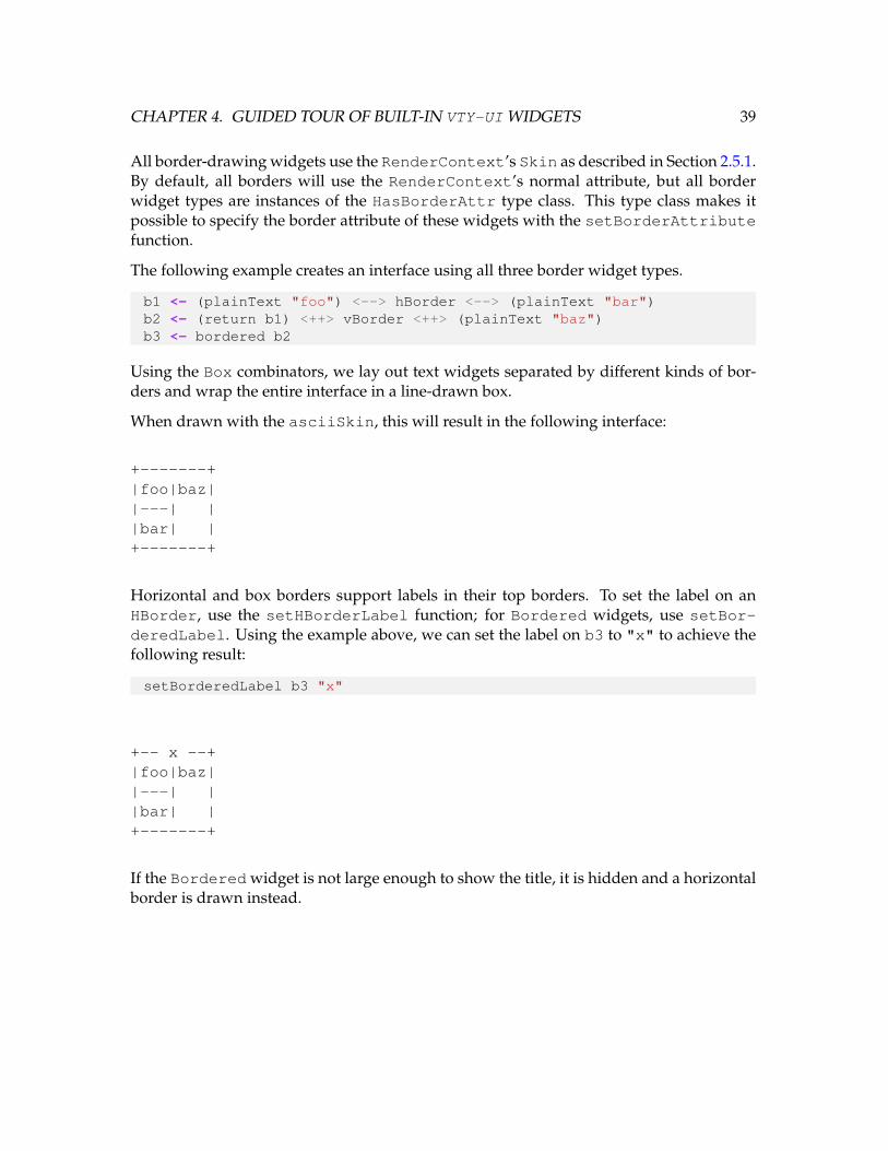
All border-drawing widgets use the RenderContext’s Skin as described in Section 2.5.1.By default, all borders will use the RenderContext’s normal attribute, but all borderwidget types are instances of the HasBorderAttr type class. This type class makes itpossible to specify the border attribute of these widgets with the setBorderAttributefunction.
The following example creates an interface using all three border widget types.
b1 <- (plainText "foo") <--> hBorder <--> (plainText "bar")b2 <- (return b1) <++> vBorder <++> (plainText "baz")b3 <- bordered b2
Using the Box combinators, we lay out text widgets separated by different kinds of bor-ders and wrap the entire interface in a line-drawn box.
When drawn with the asciiSkin, this will result in the following interface:
+-------+|foo|baz||---| ||bar| |+-------+
Horizontal and box borders support labels in their top borders. To set the label on anHBorder, use the setHBorderLabel function; for Bordered widgets, use setBor-deredLabel. Using the example above, we can set the label on b3 to "x" to achieve thefollowing result:
setBorderedLabel b3 "x"
+-- x --+|foo|baz||---| ||bar| |+-------+
If the Bordered widget is not large enough to show the title, it is hidden and a horizontalborder is drawn instead.
CHAPTER 4. GUIDED TOUR OF BUILT-IN VTY-UI WIDGETS 40
Growth Policy
VBorders grow only vertically and are one column in width. HBorders grow only hori-zontally and are one row in height. Box borders created with bordered inherit the growthpolicies of their children.
4.2 Boxes
The Box module provides two box layout widgets which can be created the followingfunctions:
• vBox – creates a box of type Widget (Box a b) which lays out two children oftypes Widget a and Widget b vertically
• hBox – creates a box of type Widget (Box a b) which lays out two children oftypes Widget a and Widget b horizontally
In addition, the box combinators <--> and <++> can be used to create vertical and hori-zontal boxes, respectively, using widgets in IO.
Box widgets have a child size policy which determines how space in the box is allocated tothe child widgets. The size policy type is ChildSizePolicy and defaults to PerChildBoxAuto BoxAuto for new boxes. Each widget can have an individual policy whosetype is IndividualPolicy; this policy can be set to BoxAuto or BoxFixed Int. In theformer case, space will be allocated as needed; in the latter, the specified fixed number ofrows or columns (depending on the orientation of the Box) will be used.
Use the setBoxChildSizePolicy to change the box size policy to one of the followingkinds of values:
• PerChild IndividualPolicy IndividualPolicy – set the policies for eachchild widget.
• Percentage Int – the total available space will be allocated as a percentage. Thenumber specified here is the percentage n (0 ≤ n ≤ 100) allocated to the first child;the rest will be allocated to the second. The BoxError exception will be raised if aninvalid percentage value is specified.
CHAPTER 4. GUIDED TOUR OF BUILT-IN VTY-UI WIDGETS 41
Boxes may also be configured with a number of rows or columns of spacing in betweentheir child widgets; this is accomplished with the setBoxSpacing function. It takesa number of rows or columns, depending on the orientation of the box. The functionwithBoxSpacing is provided as a convenience for setting the box spacing in a monadicconstruction.
The following example creates a box of each type to lay out some text widgets:
b1 <- (plainText "foo") <++> (plainText "bar") >>= withBoxSpacing 1b2 <- (return b1) <--> (plainText "baz") >>= withBoxSpacing 1
The result is an inner horizontal box, b1, containing two FormattedText widgets sepa-rated by one column, laid out on top of another FormattedText widget and separatedby one row.
Growth Policy
Boxes grow in their respective dimensions if and only if:
• One or more children can also grow in that dimension, and
• The children which can grow are in box cells with the Percentage or BoxAuto sizepolicies set.
Boxes grow in other dimensions merely if any children grow in that dimension.
Consider these examples:
• A vertical Box with a default size policy of BoxAuto / BoxAuto will grow bothvertically and horizontally if either child grows respectively.
• A vertical Box with fixed-size cells will never grow vertically, but will grow horizon-tally if either child does.
• A horizontal Box with one fixed-size cell will grow horizontally if the child in theflexible cell grows horizontally.
CHAPTER 4. GUIDED TOUR OF BUILT-IN VTY-UI WIDGETS 42
4.3 Buttons
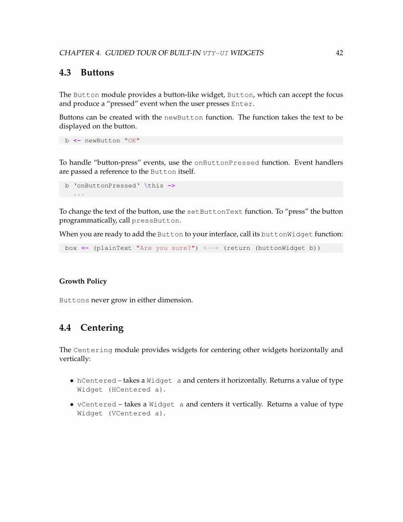
The Button module provides a button-like widget, Button, which can accept the focusand produce a “pressed” event when the user presses Enter.
Buttons can be created with the newButton function. The function takes the text to bedisplayed on the button.
b <- newButton "OK"
To handle “button-press” events, use the onButtonPressed function. Event handlersare passed a reference to the Button itself.
b ‘onButtonPressed‘ \this ->...
To change the text of the button, use the setButtonText function. To “press” the buttonprogrammatically, call pressButton.
When you are ready to add the Button to your interface, call its buttonWidget function:
box <- (plainText "Are you sure?") <--> (return (buttonWidget b))
Growth Policy
Buttons never grow in either dimension.
4.4 Centering
The Centering module provides widgets for centering other widgets horizontally andvertically:
• hCentered – takes a Widget a and centers it horizontally. Returns a value of typeWidget (HCentered a).
• vCentered – takes a Widget a and centers it vertically. Returns a value of typeWidget (VCentered a).

CHAPTER 4. GUIDED TOUR OF BUILT-IN VTY-UI WIDGETS 43
• centered – takes a Widget a and centers it both horizontally and vertically us-ing hCentered and vCentered. Returns a value of type Widget (VCentered(HCentered a)).
Horizontal and vertical centering are only useful if the widget being centered doesn’t growto fill the available space on its own, since it would be as large as the available space andthus would be centered implicitly. To constrain a growing widget to make it centerable,see Sections 4.13 and 4.11.
Growth Policy
HCentered widgets always grow horizontally and defer to their children for verticalgrowth policy. Likewise, VCentered widgets always grow vertically and defer to theirchildren for horizontal growth policy. The centered function returns a widget whichalways grows in both directions.
4.5 Checkboxes and Radio Buttons
The CheckBox module provides a rich API for creating “check box” and “radio button”widgets. Radio button widgets can be grouped together into “radio groups” to determinetheir collective exclusion behavior.
The CheckBox module provides generalized, “multi-state” checkboxes which may be inone of an arbitrary number of states, each having its own “checked character” visible inthe checkbox. The “binary” checkbox provided by the module is of the traditional two-state variety that we usually mean when we say “check box.” Most of the CheckBoxmodule’s functions are polymorphic on the CheckBox’s value type.
Add a CheckBox to your interface and insert it into a FocusGroup to use it.
4.5.1 Binary Checkboxes
Binary checkboxes can be created with the newCheckbox function, which returns a Wid-get (CheckBox Bool). Each checkbox has a text label which is passed to the construc-tor:
cb <- newCheckbox "Fancy Graphics"

CHAPTER 4. GUIDED TOUR OF BUILT-IN VTY-UI WIDGETS 44
Binary CheckBoxes look like this:
[ ] Fancy Graphics[x] Fancy Graphics
The user uses the Space key to change the CheckBox state.
Event handlers for checkbox state changes can be registered with onCheckboxChangeand take a single parameter, which is the value of the checkbox after the state changeoccurs. In general, for a checkbox of type Widget (CheckBox a), the parameter to theevent handler is of type a.
cb ‘onCheckboxChange‘ \val ->...
Binary CheckBoxes can be manipulated with the functions setCheckboxChecked, set-CheckboxUnchecked, and toggleCheckbox.
4.5.2 Radio Buttons
A radio button is essentially a checkbox, but with restrictions. We use the CheckBoximplementation to create radio buttons and use a “radio group” type to enforce the mutualexclusion required to make radio buttons work. As a result, only “binary” checkboxes (oftype Widget (CheckBox Bool)) may be used as radio buttons.
Radio buttons may be created by creating normal binary CheckBoxes and adding themto RadioGroups. A RadioGroup can be created with the newRadioGroup function.
rg <- newRadioGroupcb1 <- newCheckbox "Cake"cb2 <- newCheckbox "Death"
Once you have created the checkboxes and RadioGroup, you can add the checkboxes tothe radio group with addToRadioGroup:
addToRadioGroup rg cb1addToRadioGroup rg cb2
Once a CheckBox has been added to a RadioGroup, its appearance will be changed toindicate that it has a different behavior. CheckBoxes in RadioGroups look like this:
( ) Cake

CHAPTER 4. GUIDED TOUR OF BUILT-IN VTY-UI WIDGETS 45
(*) Death
If you’d like to know when a RadioGroup’s currently-selected CheckBox changes, youcan register an event handler for this event with onRadioChange. Its parameter will be areference to the CheckBox that became selected:
rg ‘onRadioChange‘ \theCb ->...
Once you have a reference to a CheckBox, you can get its state with getCheckboxState.For example, for binary checkboxes this value will be a Bool.
rg ‘onRadioChange‘ \theCb -> dost <- getCheckboxState theCb...
A CheckBox’s state can be changed with the setCheckboxState function. If you at-tempt to set the state to an invalid value, a CheckBoxError exception (BadCheckbox-State) will be thrown.
In addition to using an event handler to be notified when a RadioGroup changes state,you can also use the getCurrentRadio function to get a RadioGroup’s current Check-Box at any time.
4.5.3 Generalized, Multi-State Checkboxes
Although binary checkboxes may serve most purposes, they are a specific case of general-ized checkboxes which associated characters (like ’x’ and ’*’ above) with values of anytype. A multi-state checkbox can have any number of these states, and the user can togglebetween them in order.
To create a new multi-state checkbox, you must specify value-character mappings in ad-dition to a text label. The checkbox’s initial state is the first one in the list passed to theconstructor.
-- cb :: Widget (CheckBox Int)cb <- newMultiStateCheckbox "Number of Cakes" [ (1, ’1’)
, (2, ’2’), (3, ’3’)]
When the user interacts with a multi-state CheckBox, repeated state changes will cycle
CHAPTER 4. GUIDED TOUR OF BUILT-IN VTY-UI WIDGETS 46
through the list of values specified in the constructor. In all other respects, multi-statecheckboxes are the same as binary checkboxes, and all polymorphic API functions can beused on them.
4.5.4 Customizing a CheckBox’s Appearance
We saw in Section 4.5.2 that the appearance of a CheckBox can be changed. This is ac-complished with the following functions:
• setStateChar – given a CheckBox and a state value, the character representationof that state will be set. If the state value is invalid, CheckBoxError (BadState-Argument) will be thrown. As an example, the default state characters for binarycheckboxes for True and False, respectively, are ’x’ and ’ ’.
• setBracketChars – given a CheckBox and two Chars, this sets the left and rightcharacters, respectively, which surround the state character. The defaults are ’[’and ’]’.
Growth Policy
All CheckBoxes are fixed-size and do not grow in either dimension.
4.6 Collections
The EventLoop module provides the Collection type, which is a container for multi-ple widgets and their FocusGroups with a pointer to a “currently-selected” widget andFocusGroup. Collections are used to construct interfaces as described in Section 2.4.
To create a new collection:
c <- newCollection
A Collection is not a widget so it cannot be treated like one. However, the primaryoperation of interest is the addToCollection function, which adds an arbitrary Widgeta and FocusGroup to the Collection and returns an IO action which, when run, willswitch to that interface and focus group.
CHAPTER 4. GUIDED TOUR OF BUILT-IN VTY-UI WIDGETS 47
switchToFoo <- addToCollection c fooUi fooFocusGroupsomeWidget ‘onEvent‘ (const switchToFoo)
If you choose not to use the IO action returned by addToCollection, you may in-stead call setCurrentEntry. This function takes a Collection and a position andsets the Collection’s current entry to the one at the specified position. The positionis an index into the Collection’s internal list of interfaces. If the position is invalid, aCollectionError is thrown.
_ <- addToCollection c fooUi fooFocusGroupsomeWidget ‘onEvent‘ (const $ setCurrentEntry c 0)
If an empty Collection is used in any way, a CollectionError will be thrown.
4.7 Dialogs
The Dialogmodule provides a basic accept/cancel dialog widget interface and is capableof embedding arbitrary widgets.
Dialog creation is straightforward. The following example will create a new dialog withan embedded Edit widget and will set the Dialog’s title:
fg1 <- newFocusGroupe <- editWidgetaddToFocusGroup fg e
(dlg, fg2) <- newDialog e "The Title"fg <- mergeFocusGroups fg1 fg2
The newDialog function returns a Dialog and a FocusGroup. The Dialog includestwo Buttons – an “OK” button and a “Cancel” button – and the returned FocusGroupcontains those buttons in that order. You can merge the FocusGroup with your own oruse it directly as described in Section 2.3.
The Dialog itself is a composite type; the way to lay out a Dialog in your interface is bylaying out the Dialog’s widget:
let ui = dialogWidget dlg
The Dialog type provides two events: acceptance and cancellation. The following exam-ple registers handlers for both of these events. These events are triggered when the user

CHAPTER 4. GUIDED TOUR OF BUILT-IN VTY-UI WIDGETS 48
“presses” the buttons in the Dialog.
dlg ‘onDialogAccept‘ \this ->...
dlg ‘onDialogCancel‘ \this ->...
To programmatically trigger the acceptance or cancellation of a Dialog, use the accept-Dialog and cancelDialog functions.
Growth Policy
A Dialog’s growth policy depends on the growth policy of the widget embedded in it.The Dialog’s interface uses fixed-size widgets, so it will not grow in either dimensionunless you embed a widget which grows. In the example above, the Dialog will growhorizontally due to the Edit widget but will not grow vertically.
4.8 The Directory Browser
The DirBrowser module provides a rich interface for browsing the filesystem to selectfiles. The user is presented with an interface in which different file types are given differ-ent colors, and a status bar shows some information about the currently-selected file ordirectory. If the user attempts to browse an unreadable directory or get information aboutan unreadable file, an error is displayed in the browser interface.
The DirBrowser uses a List widget for selecting files and directories, so the List key-bindings apply here. In total, the directory browser supports the following key bindings:
• Enter – descends into a directory or selects a file.
• Left – ascends to the parent directory.
• Right – descends into a selected directory.
• Up, Down – changes the currently-selected entry.
• ’q’, Esc – cancels browsing.
• ’r’ – refreshes the browser’s state of the current directory.

CHAPTER 4. GUIDED TOUR OF BUILT-IN VTY-UI WIDGETS 49
DirBrowsers are created as follows:
browser <- newDirBrowser defaultBrowserSkin
The browser’s initial filesystem path will be the application’s current directory. You canchange it with the setDirBrowserPath function:
setDirBrowserPath browser "/"
To be notified when the user has selected a file, register an event handler with onBrowse-Accept. The handler will be passed the FilePath to the file which was selected.
browser ‘onBrowseAccept‘ \path -> ...
Similarly, to be notified when the user has cancelled browsing, register an event handlerwith onBrowseCancel. The handler will be passed the browser’s path at the time ofcancellation.
browser ‘onBrowseCancel‘ \path -> ...
To be notified when the user changes the browser’s current path, use onBrowserPath-Change. The event handler will be passed the new browser path.
browser ‘onBrowserPathChange‘ \path -> ...
4.8.1 Skinning
When creating a DirBrowser, we pass it a BrowserSkin. This value affects how thebrowser colors the different types of filesystem entries it displays in addition to how itcolors the rest of its interface. You can customize the browser skin by updating any of itsfields with Vty attributes of your choosing.
browser <- newDirBrowser $ defaultBrowserSkin { ... }
The attribute fields of the BrowserSkin type are as follows:
• browserHeaderAttr – used for the header and footer of the browser interface.

CHAPTER 4. GUIDED TOUR OF BUILT-IN VTY-UI WIDGETS 50
• browserUnfocusedSelAttr – used for the selected entry when the browser is notfocused.
• browserErrorAttr – used for the text widget which displays errors encounteredwhile browsing.
• browserDirAttr – used for directories.
• browserLinkAttr – used for symbolic links.
• browserBlockDevAttr – used for block device files.
• browserNamedPipeAttr – used for named pipes.
• browserCharDevAttr – used for character device files.
• browserSockAttr – used for sockets.
When the browser is focused, it uses the RenderContext’s focusAttr for the currently-selected entry in the List.
4.8.2 Annotations
For each type of file on the filesystem, the browser displays the kind of file in additionto some information about it. For example, for regular files, the size is displayed. Forsymbolic links, the link target is displayed.
It may be important to add your own such enhancements to the browser. For example,you may want to apply an attribute to files with a specific extension to make them easy tosee in the browser. In addition you may wish to generate a description about the file in thestatus bar. To accomplish this, the DirBrowser provides annotations.
An annotation is made up of three components:
• A predicate to determine whether the annotation should apply to a given file,
• A function to generate a description of the file such as its size or application-specificmetadata, and
• An attribute to apply to files of this type in the browser listing.
CHAPTER 4. GUIDED TOUR OF BUILT-IN VTY-UI WIDGETS 51
Annotations are stored in the BrowserSkin itself since they are used to influence thebrowser’s appearance. To add annotations to a skin, use withAnnotations. The follow-ing example adds an annotation for “emacs backup files,” which end in ’˜’:
let mySkin = defaultBrowserSkin ‘withAnnotations‘ myAnnotationsmyAnnotations = [ ( \path _ -> "˜" ‘isSuffixOf‘ path
, \_ _ -> return "emacs backup file", green ‘on‘ blue)
]
For the full specification of the annotation’s type, please see the API documentation.
4.8.3 Error Reporting
When a user selects a file in the browser, your application may determine that the filedoes not meet certain requirements. At this point it may be useful to report an error tothe user without leaving the browser interface. The DirBrowser provides a function todo just this called reportBrowserError. The function displays an error message in thebrowser’s error message area.
browser ‘onBrowseAccept‘ \path ->reportBrowserError browser $ T.concat [ "not a valid document: "
, T.pack path]
Growth Policy
A DirBrowser expands both vertically and horizontally.
4.9 Edit Widgets
The Edit module provides a line-editing widget, Widget Edit. This widget makes itpossible to edit text with some Emacs-style key bindings.
An Edit widget is simple to create. You can create Edit widgets in two modes: single-and multi-line:

CHAPTER 4. GUIDED TOUR OF BUILT-IN VTY-UI WIDGETS 52
-- Single-line text editor:e1 <- editWidget-- Multi-line text editor:e2 <- multiLineEditWidget
Edit widgets can be laid out in the usual way:
e <- editWidgetb <- (plainText "Enter a string: ") <++> (return e)
To use an Edit widget, add it to your interface and FocusGroup.
Edit widgets support the following editing key bindings:
• Ctrl-a, Home – go to the beginning of the line.
• Ctrl-e, End – go to the end of the line.
• Ctrl-k – remove the text from the cursor position to the end of the line.
• Ctrl-d, Del – delete the character at the cursor position.
• Left, Right, Up, Down – change the cursor position.
• Backspace – delete the character just before the cursor position and move the cur-sor position back by one character.
• Enter – “activate” the Edit widget if it is a single-line widget; if it is multi-line,insert a new line at the cursor position.
Note that Tab will not be handled by Edit widgets because it is used to change focus.
An Edit widget can be monitored for three events:
• “Activation” events – triggered when the user presses Enter in a single-line Editwidget. Handlers are registered with the onActivate function. Event handlersreceive the Edit widget as a parameter.
• Text change – when the contents of the Edit widget change. Handlers are registeredwith the onChange function. Event handlers receive the new String value in theEdit widget.
• Cursor movement – when the cursor position within the Editwidget changes. Han-dlers are registered with the onCursorMove function. Event handlers receive thenew cursor position as a parameter.

CHAPTER 4. GUIDED TOUR OF BUILT-IN VTY-UI WIDGETS 53
In addition to event handling, the Edit widget API also provides other functions. Thesefunctions trigger the respective events automatically.
• setEditText, getEditText – change the current text content of the Edit widget.
• getEditCursorPosition, setEditCursorPosition – manipulate the cursorposition within the Edit widget.
• getEditLineLimit, setEditLineLimit – manipulate the limit on the numberof lines that the text widget may hold. Takes Maybe Int where Nothing indicatesno limit. setEditLineLimit $ Just 0 is a no-op.
Wide Character Support
Some characters, such as those from some Asian character sets, require two columns in-stead of one when displayed in a terminal. The Edit widget supports such characterswith one caveat: when a wide character straddles the left or right viewing boundary ofan Edit widget, an indicator ($) will be displayed in its place to indicate that a widecharacter lies on the boundary and can be revealed by scrolling further in the appropriatedirection. Such indicators are only visual and do not affect the underlying text, so e.g. callsto getEditText will return the text as expected.
Growth Policy
Single-line Edit widgets – those created by editWidget – grow only horizontally andare always one row high. Multi-line edit widgets – those created by multiLineEdit-Widget – always grow in both dimensions. To manage this behavior, you can use one ofthe “fixed” family of widgets to control their sizes (see Section 4.11).
4.10 Fills
The Fills module provides space-filling widgets which can be used to add “flexible”space to control layout. Fixed-size widgets often need flexible space to fill the terminal, sowe use “fill” widgets to do this.
There are two types of fills:

CHAPTER 4. GUIDED TOUR OF BUILT-IN VTY-UI WIDGETS 54
• Horizontal, created by the hFill function. hFill takes a fill character and a heightand fills available space with that character using the current attribute settings.
• Vertical, created by the vFill function. vFill takes a fill character and fills avail-able space with that character using the current attribute settings.
Growth Policy
HFills always grow horizontally but not vertically. VFills always grow vertically butnot horizontally.
4.11 Fixed-Size Widgets
The Fixed module provides widget containers which fix the amount of spaced used torender the child. This can be useful when you know that an element of your interface hasthe potential to fill available space but must be fixed to a specific size for some reason.
The module provides widget types for constraining the horizontal or vertical size of awidget. The fixed-size widget containers are created with the following functions:
• hFixed – takes a widget Widget a and a width in columns and constrains thewidget to the specified width. Returns a widget of type Widget (HFixed a). Ifthe HFixed widget does not have enough space to enforce the specified width, theavailable space is used instead.
• vFixed – takes a widget Widget a and a height in rows and constrains the wid-get to the specified height. Returns a widget of type Widget (VFixed a). If theVFixed widget does not have enough space to enforce the specified height, theavailable space is used instead.
• boxFixed – takes a widget Widget a, a width in columns, and a height in rowsand constrains the widget in both dimensions. Returns a widget of type Widget(VFixed (HFixed a)).
In addition to widget creation, some manipulation functions are provided so that the fixed-size container settings can be manipulated as desired:
• setVFixed, setHFixed – sets the constraint value for a fixed-size widget.

CHAPTER 4. GUIDED TOUR OF BUILT-IN VTY-UI WIDGETS 55
• addToVFixed, addToHFixed – adds a value to the constraint value of a fixed-sizewidget.
• getVFixedSize, getHFixedSize – returns the constraint value of a fixed-sizewidget.
For example, the List widget type (Section 4.14) grows vertically but we may wish todedicate most of the terminal to the rest of the interface. We can use vFixed to constrainthe List in this way. Below, we constrain the List to five rows of height. Assuming theList elements are each one row high, if the List has fewer than five elements to displaythen the VFixed widget will automatically pad the List to ensure that it takes up thespecified number of rows. Fixed-size widgets thus guarantee that the specified space isconsumed.
lst <- newList (green ‘on‘ black)ui <- vFixed 5 lst
Growth Policy
Since VFixed and HFixed widgets are designed to constrain their children in a specificdimension, they never grow in the constrained dimension. For the other dimension, fixed-size widgets always defer to their children for the growth policy.
4.12 Groups
The Group module provides a widget for containing a group of widgets of the same type,together with a pointer to the “current” widget for the group. This can be used to embeda collection of widgets in the interface while being able to change which of the widgets isbeing displayed. This prevents users from having to construct new interfaces around eachnew widget, and the group can be modified at runtime.
To create a group, use the newGroup function:
g <- newGroup
A group contains one or more widgets of any type, although they must all have the sametype within the group. To add widgets to a group, use addToGroup:

CHAPTER 4. GUIDED TOUR OF BUILT-IN VTY-UI WIDGETS 56
switchToT1 <- addToGroup g =<< plainText "first"switchToT2 <- addToGroup g =<< plainText "second"
The addToGroup function returns an IO action. This action, when evaluated, will changethe group’s currently-active widget to the one passed to addToGroup. In the above ex-ample, evaluating switchToT2 would cause group g to show the text widget containing"second".
Input and Focus Events
Group widgets relay all key events received to the currently-active widget in the group, ifany. Focus events on the group propagate to the currently-active widget.
Growth Policy
Group widgets act as wrappers for the widgets they contain, so they delegate all growthpolicy settings from the widgets being wrapped.
4.13 Limits
The Limits module provides widgets for setting upper bounds on the sizes of other wid-gets. These widgets differ from the Fixed module we saw in Section 4.11; “limit” widgetsdo not pad their children if the children render to Images smaller than the specified space,whereas fixed-size widgets pad their children, thus guaranteeing that the specified spacewill be consumed.
The limiting widget API is similar to that of the Fixed module. Limiting widgets arecreated as follows:
• hLimit – takes a widget Widget a and a width in columns and constrains thewidget to the specified width. Returns a widget of type Widget (HLimit a). Ifthe HLimit widget does not have enough space to enforce the specified width, thechild widget is not padded.
• vLimit – takes a widget Widget a and a height in rows and constrains the wid-get to the specified height. Returns a widget of type Widget (VLimit a). If the

CHAPTER 4. GUIDED TOUR OF BUILT-IN VTY-UI WIDGETS 57
VLimitwidget does not have enough space to enforce the specified height, the childwidget is not padded.
• boxLimit – takes a widget Widget a, a width in columns, and a height in rowsand constrains the widget in both dimensions. Returns a widget of type Widget(VLimit (HLimit a)). If the child widget is smaller, it is not padded.
In addition to widget creation, some manipulation functions are provided so that the limitsettings can be manipulated as desired:
• setVLimit, setHLimit – sets the constraint value for a limiting widget.
• addToVLimit, addToHLimit – adds a value to the constraint value of a limitingwidget.
• getVLimitSize, getHLimitSize – returns the constraint value of a limiting wid-get.
Growth Policy
Limiting widgets never grow in the constrained dimension and defer to their children forgrowth policy otherwise.
4.14 Lists
The List module provides a rich interface for displaying, navigating, and selecting froma list of elements.
Lists support the following key bindings:
• Up, Down – changes the currently-selected element by one element in the respectivedirection.
• PageUp, PageDown – changes the currently-selected element by a page of elements,which depends on the number of elements currently shown in the list.
• Enter – notifies event handlers that the currently-selected item has been “activated.”
Lists are implemented with the type List a b. Its two type parameters are as follows:

CHAPTER 4. GUIDED TOUR OF BUILT-IN VTY-UI WIDGETS 58
• internal item type, a – This is the type of the application-specific value stored in eachlist item. This is the data that is represented by the visual aspect of the list elementand it will not necessarily have anything to do with the visual representation.
• item widget type, b – This is the type of the widget state of each element as it is repre-sented in the interface. For example, a simple list of strings might use String as itsinternal value type and Widget FormattedText (Section 4.18) as its widget type,resulting in a list of type List String FormattedText.
Lists are created with the newList function:
lst <- newList attr
newList takes one parameter: the attribute of the currently-selected item to be used whenthe list is not focused. The List uses its own focus attribute (Section 2.5.2) as the attributeof the currently-selected item when it has the focus. The widget type of the list (b above)won’t be chosen by the type system until you actually add something to the list.
Items may be added to a List with the addToList function, which takes an internalvalue (e.g., String) and a widget of the appropriate type:
let s = "foobar"addToList lst s =<< plainText s
In addition, items may be inserted into a List at any position with the insertIntoListfunction.
There are two restrictions on the widget type that can be used with Lists:
• The Widget b type must not grow vertically. This is because all List item widgetsmust take up a fixed amount of vertical space so the List can manage scrolling. Ifthe widget grows vertically, addToList will throw a ListError exception.
• All widgets added to the List must have the same height. This is because the listuses the item height to calculate how many items can be displayed, given the spaceavailable to the rendered List. If you specify a widget whose rendered size doesn’tmatch that of the rest of the wigets of the list, layout problems are likely to ensue.
Items may be removed from Lists with the removeFromList function, which takes aWidget (List a b) and an item position, removes the item at the specified position,and returns the removed item:

CHAPTER 4. GUIDED TOUR OF BUILT-IN VTY-UI WIDGETS 59
(val, w) <- removeFromList lst 0
If the position is invalid, a ListError is thrown. removeFromList returns the internalvalue (val) and the corresponding widget (w) of the removed list entry.
All of the items can be removed from a List with the clearList function. clearListdoes not invoke any event handlers for the removed items.
In addition to addToList, the List API provides the setSelected function. This func-tion takes a List widget and an index and scrolls the list so that the item at the specifiedposition is selected. If the position is out of bounds, the List is scrolled as much as possi-ble.
4.14.1 List Inspection
The List module provides some functions to get information about the state of a List:
• getListSize – returns the number of elements in a List.
• getSelected – takes a Widget (List a b) and returns Nothing if the List isempty or returns Just (pos, (val, widget)) corresponding to the list index,internal item value, and widget of the currently-selected list item.
• getListItem – takes a Widget (List a b) and an index and returns Nothingif the List has no item at the specified index item or returns Just (pos, (val,widget)) corresponding to the list index.
4.14.2 Scrolling a List
Although the list key bindings are bound to the List’s scrolling behavior, the List mod-ule exports the scrolling functions for programmatic manipulation of Lists. Note that inall cases, the scrolling functions change the position of the currently-selected item and, ifnecessary, scroll the list in the terminal to reveal the newly-selected item.
• scrollUp – moves the selected item position toward the beginning of the List byone position.
• scrollDown – moves the selected item position toward the end of the List by oneposition.

CHAPTER 4. GUIDED TOUR OF BUILT-IN VTY-UI WIDGETS 60
• pageUp – moves the selected item position toward the beginning of the List by onepage; the size of a page depends on the height of the List’s widgets and the amountof space available to the rendered List.
• pageDown – moves the selected item position toward the end of the List by onepage; the size of a page depends on the height of the List’s widgets and the amountof space available to the rendered List.
• scrollBy – takes a number of positions and moves the selected item position in thespecified direction. If the number is negative, this scrolls toward the beginning ofthe List, otherwise, it scrolls toward the end.
4.14.3 Handling Events
The List type produces a variety of events:
• scrolling events – events indicating that the position of the currently-selected itemhas changed. Handlers are registered with onSelectionChange and receive anevent value of type SelectionEvent. A SelectionEvent describes whether theselection has been turned “off”, which happens when the last element in the List isremoved, or whether it is on and corresponds to an item.
• item events – events indicating that an item has been added to or removed from theList. Handlers for added items are registered with onitemAdded receive eventvalues of type NewItemEvent. Handlers for removed items are registered withonItemRemoved and receive event values of type RemoveItemEvent.
• item activation – events indicating that the currently-selected item was activated, whichoccurs when the user presses Enter on a focused List. Handlers for activationevents are registered with onItemActivated and receive event values of typeActivateItemEvent.
Scrolling events are generated by the functions described in Section 4.14.2. Item activationmay be triggered programmatically with the activateCurrentItem function.
Growth Policy
Lists always grow both horizontally and vertically.
CHAPTER 4. GUIDED TOUR OF BUILT-IN VTY-UI WIDGETS 61
4.15 Padding
The Padding module provides a wrapper widget type, Padded, which wraps anotherwidget with a specified amount of padding on any or all four of its sides.
We create padded widgets with the padded function, which takes a child of type Widgeta and a padding value. In the following example we create a FormattedText widgetand pad it on all sides by two rows (or columns, where appropriate):
w <- plainText "foobar"w2 <- padded w (padAll 2)
The padding itself is expressed with the Padding type, whose values store padding set-tings for the top, bottom, left, and right sides of an object in question. Padding values arecreated with one of the following functions:
• padNone – creates a Padding value with no padding.
• padAll – takes a single parameter, p, and creates a Padding value with p rows orcolumns of padding on all four sides.
• padLeft, padRight, padTop, padBottom – each takes a single parameter andcreates a Padding value with the specified amount of padding on the specified sideindicated by the function name.
• padLeftRight, padTopBottom – each takes a single parameter and creates a Pad-ding value with the specified amount of padding on both sides indicated by thefunction name.
With these basic Padding constructors we can construct more interesting Padding valueswith the pad function:
let p = padNone ‘pad‘ (padAll 5) ‘pad‘ (padLeft 2)
The Padding type is an instance of the Paddable type class, of which pad is the onlymethod. The Padding instance of Paddable just adds the padding values together.
In addition to the padded function, the Padding module provides the withPaddingcombinator to created a Padded widget in the following way:
w <- plainText "foobar" >>= withPadding (padAll 2)

CHAPTER 4. GUIDED TOUR OF BUILT-IN VTY-UI WIDGETS 62
Growth Policy
Padded widgets always defer to their children for both horizontal and vertical growthpolicy.
4.16 Progress Bars
The ProgressBar module provides the ProgressBar type which you can use to indi-cate task progression in your applications.
ProgressBars can be created with the newProgressBar function. The function takestwo Attr arguments indicating the attributes to be used for the complete and incompleteportions of the progress bar, respectively:
bar <- newProgressBar (blue ‘on‘ white) (white ‘on‘ blue)
ProgressBars take Attr values because these widgets support text labels. You can setthe label and its alignment as follows:
setProgressText bar "Working..."setProgressTextAlignment bar AlignCenter
ProgressBars can be laid out in your interface like any other widget:
ui <- (plainText "Progress: ") <--> (return bar)
A ProgressBar tracks progress as an Int n (0 ≤ n ≤ 100). To set a ProgressBar’sprogress value, use setProgress or addProgress:
setProgress bar 35addProgress bar 1
Calls to setProgress and addProgress resulting in a progress value outside the al-lowable range will have no effect.
To be notified when a ProgressBar’s value changes, use the onProgressChange func-tion. Handlers for this event will receive the new progress value:
bar ‘onProgressChange‘ \newVal -> ...

CHAPTER 4. GUIDED TOUR OF BUILT-IN VTY-UI WIDGETS 63
ProgressBars are best used with the schedule function described in Section 2.5.3.
Growth Policy
ProgressBars grow horizontally but do not grow vertically.
4.17 Tables
The Table module provides a table layout widget which embeds other widgets and pro-vides full control over column and cell padding, alignment, and cell borders.
The Table creation function newTable requires two parameters which govern the overalltable behavior:
• column specifications – a list of values specifying how each column in the table is tobehave, including its width policy, alignment, and padding settings
• border configuration – a value specifying how the table’s borders are to be drawn (ifany)
Here is an example of a table with two columns and full borders:
tbl <- newTable [column (ColFixed 10), column ColAuto] BorderFull
To add rows to the table, we use the addRow function and the row constructor .|. toconstruct rows:
n <- plainText "Name"ph <- plainText "Phone Number"addRow tbl $ n .|. ph
In the following sections we will go into more detail on the table API.
4.17.1 Column Specifications: the ColumnSpec Type
newTable’s column specification list dictates how many terminal columns the Tablewillhave and how they will behave. The column specification type, ColumnSpec, specifiesthree properties of a column:

CHAPTER 4. GUIDED TOUR OF BUILT-IN VTY-UI WIDGETS 64
• Width – either a fixed number of columns, ColFixed, or automatically sized, Col-Auto.
• Alignment – left-aligned by default.
• Padding – no padding by default.
The width of a column dictates how many columns will be allocated to it at rendering time.A ColFixed column will be rendered in the specified number of columns. A column witha ColAuto width will be allocated a flexible amount of width at rendering time.
For example, if a Table with no borders is rendered in a region with 80 columns and hastwo ColFixed columns with 10 and 20 columns respectively and one ColAuto column,the ColAuto column will be given 80− (10 + 20) = 50 columns of space in the renderingprocess. A Table may have any number of ColAuto columns; in general, the remainingspace is divided evenly between them.
The padding and alignment in the ColumnSpec serve as the default properties for eachcell in the column unless a cell has overridden either.
The ColumnSpec type is an instance of the Paddable type class we saw in Section 4.15,so we can specify the default Padding for a column with the pad function:
newTable [column ColAuto ‘pad‘ (padAll 2)] BorderFull
The ColumnSpec type is also an instance of the Alignable type class provided by theAlignment module. This type class provides an align function which we can use to setthe default cell alignment for the column:
newTable [column ColAuto ‘align‘ AlignRight] BorderFull
The align function takes an Alignment value. Valid values are AlignLeft, Align-Center, and AlignRight.
4.17.2 Border Settings
Tables support three border configurations using the BorderStyle type. Valid valuesare as follows:
• BorderNone – no borders of any kind.

CHAPTER 4. GUIDED TOUR OF BUILT-IN VTY-UI WIDGETS 65
• BorderFull – full borders on all sides of the table and in between all rows andcolumns.
• BorderPartial – borders around or in between some elements of the table; thisconstructor takes a list of BorderFlags, whose values are Rows, Columns, andEdges.
A Table’s border style cannot be changed once the Table has been created.
4.17.3 Adding Rows
The addRow function provides a flexible API for adding various types of values to tablecells. The function expects an instance of the RowLike type class. This type class is in-tended to be instanced by any type that contains a value that can be embedded in a tablecell. Any Widget a is a RowLike, so any widget can be added to a table in a straightfor-ward way:
t <- plainText "foobar"addRow tbl t
In addition, empty cells can be created with the emptyCell function:
addRow tbl emptyCell
The above examples work in the case where the Table has only one column; to constructrows for Tables with multiple columns, we use the row constructor, .|., which takesany two RowLike values and constructs a row from them:
t1 <- plainText "foo"t2 <- plainText "bar"addRow tbl1 $ t1 .|. t2 -- tbl1 has two columns
t3 <- plainText "baz"addRow tbl2 $ t1 .|. t2 .|. t3 -- tbl2 has three columns
The only restriction on table cell content is that any widget added to a table cell must notgrow vertically. If it does, addRow will throw a TableError exception.

CHAPTER 4. GUIDED TOUR OF BUILT-IN VTY-UI WIDGETS 66
4.17.4 Default Cell Alignment and Padding
The Table stores default cell alignment and padding settings which apply to all cells inthe table. These settings are set with the following functions:
• setDefaultCellAlignment – sets the default Alignment used for all cells in thetable.
• setDefaultCellPadding – sets the default Padding value used for all cells inthe table.
We can override these settings on a per-column basis by setting Alignment and Paddingon the ColumnSpec values as we saw in Section 4.17.1.
setDefaultCellPadding tbl (padLeft 1)setDefaultCellAlignment tbl AlignCenter
As we will see in the following section, we can even override these settings on a per-cellbasis.
4.17.5 Customizing Cell Alignment and Padding
By default, each table cell uses its column’s alignment and padding settings. If the col-umn’s ColumnSpec has no alignment or padding settings, the table-wide defaults will beused instead. However, it is possible to customize these settings on a per-cell basis.
Every widget in a Table is ultimately embedded in the TableCell type. This type holdsthe widget itself and any customized alignment and padding settings. The TableCelltype is an instance of the Paddable and Alignable type classes so we can use the famil-iar pad and align functions to pad and align the TableCell.
To customize a cell’s properties, we must first wrap the cell widget in a TableCell withthe customCell function:
t <- plainText "foobar"addRow tbl $ customCell t
Then we can use pad and align on the TableCell:
t <- plainText "foobar"addRow tbl $ customCell t ‘pad‘ (padAll 1) ‘align‘ AlignRight
CHAPTER 4. GUIDED TOUR OF BUILT-IN VTY-UI WIDGETS 67
How Cell Alignment Works
Cell alignment determines how remaining space will be used when a cell’s widget is ren-dered. The default poilcy, AlignLeft, indicates that when a cell’s widget is rendered,it will be right-padded with a space-filling widget so that it takes up enough on-screencolumns to fill the width specified by the Table’s ColumnSpec. The AlignRight andAlignCenter settings behave similarly.
What this means is that the alignment settings do not dictate how the contents of each cellare laid out; they only dictate how the left-over space is used when a cell widget doesnot fill the table’s column. In most cases this distinction is effectively unimportant, but insome cases it may be helpful to understand.
Consider a table cell which contains an Edit widget. Edit widgets grow horizontall.Any Edit widget placed in a table cell will always fill it, so alignment settings will notaffect the result. However, if the Edit widget is constrained with a “fixed” widget asdescribed in Section 4.11, if any space is left over, the widget will be padded according tothe alignment setting.
Growth Policy
Tables do not grow vertically but will grow horizontally if they contain any ColAutocolumns.
4.18 Text
The Text module provides a widget for rendering text strings in user interfaces. The textwidget type, Widget FormattedText, can be used to render simple strings or morecomplex text arrangements.
A FormattedText widget can be created from a String with the plainText functionand can be laid out in the usual way:
t1 <- plainText "blue" >>= withNormalAttribute (fgColor blue)t2 <- plainText "green" >>= withNormalAttribute (fgColor green)ui <- (return t1) <++> (return t2)

CHAPTER 4. GUIDED TOUR OF BUILT-IN VTY-UI WIDGETS 68
4.18.1 Updating Text Widgets
The contents of a text widget can be set in one of three ways:
• Initially, as a parameter to plainText and textWidget
• As a Text parameter to setText
• As a list parameter of (Text, Attr) with setTextWithAttrs
All text widget update functions tokenize their inputs, finding contiguous sequences ofwhitespace and non-whitespace characters and newlines, and store the list of tokens inthe widget. Each token is assigned a default attribute of def attr, which defaults to the“normal” attribute of the widget (see Section 2.5.2 for more information on attributes).
The setText function merely takes a Text value, tokenizes it, and assigns the defaultattribute to all tokens.
The setTextWithAttrs function provides finer control over the initial attribute assign-ment to the text because it lets you specify the initial contents of the widget with your ownattribute assignments. This can be done instead of (or in addition to) the use of formattersfor maximum control over the final visual representation of the text.
In the following example, we create a text widget and then assign it a string with differentattributes for each of the words:
t <- plainText ""setTextWithAttrs t [ ("foo", fgColor green)
, (" ", def_attr), ("bar", fgColor yellow), (" ", def_attr), ("baz", red ‘on‘ blue)]
4.18.2 Formatters
In addition to rendering plain text strings, we can use “formatters” to change the arrange-ment and attributes of text. Formatters can manipulate structure and attributes to changethe text layout and appearance.
To use a formatter with a text widget, we must use a different constructor function, text-Widget:
CHAPTER 4. GUIDED TOUR OF BUILT-IN VTY-UI WIDGETS 69
t <- textWidget someFormatter "foobar"
In addition, the formatter for a text widget can be set at any time with setTextFormatter:
setTextFormatter t someFormatter
When a text widget’s contents are updated, the text is automatically broken up into tokens(see Section 4.18.1). It is these tokens on which formatters operate.
The Text module provides an example formatter called wrap. wrap wraps the text to fitinto the DisplayRegion available at rendering time, so this will end up doing the rightthing depending on the parent widget of the FormattedTextwidget. Here is an exampleusing wrap:
t <- textWidget wrap "(some long text message)"
Formatters form a Monoid, and we can use this functionality to compose formatters:
t <- textWidget (someFormatter ‘mappend‘ wrap) "Foo bar baz"
For detailed information on the token types on which the formatters operate, see theText.Trans.Tokenize module.
Growth Policy
FormattedText widgets do not grow horizontally or vertically.

Chapter 5
Other Topics
This chapter contains supplementary material on various aspects of vty-ui.
5.1 Text Clipping
Most widgets in vty-ui render some form of text. When we render text, we have toreason about the amount of space – columns – that the text will consume in the terminalso that we can render coherent interfaces. However, this is tricky because some charactersuse one column of space and others use two.1 To account for this possibility, any codewhich deals with computing the space required for text must consider the width of eachcharacter.
In cases where we have to consider character width, the most common operation we’retrying to perform is to clip a text string to ensure that it fits within a given region. TheTextClip module provides types and functions to do this in one and two dimensions:
• ClipRect - the type of two-dimensional clipping regions. Allows you to specify atop-left corner, a clipping width, and a clipping height.
• clip1d - performs one-dimensional clipping on a single line of text.
• clip2d - performs two-dimensional clipping on a list of lines of text using a Clip-Rect.
1http://www.unicode.org/reports/tr11/
70

CHAPTER 5. OTHER TOPICS 71
The functions in the TextClip module deal in physical values expressed using the Phystype. This type designates a physical width as opposed to a logical one. We use this distinc-tion to gain compile-time clarity about which integer values refer to logical characters andwhich ones refer to terminal column counts.
Both the clip1d and clip2d functions return text strings truncated so that their char-acters fit into the specified physical space. They also return Bool indicators which canbe used to determine whether clipping occurred in the “middle” of wide characters. TheEdit widget uses this feature to annotate truncated strings to indicate that a wide charac-ter can be found on either end of a truncated line of text.
In simple widgets, we could technically ignore text clipping details if we know that we’llalways be rendering strings which use single-column characters. However, we should getin the habit of always using clipping functions in case we need to start showing multi-column characters.
5.2 The Text Zipper
The TextZipper module provides a zipper2 data structure to manage the text editingprocess of multi-line text buffers. A TextZipper stores text and a cursor position at whichediting operations are applied. The zipper implementation works for any string repre-sentation type that provides implementations of drop, take, length, last, init, andnull. The module provides a default implementation (used by the Edit widget) basedon the Data.Text.Text type. Its constructor, textZipper, takes a list of Text valuesand creates a zipper.
let z = textZipper []
To extract the text content of the zipper, use getText:
let theLines = getText z
The module provides the following editing transformations:
• moveCursor (row, col) - Move the cursor to the specified cursor position. In-valid positions will be ignored.
• insertChar c - Insert c at the cursor position.2http://www.haskell.org/haskellwiki/Zipper

CHAPTER 5. OTHER TOPICS 72
• breakLine - Insert a line break at the cursor position.
• killToEOL - Kill (delete) all text after the cursor position up to the end of the currentline.
• gotoEOL - Move the cursor past the end of the current line.
• gotoBOL - Move the cursor to just before the beginning of the current line.
• deletePrevChar - Delete the character preceding the cursor position. If the cursoris at the beginning of a line, the current line will be appended onto the previous line.
• deleteChar - Delete the character at the cursor position. If the cursor is at the endof a line, the following line will be appended onto the current line.
• moveRight - Move the cursor one position to the right, wrapping to the followingline if necessary.
• moveLeft - Move the cursor one position to the left, wrapping to the preceding lineif necessary.
• moveUp - Move the cursor up by one row.
• moveDown - Move the cursor down by one row.
These transformations can be composed in natural ways to create a sequence of editingtransformations. For example:
import Control.Arrow
doEdits :: TextZipper a -> TextZipper adoEdits = foldl (>>>) id [ moveRight
, insertChar ’x’, insertChar ’z’, moveLeft, insertChar ’y’, deletePrevChar]
-- Later:let edited = doEdits $ textZipper theLines