
vtu java 4th unit swing
28
UNIT - 4 SWINGS: Swings: The origins of Swing; Two key Swing features; Components and Containers; The Swing Packages; A simple Swing Application; Create a Swing Applet; Jlabel and ImageIcon; JTextField;The Swing Buttons; JTabbedpane; JScrollPane; JList; JComboBox; JTable. 1. The origins of Swing The AWT defines the basic set of controls, windows and dialog box that supports a usable but limited graphic interface. The awt use native resources and referred to as heavy weights. The use of native peers led to several problems, Firstly because of the variation between the operating system , a components my look or even act differently in different platforms which threatens the philosophy of java, second the look and feel of each component was fixed ,third the use of heavyweight components (Rectangle and opaque) caused some frustrated restrictions. To overcome the above difficulties swing was introduces in 1977 and was included in Java foundation classes (JFC) 2. Two key Swing features The two features are light weight components and pluggable look and feel. Swing components are light weight: This means the components are written in java and do not map directly to platform specific peers. Since light weight components are build using graphic primitives which are transparent and non rectangular shapes. Thus light weight components are more efficient and more flexible . Furthur since light weight components do not translate into native peers the look of each components is determined by swing not by an underlying operating system. Hense these components will work consistently across the platform .
-
Upload
prathik7425 -
Category
Documents
-
view
70 -
download
4
description
vtu java 4th unit swing
Transcript of vtu java 4th unit swing
UNIT - 4SWINGS: Swings: The origins of Swing; Two key Swing features; Components and Containers; The Swing Packages; A simple Swing Application; Create a Swing Applet; Jlabel and ImageIcon; JTextField;The Swing Buttons; JTabbedpane; JScrollPane; JList; JComboBox; JTable.
1. The origins of SwingThe AWT defines the basic set of controls, windows and dialog box that supports a usable but limited graphic interface. The awt use native resources and referred to as heavy weights. The use of native peers led to several problems, Firstly because of the variation between the operating system , a components my look or even act differently in different platforms which threatens the philosophy of java, second the look and feel of each component was fixed ,third the use of heavyweight components (Rectangle and opaque) caused some frustrated restrictions.
To overcome the above difficulties swing was introduces in 1977 and was included in Java foundation classes (JFC)
2. Two key Swing featuresThe two features are light weight components and pluggable look and feel.Swing components are light weight: This means the components are written in java and do not map directly to platform specific peers. Since light weight components are build using graphic primitives which are transparent and non rectangular shapes. Thus light weight components are more efficient and more flexible . Furthur since light weight components do not translate into native peers the look of each components is determined by swing not by an underlying operating system. Hense these components will work consistently across the platform .
Swing Supports a pluggable look and feel : Swing supports pluggable look and feel (PLAF) i.e it is possible the way the components are rendered without effecting any of the other components. It is possible to plugin a new component without without disturbing other components .
3. Components and ContainersThe swing GUI consists of two key items Components and containers. Conceptually all Container are also components. The difference is a Component is an individual visual control such as push button or slider but a container contains a group of components. If a component need to be displayed it has to be embedded in the container. A container can also hold other containers. This enables swings to define a containment hierarchy at the top of which a top level container is defined.
Components : The swing component are derived from JComponent Class and defined in the package javax.swing. The following are the class names of swing components and all component classes starts with JJlabel , JTextField, JTabbedpane; JScrollPane ,JList ,JComboBox, JTableJapplet, JDailog, JFrame,JScrollBar,JTextArea,JButton,JMenu,JRadiButton,JCheckBox , JPasswordFeild,JPopupMenu
Containers :Swing define two types of containers the first are top level containers : JFrame, JApplet, JWindow and JDailog. The containers do not inherit JComponent . The second type of containers are light weight containers which also inherits JComponent. One such example for light weight container is JPanel
4. The Swing Packages
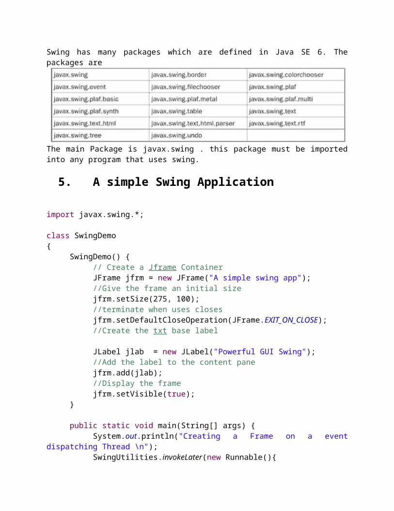
Swing has many packages which are defined in Java SE 6. The packages are
The main Package is javax.swing . this package must be imported into any program that uses swing.
5. A simple Swing Application
import javax.swing.*;
class SwingDemo{
SwingDemo() {// Create a Jframe ContainerJFrame jfrm = new JFrame("A simple swing app");//Give the frame an initial sizejfrm.setSize(275, 100);//terminate when uses closesjfrm.setDefaultCloseOperation(JFrame.EXIT_ON_CLOSE);//Create the txt base label
JLabel jlab = new JLabel("Powerful GUI Swing");
//Add the label to the content panejfrm.add(jlab);//Display the framejfrm.setVisible(true);
}
public static void main(String[] args) {System.out.println("Creating a Frame on a event dispatching Thread \n");SwingUtilities.invokeLater(new Runnable(){
public void run(){new SwingDemo(); }
});}
}
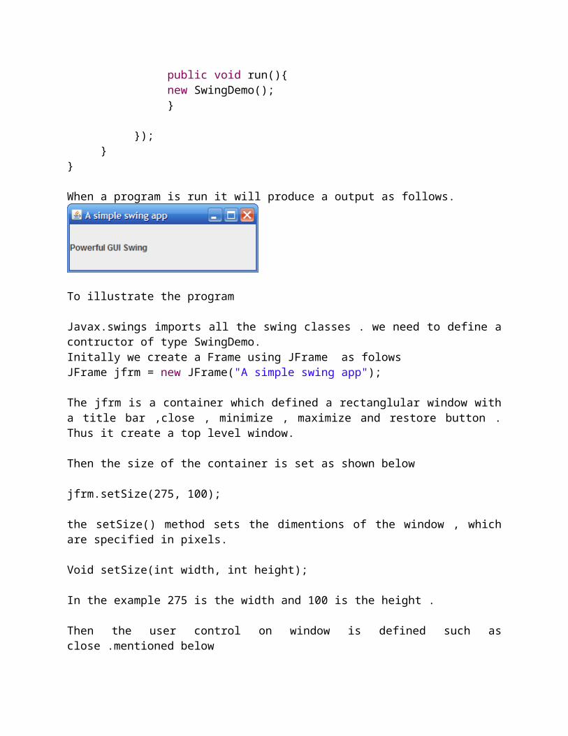
When a program is run it will produce a output as follows.
To illustrate the program
Javax.swings imports all the swing classes . we need to define a contructor of type SwingDemo.Initally we create a Frame using JFrame as folowsJFrame jfrm = new JFrame("A simple swing app");
The jfrm is a container which defined a rectanglular window with a title bar ,close , minimize , maximize and restore button . Thus it create a top level window.
Then the size of the container is set as shown below
jfrm.setSize(275, 100);
the setSize() method sets the dimentions of the window , which are specified in pixels.
Void setSize(int width, int height);
In the example 275 is the width and 100 is the height .
Then the user control on window is defined such as close .mentioned below
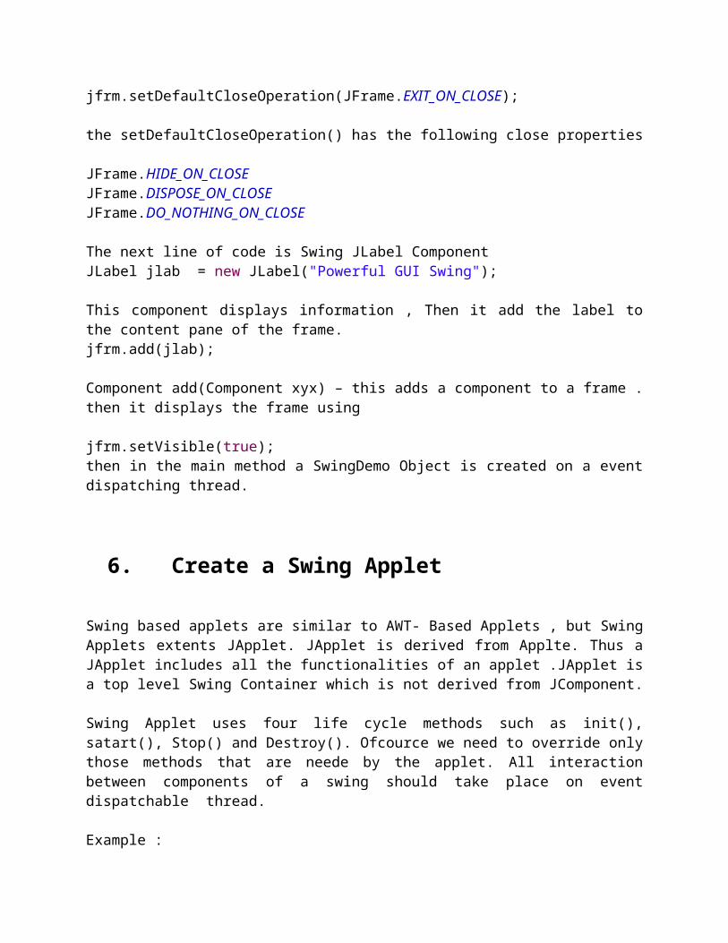
jfrm.setDefaultCloseOperation(JFrame.EXIT_ON_CLOSE);
the setDefaultCloseOperation() has the following close properties
JFrame.HIDE_ON_CLOSEJFrame.DISPOSE_ON_CLOSEJFrame.DO_NOTHING_ON_CLOSE
The next line of code is Swing JLabel ComponentJLabel jlab = new JLabel("Powerful GUI Swing");
This component displays information , Then it add the label to the content pane of the frame.jfrm.add(jlab);
Component add(Component xyx) – this adds a component to a frame . then it displays the frame using
jfrm.setVisible(true);then in the main method a SwingDemo Object is created on a event dispatching thread.
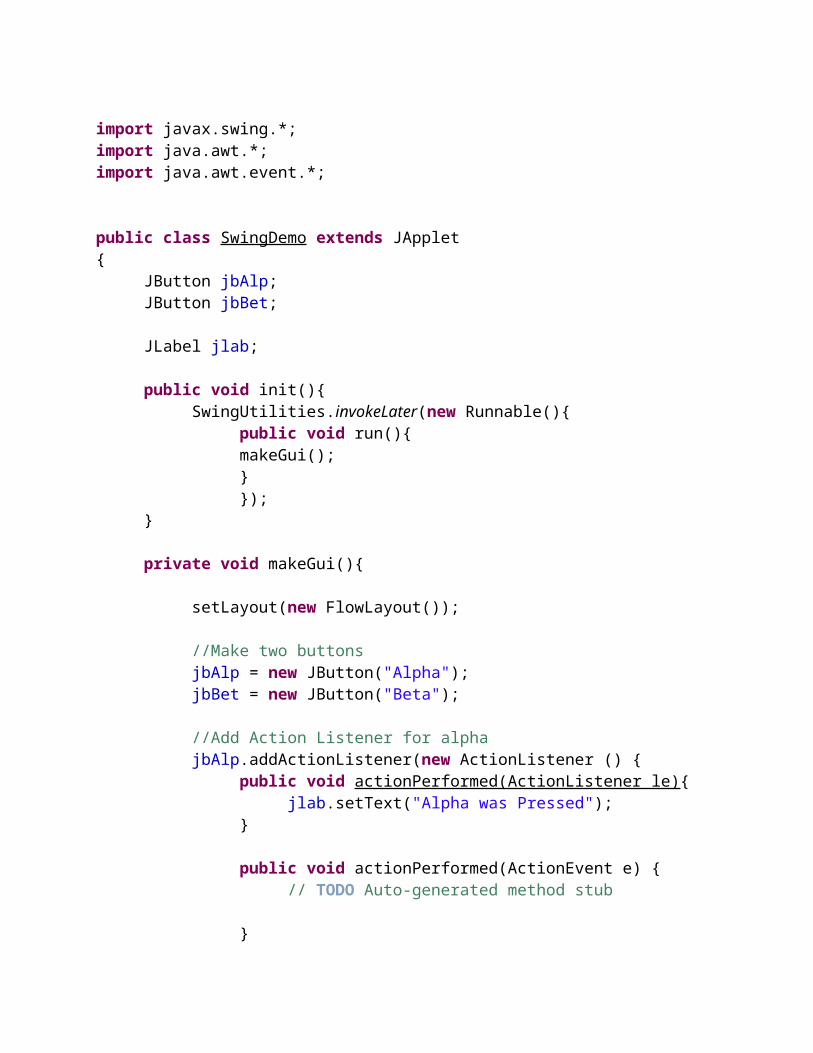
6. Create a Swing Applet
Swing based applets are similar to AWT- Based Applets , but Swing Applets extents JApplet. JApplet is derived from Applte. Thus a JApplet includes all the functionalities of an applet .JApplet is a top level Swing Container which is not derived from JComponent.
Swing Applet uses four life cycle methods such as init(), satart(), Stop() and Destroy(). Ofcource we need to override only those methods that are neede by the applet. All interaction between components of a swing should take place on event dispatchable thread.
Example :
import javax.swing.*;import java.awt.*;import java.awt.event.*;
public class SwingDemo extends JApplet{
JButton jbAlp;JButton jbBet;
JLabel jlab;
public void init(){SwingUtilities.invokeLater(new Runnable(){
public void run(){makeGui(); }});
}
private void makeGui(){
setLayout(new FlowLayout());
//Make two buttonsjbAlp = new JButton("Alpha");jbBet = new JButton("Beta");
//Add Action Listener for alphajbAlp.addActionListener(new ActionListener () {
public void actionPerformed(ActionListener le){jlab.setText("Alpha was Pressed");
}
public void actionPerformed(ActionEvent e) {// TODO Auto-generated method stub
}});
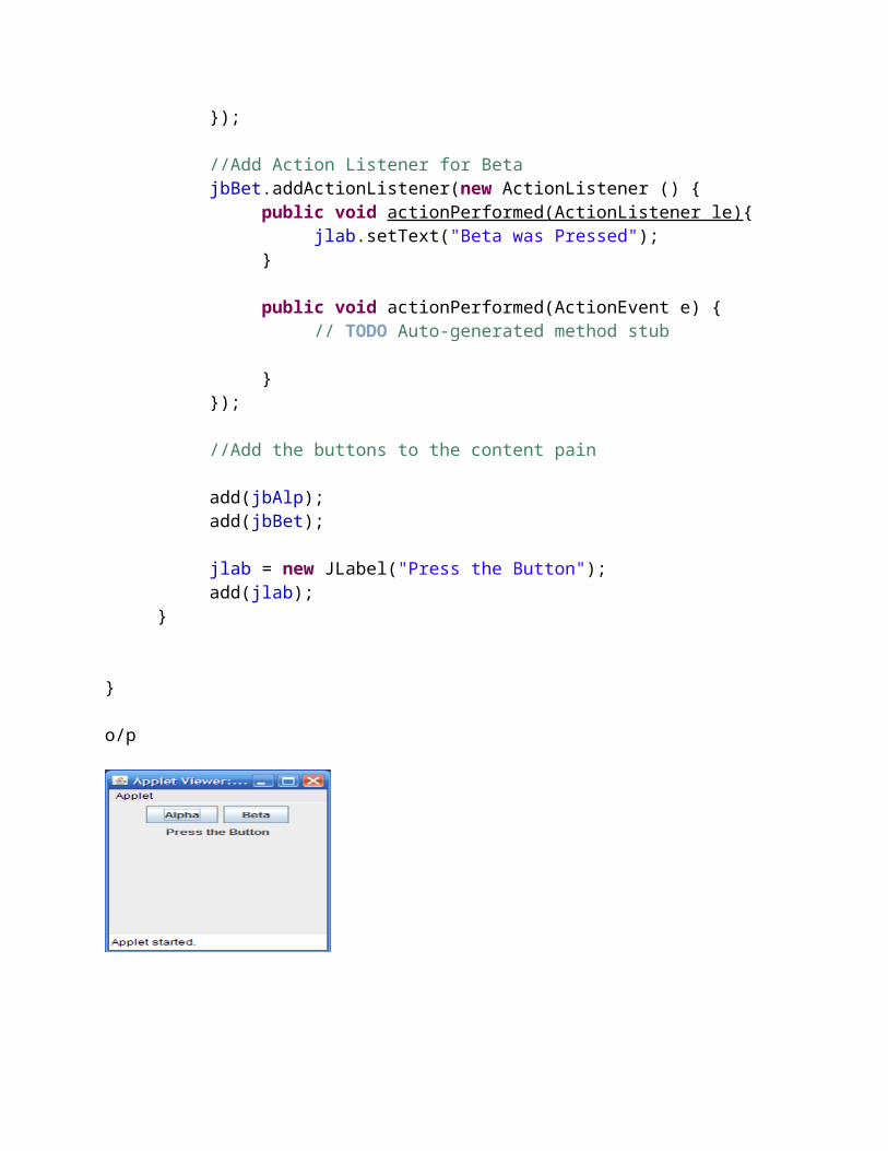
//Add Action Listener for BetajbBet.addActionListener(new ActionListener () {
public void actionPerformed(ActionListener le){jlab.setText("Beta was Pressed");
}
public void actionPerformed(ActionEvent e) {// TODO Auto-generated method stub
}});
//Add the buttons to the content pain
add(jbAlp);add(jbBet);
jlab = new JLabel("Press the Button");
add(jlab);}
}
o/p
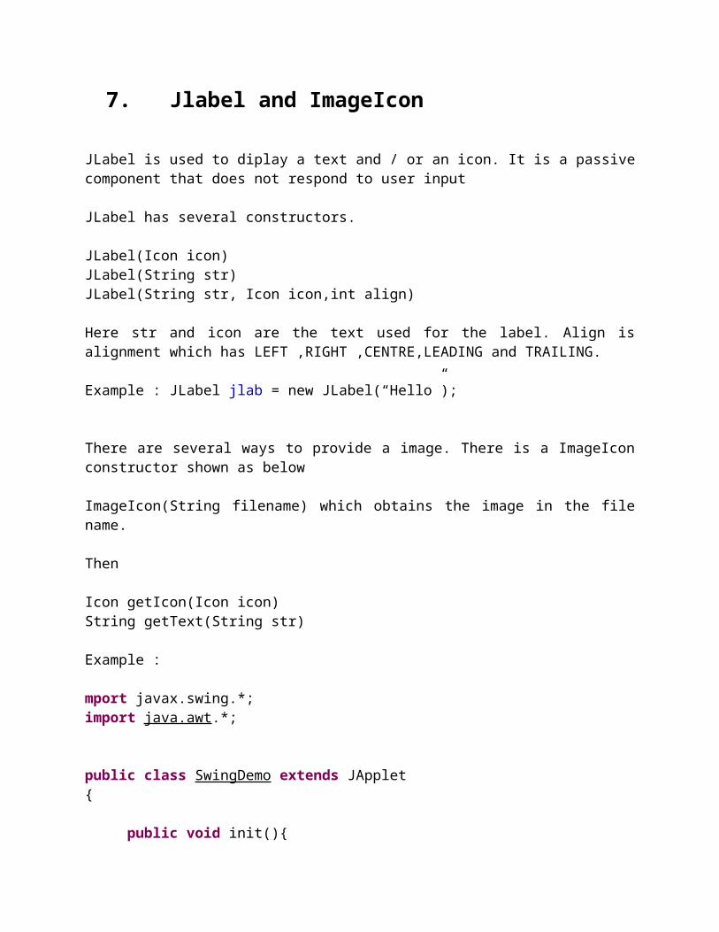
7. Jlabel and ImageIcon
JLabel is used to diplay a text and / or an icon. It is a passive component that does not respond to user input
JLabel has several constructors.
JLabel(Icon icon) JLabel(String str) JLabel(String str, Icon icon,int align)
Here str and icon are the text used for the label. Align is alignment which has LEFT ,RIGHT ,CENTRE,LEADING and TRAILING.
Example : JLabel jlab = new JLabel(“Hello”);
There are several ways to provide a image. There is a ImageIcon constructor shown as below
ImageIcon(String filename) which obtains the image in the file name.
Then
Icon getIcon(Icon icon)
String getText(String str)
Example :
mport javax.swing.*;import java.awt.*;
public class SwingDemo extends JApplet{
public void init(){SwingUtilities.invokeLater(new Runnable(){
public void run(){makeGui(); }});
}
private void makeGui(){
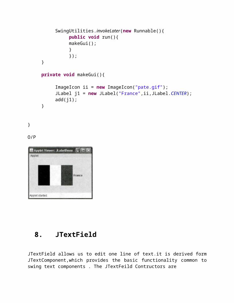
ImageIcon ii = new ImageIcon("pate.gif");JLabel j1 = new JLabel("France",ii,JLabel.CENTER);add(j1);
}
}
O/P
8. JTextField
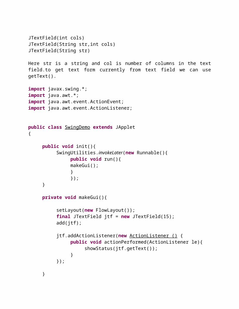
JTextField allows us to edit one line of text.it is derived form JTextComponent,which provides the basic functionality common to swing text components . The JTextFeild Contructors are
JTextField(int cols)JTextField(String str,int cols)JTextField(String str)
Here str is a string and col is number of columns in the text field.to get text form currently from text field we can use getText().
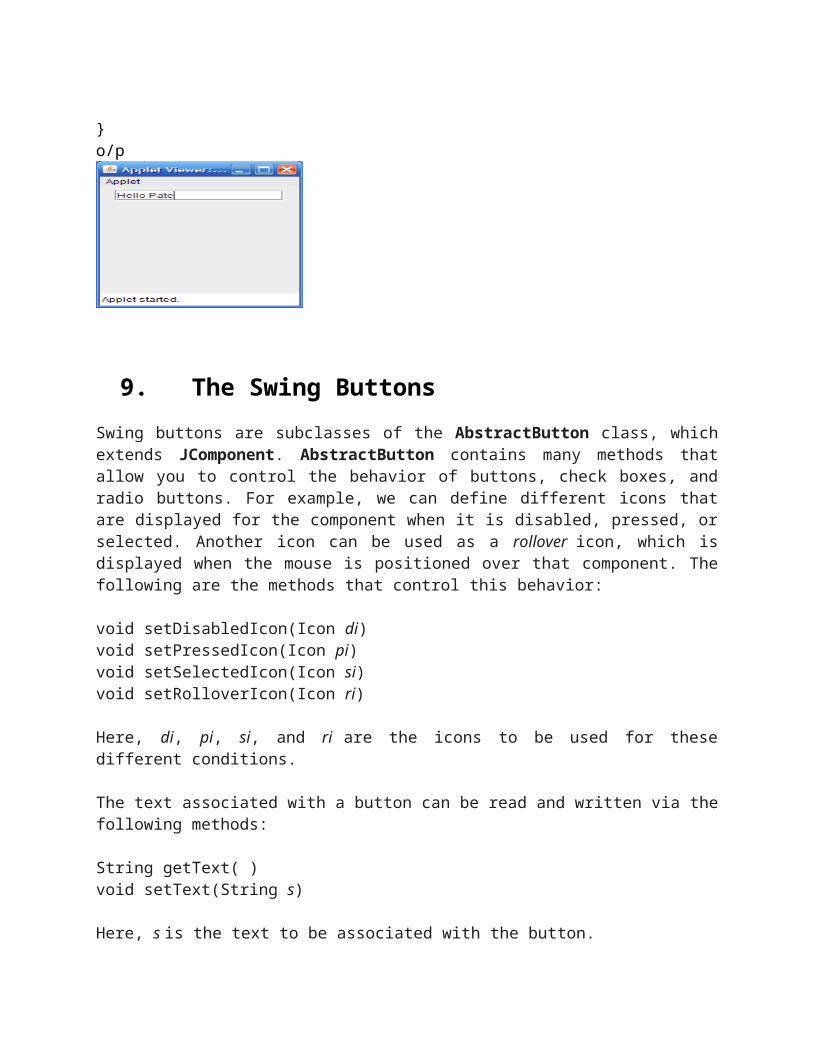
import javax.swing.*;import java.awt.*;import java.awt.event.ActionEvent;import java.awt.event.ActionListener;
public class SwingDemo extends JApplet{
public void init(){SwingUtilities.invokeLater(new Runnable(){
public void run(){makeGui(); }});
}
private void makeGui(){
setLayout(new FlowLayout());final JTextField jtf = new JTextField(15);add(jtf);
jtf.addActionListener(new ActionListener () {public void actionPerformed(ActionListener le){
showStatus(jtf.getText());}
});
}
}o/p
9. The Swing ButtonsSwing buttons are subclasses of the AbstractButton class, which extends JComponent. AbstractButton contains many methods that allow you to control the behavior of buttons, check boxes, and radio buttons. For example, we can define different icons that are displayed for the component when it is disabled, pressed, or selected. Another icon can be used as a rollover icon, which is displayed when the mouse is positioned over that component. The following are the methods that control this behavior:
void setDisabledIcon(Icon di)void setPressedIcon(Icon pi)void setSelectedIcon(Icon si)void setRolloverIcon(Icon ri)
Here, di, pi, si, and ri are the icons to be used for these different conditions.
The text associated with a button can be read and written via the following methods:
String getText( )void setText(String s)
Here, s is the text to be associated with the button.
Concrete subclasses of AbstractButton generate action events when they are pressed. Listeners register and unregister for these events via the methods shown here:
void addActionListener(ActionListener al)void removeActionListener(ActionListener al)
Here, al is the action listener. AbstractButton is a superclass for push buttons, check boxes, and radio buttons. Each is examined next.
The JButton ClassThe JButton class provides the functionality of a push button. JButton allows an icon, a string, or both to be associated with the push button. Some of its constructors are shown here:
JButton(Icon i)JButton(String s)JButton(String s, Icon i)
Here, s and i are the string and icon used for the button. The following example displays four push buttons and a text field. Each button displays an icon that represents the flag of a country. When a button is pressed, the name of that country is displayed in the text field. The applet begins by getting its content pane and setting the layout manager of that pane. Four image buttons are created and added to the content pane. Next, the applet is registered to receive action events that are generated by the buttons. A text field is then created and added to the applet. Finally, a handler for action events displays the command string that is associated with the button. The text field is used to present this string.
import java.awt.*;import java.awt.event.*;import javax.swing.*;
/*<applet code="JButtonDemo" width=250 height=300></applet>*/
public class JButtonDemo extends JAppletimplements ActionListener {JTextField jtf;public void init() {// Get content paneContainer contentPane = getContentPane();
contentPane.setLayout(new FlowLayout());// Add buttons to content pane
ImageIcon delhi = new ImageIcon("delhi.gif");JButton jb = new JButton(delhi);jb.setActionCommand("Delhi");jb.addActionListener(this);contentPane.add(jb);
ImageIcon germany = new ImageIcon("bangalore.gif");jb = new JButton(bangalore);jb.setActionCommand("Bangalore");jb.addActionListener(this);contentPane.add(jb);
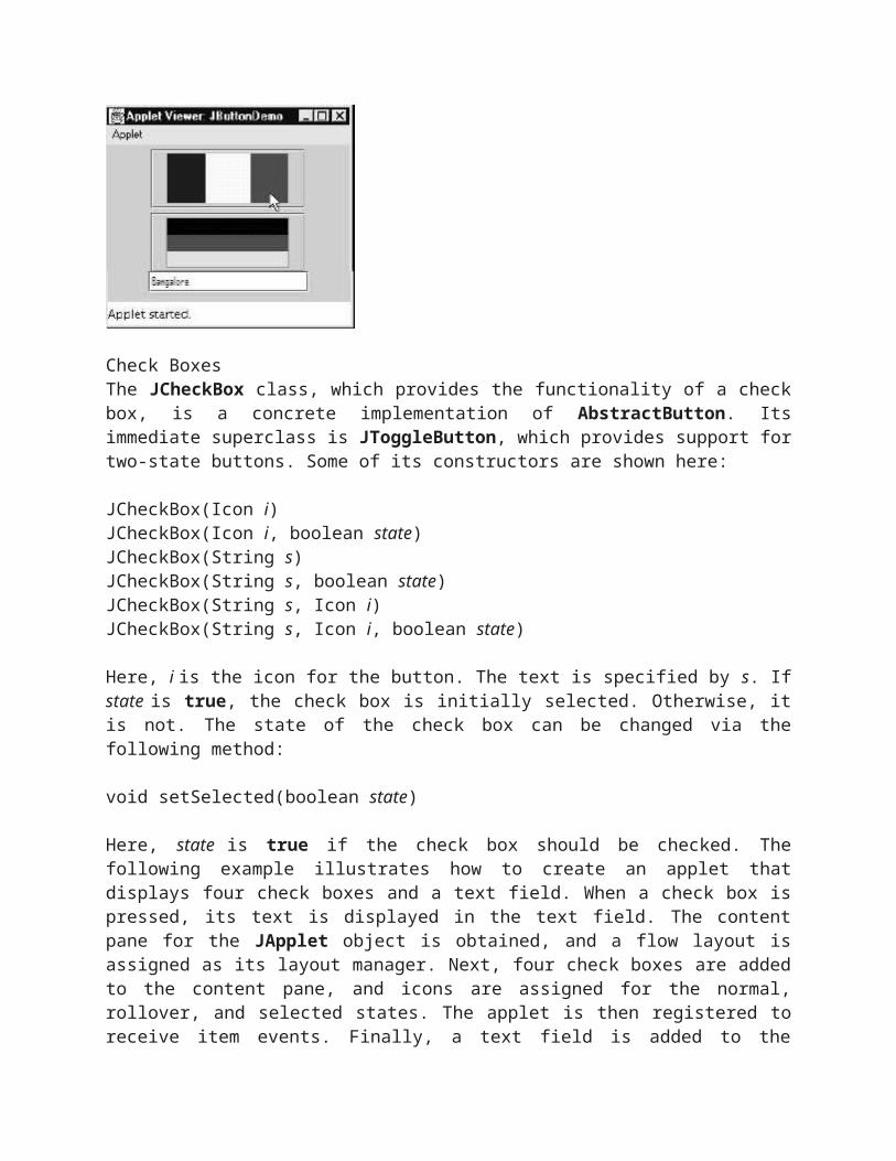
// Add text field to content panejtf = new JTextField(15);contentPane.add(jtf);}public void actionPerformed(ActionEvent ae) {jtf.setText(ae.getActionCommand());}}
o/p
Check BoxesThe JCheckBox class, which provides the functionality of a check box, is a concrete implementation of AbstractButton. Its immediate superclass is JToggleButton, which provides support for two-state buttons. Some of its constructors are shown here:
JCheckBox(Icon i)JCheckBox(Icon i, boolean state)JCheckBox(String s)JCheckBox(String s, boolean state)JCheckBox(String s, Icon i)JCheckBox(String s, Icon i, boolean state)
Here, i is the icon for the button. The text is specified by s. If state is true, the check box is initially selected. Otherwise, it is not. The state of the check box can be changed via the following method:
void setSelected(boolean state)
Here, state is true if the check box should be checked. The following example illustrates how to create an applet that displays four check boxes and a text field. When a check box is pressed, its text is displayed in the text field. The content pane for the JApplet object is obtained, and a flow layout is assigned as its layout manager. Next, four check boxes are added to the content pane, and icons are assigned for the normal, rollover, and selected states. The applet is then registered
to receive item events. Finally, a text field is added to the content pane. When a check box is selected or deselected, an item event is generated. This is handled by itemStateChanged( ). Inside itemStateChanged( ), the getItem( ) method gets the JCheckBox object that generated the event. The getText( ) method gets the text for that check box and uses it to set the text inside the text field.
import java.awt.*;import java.awt.event.*;import javax.swing.*;/*<applet code="JCheckBoxDemo" width=400 height=50></applet>*/public class JCheckBoxDemo extends JAppletimplements ItemListener {JTextField jtf;public void init() {
// Get content paneContainer contentPane = getContentPane();contentPane.setLayout(new FlowLayout());// Create iconsImageIcon normal = new ImageIcon("normal.gif");ImageIcon rollover = new ImageIcon("rollover.gif");ImageIcon selected = new ImageIcon("selected.gif");// Add check boxes to the content paneJCheckBox cb = new JCheckBox("C++", normal);cb.setRolloverIcon(rollover);cb.setSelectedIcon(selected);cb.addItemListener(this);contentPane.add(cb);cb = new JCheckBox("Java", normal);cb.setRolloverIcon(rollover);cb.setSelectedIcon(selected);cb.addItemListener(this);contentPane.add(cb);
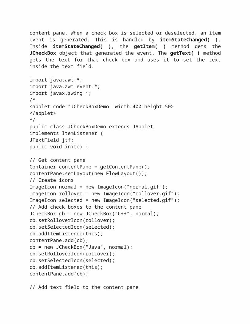
// Add text field to the content panejtf = new JTextField(15);contentPane.add(jtf);}public void itemStateChanged(ItemEvent ie) {JCheckBox cb = (JCheckBox)ie.getItem();jtf.setText(cb.getText());}}
o/p :
Radio ButtonsRadio buttons are supported by the JRadioButton class, which is a concrete implementation of AbstractButton. Its immediate superclass is JToggleButton, which provides support for two-state buttons. Some of its constructors are shown here:
JRadioButton(Icon i)JRadioButton(Icon i, boolean state)JRadioButton(String s)JRadioButton(String s, boolean state)JRadioButton(String s, Icon i)JRadioButton(String s, Icon i, boolean state)
Here, i is the icon for the button. The text is specified by s. If state is true, the button is initially selected. Otherwise, it is not.
Radio buttons must be configured into a group. Only one of the buttons in that group can be selected at any time. For example, if a user presses a radio button that is in a group, any previously selected button in that group is automatically deselected.
The ButtonGroup class is instantiated to create a button group. Its default constructor is invoked for this purpose. Elements are then added to the button group via the following method:
void add(AbstractButton ab)
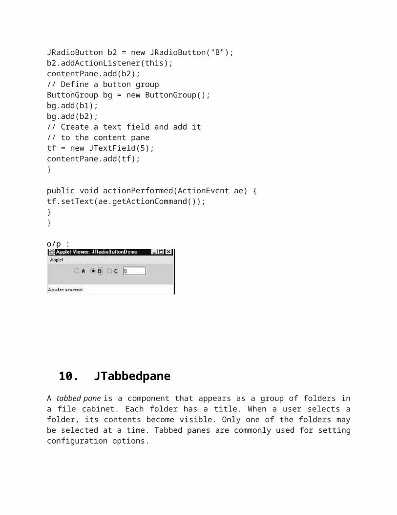
Here, ab is a reference to the button to be added to the group. The following example illustrates how to use radio buttons. Three radio buttons and one text field are created. When a radio button is pressed, its text is displayed inthe text field. First, the content pane for the JApplet object is obtained and a flow layout is assigned as its layout manager. Next, three radio buttons are added to the content pane. Then, a button group is defined and the buttons are added to it. Finally, a text field is added to the content pane.
Radio button presses generate action events that are handled by actionPerformed( ). The getActionCommand( ) method gets the text that is associated with a radio button and uses it to set the text field.
import java.awt.*;import java.awt.event.*;
import javax.swing.*;/*<applet code="JRadioButtonDemo" width=300 height=50></applet>*/public class JRadioButtonDemo extends JAppletimplements ActionListener {JTextField tf;public void init() {// Get content paneContainer contentPane = getContentPane();contentPane.setLayout(new FlowLayout());// Add radio buttons to content paneJRadioButton b1 = new JRadioButton("A");b1.addActionListener(this);contentPane.add(b1);JRadioButton b2 = new JRadioButton("B");b2.addActionListener(this);contentPane.add(b2);// Define a button groupButtonGroup bg = new ButtonGroup();bg.add(b1);bg.add(b2);// Create a text field and add it// to the content panetf = new JTextField(5);contentPane.add(tf);}
public void actionPerformed(ActionEvent ae) {tf.setText(ae.getActionCommand());}}
o/p :
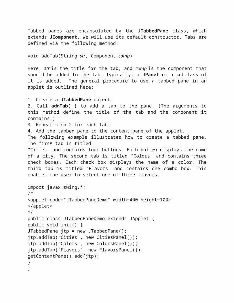
10. JTabbedpaneA tabbed pane is a component that appears as a group of folders in a file cabinet. Each folder has a title. When a user selects a folder, its contents become visible. Only one of the folders may be selected at a time. Tabbed panes are commonly used for setting configuration options.
Tabbed panes are encapsulated by the JTabbedPane class, which extends JComponent. We will use its default constructor. Tabs are defined via the following method:
void addTab(String str, Component comp)
Here, str is the title for the tab, and comp is the component that should be added to the tab. Typically, a JPanel or a subclass of it is added. The general procedure to use a tabbed pane in an applet is outlined here:
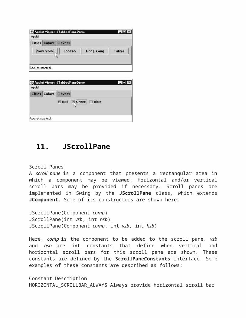
1. Create a JTabbedPane object.2. Call addTab( ) to add a tab to the pane. (The arguments to this method define the title of the tab and the component it contains.)3. Repeat step 2 for each tab.4. Add the tabbed pane to the content pane of the applet.The following example illustrates how to create a tabbed pane. The first tab is titled“Cities” and contains four buttons. Each button displays the name of a city. The second tab is titled “Colors” and contains three check boxes. Each check box displays the name of a color. The third tab is titled “Flavors” and contains one combo box. This enables the user to select one of three flavors.
import javax.swing.*;/*<applet code="JTabbedPaneDemo" width=400 height=100></applet>*/public class JTabbedPaneDemo extends JApplet {public void init() {JTabbedPane jtp = new JTabbedPane();jtp.addTab("Cities", new CitiesPanel());jtp.addTab("Colors", new ColorsPanel());jtp.addTab("Flavors", new FlavorsPanel());getContentPane().add(jtp);}}class CitiesPanel extends JPanel {public CitiesPanel() {JButton b1 = new JButton("New York");add(b1);JButton b2 = new JButton("London");add(b2);
JButton b3 = new JButton("Hong Kong");add(b3);JButton b4 = new JButton("Tokyo");add(b4);}}class ColorsPanel extends JPanel {public ColorsPanel() {JCheckBox cb1 = new JCheckBox("Red");add(cb1);JCheckBox cb2 = new JCheckBox("Green");add(cb2);JCheckBox cb3 = new JCheckBox("Blue");add(cb3);}}class FlavorsPanel extends JPanel {public FlavorsPanel() {JComboBox jcb = new JComboBox();jcb.addItem("Vanilla");jcb.addItem("Chocolate");jcb.addItem("Strawberry");add(jcb);}}
Output from this applet is shown in the following three illustrations:
11. JScrollPane
Scroll PanesA scroll pane is a component that presents a rectangular area in which a component may be viewed. Horizontal and/or vertical scroll bars may be provided if necessary. Scroll panes are implemented in Swing by the JScrollPane class, which extends JComponent. Some of its constructors are shown here:
JScrollPane(Component comp)JScrollPane(int vsb, int hsb)JScrollPane(Component comp, int vsb, int hsb)
Here, comp is the component to be added to the scroll pane. vsb and hsb are int constants that define when vertical and horizontal scroll bars for this scroll pane are shown. These constants are defined by the ScrollPaneConstants interface. Some examples of these constants are described as follows:
Constant DescriptionHORIZONTAL_SCROLLBAR_ALWAYS Always provide horizontal scroll barHORIZONTAL_SCROLLBAR_AS_NEEDED Provide horizontal scroll bar, if neededVERTICAL_SCROLLBAR_ALWAYS Always provide vertical scroll barVERTICAL_SCROLLBAR_AS_NEEDED Provide vertical scroll bar,if needed
Here are the steps that you should follow to use a scroll pane in an applet:
1. Create a JComponent object.2. Create a JScrollPane object. (The arguments to the constructor specify the component and the policies for vertical and horizontal scroll bars.)3. Add the scroll pane to the content pane of the applet.
The following example illustrates a scroll pane. First, the content pane of theJApplet object is obtained and a border layout is assigned as its layout manager. Next,a JPanel object is created and four hundred buttons are added to it, arranged intotwenty columns. The panel is then added to a scroll pane, and the scroll pane is addedto the content pane. This causes vertical and horizontal scroll bars to appear. You canuse the scroll bars to scroll the buttons into view.import java.awt.*;import javax.swing.*;/*<applet code="JScrollPaneDemo" width=300 height=250></applet>*/public class JScrollPaneDemo extends JApplet {public void init() {// Get content pane
Container contentPane = getContentPane();contentPane.setLayout(new BorderLayout());// Add 400 buttons to a panelJPanel jp = new JPanel();jp.setLayout(new GridLayout(20, 20));int b = 0;for(int i = 0; i < 20; i++) {for(int j = 0; j < 20; j++) {jp.add(new JButton("Button " + b));++b;}}// Add panel to a scroll paneint v = ScrollPaneConstants.VERTICAL_SCROLLBAR_AS_NEEDED;int h = ScrollPaneConstants.HORIZONTAL_SCROLLBAR_AS_NEEDED;JScrollPane jsp = new JScrollPane(jp, v, h);// Add scroll pane to the content panecontentPane.add(jsp, BorderLayout.CENTER);}}
Output from this applet is shown here:
12. JList In swing the basic list class is called JList. It supports the selection of one or more items in the list.JList provides several constructor. One of them are
JList(Object[] items)
This creates JList that contains the items in an array specified by the list . JList is based on two methods.First is the ListModel.This defines how the acess to the list data is achieved.The second model is the ListSelectionModel interface , which defines what list item has to be selected. It is better JList is wrapped with JScrollPane.
The Jlist generates a ListSelectionEvent when the user makes or changes a selection.this event is also generated when the user deselects the items.it is handles by implementing ListSelectionListener. The listener specifies only one method called
Void valueChanged(ListSelectionEvent le)
By default JList allows the user to select multiple range items within the list , but the behavior can be changed using setSelectionMode() , which is defined in JList
i.e void setSelectionMode(int mode);
mode =SIGLE_SELECTION,SINGLE_INTERVAL_SELECTION,MULTIPLE_INTERVAL_SELECTION
the index is represented and the value of the selected items are got by
int getSelectionIndex()
Object getSelectedValue()
13. JComboBox
through the JComboBox class, which extends JComponent. A combo box normally displays one entry. However, it can also display a drop-down list that allows a user to select a different entry. You can also type your selection into the text field. Two of JComboBox’s constructors are shown here:
JComboBox( )JComboBox(Vector v)
Here, v is a vector that initializes the combo box. Items are added to the list of choices via the addItem( ) method, whose signature is shown here:
void addItem(Object obj)
Here, obj is the object to be added to the combo box. The following example contains a combo box and a label. The label displays an icon. The combo box contains entries for “France”, “Germany”, “Italy”, and “Japan”. When a country is selected, the label is updated to display the flag for that country.
import java.awt.*;import java.awt.event.*;import javax.swing.*;/*<applet code="JComboBoxDemo" width=300 height=100></applet>*/public class JComboBoxDemo extends JAppletimplements ItemListener {JLabel jl;ImageIcon france, germany, italy, japan;public void init() {// Get content paneContainer contentPane = getContentPane();contentPane.setLayout(new FlowLayout());// Create a combo box and add it// to the panelJComboBox jc = new JComboBox();jc.addItem("France");jc.addItem("Germany");jc.addItem("Italy");jc.addItem("Japan");jc.addItemListener(this);contentPane.add(jc);// Create labeljl = new JLabel(new ImageIcon("france.gif"));contentPane.add(jl);}public void itemStateChanged(ItemEvent ie) {String s = (String)ie.getItem();jl.setIcon(new ImageIcon(s + ".gif"));}}Output from this applet is shown here:
14. JTable
A table is a component that displays rows and columns of data. You can drag the cursor on column boundaries to resize columns. You can also drag a column to a new position. Tables are implemented by the JTable class, which extends JComponent. One of its constructors is shown here:
JTable(Object data[ ][ ], Object colHeads[ ])
Here, data is a two-dimensional array of the information to be presented, and colHeads is a one-dimensional array with the column headings.Here are the steps for using a table in an applet:1. Create a JTable object.2. Create a JScrollPane object. (The arguments to the constructor specify the table and the policies for vertical and horizontal scroll bars.) 3. Add the table to the scroll pane.4. Add the scroll pane to the content pane of the applet.
The following example illustrates how to create and use a table. The content pane of the JApplet object is obtained and a border layout is assigned as its layout manager. A one-dimensional array of strings is created for the column headings. This table has three columns. A two-dimensional array of strings is created for the table cells. You can see that each element in the array is an array of three strings. These arrays are passed to the JTable constructor. The table is added to a scroll pane and then the scroll pane is added to the content pane.
import java.awt.*;import javax.swing.*;/*<applet code="JTableDemo" width=400 height=200></applet>*/public class JTableDemo extends JApplet {public void init() {// Get content paneContainer contentPane = getContentPane();// Set layout managercontentPane.setLayout(new BorderLayout());// Initialize column headingsfinal String[] colHeads = { "Name", "Phone", "Fax" };// Initialize datafinal Object[][] data = {{ "Gail", "4567", "8675" },{ "Ken", "7566", "5555" },{ "Viviane", "5634", "5887" },{ "Melanie", "7345", "9222" },{ "Anne", "1237", "3333" },
{ "John", "5656", "3144" },{ "Matt", "5672", "2176" },{ "Claire", "6741", "4244" },{ "Erwin", "9023", "5159" },{ "Ellen", "1134", "5332" },{ "Jennifer", "5689", "1212" },{ "Ed", "9030", "1313" },{ "Helen", "6751", "1415" }};// Create the tableJTable table = new JTable(data, colHeads);// Add table to a scroll paneint v = ScrollPaneConstants.VERTICAL_SCROLLBAR_AS_NEEDED;int h = ScrollPaneConstants.HORIZONTAL_SCROLLBAR_AS_NEEDED;JScrollPane jsp = new JScrollPane(table, v, h);// Add scroll pane to the content panecontentPane.add(jsp, BorderLayout.CENTER);}}
Output from this applet is shown here: