VISUALIZING TEMPORAL PATTERNS IN VISUAL...
23
Lev Manovich and Jeremy Douglass VISUALIZING TEMPORAL PATTERNS IN VISUAL MEDIA Computer Graphics as a Research Method While the explosion of new ideas and methods in cultural disciplines from the 1960s onward affected the subjects being written about and exhibited and their interpretations, one important aspect of our presentations of culture did not change. Books and museums devoted to art, design, media, and other cultural areas continue to arrange their subjects into small numbers of discrete categories - periods, artistic schools, -isms, cultural movements. The chapters in a book or the rooms of a museums act as material dividers between these categories. In this way, a continuously evolving cultural "organism" is sliced and segmented into a set of artificial boxes. In fact, while on a technological level the shift from analog to digital media is a rather recent event, we have already “been digital” on a theoretical level for a long time. That is, since the emergence of modern institutions of cultural storage and cultural knowledge production in the nineteen century (i.e., public museums and humanities disciplines housed in universities) we have been forcing the continuity of culture into strictly discrete categories in order to theorize, preserve and exhibit it (fig. 1-2). We can ask: If we are currently fascinated with the ideas of flow, evolution, complexity, heterogeneity, and cultural hybridity, why our presentations of cultural data do not reflect these ideas? Fig. 1. Typical museum floor plan (Spencer Museum of Art).
Transcript of VISUALIZING TEMPORAL PATTERNS IN VISUAL...

Lev Manovich and Jeremy Douglass VISUALIZING TEMPORAL PATTERNS IN VISUAL MEDIA Computer Graphics as a Research Method While the explosion of new ideas and methods in cultural disciplines from the 1960s onward affected the subjects being written about and exhibited and their interpretations, one important aspect of our presentations of culture did not change. Books and museums devoted to art, design, media, and other cultural areas continue to arrange their subjects into small numbers of discrete categories - periods, artistic schools, -isms, cultural movements. The chapters in a book or the rooms of a museums act as material dividers between these categories. In this way, a continuously evolving cultural "organism" is sliced and segmented into a set of artificial boxes. In fact, while on a technological level the shift from analog to digital media is a rather recent event, we have already “been digital” on a theoretical level for a long time. That is, since the emergence of modern institutions of cultural storage and cultural knowledge production in the nineteen century (i.e., public museums and humanities disciplines housed in universities) we have been forcing the continuity of culture into strictly discrete categories in order to theorize, preserve and exhibit it (fig. 1-2). We can ask: If we are currently fascinated with the ideas of flow, evolution, complexity, heterogeneity, and cultural hybridity, why our presentations of cultural data do not reflect these ideas?
Fig. 1. Typical museum floor plan (Spencer Museum of Art).

Fig 2. Typical art history timeline (Tate Modern, London). Source: Flickr photo by Ruth L. Taken on April 8, 2007. http://www.flickr.com/photos/ruthbruin2002/464176274/in/photostream/
Fig. 3. Diagram of the evolution of modern art Alfred H. Barr created in 1935 for MOMA exhibition Cubism and Abstract Art.

The use of a small number of discrete categories to describe content went hand in hand with the refusal of modern humanities and cultural institutions to use graphical representations for representation of this content. Many people know the famous diagram of the evolution of modern art made by Barr (the founder and first director of MOMA in New York) in 1935 (fig. 3). While this diagram still uses discrete categories as its building block, it is an improvement over standard art timelines and art museums floor plans since it at represents cultural process as a 2D graph. Unfortunately, this is the only well-known art history diagram produced in the whole 20th century. In contrast, since the first decades of the 19th century, scientific publications came to widely use graphical techniques that allowed representing phenomena as continuously varying. According to the online history of data visualization by Michael Friendly, during that period, "all of the modern forms of data display were invented: bar and pie charts, histograms, line graphs and time-series plots, contour plots, and so forth."1 (Fig. 4-5)
Fig 4. 1832: The first graph that fits a smoothed curve to a scatterplot: positions vs time for g; Virginis (John Herschel, England).
1 http://www.math.yorku.ca/SCS/Gallery/milestone/sec5.html.

Fig 5. 1837: First published flow maps, showing transportation by means of shaded lines, widths proportional to number of passengers (Henry Drury Harness, Ireland). Although a systematic history of visual data display remains to be researched and written, popular books by Edward Tufte illustrate how graphs representing quantitative data have already become common in various professional areas by the end of the 19th century.2 The use of visual representations of continuous qualities became especially popular after the 1960s when computers were adopted to create 2D and 3D graphics automatically. In 1960, William Fetter (a graphic designer for Boeing Aircraft Co.) coined the phrase "Computer Graphics." Around the same time, Pierre Bézier and Paul de Casteljau (who worked for Renault and Paul de Casteljau, respectively) 2 Edward Tufte, The Visual Display of Quantitative Information, 2nd edition. Graphics Press, 2001.

independently invented splines – mathematically described smooth curves that can be easily edited by a user. In 1967, Steven Coons of MIT has presented mathematical foundations for what eventually became the standard way to represent smooth surfaces in computer graphics software: "His technique for describing a surface was to construct it out of collections of adjacent patches, which had continuity constraints that would allow surfaces to have curvature which was expected by the designer."3 Coon’s technique became the foundation for surface descriptions in computer graphics (the most popular such description today is NURBS - Non Uniform Rational Basis Spline.) (Fig. 6.)
Fig 6. 3D NURBS surface. Source: http://en.wikipedia.org/wiki/File:NURBS_surface.png. When design, media, and architecture fields adopted computer graphics software in the 1990s, this led to an aesthetic and intellectual revolution. Until that time, the only practical technique for representing 3D objects in a computer was to model them collection of flat polygons. By the early 1990s, the faster processing speeds of computers and the increased size of computer memory made it practical to offer NURBS modeling developed by Coons and others already in the 1960s. This new technique for representing spatial form pushed architectural thinking away from rectangular modernist geometry and toward the privileging of smooth and complex forms made from continuous curves. As a result, at the end of the 20th century the aesthetics of such complex smooth surfaces (called “blobs” by journalists) has come to dominate the thinking of many architecture students, young architects, and even already well-established “star” architects (fig. 7-8). Visually and spatially, smooth
3 http://design.osu.edu/carlson/history/lesson4.html. For the original publication, see Steven A. Coons, Surfaces for Computer-Aided Design of Space Forms, MIT/LCS/TR-41, June 1967.

curves and freeform surfaces have emerged as the new expressive language for the globalized networked word where the only constant is the rapid change. The modernist aesthetics of the discreteness and simplicity was replaced by the new aesthetics of continuity and complexity. (Another useful term coined for this new architecture focused on the research into the new possibilities of spatial form enabled by computation and the new construction techniques necessary to build them is "non-standard architecture." In the winter 2004 Centre Pompidou has organized a show Non-Standard Architecture4, which was followed by a conference Non Standard Practice Conference at MIT.)
Fig. 7. Villa in Copenhagen, Denmark by MAD Office (Beijing).
Fig. 8. A Performing Arts Center for a cultural center on Saadiyat Island, Abu Dhabi by Zaha Hadid (London). This change in the imagination of spatial form was paralleled by the adoption of a new intellectual vocabulary. Architectural discourse came to be dominated by 4 http://www.designboom.com/contemporary/nonstandard.html
concepts and terms which parallel (or directly come from) the design elements and operations offered by the software – splines and NURBS, morphing, physically-based modeling and simulation, parametric design, particle systems, simulation of natural phenomena, AL, and so on. Here are a few examples: "The Campus is organized and navigated on the basis of directional drifts and the distribution of densities rather than the key points. This is indicative of the character of the Centre as a whole: porous, immersive, a field space." Zaha Hadid (London), description of a design for Contemporary Art Center in Rome (currently in construction). "Scenarios of hybridization, grafting, cloning, morphing give rise to perpetual transformation of architecture which strives to break down the antinomies of object/subject or object/territory." Frédéric Migayrou on R&Sie (Francois Roche and Stéphanie Lavaux, Paris.) "Fuzzy logic thinking is another step of helping human thought to recognize our environment less as a world of crisp boundaries and disconnections and more as a field of swarming agents with blurred borders. EMERGED is investigating the potential of fuzzy logic as a loose-fit organizational technique for developing intelligent, flexible and adaptive environments. Seeing the project as a testing ground for its computational tools and design techniques, the team expands its research territory from focusing and systemizing the dynamic hair tool as generative design machine to a larger scale, involving therefore levels of social, cultural and global organizations." MRGD (Melike Altinisik, Samer Chaumoun, Daniel Widrig), description of Urban Lobby (research for a speculative redevelopment of the Centre Point office tower in central London). Although computer graphics was not the only source of inspiration for this new conceptual vocabulary - important influences came from French philosophy and the sciences of chaos and complexity - it obviously played its role. Thus, along with becoming the language of contemporary design and architecture, the language of computer graphics also functions as inspiration for architectural discourse about buildings, cities, space, and social life. Representing Cultural Processes: From Discrete Categories to Curves and Surfaces If architects adopted the techniques of computer graphics as theoretical terms to talk about their own field, why should not we do the same for all cultural fields? However, rather than only using these terms as metaphors, why not actually visualize cultural processes, dynamics and flows using the same techniques of computer graphics?

The time has come to align our models of culture with the new design language and theoretical ideas made possible (or inspired) by software. Design, animation and visualization software allow us to start conceptualizing and visualizing cultural phenomena and processes in terms of continuously changing parameters - as opposed to categorical “boxes” still standard today. Just as software substituted the older Platonic design primitives (cubes, cylinders, spheres) with the new primitives (curves, flexible surfaces, particle fields) better suited for representing complexity, let’s replace the traditional "cultural theory primitives" by the new ones. In such scenario, a 1D timeline becomes a 2D or 3D graph; a small set of discrete categories is discarded in favor of curves, freeform 3D surfaces, particle fields, and other representations available in design and visualization software. This was one of the motivations behind the establishment of Software Studies Initiative (softwarestudies.com) in 2007 – a research lab located at University of California, San Diego (UCSD) and California Institute for Telecommunication and Information Technology (Calit2). Drawing on the recognized strengths of UCSD and Calit2 in digital art and in IT research, we have been developing techniques for the graphical representation and interactive visualization of cultural artifacts, dynamics, and processes. Our inspirations comes from many fields which all rely on computer graphics to visualize data - scientific visualization, information visualization, “artistic visualization” (see infoaesthetics.com), information design, and interface design. (For example, the standard graphical interfaces used in media editing, compositing and animation software such as Final Cut, After Effects, Maya, Blender, and others that employ curves to visualize the changes in various parameters of an animation over time.) Culture into Data Before we venture into folds, fields, particle clouds, complex surfaces, and other more advanced computer-driven representations, let’s start with a basic element of modern spatial representation: a 2D curve. How do you represent a cultural process that unfolds over time as a continuous curve? If, like many historians of the previous centuries, we were to believe that cultural history follows simple laws – for instance, that every culture goes though a cycle consisting from an early stage, a “golden age” and a decline stage – things would be quite simple. We would use mathematical formulas that represent the processes of growth and change (for instance, trigonometric, exponential, or polynomial functions) and feed their variables with the data representing some conditions of the actual historical process in question. The result would be a perfectly smooth curve

that represents a cultural process as a cycle of rise and fall. However, today this paradigm of history is clearly out of favor. So what we want to do instead is to create a curve that is based on the actual detailed data about the cultural process in question taken as a whole. A 2D curve defines a set of points that belong to this curve. Each point, in its turn, is defined by two numbers – X and Y coordinates. If the points are dense enough, they would visually form a curve by themselves. If they are not dense enough, we can use software to fit a curve through these points. Of course, we do not always have to necessary draw a curve through the points – for instance, if these points form clusters or any other obvious geometric patterns, this is valuable in itself5. In either case, we need to have a set of X and Y coordinates so we can draw the points. This means that we have to map a cultural process into a set made from pairs of numbers. In each pair, one number would represents a moment in time (X axis) and the other number would represent some quality of the process at that time (Y axis.) In short, we have to turn “culture” into “data.” Definitions of culture include beliefs, ideologies, fashions, and other non-physical properties. However, on a practical level, our cultural institutions and culture industries deal in a particular manifestation of culture – material (and recently, digital) objects. This is what stored in The Library of Congress and The Metropolitan Museum, created by fashion and industrial designers, uploaded by users to Flickr and sold by Amazon. Spread over time or distance, cultural objects manifest changes in a cultural sensibility, imagination or a style. So even though later on we will need to challenge the assumption that a cultural process can be equated with objects, if we can begin by using the sets of these objects to represent the gradual changes in cultural sensibility or imagination, that would be a good start. Getting numbers for the X-axis (i.e., time) is not difficult. Usually cultural objects have some discrete metadata attached to them – the name of the author, the size (of an artwork), the length (of a film), and so on – including the date and the place of creation. So if we have the dates when the cultural objects were created, we can plot these numbers metadata on X-axis. For example, if we want to represent the development of painting in the 20th century, we can plot the year each painting was completed. But what do we use for Y-axis? I.e., how do we compare the paintings to each other quantitatively?
5 I am not talking about the statistical technique of cluster analysis but simply ploting points in two dimensions and visually examining the resulting graph.

To continue with the same example, we can manually annotate the contents of the paintings. However, we will not be able to use natural language to describe precisely fine details of their visual structure. Alternatively, we can ask experts (or some other group of people) to position the paintings on some discrete scale (historical value, aesthetic preference, etc.) – but such judgments can only work with a small number of categories.6 More importantly, these methods do not scale well – they would be very costly if we want to describe hundreds of thousands or millions of objects. Moreover, even if we can afford it, people have difficulty ordering a big number of objects that are very similar to each other. Therefore, we need to resort to some automatic computer-based method to be able to describe large numbers cultural objects quantitatively. In the case of texts, this is relatively easy. Since texts already consist from discrete unites (i.e. words) they naturally led themselves to computer processing. We can use software to count occurrences of particular words and combination of words; we can compare the numbers of nouns versus verbs; we can calculate the lengths of sentences and paragraphs, and so on. Because computers are very good at counting as well as running more complex mathematical operations on numbers (the results of counting), digitization of text content such as books and the growth of web sites and blogs quickly led to new industries and epistemological paradigms which explore computational processing of texts. Google and other search engines analyze billions of web pages and the links between them to allow users search for web pages that contain particular phrases or single words. Nielsen Blogpulse mines 100+ million blogs daily to detect trends in what people are saying about particular brands, products and other topics its clients are interested in.7 Amazon.com analyzes the contents of the books it sells to calculate “Statistically Improbable Phrases” used to identify unique parts of the books.8 In the field of digital humanities, scholars have also been doing statistical studies of literary texts already for a long time (although on a much smaller scale). Some of them – most notably, Franko Moretti - have produced visualizations of the data in the form of curves showing historical trends across sets of literary texts.9 (Although
6 Such a method is an example of much more general technique called scaling: “In the social sciences, scaling is the process of measuring or ordering entities with respect to quantitative attributes or traits.” http://en.wikipedia.org/wiki/Scale_(social_sciences). 7 “BlogPulse Reaches 100 Million Mark” < http://blog.blogpulse.com/archives/000796.html>. 8 http://en.wikipedia.org/wiki/Statistically_Improbable_Phrases. 9 Franco Moretti. Graphs, Maps, Trees: Abstract Models for a Literary History. Verso: 2007.

this work is practically unknown in the West, over last few decades Russian scholars have also published a large number of books and articles that use quantitative method and visualization to study patterns in literature and other arts.10) But how do we go about automatically describing images or video quantitatively? Many kinds of visual media such as photographs do not have clearly defined discrete unites equivalent to words in a text. Additionally, visual media does not have a standard vocabulary or grammar - the meaning of any element of an image is only defined in the particular context of all other elements in this image. This makes the problem of automatic visual analysis much more challenging – but not impossible. The trick is to focus on visual form (which is easy for computers to analyze) and not semantics (which is hard to automate.) Since the middle of the 1950s, computer scientists have been developing the techniques to automatically describe visual properties of images. Today we have techniques for the analysis of distributions of grey tones and colors, orientation and curvature of lines, texture, composition, and literally hundreds of other visual dimensions. A few of these techniques – for instance, histogram – are built into digital media editing software (Photoshop, iPhoto, etc.) and are also in the interfaces of digital cameras. (When you take a photograph with most cameras today, you have an option to see a histogram of the image captured by the camera.) Many more techniques are available in specialized application software or described in professional publications in the fields of image processing, computer vision, multimedia, and media computing. Our approach (that we call Cultural Analytics) is to use these techniques to automatically analyze images and video to generate numerical descriptions of their visual structure. These numerical descriptions can be then graphed and also analyzed statistically. For example, if we plot the creation dates for a number of images on X axis, we can then use the measurements of their visual structure (brightness, saturation, or many other characteristics which can be used by themselves or in combination) to position them on Y axis, and then ask computer to draw a curve (a trend line) through these points. ArtHistory.viz For our first study to test this approach, we chose a small dataset of 35 canonical art history images that covers the period from Courbet (1849) to Malevich (1914).
10 [In Russian] Vladimir Petrov, “Problems and Methods of Empirical Aesthetics,” in Vladimir Koptsik, Vladimir Ruzov, Vladimir Petrov, Works in theory of the arts: a Dialog Between Humanities and Sciences. Moscow: OGI, 2004.

We selected color paintings that are typical of a presentation of the history of modern art in an art history textbook or a lecture: from 19th century realism and salon painting to impressionism, post-impressionism, fauvism, and geometric abstraction of 1910s. Our intention was not to find a new pattern in our set of paintings but rather to see if Cultural Analytics method can turn our shared understanding of the development of modern art into a curve based on some objective qualities of these images – thus turning an intuition into a precise model (fig. 9-16).
Fig. 9. A set of 35 paintings by canonical modern artists used for this experiment.
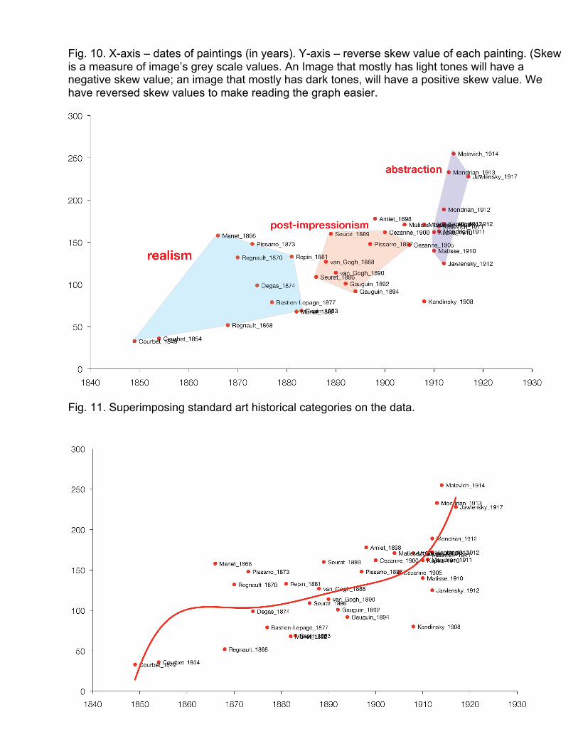
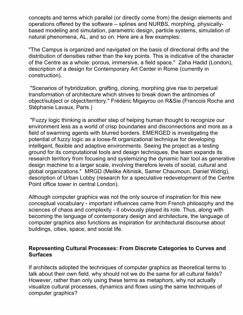
Fig. 10. X-axis – dates of paintings (in years). Y-axis – reverse skew value of each painting. (Skew is a measure of image’s grey scale values. An Image that mostly has light tones will have a negative skew value; an image that mostly has dark tones, will have a positive skew value. We have reversed skew values to make reading the graph easier.
Fig. 11. Superimposing standard art historical categories on the data.

Fig. 12. Projecting a small set of categories on the data defines each cultural object as either belonging to a distinct category or as being outside of all categories - which automatically makes it less important for research. Instead, we can visualize the overall pattern in their development that allows us to take into account all objects in the set. In this graph we defined a trend line using all the points (i.e., all 35 paintings). The curve shows that the changes in visual parameters that in our view came to define modern art in the 20th century (simplified forms, brighter tonality, more saturated colors, more flat images) accelerate after 1870, and then accelerate even more after 1905. To determine Y values for this graph, we measured paintings on the following visual dimensions: grey scale mean, saturation mean, the length of binary grey scale histogram, and skew. All values except skew were measured on 0-255 scale; skew values were normalized to the same range of values. (The length of binary grey scale histogram indicates how many different pixel values have non-0 values in the histogram. If an image has every possible grey scale value, this number will 255; if a an image only has a few grey scale values, the number will be correspondingly small.
Fig. 14. We can compare the rate of development between different time periods. Graph: comparing the changes in paintings before 1900 vs. the paintings after 1900 using linear trend lines.

Fig. 15. Using computer measurements of visual structure can be used to find the differences between cultural sets, which at first sight appear to be identical – as well as to find the similarities between the sets, which are normally thought to be very different. This graph compares the changes in median grey scale values of "realist" paintings vs. "modernist" paintings in our set. It reveals that on this visual dimension the former were changing at exactly the same rate as the later. In other words, “realist” painters were moving towards modernism at the same speed as modernist painters proper.
Fig.16. Images can be analyzed on hundreds of different visual dimensions. Graph: the number of shapes in each painting as a function of time. (Procedure: automatically count the number of shapes in each image disregarding very small shapes.) FilmHistory.viz In this example we explore the patterns in the history of cinema as represented by 1100 feature films. The data comes from cinemetrics.lv – a web site used by film scholars to collect information films’ editing patterns.11 The films for which Cinemetrics database provides data cover a period from 1902 and 2008 – thus giving us an opportunity to visualize changes over a long historical period. (Note that just as in the previous example, this data set represents a biased selection – i.e., the films which interest film historians who contributed the data - rather than an objective sample of world film production over 20th century. Also, given a particular process used by film scholars contributing to cinemetrics.lv to log shot lengths in a film, the actual numbers for each film are not completely reliable – but since we are interested in the overall patterns across many films, for our purposes the errors in the data set are not significant.) 11 Special thanks to Yuri Tsivian for generously providing access to the Cinemetrics database.

For each film in its database Cinemetrics.lv provides a number of statistics including average shot length (which can be obtained by dividing the length of a film by a total number of shots). This data allows us to explore the patterns in the speed of film cutting across different periods in the 20th century and different countries.12)
Fig. 17. X axis – dates of films (in years). Y axis – average shot length (in seconds). Each film is represented by a small circle. The trend line through the data shows that between 1902 and 2008, the average shot length for the whole set of 1100 films decreased from 14 seconds to 10 seconds – something which we may expect given the influence of MTV on cinema since the 1980s.
12 The graphs in this paper were produced using a selection of complete data contained in cinemetrics.lv database in 8/2008.

Fig. 18. During the period when film language gradually shifted from being a simulation of theatre to a “classical” language based on cutting between changing points of view, the changes occur at a much faster rate. Between 1902 and 1920, the average shot length decreased approximately four times.
Fig. 19. Here we compare the trends in the films’ shot lengths for three countries: USA, France, and Russia. The graph reveals a number of interesting patterns. Right from the beginning of the 20th century, French films are slower than American films. The two catch up in the 1920s and 1930s, but after the War that French films again become slower. And even after 1990 when both curves start going down, the gap between them remains the same. (This can partly explain why French films have not been doing well on international cinema market in recent decades.) In

contrast to the trend lines for U.S. and France, the line for Russian cinema has much more dramatic curves – a reflection of the radical shifts in Russian society in the 20th century. The dip in the 1920s represents the fast cutting of the Russian montage school (whose films dominate cinemetrics.lv selection of Russian cinema for that period), which aimed to establish a new film language appropriate for the new socialist society. After 1993 when Stalin tightens control over culture and establishes the doctrine of Socialist Realism, the films start getting slower. By the 1980s, their average shot length is at 25 second versus 15 for French films and 10 for American films. But after the Soviet Union is dissolved and Russia starts to adopt capitalism, the films cutting rates correspondingly start increasing quite rapidly. The particular details of the trend lines in this graph of course do not reflect a “complete picture.” Cinemetrics database contains unequal numbers of the films for the three countries (479 American films, 138 French films, 48 Russian films), the films are not distributed evenly in time (i.e., some periods are represented better than others), and, perhaps most importantly, the selection of films is heavily biased towards historically important directors and “art cinema” (for example, there are 53 entries for D.W. Griffith). Therefore, if we are to add more data to the graphs, the curves in the graph are likely to appear somewhat different. However, within the particular “canonical” subset of all cinema contained in Cinemetrics database the graph does show the real trends, which, as we saw, correspond to the larger cultural and social conditions in which culture is made. VideoGamePlay.viz Video games and other types of visual interactive media pose unique challenges to cultural analysis due to the complexity of their internal processes and the variability of their many manifestations. On the one hand, game experience is a result of a real-time computation that typically involves many of thousands of separate computer functions all working in tandem. On the other hand, when compared to watching a film in a movie theatre, the action of playing a video game is literally different every time. Therefore, the game experience may significantly vary from player to player and even session to session. How can we quantify and visualize a temporal structure and player’s experience of a cultural object that is always changing? We begin by extending our approaches to film and motion graphics and applying them to gameplay. That is, we turn each game session into an equivalent of a film by recording video as it is played. (This process is similar to the use of screen capture software to produce training video for various software applications.) Once we create such a recording, we can use it to analyze a game experience as a process of changes over time. Following this approach, a game is best represented as a collection of gameplay sessions – each being a different experience, but all

distributed according to the procedural logics of the underlying software. Thus, we can start by graphically representing rhythms and pattern in a single game play session. We can also aggregate the data from many sessions to visualize a space of possible experiences enabled by a particular game. We can further create visual “landscapes” of larger areas of video game culture (similar to how we visualized relationships between 1100+ feature films in FilmHistory.viz), with sets of data representing different gameplay sessions of single game, and supersets of data representing the comparison of many games. The paradigm of analyzing and visualizing a cultural artifact (or cultural experience) in terms of continuous change over time has a number of important implications for our theoretical understanding and practical study of gameplay. The video game industry already takes advantage of the fact that video games are software processes. One common practice is to record the internals states of game software as the game is played. In massively multi-player online games (MMOGs) such as World of Warcraft, statistical analysis of gameplay data drives everything from the advancement of individual characters to the marketplaces of massive auction houses. Game developers also conduct user testing during the development through extensive logging of internal gameplay data. For example, during the development of the first person shooters Halo 2 and Halo 3, Bungie Studios logged statistics on events such as player kills and deaths for hundreds of gamers over thousands of hours of play in order to fine-tune the game design's ability to produce a well-balanced experience.13 Our initial applications of Cultural Analytics to games are related to but differ from this industry paradigm in three ways. First, we emphasize games in terms of temporal patterns rather than outcomes. Second, we emphasize exploring gameplay as a total aesthetic experience (color, motion, sound) rather than as predefined event states. Third, our ambition is to compare games across titles (Halo 2 and Doom 3), companies (e.g. Bungie and Ubisoft), platforms (e.g. Wii and PS3), and platform generations (e.g. 1970s-present). Only an approach that analyses games as video can hope to achieve all these goals. At present, it is not feasible to apply industry approaches to a broad survey of games due to a wide variety of obstacles. 1) Non-networked games can’t be studied by analyzing network traffic. 2) Most game developers obfuscate the rules and protocols of their games to prevent cheating and protect intellectual property. 3) Many industry techniques for game analysis are useable during the development cycle, but cannot be used 13 Clive Thompson. “Halo 3: How Microsoft Labs Invented a New Science of Play.” Wired 15.9. August 2007.

after publication. 4) The wide variety of legacy PC and console platform hardware makes each game's software inaccessible in unique ways. All video gameplay, however, is accessible to screen recording and visual analysis, regardless of the underlying software and hardware and regardless of when or how the game was published. The time-based video of gameplay is also very useful as it allows for comparative analysis of games, which may differ in platform, genre, length of gameplay, etc. Like films, we can study games as time-based visual processes. We can further algorithmically extract information about user behavior and game semantics from these gameplay videos, visualizing how game modes change continuously over time.
Fig. 20. Visualization of patters of gameplay modes over time in "Knights of the Old Republic.
Fig. 21. Visualization of patters of gameplay modes over time in Knights of the Old Republic – close up. In a collaboration with Noah Wardrip-Fruin, our lab recorded over 40 hours of playing through Knights of the Old Republic from beginning to end. This 30-minute graph with a 3-minute closeup shows the rhythmic distribution of different game play modes over the course of the experience: cut scenes (black), combat (red), and navigation (green). This analysis is possible because the visual interfaces to games typically inform the player of their continuously changing internal states through displaying stable signifiers – for example, bars indicating health,
counters indicating time, frames indicating menu status, text announcing an event, and so forth. In addition to programming a computer to automatically recognize and record states from video recordings of gameplay (e.g. “combat”) we can also quantify signifying images as values (e.g. a green meter as “53%”). We can then visualize the rhythms of those values and states as they change over time.
Fig. 22. Suppose a researcher is trying to discover the “primitives” for types of dramatic conflict in fighting games. What are the shapes of challenges that players experience when fighting different opponents? Here, the length of health bars from the game Naruto: Clash of Ninja Revolution (top) are extracted as a time series of lines that reads from the top down (bottom). The computer opponent's bar (bottom right) gradually fades towards zero, while the player avatar (bottom left) drops suddenly at two points in time. The drama over who will succeed and who will fail in this fight is a race between the slow erosion of the opponent and sudden setbacks for the player. This suggests a new question: are the “curves” that describe this particular experience (continuous success with dramatic setbacks) present in other fight games? Which ones, and why? This broad way of questioning how games structure experience inside games, across games, and throughout game history suggests that cultural analytics of games could lead us to new theories of game genre, based not just on how games appear or their affordances, but how they are shaped as temporal processes.

Fig. 23. Top: a time-lapse image of the Rock Band rhythm game interface.Left: "Band meter" region as a time series of play performance. Bottom: "Fret bar" region as a time series of musical tablature. Suppose a researcher is working on representations of music in games, and wants access to all the musical tablature experienced by a player in the rhythm game "Rock Band." In particular, the researcher wants a transcript of all the notes missed by a series of players. In this example, a computer program extracts the musical tablature from the middle of the screen, recording a time-series of notes as they zoom by, and also extracts the missed notes from the bottom of the screen, recording only the notes that were not played correctly. With the ability to visualize one song comes the ability to extract and compare all songs – in the game, the franchise, and all other rhythm games that are visually similar. The researcher can now use Cultural Analytics to ask new questions. “What are the shapes of musical level design in all such games?” “Which shapes are associated with difficulty or pleasure?” “How is their use distributed, and how has it changed over time?” Conclusion Humanities disciplines, critics, museums, and other cultural institutions usually present culture in terms of self-contained cultural periods. Similarly, the most influential contemporary theories of history by Kahn (“scientific paradigms") and Foucault (“epistemes") also focus on stable periods rather than transitions between them. In fact, relatively little intellectual energy has been spent on thinking about how cultural change happens. Perhaps this was appropriate given that, until recently, cultural changes of all kinds were usually very slow.

However, since the emergence of globalization in, not only have these changes accelerated worldwide, but the emphasis on continual change rather than on stability has became the key to global business and institutional thinking (expressed in the popularity of terms such as “innovation” and “disruptive change.”) Our work on visualizing cultural changes is inspired by commercial software such as Google’s Web Analytics, Trends, and Flu Trends and Nelson’s BlogPulse, as well as projects by artists and designers such as seminal History Flow by Fernanda Viegas and Martin Wattenberg, and Lee Byron’s Listening History14 and The Ebb and Flow of Movies.15 Until now, most visualizations of cultural processes used either discrete media (i.e. texts) or the metadata about the media. Thus, History Flow uses histories of Wikipedia pages' edits; Lee Byron’s Listening History uses the data about his use of last.fm; and The Ebb and Flow of Movies uses box office receipts data. In contrast, our method allows for the analysis and visualization of patterns as manifested in changing structures of images, films, video and other types of visual media. We are currently expanding our work to processing of much larger sets of data – please visit softwarestudies.com to check our new results.
14 http://www.leebyron.com/what/lastfm/. 15 http://www.nytimes.com/interactive/2008/02/23/movies/20080223_REVENUE_GRAPHIC.html


![Effective Visualization of Temporal EnsemblesEnsemble-Vis was an early framework for visualizing weather fore-casting and climate modeling ensembles [20]. It provides statistical aggregation](https://static.fdocuments.us/doc/165x107/5f2a80a34f3d71600766ee39/effective-visualization-of-temporal-ensemble-vis-was-an-early-framework-for-visualizing.jpg)