Visualizing Request-Flow Comparison to Aid Performance ... · Visualizing Request-Flow Comparison...
10
1077-2626/13/$31.00 © 2013 IEEE Published by the IEEE Computer Society Accepted for publication by IEEE. ©2013 IEEE. Personal use of this material is permitted. Permission from IEEE must be obtained for all other uses, in any current or future media, including reprinting/ republishing this material for advertising or promotional purposes, creating new collective works, for resale or redistribution to servers or lists, or reuse of any copyrighted component of this work in other works. Visualizing Request-Flow Comparison to Aid Performance Diagnosis in Distributed Systems Raja R. Sambasivan, Ilari Shafer, Michelle L. Mazurek, and Gregory R. Ganger Fig. 1. Comparing request-flow graphs: This side-by-side visualization, one of three interfaces we evaluate, illustrates the output of a diagnosis technique that compares graphs. It shows these two graphs juxtaposed horizontally, with dashed lines between matching nodes in both. The rightmost series of nodes in the screenshot do not exist in the graph on the left, causing the yellow nodes to shift downward in the graph on the right. Abstract—Distributed systems are complex to develop and administer, and performance problem diagnosis is particularly challenging. When performance degrades, the problem might be in any of the system’s many components or could be a result of poor interactions among them. Recent research efforts have created tools that automatically localize the problem to a small number of potential culprits, but research is needed to understand what visualization techniques work best for helping distributed systems developers understand and explore their results. This paper compares the relative merits of three well-known visualization approaches (side-by-side, diff, and animation) in the context of presenting the results of one proven automated localization technique called request-flow comparison. Via a 26-person user study, which included real distributed systems developers, we identify the unique benefits that each approach provides for different problem types and usage modes. Index Terms—Distributed systems, human factors, problem diagnosis, visualization 1 I NTRODUCTION A distributed system is a set of software components running on mul- tiple networked computers that collectively provide some service or result. Examples now pervade all walks of life, as society uses dis- tributed services to communicate (e.g., Google’s Gmail), shop (e.g., Amazon), provide entertainment (e.g., YouTube), and so forth. Though such distributed systems often have simple interfaces and usually re- spond quickly, great complexity is involved in developing them and maintaining their performance levels over time. Unexpected perfor- mance degradations arise frequently, and substantial human effort is involved in addressing them. When a performance degradation arises, the crucial first step in ad- dressing it is figuring out what is causing it. The root cause might be any of the system’s software components, unexpected interactions • Raja R. Sambasivan is with Carnegie Mellon. E-mail: [email protected]. • Ilari Shafer is with Carnegie Mellon. E-mail: [email protected]. • Michelle L. Mazurek is with Carnegie Mellon. E-mail: [email protected]. • Gregory R. Ganger is with Carnegie Mellon. E-mail: [email protected]. Manuscript received 31 March 2013; accepted 1 August 2013; posted online 13 October 2013; mailed on 4 October 2013. For information on obtaining reprints of this article, please send e-mail to: [email protected]. between them, or slowdowns in the network connecting them. Ex- ploring the possibilities and identifying the most likely root causes has traditionally been an ad-hoc manual process, informed primarily by raw performance data collected from individual components. As distributed systems have grown in scale and complexity, such ad-hoc processes have grown less and less tenable. To help, recent research has proposed many techniques for automat- ically localizing the many possible sources of a new problem to just a few potential culprits [21, 27, 32]. These techniques do not identify the root cause directly, but rather help developers build intuition about the problem and focus their diagnosis efforts. Though complete au- tomation would be ideal, the complexity of modern systems and the problems that arise in them ensure this human-in-the-loop model will be dominant for the foreseeable future. As such, many researchers recognize the need for diagnosis tools to present their results as clearly as possible [24, 28]. But, apart from a few select instances [22, 24], far too little research has been conducted on what types of presentations are most useful for distributed systems developers. As a step toward addressing this need, this paper presents a 26-person user study that compares three promising approaches for visualizing the results of an implementation of one powerful, proven automated localization technique called request-flow comparison [32]. The ap- proaches we consider are well-known in the visualization community, and we make no claims as to their novelty. Rather, our contribution lies in identifying which of these approaches work best for diagnosing
Transcript of Visualizing Request-Flow Comparison to Aid Performance ... · Visualizing Request-Flow Comparison...
1077-2626/13/$31.00 © 2013 IEEE Published by the IEEE Computer Society
Accepted for publication by IEEE. ©2013 IEEE. Personal use of this material is permitted. Permission from IEEE must be obtained for all other uses, in any current or future media, including reprinting/republishing this material for advertising or promotional purposes, creating new collective works, for resale or redistribution to servers or lists, or reuse of any copyrighted component of this work in other works.
Visualizing Request-Flow Comparison to AidPerformance Diagnosis in Distributed Systems
Raja R. Sambasivan, Ilari Shafer, Michelle L. Mazurek, and Gregory R. Ganger
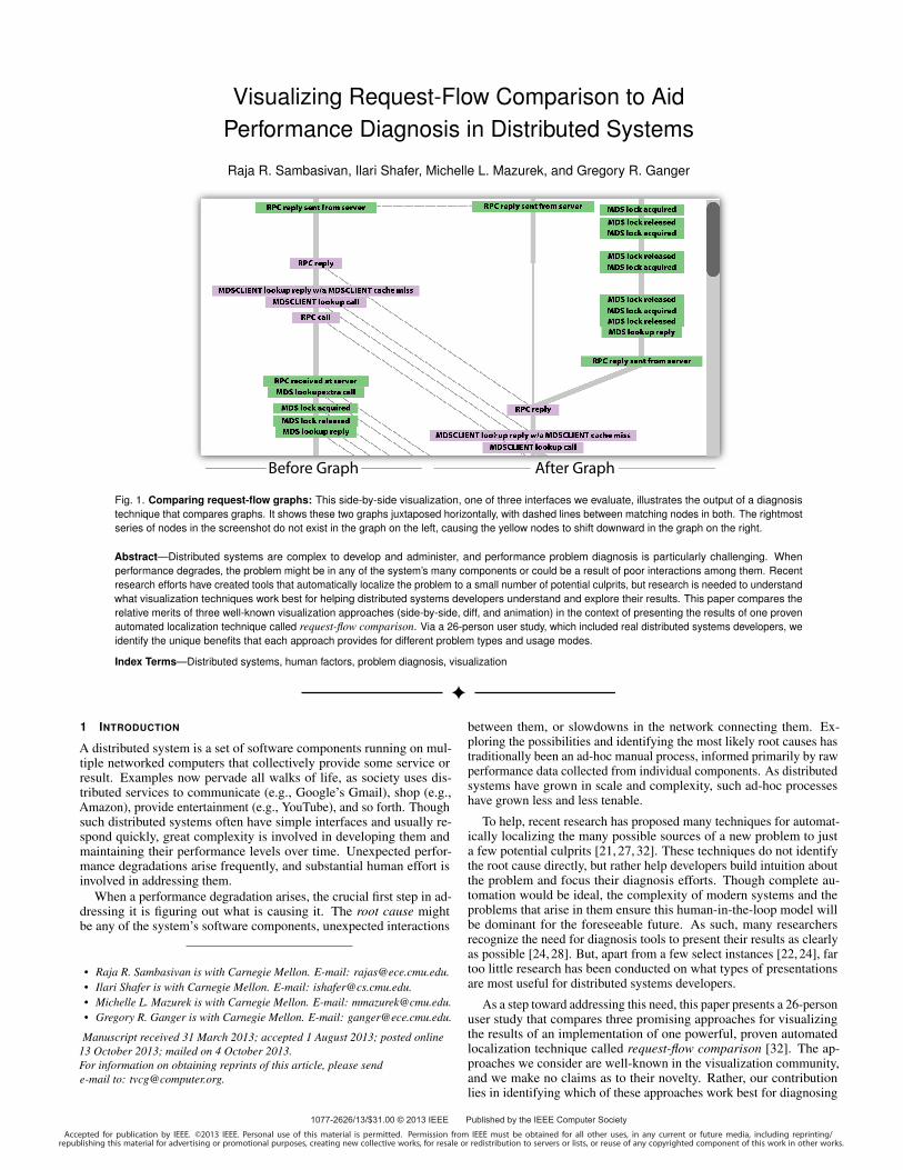
Fig. 1. Comparing request-flow graphs: This side-by-side visualization, one of three interfaces we evaluate, illustrates the output of a diagnosistechnique that compares graphs. It shows these two graphs juxtaposed horizontally, with dashed lines between matching nodes in both. The rightmostseries of nodes in the screenshot do not exist in the graph on the left, causing the yellow nodes to shift downward in the graph on the right.
Abstract—Distributed systems are complex to develop and administer, and performance problem diagnosis is particularly challenging. Whenperformance degrades, the problem might be in any of the system’s many components or could be a result of poor interactions among them. Recentresearch efforts have created tools that automatically localize the problem to a small number of potential culprits, but research is needed to understandwhat visualization techniques work best for helping distributed systems developers understand and explore their results. This paper compares therelative merits of three well-known visualization approaches (side-by-side, diff, and animation) in the context of presenting the results of one provenautomated localization technique called request-flow comparison. Via a 26-person user study, which included real distributed systems developers, weidentify the unique benefits that each approach provides for different problem types and usage modes.
Index Terms—Distributed systems, human factors, problem diagnosis, visualization
1 INTRODUCTION
A distributed system is a set of software components running on mul-tiple networked computers that collectively provide some service orresult. Examples now pervade all walks of life, as society uses dis-tributed services to communicate (e.g., Google’s Gmail), shop (e.g.,Amazon), provide entertainment (e.g., YouTube), and so forth. Thoughsuch distributed systems often have simple interfaces and usually re-spond quickly, great complexity is involved in developing them andmaintaining their performance levels over time. Unexpected perfor-mance degradations arise frequently, and substantial human effort isinvolved in addressing them.
When a performance degradation arises, the crucial first step in ad-dressing it is figuring out what is causing it. The root cause mightbe any of the system’s software components, unexpected interactions
• Raja R. Sambasivan is with Carnegie Mellon. E-mail: [email protected].• Ilari Shafer is with Carnegie Mellon. E-mail: [email protected].• Michelle L. Mazurek is with Carnegie Mellon. E-mail: [email protected].• Gregory R. Ganger is with Carnegie Mellon. E-mail: [email protected].
Manuscript received 31 March 2013; accepted 1 August 2013; posted online13 October 2013; mailed on 4 October 2013.For information on obtaining reprints of this article, please sende-mail to: [email protected].
between them, or slowdowns in the network connecting them. Ex-ploring the possibilities and identifying the most likely root causes hastraditionally been an ad-hoc manual process, informed primarily by rawperformance data collected from individual components. As distributedsystems have grown in scale and complexity, such ad-hoc processeshave grown less and less tenable.
To help, recent research has proposed many techniques for automat-ically localizing the many possible sources of a new problem to justa few potential culprits [21, 27, 32]. These techniques do not identifythe root cause directly, but rather help developers build intuition aboutthe problem and focus their diagnosis efforts. Though complete au-tomation would be ideal, the complexity of modern systems and theproblems that arise in them ensure this human-in-the-loop model willbe dominant for the foreseeable future. As such, many researchersrecognize the need for diagnosis tools to present their results as clearlyas possible [24, 28]. But, apart from a few select instances [22, 24], fartoo little research has been conducted on what types of presentationsare most useful for distributed systems developers.
As a step toward addressing this need, this paper presents a 26-personuser study that compares three promising approaches for visualizingthe results of an implementation of one powerful, proven automatedlocalization technique called request-flow comparison [32]. The ap-proaches we consider are well-known in the visualization community,and we make no claims as to their novelty. Rather, our contributionlies in identifying which of these approaches work best for diagnosing
different types of distributed systems problems and for different devel-oper usage modes. Our user study uses real problems observed in UrsaMinor [1], a real distributed storage system. It includes 13 professionals(i.e., developers of Ursa Minor and software engineers from Google)and 13 graduate students taking distributed systems classes.
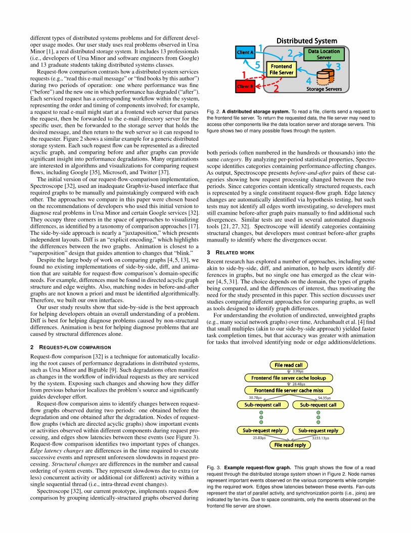
Request-flow comparison contrasts how a distributed system servicesrequests (e.g., “read this e-mail message” or “find books by this author”)during two periods of operation: one where performance was fine(“before”) and the new one in which performance has degraded (“after”).Each serviced request has a corresponding workflow within the system,representing the order and timing of components involved; for example,a request to read e-mail might start at a frontend web server that parsesthe request, then be forwarded to the e-mail directory server for thespecific user, then be forwarded to the storage server that holds thedesired message, and then return to the web server so it can respond tothe requester. Figure 2 shows a similar example for a generic distributedstorage system. Each such request flow can be represented as a directedacyclic graph, and comparing before and after graphs can providesignificant insight into performance degradations. Many organizationsare interested in algorithms and visualizations for comparing requestflows, including Google [35], Microsoft, and Twitter [37].
The initial version of our request-flow-comparison implementation,Spectroscope [32], used an inadequate Graphviz-based interface thatrequired graphs to be manually and painstakingly compared with eachother. The approaches we compare in this paper were chosen basedon the recommendations of developers who used this initial version todiagnose real problems in Ursa Minor and certain Google services [32].They occupy three corners in the space of approaches to visualizingdifferences, as identified by a taxonomy of comparison approaches [17].The side-by-side approach is nearly a “juxtaposition,” which presentsindependent layouts. Diff is an “explicit encoding,” which highlightsthe differences between the two graphs. Animation is closest to a“superposition” design that guides attention to changes that “blink.”
Despite the large body of work on comparing graphs [4, 5, 13], wefound no existing implementations of side-by-side, diff, and anima-tion that are suitable for request-flow comparison’s domain-specificneeds. For example, differences must be found in directed acyclic graphstructure and edge weights. Also, matching nodes in before-and-aftergraphs are not known a priori and must be identified algorithmically.Therefore, we built our own interfaces.
Our user study results show that side-by-side is the best approachfor helping developers obtain an overall understanding of a problem.Diff is best for helping diagnose problems caused by non-structuraldifferences. Animation is best for helping diagnose problems that arecaused by structural differences alone.
2 REQUEST-FLOW COMPARISON
Request-flow comparison [32] is a technique for automatically localiz-ing the root causes of performance degradations in distributed systems,such as Ursa Minor and Bigtable [9]. Such degradations often manifestas changes in the workflow of individual requests as they are servicedby the system. Exposing such changes and showing how they differfrom previous behavior localizes the problem’s source and significantlyguides developer effort.
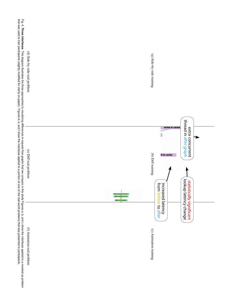
Request-flow comparison aims to identify changes between request-flow graphs observed during two periods: one obtained before thedegradation and one obtained after the degradation. Nodes of request-flow graphs (which are directed acyclic graphs) show important eventsor activities observed within different components during request pro-cessing, and edges show latencies between these events (see Figure 3).Request-flow comparison identifies two important types of changes.Edge latency changes are differences in the time required to executesuccessive events and represent unforeseen slowdowns in request pro-cessing. Structural changes are differences in the number and causalordering of system events. They represent slowdowns due to extra (orless) concurrent activity or additional (or different) activity within asingle sequential thread (i.e., intra-thread event changes).
Spectroscope [32], our current prototype, implements request-flowcomparison by grouping identically-structured graphs observed during
Data Location Data Location Data Location Data Location ServerServerServerServer
FrontendFrontendFrontendFrontendFile File File File SSSServererverervererver
Storage Storage Storage Storage ServersServersServersServers
Distributed SystemDistributed SystemDistributed SystemDistributed SystemClient AClient AClient AClient A 1111 2222
33334444
5555
Client BClient BClient BClient B
11112222
Fig. 2. A distributed storage system. To read a file, clients send a request tothe frontend file server. To return the requested data, the file server may need toaccess other components like the data location server and storage servers. Thisfigure shows two of many possible flows through the system.
both periods (often numbered in the hundreds or thousands) into thesame category. By analyzing per-period statistical properties, Spectro-scope identifies categories containing performance-affecting changes.As output, Spectroscope presents before-and-after pairs of these cat-egories showing how request processing changed between the twoperiods. Since categories contain identically structured requests, eachis represented by a single constituent request-flow graph. Edge latencychanges are automatically identified via hypothesis testing, but suchtests may not identify all edges worth investigating, so developers muststill examine before-after graph pairs manually to find additional suchdivergences. Similar tests are used in several automated diagnosistools [21, 27, 32]. Spectroscope will identify categories containingstructural changes, but developers must contrast before-after graphsmanually to identify where the divergences occur.
3 RELATED WORK
Recent research has explored a number of approaches, including someakin to side-by-side, diff, and animation, to help users identify dif-ferences in graphs, but no single one has emerged as the clear win-ner [4, 5, 31]. The choice depends on the domain, the types of graphsbeing compared, and the differences of interest, thus motivating theneed for the study presented in this paper. This section discusses userstudies comparing different approaches for comparing graphs, as wellas tools designed to identify graph differences.
For understanding the evolution of undirected, unweighted graphs(e.g., many social network graphs) over time, Archambault et al. [4] findthat small multiples (akin to our side-by-side approach) yielded fastertask completion times, but that accuracy was greater with animationfor tasks that involved identifying node or edge additions/deletions.
SubSubSubSub----request callrequest callrequest callrequest call
SubSubSubSub----request replyrequest replyrequest replyrequest reply
File read callFile read callFile read callFile read call
Frontend file server Frontend file server Frontend file server Frontend file server cache lookupcache lookupcache lookupcache lookup
SubSubSubSub----request callrequest callrequest callrequest call
SubSubSubSub----request replyrequest replyrequest replyrequest reply
3.993.993.993.99μμμμssss
28.4828.4828.4828.48μμμμssss
54.3554.3554.3554.35μμμμssss30.7830.7830.7830.78μμμμssss
Frontend file server cache missFrontend file server cache missFrontend file server cache missFrontend file server cache miss
SubSubSubSub----request replyrequest replyrequest replyrequest reply SubSubSubSub----request replyrequest replyrequest replyrequest reply
File read replyFile read replyFile read replyFile read reply
25.8325.8325.8325.83μμμμssss 3233.133233.133233.133233.13μμμμssss
Fig. 3. Example request-flow graph. This graph shows the flow of a readrequest through the distributed storage system shown in Figure 2. Node namesrepresent important events observed on the various components while complet-ing the required work. Edges show latencies between these events. Fan-outsrepresent the start of parallel activity, and synchronization points (i.e., joins) areindicated by fan-ins. Due to space constraints, only the events observed on thefrontend file server are shown.
In contrast, Farrugia et al. [13] find that small multiples outperformanimation with regard to both completion time and accuracy. In a laterstudy, Archambault et al. [5] evaluate a hybrid approach that uses side-by-side or animation to present diffs of consecutive graph evolutions.Participants preferred the hybrid approach over comparing independentgraphs of each evolutionary stage, but, it did not yield lower completiontimes or increased accuracy for most tasks. Melville et al. [25] developa set of general graph-comparison questions and find that for smallgraphs represented as adjacency matrices, a superimposed (diff) viewis superior to a juxtaposed (side-by-side) view.
For weighted graphs that are much denser than our request-flowgraphs, Alper et al. [2] find that matrix-based superimposed representa-tions outperform node-link-based ones. Robertson et al. [31] compareanimation’s effectiveness to that of small multiples and one other staticapproach for identifying trends in the evolution of Gapminder Tren-dalyzer [15] plots (3-dimensional data plotted on 2-D axes). Theyfind that animation is more effective for presenting trends, while staticapproaches are more effective for helping users identify them.
Many tools designed to identify graph differences use domain-specific algorithms or target specific graph structures. For example,TreeJuxtaposer [26] uses domain knowledge to match similar nodesin trees that show evolutionary relationships among different species.TreeVersity [18] uses a diff-based technique to identify differencesin node attributes and structure for trees with unweighted edges andknown matchings. G-PARE [34] presents overlays to compare predic-tions made by machine-learning algorithms on graph-based data. VisualPivot [30] helps identify relationships between two trees by using a lay-out that co-locates a selected common node. Beck and Diehl [6] use amatrix representation to compare software architectures based on codedependencies. Donatien [19] enables comparison of unweighted graphsby placing individual graphs in independently-configurable overlays,which can be optionally superimposed or viewed side-by-side. Theirhuman-in-the loop model for graph matching could be applied to ourinterfaces to improve matching accuracy.
Our work in this paper complements both of the above related-workcategories. Specifically, we attempt to identify good graph comparisontechniques for the output of a tool used in one important domain: perfor-mance diagnosis of distributed systems using request-flow comparison.Our domain is characterized by sparse, directed, acyclic, weightedgraphs, with unknown matchings. We also believe our intendedaudience—those familiar with distributed systems development—willexhibit different preferences than the general population.
In the systems community, there has been relatively little researchconducted on visual methods for diagnosis. Indeed, a recent survey ofimportant directions for log analysis concludes that because humanswill remain in the diagnosis loop for the foreseeable feature, visualiza-tion research is an important next step [28]. One project in this vein isNetClinic, which considers diagnosis of network faults [22]. The au-thors find that visualization in conjunction with automated analysis [21]is helpful for diagnosis. As in this study, their tool uses automatedprocesses to direct users’ attention, and the authors observe that automa-tion failures inhibit users’ understanding. In another system targetingnetwork diagnosis, Mansmann et al. observe that automated tools arelimited in utility without effective presentation of results [24].
4 INTERFACE DESIGN
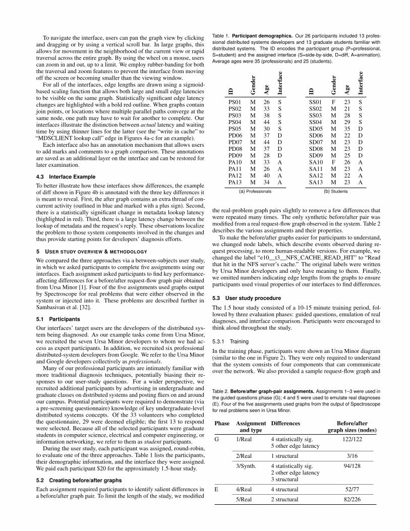
Figure 4 shows our implementations of side-by-side, diff, and anima-tion. All of them were guided by an initial pilot study, which is notdescribed in this paper. These interfaces are implemented in JavaScript,and use modified libraries from the JavaScript InfoVis Toolkit [7]. Thissection further describes them.
Side-by-side: Our side-by-sideinterface (illustrated with a simpli-fied diagram at right and in Fig-ure 4a,d) computes independent lay-ered layouts for the before and aftergraphs and displays them beside eachother. Nodes in the before graph arelinked to matching nodes in the after
graph by dashed correspondence lines. Using this interface, latencychanges can be identified by examining the relative slope of adjacentdashed lines: parallel lines indicate no change in latency, while increas-ing skew is indicative of longer response time. Structural changes canbe identified by the presence of nodes in the before or after graph withno matching node in the other graph.
Diff: Our diff interface (at right and in Fig-ure 4b,e) shows a single static image of an ex-plicit encoding of the differences between thebefore and after graphs, which are associatedwith the colors orange and blue respectively.The layout contains all nodes from both the be-fore and after graphs. Nodes that exist onlyin the before graph are outlined in orange andannotated with a minus sign; those that existonly in the after graph are outlined in blue and annotated with a plussign. This structural approach is akin to the output of a contextual difftool [23] emphasizing insertions and deletions.
We use the same orange and blue scheme to show latency changes,with edges that exist in only one graph shown in the appropriate color.Edges existing in both graphs produce a per-edge latency diff: orangeand blue lines are inset together with different lengths. The ratio of thelengths is computed from the ratio of the edge latencies in before andafter graphs, and the next node is attached at the end of the longer line.
Animation: Our animation interface (atright and in Figure 4c,f) switches automat-ically between the before and after graphs.Independent layouts are calculated for eachgraph, but non-matching nodes are not al-lowed to occupy the same position. To pro-vide a smooth transition, it interpolates thepositions of matching nodes. Nodes thatexist in only one graph appear only on theappropriate terminal of the animation. They all become more transpar-ent at the same rate, and vanish completely by the other terminal. Bothtypes of transition are linear and happen concurrently.
Users can start and stop the animation, as well as manually switchbetween terminal or intermediate points, via the provided slider. Unlessit is controlled this way, the animation repeats with a transition periodof two seconds and a pause for three seconds at either terminal.
4.1 Graph matching
Drawing correspondence lines in the side-by-side interface and mergingcorresponding nodes in the diff and animation interfaces requires iden-tifying matching nodes in the before and after graphs. This problemis hard (in the formal sense), and there exists a wide body of workinvestigating algorithms and heuristics for such matching [8, 11, 14].Like many of these approaches, we use heuristics to obtain approximatematches.
Our approximation technique, which runs in O(N2) time in thenumber of nodes, makes use of the fact that if a node in the beforegraph matches a node in the after graph, their node names will bethe same. (Note the converse is not necessarily true.) First, we usea lexically-ordered depth-first traversal to transform both graphs intostrings. Next, we keep track of the insertions, deletions, and mutationsmade by a string-edit distance transformation of one string into another.Finally, we map these edits back onto the appropriate interface. Itemsthat were not inserted, deleted, or modified are ones that correspond inboth graphs. A given node in the before graph is matched to at mostone node in the after graph. Despite the limitations of this approach,we have found it to work well in practice.
4.2 Common features
All three of our interfaces incorporate some common features, tailoredspecifically for request-flow graphs. As seen above, all graphs arerepresented with node-link diagrams since request-flow graphs aresparse, directed graphs that have fan-ins and fan-outs. They are drawnwith a layered layout based on the technique by Sugiyama et al. [36];layouts based on this technique enjoy widespread use [12].
(a)Side-by-sidetraining
(b)Difftraining
(c)Anim
ationtraining
(d)Side-by-siderealproblem
(e)Diffrealproblem
(f)Anim
ationrealproblem
Fig.4.Threeinterfaces.
Thisdiagram
illustratesthe
threeapproaches
tovisualizing
differencesin
request-flowgraphs
thatwe
compare
inthis
studyFigures
a,b,andc
showthe
interfacesapplied
toa
mocked-up
problemthatw
asused
totrain
participants(slightly
modified
forclarityon
paper).Figures
d,e,andfshow
theinterfaces
appliedto
aportion
ofoneofthe
real-world
problems
thatwas
presentedto
participants.
To navigate the interface, users can pan the graph view by clickingand dragging or by using a vertical scroll bar. In large graphs, thisallows for movement in the neighborhood of the current view or rapidtraversal across the entire graph. By using the wheel on a mouse, userscan zoom in and out, up to a limit. We employ rubber-banding for boththe traversal and zoom features to prevent the interface from movingoff the screen or becoming smaller than the viewing window.
For all of the interfaces, edge lengths are drawn using a sigmoid-based scaling function that allows both large and small edge latenciesto be visible on the same graph. Statistically significant edge latencychanges are highlighted with a bold red outline. When graphs containjoin points, or locations where multiple parallel paths converge at thesame node, one path may have to wait for another to complete. Ourinterfaces illustrate the distinction between actual latency and waitingtime by using thinner lines for the latter (see the “write in cache” to“MDSCLIENT lookup call” edge in Figures 4a-c for an example).
Each interface also has an annotation mechanism that allows usersto add marks and comments to a graph comparison. These annotationsare saved as an additional layer on the interface and can be restored forlater examination.
4.3 Interface Example
To better illustrate how these interfaces show differences, the exampleof diff shown in Figure 4b is annotated with the three key differences itis meant to reveal. First, the after graph contains an extra thread of con-current activity (outlined in blue and marked with a plus sign). Second,there is a statistically significant change in metadata lookup latency(highlighted in red). Third, there is a large latency change between thelookup of metadata and the request’s reply. These observations localizethe problem to those system components involved in the changes andthus provide starting points for developers’ diagnosis efforts.
5 USER STUDY OVERVIEW & METHODOLOGY
We compared the three approaches via a between-subjects user study,in which we asked participants to complete five assignments using ourinterfaces. Each assignment asked participants to find key performance-affecting differences for a before/after request-flow graph pair obtainedfrom Ursa Minor [1]. Four of the five assignments used graphs outputby Spectroscope for real problems that were either observed in thesystem or injected into it. These problems are described further inSambasivan et al. [32].
5.1 Participants
Our interfaces’ target users are the developers of the distributed sys-tem being diagnosed. As our example tasks come from Ursa Minor,we recruited the seven Ursa Minor developers to whom we had ac-cess as expert participants. In addition, we recruited six professionaldistributed-system developers from Google. We refer to the Ursa Minorand Google developers collectively as professionals.
Many of our professional participants are intimately familiar withmore traditional diagnosis techniques, potentially biasing their re-sponses to our user-study questions. For a wider perspective, werecruited additional participants by advertising in undergraduate andgraduate classes on distributed systems and posting fliers on and aroundour campus. Potential participants were required to demonstrate (viaa pre-screening questionnaire) knowledge of key undergraduate-leveldistributed systems concepts. Of the 33 volunteers who completedthe questionnaire, 29 were deemed eligible; the first 13 to respondwere selected. Because all of the selected participants were graduatestudents in computer science, electrical and computer engineering, orinformation networking, we refer to them as student participants.
During the user study, each participant was assigned, round-robin,to evaluate one of the three approaches. Table 1 lists the participants,their demographic information, and the interface they were assigned.We paid each participant $20 for the approximately 1.5-hour study.
5.2 Creating before/after graphs
Each assignment required participants to identify salient differences ina before/after graph pair. To limit the length of the study, we modified
Table 1. Participant demographics. Our 26 participants included 13 profes-sional distributed systems developers and 13 graduate students familiar withdistributed systems. The ID encodes the participant group (P=professional,S=student) and the assigned interface (S=side-by-side, D=diff, A=animation).Average ages were 35 (professionals) and 25 (students).
ID Gen
der
Age
Inte
rfac
e
PS01 M 26 SPS02 M 33 SPS03 M 38 SPS04 M 44 SPS05 M 30 SPD06 M 37 DPD07 M 44 DPD08 M 37 DPD09 M 28 DPA10 M 33 APA11 M 26 APA12 M 40 APA13 M 34 A
(a) Professionals
ID Gen
der
Age
Inte
rfac
e
SS01 F 23 SSS02 M 21 SSS03 M 28 SSS04 M 29 SSD05 M 35 DSD06 M 22 DSD07 M 23 DSD08 M 23 DSD09 M 25 DSA10 F 26 ASA11 M 23 ASA12 M 22 ASA13 M 23 A
(b) Students
the real-problem graph pairs slightly to remove a few differences thatwere repeated many times. The only synthetic before/after pair wasmodified from a real request-flow graph observed in the system. Table 2describes the various assignments and their properties.
To make the before/after graphs easier for participants to understand,we changed node labels, which describe events observed during re-quest processing, to more human-readable versions. For example, wechanged the label “e10__t3__NFS_CACHE_READ_HIT” to “Readthat hit in the NFS server’s cache.” The original labels were writtenby Ursa Minor developers and only have meaning to them. Finally,we omitted numbers indicating edge lengths from the graphs to ensureparticipants used visual properties of our interfaces to find differences.
5.3 User study procedure
The 1.5 hour study consisted of a 10-15 minute training period, fol-lowed by three evaluation phases: guided questions, emulation of realdiagnoses, and interface comparison. Participants were encouraged tothink aloud throughout the study.
5.3.1 Training
In the training phase, participants were shown an Ursa Minor diagram(similar to the one in Figure 2). They were only required to understandthat the system consists of four components that can communicateover the network. We also provided a sample request-flow graph and
Table 2. Before/after graph-pair assignments. Assignments 1–3 were used inthe guided questions phase (G); 4 and 5 were used to emulate real diagnoses(E). Four of the five assignments used graphs from the output of Spectroscopefor real problems seen in Ursa Minor.
Phase Assignment Differences Before/afterand type graph sizes (nodes)
G 1/Real 4 statistically sig. 122/1225 other edge latency
2/Real 1 structural 3/16
3/Synth. 4 statistically sig. 94/1282 other edge latency3 structural
E 4/Real 4 structural 52/77
5/Real 2 structural 82/226
described the meaning of nodes and edges. Finally, we trained each par-ticipant on her assigned interface by showing her a sample before/aftergraph (identical to those shown in Figures 4(a-c)) and guiding herthrough tasks she would have to complete in latter parts of the study.Participants were given ample time to ask questions and told we wouldbe unable to answer further questions after the training portion.
5.3.2 Finding differences via guided questions
In this phase of the study, we guided participants through the processof identifying differences, asking them to complete five focused tasksfor each of three assignments. Rows 1–3 of Table 2 describe the graphsused for this part of the study.
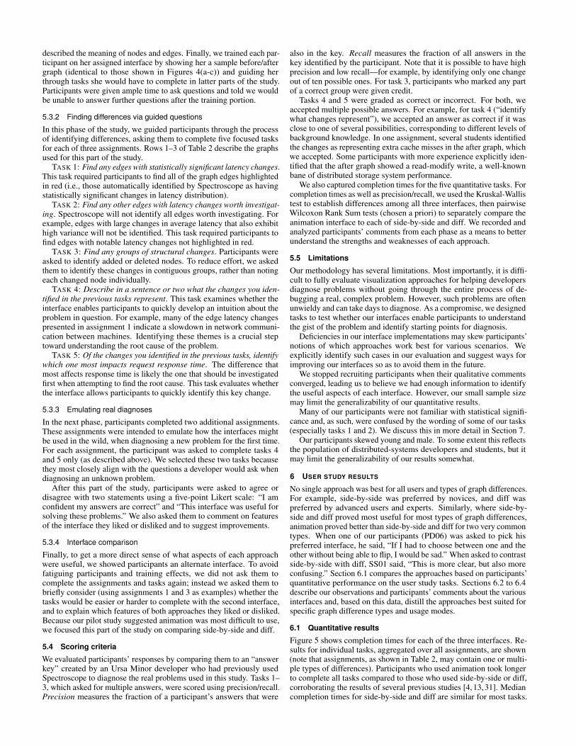
TASK 1: Find any edges with statistically significant latency changes.This task required participants to find all of the graph edges highlightedin red (i.e., those automatically identified by Spectroscope as havingstatistically significant changes in latency distribution).
TASK 2: Find any other edges with latency changes worth investigat-ing. Spectroscope will not identify all edges worth investigating. Forexample, edges with large changes in average latency that also exhibithigh variance will not be identified. This task required participants tofind edges with notable latency changes not highlighted in red.
TASK 3: Find any groups of structural changes. Participants wereasked to identify added or deleted nodes. To reduce effort, we askedthem to identify these changes in contiguous groups, rather than notingeach changed node individually.
TASK 4: Describe in a sentence or two what the changes you iden-tified in the previous tasks represent. This task examines whether theinterface enables participants to quickly develop an intuition about theproblem in question. For example, many of the edge latency changespresented in assignment 1 indicate a slowdown in network communi-cation between machines. Identifying these themes is a crucial steptoward understanding the root cause of the problem.
TASK 5: Of the changes you identified in the previous tasks, identifywhich one most impacts request response time. The difference thatmost affects response time is likely the one that should be investigatedfirst when attempting to find the root cause. This task evaluates whetherthe interface allows participants to quickly identify this key change.
5.3.3 Emulating real diagnoses
In the next phase, participants completed two additional assignments.These assignments were intended to emulate how the interfaces mightbe used in the wild, when diagnosing a new problem for the first time.For each assignment, the participant was asked to complete tasks 4and 5 only (as described above). We selected these two tasks becausethey most closely align with the questions a developer would ask whendiagnosing an unknown problem.
After this part of the study, participants were asked to agree ordisagree with two statements using a five-point Likert scale: “I amconfident my answers are correct” and “This interface was useful forsolving these problems.” We also asked them to comment on featuresof the interface they liked or disliked and to suggest improvements.
5.3.4 Interface comparison
Finally, to get a more direct sense of what aspects of each approachwere useful, we showed participants an alternate interface. To avoidfatiguing participants and training effects, we did not ask them tocomplete the assignments and tasks again; instead we asked them tobriefly consider (using assignments 1 and 3 as examples) whether thetasks would be easier or harder to complete with the second interface,and to explain which features of both approaches they liked or disliked.Because our pilot study suggested animation was most difficult to use,we focused this part of the study on comparing side-by-side and diff.
5.4 Scoring criteria
We evaluated participants’ responses by comparing them to an “answerkey” created by an Ursa Minor developer who had previously usedSpectroscope to diagnose the real problems used in this study. Tasks 1–3, which asked for multiple answers, were scored using precision/recall.Precision measures the fraction of a participant’s answers that were
also in the key. Recall measures the fraction of all answers in thekey identified by the participant. Note that it is possible to have highprecision and low recall—for example, by identifying only one changeout of ten possible ones. For task 3, participants who marked any partof a correct group were given credit.
Tasks 4 and 5 were graded as correct or incorrect. For both, weaccepted multiple possible answers. For example, for task 4 (“identifywhat changes represent”), we accepted an answer as correct if it wasclose to one of several possibilities, corresponding to different levels ofbackground knowledge. In one assignment, several students identifiedthe changes as representing extra cache misses in the after graph, whichwe accepted. Some participants with more experience explicitly iden-tified that the after graph showed a read-modify write, a well-knownbane of distributed storage system performance.
We also captured completion times for the five quantitative tasks. Forcompletion times as well as precision/recall, we used the Kruskal-Wallistest to establish differences among all three interfaces, then pairwiseWilcoxon Rank Sum tests (chosen a priori) to separately compare theanimation interface to each of side-by-side and diff. We recorded andanalyzed participants’ comments from each phase as a means to betterunderstand the strengths and weaknesses of each approach.
5.5 Limitations
Our methodology has several limitations. Most importantly, it is diffi-cult to fully evaluate visualization approaches for helping developersdiagnose problems without going through the entire process of de-bugging a real, complex problem. However, such problems are oftenunwieldy and can take days to diagnose. As a compromise, we designedtasks to test whether our interfaces enable participants to understandthe gist of the problem and identify starting points for diagnosis.
Deficiencies in our interface implementations may skew participants’notions of which approaches work best for various scenarios. Weexplicitly identify such cases in our evaluation and suggest ways forimproving our interfaces so as to avoid them in the future.
We stopped recruiting participants when their qualitative commentsconverged, leading us to believe we had enough information to identifythe useful aspects of each interface. However, our small sample sizemay limit the generalizability of our quantitative results.
Many of our participants were not familiar with statistical signifi-cance and, as such, were confused by the wording of some of our tasks(especially tasks 1 and 2). We discuss this in more detail in Section 7.
Our participants skewed young and male. To some extent this reflectsthe population of distributed-systems developers and students, but itmay limit the generalizability of our results somewhat.
6 USER STUDY RESULTS
No single approach was best for all users and types of graph differences.For example, side-by-side was preferred by novices, and diff waspreferred by advanced users and experts. Similarly, where side-by-side and diff proved most useful for most types of graph differences,animation proved better than side-by-side and diff for two very commontypes. When one of our participants (PD06) was asked to pick hispreferred interface, he said, “If I had to choose between one and theother without being able to flip, I would be sad.” When asked to contrastside-by-side with diff, SS01 said, “This is more clear, but also moreconfusing.” Section 6.1 compares the approaches based on participants’quantitative performance on the user study tasks. Sections 6.2 to 6.4describe our observations and participants’ comments about the variousinterfaces and, based on this data, distill the approaches best suited forspecific graph difference types and usage modes.
6.1 Quantitative results
Figure 5 shows completion times for each of the three interfaces. Re-sults for individual tasks, aggregated over all assignments, are shown(note that assignments, as shown in Table 2, may contain one or multi-ple types of differences). Participants who used animation took longerto complete all tasks compared to those who used side-by-side or diff,corroborating the results of several previous studies [4, 13, 31]. Mediancompletion times for side-by-side and diff are similar for most tasks.
The observed differences between animation and the other interfacesare statistically significant for task 1 (“identify statistically significantchanges”) and task 4 (“what changes represent”).1 The observed trendsare similar when students and professionals are considered separately,except that the differences between animation and the other interfacesare less pronounced for the latter.
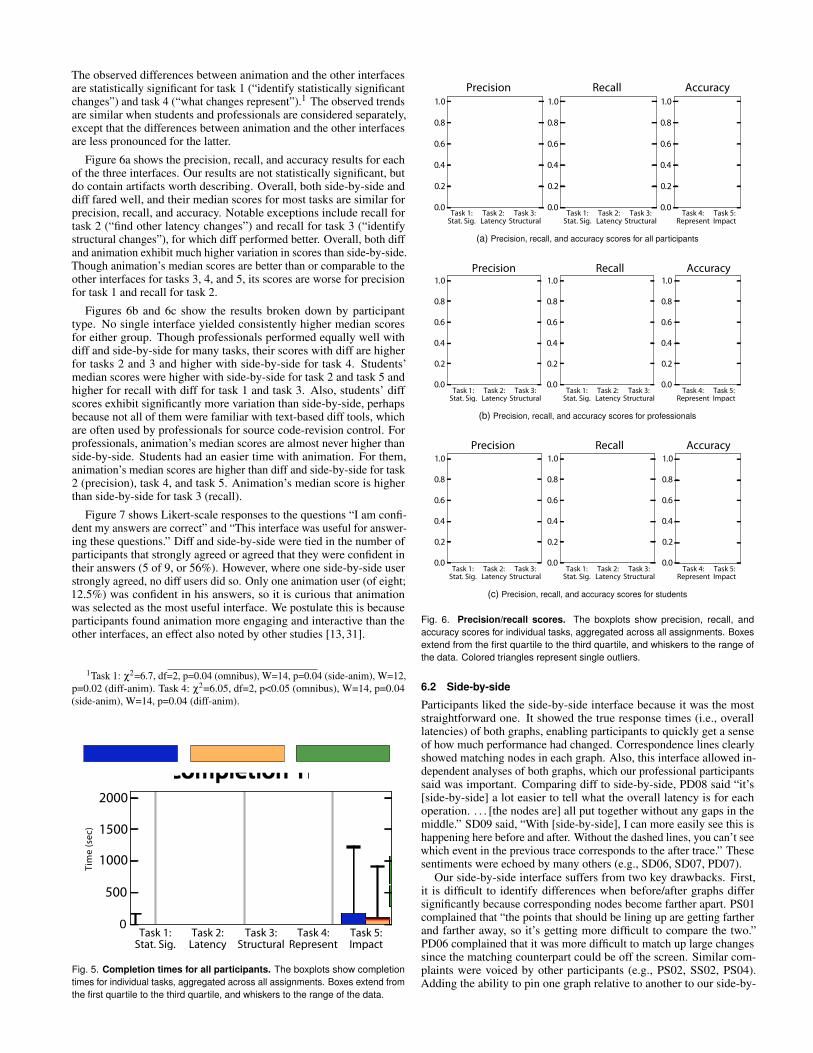
Figure 6a shows the precision, recall, and accuracy results for eachof the three interfaces. Our results are not statistically significant, butdo contain artifacts worth describing. Overall, both side-by-side anddiff fared well, and their median scores for most tasks are similar forprecision, recall, and accuracy. Notable exceptions include recall fortask 2 (“find other latency changes”) and recall for task 3 (“identifystructural changes”), for which diff performed better. Overall, both diffand animation exhibit much higher variation in scores than side-by-side.Though animation’s median scores are better than or comparable to theother interfaces for tasks 3, 4, and 5, its scores are worse for precisionfor task 1 and recall for task 2.
Figures 6b and 6c show the results broken down by participanttype. No single interface yielded consistently higher median scoresfor either group. Though professionals performed equally well withdiff and side-by-side for many tasks, their scores with diff are higherfor tasks 2 and 3 and higher with side-by-side for task 4. Students’median scores were higher with side-by-side for task 2 and task 5 andhigher for recall with diff for task 1 and task 3. Also, students’ diffscores exhibit significantly more variation than side-by-side, perhapsbecause not all of them were familiar with text-based diff tools, whichare often used by professionals for source code-revision control. Forprofessionals, animation’s median scores are almost never higher thanside-by-side. Students had an easier time with animation. For them,animation’s median scores are higher than diff and side-by-side for task2 (precision), task 4, and task 5. Animation’s median score is higherthan side-by-side for task 3 (recall).
Figure 7 shows Likert-scale responses to the questions “I am confi-dent my answers are correct” and “This interface was useful for answer-ing these questions.” Diff and side-by-side were tied in the number ofparticipants that strongly agreed or agreed that they were confident intheir answers (5 of 9, or 56%). However, where one side-by-side userstrongly agreed, no diff users did so. Only one animation user (of eight;12.5%) was confident in his answers, so it is curious that animationwas selected as the most useful interface. We postulate this is becauseparticipants found animation more engaging and interactive than theother interfaces, an effect also noted by other studies [13, 31].
1Task 1: χ2=6.7, df=2, p=0.04 (omnibus), W=14, p=0.04 (side-anim), W=12,p=0.02 (diff-anim). Task 4: χ2=6.05, df=2, p<0.05 (omnibus), W=14, p=0.04(side-anim), W=14, p=0.04 (diff-anim).
Fig. 5. Completion times for all participants. The boxplots show completiontimes for individual tasks, aggregated across all assignments. Boxes extend fromthe first quartile to the third quartile, and whiskers to the range of the data.
(a) Precision, recall, and accuracy scores for all participants
(b) Precision, recall, and accuracy scores for professionals
(c) Precision, recall, and accuracy scores for students
Fig. 6. Precision/recall scores. The boxplots show precision, recall, andaccuracy scores for individual tasks, aggregated across all assignments. Boxesextend from the first quartile to the third quartile, and whiskers to the range ofthe data. Colored triangles represent single outliers.
6.2 Side-by-side
Participants liked the side-by-side interface because it was the moststraightforward one. It showed the true response times (i.e., overalllatencies) of both graphs, enabling participants to quickly get a senseof how much performance had changed. Correspondence lines clearlyshowed matching nodes in each graph. Also, this interface allowed in-dependent analyses of both graphs, which our professional participantssaid was important. Comparing diff to side-by-side, PD08 said “it’s[side-by-side] a lot easier to tell what the overall latency is for eachoperation. . . . [the nodes are] all put together without any gaps in themiddle.” SD09 said, “With [side-by-side], I can more easily see this ishappening here before and after. Without the dashed lines, you can’t seewhich event in the previous trace corresponds to the after trace.” Thesesentiments were echoed by many others (e.g., SD06, SD07, PD07).
Our side-by-side interface suffers from two key drawbacks. First,it is difficult to identify differences when before/after graphs differsignificantly because corresponding nodes become farther apart. PS01complained that “the points that should be lining up are getting fartherand farther away, so it’s getting more difficult to compare the two.”PD06 complained that it was more difficult to match up large changessince the matching counterpart could be off the screen. Similar com-plaints were voiced by other participants (e.g., PS02, SS02, PS04).Adding the ability to pin one graph relative to another to our side-by-
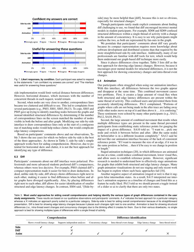
0% 20% 40% 60% 80% 100%
Anima&on
Diff
Side-‐by-‐side
Confident my answers are correct
Strongly agree Agree Neutral Disagree Strongly disagree
0% 20% 40% 60% 80% 100%
Anima&on
Diff
Side-‐by-‐side
Useful for answering these ques&ons
Strongly agree Agree Neutral Disagree Strongly disagree
Fig. 7. Likert responses, by condition. Each participant was asked to respondto the statements “I am confident my answers are correct” and “The interfacewas useful for answering these questions.”
side implementation would limit vertical distance between differences.However, horizontal distance, which increases with the number ofconcurrent threads in each request, would remain.
Second, when nodes are very close to another, correspondence linesbecame too cluttered and difficult to use. This led to complaints fromseveral participants (e.g., PS03, SS01, SS03, PA13). To cope, SS03 andPS05 gave up trying to identify matching nodes between the graphs andinstead identified structural differences by determining if the numberof correspondence lines on the screen matched the number of nodesvisible in both the before and after graph. Modifying our side-by-sideinterface to draw correspondence lines only at the start of a contiguousrun of matching nodes would help reduce clutter, but would complicateedge latency comparisons.
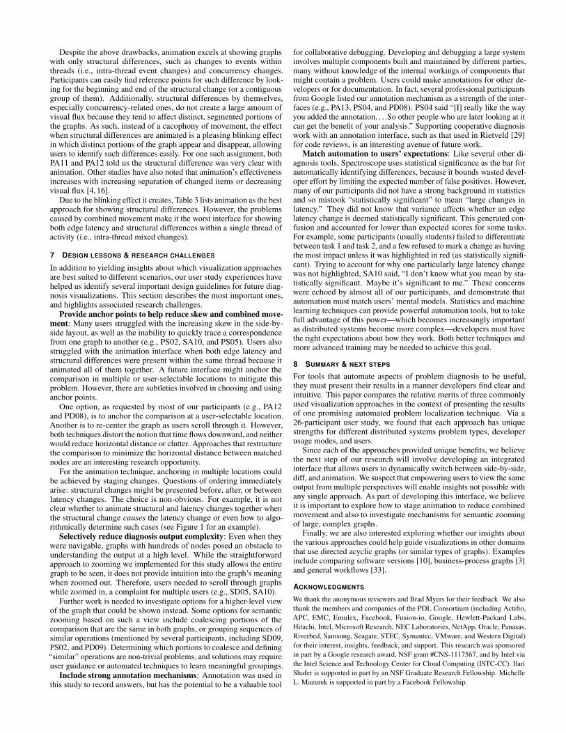
Based on participants’ comments above and our observations, Ta-ble 3 shows the use cases for which we believe side-by-side is the bestof the three approaches. As shown in Table 3, side-by-side’s simpleapproach works best for aiding comprehension. However, due to po-tential for horizontal skew and clutter, it is not the best approach foridentifying any type of difference.
6.3 Diff
Participants’ comments about our diff interface were polarized. Pro-fessionals and more advanced students preferred diff’s compactness,whereas others were less decisive. For example, PS03 claimed diff’scompact representation made it easier for him to draw deductions. In-deed, unlike side-by-side, diff always shows differences right next toeach other, making it easier to find differences when before and af-ter graphs have diverged significantly. Also, by placing differencesright next to each other, diff allows for easier identification of smallerstructural and edge latency changes. In contrast, SS04 said, “[Side-by-
side] may be more helpful than [diff], because this is not so obvious,especially for structural changes.”
Though participants rarely made explicit comments about findingdiff challenging to use, we found that diff encouraged incorrect mentalmodels in student participants. For example, SD08 and SD09 confusedstructural differences within a single thread of activity with a changein the amount of concurrency. It is easy to see why participants mightconfuse the two, as both are represented by fan-outs in the graph.
We postulate that participants’ comments about diff vary greatlybecause its compact representation requires more knowledge aboutsoftware development and distributed systems than that required by themore straightforward side-by-side interface. Additionally, many of ourprofessionals are familiar with diff tools for text, which would helpthem understand our graph-based diff technique more easily.
Since it places differences close together, Table 3 lists diff as thebest approach for showing edge latency changes. However, because itencourages poor mental models for structural differences, it is not thebest approach for showing concurrency changes and intra-thread eventchanges.
6.4 Animation
Our participants often struggled when using our animation interface.With this interface, all differences between the two graphs appearand disappear at the same time. This combined movement causestwo problems. First, it creates a large amount of visual flux whenboth structural and edge latency differences are present within thesame thread of activity. This confused users and prevented them fromaccurately identifying differences. PA11 complained, “Portions ofgraphs where calls are not being made in the after trace are fading awaywhile other nodes move on top of it and then above it . . . it is confusing.”These sentiments were echoed by many other participants (e.g., SA11,PA12, SA10, PA13).
Second, the large amount of combined movement that results whenmultiple difference types are present in the same thread preventedparticipants from establishing static reference points for gauging theimpact of a given difference. SA10 told us: “I want to. . . pick onenode and switch it between before and after. [But the same node]in before/after is in a different location completely.” SA12 said hedid not like our animation interface because of the lack of consistentreference points. “If I want to measure the size of an edge, if it was inthe same position as before. . . then it’d be easy to see change in positionor length.”
Staged animation techniques [20], in which differences are animatedin one at a time, could reduce combined movement, lower visual flux,and allow users to establish reference points. However, significantresearch is needed to understand how to effectively stage animationsfor graphs that exhibit both structural and edge latency changes. Manygraph animation visualizations do not use staging and only recent workhas begun to explore where such basic approaches fail [16].
Another negative aspect of animation (staged or not) is that it sug-gests false intermediate states. As a result, SA13 interpreted our inter-face’s animation sequence as a timeline of changes and listed this as afeature he really liked. PA13 told us we should present a toggle insteadof a slider so as to clarify that there are only two states.
Table 3. Most useful approaches for aiding overall comprehension and helping identify the various types of graph differences contained in the userstudy assignments. These results are based on our qualitative observations and participants’ comments. A 3 indicates the best approach for a particular category,whereas a 5 indicates an approach poorly suited to a particular category. Side-by-side is best for aiding overall comprehension because of its straightforwardpresentation. Diff is best for showing edge latency changes because it places such changes right next to one another. Animation is best for showing structuraldifferences (i.e., intra-thread event changes and concurrency changes) due to the blinking effect it creates for them. Due to their various drawbacks, no singleapproach is best for showing multiples types of differences within a single thread of activity.
Comprehension Difference identification
Shows overall latency change Supports independent analyses Concurrency change Intra-thread event change Edge latency change Intra-thread mixed
Side 3 3Diff 5 3Anim 3 3 3 5
Despite the above drawbacks, animation excels at showing graphswith only structural differences, such as changes to events withinthreads (i.e., intra-thread event changes) and concurrency changes.Participants can easily find reference points for such difference by look-ing for the beginning and end of the structural change (or a contiguousgroup of them). Additionally, structural differences by themselves,especially concurrency-related ones, do not create a large amount ofvisual flux because they tend to affect distinct, segmented portions ofthe graphs. As such, instead of a cacophony of movement, the effectwhen structural differences are animated is a pleasing blinking effectin which distinct portions of the graph appear and disappear, allowingusers to identify such differences easily. For one such assignment, bothPA11 and PA12 told us the structural difference was very clear withanimation. Other studies have also noted that animation’s effectivenessincreases with increasing separation of changed items or decreasingvisual flux [4, 16].
Due to the blinking effect it creates, Table 3 lists animation as the bestapproach for showing structural differences. However, the problemscaused by combined movement make it the worst interface for showingboth edge latency and structural differences within a single thread ofactivity (i.e., intra-thread mixed changes).
7 DESIGN LESSONS & RESEARCH CHALLENGES
In addition to yielding insights about which visualization approachesare best suited to different scenarios, our user study experiences havehelped us identify several important design guidelines for future diag-nosis visualizations. This section describes the most important ones,and highlights associated research challenges.
Provide anchor points to help reduce skew and combined move-ment: Many users struggled with the increasing skew in the side-by-side layout, as well as the inability to quickly trace a correspondencefrom one graph to another (e.g., PS02, SA10, and PS05). Users alsostruggled with the animation interface when both edge latency andstructural differences were present within the same thread because itanimated all of them together. A future interface might anchor thecomparison in multiple or user-selectable locations to mitigate thisproblem. However, there are subtleties involved in choosing and usinganchor points.
One option, as requested by most of our participants (e.g., PA12and PD08), is to anchor the comparison at a user-selectable location.Another is to re-center the graph as users scroll through it. However,both techniques distort the notion that time flows downward, and neitherwould reduce horizontal distance or clutter. Approaches that restructurethe comparison to minimize the horizontal distance between matchednodes are an interesting research opportunity.
For the animation technique, anchoring in multiple locations couldbe achieved by staging changes. Questions of ordering immediatelyarise: structural changes might be presented before, after, or betweenlatency changes. The choice is non-obvious. For example, it is notclear whether to animate structural and latency changes together whenthe structural change causes the latency change or even how to algo-rithmically determine such cases (see Figure 1 for an example).
Selectively reduce diagnosis output complexity: Even when theywere navigable, graphs with hundreds of nodes posed an obstacle tounderstanding the output at a high level. While the straightforwardapproach to zooming we implemented for this study allows the entiregraph to be seen, it does not provide intuition into the graph’s meaningwhen zoomed out. Therefore, users needed to scroll through graphswhile zoomed in, a complaint for multiple users (e.g., SD05, SA10).
Further work is needed to investigate options for a higher-level viewof the graph that could be shown instead. Some options for semanticzooming based on such a view include coalescing portions of thecomparison that are the same in both graphs, or grouping sequences ofsimilar operations (mentioned by several participants, including SD09,PS02, and PD09). Determining which portions to coalesce and defining“similar” operations are non-trivial problems, and solutions may requireuser guidance or automated techniques to learn meaningful groupings.
Include strong annotation mechanisms: Annotation was used inthis study to record answers, but has the potential to be a valuable tool
for collaborative debugging. Developing and debugging a large systeminvolves multiple components built and maintained by different parties,many without knowledge of the internal workings of components thatmight contain a problem. Users could make annotations for other de-velopers or for documentation. In fact, several professional participantsfrom Google listed our annotation mechanism as a strength of the inter-faces (e.g., PA13, PS04, and PD08). PS04 said “[I] really like the wayyou added the annotation. . . .So other people who are later looking at itcan get the benefit of your analysis.” Supporting cooperative diagnosiswork with an annotation interface, such as that used in Rietveld [29]for code reviews, is an interesting avenue of future work.
Match automation to users’ expectations: Like several other di-agnosis tools, Spectroscope uses statistical significance as the bar forautomatically identifying differences, because it bounds wasted devel-oper effort by limiting the expected number of false positives. However,many of our participants did not have a strong background in statisticsand so mistook “statistically significant” to mean “large changes inlatency.” They did not know that variance affects whether an edgelatency change is deemed statistically significant. This generated con-fusion and accounted for lower than expected scores for some tasks.For example, some participants (usually students) failed to differentiatebetween task 1 and task 2, and a few refused to mark a change as havingthe most impact unless it was highlighted in red (as statistically signifi-cant). Trying to account for why one particularly large latency changewas not highlighted, SA10 said, “I don’t know what you mean by sta-tistically significant. Maybe it’s significant to me.” These concernswere echoed by almost all of our participants, and demonstrate thatautomation must match users’ mental models. Statistics and machinelearning techniques can provide powerful automation tools, but to takefull advantage of this power—which becomes increasingly importantas distributed systems become more complex—developers must havethe right expectations about how they work. Both better techniques andmore advanced training may be needed to achieve this goal.
8 SUMMARY & NEXT STEPS
For tools that automate aspects of problem diagnosis to be useful,they must present their results in a manner developers find clear andintuitive. This paper compares the relative merits of three commonlyused visualization approaches in the context of presenting the resultsof one promising automated problem localization technique. Via a26-participant user study, we found that each approach has uniquestrengths for different distributed systems problem types, developerusage modes, and users.
Since each of the approaches provided unique benefits, we believethe next step of our research will involve developing an integratedinterface that allows users to dynamically switch between side-by-side,diff, and animation. We suspect that empowering users to view the sameoutput from multiple perspectives will enable insights not possible withany single approach. As part of developing this interface, we believeit is important to explore how to stage animation to reduce combinedmovement and also to investigate mechanisms for semantic zoomingof large, complex graphs.
Finally, we are also interested exploring whether our insights aboutthe various approaches could help guide visualizations in other domainsthat use directed acyclic graphs (or similar types of graphs). Examplesinclude comparing software versions [10], business-process graphs [3]and general workflows [33].
ACKNOWLEDGMENTS
We thank the anonymous reviewers and Brad Myers for their feedback. We alsothank the members and companies of the PDL Consortium (including Actifio,APC, EMC, Emulex, Facebook, Fusion-io, Google, Hewlett-Packard Labs,Hitachi, Intel, Microsoft Research, NEC Laboratories, NetApp, Oracle, Panasas,Riverbed, Samsung, Seagate, STEC, Symantec, VMware, and Western Digital)for their interest, insights, feedback, and support. This research was sponsoredin part by a Google research award, NSF grant #CNS-1117567, and by Intel viathe Intel Science and Technology Center for Cloud Computing (ISTC-CC). IlariShafer is supported in part by an NSF Graduate Research Fellowship. MichelleL. Mazurek is supported in part by a Facebook Fellowship.
REFERENCES
[1] M. Abd-El-Malek, W. V. Courtright II, C. Cranor, G. R. Ganger, J. Hen-dricks, A. J. Klosterman, M. Mesnier, M. Prasad, B. Salmon, R. R. Samba-sivan, S. Sinnamohideen, J. Strunk, E. Thereska, M. Wachs, and J. Wylie.Ursa Minor: versatile cluster-based storage. In Proc. FAST, 2005. Citedon pages 2 and 5.
[2] B. Alper, B. Bach, N. H. Riche, T. Isenberg, and J.-D. Fekete. Weightedgraph comparison techniques for brain connectivity analysis. In Proc. CHI,2013. Cited on page 3.
[3] K. Andrews, M. Wohlfahrt, and G. Wurzinger. Visual graph comparison.In Proc. IV, 2009. Cited on page 9.
[4] D. Archambault, H. C. Purchase, and B. Pinaud. Animation, small multi-ples, and the effect of mental map preservation in dynamic graphs. IEEETransactions on Visualization and Computer Graphics, 17(4):539–552,Apr. 2011. Cited on pages 2, 6, and 9.
[5] D. Archambault, H. C. Purchase, and B. Pinaud. Difference map readabil-ity for dynamic graphs. In Proc. GD, 2011. Cited on pages 2 and 3.
[6] F. Beck and S. Diehl. Visual comparison of software architectures. InProc. SOFTVIS, 2010. Cited on page 3.
[7] N. G. Belmonte. The Javascript Infovis Toolkit. http://www.thejit.org. Cited on page 3.
[8] H. Bunke. Graph matching: theoretical foundations, algorithms, andapplications. In Proc. VI, 2000. Cited on page 3.
[9] F. Chang, J. Dean, S. Ghemawat, W. C. Hsieh, D. A. Wallach, M. Burrows,T. Chandra, A. Fikes, and R. E. Gruber. Bigtable: a distributed storagesystem for structured data. In Proc. OSDI, 2006. Cited on page 2.
[10] C. Collberg, S. Kobourov, J. Nagra, J. Pitts, and K. Wampler. A system forgraph-based visualization of the evolution of software. In Proc. SOFTVIS,2003. Cited on page 9.
[11] R. Dijkman, M. Dumas, and L. García-Bañuelos. Graph matching algo-rithms for business process model similarity search. In Proc. BPM, 2009.Cited on page 3.
[12] J. Ellson, E. R. Gansner, E. Koutsofios, S. C. North, and G. Woodhull.Graphviz and Dynagraph – static and dynamic graph drawing tools. InGraph Drawing Software, Mathematics and Visualization, pages 127–148.Springer-Verlag, 2004. Cited on page 3.
[13] M. Farrugia and A. Quigley. Effective temporal graph layout: a com-parative study of animation versus static display methods. InformationVisualization, 10(1):47–64, Jan. 2011. Cited on pages 2, 3, 6, and 7.
[14] X. Gao, B. Xiao, D. Tao, and X. Li. A survey of graph edit distance.Pattern Analysis and Applications, 13(1):113–129, Jan. 2010. Cited onpage 3.
[15] Gapminder. http://www.gapminder.org. Cited on page 3.[16] S. Ghani, N. Elmqvist, and J. S. Yi. Perception of animated node-link
diagrams for dynamic graphs. Computer Graphics Forum, 31(3):1205–1214, June 2012. Cited on pages 8 and 9.
[17] M. Gleicher, D. Albers, R. Walker, I. Jusufi, C. D. Hansen, and J. C.Roberts. Visual comparison for information visualization. InformationVisualization, 10(4):289–309, Oct. 2011. Cited on page 2.
[18] J. A. G. Gomez, A. Buck-Coleman, C. Plaisant, and B. Shneiderman.Interactive visualizations for comparing two trees with structure and nodevalue changes. Technical Report HCIL-2012-04, University of Maryland,2012. Cited on page 3.
[19] M. Hascoët and P. Dragicevic. Interactive graph matching and visualcomparison of graphs and clustered graphs. In Proc. AVI, 2012. Cited onpage 3.
[20] J. Heer and G. Robertson. Animated transitions in statistical data graphics.IEEE Transactions on Visualization and Computer Graphics, 13(6):1240–1247, Nov. 2007. Cited on page 8.
[21] S. Kandula, R. Mahajan, P. Verkaik, S. Agarwal, J. Padhye, and P. Bahl.Detailed diagnosis in enterprise networks. In Proc. SIGCOMM, 2009.Cited on pages 1, 2, and 3.
[22] Z. Liu, B. Lee, S. Kandula, and R. Mahajan. NetClinic: interactivevisualization to enhance automated fault diagnosis in enterprise networks.In Proc. VAST, 2010. Cited on pages 1 and 3.
[23] D. MacKenzie, P. Eggert, and R. Stallman. Comparing and merging fileswith GNU diff and patch. Network Theory Ltd, 2002. Cited on page 3.
[24] F. Mansmann, F. Fischer, D. A. Keim, and S. C. North. Visual support foranalyzing network traffic and intrusion detection events using TreeMapand graph representations. In Proc. CHiMiT, 2009. Cited on pages 1and 3.
[25] A. G. Melville, M. Graham, and J. B. Kennedy. Combined vs. separateviews in matrix-based graph analysis and comparison. In Proc. IV, 2011.Cited on page 3.
[26] T. Munzner, F. Guimbretière, S. Tasiran, L. Zhang, and Y. Zhou. TreeJux-taposer: scalable tree comparison using focus+context with guaranteedvisibility. ACM Transactions on Graphics, 22(3):453–462, 2003. Citedon page 3.
[27] K. Nagaraj, C. Killian, and J. Neville. Structured comparative analysisof systems logs to diagnose performance problems. In Proc. NSDI, 2012.Cited on pages 1 and 2.
[28] A. J. Oliner, A. Ganapathi, and W. Xu. Advances and challenges in loganalysis. Communications of the ACM, 55(2):55–61, Feb. 2012. Cited onpages 1 and 3.
[29] Rietveld code review system. http://code.google.com/p/rietveld/.Cited on page 9.
[30] G. Robertson, K. Cameron, M. Czerwinski, and D. Robbins. Polyarchyvisualization: visualizing multiple intersecting hierarchies. In Proc. CHI,2002. Cited on page 3.
[31] G. Robertson, R. Fernandez, D. Fisher, B. Lee, and J. Stasko. Effectivenessof animation in trend visualization. IEEE Transactions on Visualizationand Computer Graphics, 14(6):1325–1332, Nov. 2008. Cited on pages 2,3, 6, and 7.
[32] R. R. Sambasivan, A. X. Zheng, M. D. Rosa, E. Krevat, S. Whitman,M. Stroucken, W. Wang, L. Xu, and G. R. Ganger. Diagnosing perfor-mance changes by comparing request flows. In Proc. NSDI, 2011. Citedon pages 1, 2, and 5.
[33] C. E. Scheidegger, H. T. Vo, D. Koop, J. Freire, and C. T. Silva. Queryingand re-using workflows with VsTrails. In Proc. SIGMOD, 2008. Cited onpage 9.
[34] H. Sharara, A. Sopan, G. Namata, L. Getoor, and L. Singh. G-PARE: avisual analytic tool for comparative analysis of uncertain graphs. In Proc.VAST, 2011. Cited on page 3.
[35] B. H. Sigelman, L. A. Barroso, M. Burrows, P. Stephenson, M. Plakal,D. Beaver, S. Jaspan, and C. Shanbhag. Dapper, a large-scale distributedsystems tracing infrastructure. Technical Report dapper-2010-1, Google,Apr. 2010. Cited on page 2.
[36] K. Sugiyama, S. Tagawa, and M. Toda. Methods for visual understandingof hierarchical system structures. IEEE Transactions on Systems, Manand Cybernetics, 11(2):109–125, Feb. 1981. Cited on page 3.
[37] Twitter Zipkin. https://github.com/twitter/zipkin. Cited on page2.