Visualizing Causal Semantics using Animationsirani/papers/tvcg.pdf · Visualizing Causal Semantics...
8
Visualizing Causal Semantics using Animations Nivedita R. Kadaba, Student Member, IEEE, Pourang P. Irani, Member, IEEE, and Jason Leboe Abstract— Michotte’s theory of ampliation suggests that causal relationships are perceived by objects animated under appropriate spatiotemporal conditions. We extend the theory of ampliation and propose that the immediate perception of complex causal relations is also dependent on a set of structural and temporal rules. We designed animated representations, based on Michotte’s rules, for showing complex causal relationships or causal semantics. In this paper we describe a set of animations for showing semantics such as causal amplification, causal strength, causal dampening, and causal multiplicity. In a two part study we compared the effectiveness of both the static and animated representations. The first study (N=44) asked participants to recall passages that were previously displayed using both types of representations. Participants were 8% more accurate in recalling causal semantics when they were presented using animations instead of static graphs. In the second study (N=112) we evaluated the intuitiveness of the representations. Our results showed that while users were as accurate with the static graphs as with the animations, they were 9% faster in matching the correct causal statements in the animated condition. Overall our results show that animated diagrams that are designed based on perceptual rules such as those proposed by Michotte have the potential to facilitate comprehension of complex causal relations. Index Terms—Causality, visualization, semantics, animated graphs, perception, visualizing cause and effect, graph semantics. 1 INTRODUCTION Causal relations are deeply rooted in human reasoning and appear in many contexts. Cause-and-effect relationships are used for explaining natural phenomena (the iron will become red under the influence of fire) and for specifying and resolving research questions (do horror movies lead to aggressive behaviour?). In most cases such relationships are intermeshed in the collection of information and data available to the user. To better comprehend cause-and-effect relationships, many visual representations, typically in the form of diagrams, have been developed and are being used extensively. Causal graphs constitute the most common representation of cause-and-effect relationships. These are directed acyclic graphs, in which vertices denote variable features of a phenomenon and edges denote a direct causal claim between these features (Fig. 1). These graphs have appeared in many forms: Feynman diagrams in physics [18], Lombardi diagrams to explain secret deals and suspect relations [6], and influence diagrams to represent the essential elements of a decision problem such as decisions, uncertainties, and objectives, and how they influence each other [16]. In all these variations, the causal graphs replace long verbose descriptions or complex mathematical formulations that describe events with their causes and effects. Although, node-link causal graphs provide information about cause-and-effect, in certain cases it can be very difficult to make credible causal inferences from linking lines and arrows [21]. They may produce many implicit and powerful assumptions, but they cannot convey the entire structure of the information to find out what is actually going on. In some instances, it is essential that the meaning or the semantic of the causal relationship be clearly revealed. For example, car manufacturers could understand better the quality of the tires being produced if a causal graph indicated that glass has a stronger influence than thorns in causing a flat tire; or that a flat tire has a larger impact on steering problems than it does on noise (Fig. 1). What seems to be lacking in the traditional forms of graphs is the capacity to convey different types of complex causal relations or semantics. Very little knowledge exists for properly visualizing complex causal relationships. The central question we address is how to make causal graphs more informative or carry precise meanings? In an effort to respond to this question we first defined a subset of the various types of causal semantics that may exist. We produced animated and static designs for depicting rich causal semantics. Our static design is an enhancement to the basic causal graph. The animated designs are based on perceptual theories explaining how we infer causal relations. In a first study, we carry out a passage recall task to compare our static diagrams to the animated representations. Our results show that participants are able to recall passages better when they are complemented with animated instead of static diagrams. In a second experiment we test whether causal representations can be intuitively and immediately captured upon viewing animated causal graphs. The results show that participants were able to comprehend causal semantics quicker when the relations were displayed with animations that were created based on results from theories of perception. 2 RELATED WORK The work described in this paper is largely inspired by work comparing animated and static diagrams, prior visualization techniques for causal relations, and from perceptual theories of causal inferences. 2.1 Animated or Static? There has been a long standing debate on whether designers should display information using static or animated displays. To this end, numerous studies have investigated the effect of animated diagrams on comprehension. Results of one study by Tversky et al. [15] show that static representations can be as effective as their animated counterparts. Tversky et al. [15] suggest that if the symbols used in the static representations are intuitive and clearly depict the information being represented, then static diagrams can replace animated diagrams, even in datasets containing temporal relationships. Pane et al. [10] conducted a study to show that static and animated visualizations, when used properly, can be equally effective. In their study, experiments were conducted to compare the advantage of animated diagrams (in the form of videos or computer simulated presentations) over text and carefully selected still images. The results of the experiment showed that there was no significant difference in comprehension between static and animated representations, if both the representations were chosen carefully and represented the same information. Nivedita R. Kadaba, Department of Computer Science, University of Manitoba. E-mail: [email protected]. Pourang P. Irani, Department of Computer Science, University of Manitoba. E-mail: [email protected]. Jason Leboe, Department of Psychology, University of Manitoba. E- Mail: [email protected]. Manuscript received 31 March 2007, accepted 1 August 2007; posted online 27 October 2007. For information on obtaining reprints of this article, please send e-mail to: [email protected]. Another study by Morrison and Tversky [8] compared the enhancement in comprehension, of students, with plain text, text along with static images, and text along with animated diagrams. In a Published 14 September 2007. IEEE TRANSACTIONS ON VISUALIZATION AND COMPUTER GRAPHICS, VOL. 13, NO. 6, NOVEMBER/DECEMBER 2007 1254 1077-2626/07/$25.00 © 2007 IEEE Published by the IEEE Computer Society
Transcript of Visualizing Causal Semantics using Animationsirani/papers/tvcg.pdf · Visualizing Causal Semantics...
Visualizing Causal Semantics using AnimationsNivedita R. Kadaba, Student Member, IEEE, Pourang P. Irani, Member, IEEE, and Jason Leboe
Abstract— Michotte’s theory of ampliation suggests that causal relationships are perceived by objects animated under appropriatespatiotemporal conditions. We extend the theory of ampliation and propose that the immediate perception of complex causalrelations is also dependent on a set of structural and temporal rules. We designed animated representations, based on Michotte’srules, for showing complex causal relationships or causal semantics. In this paper we describe a set of animations for showingsemantics such as causal amplification, causal strength, causal dampening, and causal multiplicity. In a two part study wecompared the effectiveness of both the static and animated representations. The first study (N=44) asked participants to recallpassages that were previously displayed using both types of representations. Participants were 8% more accurate in recallingcausal semantics when they were presented using animations instead of static graphs. In the second study (N=112) we evaluatedthe intuitiveness of the representations. Our results showed that while users were as accurate with the static graphs as with theanimations, they were 9% faster in matching the correct causal statements in the animated condition. Overall our results show thatanimated diagrams that are designed based on perceptual rules such as those proposed by Michotte have the potential to facilitatecomprehension of complex causal relations.
Index Terms—Causality, visualization, semantics, animated graphs, perception, visualizing cause and effect, graph semantics.
1 INTRODUCTIONCausal relations are deeply rooted in human reasoning and appear inmany contexts. Cause-and-effect relationships are used for explaining natural phenomena (the iron will become red under theinfluence of fire) and for specifying and resolving research questions (do horror movies lead to aggressive behaviour?). In most cases such relationships are intermeshed in the collection of information and data available to the user. To better comprehend cause-and-effectrelationships, many visual representations, typically in the form of diagrams, have been developed and are being used extensively.
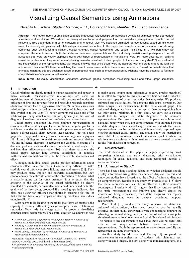
Causal graphs constitute the most common representation ofcause-and-effect relationships. These are directed acyclic graphs, inwhich vertices denote variable features of a phenomenon and edgesdenote a direct causal claim between these features (Fig. 1). Thesegraphs have appeared in many forms: Feynman diagrams in physics[18], Lombardi diagrams to explain secret deals and suspect relations[6], and influence diagrams to represent the essential elements of a decision problem such as decisions, uncertainties, and objectives, and how they influence each other [16]. In all these variations, the causal graphs replace long verbose descriptions or complex mathematical formulations that describe events with their causes and effects.
Although, node-link causal graphs provide information about cause-and-effect, in certain cases it can be very difficult to makecredible causal inferences from linking lines and arrows [21]. They may produce many implicit and powerful assumptions, but theycannot convey the entire structure of the information to find out whatis actually going on. In some instances, it is essential that the meaning or the semantic of the causal relationship be clearlyrevealed. For example, car manufacturers could understand better thequality of the tires being produced if a causal graph indicated thatglass has a stronger influence than thorns in causing a flat tire; or that a flat tire has a larger impact on steering problems than it does on noise (Fig. 1).
What seems to be lacking in the traditional forms of graphs is thecapacity to convey different types of complex causal relations or semantics. Very little knowledge exists for properly visualizingcomplex causal relationships. The central question we address is how
to make causal graphs more informative or carry precise meanings?In an effort to respond to this question we first defined a subset of the various types of causal semantics that may exist. We producedanimated and static designs for depicting rich causal semantics. Ourstatic design is an enhancement to the basic causal graph. Theanimated designs are based on perceptual theories explaining howwe infer causal relations. In a first study, we carry out a passage recall task to compare our static diagrams to the animatedrepresentations. Our results show that participants are able to recallpassages better when they are complemented with animated insteadof static diagrams. In a second experiment we test whether causalrepresentations can be intuitively and immediately captured uponviewing animated causal graphs. The results show that participantswere able to comprehend causal semantics quicker when the relations were displayed with animations that were created based onresults from theories of perception.
2 RELATED WORKThe work described in this paper is largely inspired by workcomparing animated and static diagrams, prior visualization techniques for causal relations, and from perceptual theories of causal inferences.2.1 Animated or Static?There has been a long standing debate on whether designers should display information using static or animated displays. To this end,numerous studies have investigated the effect of animated diagramson comprehension. Results of one study by Tversky et al. [15] show that static representations can be as effective as their animatedcounterparts. Tversky et al. [15] suggest that if the symbols used in the static representations are intuitive and clearly depict theinformation being represented, then static diagrams can replaceanimated diagrams, even in datasets containing temporalrelationships.
Pane et al. [10] conducted a study to show that static andanimated visualizations, when used properly, can be equallyeffective. In their study, experiments were conducted to compare theadvantage of animated diagrams (in the form of videos or computersimulated presentations) over text and carefully selected still images.The results of the experiment showed that there was no significantdifference in comprehension between static and animatedrepresentations, if both the representations were chosen carefully andrepresented the same information.
Nivedita R. Kadaba, Department of Computer Science, University of Manitoba. E-mail: [email protected] P. Irani, Department of Computer Science, University of Manitoba. E-mail: [email protected] Leboe, Department of Psychology, University of Manitoba. E-Mail: [email protected].
Manuscript received 31 March 2007, accepted 1 August 2007; posted online 27 October 2007.For information on obtaining reprints of this article, please send e-mail to:[email protected].
Another study by Morrison and Tversky [8] compared theenhancement in comprehension, of students, with plain text, textalong with static images, and text along with animated diagrams. In a Published 14 September 2007.
IEEE TRANSACTIONS ON VISUALIZATION AND COMPUTER GRAPHICS, VOL. 13, NO. 6, NOVEMBER/DECEMBER 20071254
1077-2626/07/$25.00 © 2007 IEEE Published by the IEEE Computer Society
series of three experiments Morrison and Tversky conclude that text recall is enhanced with the complementary presentation of graphical information. However, in neither of their experiments do animations outperform static representations.
Fig. 1. Causal graph depicting the effect of glass or thorns on a tire, and the effect of a flat tire on driving conditions.
While the above discussed studies do not show that animation present any benefits, several other studies suggest that animationscan be effective in various educational systems to simulate thebehaviour of concepts that are contingent upon temporal propertiesand thereby augment the learner’s ability to comprehend difficultconcepts [21].
While many studies have been designed to compare and evaluatethe effectiveness of animated designs, none of these provide anyconclusive evidence on the beneficial properties of animation. However, we believe that if the animations are created with certainspatiotemporal rules, then they can effectively convey theinformation being represented.2.2 Visualizing Causal RelationsA number of visual representations have been designed for showing causal relations. Hasse diagrams constitute one of the earliestsystems for showing causal concepts. They have been used for representing distributed systems [11], parallel processes [17], or anyother type of information structures that consists of causal events.Hasse diagrams can be difficult to comprehend as the layout of the graph creates a large number of intersecting lines. Furthermore, to view the causal chain the user has to backtrace along the variousedges. As with causal graphs, Hasse diagrams are not equipped toshow causal semantics. Additionally, enhancing Hasse diagrams would result in more clutter and make it difficult to visualizecomplex causal relationships.
Elmqvist and Tsigas [5] designed a Growing-squares technique todepict causal dependencies between processes in a system. WithGrowing-squares, each process is given a unique colour. Whenprocesses influence one another, their colours intermix in acheckered fashion over a time frame. Growing-squares takesadvantage of animation to show gradual increases and decreases of influences in a system. A user evaluation showed that users were significantly faster (~25%) in answering questions related to causalevents using Growing-squares in comparison to Hasse diagrams [5].A significant redesign of the Growing-squares visualization wouldbe necessary if it included additional causal semantics to the system.
Growing-polygons are an enhancement to the growing-squarestechnique [4]. In this approach, each causal factor is represented byan n-sided polygon and a colour. Each polygon is further divided into sectors for each of the factors in the system. As one factor influences another, over a timeframe, the colour of the first flowsinto its respective sector of the second, representing the effect. Auser evaluation by Elmqvist and Tsigas [4] showed that users were58% faster and 21% more accurate in answering causal questionswith growing-polygons than with Hasse diagrams. Additionally,Growing-polygons is capable of showing certain types of semantics such as depicting two factors that have a simultaneous effect on one another and the semantic of transitive causality, i.e. if A influences B and B influences C, then A influences C. However, significant modifications to the visualization is necessary in order to includesemantics such as strong or weak causal factors and large or small causal outcomes.
Ware et al. [19] designed a number of visual representations for showing causal information in node-link diagrams. They defined a
visual causal vector (VCV) that represented a causal relationbetween two entities. The VCV was tested using several metaphorsthat were designed with a number of spatiotemporal rules that arenecessary for perceptually inferring causal effects [19]. Results fromtheir study showed that the nature of the metaphor is less critical thanthe spatiotemporal rules that were used for showing the causalrelations. Their results inspired some of the work presented in thispaper. In particular, we extended their results for depicting semanticsthat can provide rich descriptions of naturally occurring causal relationships.
While the representations described above have facilitatedviewing causal relationships in a passive way, a number of systemshave relied on some form of interactivity for showing causality. Theinfluence explorer [16] allows users to interactively inspect theinfluence of factors on different outcomes. The interaction is provided by means of slider bars that control the amount or range ofinfluence of one factor on the effect. Neufeld and Krisstorn [9] useda variation of the influence explorer in which dynamically varyingthe values of causing factors shows the amount of influence on the final outcome. Such systems can be successfully used in situationsthat necessitate causal reasoning for making decisions. However, neither method is equipped with the ability to depict various forms ofcausal semantics.2.3 Perceiving CausalityMichotte’s theory of ampliation suggests that we perceive or infercausality when a moving object strikes another and sets the latterinto motion [7]. The causal inference is immediate upon presentationto our visual system.
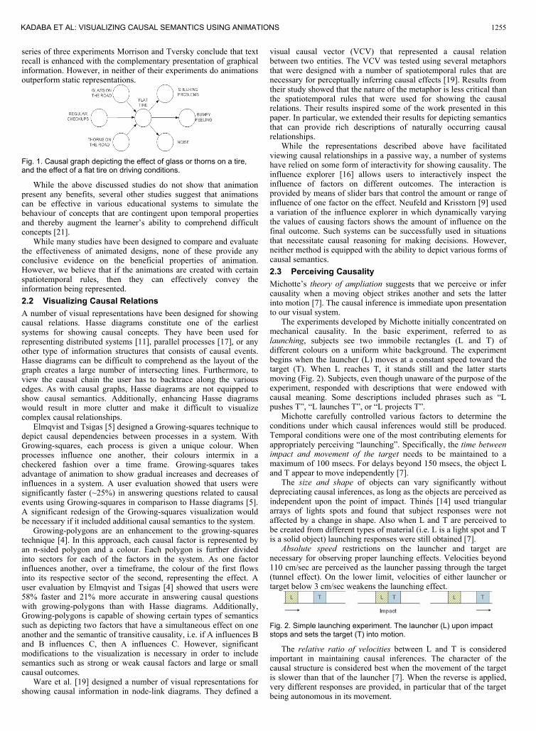
The experiments developed by Michotte initially concentrated onmechanical causality. In the basic experiment, referred to as launching, subjects see two immobile rectangles (L and T) of different colours on a uniform white background. The experimentbegins when the launcher (L) moves at a constant speed toward thetarget (T). When L reaches T, it stands still and the latter startsmoving (Fig. 2). Subjects, even though unaware of the purpose of theexperiment, responded with descriptions that were endowed withcausal meaning. Some descriptions included phrases such as “Lpushes T”, “L launches T”, or “L projects T”.
Michotte carefully controlled various factors to determine theconditions under which causal inferences would still be produced.Temporal conditions were one of the most contributing elements forappropriately perceiving “launching”. Specifically, the time betweenimpact and movement of the target needs to be maintained to amaximum of 100 msecs. For delays beyond 150 msecs, the object L and T appear to move independently [7].
The size and shape of objects can vary significantly withoutdepreciating causal inferences, as long as the objects are perceived as independent upon the point of impact. Thinés [14] used triangular arrays of lights spots and found that subject responses were not affected by a change in shape. Also when L and T are perceived to be created from different types of material (i.e. L is a light spot and Tis a solid object) launching responses were still obtained [7].
Absolute speed restrictions on the launcher and target arenecessary for observing proper launching effects. Velocities beyond 110 cm/sec are perceived as the launcher passing through the target(tunnel effect). On the lower limit, velocities of either launcher or target below 3 cm/sec weakens the launching effect.
Fig. 2. Simple launching experiment. The launcher (L) upon impactstops and sets the target (T) into motion.
The relative ratio of velocities between L and T is consideredimportant in maintaining causal inferences. The character of thecausal structure is considered best when the movement of the targetis slower than that of the launcher [7]. When the reverse is applied,very different responses are provided, in particular that of the targetbeing autonomous in its movement.
KADABA ET AL: VISUALIZING CAUSAL SEMANTICS USING ANIMATIONS 1255
In addition to temporal conditions, spatial information such as the length of the paths travelled by L and T should be carefully manipulated. In essence the causal responses start to degrade once the path of the target extends beyond its radius of action, i.e. naively related to the velocity of both objects [2, 20]. After a certain lengthof path, which can be empirically determined, the target appears tobe autonomous. The direction taken by the launcher-target couple isalso critical in inferring the relations. Best results are achieved whenthe target’s path follows the line of action created by the launcher.
Several studies have extended Michotte’s results to analyze theeffects of context environments on the perception of causality. Thesestudies state that existence of a causal event in the surroundingenvironment improves the perception of causality in a non-causal event by ~80% [12]. Another interesting study is one which examines the ability of perceptual grouping to influence causality[3]. In this study, the authors show that connectivity between acausal and non-causal event improves the perception of causality in the non-causal event, which has some bearing on the connected lines that are employed in visualizing our causal graphs.
3 SEMANTICS OF CAUSAL RELATIONSThe work of Michotte and others suggests that certain spatiotemporalconditions favour the perception of causal phenomena. We reasoned that if we could map the semantics of causal systems onto a set of perceptual semantics we could create diagrams that are moreinformative and that give rich descriptions.
We define a set of causal semantics as:Causal amplification – In abstract terms, we talk about causal
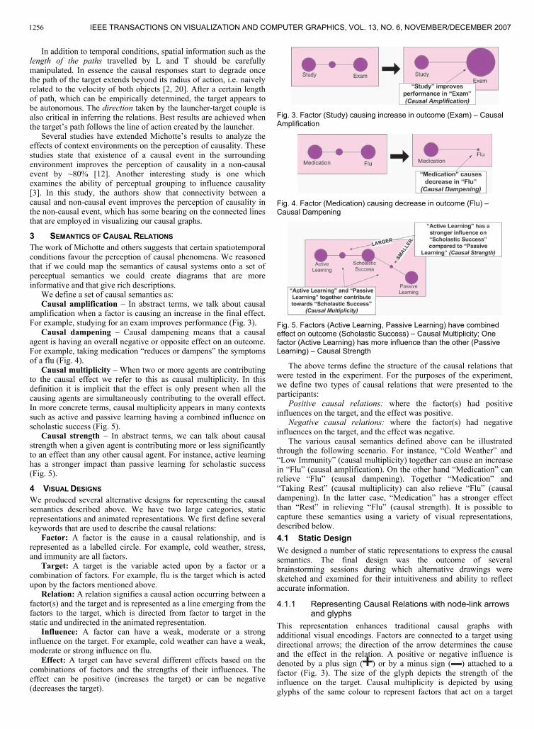
amplification when a factor is causing an increase in the final effect.For example, studying for an exam improves performance (Fig. 3).
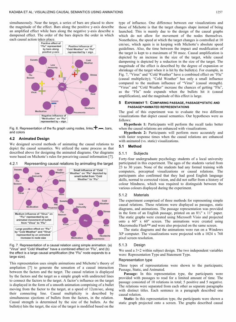
Causal dampening – Causal dampening means that a causalagent is having an overall negative or opposite effect on an outcome.For example, taking medication “reduces or dampens” the symptomsof a flu (Fig. 4).
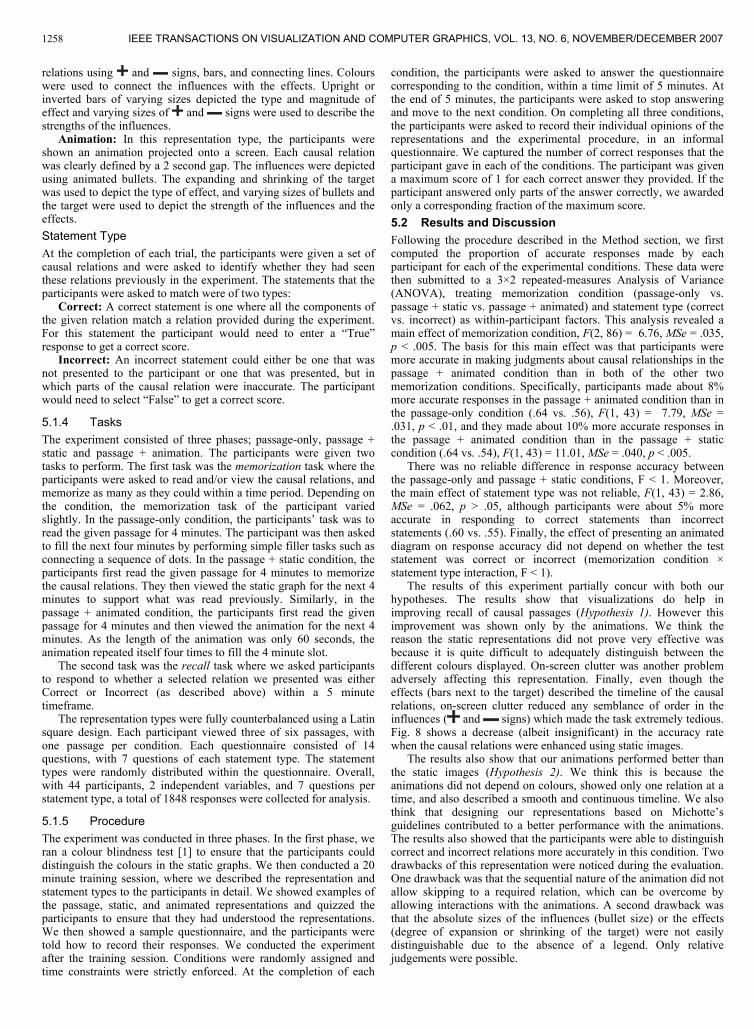
Causal multiplicity – When two or more agents are contributingto the causal effect we refer to this as causal multiplicity. In thisdefinition it is implicit that the effect is only present when all thecausing agents are simultaneously contributing to the overall effect.In more concrete terms, causal multiplicity appears in many contextssuch as active and passive learning having a combined influence on scholastic success (Fig. 5).
Causal strength – In abstract terms, we can talk about causal strength when a given agent is contributing more or less significantlyto an effect than any other causal agent. For instance, active learninghas a stronger impact than passive learning for scholastic success (Fig. 5).
4 VISUAL DESIGNSWe produced several alternative designs for representing the causal semantics described above. We have two large categories, staticrepresentations and animated representations. We first define several keywords that are used to describe the causal relations:
Factor: A factor is the cause in a causal relationship, and isrepresented as a labelled circle. For example, cold weather, stress,and immunity are all factors.
Target: A target is the variable acted upon by a factor or a combination of factors. For example, flu is the target which is actedupon by the factors mentioned above.
Relation: A relation signifies a causal action occurring between a factor(s) and the target and is represented as a line emerging from thefactors to the target, which is directed from factor to target in thestatic and undirected in the animated representation.
Influence: A factor can have a weak, moderate or a stronginfluence on the target. For example, cold weather can have a weak,moderate or strong influence on flu.
Effect: A target can have several different effects based on thecombinations of factors and the strengths of their influences. Theeffect can be positive (increases the target) or can be negative(decreases the target).
Fig. 3. Factor (Study) causing increase in outcome (Exam) – CausalAmplification
Fig. 4. Factor (Medication) causing decrease in outcome (Flu) – Causal Dampening
Fig. 5. Factors (Active Learning, Passive Learning) have combined effect on outcome (Scholastic Success) – Causal Multiplicity; Onefactor (Active Learning) has more influence than the other (PassiveLearning) – Causal Strength
The above terms define the structure of the causal relations that were tested in the experiment. For the purposes of the experiment, we define two types of causal relations that were presented to theparticipants:
Positive causal relations: where the factor(s) had positive influences on the target, and the effect was positive.
Negative causal relations: where the factor(s) had negative influences on the target, and the effect was negative.
The various causal semantics defined above can be illustratedthrough the following scenario. For instance, “Cold Weather” and“Low Immunity” (causal multiplicity) together can cause an increasein “Flu” (causal amplification). On the other hand “Medication” canrelieve “Flu” (causal dampening). Together “Medication” and“Taking Rest” (causal multiplicity) can also relieve “Flu” (causaldampening). In the latter case, “Medication” has a stronger effect than “Rest” in relieving “Flu” (causal strength). It is possible to capture these semantics using a variety of visual representations,described below.4.1 Static DesignWe designed a number of static representations to express the causalsemantics. The final design was the outcome of severalbrainstorming sessions during which alternative drawings weresketched and examined for their intuitiveness and ability to reflectaccurate information.
4.1.1 Representing Causal Relations with node-link arrowsand glyphs
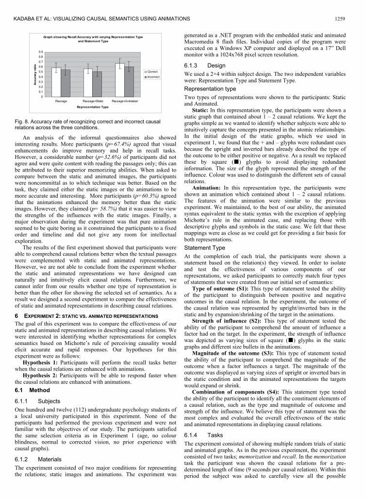
This representation enhances traditional causal graphs with additional visual encodings. Factors are connected to a target usingdirectional arrows; the direction of the arrow determines the causeand the effect in the relation. A positive or negative influence isdenoted by a plus sign ( ) or by a minus sign ( ) attached to afactor (Fig. 3). The size of the glyph depicts the strength of the influence on the target. Causal multiplicity is depicted by usingglyphs of the same colour to represent factors that act on a target
IEEE TRANSACTIONS ON VISUALIZATION AND COMPUTER GRAPHICS, VOL. 13, NO. 6, NOVEMBER/DECEMBER 20071256
simultaneously. Near the target, a series of bars are placed to showthe magnitude of the effect. Bars along the positive y-axis describean amplified effect while bars along the negative y-axis describe a dampened effect. The order of the bars depicts the order in which each causal action takes place.
Fig. 6. Representation of the flu graph using nodes, links, , , bars, and colors
4.2 Animated DesignWe designed several methods of animating the causal relations to depict the causal semantics. We utilized the same process as thatdescribed above for designing the animated diagrams. Our diagrams were based on Michotte’s rules for perceiving causal information [7].
4.2.1 Representing causal relations by animating the target
Fig. 7. Representation of a causal relation using simple animation. (a) “Virus” and “Cold Weather” have a combined effect on “Flu”, and (b)the effect is a large causal amplification (the “Flu” node expands to alarge size).
This representation uses simple animations and Michotte’s theory ofampliation [7] to generate the sensation of a causal interactionbetween the factors and the target. The causal relation is displayedby the factors and the target as a simple graph with undirected linesto connect the factors to the target. A factor’s influence on the targetis displayed in the form of a smooth animation comprising of a bulletmoving from the factor to the target, at a speed of 12cm/sec, alongtheir connecting line. Causal multiplicity is described bysimultaneous ejections of bullets from the factors, in the relation.Causal strength is determined by the size of the bullets. As thebullet(s) hits the target, the size of the target is modified based on the
type of influence. One difference between our visualizations andthose of Michotte is that the target changes shape instead of beinglaunched. This is mainly due to the design of the causal graphswhich do not allow for movement of the nodes themselves.Nonetheless, the speed at which the target changes is controlled at 10cm/sec, which again is in keeping with Michotte’s absolute speedguidelines. Also, the time between the impact and modification ofthe target is kept to a maximum of 50 msec. Causal amplification is depicted by an increase in the size of the target, while causaldampening is depicted by a reduction in the size of the target. Themagnitude of the effect is described by the degree of expansion or shrinkage of the target when it is hit by the bullet(s). For example, inFig. 7, “Virus” and “Cold Weather” have a combined effect on “Flu”(causal multiplicity); “Cold Weather” has only a small influencecompared to the medium influence of “Virus” (causal strength).“Virus” and “Cold Weather” increase the chances of getting “Flu”,as the “Flu” node expands when the bullets hit it (causalamplification), and the magnitude of this effect is large.
5 EXPERIMENT 1: COMPARING PASSAGE, PASSAGE+STATIC ANDPASSAGE+ANIMATED REPRESENTATIONS
The goal of this experiment was to evaluate the two differentvisualizations that depict causal semantics. Our hypotheses were asfollows:
Hypothesis 1: Participants will perform the recall tasks betterwhen the causal relations are enhanced with visualizations.
Hypothesis 2: Participants will perform more accurately andwith faster response times when the causal relations are enhancedwith animated (vs. static) visualizations.5.1 Method
5.1.1 SubjectsForty-four undergraduate psychology students of a local university participated in this experiment. The ages of the students varied from23 to 30 years. None of the students had any formal training withcomputers, perceptual visualizations or causal relations. Theparticipants also confirmed that they had good English languageskills, normal to corrected vision, and did not suffer from a history of colour blindness, which was required to distinguish between the various colours displayed during the experiment.
5.1.2 Materials The experiment comprised of three methods for representing simple causal relations. These relations were displayed as passages, staticdiagrams, and animations. The passage representation was providedin the form of an English passage, printed on an 8½ x 11 paper. The static graphs were created using Microsoft Visio and projectedonto a 60 x 60 screen. The animations were created usingMacromedia Flash™ and were also projected on the same screen.
The static diagrams and the animations were run on a WindowsXP computer. The visualizations were projected with a 1024 x 768pixel screen resolution.
5.1.3 DesignWe used a 3×2 within subject design. The two independent variableswere: Representation Type and Statement Type.Representation type Three types of representations were shown to the participants; Passage, Static, and Animated.
Passage: In this representation type, the participants wereprovided with passages to read for a limited amount of time. Thepassage consisted of 10 relations in total; 5 positive and 5 negative.The relations were separated from each other as separate paragraphswith distinct titles. Each sentence in a paragraph described onecausal relation.
Static: In this representation type, the participants were shown astatic graph projected onto a screen. The graphs described causal
KADABA ET AL: VISUALIZING CAUSAL SEMANTICS USING ANIMATIONS 1257
relations using and signs, bars, and connecting lines. Colourswere used to connect the influences with the effects. Upright or inverted bars of varying sizes depicted the type and magnitude ofeffect and varying sizes of and signs were used to describe the strengths of the influences.
Animation: In this representation type, the participants wereshown an animation projected onto a screen. Each causal relationwas clearly defined by a 2 second gap. The influences were depictedusing animated bullets. The expanding and shrinking of the targetwas used to depict the type of effect, and varying sizes of bullets andthe target were used to depict the strength of the influences and the effects.Statement TypeAt the completion of each trial, the participants were given a set of causal relations and were asked to identify whether they had seenthese relations previously in the experiment. The statements that theparticipants were asked to match were of two types:
Correct: A correct statement is one where all the components of the given relation match a relation provided during the experiment. For this statement the participant would need to enter a “True”response to get a correct score.
Incorrect: An incorrect statement could either be one that wasnot presented to the participant or one that was presented, but in which parts of the causal relation were inaccurate. The participantwould need to select “False” to get a correct score.
5.1.4 TasksThe experiment consisted of three phases; passage-only, passage +static and passage + animation. The participants were given twotasks to perform. The first task was the memorization task where theparticipants were asked to read and/or view the causal relations, andmemorize as many as they could within a time period. Depending onthe condition, the memorization task of the participant varied slightly. In the passage-only condition, the participants’ task was to read the given passage for 4 minutes. The participant was then askedto fill the next four minutes by performing simple filler tasks such as connecting a sequence of dots. In the passage + static condition, theparticipants first read the given passage for 4 minutes to memorize the causal relations. They then viewed the static graph for the next 4minutes to support what was read previously. Similarly, in thepassage + animated condition, the participants first read the givenpassage for 4 minutes and then viewed the animation for the next 4minutes. As the length of the animation was only 60 seconds, the animation repeated itself four times to fill the 4 minute slot.
The second task was the recall task where we asked participantsto respond to whether a selected relation we presented was either Correct or Incorrect (as described above) within a 5 minutetimeframe.
The representation types were fully counterbalanced using a Latinsquare design. Each participant viewed three of six passages, withone passage per condition. Each questionnaire consisted of 14 questions, with 7 questions of each statement type. The statementtypes were randomly distributed within the questionnaire. Overall,with 44 participants, 2 independent variables, and 7 questions perstatement type, a total of 1848 responses were collected for analysis.
5.1.5 ProcedureThe experiment was conducted in three phases. In the first phase, we ran a colour blindness test [1] to ensure that the participants coulddistinguish the colours in the static graphs. We then conducted a 20 minute training session, where we described the representation andstatement types to the participants in detail. We showed examples of the passage, static, and animated representations and quizzed the participants to ensure that they had understood the representations.We then showed a sample questionnaire, and the participants weretold how to record their responses. We conducted the experimentafter the training session. Conditions were randomly assigned and time constraints were strictly enforced. At the completion of each
condition, the participants were asked to answer the questionnairecorresponding to the condition, within a time limit of 5 minutes. At the end of 5 minutes, the participants were asked to stop answeringand move to the next condition. On completing all three conditions,the participants were asked to record their individual opinions of the representations and the experimental procedure, in an informalquestionnaire. We captured the number of correct responses that the participant gave in each of the conditions. The participant was givena maximum score of 1 for each correct answer they provided. If theparticipant answered only parts of the answer correctly, we awardedonly a corresponding fraction of the maximum score.5.2 Results and DiscussionFollowing the procedure described in the Method section, we firstcomputed the proportion of accurate responses made by eachparticipant for each of the experimental conditions. These data were then submitted to a 3×2 repeated-measures Analysis of Variance(ANOVA), treating memorization condition (passage-only vs. passage + static vs. passage + animated) and statement type (correctvs. incorrect) as within-participant factors. This analysis revealed amain effect of memorization condition, F(2, 86) = 6.76, MSe = .035, p < .005. The basis for this main effect was that participants were more accurate in making judgments about causal relationships in thepassage + animated condition than in both of the other twomemorization conditions. Specifically, participants made about 8% more accurate responses in the passage + animated condition than inthe passage-only condition (.64 vs. .56), F(1, 43) = 7.79, MSe = .031, p < .01, and they made about 10% more accurate responses inthe passage + animated condition than in the passage + staticcondition (.64 vs. .54), F(1, 43) = 11.01, MSe = .040, p < .005.
There was no reliable difference in response accuracy between the passage-only and passage + static conditions, F < 1. Moreover,the main effect of statement type was not reliable, F(1, 43) = 2.86, MSe = .062, p > .05, although participants were about 5% moreaccurate in responding to correct statements than incorrectstatements (.60 vs. .55). Finally, the effect of presenting an animateddiagram on response accuracy did not depend on whether the teststatement was correct or incorrect (memorization condition × statement type interaction, F < 1).
The results of this experiment partially concur with both ourhypotheses. The results show that visualizations do help in improving recall of causal passages (Hypothesis 1). However thisimprovement was shown only by the animations. We think the reason the static representations did not prove very effective wasbecause it is quite difficult to adequately distinguish between thedifferent colours displayed. On-screen clutter was another problem adversely affecting this representation. Finally, even though the effects (bars next to the target) described the timeline of the causalrelations, on-screen clutter reduced any semblance of order in the influences ( and signs) which made the task extremely tedious. Fig. 8 shows a decrease (albeit insignificant) in the accuracy ratewhen the causal relations were enhanced using static images.
The results also show that our animations performed better thanthe static images (Hypothesis 2). We think this is because the animations did not depend on colours, showed only one relation at a time, and also described a smooth and continuous timeline. We alsothink that designing our representations based on Michotte’s guidelines contributed to a better performance with the animations.The results also showed that the participants were able to distinguishcorrect and incorrect relations more accurately in this condition. Twodrawbacks of this representation were noticed during the evaluation.One drawback was that the sequential nature of the animation did notallow skipping to a required relation, which can be overcome byallowing interactions with the animations. A second drawback wasthat the absolute sizes of the influences (bullet size) or the effects(degree of expansion or shrinking of the target) were not easilydistinguishable due to the absence of a legend. Only relativejudgements were possible.
IEEE TRANSACTIONS ON VISUALIZATION AND COMPUTER GRAPHICS, VOL. 13, NO. 6, NOVEMBER/DECEMBER 20071258
Graph showing Recall Accuracy w ith varying Representation Typeand Statement Type
00.10.20.30.4
0.50.60.70.80.9
Passage Passage+Static Passage+Animation
Representation Type
Acc
urac
y ra
tio
Correct
Incorrect
Fig. 8. Accuracy rate of recognizing correct and incorrect causal relations across the three conditions.
An analysis of the informal questionnaires also showed interesting results. More participants (p=67.4%) agreed that visualenhancements do improve memory and help in recall tasks.However, a considerable number (p=32.6%) of participants did not agree and were quite content with reading the passages only; this canbe attributed to their superior memorizing abilities. When asked to compare between the static and animated images, the participantswere noncommittal as to which technique was better. Based on thetask, they claimed either the static images or the animations to bemore accurate and interesting. More participants (p=60.3%) agreedthat the animations enhanced the memory better than the staticimages. However, they claimed (p= 58.7%) that it was easier to viewthe strengths of the influences with the static images. Finally, amajor observation during the experiment was that pure animation seemed to be quite boring as it constrained the participants to a fixedorder and timeline and did not give any room for intellectualexploration.
The results of the first experiment showed that participants wereable to comprehend causal relations better when the textual passageswere complemented with static and animated representations.However, we are not able to conclude from the experiment whether the static and animated representations we have designed can naturally and intuitively elicit causal relations. Furthermore, we cannot infer from our results whether one type of representation is better than the other for showing the selected set of semantics. As a result we designed a second experiment to compare the effectivenessof static and animated representations in describing causal relations.
6 EXPERIMENT 2: STATIC VS. ANIMATED REPRESENTATIONSThe goal of this experiment was to compare the effectiveness of ourstatic and animated representations in describing causal relations. Wewere interested in identifying whether representations for complexsemantics based on Michotte’s rule of perceiving causality wouldelicit accurate and rapid responses. Our hypotheses for this experiment were as follows:
Hypothesis 1: Participants will perform the recall tasks betterwhen the causal relations are enhanced with animations.
Hypothesis 2: Participants will be able to respond faster when the causal relations are enhanced with animations.6.1 Method
6.1.1 SubjectsOne hundred and twelve (112) undergraduate psychology students ofa local university participated in this experiment. None of the participants had performed the previous experiment and were not familiar with the objectives of our study. The participants satisfiedthe same selection criteria as in Experiment 1 (age, no colour blindness, normal to corrected vision, no prior experience withcausal graphs).
6.1.2 Materials The experiment consisted of two major conditions for representingthe relations; static images and animations. The experiment was
generated as a .NET program with the embedded static and animatedMacromedia 8 flash files. Individual copies of the program were executed on a Windows XP computer and displayed on a 17” Dellmonitor with a 1024x768 pixel screen resolution.
6.1.3 DesignWe used a 2×4 within subject design. The two independent variableswere: Representation Type and Statement Type.Representation type Two types of representations were shown to the participants: Staticand Animated.
Static: In this representation type, the participants were shown astatic graph that contained about 1 – 2 causal relations. We kept thegraphs simple as we wanted to identify whether subjects were able tointuitively capture the concepts presented in the atomic relationships.In the initial design of the static graphs, which we used in experiment 1, we found that the + and – glyphs were redundant cuesbecause the upright and inverted bars already described the type of the outcome to be either positive or negative. As a result we replacedthese by square ( ) glyphs to avoid displaying redundantinformation. The size of the glyph represented the strength of the influence. Colour was used to distinguish the different sets of causal relations.
Animation: In this representation type, the participants wereshown an animation which contained about 1 – 2 causal relations.The features of the animation were similar to the previousexperiment. We maintained, to the best of our ability, the animatedsyntax equivalent to the static syntax with the exception of applyingMichotte’s rule in the animated case, and replacing those withdescriptive glyphs and symbols in the static case. We felt that thesemappings were as close as we could get for providing a fair basis forboth representations.Statement TypeAt the completion of each trial, the participants were shown astatement based on the relation(s) they viewed. In order to isolateand test the effectiveness of various components of ourrepresentations, we asked participants to correctly match four typesof statements that were created from our initial set of semantics:
Type of outcome (S1): This type of statement tested the abilityof the participant to distinguish between positive and negativeoutcomes in the causal relation. In the experiment, the outcome of the causal relation was represented by upright/inverted bars in the static and by expansion/shrinking of the target in the animations.
Strength of influence (S2): This type of statement tested theability of the participant to comprehend the amount of influence a factor had on the target. In the experiment, the strength of influence was depicted as varying sizes of square ( ) glyphs in the staticgraphs and different size bullets in the animations.
Magnitude of the outcome (S3): This type of statement testedthe ability of the participant to comprehend the magnitude of the outcome when a factor influences a target. The magnitude of the outcome was displayed as varying sizes of upright or inverted bars in the static condition and in the animated representations the targetswould expand or shrink.
Combination of components (S4): This statement type testedthe ability of the participant to identify all the constituent elements of a causal relation, such as the type and magnitude of outcome and strength of the influence. We believe this type of statement was themost complex and evaluated the overall effectiveness of the staticand animated representations in displaying causal relations.
6.1.4 TasksThe experiment consisted of showing multiple random trials of static and animated graphs. As in the previous experiment, the experimentconsisted of two tasks; memorization and recall. In the memorizationtask the participant was shown the causal relations for a pre-determined length of time (9 seconds per causal relation). Within this period the subject was asked to carefully view all the possible
KADABA ET AL: VISUALIZING CAUSAL SEMANTICS USING ANIMATIONS 1259
relationships that existed. In the recall task, the participant was shown a statement, based on the relations that were just viewed. Forexample, they would be presented with a statement that was not based on real facts (i.e. they could not answer correctly withoutseeing the graphs) such as “Female mosquitoes have a positive effecton malaria”. After reading the statement, the participant was asked to hit one of two keys (B = ‘Yes’ or N = ‘No’, B was taped with a “Y” on top of it) depending on whether they agreed with the statement ornot based on the previously viewed graph. We asked the participants to provide as accurate an answer as possible and to respond quickly.Upon providing an answer, the trial automatically ended and thesetup presented the next trial.
6.1.5 ProcedureThe experiment was conducted in two phases. The first phase wasthe training phase, where the participants were asked to self-trainthemselves by running a pilot tool that displayed static and animatedcausal relations. They were presented with statements that were similar to what would be displayed during the experiment. The participant was given the opportunity to run the pilot as frequently asneeded, but was not able to obtain explanations from the experimenter regarding the meanings of the relations or the visual representations. After completing the self-training phase, theparticipant was asked to run the experimental program.
The second phase was the experiment phase. The trials in theexperiment were divided into 6 sessions. At the end of each session,the timers were paused and the participant was allowed to take abreak if required.
6.1.6 Results The main variables of interest in this experiment were thecompletion times in responding the question and the accuracy of the users’ responses. Each accurate response of the participant wasawarded one point. The analysis for response times only consideredaccurate responses. The results are summarized in Fig. 9 and Fig. 10.
Response Times for Accurate Responses forStatic vs. Animated Representations
0
1
2
3
4
5
6
7
8
9
S1 S2 S3 S4
Statement Type
Res
pons
e Ti
mes
(sec
onds
)
StaticAnimated
Fig. 9. Response rate for correctly identifying the type of causal relation across all four types of statements.
The data was analysed using a 2×4 repeated-measures Analysisof Variance (ANOVA), treating representation type (static vs.animated) and statement type (S1-S4) as within-participant factors.This analysis revealed a main effect of representation condition, F(1,111) = 126.418, p < .001. The basis for this main effect was that participants were 9% quicker in making judgments about causalsemantics in the animated condition than in the static condition.(5.36 secs vs. 5.90 secs). This analysis also revealed a main effect of statement type, F(1, 3) = 263.176, p < .001. The basis for this maineffect was that performance with statements S2 (6.19 secs) and S3(6.93 secs) was significantly lower with statements S1 (4.31 secs)and S4 (5.1 secs) (all p-values between pairs of conditions were < 0.001). Finally, the effect of presenting an animated diagram onresponse rate did not depend on the type of statement, (representationtype × statement type interaction, p=.428).
Analysis of the accuracy rates did not reveal any significantdifferences between representation types F(1,111)=2.089, p=.151, 82.1% for static and 83.2% for animated. This high accuracy rate,
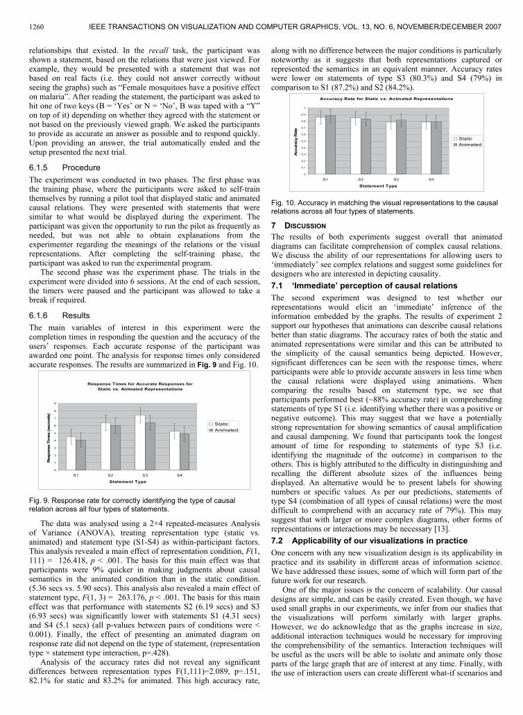
along with no difference between the major conditions is particularlynoteworthy as it suggests that both representations captured or represented the semantics in an equivalent manner. Accuracy rateswere lower on statements of type S3 (80.3%) and S4 (79%) in comparison to S1 (87.2%) and S2 (84.2%).
Accuracy Rate for Static vs. Animated Representations
0
0.1
0.2
0.3
0.4
0.5
0.6
0.7
0.8
0.9
1
S1 S2 S3 S4
Statement Type
Acc
urac
y R
ate
StaticAnimated
Fig. 10. Accuracy in matching the visual representations to the causal relations across all four types of statements.
7 DISCUSSIONThe results of both experiments suggest overall that animateddiagrams can facilitate comprehension of complex causal relations.We discuss the ability of our representations for allowing users to ‘immediately’ see complex relations and suggest some guidelines fordesigners who are interested in depicting causality.7.1 ‘Immediate’ perception of causal relationsThe second experiment was designed to test whether our representations would elicit an ‘immediate’ inference of theinformation embedded by the graphs. The results of experiment 2 support our hypotheses that animations can describe causal relationsbetter than static diagrams. The accuracy rates of both the static andanimated representations were similar and this can be attributed to the simplicity of the causal semantics being depicted. However,significant differences can be seen with the response times, where participants were able to provide accurate answers in less time whenthe causal relations were displayed using animations. When comparing the results based on statement type, we see that participants performed best (~88% accuracy rate) in comprehendingstatements of type S1 (i.e. identifying whether there was a positive or negative outcome). This may suggest that we have a potentially strong representation for showing semantics of causal amplification and causal dampening. We found that participants took the longest amount of time for responding to statements of type S3 (i.e.identifying the magnitude of the outcome) in comparison to the others. This is highly attributed to the difficulty in distinguishing andrecalling the different absolute sizes of the influences being displayed. An alternative would be to present labels for showing numbers or specific values. As per our predictions, statements of type S4 (combination of all types of causal relations) were the most difficult to comprehend with an accuracy rate of 79%). This maysuggest that with larger or more complex diagrams, other forms of representations or interactions may be necessary [13].7.2 Applicability of our visualizations in practice One concern with any new visualization design is its applicability inpractice and its usability in different areas of information science.We have addressed these issues, some of which will form part of thefuture work for our research.
One of the major issues is the concern of scalability. Our causaldesigns are simple, and can be easily created. Even though, we haveused small graphs in our experiments, we infer from our studies thatthe visualizations will perform similarly with larger graphs.However, we do acknowledge that as the graphs increase in size, additional interaction techniques would be necessary for improvingthe comprehensibility of the semantics. Interaction techniques willbe useful as the users will be able to isolate and animate only thoseparts of the large graph that are of interest at any time. Finally, withthe use of interaction users can create different what-if scenarios and
IEEE TRANSACTIONS ON VISUALIZATION AND COMPUTER GRAPHICS, VOL. 13, NO. 6, NOVEMBER/DECEMBER 20071260
view the effects in the causal graphs. Several application areas will also benefit from our
visualizations. In the medical and pharmaceutical fields, the animations can be used in radio therapy, surgery, and in drug research to visualize the effects of medication on diseases. In the educational field, the animations can be used in the form of educational games in children’s hospitals to educate the children on how to control symptoms of their diseases. In computer science, the visualizations can be used to show program structures, timelines, workload division, and system by-products. In general, causal semantics are applicable to numerous daily activities. Our visualizations are simple but powerful enough to capture some of the more complex semantics that are encountered on a regular basis. 7.3 Recommendations to designers Based on our findings we provide several recommendations:
Animated representations based on Michotte’s rules for perceiving causality can assist in showing complex causal relationships. In particular accurate spatio-temporal rules should be utilized in the construction of animated causal graphs.
In the absence or impracticality of displaying animated representations, static graphs that can accurately contain and depict an equivalent amount of information as the animated graphs, can be constructed.
Semantics of causal amplification and dampening can be accurately captured by increasing or shrinking the nodes representing the causal outcomes.
Causal multiplicity and causal strength need to be carefully designed to avoid possible ambiguities.
8 CONCLUSIONThis paper reports on the construction and evaluation of visual semantics that enhance information content in causal diagrams. Our representations are based on perceptual rules for recognizing causal occurrences, as suggested by Michotte and Thinés [7]. In this study we have short-listed some commonly encountered causal events, and have created static and animated visual semantics to represent them.
In two experiments we study and compare the effects of our novel designs. In the first experiment we study the causal relationships for their influence and efficiency in memory recall situations. In our experiment we created several arbitrary causal situations and tested the ability of participants to recall the semantics with and without visual aids. The results of our study show that accuracy rates did not improve significantly when the causal passages were complemented with static diagrams; the reasons mainly attributed to limitations of colour and on-screen clutter. However, the results showed that the accuracy rates increased by 8% over the passage-only condition and by 10% over the passage + static condition, when the passages were supplemented with animations. We believe that the spatiotemporal properties of animation can enhance information content and improve comprehension of complex causal relations.
In a second study we evaluate the ‘immediacy’ of perceiving causal relationships. We compare users’ ability to understand and match, without training, the visual representations to the correct causal statements. Our results show that participants are 9% faster with the animated representations than with the static graphs. Our results also show that participants were equally accurate with both types of representations, suggesting that both designs are informationally equivalent.
The study reported in this paper constitutes the first step in identifying whether animations based on perceptual theories of causality are effective for showing complex causal relationships. In future work we will explore the scalability of our representations to larger datasets, will identify and create semantics for more causal events such as causal transitivity and threshold causality, and evaluate our representations with real-world data.
ACKNOWLEDGEMENTSWe acknowledge NSERC for supporting this research.
REFERENCES[1] http://www.toledo-bend.com/colorblind/Ishihara.html[2] D. G. Boyle. The concept of radius of action in the causal impression.
British Journal of Psychology, British Psychological Society, Leicester, UK, 52, pp. 219-226, 1961.
[3] H. Choi, and B. J. Scholl. Effects of grouping and attention on the perception of causality. Perception & Psychophysics, Psychonomic Society, Austin, TX, 66(6), pp. 926-942, 2004.
[4] N. Elmqvist and P. Tsigas. Causality Visualization Using Animated Growing Polygons, IEEE Symposium on Information Visualization, pp. 24, 2003.
[5] N. Elmqvist, and P. Tsigas. Animated visualization of causal relations through growing 2D geometry. Information Visualization, Palgrave Macmillian, Hampshire, UK, 3(3), pp. 154-172, 2004.
[6] M. Lombardi, R. C. Hobbs, and J. Richards. Mark Lombardi: Global Networks. Independent Curators, New York, USA, 2003.
[7] A. Michotte, and G. Thinés. La Causalité perceptive (Translated by Thinés, G., Costall, A., and Butterworth, G.), Journal de Psychologie Normale et Pathologique, Presses universitaires de France, Paris, France, 60, pp. 9-36, 1963.
[8] J. B. Morrison, and B. Tversky. The (in)effectiveness of animation in instruction, In CHI '01 extended abstracts on Human factors in computing systems, pp. 377-378, 2001.
[9] E. Neufeld, S. K. Kristtorn, Q. Guan, M. Sanscartier, and C. Ware. Exploring causal influences, SPIE Conference on Visualization and Data analysis, 5669, pp. 52-62, 2005.
[10] J. F. Pane, A. T. Corbett, and J. E. Bonnie. Assessing dynamics in computer-based instruction, In Proceedings of the SIGCHI conference on Human factors in computing systems, pp. 197-204, 1996.
[11] C. Rehn. A Definition of Data Consistency Using Event Lattices. Proceedings of the International Conference on Parallel and Distributed Processing Techniques and Applications, pp. 634-640, 2004.
[12] B. J. Scholl and K. Nakayama. Causal Capture: Contextual effects on the perception of causal events. Journal of Vision, Association for Research in Vision and Ophthalmology (ARVO), Rockville, MD, 1(3), pp. 476, 2001.
[13] J. T. Stasko. Animation in user interfaces: principles and techniques. In User interface Software, L. Bass and P. Dewan, Eds., John Wiley & Sons Inc., Hoboken, NJ, pp. 81-101, 1993.
[14] G. Thinés. Contribution à la théorie de la causalité perceptive: Nouvelles recherches sur l’effect entrainement (Contributions to the theory of perceived causality: New research on the entertaining effect). Louvain: Studia Psychologica, Publications Universities de Louvain, Louvain, Belgium, 1962.
[15] B. Tversky, J. B. Morrison, and M. Betrancourt. Animation: can it facilitate? International Journal of Human-Computer Studies,Academic Press, Burlington, MA, 57, pp. 247-262, 2002.
[16] L. Tweedie, B. Spence, H. Dawkes, and H. Su. The influence explorer. In Conference Companion on Human Factors in Computing Systems,pp. 129-130, 1995.
[17] L. Viennot. Parallel N-free Order Recognition. Theoretical Computer Science, Elsevier Inc., Atlanta, GA, 175 (2), pp. 393-406, 1997.
[18] M. Veltman. Diagrammatica: The Path to Feynman Diagrams (Cambridge Lecture Notes in Physics), Cambridge University Press, Cambridge, UK, 2001.
[19] C. Ware, E. Neufeld, and L. Bartram. Visualizing Causal Relations, IEEE Symposium on Information Visualization: Late Breaking Hot Topics, pp. 39-42, 1999.
[20] M. Yela. La nature du ‘rayon action’ dans impression de causalité méchanique (The nature of the ‘radius of action’ in the impression of mechanical causality). Journal de Psychologie Normale et Pathologique, Presses universitaires de France, Paris, France, 51, pp. 330-348, 1954.
[21] J. D. Zapata-Rivera, E. Neufeld, and J. Greer. Visualization of Bayesian Belief Networks. IEEE Symposium on Visualization: Late Breaking Hot Topics Proceedings, pp. 85-88, 1999.
KADABA ET AL: VISUALIZING CAUSAL SEMANTICS USING ANIMATIONS 1261