Visualizing Attribution in Living Color
38
#SMX #21C1 @minderwinter Charles Midwinter, Collegis Education Visualizing Attribution in Living Color
-
Upload
search-marketing-expo-smx -
Category
Data & Analytics
-
view
303 -
download
1
Transcript of Visualizing Attribution in Living Color
#SMX #21C1 @minderwinter
Charles Midwinter, Collegis Education
Visualizing Attributionin Living Color

#SMX #21C1 @minderwinter
When multiple channels or tactics assist with a conversion, an attribution model is the set of rules we use to “attribute” portions of the conversion to each assisting touch-point.
But you already knew that…
What is Attribution (review, obviously)?

#SMX #21C1 @minderwinter
Last Interaction Last Non-direct Click Last AdWords Click First Interaction Linear Time Decay Position Based
Google Analytics Attribution Models

#SMX #21C1 @minderwinter
Almost anything is better than “Last Click,” but black boxes aren’t much better. No visibility on the details of the attribution
calculation Possible pitfalls with certain channels Too many groundless assumptions
required
The Problem with Out-of-the-Box Attribution Models
#SMX #21C1 @minderwinter
If you want to understand multi-channel attribution, the “multi-channel attribution funnel” reports in Google Analytics are your first stop. Take a look at the “top conversion paths”
report This is great information, but how to
summarize it at a high level?
Google Analytics & Channel/Tactic Interactions

#SMX #21C1 @minderwinter
The object that can summarize these conversion paths is called an “edge matrix.” Usually used for the analysis of networks
(eg. social networks) Encodes the connections among entities Can be visualized as a “node graph” with
open source software (Gephi)
Edge Matrices

#SMX #21C1 @minderwinter
Consider the following conversion paths: A > C > B > C A > B B > C
Edge Matrix Example 1/3

#SMX #21C1 @minderwinter
In words A
referred to C once referred to B once
B referred to C twice
C referred to B once
Edge Matrix Example 2/3

#SMX #21C1 @minderwinter
As an “Edge Matrix”
Edge Matrix Example 3/3
A B C
A 0 1 1
B 0 0 2
C 0 1 0

#SMX #21C1 @minderwinter
Just use my handy dandy Python script. Go to:
traffictheory.org/smx-2015 Download the script Make sure you have Python 2.7 installed
(not Python 3!) Follow the instructions at the URL above to
run.
MCF Top Conversion Paths to Edge Matrix

#SMX #21C1 @minderwinter
To visualize the “Edge Matrix” as a Node Graph, you’ll need Gephi, open source graph software.
Open the “edge_matrix.csv” file created by the Python script (see website for more details)
Import the “last_click.csv” file created by the Python script (see website for more details)
Turning an Edge Matrix into a Node Graph

#SMX #21C1 @minderwinter
How do we turn this spaghetti into something useful?
The Raw Node Graph

#SMX #21C1 @minderwinter
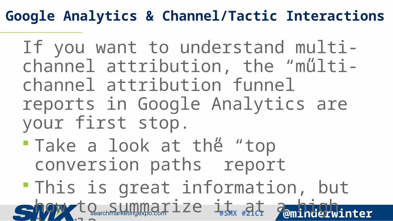
A layout algorithm uses the weights of the connections/edges to re-arrange the nodes.
Usually physics-based, involving a gravitation-like attraction that scales with the edge weights between nodes, and often a repulsion that separates weakly connected nodes.
Layout Algorithms
#SMX #21C1 @minderwinter
Nodes that refer to each other often are now placed close together in 2D space.
Two central communities of nodes are identifiable (“direct/(none)” and “google/organic”)
The Result of Layout Algorithm“Force Atlas 2”

#SMX #21C1 @minderwinter
To make this graph more useful, we’d like to map a metric to node size
The metric should give us some indication of the node’s importance to the conversion process
In order to proceed, we should understand a bit more about the node graph
Measuring Node Importance

#SMX #21C1 @minderwinter
Degree: the number of a node’s connections.
In-Degree: the number of a node’s incoming connections
Out-Degree: the number of a node’s out-going connections
Degree

#SMX #21C1 @minderwinter
A Degree = 2 In-Degree = 0 Out-Degree = 2
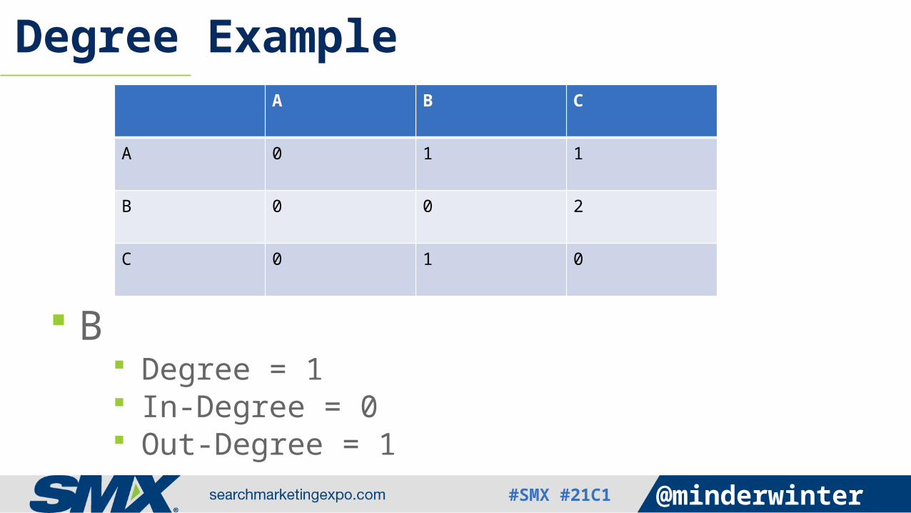
Degree ExampleA B C
A 0 1 1
B 0 0 2
C 0 1 0
#SMX #21C1 @minderwinter
B Degree = 1 In-Degree = 0 Out-Degree = 1
Degree ExampleA B C
A 0 1 1
B 0 0 2
C 0 1 0

#SMX #21C1 @minderwinter
Weighted Degree: the number of a node’s connections multiplied by their weights.
In-Degree: the number of a node’s incoming connections multiplied by their weights.
Out-Degree: the number of a node’s out-going connections multiplied by their weights.
Weighted Degree

#SMX #21C1 @minderwinter
B Weighted Degree = 2 In-Degree = 0 Out-Degree = 2
Weighted Degree ExampleA B C
A 0 1 1
B 0 0 2
C 0 1 0

#SMX #21C1 @minderwinter
The most important nodes are the ones generating incremental conversions
Conceptually, they generate a net output. A node that gets no in-bound connections, but has many out-
bound connections is a source of conversions, and should be highly valued.
A node that generates a lot of last-click conversions has value, but its net output should be adjusted so that in-bound connections are subtracted.
A node that has as many in-bound connections as it does last-click/out-bound connections is adding little value from an incremental perspective.
Assessing Node (Campaign or Source/Medium) Importance

#SMX #21C1 @minderwinter
(Weighted Out-degree + Last Click) – Weighted In-Degree
This metric gives us an indication of node importance from an incremental conversion perspective.
Net Output

#SMX #21C1 @minderwinter
Nodes that generate more incremental conversions are larger
Caveat: flawed tracking means this metric is far from perfect
Mapping “Net Output” to Node Size

#SMX #21C1 @minderwinter
Positioning tells us which nodes are closely connected, and size tells us how well nodes generate incremental conversions
It would also be nice to know how each node tends to assist in the conversion process: does it produce last clicks, or is it higher in the funnel?
Assessing Node Function

#SMX #21C1 @minderwinter
The lower a node is in the conversion funnel, the more last clicks it should have
The higher a node is in the funnel, the more likely it is to push traffic to other nodes (high weighted out-degree)
Funnel Position 1/2

#SMX #21C1 @minderwinter
Last Click / (Weighted Out-degree + Last Click) 0 for nodes with no last click 1 for nodes with all last click Varies from 0 to 1 as ratio of last click to
weighted out-degree increases
Funnel Position 2/2

#SMX #21C1 @minderwinter
Nodes high in the funnel are redder
Nodes lower in the funnel are bluer
In-between nodes are lighter in color, sometimes almost white.
Mapping Funnel Position to Node Color

#SMX #21C1 @minderwinter
The Final Result

#SMX #21C1 @minderwinter
Proximity tells you how often channels interact
Color tells you a channel/campaign’s position in the funnel
Size tells you how many incremental conversions are likely generated by a channel/campaign
How to Interpret the Result

#SMX #21C1 @minderwinter
Identify “sinks” Sinks are blueish. These kinds of channels
are at the end of the conversion path
They are lynch pins in the network, fed by channels higher in the funnel
Overvalued by last click
Sinks

#SMX #21C1 @minderwinter
Identify “sources”: Reddish Tend to be earlier in
the conversion path Undervalued by last
click
Sources

#SMX #21C1 @minderwinter
Identify “assistors”: Pale, or sometimes
white Beware of small
assistors Tend to be midway in
the conversion path Undervalued by last
click, but can be overvalued by other models
Assistors

#SMX #21C1 @minderwinter
Display Retargeting Direct Buy Behavioral
Paid Search Branded Unbranded
Organic Search
Referral Social Direct
Source, Sink, or Assistor?

#SMX #21C1 @minderwinter
Display Retargeting (Assistor) Direct Buy (Source) Behavioral
(Source/Assistor)
Paid Search Branded (Sink) Unbranded
(Source/Assistor)
Organic Search (Assistor/Sink)
Referral (Source/Assistor)
Social (Assistor) Direct
(Assistor/Sink)
Source, Sink, or Assistor?

#SMX #21C1 @minderwinter
Depending on your sales cycle, channels & campaigns may function differently in the conversion funnel
Results May Vary

#SMX #21C1 @minderwinter
Nodes with little visibility are hard to interpret:
Organic: because of (not provided), its a mix of branded and unbranded. Its “Funnel Position” will be determined by the strength of your brand and the amount of unbranded organic traffic you receive.
Direct: can skew your results. We know it contains all kinds of poorly tracked traffic. Sometimes, I just go ahead and remove direct from the graph.
Caveats

#SMX #21C1 @minderwinter
Select an attribution model that fits your conversion process Sources are under valued by both last click
and time decay, for example. Identify outliers and understand what they
say about your mix (discover fraud) Use the visualization rhetorically to justify
budget for exposure tactics
How to Make This Actionable

#SMX #21C1 @minderwinter
THANK YOU!
Charles Midwinter
Associate Director of Marketing StrategyCollegis Education
traffictheory.org/smx-2015