Visualisation of Large Scale Data Sets
45
Visualisation of Large Scale Data Sets School of Computer Science and Software Engineering Monash University Bachelor of Computer Science Honours Clayton Campus Thesis – 2005 Visualisation of Large Scale Data Sets Roy Thomson 18352685 Supervisors: Dr. Jon McCormack & Prof. Michael Reeder -1-
Transcript of Visualisation of Large Scale Data Sets
Visualisation of Large Scale Data Sets
School of Computer Science and Software EngineeringMonash University
Bachelor of Computer Science HonoursClayton Campus
Thesis – 2005
Visualisation of Large Scale Data Sets
Roy Thomson 18352685
Supervisors: Dr. Jon McCormack & Prof. Michael Reeder
-1-
Visualisation of Large Scale Data Sets
© Copyright
by
Roy Thomson
2005
-2-

Visualisation of Large Scale Data Sets
Contents
List of Figures.............................................................................................................5
List of Tables.............................................................................................................. 7
Acknowledgements.....................................................................................................8
Abstract.......................................................................................................................9
Declaration of Originality.........................................................................................10
1 Introduction...............................................................................................................11
2 Prior Research...........................................................................................................132.1 Volume rendering and isosurface creation..................................................................... 132.2 Level of detail.................................................................................................................162.3 Shaders............................................................................................................................172.4 Colour and visual techniques..........................................................................................18
2.4.1 General visualisation rules...................................................................................................182.4.2 Realism................................................................................................................................ 19
2.5 Examples of visualisation tools...................................................................................... 212.5.1 AVS..................................................................................................................................... 212.5.2 Vis5d....................................................................................................................................222.5.3 Vis5d+................................................................................................................................. 222.5.4 Cave5d................................................................................................................................. 232.5.5 OpenGL Optimizer API.......................................................................................................232.5.6 Visualization Toolkit........................................................................................................... 23
3 The ‘Marvin’ Project.................................................................................................253.1 Libraries used in Marvin................................................................................................. 25
3.1.1 Formatting of the NetCDF Data Files................................................................................. 253.1.2 SDL as Marvin's Backbone................................................................................................. 27
3.2 Structures in Marvin........................................................................................................273.3 Time and Dimensionality in Marvin............................................................................... 283.4 The Viewing Mechanisms...............................................................................................29
3.4.1 Height Maps.........................................................................................................................29
-3-

Visualisation of Large Scale Data Sets
3.4.2 Vector as Arrows................................................................................................................. 303.4.3 Isosurfaces........................................................................................................................... 31
4 Experimentation and Findings.................................................................................. 334.1 Problems found during the creation of Marvin............................................................... 33
4.1.1 Isosurface generation using marching algorithms............................................................... 334.1.2 Multiple files for multiple time steps...................................................................................334.1.3 Timing issues with display lists...........................................................................................33
4.2 Using Marvin for meteorological analysis......................................................................344.2.1 Height maps.........................................................................................................................344.2.2 Vector Displays................................................................................................................... 354.2.3 Isosurfaces........................................................................................................................... 37
5 Conclusions and Future Research.............................................................................395.1 Review.............................................................................................................................395.2 Further Research............................................................................................................. 39
Appendix A Revised Specification of Deliverables....................................................... 41Appendix B Clarification of Original Contribution........................................................42
References.......................................................................................................................43
-4-
Visualisation of Large Scale Data Sets
List of Figures
Figure 1: Weather Research and Forecasting (WRF) Information Flow Diagram..................... 12
Figure 2: Comparison between sliced information and volume rendered information using data of the likelihood of Cu-Au deposits in Mt. Milligan....................................................................... 13
Figure 3: Examples of volume rendering (a) and isosurface (b) representation..........................14
Figure 4: Triangles created for each cube permutation......................................................................15
Figure 5a-b: Triangle creation using the adaptive marching triangles algorithm........................15
Figure 6: ROAM level-of-detail triangle splitting with the viewpoint looking along the overlaid arrow............................................................................................................................................ 16
Figure 7a-d: Display of single variable information of temperature (a) and humidity (b) and multi-variable display of temperature to colour/humidity to opacity (c) and vice versa (d).......19
Figure 8a-c: An unmodified isosurface (a), the same isosurface after method 1 was applied (b) and a refined isosurface with transparency and lighting applied.................................................20
Figure 9: An example of cloud generated by Dobashi et al.'s algorithm.....................................21
Figure 10: Vis5d screenshot, volume rendering of wind speed over North America................. 22
Figure 11: Frame structure in graphical form..............................................................................27
Figure 12: User Interface mode in Marvin.......................................................................................28
Figure 13: A height map with overlaid regional texture steps............................................................30
Figure 14: Vectors visualised as arrows.......................................................................................... 31
Figure 15: An isosurface displayed in Marvin................................................................................. 32
Figure 16: Cold front along the coast south of Sydney on the day of the Canberra bush fires...............34
Figure 17: Cold front moving inland on the day of the Canberra bush fires........................................35
-5-

Visualisation of Large Scale Data Sets
Figure 18: Cold front shown by vector field.................................................................................... 36
Figure 19: Cold front and coastal winds shown by vector field......................................................... 36
Figure 20a-d: Progress of offshore moisture on the day of the Canberra bush fires............................. 37
-6-

Visualisation of Large Scale Data Sets
List of Tables
Table 1: Core Dimension Names in test data sets....................................................................... 26
Table 2: Example of variables with dependant dimensions........................................................ 26
Table 3: Example attributes for corresponding variables............................................................ 26
-7-
Visualisation of Large Scale Data Sets
Visualisation of Large Scale Data Sets
Acknowledgements
I wish to acknowledge the efforts of Dr. Jon McCormack and Prof. Michael Reeder in supervising this thesis. Their insights and patient explanations have very much been appreciated. I would also like to acknowledge the patience, devotion and encouragement of my wife, Lisa. Finally, I would like to acknowledge the origin of the project name, Marvin, to Mark Saward in the humourous conversation epitomised by the line, ‘I have the brain the size of this room and you want me to visualise weather!’
-8-
Visualisation of Large Scale Data Sets
Visualisation of Large Scale Data Sets
Monash University, 2005
Supervisors:
Dr. Jon [email protected]
Prof. Michael [email protected]
Abstract
The creation of meteorological visualisation tools draws upon a large range of areas within computer science. Displaying large quantities of data is easy; however, displaying that same data in a meaningful way so that it is easily manipulated by the user and runs at a reasonable speed is quite difficult. This thesis creates a new meteorological tool that gives greater flexibility to the user and still runs animations in real-time. It uses openGL primitives to draw geometry, display lists to reduce computation costs and help manage memory management, and SDL interrupts to handle keyboard and mouse inputs a new meteorological tool can be created that gives great flexibility to the user and still runs animations in real-time.
The meteorological tool created, called Marvin, is presented in this paper as a user driven aid for visualising data sets in NetCDF format. Marvin is also evidence that complex data structures, such as isosurfaces, do not need to be precalculated for real-time visualisation.
This document is intended to be read with the accompanying video files found on the CD presented with this thesis or on the website where this document is stored.
-9-
Visualisation of Large Scale Data Sets
Visualisation of Large Scale Data Sets
Declaration of Originality
I, Roy Thomson, declare that this thesis is my own work and has not been submitted in any form for another degree or diploma at any university or other tertiary education institute. Information derived from published and unpublished work of others has been acknowledged in the text and a list of references is given in the bibliography.
...........................................Roy Thomson
...........................................Date
-10-
Visualisation of Large Scale Data Sets
Chapter 1
Introduction
Weather has been studied for thousands of years in an attempt to predict timing of seasonal changes for agriculture. However, only in the last hundred years, has the study of weather evolved to establishing an understanding of the inherent physical processes behind the large-scale phenomena that can be seen. The use of numerical analysis aided by computer technology has been pivotal in the understanding of these processes. Computers have proven to be a powerful tool, both for numerical analysis and for reconstruction of collected and simulated data in the form of visualisation (Papathomas, et al. 1988). One advantage of visualisation tools is their ability to highlight essential phenomena in a numeric solution which can lead to better understanding of the processes in the real world (Zabusky, 1984). Another use of visualisation tools is in communication and teaching since complex models are difficult to present on paper. Interactive visualisation tools can communicate meaning and understanding more easily (DeFanti, et al. 1989).
Historically, the use of computers in meteorological study has depended on the amount of information collected by observations, such as those by weather stations. Devices like radiosonde, a radio equipped observation balloon, and airborne radar systems have permitted more accurate and more numerous observations. The demand for and use of more complex computer visualisation tools has increased due to improved measurements (Papathomas, et al. 1988). In parallel to the increase in observations, numerical models and simulations of meteorological processes have become larger and more complex, increasing further the demand for modern computer visualisation tools further.
As the need for these tools increases so too does the advances in graphical computing as well as the number of publications on what makes a good visualisation tool. Chapter two compares visualisation algorithms and ideas in current literature, concluding with the techniques that are most suitable for use in a new visualisation tool that focuses on three aspects: animation, clarity of the data displayed, and modifiability during execution. Given these aspects, it was apparent that processing efficiency, flexibility in representation, and intuitive visual schemes are important topics to discuss. Each of these are covered in chapter two.
This thesis presents a modern real-time meteorological visualisation tool which converts data from datasets in NetCDF format, detailed in Chapter three, into three-dimensional animations. This tool focuses on output of a simulation program called the Weather Research and Forecasting (WRF) model. The WRF Model is a three-dimensional, finite element numerical simulation program which takes an initial state and simulates meteorological processes to determine each future state. The processes simulated include formation of:
-11-
Visualisation of Large Scale Data Sets
- supercell thunderstorms, that is thunderstorms with a deep rotating updraft- squall lines, a row of thunderstorms with similar lifting characteristics and- baroclinic waves, which are precursors to cyclones.
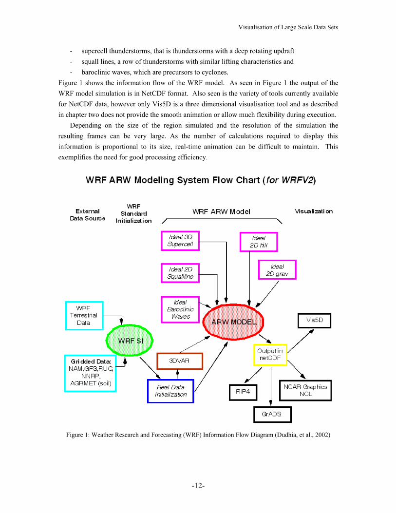
Figure 1 shows the information flow of the WRF model. As seen in Figure 1 the output of the WRF model simulation is in NetCDF format. Also seen is the variety of tools currently available for NetCDF data, however only Vis5D is a three dimensional visualisation tool and as described in chapter two does not provide the smooth animation or allow much flexibility during execution.
Depending on the size of the region simulated and the resolution of the simulation the resulting frames can be very large. As the number of calculations required to display this information is proportional to its size, real-time animation can be difficult to maintain. This exemplifies the need for good processing efficiency.
Figure 1: Weather Research and Forecasting (WRF) Information Flow Diagram (Dudhia, et al., 2002)
-12-
Visualisation of Large Scale Data Sets
Chapter 2
Prior Research
As indicated earlier, this chapter reviews literature on visualisation methods and finally discusses current visualisation tools. Beginning with efficiency issues in visualisation tools this chapter evaluates algorithms and ideas about visualisation methods, techniques to reduce geometric detail without information loss, colour schemes and realism in animations.
2.1 Volume rendering and isosurface creation
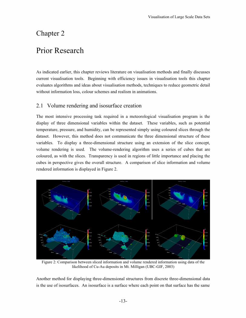
The most intensive processing task required in a meteorological visualisation program is the display of three dimensional variables within the dataset. These variables, such as potential temperature, pressure, and humidity, can be represented simply using coloured slices through the dataset. However, this method does not communicate the three dimensional structure of these variables. To display a three-dimensional structure using an extension of the slice concept, volume rendering is used. The volume-rendering algorithm uses a series of cubes that are coloured, as with the slices. Transparency is used in regions of little importance and placing the cubes in perspective gives the overall structure. A comparison of slice information and volume rendered information is displayed in Figure 2.
Figure 2: Comparison between sliced information and volume rendered information using data of the likelihood of Cu-Au deposits in Mt. Milligan (UBC-GIF, 2003)
Another method for displaying three-dimensional structures from discrete three-dimensional data is the use of isosurfaces. An isosurface is a surface where each point on that surface has the same
-13-

Visualisation of Large Scale Data Sets
value for the given variable, similar to a contour line on a map but in three dimensions. An example of a natural isosurface in meteorology is a cloud, which is an isosurface of humidity of approximately 95%. Figure 3 shows an isosurface and compares it to a volume rendering. Fuchs, et al. worked on the creation of these surfaces, though the term isosurface was not used, from the slices described earlier (Fuchs, et al. 1977). Their reconstruction algorithm found optimal surfaces between adjacent contour slices by using graph theory.
a. b.Figure 3: Examples of volume rendering (a) and isosurface (b) representation (Pfenning, 2003)
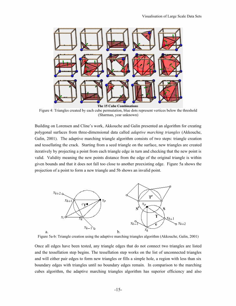
Ten years later, Lorensen and Cline developed an algorithm for constructing isosurfaces from a three-dimensional array of data, this they called marching cubes (Lorensen, Cline, 1987). They describe the marching cubes algorithm as first stepping through the data in cubes, each vertex being a unit distance from three other points on the cube. Then assigning to each vertex a binary value as to whether the vertex is above the variable’s threshold or not. This binary three-dimensional data is then converted into a series of triangles that construct the surface using the unit cubes within the data. Each cube creates between one and four triangles for the surface corresponding to the binary layout. Figure 4 shows the permutations of possible triangle arrangements.
Finally for each triangle the normal is calculated to implement lighting of the surface to emphasize detail. The main advantage of working in cubes is that only cubes adjacent to cubes with triangles in them need to be processed, as any cube with a connecting face that is entirely above or below the threshold can be assumed to be entirely inside or outside the surface. Unlike Fuchs, et al.’s method of surface creation, the marching cubes method can create vertices between slices which leads to a more accurate representation of the overall three dimensional structure.
-14-
Visualisation of Large Scale Data Sets
Figure 4: Triangles created by each cube permutation, blue dots represent vertices below the threshold (Sharman, year unknown)
Building on Lorensen and Cline’s work, Akkouche and Galin presented an algorithm for creating polygonal surfaces from three-dimensional data called adaptive marching triangles (Akkouche, Galin, 2001). The adaptive marching triangle algorithm consists of two steps: triangle creation and tessellating the crack. Starting from a seed triangle on the surface, new triangles are created iteratively by projecting a point from each triangle edge in turn and checking that the new point is valid. Validity meaning the new points distance from the edge of the original triangle is within given bounds and that it does not fall too close to another preexisting edge. Figure 5a shows the projection of a point to form a new triangle and 5b shows an invalid point.
a. b.Figure 5a-b: Triangle creation using the adaptive marching triangles algorithm (Akkouche, Galin, 2001)
Once all edges have been tested, any triangle edges that do not connect two triangles are listed and the tessellation step begins. The tessellation step works on the list of unconnected triangles and will either pair edges to form new triangles or fills a simple hole, a region with less than six boundary edges with triangles until no boundary edges remain. In comparison to the marching cubes algorithm, the adaptive marching triangles algorithm has superior efficiency and also
-15-
Visualisation of Large Scale Data Sets
reduces the number of vertices created, which decreases display time. Unfortunately, both marching algorithm’s efficiencies rely on the ability to ignore large regions of the three dimensional space due to their ability to ‘march’ along the surface. This is a problem when multiple surfaces are present in the dataset as both algorithms will find one surface and ignore the rest. One variant of marching cubes does not use the ‘marching’ part of the algorithm and this was used for the creation of the new visualisation tool.
2.2 Level of detail
Level-of-detail algorithms also improve efficiency by removing detail from a scene. Typical level-of-detail algorithms work on an object basis, for instance removing detail from a vehicle or building. Multiple representations of a single object are often used, displaying the less detailed versions when that object’s detail is not noticeable, such as when the object is far away, or when the object is unimportant (Seo, et al. 1999). In the case of isosurfaces of the scale proposed in this thesis, a single level of detail value would not suffice as some sections of the isosurface can be close to the viewpoint while others far. Thus both high detail, where the isosurface is close to the viewport and detail can be seen, and low detail, where the isosurface is far from the viewpoint and detail is not required, are required of the same object.
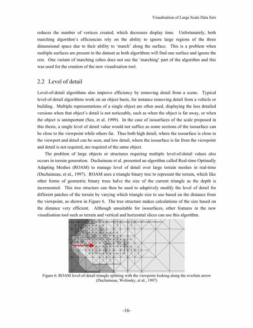
The problem of large objects or structures requiring multiple level-of-detail values also occurs in terrain generation. Duchaineau et al. presented an algorithm called Real-time Optimally Adapting Meshes (ROAM) to manage level of detail over large terrain meshes in real-time (Duchaineau, et al., 1997). ROAM uses a triangle binary tree to represent the terrain, which like other forms of geometric binary trees halve the size of the current triangle as the depth is incremented. This tree structure can then be used to adaptively modify the level of detail for different patches of the terrain by varying which triangle size to use based on the distance from the viewpoint, as shown in Figure 6. The tree structure makes calculations of the size based on the distance very efficient. Although unsuitable for isosurfaces, other features in the new visualisation tool such as terrain and vertical and horizontal slices can use this algorithm.
Figure 6: ROAM level-of-detail triangle splitting with the viewpoint looking along the overlain arrow (Duchaineau, Wolinsky, et al., 1997)
-16-
Visualisation of Large Scale Data Sets
To increase the effectiveness of geometric level-of-detail, texturing algorithms can be used in conjunction with lower threshold distances for reducing geometric detail. Bump mapping, which perturbs the surface normal at individual pixel values causing simulated irregularities on a surface, is such a method (Blinn, 1978). This reduces the processing required for geometric display at the cost of additional texture calculations. A problem with this concept is that the change between textures at the level of detail change can be noticeable. Simmons and Shreiner present a solution to this problem (Simmons, Shreiner, 2003). Their solution smoothly transitions between different level-of-detail textures by using the sampling rate on a per pixel basis and using shaders to blend the textures. The level-of-detail parameter is replaced by a query of the blended MIP-mapped texture.
2.3 Shaders
Another method for increasing efficiency is to divide the processing workload over multiple processors. This concept was shown by Chen in 1990 in a case study comparing linked supercomputers creating animations of meteorological data (Chen, 1990). Chen developed and ran this study comparing two linked systems. The first system linked a JPL CRAY XMP/18 used for object rendering and frame generation and some workstations for image previewing and video recording. The second system used the JPL CRAY for creating object geometry with a Stardent GS2000 supercomputer used for rendering and animation. Chen found that the first system was unbalanced in its processing as the CRAY needed 20 minutes to produce a frame whilst the frame was recorded in 2 minutes. In the second system the limiting factors were found to be the Stardent GS2000’s memory and the requirement of the Application Visualization System (AVS) to load all frames to be animated into memory at once. This system however could render a frame in under a minute and record it in about 15 seconds making interactive visualisation possible. Chen’s results are utilised in the use of modern graphics cards with a distribution of calculation and rendering processing between the CPU and graphical processing unit. It is important to note the distribution of tasks needs to be balanced to maintain optimal processing times.
Recent graphic cards also implement programmable shaders, such as those presented by Hanrahan and Lawson, which allow more flexibility in the distribution of processing (Hanrahan, Lawson, 1990). To utilise this feature for real-time purposes, a number of shading languages have been produced, such as OpenGL Shader Language (Kessenich, et al. 2003), NVIDIA Cg Toolkit (Mark, et al. 2003), RenderMonkey Toolsuite (ATI, 2003), and DirectX High-Level Shader Language (Microsoft, 2002). Only company affiliated literature detailing a comparison of these languages was found. Thus, for simplicity the OpenGL Shader Language was the preferred choice for this project as it is built into recent OpenGL libraries, which are already being used for the Simple DirectMedia Layer (SDL) Library (Lantinga, 1999). The SDL Library was chosen
-17-
Visualisation of Large Scale Data Sets
because it is an additional layer of abstraction that simplifies window management and input/output interrupts while maintaining portability.
Combining level of detail concepts and the area of programmable shaders, Olano, et al. presented a concept called automatic shader level of detail (Olano, et al. 2003). This concept uses compiler style simplifications, such as peephole optimisation, which replaces patterns of code with simpler code, and geometric simplifications to create multiple variations of shader scripts. An automatic level of detail variable is then used based on a function of any conceivable variable such as frames per second or distance from viewer. This concept enables simplified displays to be viewed on less powerful machines as well as increasing efficiency of large scenes.
2.4 Colour and visual techniques
2.4.1 General visualisation rules
As important as the problem of efficiency in a visualisation tool is, so too is the method of displaying information to highlight important features in a dataset. Thus it is important to balance the design of a new visualisation tool to encompass both of these techniques. To this end, (Zabusky, 1984) postulated that in graphical visualisation the numbers of displayed attributes is important. A viewer can be confused by too many attributes due to information clutter or can be disappointed that insufficient information is present, a balance must be preserved or ideally the user can specify the number and type of features present. Zabusky then describes the use of colour in visualisation as both area filling and a detail-emphasizer and as such both draws the viewer’s focus to gross structures or to gradients. Zabusky postulated that a mixture of both would be useful in visualisation. Other important aspects of visualisation Zabusky mentions are the ability to display the movement of extrema in one, two or three dimensional space, the ability to show spatial and temporal correlations of these extrema and the ability to retain or save the findings from what was visualised for further comparison and study.
Further analysis of colour and data representation has shown that to effectively communicate information the number of variables to be presented is less important than the density and layout of the information in a given area (Tufte, 1990). Tufte also examined the use of bright colours in close proximity and found that it is better to have only a few bright colours to represent extremes with the remaining colours of naturally occurring colours, such as those found in nature. A comparison of levels of shades representing a continuous spectrum was also analysed and it was found that similar shaded regions can be hard for the human eye to differentiate without the aid of contour lines to highlight boundaries between specific shaded regions. This is used in a number of computer science regions such as image compression with algorithms like JPEG compression.
Later Tufte revisited data visualisation (Tufte, 1997). Specifically Tufte comments on the lack of scales or appropriate labeling in the majority of scientific visualisation. Tufte also found that many scientific visualisations highlighted main features inadequately and highlighted less
-18-

Visualisation of Large Scale Data Sets
important features, such as reference grids, instead. It is the intention of this project to implement Tufte’s suggestions for good visualisation practices.
Kniss and Hansen showed that representing multivariate information concurrently can highlight meteorological features that are not visible when displaying the individual variables (Kniss, Hansen, 2002). By using multi-dimensional transfer functions on a set of North American satellite images the combined value for temperature and humidity shows frontal activity which was not obvious in the individual temperature and humidity images. This method was compared to using colour to represent one variable and opacity the other and the multivariate method was preferred, as shown in Figure 7. A proposed extension to this project is the implementation of this concept by enabling the user to specify new variables as a function of multiple original variables, leading also to greater flexibility for the user.
a. b.
c. d.Figure 7a-d: Display of single variable information of temperature (a) and humidity (b) and multi-variable
display of temperature to colour/humidity to opacity (c) and vice versa (d) (Kniss & Hensen, 2002)
2.4.2 Realism
Papathomas et al. briefly touched upon the issues of important features or techniques required in good visualisation in the field of meteorology (Papathomas, et al. 1988). They concluded that features of importance include quick methods of displaying realistic clouds including depth perception and motion/animation in the final display. As the step size in data sets are generally too large to show the intricacies of cloud boundaries, some form of information, which is not in
-19-

Visualisation of Large Scale Data Sets
the original data, must be added to show realistic clouds. Hence, there is a trade of between realism and accuracy to the data.
As isosurfaces are often too smooth for realistic clouds, due to large step sizes, Trembilski presented two methods for creating realistic clouds from isosurfaces as well as a means for realistic lighting of those clouds (Trembilski, 2000). The first method for modifying an isosurface into a triangle mesh for realistic clouds is a simple distortion algorithm similar to terrain generation in fractal landscapes. This method takes each original triangle and distorts the midpoint along each edge by a random amount proportional to the edge’s length. This is then repeated for the new triangles up to three or four times, in order to create enough variation for realistic looking clouds. The second method for creating realistic clouds creates two additional isosurface copies of the original and then each of these isosurfaces is distorted randomly using Brownian particle movement. Each isosurface is given a transparency factor proportional to the difference between original and distorted isosurfaces. This effect gives a transition between the cloud and the surrounding air. The lighting method presented sets a luminance value for each triangle proportional to the number of intersections between its location and the position or the sun in the simulation. This is done using ray tracing between the triangle and the sun’s position which is not appropriate for real-time applications. Figure 8 shows the results of using these techniques.
a. b.
c.Figure 8: An unmodified isosurface (a), the same isosurface after method 1 was applied (b) and a refined
isosurface with transparency and lighting applied.
Another method for creating realistic clouds is based on a transparency or fog-like effect. Trembilski and Broβler presented an algorithm for calculating transparency of a cloud for use in television weather animations (Trembilski, Broβler, 2002). This algorithm uses rays that emit from the viewer through a cloud to determine the opacity of the resulting pixel. Two additions are made to the standard hardware approach, which calculates pixel opacity as hardware-interpolated texture opacity multiplied by the vertex opacity. First, the pixel opacity is also dependant on the depth into a cloud, which gives more realistic representation of edges of a cloud. However this was found to cause problems with animations of rotation around clouds.
-20-
Visualisation of Large Scale Data Sets
The second addition suppresses this problem by weighting the vertex opacity by a trigonometric function of the rotation angle. These additions enabled rendering times of between two and seven seconds for between 18,000 and 104,000 triangles. As animation requires rendering times of 0.04 seconds per frame this technique is inappropriate for this project unless faster processors are used.
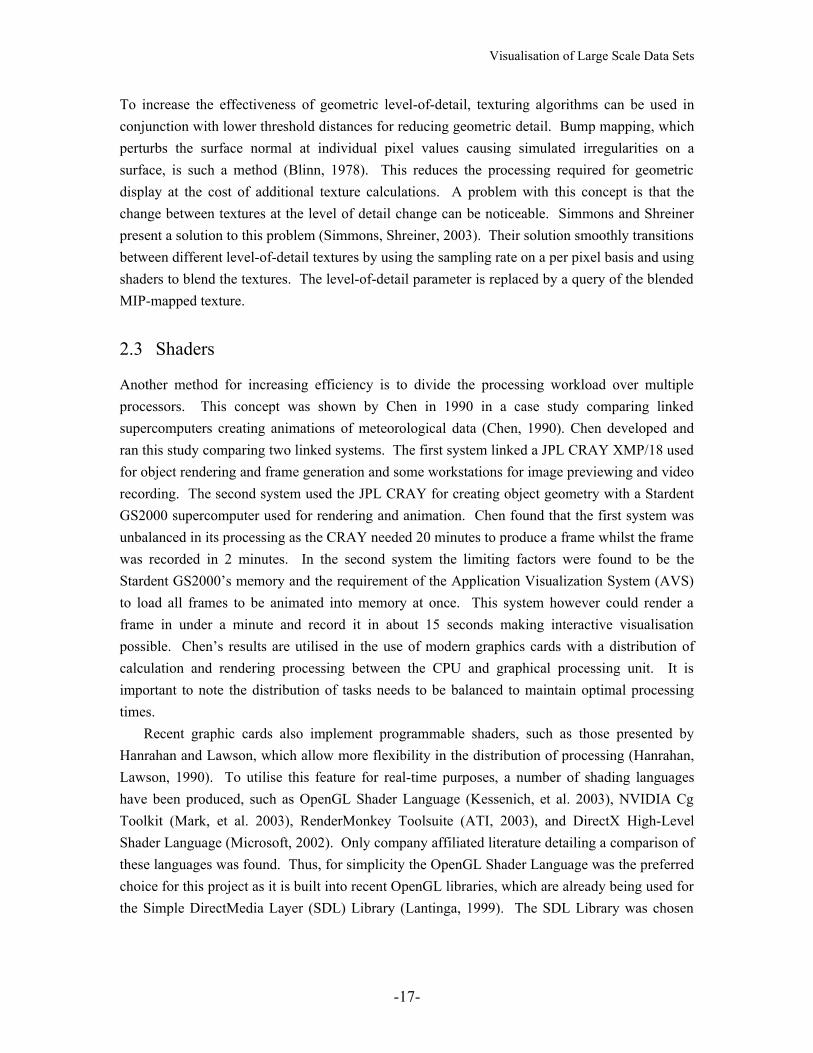
In 2000, Dobashi et al. described a method for real-time generation of realistic clouds based on the use of billboard textures (Dobashi, et al., 2000). The algorithm uses voxels within the dataset such as those used for volume rendering and applies a smoothing across the dataset to calculate the density of cloud within each voxel. This density distribution is then expressed as a set of metaballs which can be replaced by density billboard textures perpendicular to the line of vision. A ray tracing through these billboards will then accurately calculate the density of cloud passed through with greatly reduced calculations. This is a proposed extension to the Marvin project. An example of Dobashi et al.’s algorithm is shown in Figure 9.
Figure 9: An example of cloud generated by Dobashi et al.’s algorithm (Dobashi, et al. 2000)
2.5 Examples of visualisation tools
This section of chapter two describes various visualisation tools currently used for meteorological visualisation. Each tool’s description concludes with the reason why it is did not fit the specifications for this project, as outlined earlier.
2.5.1 AVS
Upson et al. developed the Application Visualization System (AVS), which was designed to provide an easily modifiable platform for any type of scientific visualisation (Upson, et al., 1989). They started with a set of primary goals based on five aspects: Ease of use, Low cost, Completeness, Extensibility and Portability. Then, using the concept of a visualisation cycle consisting of filtering, mapping and rendering phases, they developed a series of interchangeable modules for the application of the above steps in the visualisation cycle. Each module was designed to be a source, transformation or terminal module and dealt with one specific scientific data manipulation or input/output device. The AVS model provides the module interaction
-21-
Visualisation of Large Scale Data Sets
interface, a set of primary modules, a graphical user interface to help interlink the modules and it facilitates the development of custom-built modules that can be added into the model for specific requirements. As indicated by Upson et al. the primary focus of the AVS model is to be flexible for use in a large variety of scientific and engineering problems. AVS is only commercially available.
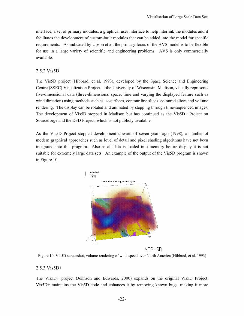
2.5.2 Vis5D
The Vis5D project (Hibbard, et al. 1993), developed by the Space Science and Engineering Centre (SSEC) Visualization Project at the University of Wisconsin, Madison, visually represents five-dimensional data (three-dimensional space, time and varying the displayed feature such as wind direction) using methods such as isosurfaces, contour line slices, coloured slices and volume rendering. The display can be rotated and animated by stepping through time-sequenced images. The development of Vis5D stopped in Madison but has continued as the Vis5D+ Project on Sourceforge and the D3D Project, which is not publicly available.
As the Vis5D Project stopped development upward of seven years ago (1998), a number of modern graphical approaches such as level of detail and pixel shading algorithms have not been integrated into this program. Also as all data is loaded into memory before display it is not suitable for extremely large data sets. An example of the output of the Vis5D program is shown in Figure 10.
Figure 10: Vis5D screenshot, volume rendering of wind speed over North America (Hibbard, et al. 1993)
2.5.3 Vis5D+
The Vis5D+ project (Johnson and Edwards, 2000) expands on the original Vis5D Project. Vis5D+ maintains the Vis5D code and enhances it by removing known bugs, making it more
-22-
Visualisation of Large Scale Data Sets
portable, less reliant on older utility programs and started to update the graphical user interface. Vis5D+ does not update the graphical approaches from the original used in Vis5D and has not been updated since 2001.
2.5.4 Cave5D
Based on the Vis5D program, Cave5D was developed by the SSEC Visualization Project specifically for virtual reality rooms but otherwise did not enhance upon the graphical approaches used. Cave5D 2.0 (Mickelson, S.A., 2001) updates the original to 64-bit and adds a few interactive features that allow a user to view segments of a simulation, toggle on and off a topographic map and modify the number of processors used. It is however only usable on mainframe computers, specifically those connected to a CAVE visualisation room.
2.5.5 OpenGL Volumizer API
Bhaniramka and Demange presented the OpenGL Volumizer API which provides high-level and extensible volume rending, shaders, large data management and multi-threading (Bhaniramka, Demange, 2002). Bhanirimka and Demange described the representation used by the OpenGL Volumizer as either volumetric or polygonal to which shaders can be used on a per pixel basic, using the graphics hardware separate to the computer processor, distributing the workload of the processors. The OpenGL Volumizer has support to render either volumetric or polygonal geometry by slicing it into multiple viewport-aligned planes. To increase speed the Volumizer uses multi-resolution volume rending or volume roaming, synonymous with level of detail and viewport culling respectively. The OpenGL Volumizer API is only commercially available. 2.5.6 Visualization Toolkit
Created in 1993 the Visualization Toolkit (VTK) was created as a higher level of abstraction to graphical rendering libraries like OpenGL or PEX (Martin, et al. 1993). VTK is open source and is designed for multiple platforms and languages such as C++, Tcl, Java and Python. VTK enables two and three dimensional rendering including volume rendering and surface reconstruction and rendering in addition to the same graphical primitives and lighting available in OpenGL. Level of detail is also incorporated in the toolkit and additional features such as motion blur and stereo projection are included. VTK is an example of a good visualisation tool and was the basis of the visualisation mechanisms used in this project. It, however, does not include shader programming and thus was not the primary rendering library used.
-23-

Visualisation of Large Scale Data Sets
-24-
Visualisation of Large Scale Data Sets
Chapter 3
The ‘Marvin’ Project
This thesis, dubbed The Marvin Project, focuses on the use of hardware implemented graphical techniques such as display lists to change meteorological visualisation from a static programmer-driven environment to a dynamic user-driven environment while maintaining real-time animation. This is done by giving the user the ability to modify any variable in the displayed scene during the execution of the program.
3.1 Libraries used in Marvin
This software was written in C++ but does not use object oriented techniques. Marvin also uses the Open Graphics Library, OpenGL, and Simple Direct Layer libraries, SDL libraries, for fundamental graphics functions. NetCDF libraries are used for retrieval of data, the NetCDF format being the output format of the WRF-Model described earlier. Marvin has been coded in such a way that it can run on Windows, UNIX, or Apple systems by carefully avoiding platform specific function calls.
3.1.1 Formatting of NetCDF Data Files
The NetCDF database structure is three tiered, into dimensions, variables and attributes. Each of these tiers are described in more detail below. The NetCDF libraries allows access to segments of the dataset in the form of retrieval functions for obtaining data stored inside a variable and query functions for obtaining attribute information about any tier. For this project three datasets were used for testing. The first test dataset was of eastern New South Wales on the day of the Canberra bushfires, this dataset was the largest of the test datasets. The second and third datasets were the results of a simulation showing the effect of a cold surface spot on a stable atmosphere, at two separate resolutions.
DimensionsThe first tier defines the dimensions of the data, in the case of the meteorological data used as test cases for this thesis there is five main dimensions, which are listed in Table 1.
-25-

Visualisation of Large Scale Data Sets
Dimension Description Name in Dataset 1 Name in Dataset 2&3Time time TimeLatitude lat south_northLongitude lon west_eastAtmosphere Level lvl bottom_topSoil Depth Level soil_lvl soil_layers_stag
Table 1: Core Dimension Names in test data sets
VariablesThe second tier of the NetCDF structure is the variables. Each variable stores the data accociated with its specific feature, i.e. the sfc_pres variable stores the data on surface pressure across the dimensions latitude, longitude and time. Dataset 1 has 33 variables while sets 2 and 3 have 112 each. Each variable can be based on single or multiple dimensions but is constrained to the size of the dimensions. An example of a variety of variables and their sizes are described in Table 2.
Dataset Variable Type Dimensions Dimension Sizes
Total Size
1 sfc_pres float time, lat, lon 12, 160, 160 307200 values1 mix_rto float time, lat, lon, lvl 12, 160, 160, 29 8908800 values2 SMOIS float Time, soil_layers_stag,
south_north, west_east5, 5, 41, 41 42025 values
3 SNOW float Time, south_north, west_east
5, 83, 83 34445 values
Table 2: Example of variables with dependant dimensions
AttributesThe final tier contains attributes. Each variable in addition to having a multi dimensional array of values can have multiple attributes which are mainly used to describe the variable further. All the example datasets use attributes to give an extended name for each variable as well as the type of unit that variable is measured in. Examples of this is shown in Table 3.
Dataset
Variable long_name / description Attribute Units Attribute
1 sfc_pres surface pressure Pa1 mix_rto mixing ratio of water vapour kg kg**-12 SMOIS SOIL MOISTURE m3 m-33 SNOW SNOW WATER EQUIVALENT kg m-2
Table 3: Example attributes for corresponding variables
Attributes can also be linked to the database as a whole instead of to individual variables, such as an attribute storing the date the dataset was created, however these have little use for the purposes of this project.
-26-

Visualisation of Large Scale Data Sets
3.1.2 SDL as Marvin’s Backbone
The SDL library is used in Marvin for portability. SDL provides a higher level of abstraction compared to OpenGL by offering functions that optimally perform complex tasks on a variety of operating systems. The main features of SDL used in Marvin are the creation and destruction of the graphics window and the event driven interrupt system for keyboard and mouse interaction.
3.2 Structures in Marvin
Marvin uses a feature structure to hold NetCDF variable information. Each variable is loaded into memory in an instance of the feature structure. These structures holds the data of a single variable in a dynamic array along with identifiers, which hold information regarding the dimensions it is dependant on, the size of those dimensions and the name of that particular variable.
Another important structure is the frame structure. A linked-list of these structures is dynamically created to correspond to each time step. Each frame holds the time of this frame, a pointer to the next and previous frame, and a display list index for each of the different visualisation methods described below. The display list indexes work in a similar manner to memory page faults; such that if an index is negative the display list is created and indexed otherwise the display list is simply called.
Figure 11: Frame structure in graphical form
The other structures of note are the camera structure which holds the position and facing of the viewing point in all different viewing modes and the mode structure which is used for tracking the mode Marvin is in and which features to view with each viewing mechanism. Options and parameters for each viewing mechanism as also held within the mode structure.
-27-
Frame
Linked List ConnectionsFrame *prevptrFrame* nextptr
Time xx.xxx
Display List IndicesTerraindl xxxVectordl xxxIsosdl xxx
Visualisation of Large Scale Data Sets
3.3 Time and dimensionality within Marvin
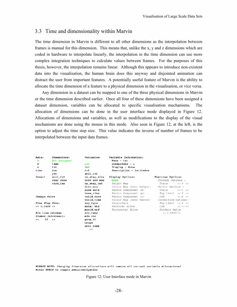
The time dimension in Marvin is different to all other dimensions as the interpolation between frames is manual for this dimension. This means that, unlike the x, y and z dimensions which are coded in hardware to interpolate linearly, the interpolation in the time dimension can use more complex integration techniques to calculate values between frames. For the purposes of this thesis, however, the interpolation remains linear. Although this appears to introduce non-existent data into the visualisation, the human brain does this anyway and disjointed animation can distract the user from important features. A potentially useful feature of Marvin is the ability to allocate the time dimension of a feature to a physical dimension in the visualisation, or vice versa.
Any dimension in a dataset can be mapped to one of the three physical dimensions in Marvin or the time dimension described earlier. Once all four of these dimensions have been assigned a dataset dimension, variables can be allocated to specific visualisation mechanisms. The allocation of dimensions can be done in the user interface mode displayed in Figure 12. Allocations of dimensions and variables, as well as modifications to the display of the visual mechanisms are done using the mouse in this mode. Also seen in Figure 12, at the left, is the option to adjust the time step size. This value indicates the inverse of number of frames to be interpolated between the input data frames.
Figure 12: User Interface mode in Marvin
-28-
Visualisation of Large Scale Data Sets
3.4 The Visualisation Mechanisms
Within Marvin there are three main viewing mechanisms: a height map, vectors drawn as arrows and isosurfaces. Each mechanism has a number of options and each is detailed below.
3.4.1 Height Maps
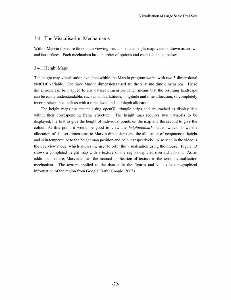
The height map visualisation available within the Marvin program works with two 3-dimensional NetCDF variable. The three Marvin dimensions used are the x, y and time dimensions. These dimensions can be mapped to any dataset dimension which means that the resulting landscape can be easily understandable, such as with a latitude, longitude and time allocation, or completely incomprehensible, such as with a time, level and soil depth allocation.
The height maps are created using openGL triangle strips and are cached as display lists within their corresponding frame structure. The height map requires two variables to be displayed, the first to give the height of individual points on the map and the second to give the colour. At this point it would be good to view the heightmap.m1v video which shows the allocation of dataset dimensions to Marvin dimensions and the allocation of geopotential height and skin temperature to the height map position and colour respectively. Also seen in the video is the overview mode, which allows the user to orbit the visualisation using the mouse. Figure 13 shows a completed height map with a texture of the region depicted overlaid upon it. As an additional feature, Marvin allows the manual application of texture to the terrain visualisation mechanism. The texture applied to the dataset in the figures and videos is topographical information of the region from Google Earth (Google, 2005).
-29-

Visualisation of Large Scale Data Sets
Figure 13: A height map with overlaid regional texture steps
In figure 13 the height map is displayed with an appropriate scaling factor to accurately represent the hills and mountains depicted in the data. However, as different datasets have a variety of dimension proportionalities, the ability to modify the scaling factor of the height map has been included in Marvin. The video heightmapscaling.m1v shows the use of this feature.
3.4.2 Vectors as Arrows
Vector visualisation in Marvin uses up to four NetCDF variables to draw arrows throughout the visualisation scene. These variables are allocated to the vector’s x, y and z components, v1, v2, and v3 with the remaining variable mapped to the colour of the vectors. Thus the resulting vector, v, at location x, y, z in the scene, is the sum its components at the same point, where x, y and z are the respective Marvin dimensions and t is time, as shown in equation 1.
ztzyxvytzyxvxtzyxvtzyxv ˆ),,,(ˆ),,,(ˆ),,,(),,,( 321 ++= Equation 1
Using these values, Marvin steps through the visualisation scene drawing arrows, at each x, y and z location, that represent the underlying vector’s direction and magnitude. Colour is also mapped onto the arrow using the colour allocated variable. The video vectors.m1v shows the allocation of
-30-

Visualisation of Large Scale Data Sets
vector components in Marvin and the animation of this visual mechanism. Figure 14 shows the vector visualisation displayed over a height map.
Figure 14: Vectors visualised as arrows
The vector visualisation, similar to the height map visualisation, needs to be easily scalable by the user. Also the ability to change the step size between vectors and height to which the vectors are draw is included in the user interaction mode. These features provide the user with the ability to increase and decrease the amount of information in the scene. This means the user can maintain a suitable level of information. Video vectscaling.m1v shows the use of these features.
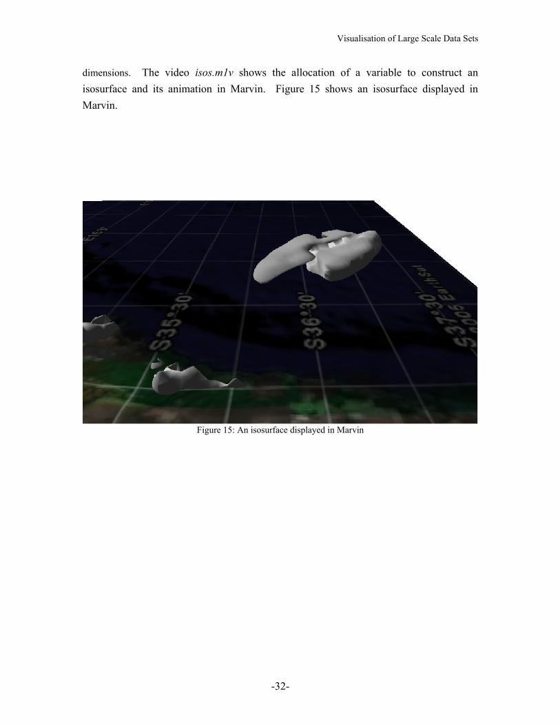
3.4.3 Isosurfaces
Isosurfaces are displayed in Marvin using a single four dimensional NetCDF variable. First this four dimensional array of values is reduced to three dimensions by setting the dimension allocated to time to the time of the current frame. This three dimensional array is then reduced to a three dimensional boolean array by applying a threshold value, like in the Marching Cubes algorithm. The array is then traversed iteratively and, using unit cubes, triangles are created to display the border between values above and values below the threshold value. For each frame this process is repeated to form an animation showing movement of the threshold value in four
-31-
Visualisation of Large Scale Data Sets
dimensions. The video isos.m1v shows the allocation of a variable to construct an isosurface and its animation in Marvin. Figure 15 shows an isosurface displayed in Marvin.
Figure 15: An isosurface displayed in Marvin
-32-
Visualisation of Large Scale Data Sets
Chapter 4
Experimentation and Findings
4.1 Problems found during the creation of Marvin
During Marvin’s creation a number of problems arose, the more interesting of which are described below.
4.1.1 Isosurface generation using marching algorithms
In implementing the marching cubes isosurface generation algorithm it was found that, although a surface would be constructed, there would only be one surface in the scene where it was expected that multiple surfaces would emerge. The reason for this was found to be that the implementation of the marching cubes algorithm would omit any cubes not along the boundary of the first surface found. This was due to the assumption that all cubes not connected to this first surface were all either entirely below or above the target value. To solve this problem a second version of the marching cubes algorithm was implemented from code by Cory Bloyd (Bloyd, 1997), which iterates over the entire scene. This more brute force approach decreased the efficiency of the isosurface display algorithm and thus greatly demonstrated the need for good memory management and caching.
4.1.2 Multiple files for multiple time steps
Another problem encountered early in the creation of Marvin was the use of multiple files for different frames of the same dataset. The dataset used for the video files referenced in this thesis is an instance of such a dataset. Having both single and multiple files datasets meant that the feature structure had to be able to store two separate forms of multi-dimensional data, one that was contiguous and the other with the time dimension accessed manually due to the method by which NetCDF libraries retrieve data. This resulted in special case functions to deal with time slices being stored separately. This variety in datasets meant that the ability to allocate any dataset dimension to any Marvin dimension was no longer possible as the time dimension in a multiple file dataset became a special case that can only be mapped to Marvin’s time dimension. In a single file datasets however, all dataset dimensions can be mapped to any Marvin dimension.
4.1.3 Timing issues with display lists
An unexpected problem arose after the development of the frame structure and the caching system to store calculated geometries. The problem being, the visualisation ran too fast. This
-33-
Visualisation of Large Scale Data Sets
was easily solved with a time delay which ensured the amount of time that had to pass would be greater than a specific value before another update would occur. This has the subsequent result that on fast machines animation are synchronized with respect to time taken to display each time step. However, on slower machines this can disturb the rate frames as displayed causing time distortions within the same animation.
4.2 Using Marvin for meteorological analysis
Once finished, Marvin needed to be checked to see that it was useful for meteorological analysis. Detailed below are the findings of using Marvin for such analysis.
4.2.1 Height Maps
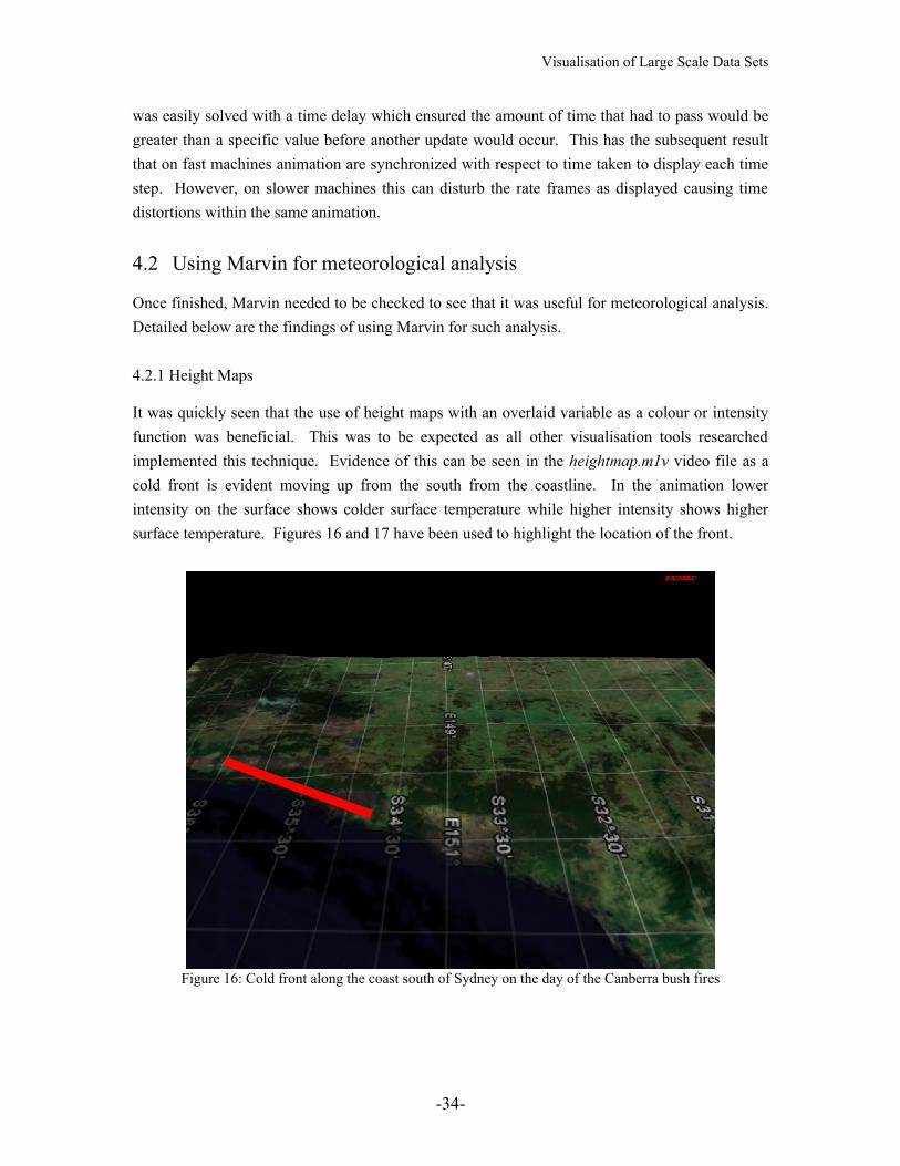
It was quickly seen that the use of height maps with an overlaid variable as a colour or intensity function was beneficial. This was to be expected as all other visualisation tools researched implemented this technique. Evidence of this can be seen in the heightmap.m1v video file as a cold front is evident moving up from the south from the coastline. In the animation lower intensity on the surface shows colder surface temperature while higher intensity shows higher surface temperature. Figures 16 and 17 have been used to highlight the location of the front.
Figure 16: Cold front along the coast south of Sydney on the day of the Canberra bush fires
-34-

Visualisation of Large Scale Data Sets
Figure 17: Cold front moving inland on the day of the Canberra bush fires
On the video a second front can be seen to the north of and moving perpendicular to the indicated front.
4.2.2 Vector Displays
Using the vector visualisation mechanism the same front can be quickly seen by the change in the size and direction of the arrows following the passing of the front. This is easily seen in the vectors.m1v video and is highlighted in figure 18 and 19 below. The use of interpolation between time steps also shows the change in wind speed and direction more intuitively.
-35-

Visualisation of Large Scale Data Sets
Figure 18: Cold front shown by vector field
Figure 19: Cold front and coastal winds shown by vector field
-36-
Increase in coastal wind following front
Visualisation of Large Scale Data Sets
4.2.3 Isosurfaces
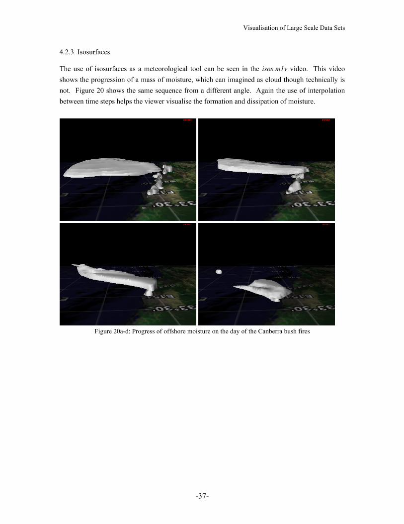
The use of isosurfaces as a meteorological tool can be seen in the isos.m1v video. This video shows the progression of a mass of moisture, which can imagined as cloud though technically is not. Figure 20 shows the same sequence from a different angle. Again the use of interpolation between time steps helps the viewer visualise the formation and dissipation of moisture.
Figure 20a-d: Progress of offshore moisture on the day of the Canberra bush fires
-37-

Visualisation of Large Scale Data Sets
-38-
Visualisation of Large Scale Data Sets
Chapter 5
Conclusions and Further Research
The research and resulting program from this thesis was motivated by the desire to aid meteorological research by providing a new visualisation tool that would highlight features in WRF-model datasets and was easy to use. This chapter reviews the success of this thesis and presents extensions on this research and program to further aid meteorological research.
5.1 Review
This thesis and the resulting program, Marvin, show that a real-time visualisation tool that is fully flexible, easy to use and requires no prior calculations of complex geometry can be made and used for meteorological analysis. It has been shown that although some calculations of isosurfaces can be slow, calculating isosurfaces dynamically and the caching mechanism provided gives the user interactive speed and the ability to visualise any variable desired. Marvin was also tested on multiple datasets and can be applied to a wide range of datasets with four or more dimensions.
5.2 Further Research
Although Marvin satisfies the primary goals for this thesis, a number of improvements can be made to its structure and more features implemented to improve the usefulness of such a visualisation tool. Some areas of further research include:
- A study of the viability of multiple isosurfaces in the same scene, both in terms of memory usage and information clutter. No system researched currently uses more than one.
- The use of mouse picking on structures to find information and its effect on simplicity of navigation. Other systems tend to use a mouse as a pointer and for picking but the ability to use it for navigation as well could enhance usability.
- Incorporation of shaders to reduce geometric complexity of isosurface while maintaining information content with textures. Again no non-commercial system researched uses shaders.
- The use of level-of-detail algorithms on a highly cached scene, to examine the trade-off between extra computations for multiple levels of detail and the speed of moving around less-cached regions.
-39-
Visualisation of Large Scale Data Sets
Some features that could be added to Marvin include:- a more complex configuration file structure to save and load the current state of the
visualisation, which would enable the user to quickly locate a region of interest found earlier.
- horizontal and vertical slice algorithms to show variable information restricted to two dimensions. This would add another visualisation mechanism and give the viewer more flexibility in how they represent data.
- the ability to input visualisation parameters numerically which would add a faster method for setting parameters for the user and
- a wider variety of colour scheme available to overlay each display mechanism, also the ability to load in custom colour schemes. This would again give more flexibility to the user and allow for the user’s specific taste.
-40-
Visualisation of Large Scale Data Sets
Appendix A
Revised Specification of Deliverables
Throughout the duration of this project the main deliverable has remained the same, being a completed visualisation program that can read in NetCDF datasets, show fine and large-scale meteorological phenomena in those datasets and provide easy control of the display to the end user. However, the intended method of using a combination of shader algorithms in addition to display list openGL functionality has been reduced to not include shader algorithms as the efficiency demands for this project could be satisfied without them. It should be noted that project with multiple isosurfaces or higher resolution datasets may require more efficient methods such as shaders allow.
-41-
Visualisation of Large Scale Data Sets
Appendix B
Clarification of Original Contribution
In this thesis, it has been shown that real-time display of large data sets is possible. Using graphical techniques such as display lists, in addition to memory management techniques like caching, animations of weather phenomena can be created simply and modified while maintaining real-time visuals.
-42-
Visualisation of Large Scale Data Sets
References
Akkouche, S., & E. Galin, (2001): Adaptive Implicit Surface Polygonization using Marching Triangles, Computer Graphics Forum, Vol. 20(2), The Eurographic Association and Blackwell Publishers, Malden, USA.
ATI, (2003): Direct3D HLSL Programming using RenderMonkey IDE, Available at: http://www.ati.com/developer/rendermonkey/publications.html (Last accessed: 15/10/2005)
Bhaniramka, P., & Y. Demange, (2002): OpenGL Volumizer: A Toolkit for High Quality Volume Rendering of Large Data sets, Proceedings of the 2002 IEEE symposium on Volume visualization and graphics, Boston, Massachusetts, pp. 45-54.
Blinn, J.F., (1978): Simulation of wrinkled surfaces, Proceedings of the 5th annual conference on Computer graphics and interactive techniques, ACM Press, New York, NY, USA, pp. 286-292.
Bloyd, C., (1997): Marching Cubes Example Program, Available at:http://astronomy.swin.edu.au/~pbourke/modelling/polygonise/marchingsource.cpp (Last accessed: 11/10/2005)
Chen, P.C, (1990): Supercomputer-Based Visualization Systems Used for Analyzing Output Data of a Numerical Weather Prediction Model, Proceedings of the 4th international conference on Supercomputing, Amsterdam, The Netherlands, pp.296-309.
DeFanti, T. A., M. D. Brown, & B. H. McCormick, (1990): Visualization: Expanding scientific and engineering research opportunities, Visualization in Scientific Computing, IEEE Computer Society Press, Los Alamitos, CA, pp. 32-47.
Dobashi, Y., K. Kaneda, H. Yamashita, T. Okita, & T. Nishita, (2000): A simple, efficient method for realistic animation of clouds, Proceedings of the 27th annual conference on Computer graphics and interactive techniques, ACM Press, New York, NY, USA, pp. 19-28.
Duchaineau, M., M. Wolinsky, D.E. Sigeti, M.C. Miller, C. Aldrich, & M.B. Mineev-Weinstein, (1997). ROAMing Terrain: Real-time Optimally Adapting Meshes. Available at: http://www.cognigraph.com/ROAM_homepage/ (Last accessed: 26/07/2005)
Dudhia, J., F. Carr, S. Chen, K. LaCroix, B. Moninger, & M. Pyle, (2002): The Weather Research & Forecasting Model. Available at http://www.wrf-model.org/ (Last accessed: 10/11/2005)
Google, (2005): Google Earth. Available at: http://earth.google.com/ (Last accessed: 1/11/2005)Hanrahan, P., & J. Lawson, (1990). A language for shading and lighting calculations.
Proceedings of the 17th annual conference on Computer graphics and interactive techniques, Dallas, TX, USA, pp. 289-298.
Hibbard, B., J. Kellum, & B. Paul, (1993): Vis5D. Available at: http://www.ssec.wisc.edu/~billh/vis5d.html (Last accessed: 12/04/2005)
-43-
Visualisation of Large Scale Data Sets
Fuchs, H., Z.M. Kedem, & S.P. Uselton, (1977): Optimal Surface Reconstruction from Planar Contours, Communications of the ACM, Vol 20 (October), pp.693-702
Johnson, S.G., & J. Edwards, (2000): Vis5D+. Available at: http://vis5d.sourceforge.net/ (Last accessed: 12/04/2005)
Kessenich, J., D. Baldwin, & R. Rost, (2003). The OpenGL Shading Language, 3Dlabs, Inc. Ltd., April 2004. Version 1.10.
Kniss, J., & C. Hansen, (2002): Volume Rendering Multivariate Data to Visualize Meteorological Simulations: A Case Study, Proceedings of the symposium on data visualization 2002, Barcelona, Spain, pp. 189-ff
Lantinga, S., (1999): SDL: Simple DirectMedia Layer, Available at: www.libsdl.org/index.php (Last accessed: 15/10/2005)
Lorensen, W.L, & H.E. Cline, (1987): Marching Cubes: A High Resolution 3D Surface Construction Algorithm, Computer Graphics, Vol. 21 (July), pp.163-169
Mark, W.R., S. Glanville, & K. Akeley, (2003). Cg: A system for programming graphics hardware in a C-like language. ACM Transactions on Graphics (Proceedings of SIGGRAPH 2003), 22(3), Aug 2003, pp. 896-907.
Martin, K., W. Schroeder, & B. Lorensen, (1993): The Visualization Toolkit. Available at: http://public.kitware.com/VTK/index.php (Last accessed: 26/07/2005)
Mickelson, S.A. (2001): Cave5D 2.0. Available at: http://www-unix.mcs.anl.gov/~mickelso/CAVE2.0.html (Last accessed: 12/04/2005)
Microsoft, (2002). DirectX Graphics Programmers Guide. Microsoft Developers Network Library, DirectX 9 edition.
Olano, M., B. Kuchne, & M. Simmons, (2003): Automatic Shader Level of Detail, Proceedings of the ACM SIGGRAPH/EUROGRAPHICS conference on Graphics hardware 2003, San Diego, California, pp. 7-14.
Papathomas, T.V., J.A. Schiavone, & B. Julesz, (1988): Applications of Computer Graphics to the Visualization of Meteorological Data, Computer Graphics, Vol. 22, No.4, August 1988.
Pfenning, F. (2003): Visualization. From lecture series on Computer Graphics, Carnegie Mellon University, Pittsburgh. Available at: http://www-2.cs.cmu.edu/~fp/courses/graphics/pdf-color/20-visualize.pdf (Last accessed: 26/07/2005)
Seo, J., G.J. Kim, & K.C. Kang, (1999): Level of detail (LOD) engineering of VR objects,Proceedings of the ACM symposium on Virtual reality software and technology, London, UK, pp. 104-110.
Simmons, M., & D. Shreiner, (2003): Per-Pixel Smooth Shader Level of Detail,
-44-
Visualisation of Large Scale Data Sets
Proceedings of the SIGGRAPH 2003 conference on Sketches & applications: in conjunction with the 30th annual conference on Computer graphics and interactive techniques, San Diego, California p.1
Sharman, J, (year unknown): The Marching Cubes Algorithm, Available at: http://www.exaflop.org/docs/marchcubes/ind.html (Last Accessed: 15/10/2005)
Treinish, L.A. (2002): Case Study on the Adaptation of Interactive VisualizationApplications to Web-Based Production of Operational Mesoscale Weather Models, Proceedings of the conference on Visualization 2002, Boston, Massachusetts, pp. 549-552.
Trembilski, A. (2000): Two Methods for Cloud Visualisation from Weather Simulation Data. Available at: wscg.zcu.cz/wscg2000/Papers_2000/X67.pdf.gz (Last Accessed: 19/4/2005)
Trembilski, A., & A. Broβler, (2002): Transparency for Polygon Based Cloud Rendering, Proceedings of the 2002 ACM symposium on Applied computing, Madrid, Spain, pp. 785-790.
Tufte, E.R (1990): Envisioning Information, Graphics Press, Cheshire, Conn. Tufte, E.R. (1997): Visual Explanations: Images and Quantities, Evidence and Narrative,
Graphics Press, Cheshire, Conn.UBC-GIF, (2003): 3D Inversion of Magnetic Data at the Mt. Milligan Deposit, BC.
Available at: http://www.eos.ubc.ca/research/ubcgif/casehist/mtmill-mag/intro.html. (Last Accessed: 20/10/2005)
Upson, C., T. Faulhaber Jr, D. Kamins, D. Laidlaw, D. Schlegel, J. Vroom, R. Gurwitz, &A. van Dam, (1989): The Application Visualization System: A Computational Environment for Scientific Visualization, IEEE Computer Graphics and Applications, pp.30-42.
Zabusky, N.J (1984): Computational Synergetics, Physics Today (July), pp.36-46.
-45-