
Visual Style Builder for...
29
1 | Page Visual Style Builder for WinForms Documentation (Q1 2010) Contents Visual Style Builder Overview ....................................................................................................................... 3 Starting the Visual Style Builder .................................................................................................................... 3 Getting Started with Visual Style Builder: Theming RadButton ................................................................... 3 Overview ................................................................................................................................................... 3 Creating a new Theme .............................................................................................................................. 3 Creating a new Repository Item ............................................................................................................... 4 Theme Repository ....................................................................................................................................... 13 Overview ................................................................................................................................................. 13 Repository Item Types and the LightVisualElement ............................................................................... 13 Associating Repository Items with Elements and States ........................................................................ 14 Removing Repository Item Association .................................................................................................. 16 Editing and Renaming Repository Items ................................................................................................. 16 Deleting Repository Items....................................................................................................................... 18 Handling Theme Files .................................................................................................................................. 18 Overview ................................................................................................................................................. 18 Loading Themes ...................................................................................................................................... 19 Saving Themes ........................................................................................................................................ 21 Merging Repositories .............................................................................................................................. 23 Applying Themes to RadControls................................................................................................................ 24 Property Precedence .................................................................................................................................. 24 Property Precedence Rules ..................................................................................................................... 24 Precedence Example: Visibility Property ................................................................................................ 27
-
Upload
nguyenkiet -
Category
Documents
-
view
213 -
download
0
Transcript of Visual Style Builder for...

1 | P a g e
Visual Style Builder for WinForms
Documentation (Q1 2010)
Contents Visual Style Builder Overview ....................................................................................................................... 3
Starting the Visual Style Builder .................................................................................................................... 3
Getting Started with Visual Style Builder: Theming RadButton ................................................................... 3
Overview ................................................................................................................................................... 3
Creating a new Theme .............................................................................................................................. 3
Creating a new Repository Item ............................................................................................................... 4
Theme Repository ....................................................................................................................................... 13
Overview ................................................................................................................................................. 13
Repository Item Types and the LightVisualElement ............................................................................... 13
Associating Repository Items with Elements and States ........................................................................ 14
Removing Repository Item Association .................................................................................................. 16
Editing and Renaming Repository Items ................................................................................................. 16
Deleting Repository Items ....................................................................................................................... 18
Handling Theme Files .................................................................................................................................. 18
Overview ................................................................................................................................................. 18
Loading Themes ...................................................................................................................................... 19
Saving Themes ........................................................................................................................................ 21
Merging Repositories .............................................................................................................................. 23
Applying Themes to RadControls ................................................................................................................ 24
Property Precedence .................................................................................................................................. 24
Property Precedence Rules ..................................................................................................................... 24
Precedence Example: Visibility Property ................................................................................................ 27

2 | P a g e

3 | P a g e
Visual Style Builder Overview The Telerik Visual Style Builder for WinForms is a desktop-based, fully functional UI customization tool
that enables easy, point-and-click customization of skins and themes for the RadControls for WinForms
suite. This tool eliminates the need to understand the element and control structure of the RadControls
to create custom skins. It gives you complete power over the UI elements of the control and allows you
to create your own custom skin in minutes.
Starting the Visual Style Builder Log in your account and click on the Downloads link (or free trials). Locate the "Q1 2010 Beta Available"
link under the RadControls for WinForms section and download RadControls for WinForms Q1 2010
Beta. Install the beta on your machine.
The new Visual Style Builder can be started from:
Start menu (Start Programs Telerik RadControls for WinForms Q1 2010 Tools)
The installation folder (usually C:\Program Files\Telerik\RadControls for WinForms Q1 2010).
Note The Open Theme Builder option in the smart tags of the controls in Visual Studio will open the old version of the tool, so please disregard it for the moment. This option will be removed for the official release. The new VSB would be invoked from the new Telerik menu Visual Studio.
Getting Started with Visual Style Builder: Theming RadButton
Overview This section aims to practically introduce the new Telerik WinForms Visual Style Builder by describing
the process of creating a simple theme for the RadButton control. This article emphasizes on all tricky
moments that might occur while using the Visual Style Builder and explains them so that the user does
not experience further issues when theming controls. The tutorial begins with the creation of all needed
repository items for styling the RadButton control and after that shows how apply them to the control.
Creating a new Theme In order to create a new theme for a control you need to simply start the Visual Style Builder. It is
initially loaded with no styles applied to the controls, i.e. you can start styling a component from scratch.
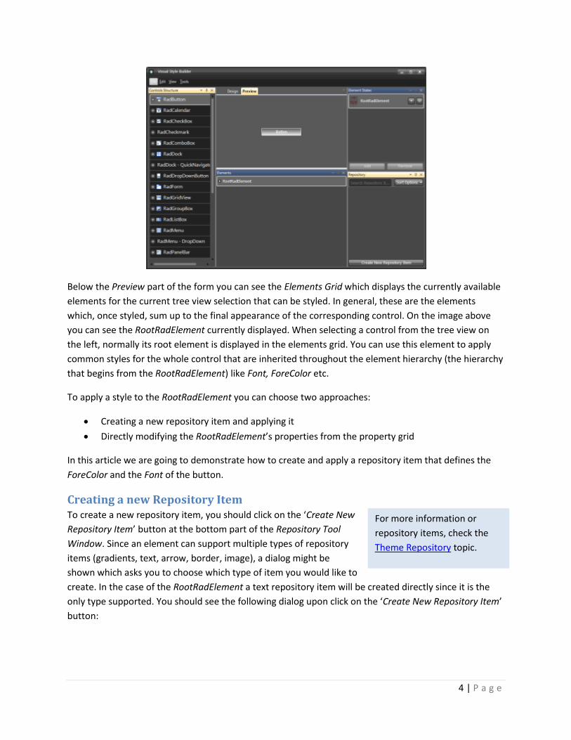
In order to begin styling the RadButton control you fill first need to select the corresponding node on the
Tree View on the left side of the application. The main form should look similar to the image below:
4 | P a g e
Below the Preview part of the form you can see the Elements Grid which displays the currently available
elements for the current tree view selection that can be styled. In general, these are the elements
which, once styled, sum up to the final appearance of the corresponding control. On the image above
you can see the RootRadElement currently displayed. When selecting a control from the tree view on
the left, normally its root element is displayed in the elements grid. You can use this element to apply
common styles for the whole control that are inherited throughout the element hierarchy (the hierarchy
that begins from the RootRadElement) like Font, ForeColor etc.
To apply a style to the RootRadElement you can choose two approaches:
Creating a new repository item and applying it
Directly modifying the RootRadElement’s properties from the property grid
In this article we are going to demonstrate how to create and apply a repository item that defines the
ForeColor and the Font of the button.
Creating a new Repository Item To create a new repository item, you should click on the ‘Create New
Repository Item’ button at the bottom part of the Repository Tool
Window. Since an element can support multiple types of repository
items (gradients, text, arrow, border, image), a dialog might be
shown which asks you to choose which type of item you would like to
create. In the case of the RootRadElement a text repository item will be created directly since it is the
only type supported. You should see the following dialog upon click on the ‘Create New Repository Item’
button:
For more information or
repository items, check the
Theme Repository topic.
5 | P a g e
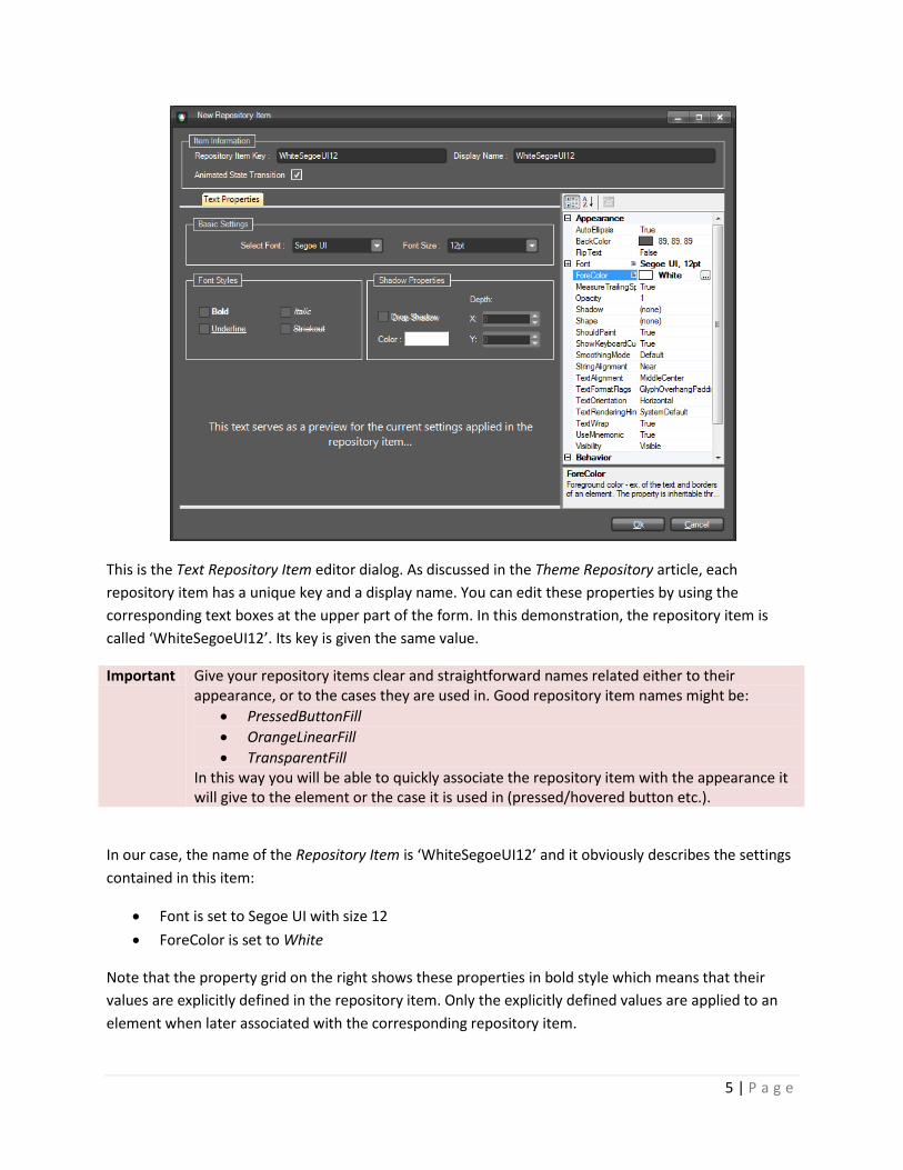
This is the Text Repository Item editor dialog. As discussed in the Theme Repository article, each
repository item has a unique key and a display name. You can edit these properties by using the
corresponding text boxes at the upper part of the form. In this demonstration, the repository item is
called ‘WhiteSegoeUI12’. Its key is given the same value.
Important Give your repository items clear and straightforward names related either to their appearance, or to the cases they are used in. Good repository item names might be:
PressedButtonFill
OrangeLinearFill
TransparentFill In this way you will be able to quickly associate the repository item with the appearance it will give to the element or the case it is used in (pressed/hovered button etc.).
In our case, the name of the Repository Item is ‘WhiteSegoeUI12’ and it obviously describes the settings
contained in this item:
Font is set to Segoe UI with size 12
ForeColor is set to White
Note that the property grid on the right shows these properties in bold style which means that their
values are explicitly defined in the repository item. Only the explicitly defined values are applied to an
element when later associated with the corresponding repository item.
6 | P a g e
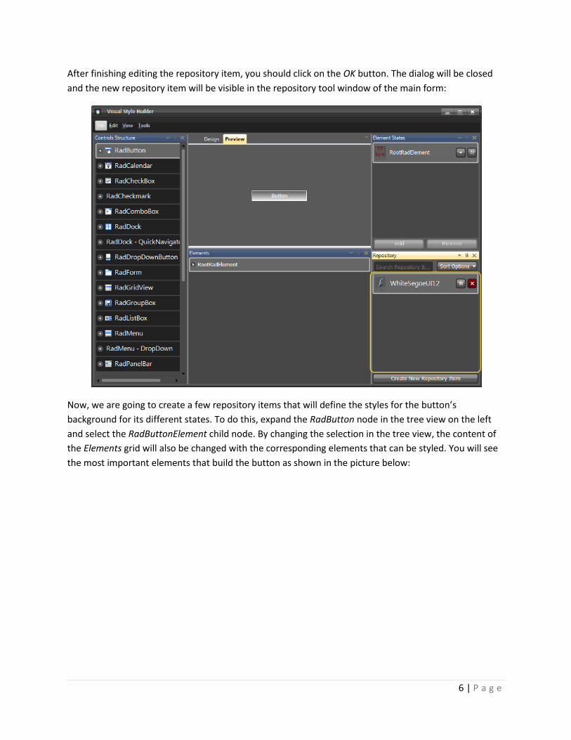
After finishing editing the repository item, you should click on the OK button. The dialog will be closed
and the new repository item will be visible in the repository tool window of the main form:
Now, we are going to create a few repository items that will define the styles for the button’s
background for its different states. To do this, expand the RadButton node in the tree view on the left
and select the RadButtonElement child node. By changing the selection in the tree view, the content of
the Elements grid will also be changed with the corresponding elements that can be styled. You will see
the most important elements that build the button as shown in the picture below:

7 | P a g e
Having selected the ButtonFill element in the Elements grid, click on the ‘Create New Repository Item’
button. You will see the Fill Repository Item Editor Dialog that allows you to create different styles of
fills. In this dialog, select the ‘Office Glass Rect’ tab and from the combo box with predefined styles,
choose ‘Orange’. The dialog should look the following way:

8 | P a g e
Give the repository item a key and a name as follows: ‘ButtonNormalFill’, ‘ButtonNormalFill‘, and check
the ‘Animated State Transition’checkbox to enable animated style transition for this repository item.
Save the repository item by clicking OK and click on the ‘Create New Repository Item’ button again. By
following the same steps described above, crate another two fill repository items with office glass rect
style and colors as follows: yellow and red. Name them ‘ButtonHoverFill’ and ‘ButtonPressedFill’. The
repository should look as follows after creating all items:
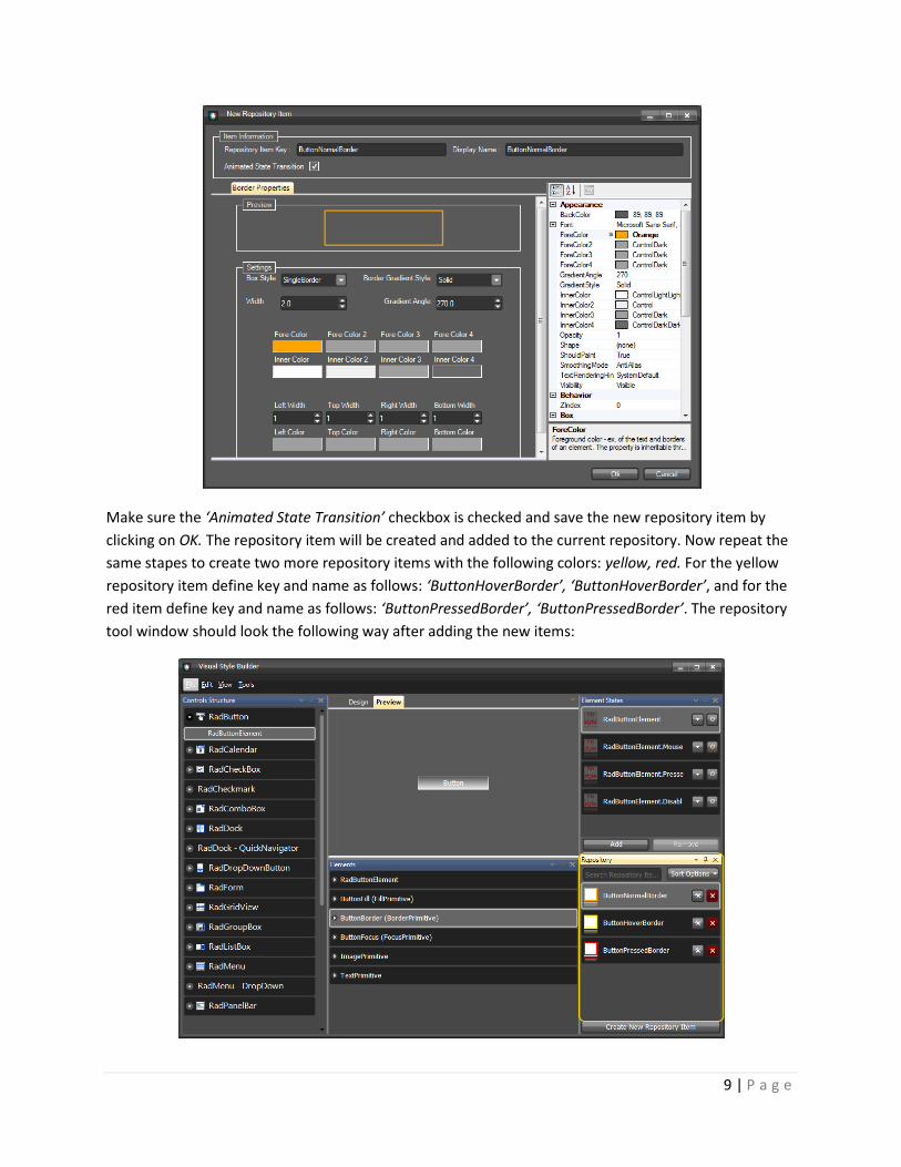
Now we are going to create a few border repository items which we are going to use later for styling the
button. To do this, select the ButtonBorder element in the Elements grid and click on the ‘Create New
Repository Item’ button to display the Border Repository Item Editor dialog. In the dialog, give a key and
a name for the repository item as follows: ‘ButtonNormalBorder’, ‘ButtonNormalBorder’. Set the
ForeColor property to Orange and also the Width property to 2. The dialog should look as follows:
9 | P a g e
Make sure the ‘Animated State Transition’ checkbox is checked and save the new repository item by
clicking on OK. The repository item will be created and added to the current repository. Now repeat the
same stapes to create two more repository items with the following colors: yellow, red. For the yellow
repository item define key and name as follows: ‘ButtonHoverBorder’, ‘ButtonHoverBorder’, and for the
red item define key and name as follows: ‘ButtonPressedBorder’, ‘ButtonPressedBorder’. The repository
tool window should look the following way after adding the new items:

10 | P a g e
Now that we have created all the repository items needed to style our button, we are going to associate
them with the corresponding elements for the correposnding states of the button (normal, mouseover,
pressed).
We will start with the RootRadElement and will associate the SegoeUI12White repository item with its
default. To do so, select the RadButton node in the tree view on the left, find the SegoeUI12White
repository item, drag it and drop it on the RootRadElement state shown in the Element States tool
window. The repository item style will be applied to the RootRadElement for its default state, and the
repository item will be highlighted in red to notify that the item is associated with the selected state as
shown on the picture below:
As you can see on the picture, the button has acquired the Segoe UI 12 font and a white forecolor. Now,
we are going to style the background of the button for its Normal, MouseOver and Pressed states. To do
so, select the RadButtonElement child node of the RadButton node in the tree view on the left. In the
Elements grid below the Preview pane make sure the ButtonFill element is selected. Find the
ButtonNormalFill repository item and by using drag-and-drop operation, associate it with the default -
RadButtonElement –state of the button. You will see how the button changes its appearance to reflect
the new styles applied from the associated repository item as shown on the picture below:

11 | P a g e
Repeat the steps above by associating the ButtonHoverFill item with the RadButtonElement.MouseOver
state, and the ButtonPressedFill with the RadButtonElement.Pressed state. At the end the Visual Style
Builder’s main form should look the following way:
If you hover/press the button in the Preview pane, you will see how the different styles are applied for
the corresponding states.
Now, we are going to associate the border repository items with the corresponding button states to
achieve more accomplished look of the button. To do this, select the ButtonBorder element from the
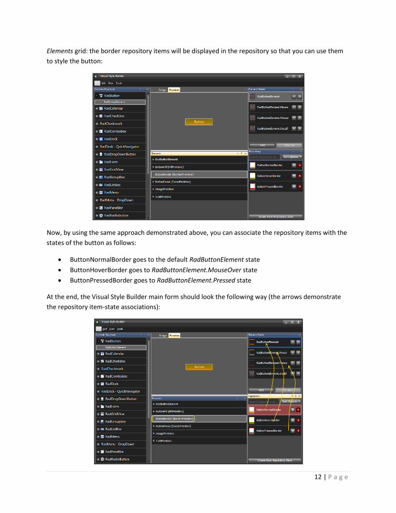
12 | P a g e
Elements grid: the border repository items will be displayed in the repository so that you can use them
to style the button:
Now, by using the same approach demonstrated above, you can associate the repository items with the
states of the button as follows:
ButtonNormalBorder goes to the default RadButtonElement state
ButtonHoverBorder goes to RadButtonElement.MouseOver state
ButtonPressedBorder goes to RadButtonElement.Pressed state
At the end, the Visual Style Builder main form should look the following way (the arrows demonstrate
the repository item-state associations):
13 | P a g e
With this, you have finished styling the RadButton control. Now, you can save the theme and use it
throughout your application. For further information on how to handle loading/saving themes, read the
Handling Themes help article.
Gotcha It is important to know that styles applied for a given state are not reset when the item goes to another state. This might confuse those who are not familiar with this behavior. Scenario: We have a button with Normal, MouseOver and Pressed states. We also have a couple of repository items which we use to style the button for the different states. Let’s say that the first repository item we assign fill to the button for its Normal state, which sets its BackColor, BackColor2, BackColor3, GradientStyle and NumberOfColors properties. The NumberOfColors property is set to 3 and the GradientStyle property is set to Linear. After associating the repository item to the Normal state of the button, the styles are applied correctly. Now, let’s say that we associate another repository item with the MouseOver state of the button that defines settings for the BackColor, BackColor2, BackColor3, BackColor4 properties, also for the GradientStyle (=Linear), but does not define setting for the NumberOfColors property. In this case, when we hover the button, the fill will not look as expected since its BackColor4 property value will not be visible. The reason for this will be that the NumberOfColors property will remain set to 3 as defined by the repository item assigned to the Normal state of the item. The main conclusion that we should make here is that each state must be assigned a style that defines all properties needed for the expected appearance of the element. This is the general approach when styling items in order to avoid confusion. For more information see Precedence Example: Visibility Property at the end of this tutorial.
Theme Repository
Overview Repository and Repository Items are major concept in the new VSB. These items greatly reduce the amount of time needed to apply property settings per element basis as well as the size of the generated XML files and the time needed to de-serialize them. The Visual Style Builder allows for intuitive and straightforward Repository management through series of editors and User Experience tools such as drag-and-drop to an ItemState, on-the-fly drop-down of all available Repository Items, etc.
Repository Item Types and the LightVisualElement Each repository contains items that can be reused throughout themes. The different repository item
types are mapped to different types of elements. The currently supported repository item types are as
listed below:
Fill repository items can be only associated with instances of the FillPrimitive class
Border repository items are only applicable to BorderPrimitive elements
Arrow repository items to ArrowPrimitive instances

14 | P a g e
Text repository items can applied both to TextPrimitive and VisualElement instances
Image repository items can be applied both to ImagePrimitive instances and VisualElements that
support images.
In general, you should not have any concern when applying repository items since the Visual Style
Builder automatically filters the available repository items according to the currently styled elements.
You can also create new repository items for the currently loaded repository. There are separate editors
for each repository item type which are displayed accordingly. Before saving the newly created
repository item, the Visual Style Builder checks whether its key is unique and if not, prompts you to
change the key with a unique value.
The LightVisualElement is a special type of primitive class that supports the functionality of all other
primitives without building an element tree. In other words, the LightVisualElement paints its Fill,
Border, Text and Image on its own. Therefore, the LightVisualElement is a type of element that supports
all Repository Item Types and thus, when editing such elements in the Visual Style Builder, the repository
is filtered appropriately to display all repository items available. Currently, LightVisualElement instances
are used in the RadScheduler, RadGridView and RadCalendar controls.
Gotcha It is important to understand the difference between different primitives (Border, Fill, Arrow etc.) and the LightVisualElement type. LightVisualElement supports multiple types of repository items since it basically encapsulates the functionality of a border, fill, text and image primitive. Therefore, when you select an element in the Elements list that is actually an instance of the LightVisualElement class (used in RadGridView, RadScheduler and RadCalendar), you simply need to assign to it the different types of repositories in order to style it according to your requirements, i.e. you can associate a border repository item, fill and image simultaneously and its appearance will be properly adjusted (the cells of a grid, scheduler, or calendar). This is not the case with elements made up of different primitives as border, fill and image. You will need to separately select and style each primitive from the Elements grid for the different states in this case (a good example is RadButtonElement and its children).
Associating Repository Items with Elements and States You can easily associate a repository item with a given element for a specific state by dragging the
repository item from the repository and dropping it onto the state in question:

15 | P a g e
The picture above shows how a repository item with name Gradient1 is associated with the ButtonFill
element of the RadButton control for the default (RadButtonElement) state.
Another way to associate a repository item with an element for a given state is to use the state’s
Available Repository Items popup which is shown upon click on the drop-down button on the right side
of the state visual representation:
The Available Repository Items popup displays a list of repository items that can be associated with the
selected state of the current element. Already associated repository items are highlighted with red and
also initially checked.
16 | P a g e
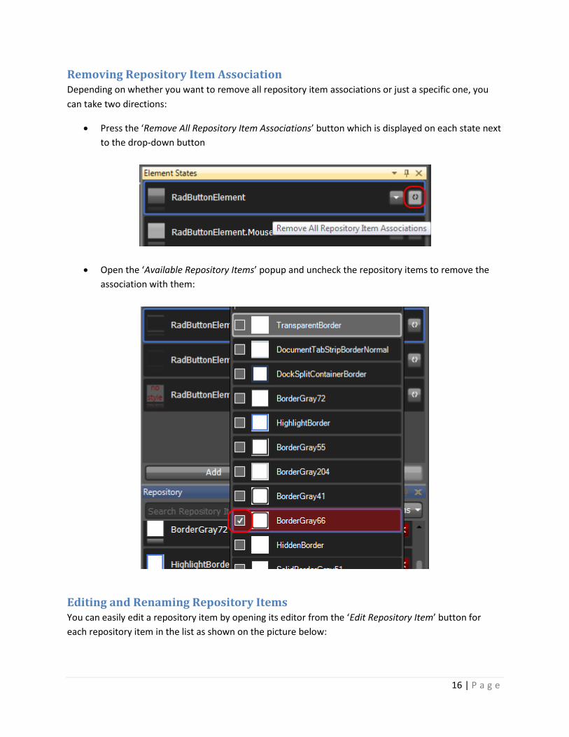
Removing Repository Item Association Depending on whether you want to remove all repository item associations or just a specific one, you
can take two directions:
Press the ‘Remove All Repository Item Associations’ button which is displayed on each state next
to the drop-down button
Open the ‘Available Repository Items’ popup and uncheck the repository items to remove the
association with them:
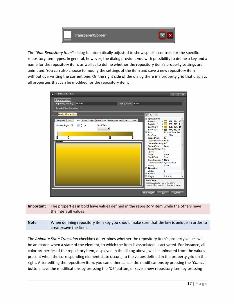
Editing and Renaming Repository Items You can easily edit a repository item by opening its editor from the ‘Edit Repository Item’ button for
each repository item in the list as shown on the picture below:
17 | P a g e
The “Edit Repository Item” dialog is automatically adjusted to show specific controls for the specific
repository item types. In general, however, the dialog provides you with possibility to define a key and a
name for the repository item, as well as to define whether the repository item’s property settings are
animated. You can also choose to modify the settings of the item and save a new repository item
without overwriting the current one. On the right side of the dialog there is a property grid that displays
all properties that can be modified for the repository item:
Important The properties in bold have values defined in the repository item while the others have their default values
Note When defining repository item key you should make sure that the key is unique in order to create/save the item.
The Animate State Transition checkbox determines whether the repository item’s property values will
be animated when a state of the element, to which the item is associated, is activated. For instance, all
color properties of the repository item, displayed in the dialog above, will be animated from the values
present when the corresponding element state occurs, to the values defined in the property grid on the
right. After editing the repository item, you can either cancel the modifications by pressing the ‘Cancel’
button, save the modifications by pressing the ‘Ok’ button, or save a new repository item by pressing

18 | P a g e
the ‘Save As New’ button. The ‘Save As New’ button is only visible when an already existing repository
item is opened for edit.
Gotcha When changing a repository item’s key it is important to know that each property setting group (a group of style settings within a StyleSheet) that uses this repository item should be updated to reference the new key. The Visual Style Builder allows for renaming a repository item’s key and updates the references of all property setting groups that are currently loaded . However, imagine that you create a couple of themes that use the same repository and save them. After that reopen them by selecting the repository and some of the files saved (not all). If you now rename a repository item’s key, the Visual Style Builder will update all references in the loaded StyleSheets but those left unloaded will still continue using old keys which will break the stylesheet.
Deleting Repository Items You can easily delete a repository item from the currently loaded repository by clicking on the red
‘Delete’ button which resides next to the ‘Edit’ button. You will be asked to confirm the operation and in
case you do so, the repository item will be removed from the repository. All references to this
repository item will also be removed.
Handling Theme Files
Overview The new WinForms theming mechanism introduces some significant improvements both in memory
footprint and performance direction. The styles for each separate control are situated in a single XML
file, accompanied by the name of the theme to which these styles belong and some further information
needed by the mechanism to map the styles to the corresponding control. The following code snippet
briefly demonstrates the common structure of a XML theme file:
<?xml version="1.0" encoding="utf-8"?>
<XmlTheme xmlns:xsi="http://www.w3.org/2001/XMLSchema-instance" ThemeName="MyTheme">
<BuilderRegistrations>
<XmlStyleBuilderRegistration>
<BuilderData xsi:type="XmlStyleSheet" xmlns:xsi="http://www.w3.org/2001/XMLSchema-instance">
<PropertySettingGroups>
…
</PropertySettingGroups>
</BuilderData>
<StylesheetRelations>
<RadStylesheetRelation ControlType="Telerik.WinControls.UI.RadForm"
ElementType="Telerik.WinControls.RootRadElement" />
</StylesheetRelations>
</XmlStyleBuilderRegistration>
</BuilderRegistrations>
</XmlTheme>
In general, the XML theme file contains Property Setting Groups that represent the style settings,
StyleSheet Relations that map the styles to an element/control, and a Theme Name attribute.

19 | P a g e
One of the new concepts that are introduced is the Theme Repository. The idea behind it is to store
common style property settings that can be easily reused throughout the whole theme. Modifying a
single repository item will change the appearance of all elements/controls that use this repository item.
In this way a theme can be created and modified in minutes. The repository can be reused throughout
different themes. However, there can be only one repository associated with a specific theme. The
association of a repository with a theme is made by giving assigning the same name to the repository
and the theme.
Each theme can have a repository containing items that can be reused throughout the theme. A theme
and a repository are connected by using the same name both for the theme and for the repository. The
repository is situated in a separate XML file that generally has the following structure:
<?xml version="1.0" encoding="utf-8"?> <XmlTheme xmlns:xsi="http://www.w3.org/2001/XMLSchema-instance" ThemeName="MyTheme"> <StyleRepository> <RepositoryItems> <Telerik.WinControls.Styles.XmlRepositoryItem ItemType="Gradient" DisplayName="ToolWindowCaptionActiveFill" Key="ToolWindowCaptionActiveFill" Capacity="14"> <XmlPropertySetting Property="Telerik.WinControls.VisualElement.BackColor" Value="Transparent" /> <XmlPropertySetting Property="Telerik.WinControls.Primitives.FillPrimitive.BackColor2" Value="Transparent" /> <XmlPropertySetting Property="Telerik.WinControls.Primitives.FillPrimitive.BackColor3" Value="Transparent" /> <XmlPropertySetting Property="Telerik.WinControls.Primitives.FillPrimitive.BackColor4" Value="Transparent" /> </Telerik.WinControls.Styles.XmlRepositoryItem> </RepositoryItems> <StyleRepository> </XmlTheme>
As you can see, the repository contains a collection of Repository Items which contain property settings.
Each repository item is uniquely identified by a key and additionally described by a name which is
displayed to the user. The key is important when reusing the same repository item for different
elements/controls throughout the Visual Style Builder.
The Theme Name here is ‘MyTheme’ which means that this repository is associated with all XML theme
files that have the same ThemeName attribute value.
Loading Themes In the new version of the WinForms Visual Style Builder you can create or modify one theme at a time,
but for all Rad Controls simultaneously. You can load a theme by choosing one of the two menu options
available:

20 | P a g e
The ‘Load’ option allows you to choose which theme files to load, whereas the ‘Load Directory’ option
allows you to select a directory and load all theme files that are situated in the chosen directory.
As already mentioned, the Visual Style Builder can load only one theme at a time. The difference
between themes is made by the Theme Name. For example, if you have the following files:
MyTheme_Telerik_WinControls_UI_RadButton.xml
MyTheme_Telerik_WinControls_UI_RadMenu.xml
AnotherTheme_Teleri_WinControls_UI_RadDropDownButton.xml
and assume that the MyTheme_Telerik_WinControls_UI_RadButton.xml and
MyTheme_Telerik_WinControls_UI_RadMenu.xml have their ThemeName attribute set to ‘MyTheme’, whereas
the AnotherTheme_Teleri_WinControls_UI_RadDropDownButton.xml file defines the ThemeName as
‘AnotherTheme’, upon loading of all three files, the Visual Style Builder will display a dialog informing
you that multiple themes are selected. In this dialog you can choose which of these themes should be
actually loaded in the application:

21 | P a g e
The upper part of the dialog displays a row for each unique theme found in the files loaded. The row
contains information about the number of files (Registered Stylesheets) for each theme, and the name
of the theme. The lower part of the dialog is populated with repositories found in the loaded files that
do not match a theme from list above, i.e. have different names. If you select a repository from this list,
it will be merged with the repository of the selected theme, whereby any key uniqueness conflicts
within the source and destination repositories must be resolved.
If the theme being loaded has no repository, i.e. there is no XML file with the repository
structure described above, an empty repository will be created when modifying the theme. If no
repository items are added in this repository in the process of modifying the theme, no separate
repository file will be saved at the end.
If the theme being loaded has no repository but there are other repositories (with different
names) found in the list of the loaded files, selecting this repositories by using the dialog above
will merge them into one repository upon saving the theme.
After selecting a theme and pressing the Ok button, the theme repositories found will be merged if
needed and if there is already a loaded theme in the Visual Style Builder, the user will be prompted to
safe their changes. After that, the old theme will be unloaded and the new theme will be loaded and
applied to the controls accordingly. If the user clicks ‘Cancel’ on the save prompt, no action will be
taken.
Gotcha If you open the Visual Style Builder and load a single repository file, this file will be considered as a theme and the Visual Style Builder will display its name in the caption of the main form. After that, each time you load a new file that has the same theme name, it will be applied to the corresponding control. If you load another repository, it will be merged with the existing one.
Gotcha If you open the Visual Style Builder and load a theme (with or without repository), and after that try to load a file that has a different file name, the Visual Style Builder will prompt you to save any changes made to the initially loaded theme if needed, close the theme and load the new one.
Saving Themes You can two options to choose from when saving:
Save as and
Save
When you choose the Save option, the Visual Style Builder automatically detects whether a theme has
been opened and edited. If yes, it simply overwrites the already loaded files with the new XML data.
However, if you created a new theme without loading files, the Visual Style Builder will display the Save
As dialog and will ask you to choose location and theme name for the newly created theme and its
repository:

22 | P a g e
The Save Theme dialog shows the current theme name, the destination folder where the theme will be
saved, a list containing all repository items in the repository of the theme, and a list of all files that will
be saved upon clicking the OK button. This list usually contains files that have been previously loaded
and files that will be newly created based on the current changes made for the controls in the Visual
Style Builder.
You can change the theme name by typing in the topmost text box. When you change the name of the
theme, all file names will be updated on the fly to reflect the new theme name. In general, the name of
a theme file is automatically generated by using the following pattern:
<ThemeName>_<ControlType>.xml
The repository items list shows all repository items found in the repository. The repository items that
are used somewhere in the currently files which are to be saved are additionally bolded. You can choose
to save all repository items, only the used ones or none of them. If you choose the last option, no
repository file will be saved. In this case, when you later load the same theme, you will not be able to
load the repository and thus lose any styles that come from repository items.
In the theme files list you can choose which files to save by checking/unchecking the corresponding row.
Each time you check/uncheck a file entry, the repository items list will be updated to reflect the
currently used repository items.
When you click on the OK button, all selected files will be saved. The repository will be saved in a
separate file that has the following name pattern:

23 | P a g e
<ThemeName>_Repository.xml
Note If you chose *not* to save certain files, you should keep in mind that the Visual Style Builder does not currently keep track of changes in separate theme files and therefore if you close the Visual Style Builder after saving, any unchecked files will not be saved.
Merging Repositories When you load a theme with a repository in the Visual Style Builder, you are able to merge its repository
with another one by loading the XML file representing the new repository. The merging process is
performed in the following steps:
Merge all repository items that do not have conflicting keys
Identify the conflicting repository items
Resolve the conflicts and commit the merge transaction
If repository item key conflicts are discovered, the following dialog is displayed to the user:
In the Grid View you can see the conflicting repository items both in the source and destination
repositories. The left side of the Grid View (highlighted in yellow) shows the already existing repository
items. The right side – highlighted with green – shows the repository items in the currently loaded
repository. The conflicting keys are presented in red. By modifying the value of a conflicting key in the
Grid View, you can resolve a conflict. The new key value will be assigned to the currently loaded item
and it will be successfully added in the existing repository.
There are also a few options how repositories are merged. These options are available to you as radio
buttons above the Grid View on the dialog. The options are as follows:

24 | P a g e
1. Do not add conflicting items in destination repository
2. Override destination repository items (conflicts in the source repository must be resolved)
3. Override source and destination repository items (items are overridden without conflict
resolving based on the ‘last-item-wins’ principle)
The first option instructs the Visual Style Builder to add the repository items from the source repository
that does not conflict with the already existing items.
The second option means that destination (existing) items that have the same keys as the currently
loaded items will be overridden. However, if there are items with the same key within the currently
loaded repository, these conflicts have to be resolved.
The third option entirely ignores repository item conflicts. Items are overridden based on their position
in the list as they are loaded from the XML file – the last item found with a conflicting key wins.
Important Generally, repository item conflicts within the same repository should not happen often. Since the Visual Style Builder checks for key uniqueness each time you add/edit repository items, it is not possible to save a repository that contains items with the same key.
After merging both repositories, you will be able to access the new repository items and used them
when designing your themes. When you save the theme, the new items will be saved in the already
existing repository.
Applying Themes to RadControls Applying themes based on the new version of the WinForms’ Theming Mechanism is done in pretty
much the same manner as before. You should add a RadThemeManager component onto your form and
load the theme files by choosing the Load Theme from File action from the smart tag of the component.
It is important to know that besides the theme files for the separate controls you should also load the
Repository File so that all references to it are not broken. After doing this, you should be able to apply
your new theme to a control by setting the ThemeName property either programmatically, or from the
Property Grid of Visual Studio.
Property Precedence
Property Precedence Rules Visual Style Builder introduces a flexible and easy to understand system of property precedence rules.
This allows you to fine tune the desired elements and eliminates the possibility of you asking yourself
“Why am I getting this color here or there?”
There are three levels at which properties can be applied:

25 | P a g e
1. Default properties level. The properties at this level are shown by default in the property grid
that you can see when you try to create a new repository item or in the property grid of the
element itself. These properties can be overridden by any of the property levels that are listed
below. Since these properties are default properties, they are not contained in the xml theme
file that you save.
2. Repository items level. When you start creating a new repository item, you will notice that the
properties that you tweak get a little square in the property grid. This square indicates that the
default property is overridden and you have a custom value for that property. All the repository
items are kept in a special repository xml file.
An element refers to a repository items using the following xml pattern (assuming that
Gradient1 is the key of the repository item):
<PropertySettingGroups>
<XmlPropertySettingGroup BasedOn="Gradient1">
<Selectors>
<XmlVisualStateSelector VisualState="RadButtonElement.MouseOver" AutoUnapply="False">
<ChildSelector xsi:type="XmlClassSelector" ElementClass="ButtonFill"
AutoUnapply="False" xmlns:xsi="http://www.w3.org/2001/XMLSchema-instance" />
</XmlVisualStateSelector>
</Selectors>
</XmlPropertySettingGroup>
</PropertySettingGroups>
3. Additional level allowing you to tweak an element overriding the default values and the values set
by a repository item. In some cases you may want to tweak an element that has an assigned
repository item without creating a new repository item. In such situations, you should click on the
element and directly tweak its properties. These settings will override the repository item’s
settings. The the xml code in this case looks like this (assuming that the Red color is set directly on
the element): <PropertySettingGroups>
<XmlPropertySettingGroup BasedOn="Gradient1">
<PropertySettings>
<XmlPropertySetting Property="Telerik.WinControls.VisualElement.BackColor" Value="Red" />
</PropertySettings>
<Selectors>
<XmlVisualStateSelector VisualState="RadButtonElement.MouseOver" AutoUnapply="False">
<ChildSelector xsi:type="XmlClassSelector" ElementClass="ButtonFill"
AutoUnapply="False" xmlns:xsi="http://www.w3.org/2001/XMLSchema-instance" />
</XmlVisualStateSelector>
</Selectors>
</XmlPropertySettingGroup>
</PropertySettingGroups>
Note The properties that are not set in the repository item property grid (i.e. they do not have the square indicator) should not be considered as default property values. Only the property grid of the element itself shows the default values.

26 | P a g e
All the property levels can be considered as small particles in one bigger particle – VisualState. In other
words these rules are valid between the property levels in a VisualState.
However, since the properties of different VisualStates are set to one and the same element, there is
interaction between these properties as well. As it is stated at the beginning of this article, a default
property value can be overridden by a custom property value. This rule is valid between the visual states
in both directions – i.e. a default property value is overridden by a custom property value and a custom
property value is not overridden by a default property value.
Note The properties' values applied for a state are not reset when a control goes to another state. There should be values in the new state which explicitly override the values from the previous state.
For example, take the following case – we have a repository item applied to the IsMouseOver state and
then we mouse hover and mouse leave the button. However, the button is still blue, even when the
mouse pointer is not on the button. This is because the settings of the default visual state
(RadButtonElement state) are default and they can’t override the settings provided by the repository
item.

27 | P a g e
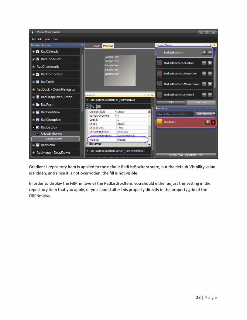
Precedence Example: Visibility Property There are cases in which you apply a repository item to an element, but this element still does not show
any colors. As stated in previous topic, if not overridden, the default values of the element are used.
Such is the case with RadListBoxItem where you apply a fill repository item to it, but you get no colors
applied. The reason for this behavior is that the default value of the Visibility property is Hidden and
repository items do not set a value to this property by default, so the Hidden value is taken into
consideration:
28 | P a g e
Gradient1 repository item is applied to the default RadListBoxItem state, but the default Visibility value
is Hidden, and since it is not overridden, the fill is not visible.
In order to display the FillPrimitive of the RadListBoxItem, you should either adjust this setting in the
repository item that you apply, or you should alter this property directly in the property grid of the
FillPrimitive.

29 | P a g e
When we set the Visibility property to Visible, we override the default value and the repository item
colors become visible.
Note This example concerns the Visibility property, but the rules described here are general and they are in force for all the properties that can be set by Visual Style Builder.