
Lean Six Sigma Group Lean Six Sigma Define Phase Tollgate Review.

WHITE PAPER
Visual six sigma: making Data analysis leanAndrew Ruddick, Catalyst Consulting Andy Liddle, Catalyst Consulting Malcolm Moore, SAS
www.jmp.com
www.catalystconsulting.co.uk

i
Visual six sigma: making Data analysis lean
Table of Contents
1. Introduction........................................................................................... 12. Be Honest: How Many Heavy-Duty Statistics Do We Really Need to Drive Process Improvement? .................................................. 13. Lean Data Analysis Process ................................................................. 34. Case Study ............................................................................................ 45. Summary ............................................................................................. 13

Visual six sigma: making Data analysis lean
1. Introduction
This paper introduces the idea of “Visual Six Sigma,” a practical and pragmatic approach to data analysis and process improvement. This approach has been developed in response to a growing business need to broaden the use of Six Sigma-type thinking beyond the realms of highly trained and statistically savvy Black Belts and Green Belts. In the typical business environment of process improvement, people are looking for simple-to-use tools that can be used by everyone at all levels to rapidly explore and interpret data, and then use that understanding to drive improvement. By making these tools highly visual and engaging, we can accelerate the process of analysis and eliminate the need for advanced statistical analysis in all but the most complex of situations. We can also broaden and deepen the application of Six Sigma thinking in the organisation by making the tools intuitive and easy to use, and the results easy to interpret.
We describe and illustrate the Visual Six Sigma approach based on a case study, but first let’s set the scene typical of many business environments and ask a critical question.
2. Be Honest: How Many Heavy-Duty Statistics Do We Really Need to Drive Process Improvement?
You may be familiar with the story of Bombay’s extraordinarily efficient lunch delivery system, which has operated for more than a century. Last spring The Times (U.K.) reported:
Just after 11 a.m. every workday, Bombay’s famous dabbawallas stream off the city’s railway network into the downtown business district to deliver hot, home-made meals to an army of hungry office workers.
Carrying tiffin boxes lovingly packed by wives and mothers in nearly 200,000 suburban kitchens, these 5,000 lunch delivery workers are part of one of the world’s most admired distribution systems.
Employing a complex colour-coded logistics process, the dabbawallas (can-carriers) complete a door-to-door service across 15 miles (25km) of public transport and 6 miles (10km) of road with multiple transfer points in a three-hour period.1
1
1 A. O’Connor, Times Newspapers Ltd. Times Online, April 21, 2007, http://www.timesonline.co.uk/tol/news/world/asia/article1685582.ece

2
Visual six sigma: making Data analysis lean
The dabbawallas’ system is said to maintain an error rate of only one in eight million (>7 sigma performance) — and they do this without statistical analysis.
In a recent analysis of lean Six Sigma deployment in a large multinational, we also made some very interesting observations, as shown in Figure 1. Not only are about 80 percent of the typical business population either terrified or very uncomfortable with statistics, greater than 80 percent of the project value comes from projects where only very basic tools and/or modest statistical analysis were required to identify and deliver the improvement.
Figure 1: Comfort Level with Statistical Methods
So, if most people are terrified of statistical methods and try to avoid the methods taught at Black Belt level and above, how can we make data analysis simple, quick, intuitive, practical and engaging for the typical business so that it can achieve data driven solutions rapidly and with minimum overhead?

Visual six sigma: making Data analysis lean
3
In this paper we describe the approach we call Visual Six Sigma based on exploiting the capabilities of JMP® software. This approach focuses heavily on using a range of very powerful and easy-to-understand visual tools to rapidly identify “hot Xs,” the process inputs responsible for driving variation in product quality or associated with variation in product quality. Statistically rigourous methods can be used (but only as much as required) to underpin this and then to easily build models to simulate “what if” scenarios to assess improvement opportunities.
Not only is this software analysis package easy to use, its visual capabilities and accessible output make the findings very easy to communicate and to engage with leaders in getting support for the improvement activities — another challenge in many continuous improvement deployments.
The Visual Six Sigma approach is described in section 3 and then demonstrated in some detail in section 4 based on a fictional (but fairly representative) case study.
3. Lean Data Analysis Process
Figure 2 presents our lean data analysis process. This starts by framing the problem with regard to the process inputs and outputs that need to be measured; the data is then collected and managed using measurement system analysis and data management methods. Once the data is clean and free of large measurement errors, visualisation methods are used to uncover the hot X’s. Statistical models are optionally developed for more complicated problems; our process knowledge is then revised using the visual and statistical models developed in steps 3 and 4. This increased understanding is also utilized to improve product or service quality.
Figure 2: Lean Data Analysis Process
Frame Problem Collect Data UncoverRelationships
ModelRelationships Revise Knowledge Utilize Knowledge

4
Visual six sigma: making Data analysis lean
4. Case Study
A fictional case study based on simulated data is presented, a copy of which is available on request from the authors. The scenario around which the data has been simulated is fairly typical of call centres. While the situation is not based on any particular case, it does try to reflect the realities of analysing and improving call centre processes.
The particular scenario relates to the handling of customer queries via an IT call centre. Prior to initiating a call, a customer may or may not have attempted to resolve the issue through alternative contact mechanisms, such as FAQs via a Web site. Due to customer demand, this call centre does not operate the traditional answering service, whereby the details of the call and issue are logged and then passed onto a service engineer capable of solving the problem. Instead, the first call is taken by a service engineer who becomes responsible for finding a solution.
Benchmark analysis (not presented here) indicated that the company had lower customer satisfaction ratings than best-in-class competitors and that higher levels of customer satisfaction are driven by call centre performance with respect to the speed with which calls are answered and problems correctly resolved. Further, customer satisfaction is the top driver of product revenues, and it is estimated that 8 percent revenue growth is possible if the company matches call centre performance of best in class. The performance goals to match best-in-class performance are:
• Timetoanswershouldbenomorethantwominutes.
• 65 percent of calls must be solved in one iteration with a maximum service time of 1.5 hours; 25 percent of all calls must be solved with no more than two iterations with a maximum total service time of five hours; and 99 percent of all calls must be solved with no more than three iterations with a maximum total service time of 15 hours.
Figure 3 summarises the distributions of time to answer calls and time to solve problems for service calls received in the prior month, and it indicates performance alongside these specifications is disappointing. It takes more than two minutes to answer 93.7 percent of calls, and very few problems are solved within the required time, irrespective of the number of times a customer contacts the call centre before the problem is solved (iterations or cycles). Substantial reductions in time to answer calls and time to solve problems are necessary to meet the new performance specifications.

Visual six sigma: making Data analysis lean
5Figure 3: Process Capability Analysis

6
Visual six sigma: making Data analysis lean
A team was commissioned to investigate the call centre process and dramatically improve process capability. The team applied the lean data analysis process and used cause-and-effect analysis to frame the problem with regard to identification of the potential causes of excessive time to answer and time to solve as illustrated in Figure 4. After voting, the team circled the process inputs in red that were prioritized as the most likely causes and were readily available in the call centre database.
Figure 4: Key Inputs Associated with Excessive Variation in Time to Answer and Time to Solve
Data on these inputs along with time to answer, time to solve and number of cycles were collated for service calls received in the prior calendar month, which resulted in a data set consisting of 2836 rows.
Figure 5 shows simple histograms of each variable, with calls having a time to answer of less than two minutes identified with darker shading. This tells us that the only time calls are answered in less than two minutes is on Tuesday and Wednesday afternoons when two staff are on duty. Further, calls are never answered in less than two minutes when three staff are on duty.
Figure 5: Visual Exploration of Relationships with Time to Answer
Visual six sigma: making Data analysis lean
7
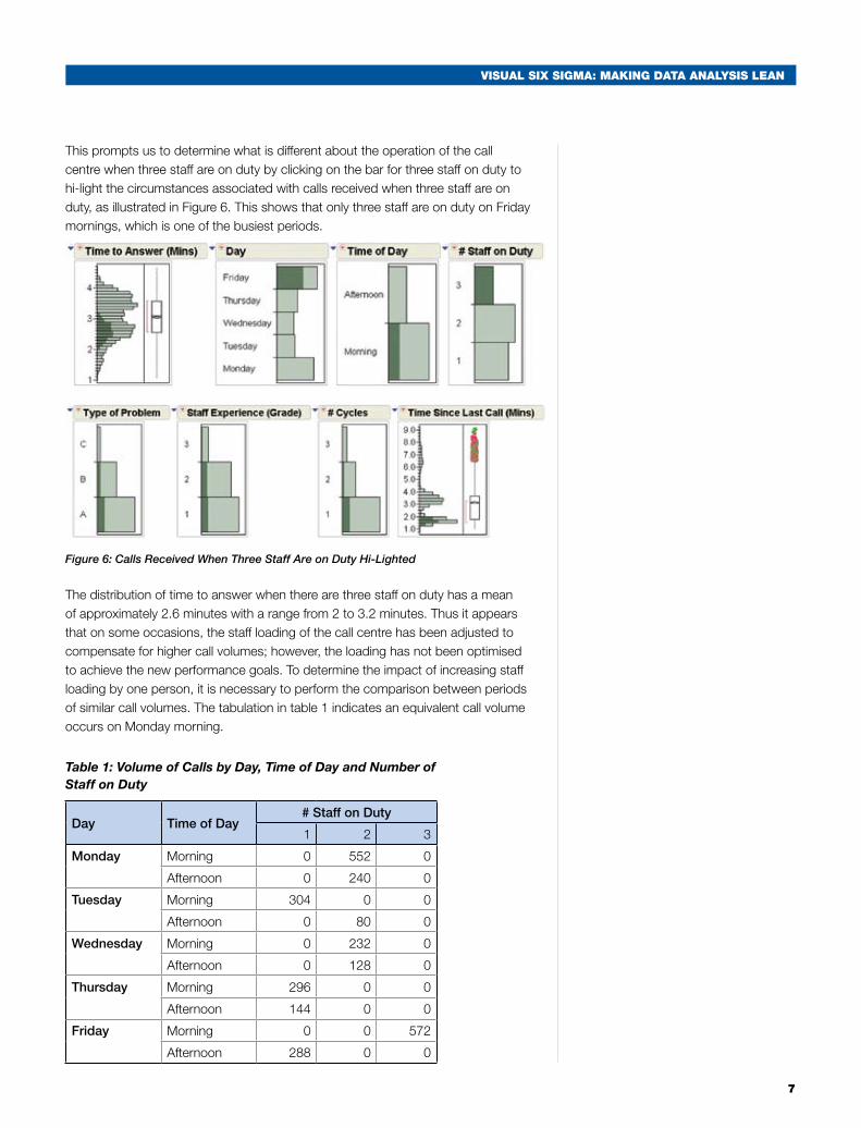
This prompts us to determine what is different about the operation of the call centre when three staff are on duty by clicking on the bar for three staff on duty to hi-light the circumstances associated with calls received when three staff are on duty, as illustrated in Figure 6. This shows that only three staff are on duty on Friday mornings, which is one of the busiest periods.
Figure 6: Calls Received When Three Staff Are on Duty Hi-Lighted
The distribution of time to answer when there are three staff on duty has a mean of approximately 2.6 minutes with a range from 2 to 3.2 minutes. Thus it appears that on some occasions, the staff loading of the call centre has been adjusted to compensate for higher call volumes; however, the loading has not been optimised to achieve the new performance goals. To determine the impact of increasing staff loading by one person, it is necessary to perform the comparison between periods of similar call volumes. The tabulation in table 1 indicates an equivalent call volume occurs on Monday morning.
Table 1: Volume of Calls by Day, Time of Day and Number of Staff on Duty
Day Time of Day# Staff on Duty
1 2 3
Monday Morning 0 552 0
Afternoon 0 240 0
Tuesday Morning 304 0 0
Afternoon 0 80 0
Wednesday Morning 0 232 0
Afternoon 0 128 0
Thursday Morning 296 0 0
Afternoon 144 0 0
Friday Morning 0 0 572
Afternoon 288 0 0

8
Visual six sigma: making Data analysis lean
By alternately clicking on the Monday morning and Friday morning cells within the summary table, we see the impact of increasing the number of staff on duty by one between periods of equivalent activity, as illustrated in Figure 7.
Figure 7: Visual Comparison of Time to Answer on Friday Morning vs. Monday Morning
The impact of increasing the number of staff on duty by one is to reduce mean time to answer by roughly one minute. This visual model is confirmed by clicking on other cells with similar call volume but differing number of staff on duty, e.g., Wednesday afternoon vs. Thursday afternoon, but this is not shown in the interest of brevity.
The distribution of time to solve has three clusters of data points: the first, with a mean of around two hours, is associated with calls solved in the first cycle; the second, with a mean of around seven hours, is associated with calls solved in the second cycle; and the third, with a mean of around 24 hours, is associated with calls solved in the third cycle. Thus a separate visual analysis was performed for each of the three subgroups defined by number of cycles.
Figure 8 shows simple histograms of each variable when the number of cycles is one with calls with a time to solve of less than 1.5 hours, identified with darker shading. This indicates that staff experience followed by type of problem are the top drivers of variation in time to solve.

Visual six sigma: making Data analysis lean
9
Figure 8: Visual Exploration of Relationships with Time to Solve When Number of Cycles = 1
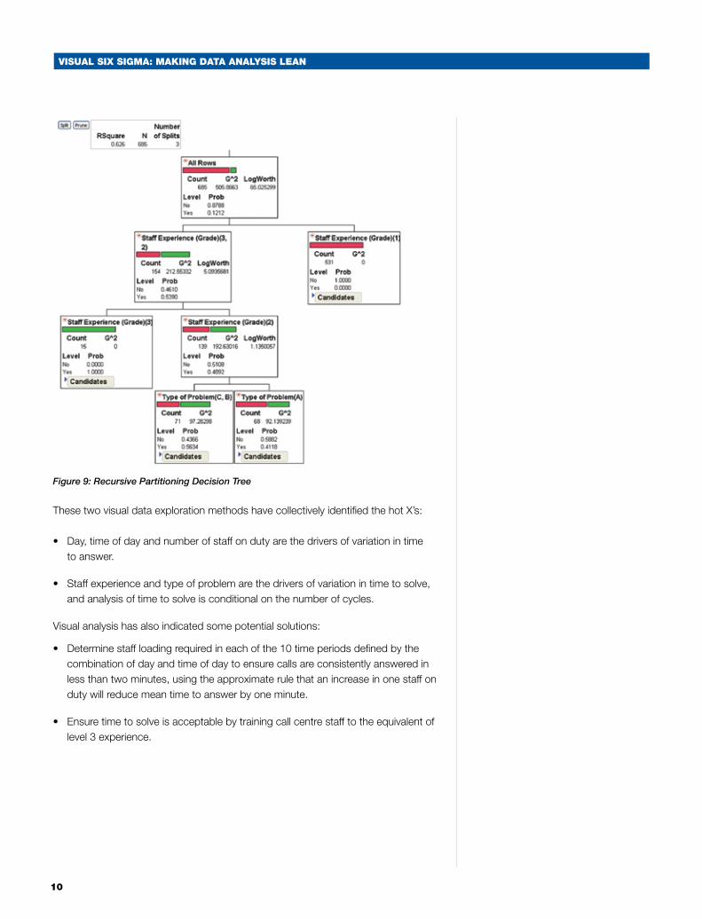
Another useful visual exploratory tool is recursive partitioning. This method repeatedly partitions data according to a relationship between the input variables and an output variable, creating a tree of partitions. It finds the critical input variables and a set of cuts or groupings of each that best predict process variation. Variations of this technique are many and include: decision trees, CART™, CHAID™, C4.5, C5 and others.
Figure 9 shows the resulting decision tree using recursive partitioning to explore the main drivers of variation in acceptable time to solve when the number of cycles is two, i.e., what is associated with calls with a solution time of less than five hours when the number of cycles is two. The hot X’s are confirmed as staff experience and type of problem. Each node of the decision tree represents a subgroup, the criteria by which the subgroup was determined and the probability of solving problems in less than five hours. The four nodes of the decision tree tell us:
• Allcallsroutedtostaffatlevel3experiencearesolvedinlessthanfivehours.
• 56 percent of calls routed to staff with level 2 experience are solved in less than five hours when the problem is category B or C.
• 41 percent of calls routed to staff with level 2 experience are solved in less than five hours when the problem is category A.
• None of the calls routed to staff with level 1 experience is solved in less than five hours.
10
Visual six sigma: making Data analysis lean
Figure 9: Recursive Partitioning Decision Tree
These two visual data exploration methods have collectively identified the hot X’s:
• Day, time of day and number of staff on duty are the drivers of variation in time to answer.
• Staff experience and type of problem are the drivers of variation in time to solve, and analysis of time to solve is conditional on the number of cycles.
Visual analysis has also indicated some potential solutions:
• Determine staff loading required in each of the 10 time periods defined by the combination of day and time of day to ensure calls are consistently answered in less than two minutes, using the approximate rule that an increase in one staff on duty will reduce mean time to answer by one minute.
• Ensure time to solve is acceptable by training call centre staff to the equivalent of level 3 experience.

Visual six sigma: making Data analysis lean
11
The effects of this subset of input variables upon time to answer and time to solve were investigated in more detail using multiple linear regression in Figure 10. Day, time of day and number of staff on duty are confirmed as the drivers of variation in time to answer, explaining 80 percent of the variation. Staff experience, type of problem and number of cycles are confirmed as the drivers of variation in time to solve, accounting for 98 percent of the variation.
Figure 10: Multiple Regression Analysis Summaries
Only two of these variables are under the control of the company — number of staff on duty and staff experience. To understand whether a viable solution is possible by controlling these variables alone, Monte Carlo simulations were performed using the regression model as the transfer function between the key process inputs, time to answer and time to solve. The results of the simulation when three staff are on duty in all periods and the experience of these staff is level 3 are indicated in Figure 11. Zero defects with regard to performance levels for time to solve are achieved; however, 42 percent of calls have an answer time in excess of two minutes.

12
Visual six sigma: making Data analysis lean
Figure 11: Monte Carlo Simulation
Figure 12 shows a distribution analysis of the simulated data with calls with an answer time in excess of two minutes hi-lighted, which indicates the poor performance with regard to time to answer, is primarily occurring on Monday and Friday mornings.
Figure 12: Visual Analysis of Drivers of Excessive Time to Answer from Simulated Data
Visual six sigma: making Data analysis lean
13
The simulation model was re-run with four staff at level 3 experience for Monday and Friday mornings and predicted 4.8 percent of calls with an answer time in excess of two minutes. A defect-free process is predicted with the following settings:
• Staffexperiencelevelequivalenttograde3atalltimes.
• FivestaffondutyonMondayandFridaymornings.
• FourstaffondutyonMondayandFridayafternoons;Tuesday,WednesdayandThursday mornings.
• Threestaffondutyatallothertimes.
5. Summary
In the case study, a variety of highly visual data exploration techniques was used to identify critical process parameters. This was combined with data mining tools to identify tighter control ranges of key parameters that result in more consistent service quality. Multiple regression modelling and Monte Carlo simulations then identified tighter control regions of key process variables that predict a near defect-free process.
Hopefully, from this example you can see how this visual approach really facilitates rapid exploration of the data to quickly drive focus onto the hot X’s. These methods are simple to understand and train and are capable of being deployed intelligently by a wide community of users. The modelling and simulation capability then builds on that to allow very rapid testing of “what if” scenarios and investigation of different improvement options.
So, if you have a concern that your data analysis is taking too long, or that your Six Sigma programme relies too heavily on a small number of highly trained and highly skilled BBs to carry out the data interpretation and statistical testing, then we would recommend that you consider the Visual Six Sigma approach as a practical and pragmatic alternative.


.

Six Sigma is a registered trademark of Motorola, Inc.
JMP WORLD HEADQUARTERS SAS INSTITUTE INC. +1 919 677 8000 U.S. & CANADA SALES 800 727 0025 www.jmp.com
SAS and all other SAS Institute Inc. product or service names are registered trademarks or trademarks of SAS Institute Inc. in the USA and other countries. ® indicates USA registration. Other brand and product names are trademarks of their respective companies. Copyright © 2008, SAS Institute Inc. All rights reserved. 103365_487180_0308