VisionsLive Style Guide November 2014_v1
36
VisionsLive Style Guide Ver 1 – Nov 14
-
Upload
barry-mcleod -
Category
Marketing
-
view
45 -
download
3
Transcript of VisionsLive Style Guide November 2014_v1

VisionsLive Style GuideVer 1 – Nov 14

Welcome.
Use these assets and guidelines to accurately communicate the VisionsLive brand.
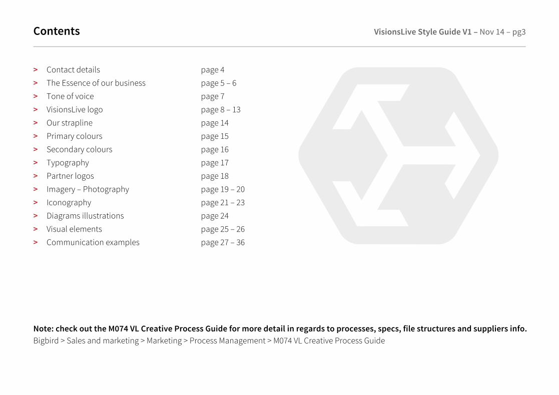
Contents VisionsLive Style Guide V1 – Nov 14 – pg3
> Contact details page 4
> The Essence of our business page 5 – 6
> Tone of voice page 7
> VisionsLive logo page 8 – 13
> Our strapline page 14
> Primary colours page 15
> Secondary colours page 16
> Typography page 17
> Partner logos page 18
> Imagery – Photography page 19 – 20
> Iconography page 21 – 23
> Diagrams illustrations page 24
> Visual elements page 25 – 26
> Communication examples page 27 – 36
Note: check out the M074 VL Creative Process Guide for more detail in regards to processes, specs, file structures and suppliers info.Bigbird > Sales and marketing > Marketing > Process Management > M074 VL Creative Process Guide

VisionsLive contact details VisionsLive Style Guide V1 – Nov 14 – pg4
Our O�ices
UK26 York Street,London W1U 6PZUnited Kingdom+44 (0)207 788 7821
US189 Main Street,Yarmouth, Maine 04096United States+1 866 412 0154
New Zealand109 Montreal Street,Sydenham, Christchurch 8023New Zealand+64 (0)3 962 8838
[email protected]://www.visionslive.com
Brand Guardians
Andreiko [email protected]
Barry McLeod (Sales and Marketing Director)[email protected]
Brian [email protected]
Creative
Rebecca Cleasby [email protected]

The essence of our business
Building a brand takes time and e�ort if it is to be fulfilled successfully. The key starting point is to apply a
cohesive identity across all communications and media to generate an expression that is individual, enabling
people to make a personal connection.
The essence of our business is – Credible, Leading edge, Competent, Professional, Market leaders,
> Our logo is simply the identifying mark of the company
> Our identity is how we consistently apply the component across all media platforms
> Our brand is the emotion we provoke in our customers, sta� and contemporaries
The consistent components of our corporate identity are crucial to a successful implementation. We need to
protect them, we need to respect them. This is why this simple document is indispensable.
VisionsLive Style Guide V1 – Nov 14 – pg5
VisionsLive Style Guide V1 – Nov 14 – pg6The essence of our business
Top reasons why you need a brand manual:
1. To enhance marketing e�orts so that e�ective use of the brand logo, design and expression generate a positive impact
2. To avoid physical distortions and deviations from the true design and character of our brand
3. To remind people that behind the brand is an organisation that invites trust and confidence
The brand guardians of VisionsLive are Andreiko Kerdemelidis, Barry McLeod and Brian Sites. Brand Guardians uphold the
elements and design principles contained in this document and while the work that they do will always be on brand, the
organisation will still use a network of advisers, internal colleagues, photographers and printers for executing the
company’s image, its message and its core competencies.
All elements of production will need to be approved by the brand guardians before being placed in production
(see key contacts).
This identity manual will ensure that our brand earns the value it deserves.
VisionsLive Style Guide V1 – Nov 14 – pg7Tone of Voice
Tone of VoiceSimple, Engaging LanguageThe way we talk along with the words we choose, helps us to get our message across and convey our outlook
RespectOur tone of voice is a basic element and just as important as the colours and images we use. Our tone of voice needs to show customers that we treat them as equals. We therefore need to talk to them on one level and convey our enthusiasm and respect for their project environments.
‘The VisionsLive team has a passion for building tools that let you connect and engage with the right people, on their devices and in their world, to get the insight you need, fast’.
Our tone of voice also needs to show that we help customers to be self-reliant but that VisionsLive support is always available.
Plain TalkingAll of our communications use plain talking. No fancy words, no showing o�. We use contractions like ‘we’re, it’s and that’s. But it’s not just about simplicity. We also want to inject energy. That’s partly done by surprising people, but also conveyed
through language. We make things sound chatty, with expressions like no wonder and that’s why.
We’re straight forward, to the point and never frilly. We get our facts across without being predictable or boring. Always try and use this bold and clear way of talking on all materials – not just ad or brochure copy
You and UsOur core focus is of course VisionsLive the company.
To customers however, we need to be more than an o�ice address – we are a support network. We therefore talk in the first person, directly to them in the second person. Examples:
Bad - The Company puts its customers firstGood - At VisionsLive we put you first
Bad - Smoking is forbidden in o�ice buildingsGood - Please do not smoke in our o�ice
Bad - The Company wishes to invite all customers to a meeting focussing on…Good - Come to a meeting to discuss…

VisionsLive Style Guide V1 – Nov 14 – pg8VisionsLive Logo – Primary
The VisionsLive logotype reflects our spirit and character. It is a uniquely created mark that stands for innovation, empathy and creativity.
Our inspiration for the logotype is derived from technology and innovation being at the centre of everything that we do, with ideas projecting from the core of our business, going in various directions whilst being true to our core business competencies.
Primary Logo – Full colour positiveCMYK file: VL_Logo_Red_CMYK.epsRGB file: VL_Logo_Red_RGB.eps
Positive full colour – VisionsLive Red on a light background. Note: Wherever possible the full colour logo must be used especially on 4 colour print.
Primary Logo – Full colour reversedCMYK file: VL_Logo_White_CMYK.epsRGB file: VL_Logo_White_RGB.eps
Reversed one colour – white on a dark background preferably VisionsLive red. Note: The logo can be converted to white under certain circumstances when sitting on a coloured panel within the communication piece generated. Please ensure su�icient contrast between logotype colour and background.

VisionsLive Style Guide V1 – Nov 14 – pg9VisionsLive Logo – Primary with strapline
Primary Logo – Full colour positive with straplineCMYK file: VL_Logo_Red_Strap_CMYK.epsRGB file: VL_Logo_Red_Strap_RGB.epsPantone file:
When appropriate, use the strapline logo.
Primary Logo – Full colour reversed with straplineCMYK file: VL_Logo_White_Strap_CMYK.epsRGB file: VL_Logo_White_Strap_RGB.eps
When appropriate, use the strapline logo

VisionsLive Style Guide V1 – Nov 14 – pg10VisionsLive Logo – Secondary
Secondary Logo – Mono positive
Note: The logo can be converted to any single colour in certain circumstances to allow for flexibility when sitting on media and must complement colours used within the communications piece generated.
Secondary Logo – Black Mono positiveCMYK file: VL_Logo_Mono_Strap_CMYK.epsRGB file: VL_Logo_Mono_Strap_RGB.eps
Note: The black version should only be used on mono media pieces or for specific online graphic e�ect
Secondary Logo – Full colour positive CMYK file: VL_Logo_Secondary_CMYK.epsRGB file: VL_Logo_Secondary_RGB.epss
Larger icon logo. Positive two colour – VisionsLive Red and Grey on a light background
Secondary Logo – Full colour reverseCMYK file: VL_Logo_Secondary_Rev_CMYK.eps
Larger icon logo. Reversed two colour – white on a dark background preferably VisionsLive Red

VisionsLive Style Guide V1 – Nov 14 – pg11Logo – Do’s and don’ts
The Logo – Master artworkAlways use the original master artwork. When supplying logos to suppliers the preferred logo format to supply are .eps vector files – due to the high resolution quality of that format. Otherwise supply a high res jpg or png if requested.
Web – Use .svg RGB files. Alternatively jpg or png 72dpi @ 100% or 200%.Standard quality print – Use .eps vector CMYK files. Alternatively pixel image med res file @ 150dpi minimum. High quality print – Use .eps vector CMYK files. Alternatively pixel image high res file @ 300dpi minimum.
Exclusion ZoneA minimum area of clear space (exclusion zone) must always remain around the logotype – minimum 1 x capital x height – all other graphic elements must not encroach on this area of clear space. The logo must be le� to breathe.

VisionsLive Style Guide V1 – Nov 14 – pg12Logo – Do’s and don’ts
The Logo – Size and layoutThe logotype has been created to a proportion of 1:2:5 and these proportions should remain always.
The logo should not be stretched, distorted or altered in any way.
30mm
Incorrect useCorrect use
Minimum Size
Print – the logo should never be displayed less than 30mm wide
Digital – the logo should never be displayed less than 30 pixels wide30 pixels

VisionsLive Style Guide V1 – Nov 14 – pg13Logo – Do’s and don’ts
Do’s> The logo should be included on all communications.> Size variations, posters and signage The signature may be printed at a bigger scale on posters and other over-sized applications. > Always leave the logo some space to breathe.> Use white or neutral backgrounds. If it’s unavoidable to sit the logo on a colour. We prefer VisionsLive red and use the negative logo.
Don’ts> Don’t sit the logo on non compatible or dark colours. > Don’t reverse the logo from backgrounds that are too light or cluttered.> Don’t squash, stretch, italic, embolden, apply outline, change colour combination or contrast, change the relationship or orientation.
Incorrect use Incorrect use Incorrect use

VisionsLive Style Guide V1 – Nov 14 – pg14Our strapline
“Get closer. Get answers. Understand. In their world™.”
This is our strapline.
Wherever possible and appropriate, the logo should appear with the strapline.
The logo has been set in a number of di�erent formats. Pick the one that best suits the usage.
“Online Qualitative Research made simple.”
This is our strapline.
These should always be set in our font – Source Sans Pro Semibold

Primary colours
Primary colours VisionsLive Style Guide V1 – Nov 14 – pg15
RedRGB: 193, 57, 55HEX: #c13937CMYK: 17, 97, 82, 7Spot: 1805 C or 186C
Note: Previous web colourRGB: 192, 32, 44HEX: #c0202c
WhiteRGB: 255, 255, 255HEX: #���CMYK: 0, 0, 0, 0Spot: NA
Dark GreyRGB: 38, 37, 38HEX: #262526CMYK: 0, 0, 0, 90Spot: Neutral Black C
Mid GreyRGB: 222, 222, 222HEX: #dededeCMYK: 0, 0, 0, 20Spot: Cool Gray 3 C
Light GreyRGB: 245, 245, 245HEX: #f5f5f5CMYK: 0, 0, 0, 10Spot: Cool Gray 3 C
Our primary brand colours are VisionsLive red, white and range of greys. These colours are used for all brand communications.
GreyRGB: 128, 126, 127HEX: #807e7fCMYK: 0, 0, 0, 60Spot: Cool Gray 9 C

Secondary colours VisionsLive Style Guide V1 – Nov 14 – pg16
Secondary colours
GoldRGB: 166, 152, 105HEX: #a69869CMYK: 0, 8, 37, 35Spot: 451 C or 8362 C
GreenRGB: 56, 98, 96HEX: #386260CMYK: 43, 0, 2, 62Spot: 5477 C
Yellow OrangeRGB: 227, 150, 32HEX: #e39620CMYK: 0, 34, 86, 11Spot: 7563 C
Blue GreyRGB: 136, 148, 168HEX: #8894a8CMYK: 19, 12, 0, 34Spot: 535 C
LilacRGB: 117, 96, 129HEX: #756081CMYK: 9, 26, 0, 49Spot: 667 C
Our secondary brand colours pastel tones. These colours are to be used in subtle amounts alongside the primary colours for brand communications.
PurpleRGB: 128, 76, 99HEX: #804c63CMYK: 0, 41, 23, 50Spot: 5135 C
LimeRGB:166, 169, 18HEX #a6a912CMYK: 2, 0, 89, 34Spot: 7745 C
Slate GreyRGB: 82, 82, 82HEX: #525252CMYK: 0, 0, 0, 68Spot: 425 C
OrangeRGB: 217, 109, 44HEX: #d96d2cCMYK: 0, 50, 80, 15Spot: 7578 C
YellowRGB: 216, 180, 9HEX: #d8b409CMYK: 0, 17, 96, 15Spot: 7759 C
BlueRGB: 68, 81, 105HEX: #445169CMYK: 35, 23, 0, 59Spot: 7545 C

Typography
Source Sans Pro LightABCDEFGHIJKLMNOPQRSTUVWXYZ 1234567890abcdefghijklmnopqrstuvwxyz !@£$%^&*()_+;”?.
Source Sans Pro SemiBoldABCDEFGHIJKLMNOPQRSTUVWXYZ 1234567890abcdefghijklmnopqrstuvwxyz !@£$%^&*()_+;”?.
Secondary typefaces We use Arial Regular for the main body copy text.
Zurich BT Roman is the logo font.
ArialABCDEFGHIJKLMNOPQRSTUVWXYZ 1234567890abcdefghijklmnopqrstuvwxyz !@£$%^&*()_+;”?.
Zurich BT Roman
Primary typefaceSource Sans Pro Light, Regular and SemiBold is a Google web font used for headings and prominent text throughout communications. It is great for sub headings, but not areas of body copy when being used for digital.
VisionsLive Style Guide V1 – Nov 14 – pg17

Partner logos VisionsLive Style Guide V1 – Nov 14 – pg18
GOLD PARTNER
PLATINUM PARTNER
SILVER PARTNER
VisionsLive Silver Partner
VisionsLive Gold Partner
VisionsLive Platinum Partner
The VisionsLive Project Success Team is available for complete international programme delivery and can provide an online qual research platform and support services. Available at various levels, the VisionsLive Partner Programme will ensure that a research project receives the premium service required to deliver client success.
Market leading Silver, Gold and Platinum levels of support attract many fantastic features. These include a white labelling service for our mobile app, online focus groups andboards and (dependant on level) platform customisation.

Imagery – Photography VisionsLive Style Guide V1 – Nov 14 – pg19
Image is everything – Images can say just as much as words.
Photography style
Photography style should always when possible and acceptable be taken with a depth of field.
Real People
The use of real people as models is both cost e�ective and retains a realistic image, however you cannot always guarantee photogenic models – images must remain inclusive and diverse, but only used when directly talking about that particular customer or customers in general.
Generally images directly looking into the eyes of the subject should be avoided, as we are always trying to achieve a natural, not posed shot.

Imagery – Photography VisionsLive Style Guide V1 – Nov 14 – pg20
Real activities
The move away from real people as the main focus is important. If we are to have a broad appeal, images should hold the action at their focus not the person in the shot.
Specifications
Specifications can vary from project to project. Shoot images in the highest possible resolution. This is a good rule of thumb whether the asset is for print or digital use.
All photos and videos should have proper, signed releases.A ‘Talent Release form’ is available from marketing
When capturing images at a crowded event, make it known that any and all attendees may be photographed or filmed and used in VL promotional communications. Honor the request of anyone who asks not to be photographed or filmed.
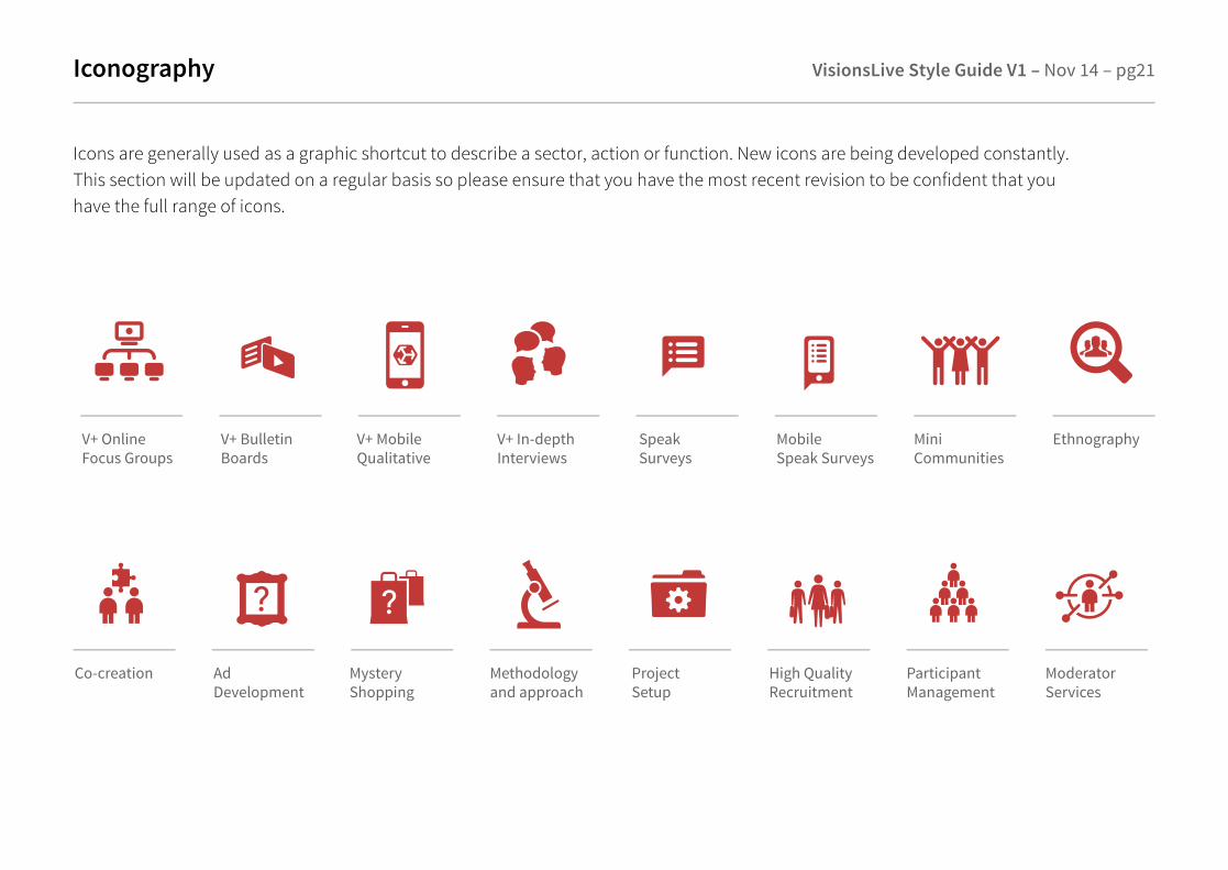
Iconography VisionsLive Style Guide V1 – Nov 14 – pg21
Icons are generally used as a graphic shortcut to describe a sector, action or function. New icons are being developed constantly. This section will be updated on a regular basis so please ensure that you have the most recent revision to be confident that you have the full range of icons.
V+ Online Focus Groups
V+ Bulletin Boards
V+ Mobile Qualitative
V+ In-depthInterviews
SpeakSurveys
Mobile Speak Surveys
MiniCommunities
Ethnography
Co-creation Ad Development
Mystery Shopping
Methodologyand approach
ProjectSetup
High QualityRecruitment
ParticipantManagement
ModeratorServices

Iconography
Youtube(website)
Google plus(website)
Twitter(website)
Linked in(website)
Groups#1e2832
Moderator #1e2832#bf222c
Observers#1e2832#a37dcc
Respondents#1e2832#0bc6�
VisionsLive Style Guide V1 – Nov 14 – pg22
Languageand TranslationServices
Task DrivenResearch
Our Team News and Events
Testimonials CustomerJourneys
Support Our O�ices
A new set of icons has been designed to work in harmony with the new visual language.
Project SuccessTeam
PartnerProgramme
Linked in(newsletter)
Youtube(newsletter)
Twitter(newsletter)
Google +(newsletter)
Communicate icons in circles on a light grey background

Iconography – Admin
Below some iconography for the admin site (Big Fish) the full set will be found in the ‘Big Fish style guide’ and on the wiki.
VisionsLive Style Guide V1 – Nov 14 – pg23
Live Groups#36615e
In-depth Interviews#e29524
V+ Speak Survey#7e4b63
V+ Community#a6a81c
V+ Boards #515151
V+ Mobile#d76d2c
Add respondents From Excel#1f6e46 #66b045
Add respondents One at a time#32485b
X

Diagrams Illustrations VisionsLive Style Guide V1 – Nov 14 – pg24
Diagrams – Illustrative Style
So�ware is an intangible product and is always di�icult product to promote. We have therefore developed a very clean technical style to illustrate functionality, process and usability of each piece of so�ware that we develop.

Design Elements – General VisionsLive Style Guide V1 – Nov 14 – pg25
V+ Qualitative Platform
V+ is a qualitative market research platform that gets you real insight from the frontline of people’s lives.
V+ is the easiest way to set up qualitative research projects – for groups/communities or for one-on-one interviewing and ethnography work. Request a demo to see just how simple it is.
With V+ you can let real online social interactions happenamong participants in your study – fluid conversations, liking and sharing images and videos – while you stay in full control.
V+ supports all digital platforms, mobile – tablet – desktop.We use the media and devices that your participants use,so we can get up close and personal.
Source Sans Pro Semibold headingsLight grey line under headings
Use VL icon or ‘>’ symbol as a bullet point in Source Sans Pro Bold
Source Sans Pro Light for body copy
Sign up for a demo
Red call to action buttonsSource Sans Pro Semibold copy Choose
your FREE V+ Bulletin
Board colour scheme
Use red tab banner below images/videos
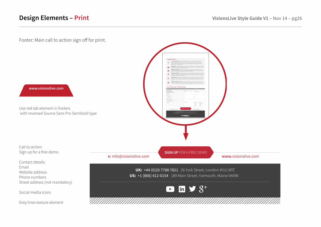
Design Elements – Print VisionsLive Style Guide V1 – Nov 14 – pg26
Footer: Main call to action sign o� for print.
UK: +44 (0)20 7788 7821 26 York Street, London W1U 6PZUS: +1 (866) 412-0154 189 Main Street, Yarmouth, Maine 04096
e: [email protected] www.visionslive.comSIGN UP FOR A FREE DEMO
Call to action: Sign up for a free demo.
Contact details:EmailWebsite addressPhone numbersStreet address (not mandatory)
Social media icons
Grey lines texture element
www.visionslive.com
Use red tab element in footers with reversed Source Sans Pro Semibold type

Print Communications – Signage VisionsLive Style Guide V1 – Nov 14 – pg27
Exhibit and Signage Display
When it comes to standing out in a crowd, sometimes less truly is more. Keep signage simple by using approved brand identity elements, colours fonts, and photography.
When appropriate use strapline...
“Get closer. Get answers. Understand. In their world™.”
or
‘Online Qualitative Research made simple.’
should be used appropriately to strengthen the message and brand.

Print Communications – Livery VisionsLive Style Guide V1 – Nov 14 – pg28
Make a great first impression by using these approved stationery elements.
A4 Letterhead (also available as a Word template) DL Comp Slip
Email signatures> VL logo> Your name> Job title> Phone number> Cell number (if applicable)> VL social links (if applicable)> Email address> Website address
Talk to the dev team to setup your template.

Print Communications – Livery VisionsLive Style Guide V1 – Nov 14 – pg29
VisionsLive Business card Matt laminate and Spot UV logo
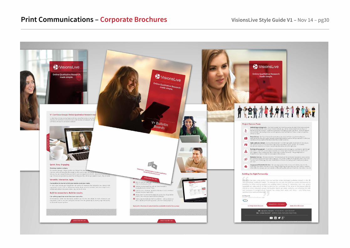
Print Communications – Corporate Brochures VisionsLive Style Guide V1 – Nov 14 – pg30

Print Communications – Welcome Pack VisionsLive Style Guide V1 – Nov 14 – pg31
VisionsLive Welcome PackA4 folder, Help Documents, Brochures, Bear and USB stick.

Print Communications – Print Adverts VisionsLive Style Guide V1 – Nov 14 – pg32

Digital Communications – Powerpoint VisionsLive Style Guide V1 – Nov 14 – pg33
It’s important to make every e�ort to capture the exciting brand personality in your presentations. Follow these guidelines when creating dynamic presentations:
> The VisionsLive logo should appear on each screen of the presentation.> This may appear either over white or reversed on a black or a dark background.> The logo should appear in approved colours
Powerpoint – Google hangouts

Digital Communications – Online Marketing VisionsLive Style Guide V1 – Nov 14 – pg34
Example of email newsletter for christmas promotion

Digital Communications – Social Media VisionsLive Style Guide V1 – Nov 14 – pg35
Google+ Use consistent VL communication cover image/header throughout all social media

Digital Communications – VL Website VisionsLive Style Guide V1 – Nov 14 – pg36
VisionsLive Customer Website


![Outback Organics_USA_A4 Training Manual 2014_v1[1]](https://static.fdocuments.us/doc/165x107/58efd1d41a28ab672a8b4581/outback-organicsusaa4-training-manual-2014v11.jpg)