Vertex Brewing Co.
42
-
Upload
kelsey-paone -
Category
Documents
-
view
230 -
download
3
description
Brand standards manual
Transcript of Vertex Brewing Co.


Verte
x Br
ewing
Co.
4
Br
and
Stan
dard
s Man
ual
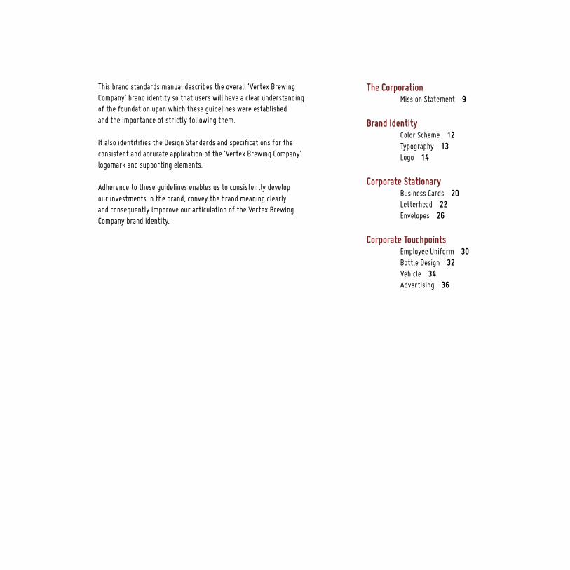
The Corporation Mission Statement 9
Brand Identity Color Scheme 12 Typography 13 Logo 14
Corporate Stationary Business Cards 20 Letterhead 22 Envelopes 26
Corporate Touchpoints Employee Uniform 30 Bottle Design 32 Vehicle 34 Advertising 36
This brand standards manual describes the overall ‘Vertex BrewingCompany’ brand identity so that users will have a clear understandingof the foundation upon which these guidelines were establishedand the importance of strictly following them.
It also identitifies the Design Standards and specifications for theconsistent and accurate application of the ‘Vertex Brewing Company’logomark and supporting elements.
Adherence to these guidelines enables us to consistently developour investments in the brand, convey the brand meaning clearlyand consequently imporove our articulation of the Vertex Brewing Company brand identity.
Vertex Brewing Co. 5 Brand Standards Manual


The Corporation

Verte
x Br
ewing
Co.
8
Br
and
Stan
dard
s Man
ual
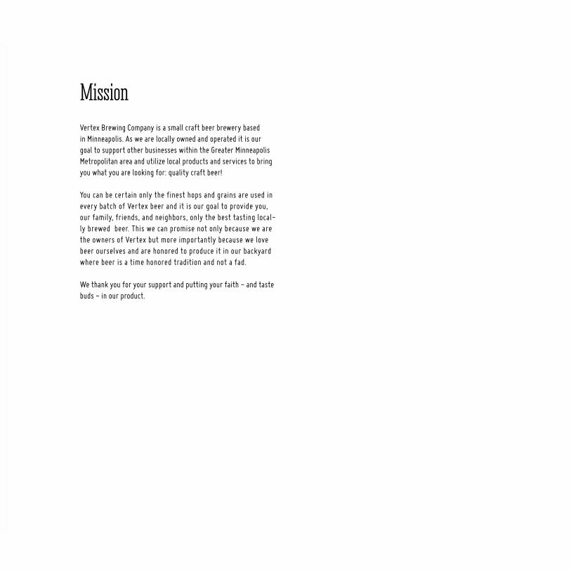
MissionVertex Brewing Company is a small craft beer brewery based in Minneapolis. As we are locally owned and operated it is our goal to support other businesses within the Greater Minneapolis Metropolitan area and utilize local products and services to bring you what you are looking for: quality craft beer!
You can be certain only the finest hops and grains are used in every batch of Vertex beer and it is our goal to provide you, our family, friends, and neighbors, only the best tasting local-ly brewed beer. This we can promise not only because we are the owners of Vertex but more importantly because we love beer ourselves and are honored to produce it in our backyard where beer is a time honored tradition and not a fad.
We thank you for your support and putting your faith - and taste buds - in our product.
Vertex Brewing Co. 9 Brand Standards Manual

Brand Identity

CMYK 32 / 93 / 84 / 42RGB 117 / 33 / 33HEX
CMYK 7 / 7 / 15 / 0RGB 235 /230 / 214HEX
CMYK 0 / 0 / 0 / 100RGB 35 / 31 / 32 HEX
Color consistency is as important as logomark consistency. Building strong color equity for the Vertex brand is critical to strengthening brand awareness with clients, maintaining a unique place in the market.
Corporate Brand Colors Color Reproduction Uncoated Papers
Color Scheme
The use and values of our corporate brand colors have been carefull considered within the logo. Please ensure that the colors and tint values are not changed or altered in any way.
Printers should adjust their dentisities / ink mixes to print on uncoated papers so that the colors match their coated equivalents as colsely as pos-sible.
Verte
x Br
ewing
Co.
12
Bran
d St
anda
rds M
anua
l
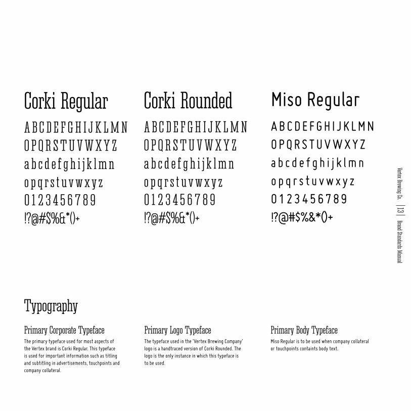
Corki Regular Corki Rounded Miso RegularA B C D E F G H I J K L M NO P Q R S T U V W X Y Za b c d e f g h i j k l m no p q r s t u v w x y z0 1 2 3 4 5 6 7 8 9!?@#$%&*()+
A B C D E F G H I J K L M NO P Q R S T U V W X Y Za b c d e f g h i j k l m no p q r s t u v w x y z0 1 2 3 4 5 6 7 8 9!?@#$%&*()+
A B C D E F G H I J K L M NO P Q R S T U V W X Y Za b c d e f g h i j k l m no p q r s t u v w x y z0 1 2 3 4 5 6 7 8 9!?@#$%&*()+
The primary typeface used for most aspects of the Vertex brand is Corki Regular. This typeface is used for important information such as titling and subtitling in advertisements, touchpoints and company collateral.
The typeface used in the ‘Vertex Brewing Company’ logo is a handtraced version of Corki Rounded. The logo is the only instance in which this typeface is to be used.
Miso Regular is to be used when company collateral or touchpoints containts body text.
Primary Corporate Typeface Primary Logo Typeface Primary Body Typeface
Typography
Vertex Brewing Co. 13 Brand Standards Manual

The logo must never be redrawn or modified. Every element has been drawn with the highest attention to detail to ensure accurate reproduction from micro to macro sizes.
Do not use a background that is close to the same tone or color range as the logo mark. The entire logo must be clearly visible.
Usage Guidelines
Logo
122 mm
91 mm
22 mm
11 mm
73 mm
54 mm
76 mm
Verte
x Br
ewing
Co.
14
Bran
d St
anda
rds M
anua
l

The logo has been designed to work well at large sizes as well as smaller, more subtile sizes. In the interest of legability, particularly for the small type at the bottom of the logo, the example shows the minimum size that the logo should be reproduced. If using embroidery, it is important to never alter the logo in any way and to ensure the logo is large enough so that all type and graphics are clear.
For maximum impact and instant recognitition, the logo should not be crowded by other visual ele-ments. Adequate white space should be left around the logo so that its prominence is not compromised. In no instance should a line of text or any other visual element overlay the logotype.
Minimum Size Clear Space Around
3 cm 6 cm
Vertex Brewing Co. 15 Brand Standards Manual

The primary logo is always the preferred version for all applications. There are versions of the primary logo that are acceptable depending on the reproduction technique.
If using full CMYK print on a dark background all aspects of the logo must still be visible. The type and top hat is to be changed to white and red is elimiated from the hat and is to be changed to black.
When using the logo on grayscale documents or collateral the primary full color logo is to be converted to grayscale.
Logo Variations Dark Background Grayscale
Verte
x Br
ewing
Co.
16
Bran
d St
anda
rds M
anua
l

If printing using one color white or black is to be used depending on the background.
When the logo is used without the mark the mark must be present somewhere else in the composition. Shown is the logotype on a light and dark background.
The same can be for the mark without the logo. It may be used as long as the logotype is somewhere else within the composition.
One Color Logo Without Mark
Vertex Brewing Co. 17 Brand Standards Manual

Corporate Stationary

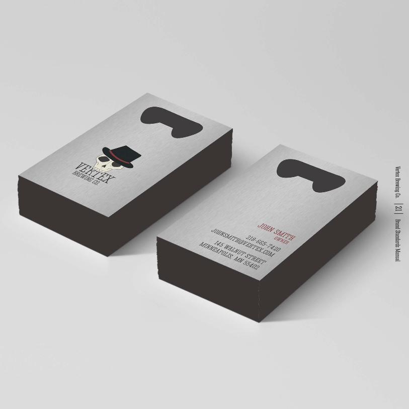
These business cards are created using stainless steel so they can be used to open a Vertex beer.
The type standards for the employee information are explained above.
Business Cards
JOHN SMITHOWNER
145 WALNUT STREETMINNEAPOLIS, MN 55402
3 x 5 inch card
Corki Regular 10 pt.
Corki Regular 8 pt.
Verte
x Br
ewing
Co.
20
Bran
d St
anda
rds M
anua
l
Vertex Brewing Co. 21 Brand Standards Manual

Vertex Brewing Co.’s letterhead is in the IOS Standard A4 size. The typeface and point size for the information is explained above.
Letterhead
JOHN SMITHOWNER
145 WALNUT STREETMINNEAPOLIS, MN 55402
Corki Regular 10 pt.
10 mm
10 mm
10 mm
A4 size
Verte
x Br
ewing
Co.
22
Bran
d St
anda
rds M
anua
l

Vertex Brewing Co. 23 Brand Standards Manual
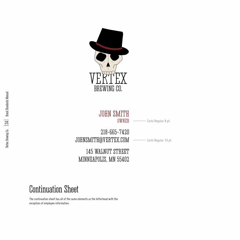
The continuation sheet has all of the same elements as the letterhead with the exception of employee information.
Continuation Sheet
Corki Regular 10 pt.
Corki Regular 8 pt.
Verte
x Br
ewing
Co.
24
Bran
d St
anda
rds M
anua
l

Vertex Brewing Co. 25 Brand Standards Manual

The size of the envelope ensures that both the IOS-A4 and standard letter sized paper will fit when tri-folded. Envelop standards are explained above.
The back of the envelope has an additional logo and the inside contains a pop of color.
Envelopes
Corki Regular 16 pt.
Corki Regular 12 pt.
Verte
x Br
ewing
Co.
26
Bran
d St
anda
rds M
anua
l

Vertex Brewing Co. 27 Brand Standards Manual


Corporate Touchpoints

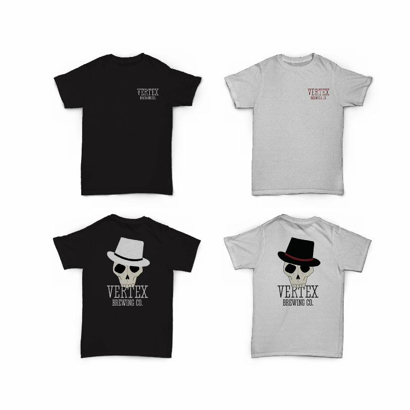
At Vertex Brewing Company we require all employees to be easily identifiable. Employees must wear a Vertex t-shirt and hat at all times.
T-shirt and hats are also available to be sold to the public.
Employee UniformEmployees with long hair must pull it back into the hat and wear khaki or black slacks with the shirt given.

Each flavor of Vertex beer comes with its unique character. The characters give life to each flavor.
All characters follow the same style as the character of the logo mark and are shown above.
Bottle Design


The utility vehicle for Vertex Brewing Company follows the guidelines as stated in the identity. Using the mark as a bleed to identify the company the van is easily recognized from a distance.
Vehicle

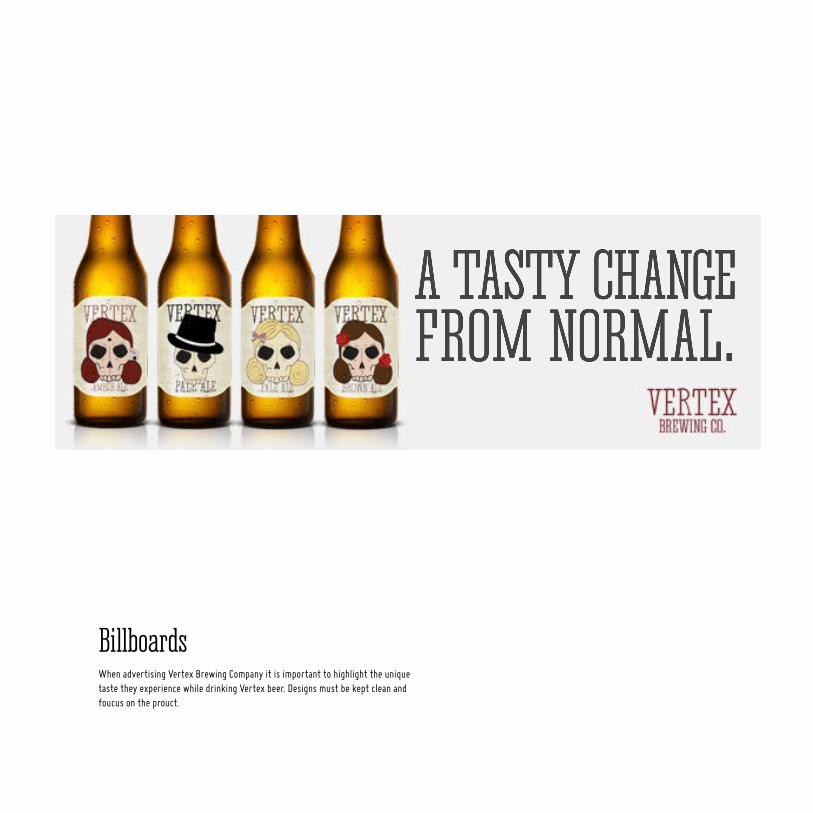
When advertising Vertex Brewing Company it is important to highlight the unique taste they experience while drinking Vertex beer. Designs must be kept clean and foucus on the prouct.
Billboards
A TASTY CHANGEFROM NORMAL.

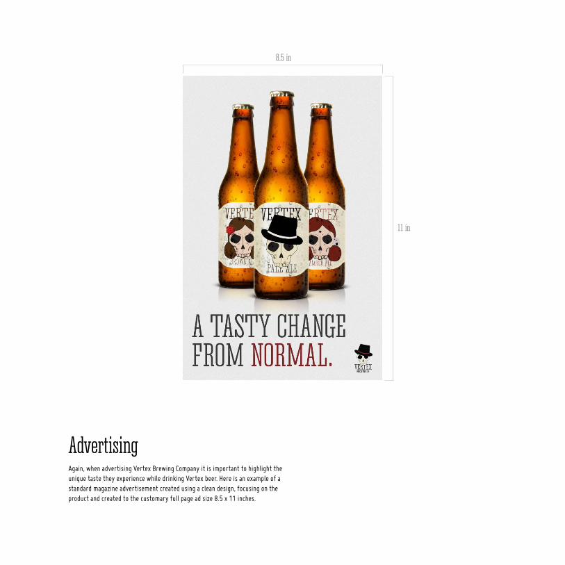
Again, when advertising Vertex Brewing Company it is important to highlight the unique taste they experience while drinking Vertex beer. Here is an example of a standard magazine advertisement created using a clean design, focusing on the product and created to the customary full page ad size 8.5 x 11 inches.
Advertising
11 in
8.5 in


Identity & Brand Standards Manualcreated by
Kelsey Paone