BILINGUAL CHILDREN'S REPAIRS Bilingual Children's Repairs of ...
Upload
della-reedCategory
view
218download
1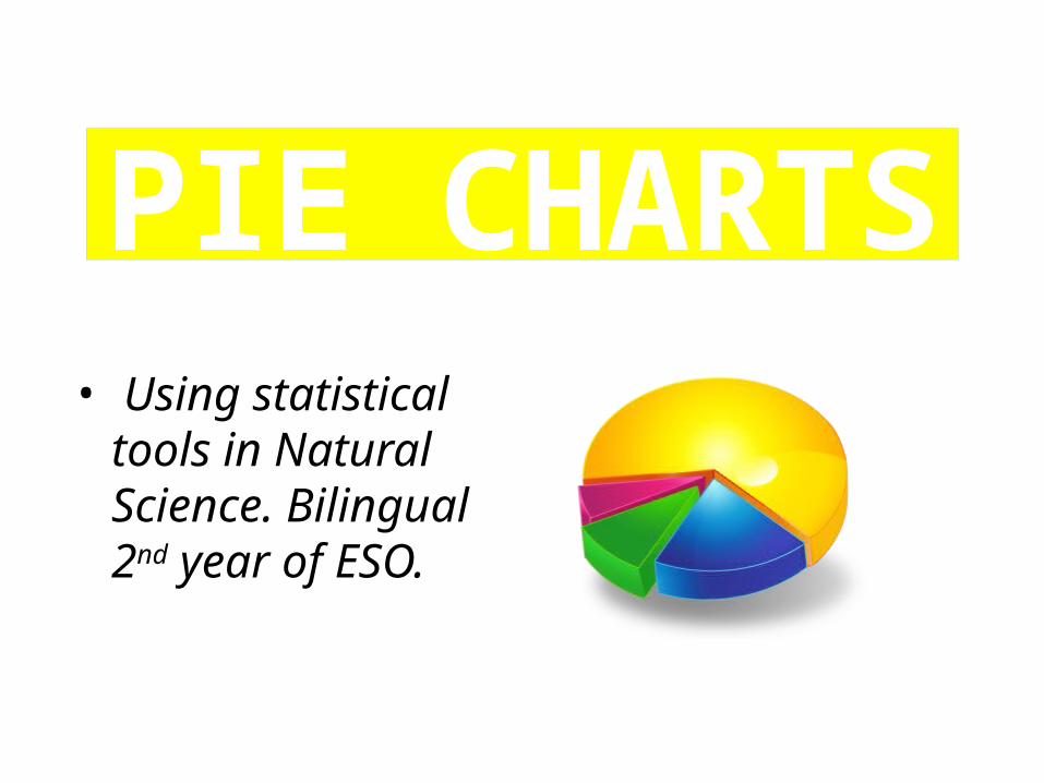
PIE CHARTS• Using statistical
tools in Natural Science. Bilingual 2nd year of ESO.
From % to diagrams
• We can convert percentages into diagrams.
• For this year, the most useful of them is the sector diagram, usually called “pie chart” because of its appearance.
Vocabulary: diagrama de sectores o diagrama circular o diagrama de tarta.
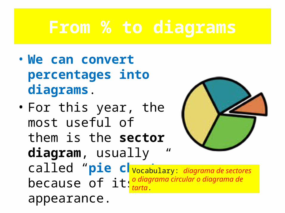
Pie charts • A : ½ = (1x100/2) = 50%
• B: ¼ = (1x100/4) = 25%
• C: 1/3 = (1x100)3 = 33.3 %
A
B
C
• A pie chart has some coloured sectors.
• Each sector represents a fraction of the whole quantity.
• Examples: Here we have some easy-to-interpret fractions:
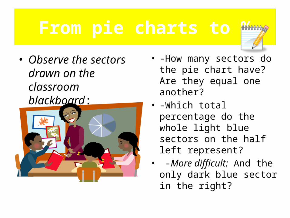
From pie charts to %
• Observe the sectors drawn on the classroom blackboard:
• -How many sectors do the pie chart have? Are they equal one another?
• -Which total percentage do the whole light blue sectors on the half left represent?
• -More difficult: And the only dark blue sector in the right?
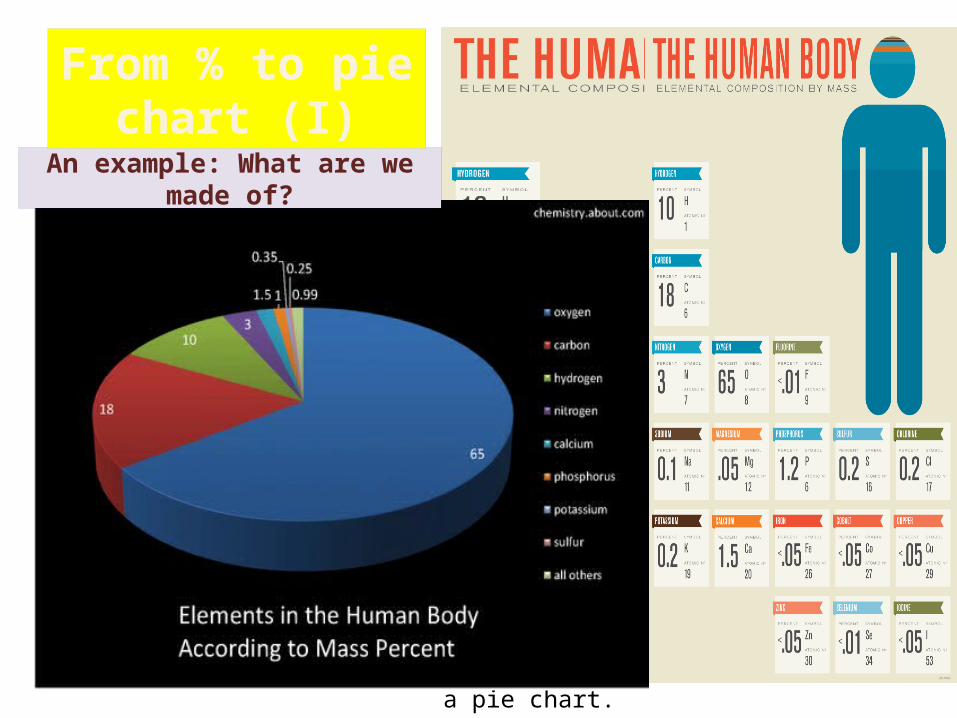
These numbers can be converted into a pie chart.
An example: What are we made of?
From % to pie chart (I)
• If we have some data expressed in %, we can obtain a pie chart from them.
• As the pie chart is circular, we have to transform % or “fractions” into “sectors”.
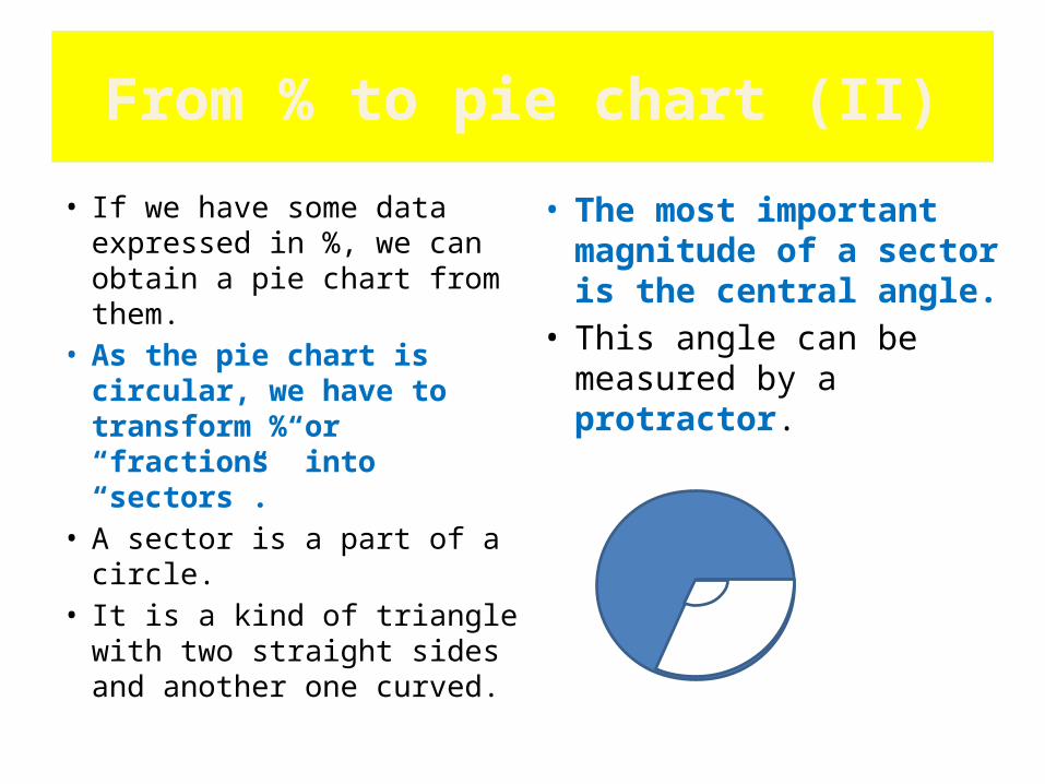
• A sector is a part of a circle.
• It is a kind of triangle with two straight sides and another one curved.
• The most important magnitude of a sector is the central angle.
• This angle can be measured by a protractor.
From % to pie chart (II)
From % to pie chart (III)
• To draw a pie chart, we have to establish a relationship between “grades” and “fractions”.
• A circumference contains 360º.– Half a circumference is:
360º x(1/2) =180º.– A quarter of circumference
is:360º x (1/4) = 90º.
• Each fraction corresponds to a certain % and to a certain amount of grades.– 1 = 100% is 360º.– ½ = 50% is 180º– ¼ = 25% is 90º,
etc.So, the formula we have to
use is:“grades” = 360º x “fraction” = = 360º x (%) /100
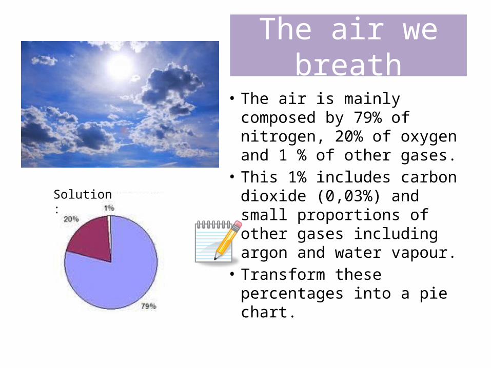
The air we breath
• The air is mainly composed by 79% of nitrogen, 20% of oxygen and 1 % of other gases.
• This 1% includes carbon dioxide (0,03%) and small proportions of other gases including argon and water vapour.
• Transform these percentages into a pie chart.
Solution:
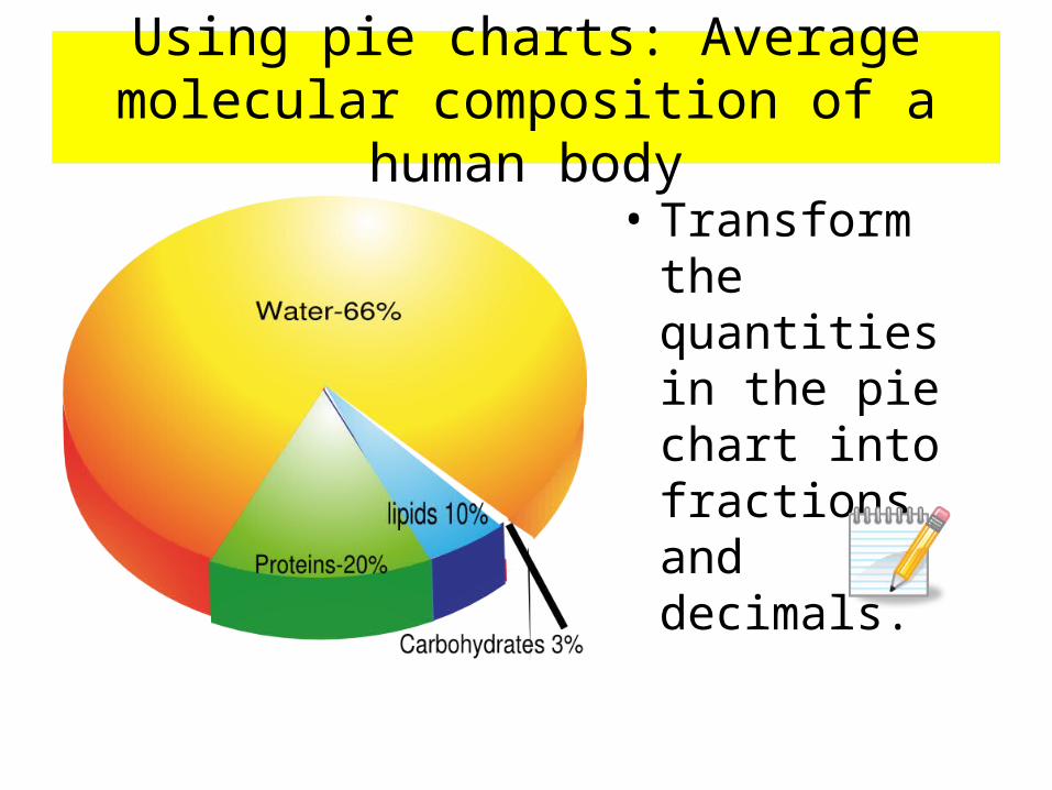
Using pie charts: Average molecular composition of a human body
• Transform the quantities in the pie chart into fractions and decimals.
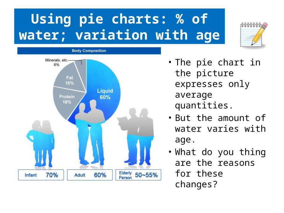
Using pie charts: % of water; variation with age
• The pie chart in the picture expresses only average quantities.
• But the amount of water varies with age.
• What do you thing are the reasons for these changes?
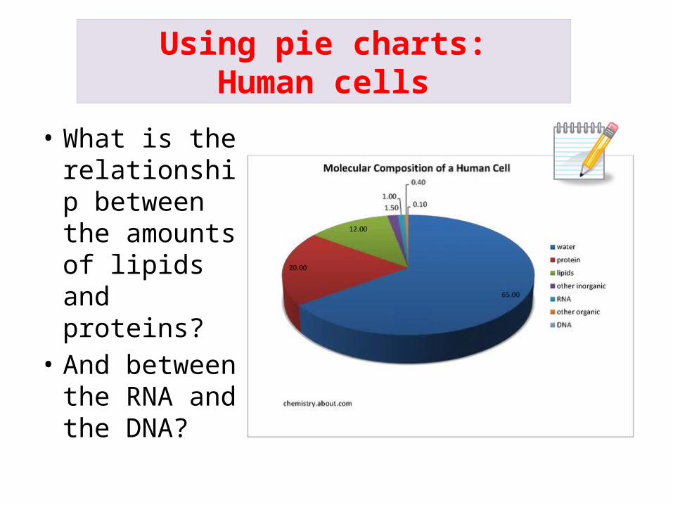
Using pie charts:Human cells
• What is the relationship between the amounts of lipids and proteins?
• And between the RNA and the DNA?
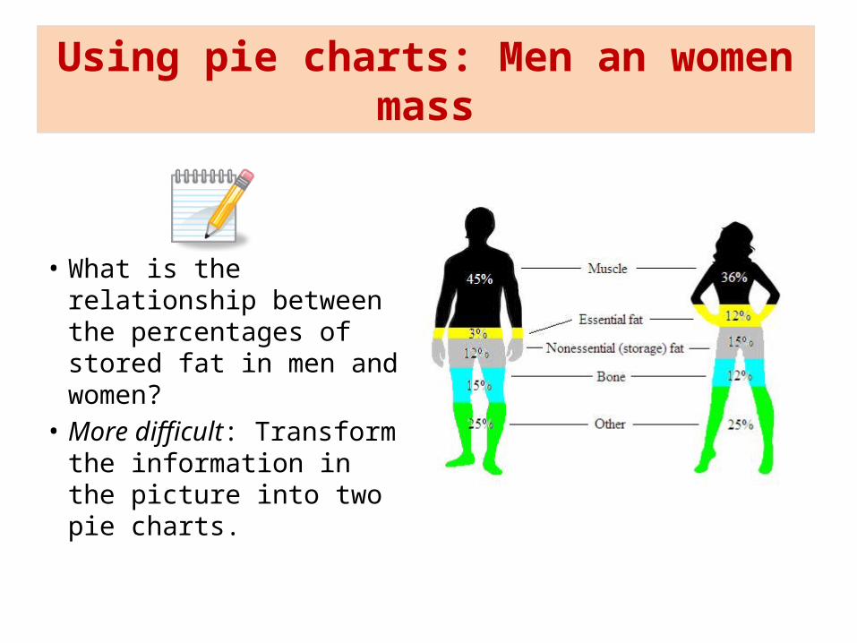
Using pie charts: Men an women mass
• What is the relationship between the percentages of stored fat in men and women?
• More difficult: Transform the information in the picture into two pie charts.
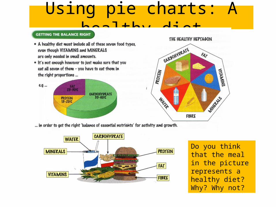
Using pie charts: A healthy diet
Do you think that the meal in the picture represents a healthy diet?Why? Why not?
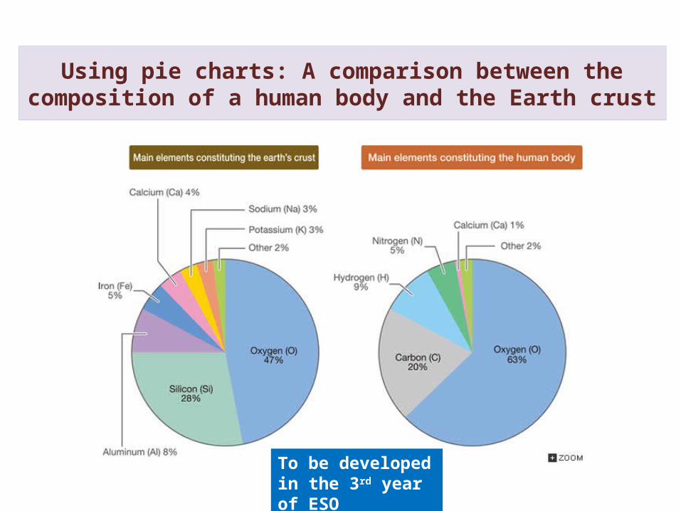
Using pie charts: A comparison between the composition of a human body and the Earth crust
To be developed in the 3rd year of ESO
Pie charts
References:• Free material from the
Internet.• CGSE books.
• These materials have been adapted for the 2nd year of ESO by– Mª del Carmen Urlanga
Zubillaga– Departamento de Física y
Química– IES José Mª Pereda, Santander.


![Franco’s dictatorship 1939-1975 - Historiasiglo20.orgFranco’s dictatorship 1939-1975 Juan Carlos Ocaña Aybar [4º ESO] Geography and History – Bilingual Studies – IES Parque](https://static.fdocuments.us/doc/165x107/5e81f8d51164a5246d586a5f/francoas-dictatorship-1939-1975-francoas-dictatorship-1939-1975-juan-carlos.jpg)


![The Interwar Period 1919-1939 - Historiasiglo20.org Period.pdf · The Interwar Period 1919-1939 [4º ESO] Geography and History – Bilingual Studies ... 2. World economy over the](https://static.fdocuments.us/doc/165x107/5a9e6b507f8b9a8e178b5449/the-interwar-period-1919-1939-periodpdfthe-interwar-period-1919-1939-4-eso.jpg)
