Using Cognitive Principles and Perpetual Processes to...
31
Using Cognitive Principles and Perpetual Processes to Inform Interface Design April 7, 2014 Joan E. Dodson, Ph.D. UX Researcher 26 th Annual IEEE STC
Transcript of Using Cognitive Principles and Perpetual Processes to...

Using Cognitive Principles and
Perpetual Processes to Inform Interface Design
April 7, 2014
Joan E. Dodson, Ph.D.UX Researcher
26th Annual IEEE STC


Presentation Goal
• To use current understanding of cognitive processes and visual perception principles to improve software interface
– Human brain flexible and adaptable but has changed little since the Stone Age
– Our environment has changed tremendously – When designing user interfaces, best to work with the constraints and
organization of the human brain and not against
3
Agenda
• Cognitive Science
• Perceptual Processes
• Memory
• Organizing for Navigation
• Visual Attention
4

Cognitive Principles and Design Considerations
• Cognitive science: The study of how we think and learn
– Understanding how people process information increases the likelihood that a designer will produce interfaces and web design that users can:
• Comprehend
• Use efficiently
• Become proficient faster
• Make less mistakes
• Decrease frustration
Better interface design works with the human brain5
Perceptual Processes and User Interfaces

Perceptual Processes
• Sensory Data
– Primary sense is vision
– More real estate area of the brain is given to vision processes
– Visual perception fast and efficient
– Brain seeks to make meaningful patterns
– Fades very quickly (few hundred milliseconds)
7

Visual Perception Process
• Combination of bottom up and top down processes
• Bottom up– Occurs early in the process– Without conscious attention or effort
• Top down– Affected by our memories, expectations and intentions– Age, gender, language, culture and educational background also impact
8

What We Know Shapes our Interpretation
• We tend to ignore anything that is not meaningful or useful at the moment
• We see more with our mind than with our eyes
“What we know, what we expect, and what we want to do,
influences and shapes what we see and how we see it.”
9

Memory and User Interfaces

Working Memory
• Working memory– Equivalence of awareness– Imposes limitations on the number of items we can receive, process and
remember– Most people can only hold 3 – 4 items in their working memory
• Easier to remember: 256-327-6744 rather than 2563276744– New information fades rapidly unless further processed (Snapchat)
11

Long Term Memory
• Theoretically limitless, but retrieving can be a problem
– What we pay attention to in working memory gets transformed into long term memory
– The more ways we can connect new information with old information, the more likely it is to be stored
– The more we know on a subject, the easier it is to remember additional new information
12

Recognition vs. Recall
• Recognition process much smoother– Users have surprisingly good ability to recognize logos, websites, etc.– Each page should have a recognizable image or logo – Microsoft does a great job with this and their logos
• Recall– Much tougher, this process is erratic and heavily cue dependent– Site design should include lots of clues to help user
13
Microsoft Inc.
Navigation and User Interfaces
Navigation
• Our visual and cognitive systems make sense of the world by understanding structure
– Our memory for content improves whenever information is organized– Easiest to retrieve and to integrate with new information– Users apply hierarchical organization to large amounts of information
• Consistency– Helps users learn the interface– Without patterns it is extremely difficult to learn and recall new information
15

Organize for Navigation - Content Placement on Page
• Eye tracking research has revealed important clues for optimal placement of material on pages
– Keep navigation menu all the way to the left. Users look to find lists of current options here
– Keep the main content a bit further in the left– The most important content should be located one-third to halfway across the page– Keep secondary content to the right
– Users spend 70% of their time viewing the left half of page
– Users spend 80% of their time looking above thepage fold
16
New eye-tracking study shows how people view social media profilesPosted by Roman Bodnarchuk on Mon, Dec 19, 2011 @ 09:28 AM

Organize for Navigation – Alerts
• Attention grabbed by salient information– Color: usually red or bright orange
Make sure contrast from background and surrounding object– Sound (alarms, specific tones or frequencies)– Flashing– Position (top of left page or bottom right best)– Should have to be acknowledged or else too easy to ignore
17
Paramount PicturesStar Trek II: The Wrath of Khan (1982)
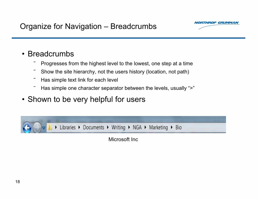
Organize for Navigation – Breadcrumbs
• Breadcrumbs ⎯ Progresses from the highest level to the lowest, one step at a time⎯ Show the site hierarchy, not the users history (location, not path)⎯ Has simple text link for each level⎯ Has simple one character separator between the levels, usually “>”
• Shown to be very helpful for users
18
Microsoft Inc

Organize for Navigation - Static Banners
• For maximum notice visual pagers or notifications should be in top left or bottom right.
– These can be distracting, so caution is advised if user needs to give full attention to the primary task
– http://www.karvysolutions.com/packages/banner-design.html
19
http://www.karvysolutions.com/packages/banner-design.html

Organize for Navigation – Depth vs. Breadth
• Depth vs. Breadth has been extensively studied (Larson & Czerwinski, 1998)
– Users prefer breadth over depth• Leads to better navigational strategies
• Less anxiety and frustration
• Reduces search time and errors
• ‘Drilling down’ too far leads to users forgetting where they were heading in the first place…
20

Organize for Navigation –Individualizing the Interface
• Users want choices, BUT: – Too many lead to indecision and less movement forward– There should be some choices, but not too many
This leads to greater user satisfaction
• Hicks law: describes the time it takes to make a decision as a result of possible choices. Too many choices increases the decision time logarithmically.
21

Visual Attention and User Interfaces

Visual Attention and Shapes
• Humans have a limited amount of visual attention to ‘spend’
– Users prefer objects with curves • Curves take less cognitive effort to visually process• Circles are the fastest for the human eye and brain to process
– Applies to widgets, icons, pullout windows, etc.
Steve Jobs and Apple understood this concept very well
23
Apple Inc

Visual Attention and Fonts
• Fonts – Should be clear, large, and have good contrast– The smaller the font, the more difficult it is to read– Larger font and character size can be used to draw attention towards
specific sites and guide the users eye– When users perceive that reading a font will require high effort, they are
far less likely to engage in that reading (Song & Schwartz, 2008)– Users are more likely to forget instructions written in a difficult to read font
Contrast: “If it’s hard to read, it’s hard to do” vs.
“If it’s hard to read, it’s hard to do.”
24

Visual attention and Color
• Color choices should be standardized and consistent on interfaces
• Color overrides shape during boundary detection tasks
• Some fields, such as the U.S. military have specific meaning for specific colors
– Shape and color both are used for quick identification
25
US Army FM 100-5

Visual Attention and Color
• Color can be used to provide enhance or redundant presentation of information
– A Red Background: should be used for:• A warning message• If you want users to do a detailed search• If you are highlighting detailed features
– A Blue Background: should be used for: • A calm or positive message• If you want users to be creative• If you are highlighting instructions
26

Why Cognitive Principles are Valuable Design Guidelines
• Users need to be guided by an information architecture that creates a sense of confidence as they navigate the site.
– Good interface design inspires:• User confidence• User satisfaction• Less errors• Customer loyalty
- Poor interface design can lead to:• Decreased user satisfaction• Longer access times• More error rates• Expensive training
27

Author Bio
• Joan Dodson is currently a User Researcher for the User Experience (UX) Team at Northrop Grumman in Huntsville, Alabama. The UX team applies principles and best practices from the fields of interaction design, user experience, and usability engineering. Before joining the UX team, Joan taught various classes in psychology at the University of Alabama in Birmingham and the University of Alabama at Huntsville. The classes included cognition, experimental methods and design, statistics, and personality, among others. Joan received her PhD in Psychology at the University of Alabama in Birmingham, her M.A. in Experimental Psychology from the University of Alabama at Huntsville, and her B.S. in Geological Sciences from the University of Illinois at Chicago. Her research interests include bridging the gap between cognitive science research and interface design by examining research findings in three critical areas: memory, perception, and navigation organization.
• Neta Ezer is a human factors engineer on the Northrop Grumman User Experience (UX) team with five years of experience designing and evaluating interfaces for mission-critical applications. Prior to working at Northrop Grumman, she led human engineering of displays and controls for NASA’s Orion Multi-Purpose Crew Vehicle, was an investigator for projects on human-robot interaction, and supported flight crew integration for the International Space Station. Dr. Ezer is knowledgeable in the areas of human performance testing, user-centered design, human-systems integration, display standards, human-robot/computer interaction, and usability analysis methods. She holds a B.S degree in Industrial Design and M.S. and Ph.D. degrees in Engineering Psychology (i.e., Human Factors), with a minor in Human-Computer Interaction, from the Georgia Institute of Technology.
29

Abstract
• The brains of humans, while flexible and adaptable, have changed little since the Stone Age. Effective software architecture takes this fact into consideration and works with the innate capabilities and constraints of the human brain to create a more robust and intuitive user interface. The audience of this presentation will learn highlights of how the latest human brain research enables information architects and developers to update, integrate, and retrofit their software products to benefit users and customers through greater integrity, efficiency and user satisfaction. Information architects who work with findings from cognitive neuroscience and similar fields at the beginning of the typical software development cycle normally create a software product with enhanced fitness for use. This helps sustain customer loyalty and promotes a user-centric software product. Unfortunately, many information architects encounter obstacles such as lack of time and access while parsing through the scientific literature in search of the most current research findings. This presentation helps bridge the gap between psychology research and software user interface architecture by highlighting information architecture considerations in three critical areas: memory, perception, and navigation. Information architecture considerations based on memory cover recall, recognition, chunking, and retrieval cues. Those based on perception cover areas such as shapes, attention, and the effects of color. Information architecture considerations based on navigation cover breadth versus depth, symmetrical versus nonsymmetrical structures, and navigation cues. Information architecture guidelines were compiled from academic and commercial research in fields such as cognitive and developmental psychology, neuroscience, information architecture, and software development. The guidelines were reviewed by a multidisciplinary user experience team for quality, ease of interpretation and direct applicability to current interface design problems.
References
• Callaghan, R. J. (1990). Improved Illumination of descriptors for robust color object recognition, Data for Color Research, Color Research and Application, 445-459.
• Hick, W. E. (1952). On the rate of gain of information. Quarterly Journal of Experimental Psychology, 4, 11-12.
• Larson, K., & Czerwinski, M. (1998). Web page design: Implications of memory, structure, and Scent from information retrieval. Proceedings of the Associations for Computering Machinery’s CHI, 1998, 18-23.
• Nanni, J. ( 2009). Visual Perception: An interactive journey of discovery through our visual system. Verlag Nigglie, AG
• Song, H. & Schwarz, N. (2008). If it’s hard to read, it’s hard to do: Processing fluency affects effort prediction and motivation. Psychological Science, 19, 986-988.