![Automorphisms of the Lattice of Recursively Enumerable ...homepages.ecs.vuw.ac.nz/~downey/publications/prompt.pdf · (see Odifreddi [1989] for details). However, Harrington and Soare](https://static.fdocuments.us/doc/165x107/5c68dfa209d3f25c6a8c2f24/automorphisms-of-the-lattice-of-recursively-enumerable-downeypublicationspromptpdf.jpg)
User Evaluation of Polymetric Views Using a Large...
10
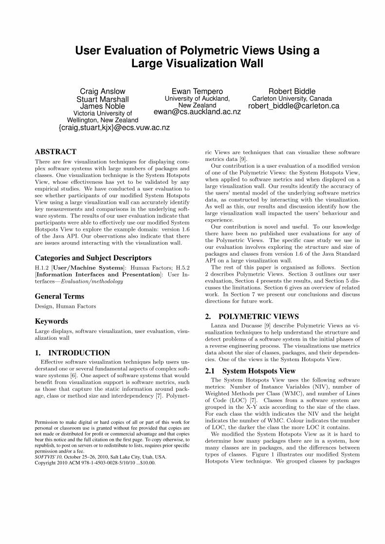
User Evaluation of Polymetric Views Using a Large Visualization Wall Craig Anslow Stuart Marshall James Noble Victoria University of Wellington, New Zealand {craig,stuart,kjx}@ecs.vuw.ac.nz Ewan Tempero University of Auckland, New Zealand [email protected] Robert Biddle Carleton University, Canada [email protected] ABSTRACT There are few visualization techniques for displaying com- plex software systems with large numbers of packages and classes. One visualization technique is the System Hotspots View, whose effectiveness has yet to be validated by any empirical studies. We have conducted a user evaluation to see whether participants of our modified System Hotspots View using a large visualization wall can accurately identify key measurements and comparisons in the underlying soft- ware system. The results of our user evaluation indicate that participants were able to effectively use our modified System Hotspots View to explore the example domain: version 1.6 of the Java API. Our observations also indicate that there are issues around interacting with the visualization wall. Categories and Subject Descriptors H.1.2 [User/Machine Systems]: Human Factors; H.5.2 [Information Interfaces and Presentation]: User In- terfaces—Evaluation/methodology General Terms Design, Human Factors Keywords Large displays, software visualization, user evaluation, visu- alization wall 1. INTRODUCTION Effective software visualization techniques help users un- derstand one or several fundamental aspects of complex soft- ware systems [6]. One aspect of software systems that would benefit from visualization support is software metrics, such as those that capture the static information around pack- age, class or method size and interdependency [7]. Polymet- Permission to make digital or hard copies of all or part of this work for personal or classroom use is granted without fee provided that copies are not made or distributed for profit or commercial advantage and that copies bear this notice and the full citation on the first page. To copy otherwise, to republish, to post on servers or to redistribute to lists, requires prior specific permission and/or a fee. SOFTVIS’10, October 25–26, 2010, Salt Lake City, Utah, USA. Copyright 2010 ACM 978-1-4503-0028-5/10/10 ...$10.00. ric Views are techniques that can visualize these software metrics data [9]. Our contribution is a user evaluation of a modified version of one of the Polymetric Views: the System Hotspots View, when applied to software metrics and when displayed on a large visualization wall. Our results identify the accuracy of the users’ mental model of the underlying software metrics data, as constructed by interacting with the visualization. As well as this, our results and discussion identify how the large visualization wall impacted the users’ behaviour and experience. Our contribution is novel and useful. To our knowledge there have been no published user evaluations for any of the Polymetric Views. The specific case study we use in our evaluation involves exploring the structure and size of packages and classes from version 1.6 of the Java Standard API on a large visualization wall. The rest of this paper is organised as follows. Section 2 describes Polymetric Views. Section 3 outlines our user evaluation, Section 4 presents the results, and Section 5 dis- cusses the limitations. Section 6 gives an overview of related work. In Section 7 we present our conclusions and discuss directions for future work. 2. POLYMETRIC VIEWS Lanza and Ducasse [9] describe Polymetric Views as vi- sualization techniques to help understand the structure and detect problems of a software system in the initial phases of a reverse engineering process. The visualizations use metrics data about the size of classes, packages, and their dependen- cies. One of the views is the System Hotspots View. 2.1 System Hotspots View The System Hotspots View uses the following software metrics: Number of Instance Variables (NIV), number of Weighted Methods per Class (WMC), and number of Lines of Code (LOC) [7]. Classes from a software system are grouped in the X-Y axis according to the size of the class. For each class the width indicates the NIV and the height indicates the number of WMC. Colour indicates the number of LOC, the darker the class the more LOC it contains. We modified the System Hotspots View as it is hard to determine how many packages there are in a system, how many classes are in packages, and the differences between types of classes. Figure 1 illustrates our modified System Hotspots View technique. We grouped classes by packages
Transcript of User Evaluation of Polymetric Views Using a Large...
User Evaluation of Polymetric Views Using aLarge Visualization Wall
Craig AnslowStuart MarshallJames Noble
Victoria University ofWellington, New Zealand
{craig,stuart,kjx}@ecs.vuw.ac.nz
Ewan TemperoUniversity of Auckland,
Robert BiddleCarleton University, Canada
ABSTRACTThere are few visualization techniques for displaying com-plex software systems with large numbers of packages andclasses. One visualization technique is the System HotspotsView, whose effectiveness has yet to be validated by anyempirical studies. We have conducted a user evaluation tosee whether participants of our modified System HotspotsView using a large visualization wall can accurately identifykey measurements and comparisons in the underlying soft-ware system. The results of our user evaluation indicate thatparticipants were able to effectively use our modified SystemHotspots View to explore the example domain: version 1.6of the Java API. Our observations also indicate that thereare issues around interacting with the visualization wall.
Categories and Subject DescriptorsH.1.2 [User/Machine Systems]: Human Factors; H.5.2[Information Interfaces and Presentation]: User In-terfaces—Evaluation/methodology
General TermsDesign, Human Factors
KeywordsLarge displays, software visualization, user evaluation, visu-alization wall
1. INTRODUCTIONEffective software visualization techniques help users un-
derstand one or several fundamental aspects of complex soft-ware systems [6]. One aspect of software systems that wouldbenefit from visualization support is software metrics, suchas those that capture the static information around pack-age, class or method size and interdependency [7]. Polymet-
Permission to make digital or hard copies of all or part of this work forpersonal or classroom use is granted without fee provided that copies arenot made or distributed for profit or commercial advantage and that copiesbear this notice and the full citation on the first page. To copy otherwise, torepublish, to post on servers or to redistribute to lists, requires prior specificpermission and/or a fee.SOFTVIS’10, October 25–26, 2010, Salt Lake City, Utah, USA.Copyright 2010 ACM 978-1-4503-0028-5/10/10 ...$10.00.
ric Views are techniques that can visualize these softwaremetrics data [9].
Our contribution is a user evaluation of a modified versionof one of the Polymetric Views: the System Hotspots View,when applied to software metrics and when displayed on alarge visualization wall. Our results identify the accuracy ofthe users’ mental model of the underlying software metricsdata, as constructed by interacting with the visualization.As well as this, our results and discussion identify how thelarge visualization wall impacted the users’ behaviour andexperience.
Our contribution is novel and useful. To our knowledgethere have been no published user evaluations for any ofthe Polymetric Views. The specific case study we use inour evaluation involves exploring the structure and size ofpackages and classes from version 1.6 of the Java StandardAPI on a large visualization wall.
The rest of this paper is organised as follows. Section2 describes Polymetric Views. Section 3 outlines our userevaluation, Section 4 presents the results, and Section 5 dis-cusses the limitations. Section 6 gives an overview of relatedwork. In Section 7 we present our conclusions and discussdirections for future work.
2. POLYMETRIC VIEWSLanza and Ducasse [9] describe Polymetric Views as vi-
sualization techniques to help understand the structure anddetect problems of a software system in the initial phases ofa reverse engineering process. The visualizations use metricsdata about the size of classes, packages, and their dependen-cies. One of the views is the System Hotspots View.
2.1 System Hotspots ViewThe System Hotspots View uses the following software
metrics: Number of Instance Variables (NIV), number ofWeighted Methods per Class (WMC), and number of Linesof Code (LOC) [7]. Classes from a software system aregrouped in the X-Y axis according to the size of the class.For each class the width indicates the NIV and the heightindicates the number of WMC. Colour indicates the numberof LOC, the darker the class the more LOC it contains.
We modified the System Hotspots View as it is hard todetermine how many packages there are in a system, howmany classes are in packages, and the differences betweentypes of classes. Figure 1 illustrates our modified SystemHotspots View technique. We grouped classes by packages

down the Y axis and ordered the classes in the packagesalphabetically along the X axis. We added text labels forpackages. We coloured borders for classes to represent thedifferent kinds of classes: concrete classes have blue borders,interfaces red borders, and abstract classes green borders.
Figure 1: Modified System Hotspots View. Exten-sions: packages ordered in Y axis, text labels forpackages, classes grouped in packages, and colouredborders for different kinds of classes.
Figure 2: Software visualization pipeline.
2.2 Software Visualization PipelineFigure 2 shows the pipeline of tools we used to create our
software visualizations. We first downloaded the Java Stan-dard API 1.6 source code from the Sun Microsystems website1. Next we loaded the source code into a SciTools Un-derstand Project and executed the metrics analyser featurewhich exported the selected software metrics into a CSVfile. We filtered the files and then loaded them into a Pro-cessing [13] sketch where we implemented our modified Sys-tem Hotspots View technique. Upon execution of the sketchlarge static images are generated which can then be viewedon a large visualization wall.
3. USER EVALUATIONWe wanted to find out how effective our modified System
Hotspots View technique is for visualizing large packagesand classes using a large visualization wall.
3.1 ProcedureWe asked participants to complete some tasks with our
modified System Hotspots Views by answering questions
1http://download.java.net/jdk6/source/
Figure 3: Visualization wall.
about the size of packages and classes in the Java Stan-dard API 1.6. The questions were aimed at discovering howaccurately participants perceived the absolute size and rel-ative differences of elements in the System Hotspots View.These questions were not designed to be representative soft-ware comprehension tasks. The focus was on how effectivelythe System Hotspots View represented the underlying datarather than on how useful the data was.
The Java Standard API 1.6 was selected as a case studyas it is a large commonly used software system. There wasone System Hotspots View for each of the three top levelpackages in the API defined as java, javax, and org, seeFigure 4. For some of the questions we displayed an ad-ditional zoomed in view of a package. The Java StandardAPI 1.6 contains over 200 packages, nearly 5800 classes, 9500variables, nearly 50,000 methods, and 523,500 lines of code.
The System Hotspots Views were displayed on a largevisualization wall. Figure 3 illustrates the visualization wallwhich has 12 screens arranged 4 (width) x 3 (height). Eachindividual display is 2560 x 1600 pixels for a total displayof 10240 x 4800 pixels. The width of the visualization wallis 2800mm and the height is 1400mm. The bottom edge ofthe wall is 650mm off the ground. The visualization clustersoftware is controlled by Rocks2 and the user interface bythe Scalable Adaptive Graphics Environment (SAGE)3.
2http://www.rocksclusters.org3http://www.sagecommons.org

Each participant was given an information sheet aboutthe evaluation, consent form to sign if they agreed, andcompleted a pre-study questionnaire to find out their Javasoftware development experience. With each participant’sconsent we video recorded their actions when completing thetasks. We asked participants to think aloud when answeringthe questions so that we could capture their thoughts abouttheir actions, perceptions, and expectations regarding theapplication’s interface and functionality. Getting the usersto talk about their actions and thoughts enabled us to gaininsight into how each user views the computer system, iden-tification of their misconceptions, and what parts of the in-terface caused the most problems. Measurement of the usertasks was done by recording the time taken to answer thetotal number of questions and any errors.
At the end each participant completed a post study ques-tionnaire. The questionnaire asked for participants opinionon the strengths and weaknesses of the System HotspotsView and the visualization wall. We asked participants howeffective they thought the System Hotspots View was forcompleting the user tasks on a scale of 1–10 where 1 was“very ineffective” and 10 was “very effective”.
3.2 ParticipantsWe conducted evaluations with 14 participants who were
a convenient sample of academic, graduate, and undergrad-uate students from our department. 11 participants weremale, three were female. Most participants were aged in therange 25–29. All participants except one had a bachelorsdegree, two had PhDs, the rest were studying towards mas-ters or PhD degrees. 10 participants were undergraduate orpost-graduate students, two participants were professionalsoftware developers and the other two participants were auniversity professor and a research fellow.
3.3 User TasksEach participant completed all the tasks using the same
set of visualizations. The participants recorded their an-swers in a web form and we recorded the time it took tocomplete the tasks. The first six questions related to pack-ages and the remaining five to classes.
1. How many packages are there in there in the Java API?
2. What is the biggest package in the Java API?
3. How many classes are there in the java.math package?
4. What package(s) in the Java API contain only inter-faces?
5. What package(s) in the Java API contain no classes,abstract classes, or interfaces?
6. What packages contain classes that have the same num-ber of attributes as methods?
7. What is the biggest class (including abstract classesand interfaces) in the Java API?
8. What is the biggest interface in the Java API?
9. What is the biggest abstract class in the Java API?
10. How much bigger is the java.awt.Component class thanthe java.awt.Container class?
11. How much bigger is the java.awt.Component class thanthe java.awt.Window class?
Figure 4: System Hotspots View of the top leveljava package of the Java Standard API 1.6.

Table 1: User tasks results. Numbers (rows 1–11) are percentages. Expertise and effectiveness are selfassessed by participants. Ranking is the mean percentage of user task questions.Participant id 1 2 3 4 5 6 7 8 9 10 11 12 13 14 Mean1. Number packages 89 90 89 74 26 90 62 91 90 64 90 90 90 95 802. Biggest package 55 55 100 100 55 100 100 55 100 55 55 55 55 100 743. Classes in Math 100 78 90 89 89 89 89 78 100 89 89 67 78 89 87package4. Packages only 69/2 77/0 69/0 38/0 15/0 69/3 38/0 54/1 69/0 46/2 69/0 69/5 62/1 62/0 58/1contain interfaces5. Packages no classes 50/1 100/0 0/0 0/0 0/2 0/0 50/0 50/3 100/0 0/0 100/0 50/0 50/0 100/0 46/06. Same number of 44/4 33/11 28/5 28/0 6/0 72/2 22/1 28/7 44/5 33/1 28/1 17/1 22/3 56/11 33/4attributes & methods7. Biggest class 100 100 100 34 100 100 100 100 100 100 100 100 100 100 958. Biggest interface 72 82 82 82 82 82 82 100 82 82 82 82 82 100 849. Biggest abstract class 57 100 100 100 100 100 100 100 100 100 18 100 100 100 9110. Comp. vs. Cont. 44 0 28 88 91 55 31 55 37 37 22 73 91 91 5311. Comp. vs. Wind. 73 0 73 86 69 97 48 86 73 73 53 69 69 69 67
Time taken (mins) 32 25 23 22 18 20 22 20 22 10 26 21 18 30 22Expertise 7 3 2 7 9 9 6 5 4 6 7 4 3 9 5.8Effectiveness 5 6 7 7 7 8 8 8 4 7 5 3 8 7 6.4Ranking 68 65 69 66 58 78 66 73 82 62 73 64 74 89 71
4. RESULTSWe first report the results from the user tasks, then dis-
cuss the strengths and weaknesses of our modified SystemHotspots View and the visualization wall.
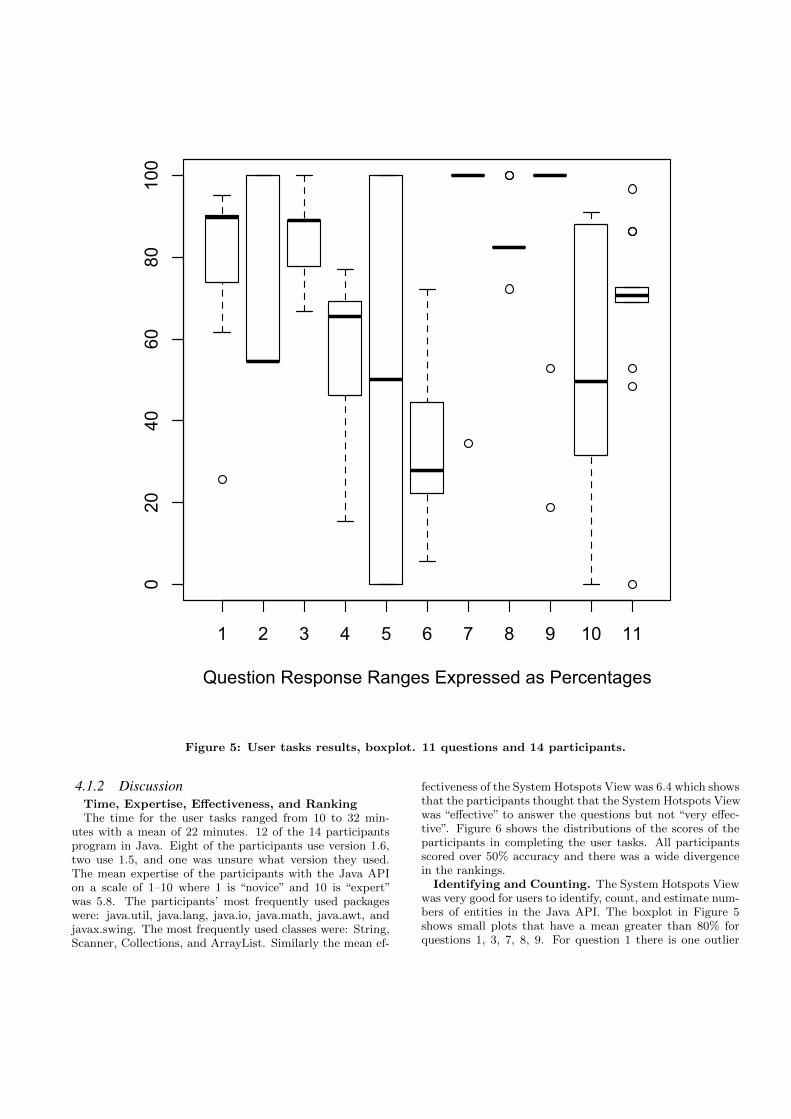
4.1 User TasksTable 1 and Figure 5 present the results from the user
tasks. The table shows the percentage correct for each par-ticipant. The percentage is calculated by the total numberof correct answers for that question (e.g. X packages correctout of a total of Y * 100), total metric values of one entitydivided by the total metric values of the biggest entity (e.g.NIV, WMC, LOC of package X divided by NIV, WMC, LOCof the biggest package Y * 100), or the difference in size ofentities (e.g. biggest class Y divided by the smaller class X *100). For questions 4–6 there is an additional number whichshows the number of incorrect answers the participant gave(e.g. participant 1, Q4, 69/2, 69% correct and 2 answersincorrect). The boxplot shows distributions for each taskwhere the mean is represented by a heavy horizontal bar,the inner quartiles as a box, the outer quartiles as whiskers,and any outliers as small circles.
4.1.1 User Tasks Results1. Number of packages. There are 203 packages in
the Java Standard API 1.6. The closest participant (14)answered with 193. Most of the participants gave an answerbetween 180-183. Some gave the following: 150, 125, and52.
2. Biggest Package. The biggest package is javax.swing.Eight participants said that java.awt was the biggest and sixparticipants said javax.swing was the biggest.
3. Number of classes in java.Math package. Thereare nine classes in the java.Math package. One participantanswered with 10. Two correctly said nine classes, sevensaid eight, three said seven, and one said six classes.
4. Packages that only contain interfaces. Thereare 13 packages that contained only interfaces. Nine of theparticipants gave an answer between eight and 10. About50% of participants gave incorrect additional packages.
5. Packages that contain no classes. There were onlytwo packages that contained no classes, javax.lang.modeland javax.rmi. Four participants got both packages, five
participants identified one of the packages, and the remain-der participants did not identify any.
6. Packages with same number of attributes asmethods. We classified 18 packages that had classes withthe same number of attributes as methods. We disregardedclasses with less than 10 attributes and methods as theyare hard to identify. All participants recognized that theyshould be looking for square boxes. Only two participantsgot more than 50% of the packages. The rest of the par-ticipants identified only some of the most obvious packagesthat met this criteria.
7. Biggest class in the Java API. The biggest classis Component from the java.awt package. 13 of the partici-pants said Component while the remaining participant saidWindow also from the java.awt package.
8. Biggest interface in the Java API. The biggestinterface is CSS2Properties from the org.w3c.dom.bootstrappackage. Two participants got this correct. 11 participantssaid that the second biggest interface, DatabaseMetaDatafrom the java.sql package was the biggest interface. Oneparticipant said that the third biggest interface, ResultSetfrom java.sql was the biggest. The DatabaseMetadata classhas 61 attributes while CSS2Properties has zero. This madeDatabaseMetadata take up significantly more area on thescreen while CSS2Properties is just a single long red line.
9. Biggest Abstract Class in the Java API. Thebiggest abstract class is java.awt.Component. 12 partici-pants said Component, one said Window from java.awt, andthe remaining said AbstractButton from javax.swing.
10. Component versus Container. For this questionwe provided participants a scaled up image of the java.awtpackage. When considering NIV, WMC, and LOC, the Com-ponent class is 2.2 times bigger than the Container class.Participants gave a very wide range of answers from 2–10times bigger as evidenced by the large box and whisker plotfor question 10 in Figure 5.
11. Component versus Window. Again we provided ascaled up image of the java.awt package. When consideringNIV, WMC, and LOC, the Component class is 2.9 timesbigger than the Container class. Participants were moreaccurate for this question compared with 10 and answersranged from 2.5–6 times bigger as evidenced by a condensedbox and whisker plot for question 11 in Figure 5.
1 2 3 4 5 6 7 8 9 10 11
020
4060
80100
Question Response Ranges Expressed as Percentages
Figure 5: User tasks results, boxplot. 11 questions and 14 participants.
4.1.2 DiscussionTime, Expertise, Effectiveness, and RankingThe time for the user tasks ranged from 10 to 32 min-
utes with a mean of 22 minutes. 12 of the 14 participantsprogram in Java. Eight of the participants use version 1.6,two use 1.5, and one was unsure what version they used.The mean expertise of the participants with the Java APIon a scale of 1–10 where 1 is “novice” and 10 is “expert”was 5.8. The participants’ most frequently used packageswere: java.util, java.lang, java.io, java.math, java.awt, andjavax.swing. The most frequently used classes were: String,Scanner, Collections, and ArrayList. Similarly the mean ef-
fectiveness of the System Hotspots View was 6.4 which showsthat the participants thought that the System Hotspots Viewwas “effective” to answer the questions but not “very effec-tive”. Figure 6 shows the distributions of the scores of theparticipants in completing the user tasks. All participantsscored over 50% accuracy and there was a wide divergencein the rankings.
Identifying and Counting. The System Hotspots Viewwas very good for users to identify, count, and estimate num-bers of entities in the Java API. The boxplot in Figure 5shows small plots that have a mean greater than 80% forquestions 1, 3, 7, 8, 9. For question 1 there is one outlier

Figure 6: Distribution of the participant’s scores.
where participant 5 has just guessed the answer. For ques-tion 3 nearly 90% of the participants got this correct.
Questions 7–9 have condensed box and whisker plots whichshows that the participants got the same answer for thequestion with a couple of outliers each. For question 7,95% of the participants answered this correctly. Partici-pant 4 said that Window was the biggest class, hence theoutlier below 40%, but perhaps that was a typographicalerror when the user was entering the data into the webform. For question 8 there is one outlier at the top whichrepresents the two participants who got the answer cor-rect. Since the DatabaseMetadata class took up more areathan the CSS2Properties class participants perceived thatDatabaseMetadata was bigger. For question 9, 91% got thisanswer correct. The two participants who got it wrong failedto see the green border for the Component class.
We believe participants would have done much better onquestion 2 if we had of had the images in Figure 4 to thesame scale as the javax.swing package is significantly biggerthan the java.awt package.
Filtering Information. The System Hotspots View isless good for filtering information or finding a subset of in-formation. The main problem with answering questions 4and 5 is that some of the information the participants hadto find in the visualizations was very small.
For question 4 users had to list packages that containedonly interfaces and they often included additional packageswhich were all concrete classes. The concrete classes inthese packages were really small and hard to see. The mostamount of incorrect packages were five by participant 12.
For question 5 the participants had to find packages thatcontained only a package label with no classes. This was ahard task as these packages were both small. There wereonly two packages, javax.lang.model and javax.rmi. Partici-pants either got both, one, or none of them. This is evidentin the boxplot were there is a value at 100, 50, and 0. In ret-rospect the underlying data for this question was incorrect.The javax.lang.model package does not have any classes buthas one enum and one annotation which we don’t repre-sent in our System Hotspots View, but it is something wecould easily remedy. Likewise javax.rmi actually has threeclasses but the version of the visualizations we were usingwere an earlier version which didn’t include this information.Nonetheless we believe these two minor aspects did not havean affect on the ability of the participants for this task asthey did not need to know about the discrepancies with theunderlying data to answer the question.
Comparing. The System Hotspots View is worst forcomparing numbers of filtered entities. Question 6 is thetask that participants did the worst on where the boxplotshows the mean about 30%. Only two participants, 14 and 6got more than 50% of the packages. Of the correct packagesparticipants identified the most obvious ones, but when itcame to some of the smaller packages they could not com-pare the number of attributes and methods very well as theimages were too small for them.
When comparing classes the participants performed worsefor question 10 than 11. The boxplot shows that question10 has a much larger range of answers than question 11. Inquestion 10 eight of the participants and in question 11 sevensaid that the Component class was much bigger than it ac-tually was. One participant said that there was no differencein size between the classes, but they must have interpretedthe question incorrectly. For these questions some of theparticipants raised the point that the LOC for each classwas hard to determine as these classes were all in the samerange so they could not tell how many more LOC one classhad than another.
4.2 System Hotspots View
4.2.1 Strengths of the System Hotspots ViewOverview. Many participants stated that the visualiza-
tions created a large overview of the system which enabledthem to get a quick understanding of the size of the systemas a whole and the characteristics of packages and classes.
“Quick understanding of gross characteristics plusability to focus in.” - Participant 2
“Good overview and overall understanding of packages.”-4
“Quick to read not cluttered with data.” - 7
“Gives a good summary of the information in aneasily accessible way does not require any knowl-edge of Java to use.” - 13
“Good at showing multiple dimensions, and goodorganisation of those mediums; number of at-tributes and methods are more important.” - 14
Identifying. Participants thought that the System HotspotsView easily helped them to identify large packages and classes,interfaces, and outliers. There is evidence for this as par-ticipant answers to questions 2 and 7-9 were mostly correct.Questions 7-9 show that participants got over 80%. Whilefor question 2 most would have got this answer correct butthe images were not to scale.
“The visualizations are also helpful to spot rel-ative sizes and anomalies (very large or oddlyshaped classes).” - 3
“Outliers are easy to spot (only interfaces, manyattributes, many methods).” - 4
“Interfaces are easy to spot.” - 5
“Easy to spot excessively large classes.” - 11

Size. Participants thought that the characteristics of theSystem Hotspots View made it easy to understand the sizeof packages and classes. All participants quickly identifiedthe largest packages and classes for questions 2, and 7-9.
“It’s easy to see which packages have big packagesor lots of packages.”- 1
“Height and width give a quick feel for the num-ber of members and hence size.” - 5
“They showed comparative sizes, and the typesof the major classes in the Java API.” - 6
“Gives you an overall feeling on the size of Javapackages.” - 11
“Good for looking at the sizes of class.” - 12
Colour. Some participants commented on the use ofcolour to identify entities in the system. The border coloursfor classes made it easy for participants to identify the ap-propriate classes for questions 7-9.
“The use of colors helped me to quickly spot thedifferent types of classes.” - 3
“Had color.” - 7
“Diagrams and colours are better than words andbig diagrams are easier to see.” - 8
4.2.2 Weaknesses of the System Hotspots ViewComparing. Participants thought that it was hard to
compare the relative size of packages and classes. Partici-pants struggled with comparing the size of entities. Ques-tions 10 and 11 are evidence of this as participants gave awide range of answers.
“One can tell comparatively which class has moremethods or which has more attributes, but theycouldn’t exactly tell how many more of thesemethods or attributes they have.” - 1
“The relative sizes between the three main visual-izations were not correct. So comparing betweenthese three images was difficult. It was also diffi-cult that the order chosen was the names of thepackages by alphabet, this did not help with anyof the questions.” - 3
Large Packages. Participants thought that the SystemHotspots View was good for counting classes in small pack-ages but for large packages it was hard to tell how manyclasses it contained and what kinds of shapes some classeswere. Participants struggled with identifying small classesthat were boxes as required for question 6.
“The visualization seems less useful when thereare too many classes in a package, as you can’tactually tell the shape of a class.” - 11
“Hard to ‘query’ the diagrams to count the num-ber of objects of a certain type.” - 12
“You cannot tell how many classes there were inlarge packages.” 14
Data Manipulation. Participants wanted interactionfeatures for manipulating the data in the System HotspotsViews such as querying, sorting, and filtering. These fea-tures would have helped participants to answer all the ques-tions more effectively.
“Make it easier to see the packages with smallclasses, have some kind of a scale so you can tellthe actual number in each entity.” - 1
“Interaction with the metrics (such as being ableto sort) would be very nice!” - 3
“Interaction should provide more detail, e.g. en-tity names, LOC, and there should be ways toquery and sort, e.g. by color or height.” - 5
Scale. All the participants struggled with the non-uniformscale of the three visualizations. This affected the answer toquestion 2 where participants would have almost certainlyall the got the correct answer.
“Make the images equal size.” - 3
“All packages have to be scaled relative to theothers, packages in the middle section are smallerscaled than others.” - 4
“Some of the images were too small to make outthe shapes and kinds of classes.” - 6
Colour. A few participants raised issues about the colourencoding and fonts used for the text. They thought thatthe green and blue borders for abstract classes and concreteclasses were hard to identify when the classes were largeand had a black shading. This affected participant answersto question 9 which had the same answer to question 7.However, the red borders for interfaces clearly stood out forquestion 8.
“Don’t use bold font, don’t use a serif font on ascreen.” - 3
“Some of the classes are tiny so it is hard to seecolours and borders at that resolution.” - 5
“Borders hard to see (green, blue).” - 10
One participant raised the issue that he was red-greencolour blind.
“Relied on red / green one-pixel borders, whichwere hard for me to look at.” - 12
Metric Shading. The shading of the LOC was also con-fusing for some participants when determining the size of aclass as it was not clear what the actual value for this met-ric was for the class they were inspecting. Having a largerscale of the LOC shading would have helped participants toanswer questions 10 and 11 better.
“Shading is capped (1000 LOC or 100,000 LOChard to tell) absolute number of things hard toget, relative numbers works better.” - 4

“The shading as an indicator for size is hard toevaluate, and it conflicts with my desire for sizeto be indicated by area.” - 5
Representation and Encoding. A couple of partici-pants quite often referred back to the technique descriptionto remember the meaning of the dimensions and colour en-coding.
“Had to keep referring to the key to rememberwhat dimension or color represented what aspect.Have the key visible on the screen and be able tohide the smaller classes below a threshold.” - 7
“It is easy to confuse the width of a package tobe the number of classes in it. The width insteadshows the number of attributes in a package.” -14
4.3 Visualization Wall
4.3.1 Strengths of the Visualization WallDisplay Size. All participants enjoyed the large display
size and the ability to display large amounts of information.This resonates with the findings by Andrews et al. [1].
“ Allows all the data to be seen at once, makes iteasier to find the classes that stand out easier.”- 1
“It was big!” - 9
Physical Size. Several participants commented that itwas useful to physically walk around to use the wall. Thisresonates with the findings by Ball et al. [2].
“No scrolling, just walking about.” 3
“It was big enough to walk around and pointthings out on an eye level, and could comparetwo sizes quite easily.” - 6
“Resolution excitement when walking around thescreen.” - 9
“Large display estate and can move around.” -11
“Step back to see a bigger picture, step close tosee detail. ” - 12
Concentration. Two participants felt the visualizationwall helped them to concentrate better when answering thesekinds of questions.
“It is ‘stimulating’ to move about while lookingat metrics (or any type of documentation for thatmatter) in the sense that you are more concen-trated on the task because you can move freely- are not confined to a single position such assitting on your chair.” - 3
“I could see more data at once, which lessened re-quirements for me to remember stuff that wasn’tvisible.” - 5
4.3.2 Weaknesses of the Visualization WallInteraction. This was the first time for all participants
using a large visualization wall. Of biggest concern with thevisualization wall was that there was a lack of interactionwith the static images. Figure 7 shows some of the tech-niques (also including hands and paper) participants usedto compare data in the System Hotspots View. Most of theparticipants wanted to be able to drag images around thescreen, re-size and scale images, and zoom in on details.
“I would like manual zoom control to focus in ondetails.” - 2
“You can’t interact with the visualization.” - 11
“Ability to drag images around to compare, clickon them while looking at them.” - 12
“Provide an easy way to re-size the areas you arelooking at.” - 13
The monitors in the visualization wall emitted a largeamount of heat. Participants were tempted to touch themonitors to interact with the data in the visualizations. Wehad to make them aware that they were not touch screens.
Physical Height. The height of the wall posed problemsfor some participants as they were shorter than others so itmade it hard for them to read the information on the toprow of screens, likewise for very tall participants who had tobend down to see the information on the bottom row, seeFigure 7.
“Some diagrams higher than me.” - 8
“The height of the bottom screens not good forstanding but height of top screens is good.” - 13
Interior Bezels. The bezels around the outside of each ofthe monitors created problems for some participants tryingto understand information that spread from one screen toanother. Bi et al. [4] claim that interior bezels do not affectvisual search nor error rate; however, splitting objects acrossbezels is detrimental to search accuracy.
“Hard to see diagrams that spread across screens.”- 8
“The gaps between the screens caused issues withviewing the information.” - 9
“Bezel makes it hard to see the image on thecrossover height of the bottom screens.” - 13
5. LIMITATIONSResults. We conducted our user evaluation with a small
number of participants. Future studies should involve agreater number of participants and a significant number ofindustry professionals. We did not vary the order of thequestions which might have introduced a learning bias.
Scale of Visualizations. Due to limitations with ourimplementation and the SAGE software used to drive thevisualization wall all the images of the three top level pack-ages were not at the same scale. This made it difficult forparticipants when comparing the size of packages and classes

(a) Hands (b) Fingers
(c) Pen (d) Bending
(e) Crouching (f) Kneeling
Figure 7: Participants interacting with the SystemHotspots Views on the visualization wall.
and counting packages and classes in packages. The heightof the largest image was greater than the height of our visu-alization wall. Once this image was scaled down the imagewas too small to properly view on the visualization wall.
Interaction. There were no user controls for participantsto be able to manipulate the data in the visualization suchas the ordering of classes or filtering out any information.The only interaction with the visualizations was controlled
by the observer of the user evaluation who moved the imagesaround the screen and at the participant’s request. The in-teraction was controlled on a machine sitting a couple of me-tres back from the visualization wall. The actions that wereavailable were repositioning and minimal scaling of the im-ages using a mouse. These two important interaction taskswere quite cumbersome. The limited control screen didn’tactually show the details of the images, only the outline.Making positional adjustments to the image had a slight de-lay effect with re-displaying the image. The images werelarge but not high resolution and the quality of the imagewas severely affected when the images were scaled larger orsmaller.
Visualization Wall. Some of the participants thoughtthat the height of the visualization wall too tall for themor that they had to bend down or crouch to view the infor-mation, see Figure 7. To alleviate this issue we provided achair for tall people to sit on when they required viewingthe bottom row of monitors. We didn’t provide a steppingblock for the shorter participants but this would have beena useful asset.
We alleviated the interior bezel issue by correcting theimages with the SAGE software which made an image flowfrom one screen to another seamlessly. However, some of theparticipants still had difficulties determining what informa-tion was being shown on which display.
Measurement. Time measurements were taken using amanual stop watch once participants were given the questionsheet and after they had the System Hotspots View tech-nique explained to them. Some typed their answers into theweb form as they went while the others wrote their answerson the sheet provided and then entered their answers intothe web form on completion of the tasks. Therefore the timemeasurement was not as accurate as it could be.
6. RELATED WORKTo our knowledge there have been no published user eval-
uations for any of the Polymetric Views. We have not seenany System Hotspots Views that contain more than 1,000classes published in the literature. Numerous tools supportPolymetric Views [9].
Code Crawler is a language independent reverse engineer-ing tool which was the first tool to use Polymetric Viewsand has since been integrated as a plugin to Eclipse [10].CodeCity is a tool that stems from Code Crawler and usesa 3D city metaphor based on Polymetric Views to displayadditional kinds of metric information such as disharmonymaps which focus on design flaws [17, 18]. The Mondriantoolkit aims to bring the Polymetric Views closer to the codeby extending existing programming languages to use embed-ded scripts in their programs to create visualizations [12].Bergel et al. [3] extended the Mondrian toolkit by display-ing dynamic information about CPU consumption in ClassBlueprints. Softwarenaut uses Polymetric Views but focuseson the dependencies between modules [11]. Lagrein is a toolthat supports a number of Polymetric Views and augmentsthem with software requirements and change history infor-mation [8].
Large visualization walls are rare and very little work hasbeen done to investigate how they might be used in thecontext of information or software visualization. Yost etal. [19] conducted an evaluation to explore the effect of us-ing large visualization walls for information visualization.

Their results showed that performance on most tasks wasmore efficient and sometimes more accurate because of theadditional data that could be displayed, despite the physi-cal navigation. Andrews et al. [1] conducted a study whichdemonstrated how large displays support sensemaking. Ballet al. [2] identified that physical navigation helped improveuser performance with large displays. Bi et al. [4] discusshow interior bezels affect user behaviours, and suggest guide-lines for effectively using tiled-monitor large displays anddesigning user interfaces suited to them. Other researchershave investigated large displays for daily desktop computingtasks [5] such as navigation tasks [16] and window and taskmanagement [14].
7. CONCLUSIONSWe have conducted a user evaluation to measure the ef-
fectiveness of a modified System Hotspots View techniquefor software visualization using a large visualization wall. Insummary, our modified System Hotspots View technique isvery good for users to identify, count, and estimate numbersof entities in a software system. The technique is less goodfor filtering information or finding a subset of information.The technique is worst for comparing numbers of filteredentities.
Future work is to create a comprehensive and interac-tive software visualization tool. We will implement otherPolymetric Views [9] such as System Complexity and ClassBlueprint, provide user controls for tasks like filtering, query-ing, and sorting, and augment the visualizations with docu-mentation such as Javadoc.
The large visualization wall supported displaying largeamounts of data at once, however it lacked effective tech-niques for user interaction. Some issues that arose from thetechniques were the lack of user controls for querying, sort-ing, and filtering.
Ben Shneiderman [15] claims that gigapixel displays willbe useful for some tasks, but innovative interface design islikely to have higher payoffs and wider usage. Given thiswe are also interested in exploring software visualization inthe context of multi-touch tables and walls. We will conductuser evaluations with our multi-touch software visualizationsto investigate how collaboration and interactivity affects theusability of Polymetric Views.
AcknowledgmentsThis work is supported by the Software Process and ProductImprovement project through the New Zealand Foundationfor Research Science and Technology, as well as a Telstra-Clear scholarship. Thanks to Roger Cliffe for technical as-sistance with the visualization wall and user evaluation.
8. REFERENCES[1] C. Andrews, A. Endert, and C. North. Space to think:
large high-resolution displays for sensemaking. InProceedings of CHI, pages 55–64. ACM, 2010.
[2] R. Ball, C. North, and D. A. Bowman. Move toimprove: promoting physical navigation to increaseuser performance with large displays. In Proceedings ofCHI, pages 191–200. ACM, 2007.
[3] A. Bergel, R. Robbes, and W. Binder. Visualizingdynamic metrics with profiling blueprints. InProceedings of TOOLS Europe, 2010.
[4] X. Bi, S.-H. Bae, and R. Balakrishnan. Effects ofinterior bezels of tiled-monitor large displays on visualsearch, tunnel steering, and target selection. InProceedings of CHI, pages 65–74, 2010.
[5] X. Bi and R. Balakrishnan. Comparing usage of alarge high-resolution display to single or dual desktopdisplays for daily work. In Proceedings of CHI, pages1005–1014. ACM, 2009.
[6] S. Diehl. Software Visualization: Visualizing theStructure, Behaviour, and Evolution of Software.Springer Verlag, 2007.
[7] N. E. Fenton and S. L. Pfleeger. Software Metrics: ARigorous and Practical Approach. PWS Publishing,1998.
[8] A. Jermakovics, M. Scotto, A. Sillitti, and G. Succi.Lagrein: Visualizing user requirements anddevelopment effort. In Proceedings of ICPC, pages293–296. IEEE, 2007.
[9] M. Lanza and S. Ducasse. Polymetric views-alightweight visual approach to reverse engineering.IEEE Transactions on Software Engineering,29(9):782–795, 2003.
[10] M. Lanza and R. Marinescu. Object-Oriented Metricsin Practice. Springer Verlag, 2005.
[11] M. Lungu and M. Lanza. Softwarenaut: cutting edgevisualization. In Proceedings of SoftVis, pages179–180. ACM, 2006.
[12] M. Meyer, T. Girba, and M. Lungu. Mondrian: Anagile information visualization toolkit. In Proceedingsof SoftVis, pages 135–144. ACM, 2006.
[13] C. Reas and B. Fry. Processing: A ProgrammingHandbook for Visual Designers and Artists. MITPress, 2007.
[14] G. Robertson, M. Czerwinski, P. Baudisch, B. Meyers,D. Robbins, G. Smith, and D. Tan. The large-displayuser experience. IEEE Computer GraphicsApplications, 25(4):44–51, 2005.
[15] B. Shneiderman. Extreme visualization: squeezing abillion records into a million pixels. In Proceedings ofSIGMOD, pages 3–12. ACM, 2008.
[16] D. S. Tan, D. Gergle, P. G. Scupelli, and R. Pausch.Physically large displays improve path integration in3d virtual navigation tasks. In Proceedings of CHI,pages 439–446. ACM, 2004.
[17] R. Wettel and M. Lanza. Visualizing software systemsas cities. In Proceedings of VISSOFT, pages 92–99.IEEE, 2007.
[18] R. Wettel and M. Lanza. Visually localizing designproblems with disharmony maps. In Proceedings ofSoftVis, pages 155–164. ACM, 2008.
[19] B. Yost, Y. Haciahmetoglu, and C. North. Beyondvisual acuity: the perceptual scalability of informationvisualizations for large displays. In Proceedings ofCHI, pages 101–110. ACM, 2007.