Usability Study of Existing Web Pages
16
1 / 16 Strategic partnership funded by Interreg Baltic Sea Region Programme Project: "Empowering Participatory Budgeting in the Baltic Sea Region – EmPaci" Usability Study of Existing Web Pages Group of activities 4.1: Output 2 Responsible Partner: University of Rostock December 2020 Status: Final (English) Usability Features in national partner language to be added Responsible for the content solely publisher/presenter; it does not reflect the views of the European Commission or any related financial body. Those institutions do not bear responsibility for the information set out in the material.
Transcript of Usability Study of Existing Web Pages
1 / 16
Strategic partnership funded by Interreg Baltic Sea Region
Programme
Project: "Empowering Participatory Budgeting in the Baltic
Sea Region – EmPaci"
Usability Study of Existing Web Pages
Group of activities 4.1: Output 2
Responsible Partner: University of Rostock
December 2020
Status: Final (English)
Usability Features in national partner language to be added
Responsible for the content solely publisher/presenter; it does not reflect the views of the European Commission or any
related financial body. Those institutions do not bear responsibility for the information set out in the material.
2 / 16
List of abbreviations
GoA............................................................................................................................................. Group of Activities
ICT .................................................................................................... Information and Communication Technology
PB ...................................................................................................................................... Participatory Budgeting
UX .................................................................................................................................................. User Experience
WCAG ........................................................................................................... Web Content Accessibility Guidelines

3 / 16
Table of Figures
Figure 1: Usability Categories ..................................................................................................... 7
Figure 2: The Availablity and Quality of Search Capabilities of the Assessed PB-Initiatives ... 11
Figure 3: The Varying Image Quality on the Different PB-Websites ........................................ 12
Figure 4: Example of Mobile-Optimized Websites................................................................... 13
Figure 5: Example of a Hard to Read Text Due to Low Contrast in Colors ............................... 14
Figure 6: Navigation-Bar with Visual Feedback Through Color and Underscored Text
(Bologna, [IT]) ........................................................................................................................... 14
Tables
Table 1: Detailed Description of Assessed Usability Items ........................................................ 8
4 / 16
Table of Contents
1 Introduction ........................................................................................................................ 5
2 Assessed Usability and Accessibility Features .................................................................... 7
3 Usability Analysis ................................................................................................................ 9
3.1 Navigation ................................................................................................................ 10
3.2 Search ....................................................................................................................... 10
3.3 Content Design ......................................................................................................... 11
3.4 Mobile Enablement .................................................................................................. 12
3.5 Accessibility .............................................................................................................. 13
3.5.1 Supporting the Motoric Impaired ........................................................................ 13
3.5.2 Supporting the Visually Impaired ......................................................................... 14
4 Closing Remarks ............................................................................................................... 15
References ................................................................................................................................ 16
5 / 16
1 Introduction
Usability describes how a system, product, or service can be used to achieve specific goals
with effectiveness, efficiency, and satisfaction in a particular context of use.1 The term user-
friendliness is also used as a qualifier to refer to the design knowledge, competencies,
activities, and design attributes that contribute to usability, such as usability expertise,
usability professional, usability engineering, usability method, or usability evaluation. In
summary, usability is a quality feature that assesses how easy user interfaces are to operate.
User Experience (UX) describes users' perceptions and reactions resulting from the use or
expected use of a system, product, or service. UX captures the holistic experience of a user
in a system, not only functional, but also emotional and aesthetic aspects are a part of this
kind of perspective.2 However, UX also results from the user's internal and physical state,
which is caused by previous experiences, attitudes, skills, abilities, personality, and the given
context.
In a Participatory Budgeting (PB) system, many factors influence the overall user experience.
A lot of these aspects are not technical, like socio-economic, political, or behavioral influence
factors. Arguably, these aspects are out of control for the designers of a PB system. Despite
this, we in fact can control technical aspects of information and communication technology
(ICT) systems and process-related facets to a limited degree.3 This IT involvement is even
more important, as the impact of a positive look and feel of public websites exceeds the
design aspects: A study in the UK showed a strong correlation between credibility and
usability. Those with high usability are also rated as more credible4. Therefore, a well-
designed PB-website is expected to have a substantial influence on the overall perception of
the PB-initiative. Additionally to the UX-guidelines, public institutions have a special
obligation regarding accessibility. The classical UX-process often focusses on the needs of an
average user or targets a specific user group. Public administrations, though, must include all
citizens regardless of age, technical skills, or disabilities. The EU Council outlined this
requirement in 2009.5
1 ISO (2018). 2 Richter, M./Flückiger, M. (2016). 3 Omar, A./Weerakkody, V./Sivarajah, U. (2017). 4 Huang, Z./Benyoucef, M. (2014). 5 Council of the European Union (03/31/2009).

6 / 16
This report assesses whether current PB-initiatives follow usability and accessibility
guidelines. In total, we evaluated 50 different cities for the fulfillment level of 47 distinct
design aspects. Using the analyses, we worked out which design elements can be considered
standard and identified shortcomings of current approaches. As most of our current partners
in the EmPaci project do not have a functional PB-initiative yet, we choose other cities from
different parts of the world to learn from. This analysis is done in conjunction with the
feature matrix. The feature matrix also contains the usability information that this analysis
builds upon. The data can be downloaded and used for further research. A manual is
available in the output document 1 of Group of Activities (GoA) 4.1. This output is a joint
work between the Russian project partners (ITMO University, St Petersburg) who were
responsible for data collection, and the German project partners (University of Rostock) who
crafted this report and coordinated the efforts.
The following section gives a detailed overview of the assessed items. Section 3 is concerned
with an analysis of these items, followed by a conclusion.

7 / 16
2 Assessed Usability and Accessibility Features
In total, we assessed 23 distinct quality features. They originate from the works of Kalbach6
and Ertel & Laborenz7. These studies were adapted towards a business-related context to
make these items understandable not only for IT-engineers but for everybody. Figure 1
shows the categorisation of these quality features into five distinctive sections. Navigation is
concerned with a consistent browsing experience that follows best practices in website
design. Search assesses whether the web-page has a functioning search capability. Content
Design regards the readability and the structuring of the information on the web-page.
Readiness for smaller screen sizes of tablets and mobile phones is examined in Mobile
Enablement. Accessibility is the largest category and is used to assess the optimisation for
users with disabilities like poor eyesight, motoric impaired or other sensory impairments.
Figure 1: Usability Categories
The categorisation is the groundwork for further analysis of the different PB-initiatives. It
additionally serves as a catalogue of desirable usability features that not only the EmPaci
partners can use to implement and improve their own PB-process, but also other local
authorities when implementing their online surfaces for PB. The feature matrix's functional
facets are more like a catalogue, where interested cities can pick the functions that fit best
to their own needs. In contrast, this collection of usability-related assessments is
recommendable for every software-supported PB, regardless of the process-specific
implementations.
The Table below shows a detailed description of the usability and accessibility-related items.
6 Kalbach, J. (2008). 7 Ertel, A./Laborenz, K. (2017).
Navigation SearchContent Design
Mobile Enablement
Accessibility
8 / 16
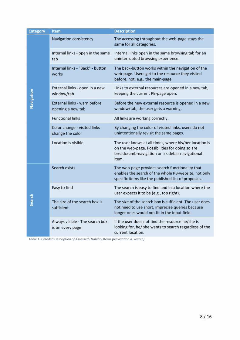
Category Item Description N
avig
atio
n
Navigation consistency The accessing throughout the web-page stays the same for all categories.
Internal links - open in the same
tab
Internal links open in the same browsing tab for an uninterrupted browsing experience.
Internal links - "Back" - button
works
The back-button works within the navigation of the web-page. Users get to the resource they visited before, not, e.g., the main-page.
External links - open in a new
window/tab
Links to external resources are opened in a new tab, keeping the current PB-page open.
External links - warn before
opening a new tab
Before the new external resource is opened in a new window/tab, the user gets a warning.
Functional links All links are working correctly.
Color change - visited links
change the color
By changing the color of visited links, users do not unintentionally revisit the same pages.
Location is visible The user knows at all times, where his/her location is on the web-page. Possibilities for doing so are breadcrumb-navigation or a sidebar navigational item.
Sear
ch
Search exists The web-page provides search functionality that enables the search of the whole PB-website, not only specific items like the published list of proposals.
Easy to find The search is easy to find and in a location where the user expects it to be (e.g., top right).
The size of the search box is
sufficient
The size of the search box is sufficient. The user does not need to use short, imprecise queries because longer ones would not fit in the input field.
Always visible - The search box
is on every page
If the user does not find the resource he/she is looking for, he/ she wants to search regardless of the current location.
Table 1: Detailed Description of Assessed Usability Items (Navigation & Search)
9 / 16
Co
nte
nt
De
sign
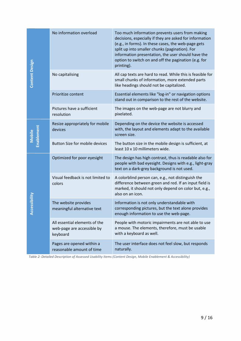
No information overload Too much information prevents users from making
decisions, especially if they are asked for information (e.g., in forms). In these cases, the web-page gets split up into smaller chunks (pagination). For information presentation, the user should have the option to switch on and off the pagination (e.g. for printing).
No capitalising All cap texts are hard to read. While this is feasible for small chunks of information, more extended parts like headings should not be capitalized.
Prioritize content Essential elements like "log-in" or navigation options stand out in comparison to the rest of the website.
Pictures have a sufficient
resolution
The images on the web-page are not blurry and pixelated.
Mo
bile
Enab
lem
en
t Resize appropriately for mobile
devices
Depending on the device the website is accessed with, the layout and elements adapt to the available screen size.
Button Size for mobile devices The button size in the mobile design is sufficient, at least 10 x 10 millimeters wide.
Acc
essi
bili
ty
Optimized for poor eyesight The design has high contrast, thus is readable also for people with bad eyesight. Designs with e.g., light-gray text on a dark-grey background is not used.
Visual feedback is not limited to
colors
A colorblind person can, e.g., not distinguish the difference between green and red. If an input field is marked, it should not only depend on color but, e.g., also on an icon.
The website provides
meaningful alternative text
Information is not only understandable with corresponding pictures, but the text alone provides enough information to use the web-page.
All essential elements of the
web-page are accessible by
keyboard
People with motoric impairments are not able to use a mouse. The elements, therefore, must be usable with a keyboard as well.
Pages are opened within a
reasonable amount of time
The user interface does not feel slow, but responds naturally.
Table 2: Detailed Description of Assessed Usability Items (Content Design, Mobile Enablement & Accessibility)

10 / 16
3 Usability Analysis
The following section contains the analysis of the different cities (50 in total). It gives a
quantitative overview of the fulfillment level of the various usability criteria shown in
Table 1. The content is further structured along the categories presented in Figure 1.
3.1 Navigation
The navigation analysis is concerned with the routes of the web-page. In a nutshell, a
website should confirm the browsing experience a user is familiar with. This includes
concepts like the behavior of links or a functional back-button.
All web-pages use consistent navigation that does not change while browsing through
different pages. The user also views his/her current location on every page for all assessed
PB-initiatives, e.g., through breadcrumb navigation or a sitemap. Further, all initiatives
provide a functioning back-button, all internal links open in the same window, change their
color once they are clicked, and all websites warned the user before leaving the website
through an external link. Further, we detected no broken links in none of the PB-websites.
However, as it was not possible to check every available link, this statement is merely based
on a small sample per website.
As a result, we can state that most of the current PB-initiative do surprisingly well regarding
their websites' navigation. The only minor problem persists in the opening of external links –
two of the 50 initiatives (Uktha, Russia and Vologda, Russia) open an external link in the
same window, leaving the PB-website in favor of the external resource. However, regarding
the variety and amount of examined websites, this can be considered a minor deviation from
the overall sound quality.
3.2 Search
Even with a clear structure, it can be challenging to find specific items on large websites.
Search capabilities offer an alternative – the right search term is often the fastest way to the
requested resource – under the condition, the user knows the correct keywords and what
she or he is looking for. Almost all larger websites today utilize some form of search
capability.8
8 Bühler, P./Schlaich, P./Sinner, D. (2017).
11 / 16
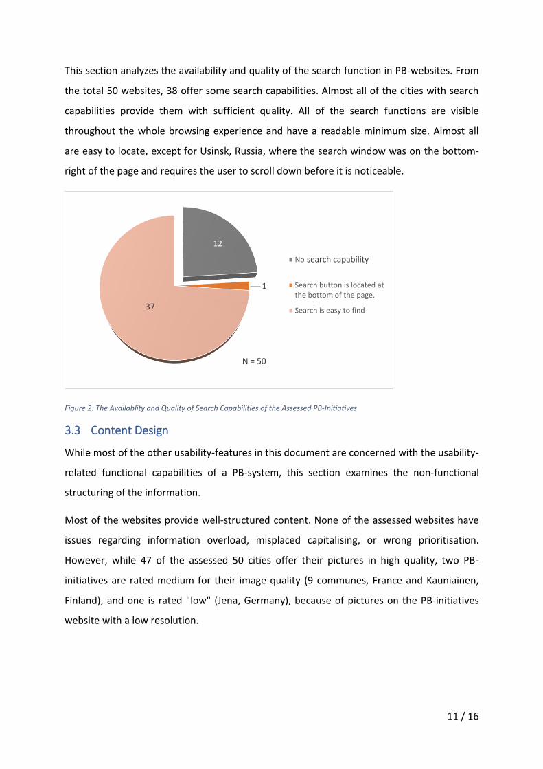
This section analyzes the availability and quality of the search function in PB-websites. From
the total 50 websites, 38 offer some search capabilities. Almost all of the cities with search
capabilities provide them with sufficient quality. All of the search functions are visible
throughout the whole browsing experience and have a readable minimum size. Almost all
are easy to locate, except for Usinsk, Russia, where the search window was on the bottom-
right of the page and requires the user to scroll down before it is noticeable.
Figure 2: The Availablity and Quality of Search Capabilities of the Assessed PB-Initiatives
3.3 Content Design
While most of the other usability-features in this document are concerned with the usability-
related functional capabilities of a PB-system, this section examines the non-functional
structuring of the information.
Most of the websites provide well-structured content. None of the assessed websites have
issues regarding information overload, misplaced capitalising, or wrong prioritisation.
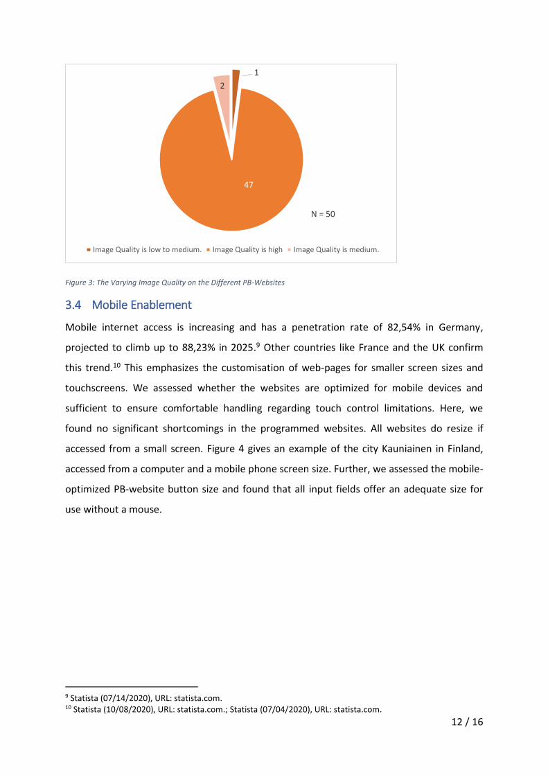
However, while 47 of the assessed 50 cities offer their pictures in high quality, two PB-
initiatives are rated medium for their image quality (9 communes, France and Kauniainen,
Finland), and one is rated "low" (Jena, Germany), because of pictures on the PB-initiatives
website with a low resolution.
No
Search button is located atthe bottom of the page.
Search is easy to find
search capability
12
1
37
N = 50
12 / 16
Figure 3: The Varying Image Quality on the Different PB-Websites
3.4 Mobile Enablement
Mobile internet access is increasing and has a penetration rate of 82,54% in Germany,
projected to climb up to 88,23% in 2025.9 Other countries like France and the UK confirm
this trend.10 This emphasizes the customisation of web-pages for smaller screen sizes and
touchscreens. We assessed whether the websites are optimized for mobile devices and
sufficient to ensure comfortable handling regarding touch control limitations. Here, we
found no significant shortcomings in the programmed websites. All websites do resize if
accessed from a small screen. Figure 4 gives an example of the city Kauniainen in Finland,
accessed from a computer and a mobile phone screen size. Further, we assessed the mobile-
optimized PB-website button size and found that all input fields offer an adequate size for
use without a mouse.
9 Statista (07/14/2020), URL: statista.com. 10 Statista (10/08/2020), URL: statista.com.; Statista (07/04/2020), URL: statista.com.
Image Quality is low to medium. Image Quality is high Image Quality is medium.
N = 50
47
1
2

13 / 16
Figure 4: Example of Mobile-Optimized Websites Note: Accessed From a Desktop (Left) and a Mobile Device (Right)
3.5 Accessibility
As the European Union Council stated, public administrations have an outstanding obligation
to make their service accessible for all citizens regardless of potential disabilities.11 This
recommendation was put into law in 2016, requiring member states to fulfill minimum
inclusion requirements for their e-Government applications.12 This section assesses the
accessibility for users with sensory or motoric impairments. The functional assessment
builds on the works of Dungga, Weissenfeld, and Klein.13
3.5.1 Supporting the Motoric Impaired
The handling of classical input devices like a mouse or a touchscreen requires fine-motoric
skills. Often, people that lack these skills use the keyboard as a fallback-input unit. However,
the efficient usage of these alternative devices is just possible if the website provides
meaningful mouse-alternatives like shortcuts.
Most of the assessed cities do not offer these alternatives. Out of the 50 assessed cities, 47
do not support the mere use of shortcuts and keyboard. Two of the municipalities
(Greensboro, U.S.A. and Cluj-Napoca, Romania) provide essential support for keyboard-
driven navigation by, e.g., prioritising tab-stops or quickly referring to the accessibility
support. One PB-initiative (Porto Alegre, Brazil) supports full shortcut-driven keyboard
navigation.
11 Council of the European Union (03/31/2009). 12 European Parliament (10/26/2016). 13 Dungga, A./Weissenfeld, K./Klein, E. (2019).

14 / 16
3.5.2 Supporting the Visually Impaired
The varieties of visual impairments are manifold, ranging from a light limitation like the
missing ability to sense color to complete blindness. This diversity also motivates a variety of
requirements. We assessed a total of four different items for different levels of visual
impairments.
To enable easy readability, especially for users with a slight visual impairment, we checked
whether the PB-websites have sections that provide a low contrast, for example, due to poor
color choice or small font sizes. One of the municipalities (Oradea, Romania) uses a low-
contrast design, which can make it difficult to read (Example in Figure 5).
Figure 5: Example of a Hard to Read Text Due to Low Contrast in Colors Note: Grey Text on a Light-Grey Background
Two PB-initiatives provide images with text that is too small to read in the context of the
website (9 Communes, France & Kauniainen, Finland). Two websites are already conforming
to the Web Content Accessibility Guidelines (WCAG) standard that predefines a minimum
level of contrast. The rest of the PB-initiatives provides a sufficient contrast without explicitly
confirming a predefined standard.
Another design decision that makes the website more accessible is providing visual feedback
not only through colors but also through other design elements. Examples of these design
elements are icons or underscores. Colorblind users might otherwise be limited in their use
of the web-page, as they have problems recognising the website's current state. As an
example, in Figure 6, the clicked element "Patti di collaborazione" is underscored; the
selected item can be identified without relying on colors.
Figure 6: Navigation-Bar with Visual Feedback Through Color and Underscored Text (Bologna, [IT])
All assessed cities provide some form of extended visual feedback for better readability. Five
cites also provide a high-contrast mode (see Cluj-Napoca, Romania or Jena, Germany). This
functionality can further increase accessibility for visually impaired citizens.

15 / 16
Fully blind users cannot cope with a high contrast design – these users are dependent on
either a text-to-speech engine or a braille interface. While the market offers software and
specialized hardware that translates the textual content into braille to speech, these tools
cannot describe pictures. We, therefore, assessed whether a user can understand the PB-
websites without the consideration of images. In this regard, all cities either used just photos
as side information or applied a meaningful alternative text.
4 Closing Remarks
This report assessed the websites of various PB-initiatives regarding usability and
accessibility criteria. While we were able to discover shortcomings in some PB-initiative, we
can state that the current PB-initiatives' usability is consistently high. Also, all PB-initiatives
provide sufficient accessibility for the e-inclusion of impaired users. Some of the websites
implement exemplary measures regarding the latter, like Cluj-Napoca in Romania, with a
dedicated menu for toggling accessibility-related options, or Arkhangelsk in Russia with a
dedicated high contrast black and white version that also reduced the content to the most
necessary elements.
16 / 16
References
Bühler, P./Schlaich, P./Sinner, D. (2017): Webdesign, Berlin, Heidelberg 2017.
(03/31/2009): Council Conclusions on accessible information society - 2935th TRANSPORT, TELECOMMUNICATIONS, and ENERGY Council meetings, Brussels 03/31/2009.
(10/26/2016): Directive (EU) 2016/2102 of the European Parliament and of the Council of 26 October 2016 on the accessibility of the websites and mobile applications of public sector bodies - EUR-Lex - 32016L2102 -, 10/26/2016.
Dungga, A./Weissenfeld, K./Klein, E. (2019): Barrierefreies E-Government, in: Stember, J./Eixelsberger, W./Neuroni, A./Spichiger, A./Habbel, F.-R./Wundara, M. (Hrsg.): Handbuch E-Government, Wiesbaden 2019, pp. 1‑20.
Ertel, A./Laborenz, K. (2017): Responsive Webdesign - Konzepte, Techniken, Praxisbeispiele, 3. Edition, Bonn 2017.
Huang, Z./Benyoucef, M. (2014): Usability and credibility of e-government websites, Government Information Quarterly, Vol. 31, Issue 4/2014, pp. 584‑595.
ISO (2018): Ergonomics of human-system interaction - Part 11: Usability: Definitions and concepts, 1. Edition, Berlin, Wien, Zurich 2018.
Kalbach, J. (2008): Handbuch der Webnavigation, Köln 2008.
Omar, A./Weerakkody, V./Sivarajah, U. (2017): Developing Criteria for Evaluating a Multi-channel Digitally Enabled Participatory Budgeting Platform, in: Parycek, P./Charalabidis, Y./Chugunov, A.V./Panagiotopoulos, P./Pardo, T.A./Sæbø, Ø./Tambouris, E. (Hrsg.): Electronic Participation, Vol. 10429, Cham 2017, pp. 3‑11.
Richter, M./Flückiger, M. (2016): Usability und UX kompakt, Berlin, Heidelberg 2016.
Statista (07/04/2020): Forecast of the mobile internet user penetration rate in the United Kingdom (UK) from 2015 to 2025, URL: statista.com (Accessed: 12.11.2020).
Statista (07/14/2020): Forecast of the mobile internet user penetration rate in Germany from 2015 to 2025, URL: statista.com (Accessed: 12.11.2020).
Statista (10/08/2020): Forecast of the mobile internet penetration in France from 2010 to 2025, URL: statista.com (Accessed: 12.11.2020).