Usability Report
14
-
Upload
gary-schroeder -
Category
Internet
-
view
89 -
download
0
Transcript of Usability Report

Novaspaceart.com
Prepared by @gary_schroederDecember 2016
Usability Testing Report

Executive Summary A usability test was conducted against novaspaceart.com, an online art dealer, using three participants who were asked to complete five discrete tasks using the website. The tests were conducted by one test manager in a closed conference room with a participant provided with a Macbook Air laptop and a Chrome web browser. The tests were conducted in order to determine what if any usability problems existed so that they can be corrected. Findings The tests revealed that (1) the visual aesthetics of the site are perceived to be unattractive and out-of-date; (2) the meaning of some of the labels used to define various sections are unclear and don’t immediately suggest what is associated with them; (3) the shopping cart UI is confusing; (4); the lack of a direct path to the FAQ page is a glaring omission; (5) the customer satisfaction guarantee is challenging to find; and (6) the Want List function is far too difficult to use. Introduction Novaspace Art started life in 1978 as a mail-order service dealing in the space-themed artwork. In the 1990s, they expanded their art offerings and became an outlet for selling items autographed by astronauts. That end of the business quickly began outselling the art. Their original website, novaspace.com supported all of their products, but because of the total volume of inventory, they eventially spun off their autogrpah market to a new website called astronautcentral.com. Another subsite, novaspaceart.com, remains dedicated to selling space-themed art. Like all of the websites in the Novaspace family of businesses, the Novaspace Art website is extremely dated and has an early 2000s design aesthetic. It reflects the amateur style of that time period, before web-based user interfaces had become refined and standards for the new medium had really gelled. Different segments of the site look completely different from one another, the UI is non-uniform, the navigation is cluttered and confusing, and the site is incompatible with modern mobile devices.
Novaspaceart.com Usability Report | @gary_schroeder 1

Initial Participant Reactions
Comments/Observations Participant 1 ▶ “This looks like an artist’s personal site.” Participant 2 ▶ “My first impression is that it’s not nice to look at.“ ▶ “I’m not sure what some of these categories mean. I have no idea what ‘after market’ means. Why would something be ‘limited edition’?” ▶ “It looks like it was made by a sad template.” ▶ “I think the yellow text [breadcrumb below the main nav] is really hard to read.” Participant 3 ▶ “It looks like a site that was made, 10, maybe 12, 13 years ago. It hasn’t been updated in its design since then...it doesn’t mean its content hasn’t been updated.” Takeaways
● The purpose of the site may not be immediately obvious. ● Two participants were particularly bothered by the visual aesthetics of
the site which they found to be both ugly and out-of-date. Surprisingly, the third did not assume that the site’s retrograde looks meant that it wasn’t being actively maintained, he gave it the benefit of the doubt.
● The meaning of the labels shown over the thumbnail images is unclear and doesn’t immediately suggest what will be found by clicking on the thumbnail images.
Novaspaceart.com Usability Report | @gary_schroeder 2

Task 1 - Review the catalog of items for sale
Participant 2 found this shopping cart interface overly confusing.
Comments/Observations Participant 1 ▶ Never used the main navigation to investigate the catalog. Navigated straight from the home page examples. He eventually used the “Originals” tab instead of always using the browser’s back button. ▶ “I like that! If you hover over images, it gives a description of the artwork. It depends, though. Sometimes it’s an image description, sometimes a description of the artist.It should be consistent.” Participant 2 ▶ Was surprised that clicking on thumbnail image of one painting led to an artist’s entire catalog. ▶ “I don’t know why they’re telling you what’s SOLD.” ▶ Kept using the browser’s back button to navigate, not the main nav menu. ▶ Depending on the artwork format (paintings vs. posters, etc.), got different pages for the same artist. “I don’t know why they’re not just grouped together.” ▶ “The purchase section is really hard to understand. This is just way too complicated.” ▶ “Miniatures--what does that mean?” Participant 3 ▶ From the home page, he clicked on a thumbnail image and was confused when the page it took him to did not feature the same image anywhere. ▶ “After market? I don’t know what that means.” Takeaways
● Participants prefered to use home page links and browser back button rather than navigation menu to explore.
● Words used for labels are unclear/confusing ● Shopping cart UI overly complex/unclear ● Links did not always lead to expected results
Novaspaceart.com Usability Report | @gary_schroeder 3
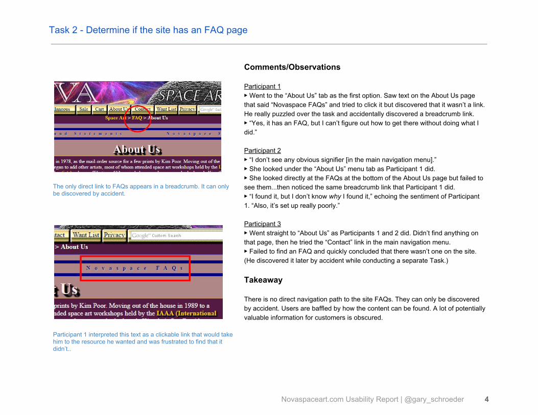
Task 2 - Determine if the site has an FAQ page
The only direct link to FAQs appears in a breadcrumb. It can only be discovered by accident.
Participant 1 interpreted this text as a clickable link that would take him to the resource he wanted and was frustrated to find that it didn’t..
Comments/Observations Participant 1 ▶ Went to the “About Us” tab as the first option. Saw text on the About Us page that said “Novaspace FAQs” and tried to click it but discovered that it wasn’t a link. He really puzzled over the task and accidentally discovered a breadcrumb link. ▶ “Yes, it has an FAQ, but I can’t figure out how to get there without doing what I did.” Participant 2 ▶ “I don’t see any obvious signifier [in the main navigation menu].” ▶ She looked under the “About Us” menu tab as Participant 1 did. ▶ She looked directly at the FAQs at the bottom of the About Us page but failed to see them...then noticed the same breadcrumb link that Participant 1 did. ▶ “I found it, but I don’t know why I found it,” echoing the sentiment of Participant 1. “Also, it’s set up really poorly.” Participant 3 ▶ Went straight to “About Us” as Participants 1 and 2 did. Didn’t find anything on that page, then he tried the “Contact” link in the main navigation menu. ▶ Failed to find an FAQ and quickly concluded that there wasn’t one on the site. (He discovered it later by accident while conducting a separate Task.) Takeaway There is no direct navigation path to the site FAQs. They can only be discovered by accident. Users are baffled by how the content can be found. A lot of potentially valuable information for customers is obscured.
Novaspaceart.com Usability Report | @gary_schroeder 4

Task 3 - Find the satisfaction guarantee
This is one of the pathways to finding the satisfaction guarantee, but this path depends on finding the FAQ page--which is a serious problem as found in Task 2.
Comments/Observations Participant 1 ▶ Perceived “Sale” as terms and conditions rather than items being sold at discounted sale prices. ▶ Found the “terms” hyperlink on the Originals page but that took him to information related to layaway plans. He went back to the FAQs and successfully found the guarantee policy. Participant 2 ▶ Looked in FAQs under “Ordering, Shipping, Customer Service.” Found the Guarantee there, which led to a badly formed page. ▶ “This is the worst page I’ve ever seen. It looks fake.” Participant 3 ▶ Looked at the footer first.Thought it was odd that they feature a Facebook link in the page footer, but not an updated website. [That link is actually a way to post the existence of the website to your own Facebook timeline.] ▶ “Maybe this site is abandoned and they want you to go to Facebook.” ▶ Went to the About us page and stumbled onto the FAQs. He was surprised since he had declared that the site had none during Task 2. He used the FAQs to find the Guarantee policy. Takeaway There are multiple paths to locating the satisfaction guarantee. Participants were able to locate it, but not without some difficulty.
Novaspaceart.com Usability Report | @gary_schroeder 5

Task 4 - Find a way to save favorite items
Adding catalog items to a wish list is one of the most challenging features of the site. To be successful, users have to recognize that they first need to create an account via Link 3, and then they have to login with that newly created set of credentials. The interface completely fails to explain this. A further point of confusion on this UI is that links 2 and 3 seem to do exactly the same thing even though they use different language. Link 2 says “New Wish List System Users”. Link 3 says “New Wish List System users Sign up Here.” Which one should be used? Why are there two? Another significant problem is that many items do not feature a button by which to add them to the Want List. (See the image in Task 1 for an example of one that does.) There doesn’t seem to be an obvious explanation as to why some items feature this button and others do not. Basically, this is just a terrible interface that puts a lot of unnecessary cognitive load on the user.
Comments/Observations Participant 1 ▶ Found “Want List” in main navigation but initially thought he could favorite an item by going directly to a specific item. ▶ Read the instructions and signed up for an account and saw that he was then presented with an empty Wish List. ▶ Saw “”Registered users login here” link and entered his newly created login credentials. ▶ Was stymied by the fact that many artworks don’t feature a “favorites” feature, what the site shows as a “Want” button. ▶ Looked for a Wish List FAQ but found none. ▶ Eventually stumbled onto an item that featured a “Want” button, but never noticed that it was there. Task failed. Participant 2 ▶ “I noticed before, there’s a Want List.” Tried an example item but found that it couldn’t be added to a list even though an earlier item that she saw could be. ▶ “Maybe I can only do it on prints?” ▶ Found the login creation form, created login credentials but couldn’t figure out how to add anything to the list. ▶ “I’m at Astronaut Central” now. Is this the same thing? I don’t think it is.” Abandoned task without success. Participant 3 ▶ “My way of doing it would be just to email the link to myself.” ▶ “There’s nothing on here that tells me how I can save this.” ▶ Never saw the “Want List” navigation tab, gave up immediately because he had a preferred alternative. Takeaway The Want List feature is too difficult to use.
Novaspaceart.com Usability Report | @gary_schroeder 6

Task 5 - Find a way to get more information
Contact page.
Comments/Observations Participant 1 ▶ Found the contact page right away. Participant 2 ▶ Quickly found Contact button in main navigation. Participant 3 ▶ Found “Contact Us” link in the page footer Takeaway There’s no problem here. Users can easily find contact information.
Novaspaceart.com Usability Report | @gary_schroeder 7

Methodology The tests were conducted by one test manager in a closed conference room with a participant provided with a Macbook Air laptop and a Chrome web browser. The tests were conducted in order to determine what usability problems existed--if any--so that they might be corrected. Description of participants All participants were recruited from a pool of work colleagues. Each possessed a high degree of experience and comfort with electronic media, the Internet in general, and ecommerce websites in particular. Participant 1 was a 52 year old male working as an office manager for a media and public relations organization. Participant 2 was a 30 year old female employed as a science writer. She also blogs in her spare time and has deep experience managing social media campaigns. Participant 3 was a 45 year old male employed as an internal communications manager responsible for authoring and distributing electronic newsletters. All participants were able to answer the opening questions and complete the five tasks in under 35 minutes. Opening Questions Each participant was asked the following questions in order to put them at ease and solicit information by which to gauge their Internet competency.
● First, what’s your occupation? What do you do all day? ● Roughly how many hours a week altogether—just a ballpark estimate— would you say
you spend using the Internet, including Web browsing and email, at work and at home ● And what’s the split between email and browsing—a rough percentage? ● What kinds of sites are you looking at when you browse the Web? ● Do you have any favorite Web sites?
Novaspaceart.com Usability Report | @gary_schroeder 8

Task Development Strategy The purpose of the Novaspaceart.com website is to sell original paintings, prints, posters, and other space-themed paraphenalia. Since its entire reason for being is to promote awareness of the company’s existence and sell the products it carries, the most important tasks the website must facilitate are those which promote and sell. Each task was selected according to that premise. In the opening exercise prior to the first task, I wanted to gauge user responses to the site’s visual appearance since that can both support or undermine the perceived credibility of the site. Trustworthiness is critical when asking a user to input credit card data and other personally identifying information. I wanted to gauge how easy it was for users to browse the inventory of items available for sale. If the inventory is too frustrating to browse or if major sections go unnoticed, there’s an opportunity for lost sales. The site offers the ability to create a personal account and save items to a wishlist for later recall, but the vague instructions and unintuitive interface provided for this action suggested this part of the site as one which should be tested with actual users. Lastly, I wanted to round out the task list with some simpler tasks (like finding a contact page and the satisfaction guarantee) so that the participants could feel a sense of accomplishment on the premise that an unbroken series of frustrations could cause them to lose their open mindedness during the usability test and bias the results.
Novaspaceart.com Usability Report | @gary_schroeder 9
Task Script
Open the Novaspace home page
“First, I’m going to ask you to look at this page and tell me what you make of it: what strikes you about it, whose site you think it is, what you can do here, and what it’s for. Just look around and do a little narrative.You can scroll if you want to, but don’t click on anything yet.”
Allow this to continue for 3 or 4 minutes at most.
“Thanks. Now I’m going to ask you to try doing some specific tasks. I’m going to read each one out loud and give you a printed copy. I’m also going to ask you to do these tasks without using Search. I’ll learn a lot more about how well the site works that way. And again, it will help me if you can try to think out loud as much as possible.”
Hand participant Task 1 and read it aloud
“Just browse through the available works of art for sale so that you get a sense of what their catalog of items includes. Tell me what you’re thinking as you look around.”
Hand participant Task 2 and read it aloud
“Some websites to have a list of frequently asked questions--or FAQs--to help explain how to use the site. Not every site has an FAQ. Tell me if this site has a list of FAQs or not.”
Novaspaceart.com Usability Report | @gary_schroeder 10
Hand participant Task 3 and read it aloud
“Tell me if they offer any kind of guarantee of satisfaction that allows for refunds in case you’re not happy with the product.”
Hand participant Task 4 and read it aloud
“Let’s say that you’re pressed for time and that you don’t have time to go through the process of placing an order right now, but you don’t want to review the catalog all over again in the future. See if you can find a way to mark certain items as ‘favorites’ that you can easily find again if you come back later.”
Hand participant Task 5 and read it aloud
“Imagine that you’ve found one or two pieces of work that you’re interested in purchasing, but you have questions about your options that aren’t answered by the information available on the website. See if you can find a way to ask for more information.”
“Great! We’re all done. Do you have any questions for me?”
Novaspaceart.com Usability Report | @gary_schroeder 11

Recommendations
Recommendation 1 The tests revealed that the visual aesthetics of the site are perceived to be unattractive and out-of-date. This may have serious consequences for the site’s effectiveness as a sales tool. Sites that are beautiful are perceived as being easy to use. The converse is also true. To increase user confidence in the site and enhance the overall user experience, novasapceart.com should be redesigned by experts to give it a contemporary look and feel that more closely mateches what users expect from a reputable ecommerce website. Any such redesign should seek to standardize the look and feel of all pages within the site. As it stands now, one is able to abruptly navigate between Nova Space Art and its sister site Astronaut Central without being aware of the change in domain names. This results in a negative user experience and may also result in lost sales as users question why they’ve been dumped to a site with a completely different name and visual template. Some may even interpret this as a nefarious hijacking attempt. Lastly on the design front, the site should be mobile-friendly.
Importance Level: HIGH May cause site to fail in its primary function of facilitating sales.
Recommendation 2 Users consistently reported that the meaning of some of the labels used to define various sections of the website are unclear and that they don’t immediately suggest what is associated with them. Notable examples include “After Market”, “Miniatures”, and “Limited Editions.” This can be easily corrected by including brief descriptive text that makes it plain to the user that they can expect to find within these categories.
Importance Level: MEDIUM May cause difficulty in site navigation.
Recommendation 3 Test revealed that the shopping cart UI is confusing. Since the cart and Want List functions are bundled into the same UI, these should be considered two parts of the same problem. The recommendation is to redesign the UI for these functions such that the first time user is affirmatively guided through the sign-up process and then shown how to add items to the Want List. The current site provides the UI for some items, but not others. The cart/Want List UI should be consistently presented with every item available for purchase.
Importance Level: HIGH May cause site to fail in its primary function of facilitating sales.
Novaspaceart.com Usability Report | @gary_schroeder 12

Recommendation 4 All participants reported serious difficulty in locating the site’s Frequently Asked Questions page. This page contains a lot of important clarifying details about the vendor’s service, guarantees, shipping methods, etc. While the FAQ page can be stumbled on by navigating to other pages within the site, it’s important enough to be listed prominently in the site’s main navigation menu, or on the home page at a minimum. This is a simple change that could have significant payoffs. An alternative suggestion is to incorporate the information contained on the FAQ page directly into the main site content. For example, rather than having a question titled “what is matting and framing?” on a separate page, simply include that text on every item-for-sale page under a link labeled “framing options.” Place contextual information on pages where it can do the most good for the user. Reduce their workload, don’t make them dig through a long list of unrelated questions.
Importance Level: HIGH May cause site to fail in its primary function of facilitating sales.
Novaspaceart.com Usability Report | @gary_schroeder 13