USABILITY, ACCESSIBILITY,...
46
1
Transcript of USABILITY, ACCESSIBILITY,...

1

USABILITY, ACCESSIBILITY, ACCEPTABILITY
2
Acceptability
Accessibility Usability
Objectives
• Forms of guidelines in IxD
• Evaluate of an interactive product in terms of goals and principles of interaction design

USABILITY

Definition of usability
• ISO 9241-11
• The extent to which a product can be used – by specified users
– to achieve specified goals
– with effectiveness, efficiency and satisfaction
– in a specified context of use.

Usability for desktop applications
ISO 9241 outlines 3 measurable attributes
• Effectiveness: – Accuracy and completeness with which users achieve
specified goals;
• Efficiency: – Resources expended in relation to the accuracy and
completeness with which users achieve goals;
• Satisfaction: – Freedom from discomfort, and positive attitudes
towards the use of the product.
24 June 2014
MIDI 2014
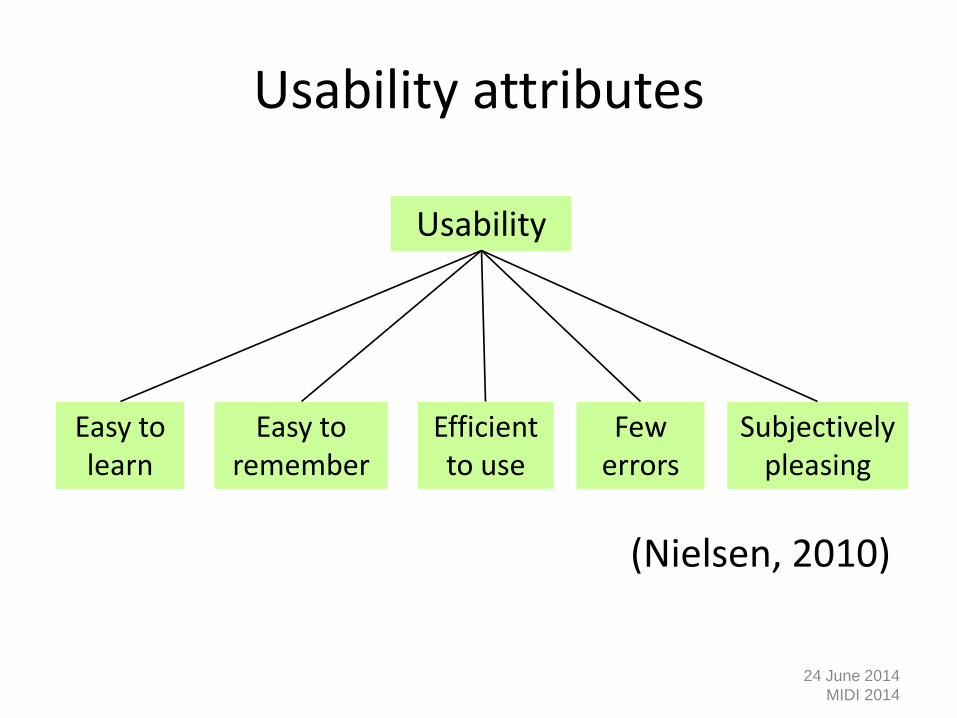
Usability attributes
(Nielsen, 2010)
24 June 2014
MIDI 2014
Usability
Easy to learn
Efficient to use
Easy to remember
Few errors
Subjectively pleasing

Nielsen’s principles vs. ISO 9241
Nielsens principles
1. Learnability
2. Efficiency of use
3. Memorability
4. Few and noncatastrophic errors
5. Satisfaction
ISO 9241
A. Effectiveness
B. Efficiency
C. Subjective satisfaction

Norman’s usability principles
• Visibility
• Constraints
• Mapping
• Consistency
• Feedback
• Affordance Norman, Donald A. (2002). The Design of
Everyday Things. New York: Basic Books.

10
Visibility
• This is a control panel for an elevator • How does it work? • Push a button for the floor you want? • Nothing happens. Push any other button?
Still nothing. What do you need to do? It is not visible as to what to do!
From:
www.baddesigns.com

www.id-book.com 11
Visibility …you need to insert your room card in the slot by the buttons
to get the elevator to work! How would you make this action more visible? • make the card reader more obvious • provide an auditory message, that says what to do (which
language?) • provide a big label next to the card reader that flashes when
someone enters
• make relevant parts visible • make what has to be done obvious

www.id-book.com 12
Constraints
• Restricting the possible actions that can be performed
• Helps prevent user from selecting incorrect options
• Physical objects can be designed to constrain things – e.g. only one way you can insert a key into a lock

www.id-book.com 13
Feedback
• Sending information back to the user about what has been done
• Includes sound, highlighting, animation and combinations of these
– e.g. when screen button clicked on provides sound or red highlight
feedback:
“ccclichhk”

Mapping
14

www.id-book.com 15
Logical or ambiguous design?
• Where do you plug the mouse?
• Where do you plug the keyboard?
• top or bottom connector?
• Do the color coded icons help?
From: www.baddesigns.com

www.id-book.com 16
How to design them more logically
(i) A provides direct adjacent mapping between icon and connector
(ii) B provides color coding to associate the connectors with the labels
From: www.baddesigns.com

www.id-book.com 17
Consistency
• Design interfaces to have similar operations and use similar elements for similar tasks
• For example:
– always use ctrl key + first initial of the command for an operation – ctrl+C, ctrl+S, ctrl+O
• Main benefit is consistent interfaces are easier to learn and use

www.id-book.com 18
When consistency breaks down
• What happens if there is more than one command starting with the same letter? – e.g. save, spelling, select, style
• Have to find other initials or combinations of keys, thereby breaking the consistency rule – e.g. ctrl+S, ctrl+Sp, ctrl+shift+L
• Increases learning burden on user, making them more prone to errors

www.id-book.com 19
Internal and external consistency
• Internal consistency refers to designing operations to behave the same within an application – Difficult to achieve with complex interfaces
• External consistency refers to designing operations, interfaces, etc., to be the same across applications and devices – Very rarely the case, based on different designer’s
preference
www.id-book.com 20
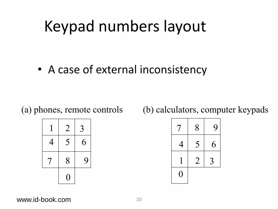
Keypad numbers layout
• A case of external inconsistency
1 2 3
4 5 6
7 8 9
7 8 9
1 2 3
4 5 6
0 0
(a) phones, remote controls (b) calculators, computer keypads
www.id-book.com 21
Affordances: to give a clue
• Refers to an attribute of an object that allows people to know how to use it – e.g. a mouse button invites pushing, a door handle
affords pulling
• Norman (1988) used the term to discuss the design of everyday objects
• Since has been much popularised in interaction design to discuss how to design interface objects – e.g. scrollbars to afford moving up and down, icons to
afford clicking on

www.id-book.com 22
Affordance and interaction design
• ‘Perceived’ affordances
– Learned conventions of arbitrary mappings between action and effect at the interface
– Some mappings are better than others

www.id-book.com 23
Examples
– Physical affordances:
How do the following physical objects afford? Are they obvious?

www.id-book.com 24
Virtual affordances
How do the following screen objects afford?
What if you were a novice user?
Would you know what to do with them?

Accessibility
• Legislation
– UK Disability Discrimination Act
– W3C declarations and guidelines
– Usability.gov guidelines
Acessibility
• Concerns removing the barriers that would otherwise exclude some people from using the system at all.
• Excluding reasons:
– Physically
• Inappropriate siting of equipment
– Conceptually
• Cannot understand complicated instructions
– Economically
• Cannot afford essential technology
– Culturally
• Inappropriate metaphors
– Socially • Equipment is unavailable at an appropriate time and place
• If people are not members of a particular social group and cannot uinderstand particulat messages

Web Content Accessibility Principles
Principle 1: Perceivable
Information and user interface components must be presentable to users in ways they can perceive.
Principle 2: Operable
User interface components and navigation must be operable
Principle 3: Understandable
Information and the operation of user interface must be understandable.
Principle 4: Robust –
Content must be robust enough that it can be interpreted reliably by a wide variety of user agents, including assistive technologies.
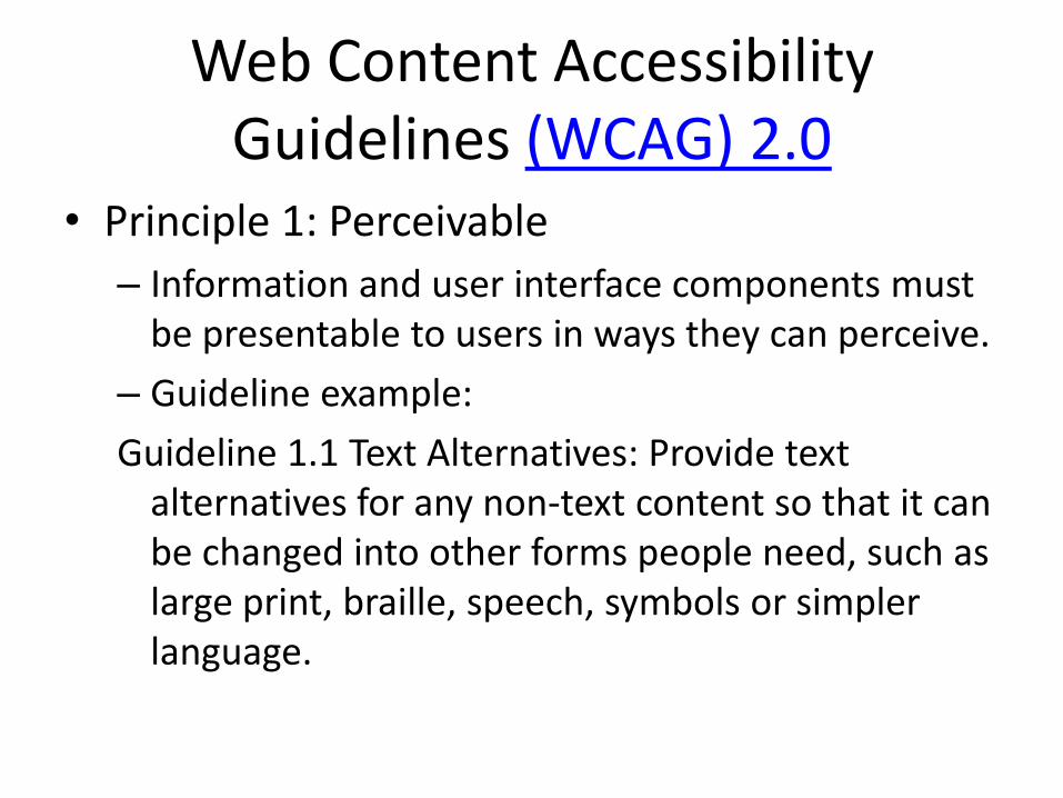
Web Content Accessibility Guidelines (WCAG) 2.0
• Principle 1: Perceivable
– Information and user interface components must be presentable to users in ways they can perceive.
– Guideline example:
Guideline 1.1 Text Alternatives: Provide text alternatives for any non-text content so that it can be changed into other forms people need, such as large print, braille, speech, symbols or simpler language.

Assistive technologies
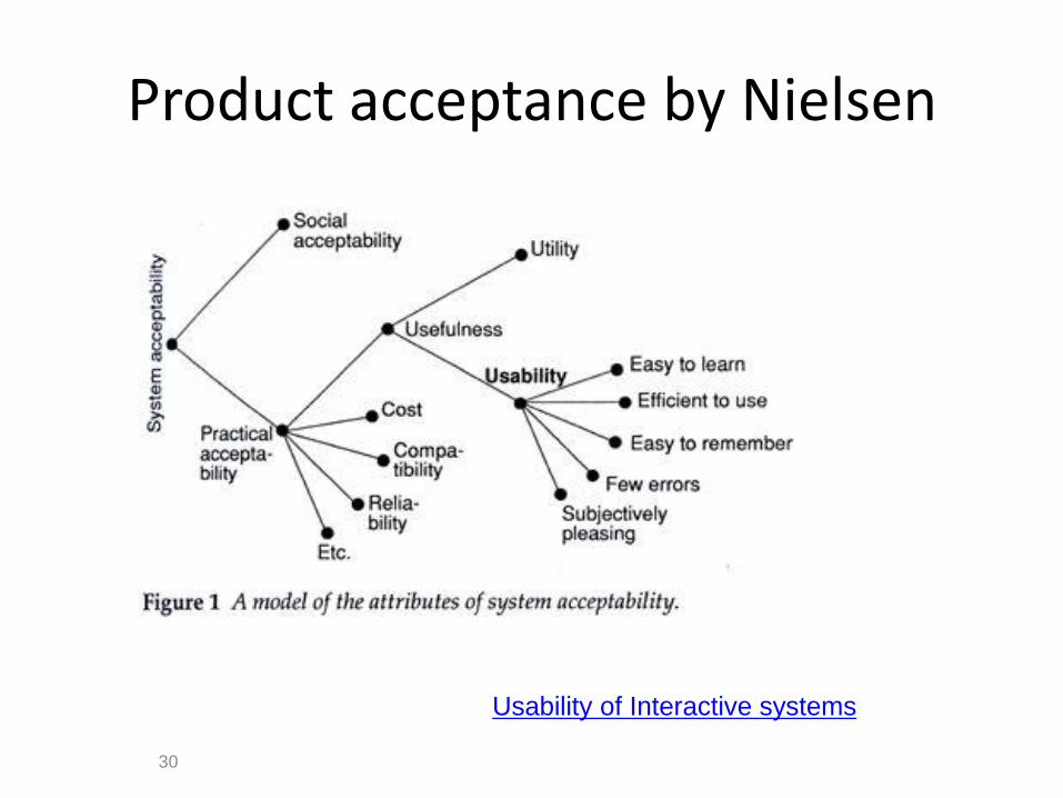
Product acceptance by Nielsen
30
Usability of Interactive systems
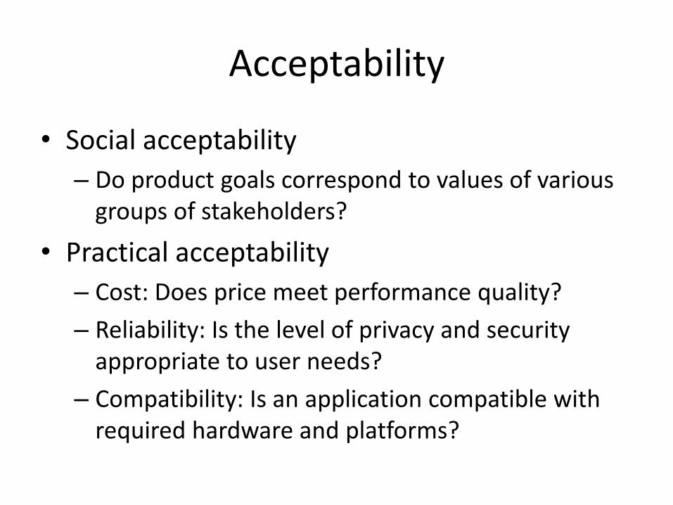
Acceptability
• Social acceptability
– Do product goals correspond to values of various groups of stakeholders?
• Practical acceptability
– Cost: Does price meet performance quality?
– Reliability: Is the level of privacy and security appropriate to user needs?
– Compatibility: Is an application compatible with required hardware and platforms?
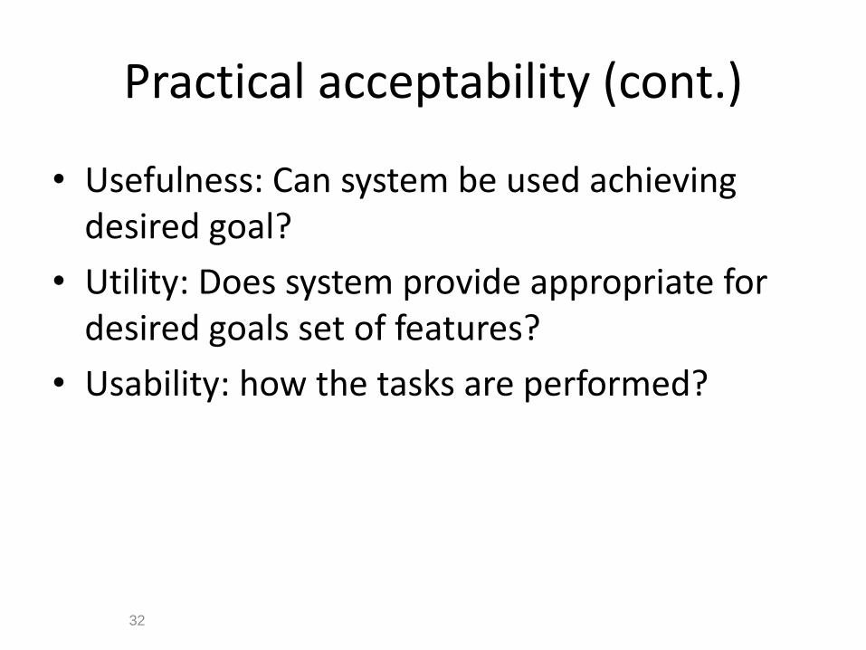
Practical acceptability (cont.)
• Usefulness: Can system be used achieving desired goal?
• Utility: Does system provide appropriate for desired goals set of features?
• Usability: how the tasks are performed?
32

www.id-book.com 33
The User Experience
• How a product behaves and is used by people in the real world – “every product that is used by someone has a user experience:
newspapers, ketchup bottles, reclining armchairs, cardigan sweaters.” (Garrett, 2003)
• Cannot design a user experience, only design for a user experience
The iPod Nano Touch

Panaudojamumo ir potyrių tikslai
34
enhancing sociabilitynaudUsability
efficiency
Effect
iveness
safe
ty
mem
ora
bility le
arn
abili
ty
Usefullness
satisfying
enjoyable
fun
engaging
pleasura
ble
motivating
challenging
supporting
creativity
rewarding
enhancing socialability
35
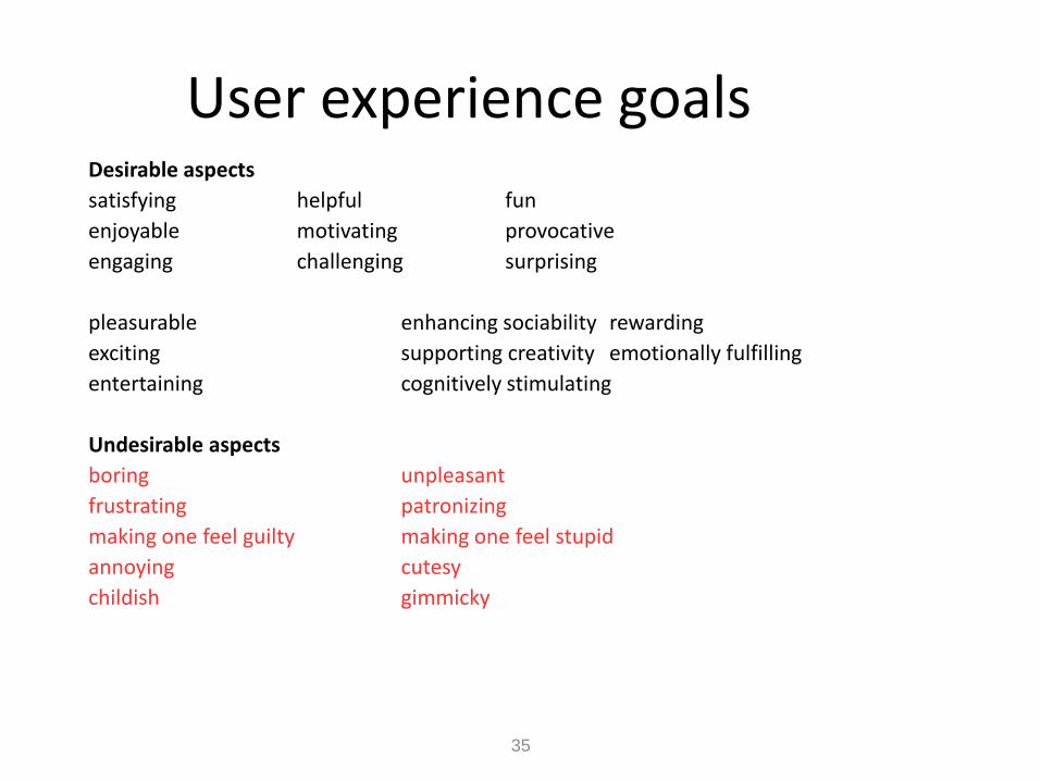
User experience goals Desirable aspects
satisfying helpful fun
enjoyable motivating provocative
engaging challenging surprising
pleasurable enhancing sociability rewarding
exciting supporting creativity emotionally fulfilling
entertaining cognitively stimulating
Undesirable aspects
boring unpleasant
frustrating patronizing
making one feel guilty making one feel stupid
annoying cutesy
childish gimmicky

www.id-book.com 36
Cultural differences
• 5/21/2012 versus 21/5/2012?
– Which should be used for international services and online forms?
• Why is it that certain products, like the iPod, are universally accepted by people from all parts of the world whereas websites are reacted to differently by people from different cultures?

www.id-book.com 37
• Designed to be different for UK and US customers
• What are the differences and which is which?
• What should Anna’s appearance be like for other countries, like India, South Africa, or China?
Anna, IKEA online sales agent

38
Usability goals
• Effective to use
• Efficient to use
• Safe to use
• Have good utility
• Easy to learn
• Easy to remember how to use

User needs analysis
1. Define your users: Who are the users?
2. Identify user goals:
– What do your users want and need?
– How do they solve their problems now?
3. Define business goals:
– What do the users need to do for this Web site or application to be a viable investment?
39
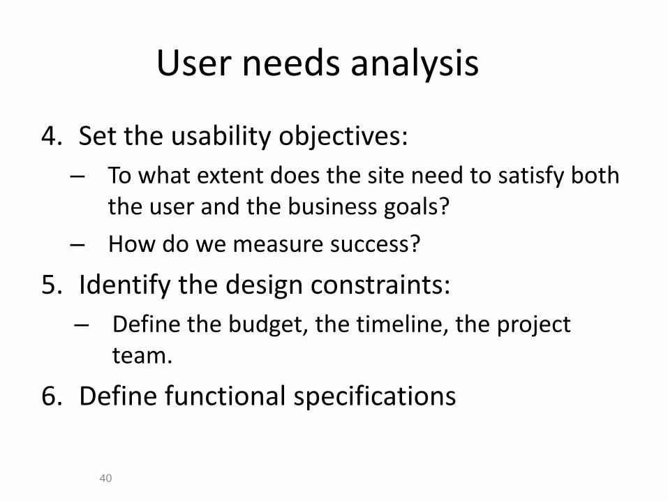
User needs analysis
4. Set the usability objectives:
– To what extent does the site need to satisfy both the user and the business goals?
– How do we measure success?
5. Identify the design constraints:
– Define the budget, the timeline, the project team.
6. Define functional specifications
40

Usability objectives
24 June 2014
MIDI 2014
ISO 9241
Tasks
Users
Measures from business goals
Mayhew, 1999

Examples of usability objectives Category Examples of Specifi c Objectives
Learning time/ task time
Users will be able to use this site the fi rst time without any training First-time users will be able to fi nd their topic of interest within two minutes of visiting the site; expert users (fi ve or more visits) will be able to fi nd a topic within 30 seconds
Number of errors
Users will not visit more than three incorrect pages (on average) in completing a task Users will make no fatal errors at least 99 percent of the time (such as entering an incorrect credit card or shipping address)
Subjective impressions
On a scale of 1 (really appealing) to 7 (really unappealing), users will rate the site at least a 2.5
Accomplished tasks
At least 75 percent of users who add an item to a shopping cart will complete a purchase At least 95 percent of users who complete their credit card information will complete a purchase
Revisits At least 50 percent of registered users will return to the site at least once per month

Tom Brinck, Darren Gergle, and Scott D. Wood. User needs analysis. In
User Experience Re-Mastered. Morgan Kaufman, 2010, Chapter 2.

MTV Networks‘ Mobile Apps Life Cycle
1. Discovery
2. Adoption
3. Trial
4. Abandonment or Long-Term Usage
44
MTV Networks' Mobile Apps Study Reveals the Life Cycle of an App:
From Discovered to Discarded

45
Usability and user experience goals
• Selecting terms to convey a person’s feelings, emotions, etc., can help designers understand the multifaceted nature of the user experience
• How do usability goals differ from user experience goals?
• Are there trade-offs between the two kinds of goals? – e.g. can a product be both fun and safe?
• How easy is it to measure usability versus user experience goals?
Bibliography
• Norman, Donald A. (2002). The Design of Everyday Things. New York: Basic Books.
• David Benyon, Phil Turner, Susan Turner Designing Interactive Systems: People, Activities, Contexts, Technologies Addison Wesley, Chapter 4. Usability.
• Nielsen, J. Ch. 1. What is usability? In C. Wilson, C. Courage and K. Baxter, eds., User Experience Re-Mastered. Morgan Kaufman, 2010, Chapter 1.
• Tom Brinck, Darren Gergle, and Scott D. Wood. User needs analysis. In User Experience Re-Mastered. Morgan Kaufman, 2010, Chapter 2.
• Jennifer Preece, Yvonne Rogers, Helen Sharp (2011). Interaction design: beyond human – computer interaction. John Wiley & Sons www.id-book.com , chapter 1
• Usability of Interactive systems
46