Unified Viewer of Map Images/Data Simplest possible map viewer

U.S. Geological Survey - National Climate Change Viewer
Tutorial and Documentation
February 7, 2017

NCCV Tutorial and Documentation
-Alder and Hostetler, USGS 2
Contents 1 Introduction ..................................................................................................................................................................... 3 2 Overview of the USGS National Climate Change Viewer .............................................................................................. 3
2.1 The main window ................................................................................................................................................... 3 2.2 Controls and map navigation ................................................................................................................................. 4
3 Application Tabs ............................................................................................................................................................. 5 3.1 Climograph and Histogram tab .............................................................................................................................. 5 3.2 Time Series tab ...................................................................................................................................................... 6 3.3 Data Table tab ....................................................................................................................................................... 7 3.4 Percentile Table tab ............................................................................................................................................... 7 3.5 Model Info tab ........................................................................................................................................................ 7 3.6 Download Summary tab ........................................................................................................................................ 7
4 Water-Balance Modeling ................................................................................................................................................ 9 4.1 Overview and limitations of the Water-Balance model .......................................................................................... 9 4.2 HUC regions .......................................................................................................................................................... 9 4.3 Water-balance variables in the NCCV ................................................................................................................. 11
5 Appendix ....................................................................................................................................................................... 13 5.1 Methods ............................................................................................................................................................... 13 5.2 Models ................................................................................................................................................................. 13 5.3 Citation Information .............................................................................................................................................. 13
6 Disclaimer ..................................................................................................................................................................... 14

NCCV Tutorial and Documentation
-Alder and Hostetler, USGS 3
1 Introduction
Worldwide climate modeling centers participating in the 5th
Climate Model Intercomparison Program (CMIP5) are providing climate information for the ongoing Fifth Assessment Report (AR5) of the Intergovernmental Panel on Climate Change (IPCC). The output from the CMIP5 models is typically provided on grids of ~1 to 3 degrees in latitude and longitude (roughly 80 to 230 km at 45° latitude). (The Global Climate Change (GCCV) viewer visualizes the global model data sets on a country-by-country basis.) To derive higher resolution data for regional climate change assessments, NASA has statistically downscaled maximum and minimum air temperature and precipitation from 33 of the CMIP5 models to produce the NEX-DCP30 dataset on a very fine 800-m grid (Figure 1) over the continental United States (Thrasher et al., Eos, Transactions American Geophysical Union, Volume 94, Number 37, 2013, doi:10.1002/2013EO370002).
Figure 1
The full NEX-DCP30 dataset includes 33 climate models for
historical and 21st century simulations for four Representative Concentration Pathways (RCP) greenhouse gas (GHG) emission scenarios developed for AR5. (Further details regarding the science behind developing and applying the RCPs are given by Moss et al., Nature, Volume 463, 2010, doi:10.1038/nature08823) Our application, the USGS National Climate Change Viewer (NCCV), includes historical (1950-2005) and future (2006-2099) climate projections for RCP4.5 (one of the possible emissions scenarios in which atmospheric GHG concentrations are stabilized so as not to exceed a radiative equivalent of 4.5
Wm-2 after the year 2100, about 650 ppm CO2 equivalent) and RCP8.5 (the most aggressive emissions scenario in which GHGs continue to rise unchecked through the end of the century leading to an equivalent radiative forcing of 8.5
Wm-2, about 1370 ppm CO2 equivalent). For perspective,
the current atmospheric CO2 level is about 400 ppm. We include 30 of the 33 models in the viewer that have both RCP4.5 and RCP8.5 data; the remaining two scenarios, RCP2.6 and RCP6, are available in the NEX-DCP30 data set. Additionally, we have used the climate data (temperature and precipitation) to simulate changes in the contiguous United States (CONUS) water balance over the historical and future time periods (Hostetler, S.W. and Alder, J.R., Water Resources Research, 52, 2016, doi:10.1002/2016WR018665).
The NCCV allows the user to visualize projected changes in climate (maximum and minimum air temperature and precipitation) and the water balance (snow water equivalent, runoff, soil water storage and evaporative deficit) for any state, county and USGS Hydrologic Unit (HUC). USGS HUCs are hierarchical units associated with watersheds in a way similar to states and counties. Larger HUCs span multistate areas such as the California Region (HUC2, average area of 4.6×10⁵ km2) and telescope down to smaller subregions such as the California-Northern Klamath-Costal HUC4 (average area of 4.3×10⁴ km2), and HUC8 subbasins (average area of 1.8×10³ km2) such as Upper Klamath Lake, Oregon. To create a manageable number of permutations for the viewer, we averaged the climate and water balance data into four climatology periods: 1981-2010, 2025-2049, 2050-2074, and 2075-2099. The 1981-2010 range represents the current climate normal period; although, the NEX-DCP30 dataset is bias corrected over the 1950-2005 period (see Section 3.2 Methods of this linked document). The viewer provides many useful tools for exploring climate change such as maps, climographs (plots of monthly averages), histograms that show the distribution or spread of the model simulations, monthly time series spanning 1950-2099, and tables that summarize changes in the quantiles (median and extremes) of the variables. The application also provides access to summary reports in PDF format and CSV. The gridded NEX-DCP30 data can be downloaded in NetCDF format from the Earth System Grid Federation data portal (https://pcmdi.llnl.gov/search/esgf-llnl/) and the hydroclimate data are available from the from the US Geological Survey’s Geo Data Portal (http://cida.usgs.gov/climate/gdp/).
2 Overview of the USGS National Climate Change Viewer
Interpreting output from many climate models in time and space is challenging. To aid in addressing that challenge, we have designed the viewer to strike a balance between visualizing and summarizing climate information and the complexity of navigating the site. The features of the viewer are readily discovered and learned by experimenting and interacting; however, for reference we provide the following tutorial to explain most of the details of the viewer. 2.1 The main window
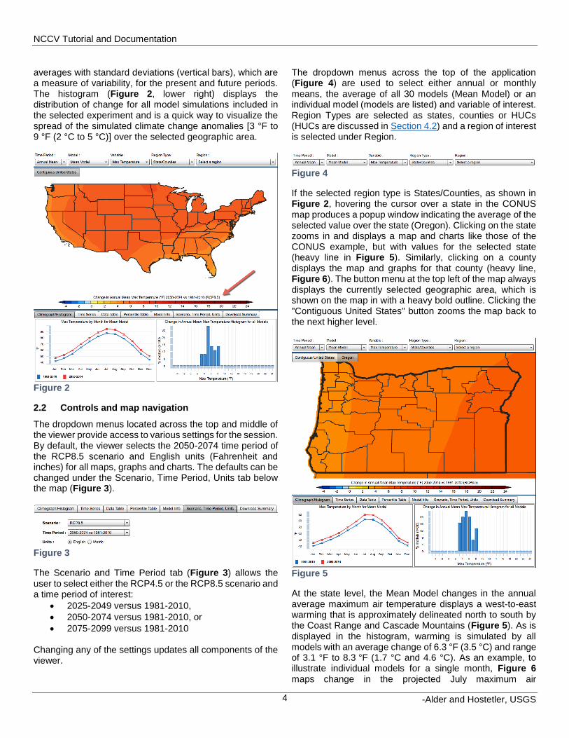
The main window of the NCCV (Figure 2) displays maps of future change (the difference between the historical period and the selected period) in the climate or water-balance variables and two accompanying graphs. As indicated by the red arrow above the color scale, the changes shown here are for the annual average maximum air temperature for the period 2050-2074 in the RCP8.5 simulation. The map provides a general impression of the spatial variability of change across the contiguous United States. The climograph (Figure 2, lower left) compares monthly
NCCV Tutorial and Documentation
-Alder and Hostetler, USGS 4
averages with standard deviations (vertical bars), which are a measure of variability, for the present and future periods. The histogram (Figure 2, lower right) displays the distribution of change for all model simulations included in the selected experiment and is a quick way to visualize the spread of the simulated climate change anomalies [3 °F to 9 °F (2 °C to 5 °C)] over the selected geographic area.
Figure 2
2.2 Controls and map navigation
The dropdown menus located across the top and middle of the viewer provide access to various settings for the session. By default, the viewer selects the 2050-2074 time period of the RCP8.5 scenario and English units (Fahrenheit and inches) for all maps, graphs and charts. The defaults can be changed under the Scenario, Time Period, Units tab below the map (Figure 3).
Figure 3
The Scenario and Time Period tab (Figure 3) allows the user to select either the RCP4.5 or the RCP8.5 scenario and a time period of interest:
2025-2049 versus 1981-2010,
2050-2074 versus 1981-2010, or
2075-2099 versus 1981-2010 Changing any of the settings updates all components of the viewer.
The dropdown menus across the top of the application (Figure 4) are used to select either annual or monthly means, the average of all 30 models (Mean Model) or an individual model (models are listed) and variable of interest. Region Types are selected as states, counties or HUCs (HUCs are discussed in Section 4.2) and a region of interest is selected under Region.
Figure 4
If the selected region type is States/Counties, as shown in Figure 2, hovering the cursor over a state in the CONUS map produces a popup window indicating the average of the selected value over the state (Oregon). Clicking on the state zooms in and displays a map and charts like those of the CONUS example, but with values for the selected state (heavy line in Figure 5). Similarly, clicking on a county displays the map and graphs for that county (heavy line, Figure 6). The button menu at the top left of the map always displays the currently selected geographic area, which is shown on the map in with a heavy bold outline. Clicking the "Contiguous United States" button zooms the map back to the next higher level.
Figure 5
At the state level, the Mean Model changes in the annual average maximum air temperature displays a west-to-east warming that is approximately delineated north to south by the Coast Range and Cascade Mountains (Figure 5). As is displayed in the histogram, warming is simulated by all models with an average change of 6.3 °F (3.5 °C) and range of 3.1 °F to 8.3 °F (1.7 °C and 4.6 °C). As an example, to illustrate individual models for a single month, Figure 6 maps change in the projected July maximum air

NCCV Tutorial and Documentation
-Alder and Hostetler, USGS 5
temperature as simulated by the Community Climate System Model (CCM4) developed by the National Center for Atmospheric Research (NCAR) in Boulder, CO, and Figure 7 maps similar details from the NOAA Geophysical Fluid Dynamics Laboratory (GFDL) CM3 model. For Benton County, OR, the climographs indicate that CM3 projects greater summer warming than is projected by CCSM4. The simulated July change is 3.6 °F (2.0 °C) in the CCSM4, whereas the change simulated by CM3 is 5.6 °F (3.1 °C) and the maximum summer temperature shifts from July to August in the GFDL simulation.
Figure 6
Figure 7
Changes in precipitation can display substantially more spatial variability than air temperature, especially in mountainous areas such as Oregon (Figure 8). The influences of land-sea contrasts along the coast and inland mountain ranges are clear in the pattern of precipitation. The projected Mean Model precipitation rate for December displays a modest increase averaged over Oregon, particularly along the coast and over the Cascade Mountains. As indicated in the climograph, averaged over Oregon, there is little change in the future (0.5 in/mo or 13.1 mm/mo); however, the histogram indicates that 22 of the models project an increase and 8 models simulate a decrease. While the models all project warmer air temperatures in the future, it is not uncommon for the suite of 30 models to project a mix of wetter and drier conditions for a given month and location due to the natural variability of precipitation and the internal variability and differing physics of the models. In the case of mixed projected changes, it is important to consider the mean model average and the distribution (majority) of the models.
Figure 8
3 Application Tabs
3.1 Climograph and Histogram tab
The climographs (Figure 9) compare the monthly climatology of the historical and selected future simulations. In this example for Benton County, Oregon, the mean model maximum air temperature for the historical (1981-2010, blue line) and future (2050-2074 of the RCP8.5 scenario, red line) are plotted. The vertical error bars indicate the standard deviation, which is a measure of variability in the model simulations. In the case of the mean model, the vertical bars represent the standard deviation of the combined 30

NCCV Tutorial and Documentation
-Alder and Hostetler, USGS 6
models. In the example, the maximum temperature for 2050-2074 is consistently warmer in all months, displays monthly variability comparable to the historical period, and, because the error bars do not overlap with those of the historical period, suggests that the changes are statistically significant. Hovering the cursor over a month displays values for the mean and standard deviation of the historical and future simulations. The maximum air temperature for May is projected to warm by about 4.0 °F (2.2 °C) in Benton County, Oregon in 2050-2074 under the RCP8.5 emission scenario. Clicking on the monthly values in the graph changes the map to plot the selected month.
Figure 9
The histograms in the bottom right of the application window (Figure 10) display the distribution of change simulated by all the models for the selected variable, geographic area, experiment, and time period. Bins in the units of the variable are indicated on the horizontal axis and the percent of the 30 models falling within each bin is indicated on the vertical axis. The histogram gives a sense of the range and distribution of climate change simulated by the models. Hovering the cursor over the histogram bars produces a window that summarizes the distribution and indicates which models fall within each bin (Figure 11). Continuing with the example of Benton County, Oregon, the average change for all models is 5.9 °F (3.3 °C) and 36.7% (11/30) of the models simulate a warming of July maximum air temperature of between 5.0 °F and 6.0 °F (2.8 °C to 3.3 °C) and there is an approximate range of 1 °F to 11 °F (0.6 °C and 6.1 °C) in the simulated warming. Clicking repeatedly on a histogram bar cycles through the models in the bin and changes the map and climatology plot to display the selected model.
Figure 10
Figure 11
3.2 Time Series tab
The Time Series tab (Figure 12) allows the user to visualize the 1950-2099 changes of the selected variable for the RCP4.5 and RCP8.5 projections. The radio buttons located in the bottom right of the window can be used to select either the actual values of the variables or the changes relative to 1950-2005. In the case of Benton County, Oregon July maximum temperature (Figure 12), the RCP4.5 and RCP8.5 scenarios display the warming trends that more-or-less track each other until around 2030 when they begin to diverge as a result of stabilizing GHGs in RCP4.5 simulations and continued increases in GHGs in the RCP8.5 simulations. In 2030, the time series of relative change (Figure 13) indicate warming of 2.0 °F (1.1 °C) and 3.5 °F (1.9 °C) respectively for RCP4.5 and RCP8.5; by 2099 the warming increases to 5.5 °F (3.1 °C) and 10.6 °F (5.9 °C). As with other plots, hovering the mouse over the graphs produces popup windows that display the date and values of the selected points. Both the raw data and the differences are useful. For example, raw values can indicate what year winter minimum temperature is projected to cross the freezing point or maximum summer temperature is projected to exceed the threshold for physiological limits for crops and animals, whereas relative changes can be used to

NCCV Tutorial and Documentation
-Alder and Hostetler, USGS 7
investigate when projected temperatures will warm by more than 2 °C relative to the 1981-2010 average.
Figure 12
Figure 13
3.3 Data Table tab
The Data Table tab (Figure 14) provides a way to explore the average change in a selected variable for a given model and geographic area. Clicking on the column headers sorts the models, the time-period averages, and the changes into either ascending or descending order. The flags indicate the model’s country of origin. Sorting the models by the magnitude of change, for example, is a convenient way to explore the range and spatial pattern of climate change. Clicking on a row selects a model and displays the change in the map above. In Figure 14, the ACCESS1-0 model has been selected and the 2050-2074 change in maximum temperature is mapped.
Figure 14
3.4 Percentile Table tab
The percentile tables sort the averaging periods into commonly used bins (Figure 15). These tables provide a way to explore not only projected changes in the median but also changes in extreme values across the scenarios. In the example for maximum temperature in Figure 15, the 10th percentile represents the coldest 10 percent of the temperatures, the 50th percentile represents the median (approximate average) temperature, and the 90th percentile represents the warmest 10 percent of the temperatures in the data. Relative to 1981-2010, over 2075-2099 the 10th percentile temperature for Benton County, Oregon warms by 3.8 °F (2.1 °C) in RCP4.5, whereas the 90th percentile changes by 5.5°F (3.1 °C) in the Mean Model. Greater warming in the extremes is evident in the RCP8.5 simulations in which the 10th percentile changes by 6.3°F (3.5 °C) and the 90th percentile changes by 9.7 °F (5.4 °C).
Figure 15
3.5 Model Info tab
The Model Info tab displays the full name of the modeling center and country of origin for the global models in the NEX-DCP30 data set (Figure 16).
Figure 16
3.6 Download Summary tab
The Download Summary tab (Figure 17) provides access to PDF summaries of the data used in the graphs. The summary reports are available for CONUS, states, counties, and HUCs in either English or metric units. They summarize all of the climate and water balance data for the selected geographic unit through time series and climograph plots of seasonal averages of all 30 models for both the RCP4.5 and RC 8.5 emission scenarios (Figure 18).
Figure 17

NCCV Tutorial and Documentation
-Alder and Hostetler, USGS 8
Figure 18
The monthly average temperature, precipitation and hydroclimate data used in the time series plots for the selected geographic area are available for the mean model and each individual model for users wishing to do additional analyses and exploration. Clicking on the Download Time Series buttons (Figure 17) will download files in comma separated variable (CSV) format that can be opened in spreadsheet or other programs (Figure 19). Metadata is included to describe the file contents and the monthly values for the two scenarios are registered in time by the model year and month. Note that the data are the raw averages and not the differences between the scenarios and the historical period.
Figure 19

NCCV Tutorial and Documentation
-Alder and Hostetler, USGS 9
4 Water-Balance Modeling
In addition to information about temperature and precipitation, related projections of future change in the terrestrial hydrological cycle are of interest. We applied a simple water-balance model driven by the NEX-DCP30 temperature and precipitation data from all the included CMIP5 models to simulate changes in the monthly water balance through the 21st century.
4.1 Overview and limitations of the Water-Balance model
The water-balance model (WBM) was developed by USGS scientists G. McCabe and D. Wolock (J. Am. Water Resour. Assoc., 35, 1999, doi:10.1111/j.1752-1688.1999.tb04231.x). It has been applied to investigate the surface water-balance under climate change over the US and globally (McCabe and Wolock, Climatic. Change, 2010, doi:10.1007/s10584-009-9675-2; Pederson et al., Geophysical Research Letters, 2013, doi:10.1002/grl.50424, 2013). A detailed evaluation of the water-balance model using our specific configuration is also available (Hostetler, S.W. and Alder, J.R., Water Resources Research, 52, 2016, doi:10.1002/2016WR018665). The WBM accounts for the partitioning of water through the various components of the hydrological system (Figure 20). Air temperature determines the portion of precipitation that falls as rain and snow, the accumulation and melting of the snowpack, and evapotranspiration (PET and AET). Rain and melting snow are partitioned into direct surface runoff (DRO), soil moisture (ST), and surplus runoff that occurs when soil moisture capacity is at 100% (RO).
Figure 20 From McCabe and Markstrom, 2007, US
Geological Survey Open-File Report 2007-1088.
We include four water balance variables in the viewer (Figure 20):
1. Snow water equivalent (SWE), the liquid water stored in the snowpack,
2. Soil water storage, the water stored in soil column, 3. Evaporative deficit, the difference between
potential evapotranspiration (PET), which is the amount of evapotranspiration that would occur if unlimited water were available, and actual evapotranspiration (AET) which is what occurs but can be water limited, and
4. Runoff, the sum of direct runoff (DRO) that occurs from precipitation and snow melt and surplus runoff (RO) which occurs when soil moisture is at 100% capacity
Note that the values for all variables are given in units of average depth (e.g., inches or millimeters) over the area of the selected state, county or HUC. The simplicity of the WBM facilitates the computational performance needed to run 30 implementations of the model for 150 years over the ~12 million NEX-DCP30 grid cells. An additional strength of the WBM is that it provides a common method for simulating change in the water balance, as driven by temperature and precipitation from the CMIP5 models, thereby producing outputs that are directly comparable across all models. There are tradeoffs, however, in using the simple WBM instead of more complex, calibrated watershed models that use more meteorological inputs (e.g., solar radiation, wind speed) and are adjusted to account for groundwater and water management. These limitations should be kept in mind when viewing the water balance components:
1) ET is computed by a temperature-dependent equation,
2) The model does not simulate or account for ground water,
3) There is no routing of runoff between grid cells so the viewer displays the spatial average within a region, and
4) The parameters used in the model are independent of land use and vegetation,
5) There are no man-made diversions or reservoirs.
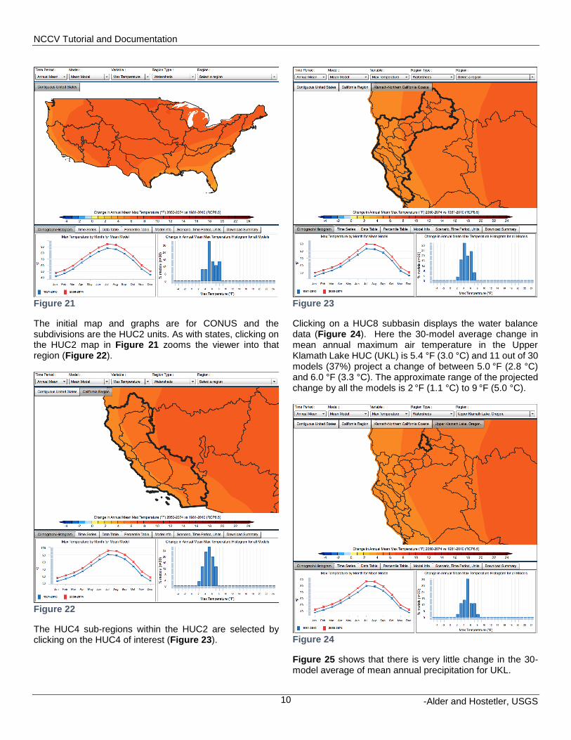
4.2 HUC regions
To view the HUC water balances, select Watersheds as the Region Type (Figure 21).
NCCV Tutorial and Documentation
-Alder and Hostetler, USGS 10
Figure 21
The initial map and graphs are for CONUS and the subdivisions are the HUC2 units. As with states, clicking on the HUC2 map in Figure 21 zooms the viewer into that region (Figure 22).
Figure 22
The HUC4 sub-regions within the HUC2 are selected by clicking on the HUC4 of interest (Figure 23).
Figure 23
Clicking on a HUC8 subbasin displays the water balance data (Figure 24). Here the 30-model average change in mean annual maximum air temperature in the Upper Klamath Lake HUC (UKL) is 5.4 °F (3.0 °C) and 11 out of 30 models (37%) project a change of between 5.0 °F (2.8 °C) and 6.0 °F (3.3 °C). The approximate range of the projected change by all the models is 2 °F (1.1 °C) to 9 °F (5.0 °C).
Figure 24
Figure 25 shows that there is very little change in the 30-model average of mean annual precipitation for UKL.

NCCV Tutorial and Documentation
-Alder and Hostetler, USGS 11
Figure 25
4.3 Water-balance variables in the NCCV
The WBM outputs many variables; for brevity the viewer is limited to runoff, snow water equivalent (SWE), soil water storage and evaporative deficit. We continue to focus on UKL as an example. As is the case with temperature and precipitation, the water balance components are selected by clicking on the Variable dropdown menu (Figure 26), here March SWE is selected. The example shows a region-wide loss of March SWE over 2050-2074 averaging period of the RCP8.5 scenario. In the UKL, SWE is reduced by about half relative to 1981-2010. The histogram in the lower right of Figure 26 indicates all 30 models simulate less SWE in the future, with 90% of the models simulating a loss of greater than a 4.0 in (101 mm) and a mean of -7.6 in (mean of -192 mm). Because precipitation is essentially unchanged (Figure 25), the loss of SWE is primarily attributable to warming winter temperatures.
Figure 26
The application provides time series, data tables and percentile tables for the water-balance variables similar to those for temperature and precipitation. Over UKL, both the RCP4.5 and RCP8.5 SWE time series display a steady decline from about 1970 to 2055 (Figure 27). The RCP4.5 and RCP8.5 values diverge around 2055, the loss of SWE in RCP4.5 stabilizes at about 10 in (254 mm), but continues to decline in the RCP8.5 simulations through the end of the century.
Figure 27
Snowpack is a strong control of seasonal runoff,especially in the mountainous West. In general, warmer temperatures result in more precipitation falling as rain, more runoff instead storage in snowpack, and earlier snow melt, all of which effectively change the timing and magnitude of the annual hydrograph (Figure 28). As indicated by March runoff for UKL, the water-balance model simulates a large shift in the seasonality of runoff and near zero change in the annual total in the RCP8.5 simulation. All 30 CMIP5 models produce increased runoff in March and reduced runoff in the summer months.
NCCV Tutorial and Documentation
-Alder and Hostetler, USGS 12
Figure 28
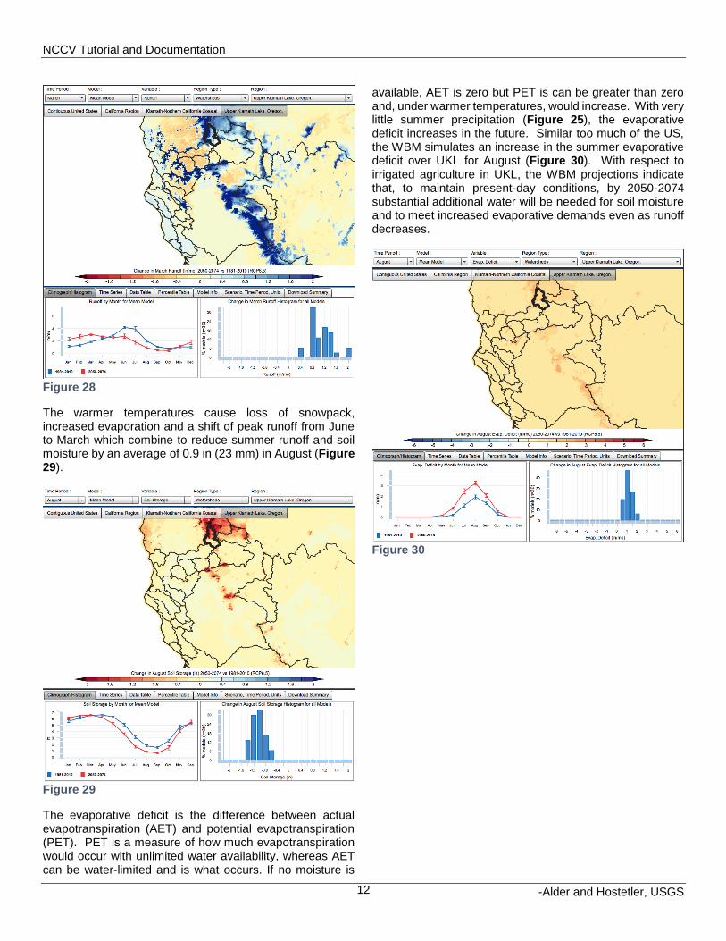
The warmer temperatures cause loss of snowpack, increased evaporation and a shift of peak runoff from June to March which combine to reduce summer runoff and soil moisture by an average of 0.9 in (23 mm) in August (Figure 29).
Figure 29
The evaporative deficit is the difference between actual evapotranspiration (AET) and potential evapotranspiration (PET). PET is a measure of how much evapotranspiration would occur with unlimited water availability, whereas AET can be water-limited and is what occurs. If no moisture is
available, AET is zero but PET is can be greater than zero and, under warmer temperatures, would increase. With very little summer precipitation (Figure 25), the evaporative deficit increases in the future. Similar too much of the US, the WBM simulates an increase in the summer evaporative deficit over UKL for August (Figure 30). With respect to irrigated agriculture in UKL, the WBM projections indicate that, to maintain present-day conditions, by 2050-2074 substantial additional water will be needed for soil moisture and to meet increased evaporative demands even as runoff decreases.
Figure 30
NCCV Tutorial and Documentation
-Alder and Hostetler, USGS 13
5 Appendix
5.1 Methods
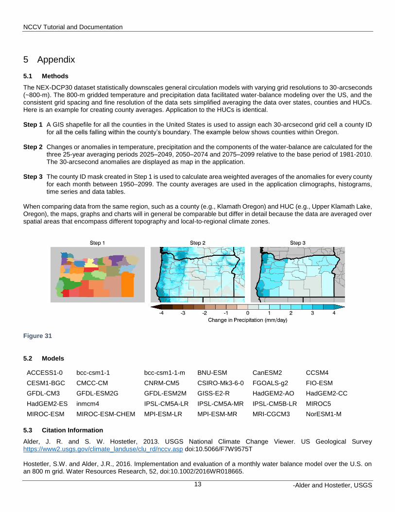
The NEX-DCP30 dataset statistically downscales general circulation models with varying grid resolutions to 30-arcseconds (~800-m). The 800-m gridded temperature and precipitation data facilitated water-balance modeling over the US, and the consistent grid spacing and fine resolution of the data sets simplified averaging the data over states, counties and HUCs. Here is an example for creating county averages. Application to the HUCs is identical. Step 1 A GIS shapefile for all the counties in the United States is used to assign each 30-arcsecond grid cell a county ID
for all the cells falling within the county’s boundary. The example below shows counties within Oregon. Step 2 Changes or anomalies in temperature, precipitation and the components of the water-balance are calculated for the
three 25-year averaging periods 2025–2049, 2050–2074 and 2075–2099 relative to the base period of 1981-2010. The 30-arcsecond anomalies are displayed as map in the application.
Step 3 The county ID mask created in Step 1 is used to calculate area weighted averages of the anomalies for every county
for each month between 1950–2099. The county averages are used in the application climographs, histograms, time series and data tables.
When comparing data from the same region, such as a county (e.g., Klamath Oregon) and HUC (e.g., Upper Klamath Lake, Oregon), the maps, graphs and charts will in general be comparable but differ in detail because the data are averaged over spatial areas that encompass different topography and local-to-regional climate zones.
Figure 31
5.2 Models
ACCESS1-0 bcc-csm1-1 bcc-csm1-1-m BNU-ESM CanESM2 CCSM4
CESM1-BGC CMCC-CM CNRM-CM5 CSIRO-Mk3-6-0 FGOALS-g2 FIO-ESM
GFDL-CM3 GFDL-ESM2G GFDL-ESM2M GISS-E2-R HadGEM2-AO HadGEM2-CC
HadGEM2-ES inmcm4 IPSL-CM5A-LR IPSL-CM5A-MR IPSL-CM5B-LR MIROC5
MIROC-ESM MIROC-ESM-CHEM MPI-ESM-LR MPI-ESM-MR MRI-CGCM3 NorESM1-M
5.3 Citation Information
Alder, J. R. and S. W. Hostetler, 2013. USGS National Climate Change Viewer. US Geological Survey https://www2.usgs.gov/climate_landuse/clu_rd/nccv.asp doi:10.5066/F7W9575T
Hostetler, S.W. and Alder, J.R., 2016. Implementation and evaluation of a monthly water balance model over the U.S. on an 800 m grid. Water Resources Research, 52, doi:10.1002/2016WR018665.

NCCV Tutorial and Documentation
-Alder and Hostetler, USGS 14
Thrasher, B., J. Xiong, W. Wang, F. Melton, A. Michaelis, and R. Nemani, 2013. New downscaled climate projections suitable for resource management in the U.S. Eos, Transactions American Geophysical Union 94, 321-323, doi:10.1002/2013EO370002.
6 Disclaimer
These freely available, derived data sets were produced by J. Alder and S. Hostetler, US Geological Survey (USGS). The original climate data are from the NEX-DCP30 dataset, which was prepared by the Climate Analytics Group and NASA Ames Research Center using the NASA Earth Exchange, and is distributed by the NASA Center for Climate Simulation. No warranty expressed or implied is made by the USGS regarding the display or utility of the derived data on any other system, or for general or scientific purposes, nor shall the act of distribution constitute any such warranty. The USGS shall not be held liable for improper or incorrect use of the data described and/or contained herein.
![INDEX [haltonhills.ca]haltonhills.ca/omb/PDF/EdenOak/Final Witness Statement of Quiambao... · INDEX Tab Description ... June 2016 Geotechnical Report. ... for all engineering geological](https://static.fdocuments.us/doc/165x107/5aa615947f8b9a7c1a8e41de/index-witness-statement-of-quiambaoindex-tab-description-june-2016-geotechnical.jpg)