Untidy Data: The Unreasonable Effectiveness of Tables
11
Untidy Data: The Unreasonable Effectiveness of Tables Lyn Bartram, Michael Correll, and Melanie Tory 1 3 3 4 4 2 2 Fig. 1: An example spreadsheet (shared with permission of Cornerstone Architects) showing various “rich” table features that our participants employed, including (1) A Master Table of base data that is often left untouched, with manipulations happening in a copy or other area separate from the base data; (2) Marginalia such as comments or derived rows or columns in the periphery of the base table, often taking the form of freeform natural language comments; (3) Annotations such as highlighting or characters with specific meaning (e.g., a dash denotes missing values) to flag particular cells as anomalous or requiring action; and (4) Multi-cell features such as labels or even data that span multiple rows or columns of the sheet. Abstract— Working with data in table form is usually considered a preparatory and tedious step in the sensemaking pipeline; a way of getting the data ready for more sophisticated visualization and analytical tools. But for many people, spreadsheets — the quintessential table tool — remain a critical part of their information ecosystem, allowing them to interact with their data in ways that are hidden or abstracted in more complex tools. This is particularly true for data workers [61], people who work with data as part of their job but do not identify as professional analysts or data scientists. We report on a qualitative study of how these workers interact with and reason about their data. Our findings show that data tables serve a broader purpose beyond data cleanup at the initial stage of a linear analytic flow: users want to see and “get their hands on” the underlying data throughout the analytics process, reshaping and augmenting it to support sensemaking. They reorganize, mark up, layer on levels of detail, and spawn alternatives within the context of the base data. These direct interactions and human-readable table representations form a rich and cognitively important part of building understanding of what the data mean and what they can do with it. We argue that interactive tables are an important visualization idiom in their own right; that the direct data interaction they afford offers a fertile design space for visual analytics; and that sense making can be enriched by more flexible human-data interaction than is currently supported in visual analytics tools. Index Terms—Data practices, Tabular data, Interview study, Visualization, Analytics, Data workers, Sensemaking. 1 I NTRODUCTION Despite the widespread proliferation of visualization tools, data tables remain ubiquitous. Spreadsheets, the canonical table tools, pervade the data ecosystems of organizations, even when purpose-built business intelligence (BI) tools are widely available. Why? Are these organiza- tions, and their people, simply unsophisticated in their data strategy? Our investigations into data practices (both in this and previous stud- ies [4]) says emphatically: no! In fact, the table form is an interesting and valuable visual data representation in its own right. Just as data • Lyn Bartram is with Simon Fraser University. E-mail: [email protected]. • Michael Correll is with Tableau. E-mail: [email protected]. • Melanie Tory is with the Roux Institute. E-mail: [email protected]. can be “unreasonably effective” [37] at solving problems, we observed that tables, oft-maligned by the visualization community in favor of more strictly visual representations, often play an out-sized role in the sensemaking process. Tables enable users to “get their hands on the data:” see it, structure it, organize it, add new meaning, and mark it up in ways that few other visualization tools do. As such, table representa- tions provide a rich and direct means of interaction and an important cognitive structure for thinking with data. Yet these rich interaction possibilities are stripped away when data tables are “tidied,” “cleaned,” or otherwise “prepped” for ingestion into analytics tools. We maintain that tables and spreadsheets remain useful across a variety of skillsets and user profiles. We focus on the everyday work that people in business settings, even people who would not self-describe as professional analysts, get done with their data. Following Liu et al. [62], we term these people data workers. Data workers, in contrast with aspirational “unicorn” [6, 25] data scientists, are found in all sectors, and have diverse levels of data expertise and experience coupled with
Transcript of Untidy Data: The Unreasonable Effectiveness of Tables
Untidy Data: The Unreasonable Effectiveness of Tables
Lyn Bartram, Michael Correll, and Melanie Tory
1
3
3 442
2
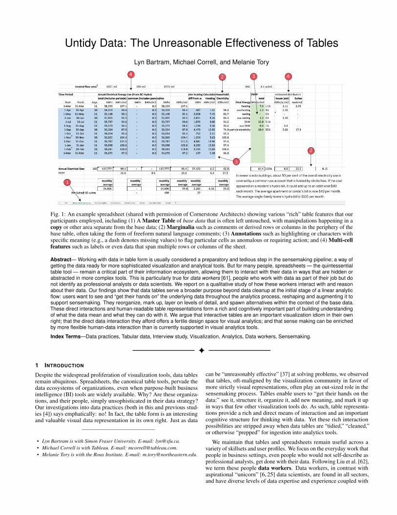
Fig. 1: An example spreadsheet (shared with permission of Cornerstone Architects) showing various “rich” table features that ourparticipants employed, including (1) A Master Table of base data that is often left untouched, with manipulations happening in acopy or other area separate from the base data; (2) Marginalia such as comments or derived rows or columns in the periphery of thebase table, often taking the form of freeform natural language comments; (3) Annotations such as highlighting or characters withspecific meaning (e.g., a dash denotes missing values) to flag particular cells as anomalous or requiring action; and (4) Multi-cellfeatures such as labels or even data that span multiple rows or columns of the sheet.
Abstract— Working with data in table form is usually considered a preparatory and tedious step in the sensemaking pipeline; a way ofgetting the data ready for more sophisticated visualization and analytical tools. But for many people, spreadsheets — the quintessentialtable tool — remain a critical part of their information ecosystem, allowing them to interact with their data in ways that are hidden orabstracted in more complex tools. This is particularly true for data workers [61], people who work with data as part of their job but donot identify as professional analysts or data scientists. We report on a qualitative study of how these workers interact with and reasonabout their data. Our findings show that data tables serve a broader purpose beyond data cleanup at the initial stage of a linear analyticflow: users want to see and “get their hands on” the underlying data throughout the analytics process, reshaping and augmenting it tosupport sensemaking. They reorganize, mark up, layer on levels of detail, and spawn alternatives within the context of the base data.These direct interactions and human-readable table representations form a rich and cognitively important part of building understandingof what the data mean and what they can do with it. We argue that interactive tables are an important visualization idiom in their ownright; that the direct data interaction they afford offers a fertile design space for visual analytics; and that sense making can be enrichedby more flexible human-data interaction than is currently supported in visual analytics tools.
Index Terms—Data practices, Tabular data, Interview study, Visualization, Analytics, Data workers, Sensemaking.
1 INTRODUCTION
Despite the widespread proliferation of visualization tools, data tablesremain ubiquitous. Spreadsheets, the canonical table tools, pervade thedata ecosystems of organizations, even when purpose-built businessintelligence (BI) tools are widely available. Why? Are these organiza-tions, and their people, simply unsophisticated in their data strategy?Our investigations into data practices (both in this and previous stud-ies [4]) says emphatically: no! In fact, the table form is an interestingand valuable visual data representation in its own right. Just as data
• Lyn Bartram is with Simon Fraser University. E-mail: [email protected].• Michael Correll is with Tableau. E-mail: [email protected].• Melanie Tory is with the Roux Institute. E-mail: [email protected].
can be “unreasonably effective” [37] at solving problems, we observedthat tables, oft-maligned by the visualization community in favor ofmore strictly visual representations, often play an out-sized role in thesensemaking process. Tables enable users to “get their hands on thedata:” see it, structure it, organize it, add new meaning, and mark it upin ways that few other visualization tools do. As such, table representa-tions provide a rich and direct means of interaction and an importantcognitive structure for thinking with data. Yet these rich interactionpossibilities are stripped away when data tables are “tidied,” “cleaned,”or otherwise “prepped” for ingestion into analytics tools.
We maintain that tables and spreadsheets remain useful across avariety of skillsets and user profiles. We focus on the everyday work thatpeople in business settings, even people who would not self-describe asprofessional analysts, get done with their data. Following Liu et al. [62],we term these people data workers. Data workers, in contrast withaspirational “unicorn” [6, 25] data scientists, are found in all sectors,and have diverse levels of data expertise and experience coupled with

deep domain knowledge. The work of data workers often expandspast boundaries of traditional sensemaking or analysis structures, andencompasses an expansive set of tasks and skills [4, 23]. Going beyondjust analysis, data work is part of human-data interaction (HDI), abroad concept that includes individual and organizational sensemakingactivities such as data monitoring, communicating, and munging, andexpands beyond visualization to data notifications, spreadsheets, datawrangling tools, and any other means of sensemaking with data.
The work practices and needs of data workers are poorly understoodand ill-supported by current technology, especially with respect to formslike the spreadsheet and the table that may be seen as less prestigioustargets for design or research than other visual analytics approaches.Both commercial and academic efforts to support data workers can fallprey to a temptation to fully automate the work (denying data workersthe ability to employ their expertise or exercise their agency over thesensemaking process [39]) or focus on narrow groups of users withparticular data science skillsets (with the tacit assumption that the massof data workers will adapt, catch up, or be left behind). Without a deeperunderstanding of data workers’ practices and needs, we risk focusingour efforts on approaches that do not address the core challenges facedin everyday data work. An even greater risk is that we blame theworkers themselves, characterizing them as unskilled or employingineffective work patterns, implying that data workers need to be “fixed”through training so they can then work in the same ways and withthe same tools as data professionals. Instead, we need to support dataworkers where they are and empower them to be successful with data.
In this paper, we present the results of a qualitative study of dataworkers and their relationship with and actions upon their own data.While our interviews were conceived of as being tool and format agnos-tic, nearly all of our interviews ultimately centered on the spreadsheetas a common platform of our participants’ data work. We wanted toexplore this ubiquity, figure out what makes tables tick, and identifyopportunities (or gaps) in existing tooling for visual analytics that alltoo often leave the table behind. Thus, our original research question of“how do people who do not describe themselves as professional analystsmanipulate, clean, or otherwise munge their data?” became, over thecourse of our open-ended exploration, more tightly focused:
1. How do tables, as visual and analytical objects, contribute tosensemaking and understanding?
2. Which modes, methodologies, and affordances do tables supportthat other analytical tools do not?
Overall, we found:
1. Tables as artifacts have an internal richness of meaning andspecial structural affordances that are often lost when they areimported or converted for use in other analytical tools: not justannotations and other forms of metadata, but spatial organization,analytical transparency, and modes of interaction that do notsurvive distillation into the clean and tidy forms demanded byadvanced analytics or visualization tools.
2. Ad hoc human-data interactions (like “eyeballing,” “manipulat-ing,” “marking up,” or “verifying”), despite being both ubiquitousand important in our participants’ day-to-day work, are not giventheir due importance in formal models of data analytics and arenot always supported by analytics tools.
3. Data workers place a high value on building trust and under-standing both from and via their data manipulations. They arewilling to perform actions they self-describe as monotonous andrepetitive, and face guilt over not using tools they consider moresophisticated or powerful, to maintain immediate access, control,and understanding over their actions and sense making process.
Despite rhetorical/marketing/research shifts away from data manipu-lation at the spreadsheet level and towards automated- or augmented-analytics tools that generate visualizations, dashboards, and even “auto-mated insights” [58] without intervening table generation or inspectionsteps, the table is an indispensable and inescapable component of howmany people do their everyday data work. Tables, and the ways that
people work with them, are not juvenilia generated by users who arenot sufficiently savvy or sophisticated to use other tools— a temporaryembarrassment that will be dispensed with through a killer app or acomprehensive enough data science education program. Rather, weargue that there are real cognitive and analytical benefits to the tableas form; experiences that are not easily duplicated by other ways ofworking with data: that the table functions as an important (and perhapsinescapable) component of the sensemaking process.
We conclude with a call to bring the strengths of interactive tablesinto visual analytics tools, enabling rich and direct means of gettingone’s hands on the data. We also encourage researchers to further studythe practices of data workers at all stages of experience and data fluency,especially around building trust in and control over their tools andprocesses. Existing work that focuses on the idiosyncratic populationof professionals may fail to reflect the crucial (but oftentimes tedious,messy, or error prone) data work that people do each and every day.We should think about the best opportunities to intervene as designersin not just providing complex tools to support sensemaking, but alsoproviding the scaffolding that would allow people to build trust, fluency,and confidence in their work.
2 RELATED WORK
We first discuss tables in two areas of visualization research: tablesused for data wrangling and tables as a visualization technique. Wethen discuss the work most similar to ours, studies of data work.
2.1 Table Techniques in Visualization ResearchTables feature prominently in tools for data cleaning, wrangling, andpreparation, a process that accounts for over 80% of time and costin analytics [49]. Tabular data sets present myriad wrangling chal-lenges [12, 69, 78]. Wickham describes principles for making datatables computationally easy to read, model and visualize [87]: in a“tidy” structure all related columns become levels of an overall dimen-sion and each row is a unique combination of observations for eachlevel. This results in a “tall” format with potentially many rows foreach item. Dealing with dirty or ill-defined data introduces additionalchallenges of cleaning (making data types consistent, ensuring ap-propriate types), validation (checking for bad data) and removing orreplacing anomalous values [5, 48]. This may require decisions aboutdensification or imputation [46, 52] or about what to ignore [48].
Targeted solutions to data cleaning and wrangling include program-matic libraries for experts [33, 67] but we focus on methods accessibleto non-programmers. Automatic approaches focus on cleaning up anddisambiguating data types (see Contreras-Ochando et al. [21] for areview), interpreting and transforming table structures [18, 83], and us-ing structure to suggest annotations [27]. Semi-automated approaches[48,50,76] focus on building-block procedures and/or machine-learningassistance related to types and imputation, learning from user input, orcontext. Commercial examples include Alteryx1, Trifacta Wrangler2,and Tableau Prep3. Manual (Instruction) techniques tackle the problemby changing the work practices of users. This includes establishing stan-dards on how to reconfigure “bad data”, including combining datasetsinto one sheet, structuring tidy tables, cleaning data, and removing com-mon domain habits like markup, formatting and comments [12, 36, 87].
Bertin [7] pioneered interest in the table as a visual idiom, definingthe interactive table via the affordances of a fully reorderable matrix.From Bertin’s method, Perin et al. [72] propose critical requirementsfor tabular visualizations including visual cell encoding, row and col-umn reordering to exploit spatial association and to group meaningfulchunks, and annotation of results (e.g., naming groups).
There is a long history in visualization of adapting table metaphorsand affordances for visualizations; e.g., as “visualization spread-sheets” [19, 20] or “spreadsheet-like interfaces” [44] where each cellcontains a different visualization design, data facet, or both. Tools suchas TableLens [77], Bertifier [72], and Taggle [35] all use the table form
1www.alteryx.com2www.trifacta.com/3www.tableau.com/products/prep
Page 2 of 11

as the substrate for embedding visualizations in cells, managing hetero-geneous data, and supporting familiar operations such as sorting andrearrangement of rows and columns. Many visualization designers bor-row affordances or structures from spreadsheets. For instance, sortableand scannable grids of data appear in recent systems like UpSet [59]and Serendip [1]. Gneiss expands the flat table spreadsheet model byembedding hierarchy in cells [17]. Likewise, the ability to juxtaposedata elements, cells, or visualizations with natural language commen-tary or metadata has been described as an important and powerful toolfor understanding in visualization design paradigms like LitVis [89].
Despite the well-established history of tables in visualization, andthe utility of spreadsheet-like operations, we argue that tables per se aregiven short shrift in contemporary visualization research— consideredtransitory artifacts to wrangle data before analysis or visual representa-tions that require a consistent and tidy data format. For instance, theheatmap borrows the grid structure, but assumes that each cell containshomogeneous data. Widely used commercial tools like TableauTM andPowerBITM offer table views with limited interaction, intended for datapreview or as advanced versions of the well-known pivot table.
2.2 Ecological Studies of Data WorkNumerous studies have explored the practices of people who work withdata, most of them focusing on professional analysts and data scientistsin enterprise environments [2, 49, 51, 61, 63, 68, 79, 90]. While most ofthese studies focused on analysis activities, some characterized addi-tional aspects of data work including data capture, discovery, wrangling,modeling, and reporting, among others [2, 49, 68, 90].
Fewer studies have extended this effort beyond the analytics set-tings proposed in earlier models (e.g., the Pirolli-Card sensemakingloop [73]) and to a wider population of people who work with datain more informal, unstructured, or ad hoc contexts [4]. Bigelow etal. [8] found that designers working with data frequently switched toolsand followed a non-linear sequence of tasks. Convertino et al. [22]reported that “casual data analysts” tend to follow a workflow of “cleanand report,” spending most of their time preparing and organizingdata in spreadsheets and struggling to take full advantage of their data.Boukhelifa et al. [10] documented three strategies data workers employto manage uncertainty in their data: ignore, understand, and mini-mize. Most similar to our work because of the focus on spreadsheets,Dourish [29] examined collaborative “spreadsheet events” through asociological lens and explored how the grid structure of the spreadsheetsupports particular patterns of interaction. Likewise, Sarkar and Gor-don [80] found that people acquire spreadsheet knowledge informally,opportunistically and socially. In particular, like generates like: becausepeople learn from others examples, visible features, methods, structuresand design practices percolate better than hidden functions. Many ofthese studies identify spreadsheets as an important tool for data workers.Our research extends existing knowledge by focusing on the particularsof how data workers used the form and affordances of tables in theirsensemaking practices.
3 SPREADSHEETS AND RICH TABLES
Once tables emerged as the focus of our analysis, we conducted aliterature survey about table use. Here we synthesize those findings,forming a frame for analysis of our study. Our observations (section 5)confirm and elaborate many of these themes.
The quintessential workplace data tool is the spreadsheet [26,32,75],designed as a multipurpose tool for data entry, structuring, storage,and analysis [12]. A 2019 survey reported that 88% of companies usemore than 100 spreadsheets in critical business processes [28]. Thesimplest table consists of a grid where rows represent unique items,columns represent attributes, and cells contain values. The spreadsheetprovides a range of functions to support data modeling, calculation,organization and visualization. However, the majority of spreadsheetsare used for storing and interacting with data [16,38,41,51], often withonly the simplest calculation functions [41]. For many data workers,the spreadsheet’s value is as a sophisticated table editor and archive,supporting functions of data integration, manipulation, shaping, editing,annotation and reporting, with minimal calculation [29, 41, 75]. In this
context, the spreadsheet is the computational tool that instantiates twocritical constructs in our work: untidy data and rich tables.
3.1 Characteristics of Rich TablesSpreadsheet data organization is table-based but loosely constrained; asa result, real world spreadsheets can be computationally difficult to useverbatim in statistical and analytical tools [12, 69, 78, 87]. Analyticaltools might rely on (or attempt to parse) data into a single expectedformat (e.g., “tidy data” [87]), whereas spreadsheet structure is con-strained only by the grid, which affords all sorts of spatial organizationsor schema. As per Dourish [29], “the grid is fundamental to the ma-teriality of the spreadsheet form; much of what we manipulate whenwe manipulate spreadsheets is actually the gridnavigating, extending,inserting, deleting, and merging grid columns and rows.”
When tabular artifacts are inextricably enmeshed with human sense-making activity, we refer to them as rich tables. We characterizerich tables functionally, through the presence of one or more of thefollowing features (see Fig. 1 for an example):
Layout: The data layout is structured for human readability ratherthan machine parsing [17, 69, 87]. E.g., the data might be structuredin a “wide” (rather than “tall”) format, where rows contain uniqueitems and the attributes of each item are stored in columns. Levelsof a dimension are expressed in different columns. This results in acompact, item-centric view that is easy to scan [77]. Hierarchies occurin both row and column groups where an extra row or column containsa second dimension name [18].
Heterogeneity: Cell types are rarely consistent [60]. Cells withina column may vary in semantics (data meanings), data types, valueranges, and data formats. Columns may have inconsistent distributions,behaviours, clusters and outliers.
Missing or sparse data: Tables frequently have empty space at arow, column or cell scope, evidence of data quality issues (missing orsparse data) or simply values that remain to be filled in [29, 30].
Multiple datasets: Data work frequently involves collecting andintegrating datasets [24, 52, 69] with different schemas. In spreadsheetsthese are often kept as separate worksheets [35] or even files where therelations and dependencies are incompletely specified or even implicit.
Multiple data grains: Worksheets have multiple levels of detail“sprinkled about” [12], as different tables or within the same worksheet.Moreover, the data can have different grains [46, 69]: e.g., sums acrosscolumns or rows many appear in the same table as raw values.
Annotations: Spreadsheet tables often contain visual markup, for-matting, and spatial organization (aligned columns or rows) that meansomething to the user but are lost in machine translation. [12, 85].
3.2 Using Rich TablesIf rich tables are “messy” [87], “dirty” [5, 48] or just plain “bad” [66],why do these practices persist? In reality, rich tables afford manyvaluable interactions:
Multiscale readability: Tables support efficient comparison andare good for looking up values [34]. One study [74] showed thatstudents effectively used different access patterns (whole table scan,horizontal and vertical reading, and targeted comparison) to develop adeep understanding of a multidimensional dataset.
Spatial semantics: Spatial organization is an important visual re-source [64, 71]. Spreadsheet users frequently organize their data insemantically related substructures. This can include “blocks” of con-tiguous cells or specified “zones” [3]. These subsets may differ ingranularity: it is common to see summary tables (e.g. pivot tables) nearthe “source” data [13] (see Fig 1) to support synthesis. The layoutserves as “secondary notation” that conveys meaning to the user [40].
Direct editing: Spreadsheet tables allow data editing directly onthe cell, or by adding new rows and columns opportunistically withouthaving to understand formal data methods like joins [75, 80]. Richtables allow attention and interaction at varied levels of organizationalscale, from scanning the entire table to cell-based focus. Working atthe cell level comprises a large part of spreadsheet activity [29], incontrast to working on the data in the aggregate: spreadsheet usersselect cells, do some operation (like a lookup from another cell), and
Page 3 of 11

then see their results. Through cell references, transformations andcalculations are explicit to users: they can see and touch both theoriginal data, the operation, and the result. Drummey [31] calls this“cell-based thinking” and claims that transition to analytic tools likeTableau is difficult due to the mismatch between cell-based thinkingand Tableau’s aggregation-centric model.
Annotation: Beyond editing data, people also markup and annotatethe data as part of building essential context [57, 88], using layout,formatting, color, and comments at various organizational levels [27,53, 77, 80, 83]. Sarkar et al. [80] refer to “craft practices and designpatterns” that become formalized in templates that reflect businesspractices, are shared [29], and scaffold opportunistic learning [80].
Flexible interactions: Direct manipulation is at the heart of the richtable. Flexible rearrangement operations to associate related items orhide temporarily uninteresting ones support fluid thinking [77]. Userscreate new structure using familiar copy-paste, drag and drop operationsthat operate via direct selection without requiring knowledge of formaldata functions. This materiality – the digital experience of working“hands-on” – is an essential process in building knowledge about andwith data [29,43,82], and is grounded in Piaget’s foundational principlethat we construct knowledge through action and experience [84].
4 METHODS
The goal of our study was to understand how data workers make senseof their data; in particular, the practices and interactions they employwhen engaging in direct data manipulation. Prior to our study, two ofthe authors interviewed data training experts (E1, E2) to understandthe data interaction practices and challenges of their diverse clients.These interviews focused our study design towards an analysis ofdata interactions and how representations and tools supported dataworkers’ practices. User-system interactions are influenced by manyfactors that are not easily measurable or quantifiable [9, 56, 65]. Thischallenge is magnified when the system is the mediating artifact andusability can influence behaviors and outcomes. We therefore used amixed-methods qualitative approach combining descriptive techniques,semi-structured interviews, and observational walkthroughs to elicitconcepts and capture how peoples’ data interactions contributed totheir formation of understanding. These methods support insightsinto behavior and interaction processes as well as the knowledge andconcepts that underlie them [9, 65, 70]. This approach is common informative user research and cognitive engineering [81].
4.1 RecruitmentWe broadly sampled data workers from a variety of backgrounds andsectors with diverse data skills. Participants were recruited from severalsources: targeted emails (n=3) to previous participants of visualizationtraining sessions offered by Simon Fraser University or who weresuggested by expert consultants as representative users. Our recruitmentemail solicited participants who had experienced challenges workingwith their data and who manipulated their data directly within or acrossbusiness intelligence tools as part of their work. Second, we solicitedparticipants (n=9) on User Interviews4, a common recruiting site foruser research. We used a screening survey to refine participant selection(see supplemental material). In all cases, we selected participants whoidentified their data use as one or more of: (1) use data analyses,visualizations or dashboards that others have prepared; (2) use BI toolsto ask and answer questions about data; or (3) use BI tools to createvisualizations, analyses or reports for use by others.
We explicitly did not define “business intelligence tools” in thescreener. Applicants who self-identified as advanced analysts, datascientists, IT support, or data administrators were rejected. In addition,the screener asked about the participant’s job and sector, the size oftheir organization, and their perception of the frequency of difficulties.In all cases, we selected applicants who were willing to walk through acurrent or recent analysis of their data, explaining practices, conceptsand challenges as they did so. Qualified applicants were contacted byemail to arrange study sessions.
4www.userinterviews.com/
4.2 ParticipantsOur participants (Table 1) consisted of 12 data workers (4 female, 8male). Ten were based in North America, one in Africa, and one inEurope. Participants represented a variety of economic sectors andorganization sizes, from small business owners to government workers.All but two worked with data using more than one tool and from morethan one source. None had formal training in data analytics nor datascience. All non-government participants were compensated with a$60 USD Amazon gift card.
4.3 ProcedureSessions took place remotely over Zoom. Participants were asked tobring data from a recent analysis. We first explained the motivation,procedure and potential outcomes. We then conducted a semi-structuredinterview, a sketching exercise, and walkthough, all focusing on howparticipants work with data in their job.
Interview topics included: how they used data in their work, theirorganizational practice (are you supporting others with data and/oranalysis? How?), the kinds of data they used; how they made sense of itand/or transformed it for others to use, where they obtained and retainedtheir data, and the tools and methods they used (see supplementalmaterial for the interview script).
We then asked participants to describe the data and analysis theyhad brought to the session, beginning with an overview of their goalsand major steps that they took or would take for their work. We askedthem to sketch their working model of the data as a way of encouragingintrospection about their personal data models. We include more detailsabout this visual elicitation in our supplemental materials.
We then moved to the third stage in the study. Each participantbrought an example of a current or recent dataset and sensemaking taskrepresentative of their work. We asked them to walk through achievingtheir task goals with these data, showing us which tools they use, whichactions they took, and where they faced challenges. In particular, weasked them to talk us through any instances of the following:
• How they arranged their data for sensemaking steps or placeswhere the data need to be manipulated, re-organized or amended
• Tasks that were difficult or tedious• How they understood the journey from the “raw” data to the
finished result• How they identified and dealt with missing and erroneous data
During the walkthrough, the session lead observed the participant’sactions, probed for explanation, and confirmed understanding. Weconcluded by asking participants to discuss how well their current toolsand practices helped them explore relationships in the data, and howthey matched and/or impeded how they thought about their data.
We note that in several cases, participants described their full datascope to us but were unable to bring some of these data to the screendue to privacy and confidentiality concerns. This resulted in somesessions where participants told us about more data than we actuallysaw. However, we were assured that the data approaches shown to uswere representative of these other complex data tasks they undertookwith respect to tools, practices, and challenges.
4.4 Data CollectionSessions were audio and video-recorded using Zoom. In 2 cases, wealso recorded an additional screen when the walkthrough required twoparticipant screens. Audio recordings were fully transcribed. We alsosolicited sketches and any other supplemental material participantswished to share; participants sent these to the study lead via email.Finally, we took notes during the session. In three sessions, two studyresearchers were present and took notes; in the remaining 9, only thelead researcher was present as both observer and notetaker.
We emphasized that we were capturing both audio and video record-ings plus participant sketches and observer notes. We explained thatwe did not need examples of data nor the data schema, but that screenrecordings could expose some data. We explained that these raw datawould be kept confidential, and that any use of participant-supplied con-tent beyond analytical use by the leads would only occur with express
Page 4 of 11
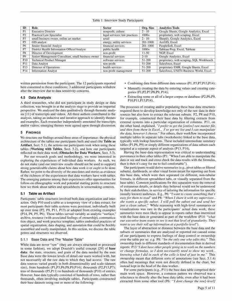
Table 1: Interview Study Participants
ID Role Sector Org. Size Analytics ToolsP1 Executive Director nonprofit, culture 2 - 10 Google Sheets, Google Analytics, ExcelP2 Practical Law Specialist legal services; law practices 1000+ proprietary, web scraping, ExcelP3 small business owner, online art market retail 2 - 10 Shopify, Google Analytics, ExcelP5 GIS analyst energy; utility services 201-1000 ArcGIS, ExcelP6 Senior financial Analyst financial services 201-1000 PeopleSoft, ExcelP7 District Health Information Officer/Analyst public health 1000+ Tableau Prep, Excel, TableauP8 Director of Development non-profit 11-50 NGP, ExcelP9 Senior Management Consultant, small business owner financial services 2-10 Google Analytics, ExcelP10 Technical Product Manager software services 51-200 proprietary, web scraping, SQL WorkbenchP11 Data Analyst non-profit 51-200 Salesforce, ExcelP13 Director of Operations health services 51-200 proprietary EMR, Google Sheets, ExcelP14 Information Analyst non-profit management 51-200 Salesforce, UNIT4 Business World, Excel
written permission from the participant. The 12 participants reportedhere consented to these conditions; 3 additional participants withdrewafter the interview due to data sensitivity concerns.
4.5 Data AnalysisA third researcher, who did not participate in study design or datacollection, was brought in at the analysis stage to provide an impartialperspective. We analyzed the data qualitatively through thematic analy-sis [11] of transcripts and videos. All three authors contributed to theanalysis, taking an inductive and iterative approach to identify themesand examples. Each researcher independently annotated the transcriptsand/or videos; emerging themes were agreed upon through discussion.
5 FINDINGS
We structure our findings around three areas of importance: the physicalarchitecture of the tables our participants built and used (the Table asArtifact, Sect. 5.1), the actions our participants took when using thesetables (Working with Tables, Sect. 5.2), and how our participantsreflected on their data work (Obstacles for Data Workers, Sect. 5.3).
Per our research goals and methodology, we were interested inexploring the experiences of individual data workers. As such, wedo not make (and our interview results should not be used to support)strong generalizable claims about how data work is or ought to be done.Rather, we point to the diversity of the anecdotes and stories as evidenceof the richness of the experiences that data workers have with tables.The emerging patterns among their experiences offer opportunities forfollow-on ethnographic work and potential starting points to structurehow we think about tables and spreadsheets in sensemaking contexts.
5.1 Table as ArtifactParticpants’ table structures involved both data organization and inter-action. Only P10 used a table as a temporary view of a data extract; formost participants their table systems were persistent, individually builtup over time (P2, P9, P11, P13) or adopted from existing examples(P14, P8, P5, P6). These tables served variably as analytic “surface,”archive, resource (with associated feelings of ownership), communica-tion object, and work practice template; tables embodied practices ofspatial organization, data shaping, and annotation that could be flexiblyassembled and easily manipulated. In this section, we discuss the tablegenres and structures we observed.
5.1.1 Base Data and The “Master Table”While data are never “raw” (they are always structured or processedin some fashion), we adopt Dourish’s useful concept [29] of basedata: the state, structure, and grain of the data needed by the user.Base data were the lowest levels of detail our users worked with, butnot necessarily all the raw data to which they had access. The rawdata sources varied greatly in both dimensionality and scale (datasetsize), from hundreds (P1,P3,P6,P8,P9,P14); thousands (P2,P13,P7);tens of thousands (P5,P11) to hundreds of thousands (P10) of entries.However, base data typically consisted of hundreds of rows, rather thanthousands, often involving multiple tables. Participants constructedtheir base datasets using one or more of the following:
• Combining data from different data sources (P1, P3,P7,P13,P14);• Manually creating the data by entering values and creating cate-
gories (P1,P2,P7,P6,P9, P14);• Extracting some or all of a larger corpus or database (P2,P6,P9,
P10,P11,P13,P14).
The processes of creating and/or populating these base data structuresrequired them to develop knowledge not only of the raw data in theirsources but also how to extract the relevant subsets. P2, P8 and P10,for example, constructed their base data by filtering extracts fromexternal systems into a particular organization of columns. P11, onthe other hand, explained, ”I prefer to get the [entire] raw master file,and then from there in Excel... I’ve got my list and I can manipulatethe data, however I choose.” For others, their workflow incorporatedmultiple tables in separate tabs (worksheets) linked to the base data,typically with lookup functions. These included intermediate summarytables (P1,P6, P9) or simply different organizations of data subsets eachtargeted at a separate aspect of analysis (P13, P14).
Having the base-data representation was critical to understandingprovenance in their other tables (P1: ”When I am able to manipulate thedata or see and track and cross check the data results with the formulas,then it then it’s easy for me to feel comfortable”).
Our participants would derive summaries (e.g., pivot tables or filteredsubsets), dashboards, or other visual forms meant for reporting out fromthis base data, which were then separated (in different, non-tabularformats, in different spreadsheet tabs, or visually separated from thebase table). Common justifications for this separation were the removalof extraneous details, or details they believed would not be understoodby their stakeholders, in service of tailoring the information for specific(usually known) audiences. E.g., P6: “I want to create something that’seasy for them to read” and P8: “When I share it with my supervisor...she wants a specific subset. I will pull the subset out and send herjust a clean subset.” While reasoning with high-level summaries orvisualizations was rare in the participants’ actual data work, thesesummaries were most likely to appear in reports rather than intermixedwith the base data or generated as part of the workflow (P14: “whatour executive team wants to see is not that level of granularity. Theywant to see their roll up information at a portfolio level”).
The layer of abstraction or distance between the base data and thesubsets or summaries that are analyzed or reported out caused someof our participants to express feelings of deep control or ownershipover the table per se: e.g. P8: “Im the only one who edits this.” Thisownership leads to different standards of documentation than in derivedreports: P13 “I dont have other people going in to work on the numbersor change formulas, so I dont necessarily need to show my work...knowing what I did in each of the cells is kind of just in me.” Thisownership meant that different sorts of annotations (see Sect. 5.1.4)often had meanings that were not directly defined in the chart, butinstead kept in the head of the data worker.
For some participants (e.g., P11) the base data table comprised theirmain work space. However, a common pattern we observed was areluctance to directly alter the base data table, even after it had beenextracted from some other tool (P6: ‘‘I dont change the row[-level]
Page 5 of 11

data.”). This reluctance would occasionally result in a “master table”or “master sheet” containing only the base data, separated spatially orcontextually from any derived data or annotations. Some participantswere hesitant to interact with this master table in any way. This could befor caution (P2: “[I am] paranoid that I will do something that will ruinthe original sheet,”), for record-keeping and replicability (P5: “I keptall the data intact and included the list so I can go back”), or becausethe master table itself is the repository of the data, and so the sourceof truth (P11: “We think of [this workbook] as the data repository inmany ways... but if were going to be doing any sort of analysis, thatwould be pulled in elsewhere).”
If the master table is the sanctum sanctorum within which no interac-tion or adornment is permitted, then data work must happen elsewhere,typically on a copy, often in a separate tab within the same workbook.P7 referred to their copy of the row-level data table as “the ‘workoutview’...this is the starting point for me.” P6, with a similar data organi-zation, said “From this I can get all the raw information already. But inorder to do deep analysis, I have separate tabs.” These staging groundsallowed our participants to explore, experiment, and verify their work.For instance, P1 used explicit links to a master table in a formula tobuild confidence in their work: “when I am able to manipulate the dataor see and track and cross check the data results with the formulas,then it then it’s easy for me to feel comfortable.”
One challenge was making comparisons, particularly when a mastertable plus variants was used to explore alternatives. For example, P10created multiple sets of simulated search engine results, then foundit challenging to compare those what-if scenarios. Even during ourinterview they got confused about which data were which: “But byhaving multiple tabs open, simulating the same search with tweakingsome parameters, I got lost. So this is an area of breakdown... notknowing the relationship between the simulated and the actual.”
5.1.2 Spatial Organization and the Readable Table
We turn now to how our participants shaped their working tables. Fig. 1,from a pilot interview, illustrates some of the ways our participants builtand adapted rich tables. These patterns illustrate how the table functionsas pedagogical structure, visualization, and directly manipulable objectfor many of our participants. The tables our participants used wereall in “wide” format with one row per item. For those who explicitlytried to refactor their data into “tall” format for other tools, such asP1 and P7, this violated their model of how to think about the data.Our participants all had an item-centric working model of their data(P1: “the individual is the row, and then the columns represent varioussegments...in my head, it’s either that the person or the organizationis the row and everything else has to be the column or the reverse”).This allowed them to read and compare items across multiple columnsefficiently (P7: “So if we are getting two reports from one facility for asingle month, we know something is wrong, because that’s not how theyare supposed to report”). Wide tables were the default format even fordata that was not natively tabular. P10, for example, pulled snapshotsof a very large JSON dataset into tabular views to “get a sense of mydata at a macro scale” with respect to detecting key attributes to formsubsequent queries. The wide table was viewed as a natural structurefor organizing data views, accommodating multiple levels of detail, andcomparing and grouping the effects of filtering and sorting on items.
Participants used spatial organization to visually associate or dis-criminate data both within and across tables, taking advantage of thestrong perceptual organizing principle of proximity. These spatial or-ganizations were either fixed (defined at the time of building the table)or dynamic (responding to re-ordering interactions). Some partici-pants (P1, P5, P9, P13) created explicit hierarchies with multi-columnheadings; these were often used to reorganize the base data into moremeaningful segments. Only one (P9) used a multi-row heading insummary tables. More common was spatial adjacency for clustering.Common table structures grouped related columns together, orderedwhere appropriate, and in some cases (P8, P9) representing implicithierarchy (e.g., “Category, Sub-category”).
Spatial organization also mattered across tables. The flexible con-tainer of the sheet afforded different ways to organize combinations
of views and summary tables. P6 grouped pivot tables and filters intabs specific to different analytical questions of corporate performance– for both analysis and communication purposes. In contrast, P1 builtsheets of summary tables for their own path to the final analysis, withthe overall summary at the left and sub-populations to the right. Ta-bles were typically separated by white space and formatting and hadmulticolumn headers similar to pivot tables.
5.1.3 Data GranularityThe wide table format supports easy expression of different data grains;this was important to participants as it helped to “cross-reference dataand see [results] more clearly” (P1). P7 brought up the challenge ofmanaging different data grains in tidy tables for analytic tools; theyused monthly counts (one grain) of Covid cases and yearly populations(a coarser grain) by region to analyse disease spread. In Excel it waseasy to sum up the case counts to the regional-level and then divide bypopulation to derive the infection percentage using either a temporarytable or direct cell-based calculations, but in Tableau Prep they hadto go through a series of painful pivot steps to avoid propagating thewrong data grain. The most common examples of different data grainare summary rows and columns, which were very common in both baseand derived tables (observed in the tables of 10 participants).
A related challenge was structuring and presenting the same data atmultiple levels of detail to manage communication. As per P2, “ [ourVP] just wants information a high level, he’s not going to drill downinto the data in the same way that say, for example, one of the lawyerswho’s written the content might do... I find myself creating differentversions of a spreadsheet of data, just to share with different people.”
5.1.4 Marginalia and AnnotationsThere was an accumulation of marginalia, commentary, and other sortsof annotation, especially for participants who refrained from editing thecentral master table (Sect. 5.1.1). Our participants variously includedcomments, color or symbol legends, or just detailed explanations of thedata provenance, in the areas around the master table of the base data.
We refer to marginalia as additional information in the peripheryof the master table: e.g., derived columns, comments, descriptions,and summaries. Marginalia are designed for human readers, and addcontext or additional details to otherwise unadorned base data. Naturallanguage descriptions (of the meaning of particular columns or tables,of data provenance, or summarized findings) results in cells in themargins containing text data that is rarely standardized or amenable toactions like sorting or pivoting (P8, “[the notes column]’s not reallysortable because the notes are kind of freeform. But thats by design.”)
A specific type of marginalia are bespoke categories or other derivedcolumns. For instance, P8 manually created categories of contacts: “SoI’ve created kind of my own data sorted categories ... they’re eitherVIP, they’re not, they’re currently a donor, they’re a prospect, or we’retrying to figure out who they are.”
We refer to annotations as additional information included withinthe main body of a table, for instance highlighting a cell or changing itsvalue to match a convention. Annotations served to flag important partsof the table for follow-up, disambiguating values that would otherwiseappear identical, adding codes, noting concerns about data reliability,or providing structure to help navigate the visual complexity. P14used dashes in cells that would otherwise be blank to indicate a dataquality issue, whereas P2 would highlight an entire row if there was“a major red flag.” Disambiguating different sorts of missing data wasan important task for P5: “[a] blank value is telling me that I donthave a customer of that type in that county.” But for cases where theblank value was indicative of a data prep failure (say, a failed join),they used annotations so the final cell was not blank: “If something gotscrewed up, I wanted a placeholder on the data.” P8, by contrast, usedhighlighting for triage: “if something is highlighted in yellow then Ineed to act on it in two weeks.” Lastly, P13 used color coding to flagkey performance indicators over time as poor, satisfactory, or good.
An action that sits at the intersection of marginalia and annotation isin-cell commenting. Curiously, we did not observe any explicit use ofthe in-cell commenting features afforded by Excel and Google Sheets;
Page 6 of 11
participants tended to create comments in separate columns inline withthe rest of the data (although often spatially separate from the mastertable) rather than existing as something to invoke by clicking on a cell.While we did not specifically ask about cell-based comment features,it is possible that the reluctance to use them was based on a loss of“glanceability” or the likely loss of these comments when the table istranslated to or from other tools.
5.2 Working with Tables
In this section we focus on the actions that our participants performedwith their data, especially sensemaking actions (like altering dataschema, adding or combining new data, and verifying data integrity)and the extent to which they were supported by tabular forms. Actionsthat made use of the tabular form and/or the spreadsheet were presentacross all stages of the sensemaking process, from data preparation andcleaning, to analysis, to reporting and presentation. While the tableform was more or less strongly represented at these different stages,it was never entirely absent: manual interaction with a table is not soeasily dispensed with, despite the focus in data science on repeatableor automated data flows, or best practice guides with statements like“there is no worse way to screw up data than to let a single human typeit in, without validation” [36].
5.2.1 Moving Between Tools
While spreadsheet software was ubiquitous among our participants,only 3 participants exclusively used spreadsheets. Participants popu-lated their tables by extracting data from other tools (see Table 1), suchas Salesforce (P2, P3, P8, P11, P14), PeopleSoft (P6), webscrapers (P2,P8, P10), Shopify (P3), or proprietary tools (P5, P8, P13, P14). As such,participants would occasionally drop in or out of spreadsheet softwarefor other tasks. Note that for most of our participants, their primarydata source was a big data system that included a visual interface todata (e.g. Google Analytics, Shopify), yet they still dumped data out ofthese tools to work with it in spreadsheets.
One reason to change either tools or table contexts was to reportout in a form that would be more useful for external stakeholders. ForP9, that meant manually entering in values from a pivot table into Pow-erPoint: “if I were a hands-on CIO I could go in and play, [but] in mostcircumstances somebody will need to dump out of the analytics tool ...the client just wants the data presented in PowerPoint,” whereas for P6this was connecting dashboard templates to aggregated data. Similarto observations by Dourish [29] on the “performative aspect” of thespreadsheet, often a table per se was the medium of external commu-nication (although often simplified or filtered for external audiences).For instance, P5 claimed that “what I do with that is dump it into Excel,put it into a pivot table, and distribute it out.” P13 communicated withtheir stakeholder (a CEO) with a pivot table, but admitted to lookingfor “a better, easier space for someone who’s not a math nerd.”
In other cases, the move into spreadsheets was temporary, with thetable acting as an interlocutor between software tools. For instance,P14 used Excel as a bridge between Salesforce and their other businessdata management system: exporting from Salesforce, manually joining(see Sect. 5.2.4) and augmenting the data with information from theirother sources, and re-importing back into Salesforce. The ease of use ofworking with tables was frequently cited as a reason to export to tablesfrom other systems: P9 was “more comfortable” in Excel, P2 calledExcel “pretty much our best friend,” and had “a lot more confidencespeaking on how this data is being pulled [in Excel],” whereas P11admitted “I don’t really like working with Salesforce in terms of datamanipulation... I prefer to get the raw master file in Excel.”
Participants occasionally used other data cleaning tools, but de-faulted to spreadsheets when they encountered barriers. P1 reported: “Ican do manual cleaning, and generally it’s okay, it’s just time consum-ing. And it felt like it was taking me more time to create the formulas toclean it in [Tableau] Prep ... Google Sheets is my kind of my world.”We explore this notion of guilt over tooling choices further in Sect. 5.3.
5.2.2 Eyeballing & VerificationA common task we observed with tables was “eyeballing” the data toconfirm that they met expectations. 11 of our participants made explicitstatements about verification or other forms of data quality assessment.As per P8, “I’m the quality control.” Despite the importance of verifica-tion, two participants, P3 and P7, were clear-eyed about “perfect” dataas being an unattainable goal: P7 said “Data is never perfect... [if youdont look at the data, then] the data will surprise you at the momentthat you least expect.” whereas P3’s motto was “I dont want to putgarbage in: I want to have the best garbage possible.”
Eyeballing was often ad hoc, rarely connected to formal data clean-ing procedures or algorithms (per P3: “It’s not science per se... justvisual”). An exception was P5, who would “run that data check andget an exception report” to confirm that, e.g., all 2-inch valves wereconnected only to 2-inch pipes. Rather than formal procedures, weobserved participants encountering “a discrepancy” (P1,P11),“alarmbells” (P2), “major red flags” (P2), “something out of the ordinary”(P8), “something [that] drastically changes” (P9), or failing a “spotcheck” (P5,P10). Participants would then dive into the base data todiagnose errors (per P9: “after analyzing the data three or four times,you notice a pattern... if something drastically changes, then you wantto double check at the Excel level”). Eyeballing happened at all stagesof data work, not just during data preparation; for instance, P14 encoun-tered an incorrect value in the pivot table intended for presentation tostakeholders during our interview, and made a verbal note to updatethis value once the interview was over.
For some participants, eyeballing occurred in a (master) table of thebase data. For instance, for P6 “When I validate my data, normally, Ialways go to the row[-level] data.” Directly looking at the base dataprovided participants with a sense of control over their data plus directaccess to fields to be corrected. As per P2: “[the spreadsheet] offersme the flexibility to kind of eyeball my data and manipulate it into amanner that is sufficient for me” and for P10, “I can read [the basedata] and understand what this means... and if there’s any data missing,or if data is not being parsed out correctly, I can catch that with somespot checking... like a kind of quick and dirty way to poke around.”P9’s eyeballing could encompass the entire dataset: “if something is outof the ordinary then I double check thousands and thousands of rows.”But this was relatively uncommon. P10, for instance, would create adhoc subsets of the base data in order to perform closer inspections, oraggregate the data to a higher level of detail before eyeballing.
As a way of counteracting the issues of scale like those encounteredby P9 and P10, other participants would focus only on the data that hadbeen updated or changed. E.g., P6’s workflow was “I dont blind uploadanything... I keep multiple tables within that Excel sheet of peoplethat need to be added... and I screen that extensively [because it is]hard to go back and figure out where and when exactly new data camein.” Perhaps more formally, P5 stated that “We do a daily inspection...one analyst every day takes a global look at all the changes for thatday and really just does a spot check,” and stated that this standardwas being augmented by bringing in an exterior data cleaning team:“We’ve kept a dirty house for a while, and now we’re getting it allcleaned at once.” Interestingly, P5 continued to perform data cleaningoperations in advance of the arrival of this professional data cleaningservice; rather than redundant, we suggest that this action might be partof deriving a feeling of ownership over the data, in the same way wemight clean our homes more if we know strangers will be coming over.
A related rationale for checking changed data was a lack of trustin the the worker’s own actions (but an implicit or explicit trust in thebase data). E.g., P14: “its really heavily manual. So that means thattheres always the concern about data quality from the inputter, which ispredominantly me.” and P9 “I dont have to doubt the data that Googleis providing... what I doubt is the analytics that I do in Excel.”
5.2.3 Manipulating Rows and ColumnsWhile it was uncommon for our participants to insert columns withinthe base table, it was common for them to append new columns asmarginalia (occasionally with blank columns as visual separators be-tween base and derived data). Exceptions were P2 and P11, who created
Page 7 of 11

and inserted new calculated columns adjacent to the source column.Most participants did not dynamically reorder columns in their tables,
largely due to lookup dependencies (P1, P9, P14). Some whose mainworkout space was the base table, however, relied on dynamic ordering.P2 frequently rearranged columns to get a single page snapshot of whatwas most relevant: “I need to see the most important information first”.P11 reordered columns to collect related data after updates, as resultsappeared in a new, “distant” column. However, many participants hidand revealed columns to create visual subsets, supporting differentaspects of sensemaking and communication. For example, P14 usedhiding to focus attention on specific sub-organizations, so they coulddrill-down or rollup detail columns. Hiding columns was a commonstrategy to manage very wide tables (P2, P8, P11, P14).
The most common spatial organization strategies used filtering andsorting to group associated rows (eight participants). Sorting was alsoa key strategy in adding data to the table using column alignment (seeSect. 5.2.4). For those who worked in the base table, filters and sortingwere key tools to segment and relate items. Participants valued theability to combine filters via menu options, and to have them dynami-cally update with the data (P8: “when I add a new category [type], itautomatically gets added to the list, so I can always see the options”).P3 and P10, by comparison, relied primarily on sorting to determinethe range of values in relevant columns.
5.2.4 Re-coding and Joining
We saw that participants frequently re-coded their data, either by addingnew types in existing columns (P2,P8,P13,P14) or by defining newderived types (P1,P2,P5,P9,P13,P14). An interesting example of re-coding was P1. Working with survey data, P1 needed to report ongender demographics as part of a diversity and inclusion initiativewhile also (as per accepted practices for inclusive gender solicitation inweb forms [45]) providing free-text responses for gender presentation.They attempted to group gender identities using regular expressions,but were unable to write a regular expression that was specific enoughto exclude “Woman” but include other text that ended in “man.” Assuch, they manually placed “Woman” with “Womxn” to make theirregular expressions easier to write and their analytical questions aboutgender easier to answer.
While participants felt free to add to, annotate, re-code, or derivenew information in their local data, they rarely adjusted data schema insource repositories. P5, when asked about whether or how they wouldperform a batch update, claimed that such a task would “involve theIT department and [they’d] say ‘hey, run this script’.” An exceptionwas P13, whose workflow involved updating not just data but alsothe schema to match new (and more convenient) standards. Theywould locate the deprecated data in Salesforce, export to Excel formanipulation, schema correction and cross-checking, and then performa batch update back to Salesforce— a tedious and manual process (“myjob is doing that over and over and over”).
A related problem (and persistent challenge) was joining togethermultiple sources of existing data: (P5: “—thats really the heavy lift,”,P9:“was such a pain that I decided to do away with it.”). This was thecase even for tools like Tableau Prep (P7) that have visual interfacesfor joining tables (albeit ones that require an understanding of databaseconcepts such as inner, outer, left, and right joins). Instead, participantsused tables for joining or “bridging” disparate data sources in theirworking tables. Some used formal lookup functions (P1,P11,P14).Others used a shortcut solution to the difficulty of performing (orunderstanding) data joins afforded by the table structure: the copy andpaste join (P7, P9, P14). That is, the user sorts or pivots both sheetsbased on a common field, then simply copies and pastes fields from onesheet to the other. Both P7 and P9 admit to employing copy and pastejoins in their workflows: as per P7, “I dont always get it right. Thejoins [in Tableau Prep] are quite tricky, [whereas in Excel] its reallysimple and straightforward: you just have to copy one column: youjust have to copy and paste, you dont have to worry about the joiningcolumns and all that” (although they did admit some guilt about suchmanual and error-prone procedures, see Sect. 5.3 and Sect. 5.2.1).
5.2.5 Manual Calculations & ManipulationsStrangely absent in the tables we observed was the heavy use of for-mulae. Formulae we did encounter were relatively straightforward (forinstance, running totals of rows or columns, or lookups to link relatedtables). Occasionally these formulae were for the benefit of readabilityrather than mathematical utility. E.g., P6 had a running total column,but only so the total would be “more visible for people to get the resultright away rather than to do the math in their mind.”
An interesting example of wanting control and ownership over for-mula evaluation was P13, a self-described “calculator junkie,” whoused a handheld calculator to create projections for their metrics ofinterest (P7 also used a handheld calculator as a supplement to theirtable, but for “eyeballing” and verification purposes, see Sect. 5.2.2).Although they were aware that using the calculation engine in Excelcould support transparency and reproducibility, they felt their comfortwith their calculator and their sole ownership of the table data justifiedtheir exclusion: “I dont have other people going in to work on thenumbers or change formulas, so I dont necessarily need to show mywork.” Another example of eschewing certain forms of computationalautomation was P1, who manually built what was functionally a pivottable in Excel, cell by cell, through manual lookup commands. Theirstated reason for doing so (rather than relying on built-in pivot tablefunctionality) was “[I want to] easily see and track/crosscheck the dataresults with the formulas. Then it’s easy for me to feel comfortablewith whats being reported.” That is, they were relying on the formulaehighlighting in Excel to show precisely which numbers from the mastertable fed into the resulting pivot table, for verification.
5.3 Obstacles for Data WorkersSoliciting challenges that participants encountered in their data work re-vealed a recurring tension between the tedium of manual work practicesand barriers to adopting new tools.
A consistent complaint was that tasks were often rote, repetitive andboring, and yet still required manual action and attention. P14 said“it’s just the tediousness of it that makes it difficult, and the manualdata input, which always leads to the opportunity for error” while P11complained about doing the same complex re-coding task “over andover and over.” P9 even admitted to giving up on more sophisticateddata work (like joins, see Sect. 5.2.4) in the face of workload: “I let thepeople in my organization know to [settle for a lower] level of insightbecause it just takes too much time... I wish Google Analytics just didit.” P13 was confident in doing their work with the current scale of theirdata, but was worried about the future: “the point is pain avoidance...as we continue to grow, its only going to get worse.”
Our participants were cognizant of the extra manual effort (andopportunity for error) of performing their data work exclusively inspreadsheets. As such, they occasionally expressed a desire to useor master other tools, at times resembling guilt over not using more“sophisticated” tools. P13 stated “I havent [used visualization tools],but its something that I need to.” P10 likewise stated: “I achieveda proficiency in doing data analysis in spreadsheets ... sometimes itwas easier to perform a specific task in [a spreadsheet], as opposed tomaybe a more elegant solution of actually using SQL or a BI solution.”Another barrier to adopting tools was a sheer lack of time or backgroundknowledge. P11 stated “I feel like this would be a lot easier if I knewSQL... But you know, at a nonprofit, everything’s always on fire. Sotaking time to learn SQL is not generally on my schedule.”
P7 tried particularly hard to learn new tools. Despite struggling withjoins (see Sect. 5.2.4), P7 felt an obligation to remain in Tableau Prep:“I know its easier for me to go back to Excel and do one or two things,but I try to persevere ... I want to see how far I can get with TableauPrep before I have to give up.” Building fluency (for future benefits)was an important goal for P7: “If I stick to Excel, then I will have tospend a lot of time doing something that is really really simple.” P7employed an iterative process in Tableau Prep in order to build comfortand verify accuracy: “you want to have very simple building blocksand move slowly.” After each atomic step (such as a join or pivot),they would validate values (occasionally using a handheld calculator)to ensure they were getting “the actual figures [they] expect.”
Page 8 of 11

6 DISCUSSION
Our exploration into the activities of data workers led us inexorably toan investigation of how people use tables to make sense of their data,organize and structure their workflow, and document their findings.The spreadsheets we saw were not mere matrices of values. Instead,our participants constructed, used, and presented their tables in richand sophisticated ways. We found that many data workers rely ontables as a trusted window with “direct” access to their data in a formthat gives them both precise control and a sense of confidence andownership over the data manipulations they want to perform. Whetheras the original data source, the “home base” for sensemaking, a “workspace” for testing and verifying data manipulations, or an intermediateor interlocutory artifact, spreadsheets were ubiquitous elements in howdata workers got their work done. The form of the spreadsheet, in turn,shaped the sort of work people were doing.
We focus our discussion on the structure, uses, and unsolved chal-lenges in the genre we call rich tables. The predominance and persis-tence of data work involving rich tables has concrete implications bothfor how we as designers ought to support data workers and how we asresearchers should conceptualize the people and processes we study.
Rich tables are living, changing data documents that include an-notations, comments, and spatial structures that are important for un-derstanding, reading, and presenting the data. Analytics tools oftenassume tidiness in the input data (e.g., few could accept something likeFig. 1 without hiccups). Rather than focusing on “tidying” the structureor “cleaning” the data to fit a proscribed machine-readable form, de-signers should support a wider variety of human-legible metadatawhen modeling, importing, or working with data. For example, per-mitting the native wide format, preserving both explicit and implicitassociations from spatial structure such as aligned columns, linkedtables and summary views, or including user-generated markup andmarginalia. An example of affording flexibility in data structures is theFalx system [86], which attempts to infer ad hoc data transformationsin order to generate custom visualizations rather than working aroundan assumed single and immutable data structure.
The prominence of untouchable master tables suggests value ingiving users areas for consequence-free and transparent experi-mentation with data. Experimentation is especially important forverification tasks related to calculations, joins, and aggregation; manyof our participants were willing to perform extremely labor-intensiveprocesses rather than rely on automatic operations about which theylacked trust or confidence. To support scaffolding and “debugging”,we might need to augment visualizations with explicit data flow in-formation as suggested by Hoffswell et al. [42] or explicitly visualizehow calculations and aggregations lead to a final visual result asper Kim et al. [54, 55]. We could also offer no code mechanisms to ex-plicitly support what-if analysis and comparison of alternative scenarios(e.g., P10’s multiple search simulation runs).
Our participants continuing to do their work in spreadsheets, despiteknowledge of (or guilt over not using) more “sophisticated” BI or visualanalytics tools points to a need for scaffolding and support for newusers. To integrate other tools into their workflow, data workers needto be able to trust and rely on them in the same way they currentlydo with spreadsheets, and be able to seamlessly fit them into theirworkflow in the face of time and resource pressure. Note that this isnot just a matter of education; because data is not necessarily the coreof their job, we need to develop fundamentally different means ofinteraction to support data workers. Ultimately these approaches willbenefit everyone, data workers and professional analysts alike.
Our most salient finding was the sheer irreplaceability of the tableform. There is a temptation in analytics tools to focus quickly onabstractions (e.g., overview visualizations). While abstraction andsummarization is powerful, if people can’t get direct access to thebase data in your analytics tool, they’ll leave it and go to a toolwhere they can. The power and immediacy of being able to see,manipulate, and validate data was critical to our participants’ data work,something they missed when attempting to use non-tabular tools, andoccasionally something they were willing to endure tedium or extensiveeffort to retain. Despite being a workhorse of data work, the table has
received short shrift in contemporary visualization research. Whilebooks and blogs for non-academic audiences have many guidelines forthe construction of tables (e.g., Few [34]), definitive research on thedesign and use of tables as visualizations, or embedded within visualanalytics processes is relatively sparse. We call for a renewed focuson the table alongside other visual forms of data communication.
This neglect has implications even for our empiricism: Joslyn &Savelli [47] point out that empirical studies in visualization often lacktextual or tabular conditions. When do users really need novel orcomplex visualization systems? Sometimes, a simple table may suffice,or perhaps even outperform, as in early experiments by Carter [15].
Lastly, we note the focus in visualization research on “domain ex-perts” and “analysts”. While these groups provide useful new problemsand datasets, they are not representative of all (or perhaps even most)data workers. We strongly encourage researchers to explore workpractices of all types of users, in the wild. Millions of data workersare using data every single day. They are employing complex and te-dious workflows with spreadsheets rather than wholeheartedly adoptingthe visual analytics tools we work so hard to produce. There is an enor-mous opportunity for visualization to become the enabling force fordata driven decision making in organizations. But to do so, we need tofundamentally change who we, as a research community, conceptualizeas the visualization user and the skills they possess or prioritize. Richinteractive tables offer one way to bridge that gap.
6.1 Limitations & Future WorkOur research is exploratory and formative, and consequently limited inscope. In many ways our contribution is not only to report on findingsof what users do but also to surface questions to be addressed in futurework. Notably, our study focused on self-reported behaviors, so we didnot specifically question participants about their cognitive processing.Extracting and defining mental models is a difficult task [14]. Further,we did not explicitly probe users for how the spatial organization andreorganization of their tables helped them develop a mental model norhow the organization aided their processing and workflow sequences– but it exposed these practices in common use. We encourage futurework to explore what spatial structures, and the acts of manipulatingand redefining them, might mean for cognitive processes and mentalmodels. Our future work will also examine how features of rich tables,such as marginalia, may support both individual sensemaking andcollaborative workflows [29].
7 CONCLUSION
We examined the sensemaking practices of data workers. Describingthis process is one and the same as describing the genre of rich tables,the tabular, human readable and human manipulable format that wasubiquitous in the data work we observed. While some (includingsome of our participants!) disparage the table or spreadsheet as aprimitive analytical tool to be inevitably replaced by sophisticated datamanagement or analysis tools, it persists all the same. As a tool forallowing someone to immediately “see” and “get their hands on” thedata, the table has affordances that are unmatched even by complexanalytical systems. We should strive to bring those affordances to thevisual analytic systems of tomorrow.
ACKNOWLEDGMENTS
This work was partly supported by the Natural Sciences and Engi-neering Research Council of Canada. We thank Jonathan Drummey,Bethany Lyons, Maureen Stone, and the reviewers for feedback.
REFERENCES
[1] E. Alexander, J. Kohlmann, R. Valenza, M. Witmore, and M. Gleicher.Serendip: Topic model-driven visual exploration of text corpora. In 2014IEEE Conf. Visual Analytics Science and Technology (VAST), pp. 173–182.IEEE, 2014. doi: 10.1109/VAST.2014.7042493
[2] S. Alspaugh, N. Zokaei, A. Liu, C. Jin, and M. A. Hearst. Futzingand moseying: Interviews with professional data analysts on explorationpractices. IEEE Trans. Visualization and Computer Graphics, 25(1):22–31,2019. doi: 10.1109/TVCG.2018.2865040
Page 9 of 11

[3] J. A. Amozurrutia and C. M. Servs. Excel spreadsheet as a tool for socialnarrative analysis. Quality & Quantity, 45(4):953–967, 2011. SpringerNetherlands. doi: 10.1007/s11135-010-9406-9
[4] Anonymous. Finding their data voice: Practices and challenges of dash-board users. In submission, 2021.
[5] O. Azeroual. Data Wrangling in Database Systems: Purging of Dirty Data.Data, 5(2):50, June 2020. Number: 2 Publisher: Multidisciplinary DigitalPublishing Institute. doi: 10.3390/data5020050
[6] S. Baskarada and A. Koronios. Unicorn data scientist: the rarest of breeds.Program, 2017.
[7] J. Bertin. Graphics and graphic information processing. Walter de Gruyter,2011.
[8] A. Bigelow, S. Drucker, D. Fisher, and M. Meyer. Reflections on howdesigners design with data. In Proc. 2014 Intl. Working Conf. AdvancedVisual Interfaces, pp. 17–24, 2014. doi: 10.1145/2598153.2598175
[9] A. Blandford and S. Attfield. Interacting with Information. Syn-thesis Lectures on Human-Centered Informatics, 3(1):1–99, Jan.2010. Publisher: Morgan & Claypool Publishers. doi: 10.2200/S00227ED1V01Y200911HCI006
[10] N. Boukhelifa, M.-E. Perrin, S. Huron, and J. Eagan. How data workerscope with uncertainty: A task characterisation study. In Proc. Conf. HumanFactors in Computing Systems, CHI ’17, pp. 3645–3656. ACM, 2017. doi:10.1145/3025453.3025738
[11] V. Braun and V. Clarke. Using thematic analysis in psychology. Qual. Res.Psychol., 3(2):77–101, 2006. doi: 10.1191/1478088706qp063oa
[12] K. W. Broman and K. H. Woo. Data organization in spreadsheets. TheAmerican Statistician, 72(1):2–10, 2018. Publisher: Taylor & Franciseprint: https://doi.org/10.1080/00031305.2017.1375989. doi: 10.1080/
00031305.2017.1375989[13] T. D. Cao, I. Manolescu, and X. Tannier. Extracting linked data from
statistic spreadsheets. In Proc. Intl. Workshop on Semantic Big Data,SBD ’17, pp. 1–5. ACM, New York, NY, USA, May 2017. doi: 10.1145/3066911.3066914
[14] K. Carley and M. Palmquist. Extracting, Representing, and AnalyzingMental Models. Social Forces, 70(3):601–636, Mar. 1992. Publisher:Oxford Academic. doi: 10.1093/sf/70.3.601
[15] L. F. Carter. An experiment on the design of tables and graphs used forpresenting numerical data. J. Applied Psychology, 31(6):640–650, Dec.1947. Publisher: American Psychological Assoc. doi: 10.1037/h0054246
[16] C. Chambers and C. Scaffidi. Struggling to excel: A field study of chal-lenges faced by spreadsheet users. In 2010 IEEE Symp. Visual Languagesand Human-Centric Computing, pp. 187–194, 2010. ISSN: 1943-6092.doi: 10.1109/VLHCC.2010.33
[17] K. S.-P. Chang and B. A. Myers. Using and Exploring Hierarchical Data inSpreadsheets. In Proc. 2016 Conf. Human Factors in Computing Systems,CHI ’16, pp. 2497–2507. ACM, New York, NY, USA, May 2016. doi: 10.1145/2858036.2858430
[18] Z. Chen and M. Cafarella. Automatic web spreadsheet data extraction.In Proc. 3rd Intl Workshop on Semantic Search over the Web, SSW ’13,pp. 1–8. ACM, New York, NY, USA, Aug. 2013. doi: 10.1145/2509908.2509909
[19] E. Chi, J. Riedl, P. Barry, and J. Konstan. Principles for InformationVisualization Spreadsheets. Computer Graphics and Applications, IEEE,18:30–38, Aug. 1998. doi: 10.1109/38.689659
[20] E.-H. Chi, P. Barry, J. Riedl, and J. Konstan. A spreadsheet approach toinformation visualization. In Proc. VIZ’97, pp. 17–24. IEEE, 1997. doi:10.1109/INFVIS.1997.636761
[21] L. Contreras-Ochando, C. Ferri, J. Hernndez-Orallo, F. Martnez-Plumed,M. J. Ramrez-Quintana, and S. Katayama. Automated Data Transfor-mation with Inductive Programming and Dynamic Background Knowl-edge. In U. Brefeld, ed., Machine Learning and Knowledge Discovery inDatabases, Lecture Notes in Computer Science, pp. 735–751. SpringerIntl. Publishing, Cham, 2020. doi: 10.1007/978-3-030-46133-1 44
[22] G. Convertino and A. Echenique. Self-service data preparation and analy-sis by business users: New needs, skills, and tools. In Proce. 2017 CHIConf. Extended Abstracts on Human Factors in Computing Systems, pp.1075–1083. ACM, 2017. doi: 10.1145/3027063.3053359
[23] A. Crisan, B. Fiore-Gartland, and M. Tory. Passing the data baton: Aretrospective analysis on data science work and workers. IEEE Trans.Visualization and Computer Graphics, 2020. doi: 10.1109/TVCG.2020.3030340
[24] A. Crisan and T. Munzner. Uncovering Data Landscapes through DataReconnaissance and Task Wrangling. In 2019 IEEE Visualization Conf.
(VIS), pp. 46–50, Oct. 2019. doi: 10.1109/VISUAL.2019.8933542[25] T. Davenport. Beyond unicorns: Educating, classifying, and certifying
business data scientists. Harvard Data Science Review, 2(2), 5 2020. doi:10.1162/99608f92.55546b4a
[26] T. Davies and M. Frank. ’There’s no such thing as raw data’: exploring thesocio-technical life of a government dataset. In Proc. ACM Web ScienceConf., WebSci ’13, pp. 75–78. ACM, New York, NY, USA, May 2013.doi: 10.1145/2464464.2464472
[27] M. de Vos, J. Wielemaker, H. Rijgersberg, G. Schreiber, B. Wielinga, andJ. Top. Combining information on structure and content to automaticallyannotate natural science spreadsheets. Intl. J. Human-Computer Studies,103:63–76, July 2017. doi: 10.1016/J.ijhcs.2017.02.006
[28] J. Dearing. Study Finds Spreadsheet Risk is Real; Businesses are Awareof the RiskYet Despite Relying on this Data to Make Key Business Deci-sionsthe Risk is Ignored. Business Wire, June 2019.
[29] P. Dourish. Spreadsheets and Spreadsheet Events in Organizational Life.In The Stuff of Bits. The MIT Press, 2017. doi: 10.7551/mitpress/10999.003.0005
[30] J. Drummey. Creating Lists of Values for Tableau from Text & ExcelSources. Drawing with Numbers, Jan. 2018.
[31] J. Drummey. Thoughts on Mental Models and data preparation, Mar. 2019.[32] S. Erete, E. Ryou, G. Smith, K. M. Fassett, and S. Duda. Storytelling
with Data: Examining the Use of Data by Non-Profit Organizations. InProc. Conf. Computer-Supported Cooperative Work & Social Computing,CSCW ’16, pp. 1273–1283. ACM, New York, NY, USA, Feb. 2016. doi:10.1145/2818048.2820068
[33] H. W. et al. Welcome to the tidyverse. J. Open Source Software,4(43):1686, 2019. doi: 10.21105/joss.01686
[34] S. Few. Show me the Numbers. Analytics Press, 2004.[35] K. Furmanova, S. Gratzl, H. Stitz, T. Zichner, M. Jaresova, A. Lex, and
M. Streit. Taggle: Combining overview and details in tabular data visual-izations. Information Visualization, 19(2):114–136, Apr. 2020. Publisher:SAGE Publications. doi: 10.1177/1473871619878085
[36] C. Groskopf. The quartz guide to bad data. https://github.com/Quartz/bad-data-guide, 2021.
[37] A. Halevy, P. Norvig, and F. Pereira. The unreasonable effectiveness ofdata. IEEE Intelligent Systems, 24(2):8–12, 2009.
[38] M. Handel. What do people do at work? A profile of U.S. jobs fromthe survey of workplace Skills, Technology, and Management Practices(STAMP). J. Labour Market Research, 49:177–197, 2016.
[39] J. Heer. Agency plus automation: Designing artificial intelligence intointeractive systems. Proc. National Academy of Sciences, 116(6):1844–1850, 2019. doi: 10.1073/pnas.1807184115
[40] D. G. Hendry and T. R. G. Green. Creating, comprehending and explainingspreadsheets: a cognitive interpretation of what discretionary users thinkof the spreadsheet model. Intl. J. Human-Computer Studies, 40(6):1033–1065, June 1994. doi: 10.1006/ijhc.1994.1047
[41] F. Hermans and E. Murphy-Hill. Enron’s Spreadsheets and Related Emails:A Dataset and Analysis. In 2015 IEEE/ACM 37th IEEE Intl. Conf. SoftwareEngineering, vol. 2, pp. 7–16, May 2015. ISSN: 1558-1225. doi: 10.1109/ICSE.2015.129
[42] J. Hoffswell, A. Satyanarayan, and J. Heer. Augmenting Code with InSitu Visualizations to Aid Program Understanding. In Proc. Conf. HumanFactors in Computing Systems, CHI ’18, pp. 1–12. ACM, Montreal QC,Canada, Apr. 2018. doi: 10.1145/3173574.3174106
[43] S. Huron, Y. Jansen, and S. Carpendale. Constructing visual representa-tions: Investigating the use of tangible tokens. IEEE Trans. Visualizationand Computer Graphics, 20(12):2102–2111, 2014. doi: 10.1109/TVCG.2014.2346292
[44] T. Jankun-Kelly and K.-L. Ma. Visualization exploration and encapsulationvia a spreadsheet-like interface. IEEE Trans. Visualization and ComputerGraphics, 7(3):275–287, 2001. doi: 10.1109/2945.942695
[45] S. Jaroszewski, D. Lottridge, O. L. Haimson, and K. Quehl. “genderfluid”or “attack helicopter” responsible hci research practice with non-binarygender variation in online communities. In Proc. Conf. Human Factors inComputing Systems, pp. 1–15, 2018. doi: 10.1145/3173574.3173881
[46] Jonathan Drummey. Zen Master: You Did What to Your Data? A DeepDive into Imputing and Densifying Data. Tableau Conference, 2019.
[47] S. Joslyn and S. Savelli. Visualizing uncertainty for non-expert end users:The challenge of the deterministic construal error. Frontiers in ComputerScience, 2:58, 2020. doi: 10.3389/fcomp.2020.590232
[48] S. Kandel, J. Heer, C. Plaisant, J. Kennedy, F. van Ham, N. H. Riche,C. Weaver, B. Lee, D. Brodbeck, and P. Buono. Research directions in
Page 10 of 11

data wrangling: Visualizations and transformations for usable and credibledata. Information Visualization, 10(4):271–288, Oct. 2011. Publisher:SAGE Publications. doi: 10.1177/1473871611415994
[49] S. Kandel, A. Paepcke, J. M. Hellerstein, and J. Heer. Enterprise dataanalysis and visualization: An interview study. IEEE Trans. Visualizationand Computer Graphics, 18(12):2917–2926, 2012. doi: 10.1109/TVCG.2012.219
[50] S. Kandel, R. Parikh, A. Paepcke, J. M. Hellerstein, and J. Heer. Profiler:Integrated statistical analysis and visualization for data quality assessment.In Proc. Intl. Working Conf. Advanced Visual Interfaces, pp. 547–554,2012. doi: 10.1145/2254556.2254659
[51] E. Kandogan, A. Balakrishnan, E. M. Haber, and J. S. Pierce. From datato insight: Work practices of analysts in the enterprise. IEEE ComputerGraphics and Applications, 34(5):42–50, 2014. doi: 10.1109/MCG.2014.62
[52] S. Kasica, C. Berret, and T. Munzner. Table Scraps: An ActionableFramework for Multi-Table Data Wrangling From An Artifact Study ofComputational Journalism. IEEE Trans. on Visualization and ComputerGraphics, 27(2):957–966, 2021. doi: 10.1109/TVCG.2020.3030462
[53] T. Kendrick. How to Use a Content Idea Spreadsheet to Stay Organized.https://toniakendrick.com/content-idea-spreadsheet/, Apr.2016.
[54] Y. Kim, M. Correll, and J. Heer. Designing animated transitions to conveyaggregate operations. Computer Graphics Forum, 38(3):541–551, 2019.doi: 10.1111/cgf.13709
[55] Y. Kim and J. Heer. Gemini: A grammar and recommender system foranimated transitions in statistical graphics. IEEE Trans. Visualization andComputer Graphics, 2020. doi: 10.1109/TVCG.2020.3030360
[56] L. M. Koesten, E. Kacprzak, J. F. A. Tennison, and E. Simperl. The trialsand tribulations of working with structured data: -a study on informationseeking behaviour. In Proc. Conf. Human Factors in Computing Systems,CHI ’17, pp. 1277–1289. ACM, 2017. doi: 10.1145/3025453.3025838
[57] A. Kohlhase, M. Kohlhase, and A. Guseva. Context in Spreadsheet Com-prehension. In SEMS@ ICSE, pp. 21–27, 2015.
[58] P.-M. Law, A. Endert, and J. Stasko. Characterizing automated datainsights. arXiv preprint arXiv:2008.13060, 2020.
[59] A. Lex, N. Gehlenborg, H. Strobelt, R. Vuillemot, and H. Pfister. Upset:visualization of intersecting sets. IEEE Trans. Visualization and ComputerGraphics, 20(12):1983–1992, 2014. doi: 10.1109/TVCG.2014.2346248
[60] A. Lex, H. Schulz, M. Streit, C. Partl, and D. Schmalstieg. VisBricks:Multiform Visualization of Large, Inhomogeneous Data. IEEE Trans.Visualization and Computer Graphics, 17(12):2291–2300, Dec. 2011.Conference Name: IEEE Trans. Visualization and Computer Graphics.doi: 10.1109/TVCG.2011.250
[61] J. Liu, N. Boukhelifa, and J. Eagan. Making sense of data workers’ sensemaking practices. In Extended Abstracts of the 2018 CHI Conf. HumanFactors in Computing Systems, 2018.
[62] J. Liu, N. Boukhelifa, and J. R. Eagan. Understanding the Role of Alterna-tives in Data Analysis Practices. IEEE Trans. Visualization and ComputerGraphics, 26(1):66–76, Jan. 2020. doi: 10.1109/TVCG.2019.2934593
[63] J. Liu, A. Wilson, and D. Gunning. Workflow-based human-in-the-loopdata analytics. In Proc. 2014 Workshop on Human Centered Big DataResearch, pp. 49–52. ACM, 2014. doi: 10.1145/2609876.2609888
[64] J. R. Martin and R. Veel. Reading Science: Critical and FunctionalPerspectives on Discourses of Science. Routledge, jul 2005.
[65] E. Mayr, G. Schreder, M. Smuc, and F. Windhager. Looking at theRepresentations in our Mind: Measuring Mental Models of InformationVisualizations. In Proc. Workshop on Beyond Time and Errors on NovelEvaluation Methods for Visualization, BELIV ’16, pp. 96–103. ACM,New York, NY, USA, Oct. 2016. doi: 10.1145/2993901.2993914
[66] E. McCallum, ed. Bad Data Handbook. O’Reilly Media, 2012.[67] W. McKinney et al. pandas: a foundational python library for data analysis
and statistics. Python for High Performance and Scientific Computing,14(9):1–9, 2011.
[68] M. Muller, I. Lange, D. Wang, D. Piorkowski, J. Tsay, Q. V. Liao,C. Dugan, and T. Erickson. How data science workers work with data:Discovery, capture, curation, design, creation. In Proc. Conf. Human Fac-tors in Computing Systems, pp. 1–15. ACM, 2019. doi: 10.1145/3290605.3300356
[69] P. Murrell. 3. Data Intended for Human Consumption, Not MachineConsumption. In Bad Data Handbook. O’Reilly Media, 2012.
[70] J. D. Novak and A. J. Caas. The Origins of the Concept Mapping Tool andthe Continuing Evolution of the Tool. Information Visualization, 5(3):175–
184, Sept. 2006. Publisher: SAGE Publications. doi: 10.1057/palgrave.ivs.9500126
[71] A. Pellegrin and M. Betrancourt. How Can Spatial Arrangement in TablesImprove Readers’ Cognitive Processing? Technical report SS-00-04,AAAI, 2000.
[72] C. Perin, P. Dragicevic, and J. Fekete. Revisiting Bertin Matrices: NewInteractions for Crafting Tabular Visualizations. IEEE Trans. Visualizationand Computer Graphics, 20(12), Dec. 2014. doi: 10.1109/TVCG.2014.2346279
[73] P. Pirolli and S. Card. The sensemaking process and leverage points foranalyst technology as identified through cognitive task analysis. In Intl.Conf. Intelligence Analysis, 2005. Library Catalog: www.researchgate.net.
[74] T. Prodromou. Students Emerging Reasoning about Data Tables of Large-Scale Data. Intl. J. Statistics and Probability, 4(3):p181, July 2015. Num-ber: 3. doi: 10.5539/ijsp.v4n3p181
[75] C. Ragsdale. Spreadsheet Modeling and Decision Analysis: A PracticalIntroduction to Business Analytics. Nelson Education, Feb. 2014.
[76] V. Raman and J. M. Hellerstein. Potter’s wheel: An interactive datacleaning system. In VLDB, vol. 1, pp. 381–390, 2001.
[77] R. Rao and S. K. Card. The table lens: Merging graphical and symbolicrepresentations in an interactive focus + context visualization for tabularinformation. In Proc. ACM Conf. Human Factors in Computing Systems,p. 318322. New York, NY, USA, 1994. doi: 10.1145/191666.191776
[78] T. Rattenbury, J. M. Hellerstein, J. Heer, S. Kandel, and C. Carreras.Principles of Data Wrangling: Practical Techniques for Data Preparation.”O’Reilly Media, Inc.”, June 2017.
[79] D. M. Russell. Simple is good: Observations of visualization use amongstthe big data digerati. In Proc. Intl. Working Conf. Advanced Visual Inter-faces, AVI ’16, pp. 7–12. ACM, 2016. doi: 10.1145/2909132.2933287
[80] A. Sarkar and A. Gordon. How do people learn to use spreadsheets?(Work in progress). Technical report, Microsoft Research, June 2019.
[81] M. Sharples, N. Jeffery, J. B. H. du Boulay, D. Teather, B. Teather, andG. H. du Boulay. Socio-cognitive engineering: A methodology for thedesign of human-centred technology. European J. Operational Research,136(2):310–323, Jan. 2002. doi: 10.1016/S0377-2217(01)00118-7
[82] A. Tanweer, B. Fiore-Gartland, and C. Aragon. Impediment to insight toinnovation: understanding data assemblages through the breakdownrepairprocess. Information, Communication & Society, 19(6):736–752, 2016.doi: 10.1080/1369118X.2016.1153125
[83] M. van Assem, H. Rijgersberg, M. Wigham, and J. Top. Converting andAnnotating Quantitative Data Tables. In P. F. Patel-Schneider, Y. Pan,P. Hitzler, P. Mika, L. Zhang, J. Z. Pan, I. Horrocks, and B. Glimm, eds.,The Semantic Web ISWC 2010, Lecture Notes in Computer Science, pp.16–31. Springer, 2010. doi: 10.1007/978-3-642-17746-0 2
[84] B. J. Wadsworth. Piaget’s theory of cognitive and affective development:Foundations of constructivism, 5th ed. Longman Publishing, White Plains,NY, England, 1996.
[85] J. M. Wagner and J. Keisler. Enhance your own research productivityusing spreadsheets. In Models, Methods, and Applications for InnovativeDecision Making, pp. 148–162. INFORMS, 2006.
[86] C. Wang, Y. Feng, R. Bodik, I. Dillig, A. Cheung, and A. J. Ko. Falx:Synthesis-powered visualization authoring. In Proc. Conf. Human Factorsin Computing Systems, 2021.
[87] H. Wickham. Tidy Data. J. Statistical Software, 59(1):1–23, Sept. 2014.Number: 1. doi: 10.18637/jss.v059.i10
[88] K. Wolstencroft, S. Owen, M. Horridge, O. Krebs, W. Mueller, J. L. Snoep,F. du Preez, and C. Goble. Rightfield: embedding ontology annotation inspreadsheets. Bioinformatics, 27(14):2021–2022, 2011.
[89] J. Wood, A. Kachkaev, and J. Dykes. Design exposition with literate visu-alization. IEEE Trans. Visualization and Computer Graphics, 25(1):759–768, 2019. doi: 10.1109/TVCG.2018.2864836
[90] A. X. Zhang, M. Muller, and D. Wang. How do data science workerscollaborate? roles, workflows, and tools. Proc. ACM Human ComputerInteraction, 4(CSCW1), May 2020. doi: 10.1145/3392826
Page 11 of 11