unit 4
37
Unit 4 Portraits
-
Upload
dimitri-baltzopoulos -
Category
Documents
-
view
212 -
download
0
description
my unit 4 assign=ment
Transcript of unit 4
Unit 4
Portraits
Shoot One
Inspira2on
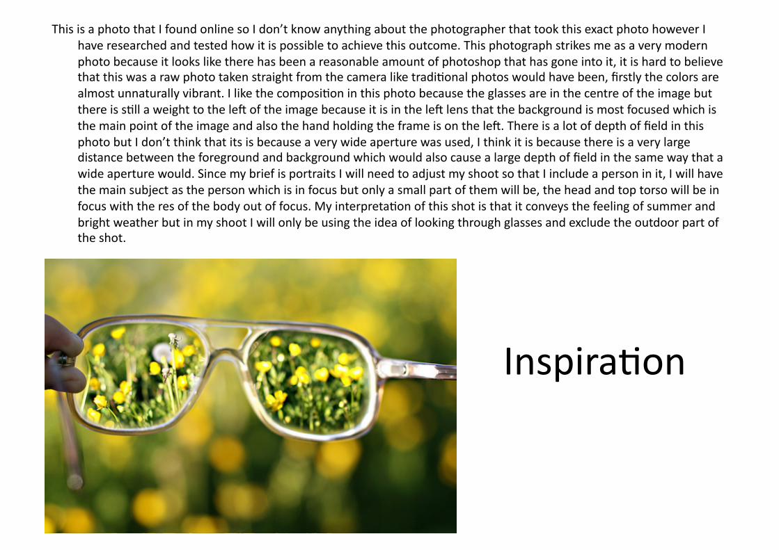
This is a photo that I found online so I don’t know anything about the photographer that took this exact photo however I have researched and tested how it is possible to achieve this outcome. This photograph strikes me as a very modern photo because it looks like there has been a reasonable amount of photoshop that has gone into it, it is hard to believe that this was a raw photo taken straight from the camera like tradi2onal photos would have been, firstly the colors are almost unnaturally vibrant. I like the composi2on in this photo because the glasses are in the centre of the image but there is s2ll a weight to the leE of the image because it is in the leE lens that the background is most focused which is the main point of the image and also the hand holding the frame is on the leE. There is a lot of depth of field in this photo but I don’t think that its is because a very wide aperture was used, I think it is because there is a very large distance between the foreground and background which would also cause a large depth of field in the same way that a wide aperture would. Since my brief is portraits I will need to adjust my shoot so that I include a person in it, I will have the main subject as the person which is in focus but only a small part of them will be, the head and top torso will be in focus with the res of the body out of focus. My interpreta2on of this shot is that it conveys the feeling of summer and bright weather but in my shoot I will only be using the idea of looking through glasses and exclude the outdoor part of the shot.

Thumbnails
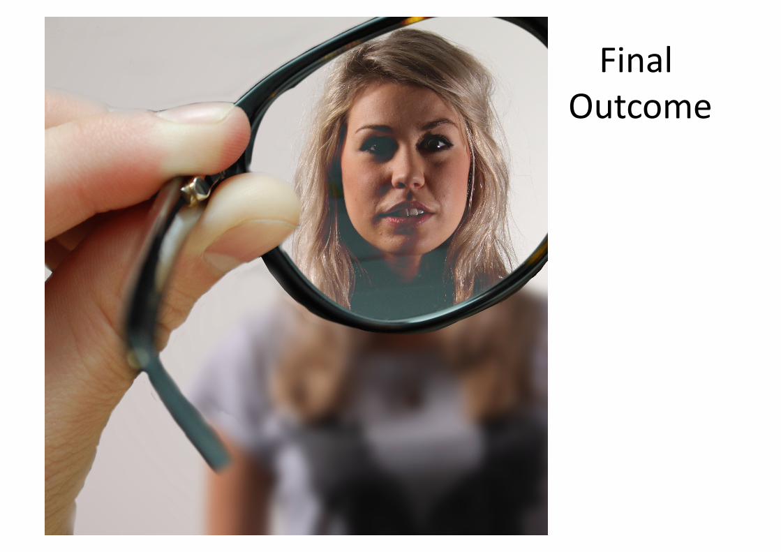
Final Outcome
Self Review The first problem that I encountered was that it is not possible to get the frame of the glasses in
focus when the background or subject was also in focus, so what I had to do was take two different images (one of the frame of the glasses and my hand and one of the subject or person). I then had to cut out the frame of the glasses out and put it into the portrait image but I also had to cut out the lens of the glasses and use the blending op2ons so that I could make the final image as authen2c as possible with the reflec2ons you would get in photographing glasses.
Composi2onally I had to change the image from the inspira2on because if I had both of the lenses in shot then this leE too liOle space for the subject so I had to compromise and only use one lens in shot. However, I s2ll feel that it is a very full shot with not a lot of empty space of color in it.
I am vey pleased with the way that my image has turned out because I feel that it looks very authen2c and I believe that to someone who hasn’t done photography this doesn’t look photoshopped.
Shoot Two
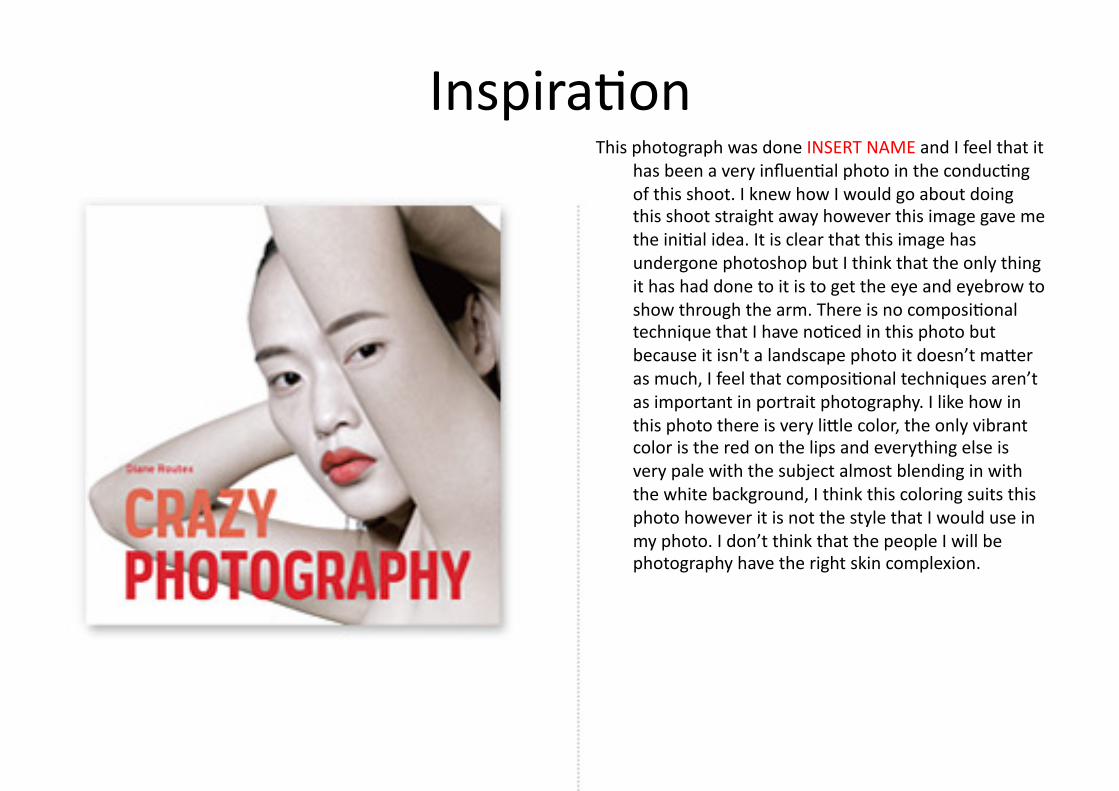
Inspira2on This photograph was done INSERT NAME and I feel that it
has been a very influen2al photo in the conduc2ng of this shoot. I knew how I would go about doing this shoot straight away however this image gave me the ini2al idea. It is clear that this image has undergone photoshop but I think that the only thing it has had done to it is to get the eye and eyebrow to show through the arm. There is no composi2onal technique that I have no2ced in this photo but because it isn't a landscape photo it doesn’t maOer as much, I feel that composi2onal techniques aren’t as important in portrait photography. I like how in this photo there is very liOle color, the only vibrant color is the red on the lips and everything else is very pale with the subject almost blending in with the white background, I think this coloring suits this photo however it is not the style that I would use in my photo. I don’t think that the people I will be photography have the right skin complexion.

Thumbnails
Final Outcome
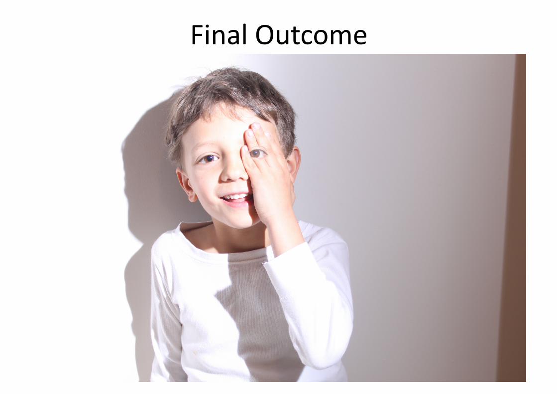
Self Review I feel that this shoot went very well because it was very simple. I tried to achieve the same
coloring style as was in the shot I used in my inspira2on, my brother was a very good model because he has a freakishly fair skin complexion for being half Greek. I think that I was able to use the image in my inspira2on sec2on very well and learn what I needed to do before conduc2on the shoot.
The main problem I encountered with this shoot was trying to get my brother to hold his head s2ll in between the two shots because the ini2al photoshoping plan was to have the two images layered over each other and rub through one but since my brother didn’t stay s2ll I had to cut out the eye from one shot and they copy, adjust and move the eye into place over the hand. I also changed the opacity of the layer down to 50% so that you could see some a the hand through the eye.

Shoot Three
Inspira2on
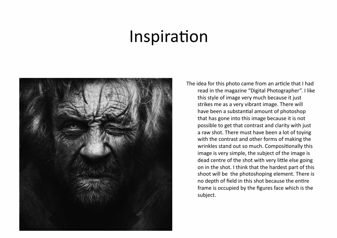
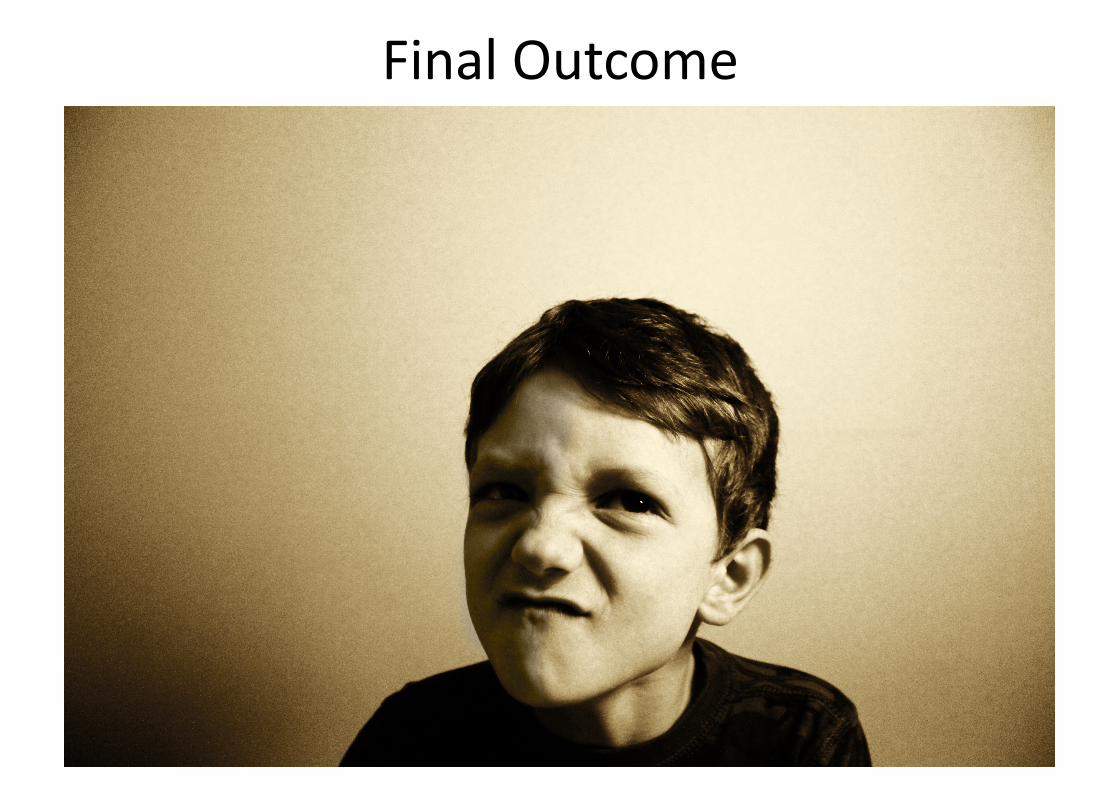
The idea for this photo came from an ar2cle that I had read in the magazine “Digital Photographer”. I like this style of image very much because it just strikes me as a very vibrant image. There will have been a substan2al amount of photoshop that has gone into this image because it is not possible to get that contrast and clarity with just a raw shot. There must have been a lot of toying with the contrast and other forms of making the wrinkles stand out so much. Composi2onally this image is very simple, the subject of the image is dead centre of the shot with very liOle else going on in the shot. I think that the hardest part of this shoot will be the photoshoping element. There is no depth of field in this shot because the en2re frame is occupied by the figures face which is the subject.
Thumbnails
Final Outcome
Self Review I think that this shoot was one of my least successful ones because it found it surprisingly hard to
achieve the same style or finish to the image that I used in my inspira2on sec2on. I think the man
Shoot Four
Inspira2on
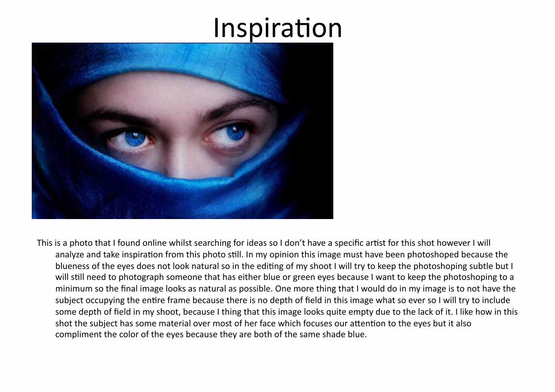
This is a photo that I found online whilst searching for ideas so I don’t have a specific ar2st for this shot however I will analyze and take inspira2on from this photo s2ll. In my opinion this image must have been photoshoped because the blueness of the eyes does not look natural so in the edi2ng of my shoot I will try to keep the photoshoping subtle but I will s2ll need to photograph someone that has either blue or green eyes because I want to keep the photoshoping to a minimum so the final image looks as natural as possible. One more thing that I would do in my image is to not have the subject occupying the en2re frame because there is no depth of field in this image what so ever so I will try to include some depth of field in my shoot, because I thing that this image looks quite empty due to the lack of it. I like how in this shot the subject has some material over most of her face which focuses our aOen2on to the eyes but it also compliment the color of the eyes because they are both of the same shade blue.

Thumbnails
Final Outcome
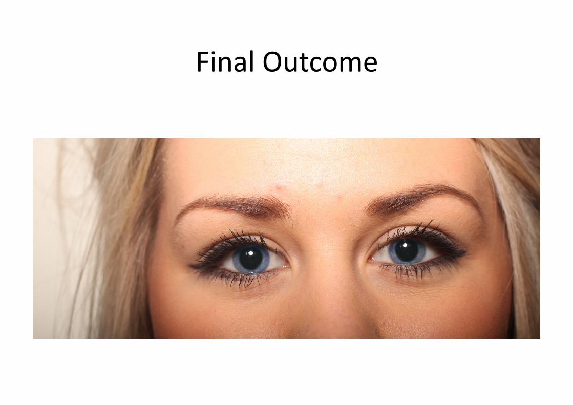
Self Review I feel that my shoot went very well because I was able to keep the photoshoping to a minimum
which made for a very natural looking photo, I would like to think that you wouldn’t be able to no2ce that there was any photoshoping that went into this image.
Upon edi2ng this shot all I changed was the color of the eyes slightly because the flash made the eyes look very pale and discolored as if they had been bleached even though Sophie has very blue eyes in person. I leE in any other imperfec2ons like the barely visible spots or blemishes above/in between the eyebrows, I did this because I wanted to tamper with a liOle of the image as possible.
Composi2onally I like this image a lot because I have copied the composi2onal technique of the shot that was used in the inspira2on sec2on however I said that it looked quite empty because there was no depth of field in the image so when I was cropping the image to size I leE some of the background in so that you could see the unfocused or soE feel to the hair.
Shoot Five
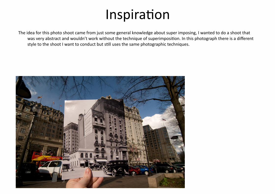
Inspira2on The idea for this photo shoot came from just some general knowledge about super imposing, I wanted to do a shoot that
was very abstract and wouldn’t work without the technique of superimposi2on. In this photograph there is a different style to the shoot I want to conduct but s2ll uses the same photographic techniques.

Thumbnails

Final Outcome
Self Review The problem that I encountered in the edi2ng of this shoot was trying to get the drop shadow of
the Lego figure to look right, I s2ll feel that it could have been done beOer but

Shoot Six
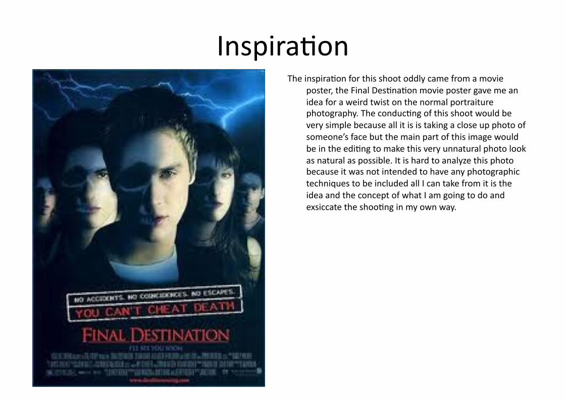
Inspira2on The inspira2on for this shoot oddly came from a movie
poster, the Final Des2na2on movie poster gave me an idea for a weird twist on the normal portraiture photography. The conduc2ng of this shoot would be very simple because all it is is taking a close up photo of someone’s face but the main part of this image would be in the edi2ng to make this very unnatural photo look as natural as possible. It is hard to analyze this photo because it was not intended to have any photographic techniques to be included all I can take from it is the idea and the concept of what I am going to do and exsiccate the shoo2ng in my own way.

Thumbnails
Final Outcome
Self Review The first problem that I encountered upon edi2ng this shoot was that photos where a slightly
different style to the ones in the movie poster. In the poster the people have no expression on their face and the image has a much darker feel to it, I was very caught up in taking a very good ini2al image that I didn’t think of this however I don’t think that it affected the final outcome of the edited shots very much. I think that the edi2ng also went well and the blending look quite natural.
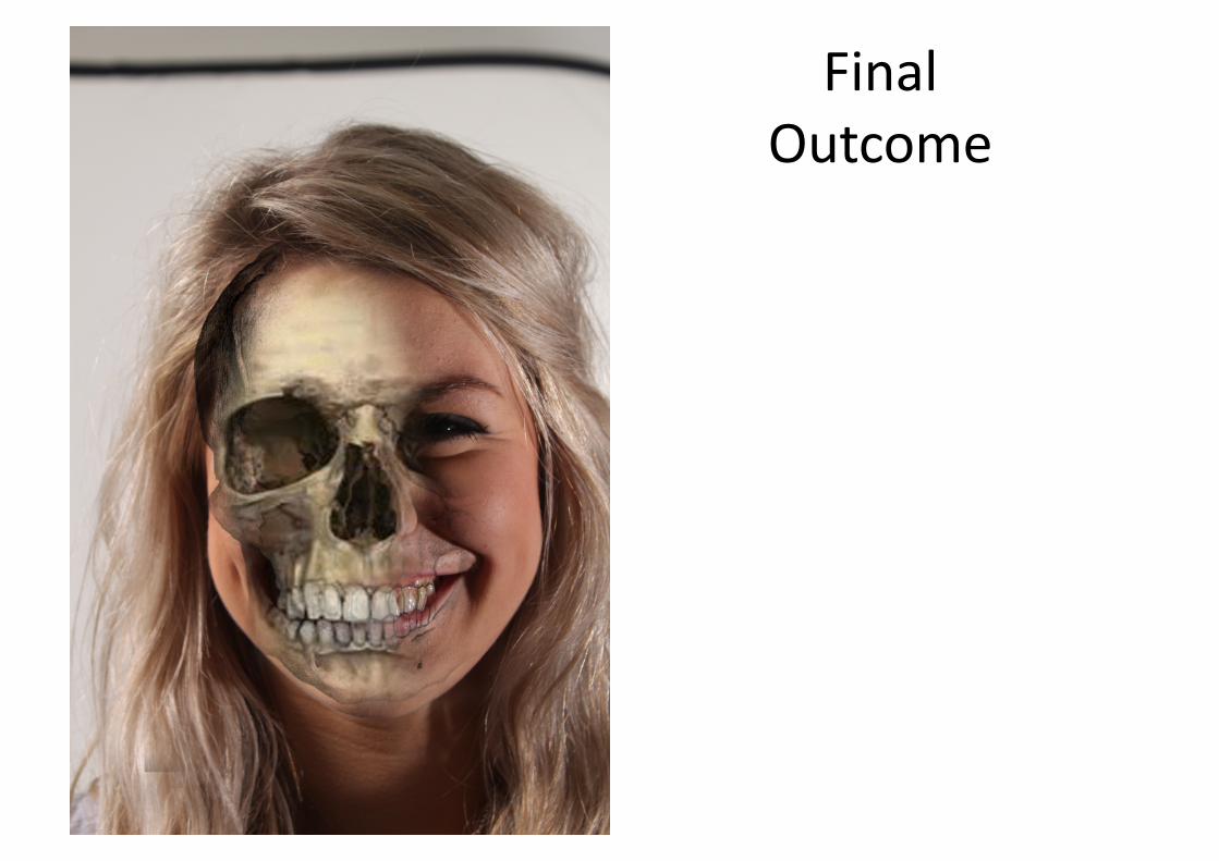
The composi2on of this image was very simple, the subject was in the centre of the frame taking up most of the space with the skull taking up just a liOle bit more of its fair half of the image because if the face blended into the skull in the dead centre of the image then it looked too perfect and at a glance there was something that didn’t look right in the image.
In conclusion I think that this shoot was very successful because the photoshoping and the ini2al shoot went well so there was really no reason why this image wouldn’t have turned out the way I intended it too.
Shoot Seven
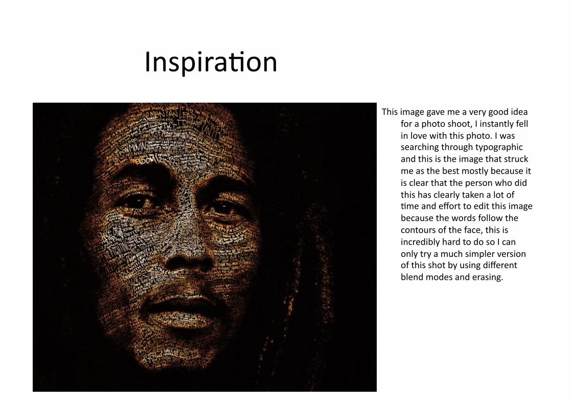
Inspira2on This image gave me a very good idea
for a photo shoot, I instantly fell in love with this photo. I was searching through typographic and this is the image that struck me as the best mostly because it is clear that the person who did this has clearly taken a lot of 2me and effort to edit this image because the words follow the contours of the face, this is incredibly hard to do so I can only try a much simpler version of this shot by using different blend modes and erasing.

Thumbnails
Final Outcome
Final Outcome
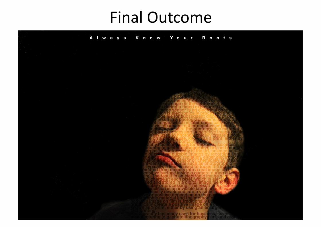
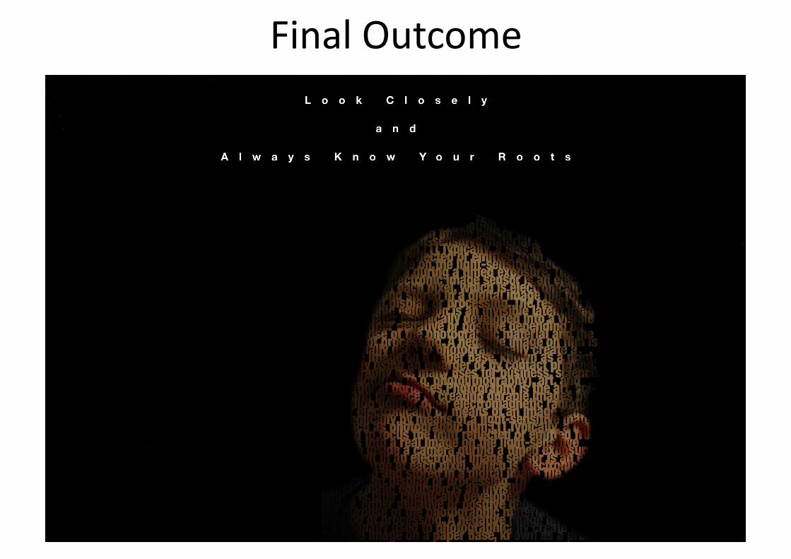
Self Review There are two final outcomes here because I couldn’t decide which one was beOer, in one of
them I just used a the blend mode overlay to slightly match the color of the text to the skin color which made for an interes2ng outcome however in the other one more photoshoping was needed. Instead of just using a blend mode I made the text a close together as possible so that if took up as much space as possible and then I selected the inverse of it and rubbed through the layer that had my brother’s face on it. This made for a very interes2ng photo because from a distance it looked like there are just come lines over his face but at a closer look you can see that it is actually text.
This is the only photo shoot that I have done that has included a hidden meaning, the 2tle on the shot “always know your roots” may seem like it has no relevance however the text that is overlayed on the shot is actually a descrip2on of how photography started


![Unit 1 Unit 2 Unit 3 Unit 4 Unit 5 Unit 6 Unit 7 Unit 8 ... 5 - Formatted.pdf · Unit 1 Unit 2 Unit 3 Unit 4 Unit 5 Unit 6 ... and Scatterplots] Unit 5 – Inequalities and Scatterplots](https://static.fdocuments.us/doc/165x107/5b76ea0a7f8b9a4c438c05a9/unit-1-unit-2-unit-3-unit-4-unit-5-unit-6-unit-7-unit-8-5-formattedpdf.jpg)